31 Jaw-Dropping Plate Wall Decor Ideas That Will Instantly Transform Your Dining Room

You know that feeling when you finally find the plate wall that looks exactly right for your space? It feels like magic, but it’s really about having the right inspiration. After filtering through hundreds of options across Etsy, antique markets, and classic brands like Ballard Designs, we narrowed it down to the looks that actually deliver. We’ve curated 31 distinct plate wall ideas, from grandmillennial traditional to eclectic modern farmhouse. Plate walls are the heart of the Collected Home movement trending in 2026, offering a deeply personal alternative to mass-produced art. And stay until the end—we break down the most common mistakes that can ruin these looks. 📌 Save this to Pinterest for later—you’ll want to revisit these ideas.
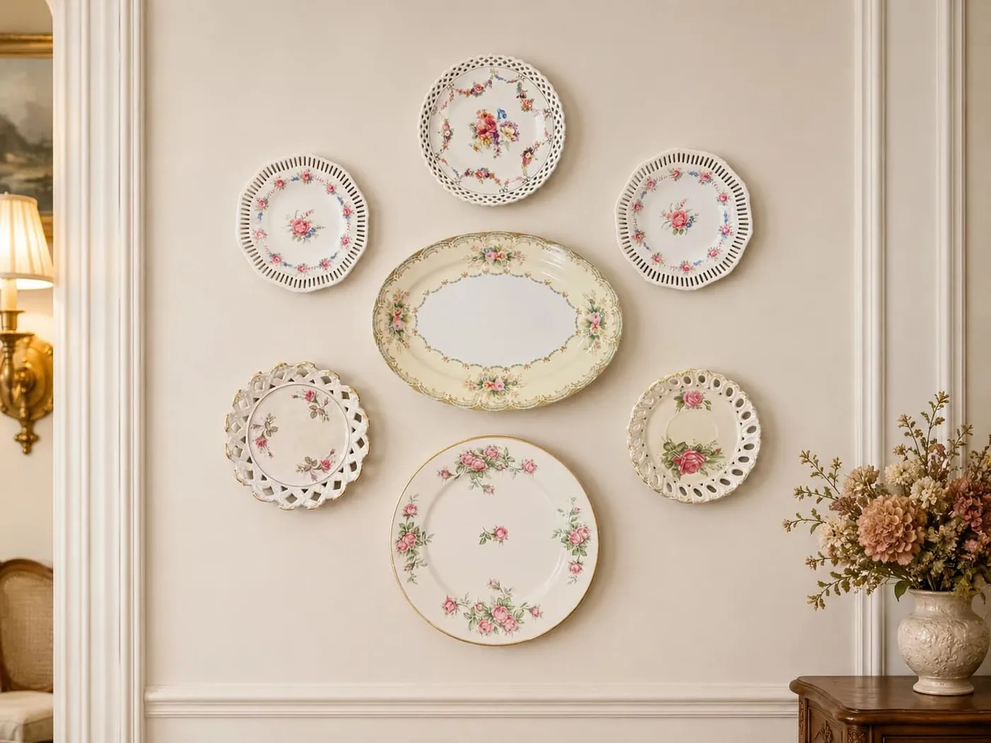
1. A Symmetrical Display of Romantic Floral Plates
This arrangement feels so graceful and intentional because of its strict adherence to symmetry. The central axis is clear, with pairs of plates mirroring each other in shape and placement. This creates a sense of calm and order that feels very classic. The use of white wall molding acts as a built-in frame, elevating the entire collection from a simple display to a true architectural feature. The consistent color story—pinks, greens, and creams across all plates—unifies the different shapes and sizes into one cohesive statement.
|
📋 Copy HEX 🔗 Share |
When creating a symmetrical grid like this one, precision is everything. Lay out your plates on the floor first to finalize the arrangement. Use a laser level to establish your central vertical and horizontal axes on the wall. For a balanced look, the space between each plate should be consistent, typically between 2 to 4 inches. A smaller gap creates a denser, more unified look, while a wider gap allows each individual plate to breathe. Measure twice, hang once!
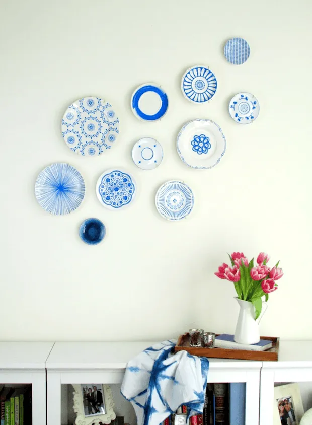
2. A Cheerful Cluster of Blue and White China
The charm of this corner comes down to a simple, repeatable formula. Think of it as 60% classic blue-and-white patterned plates, 30% crisp white furniture and pitchers, and 10% fresh, vibrant color (like these pink tulips). The formula works because the plates provide the pattern and history, the white elements offer a clean, modern canvas, and the pop of pink adds life and keeps it from feeling too stuffy. You could easily swap the pink for sunny yellow or lavender and achieve the same fresh effect.
|
📋 Copy HEX 🔗 Share |
You absolutely do not need a collection of antique Delftware to get this look. The key is the blue-and-white color story, not the price tag. Head to stores like HomeGoods, Tuesday Morning, or even a local thrift shop, where you can often find individual decorative plates for $3-$10 each. Look for varying patterns—some floral, some geometric, some with landscapes—to build an interesting collection. A white IKEA Eket or Besta cabinet ($50-$150) can serve as the perfect anchor below. For a more modern vibe, see the eclectic grouping in Idea #5.
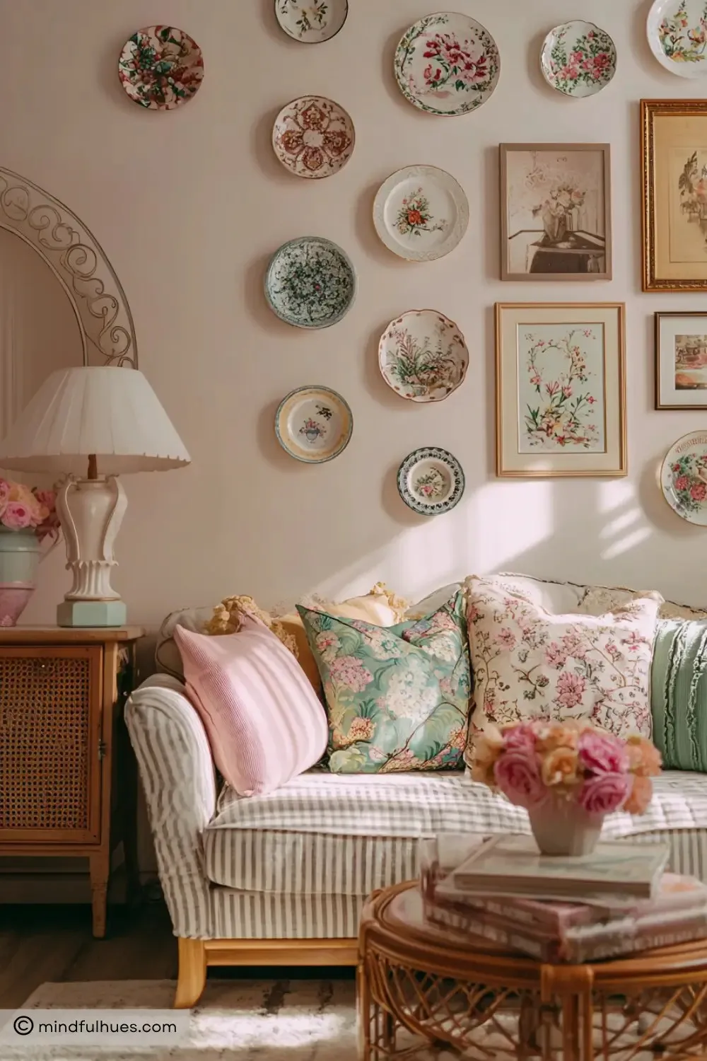
3. A Vintage-Inspired Gallery on a Soft Pink Wall
The single most important element here is the mix of mediums. This isn’t just a plate wall; it’s a true gallery wall where floral plates and framed botanical prints are treated as equals. Removing the gold-framed art would leave you with a sweet, but much more conventional, plate display. By integrating the prints, the collection gains depth, texture, and a more curated, thoughtful feel. It shows that the plates are not just decorative objects but part of a larger artistic story.
|
📋 Copy HEX 🔗 Share |
Let’s be honest: achieving this effortless, collected-over-time look takes… well, time. Finding vintage plates and botanical prints that complement each other in color and style without being perfectly matched is a treasure hunt. The risk is that if the pieces don’t share a common thread (like the delicate floral theme and soft palette here), the wall can quickly look cluttered and chaotic rather than curated. Patience is key; don’t try to buy it all in one weekend.
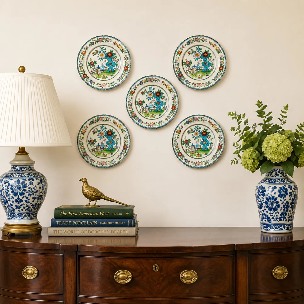
4. Five Floral Plates Above a Bowed Mahogany Cabinet
This composition is a masterclass in balance and visual weight. The dark, heavy mahogany cabinet grounds the entire vignette. The five plates are arranged in a classic diamond-cross formation that draws the eye upward and outward, making the wall feel taller. The visual weight is perfectly distributed: the larger plate is centered, with smaller plates radiating out. Furthermore, the colors in the plates are echoed in the accessories below—the blue and white lamp and vase tie directly back to the ceramic display, creating a harmonious loop of color.
|
📋 Copy HEX 🔗 Share |
This type of arrangement works best on a wall space that is between 4 and 6 feet wide. You need enough negative space on either side of the plate grouping to prevent it from feeling cramped. The ideal ceiling height is 8 feet or more, allowing the display to sit comfortably above a standard-height (30-36 inch) cabinet without touching the ceiling. For a smaller wall, consider a vertical arrangement like the one in Idea #8 to draw the eye up.
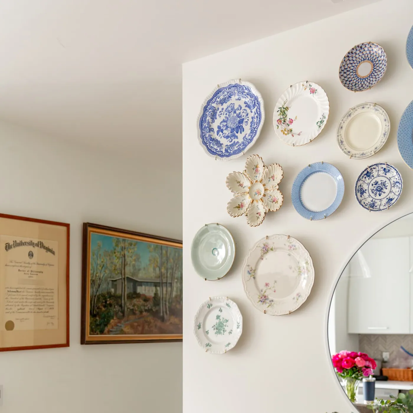
5. Eclectic Blue and White Plates Beside a Round Mirror
When creating an eclectic, asymmetrical cluster like this, the key is to start with an anchor piece and build outwards. Your largest plate or platter should be placed first, typically slightly off-center. Then, add the next largest plates around it, forming a loose triangle. Finally, fill in the gaps with your smallest plates. This method prevents the layout from feeling random and ensures a balanced, organic flow. Keep the spacing between plates relatively tight and consistent, around 1.5 to 3 inches, to make it read as a single art installation.
|
📋 Copy HEX 🔗 Share |
This look is a direct reflection of the Grandmillennial trend, which celebrates and modernizes traditional decor elements. Young designers and homeowners are raiding their grandmothers’ china cabinets and flea markets for beautiful, storied pieces. Instead of using them for dining, they’re turning them into art. It’s a sustainable, personal way to decorate that pushes back against the fast-fashion, mass-produced wall decor that dominated the last decade. This trend has staying power because it’s rooted in personality and history.
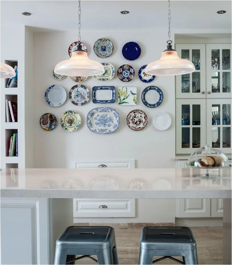
6. A Kitchen Wall of Plates with Ribbed Glass Pendants
Hanging plates around existing fixtures like pendant lights requires careful planning. Here’s a quick guide to getting it right:
|
📋 Copy HEX 🔗 Share |
- First, turn the lights on to see their full dimension and glow. This helps you visualize the space they occupy.
- Create paper cutouts of all your plates. Use painter’s tape to arrange these templates on the wall, starting with your largest pieces and working around the pendants.
- Live with the paper layout for a day or two. Walk past it from different angles to ensure no key part of a plate is awkwardly obscured by a light fixture.
- Adjust as needed. You want the lights to feel integrated, not like an obstacle.
- Once you’re happy, mark the center of each paper cutout and hang your plates.
Plates in the kitchen look fantastic, but they are magnets for grease and dust, especially if they’re near the stove. To keep them looking fresh, you’ll need to clean them every 2-3 months. Avoid putting antique or hand-painted plates in the dishwasher, even if you think they’re sturdy. The best method is to take them down and hand wash them with warm water and a gentle dish soap. Use a microfiber cloth to dry them thoroughly before rehanging to prevent water spots. It’s a bit of a chore but necessary to protect your collection.
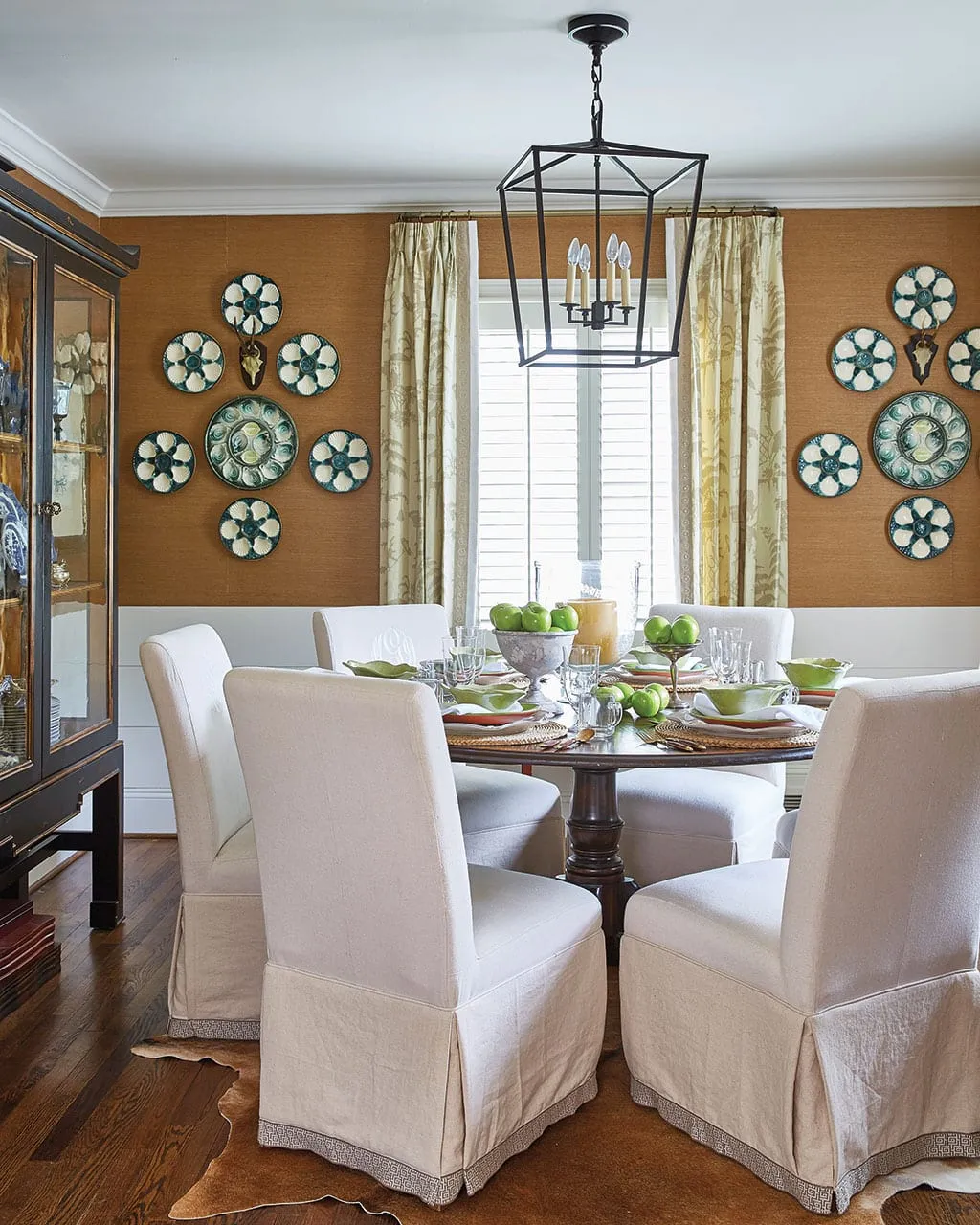
7. Foundational Steps for a Classic Kitchen Plate Display
A successful plate wall is all in the prep work. Before you even think about hammering a nail, run through this simple checklist:
|
📋 Copy HEX 🔗 Share |
- Measure your wall space precisely. Know the total height and width you have to work with.
- Decide on a theme or color palette. Are you going for blue and white, a mix of florals, or something more abstract? Committing to a concept is crucial.
- Gather your collection. You need to know exactly which plates you’re hanging before you can plan a layout.
- Choose your hangers. Will you use wire plate hangers, adhesive discs, or a picture rail system? Each has different visual and installation requirements.
Those spring-loaded wire plate hangers are effective, but they are not without their faults. The metal tips can scratch or chip the edges of delicate antique porcelain over time. More importantly, the tension they put on a plate is constant. For very old or fragile pieces, this can be a risk. Adhesive disc hangers are a great alternative, as they distribute the weight more evenly, but be warned: they are meant to be permanent. Removing them can be very difficult and may damage the back of the plate or leave residue.
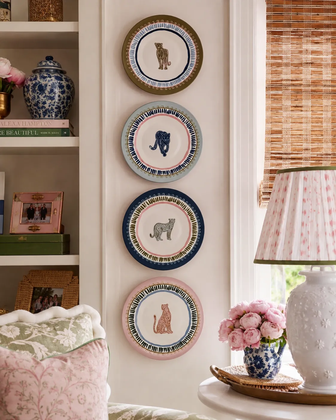
8. A Playful Vertical Stack of Animal-Themed Plates
This look is all about layering patterns in a controlled way. The formula is simple: 50% solid wall color + 30% large-scale pattern (the animal plates) + 20% small-scale or textural pattern (the woven blind and pleated lampshade). By keeping the wall a single, neutral color, the detailed illustrations on the plates become the undeniable star. The woven texture of the blind adds warmth and dimension without competing for attention. It’s a balanced equation that feels playful yet sophisticated.
|
📋 Copy HEX 🔗 Share |
that makes this work is the strictly vertical arrangement. If these four plates were scattered in a cluster, the effect would be completely different—more chaotic and less impactful. Stacking them in a neat column creates a strong, graphic line that draws the eye upward, making the wall feel taller. It turns the plates into a single, cohesive art piece, like a totem pole of charming illustrations. This deliberate, linear placement is what gives the playful subject matter its sophisticated edge.
9. A Vibrant Collection of Hand-Painted Blue and Yellow Plates
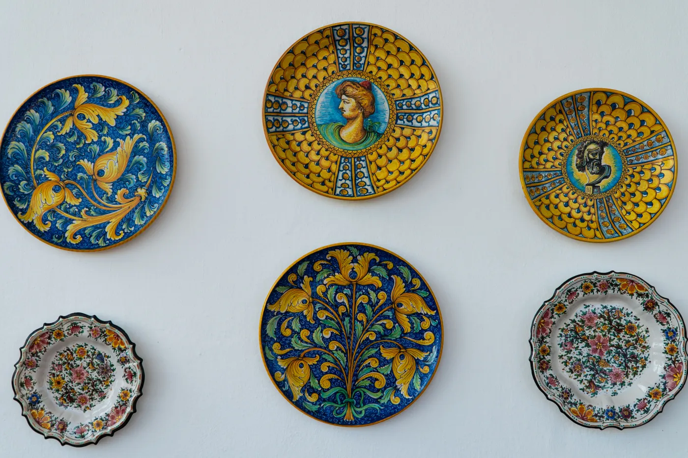
This arrangement feels so alive and cohesive despite the variety of patterns because it sticks to a disciplined and energetic color palette. The consistent use of cobalt blue and bright yellow acts as the thread that ties everything together. Even though some plates feature portraits and others have floral motifs, the shared colors make them feel like they belong to the same family. The crisp white wall acts as the perfect gallery-style backdrop, allowing the intense colors to truly pop without any competition.
|
📋 Copy HEX 🔗 Share |
Achieving this hand-painted, artisan look can vary wildly in cost. Here’s a possible breakdown for a display of six plates:
- Artisan/Hand-Painted Plates: $300 – $1,200 ($50-$200 each)
- Lighting: N/A
- Textiles: N/A
- Decor/Accessories (Hangers): $20 – $50
- Paint/Wall Treatment: $50 – $100
- TOTAL: $370 – $1,350
Budget alternative: Source mass-produced plates with similar patterns from stores like Pier 1 or World Market and mix in one or two authentic artisan plates as focal points. This could bring the total cost down to $150 – $300.
10. An Eclectic Blue and White Plate Wall in a Traditional Room
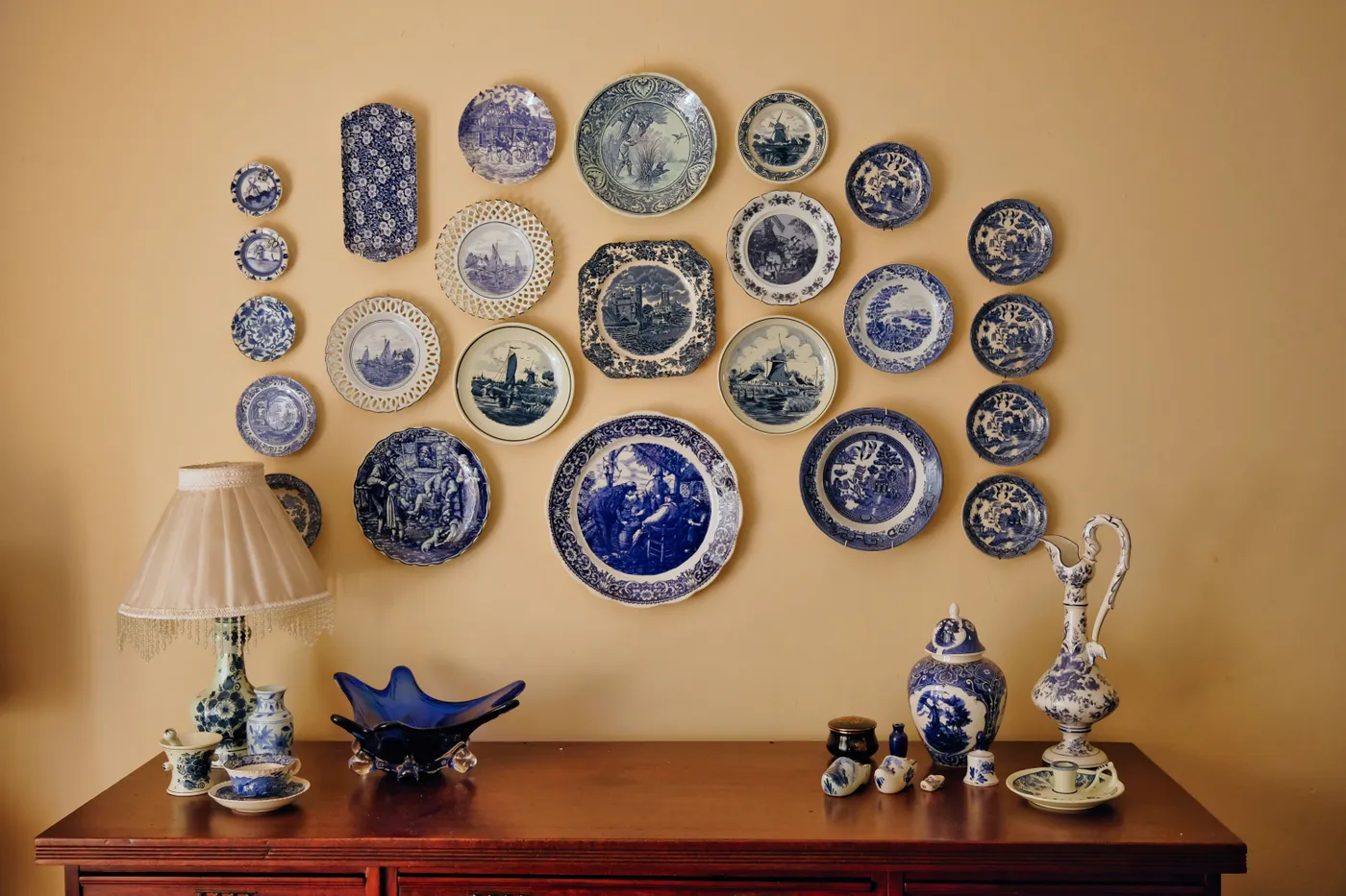
A dense, large-scale plate collection like this demands a substantial wall. This look is best suited for a primary feature wall in a dining room, living room, or entryway that is at least 8 to 12 feet wide. On a smaller wall, this many plates would feel overwhelming and cluttered. Ceiling height should ideally be 9 feet or higher to accommodate the vertical spread of the display and the height of the console table below it. If your space is smaller, consider a more curated version with 5-7 plates, like in Idea #4.
|
📋 Copy HEX 🔗 Share |
When you’re mixing dozens of patterns, as seen here, the secret to cohesion is varying the scale of the prints. Make sure you have a mix of large-scale, medium-scale, and small-scale patterns. For example, a plate with a large, singular floral motif (large-scale) should be balanced by a plate with a tight, repeating geometric design (small-scale). This variety creates visual rhythm and prevents the patterns from blurring into a chaotic mess from a distance. Aim for about 40% large, 40% medium, and 20% small patterns.
11. A Global-Inspired Plate Display on a Saffron Wall
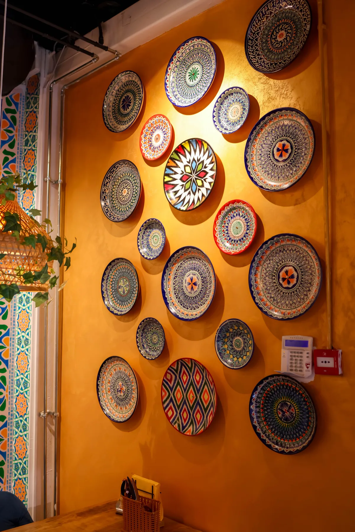
The bold, unapologetic saffron wall color is the single element that makes this entire room sing. Without it, this would be a lovely but much safer collection of patterned plates on a neutral wall. The warm, spicy hue provides an energetic backdrop that makes the blues and greens of the plates vibrate. It elevates the look from simply eclectic to well-traveled and infuses the entire space with personality and warmth. It’s a brave choice that pays off in a big way.
|
📋 Copy HEX 🔗 Share |
A wall color this saturated and specific is a major commitment. Saffron, ochre, or marigold can look stunning in a room with abundant natural light, but in a darker space, they can feel heavy and overwhelming. Before you paint the entire room, get a sample pot and paint a large poster board. Move it around the room at different times of day to see how the light affects the color. Also, consider that this color will heavily influence all future decor choices—it’s not a neutral backdrop.
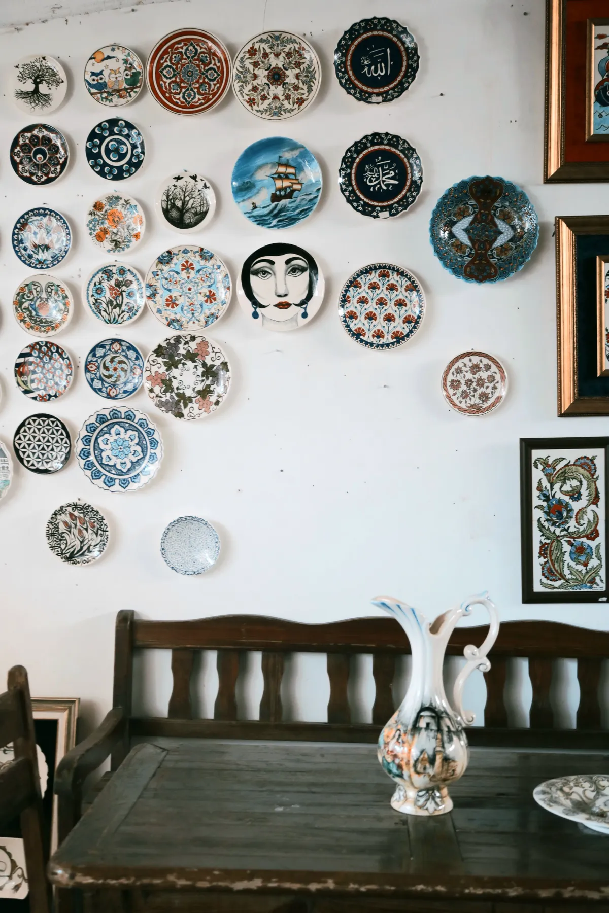
12. Artistic Ceramic Plates Above a Rustic Wooden Bench
This display works because it fully embraces an art gallery approach rather than a purely decorative one. The plates feature a huge range of styles—from traditional florals to modern illustrative faces—and are hung with their visible nails, reinforcing the idea of an artist’s studio. The arrangement is deliberately imperfect and organic, which feels authentic. The rustic dark wood bench below provides a heavy, grounding anchor for the riot of color and pattern on the wall, preventing the display from feeling like it’s floating away.
|
📋 Copy HEX 🔗 Share |
You can capture this artistic, eclectic vibe without spending a fortune on artisan ceramics. Check out college art sales or local craft fairs for unique, one-off pieces from emerging artists—they’re often very affordable. Don’t be afraid to mix in interesting finds from Anthropologie or even Target’s Opalhouse line. The key is variety in design. A rustic bench can be a frequent find on Facebook Marketplace or at flea markets for under $100, often with more character than a new one.
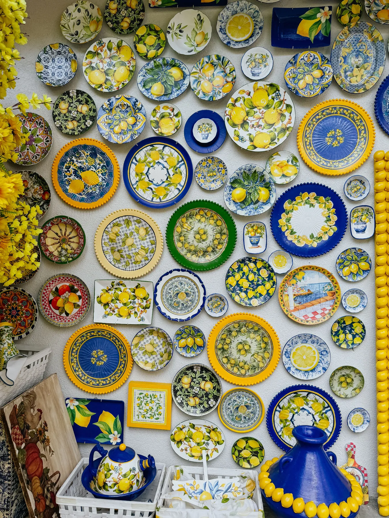
13. A Vibrant Wall of Mediterranean Lemon-Themed Plates
This joyous, maximalist display follows a clear recipe for a sunny Mediterranean vibe. It’s roughly 50% lemon-themed plates + 40% solid cobalt blue accents (the vase, details on other plates) + 10% fresh greenery and real lemons. The key is the density of the arrangement; the plates are packed tightly together to create a solid mass of color and pattern. This ‘more is more’ approach is what gives it that feeling of abundance and Italian coastal charm. The textured white wall acts as the perfect simple canvas.
|
📋 Copy HEX 🔗 Share |
A dense display like this is a glorious statement, but it’s also a serious dust collector. With all the overlapping edges and varied surfaces, a simple wipe-down isn’t going to cut it. Plan on a deep clean at least twice a year, which involves taking every single plate off the wall for a proper wash. For weekly maintenance, a feather duster or a soft brush attachment on your vacuum will be your best friend. Be especially careful with any unglazed ceramic pieces, as they can be more porous and stain easily.
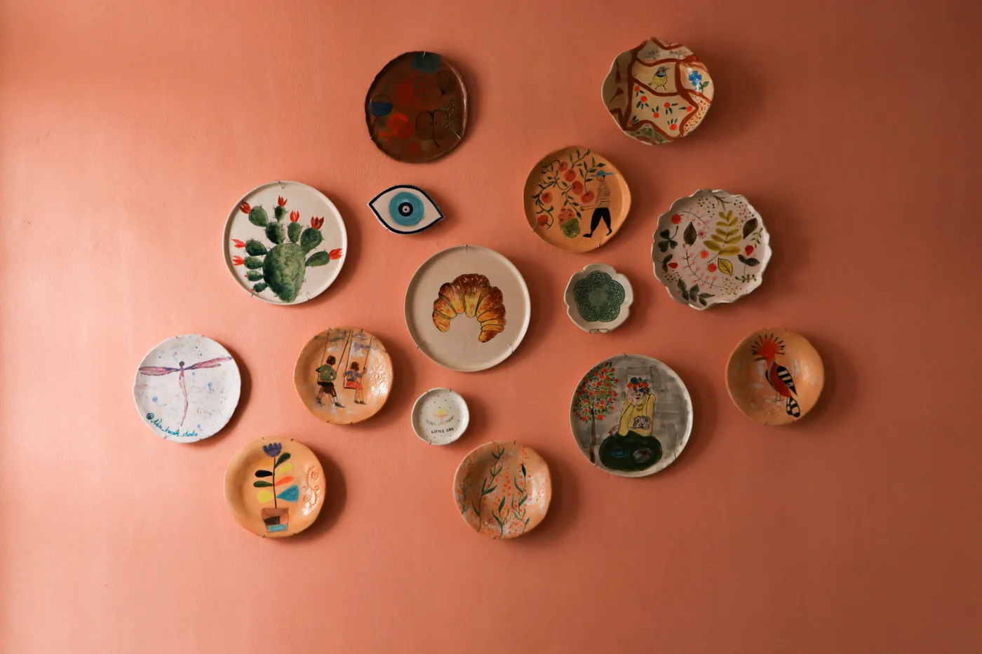
14. An Eclectic Folk Art Plate Wall on a Salmon Background
The standout feature here is the incredible diversity of plate shapes. We see not just standard circles, but ovals, rounded squares, and even a fish-shaped platter. This rejection of uniformity is what gives the wall its playful, folk-art character. If all the plates were perfectly round, the display would feel much more formal and traditional. The varied silhouettes create a dynamic, sculptural quality that makes the entire wall feel like a single, sprawling piece of art.
|
📋 Copy HEX 🔗 Share |
This arrangement succeeds because it feels deeply personal and handmade. The organic, slightly imperfect clustering gives the impression of a collection that has grown slowly over time. The warm, textured salmon wall color is a brilliant choice—it’s unconventional and has a rustic, earthy quality that perfectly complements the folk-art style of the plates. A plain white wall would have felt too sterile and modern for these charmingly irregular pieces.
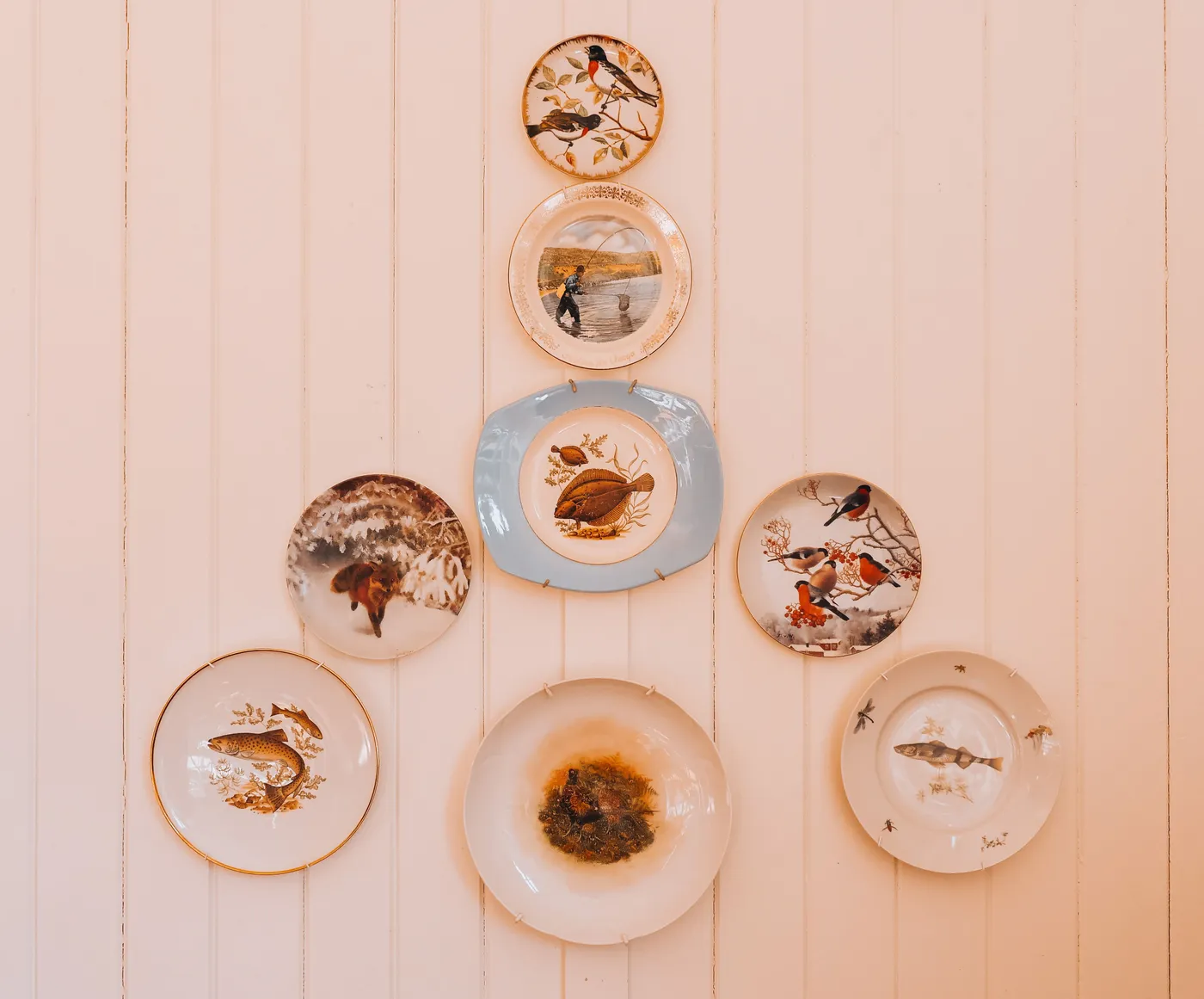
15. A Symmetrical Display of Nature Plates on a Peach Paneled Wall
When hanging plates on a paneled or shiplap wall, use the vertical lines to your advantage. Aligning the central axis of your display with one of the paneling grooves creates an instant sense of order and intentionality. For this symmetrical look, you’d find the center of the wall (or the center of your furniture piece below), align it with a panel line, and then build your arrangement outwards from there. It’s a simple trick that makes the final result look incredibly polished and integrated with the room’s architecture.
|
📋 Copy HEX 🔗 Share |
This kind of formal, symmetrical eight-plate arrangement is perfect for the space above a bed’s headboard, a fireplace mantel, or a console table. It requires a horizontal wall space of about 5-7 feet to allow for proper breathing room around the collection. The vertical paneling helps to draw the eye up, so it works well with standard 8-foot ceilings, but it would be even more dramatic with 9-foot or 10-foot ceilings. Compare this formal layout to the more organic cluster in Idea #12.
16. Three Ornate Indian Deity Plates on a Deep Teal Wall
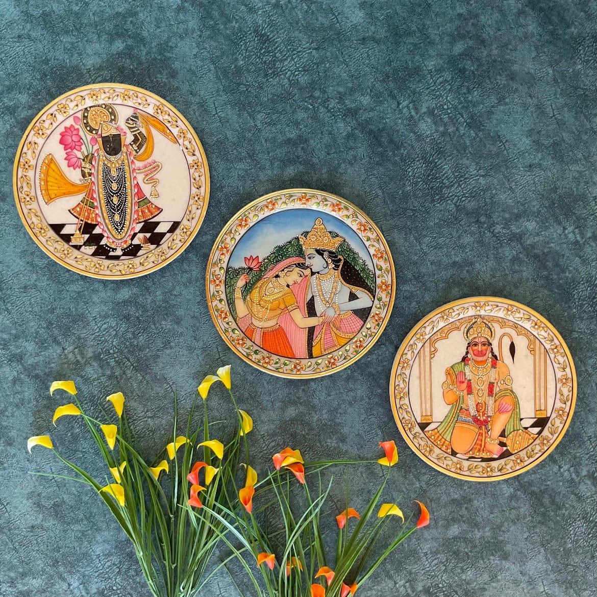
The power of this vignette comes from the dramatic color contrast. The deep, textured teal wall creates a moody, luxurious backdrop that makes the gold rims and vibrant colors of the plates practically leap forward. If these plates were hung on a white or beige wall, they would still be beautiful, but they would lose this incredible sense of depth and drama. The teal color is not just a background; it’s an active participant in the design, enhancing the richness and ornate quality of the artwork on the plates.
|
📋 Copy HEX 🔗 Share |
We’re seeing a huge movement in design toward celebrating cultural heritage and incorporating meaningful, artistic objects into our homes. This display is a perfect example. Instead of generic decor, the homeowner has chosen to showcase pieces that are not only visually stunning but also hold cultural and spiritual significance. This trend, often called Artisanal Global, is about creating spaces that tell a personal story and connect us to a larger world of craft and tradition. It’s the ultimate antidote to bland, soulless interiors.
17. An Elegant Mix of Plates Above a Marble Countertop
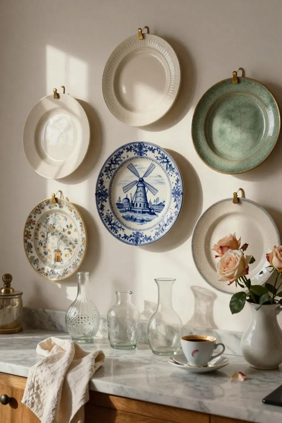
The serene elegance here is a careful balancing act. The formula is: 40% classic patterns (the blue and white plates) + 30% organic modern shapes (the clear glass carafes) + 20% natural elements (the roses) + 10% metallic warmth (the brass hangers). The brass is crucial; it bridges the gap between the traditional plates and the contemporary glassware, adding a touch of warmth to the otherwise cool palette of white, blue, and marble. This mix of styles is what makes the corner feel curated and timeless.
|
📋 Copy HEX 🔗 Share |
Using visible brass wire hangers is a specific stylistic choice. While they add a lovely metallic glint, be aware that they can visually distract from the plate itself, especially on simpler, more modern designs. They work well here because the plates are quite traditional. For a cleaner, more minimalist look where the plate seems to float on the wall, consider using adhesive disc hangers which are completely hidden from the front. It’s a trade-off between added decorative detail and uninterrupted focus on the ceramic.
18. Farm Animal Plates on Distressed Wood Shelves
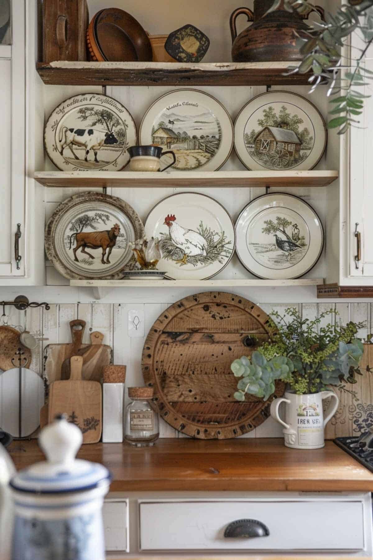
This is farmhouse style done right because it’s all about authentic, layered texture. You have the clean, painted lines of the shiplap, the rugged, distressed finish of the wood shelves, the smooth gloss of the ceramic plates, and the matte finish of the rustic cutting boards. This rich combination of textures is what creates the cozy, lived-in feeling. The display also works because it breaks the
|
📋 Copy HEX 🔗 Share |
19. Blue and White Plate Display in a Classic Kitchen
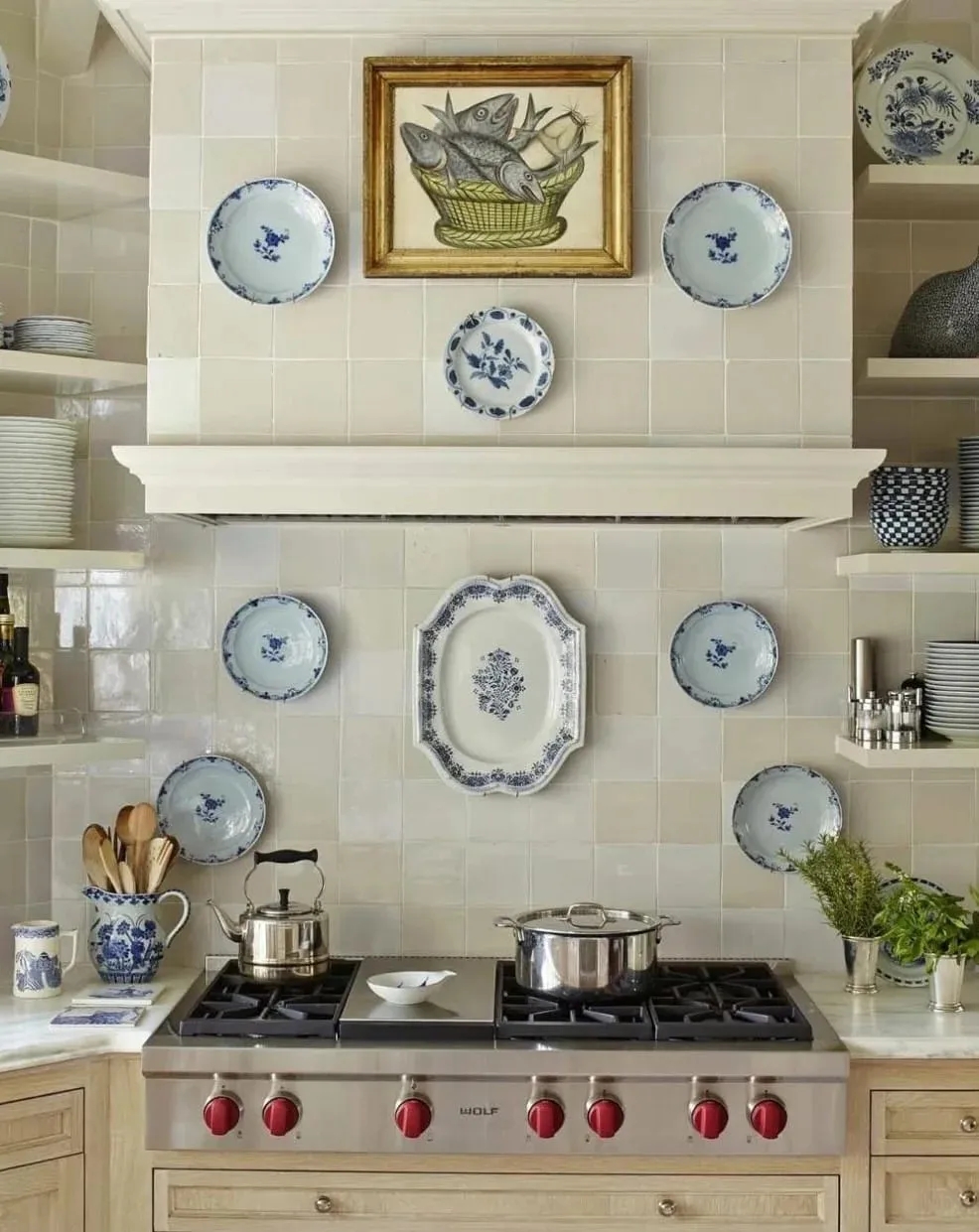
When incorporating a plate wall around a focal point like a range hood, think in layers. The gold-framed fish painting is the primary focal point here, placed at eye level. The large scalloped platter is the secondary anchor, creating a strong presence above. The smaller plates are the tertiary layer, used to fill out the composition and connect the two main elements. This hierarchical approach ensures the wall feels organized and intentionally designed, rather than like a random assortment of items.
|
📋 Copy HEX 🔗 Share |
that truly elevates this kitchen is the custom mantel-style range hood. It transforms a purely functional appliance into a beautiful piece of architectural millwork. It provides the perfect frame for the artwork and plate display, giving it a sense of importance and creating a classic, hearth-like focal point for the entire room. Without this substantial piece of trim work, the arrangement would feel far less grounded and impactful.
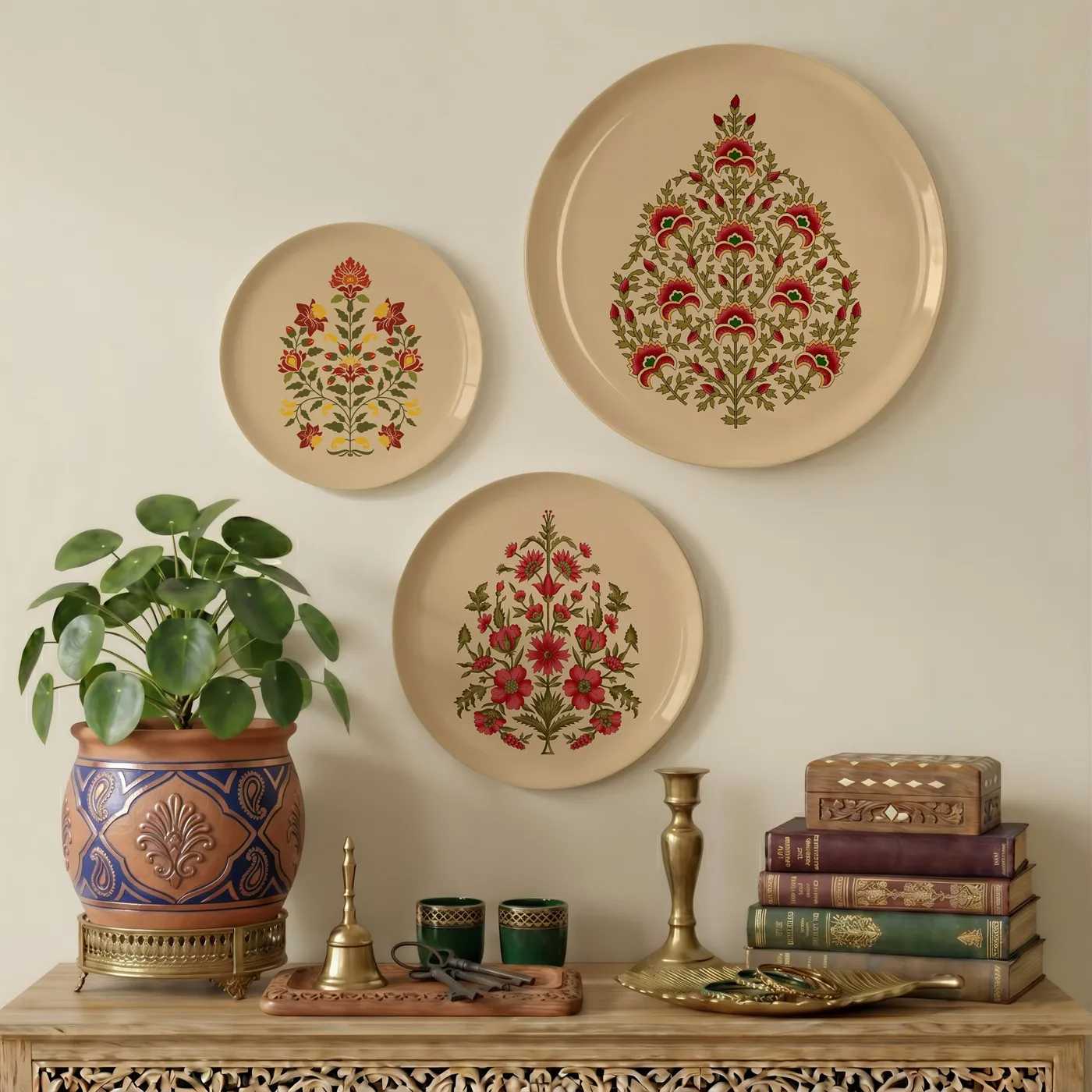
20. Beige Plates with Red and Green Florals on a Cream Wall
This vignette is a lesson in the power of tone-on-tone decorating. The beige plates are only a few shades darker than the cream wall, creating a soft, low-contrast look that feels very sophisticated and serene. The deep red and sage green floral patterns then pop beautifully against this neutral-on-neutral backdrop. The carved light wood console table continues this low-contrast palette, making the entire composition feel harmonious and calming. The large green Pilea plant provides a burst of life that connects directly to the green in the plates.
|
📋 Copy HEX 🔗 Share |
A monochromatic or low-contrast color scheme like this is beautiful, but it relies heavily on the quality of light in the room. In a room with flat, cool, or insufficient lighting, this entire corner could fall flat and just look beige and boring. This look thrives in a space with ample natural light that can create subtle shadows and highlight the different textures—the gloss of the plates, the grain of the wood, the leaves of the plant. Always test your paint colors in your own light before committing.
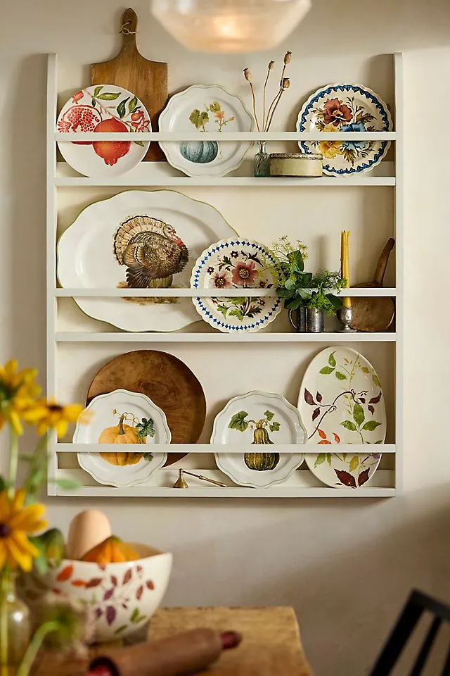
21. A White Plate Rack Showcasing Seasonal Decor
A plate rack is the perfect canvas for easy seasonal updates. Here’s a quick guide to styling it for autumn:
|
📋 Copy HEX 🔗 Share |
- Start by clearing it completely. Give the rack a good wipe down.
- Anchor the display with your largest plates or platters, usually on the bottom or middle shelf. Here, the turkey and pumpkin plates serve as the focal points.
- Layer in smaller plates with complementary patterns, like the pomegranate and foliage designs. Don’t be afraid to overlap them slightly.
- Add texture and warmth with natural elements like small wooden cutting boards or dried botanicals in a vase.
- Finish with a touch of ambiance, like a single taper candle in a simple holder.
You don’t need a built-in or custom rack to get this charming look. IKEA sells simple wall shelves like the TORNVIKEN or MOSSLANDA that can be used to display plates for under $25. For a more traditional rack, check out Wayfair or even Amazon for options under $100. The real savings come from collecting your seasonal plates over time from places like Marshalls, HomeGoods, or post-holiday clearance sales. A beautiful collection can be built for very little money with a bit of patience.
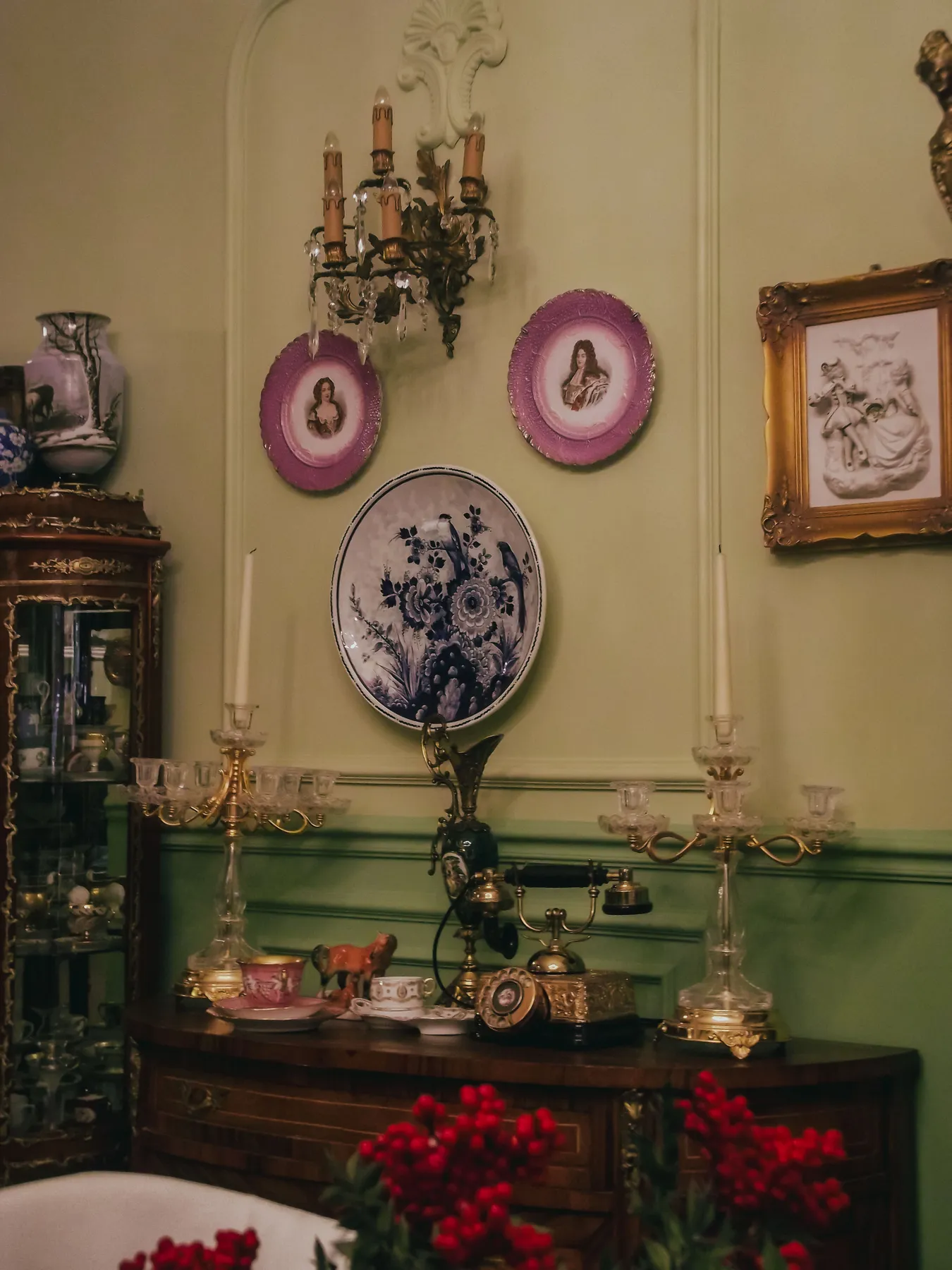
22. Baroque-Inspired Gallery with Plates and Crystal Sconces
This luxurious, ornate look is a rich and complex formula: 30% dramatic color (the fuchsia-bordered plates), 30% classic pattern (the large blue and white floral plate), 20% metallic glam (the gold sconce and frame), and 20% dark, grounding furniture (the wood sideboard). The key is that no single element overpowers the others. The fuchsia provides the modern, unexpected jolt, while the traditional elements like the blue and white plate and baroque sconce keep it feeling elegant and timeless.
|
📋 Copy HEX 🔗 Share |
The single element holding this entire maximalist composition together is the light olive green wall color. It’s a surprisingly versatile neutral that has enough color to feel rich but is soft enough to let the fuchsia, blue, and gold accents shine. If the wall were white, the look would be harsher and less cohesive. If it were a dark, dramatic color, the individual pieces might get lost. This specific shade of green is the perfect sophisticated canvas that harmonizes all the opulent details.
23. Hand-Painted Floral Plate on a Sunlit Textured Wall
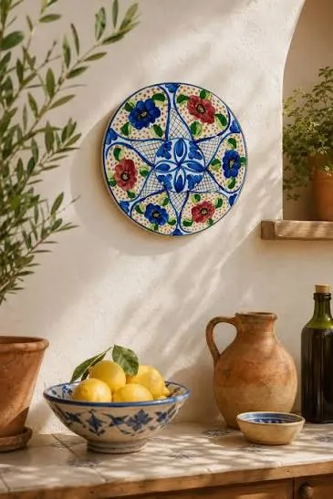
This scene feels so warm and alive because it masterfully mixes textures and embraces natural imperfection. You have the slightly rough, plastered texture of the off-white wall, the smooth glaze of the ceramic plate, the waxy skin of the lemons, the porous surface of the terra cotta pots, and the delicate leaves of the olive branches. This layering of different tactile qualities creates a rich sensory experience. The dappled sunlight casting leaf shadows across the wall adds a final, dynamic layer that a static, perfectly lit room could never achieve.
|
📋 Copy HEX 🔗 Share |
To create a collected, Mediterranean-inspired display, think in terms of a color family rather than a strict color palette. Here, the theme is warm and earthy. The burnt orange of the terra cotta, the deep red in the plate, and the vibrant yellow of the lemons all belong to the same warm family. They don’t match perfectly, but they harmonize beautifully. This approach allows for more flexibility when collecting items and results in a look that feels more authentic and less decorated.
24. A Grand Traditional Kitchen with a Subtle Plate Wall
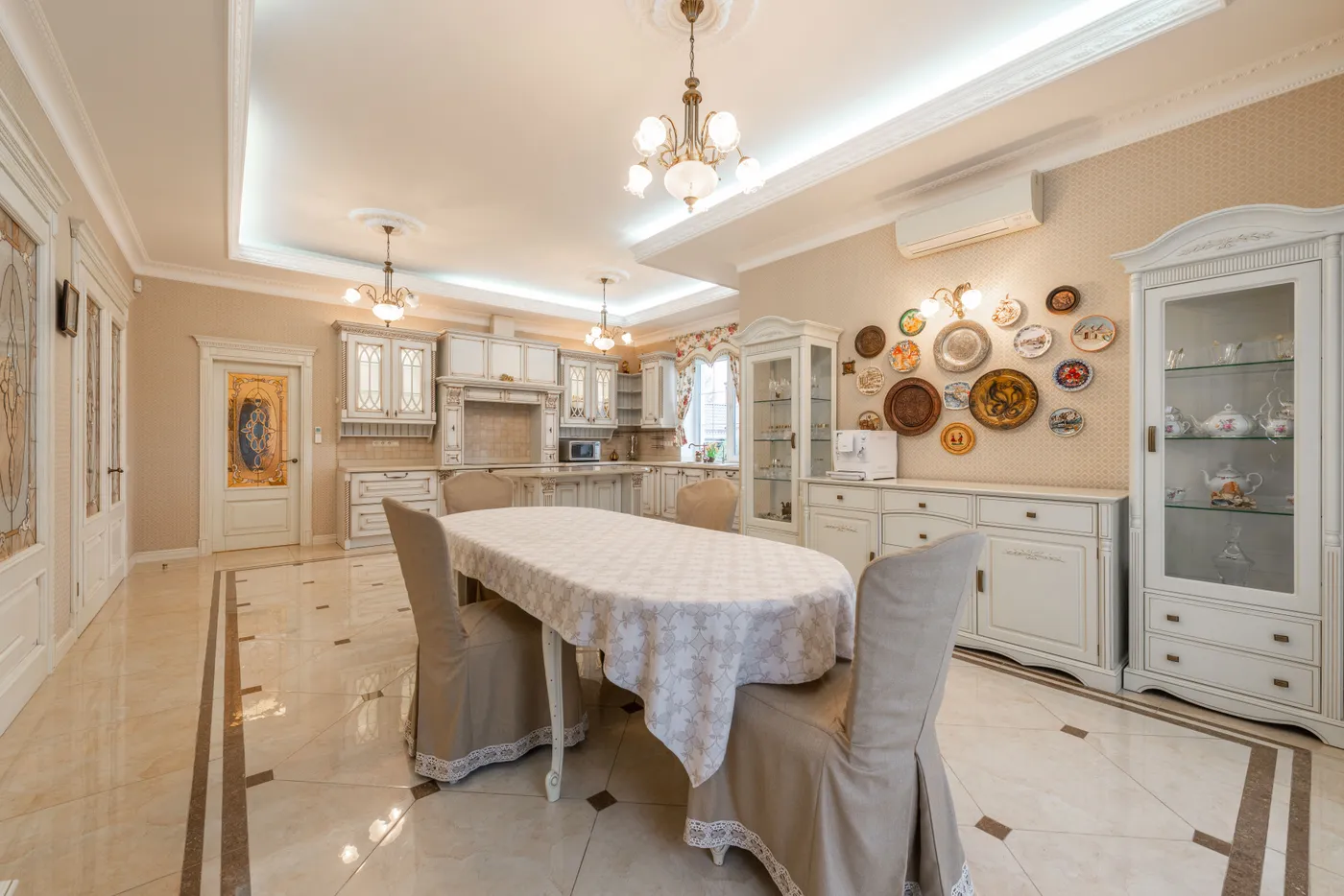
In a space this grand and filled with ornate details—from the chandeliers to the intricate moldings—the plate wall succeeds by being a supporting actor, not the star. The arrangement is clean and relatively sparse, and the plates feature a mix of colors and patterns that feel collected rather than strictly matched. This prevents the wall from competing with the other powerful architectural elements. It adds a layer of personal history and color to the neutral room without creating visual chaos. The display complements the room’s character rather than trying to define it.
|
📋 Copy HEX 🔗 Share |
Polished tile floors like these are stunningly elegant, but they are unforgiving. Dropping a plate while hanging or cleaning this display would almost certainly result in it shattering. Furthermore, this type of glossy surface shows every speck of dust, footprint, and water spot, requiring frequent cleaning to maintain its pristine look. While beautiful, it’s not the most practical choice for a high-traffic area, especially with kids or pets. A matte or honed finish tile would offer a similar look with much easier upkeep.
25. A Rustic Plate Display in a Stone Wall Niche
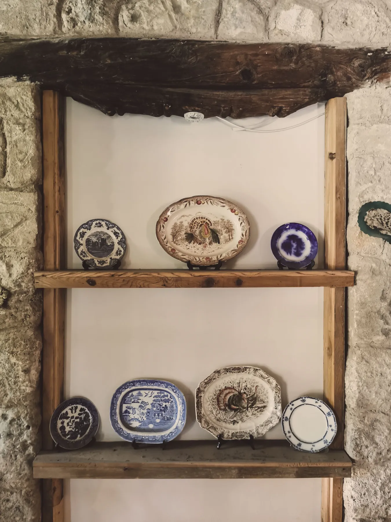
The raw, unfinished wood beam at the top of the niche is the single element that provides the essential rustic character. Without it, you’d have plates in a stone alcove, which is nice, but could lean Tuscan or French Country. That dark, rough-hewn beam, however, injects a rugged, almost primitive quality that feels distinctly rustic and American. It provides a powerful horizontal line and a dark contrast that makes the lighter stone and delicate plates stand out. It’s the anchor of the whole design.
|
📋 Copy HEX 🔗 Share |
This look taps directly into the Modern Rustic and Organic Modern trends, which are all about celebrating natural, unrefined materials. Homeowners are moving away from perfectly polished finishes and embracing the texture and character of materials like rough stone and raw wood. This niche isn’t just a place to display things; it’s a celebration of its own construction. It’s about finding beauty in imperfection and creating homes that feel connected to the natural world.
26. An Eclectic Mix of Plates on Patterned Wallpaper
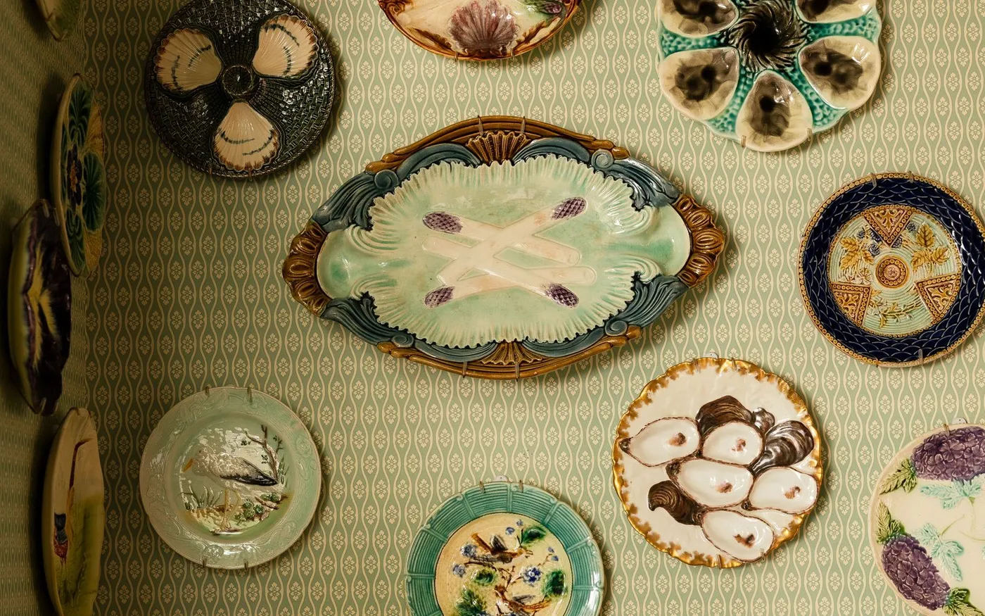
Hanging plates on patterned wallpaper can be tricky, but the secret is to choose plates that have a significant amount of white space or a solid light-colored background in their design. Notice how the asparagus, oyster, and bird plates all have a creamy or white base. This creates a visual separation between the pattern on the plate and the pattern on the wall, allowing the artwork on the plate to be clearly visible. If you used plates with an all-over, dense pattern, they would blend in and get lost against the busy wallpaper.
|
📋 Copy HEX 🔗 Share |
This is a bold, maximalist look that requires confidence. And wallpaper, especially a high-quality print like this, is a significant investment in both materials and labor. Furthermore, every nail hole you make to hang a plate is a permanent puncture in that expensive wallpaper. Unlike a painted wall, you can’t just spackle and touch it up. You need to be 100% certain of your layout before you start hanging, because there’s no easy way to undo it. Using paper templates first is not just a suggestion here; it’s mandatory.
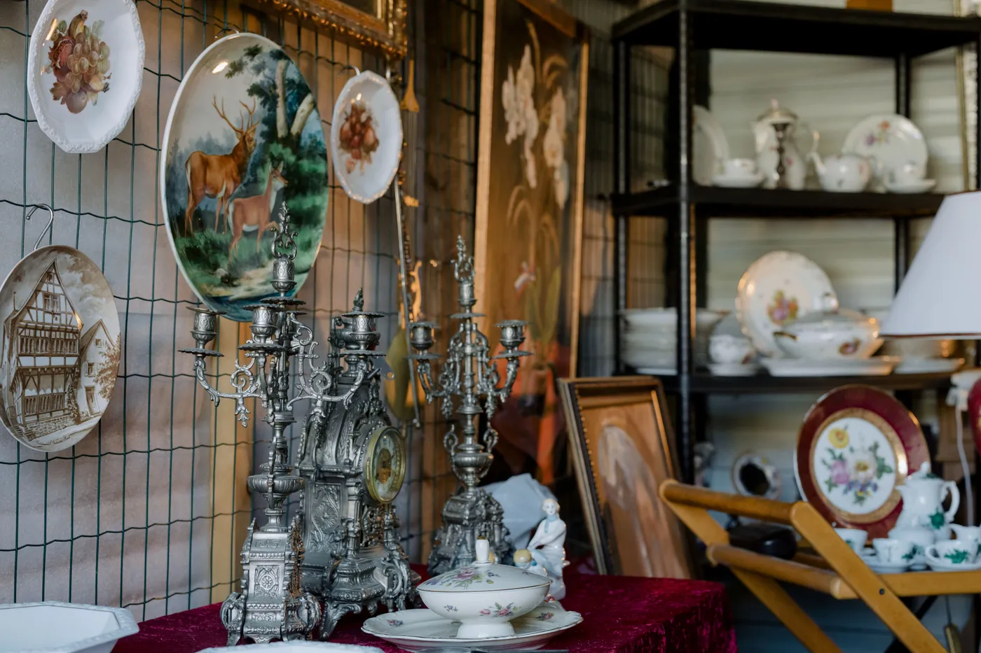
27. A Display of Antique Plates on a Green Wire Grid
A wire grid offers incredible flexibility for a plate display, allowing you to change your arrangement without putting new holes in the wall. Here’s how to create one:
|
📋 Copy HEX 🔗 Share |
- Purchase a wire grid panel from a garden supply store or a retail display store. They often come in black, white, or green.
- Securely mount the grid to the wall using appropriate screws and anchors. Make sure it’s level.
- Use S-hooks to hang your plates. You’ll need to attach a wire or string to the back of your plate’s hanger.
- The S-hooks allow you to easily slide the plates horizontally and vertically to perfect your layout.
- This system is ideal for renters or anyone who loves to frequently change their decor.
This ornate, antique-heavy look can be quite expensive, especially the silver pieces. To get a similar vibe for less, focus on the layering and color palette. You can find a wire grid for under $40 online. Source interesting but inexpensive plates from flea markets. Instead of antique silver, look for silver-plated or even high-quality pewter or stainless steel candlesticks and decorative objects from thrift stores. A deep red velvet or velveteen fabric remnant can be found at a craft store for a fraction of the cost of a custom tablecloth.
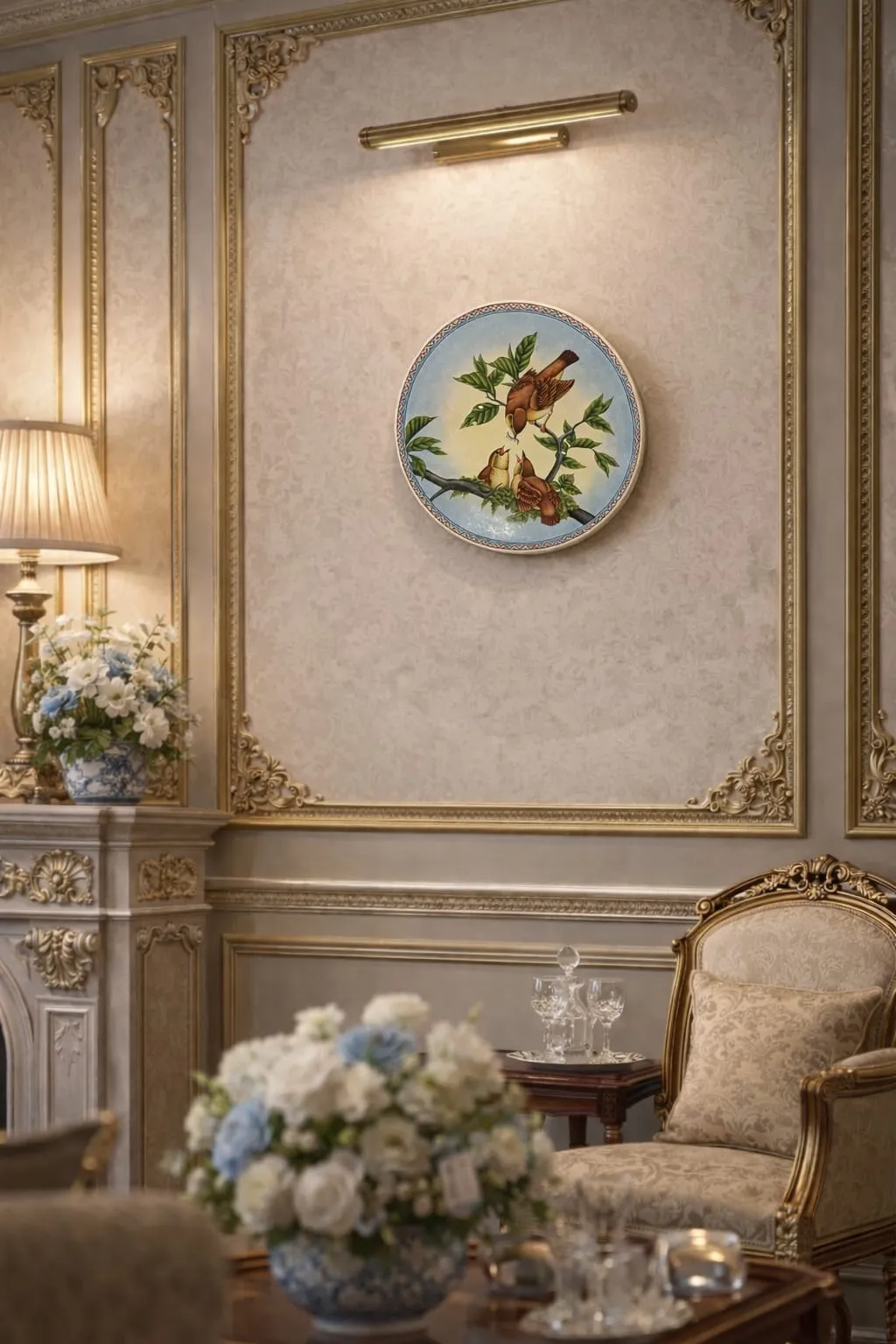
28. A Decorative Bird Plate with a Brass Picture Light
This is an expert use of layering to create a sense of luxury and depth. You have multiple frames working together: first, the ornate gold and grey wall paneling frames the entire section of the wall. Within that, the patterned wallpaper acts as a second, softer frame. Finally, the circular shape of the plate itself frames the central bird motif. This series of nested frames guides the eye directly to the artwork and makes a single plate feel as important and deliberate as a priceless painting in a museum.
|
📋 Copy HEX 🔗 Share |
The brass picture light is the key element that transforms this from simple decoration into a curated piece of art. The light’s sole purpose is to illuminate the plate, signaling that this object is special and worthy of attention. It adds a warm, focused glow that highlights the details and colors of the illustration. Without the light, the plate would be just one more pretty object in an ornate room. With the light, it becomes a focal point.
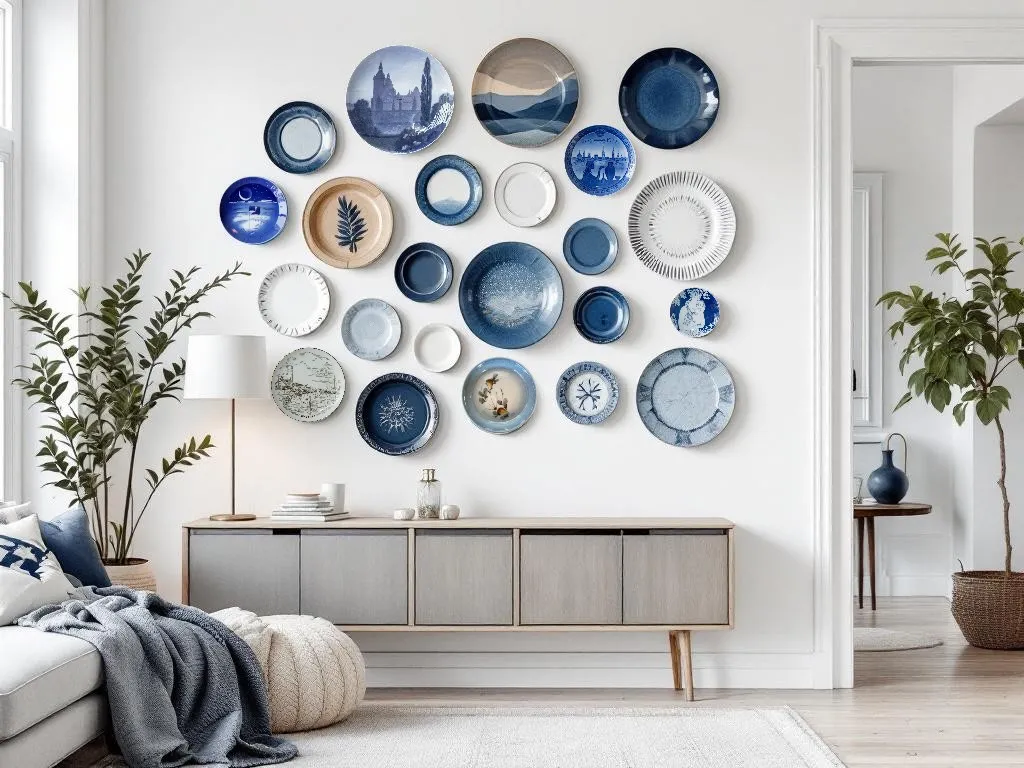
29. An Eclectic Blue and White Gallery Over a Modern Credenza
This serene and modern take on a plate wall is a perfect example of a controlled eclectic style. The formula is: 70% blue and white plates in various patterns + 20% light, natural wood tones (the credenza) + 10% organic green (the plant). The key to keeping it from feeling chaotic is the very tight color palette. Even though there are dozens of different patterns, the consistent use of blue, white, and a touch of beige makes the entire collection read as a single, cohesive art installation. Compare with the more traditional take in Idea #10.
|
📋 Copy HEX 🔗 Share |
To create a large, free-form gallery wall like this, start by establishing an invisible frame on the wall with painter’s tape. Decide on the overall height and width of your desired installation. Then, lay this same taped-off rectangle on your floor. Arrange all your plates within that boundary on the floor, moving them around until you find a composition you love. This allows you to perfect the spacing and balance before making a single hole in the wall. This planning step is the single biggest difference between a professional-looking installation and an amateur one.
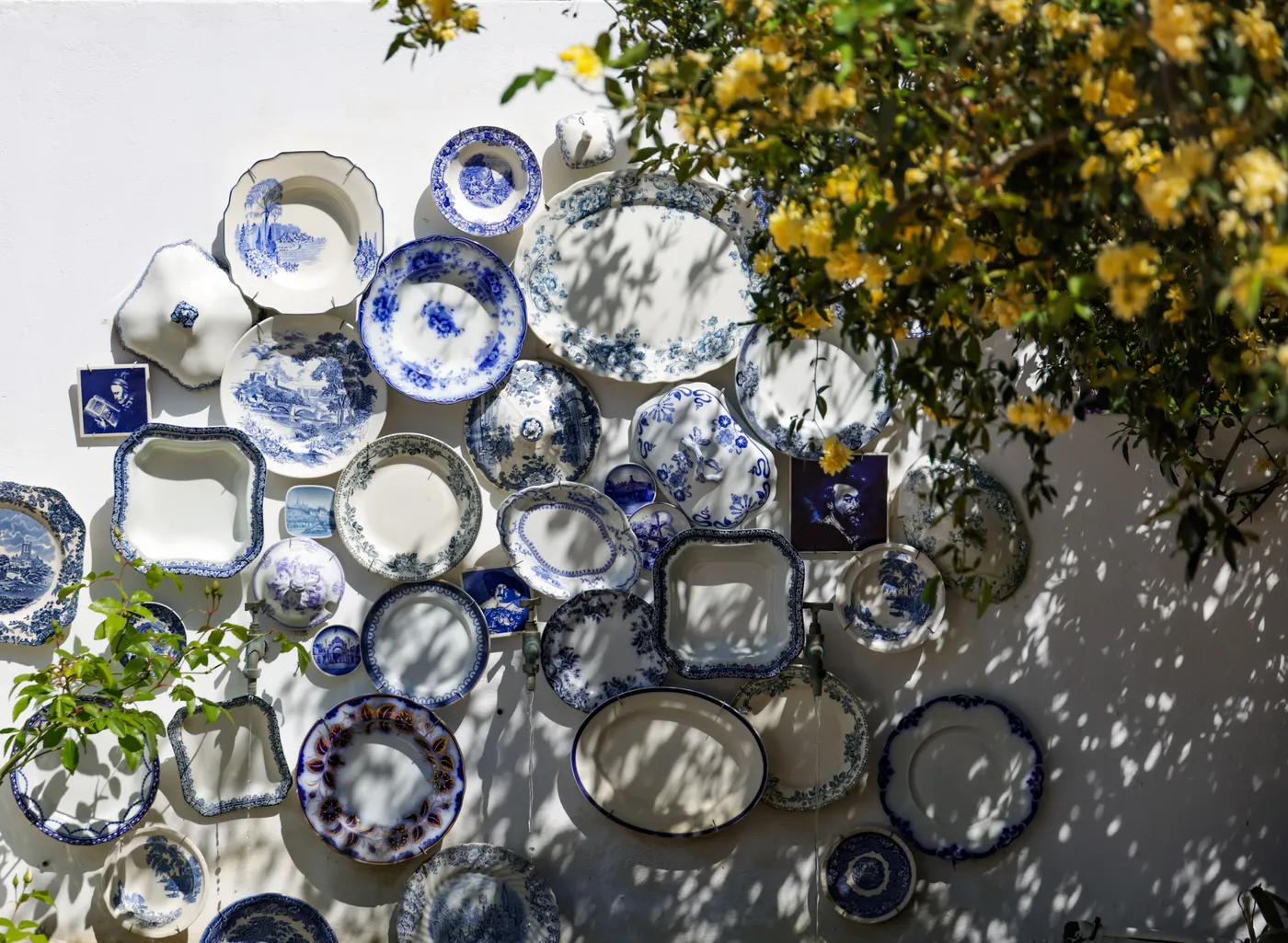
30. An Outdoor-Inspired Blue and White Plate Wall
What makes this display so magical is the interplay between the man-made objects (the ceramic plates) and the natural elements (the green foliage and dappled sunlight). The greenery weaves in and out of the arrangement, partially obscuring some plates, which creates a sense of discovery and mystery. The dappled shadows from unseen leaves dance across the wall, adding a layer of dynamic, ever-changing pattern. This integration of nature prevents the wall from feeling like a static, formal display and instead makes it feel like a living, breathing part of a garden.
|
📋 Copy HEX 🔗 Share |
While this looks like a charming outdoor patio wall, be very cautious about hanging valuable or antique plates outside. Constant exposure to UV rays can fade delicate hand-painted colors over time. Moisture can get trapped behind the plates, leading to mold or mildew on the wall surface. And, of course, there’s the risk of damage from wind, storms, or accidental bumps. If you love this look for an outdoor space, use durable, inexpensive, and easily replaceable plates rather than your priceless heirlooms.
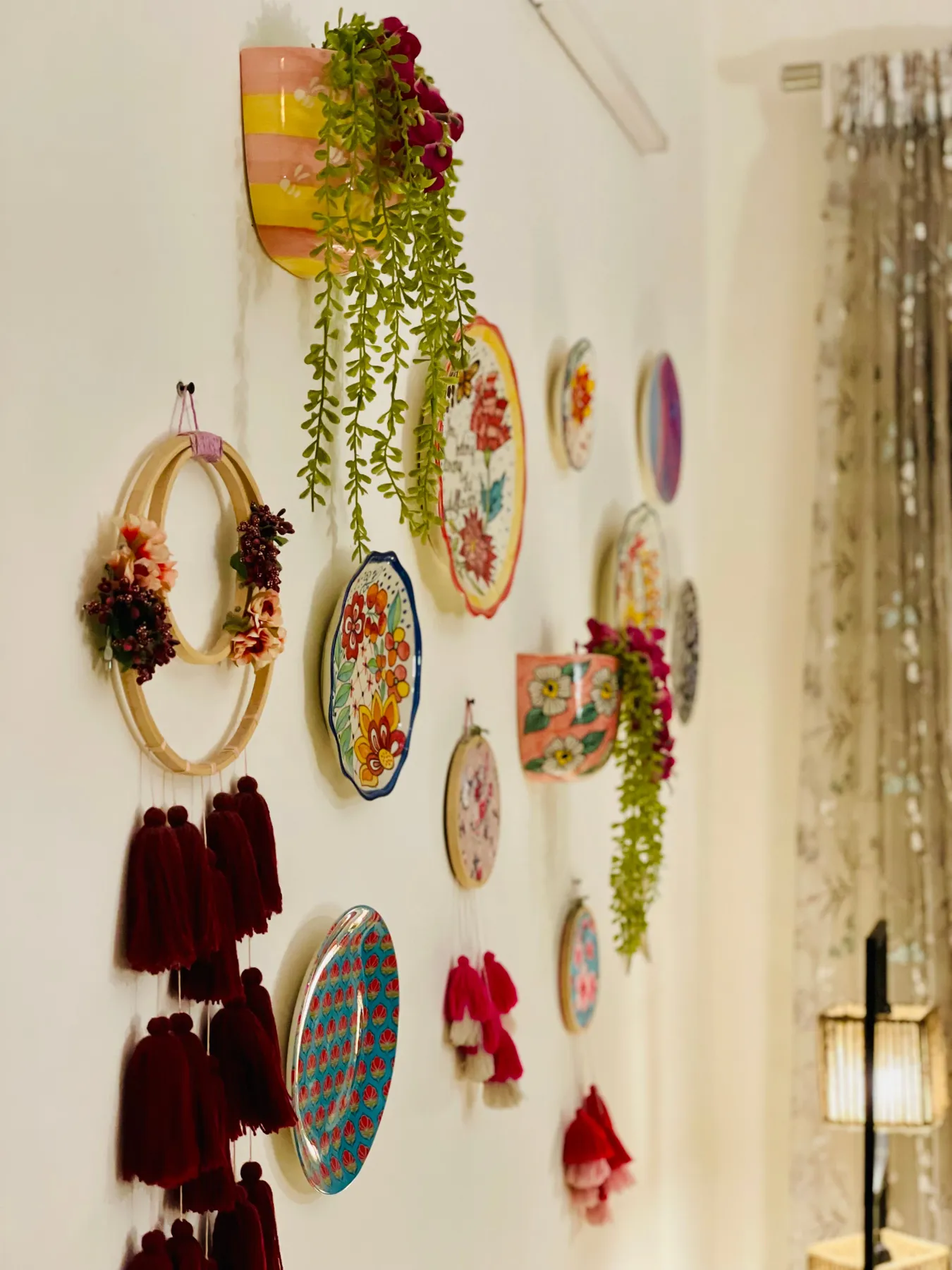
31. An Eclectic Wall of Plates, Florals, and Tassels
The standout element here is the unapologetic use of texture. This isn’t just about the smooth glaze of the plates; it’s about the soft, fibrous texture of the tassels, the faux-silky finish of the artificial flowers, and the rougher weave of the embroidery hoops. This multi-sensory approach is what gives the wall its vibrant, handcrafted, and playful energy. Removing the textile elements would leave a perfectly nice plate wall, but it would lose all of this wonderful tactile dimension and boho charm.
|
📋 Copy HEX 🔗 Share |
This vibrant, bohemian look is a study in controlled chaos. The recipe is approximately: 40% ceramic plates (the hard, smooth element) + 40% textile art (the soft, textured element, including tassels and hoops) + 20% faux botanicals (the organic element). The success of the composition relies on the consistent color story of burgundy, pink, and yellow, which threads through all the different materials and ties them together into a cohesive, joyful whole.
Your Walls Are Waiting for Their Story
A blank wall is just an opportunity. Whether you start with a single pair of plates over a console or plan a full-wall gallery, the key is to choose pieces that you truly love. This is your chance to move beyond generic art and tell a story that is uniquely yours. Ready to start your collection? Pin your favorite ideas from this article to your board, and let the treasure hunt begin!