32 Jaw-Dropping Picture Frame Ideas You Need to Try to Elevate Your Home Decor Style

You know that feeling when you finally find the picture frame arrangement that looks exactly right for your space? It’s that finishing touch that turns a house into a home, but getting there can feel overwhelming. We spent serious time browsing IKEA, Target, and West Elm to bring you only what’s worth your attention this year. After filtering through hundreds of options, we narrowed it down to 32 curated ideas that actually deliver, covering every style from minimalist grids to eclectic gallery walls. This isn’t just about what’s popular; it’s about what looks good and tells your story. And stay until the end—we break down the most common mistakes that can ruin these looks. 📌 Save this to Pinterest for later—you’ll want to revisit these ideas.
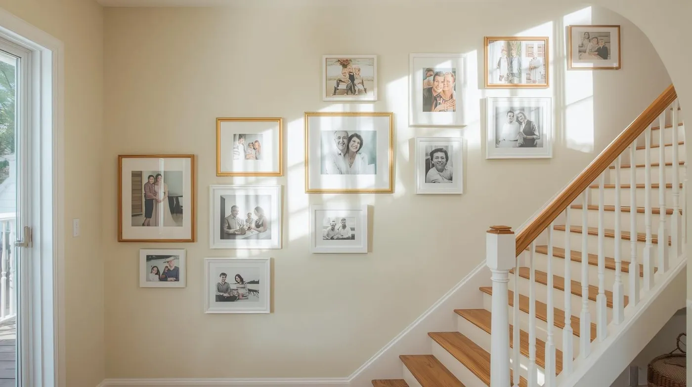
1. A Neutral Gallery Wall with Mixed Finishes Along the Stairs
This arrangement feels so effortless and personal. What makes it work is the clever use of mixed materials within a tight color palette. The warmth of the gold-toned frames plays beautifully against the crisp white frames and the light wood of the staircase. By keeping the frames to just two or three finishes, the collection feels curated, not chaotic. The organic, non-linear layout also follows the upward movement of the stairs, drawing your eye up and making the space feel dynamic and lived-in.
|
📋 Copy HEX 🔗 Share |
When hanging a gallery wall along a staircase, don’t follow the angle of the stairs exactly. This can look too rigid and predictable. Instead, establish a central midline about 60 inches from the floor of each step, and arrange your frames organically around that invisible line. Let some frames dip slightly below and others float slightly above. This creates a more natural, collected-over-time feeling while still maintaining a sense of balance as you walk up and down.
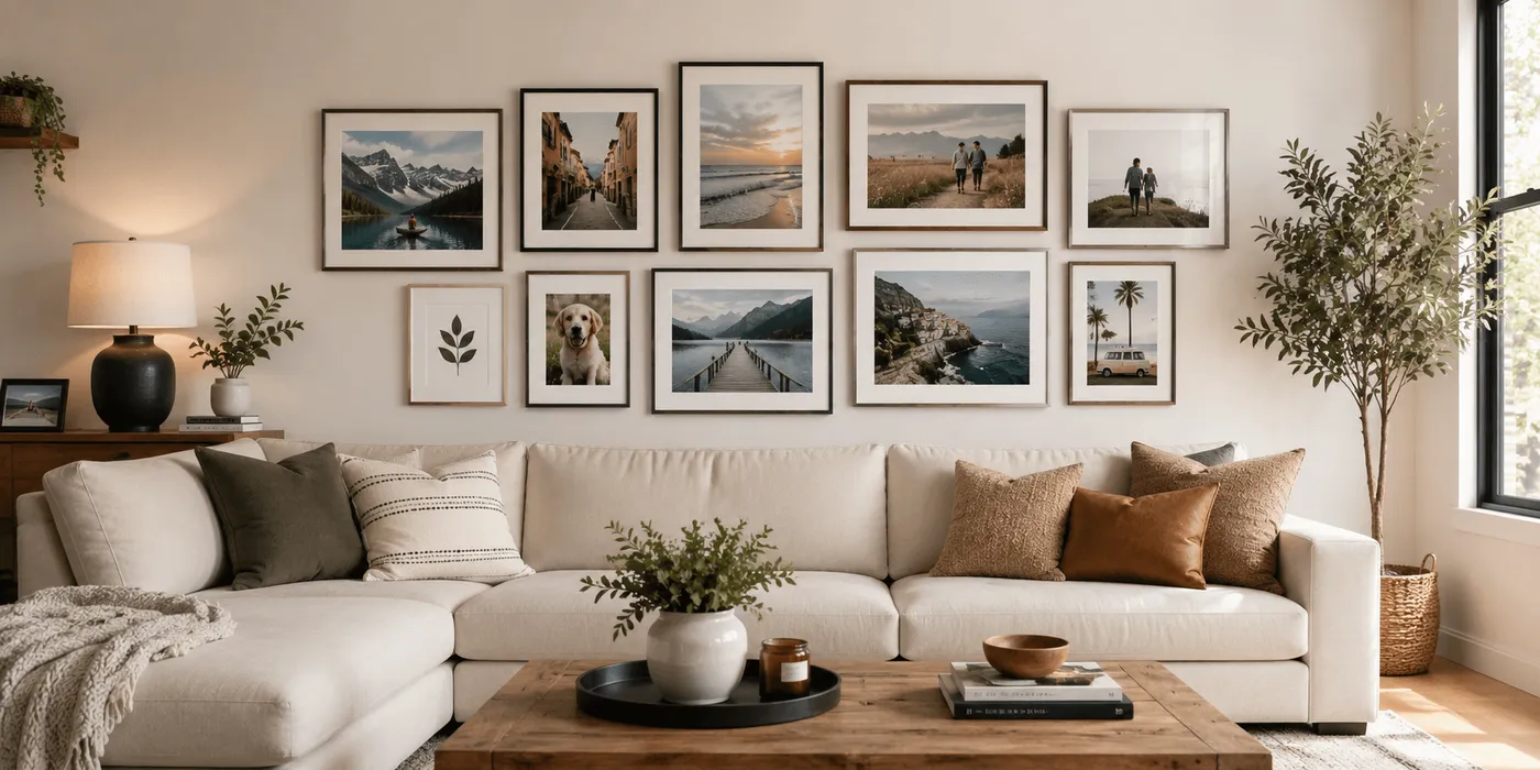
2. Curate a Serene Gallery Wall Above Your Sectional Sofa
The formula for this calm, cohesive look is surprisingly simple. It’s about balance, not perfect matching. Think of it as: 40% dark frames (for grounding) + 40% light wood frames (for warmth) + 20% medium wood tones (for transition). This ratio ensures visual interest without any single frame style overpowering the others. The consistent use of generous white matting inside each frame is the secret ingredient that ties all the different pieces together into one unified statement.
|
📋 Copy HEX 🔗 Share |
Let’s be honest: hanging a ten-frame gallery wall perfectly is a test of patience. One crooked frame can throw off the whole look. The key is to create paper templates for every single frame. Trace each frame onto kraft paper, cut it out, and use painter’s tape to arrange the templates on the wall. You can move them around endlessly without making a single nail hole. Only when you’re 100% happy with the layout should you hammer in your nails directly through the paper.
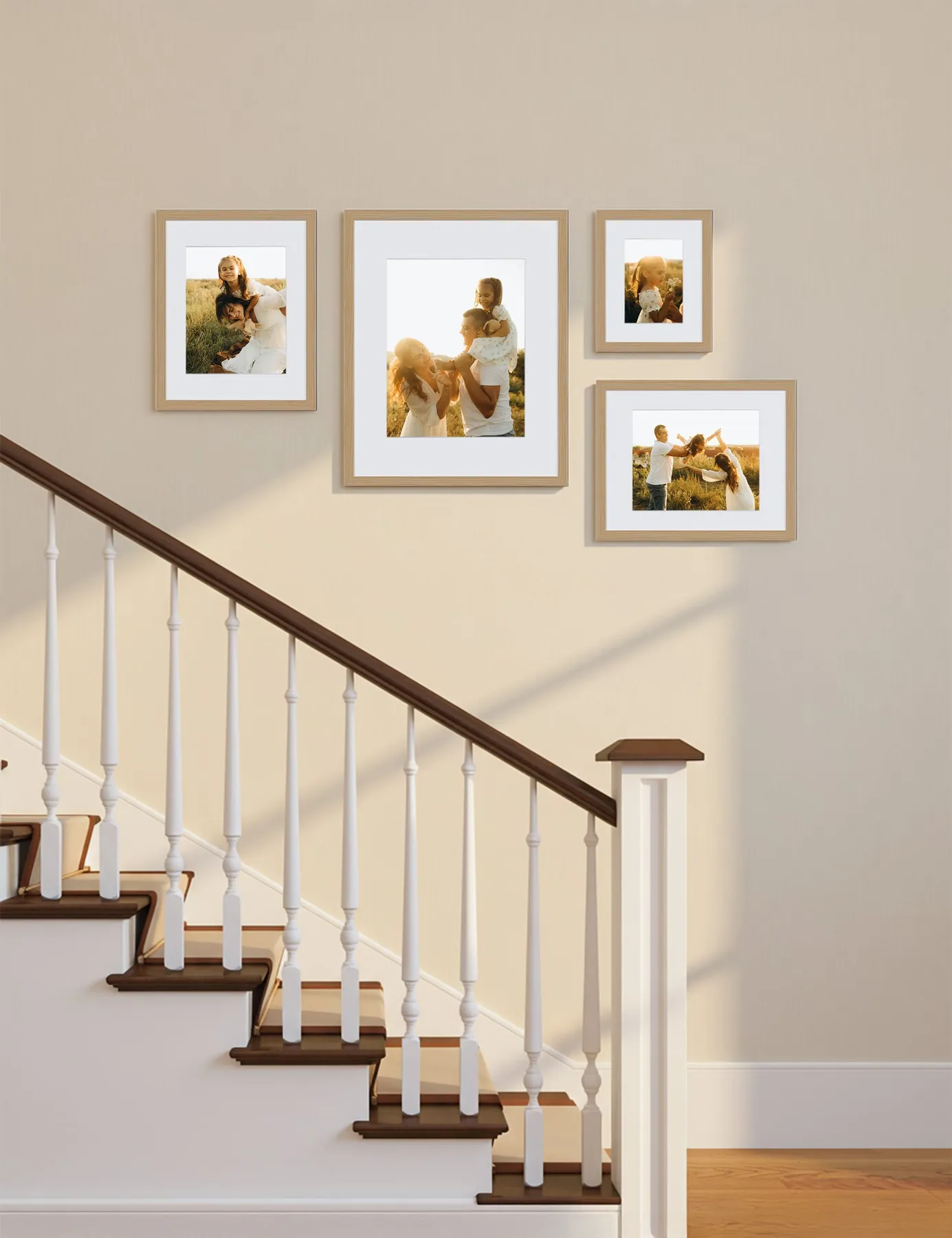
3. Warm Up a Staircase with a Light Wood Frame Collection
The single most important element here is the consistent use of light wood frames. While a mix of finishes can be beautiful, as seen in Idea #0, sticking to one frame style creates an immediate sense of calm and intention. It turns a collection of personal family photos into a single, impactful piece of wall art. The uniform frames and white matting let the photos themselves be the stars, while the light wood tone adds warmth that beautifully complements the darker wood of the stair treads.
|
📋 Copy HEX 🔗 Share |
You don’t need custom framing to get this high-end look. The key is finding a standard-size frame you love and buying it in bulk. IKEA’s RIBBA or Target’s Made By Design lines offer simple, light wood-look frames for around $10-$25 each. For an even more budget-friendly approach, scour thrift stores for frames of the right size, remove the old art, and give them all a uniform look with a light-colored wood-effect spray paint or contact paper.
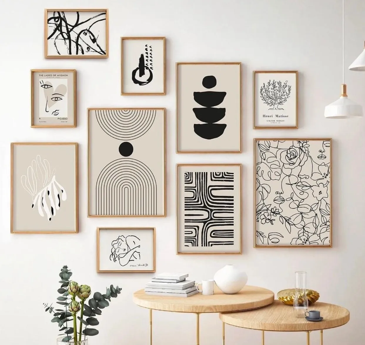
4. A Minimalist Grid of Abstract Line Art in Light Wood
This gallery wall is a masterclass in the power of repetition and negative space. The reason it feels so calming and sophisticated is that three key elements are repeated: the light wood frame material, the black-on-beige color scheme of the art, and the rectangular shape. This consistency allows the subtle variations in the line art to stand out. The tight spacing between the frames—no more than 2-3 inches apart—makes the entire collection read as one large, unified piece of art rather than eleven separate items.
|
📋 Copy HEX 🔗 Share |
A tight grid arrangement like this works best on a contained wall, typically between 8 and 12 feet wide. It’s perfect for a dining room wall, behind a sofa, or in a wide hallway. On a very large, open-plan wall, it can sometimes feel a bit small or lost. For larger spaces, consider increasing the size of each individual frame (e.g., using 16x20s instead of 11x14s) or adding more frames to the grid to maintain the right proportion.
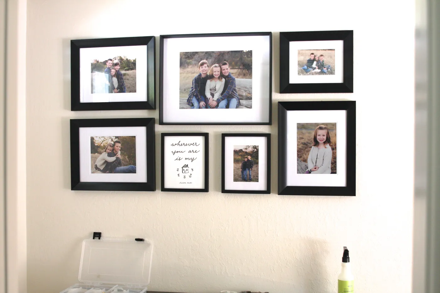
5. Achieve Classic Symmetry with Black Frames and White Mats
Creating a symmetrical gallery wall that doesn’t feel stiff requires precise planning. Here’s a quick guide to getting it right with paper templates:
|
📋 Copy HEX 🔗 Share |
- Trace each frame onto a large sheet of kraft paper or newspaper and cut it out.
- Mark the exact spot for the nail on each paper template.
- Find the center of your wall space and mark it with a small piece of painter’s tape. Arrange your central frame’s template first.
- Using a level and a measuring tape, arrange the flanking templates on either side, ensuring equal spacing.
- Once you’re happy with the layout, hammer the nails directly through the paper templates.
- Tear the paper off the wall, and your nails will be perfectly placed for hanging.
The secret to making any gallery wall look professionally curated is the matting. For a classic, high-end look, opt for a wider mat. A common mistake is choosing a mat that’s only 1.5 or 2 inches wide. Try going for a 3- to 4-inch mat instead. This gives your photos breathing room and makes the entire piece feel more substantial and intentional, especially with personal family photos. It draws the eye inward and gives the images a sense of importance.
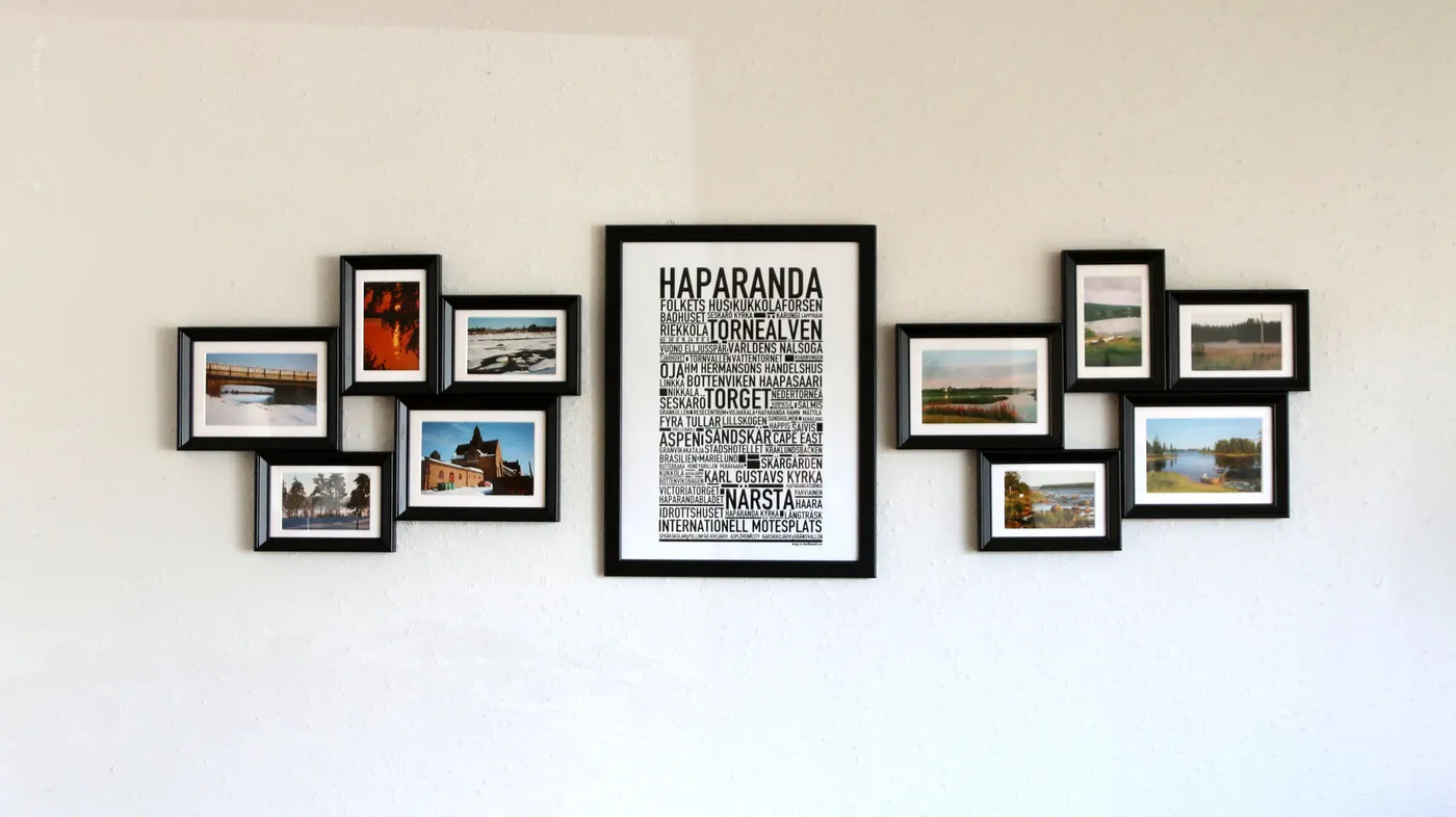
6. Anchor Your Gallery Wall with a Central Typography Piece
If you take away the large central typography poster, the entire arrangement falls apart. That single, oversized piece is the anchor that gives the smaller, organically clustered frames their structure and purpose. It provides a strong vertical line that the eye can lock onto, preventing the smaller landscape photos from feeling like they’re just floating randomly on the wall. This is a brilliant strategy if you want the personality of a gallery wall without the visual chaos that can sometimes result.
|
📋 Copy HEX 🔗 Share |
The visual recipe here is all about creating ‘contained chaos.’ It breaks down to roughly 50% central anchor, 25% left cluster, and 25% right cluster. The key is that the two side clusters should feel balanced in visual weight but not be mirror images of each other. For example, you can balance two medium frames on the left with one large and two small frames on the right. This ‘asymmetrical symmetry’ is what makes the wall feel dynamic and curated.
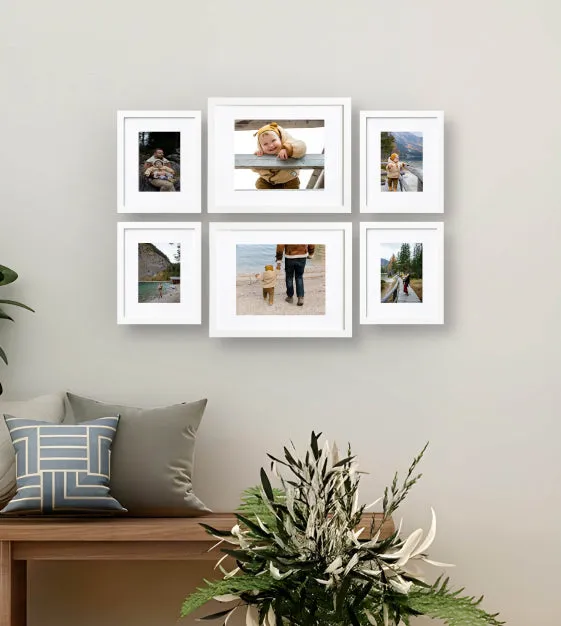
7. Create a Fresh Family Gallery with Crisp White Frames
Getting this clean, inviting look is more accessible than you might think. The combination of white frames on a soft gray wall is timeless and lets your family photos shine.
|
📋 Copy HEX 🔗 Share |
- White Frames (Set of 6, various sizes): $80 – $200
- Professional Photo Printing: $40 – $100
- Light Brown Wooden Bench: $150 – $400
- Decorative Pillows (2): $30 – $70
- TOTAL: $300 – $770
Budget alternative: Source frames from Target or Walmart ($100), print photos at a local drug store during a sale ($25), and find a similar bench on Facebook Marketplace ($75) for a total of around $200.
White frames look incredibly fresh and bright, but they do require a bit more upkeep than their wood or black counterparts. They tend to show dust, fingerprints, and scuffs more readily, especially in a high-traffic area like an entryway or living room. A quick wipe-down with a microfiber cloth every week or two will keep them looking sharp. If you get a scuff, a magic eraser can often lift it right off without damaging the finish, but always test on a back corner first.
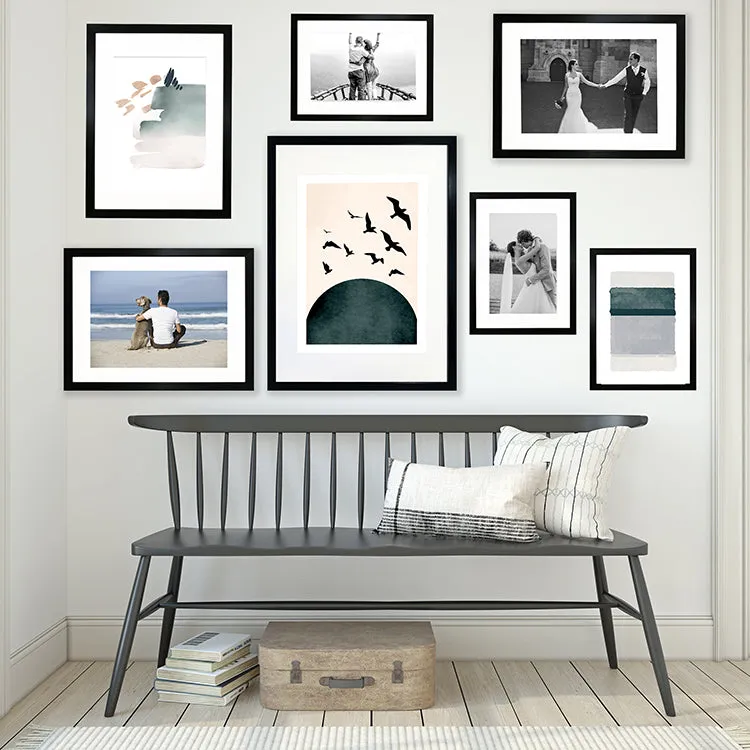
8. A Modern Mix of Art in Black Frames Above a Spindle Bench
This composition is so satisfying because of the smart use of contrast and repetition. The sharp, modern lines of the black frames create a graphic contrast against the soft white wall. That black is then repeated in the stripes of the cream-colored pillows on the bench below, creating a visual echo that ties the top and bottom halves of the vignette together. The mix of abstract art with personal photos also adds a layer of sophistication, suggesting a well-rounded and curated collection.
|
📋 Copy HEX 🔗 Share |
You can achieve this exact vibe for a fraction of the cost. The key elements are black frames, a dark bench, and striped pillows. Check IKEA for their ‘FISKBO’ black frames, which are incredibly affordable (around $5-$15). For the bench, keep an eye on Facebook Marketplace or local thrift stores for a vintage spindle back that you can paint a dark charcoal gray. A can of chalk paint will run you about $25. Finish the look with striped pillow covers from H&M Home or Amazon for under $30.
9. Make a Serene Statement with One Large Landscape Print
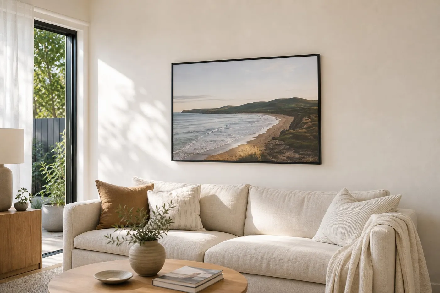
The power of this room comes from one single decision: going big. Instead of a busy gallery wall, one oversized piece of art commands the space, creating an immediate sense of calm and focus. The thin, minimalist black frame ensures that nothing distracts from the serene coastal landscape. This approach simplifies the room, provides a clear focal point, and makes the entire space feel more expansive and intentional. It’s a case of addition by subtraction; removing the clutter of multiple frames adds immense impact.
|
📋 Copy HEX 🔗 Share |
This look is all about proportion. A single large frame works best above a substantial piece of furniture, like a sofa that’s at least 84 inches wide, or a king-sized bed. A good rule of thumb is that the artwork should be approximately two-thirds the width of the furniture it hangs above. For height, the center of the image should be at eye level, which is typically 57-60 inches from the floor. The bottom of the frame should be about 6-10 inches above the back of the sofa.
10. Weave a Personal Story with an Eclectic Object Gallery Wall
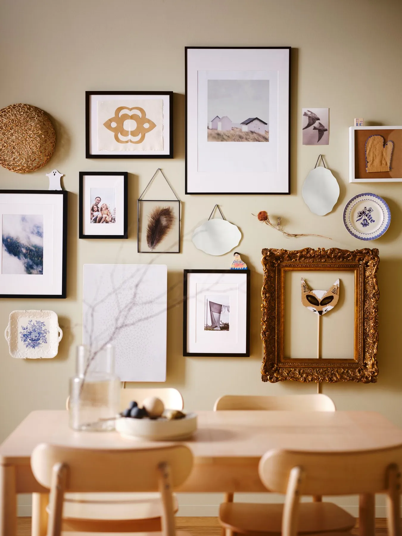
When creating a mixed-media gallery wall, the secret is to establish a visual pathway for the eye to follow. Start by placing your largest pieces first—like the ornate gold frame and the largest black frame—to create anchor points. Then, fill in the spaces around them with your smaller items like mirrors, plates, and textiles. Try to create diagonal lines and groupings of three to make the layout feel dynamic. Don’t be afraid to mix high-end art with personal mementos; that’s what gives it soul.
|
📋 Copy HEX 🔗 Share |
We’re seeing a huge move away from mass-produced, impersonal decor and a shift towards what designers are calling collected or narrative interiors. This type of wall is the perfect embodiment of that trend. It’s not about what’s in style—it’s about telling your unique story through objects you love. This look has serious staying power because it’s impossible to replicate and it can evolve with you over time. You can swap pieces in and out as you find new treasures.
11. An Eclectic Botanical Gallery Climbing a White Staircase
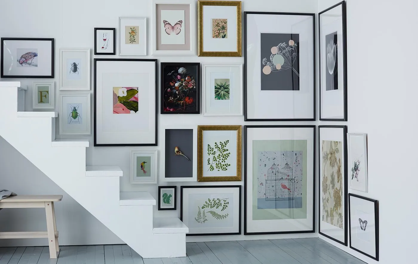
A sprawling gallery wall like this is stunning, but it’s a commitment. First, it’s a major dust magnet. All those frame edges and glass surfaces will need regular attention, which can be awkward on a staircase. Second, the installation is a project. Hanging dozens of frames on an angle, ensuring proper spacing, and getting everything level requires a lot of planning, measuring, and a very patient partner. Unlike a single large print, it’s not a quick weekend update.
|
📋 Copy HEX 🔗 Share |
Before you even think about buying frames, run through this checklist. It will save you a world of frustration:
- Measure the total square footage of the wall space you want to cover. This helps you estimate how many frames you’ll actually need.
- Lay it all out first! Use the floor in an empty room to arrange your frames until you find a layout you love. Take a picture to reference during installation.
- Locate the studs in your wall. Heavier frames will need to be anchored to a stud, which might affect your desired placement.
- Confirm your color palette. Notice how this example sticks to white, black, and gold frames? Decide on your 2-3 unifying colors before you start buying.
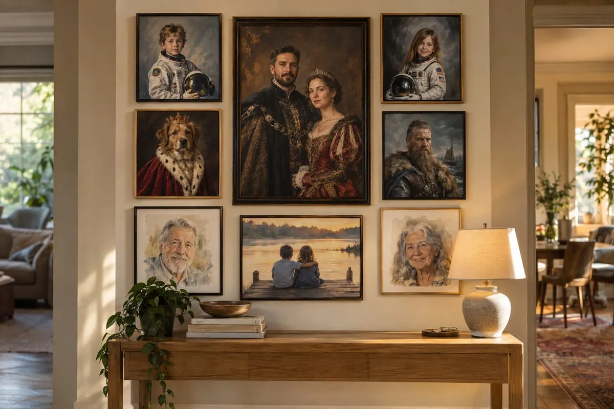
12. Mix Frame Styles for an Eclectic Portrait Gallery
An eclectic gallery wall thrives on a formula that feels random but is actually quite deliberate. The mix here is approximately 40% simple black frames + 30% ornate gold frames + 30% warm wood frames. This controlled variety provides visual texture. To make it work, you need a common thread. Here, the thread is the portrait theme, which includes people, a dog, and various artistic styles. This shared subject matter is what holds the different frame styles together in a cohesive conversation.
|
📋 Copy HEX 🔗 Share |
At first glance, this mix of frames might seem chaotic, but it works because of two key design principles. First, balance: the heavy, dark frames are distributed evenly throughout the arrangement, preventing one side from feeling heavier than the other. Second, a common theme: every single piece is a portrait of some kind. This thematic consistency gives your brain a rule to follow, making the visual variety of the frames feel exciting and intentional rather than messy and random.
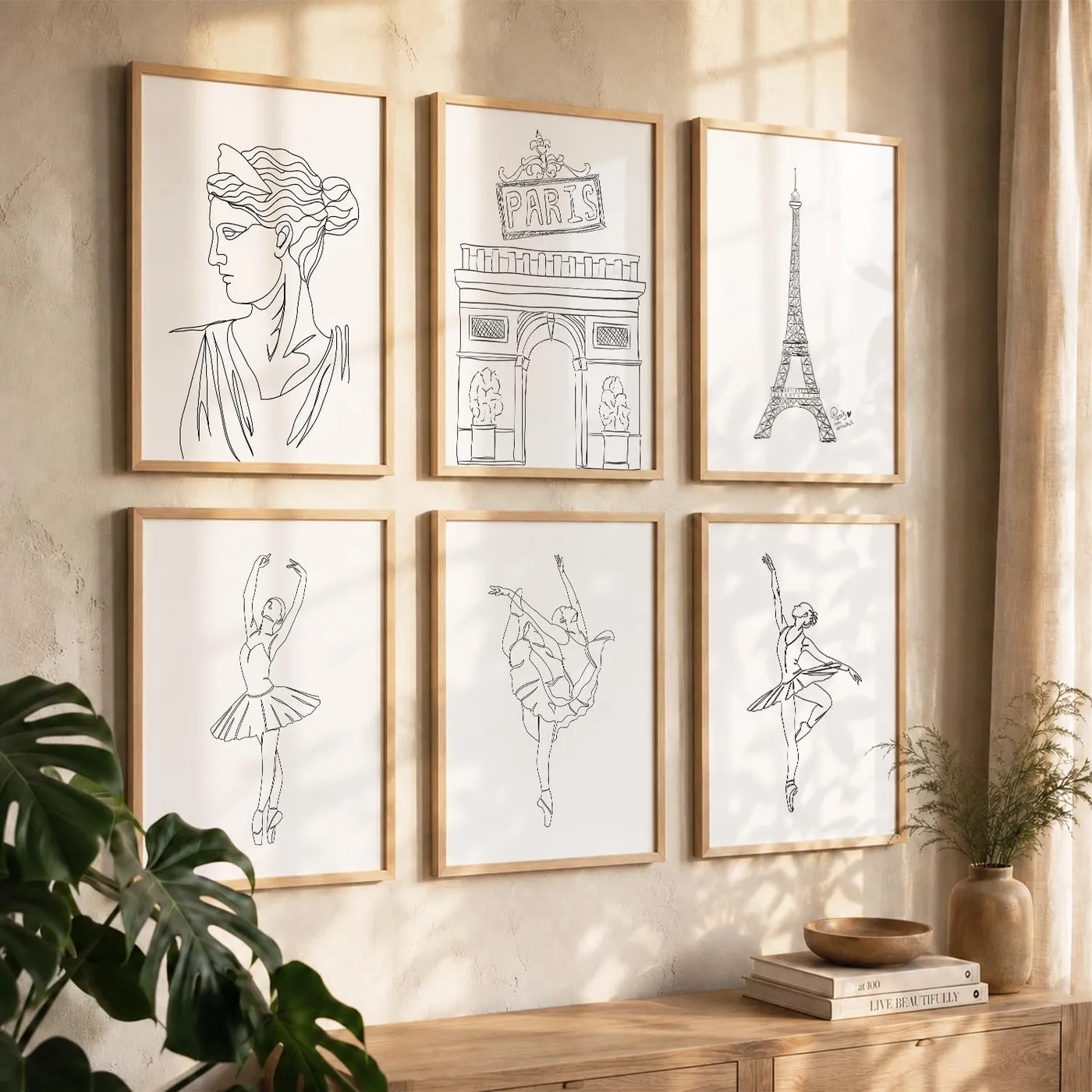
13. A Calm and Collected Grid of Minimalist Parisian Art
The single element that makes this arrangement so incredibly chic and successful is the precision of the grid. It’s not just a collection of pictures; it’s a single, unified architectural element. The razor-thin, consistent spacing between each frame is crucial. If the gaps were uneven or the frames were misaligned by even a quarter of an inch, the entire illusion of serene order would be shattered. The perfection of the grid is what elevates simple prints into a sophisticated statement piece.
|
📋 Copy HEX 🔗 Share |
Hanging a perfect grid is all about the prep work. Here’s how to do it with a laser level and painter’s tape:
- Decide on your spacing (e.g., 2 inches between each frame).
- Use a laser level to project a perfectly straight horizontal line where the top of your first row of frames will be. Apply a strip of painter’s tape along this line.
- Measure and mark the tape for the top corner of each frame in that row.
- Project a vertical line for the side of your first column and apply tape.
- Hang your first frame, then use a spacer (like a 2-inch wide block of wood) to hang the next ones perfectly.
- Repeat for each row and column, using the laser level to guide you.
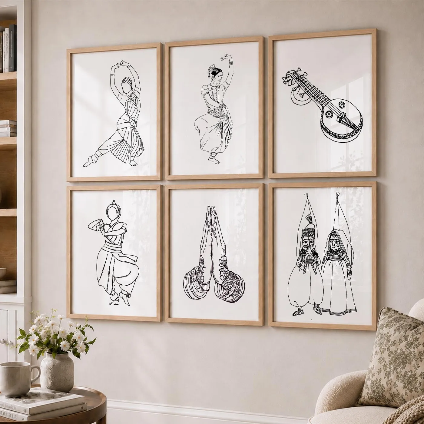
14. A Curated Grid of Line Art in Matching Light Wood Frames
For instant cohesion in a gallery wall, purchase your prints as a set or from the same artist’s series. Many artists on sites like Etsy or Society6 create collections of 6, 9, or 12 prints that are designed to be displayed together. This takes the guesswork out of curating and ensures that the line weight, color palette, and overall style are perfectly matched. All you have to do is pop them into matching frames for a look that feels professionally designed.
|
📋 Copy HEX 🔗 Share |
The beauty of a grid layout is its scalability. This 2×3 configuration is perfect for a smaller wall or above a loveseat. For a larger wall behind a full-sized sofa, you could expand it to a 3×3 grid. For a narrow hallway, a 2×4 vertical arrangement would work beautifully. The key is to keep the spacing between the frames consistent (2-3 inches is ideal) and to ensure the overall block of frames is scaled appropriately to the wall, leaving a generous amount of negative space around the edges.
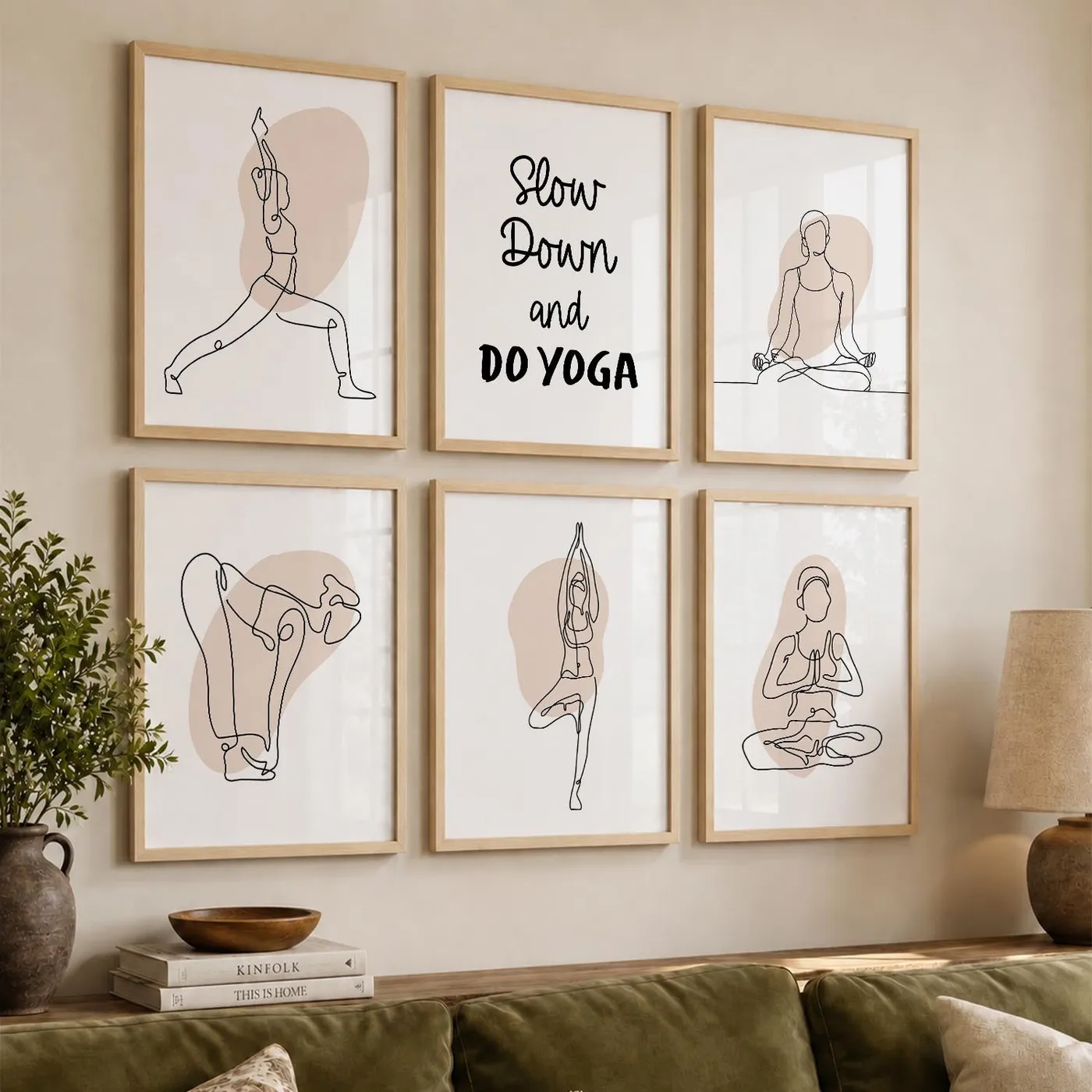
15. Create a Mindful Corner with Yoga-Inspired Line Art
This arrangement feels so serene because of a subtle but brilliant design choice: the soft, irregular peach-toned shape behind each line drawing. Without this element, the black-on-white art in simple wood frames could feel a bit stark or clinical. That little wash of warm color adds an organic, human touch that softens the entire look. It connects the art to the neutral beige wall and the green sofa, creating a harmonious and gentle color story that enhances the mindful theme.
|
📋 Copy HEX 🔗 Share |
As our homes increasingly become sanctuaries from a busy world, we’re seeing a huge trend towards wellness design—creating spaces that actively support mental and emotional well-being. This art collection is a perfect example. It’s not just decorative; it serves as a visual reminder to slow down, breathe, and be present. The minimalist style avoids overstimulation, and the yoga theme brings a sense of calm and intention to the room. It’s decor that does more than just look good.
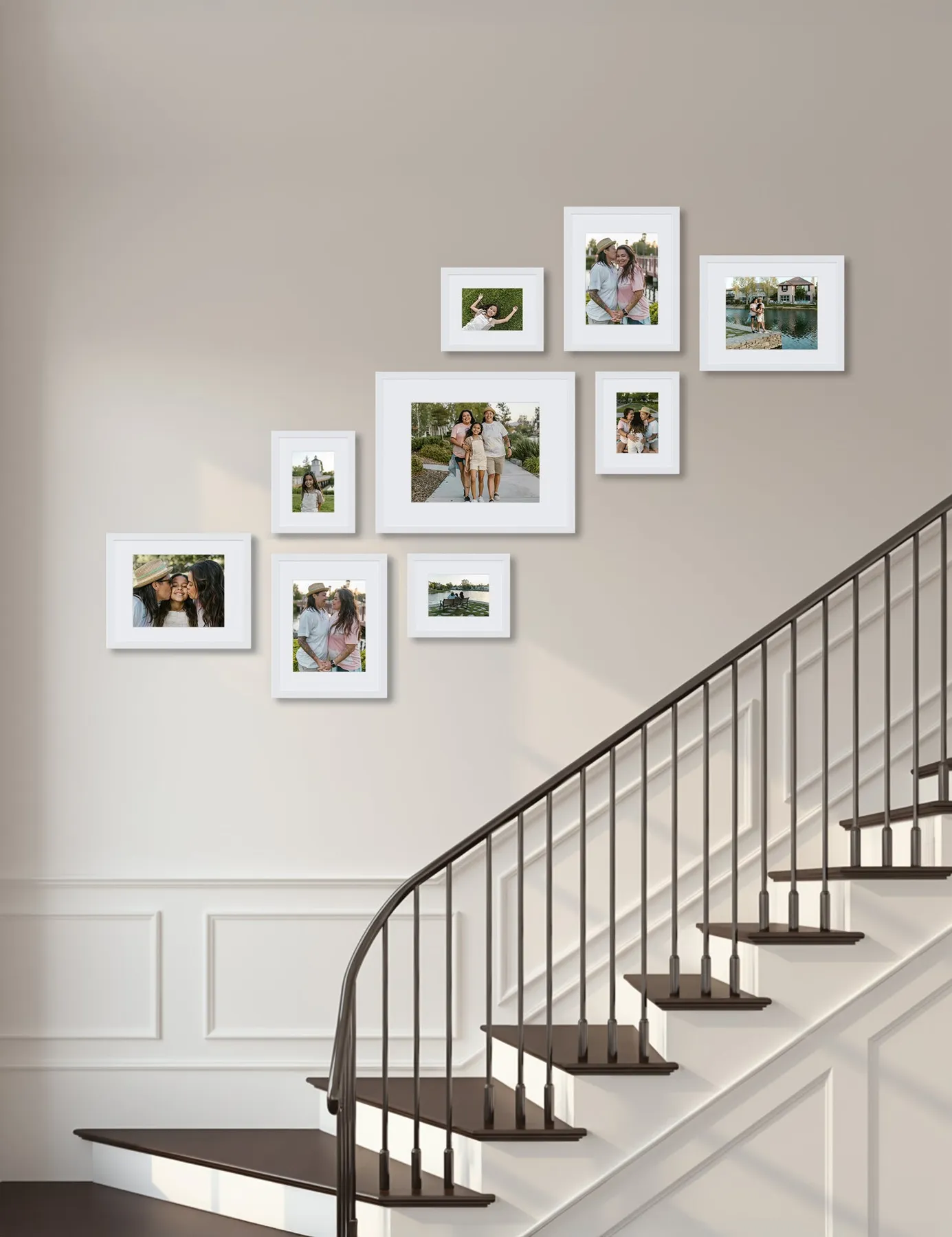
16. A Personal Journey: Family Photos in White Frames Up the Stairs
A staircase gallery wall is a beautiful way to display family memories, but think about the long-term logistics. If you like to update your photos frequently (new school pictures, holiday cards, etc.), accessing these frames can be a balancing act on the stairs. It’s not as simple as swapping a photo on a living room wall. Consider using frames with easy-to-open backs or reserving the highest, hardest-to-reach spots for more timeless, permanent portraits. Compare this look with the white frames in Idea #6, which are easier to access.
|
📋 Copy HEX 🔗 Share |
You don’t need to spend a fortune on custom framing for this classic look. Stores like Michaels and JOANN Fabric frequently have buy one, get one free sales on basic wall frames. Their Belmont collection, for example, offers simple white frames in dozens of sizes. For printing, look beyond the usual suspects. Online services like Mpix or Nations Photo Lab offer much higher quality prints than drugstore kiosks for a very reasonable price, which can make your DIY gallery wall look far more expensive.
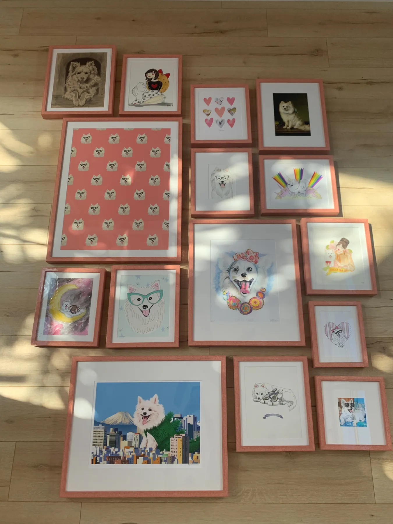
17. A Playful Gallery Wall Using Uniform Pink Frames
The undeniable star of this show is the color pink. By framing wildly different pieces of art—all featuring dogs, but in various styles and colors—in the exact same matte pink, the collection achieves a bold, joyful cohesion. If these pieces were in mismatched frames, it might look cluttered. If they were all in black or white frames, it would be fine, but not nearly as fun. The audacious choice of a single, vibrant color is what gives this gallery wall its unforgettable personality.
|
📋 Copy HEX 🔗 Share |
Can’t find the perfect colored frame? Make it yourself. This is a fantastic trick for creating a high-impact, custom look on a budget. Buy a collection of cheap frames in the sizes you need—they don’t even have to match. Lightly sand the surfaces, then give them all two or three coats of the exact same spray paint color. A matte or satin finish usually looks more high-end than gloss. This ensures perfect uniformity and allows you to pick any color under the sun.
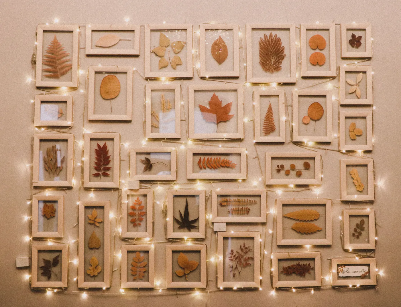
18. A Whimsical Wall of Pressed Botanicals and Fairy Lights
Creating your own framed botanical art is a rewarding DIY project. Here’s a quick guide to pressing and framing leaves:
|
📋 Copy HEX 🔗 Share |
- Collect interesting leaves on a dry day, avoiding any with blemishes or moisture.
- Place a leaf between two sheets of parchment or newspaper.
- Insert the paper into the middle of a heavy book (like a phone book or textbook).
- Stack several more heavy books on top and leave it in a dry place for 2-4 weeks.
- Once completely flat and dry, carefully mount the leaf onto archival paper using a tiny dab of acid-free glue and place it in a simple frame.
This is a beautiful, organic look, but it has two realities to consider. First, natural botanicals will fade over time, especially if the wall receives any direct sunlight. Think of it as part of their charm—the colors will soften and change. To slow this process, use UV-protective glass in your frames. Second, battery-powered fairy lights are convenient, but the batteries will need to be changed every few months, which can be a bit of a hassle depending on how your display is woven together.
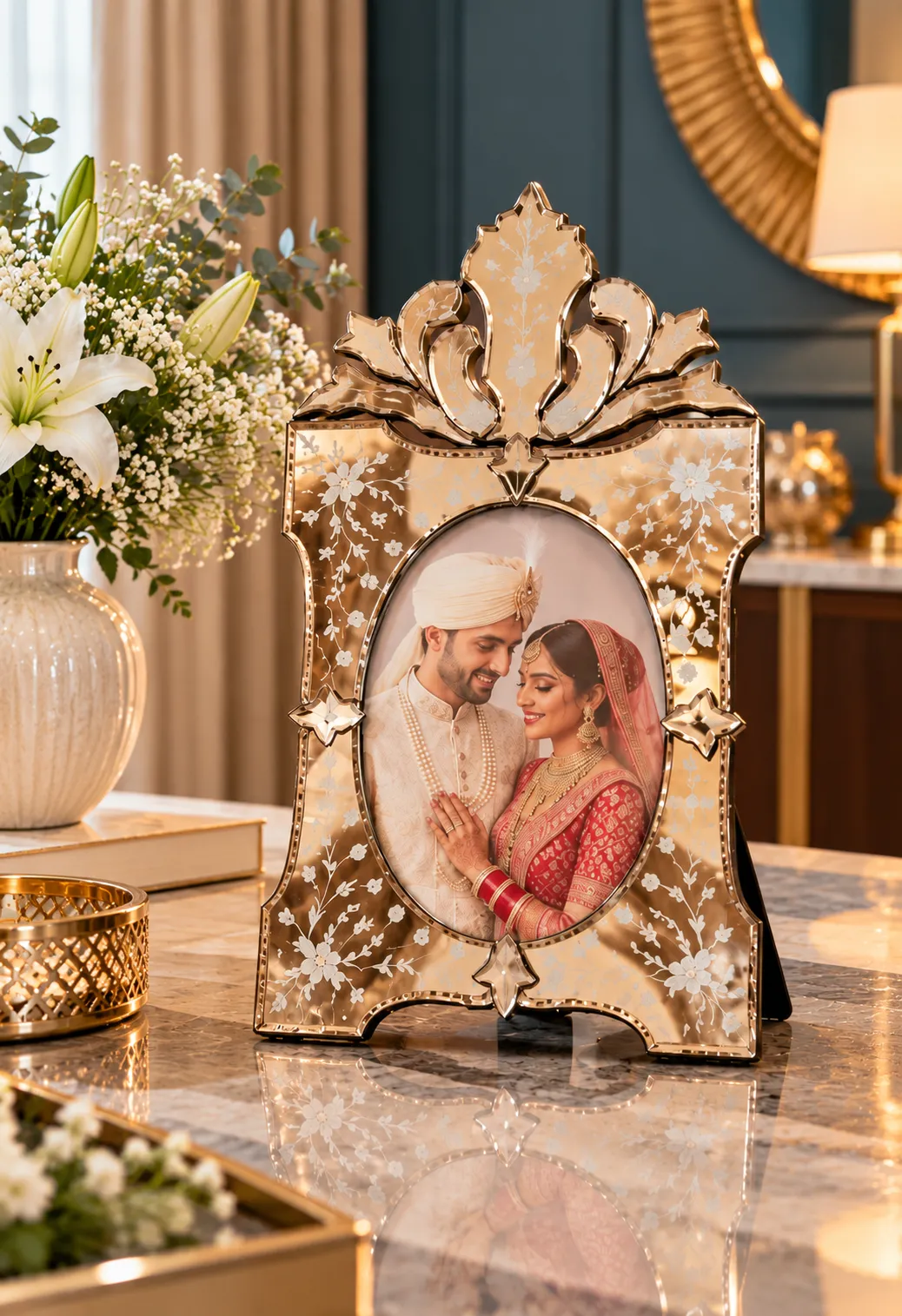
19. Add a Touch of Luxury with an Etched Gold Mirrored Frame
This frame works because it transcends its basic function. It’s not just holding a picture; it’s a decorative object in its own right, almost like a small sculpture. The mirrored gold finish bounces light around the room, adding a touch of brightness and glamour. The delicate etched floral pattern adds a layer of texture and detail that draws you in, making the piece feel special and treasured. The oval opening is also a classic touch that softens the frame’s rectangular shape and lends it a vintage feel.
|
📋 Copy HEX 🔗 Share |
A frame this ornate is a statement piece, and it needs the right environment. This is not a style that will blend seamlessly into a minimalist, Scandinavian, or mid-century modern home. It could look out of place or even gaudy. This frame belongs in a room with a more traditional, glamorous, or maximalist aesthetic where its opulence feels right at home alongside other detailed and decorative elements. It’s a beautiful piece, but it’s not a chameleon.
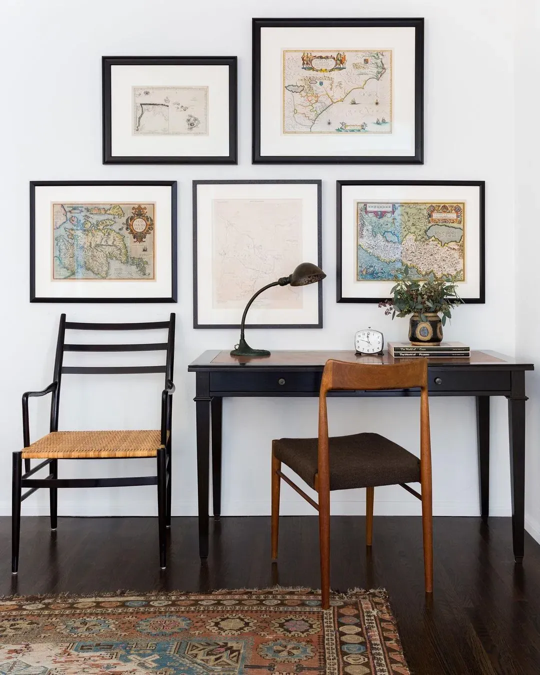
20. A Scholarly Gallery of Framed Vintage Maps
The classic, academic vibe of this gallery wall comes from a balanced visual equation: 60% muted, neutral map tones + 30% bold black frame contrast + 10% white mat breathing room. The maps themselves provide the texture and history, while the strong, simple black frames provide a modern, graphic structure that keeps the look from feeling dusty or old-fashioned. The white mats are essential for separating the detailed maps from the bold frames, allowing each element to shine.
|
📋 Copy HEX 🔗 Share |
Authentic vintage maps can be pricey. For a fraction of the cost, dive into the digital archives of the Library of Congress, the New York Public Library, or university collections. They have thousands of high-resolution, public-domain maps that you can download for free. You can then have them printed at your local print shop or an online service for as little as $10-$20 per print. Frame them in affordable black frames from a craft store, and you’ve got a sophisticated gallery wall for under $150.
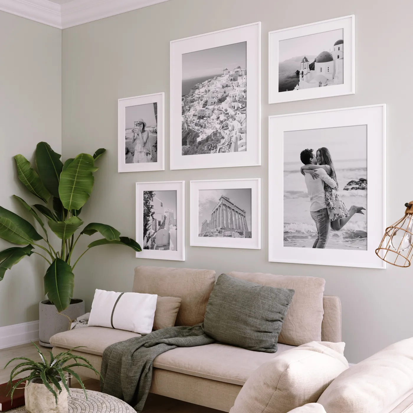
21. A Serene Display of Black and White Photos in White Frames
When using white frames with white mats, the specific shade of white you choose for the mat is critical. Don’t just grab the default bright white. Hold the mat sample up to your frame and your wall color. Sometimes a slightly off-white, cream, or natural white mat can look much more sophisticated and create a softer transition than a stark, brilliant white, which can sometimes have a blueish tint and look cheap next to a warm white frame or wall paint.
|
📋 Copy HEX 🔗 Share |
The most impactful element here isn’t the frames or the photos—it’s the light gray-green wall color. If this gallery were on a plain white wall, it would be perfectly nice, but it wouldn’t have the same depth. The soft, muted color provides a gentle contrast that makes the white frames truly ‘pop’. It creates a serene, gallery-like atmosphere and makes the entire arrangement feel more deliberate and designed. Never underestimate the power of the right background color.
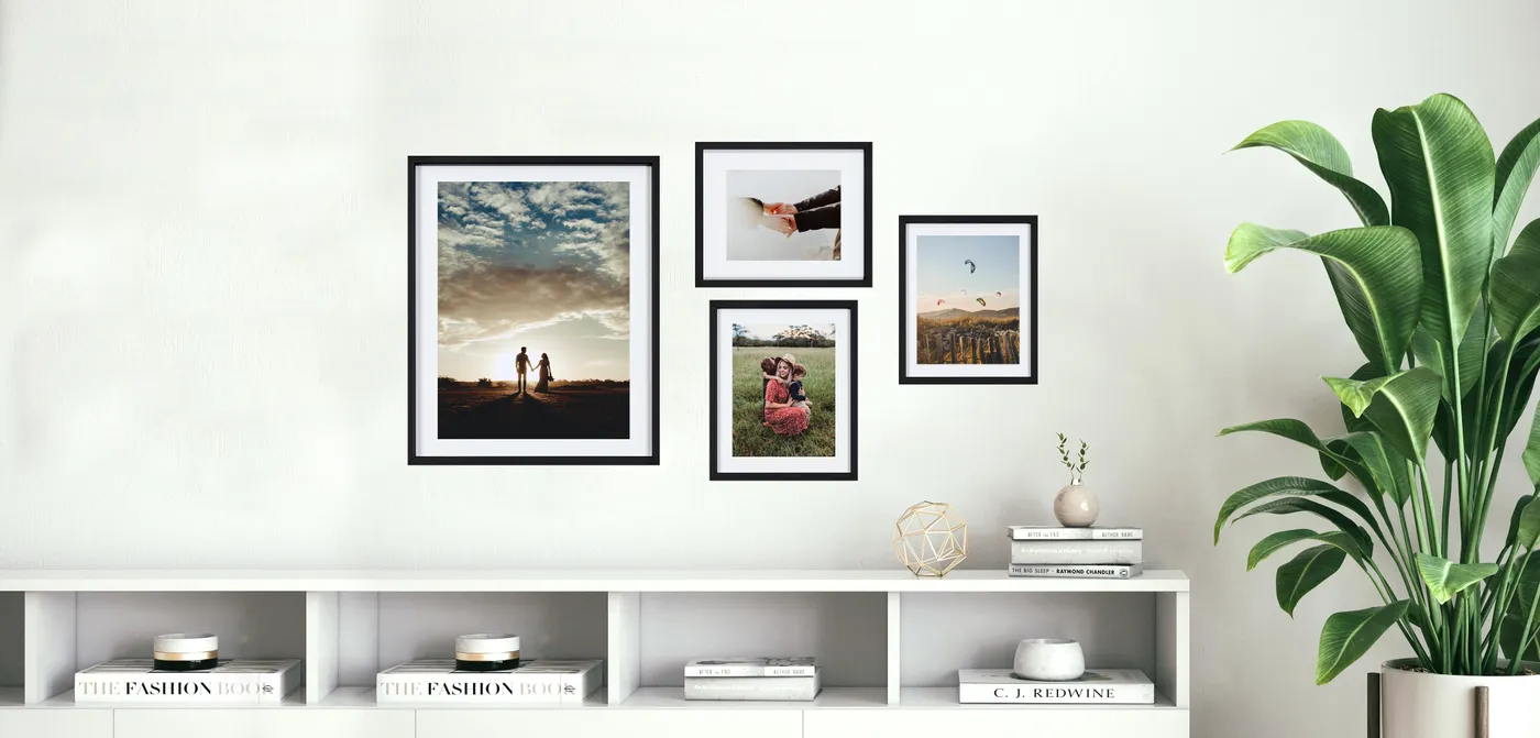
22. A Clean, Modern Vignette with Black Frames and Greenery
This little corner is perfectly balanced thanks to the visual triangle, a classic styling trick. Your eye is drawn from the top of the frames, down to the gold sculpture on the console, and over to the large green plant, then back up. This circular path makes the composition feel complete and satisfying. The strong vertical lines of the frames and the plant are balanced by the horizontal line of the white console table, creating a stable and pleasing geometric foundation.
|
📋 Copy HEX 🔗 Share |
When styling art over a console table, scale is everything. The total width of your frame grouping should be at least half the width of the console, but not wider than the console itself. Ideally, aim for the two-thirds to three-quarters mark. For a 60-inch console, your art grouping should span about 40-45 inches. This ensures the art feels anchored by the furniture beneath it, rather than looking like it’s floating aimlessly or overwhelming the piece.
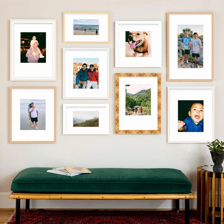
23. An Eclectic Mix of Natural Wood and White Picture Frames
Achieving this cozy, personalized corner involves a mix of textures and colors. This eclectic look feels collected over time.
|
📋 Copy HEX 🔗 Share |
- Mixed Frames (wood, white, burl): $150 – $450
- Art Prints/Photos: $50 – $200
- Dark Green Velvet Bench: $250 – $600
- TOTAL: $450 – $1,250
Budget alternative: This look is a thrifter’s dream. Collect mismatched frames from Goodwill ($40), print your own photos ($25), and reupholster a secondhand bench with affordable green velvet fabric ($100) for a total around $165. This is a great budget version of the pricier look in Idea #28.
Mixing different wood tones can be incredibly chic, but there’s a fine line between eclectic and chaotic. The trick is to pay attention to the undertones. Look at your woods in natural light. Do they lean warm (yellow, orange, red) or cool (gray, ashy)? As long as you stick to woods within the same temperature family—like the warm light wood and burl wood here—they will harmonize beautifully. Throwing a cool, ashy gray wood into this mix would likely feel jarring.
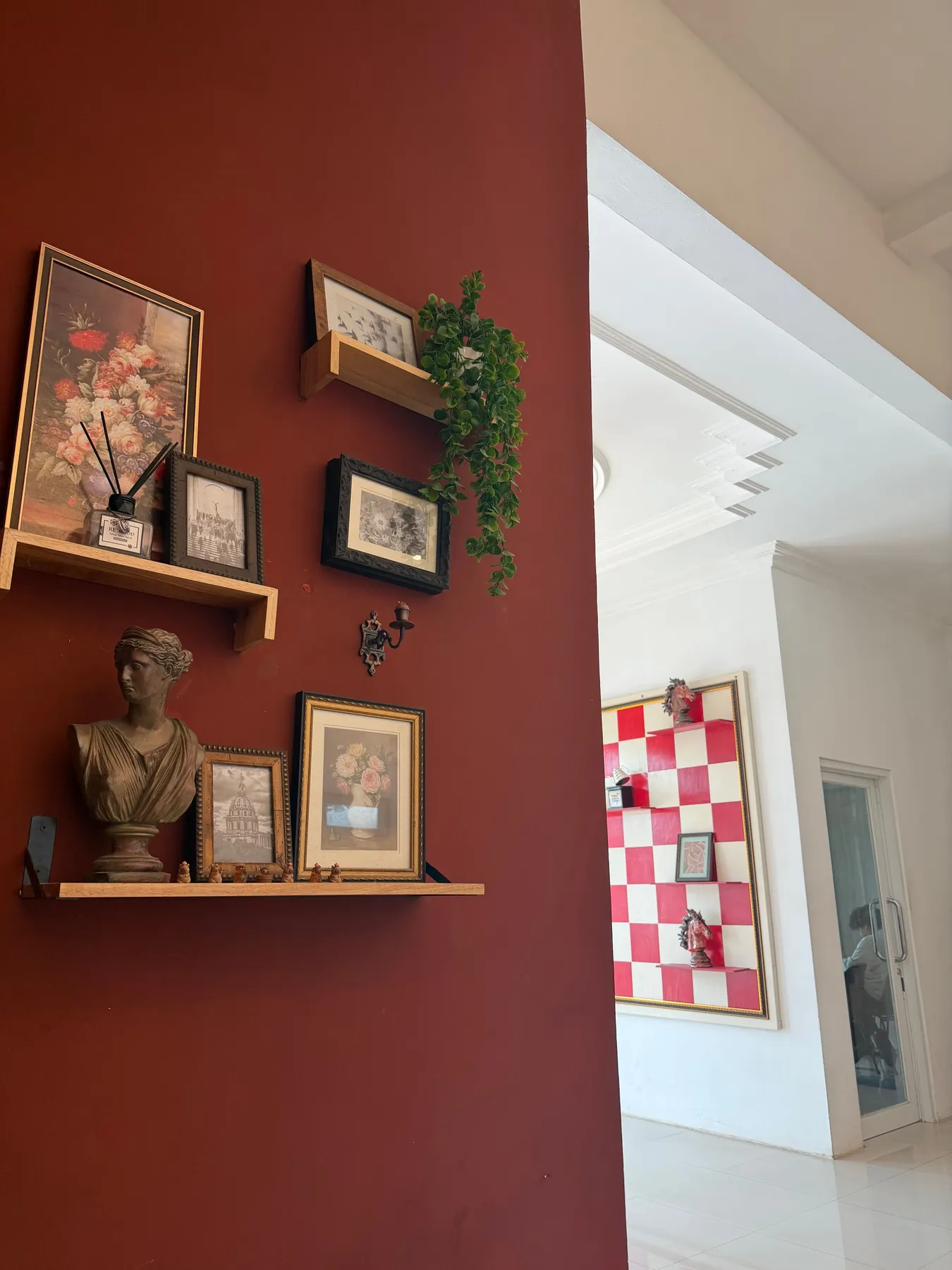
24. Go Bold with an Eclectic Display on a Deep Red Wall
The single thing that makes this entire wall work is the audacious, deep red paint color. Take that away, and you have a perfectly nice collection of objects on a shelf. But against that rich, dramatic backdrop, every single item is instantly elevated. The white of the classical bust becomes more sculptural, the gold trim on the frames becomes more luminous, and the green of the plant becomes more vibrant. The wall color is not a background; it’s the main event that gives everything else its power.
|
📋 Copy HEX 🔗 Share |
This look is a masterclass in layering. It works because it doesn’t just rely on framed art. The composition includes three-dimensional objects like the bust and candle holder, which add physical depth. The trailing plant adds an organic, free-flowing shape that breaks up the hard lines of the frames and shelves. Finally, the light wood shelves cut horizontally across the rich red wall, providing a moment of visual calm and a grounding element for the diverse objects they hold.
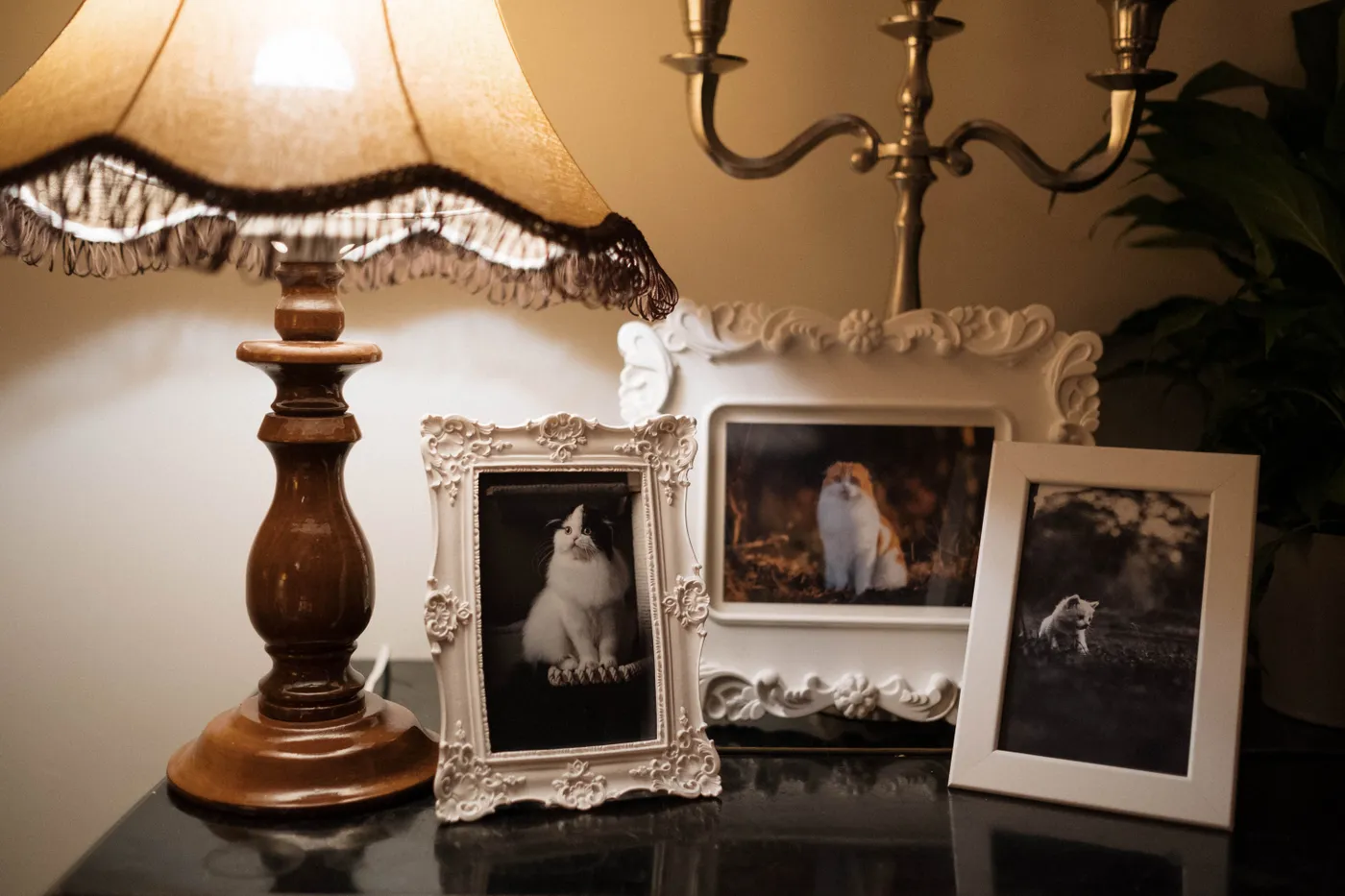
25. A Sentimental Tabletop Display of Ornate White Frames
When creating a tabletop vignette with multiple frames, think in layers and varying heights to avoid a flat, lineup-style look. Start with your tallest item in the back (like the lamp or a taller frame). Then, place a medium-height frame slightly overlapping it. Finally, add your smallest frame or object in the foreground. Let the items touch and interact. The mix of two ornate frames with one simple one here is also key; the simple frame gives your eye a place to rest, making the ornate ones feel even more special.
|
📋 Copy HEX 🔗 Share |
Ornate, detailed frames add so much character, but let’s be real: they are dust magnets. Those beautiful carvings and crevices are the perfect hiding spot for dust bunnies. To keep them looking their best, a regular feather duster won’t cut it. Your secret weapon is a clean, soft-bristled makeup brush (like a fluffy blush or powder brush). It’s gentle enough not to scratch the finish but firm enough to get into all the nooks and crannies with a quick weekly dusting.
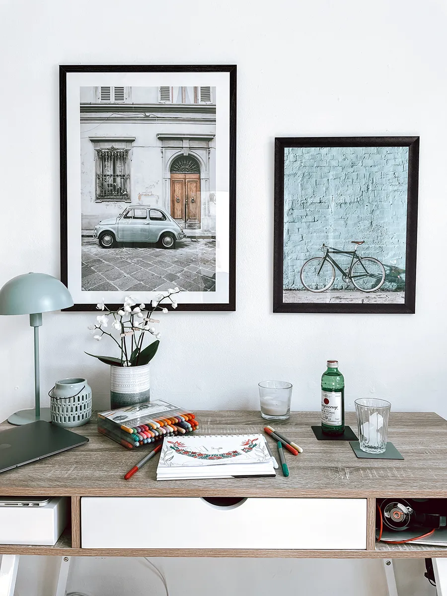
26. Minimalist Urban Art in Sleek Black Frames for a Desk Area
The formula for this clean and inspiring workspace is all about restraint. It’s about 80% minimalism + 20% personality. The minimalism comes from the clean white walls, the simple light wood desk, and the unadorned black frames. That 80% creates a calm, uncluttered foundation. The crucial 20% is the art itself. The choice of muted, urban scenes adds a specific point of view and a touch of color without disrupting the overall serene and focused atmosphere of the space.
|
📋 Copy HEX 🔗 Share |
You can get this exact minimalist vibe without a big budget. The key is the slim black frame. IKEA’s FISKBO or SILVERHÖJDEN frames are perfect and cost less than $20 each. For the art, browse sites like Society6, Artfully Walls, or even Etsy for downloadable prints. You can often find beautiful digital art files for $5-$10, and then have them printed at your local office supply store or an online printer. The entire look can easily be achieved for under $75.
27. A Vibrant Pop Art Gallery in Simple Black Frames
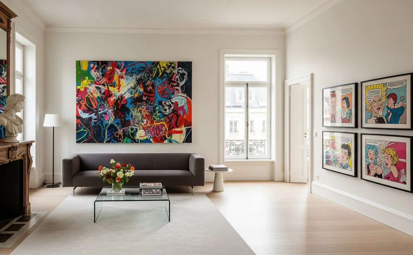
Pop art, especially styles reminiscent of Roy Lichtenstein from the mid-20th century, is having a major resurgence. As interior design trends cycle through the 80s and 90s, this kind of bold, graphic, and slightly retro art feels incredibly fresh and energetic again. It’s a reaction against the years of all-gray-everything and a move towards more colorful, personality-driven spaces. It’s playful, confident, and a guaranteed conversation starter.
|
📋 Copy HEX 🔗 Share |
This gallery wall is so effective because of the high contrast between the art and the frames. The artwork is loud, vibrant, and complex, filled with primary colors and bold patterns. The frames are the exact opposite: simple, thin, matte black, and uniform. They act as a grounding force, a quiet container for the chaos within. If the frames were ornate or colorful, the entire wall would be visual overload. The simplicity of the frames is what makes the boldness of the art work.
28. A Luxurious and Moody Gallery Wall of Ornate Gold Frames
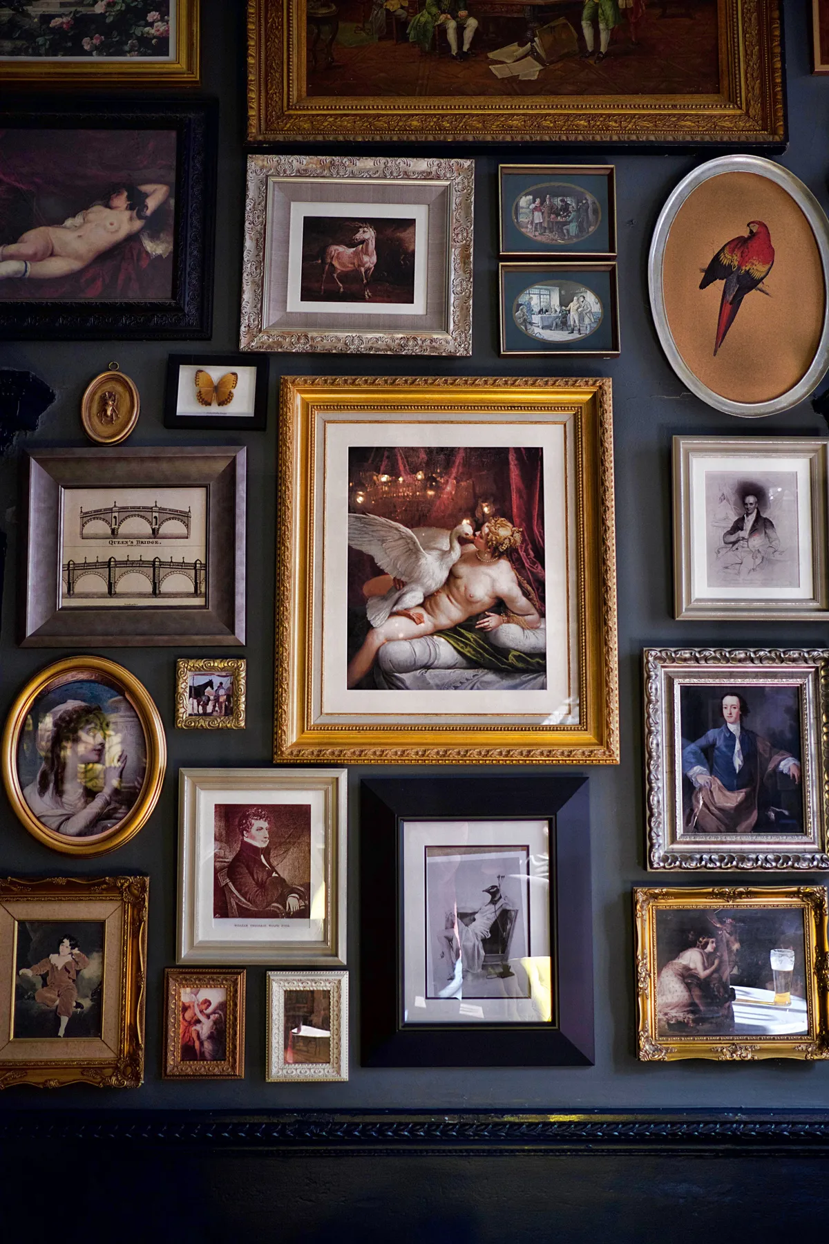
The single element that defines this look is density. This isn’t a gallery wall with thoughtful spacing and breathing room; it’s a rich, layered tapestry of frames. They are packed together, overlapping in places, creating a solid wall of texture and history. Removing even a few frames would dilute the effect. The power comes from the overwhelming, floor-to-ceiling commitment to the collection. It transforms the wall from a surface to hang things on into a singular, magnificent art object.
|
📋 Copy HEX 🔗 Share |
A look this dramatic comes with some serious considerations. First, cost. Acquiring this many ornate frames, even from thrift stores and flea markets, is a significant investment of time and money. Second, the dark wall color that makes the gold and silver pop is notoriously difficult to maintain. It will show every scuff, fingerprint, and speck of dust. Finally, this is a very specific, maximalist aesthetic. It’s a bold statement that will dictate the style of the entire room, so you have to be all in.
29. A Classic Corner Gallery with Gold and Dark Wood Frames
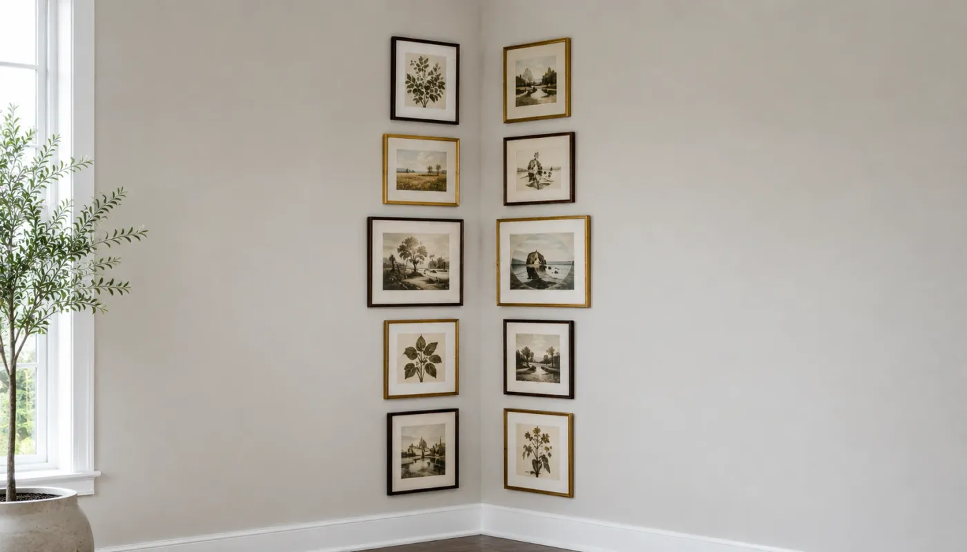
Don’t let a corner stop your gallery wall. Wrapping your frames around an inside corner is a fantastic designer trick to make a space feel more immersive and considered. The key is to treat the two walls as one continuous canvas. Let one or two frames from one side cross over the corner by just a few inches, and vice-versa. This visual stitching prevents the corner from feeling like a hard stop and creates a beautiful, flowing effect that draws you into the space.
|
📋 Copy HEX 🔗 Share |
This corner-wrapping technique is most effective in spaces where the corner is a focal point, such as the end of a hallway, the corner of a dining nook, or behind a reading chair. It works best on walls that are relatively similar in width. If one wall is 10 feet wide and the adjacent wall is only 2 feet wide, the effect can look unbalanced. Aim for walls where the layout can feel roughly symmetrical in visual weight, even if the frame count isn’t identical on both sides.
30. An Industrial-Chic Gallery on a Textured Concrete Wall
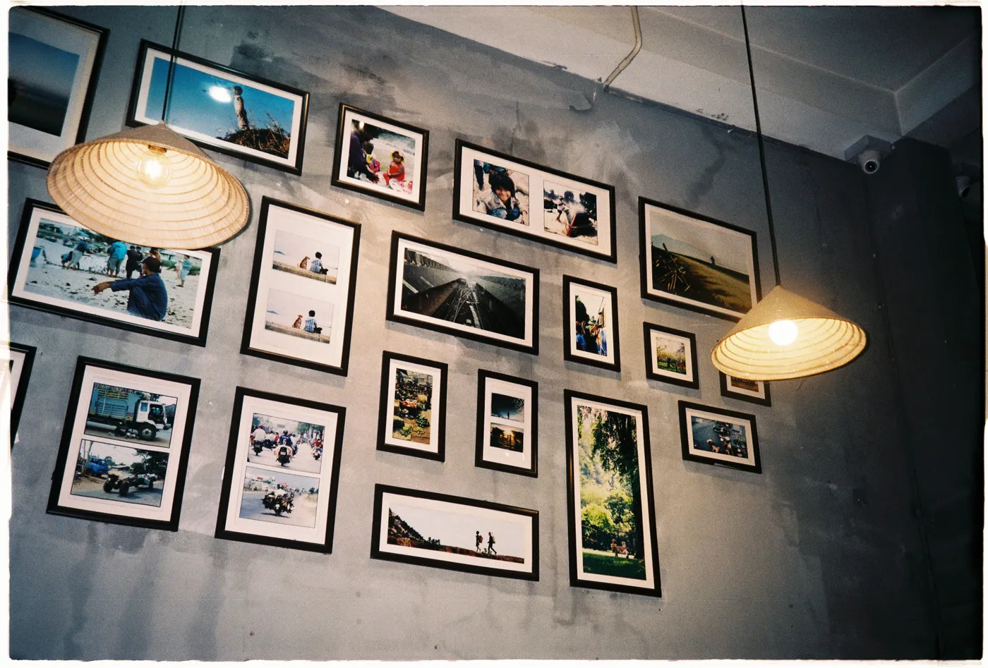
The success of this gallery wall lies in the brilliant juxtaposition of materials and moods. The concrete wall is industrial, cool-toned, and impersonal. The collection of photographs, on the other hand, is warm, personal, and filled with memories. This high-contrast pairing is what creates the magic. The roughness of the concrete makes the sentimental photos feel even more precious, while the photos bring life and humanity to the stark architectural surface. The straw pendant lights add another layer of warm, natural texture.
|
📋 Copy HEX 🔗 Share |
Hanging anything on a concrete or cinder block wall is a bit more involved than drywall. You can’t just use a simple nail and hammer. You’ll need a special hammer drill and masonry drill bits to create the pilot holes. Then, you’ll need to insert concrete wall anchors or use concrete screws to securely hang your frames. It’s a very sturdy and permanent solution, but it also means you should be very sure about your layout, as patching holes in concrete is not a simple task.
31. An Elegant, Neutral Gallery Mixing Abstracts and Classics
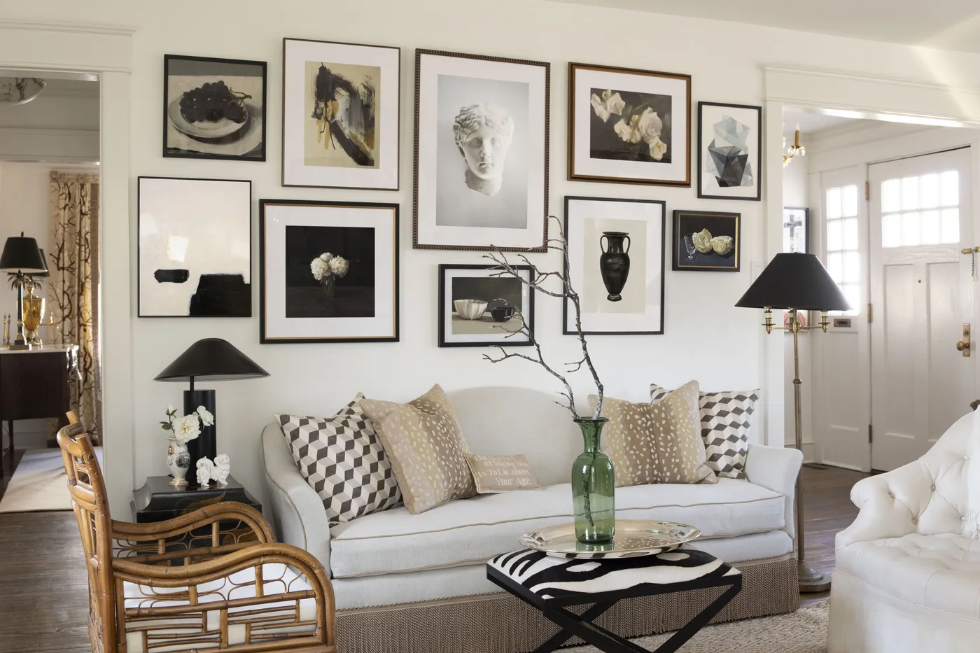
This sophisticated look is achieved by blending different art genres within a controlled palette. The formula is roughly 50% modern abstract prints + 30% classic art (like still lifes or figure drawings) + 20% simple typographic or line art. By keeping the art almost entirely within a black, white, and cream color scheme, the different styles can coexist harmoniously. The mix of simple black frames and warmer dark wood frames adds another layer of curated, not-too-perfect interest.
|
📋 Copy HEX 🔗 Share |
To recreate this high-end, curated look with a focus on quality prints and framing, here’s a potential cost breakdown. This assumes sourcing from art print sites and using custom or high-quality ready-made frames.
- Large Anchor Art Pieces (2-3): $300 – $900
- Medium Sized Prints (5-7): $250 – $700
- Professional Framing: $800 – $2,500
- TOTAL: $1,350 – $4,100
Budget alternative: Compare this with the much more accessible gallery wall in Idea #1, which can be achieved for a few hundred dollars.
32. A Flexible Gallery on a Metal Grid Over White Brick
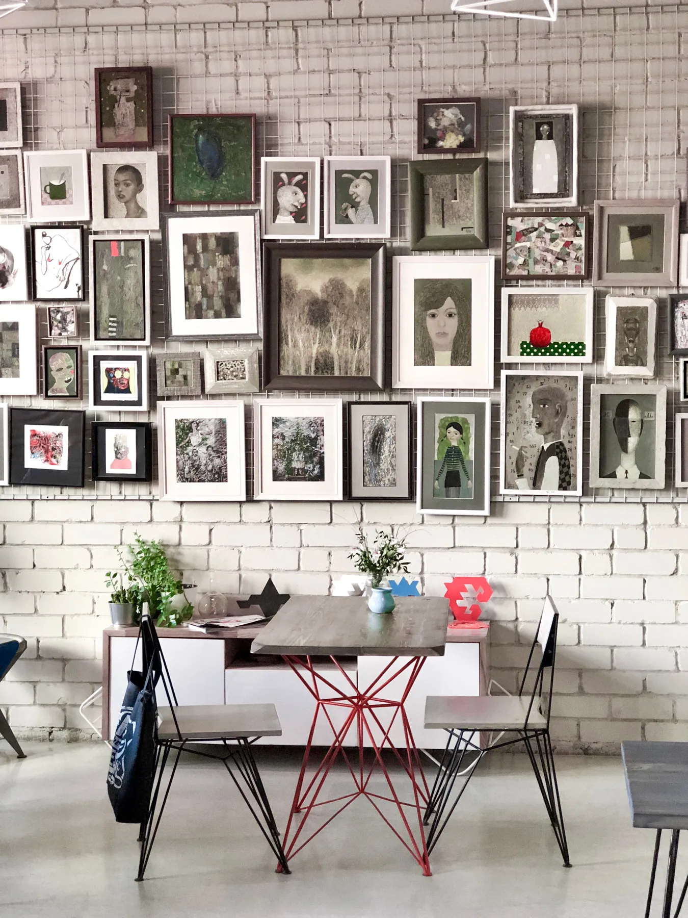
The absolute game-changer in this space is the metal grid hanging system. It’s the single element that provides both the industrial-chic structure and incredible flexibility. For renters, or anyone who loves to rearrange their art, a system like this is brilliant. It allows you to move, add, or swap out frames endlessly using simple hooks, all without drilling a single new hole into that beautiful white brick wall. It turns the wall into a dynamic, ever-changing canvas.
|
📋 Copy HEX 🔗 Share |
A grid system is fantastic, but you need to check a few things before you commit. It’s not a simple peel-and-stick solution.
- Confirm your wall material. Installing the grid securely into brick, drywall, or plaster requires different types of anchors and screws. Make sure you have the right hardware.
- Check the weight capacity. The grid system itself and the hardware used to mount it will have a maximum load capacity. Add up the approximate weight of all the frames you plan to hang to ensure you don’t overload it.
- Get it level! The main grid must be perfectly level and plumb. If the grid is crooked, every frame you hang on it will also be crooked. Take your time with this crucial first step.
Your Walls Are Waiting for Their Story
See? There are so many ways to make your walls feel like you, from a single, statement piece to a sprawling story told through dozens of frames. Don’t be afraid to start small, experiment, and let your collection evolve over time. The most beautiful walls are the ones that truly reflect the people who live within them. Now, go open up your Pinterest boards and start dreaming up your perfect arrangement!