
You know that feeling when you finally find the poster print that looks exactly right for your space? It’s the one that pulls everything together, adds personality, and just makes you happy to look at. But finding that perfect piece can feel like searching for a needle in a haystack. After filtering through hundreds of options across Etsy, Society6, and Desenio, we narrowed it down to 28 ideas that actually deliver. We pulled the best poster print options across every price point—from $20 to $500. This is more than just a list; it’s a curated collection of real-world examples, covering styles from modern minimalist to cozy eclectic. We’re showing you exactly how to make these looks work in your own home. And stay until the end—we break down the most common mistakes that can ruin these looks. Pin this guide for later—your future self will thank you when it’s time to actually do this.
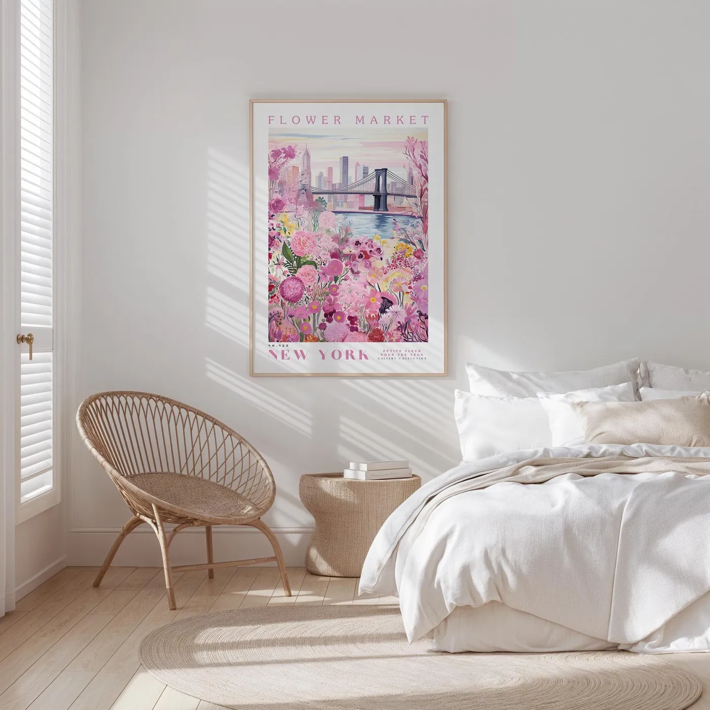
1. Create a Serene Escape with a Pink Floral New York Print
This bedroom feels so calm and airy, and the poster is a huge part of that. It works because it introduces a soft, specific color story (pale pinks and greens) into an otherwise neutral room. The light wood frame of the print perfectly echoes the rattan chair and woven side table, creating a sense of cohesion without being overly matched. The large scale of the print is also key; it’s substantial enough to act as a headboard, anchoring the bed and making the whole wall feel intentional.
|
📋 Copy HEX 🔗 Share |
Here’s a pro tip for hanging any art above furniture like a bed or a sofa: the bottom of the frame should be 6 to 8 inches above the top of the furniture. This visually connects the two pieces, making them feel like a single, cohesive unit. If you hang it too high, the art will look like it’s floating away from the furniture it’s supposed to be accenting, creating a noticeable and awkward gap. Getting this measurement right is one of the simplest ways to make your space feel professionally styled.
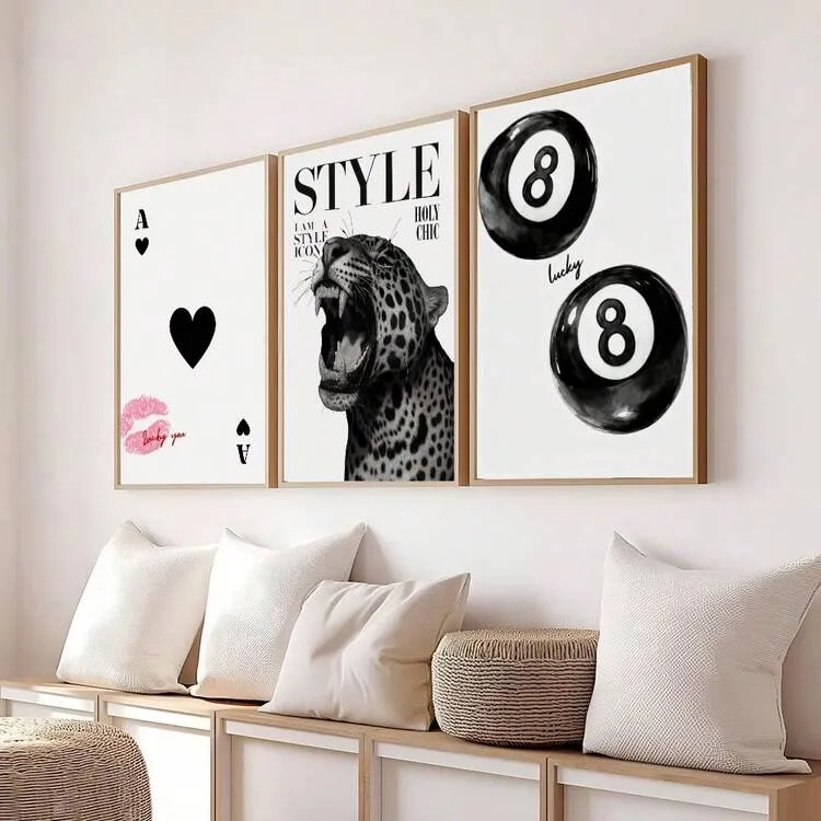
2. A Playful Trio of Modern Graphic Art Prints
The formula for this chic little corner is refreshingly simple. Think of it as 60% neutral foundation (the white wall, cream pillows), 30% natural texture (the wood console table and frames, woven baskets), and 10% playful graphic punch (the black, pink, and red in the prints). You could easily swap the art for different graphics or the accent color from pink to a bold blue or green, and as long as you keep those ratios, the balanced, modern feel would remain. It’s a foolproof recipe for a stylish vignette.
|
📋 Copy HEX 🔗 Share |
Let’s be honest: hanging a trio of prints this perfectly aligned is harder than it looks. You’ll need a level, a tape measure, and a lot of patience. One frame being off by even a quarter of an inch will throw off the whole look. I recommend using painter’s tape to map out the positions on the wall before you even think about picking up a hammer. Or, even better, use picture-hanging strips so you can make tiny adjustments without putting a dozen nail holes in your wall.
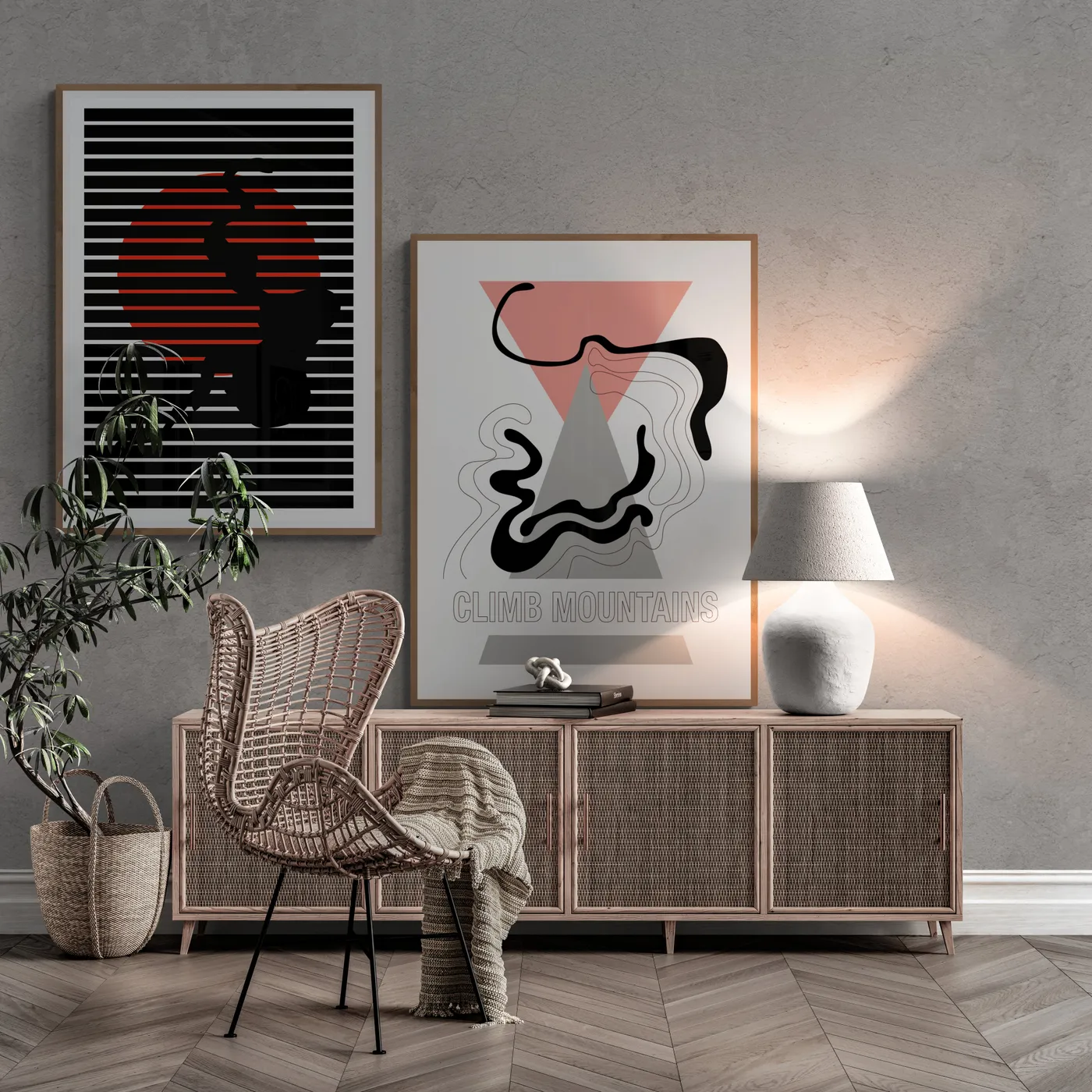
3. Warm Up Concrete Walls with Abstract Art and Wicker
The single element that makes this entire space work is the warm glow from that textured white table lamp. Without it, the concrete wall and herringbone floor could feel cold and impersonal. The lamplight brings out the warmth in the wicker cabinet and chair, highlights the texture of the wall, and makes the red-orange tones in the abstract art pop. It’s the bridge between the hard, industrial materials and the soft, natural ones, proving that lighting isn’t just functional—it’s the secret ingredient to creating a mood.
|
📋 Copy HEX 🔗 Share |
You don’t need to splurge on designer wicker to get this warm, modern vibe. The key is the texture and natural tone. Check out IKEA’s TOLKNING series or Target’s Opalhouse collection for incredibly similar wicker and rattan cabinets and chairs, often for under $200. You can find abstract prints on sites like Society6 or Etsy for $30-$50 and frame them yourself. The whole look is achievable on a budget if you focus on recreating the mix of textures and warm light.
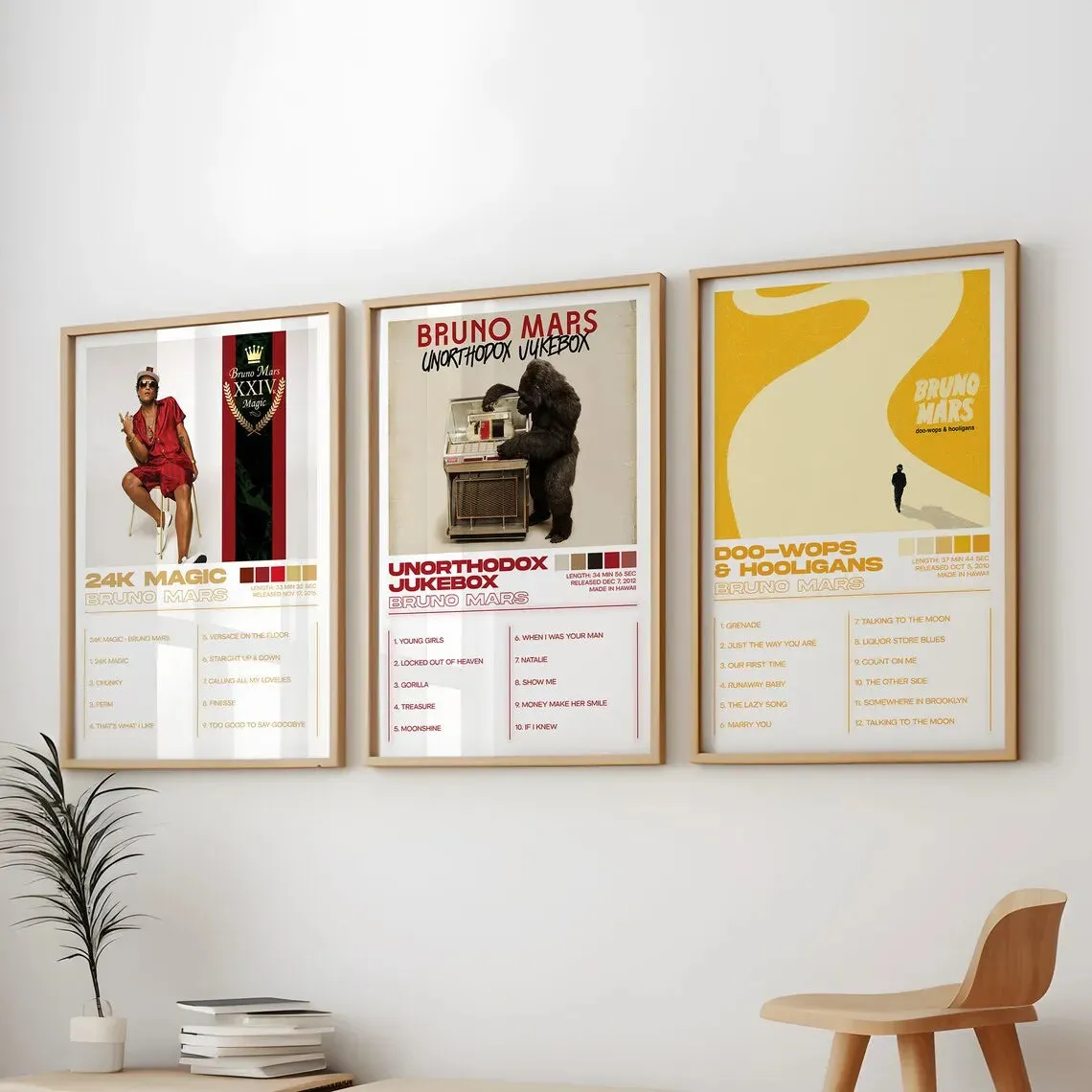
4. Display Your Favorite Album Art as a Triptych
A three-piece set, or triptych, like this works beautifully over a piece of furniture or on a narrow wall. For this look to feel balanced, the total width of the three prints (including the spaces between them) should be about two-thirds the width of the furniture below it. These look like they’re about 12×18 inches each. On a standard 8-foot-tall wall, you’ll want to hang the center of the grouping at eye level, which is typically 57-60 inches from the floor. This scale is perfect for an office nook, a hallway, or above a dresser.
|
📋 Copy HEX 🔗 Share |
Hanging a triptych evenly can be tricky. Here’s a quick guide to get it right:
- Decide on your spacing. A gap of 2-3 inches between frames usually looks best.
- Find the center of your wall space and mark it lightly with a pencil. This is where the center of your middle print will go.
- Hang the middle print first, ensuring it’s perfectly level.
- Measure the distance from the side of the middle frame to where the edge of the next frame should be (frame width + your desired gap). Mark the spot for your second nail.
- Hang the side prints, using a level to ensure they line up perfectly with the center one.
Total time? About 20 minutes and totally worth the precision.
5. Go Bold with a Floor-to-Ceiling Vintage Gallery on Black Walls
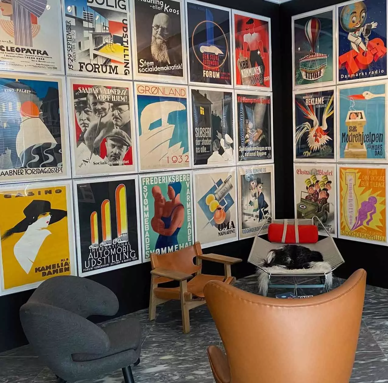
Creating a gallery wall of this scale is an investment, but it delivers major impact. Here’s a rough idea of the cost:
- Poster Prints: Sourcing vintage-style prints can range from affordable downloads to expensive originals. Let’s budget $15 – $75 per print for 16 prints: $240 – $1,200
- Frames: Simple white gallery frames are key. For this many, buying in bulk helps. $25 – $60 per frame: $400 – $960
- Paint: A gallon of high-quality black paint (like Farrow & Ball’s Railings or Benjamin Moore’s Onyx): $80 – $120
- TOTAL: $720 – $2,280
- Budget alternative: Use thrift store frames and paint them all white. Print high-resolution public domain art for pennies. You could achieve a similar feel for $300 – $500.
|
📋 Copy HEX 🔗 Share |
This room is a masterclass in controlled chaos. The dark, moody wall color could easily feel overwhelming, but the grid of bright white frames creates a strong sense of order and rhythm. This contrast is the primary reason it works so well. Secondly, the sheer volume of art turns the wall into a singular, textured feature, much like wallpaper. It commands attention and makes the relatively simple lounge furniture in front of it feel curated and important. The dark wall recedes, making the colorful art pop forward.
6. Nod to Nostalgia with Monochromatic Music-Themed Prints
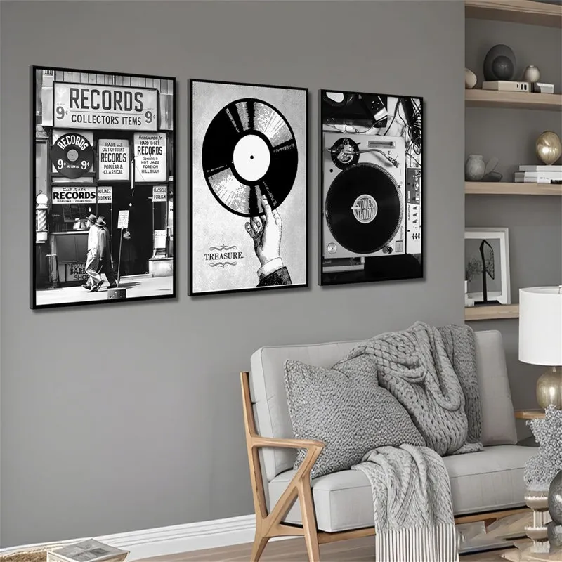
When creating a small gallery set like this, choosing a unifying theme is essential. Here, the vintage music concept is clear: a record store, a vinyl record, and a turntable. This narrative cohesion makes the three separate images feel like a single piece of art. When you’re picking prints, ask yourself: Do these tell a story together? Whether it’s a color, a subject, or a style (like black and white photography), a strong theme will make your arrangement look intentional and curated, not random.
|
📋 Copy HEX 🔗 Share |
Glass-fronted frames look sleek, but they are magnets for dust, fingerprints, and glare. A weekly dusting with a microfiber cloth is a must. For a truly streak-free clean, use a dedicated glass cleaner sprayed onto the cloth, not directly onto the glass (this prevents drips from seeping behind the frame and damaging the print or mat). If glare from a nearby window is a major issue, consider investing in anti-reflective or museum-grade glass for your frames. It costs more upfront but makes a world of difference in viewing clarity.
7. Add Intense Drama with a Single Gothic Character Print
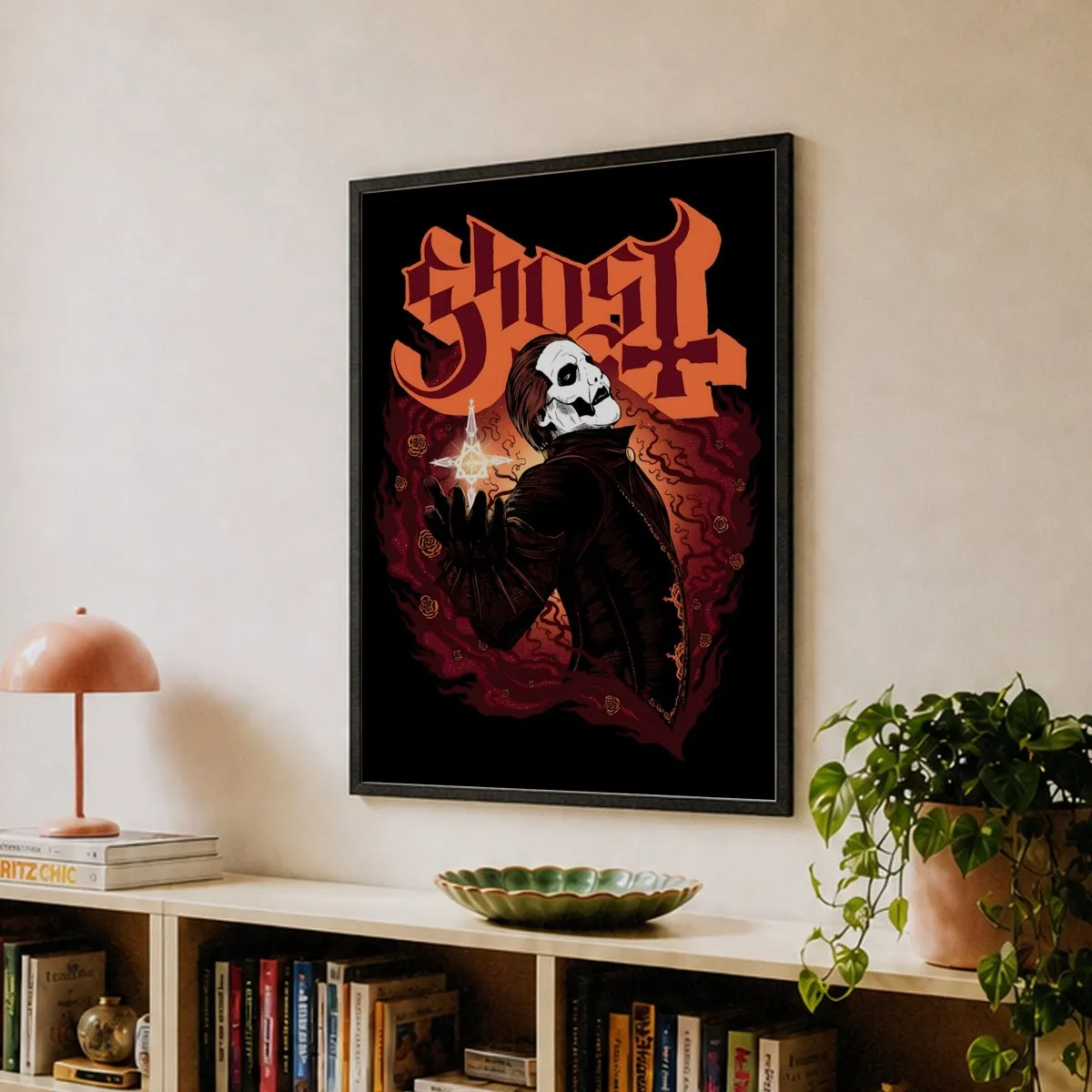
The power of this artwork is concentrated in its fiery red and orange background. If you were to change that background to a neutral grey or blue, the piece would lose almost all of its intensity. The color itself communicates passion, danger, and energy, perfectly complementing the mysterious gothic character. It’s a powerful reminder that with art, the background is never just a background—it’s an active part of the story and the mood. The choice of a simple dark frame was smart, as it contains the energy without competing with it.
|
📋 Copy HEX 🔗 Share |
A piece of art this intense and specific needs the right environment. In a very small room, it could feel overwhelming or even claustrophobic. It also demands a certain commitment to a mood. You can’t just drop this into a light and airy farmhouse-style living room and expect it to work. It needs to be supported by other decor choices that lean into the same dramatic, expressive vibe. If your style is generally more subdued, a piece this strong might always feel a little out of place.
8. Inject Playful Modernism with a Pink Convertible Print
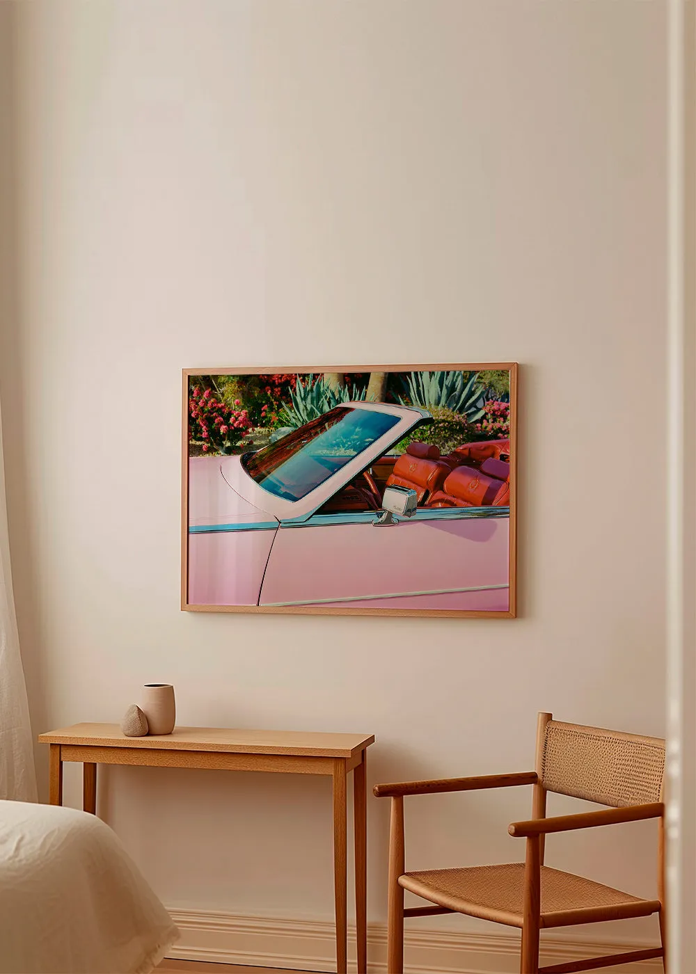
This corner is a perfect example of warm minimalism. The visual recipe is approximately 70% warm neutrals (the light beige wall, wood tones, and woven chair) + 20% lush green (from the print’s garden) + 10% playful color pop (the pink car). This high ratio of neutral-to-color keeps the space feeling calm and sophisticated, while the single, unexpected splash of pink adds personality and prevents it from feeling boring. The key is that the pop of color is contained entirely within the artwork, making it a low-commitment way to be bold.
|
📋 Copy HEX 🔗 Share |
There’s a reason art like this is so popular right now. We’re seeing a huge trend towards what designers call escapist aesthetics. Pieces that depict dreamy, nostalgic, or slightly surreal scenes—like a vintage pink car in a lush, perfect garden—offer a little visual getaway from the everyday. It’s less about realism and more about evoking a feeling. This trend has real staying power because it taps into a universal desire for joy and beauty in our personal spaces. Compare this with the vintage music nostalgia of Idea #6.
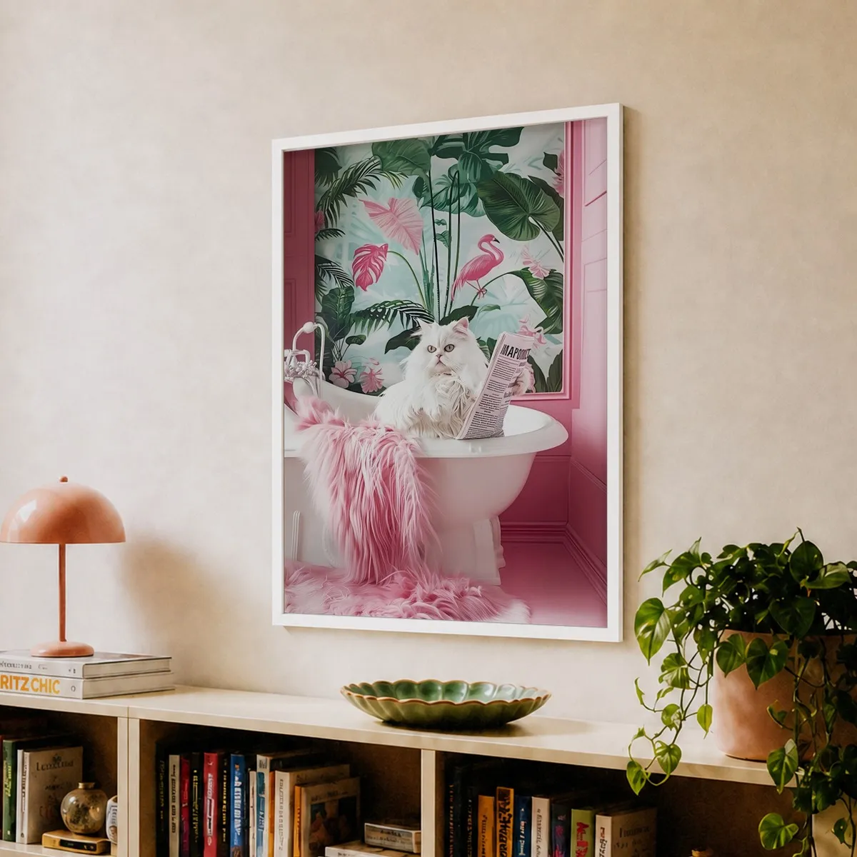
9. Embrace Whimsy with a Fluffy Cat in a Pink Bathtub
You don’t need a gallery budget to bring this kind of playful, chic energy into your space. The charm here is all in the image, not an expensive frame or artist. You can find thousands of quirky, high-fashion animal prints on sites like Etsy or Fy! for as little as $15-$25 for a digital download you can print yourself. Pair it with a simple, affordable white frame from IKEA’s FISKBO series ($5-$15) or Target. The whole statement piece could easily cost you less than $40.
|
📋 Copy HEX 🔗 Share |
This print just makes you smile, and that’s a design principle in itself! But technically, it works because of its clever use of surrealism and color commitment. The image of a perfectly coiffed cat in a bathtub is delightfully unexpected, immediately capturing your attention. Furthermore, the composition is a study in pink—the walls, the rug, the wallpaper accents—which makes the whole piece feel incredibly deliberate and high-fashion, despite its playful subject. It’s a joke told in a very sophisticated way.
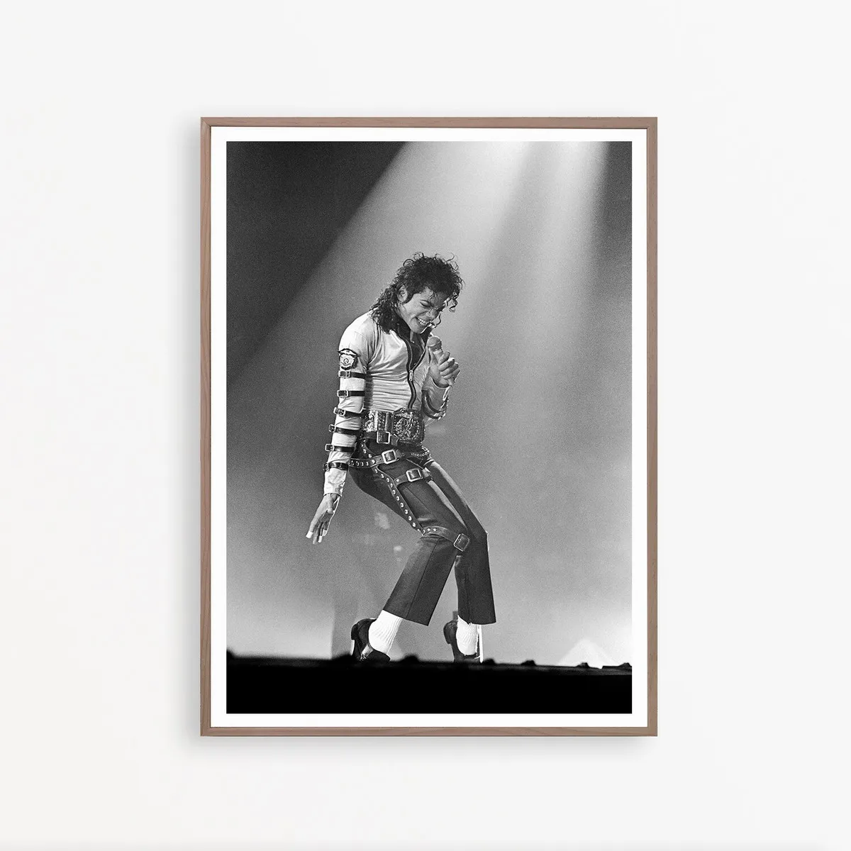
10. Capture Concert Energy with Iconic Black and White Photography
When you have a photograph that is this dynamic and iconic, treat it like a major piece of art. The key is to give it space to breathe. Notice the generous white matting between the photo and the frame? That negative space is crucial. It acts as a pause, drawing your eye inward to the details of the photograph. For a large print (24×36 inches or bigger), I recommend a mat that is at least 3-4 inches wide on all sides. This elevates the print from a simple poster to a true gallery piece.
|
📋 Copy HEX 🔗 Share |
A single, large-scale piece like this works best on a wall where it can be the undisputed focal point. Aim for a wall that’s at least 6-8 feet wide in a living room, bedroom, or entryway. The artwork itself should occupy 50-60% of the wall width. If your print is 36 inches wide, it will look best on a wall that is 60-72 inches wide. Any smaller, and the art will overwhelm the space; any larger, and it may start to look a little lost. Compare this large-scale approach to the multi-panel display in Idea #15.
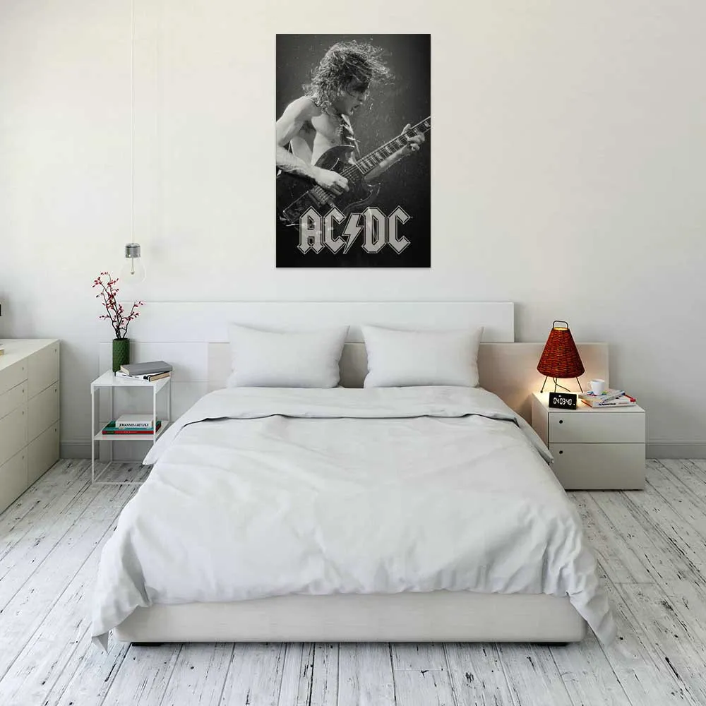
11. Contrast a Minimalist White Room with a Bold Rock Poster
The success of this room hinges on one powerful design principle: contrast. You have an almost entirely white space—walls, floors, bedding, nightstands—that is stark, clean, and full of light. Then, you introduce one single element that is the complete opposite: a large, dark, energetic black and white rock poster. This high contrast creates a dramatic focal point that is impossible to ignore. Without the poster, the room is just a white box; with it, it has a personality and a point of view.
|
📋 Copy HEX 🔗 Share |
A room this stark and minimalist looks amazing in photos, but it can be challenging to live in. Every single thing that is out of place—a stray sock, a stack of mail, a water glass—will immediately look like clutter against the clean white backdrop. This look requires a serious commitment to tidiness. The distressed white floors are also beautiful, but they’ll show dirt and scuffs much more readily than a natural wood tone. It’s a high-impact look with a high-maintenance lifestyle to match.
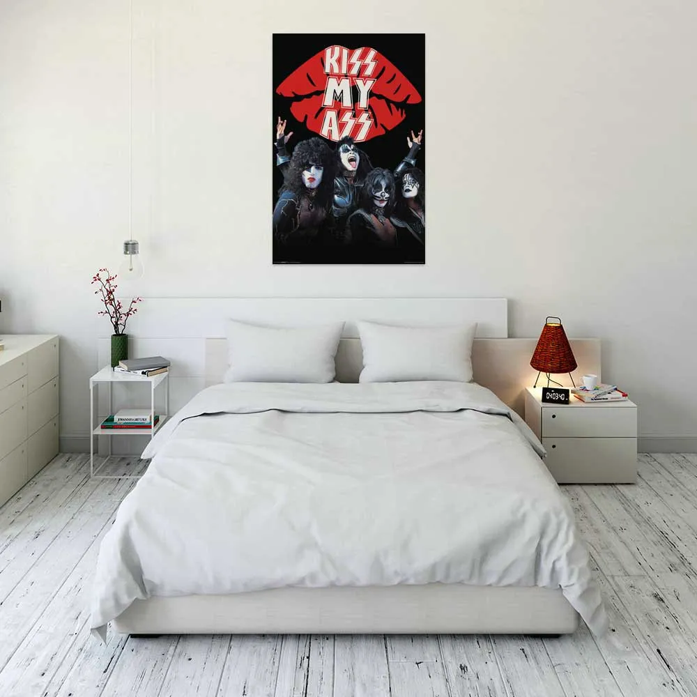
12. Make a Statement with a Kiss Poster in a Clean White Bedroom
that makes this room more than just a simple white bedroom is the poster’s unapologetic attitude. It’s provocative, a little irreverent, and injects a shot of rock-and-roll energy into a very serene setting. Choosing a piece of art that has a strong voice or sense of humor is one of the fastest ways to give a space a distinct personality. This isn’t just a decorative picture; it’s a statement. It tells you something about the person who lives here.
|
📋 Copy HEX 🔗 Share |
This room’s design equation is beautifully simple: 90% clean, minimalist white + 10% bold, graphic attitude. The overwhelming majority of the space is calm and neutral, which provides the perfect blank canvas for the poster to take center stage. The few other dark elements, like the pendant light cord and the legs of the side table, act as small echoes of the poster’s black, tying it into the room. It’s the same high-contrast principle we saw in Idea #11, but with a touch more humor.
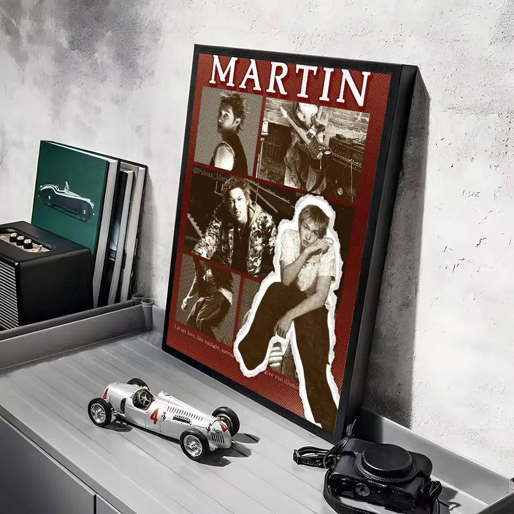
13. Personalize Your Space with a Custom Name Band Collage
You can create a personalized print like this one on sites that offer custom poster design tools. Here’s the basic process:
- Start with a template. Look for collage or multi-photo layouts.
- Create the header. Add a solid color block at the top and use the text tool to type a name or word in a bold, sans-serif font. White text on a red background is a classic.
- Upload your images. For the collage portion, use a collection of black and white photos for a cohesive look. Drag and drop them into the template.
- Add the outline effect. Some design tools have a ‘stroke’ or ‘outline’ feature you can apply to one of the images to make it stand out.
- Review and order. Double-check your spelling and layout before sending it to print!
It’s a great way to make something that is truly one-of-a-kind.
|
📋 Copy HEX 🔗 Share |
We’re seeing a huge movement away from generic, mass-produced art and towards pieces that feel deeply personal. This poster is a perfect example. It’s not just a band poster; it’s a poster that incorporates a personal name, making it unique to the owner. This trend of ‘hyper-personalization’ is about making our homes a true reflection of our own stories, identities, and tastes. It’s about creating a space that couldn’t belong to anyone else.
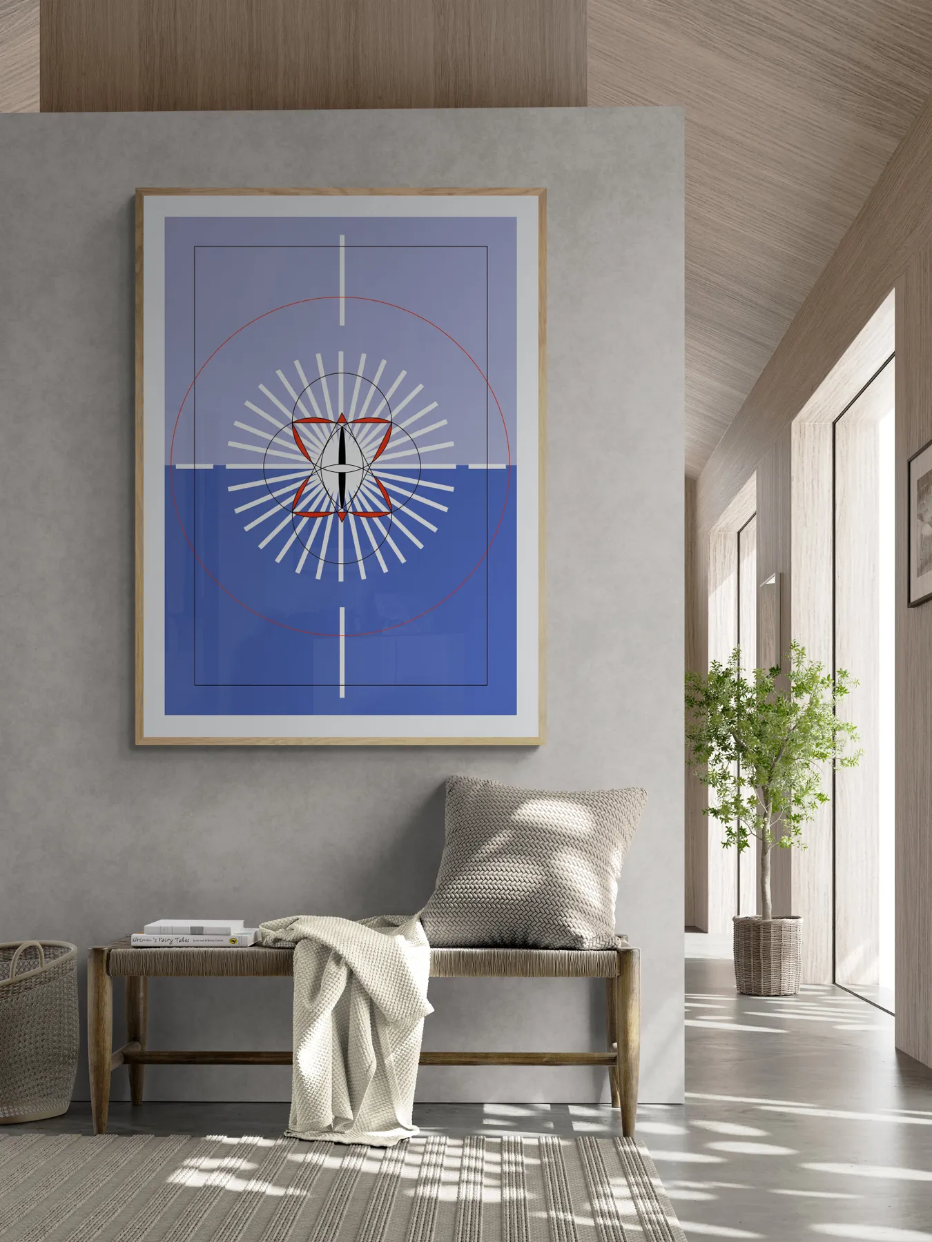
14. Energize a Neutral Hallway with a Geometric Abstract Print
In an open or transitional space like a hallway, a large piece of art can do more than just decorate—it can create a zone or a destination. By placing this bold print above the bench, the designer has created a distinct moment. It turns a simple walkway into a place to pause. The art and bench work together to anchor the area, giving it purpose. Use this trick in any long hallway or open-concept room to break up the space and create intentional focal points.
|
📋 Copy HEX 🔗 Share |
The scale here is perfect. As a general rule, artwork hung above a piece of furniture should be about 2/3 to 3/4 the width of the furniture. This print looks to be about 40 inches wide above a 60-inch bench, which fits the rule perfectly. This ensures the art relates to the furniture and they feel like a cohesive pair, rather than two random items placed on the same wall. The height is also spot on, with just enough breathing room between the bench and the frame.
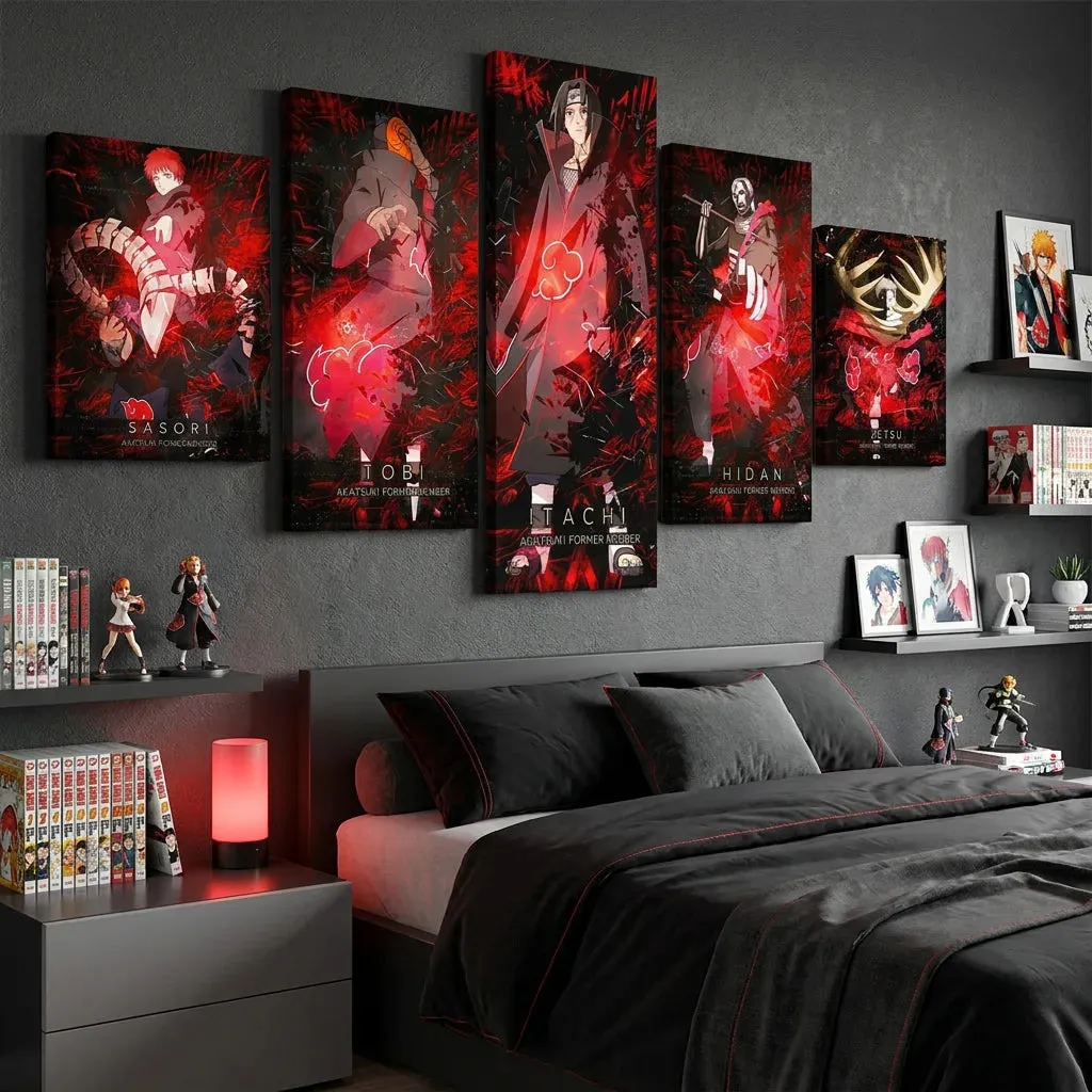
15. Create an Immersive Vibe with a Multi-Panel Anime Display
This themed bedroom is successful because of its commitment and repetition. The vibrant red from the five-panel artwork is strategically repeated throughout the space: in the stitching on the bedding, the glow of the lamp, and other small accents. This color echo makes the entire room feel cohesive and immersive. The dark gray walls and bedding also serve as a perfect moody backdrop, allowing the red to pop without competition. It feels like a fully realized world, not just a room with a poster in it.
|
📋 Copy HEX 🔗 Share |
Committing to a strong theme like this can be amazing, but it’s wise to plan ahead. Ask yourself these questions before you begin:
- Is this a theme I’ll love for years, or is it a passing interest? Themed rooms can be costly to re-do.
- Have I measured for a multi-panel piece? Ensure you have enough uninterrupted wall space and account for the small gaps between each panel.
- Does my existing furniture work? The dark, modern furniture here supports the theme. A rustic oak bed frame might clash.
- What’s my lighting plan? The moody red lamp is key to the atmosphere. Plan for lighting that enhances the vibe.
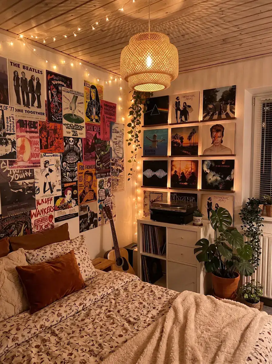
16. Curate a Cozy Music Haven with a Poster and Vinyl Wall
This look is incredibly personal and can be very budget-friendly. Instead of buying new prints, dig through your own collection of concert ticket stubs, magazines, or even old t-shirts that could be framed. Use the album art from vinyl records you already own—they are literally 12×12 pieces of art. Displaying them on simple floating picture ledges from IKEA or Target is an inexpensive and flexible way to create a display. The string lights are another super affordable touch that adds a huge amount of cozy atmosphere for less than $20.
|
📋 Copy HEX 🔗 Share |
While this room has an amazing, cozy vibe, be prepared for the reality of a maximalist display. A wall covered in posters, plus open shelves of records and plants, creates a lot of surfaces for dust to collect. This isn’t a clean once a month kind of space; it requires regular dusting to keep it from looking grimy. Also, be mindful of the line between curated eclectic and just plain cluttered. It’s important to have some sense of organization, like the neat rows of records, to keep the chaos feeling charming. Compare this to the very orderly look of Idea #4.
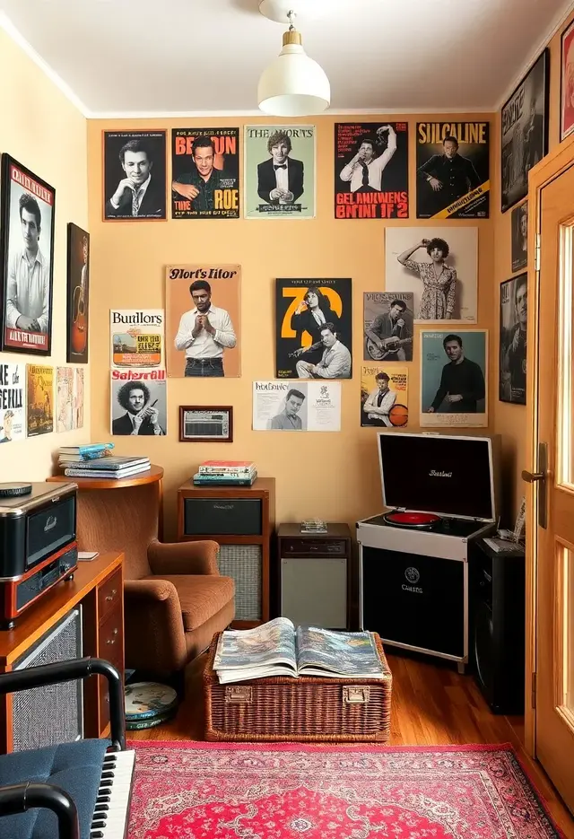
17. Layer Unframed Vintage Posters for a Lived-In, Eclectic Look
The formula for this kind of warm, layered maximalism is all about texture and history. It’s about 50% personal ephemera (the unframed posters), 30% warm, grounding elements (the wood floors, wicker trunk, peach walls), and 20% pattern and comfort (the red rug, soft lighting). The key is that nothing feels too new or perfect. The slightly worn edges of the posters and the lived-in feel of the furniture are essential to the charm. It’s a style that celebrates imperfection and personal stories.
|
📋 Copy HEX 🔗 Share |
Taping posters directly to the wall gives a wonderfully casual, bohemian vibe, but it comes with risks. The paper is exposed to dust, moisture, and sunlight, which can cause fading, yellowing, and brittleness over time. The corners are also prone to curling and tearing. If you love a poster and want it to last, framing it behind UV-protective glass is always the best option. For less precious prints, this method is fine, but know that it’s a look with a limited lifespan. Use painter’s tape or gentle poster putty to minimize wall damage.
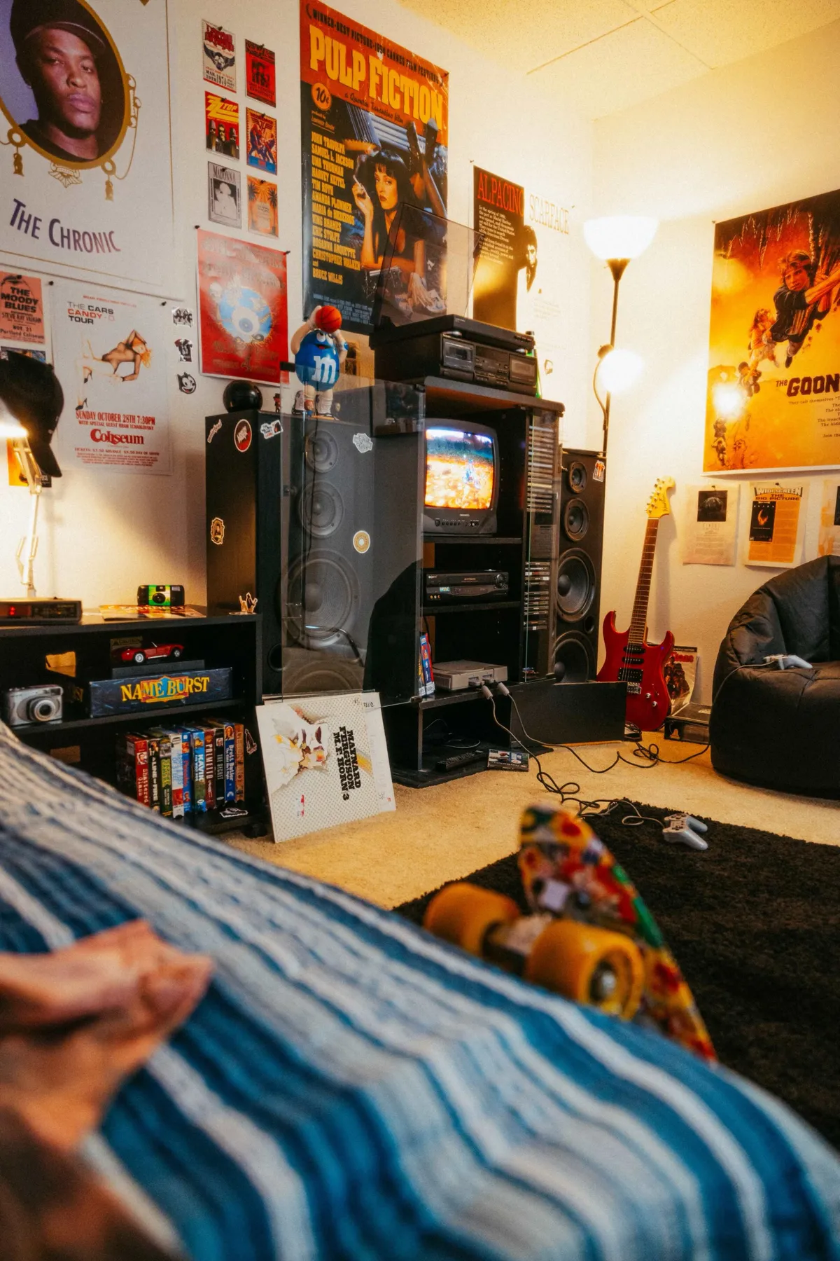
18. Channel 90s Nostalgia with a Casual Movie Poster Collage
While the posters set the theme, the one object that truly anchors this room in a specific era is the CRT television. That bulky, deep-set TV is an instant signifier of the 90s and early 2000s. If you were to replace it with a modern, flat-screen TV, the room would still be cool and eclectic, but it would lose that powerful, specific hit of nostalgia. It’s a great example of how functional objects, not just decor, can define the entire aesthetic of a space. The red guitar is a close second!
|
📋 Copy HEX 🔗 Share |
This is the ultimate get this look for less because the entire aesthetic is built on affordability and accessibility. This isn’t about expensive art; it’s about passion. You can find classic movie posters like Pulp Fiction and Scarface online for $10-$20. Music posters are often even cheaper. Better yet, scour thrift stores, flea markets, and Facebook Marketplace for vintage finds and old frames. The slightly imperfect, lived-in quality is part of the charm, so you don’t need pristine condition. This look is all about personality, not price tags.
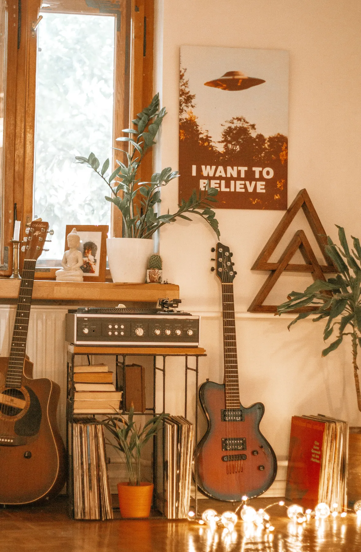
19. Style a Cozy Corner with a UFO Poster and Your Favorite Guitars
This little corner feels so authentic and inviting because it’s a perfect vignette. It’s not just a poster on a wall; it’s a collection of objects that tell a story about the person who lives there. The guitars, the record player, the stacks of vinyl, and the UFO poster all point to a specific set of interests. The composition works because the items are layered—guitars in front of the shelf, plants mixed in—creating depth and a sense of casual curation. It feels personal because it is personal.
|
📋 Copy HEX 🔗 Share |
Don’t just decorate—tell your story. The most interesting homes are the ones that reflect the passions of the people inside. Instead of buying generic art, think about how you can display the things you already own and love. Frame a vintage map from a place you traveled, hang your collection of hats, or display your guitar on the wall instead of hiding it in a case. These personal items have more character than anything you can buy at a big-box store.
20. Build a Personal Story with an Organic Photo and Print Collage
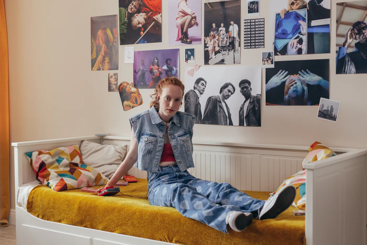
Creating a free-form collage that looks cool and not chaotic takes a bit of planning. Follow these steps for an organic feel:
- Start with an anchor piece. Choose your largest or favorite print and place it slightly off-center.
- Build outwards. Add your next pieces around the anchor, radiating outwards like ripples. Don’t try to make a perfect grid.
- Vary the spacing. Let some images overlap slightly, while others have more breathing room. This creates a more dynamic, layered look.
- Mix sizes and orientations. Combine vertical posters, horizontal prints, and small square photos.
- Step back often. Take a few steps back to look at the overall balance. Adjust as you go until it feels right to your eye.
This method is more art than science, so trust your gut!
|
📋 Copy HEX 🔗 Share |
The dream is a beautiful, evolving wall collage. The reality can be damaged paint and lost security deposits. If you’re a renter, or just don’t want to mess up your walls, be very careful about your choice of adhesive. Standard tape can peel paint right off. Look for wall-safe poster putty or removable picture-hanging strips. Even then, test them on an inconspicuous spot first. For a truly damage-free option, consider getting a large corkboard, painting it to match your wall, and pinning your collage to that.
21. Mix Posters and Photos for a Youthful Vibe Above a Daybed
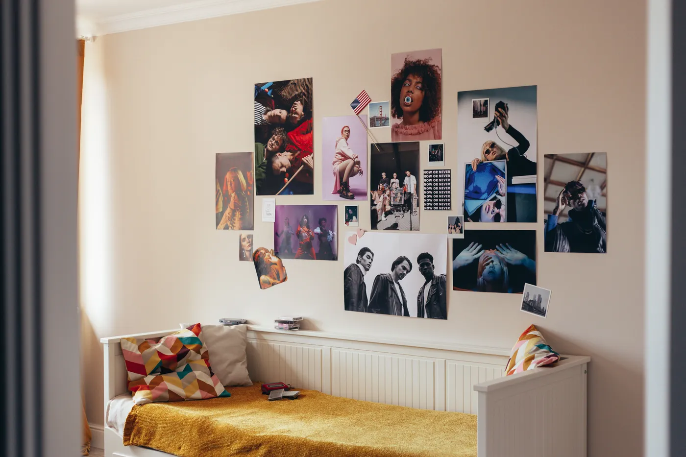
The color story here is what makes the eclectic mix feel cohesive. The formula is about 40% warm neutrals (the beige wall, white bed), 30% grounding darks (the grey curtain, black elements in the posters), and 30% vibrant accent colors (the mustard yellow blanket and the pops of color in the pillows and art). The mustard yellow is the key—it’s a bold, confident choice that ties everything together and gives the space its youthful energy. It proves you don’t need a lot of color to make a big impact.
|
📋 Copy HEX 🔗 Share |
This is a fantastic example of a high-impact, low-cost bedroom look. It’s all about curation, not expensive items. Here’s how it could break down:
- Unframed Poster Prints: A mix of 8-10 prints sourced online or from magazines: $30 – $80
- Adhesive: Wall-safe putty or tape: $5 – $10
- Accent Textiles: A bold throw blanket and a couple of patterned pillows from a store like H&M Home or Target: $50 – $100
- TOTAL: $85 – $190
- Budget alternative: This entire look is the budget alternative! You could do it for even less by printing your own photos and using a blanket you already own. It’s a similar vibe to Idea #20, proving great style can be super accessible.
22. Get a Graphic Edge with a Magazine Cover Style Poster
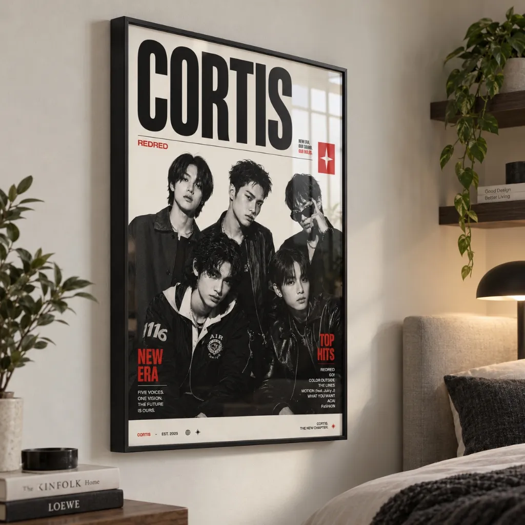
What elevates this from a simple band photo to a piece of graphic art is its strong typographic design. The clean layout, the bold red text, and the overall composition mimic the look of a high-end fashion or music magazine like Rolling Stone or The Fader. This clever design choice gives the image a sense of cultural relevance and graphic sophistication. It feels less like fan memorabilia and more like a curated piece of contemporary art. It’s all about the power of good typography.
|
📋 Copy HEX 🔗 Share |
We’re in an era where the lines between different creative fields are constantly blurring. This poster is a perfect example. It’s not just photography; it’s graphic design. It’s not just wall decor; it’s a nod to editorial layout. This trend of bringing elements from other disciplines—like magazine design, album art, or even website UI—into our home decor is about celebrating a broader visual culture. It shows an appreciation for design in all its forms, and it creates spaces that feel smart and culturally aware.
23. Cover a Wall Entirely in Vintage Film Posters for Max Impact
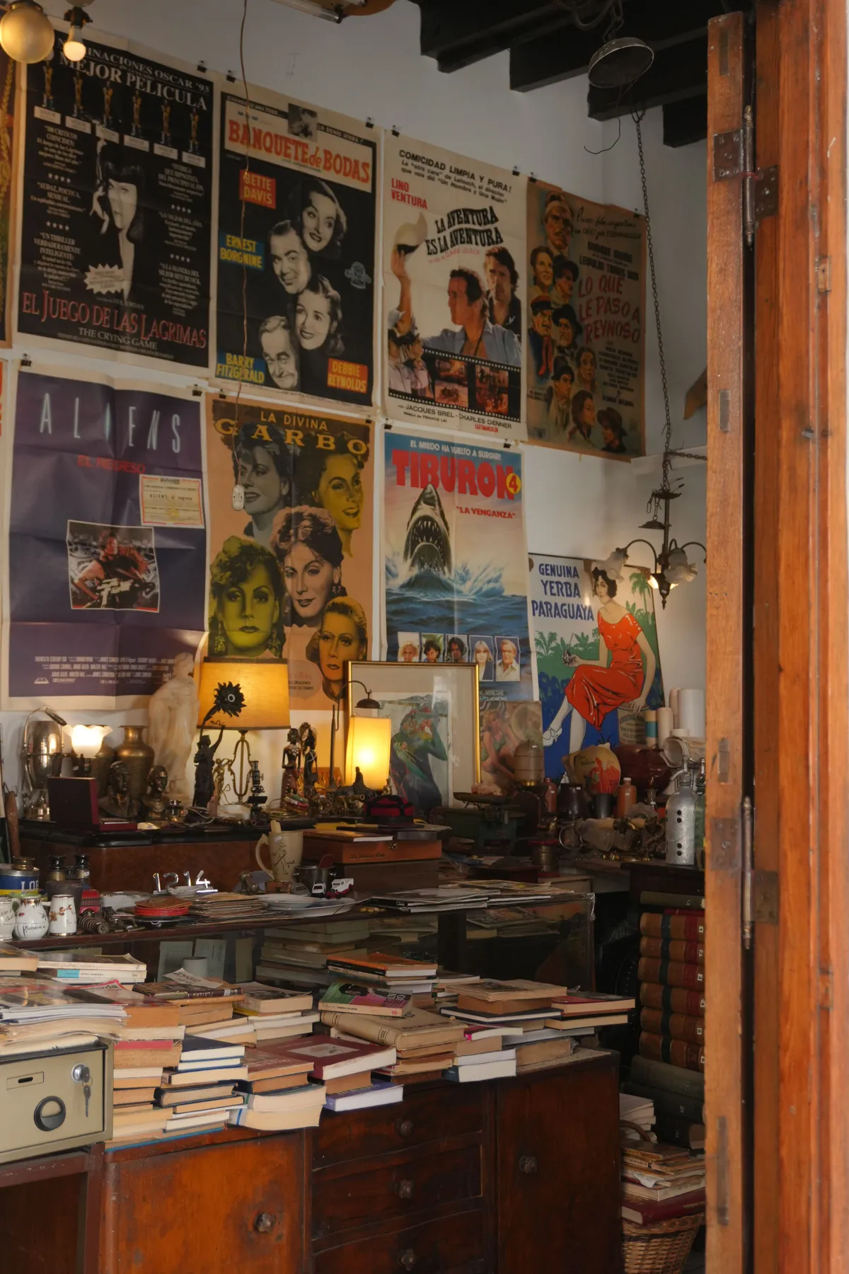
This works for the same reason a patterned wallpaper works: density and repetition. By covering the entire wall surface, the individual posters stop being individual objects and merge into a single, dynamic, textured surface. The sheer volume creates an undeniable impact that a few scattered posters never could. It’s a ‘go big or go home’ approach that turns a simple collection into a powerful architectural feature. The warm, cluttered desk in front adds to the feeling of a creative, lived-in space.
|
📋 Copy HEX 🔗 Share |
A wall like this is a maximalist’s dream, but it’s also a dust collector’s paradise. The tops of the posters, especially if they are layered, will gather dust. It’s not a surface you can easily wipe down. You’ll need to use a soft brush attachment on your vacuum cleaner or a feather duster regularly. Also, unless these are behind glass, they are highly susceptible to fading from any ambient UV light over time. This is a look that requires a certain acceptance of imperfection and the patina of age, very different from the pristine minimalism of Idea #12.
24. Energize Your Living Room with a Pink Pop Art Gallery Wall
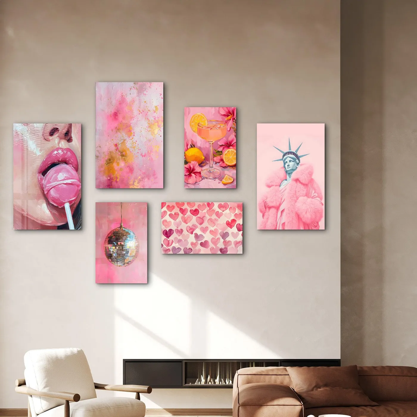
When you’re creating a gallery wall with prints of different styles, sizes, and orientations, having a unifying element is crucial to prevent it from looking like a chaotic mess. Here, the unifying element is the color pink. It appears in every single piece, even though the art styles range from photography to graphic text. This shared color palette is what ties the collection together and makes it feel curated and intentional. You can use this trick with any color to create a cohesive gallery wall from disparate prints.
|
📋 Copy HEX 🔗 Share |
A successful gallery wall is all about planning. Before you hammer a single nail, lay all your framed prints out on the floor. Arrange and rearrange them until you find a composition that feels balanced and dynamic. Take a photo with your phone to remember the layout. You can also trace each frame onto craft paper, cut them out, and tape the paper templates to the wall to visualize the final look. This extra 30 minutes of prep will save you a lot of frustration and unnecessary holes in the wall.
25. Add Artistic Flair with Abstract Playing Card Jester Art
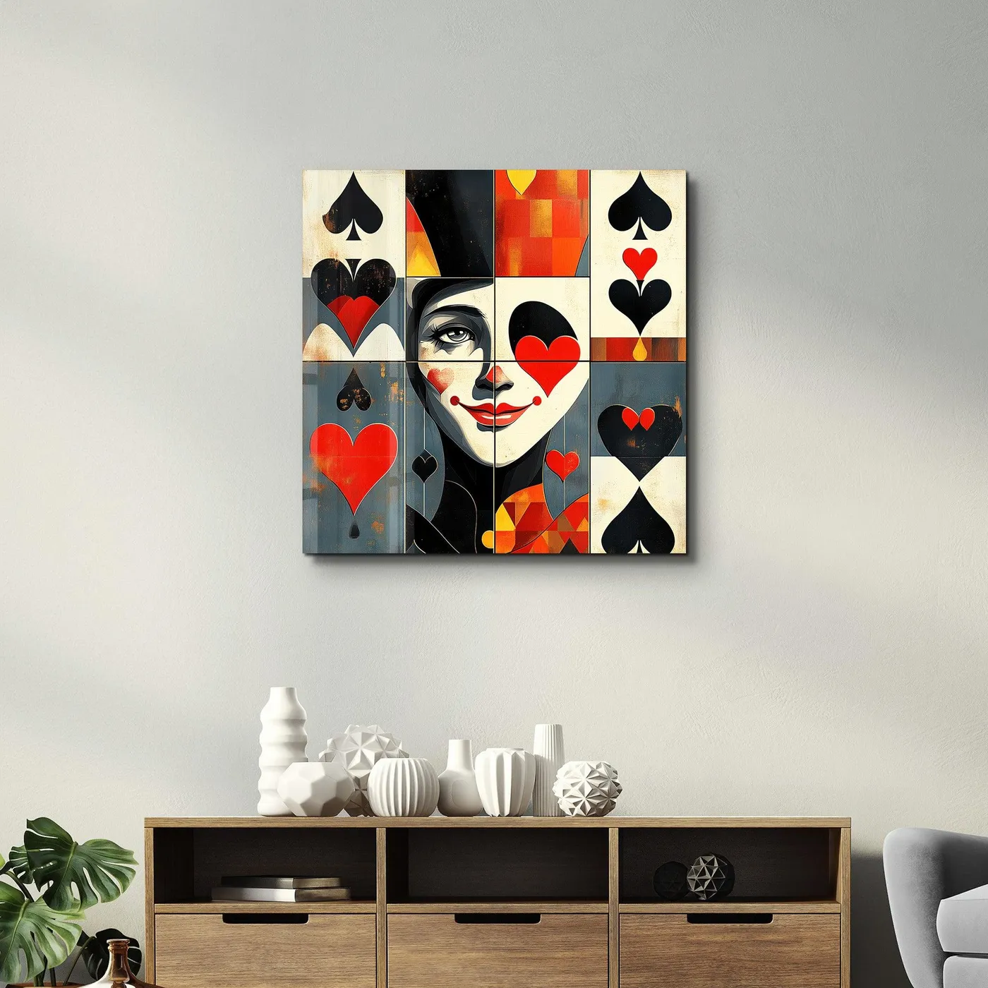
This piece of art is successful because it balances the familiar with the abstract. We instantly recognize the playing card suits—hearts and spades—but they’ve been deconstructed and reassembled into a new, artistic form. This clever abstraction engages the viewer, making us look closer to decipher the image. The large, bold scale also gives it a powerful presence in the room, turning it into a true statement piece rather than a passive decoration. It’s smart, playful, and visually commanding.
|
📋 Copy HEX 🔗 Share |
For a large, square statement piece like this to work over a console table, proportion is everything. The artwork should be at least half the width of the console, but not wider than the console itself. A good target is around 75% of the furniture’s width. This ensures the art feels anchored and substantial. For a standard 5-foot-wide console table (60 inches), you’d want a piece of art that’s around 45 inches wide. This creates a balanced, intentional relationship between the art and the furniture below it.
26. Decorate a Staircase Wall with a Trio of Band Posters
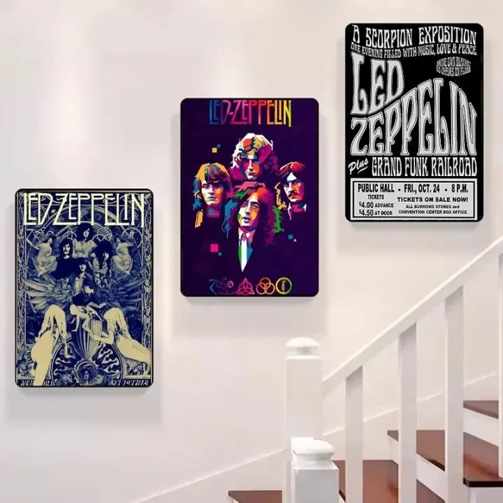
Hanging art along a staircase requires a slightly different approach than a flat wall. The key is to follow the angle of the stairs. A common method is to hang the frames so that their center points align with a diagonal line that runs parallel to the stair railing, about 60 inches above the stair treads. This ensures that as you walk up or down the stairs, the artwork remains at a comfortable eye level. Don’t hang them all at the same horizontal height—it will look strange and disconnected from the architecture.
|
📋 Copy HEX 🔗 Share |
You don’t have to hunt down rare, expensive vintage posters to get this look. There are countless online shops on Etsy and Society6 that specialize in high-quality reproductions of classic band posters and concert advertisements. You can often get a set of three prints for under $50. Pair them with simple, affordable black or wood frames from a craft store or IKEA, and you can create this entire musical gallery for less than $100. The vibe comes from the iconic imagery, not the price tag.
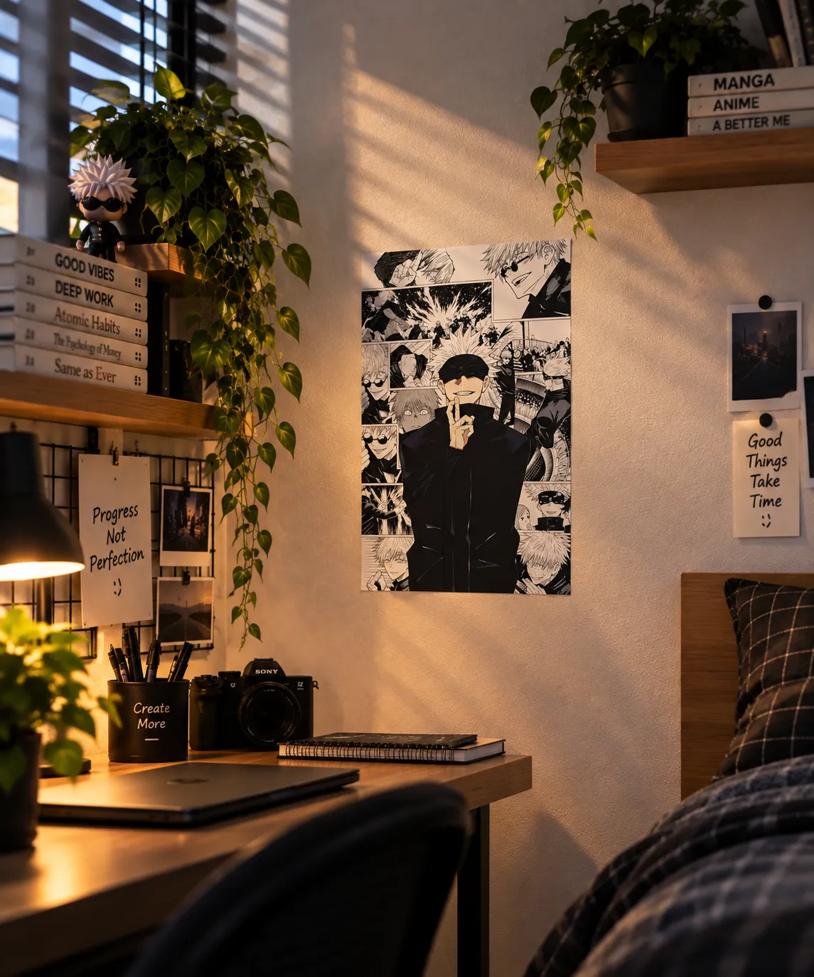
27. Create a Focal Point with a Large Monochrome Anime Poster
The single most impactful element in this scene isn’t the poster itself, but the dramatic lighting. The strong diagonal shadows cast by the window blinds slice across the wall and the artwork, adding a layer of texture, depth, and mood that wouldn’t exist in flat, even light. It makes the poster feel more integrated into the room and creates a dynamic, cinematic quality. This is a perfect reminder that how you light your art is just as important as the art you choose.
|
📋 Copy HEX 🔗 Share |
A large, densely detailed poster like this can be a fantastic focal point, but it’s not a great fit for every room. In a very small space, like a tiny home office or a narrow bedroom, it can feel visually overwhelming and make the room seem even smaller. The intricate black and white details can create a sense of visual noise if there isn’t enough negative space around it to let the eye rest. This kind of piece needs a bit of breathing room to be fully appreciated.
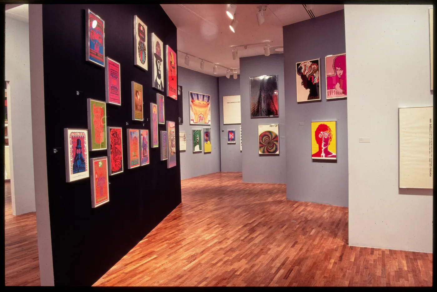
28. Mix Psychedelic and Pop Art for a Vibrant Gallery Display
This gallery’s formula is all about creating harmony from diversity. It’s about 50% bold, colorful artwork, 30% neutral backdrop (the light gray walls and wood floors), and 20% grounding black (the accent wall and some frames). The black wall is a genius move; it acts like a deep, rich canvas that makes the psychedelic colors of the posters pop with incredible intensity. The gray walls, in contrast, provide a calmer, more traditional gallery feel, offering a place for the eye to rest.
|
📋 Copy HEX 🔗 Share |
This space successfully mixes wildly different art styles—pop art, psychedelic, illustrative—without feeling chaotic. How? First, the use of consistent framing on the gray wall helps to unify the pieces. Second, the bold black wall creates a designated ‘zone’ for the most vibrant, dense collection of posters, containing their energy. It’s a lesson in ‘organized chaos,’ using architectural elements and framing to create a cohesive experience out of eclectic tastes, much like the grid system in Idea #5.
Your Walls Are Waiting for Their Story
As you can see, poster prints are one of the most versatile and personal ways to bring character to your home. Whether you go for a single, dramatic statement piece or a sprawling gallery wall that tells your life story, the key is to choose what you love. Don’t be afraid to mix styles, play with scale, and let your walls reflect who you are. Now, go find that perfect print and start telling your story. And don’t forget to save your favorite ideas to Pinterest so you can find them later!