
An IKEA kitchen is a blank canvas that invites big ideas. With the right layout, palette, and materials, these affordable cabinets can look custom and current. The goal is making the space feel intentional, not like a showroom.
This article walks through 19 kitchens that prove the point. From teal cabinets to marble islands, each look focuses on what works: scale, light, storage, and contrast. Expect practical takes on color, hardware, and open shelving that you can apply to your own remodel.
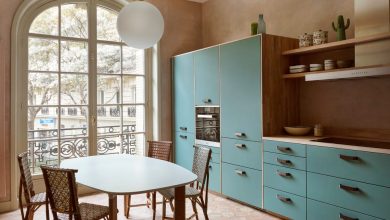
Vibrant Teal IKEA Cabinets: Layout and Flow
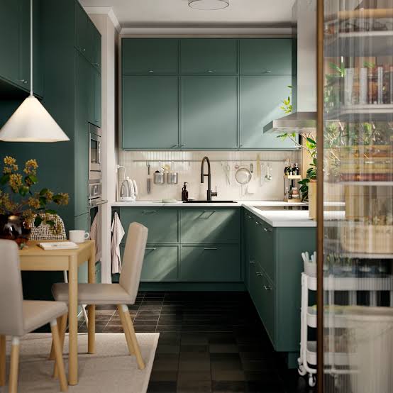
In a roomy galley kitchen with a dining area, the teal cabinets become the main event without overwhelming the space. A single pendant light keeps the look open. The white countertops and wood dining table stop the vibrant teal from feeling heavy. A glass-front cabinet breaks up the solid color and adds a visual pause. The layout works because the bold cabinetry is concentrated on one side, letting the dining area feel separate and calm.
Blue Open Shelf Accent: Palette and Styling
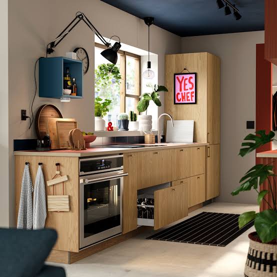
This compact galley kitchen proves that a single accent color can define the whole room. Light wood IKEA cabinets and white walls keep the base neutral, while a blue open shelving unit pulls focus. The black pendant light adds contrast without competing. The palette works because the blue is contained to the shelving and a few accessories, not splashed across every surface. A white countertop and backsplash keep the look clean. Choose one color and let it live on open shelves or a single cabinet run. The ratio is about 70 percent neutral to 30 percent accent.
Scandinavian Brightness: Materials and Light
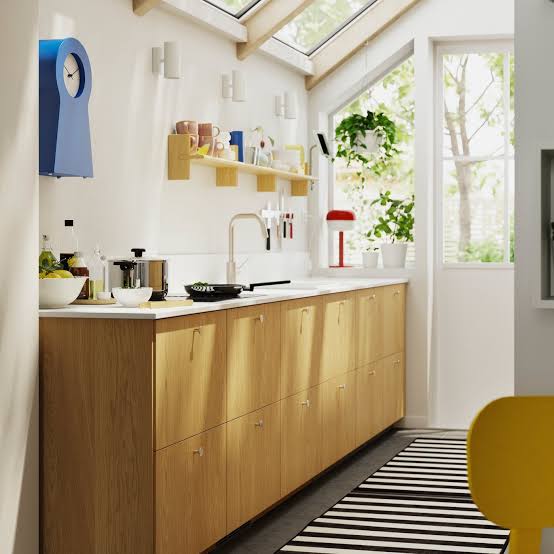
How do you make a long kitchen feel bright without a wall of windows? This modern Scandi kitchen uses a skylight and a single window to spread natural light evenly across a long linear cabinet run. The light wood cabinets and white tile backsplash reflect that light, making the room feel wider than it is. A blue clock on the wall adds a small color pop without breaking the calm. The open shelves above the counter keep the eye moving horizontally, which suits the long layout.
Materials here create the look. The wood cabinets bring warmth, the laminate countertops keep upkeep simple, and the matte finishes avoid glare under the skylight. The space stays bright and uncluttered.
Handleless Wood Veneer: Scale and Proportion
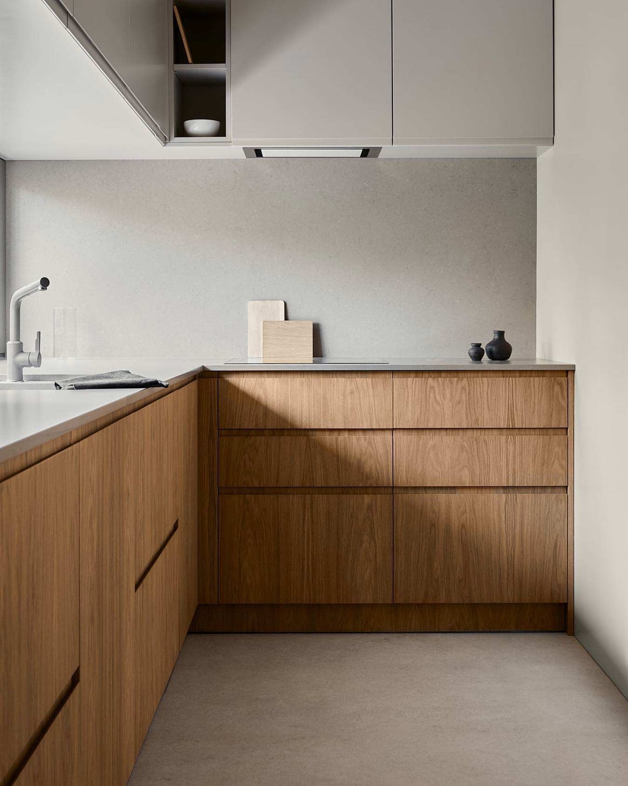
A roomy linear kitchen with handleless wood veneer cabinets reads as a single, continuous surface. The warm wood tones are balanced by a gray stone countertop and matte white laminate on the upper cabinets. Integrated appliances keep the proportions clean, so the eye follows the counter line without interruption. Soft ambient light from above prevents the wood from feeling dark. The key is the ratio: one continuous material for the lower cabinets anchors the room, while the lighter upper section keeps it from closing in.
Drawer Organization: Storage Solutions
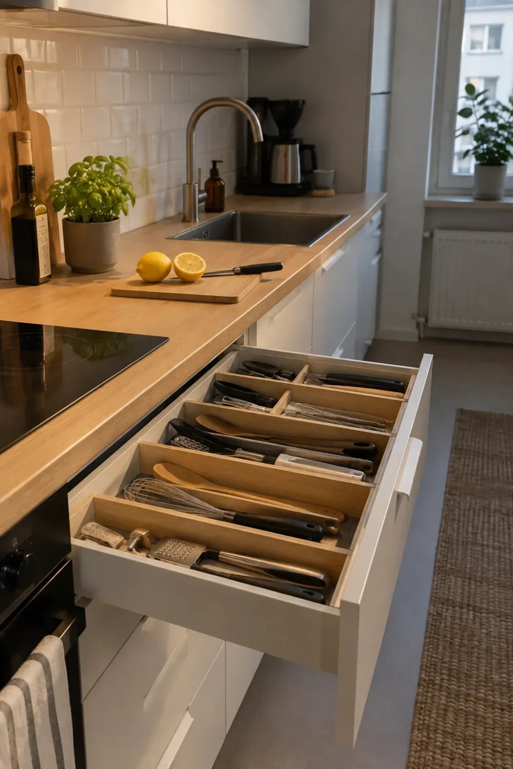
Divide before you stack in kitchen drawers. In this organized drawer, wooden dividers keep utensils, spatulas, and gadgets in separate lanes so nothing gets buried. The white cabinets and wood countertop above stay clean because the mess is contained inside. A deep drawer like this works best when you use vertical dividers for baking sheets or cutting boards. The layout is galley, so every inch counts. Natural light makes the organized interior easy to see. For renters, drawer dividers are a low-commitment swap that changes how the kitchen lives without touching cabinets or counters.
White Cabinets and Wood Island: Style Variation
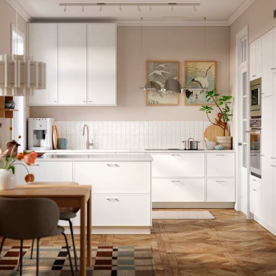
White uppers and a wood island create a cleaner line than an all-wood kitchen. Here the white cabinets keep the galley open, while the warm wood floor and island bring back the natural tone. A simple pendant light and a dining table in matching wood tie the two sides together. The look reads as intentional without being fussy.
Organized Open Shelving: Styling Variation
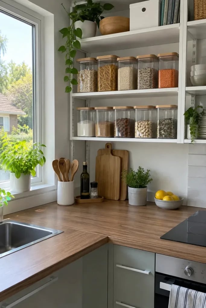
Glass jars lined up on open shelves turn everyday storage into a display. The wood countertop and potted plants soften the white and glass. Daylight keeps the compact corner open. For renters, peel-and-stick contact paper on the shelf surface can match the wood tone without permanent changes.
Fluted Glass Cabinets: Materials and Visual Interest
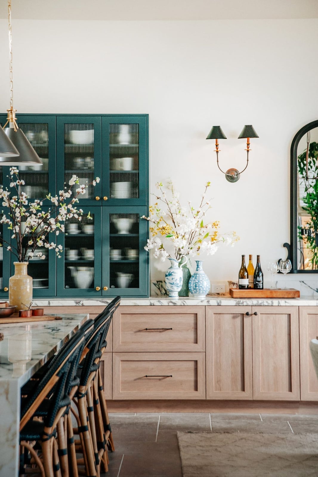
Teal fluted glass cabinets add texture without adding clutter. The ribbed glass catches light differently than flat panels, so the upper cabinets feel lively even when closed. Wood base cabinets and a marble island ground the color. The palette works because the teal is the only saturated shade; the wood and stone stay neutral.
Geometric Pink Tile Backsplash: Palette and Impact
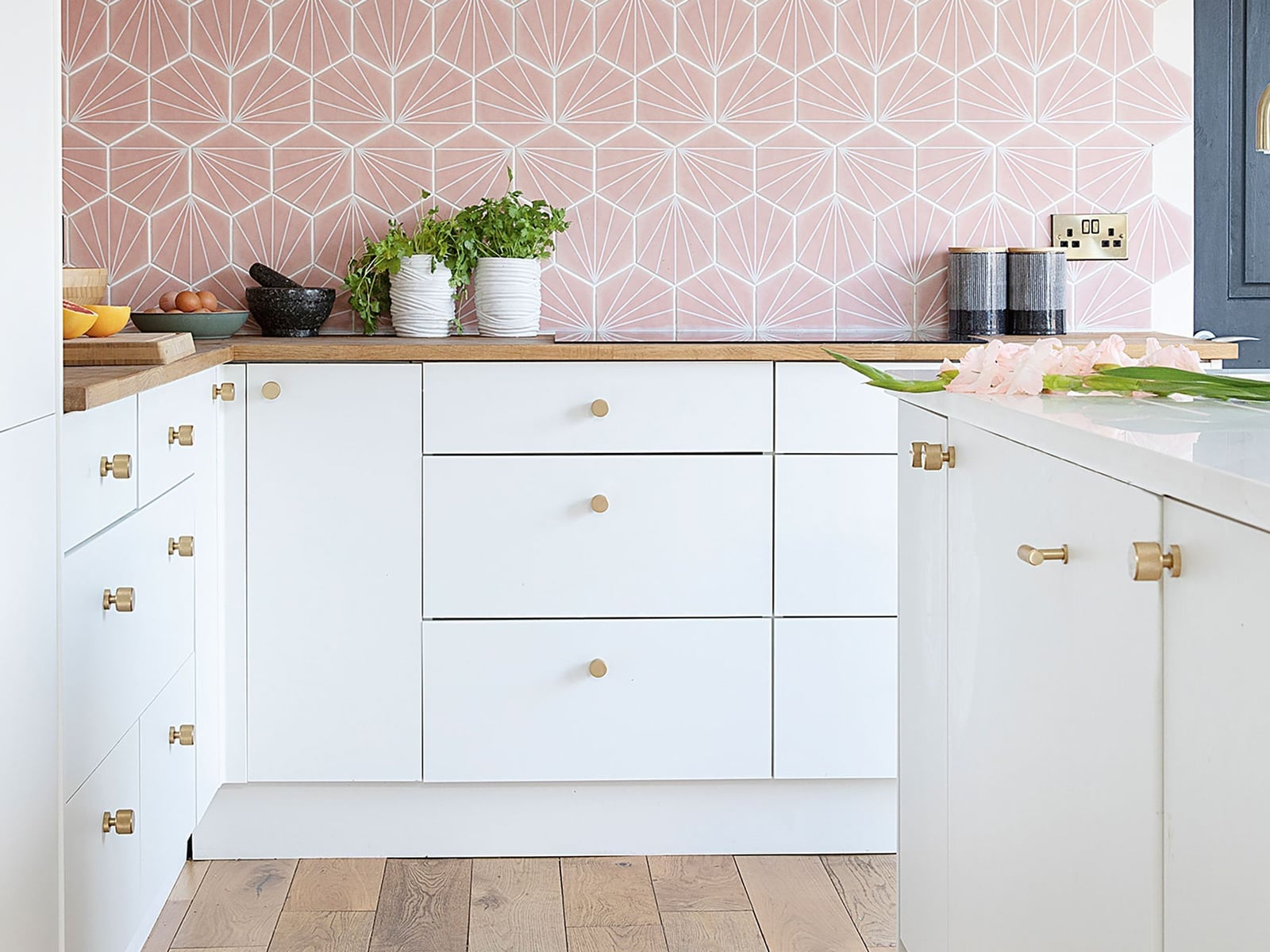
Can a pink backsplash feel neutral? This one does. The geometric tile in pale pink sits between white cabinets and a wood countertop, so it reads as a warm accent rather than a bright one. Brass hardware adds a subtle gold line that picks up the tile’s undertone. The pattern keeps the eye moving, which helps a roomy kitchen feel connected rather than spread out.
Chevron Backsplash: Materials and Texture
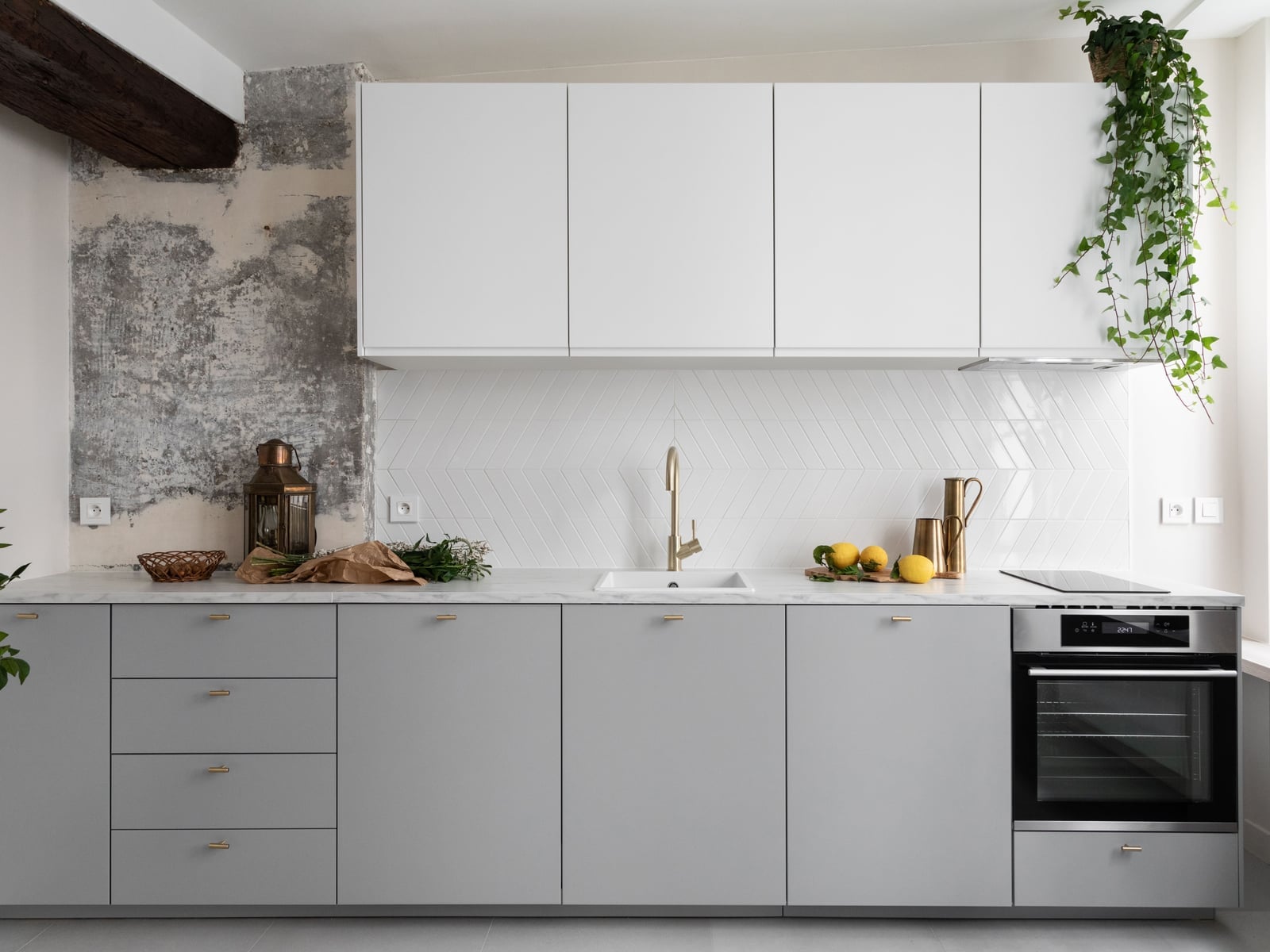
A chevron tile backsplash repeats the same V pattern across the wall, which draws the eye along the counter. Gray laminate cabinets and brass hardware keep the look Scandi: clean but not cold. The overhead track light hits the tile’s surface, so the pattern shifts throughout the day. That movement is what keeps a neutral palette from falling flat.
Sage Green Cabinetry and Island: Scale and Proportion
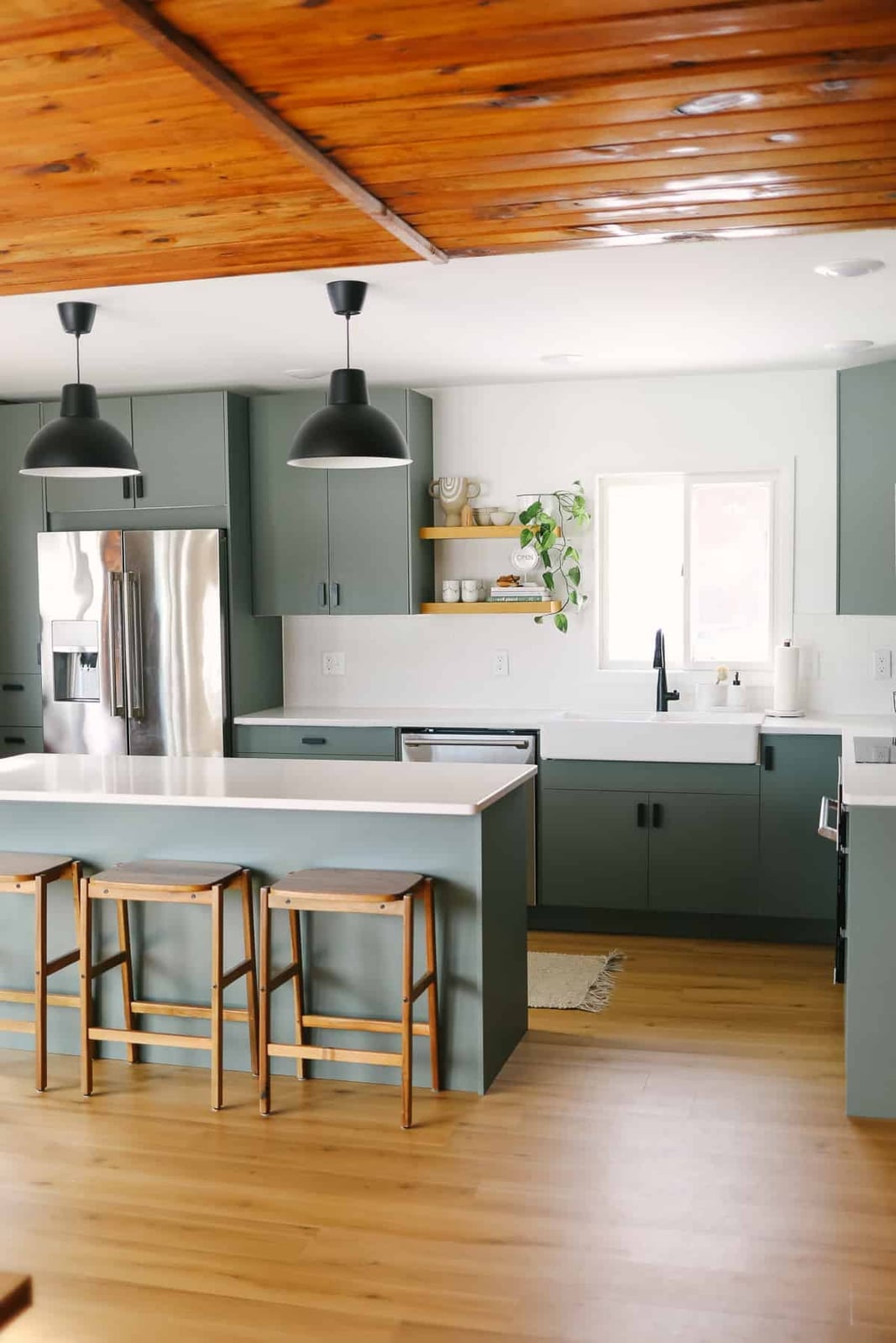
A large island needs enough clearance around it for traffic to flow, and this open plan kitchen gives the sage green cabinetry room to breathe. The island anchors the space without blocking the path between the range and the sink. White quartz counters and wood flooring keep the look light, while pendant lights above define the island as its own zone. The farmhouse sink ties the green cabinets to a classic feel without making the room fussy.
Sage Green Cabinets with Gold Hardware: Styling Variation
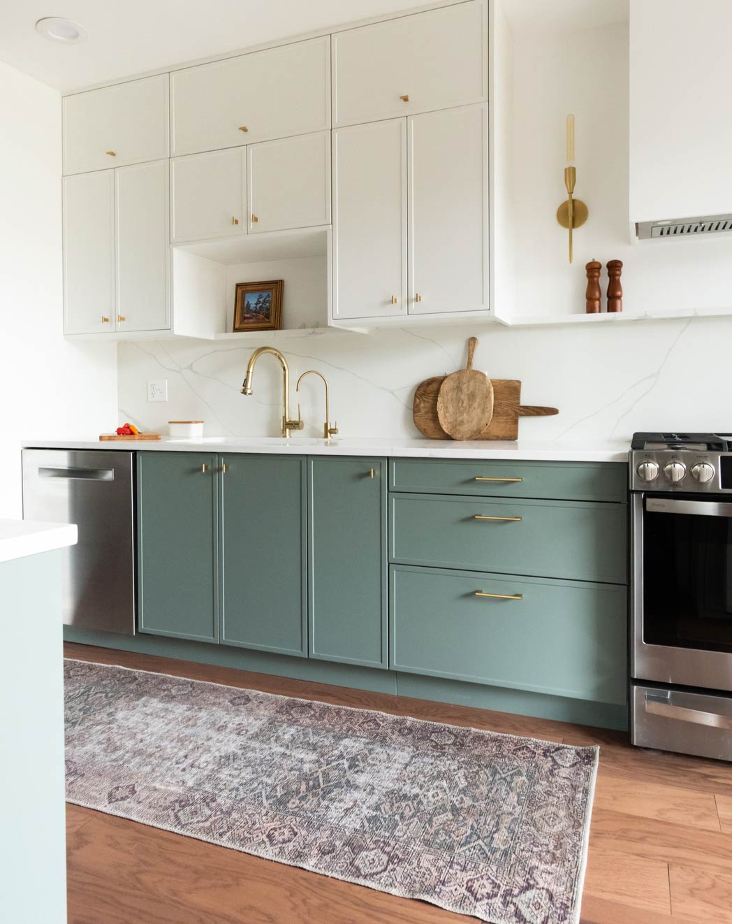
Sage green cabinets often lean toward a soft, rustic look, but swapping the hardware changes the whole feel. Here, gold pulls and knobs add warmth without making the kitchen feel traditional. The marble backsplash keeps the palette clean, and a patterned rug under the island breaks up the hard surfaces.
The trick is balance: the gold hardware stands out because the kitchen stays neutral. White walls and wood tones let the cabinet color and metal finish do the work. The rug adds a layer of pattern without competing with the marble, so the kitchen looks collected and not busy.
Deep Green Lower Cabinets: Palette and Contrast
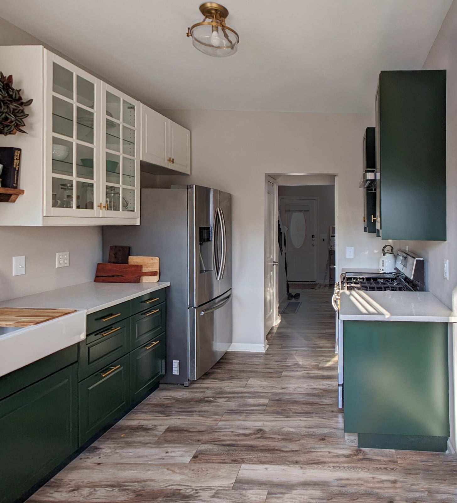
The dark green lower cabinets sit against white uppers, creating a clear visual weight that grounds the kitchen. Stainless steel appliances and quartz counters keep the contrast sharp without adding another color. The layout works because the darker shade stays below eye level, so the room feels balanced rather than heavy.
Light Green Cabinets and Wood Countertop: Materials
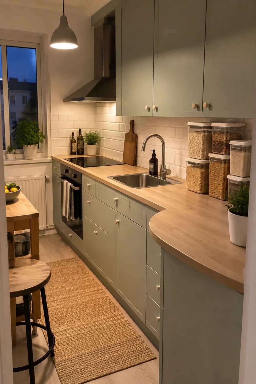
This galley kitchen pairs light green cabinets with a wooden countertop, which softens the compact layout. The wood adds warmth, and the white subway tile backsplash reflects light from the window. The combination works best when the wood tone is warm enough to contrast with the green but not so dark that it shrinks the space.
Dark Gray Cabinets and Plants: Styling Variation
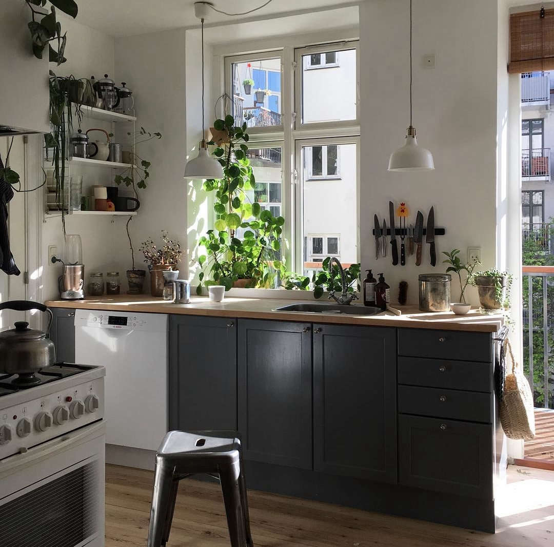
A compact galley kitchen benefits from a single dark element, and dark gray cabinets create a strong backdrop without closing in the room. The white walls and wood floor keep the space from feeling too serious, and the plants add life on the counter and windowsill.
Pendant lights above the counter provide focused task light, and the window brings in daylight that keeps the gray from looking flat. The plants break up the straight lines of the cabinets and add a soft, organic shape that the dark finish needs to feel inviting.
Contrasting Cabinetry: Palette and Design
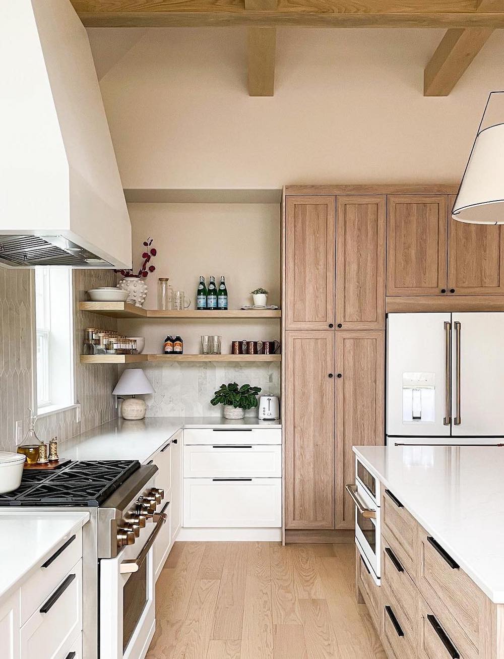
In a roomy galley kitchen with an island, pairing wood cabinets with a white island creates a clear division of roles. The wood brings warmth, while the white island keeps the layout from feeling heavy. A black stainless steel range anchors the cook zone. This palette works because the contrast is intentional: one warm surface, one light surface, and dark accents to ground it. Pendant lights above the island add focused task light. The resulting modern farmhouse kitchen wood white cabinets setup is a practical balance of texture and tone.
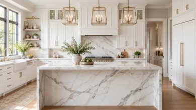
Marble Island and Range Hood: Materials and Luxury
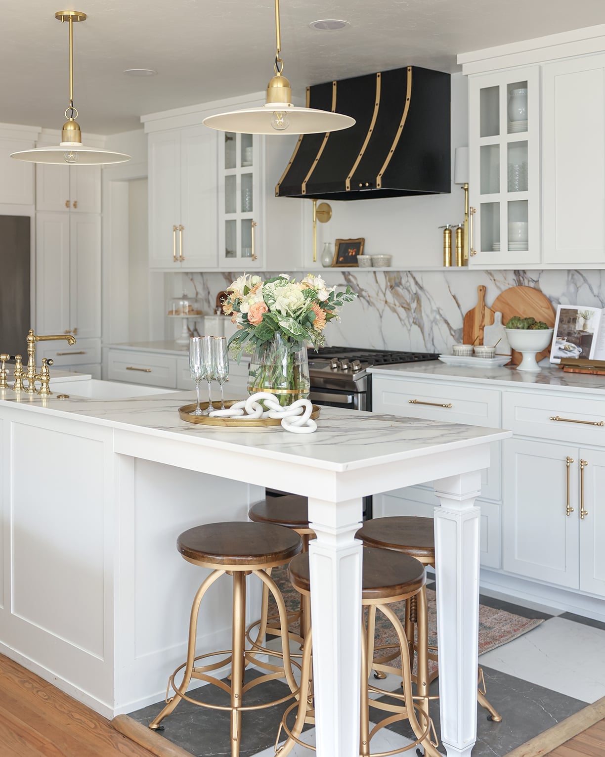
A good rule when adding a statement piece to a kitchen is to let one element lead and keep the rest simple. In this roomy transitional kitchen, the marble island with a waterfall edge is the clear centerpiece. Brass stools add a warm metallic note. The ornate black and gold range hood echoes the brass accents and draws the eye upward. The contrast between the dark hood and the pale marble is softened by natural light. To recreate the look, a marble-look laminate island top and a peel-and-stick tile back splash can mimic the same transitional kitchen marble island range hood feel without permanent changes.
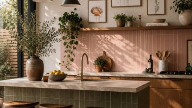
Blush Pink Tile Backsplash: Palette and Accent
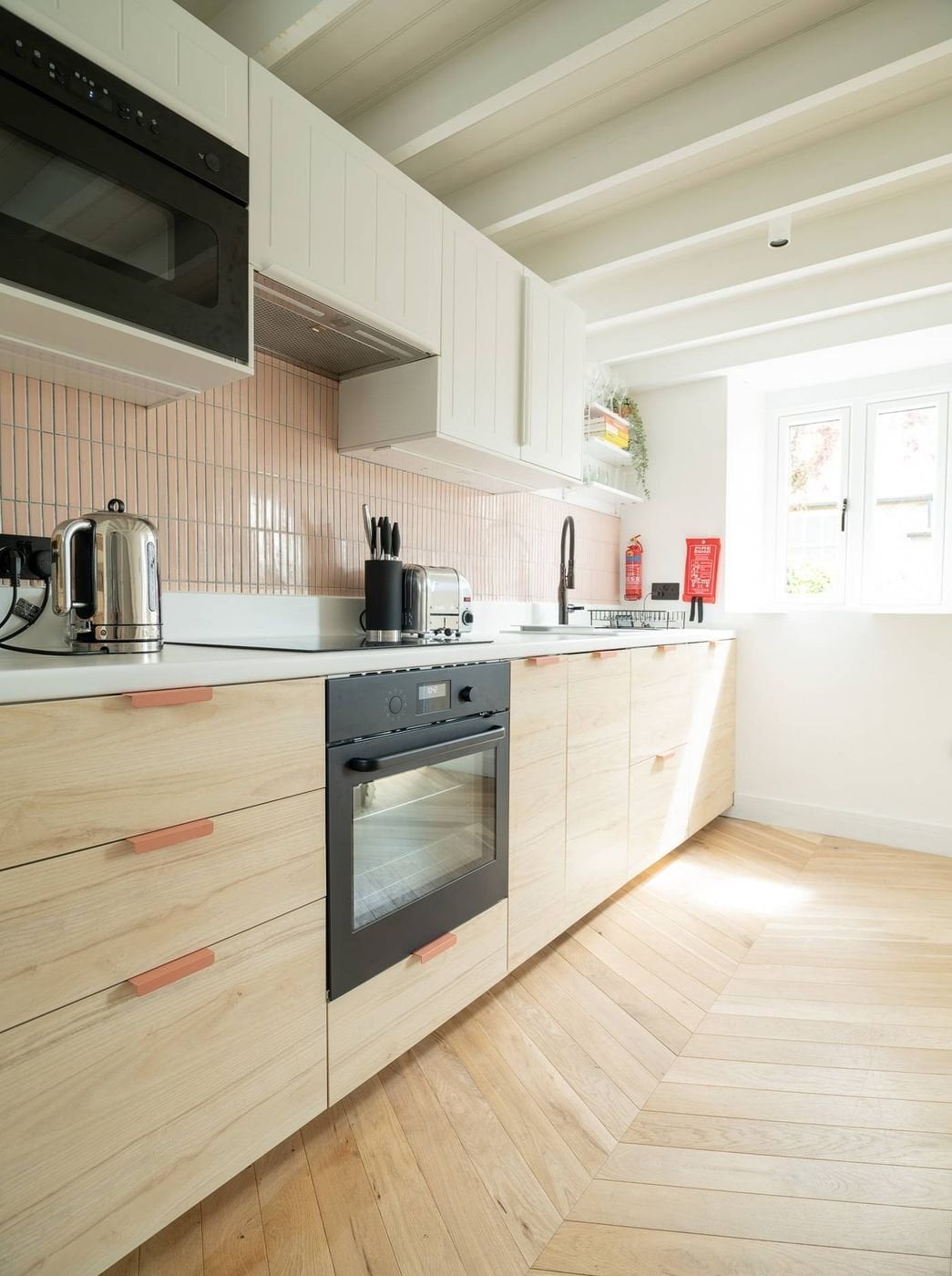
A blush pink backsplash can feel risky, but against light wood cabinets and a white quartz countertop, it becomes a soft accent. In this compact linear kitchen, the vertical pink tile runs from counter to upper cabinet, drawing the eye up and making the space feel taller. A black oven breaks the pale palette and gives the room a grounded focal point. Natural daylight keeps the pink from feeling too warm.
Pink zellige or subway tile in a soft blush tone offers the same color payoff. The key is keeping the surrounding surfaces neutral. Light wood cabinets and white quartz let the blush pink tile backsplash modern kitchen approach work without overwhelming the room.
Gray Cabinets and Marble Island: Scale and Balance
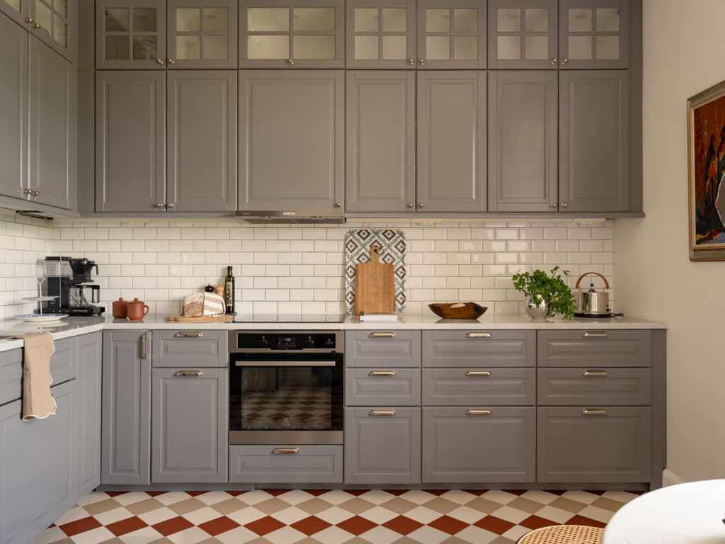
Gray cabinets can feel flat without a contrasting element, but in this roomy kitchen, the white marble island adds the necessary visual lift. Integrated appliances keep the run of cabinetry clean and uninterrupted. Recessed lighting provides even illumination, while natural light from the window adds warmth to the cool gray tone. The layout works because the island is large enough to balance the mass of the full wall of gray cabinets. For a similar approach, choose a gray IKEA kitchen cabinets marble island combination where the island is at least two feet shorter than the main cabinet run to maintain proportion.
Final Thoughts
An IKEA kitchen works best when you treat it as a system, not a single look. The layouts here show that color, material, and hardware choices define the character more than the cabinet doors themselves. Teal, sage, white, or gray each bring a different mood, but they share a respect for proportion and function.
Upkeep matters: wipe wood veneer gently, seal natural stone counters annually, and check drawer slides for alignment after a year. Open shelving needs regular dusting, and plants should be chosen for your light level and USDA zone. The real takeaway is that a well-planned IKEA kitchen can live as long as any custom build when you prioritize layout and materials over trends.