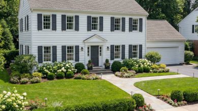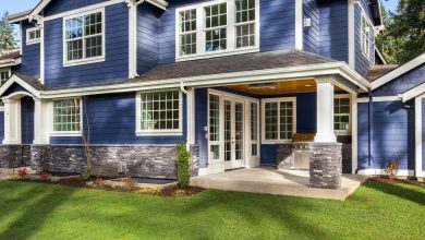

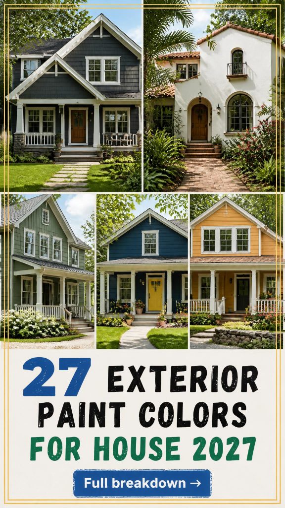
You know that feeling when you finally find the exterior paint color that looks exactly right for your house? That Pinterest-perfect curb appeal that makes you smile every time you pull into the driveway. We get it, and we’re here to help you get there. After filtering through hundreds of options and emerging trends, we narrowed it down to 27 ideas that actually deliver stunning results. This isn’t just a gallery of pretty pictures; we’re diving into the details of modern, traditional, and coastal styles that are defining home exteriors for 2027. We’re seeing a huge shift towards colors that feel both personal and timeless, moving away from the fleeting trends of the past few years. And stay until the end—we break down the most common mistakes that can ruin these looks. 📌 Save this to Pinterest for later—you’ll want to revisit these ideas.
1. Warm Peach Stucco with a Terracotta Roof
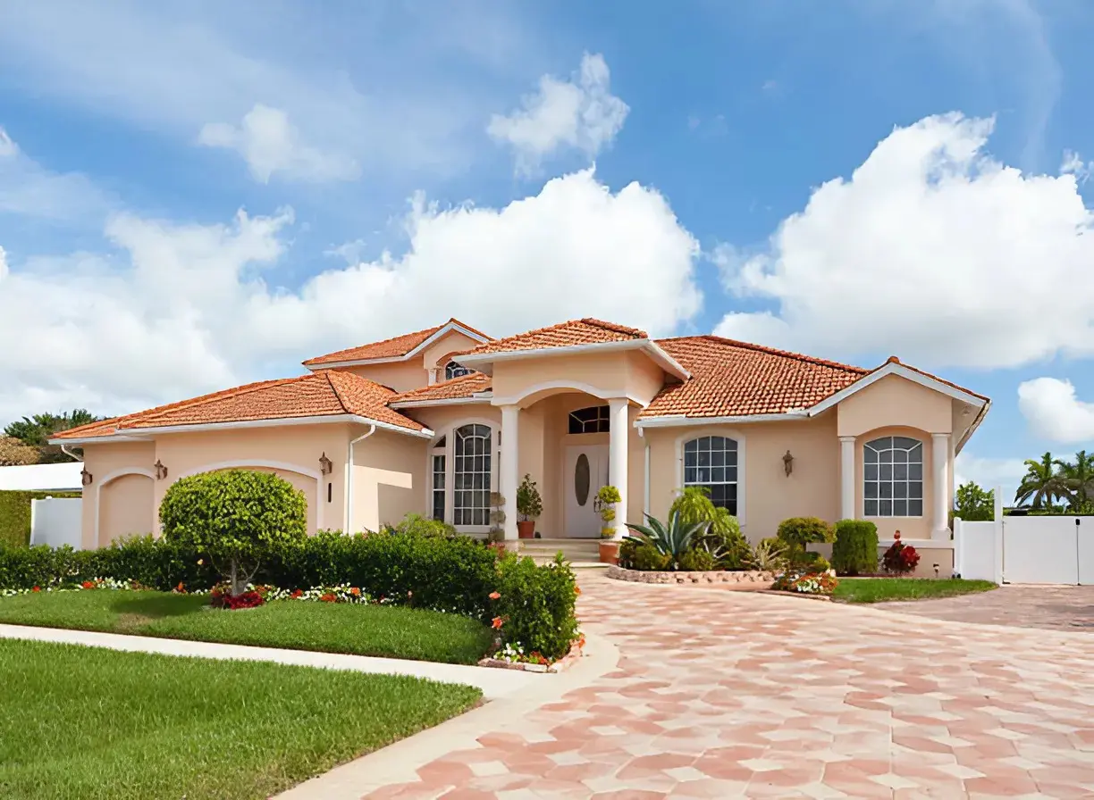
This combination is a masterclass in tonal harmony. The peach/coral stucco works because it shares the same warm, earthy undertones as the terracotta roof tiles and coral pavers. This creates a cohesive, monochromatic-adjacent look that feels intentional and luxurious. The crisp white of the columns and window grids provides just enough contrast to keep the warmth from feeling overwhelming, adding a clean, architectural definition. Finally, the lush green landscaping introduces a complementary color that makes the entire warm palette pop.
|
📋 Copy HEX 🔗 Share |
Earthy, sun-baked tones are making a huge comeback as we move away from cooler grays. This Mediterranean-inspired look taps into a collective desire for warmth, travel, and homes that feel like a permanent vacation. It’s a sophisticated evolution of the terracotta and clay trend we’ve seen indoors, now confidently applied to exteriors. This palette suggests permanence and a connection to natural materials, which feels right for right now. It’s a timeless look that will age gracefully, unlike some more fleeting color trends.
2. Classic White Brick with Bold Charcoal and Wood Accents
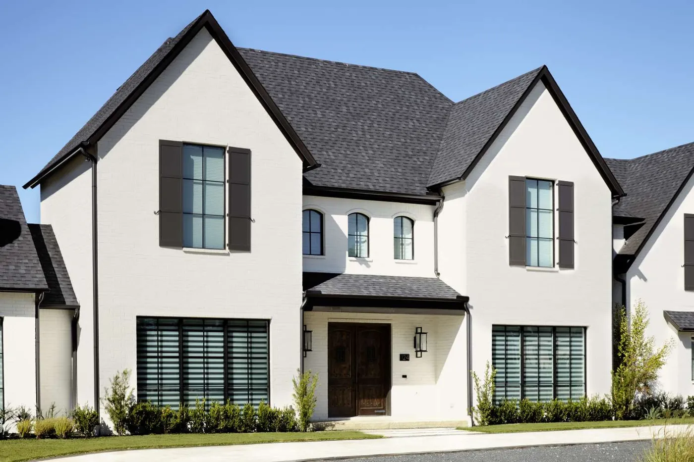
Think of this classic look as a simple but powerful formula: 70% crisp white brick + 20% deep charcoal/black + 10% warm wood. The white brick serves as a bright, textured canvas. The charcoal elements—seen here on the roof, shutters, and window frames—create strong, graphic lines that give the home a modern edge and a sense of structure. The final 10% is the warm wood of the double entry door, which prevents the high-contrast palette from feeling cold and adds a necessary touch of organic warmth and welcome.
|
📋 Copy HEX 🔗 Share |
When painting brick, surface preparation is everything. Don’t skip the pressure wash to remove all dirt and efflorescence (that chalky white powder). Then, apply a high-quality masonry primer specifically designed for brick. This ensures the paint adheres properly and prevents moisture from getting trapped, which can cause peeling and long-term damage to the brick itself. For a timeless finish, choose a mineral-based or silicate paint, which bonds with the brick for a more durable, breathable coating than standard acrylic latex.
3. Timeless White Brick with a Statement Dark Wood Door
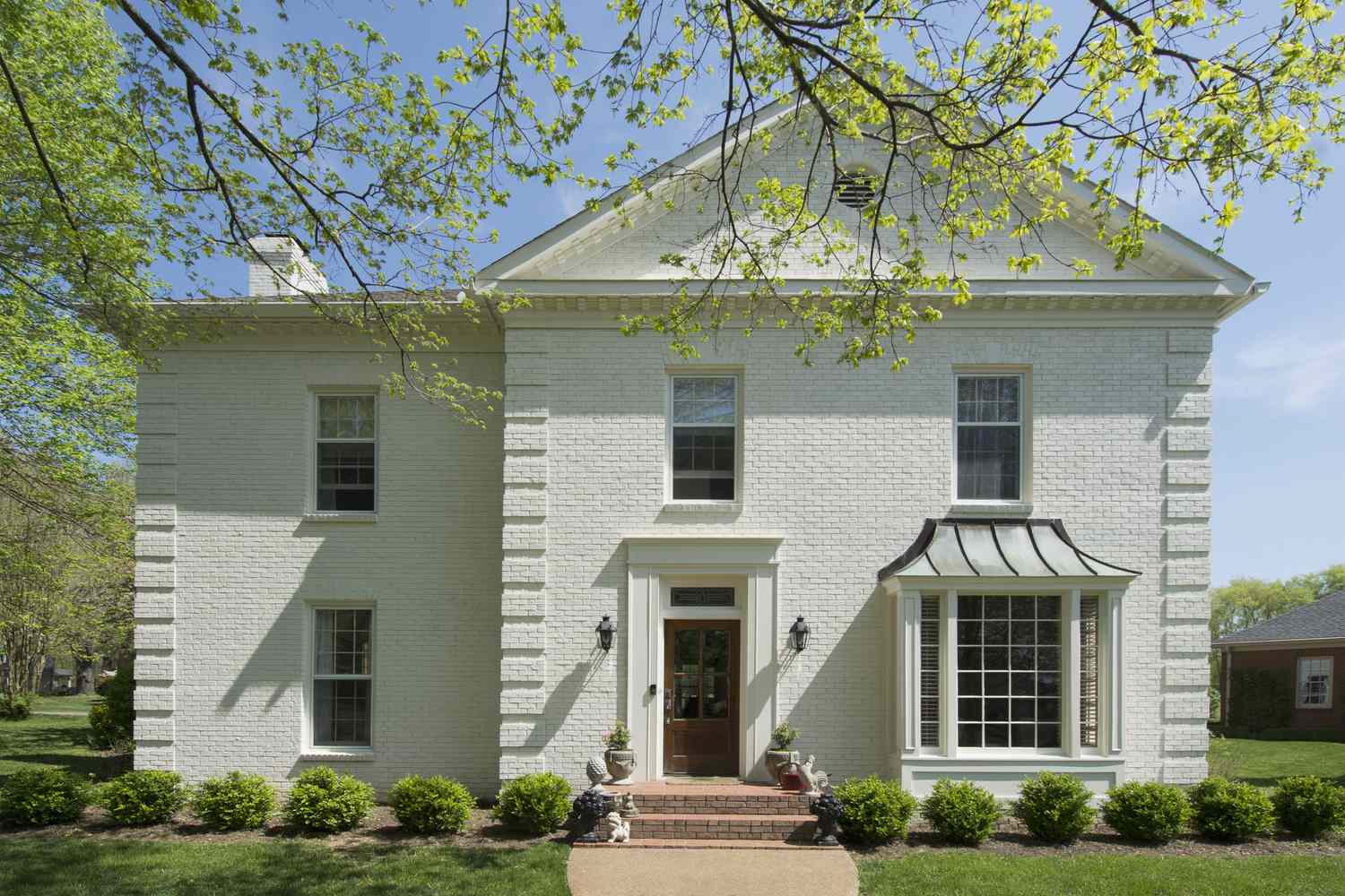
The single element that anchors this entire design is the dark wood front door. Without it, the house would still be lovely, but it would lack a focal point and feel much more monolithic. The rich, dark stain of the wood provides a necessary organic texture and warmth that breaks up the expanse of painted white brick. It acts as a visual invitation, drawing your eye directly to the entrance and signaling a warm, welcoming interior. It’s the detail that elevates the entire facade from simply ‘nice’ to ‘stately’. Compare this to the similar palette in Idea #2, which uses black for a sharper contrast.
|
📋 Copy HEX 🔗 Share |
Maintaining a pristine white brick exterior is a commitment. It will show dirt, pollen, and mildew more readily than a darker color, especially in shady or damp climates. Plan for a gentle pressure washing every 2-3 years to keep it looking fresh. Also, be mindful of ‘brick staining’ from runoff from metal elements like the bay window awning. Over time, rust or mineral deposits can leave streaks that are difficult to remove without professional cleaning. It’s a high-impact look, but it’s definitely not low-maintenance.
4. Modern Red Brick Paired with Expansive Black-Framed Windows
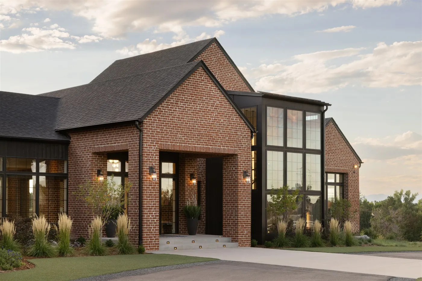
The success of this design lies in its bold use of contrast and material honesty. The traditional, textured red brick provides a sense of history and permanence, while the clean, sharp lines of the black window frames and trim feel distinctly modern. This juxtaposition works because it doesn’t try to hide either element. The huge glass panels are a confident, contemporary statement, and letting them dominate a section of the facade creates a powerful visual dialogue between solid and void, classic and new. The integrated lighting adds another layer, highlighting the texture of the brick at night.
|
📋 Copy HEX 🔗 Share |
You don’t need custom floor-to-ceiling windows to get this vibe. A similar high-contrast look can be achieved on a tighter budget. Start with your existing brick. Instead of replacing windows, paint your existing window frames and trim a dramatic matte black (like Sherwin-Williams Tricorn Black). A gallon of high-quality exterior trim paint runs about $70-$90. Then, update your exterior lighting with modern black sconces from a big-box store for around $50-$150 each. The key is committing to the bold black accents against the warm brick.
5. Dark Grey Siding with a Welcoming Light Blue Front Door
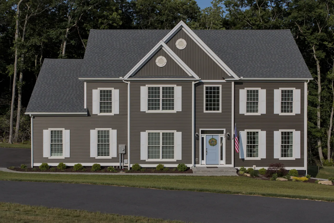
It’s all about the light blue front door. On a house with a reserved, classic palette of dark grey and crisp white, the door is a surprising and delightful injection of personality. It prevents the exterior from feeling too severe or formal. The soft, powdery blue is just saturated enough to stand out without being jarring. It acts as a friendly ‘hello’ and a focal point that breaks the symmetry of the facade. Remove it, and the house is perfectly nice; with it, the house has character and charm.
|
📋 Copy HEX 🔗 Share |
This classic color scheme works beautifully on a wide range of homes, but it’s particularly effective on two-story suburban houses from 1,800 to 3,500 square feet. The dark grey siding gives the structure a sense of substance and weight, while the bright white trim keeps it from looking too heavy or oppressive. For smaller, single-story homes, consider a slightly lighter shade of grey to prevent the house from appearing smaller than it is. The key is having enough trim and window details to provide that essential white contrast.
6. Coastal Cool: Medium Blue Siding with a Natural Wood Porch
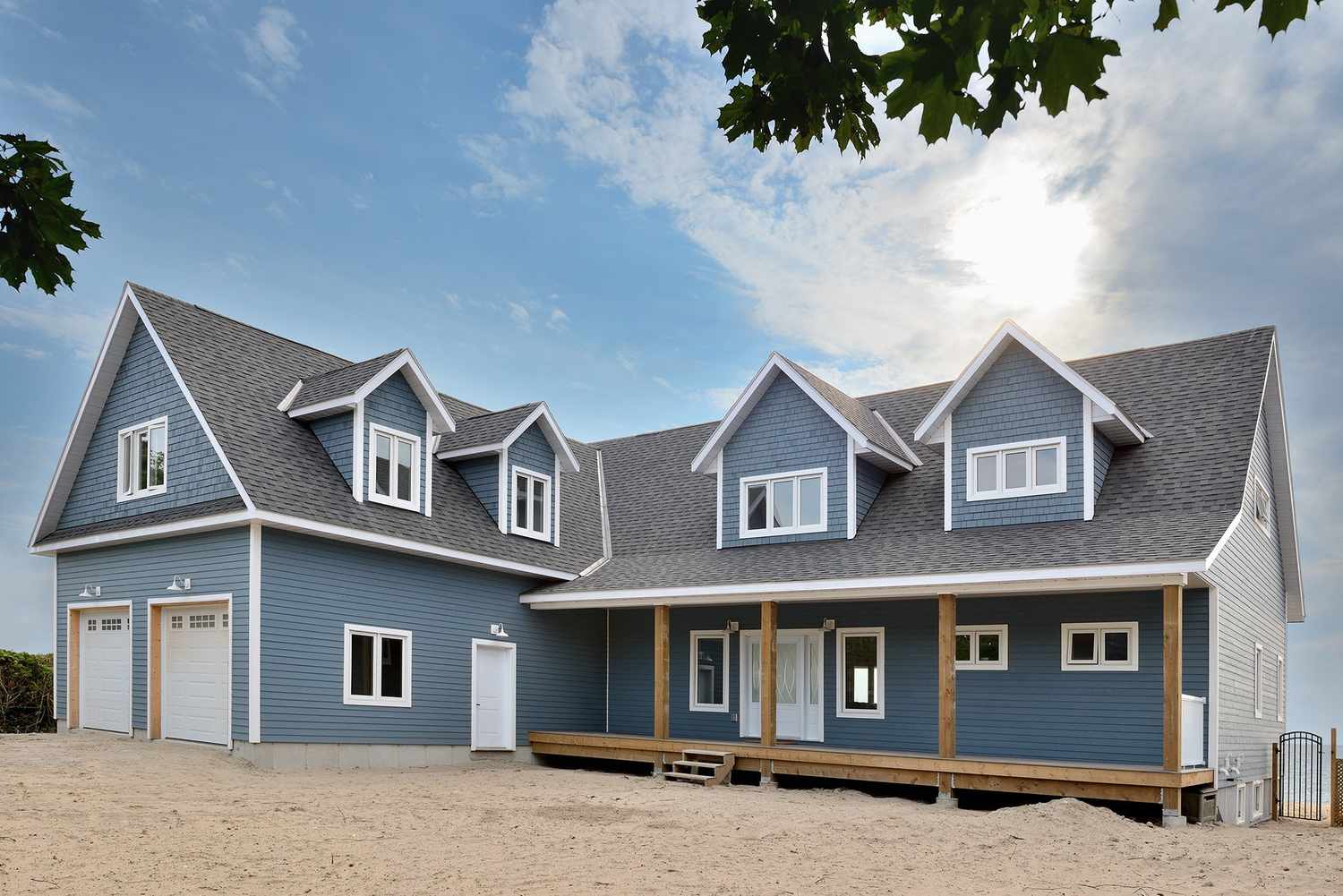
When mixing siding styles like the horizontal planks and shingles seen here, the key is to keep them in the exact same color. Using one unified blue prevents the different textures from looking busy or disjointed. This technique adds architectural interest and texture without introducing a new color, making the house feel thoughtfully designed. Always order all your siding from the same batch to ensure a perfect color match, as dye lots can vary slightly. It’s a subtle pro move that makes a huge difference.
|
📋 Copy HEX 🔗 Share |
A natural wood porch is gorgeous, but it requires regular upkeep to stay that way, especially in a coastal or humid environment. To prevent graying, rot, and splintering, you’ll need to clean and reseal it every 1-2 years. The annual cost for professional resealing can be $300-$700 depending on the size, or you can DIY for the cost of sealant and a weekend of work. If that sounds like too much, consider a composite decking material in a realistic wood tone. It offers a similar look with a fraction of the maintenance.
7. Suburban Classic: Taupe Siding with Cream Trim and Dark Shutters
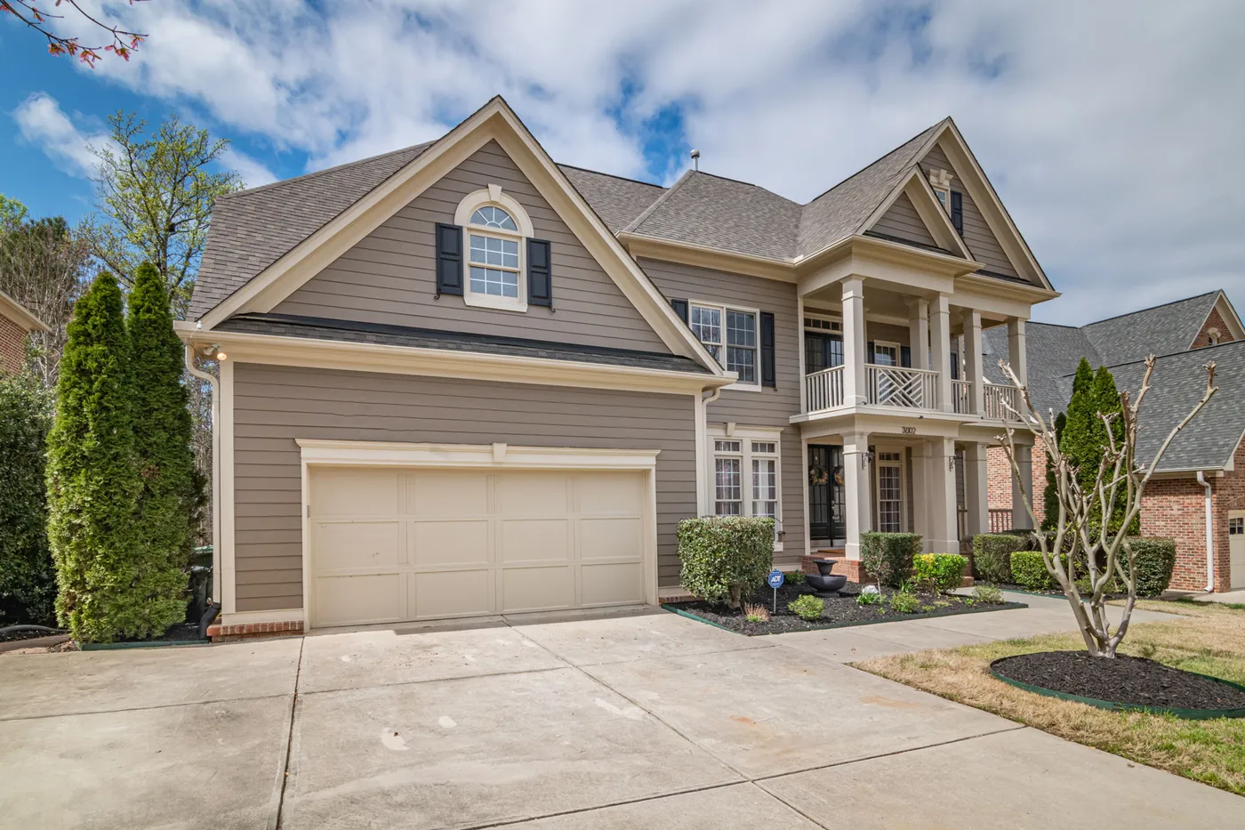
This timeless look follows a tried-and-true formula: 60% mid-tone neutral siding (the taupe) + 30% creamy off-white (the trim, columns, and garage) + 10% dark accent (the shutters). This ratio is so successful because it’s balanced and easy on the eyes. The taupe provides warmth, the cream adds brightness and definition, and the dark shutters ground the scheme and add a touch of classic formality. You could easily swap the taupe for a muted green or a warm gray and keep the rest of the formula for a similarly classic but personalized result.
|
📋 Copy HEX 🔗 Share |
Before you commit to a three-color scheme, check these boxes to make sure it will work for your home’s architecture.
- Architectural Features: Does your house have distinct elements like shutters, columns, and wide trim that can carry the different colors without looking cluttered?
- Roof Color: Confirm your roof color is a neutral gray or black. A brown, green, or red roof will clash with this specific taupe and cream palette.
- Sample in All Lights: Get large paint samples and check them in morning, noon, and evening light. Taupe can look dramatically different depending on the sun’s position.
8. New England Elegance: White Clapboard and Dark Green Shutters
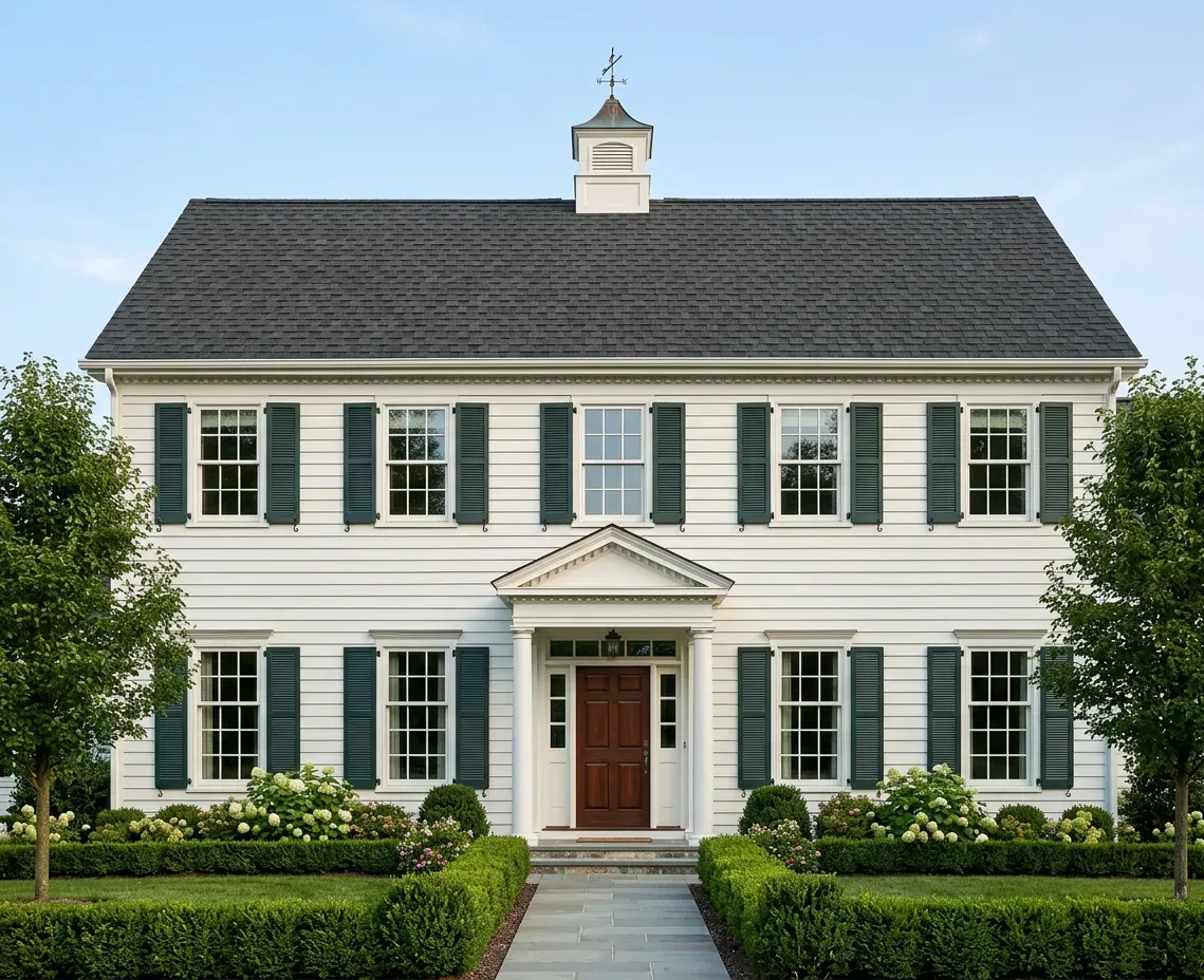
This combination is a cornerstone of American architecture for a reason. The crisp white clapboard creates a bright, clean canvas that reflects light beautifully, making the house appear larger and more prominent. The dark forest green shutters provide a deep, grounding contrast that is sophisticated and natural. Green is a nod to the surrounding landscape, so it feels harmonious and settled. The final touch is the symmetry of the facade, which gives the color scheme a sense of order, elegance, and timeless grace.
|
📋 Copy HEX 🔗 Share |
Functional shutters are a beautiful detail, but the fixed, decorative ones seen here can be a maintenance headache. Dust, cobwebs, and dirt collect in the louvers and are difficult to clean. Worse, they can trap moisture against your siding, leading to mildew or even rot if not properly installed with stand-off hardware (known as shutter dogs). If you love the look, just be prepared for the extra cleaning and periodic checks to ensure water isn’t getting trapped behind them.
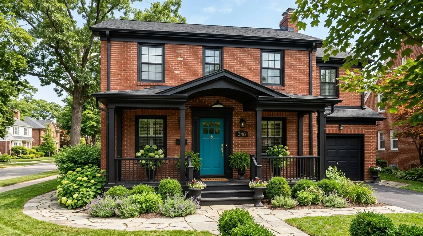
9. Traditional Brick Given a Jolt with a Bright Teal Door
The teal front door is, without a doubt, the star of this show. Against the traditional backdrop of red brick and black trim, the vibrant, unexpected color is a shot of pure personality. It signals that while the home’s architecture is classic, the people inside have a modern sensibility. It’s a low-cost, high-impact design move that completely transforms the feeling of the entrance from formal to fun and approachable. This is a perfect example of how one quart of paint can change the entire curb appeal of a house. For another bold door color, see Idea #26.
|
📋 Copy HEX 🔗 Share |
When pairing a bright, saturated door color like teal with red brick, the key is to include a bridge color. Here, the black trim, porch railings, and garage door serve that purpose perfectly. The black is a strong neutral that mediates the high contrast between the warm red brick and the cool, vibrant teal. Without the black, the teal and red would fight for attention. By surrounding the door area with black, it gives the teal a sophisticated frame and makes the color choice feel intentional, not random.
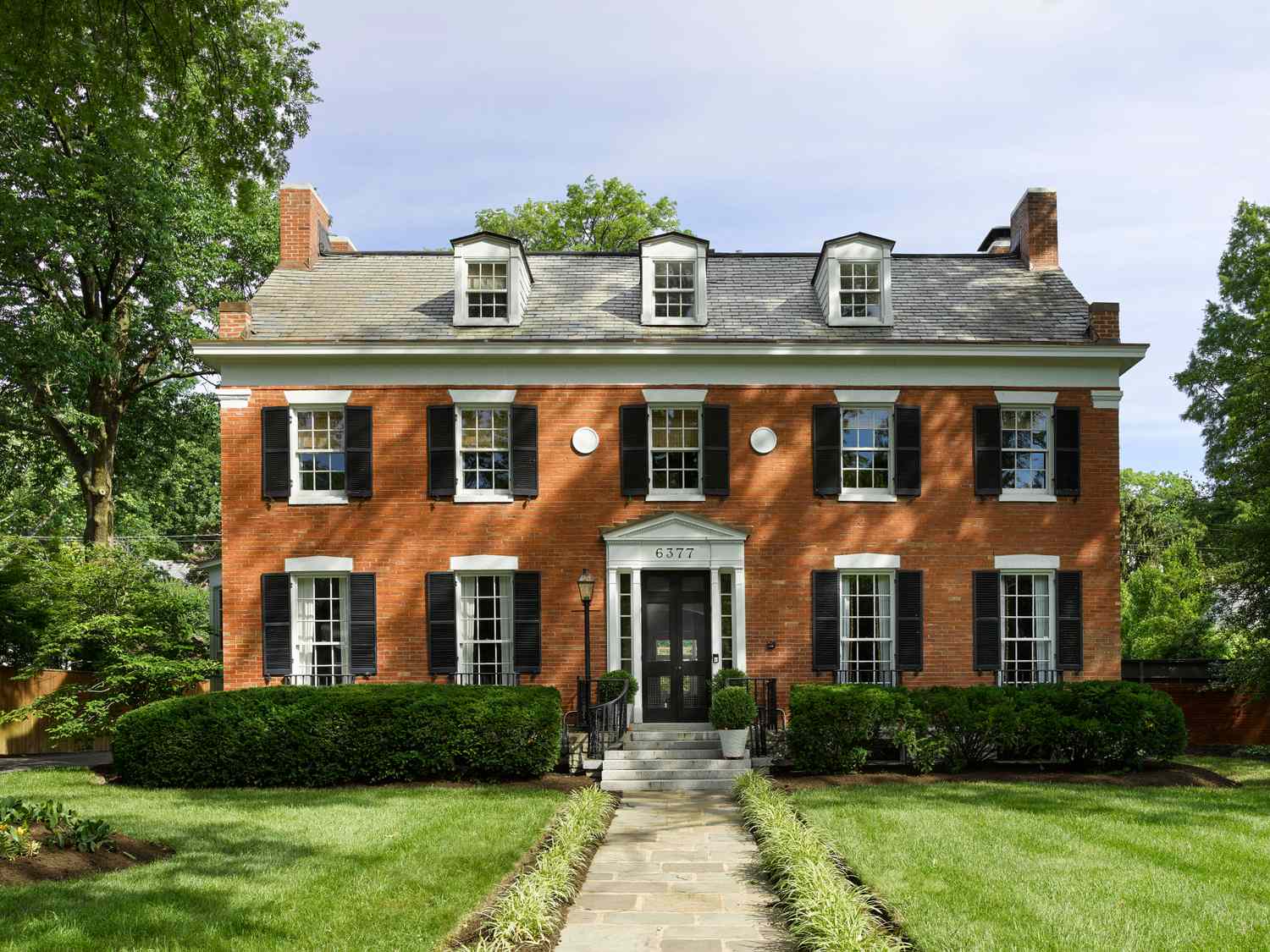
10. Stately Colonial Brick with Classic Black Shutters
The visual math here is all about tradition and balance. The formula is roughly 80% warm red brick + 15% crisp white trim + 5% bold black accents. The brick is the undeniable hero, providing texture and a sense of history. The white trim around the windows and door acts like a mat on a painting, cleanly framing each element and making them pop against the brick. The black shutters and door are the final punctuation marks, adding rhythm and a grounding weight to the symmetrical facade. It’s a combination that has worked for centuries.
|
📋 Copy HEX 🔗 Share |
This particular scheme excels on larger, symmetrical homes, typically 2,500 square feet and up. The repetitive pattern of windows and shutters requires a broad facade to look balanced rather than busy. On a smaller house, a full set of black shutters can feel overwhelming. For a smaller brick home, consider removing the shutters and instead painting just the window sashes black for a more modern, less cluttered take on the same high-contrast palette. This is a look that demands a bit of grandeur to really sing.
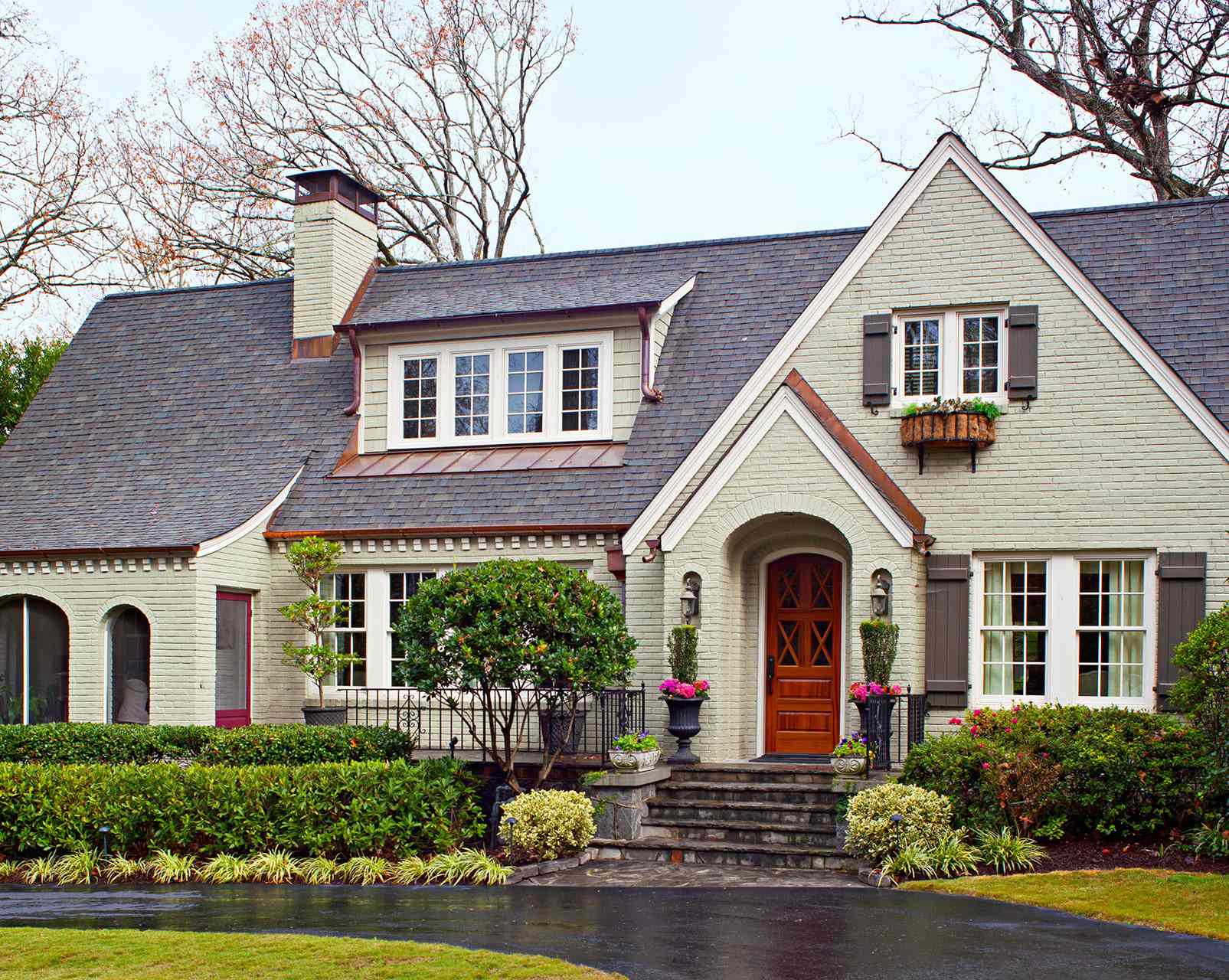
11. Sophisticated Sage Green Brick with Copper and Wood Details
Recreating this elegant, custom look is an investment in high-end materials. The beauty is in the details, where natural materials shine.
- Paint/Surface Prep: Professional brick painting for a house this size, including prep and high-quality paint. ($8,000 – $15,000)
- Copper Accents: Real copper gutters, downspouts, and dormer trim are the biggest splurge. ($10,000 – $20,000+)
- Wood Elements: Custom solid wood front door and shutters. ($5,000 – $12,000)
- Lighting & Railings: Wrought iron railings and high-end exterior sconces. ($2,000 – $5,000)
- TOTAL: $25,000 – $52,000+
- Budget alternative: Use a metallic copper-colored paint on standard aluminum gutters, choose a wood-look fiberglass door, and use high-quality composite shutters for a similar vibe at about 40% of the cost.
|
📋 Copy HEX 🔗 Share |
Real copper is stunning, but it’s a living finish. It will naturally oxidize and develop a patina over time, turning from a shiny penny color to a darker brown and eventually to the characteristic verdigris green. This process can take years and will happen unevenly depending on exposure to rain and sun. While many appreciate this natural aging, if you want to maintain the bright copper look, you’ll need to have it professionally cleaned and sealed every 3-5 years, which can be costly. Be sure you love the patina before you invest.
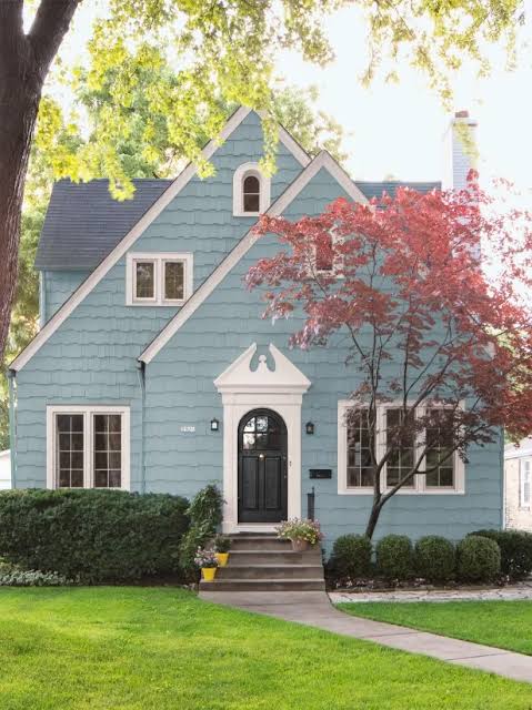
12. Moody and Modern Deep Blue Exterior
Deep, saturated blues are trending for exteriors as homeowners look for colors that are both bold and timeless. Unlike black, which can sometimes feel too stark, a deep navy or indigo has a richness and complexity that changes with the light. It feels modern and sophisticated, yet also classic and a bit nautical. This trend is a move away from the light and airy palettes of the last decade, embracing a moodier, more grounded aesthetic that gives a home a real sense of substance and drama. It pairs beautifully with both wood accents and crisp white trim.
|
📋 Copy HEX 🔗 Share |
Dark paint colors like deep blue absorb more heat from the sun than lighter colors. This can lead to slightly higher cooling costs in hot, sunny climates. More importantly, dark paints are more susceptible to fading from UV exposure over time, especially on south-facing walls. To mitigate this, invest in a high-quality, fade-resistant paint with a lifetime warranty. It might cost more upfront, but it will save you from having to repaint every few years. Also, surface imperfections are more noticeable with dark, glossy sheens, so prep work is critical.
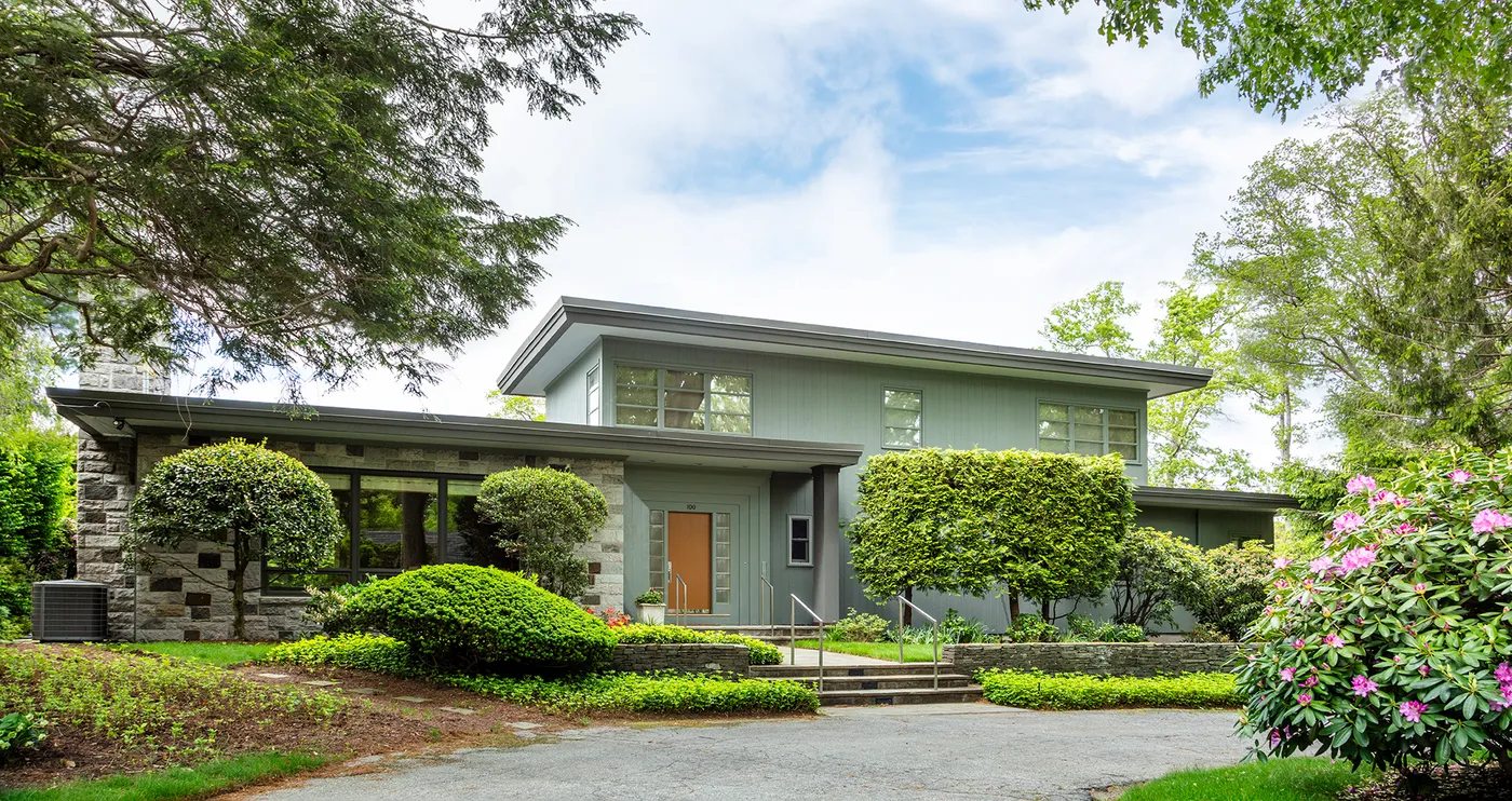
13. Contemporary Sage Siding with Natural Stone Cladding
This design succeeds by layering natural textures and colors. The soft sage green of the vertical siding has an organic, calming feel that connects the house to its landscape. Grounding the structure with the darker, rougher texture of stone cladding on the lower level gives it a sense of permanence and strength. The dark gray trim acts as a crisp, modern frame, while the light wood door provides a single point of warmth and focus, preventing the cool green-and-gray palette from feeling distant. It’s a balanced conversation between modern lines and natural materials.
|
📋 Copy HEX 🔗 Share |
Real stone cladding is expensive. For a similar look at a fraction of the cost, look into stone veneer products. These are made from either manufactured concrete or thin-cut natural stone and are much lighter and easier to install. A professional installation of stone veneer can run $15-$30 per square foot, compared to $30-$60+ for full-thickness stone. It’s a widely used alternative that provides the same texture and gravitas without the massive structural and financial investment. Compare this to the red brick and black trim in Idea #4 for another take on a modern masonry look.
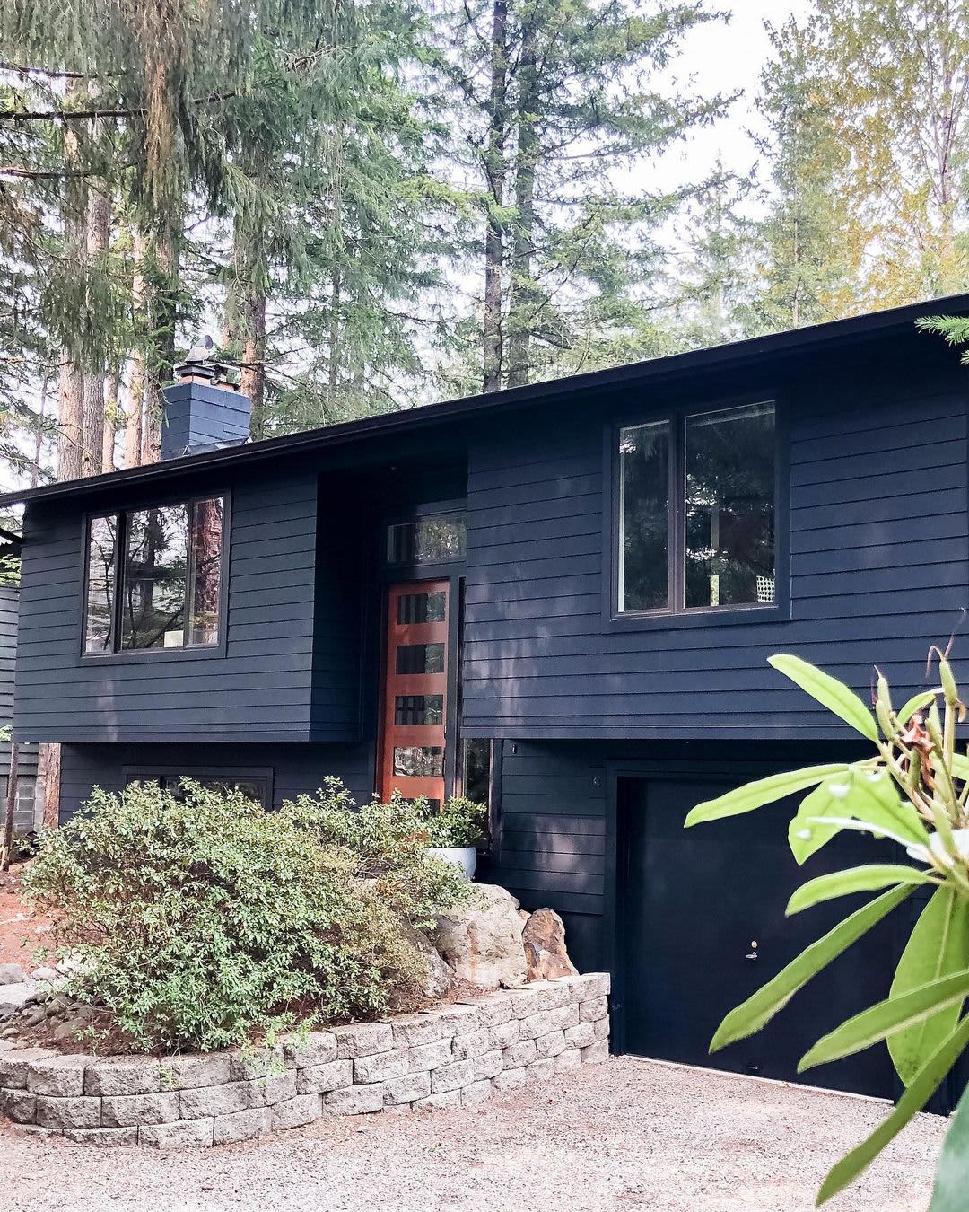
14. Striking Charcoal Facade with a Warm Wood Entry
The warm wood entry door is the crucial element that makes this design work. Against the cool, minimalist backdrop of the charcoal siding and black trim, the door is a beacon of warmth and organic texture. Its vertical lines and glass panels draw the eye, breaking up the horizontal siding and providing a clear, welcoming focal point. Without this door, the facade would risk feeling like a monolithic, impersonal box. The wood introduces a human scale and a touch of nature that makes the modern architecture feel approachable and inviting.
|
📋 Copy HEX 🔗 Share |
You can create a similar wood-paneled accent yourself on a smaller scale, like around an existing door, with this simplified process. It’s a weekend project that adds major custom appeal.
- Measure and Plan: Measure your accent area and plan the layout for 1×4 vertical wood slats, leaving a small gap (e.g., 1/2 inch) between each.
- Choose Your Wood: Select a weather-resistant wood like cedar or cypress. Cut all pieces to the required length.
- Seal All Sides: Before installation, apply a high-quality exterior stain and sealant to all six sides of every board. This is critical for preventing warping and rot.
- Install Furring Strips: Attach thin, vertical furring strips to the wall to create an air gap behind the wood slats for drainage.
- Attach Slats: Use exterior-grade screws or a combination of construction adhesive and finish nails to attach your wood slats to the furring strips, using spacers for even gaps.
Time: 1-2 days. Cost: $200-$500 in materials.
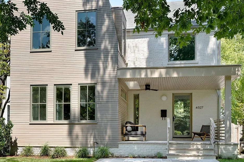
15. Soft Neutrals: Light Beige Siding with White Brick and Sage Trim
When combining multiple neutral colors and textures like this, the secret is to choose shades that share the same undertone. Here, the light beige siding, the white brick, and the sage green window frames all have a soft, slightly warm undertone. This prevents them from clashing and creates a gentle, harmonious palette. If the beige were too yellow or the green too blue, the effect would be jarring. Always get large samples of all your materials—siding, paint, brick—and look at them together outside in natural light to confirm their undertones play nicely.
|
📋 Copy HEX 🔗 Share |
This multi-material, light-neutral scheme is ideal for modern homes with distinct architectural blocks or sections. It helps to visually break up a large facade without using loud colors. It works well on houses from 2,000 to 4,500 square feet where a single color might look monotonous. The key is having clear transitions, like inside corners or changes in plane, where one material can cleanly end and another can begin. Trying to apply this to a simple, flat facade can look forced and arbitrary.
16. Friendly Sage Green Siding with a Pop of Orange
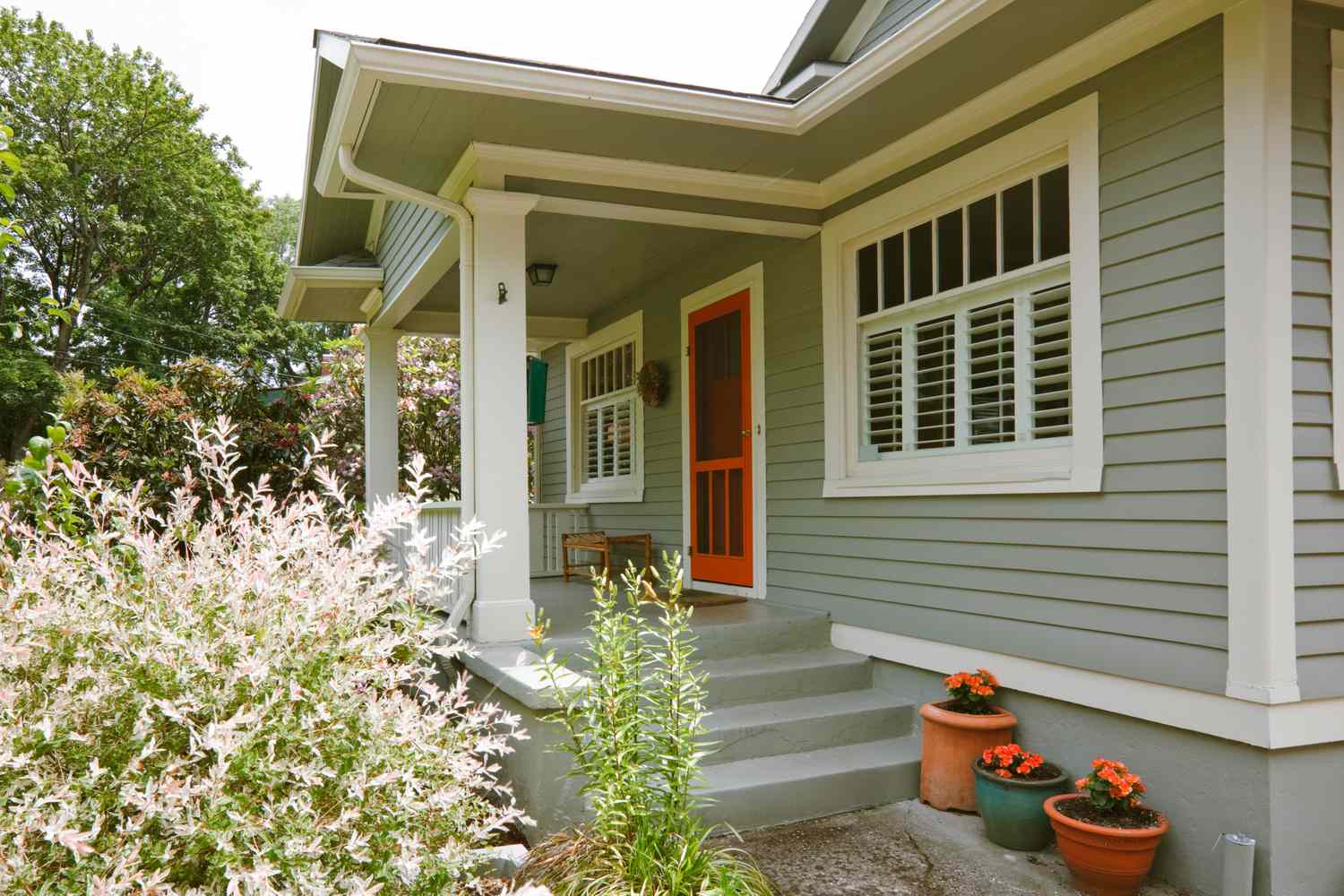
This color combination is a fantastic example of using complementary colors effectively. The sage green siding is a muted, earthy tone, while the orange screen door is vibrant and energetic. On the color wheel, green and red/orange are opposites, which is why they create such a dynamic and visually exciting contrast. The key is the ratio: the green dominates, creating a calm backdrop, while the orange is used sparingly as a powerful accent. The crisp white trim acts as a neutral buffer, keeping the two strong colors from overwhelming the eye.
|
📋 Copy HEX 🔗 Share |
This is one of the most budget-friendly curb appeal upgrades you can make. A quart of high-quality exterior paint for the door is about $25-$40. You can get this look for even less by finding a vintage screen door on Facebook Marketplace or at a salvage yard for under $50, then painting it yourself. The terracotta pots are another inexpensive touch, often available for under $20 each at home improvement stores. For less than $100, you can completely change the personality of your home’s entrance. For a deeper green, see Idea #11.
17. Bold Modern Mix: Dark Gray Stucco and Red-Orange Wood Trim
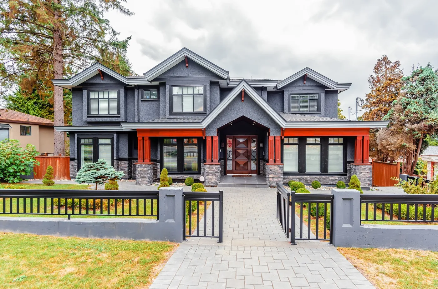
This daring look is built on a formula of high contrast and confident color: 50% dark gray stucco + 30% natural gray stone + 20% bold red-orange wood. The dark gray stucco provides a sleek, modern, and neutral base. The stone veneer grounds the structure with texture and a slightly lighter tone. But the magic is in the 20% of saturated red-orange on the pillars and trim. This accent color is warm, energetic, and completely transforms the home from a simple gray box into a unique architectural statement. The black window frames support the modern aesthetic without competing for attention.
|
📋 Copy HEX 🔗 Share |
A color scheme this bold and specific can be a double-edged sword when it comes to resale value. While it’s incredibly striking and will appeal to buyers with a modern sensibility, it may be a turn-off for those with more traditional tastes. A unique color palette makes a strong personal statement, which can sometimes make it harder for potential buyers to envision themselves in the space. If you plan on selling within the next 5-7 years, you might consider using the red-orange on more easily repaintable elements, like just the front door.
18. High-Contrast Cottage: Dark Grey Wood with Vibrant Red Trim
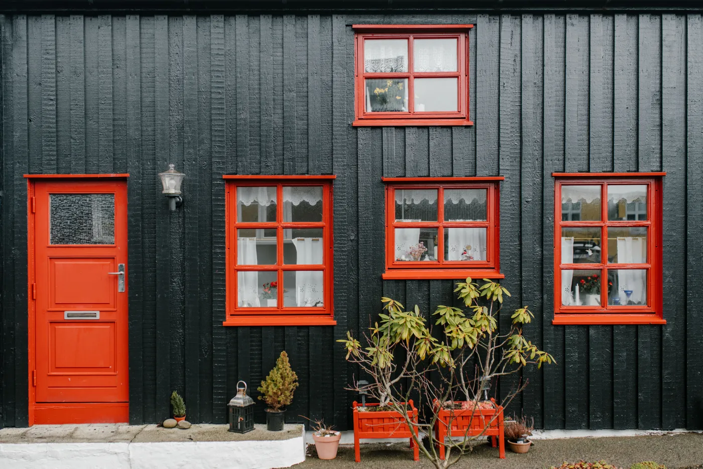
The red window frames and door are what give this home its unforgettable character. They are the single design choice that elevates the exterior from a simple dark cottage to a bold, graphic, and almost playful statement. The combination of dark grey and vibrant red is dramatic and confident. It’s a modern take on traditional Scandinavian farmhouses, which often feature dark siding with brightly colored trim. Removing the red would leave a perfectly fine but much more somber and forgettable exterior.
|
📋 Copy HEX 🔗 Share |
We’re seeing a move towards dopamine decor and expressing more personality in our homes, and this is the exterior version of that trend. After years of safe neutrals, homeowners are getting more courageous with color. Using a bright, joyful color on trim is a relatively low-commitment way to participate in this trend. It’s less overwhelming than painting the whole house a bright color but delivers a huge dose of personality and charm. It’s a sign people are ready to have more fun with their homes.
19. Dramatic Charcoal Siding with a Red Metal Porch Roof
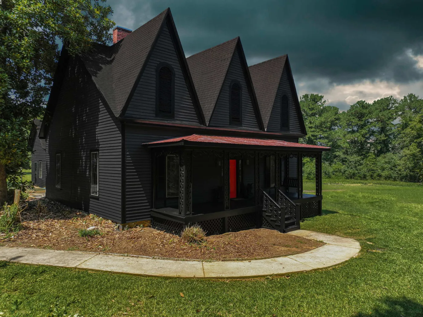
This design is all about drama, and it works by committing fully to a dark and moody palette, then piercing it with a single, bold accent color. The dark charcoal siding and dark shingled roof create a cohesive, almost monolithic backdrop that feels strong and mysterious. This makes the vibrant red of the porch roof and front door incredibly impactful. The eye is immediately drawn to the entry. The use of red is restrained but powerful, creating a clear focal point and adding a necessary splash of energy to the otherwise somber scheme. Compare this to the red trim in Idea #18 for a different use of the same colors.
|
📋 Copy HEX 🔗 Share |
A standing-seam or corrugated metal roof, like the red one on this porch, is exceptionally durable and low-maintenance. The factory-applied color finish is incredibly tough and fade-resistant, often warrantied for 30-50 years. Unlike painted wood or shingles, it won’t peel, chip, or require repainting. Its main upkeep is an occasional rinse with a hose to remove dirt and debris, and checking to ensure fasteners are still secure after major storms. It’s a fantastic long-term investment for a high-impact accent.
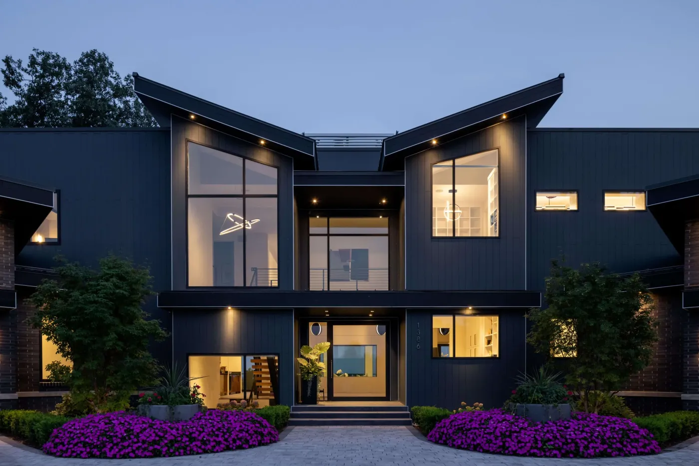
20. Sleek Dark Gray Modern Home with Strategic Lighting
For a dark, modern exterior like this, exterior lighting isn’t an accessory; it’s a critical design element. Use a layered approach. First, add ambient light with recessed soffit lighting to wash the walls in a soft glow. Second, incorporate task lighting, like a well-lit entryway, for safety and function. Finally, use accent lighting, like uplights on the gray brick sections or on nearby landscaping, to create dramatic shadows and highlight architectural features. Using warm-temperature bulbs (2700K-3000K) is essential to make the dark facade feel inviting, not intimidating.
|
📋 Copy HEX 🔗 Share |
Dark, monochromatic color schemes are most effective on modern architecture with clean lines, varied massing, and large windows. This house works because its peaked rooflines, intersecting planes, and expansive glass create visual interest. On a flat, simple, traditional house (like a basic ranch or colonial), an all-dark-gray exterior can look flat and oppressive. The architecture itself needs to have some inherent drama for this color scheme to succeed. It’s ideal for homes over 2,200 square feet with interesting angles.
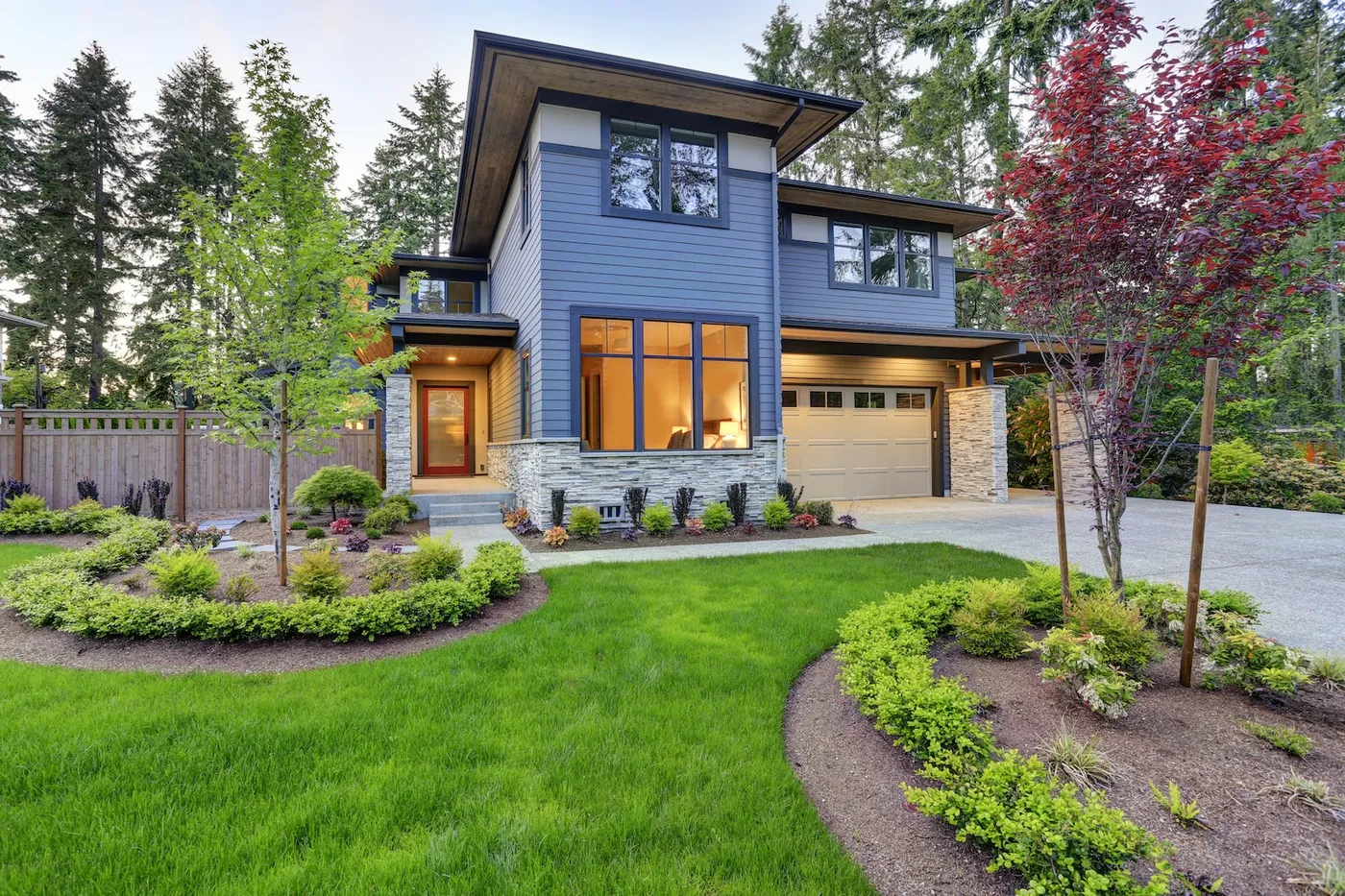
21. Modern Blue Siding with Stacked Stone and a Red Door
This contemporary look can be broken down into a confident color formula: 50% cool mid-tone (the blue siding) + 40% textured neutral (the gray stone) + 10% warm accent (the red door and wood soffit). The blue and gray create a calm, modern canvas. The stacked stone provides essential texture that keeps the facade from looking flat. The final 10% is the crucial part; the warm red door is a classic complementary pop against the blue, and the wood soffit adds a touch of organic warmth that ties everything together. It’s a perfectly balanced equation.
|
📋 Copy HEX 🔗 Share |
This is a very of the moment color palette. The combination of dusty blue, gray stone, and a pop-of-color front door has been popular in new construction for the past few years. While it looks fresh and appealing now, it runs the risk of looking dated in 10-15 years, much like the beige and brown combinations of the early 2000s. The easiest element to change is the front door color, so if you’re worried about longevity, stick with the blue and gray and be prepared to update the door color down the line to keep the look current.
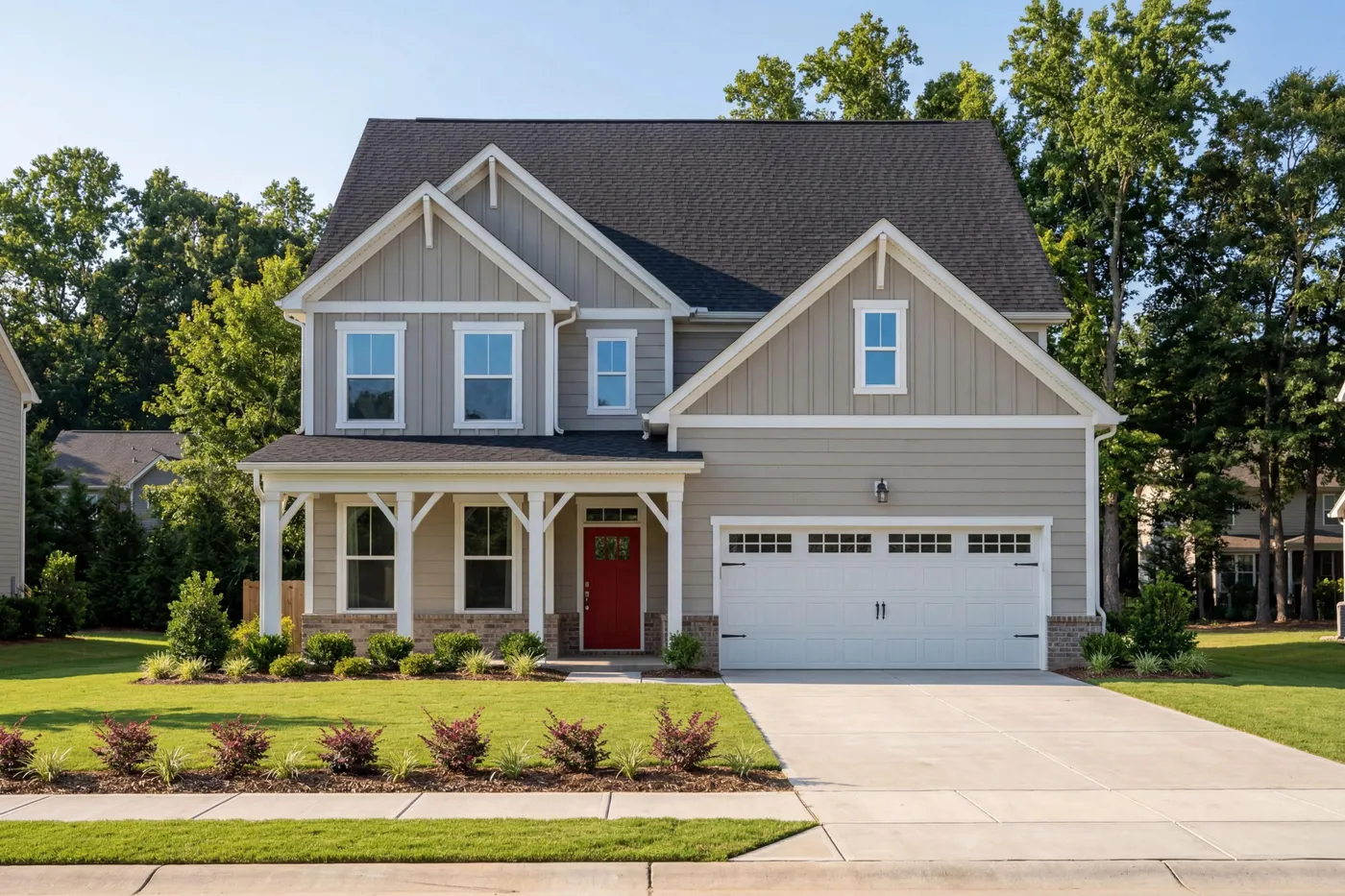
22. Welcoming Gray Two-Story with a Dark Red Door
Achieving this clean, welcoming suburban look is a mid-range project, with the garage door being a key feature.
- Paint: Professional painting for a two-story house, including prep and two coats of quality paint (e.g., Benjamin Moore or Sherwin-Williams). ($6,000 – $12,000)
- Garage Door: New carriage-style garage door with windows and hardware. ($2,500 – $5,000)
- Front Door: New fiberglass front door, painted. ($1,500 – $3,500)
- Trim & Columns: This assumes existing trim is in good shape and just needs paint. If replacement is needed, add $2,000+.
- TOTAL: $10,000 – $20,500+
- Budget alternative: Repaint your existing garage door and front door, and add decorative magnetic hardware to the garage door for about $50 to get the carriage house look for less.
|
📋 Copy HEX 🔗 Share |
A well-coordinated exterior involves more than just the wall color. Before you start painting, make a complete plan.
- Check Fixed Elements: Your roof shingle color and any brick or stone skirting are permanent. Make sure your chosen gray doesn’t clash with their undertones (e.g., a cool gray with a warm brown brick can look ‘off’).
- HOA Approval: If you live in a community with a homeowners’ association, get your color palette approved in writing before you buy a single gallon of paint.
- Consider the Garage Door: The garage door is a huge part of your facade. Decide if you want it to blend in (same color as siding) or stand out (same color as trim). Here, matching the white trim works beautifully.
23. Light Gray Siding with Dark Wood Double Doors
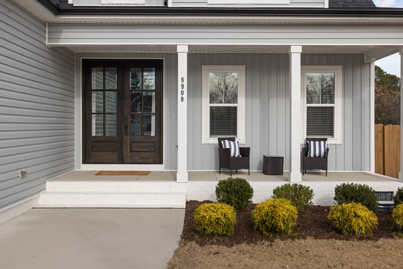
The dark wood double entry doors are the heart of this design. They provide a sense of substance, warmth, and luxury that elevates the simple, clean palette of light gray and white. The deep brown tone and natural grain of the wood create a rich focal point that draws you toward the entrance. If these were simple white doors, the home would feel much less custom and inviting. The choice to invest in high-quality, substantial doors is what gives this classic exterior its upscale, polished feel.
|
📋 Copy HEX 🔗 Share |
Restoring wood doors to this rich finish is a rewarding DIY project if they’ve become faded or weathered.
- Remove Hardware: Take off all handles, locks, and hinges.
- Strip Old Finish: Use a chemical stripper and scraper to remove the old varnish or paint. Follow up with sanding, starting with 120-grit and finishing with 220-grit sandpaper for a smooth surface.
- Clean Thoroughly: Wipe the doors down with mineral spirits to remove all dust and residue.
- Apply Stain: Using a quality brush or rag, apply an exterior-grade wood stain in your desired color. Let it penetrate, then wipe off the excess. Apply a second coat if needed for a deeper color.
- Seal with Spar Urethane: Apply at least three coats of a high-quality marine spar urethane with UV protection, sanding lightly between coats. This is the crucial step for protecting the wood from sun and rain.
Time: 2-3 days (to allow for drying). Cost: $100-$150 for materials.
24. Breezy Light Blue Coastal Home with a Metal Roof
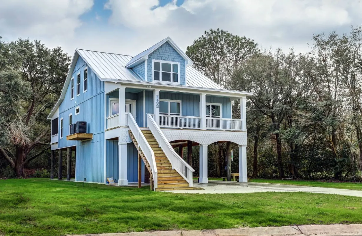
This design perfectly captures a coastal feeling through its color and material choices. The light, airy blue of the vertical siding immediately evokes clear skies and sea. The crisp white trim is like the whitecaps on waves, providing clean contrast and a fresh feeling. The silver metal roof is a key element; not only is it practical for coastal weather, but its reflective quality mimics the shimmer of water and sun, enhancing the bright, breezy aesthetic. The elevated structure and wrap-around porch are classic coastal architectural forms that complete the picture.
|
📋 Copy HEX 🔗 Share |
A metal roof is a fantastic choice for longevity, often lasting 50 years or more, but it’s not entirely set it and forget it. At least once a year, you should have the roof inspected for any screws that may have backed out, which can create a potential leak point. Also, while the paint finishes are durable, scratches from falling branches can compromise the protective layer and lead to rust, so it’s good to trim back any overhanging trees. In areas with salt spray, an annual rinse with fresh water can help prevent corrosion over the long term.
25. Vibrant Victorian with a Light Blue and Royal Purple Scheme
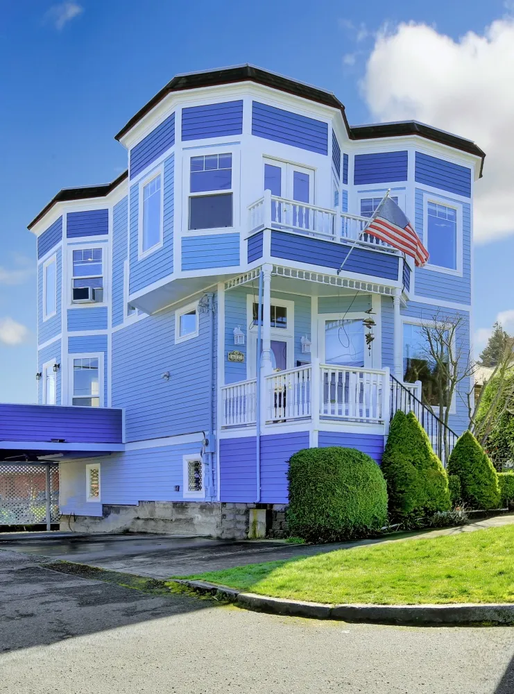
When painting a Victorian home with intricate trim, a three-color palette is a great starting point. The rule of thumb is: use the lightest color for the main body siding to make the house feel large and grand (light blue). Use the boldest or darkest color for accents you want to highlight, like the trim and decorative panels (royal purple). Finally, use a crisp neutral (white) for window sashes, porch railings, and soffits to create clean lines and keep the scheme from becoming too overwhelming. This strategic placement is key to a successful Painted Lady look.
|
📋 Copy HEX 🔗 Share |
A multi-color, detailed paint job on a large Victorian is a significant undertaking and a major expense. Professional painters charge a premium for the extensive prep work, masking, and detail work required. Expect a job like this to cost 50-100% more than painting a simpler house of the same size. This is not a beginner-friendly DIY project. The height, architectural details, and need for precision make it a job best left to experienced pros who are insured and have the right equipment for working safely at height.
26. Classic Tudor Style with a Bold Red Arched Door
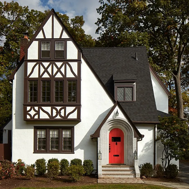
The enduring appeal of Tudor style lies in its dramatic contrast. The creamy white stucco acts as a bright background that makes the dark brown timbering pop, creating a strong graphic pattern. This high-contrast framework is what gives the style its distinctive, storybook character. The steep, dark roofline adds to the drama and sense of medieval heft. The brick archway adds another layer of texture and historical reference, making the whole composition feel rich and layered. For a more modern take on a red door, check out Idea #21.
|
📋 Copy HEX 🔗 Share |
The vibrant red arched door is the single element that brings this classic design to life. While the white stucco and dark brown trim are traditional and expected for a Tudor, the brilliant red door is a shot of energy and personality. It draws the eye immediately to the entrance and provides a warm, welcoming focal point against the cool white and dark brown palette. It’s a modern touch that respects the home’s historic style while signaling that the interior is likely fresh and updated. It proves that even the most traditional homes can handle a bold dose of color.
27. Elegant Mix of Red Brick, White Stucco, and Black Trim
This home demonstrates a sophisticated formula for combining materials: 50% classic masonry (the red brick), 40% clean, light surfaces (the white stucco), and 10% sharp, graphic accents (the black trim, shutters, and door). This ratio works because the two main materials are separated by floor, giving each one space to breathe. The brick grounds the home with weight and tradition, while the stucco on the upper level lends it a lighter, more modern feel. The black trim is the essential unifying element, tying the brick, stucco, and windows together into one cohesive design.
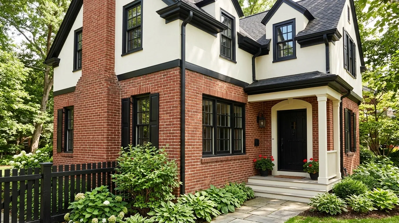
|
📋 Copy HEX 🔗 Share |
When using both brick and stucco, creating a clean transition is key. The horizontal black trim band seen here is a brilliant solution. It acts as a deliberate visual break, giving a crisp, finished edge to both the brick below and the stucco above. Without this band, the point where the two materials meet could look abrupt or unfinished. This small detail provides architectural definition and makes the combination of materials feel intentional and well-designed, rather than like an afterthought.
Your Home’s New Chapter Starts With Color
Choosing an exterior paint color feels like a huge decision, but it’s also the most exciting way to redefine your home’s character. Whether you’re drawn to a classic combination or a bold modern statement, the right palette is waiting. Don’t forget to save your favorite ideas to your Pinterest board to start building the vision for your home’s beautiful future.