
You know that feeling when you finally find a design idea that just clicks, the one that makes your home feel more like you? That’s the magic of dopamine decor. It’s less about following rigid rules and more about filling your space with color, pattern, and joy. After filtering through hundreds of options across IKEA, Target, and West Elm, we narrowed it down to the 26 ideas that actually deliver that happy hit. Inside, you’ll find curated inspiration for every room, blending maximalist, eclectic, and vibrant mid-century styles that are making waves in 2026 as we all lean into more personal, expressive homes. And stay until the end—we break down the most common mistakes that can ruin these looks. 📌 Save this to Pinterest for later—you’ll want to revisit these ideas.
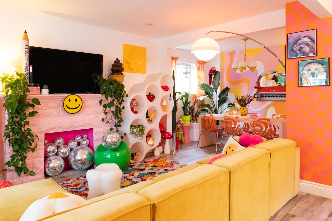
1. A Pink Fireplace Filled with Disco Balls? Yes, please.
This look is a masterclass in creating a focal point that’s pure, unexpected joy. By taking a traditional element—a brick fireplace—and painting it an unapologetic hot pink, the design immediately subverts expectations. Filling it with disco balls instead of logs doubles down on the playful vibe, turning a functional void into a shimmering art installation. The contrast between the formal structure of the fireplace and the whimsical, light-catching spheres is what makes it so magnetic and memorable.
|
📋 Copy HEX 🔗 Share |
Okay, let’s get real. While a fireplace full of disco balls is an incredible statement, it’s also a dust magnet. Those little mirrored squares will need regular dusting to keep them sparkling. The beautiful multi-colored shag rug is another high-maintenance hero; it will require frequent vacuuming and professional cleaning to prevent matting and keep those vibrant colors from looking dingy. This is a look for someone who prioritizes high-impact style over low-maintenance living, and we’re here for it.
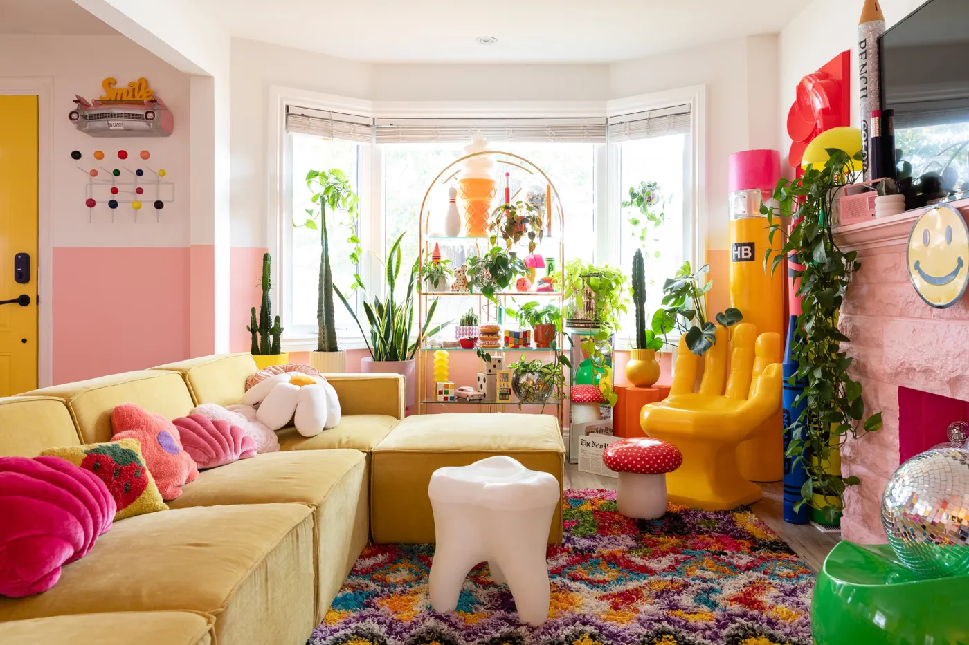
2. Go Big with a Yellow Sectional and Two-Tone Walls
The formula here is all about confident color blocking. Think of it as 60% bold anchor + 30% split-wall feature + 10% eclectic accessories. The massive yellow sectional provides the 60% foundation, a single piece that defines the room’s energy. The pink and white two-toned wall acts as a large-scale graphic element without overwhelming the space. The final 10% comes from the quirky decor, like the handchair and tooth stool, which sprinkle in personality. You could swap the yellow for cobalt blue and the pink for a soft mint green to get a totally different but equally balanced feel.
|
📋 Copy HEX 🔗 Share |
Creating a crisp line on a two-tone wall is crucial. Don’t just eyeball it! Use a laser level to mark your line around the entire room. Apply high-quality painter’s tape (like FrogTape) firmly along the outside edge of the line for the color you’re painting first. Paint your first color, let it dry completely, then remove the tape. For a super-sharp edge, paint a thin line of the base wall color over the tape’s edge before you apply the new color; this seals the tape and prevents any bleeding.
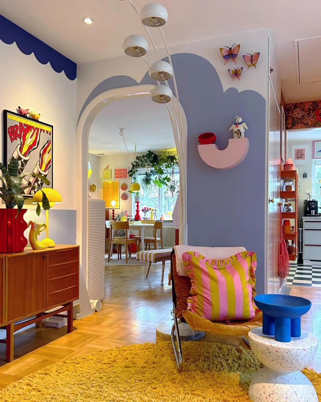
3. Combine Pop Art Attitude with Playful Scalloped Walls
The single element that makes this room sing is the custom wall paint. Without the hand-painted lavender clouds and royal blue scallops, the space would just be a collection of cool furniture. The wall treatment is what ties everything together and establishes the room’s playful, artistic narrative. It’s a bold choice that shows a commitment to a vision, transforming plain drywall into a canvas that’s as important as the pop art hanging on it. It proves that you don’t need to fill a room with things when the walls themselves are a work of art.
|
📋 Copy HEX 🔗 Share |
Want to paint your own wall scallops? It’s easier than it looks. Here’s a quick guide:
- Plan Your Scallops: Use a round object (like a bowl or a lid) and a pencil to lightly trace half-circles along a level line on your wall. The size of your object will determine the size of your scallops.
- Tape the Straight Edge: If your scallops hang down from a line, tape off the straight line above your traced pattern.
- Get a Good Brush: Use a small, angled artist’s brush for precision. Don’t overload it with paint.
- Trace with Paint: Carefully paint along your pencil lines, filling in the scallop shape. Work slowly for a clean edge. Two coats will likely be needed.
This DIY should only take a few hours and cost less than $30 in paint and supplies.
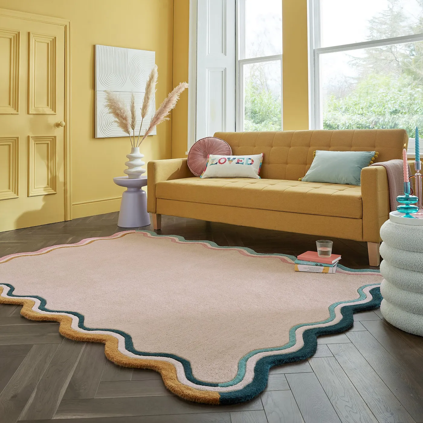
4. Anchor Your Room with a Wavy, Colorful Border Rug
A custom wavy rug can be pricey, but you can get this look for much less. Check out retailers like Rugs USA or even Etsy for affordable, colorful abstract rugs. For a true DIY hack, buy a simple, low-pile pink rug from IKEA or Target ($100-$200). Then, get samples of carpet squares or rug remnants in your desired border colors. Cut them into wavy shapes and affix them to the border of the main rug using heavy-duty carpet tape or a strong fabric adhesive. It’s a project that gives you a custom look for a fraction of the cost.
|
📋 Copy HEX 🔗 Share |
A statement rug like this needs room to breathe. This idea works best in a space that is at least 12×15 feet. In a smaller room, a rug with such a bold, thick border can actually make the space feel more cramped. The key is to have enough floor space around the rug to let the pattern feel intentional, not like it’s climbing the walls. Aim for at least 18-24 inches of bare floor between the rug’s edge and the walls for the best effect. A lower ceiling (8 feet) is fine, as the focus is all on the floor.
5. Embrace Retro Vibes with an Orange Checkerboard Floor
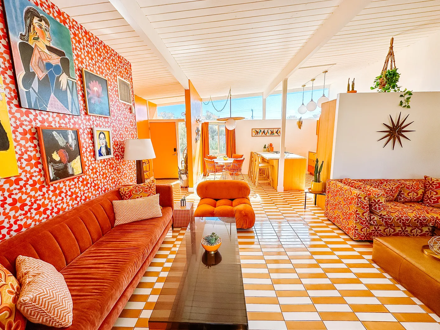
The resurgence of 70s-inspired design is all about embracing warmth, personality, and unapologetic color. This orange and white checkerboard floor is a perfect example. After years of cool grays and minimalist aesthetics, people are craving spaces that feel lively and optimistic. This retro pattern, especially in a warm hue like orange, is an instant mood-booster. It feels nostalgic yet fresh, and it’s a powerful way to build a room’s entire personality from the ground up, which is why it’s dominating Pinterest boards right now.
|
📋 Copy HEX 🔗 Share |
Let’s talk upkeep. While tile is durable, a checkerboard pattern—especially one with white—is brutally honest about dirt. Every crumb and footprint will show. You’ll be sweeping or vacuuming daily, especially in a high-traffic area. The grout lines will also need regular sealing (at least once a year) to prevent them from absorbing spills and getting discolored. A steam mop can be your best friend for keeping both the tiles and the grout looking fresh without harsh chemicals. It’s a commitment, but the visual payoff is huge.
6. Use Unexpected Color Pops like Lime Green Table Legs
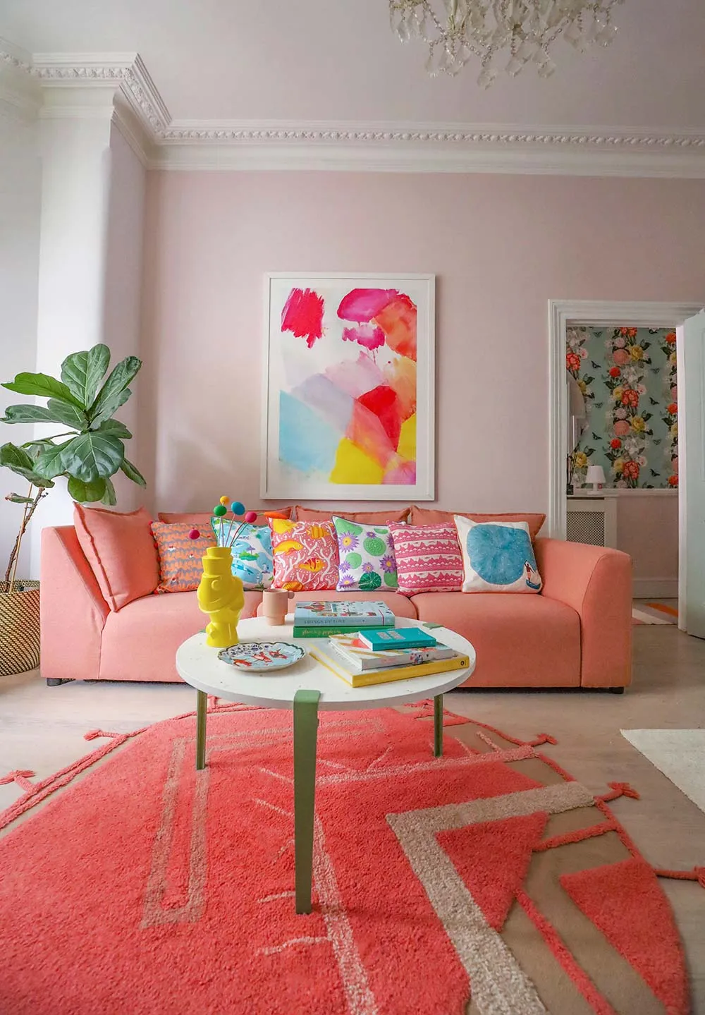
This room is a perfect example of the 80/20 rule in design. About 80% of the room is grounded in a relatively calm palette of coral, pink, and beige. It’s the final 20%—those surprising pops of lime green on the coffee table legs and in the throw pillows—that electrifies the space. This high-contrast accent color breaks up the warmth of the coral and pink, adding a zesty, modern twist. It’s an intentional, confident choice that shows you’re not afraid to play with color. For a bolder take-on pattern, check out the gallery wall in Idea #7.
|
📋 Copy HEX 🔗 Share |
Want to paint a piece of furniture to create a similar accent? The key to a professional, lasting finish is prep work. Don’t just slap paint on it. First, lightly sand the surfaces to be painted to give the primer something to grip. Then, apply one to two thin coats of a high-adhesion primer (Zinsser B-I-N is a great choice). Once the primer is fully cured, apply two coats of your chosen color in a satin or semi-gloss finish for durability. This process ensures the paint won’t chip or scratch off easily.
7. Curate a Floor-to-Ceiling Gallery Wall on an Orange Backdrop
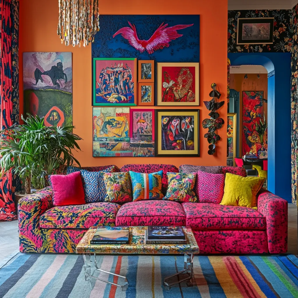
The gallery wall is, without a doubt, the heart and soul of this room. It’s not just decoration; it’s a story. Removing it would leave you with a fuchsia sofa and an orange wall, which is bold but lacks personality. The collection of diverse artworks, frames, and styles is what gives the space its maximalist, eclectic energy. It provides endless points of interest and makes the room feel deeply personal and curated over time, rather than decorated in a single weekend. It’s the element that truly defines the room as a creative sanctuary.
|
📋 Copy HEX 🔗 Share |
Recreating this specific look involves curating a lot of art, but here’s a possible breakdown:
- Paint: High-quality orange paint and supplies: $70 – $150
- Art & Prints: A mix of original art, prints, and posters: $500 – $5,000+
- Framing: Professional and DIY framing for 20+ pieces: $800 – $4,000
- Main Furniture: Fuchsia sofa: $1,500 – $4,500
- Textiles: Striped rug and pillows: $300 – $900
- Lighting: Beaded chandelier: $200 – $600
- TOTAL: $3,370 – $15,150+
Budget alternative: Source prints from Etsy and frames from IKEA and thrift stores to get a similar feel for under $1,000.
8. Soften Your Palette with a Pastel Checkerboard Rug
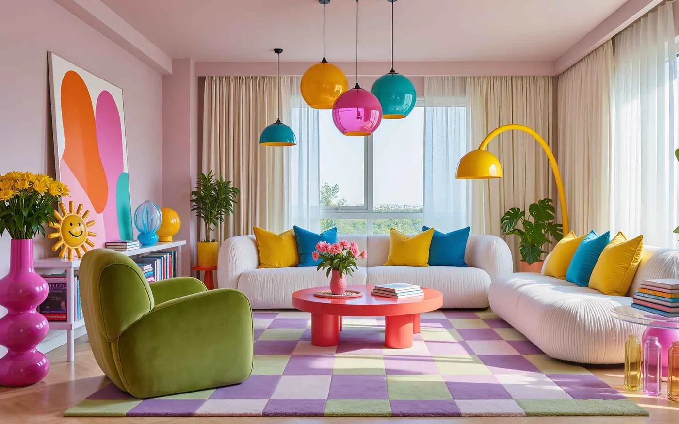
This look achieves its playful vibe by balancing soft pastels with clean, modern forms. The formula is roughly 50% grounding neutrals + 40% large-scale pattern + 10% saturated accents. The white ribbed sofa and sheer curtains provide the neutral base. The oversized pastel checkered rug is the undeniable star, covering a large area with a soft but graphic pattern. Finally, the hot pink coffee table, vibrant glass lamps, and throw pillows serve as the high-energy accents that keep the pastels from feeling too juvenile. It’s a sophisticated take on a sweet palette.
|
📋 Copy HEX 🔗 Share |
A white ribbed sofa and a light-colored rug are a stunning combination, but they are not for the faint of heart. If you have pets, kids, or enjoy red wine on the couch, this might not be the most practical choice. Upholstery with performance fabric (like Crypton or Sunbrella) is a must. For the rug, choose a material that is known for stain resistance, like polypropylene, or be prepared for regular professional cleanings. An ounce of prevention, like a no-shoes-on-the-rug rule, will go a long way.
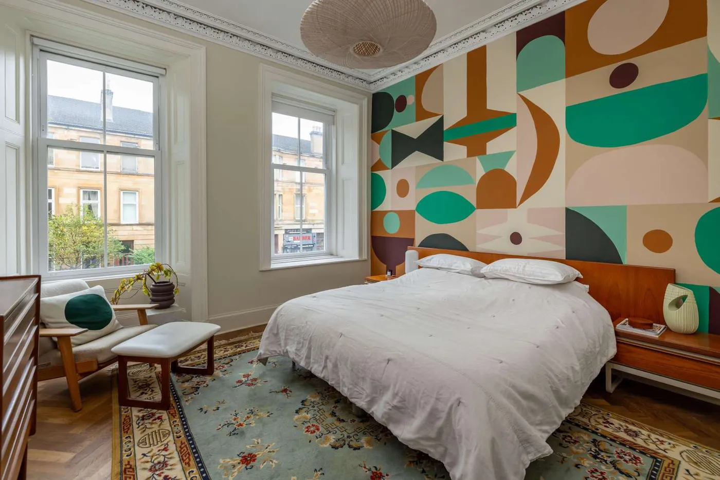
9. Commission a Geometric Mural for a Unique Bedroom Wall
A large-scale mural like this makes the biggest impact in a room with at least 9-foot ceilings and a wall that is unobstructed by lots of doors or windows. For a primary bedroom, you’ll want a minimum room size of about 13×13 feet so the mural doesn’t feel like it’s closing in on you. The key is having enough distance to stand back and appreciate the full composition. In a smaller room or one with lower ceilings, consider a mural with smaller-scale shapes or one that only covers the top half of the wall to avoid overwhelming the space.
|
📋 Copy HEX 🔗 Share |
Before you hire an artist or buy a wall-sized decal, run through this checklist:
- Measure Your Wall: Get precise width and height measurements. Note the location of any outlets or switches.
- Check Your Lighting: How does light hit the wall throughout the day? A mural on a wall facing a bright window might look washed out, while one in a dark corner could lose its impact.
- Assess the Wall Surface: The wall needs to be smooth and primed. Any texture or imperfections will show through and disrupt the design. Sand and patch as needed.
- Confirm Your Color Palette: Ensure the mural’s key colors will work with your existing flooring, trim, and furniture you plan to keep.
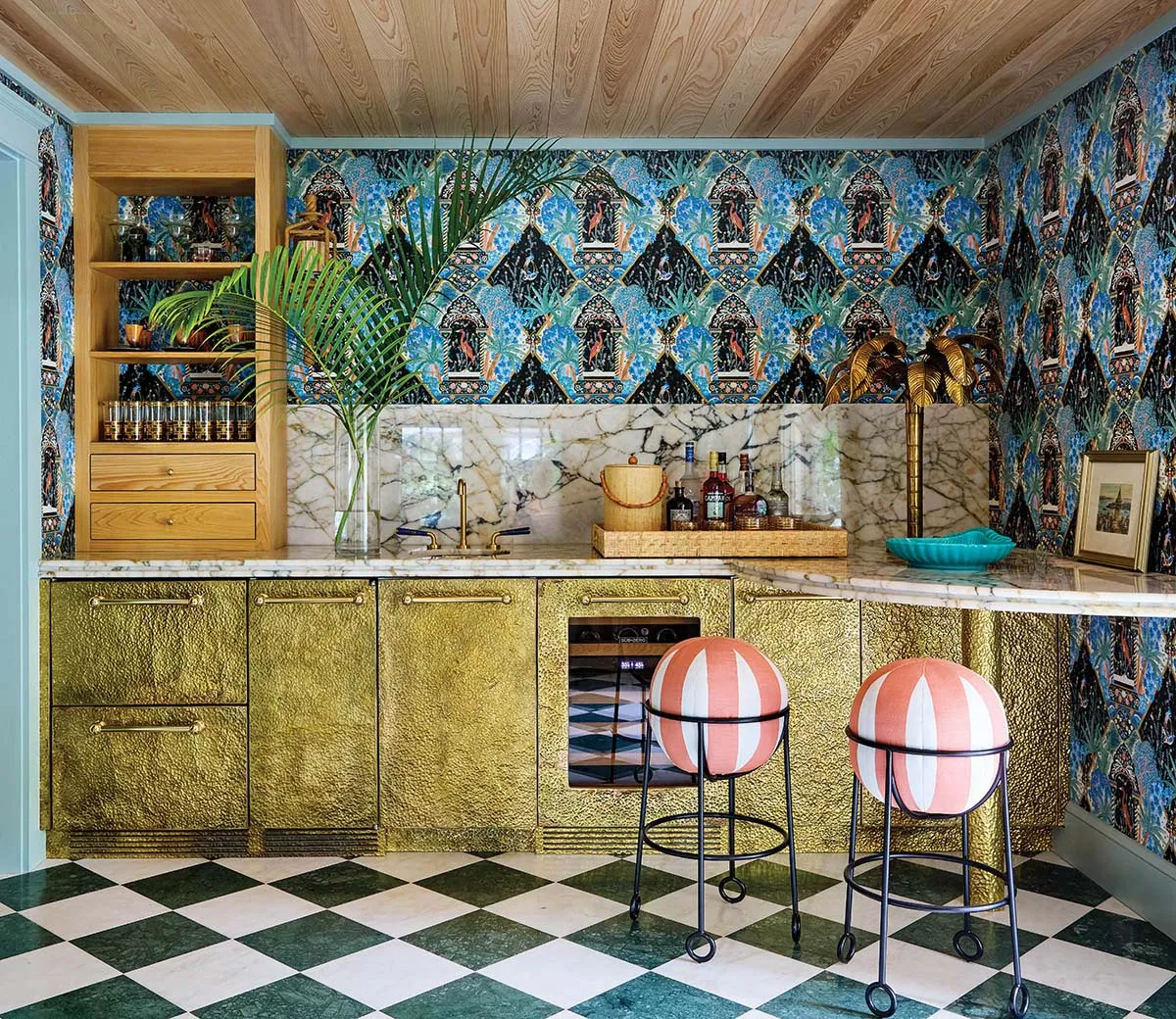
10. Go Glam with Tropical Wallpaper and Hammered Gold Cabinets
This bar area succeeds by fearlessly mixing pattern, texture, and sheen. The design works because it balances three distinct elements. The dark, matte tropical wallpaper provides a dramatic, organic backdrop. The hammered gold cabinetry introduces a layer of metallic texture and high-shine glamour. Finally, the green and white checkerboard floor grounds the space with a classic, graphic pattern. It’s a textbook example of contrast: dark vs. light, matte vs. shiny, organic vs. geometric. This tension is what makes the space so visually exciting and luxurious.
|
📋 Copy HEX 🔗 Share |
A hammered gold finish is stunning, but it requires specific care. Avoid abrasive cleaners or scouring pads, which can scratch the surface and ruin the finish. Stick to a soft microfiber cloth and a gentle, pH-neutral cleaner. The white marble countertop is also porous and can stain or etch easily from acidic liquids like citrus juice or wine. Sealing it annually is non-negotiable, and you’ll want to wipe up spills immediately. This is a high-style, high-care combination.
11. Let a Salmon Pink Armchair Shine Amongst Greenery
When arranging a collection of plants, think in triangles. Group plants in threes or fives, varying their heights to create a dynamic, natural-looking cluster. Place the tallest plant in the back, a medium-height one to the side, and a shorter, fuller one in front. This creates depth and prevents the arrangement from looking like a flat, boring lineup. Also, make sure to mix leaf shapes, textures, and shades of green for maximum visual interest. This is a more grounded, earthy version of the bright colors seen in Idea #6.
|
📋 Copy HEX 🔗 Share |
You don’t need to spend a fortune to get this plant-filled, cozy vibe. Look for vintage or secondhand armchairs on Facebook Marketplace or at a local consignment shop; reupholstering a chair with a great shape can be cheaper than buying new. For the plants, check out local plant swap groups on social media. Many plant lovers are happy to trade cuttings for free. Big box stores like Home Depot and Lowe’s also have affordable houseplants, especially smaller ones you can nurture and grow over time.
12. Mix Corduroy, Velvet, and Acrylic for a Tactile Treat
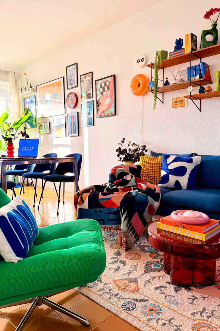
This room’s success is all about the texture formula. It’s a deliberate mix: 40% soft velvet (the blue sofa), 30% structured texture (the green corduroy armchair), 20% flat pattern (the rug and art), and 10% slick surprise (the acrylic coffee table). This layering of different tactile surfaces is what makes the room feel so rich and interesting. Even if the colors were all neutral, the space would still feel dynamic because of the interplay between plush, ribbed, and smooth materials. It’s a feast for the eyes and the hands.
|
📋 Copy HEX 🔗 Share |
that elevates this room from simply eclectic to designer is the transparent red coffee table. It’s a completely unexpected material and color choice. While a wooden or metal table would have been fine, the translucent acrylic adds a layer of modernity and playfulness. It allows you to see the patterned rug underneath, so it doesn’t visually clutter the space, and the pop of red adds a jolt of energy that ties into the warmer tones in the artwork. It’s a bold, clever choice.
13. Anchor a Maximalist Gallery Wall with a Deep Blue Velvet Sofa
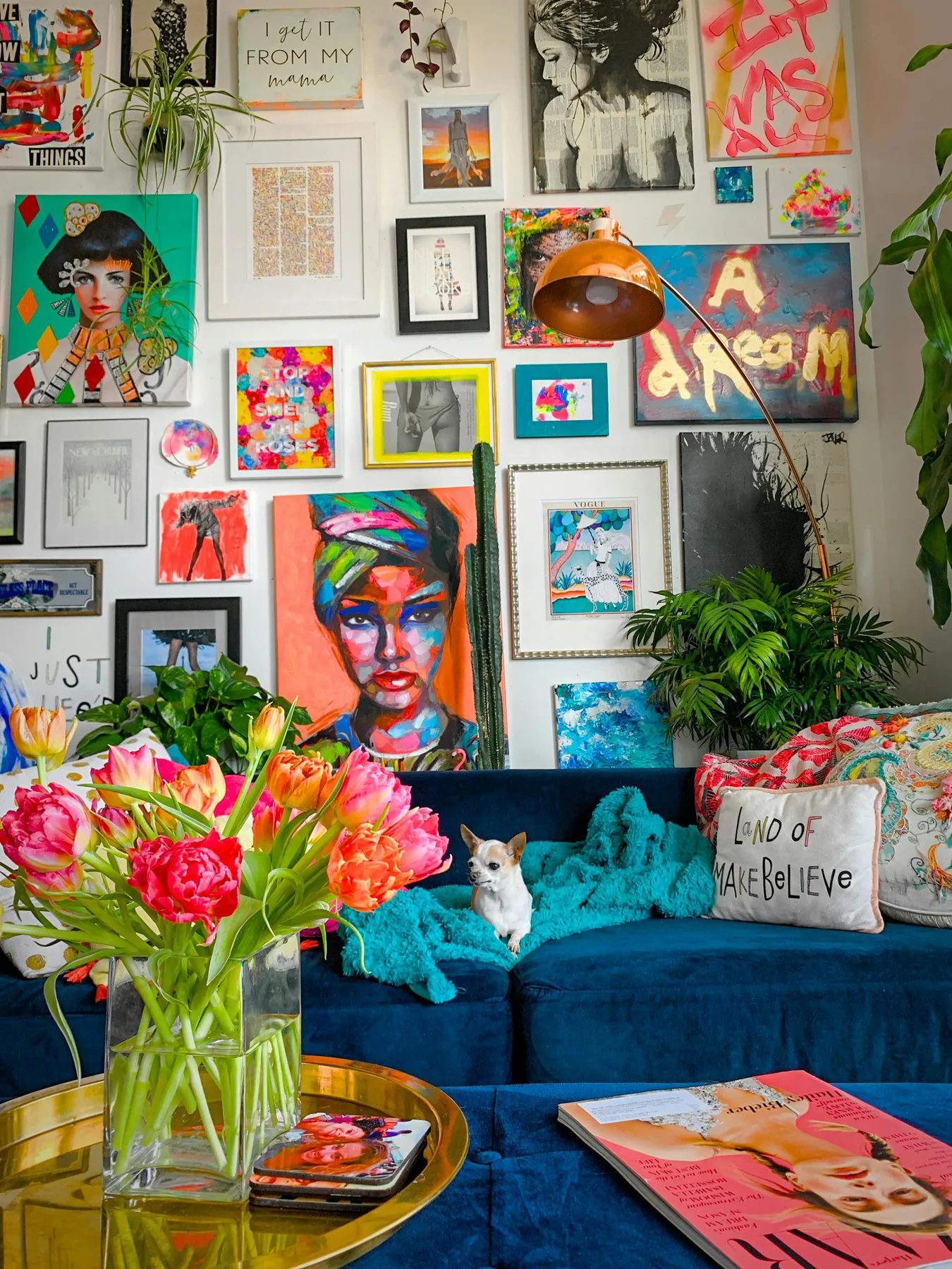
A busy, floor-to-ceiling gallery wall can easily feel chaotic. The reason it works so well here is the deep blue velvet sofa acting as a visual anchor. Its solid, saturated color and substantial form provide a place for the eye to rest amidst the delightful frenzy of the art. The dark, cool tone grounds the space, preventing the dozens of smaller, brighter pieces on the wall from feeling like they’re floating away. It’s the calm in the beautiful storm. Compare this deep-toned approach with the bright orange wall in Idea #7.
|
📋 Copy HEX 🔗 Share |
Let’s be honest: velvet is a magnet for dust, lint, and pet hair. If you have a furry friend, you’ll need a good lint roller or a vacuum with an upholstery attachment at the ready. Also, while a maximalist gallery wall looks effortlessly cool, it can be a challenge to keep straight and dust. Using museum putty behind the bottom corners of the frames can help keep them from shifting, and a long-handled feather duster will be your best friend for weekly maintenance.
14. Create a Reading Nook with a Bold Piece of Abstract Art
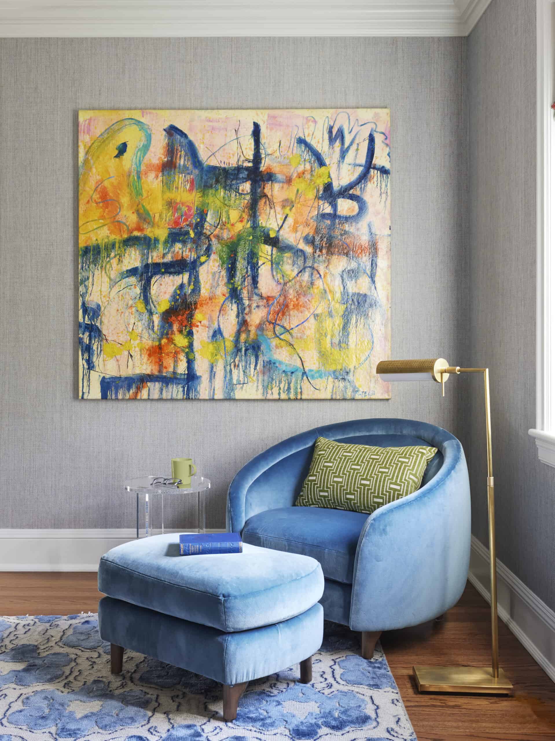
When hanging oversized art above furniture, the rule of thumb is to center the piece with the furniture, not necessarily the wall. The bottom of the frame should be 6 to 10 inches above the back of the chair or sofa. This creates a cohesive visual unit, connecting the art to the furniture. Hanging it too high disconnects the two elements and leaves an awkward gap. If you’re hanging a piece this large, always use two hooks or a cleat system, never a single wire, to ensure it stays level and secure.
|
📋 Copy HEX 🔗 Share |
To create a truly functional and comfortable reading nook like this, you need a dedicated corner of at least 5×7 feet. This allows enough space for a comfortable accent chair and ottoman, a small side table for your drink and book, and a floor lamp. Most importantly, it provides enough room to walk around the setup without feeling cramped. Anything smaller, and the nook starts to feel more like a cluttered corner than a relaxing escape.
15. Go Moody and Maximalist with Dark Botanical Wallpaper
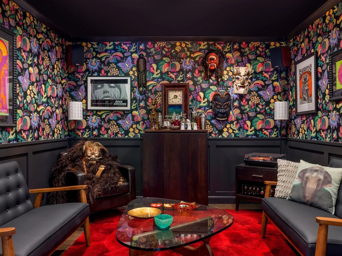
This look taps into the growing desire for homes that feel like personal, immersive worlds. It’s a departure from the light-and-airy aesthetic, leaning into a moodier, more enveloping vibe that feels cozy and protective. Trends like dark academia and goblincore celebrate rich textures, natural motifs, and a sense of history or fantasy. This dark botanical wallpaper, paired with collected objects like the masks, perfectly captures that spirit. It’s about creating a space that feels like a discovery, full of stories and secrets.
|
📋 Copy HEX 🔗 Share |
The dark botanical wallpaper is the undeniable hero of this room. It sets the entire tone. Without it, the space would be a collection of interesting, but disconnected, pieces. The wallpaper acts as the narrative thread, tying the dark wainscoting, red rug, and eclectic decor into a cohesive, intentional vision. It’s dramatic, immersive, and creates a cocoon-like effect that is the very essence of this moody maximalist style. It’s the one element that makes the whole room feel like a transportive experience.
16. Extend a Forest Mural Up Onto a Sloped Ceiling
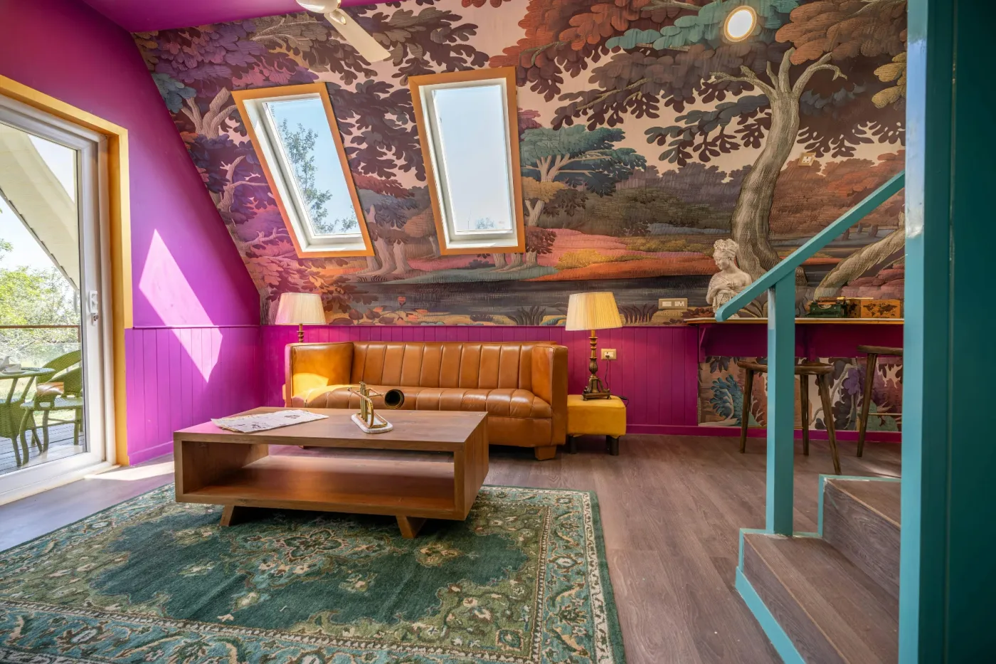
Architectural quirks like a sloped ceiling can be challenging, but this room embraces it as a feature. By continuing the forest mural wallpaper from the wall onto the ceiling, the design creates a seamless, immersive canopy effect. This trick blurs the lines of the room, making the space feel larger and more enchanting, as if you’re truly sitting in a forest clearing. It turns an awkward angle into the most magical part of the room, proving that you should work with your room’s unique features, not against them.
|
📋 Copy HEX 🔗 Share |
Wallpapering a ceiling, especially a sloped one, is not a beginner-friendly DIY project. It’s physically demanding (hello, neck and shoulder pain) and requires precision to match the pattern seamlessly while fighting gravity. Getting it wrong can result in bubbles, crooked lines, and a lot of frustration. Unless you have significant wallpapering experience, this is one of those jobs where hiring a professional is almost always worth the money to ensure a flawless, long-lasting result.
17. Add an Artistic Edge with Paint-Drip Wainscoting
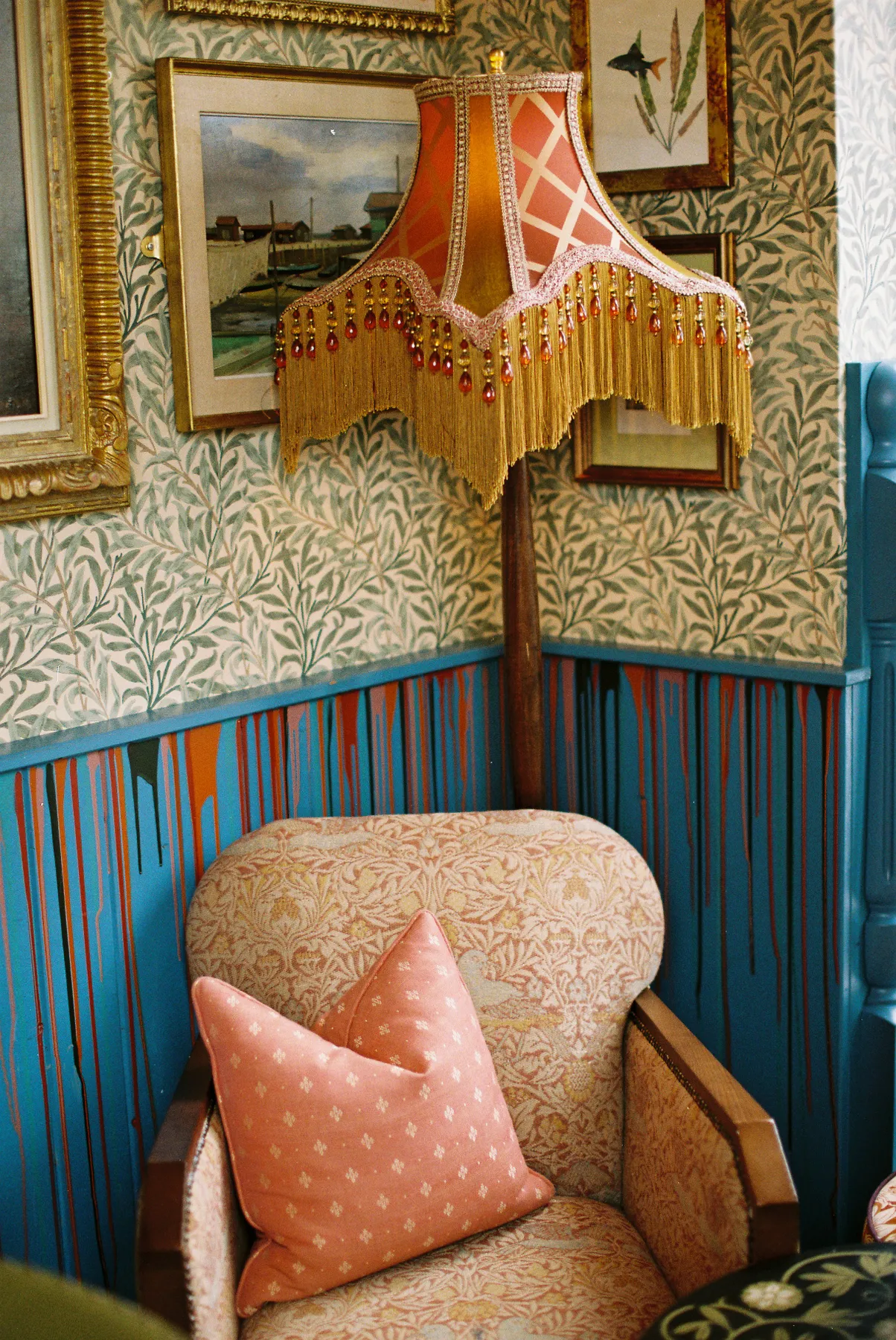
To create a controlled, artistic paint drip effect, the key is the consistency of your paint. You may need to thin your accent color paint slightly with water (for latex) or a product like Floetrol to get it to flow nicely without being too runny. Use a small syringe or a squeeze bottle to apply the paint along the top edge of the wainscoting. Do a test run on a piece of cardboard first to see how it drips. Apply it in varying amounts to create drips of different lengths for a more organic, random look.
|
📋 Copy HEX 🔗 Share |
This high-impact, artistic look is surprisingly affordable to achieve. You don’t need gallons of paint. The main wainscoting color might take a quart, but for the drips, you can get away with using sample pots of paint, which typically cost only $5-$10 each. This means you can create a multi-colored, layered effect with orange, pink, and green for under $30 in materials. Pair it with thrifted gilded frames to complete the eclectic, artistic vibe on a serious budget.
18. Create a Whimsical Vanity with a Wavy Backlit Mirror
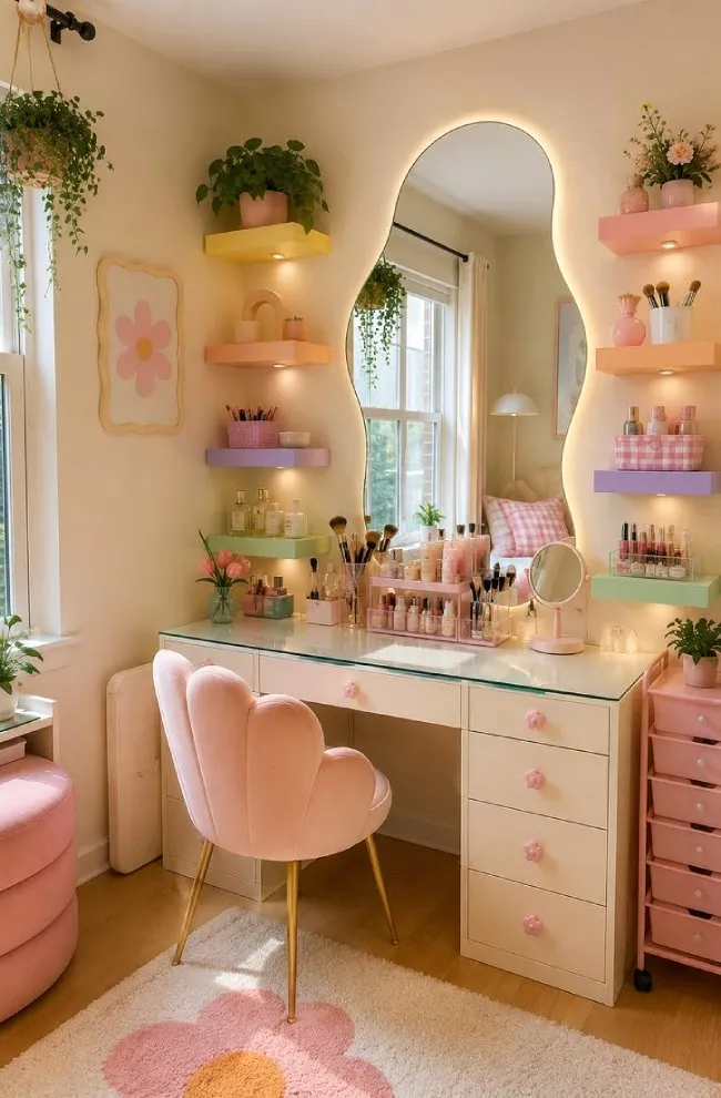
The key to making a multi-pastel space feel cohesive and not chaotic is balance. This vanity area follows a simple formula: 60% neutral foundation + 30% primary pastel + 10% accent pastels. The cream walls and white desk provide the neutral canvas. Soft pink is the dominant pastel, seen in the chair, rug, and several accessories. The final 10% is a sprinkle of lavender, mint green, and yellow on the shelves. This hierarchy prevents the colors from competing with each other and creates a harmonious, dreamy effect.
|
📋 Copy HEX 🔗 Share |
Open shelving in a vanity area looks amazing on Pinterest, but it requires serious discipline to maintain. This is not a ‘toss it on the shelf’ situation. To keep it from looking like a chaotic drugstore aisle, you need to be committed to decanting products into prettier bottles, using organizers, and regularly curating what’s on display. If you’re not naturally a tidy person, this setup can quickly become a source of visual stress rather than joy. Be honest with yourself about your tolerance for clutter before you commit.
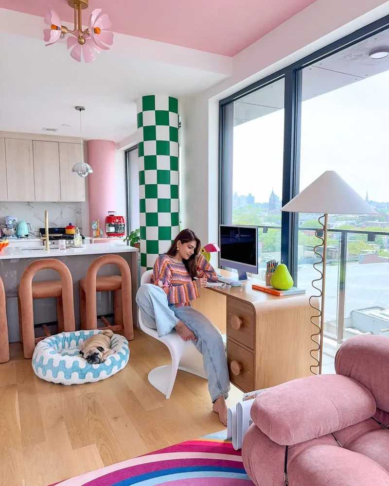
19. Paint the Ceiling Pink and Wrap a Column in Checkerboard
The single most transformative choice in this space is painting the ceiling pink. We’re so conditioned to think of ceilings as white that this simple change has a radical effect. It instantly makes the room feel more intimate, custom, and playful. It’s the “fifth wall,” and using it as a canvas for color is a power move in design. It draws the eye upward, emphasizes the room’s volume, and creates a warm, rosy glow that flatters everything and everyone in the space. The room would still be fun without it, but the pink ceiling is what makes it unforgettable.
|
📋 Copy HEX 🔗 Share |
This design works because it confidently breaks architectural rules. Instead of trying to hide the structural column, it turns it into a focal point with a graphic green and white checkerboard pattern. This, combined with the pink ceiling, tells you that this is a space for fun. The consistent use of curves in the bar stools, sofa, and desk drawers softens all the bold color and pattern, preventing the room from feeling harsh. It’s a masterful balance of graphic lines, soft shapes, and joyful color.
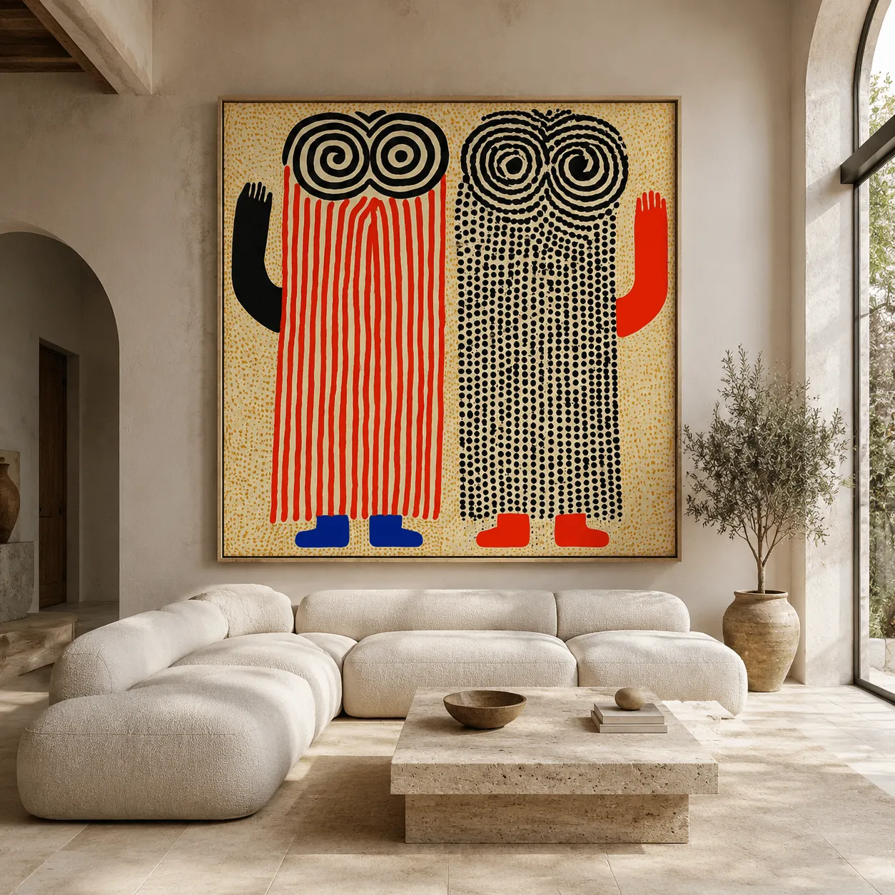
20. Let One Massive Piece of Art Be Your Dopamine Hit
To pull off a single, massive piece of art, you need two things: wall space and viewing distance. This look is ideal for a room with a large, uninterrupted wall (at least 12 feet wide) and a ceiling height of 9 feet or more. The room itself should be large enough that you can stand at least 10-15 feet back from the artwork to take it all in. In a smaller space, a piece this large will feel oppressive and you’ll never be able to appreciate its full impact. This is the minimalist’s answer to the joyful chaos of Idea #1.
|
📋 Copy HEX 🔗 Share |
Original large-scale art can cost thousands, but you can get this impactful look for less. Search for oversized prints on sites like Society6 or Artfully Walls, where you can often find 40×60 inch prints for a few hundred dollars. For a really affordable option, buy a huge blank canvas from a craft store (around $100-$150) and create your own abstract piece. You don’t have to be a professional artist; using large brushes to block out bold shapes and colors can create a surprisingly sophisticated and personal statement piece.
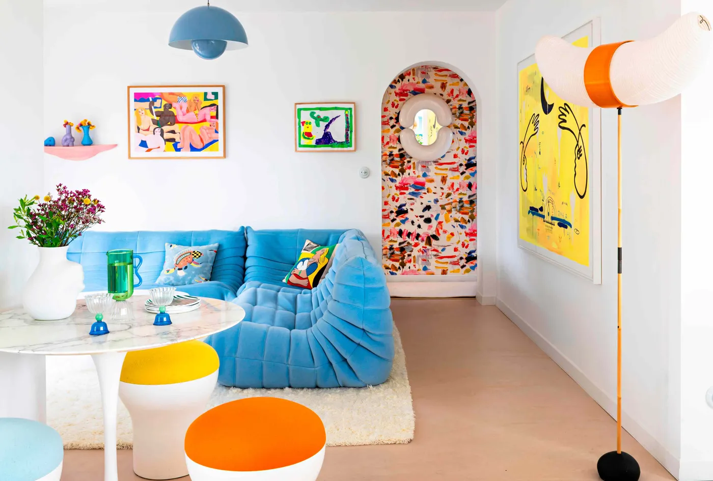
21. Pair a Bright Blue Sofa with Colorful Abstract Art
When choosing art to go with a bold piece of furniture like this blue sofa, the goal is to complement, not match. Look for artwork that has a tiny amount of the sofa’s color in it—just a sliver or a brushstroke. The rest of the art’s palette should introduce new, harmonious colors, like the yellows and pinks seen here. This creates a sophisticated visual connection without being too obvious. If the art was also predominantly blue, the two pieces would compete and the overall effect would be flat.
|
📋 Copy HEX 🔗 Share |
This vibrant space uses a classic color rule with a twist. It’s a 70/20/10 split. The neutral elements—white walls, light floors, marble table—make up about 70% of the visual space, creating a calm backdrop. The bold blue sofa is the 20%, the secondary color that gives the room its identity. The final 10% is a riot of warm accent colors like yellow, orange, and pink, sprinkled throughout the stools and artwork. This formula allows the bold colors to shine without becoming overwhelming.
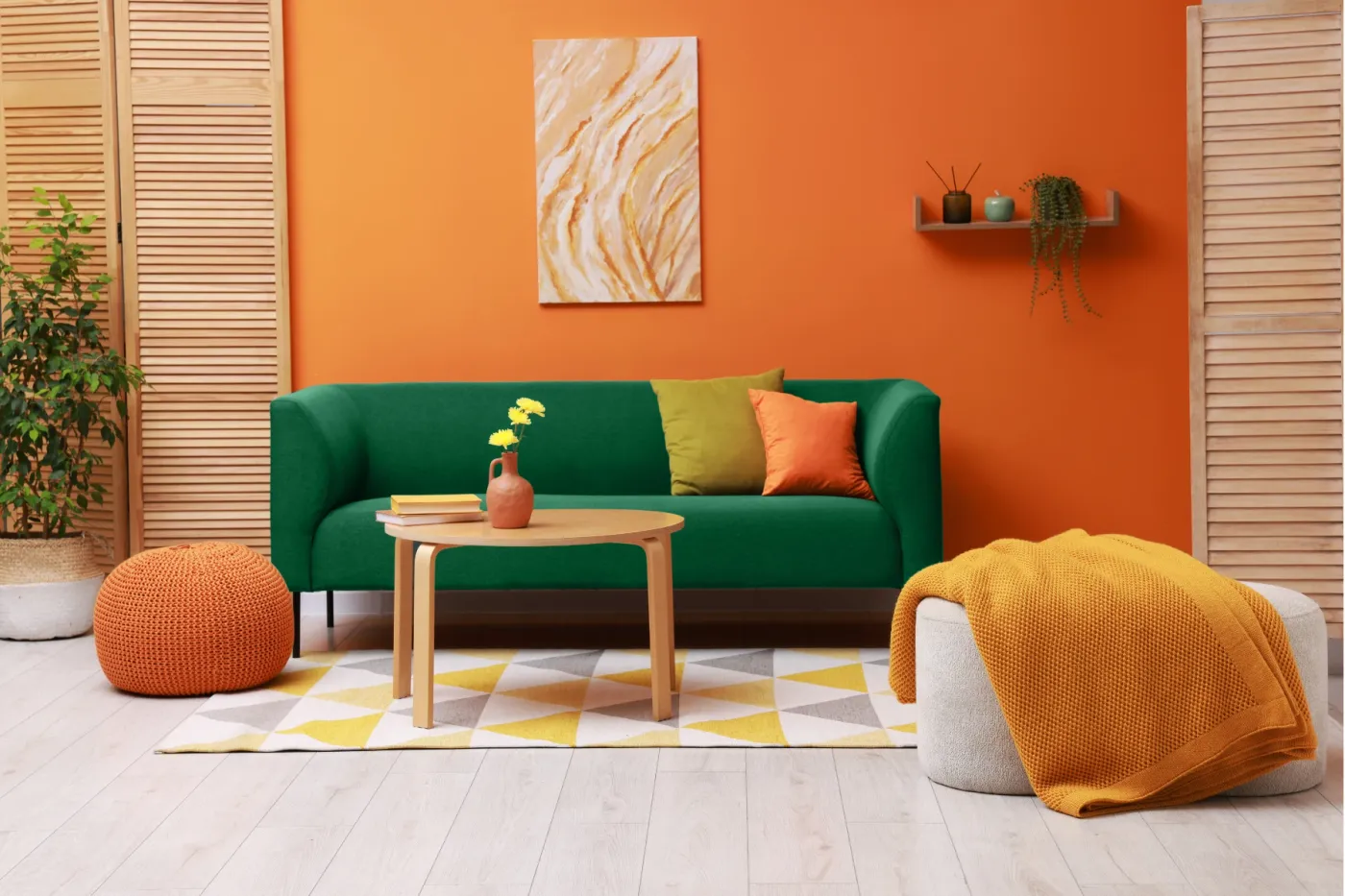
22. Try a Classic Combo: Forest Green, Orange, and Yellow
This color combination of deep green, earthy orange, and bright yellow has serious staying power because it’s rooted in nature. It reminds us of autumn leaves and late-summer sunsets. While it has a retro, 70s feel, it’s being reinterpreted in modern ways. After a long period of cool grays and neutrals, people are craving warmth and comfort, and this palette delivers exactly that. It feels optimistic and energetic yet grounded and cozy, making it a perfect, enduring choice for a living space.
|
📋 Copy HEX 🔗 Share |
This is one of the most accessible looks in the entire roundup because it can be achieved primarily with paint and affordable accessories. An orange accent wall costs less than $50. You can find forest green sofa covers for popular IKEA models online. The real key is in the textiles: scour places like Target, H&M Home, or even Walmart for geometric rugs, knitted poufs, and throw pillows in this color story. You can easily pull together this entire vibrant look for under $800.
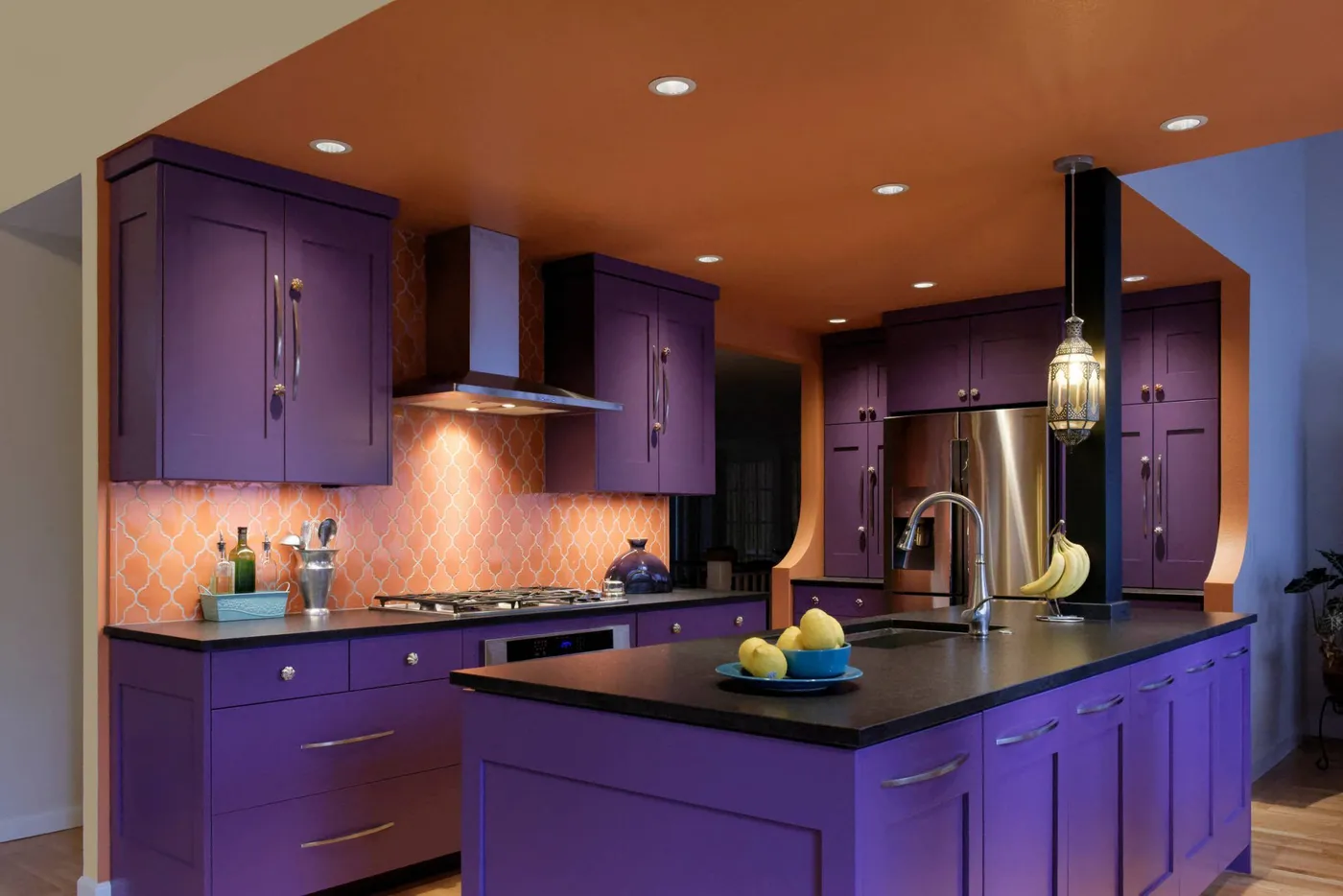
23. Go for a Bold Kitchen With Purple Cabinets and an Orange Ceiling
The single thing that makes this kitchen unforgettable is its audacious color pairing. Purple and orange are a high-contrast, high-energy combination that you rarely see in a kitchen. It’s a choice that exudes confidence and a love for color. While the arabesque tile and cabinet style are beautiful, it’s the color story that elevates the room from a nice kitchen to a wow moment. It’s a powerful reminder that kitchens don’t have to be white, gray, or wood-toned to be stunning.
|
📋 Copy HEX 🔗 Share |
A purple and orange kitchen is a bold statement, and bold statements can affect resale value. While you should design your home for you, it’s something to be aware of if you plan on selling in the next few years. Also, saturated colors like these can look dramatically different depending on the light. A vibrant purple in a showroom can look dark and muddy in a kitchen with poor natural light. Always paint large sample boards and move them around the room for a few days before you commit to painting all your cabinets.
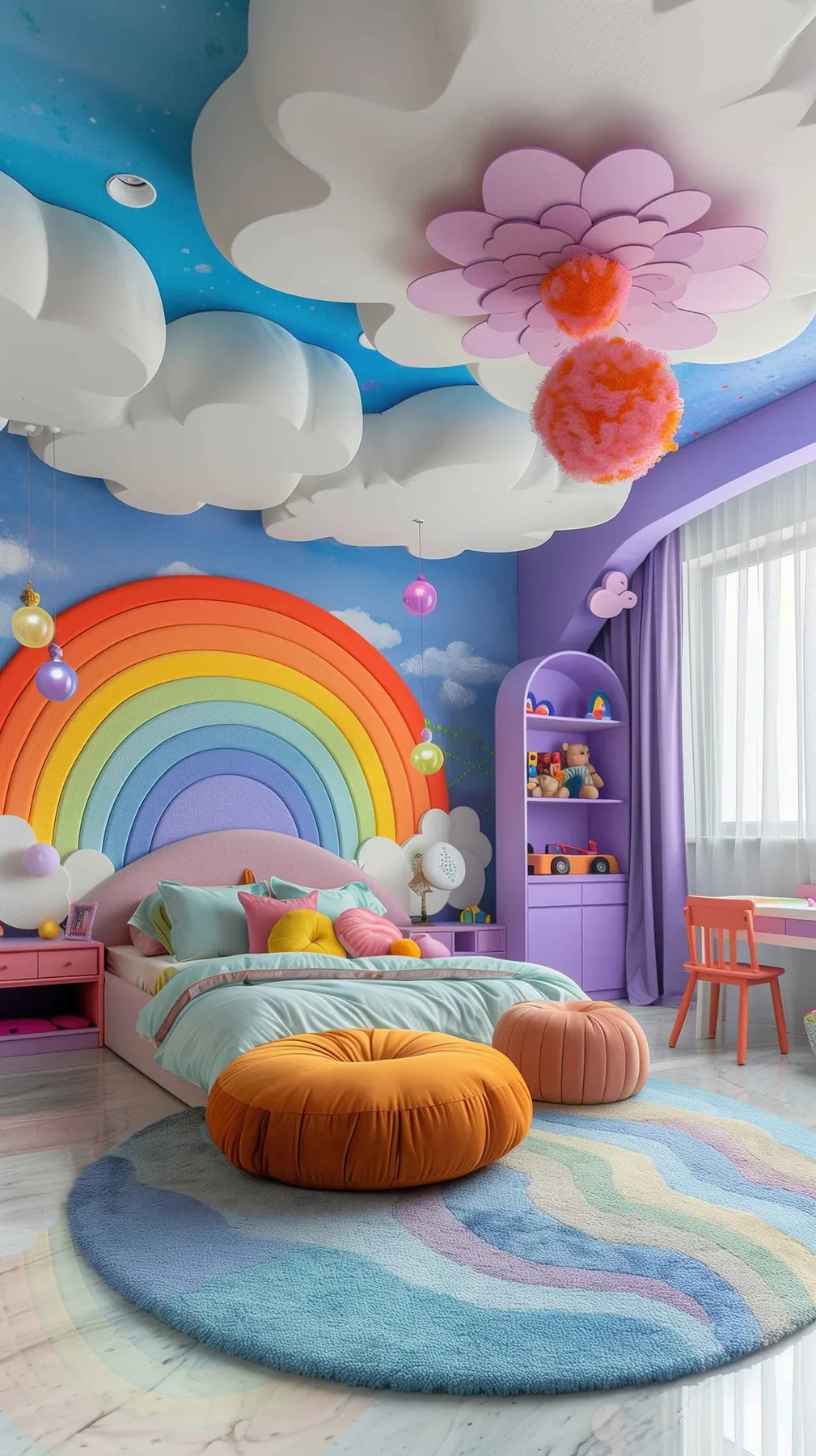
24. Dream Big with a Plush Rainbow Headboard and Cloud Ceiling
This bedroom succeeds by fully committing to a theme and creating a completely immersive environment. The design works because it layers the sky concept on multiple levels: the blue walls, the painted clouds, the 3D cloud fixtures, and even the rainbow headboard. This repetition of a theme, executed with soft textures and a cohesive pastel palette, is what makes it feel like a magical, cohesive world rather than just a decorated room. It’s a testament to the power of going all-in on a creative vision.
|
📋 Copy HEX 🔗 Share |
When designing a child’s room with a strong theme, the key to longevity is to invest in the foundational pieces and keep branded characters out of the picture. The plush rainbow headboard and cloud lights are whimsical but also well-made and abstract. The theme is sky or rainbow, not a specific TV show. This allows the room to grow with the child. You can easily swap out bedding and smaller accessories as their tastes change, without having to redo the entire expensive and creative core of the room.
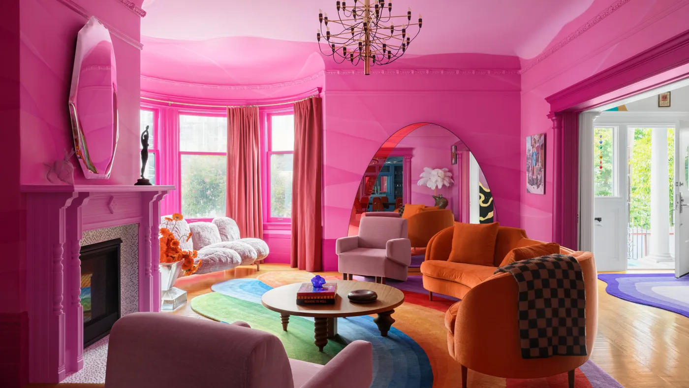
25. Drench a Room in Hot Pink, from Walls to Fireplace
This room’s formula is monochromatic saturation plus a full spectrum. About 70% of the room’s surfaces—the walls, fireplace, and mirror frame—are drenched in the same shade of hot pink. This creates a powerful, enveloping base. The rainbow-striped rug provides the 20%, introducing a joyful riot of color. The final 10% comes from the solid orange and blush seating, which bridges the gap between the pink base and the multi-colored rug. It’s a bold, confident approach to color theory. This is a full-throttle version of the pink accents in Idea #2.
|
📋 Copy HEX 🔗 Share |
A color-drenched look with this much saturation works best in a room with generous proportions and ample natural light. You’ll want a space that’s at least 15×20 feet with ceilings that are 10 feet or higher. In a smaller, darker room, a color this intense can feel overwhelming and claustrophobic. The high ceilings and large windows are what keep this hot pink room feeling airy and glamorous rather than small and suffocating. The large arched mirror also helps by bouncing light and creating an illusion of even more space.
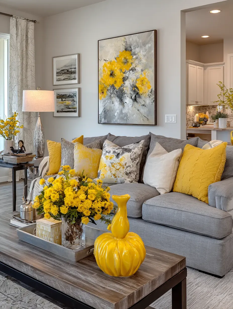
26. Inject Joy into a Neutral Room with Bursts of Yellow
This is the perfect entry point into dopamine decor because it’s low-risk and high-reward. The room works because it’s built on a classic, versatile foundation: a gray sectional sofa and neutral walls. This calm backdrop allows the pops of vibrant yellow to truly sing. Because the yellow is used in easily swappable items—pillows, vases, flowers, and art—it makes a huge impact without a huge commitment. It’s proof that you don’t need to paint your walls orange to create a space that feels cheerful and bright. If you love this but are ready for more commitment, check out the full yellow sofa in Idea #4.
|
📋 Copy HEX 🔗 Share |
Ready to try this at home? It’s incredibly budget-friendly. Skip the expensive original art for now and find a vibrant yellow print on Etsy for $20. Grab a handful of pillow covers from Amazon or H&M Home for about $10-$15 each. A bright yellow vase from Target or HomeGoods will run you about $25. Fresh yellow flowers from the grocery store are a weekly $10 treat. For under $100, you can completely change the energy of your living room this weekend.
Your Home Should Be Your Happy Place
These ideas are more than just trends; they’re permission slips to let your personality shine through in your space. You don’t have to do it all at once. Just pick one detail from this list that made you smile and start there. Ready for more daily inspiration? Find and follow us on Pinterest for your next great idea.