
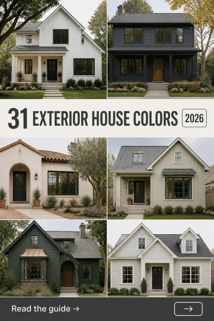
You know that feeling when you finally find the exterior house color that looks exactly right? It’s a mix of relief and pure excitement. But getting there can feel like an endless scroll through Pinterest boards filled with fifty shades of gray. We get it. That’s why we did the hard work for you, analyzing trends from color authorities like Sherwin-Williams and Benjamin Moore to find palettes that work in the real world.
Inside, you’ll find 31 distinct exterior color ideas, covering everything from moody modern farmhouse to timeless Craftsman and vibrant traditional styles. The shift for 2026 is all about creating personalized curb appeal that tells a story, moving beyond safe neutrals to embrace rich, thoughtful color. And stay until the end—we break down the most common mistakes that can ruin these looks. Pin this guide for later—your future self will thank you when it’s time to actually pick up a paintbrush.
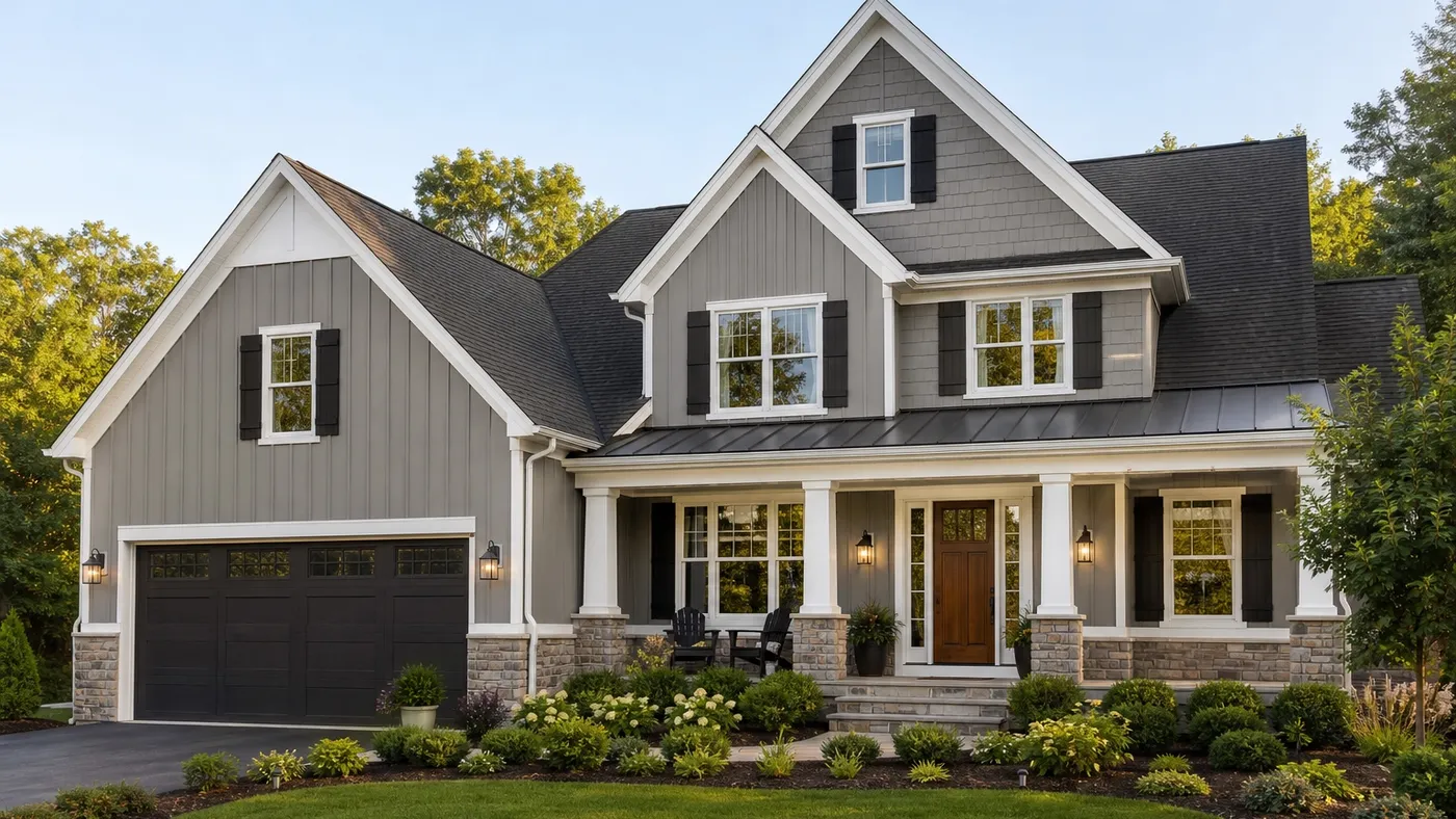
1. Modern Farmhouse with Gray Siding and a Wood Front Door
This combination is a modern classic for a reason. The light gray board-and-batten siding creates a clean, vertical rhythm, while the gray shingles add textural variety. It works because of the high-contrast principle: the crisp white trim and deep black shutters create sharp, defined lines that make the architecture pop. The warm wood front door and stone pillars prevent the palette from feeling cold by introducing natural, earthy tones that ground the entire design.
|
📋 Copy HEX 🔗 Share |
This is a masterclass in balancing warm and cool tones. The cool gray siding is the dominant color, but without the warmth of the wood and stone, the house would feel much less inviting. It’s a push-and-pull that results in perfect harmony.
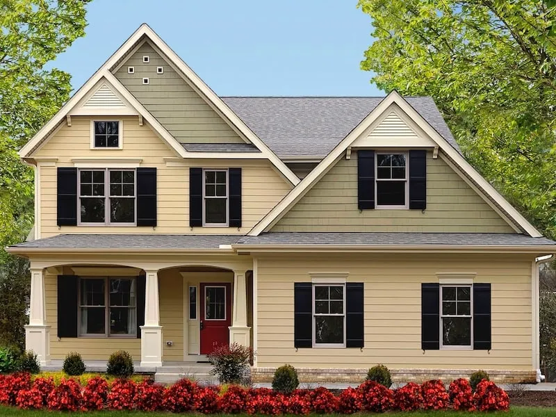
2. Traditional Home with Yellow Siding and Green Gables
This charming look is all about a playful, yet traditional, color formula. Think of it as 60% soft primary (the light yellow siding), 30% earthy secondary (the pale green gables), and 10% bold accents (the black shutters and fire-engine red door). The white trim acts as a neutral frame that separates and defines each color, preventing the look from becoming chaotic. You could swap the yellow for a pale blue and the green for a muted gray, and the formula would still hold its classic appeal.
|
📋 Copy HEX 🔗 Share |
A friendly heads-up on this color combination: lighter colors like pale yellow and green can show dirt and mildew more easily, especially in damp or shady climates. You’ll want to plan for a gentle power wash every 2-3 years to keep it looking fresh. Also, that vibrant red door is gorgeous, but red pigments are notorious for fading faster than other colors in direct sunlight. Consider a high-quality, UV-resistant paint and be prepared for a touch-up every few years to maintain its punch.
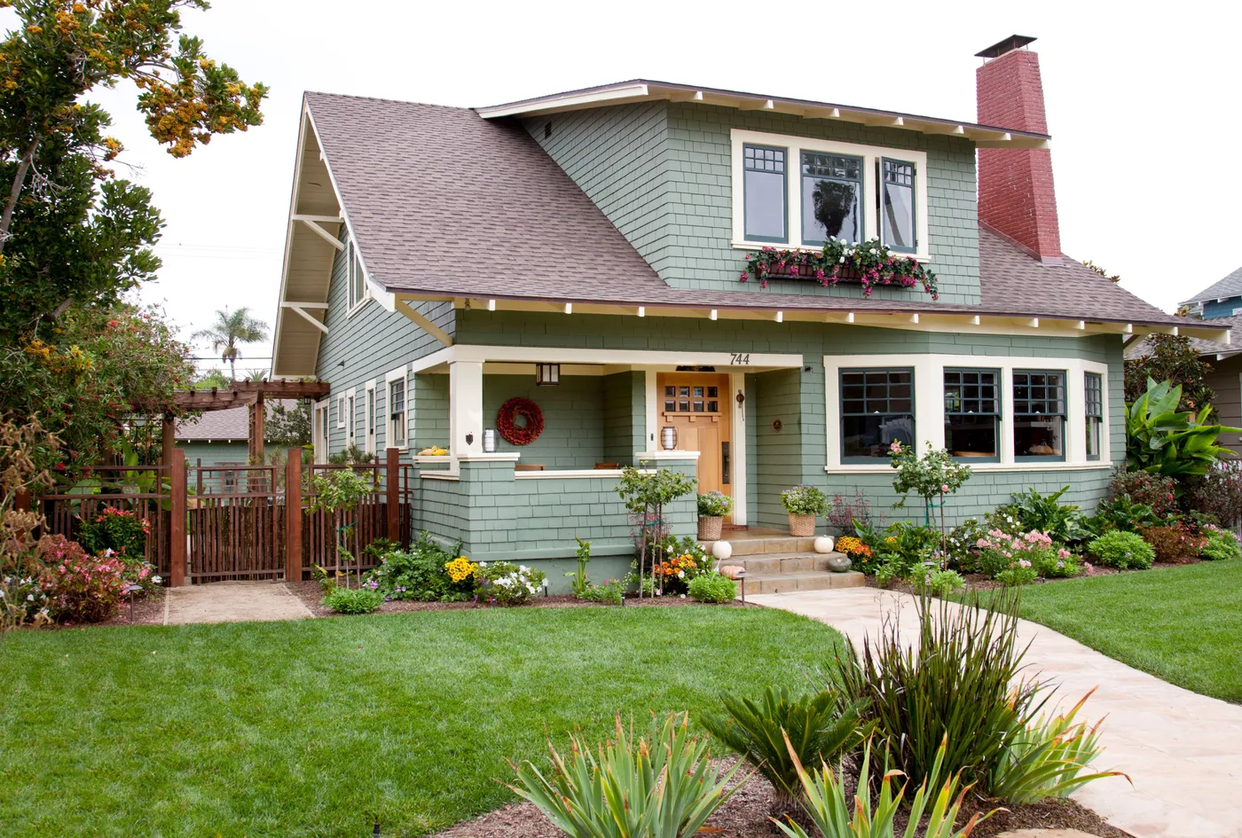
3. Sage Green Craftsman with Natural Wood and Cream Trim
The single element holding this entire design together is the cream trim. It’s the visual bridge between the earthy sage green siding, the natural wood door, and the red brick chimney. If you were to make the trim a stark, bright white, the look would feel much harsher and less cohesive. The cream has a warm undertone that speaks to the other natural materials, creating a soft, welcoming glow. It proves that the ‘in-between’ colors are often the most important ones in a palette.
|
📋 Copy HEX 🔗 Share |
You don’t need a custom build to get this earthy Craftsman feel. Start with a sage green paint, which is available from nearly every major brand. For the trim, choose an off-white or cream instead of a pure white. Instead of a solid wood door (which can be pricey), look for a fiberglass door with a convincing wood-grain finish from Home Depot or Lowe’s for around $400-$800. For the pathway, check Facebook Marketplace for leftover flagstone or pavers from a neighbor’s project. You can achieve this entire color story for under $2,000 in materials if you’re willing to DIY.
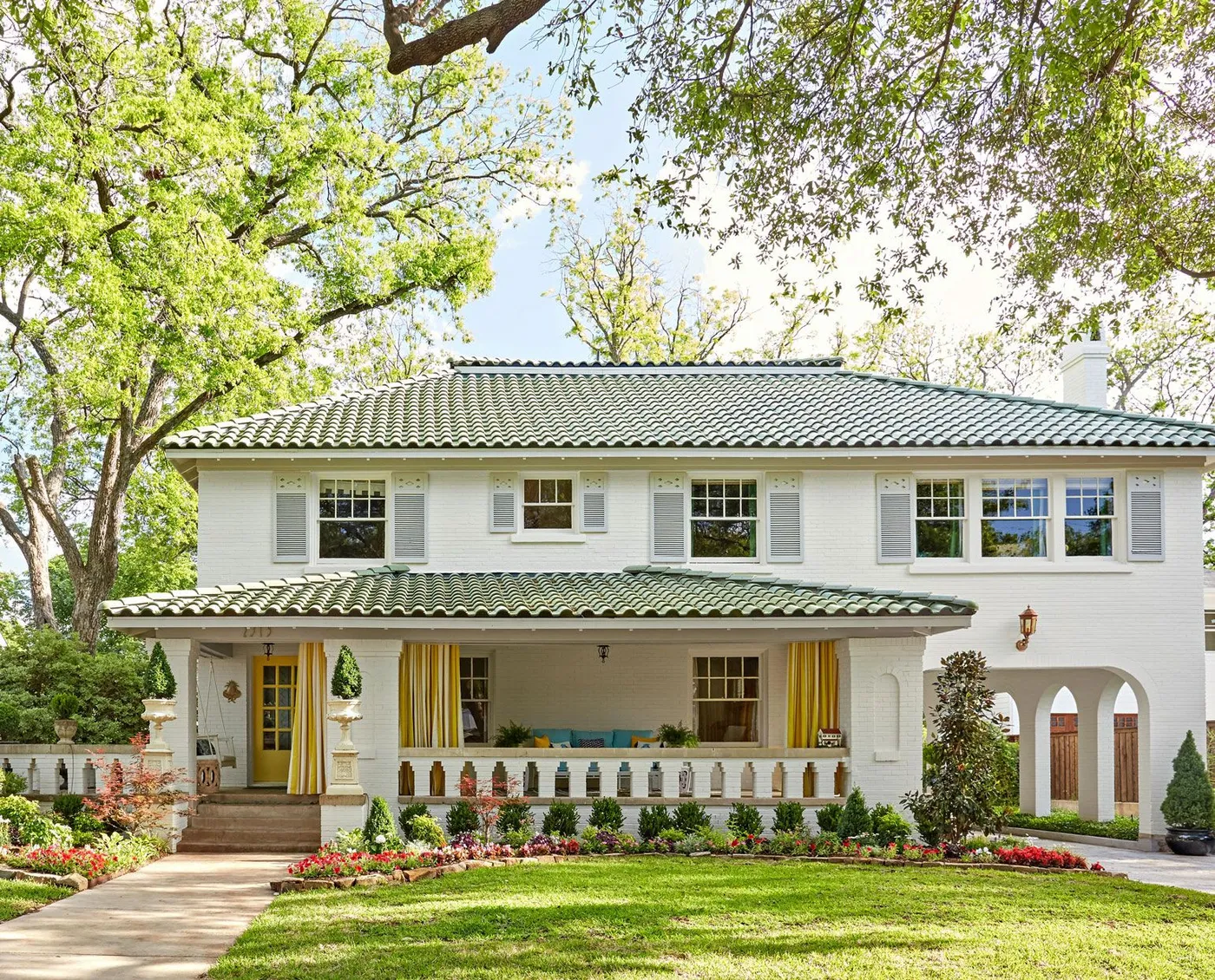
4. White Brick House with a Green Scalloped Tile Roof
This look is gaining traction as homeowners seek to add personality and a touch of whimsy to classic home styles. We’re seeing a move away from monotonous gray or black roofs toward statement colors. A green tile roof, especially a scalloped one, feels both historic and incredibly fresh. Paired with a playful yellow door, it’s part of a larger trend called ‘dopamine decor,’ where bright, joyful colors are used to create an uplifting and personal space. It’s a confident choice that has major staying power because it’s rooted in classic materials.
|
📋 Copy HEX 🔗 Share |
A green tile roof is stunning, but it’s a commitment. While durable, individual tiles can crack from impact (like falling branches) and need to be replaced by a professional roofer. The white-painted brick will also require upkeep. Depending on your climate, expect to pressure wash it every few years to remove mildew or dirt. Repainting may be necessary every 7-10 years to keep it looking crisp. Those yellow and white striped curtains are a fun touch, but outdoor fabric will need to be washed seasonally and will likely need replacing every 3-5 years due to sun fading.
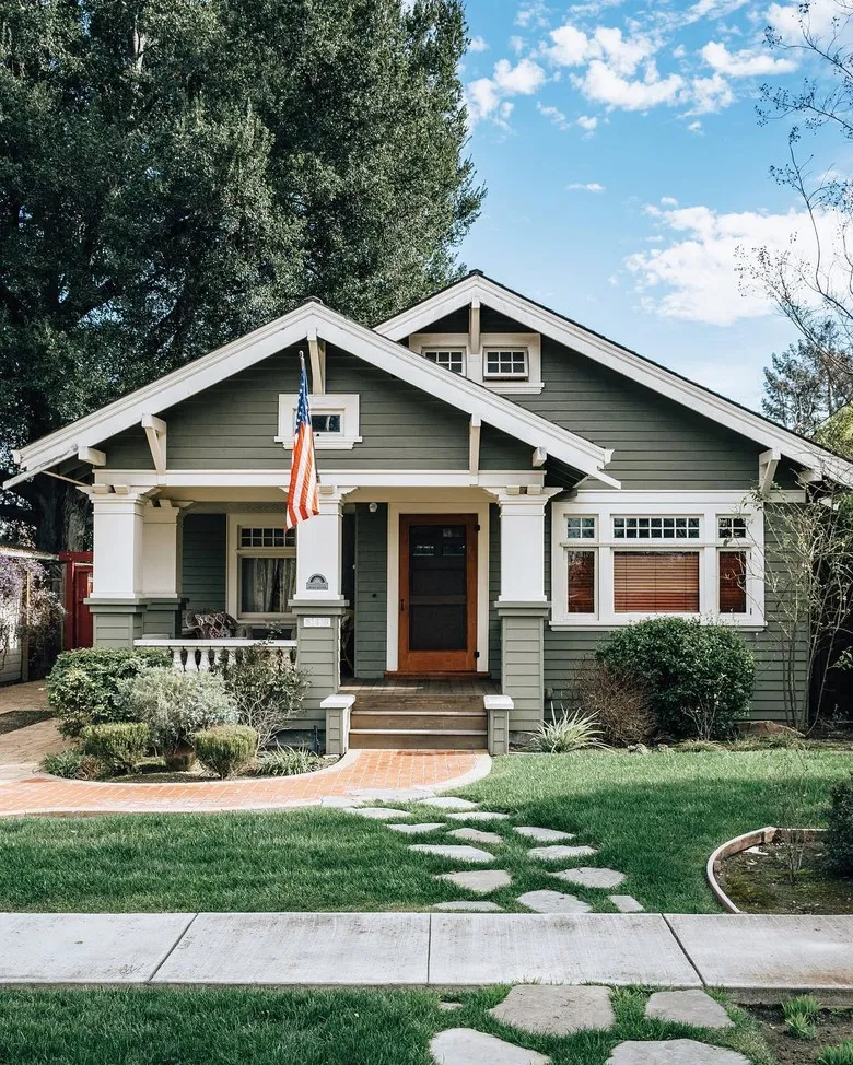
5. Craftsman Home with Dark Sage Siding and a Brick Path
The curving brick pathway is key to this home’s inviting feel. You can create a similar look yourself. Here’s a quick guide:
- Outline the path shape with garden hoses, then mark with spray paint.
- Excavate the path area to a depth of about 6 inches.
- Add and compact a 4-inch layer of paver base (crushed stone).
- Add a 1-inch layer of paver sand and screed it level.
- Lay your bricks in the desired pattern, tapping them into place with a rubber mallet.
- Sweep polymeric sand into the joints, mist with water, and let it cure.
This is a weekend project, and material costs for a 50-foot path would be around $500-$800.
|
📋 Copy HEX 🔗 Share |
This deep, saturated color scheme works beautifully on a home of this size—roughly 2,000 to 3,500 square feet. The prominent white trim is crucial; on a smaller house, this dark of a sage green could feel overwhelming without enough bright contrast to break it up. The key is the ratio of siding to trim. If your home has smaller windows or thin trim, consider a slightly lighter green to maintain a sense of openness. For a smaller footprint, check out the lighter palette in Idea #2.
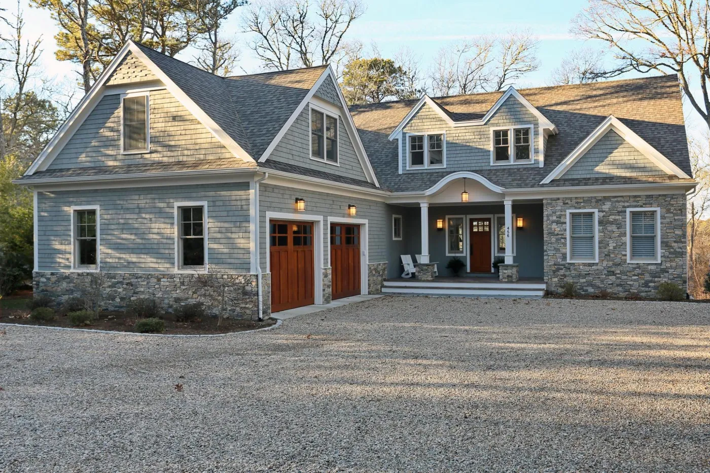
6. Coastal-Inspired Gray Shakes with Stone and Wood Garage Doors
This exterior design feels so balanced because it masterfully layers textures. You have the fine, repeating lines of the gray cedar shakes, the rugged, organic pattern of the stacked stone veneer, and the smooth, warm grain of the wooden garage doors. Each material has a distinct character, but they all share a natural, earthy quality. The white trim acts as negative space, giving your eyes a place to rest and preventing the texture combination from feeling too busy. The result is a look that’s complex but not complicated.
|
📋 Copy HEX 🔗 Share |
Thinking of a similar stone and wood combination? Here’s a quick checklist before you commit:
- Check your undertones: Take samples of your chosen siding, stone, and wood stain outside. Make sure the gray siding’s undertone (is it blue, green, or purple?) works with the tones in the stone.
- Consider the garage door’s sun exposure: A solid wood door facing west or south will require more frequent sealing and maintenance than one facing north.
- Budget for masonry: Stone veneer isn’t just the cost of the material; professional installation is key to making it look authentic. Get at least two quotes from local masons.
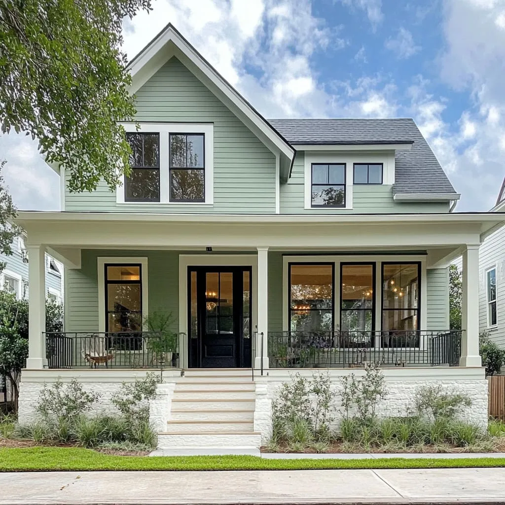
7. Two-Story Sage Green House with Crisp Black and White Accents
The black window frames are the secret ingredient here. Without them, this would be a perfectly nice, classic home. With them, it’s elevated to something sharp and modern. The black provides a graphic punch that contains the windows and makes them stand out against the soft sage and bright white. It’s a small detail that adds a significant amount of definition and sophistication, proving that sometimes the smallest choices have the biggest impact on the final look.
|
📋 Copy HEX 🔗 Share |
When using a three-color palette like this (sage, white, black), the key to a professional look is getting the sheen right for each surface. Use a matte or flat finish for the main siding to give the sage green a soft, velvety appearance. For the white trim, go with a satin or semi-gloss finish. This not only makes it easier to clean but also provides a subtle reflection of light that helps it pop. The black accents, like the door and railings, look best in a durable satin finish—it’s not too shiny, not too flat.
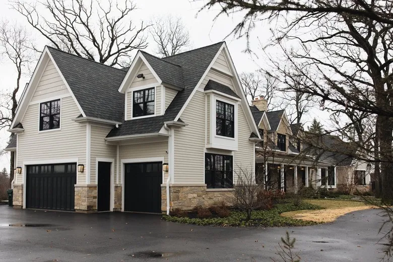
8. Understated Home with Beige Siding and Black-Framed Windows
This is a fantastic example of a high-contrast neutral palette. The formula is simple: 70% warm neutral (the light beige siding), 20% dark neutral (the dark gray roof and black windows/garage), and 10% textural accent (the light brown stone veneer). The white trim serves to bridge the gap between the light siding and dark frames. This equation creates a look that’s timeless and sophisticated. You could swap the beige for a warm white or a light greige, and the formula would still deliver that same clean, classic impact.
|
📋 Copy HEX 🔗 Share |
Black-framed windows can be a major expense. To get this high-contrast look on a budget, keep your existing vinyl or wood windows and paint them! After proper prep and priming, use a high-quality exterior paint formulated for the material, like Sherwin-Williams Emerald Urethane Trim Enamel in Tricorn Black. For a few hundred dollars in paint and supplies, you can achieve the same dramatic effect as new windows that could cost upwards of $15,000. It’s a weekend project that completely changes the face of your house.
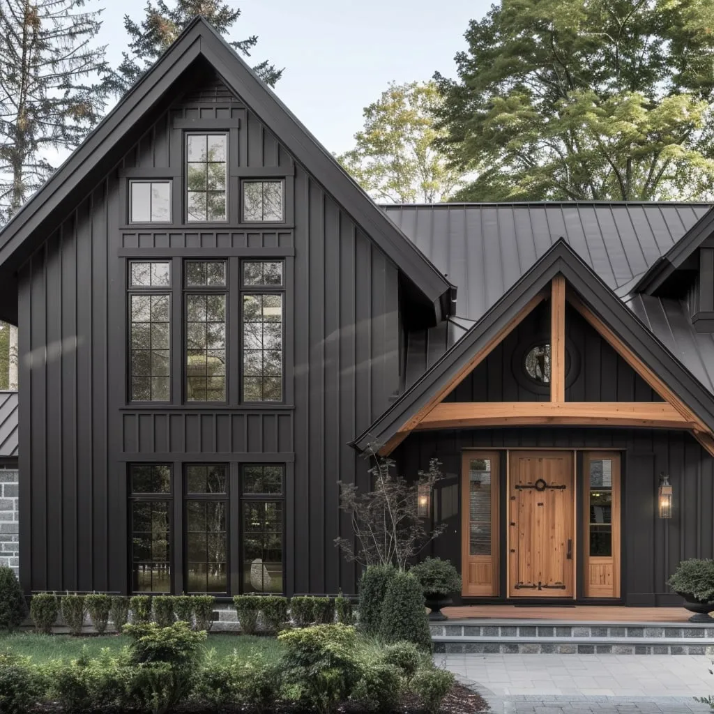
9. Modern Home with Dark Board-and-Batten and Natural Wood
The success of this design lies in the powerful contrast between materials. The dark, vertical board-and-batten siding creates a strong, monolithic feel, which is then softened and humanized by the natural wood accents around the entrance. The wood acts as a visual cue, saying, “This is the way in; this is a place of warmth.” The light gray stone steps add another layer of natural texture, preventing the dark siding from feeling too imposing and connecting the structure to the surrounding landscape.
|
📋 Copy HEX 🔗 Share |
Dark exteriors are incredibly chic, but they have a practical downside: they absorb more heat than lighter colors. If you live in a hot, sunny climate like the American Southwest or Florida, a black or charcoal exterior can lead to higher cooling costs in the summer. Additionally, dark paint colors can be more susceptible to fading over time from UV exposure. Opt for the highest quality paint you can afford, specifically one with advanced fade-resistant technology, to prolong the life of the color. Compare with the lighter look of Idea #10, which uses a similar modern style.
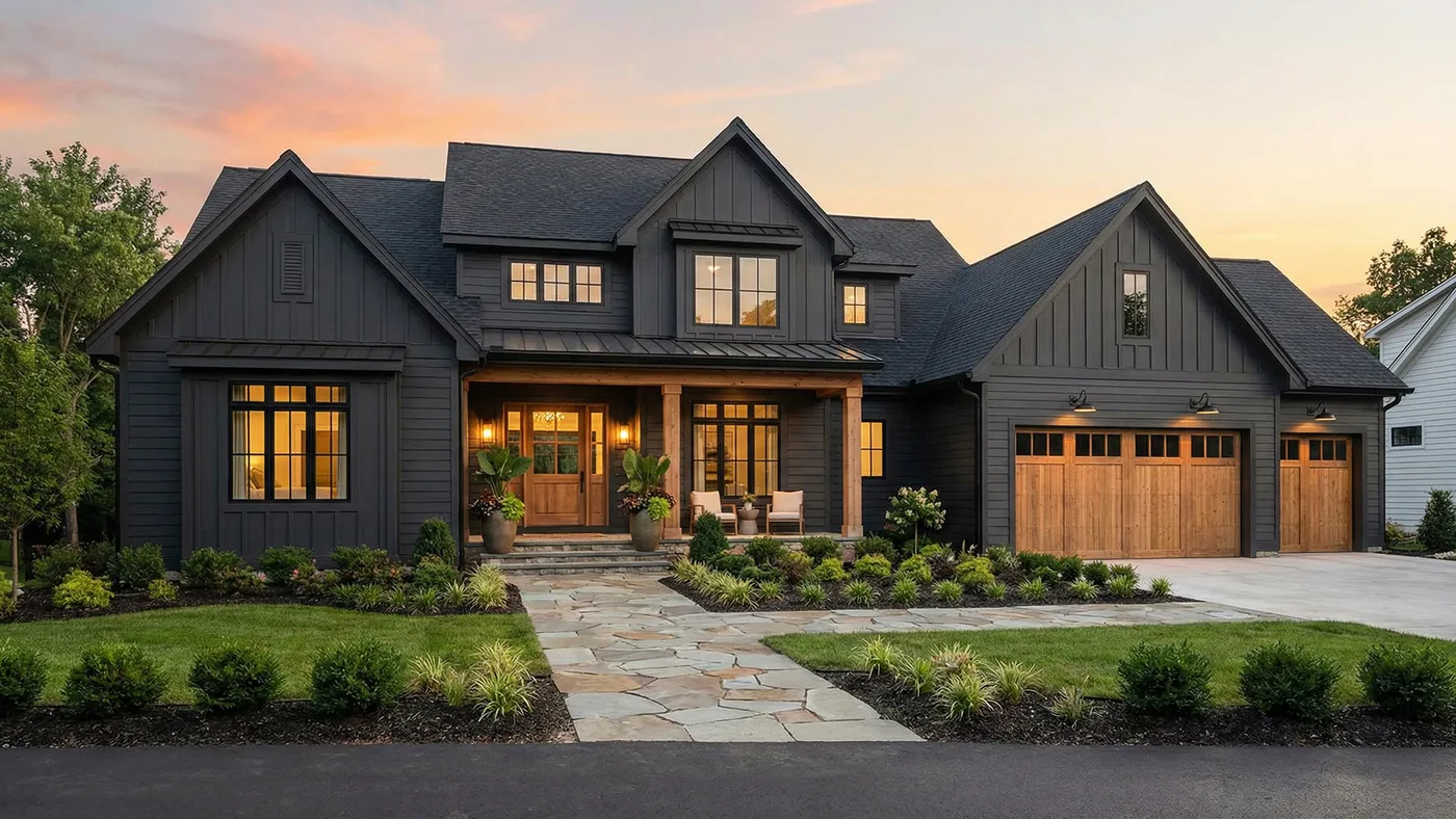
10. Dark Gray Modern Farmhouse with a Flagstone Pathway
The warm wood elements—the garage doors, front door, and porch columns—are what make this house feel like a home. Take them away, and you’re left with a handsome but somewhat cold dark gray box. The wood introduces an essential organic warmth and a touch of rustic character that is central to the modern farmhouse identity. It’s the perfect counterbalance to the moody siding and black-framed windows, creating a design that feels both sophisticated and deeply welcoming.
|
📋 Copy HEX 🔗 Share |
Recreating this refined farmhouse look involves a mix of high-impact materials.
- Siding (materials + installation): $15,000 – $30,000
- Wood Garage & Front Doors: $8,000 – $20,000
- Windows: $10,000 – $25,000
- Roofing: $12,000 – $22,000
- Flagstone Pathway & Landscaping: $5,000 – $10,000
- TOTAL: $50,000 – $107,000
Budget alternative: Use standard garage doors painted a warm brown, a fiberglass wood-look front door, and concrete pavers instead of flagstone to bring the total cost down by 40-50%.
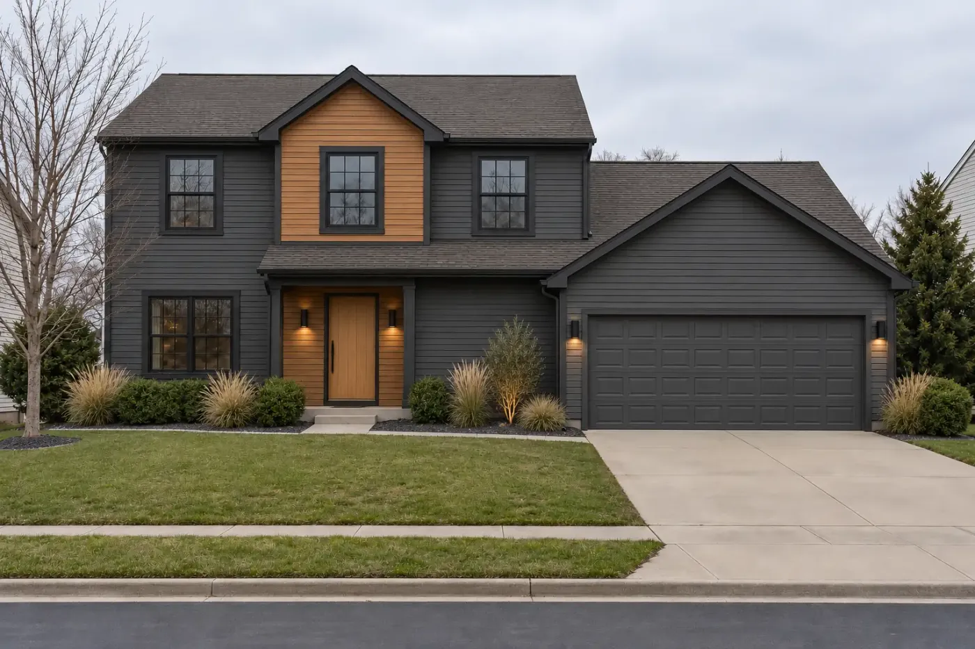
11. Modern Exterior with Mixed Dark Gray and Natural Wood Siding
When mixing siding materials like this, the transition points are everything. Notice how the wood siding is used to block out an entire architectural volume—the second story—and to frame the entryway. This looks intentional and clean. Avoid mixing materials in a patchy or arbitrary way. A good rule of thumb is to dedicate one material per ‘plane’ or ‘box’ of the house’s structure. This creates a cohesive, architectural look rather than a chaotic, pieced-together one.
|
📋 Copy HEX 🔗 Share |
This style of architectural blocking with different materials works best on homes with a modern, geometric structure and a footprint of at least 1,800 square feet. It requires distinct volumes or planes to work effectively. On a smaller, more traditional home, like a simple ranch or cottage, this approach can look forced and may visually chop up the house, making it appear smaller. If your home has a simpler form, consider using the secondary material (like the wood) only as an accent around the front door or on a single gable.
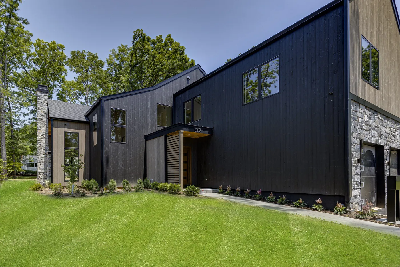
12. Contemporary Home with Dark Timber, Stone, and Wood Accents
This design feels incredibly luxurious and grounded, and it’s all about a commitment to natural materials. The dark timber cladding provides a sleek, modern canvas. The rough-hewn natural stone wall introduces a powerful sense of permanence and history. Finally, the light wood accents on the porch ceiling and door add a touch of warmth and craftsmanship. It works because these three textures—smooth, rough, and warm—are in perfect conversation with each other, creating a rich sensory experience before you even step inside.
|
📋 Copy HEX 🔗 Share |
A mix of premium materials like this requires a specific maintenance schedule. The dark timber cladding will need to be cleaned and potentially re-sealed every 3-5 years to protect it from UV damage and moisture. The natural stone is very low-maintenance but should be inspected annually for any cracks in the mortar that need repointing. The light wood accents are the most vulnerable; they’ll need a fresh coat of high-quality exterior sealant every 1-2 years, especially if they get a lot of sun and rain, to prevent graying and water damage.
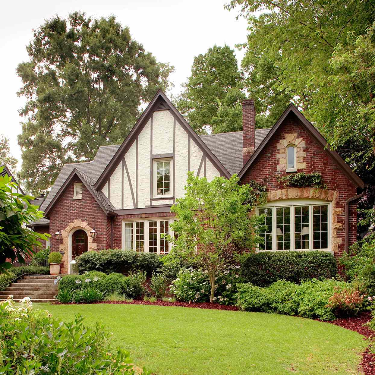
13. Classic Tudor Revival with Brick, Stucco, and Dark Trim
The most crucial element of the Tudor style is the high contrast between the stucco and the half-timbering. The bright, creamy stucco panels make the dark brown timbering pop, creating the iconic graphic pattern that defines this architectural style. If the stucco were a darker color, or the timbering a lighter one, you would lose that essential drama. Everything else—the brick, the stone, the roof—is secondary to this fundamental interplay of light and dark.
|
📋 Copy HEX 🔗 Share |
We’re seeing a resurgence of interest in classic architectural styles like Tudor as a reaction against the sea of minimalist white farmhouses. Homeowners are craving character, history, and craftsmanship. In 2026, this isn’t about creating a perfect historical replica, but about embracing the New Traditional trend. It’s about celebrating the unique details—like half-timbering and stone archways—that give a home a sense of soul and permanence. This style has staying power because it’s authentic and timeless.
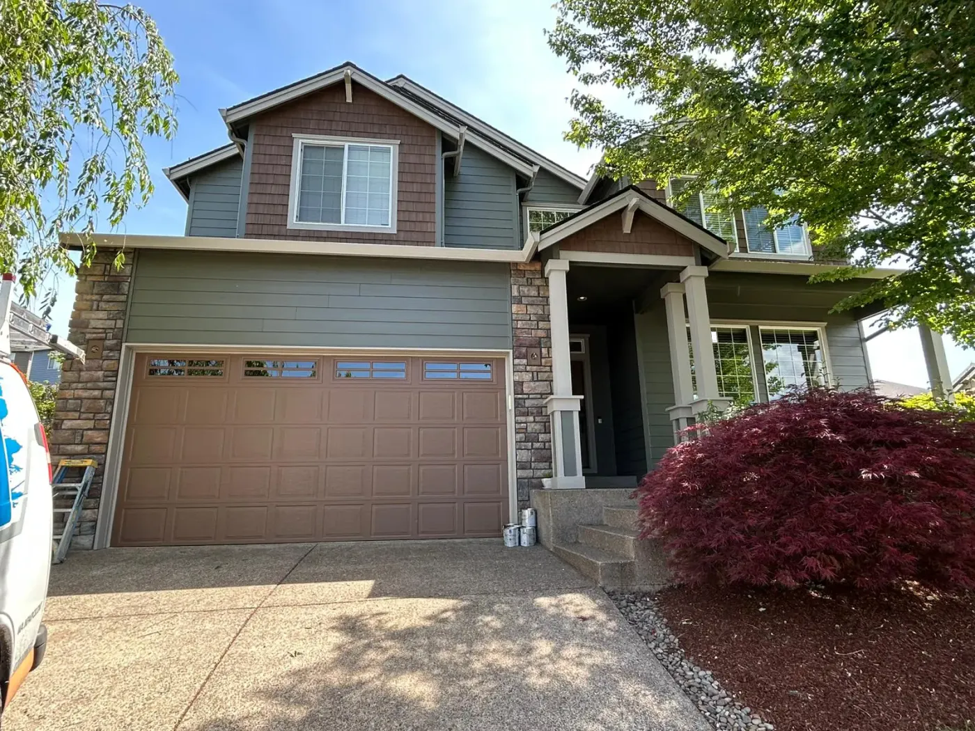
14. Earthy Green Siding with Brown Shingles and Stone Pillars
This home’s palette is a lesson in layering analogous colors. The formula is: 50% mid-tone earth green (main siding), 30% dark earth tones (brown shingles and garage door), and 20% textural stone (multi-tone pillars). The white trim and pillars act as a neutral spacer, adding crispness. The key is that all the main colors—the greens and browns—sit next to each other on the color wheel, creating a harmonious, nature-inspired feel. It’s a low-contrast approach that feels very calm and integrated with the landscape.
|
📋 Copy HEX 🔗 Share |
With this many different materials and colors (siding, shingles, stone, trim, garage door), there’s a real risk of the facade looking too busy if not handled carefully. The key to its success here is the limited color family. If the stone had wildly different colors, or if the roof were a clashing color, the whole thing could fall apart. Before you commit to a multi-material facade, make a physical mood board with samples of EVERY finish to see them together in natural light. What looks good on a screen can be jarring in reality.
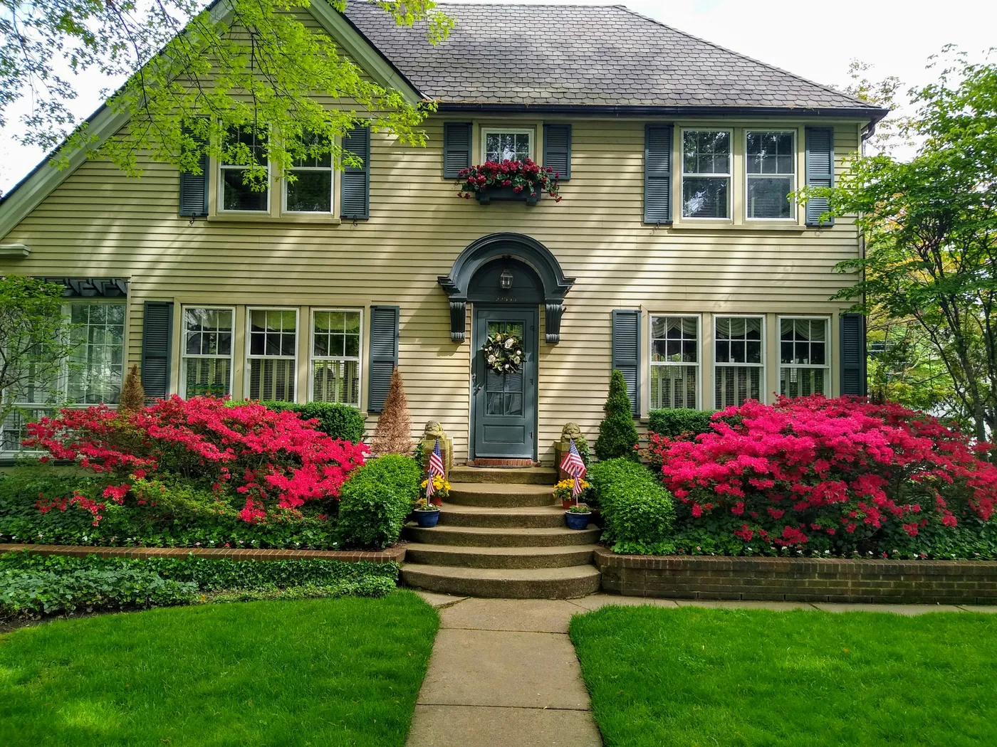
15. Yellow House with Teal Shutters and Vibrant Red Azaleas
This combination is so joyful because it uses a triadic color scheme—yellow, blue (in the teal), and red—but in a sophisticated way. The yellow siding is a soft, buttery tone, not a primary school yellow. The teal is deep and muted, not a bright turquoise. And the red is delivered by the landscaping, not the house itself. This use of color theory creates a look that is vibrant and full of energy, yet still feels classic and intentional because the shades are carefully chosen and balanced.
|
📋 Copy HEX 🔗 Share |
Want to paint your shutters for a high-impact update? It’s a great DIY project.
- Carefully remove the shutters from the house. Number them so you know where they go back!
- Lay them on a drop cloth and scrub them thoroughly with a TSP solution or a strong degreaser to remove dirt and chalky old paint.
- Lightly sand all surfaces with 120-grit sandpaper to give the new paint something to grip.
- Apply one coat of a high-quality exterior bonding primer. Let it dry completely.
- Apply two thin coats of your chosen color in an exterior-grade paint, allowing for proper drying time between coats.
This weekend project typically costs under $150 for primer, paint, and supplies.
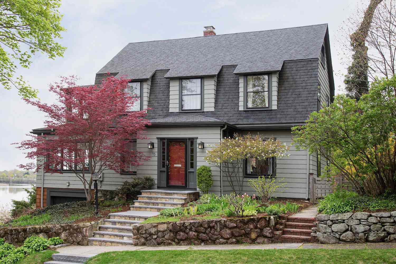
16. Gray Shingle Siding with a Contrasting Red Front Door
The red front door is everything here. It’s the focal point, the punctuation mark, and the single injection of warmth in an otherwise cool and stately gray palette. Without it, the house would still be handsome, but it might feel a bit unapproachable or severe. The red door is a clear and confident welcome sign. It draws your eye directly to the entrance and adds a dose of personality that transforms the entire feel of the home from just a structure to a place where people live.
|
📋 Copy HEX 🔗 Share |
A new front door can be expensive, but you can get this exact color pop for the price of a quart of paint. If your current door is in good shape, you can completely transform it in an afternoon. A quart of high-quality exterior paint (like Benjamin Moore’s Caliente or Behr’s Red My Mind) will cost you about $30-$50. With some sandpaper, primer, and a good brush, you can give your home a major facelift for under $100. It’s arguably the highest-impact, lowest-cost exterior upgrade you can make.
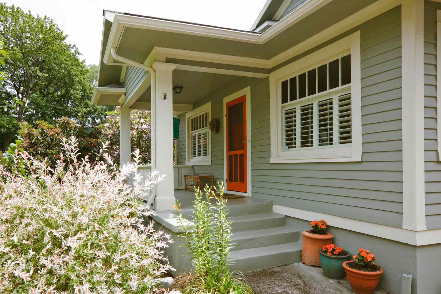
17. Sage Green Home Featuring a Bright Orange Screen Door
The magic of this color combination lies in using complementary colors—green and orange (which is a mix of red and yellow). Because they are opposites on the color wheel, they make each other appear more vibrant. The key to making it work is in the proportions. The sage green is the dominant, muted base, while the orange is used sparingly as a high-impact accent. If the whole house were orange, it would be overwhelming. But as a small pop on the door, it’s exciting and stylish. Notice how the potted orange flowers echo the door color, making the choice feel intentional.
|
📋 Copy HEX 🔗 Share |
Ready to try a bold front door color? Fantastic! But before you start painting, do these three things:
- Test, test, test: Paint a large poster board with your chosen color and tape it to your door. Look at it in the morning, afternoon, and evening light. A color can look completely different in direct sun versus shade.
- Check neighborhood rules: If you have an HOA, double-check the bylaws. Some have surprisingly strict rules about acceptable front door colors.
- Consider your interior entry: How will this bold new color look from the inside when the door is open? Make sure it doesn’t clash horribly with your entryway decor.
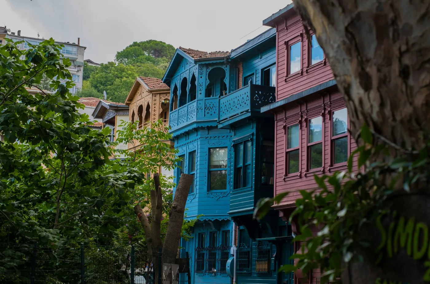
18. Vibrant and Ornate Traditional Painted Turkish Houses
This scene is a beautiful explosion of color, and it works because of context and repetition. In this traditional setting, bold colors are the norm, so the vibrant blue and reddish-brown don’t look out of place. Furthermore, the repetition of the ornate, carved wooden details across each house creates a sense of rhythm and cohesion. Even though the colors are different, the shared architectural language and material (wood) tie them all together into a harmonious, if lively, streetscape.
|
📋 Copy HEX 🔗 Share |
While incredibly inspiring, translating this look to a typical American suburb can be tricky. A single, bright blue house on a street of beige homes might stick out in a way that feels jarring rather than charming. If you love this look, consider a slightly more muted version of the color. Or, use the boldest color on a smaller element, like the front door or shutters, rather than the entire facade. The key is to be respectful of your home’s architectural style and its surrounding context.
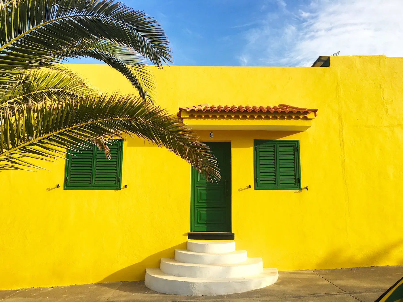
19. Tropical Vibe with Bright Yellow Stucco and Green Shutters
This is the color palette of sunshine and nature. The formula is a simple but powerful one: 80% bright, warm color (the yellow stucco) and 20% deep, cool accent (the dark green door and shutters). The crisp white of the steps and the earthy terracotta of the roof tiles act as grounding neutrals. This high-contrast, complementary scheme (yellow is opposite purple, but green is next door) is inherently energetic and cheerful, making it perfect for locations with lots of sun to play off the vibrant walls.
|
📋 Copy HEX 🔗 Share |
A bold, saturated color like this bright yellow works wonders on smaller buildings or homes with simple, clean lines. On a very large, architecturally complex home, this much vibrant color could easily become overwhelming and lose its charm. It’s perfect for a small cottage, a bungalow, or a modern home up to about 1,500 square feet. The simplicity of the structure allows the color itself to be the main feature without competing with too many gables, dormers, or trim details.
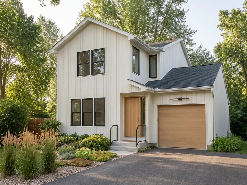
20. Modern White Board-and-Batten with Black Trim and Wood Doors
Achieving this crisp, modern look is all about investing in the key contrasting elements. The board-and-batten siding is a significant cost, but it’s what gives the house its signature texture.
- White Board-and-Batten Siding (Fiber Cement): $12,000 – $25,000
- Black-Framed Windows: $15,000 – $30,000
- Wood Garage & Front Door: $7,000 – $18,000
- Dark Gray Shingle Roof: $10,000 – $20,000
- Exterior Lighting & Hardware: $1,000 – $3,000
- TOTAL: $45,000 – $96,000
Budget alternative: Use standard white vinyl siding, paint existing window frames black, and opt for a steel garage door painted a convincing faux wood finish to capture the look for 40-60% less.
|
📋 Copy HEX 🔗 Share |
White siding, especially in a rainy or dusty climate, is going to show every speck of dirt. Plan on a yearly soft wash to keep it looking pristine. The natural wood doors are beautiful but require the most upkeep. They will need to be cleaned and resealed with a UV-protectant finish every 1-2 years to prevent them from turning gray and weathered. If you neglect the wood elements, the entire high-end look of the home will be compromised. Black metal fixtures and handrails are generally very low-maintenance, but may need a touch-up with exterior metal paint every 5-7 years if they start to show wear.
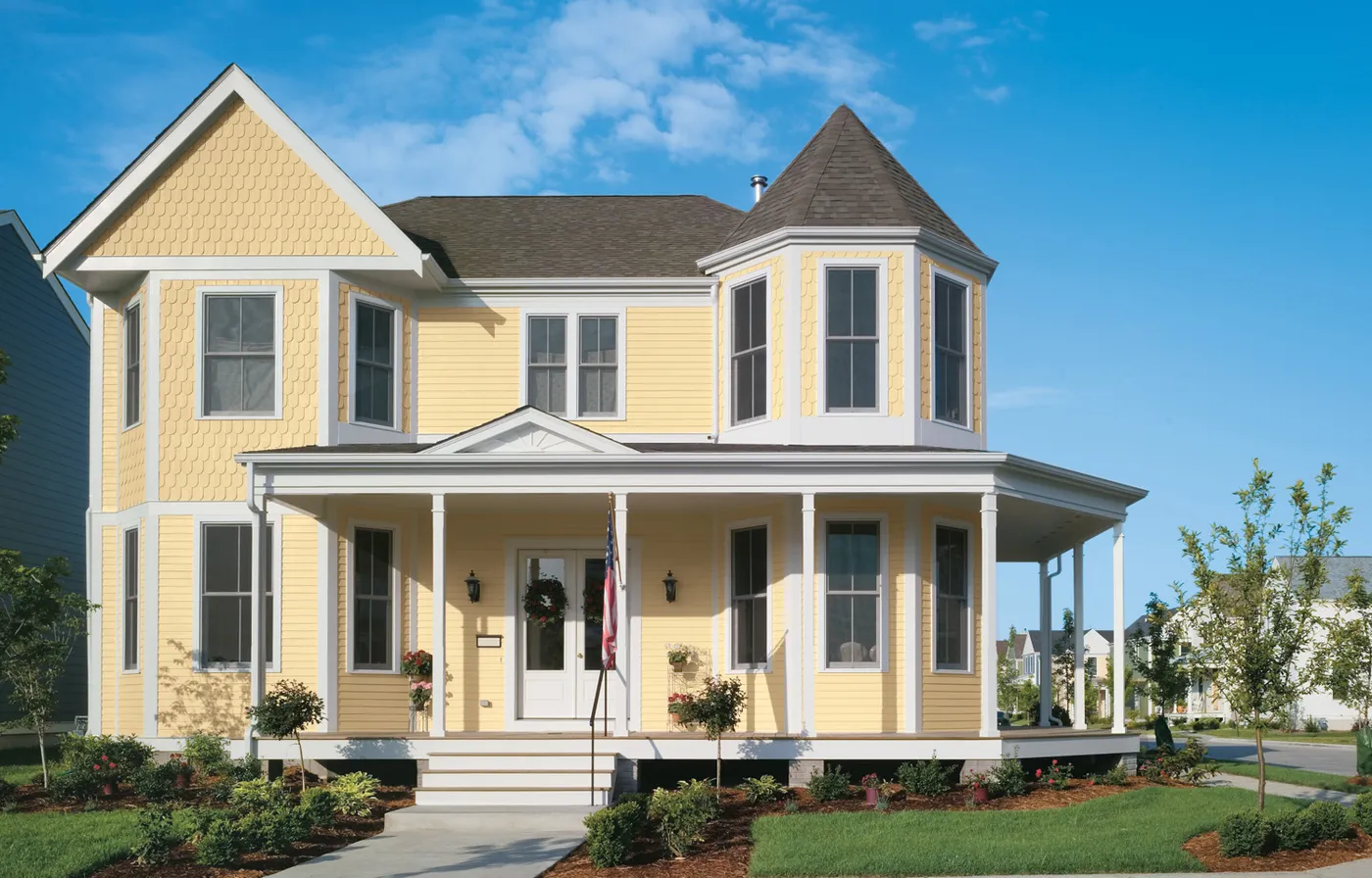
21. Classic Victorian Home with Cheerful Yellow Siding
The wrap-around front porch is the single feature that defines the welcoming character of this home. While the yellow color is cheerful, it’s the porch that provides the sense of community and relaxation. It’s a transitional space between the public street and the private home, an invitation to sit and stay awhile. Architecturally, it adds depth and shadow to the facade, preventing the large, two-story structure from looking like a flat, yellow box. All other design choices support the friendly nature of this porch.
|
📋 Copy HEX 🔗 Share |
When painting a home with varied textures like this one—which has both horizontal siding and scallop shingles—use the same exact color for both. Don’t be tempted to use a slightly different shade. The change in texture itself will make the color appear slightly different due to how light hits the varied surfaces. This creates a subtle, sophisticated depth. Using two different yellows would likely just look like a mistake and create visual clutter on an already detailed facade.
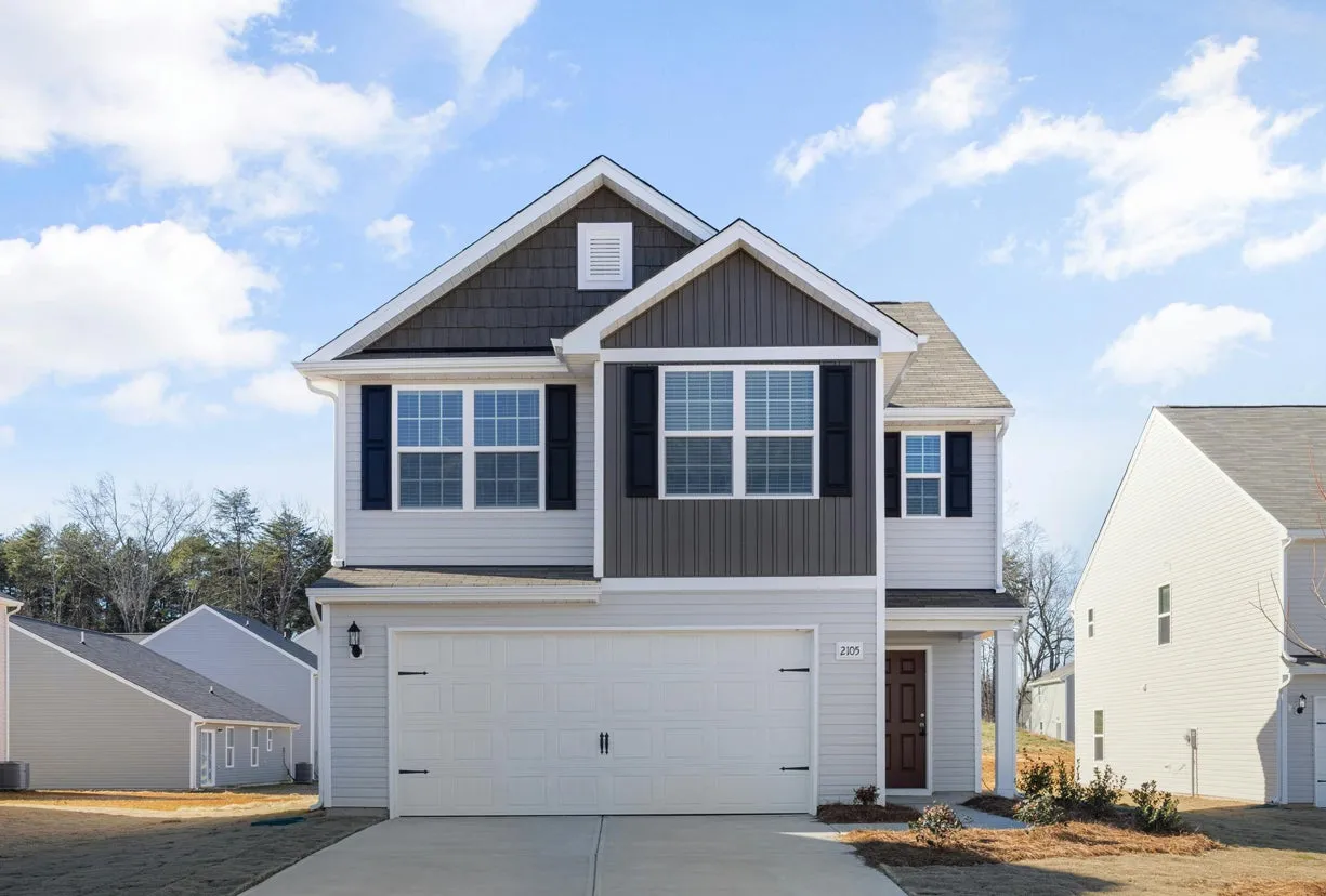
22. Modern Farmhouse with Light and Dark Gray Siding
This home’s exterior feels dynamic because it uses color to emphasize its architecture. Placing the dark gray vertical siding on the gables draws the eye upward and highlights the classic farmhouse peaks. The main body of the house is kept in a lighter gray, which makes it feel larger and more grounded. The sharp black shutters and white trim act like eyeliner, defining the windows and adding a graphic crispness. It’s a clever use of a simple grayscale palette to create visual interest and architectural definition.
|
📋 Copy HEX 🔗 Share |
You can get this multi-toned look without re-siding your whole house. If you have a home with gables, simply painting them a darker shade than the main body is a high-impact, low-cost project. A gallon of quality exterior paint is about $60-$80. For about $200 and a weekend on a ladder, you can add the same architectural interest. Black shutters are widely available at big-box stores like Home Depot, often for less than $50 a pair, and can be installed in a couple of hours.
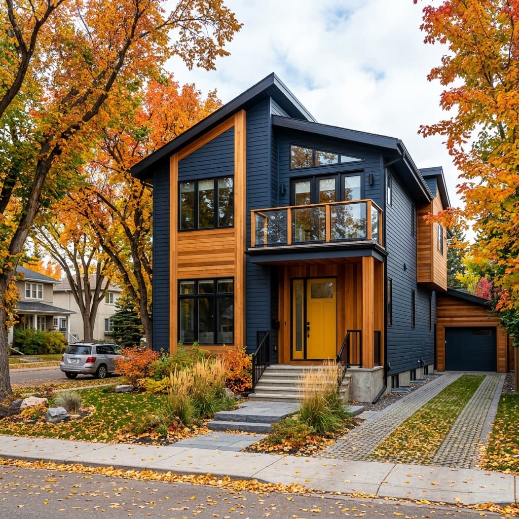
23. Modern Dark Blue House with Natural Wood Panels and a Yellow Door
That pop of bright yellow on the front door is the element that gives this serious, modern exterior its soul. The dark blue siding and natural wood are sophisticated and handsome, but the yellow door adds a jolt of unexpected personality and fun. It’s a confident, playful choice that prevents the design from taking itself too seriously. It also serves as an unmistakable focal point, drawing you toward the entrance with a sense of cheerful welcome. Without it, the house just wouldn’t have the same memorable charm.
|
📋 Copy HEX 🔗 Share |
This color combination taps right into the Nature-Forward design trend for 2026. The deep blue evokes a moody sky or deep water, while the natural wood siding speaks to forests and earth. The pop of yellow is like a wildflower or autumn leaf—a burst of natural, organic color. Homeowners are increasingly looking for palettes that connect their homes to the surrounding environment, and this sophisticated, nature-inspired combination is a perfect example of how to do it in a modern way.
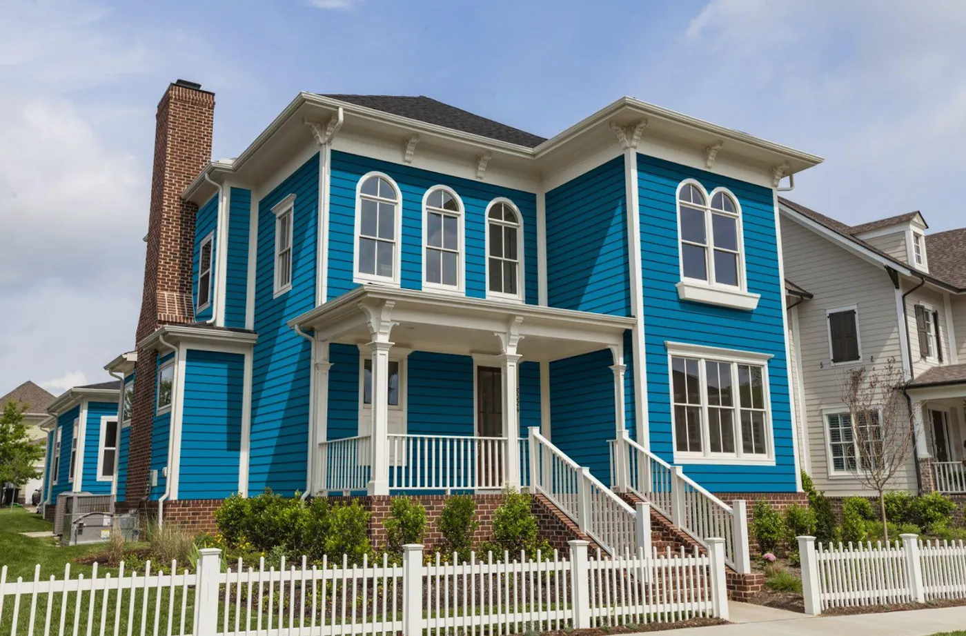
24. Vibrant Teal Victorian with a Classic White Picket Fence
A vibrant, saturated color like this teal is a bold statement that can look absolutely incredible, but it’s not for the faint of heart. Be prepared for your home to be the teal house on the corner. It will get a lot of attention, for better or worse. Also, high-saturation colors can be more prone to fading over time, especially on sun-drenched walls. Investing in a top-of-the-line, UV-resistant paint is non-negotiable if you want the color to last. And remember, a color this unique might be a turn-off for some potential buyers if you plan to sell in the near future.
|
📋 Copy HEX 🔗 Share |
This bold color choice works well here because it’s on a large, stately home (likely 3,000+ sq. ft.) with lots of crisp white trim to balance it. The white picket fence, porch, and window frames make up a significant percentage of the visible facade, which keeps the teal from being completely overpowering. On a smaller, simpler home with less trim, this color could feel overwhelming. If your house is under 2,000 sq. ft., consider using a bold color like this on the front door or shutters instead of the entire body.
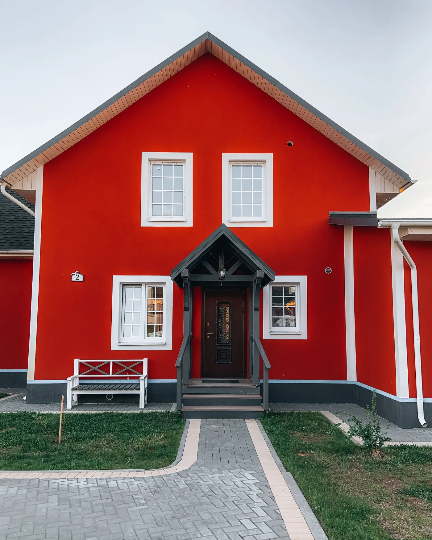
25. Striking Red Stucco Home with Dark Gray and White Accents
The success of this bold color choice lies in the sophisticated use of neutrals to support it. The vivid red is the undeniable star, but the dark gray roof and trim ground the entire composition, adding weight and seriousness that prevents the red from looking cartoonish. The crisp white of the windows acts as a clean, graphic separator, defining the openings and adding a necessary touch of brightness. This three-part palette—bold color, dark neutral, and light neutral—is a recipe for a dramatic yet balanced exterior.
|
📋 Copy HEX 🔗 Share |
A paver pathway adds immense curb appeal and can be a manageable DIY project. Here’s the short version:
- Mark out your path and excavate 6-7 inches of soil.
- Fill and compact a 4-inch layer of paver base (crushed gravel).
- Add and level a 1-inch layer of paver sand.
- Lay your pavers directly on the sand, tapping them into place. Don’t slide them.
- Install edge restraints to keep the pavers from shifting.
- Sweep polymeric sand into the joints and lightly mist with water to activate the binding agent.
Allow 24 hours to cure before walking on it. This project could take a weekend and cost $5-$15 per square foot in materials.
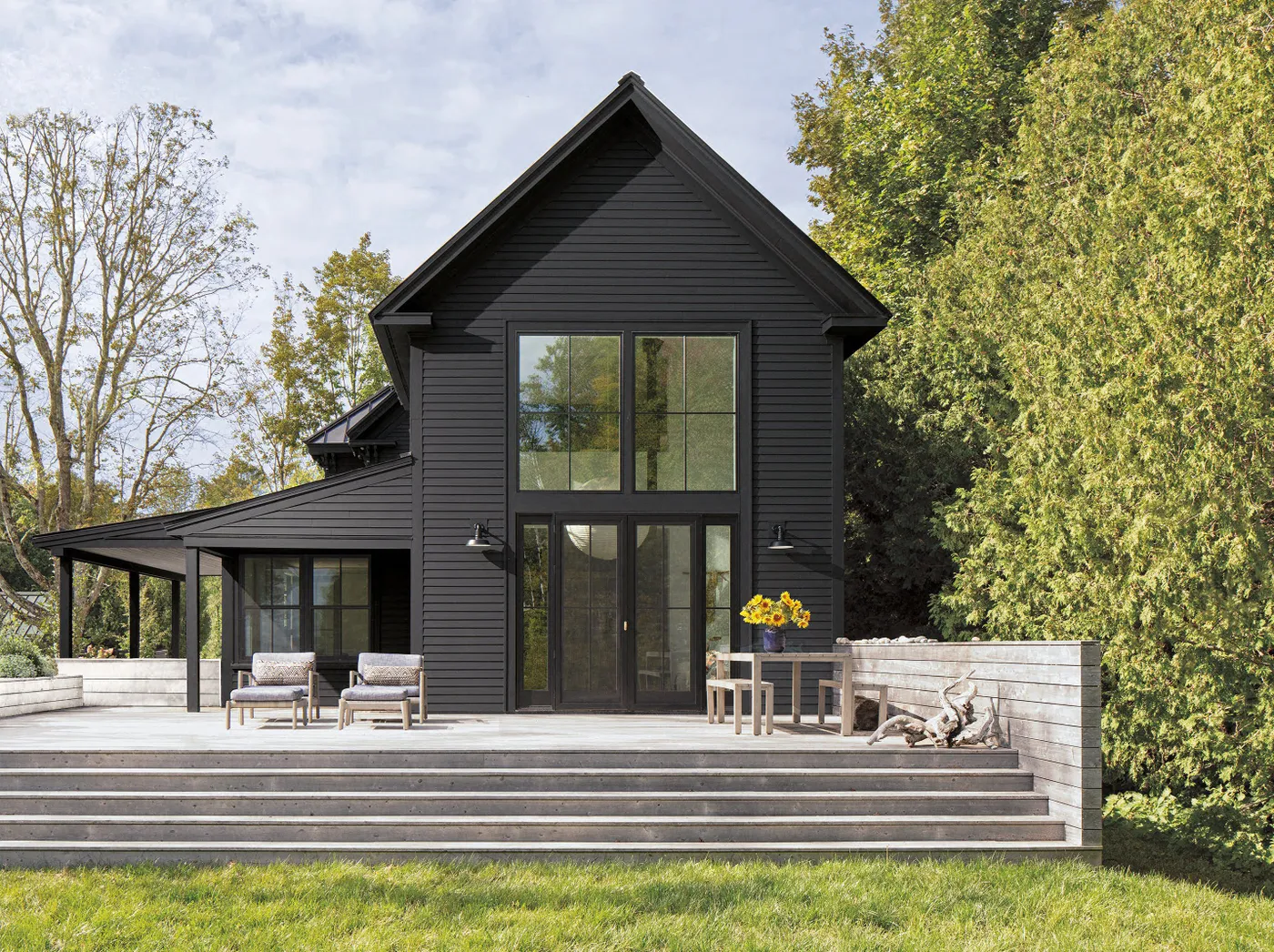
26. Modern Black House with an Expansive Natural Wood Deck
The single element that makes this design so successful is the massive, light-toned wood deck. It serves as a warm, organic plinth upon which the dark, modern house sits. The deck’s light color and horizontal lines provide a crucial visual counterbalance to the house’s dark, vertical siding. It domesticates the stark architecture, creating an inviting outdoor living space that bridges the gap between the sleek man-made structure and the wildness of the surrounding trees. Without the deck, the house would feel much more isolated and less welcoming.
|
📋 Copy HEX 🔗 Share |
That beautiful, light natural wood deck requires consistent upkeep to stay looking that good. To prevent it from graying and weathering, it will need to be cleaned and resealed every single year, especially if it’s in a location with harsh sun or lots of rain and snow. The black board-and-batten siding is lower maintenance but can show dust and pollen, so a yearly rinse is a good idea. Also, black siding can get extremely hot to the touch in direct summer sun, something to be aware of if you have young children.
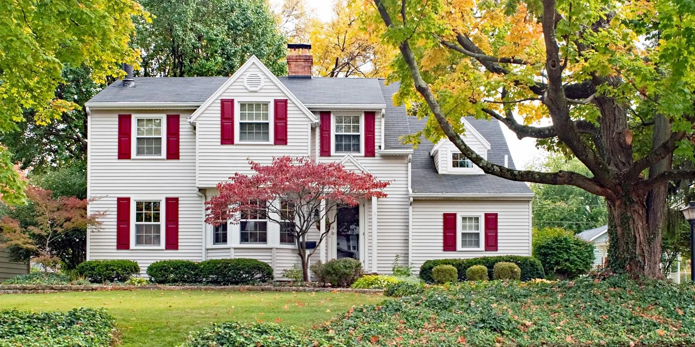
27. Classic White Clapboard House with Dark Red Shutters
This is one of the most timeless American color palettes, and its formula is beautifully simple. It’s approximately 70% classic neutral (white clapboard), 20% deep accent color (the dark red shutters), and 10% grounding dark tone (the dark gray roof). The green of the landscaping provides a natural, complementary fourth color. This combination works because it’s balanced, high-contrast, and deeply rooted in tradition. It’s a look that feels both stately and incredibly welcoming. You could easily swap the red for a navy blue or a forest green and achieve a similarly classic feel.
|
📋 Copy HEX 🔗 Share |
When choosing a red for shutters, avoid anything too bright or primary. A true fire-engine red can look cheap and dated. The key to a sophisticated look is to choose a red with a bit of black or brown in it, like a barn red, a brick red, or a deep cranberry. These slightly muted, earthier reds have a historic feel that complements traditional architecture beautifully. Always get a sample pint and test it outside before committing to the full gallon.
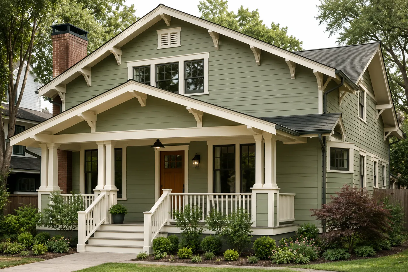
28. Craftsman Bungalow with Sage Green Siding and Creamy White Trim
This is a perfect example of an analogous color scheme, which uses colors that are next to each other on the color wheel. The sage green siding, the reddish-brown brick, and the brown wood door are all warm, earthy tones found in nature. The creamy white trim succeeds because it also has a warm, yellow undertone, unlike a stark, cool white which would clash. This shared warmth across all elements creates a palette that is incredibly harmonious, gentle on the eyes, and feels deeply connected to the surrounding garden.
|
📋 Copy HEX 🔗 Share |
Painting a house of this style and size is a significant project, but it’s one of the most impactful updates you can make. Here’s a general cost estimate:
- Professional Labor (prep, prime, paint): $5,000 – $9,000
- Paint & Materials (primer, paint, caulk): $1,500 – $2,500
- Scaffolding/Lift Rental (if needed): $500 – $1,500
- Potential Wood Rot Repair: $200 – $2,000+
- TOTAL (Pro Job): $7,200 – $15,000
Budget alternative: A DIY paint job can bring the cost down to just the materials, around $2,000-$3,000, but be prepared for a very labor-intensive week or two.
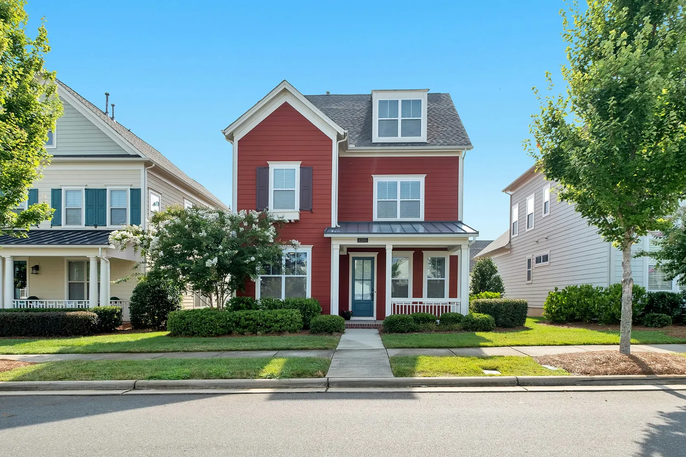
29. Barn Red House with a Deep Blue Door and Dark Shutters
The deep blue front door is the masterstroke of this design. A white or black door would have been a safe, predictable choice. But the blue is unexpected and sophisticated. It works with the red siding because they are both primary colors, creating a classic Americana feel, but the specific shades—a deep barn red and a rich navy blue—keep the combination from looking childish. It’s a confident color choice that adds a layer of curated personality to an otherwise very traditional home.
|
📋 Copy HEX 🔗 Share |
This is a lot of look. A red house with a blue door and dark shutters is a very specific, bold statement. While it looks fantastic, it’s a palette that might not appeal to every homebuyer down the line. If you’re planning on selling within the next 5 years, you might consider a more neutral body color. But if this is your forever home and you love this vibrant, patriotic-adjacent charm, then go for it! A home’s exterior should, first and foremost, bring you joy when you pull into the driveway.
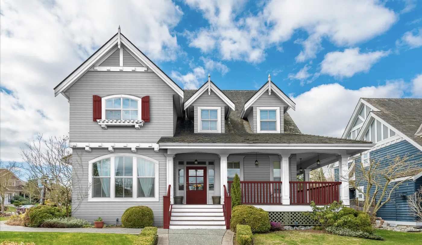
30. Light Gray House with Dark Red Accents and White Trim
Love this classic look? Before you head to the paint store, run through this quick checklist:
- Confirm your gray’s undertone: Does your light gray siding have a blue, green, or purple undertone? Hold a red paint swatch next to it in the sunlight. A blue-toned gray might make a pure red look slightly purplish. Make sure you like the interaction.
- Assess your paintable accents: Does your home have shutters and railings like this one? If not, where will you put the red? Just the front door is a great option. Don’t force accents where they don’t architecturally belong.
- Check HOA Rules: Red can sometimes be a controversial accent color in neighborhoods with strict homeowners associations. Better to ask for forgiveness than repaint everything.
|
📋 Copy HEX 🔗 Share |
This is a classic 60-30-10 color rule in action. The light gray siding is the 60% dominant color, setting a neutral and calm backdrop. The white trim makes up about 30% of the look, providing crisp definition and brightness. The dark red is the 10% accent color, used sparingly on the door, railings, and shutters to provide a powerful pop of color and personality without overwhelming the facade. This formula is a foolproof way to build a balanced and timeless exterior palette.
31. Craftsman Exterior with Green Shingles and a Light Wood Door
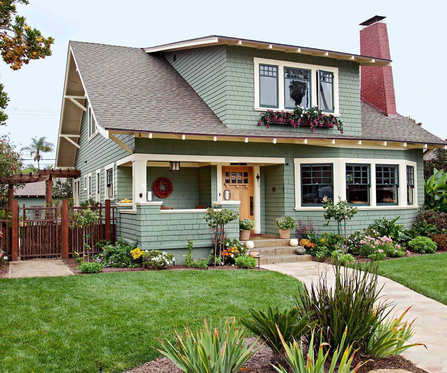
This home’s color palette feels so cohesive because it pulls all its colors from a single natural landscape. The sage green shingles evoke foliage, the cream trim is like a light stone or seashell, the reddish-brown brick mimics earthy clay, and the light wood door speaks for itself. Because all these colors coexist in nature, they feel inherently right together on a house. This is a much more foolproof approach than trying to invent a color scheme from scratch. When in doubt, look to the outdoors for inspiration. This is a similar, but distinct, take on the palette in Idea #27.
|
📋 Copy HEX 🔗 Share |
Notice how the window frames are a dark green, a few shades darker than the main shingle siding. This is a sophisticated designer trick called tonal layering. Instead of using a high-contrast color like white or black for the window frames, choosing a darker shade of the main color adds depth and subtlety. It makes the facade feel richer and more custom-designed than if every non-siding element was just painted the same color of trim. It’s a small detail that makes a huge difference.
Ready to Find Your Home’s True Colors?
Choosing an exterior color is about more than just paint; it’s about crafting your home’s identity and creating a first impression that feels like you. We hope these 31 ideas have sparked some inspiration and given you the confidence to move beyond the builder-grade beige.
Don’t forget to save your favorite looks to your Pinterest board. When you’re ready to start sampling, you’ll have a perfectly curated collection of ideas to guide you. Happy painting!