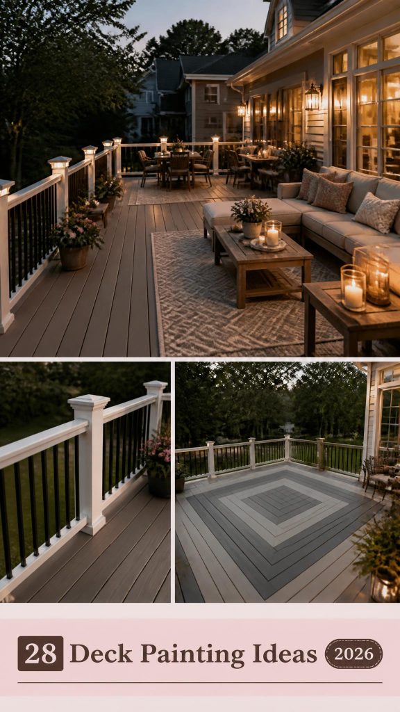
28 Gorgeous Deck Painting Ideas That Will Transform Your Outdoor Living Space

You know that feeling when you finally find the deck painting idea that looks exactly right for your space, only to realize you have no idea how to actually pull it off? Your search ends here. We’ve gone through hundreds of options from the latest collections at Sherwin-Williams, Home Depot, and Lowe’s to find what truly works. We’ve curated 28 gorgeous, real-home examples covering every style, from sleek modern contrasts to warm, natural wood stains, with project costs ranging from $300 to over $5000. This isn’t just a gallery; it’s a practical guide to creating an outdoor space you’ll love. And stay until the end—we break down the most common mistakes that can ruin these looks. 📌 Save this to Pinterest for later—you’ll want to revisit these ideas.
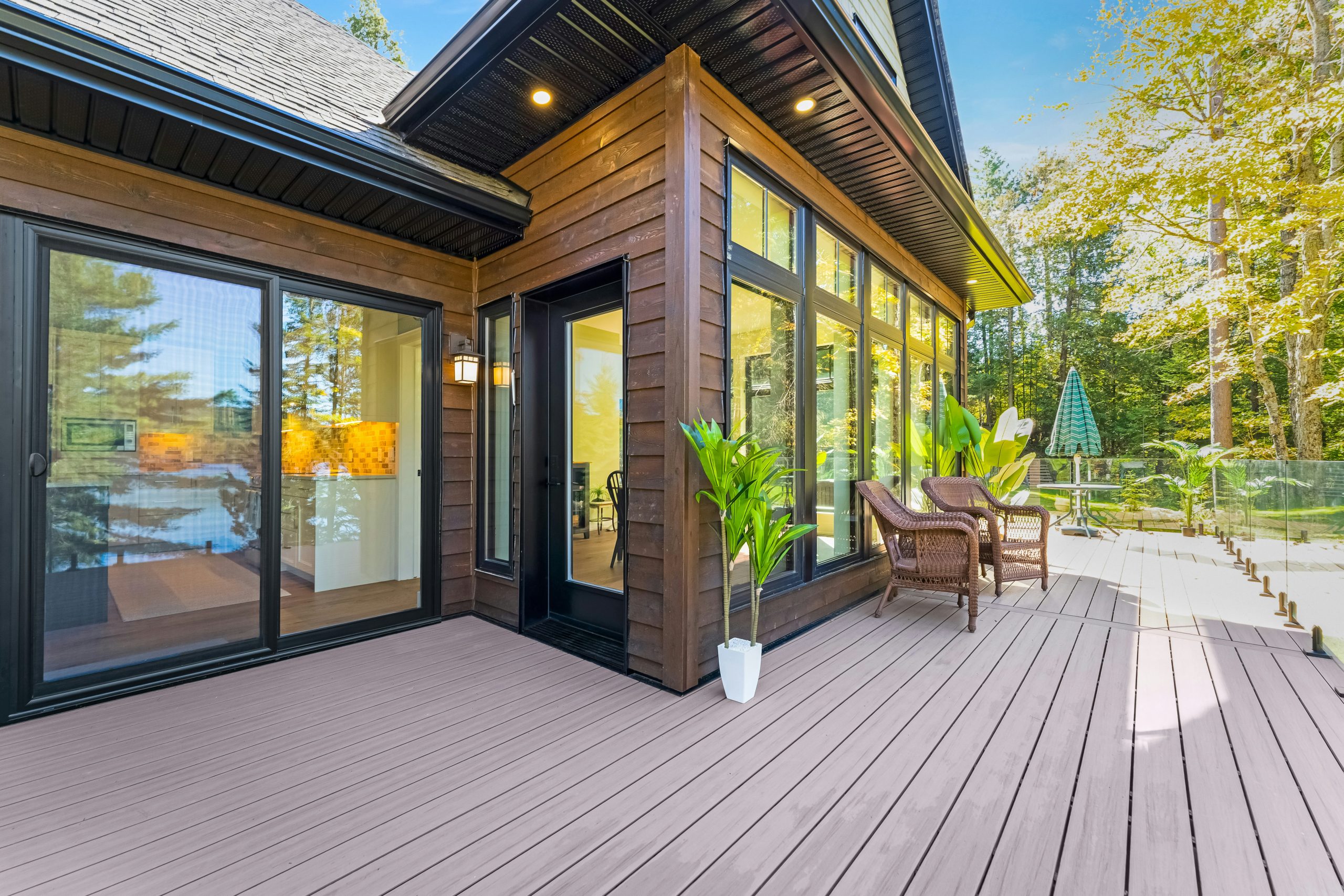
1. Contrast a Light Gray Deck with Dark Wood Siding
This combination is a masterclass in modern exterior design. The cool, light gray of the composite deck provides a clean, neutral ground plane that feels spacious and contemporary. It works because it creates a high-contrast foundation for the rich, warm tones of the dark brown horizontal wood siding. The black-framed windows and doors act as sharp, graphic accents that tie the whole look together, while the clear glass railing ensures the view remains the star of the show. This isn’t just a deck; it’s a seamless extension of the home’s architecture.
|
📋 Copy HEX 🔗 Share |
When installing a glass railing, always opt for panels that are at least 3/8-inch thick tempered or laminated glass for safety and durability. For a truly seamless look as seen here, specify a base shoe or spigot mounting system, which eliminates the need for vertical posts between the panels. This preserves your view and gives the entire space a high-end, architectural feel. Ensure your deck’s substructure is properly reinforced to handle the significant weight of the glass panels before you commit.
2. Pair a Light Gray Deck Floor with Dark Gray Railings
Here’s the formula for a clean, private, and modern outdoor space: 70% light, neutral floor + 20% dark, contrasting railing + 10% natural green accent. The light gray deck floor acts as a bright canvas, making the area feel larger. The dark gray railings ground the space and create a strong visual boundary. The final 10%, the tall dark green privacy screen, adds a touch of nature and necessary seclusion without feeling heavy. You could swap the dark gray for a deep navy or even a black for a similar effect, as long as you maintain that sharp contrast.
|
📋 Copy HEX 🔗 Share |
A privacy screen is a fantastic addition, but let’s be honest about the wind. A tall, solid screen like this acts like a sail. If you live in a windy area, you absolutely must ensure it’s anchored securely to the deck’s framing, not just the surface boards. Use heavy-duty galvanized bolts and reinforcing posts. Otherwise, a strong gust could not only damage the screen but also rip up your deck boards. It’s a safety issue first and an aesthetic one second. Always check local building codes for height and anchoring requirements.
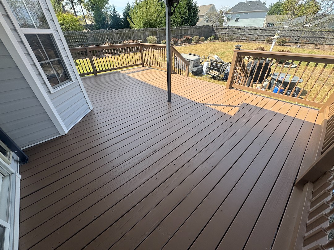
3. Go Classic with a Solid Brown Deck and Darker Brown Railings
- Paint (Deck & Railing): $150 – $300 (e.g., Sherwin-Williams SuperDeck)
- Prep Materials (Cleaner, Sander): $50 – $100
- Labor (DIY): $0
- Labor (Professional Painter): $750 – $1,500
- TOTAL (DIY): $200 – $400
- TOTAL (PRO): $950 – $1,900
- Budget alternative: Use a solid stain instead of paint for a similar look with slightly better durability, often for about 10-15% less cost per gallon. This can bring your total DIY cost down to under $300.
|
📋 Copy HEX 🔗 Share |
The single element that makes this look so clean and satisfying is the tonal color variation. Painting the railing a slightly darker shade of brown than the floor is a subtle but powerful designer move. It adds depth and dimension without introducing a new, competing color. If both were the same shade, the deck would look flat and less defined. This simple two-tone approach highlights the structure’s architecture—like the turned balusters and newel posts—making the entire deck feel more custom and thoughtfully designed.
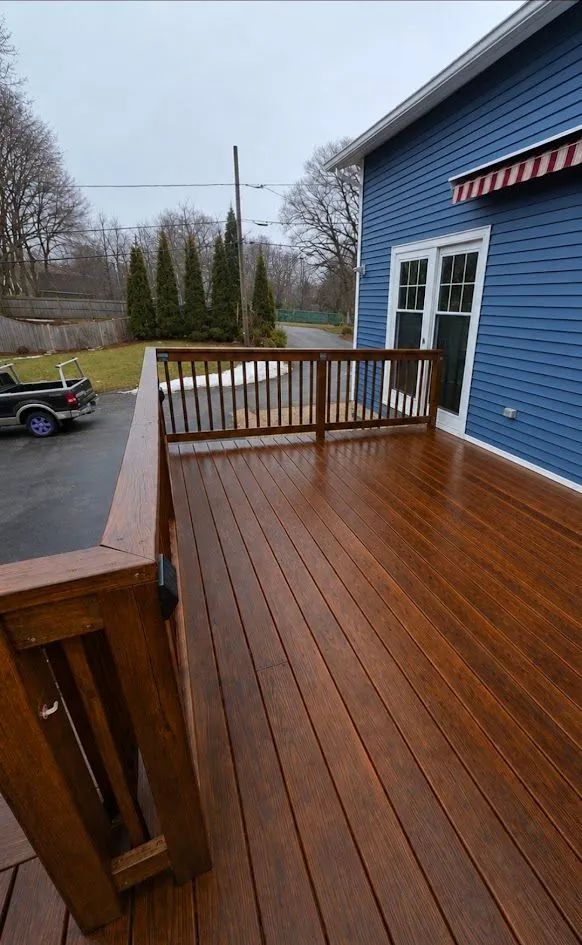
4. Choose a Glossy, Dark-Stained Finish for a Polished Look
A high-gloss finish on a dark-stained deck is undeniably stunning, but it’s a high-maintenance relationship. That beautiful sheen will be the first thing to show dust, pollen, and water spots. You’ll need to clean it more frequently than a satin or matte finish to keep it looking pristine. More importantly, that gloss comes from a film-forming topcoat, which is prone to scratching from patio furniture and can become extremely slippery when wet. Expect to lightly sand and reapply a maintenance coat every 12-24 months to keep it from looking tired and scratched.
|
📋 Copy HEX 🔗 Share |
When pairing a dark deck with blue siding, the key is managing the color temperatures. This rich, warm brown stain works beautifully with the cool blue siding because they are complementary. To ensure a cohesive look, pull a color from your home’s trim—in this case, white—for other elements like the French doors. This creates a visual triangle (deck-siding-trim) that feels balanced. If your home has cream or beige trim, consider a slightly less reddish-brown stain to avoid clashing undertones.
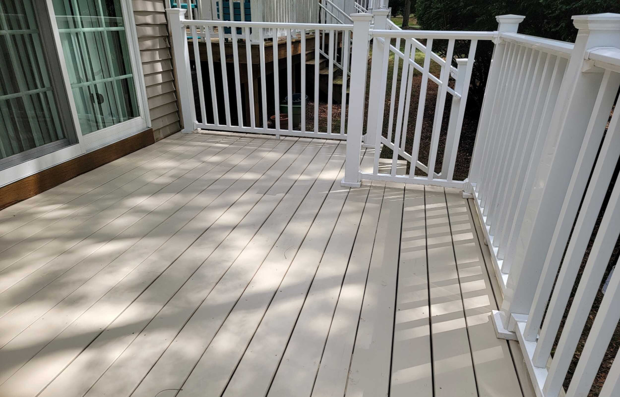
5. Paint Your Deck Light Beige with a Crisp White Picket Railing
This look feels so bright and airy for a couple of key reasons. First, the light beige (or ‘greige’) paint on the deck floor is a warm neutral that harmonizes with the light brown siding of the house, creating a cohesive and expansive feel. It avoids the starkness that a pure white deck might have. Second, the classic white picket railing offers a clean, graphic outline without feeling heavy or obstructing the view. The repetition of vertical lines in the pickets provides a pleasing rhythm that feels traditional yet fresh. It’s a timeless combination that just plain works.
|
📋 Copy HEX 🔗 Share |
You don’t need a custom build to get this clean, coastal vibe. A fresh coat of paint is doing most of the work here. Grab a gallon of beige exterior porch and floor paint for about $40-$60. If your railings are looking tired, a gallon of bright white exterior semi-gloss will cost another $40. Spend a weekend on prep work—thorough cleaning and sanding are non-negotiable—and you can completely transform an old wooden deck for under $150. This is a perfect budget-friendly alternative to the costly composite deck in Idea #1.
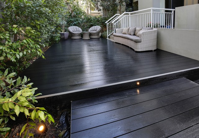
6. Create a Moody Vibe with a Dark Deck and Woven Seating
We’re seeing a huge move towards treating outdoor spaces like interior living rooms, and this look is the perfect example. The trend, often called ‘dark and moody’ or ‘organic modern,’ is all about creating intimacy and sophistication outdoors. The nearly black deck grounds the space and makes the surrounding green foliage pop. Paired with soft, sculptural furniture and warm, layered lighting, it feels less like a deck and more like an open-air lounge. It’s popular because it rejects the idea that outdoor areas have to be bright and rustic; they can be chic and mysterious too.
|
📋 Copy HEX 🔗 Share |
This sophisticated, dark look works best in a moderately sized, well-defined space, typically from 150 to 300 square feet. A deck that’s too small will feel cramped and gloomy with such a dark color. A deck that’s too large and expansive might lose that intimate, lounge-like feel. The key is enclosure, either from the house, privacy screens, or, as seen here, lush garden plantings. A minimum ceiling height isn’t relevant, but having multiple light sources—like the embedded step lights and garden uplighting—is crucial to making it feel inviting, not ominous, after dark.
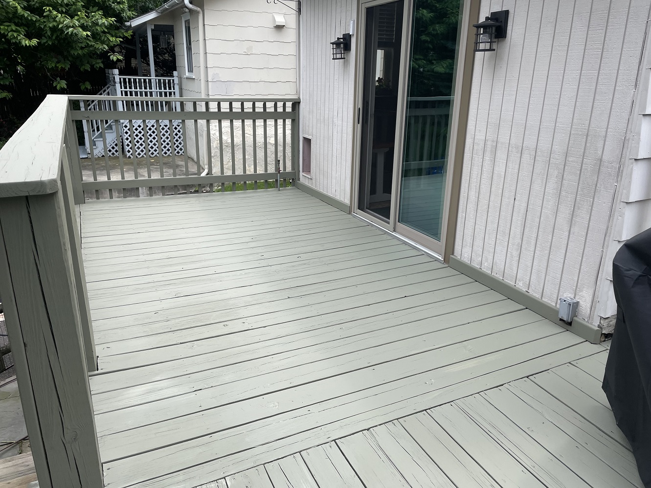
7. Unify a Deck and House with a Single Sage Green Color
The formula here is all about monochromatic harmony: 60% dominant muted color (sage green) + 30% soft neutral (off-white) + 10% sharp accent (black). By painting the deck, railings, and even the house’s base trim in the same sage green, you create a seamless, unified foundation. The off-white siding provides a gentle contrast that keeps the look from feeling flat. The black wall sconces are the essential ‘jewelry,’ adding a modern, graphic punch that prevents the palette from becoming bland. This recipe is perfect for a calm, earthy, and cohesive exterior.
|
📋 Copy HEX 🔗 Share |
To get that perfectly uniform painted deck finish, follow these steps. This process will take a weekend and cost roughly $100-$200 in materials.
- Thoroughly sweep the deck, then pressure wash or scrub with a dedicated deck cleaner. Let it dry completely for 24-48 hours.
- Sand the entire surface with an orbital sander (80-grit paper) to remove old finish and open the wood’s pores. Vacuum all dust.
- Apply one coat of a high-quality exterior oil-based primer. This is crucial for adhesion and preventing tannin bleed.
- Once the primer is dry, apply your first coat of sage green porch and floor paint using a roller with an extension pole.
- Wait the manufacturer’s recommended time, then apply a second coat for full, even coverage.
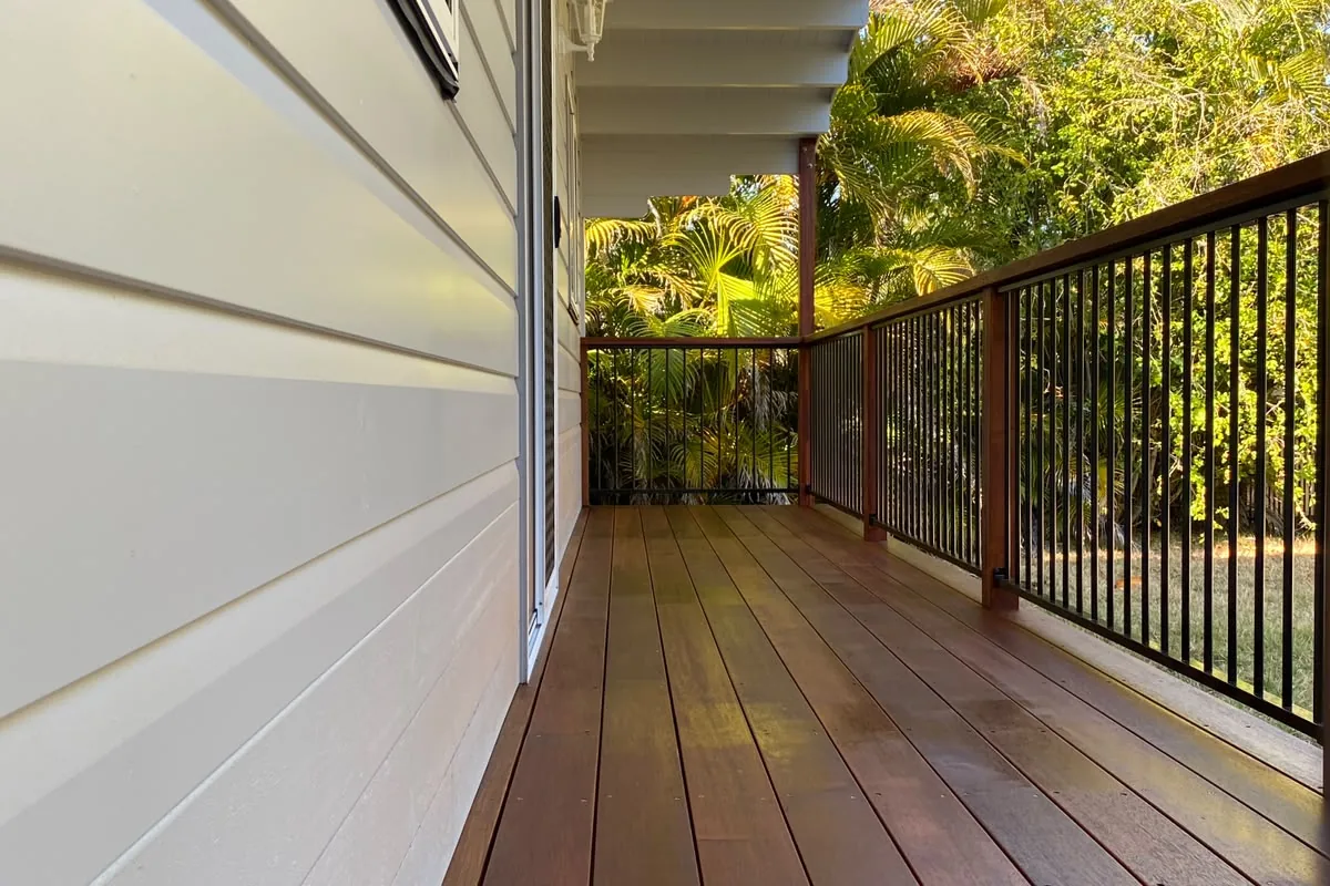
8. Combine a Dark Wood Deck with Black Metal Balusters
The single element that elevates this deck from standard to sophisticated is the mixed-material railing. Specifically, the slim, black vertical metal balusters. If this railing were all wood, it would look much heavier and more traditional. The metal balusters, however, provide security while almost disappearing into the background, preserving the view of the lush greenery. They introduce a modern, industrial touch that contrasts beautifully with the classic warmth of the dark brown wood top rail and deck planks. It’s this thoughtful mix of materials that makes the design feel current and custom.
|
📋 Copy HEX 🔗 Share |
When using metal balusters, spacing is everything. For a clean, contemporary look, space them no more than 4 inches apart on center—this is also the standard safety code requirement to prevent small children from squeezing through. To make installation easier and perfectly uniform, use pre-drilled railing connectors. These small plastic guides fit onto the top and bottom rails and ensure your balusters are perfectly spaced and angled, saving you a massive amount of time and measuring.
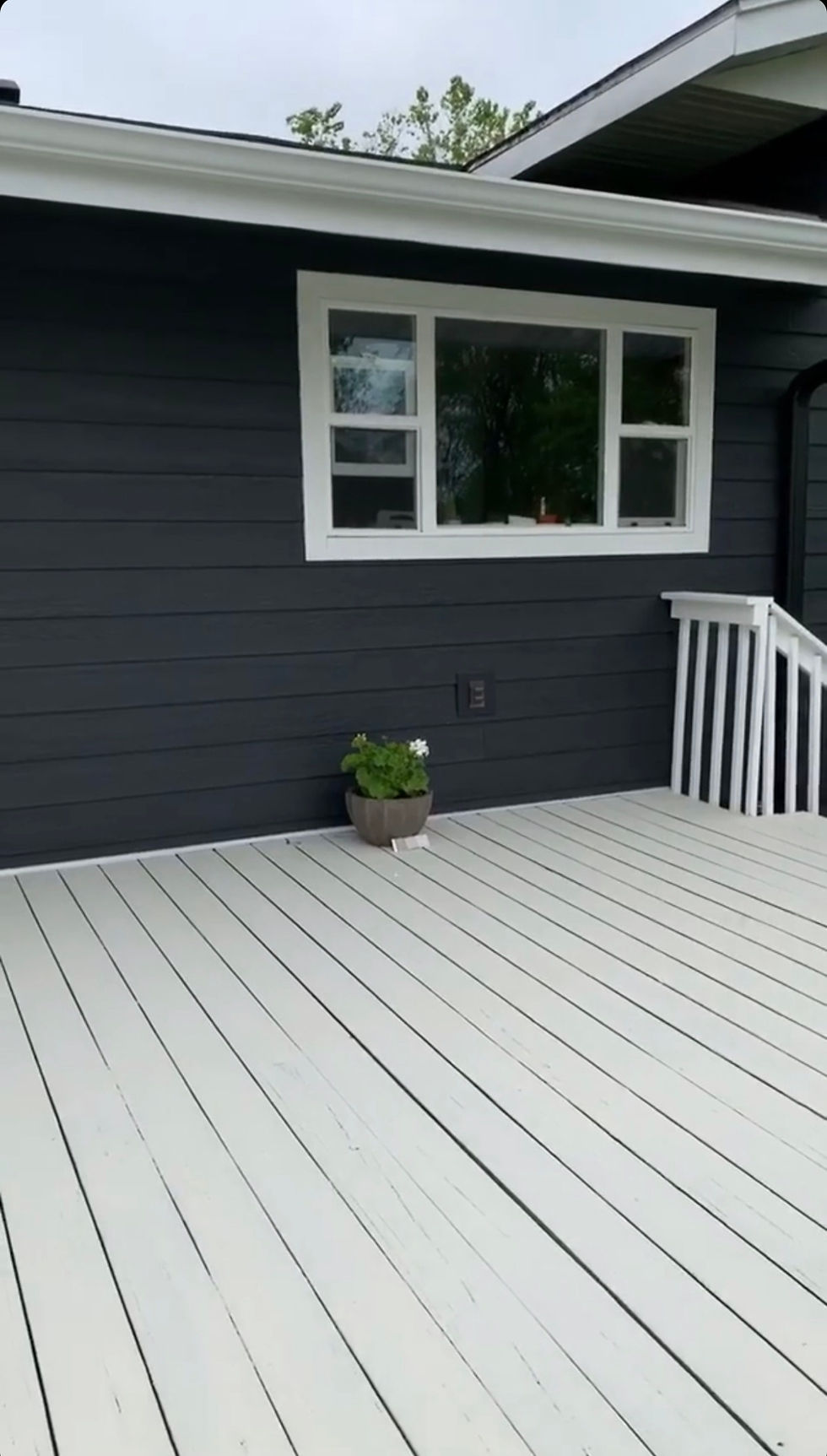
9. Contrast Charcoal Siding with a Light Gray Deck and White Rails
This is a masterclass in using contrast to create a crisp, modern exterior. The look works because of the clear visual hierarchy created by three distinct tones. The dark charcoal siding acts as a bold, dramatic backdrop. The light gray deck provides a soft, neutral transition between the house and the yard, preventing the look from being too severe. Finally, the bright white railings and trim pop against both the dark siding and the gray deck, creating clean lines and a sense of architectural definition. It’s a classic, high-contrast palette that will never go out of style. For a similar feel, see Idea #1.
|
📋 Copy HEX 🔗 Share |
A light gray or white deck looks fantastic when it’s clean, but it’s a magnet for dirt, mildew, and footprints. Be prepared for a more rigorous cleaning schedule than you would have with a brown or dark gray deck. You’ll likely need to pressure wash it at least twice a year and spot-clean for spills or muddy paws regularly. If you have a lot of trees overhead, you’ll be constantly fighting against pollen stains and fallen leaves. It’s a beautiful choice, but it’s not a low-maintenance one.
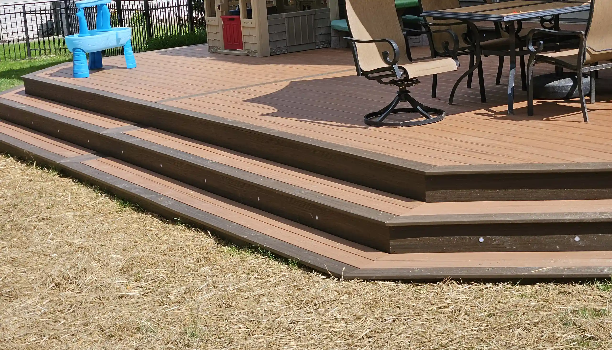
10. Build a Two-Tone Composite Deck with Curved Steps
A multi-level, two-tone deck is a significant investment, so a checklist is essential before you break ground.
- Check Setbacks: Verify your local zoning laws for property line setbacks. A large, multi-level structure might have different requirements than a simple ground-level patio.
- Material Samples: Get physical samples of your chosen composite colors. View them outside in the morning, noon, and evening light to see how the tones change.
- Plan for Drainage: Ensure the design allows for proper water runoff away from your house’s foundation, especially on the lower level.
- Electrical Plan: Finalize the placement for all integrated lighting before construction starts. Running conduit later is a nightmare.
|
📋 Copy HEX 🔗 Share |
A design with grand, curved steps and multiple levels is best suited for larger backyards where it can be a true focal point without overwhelming the space. You’ll want a minimum area of around 400 square feet to pull this off effectively. The change in elevation helps define different ‘zones’—like dining and lounging—so it’s perfect for properties with a gentle slope. If your yard is smaller or completely flat, a single-level design like the one in Idea #22 might be a more practical and visually balanced choice.
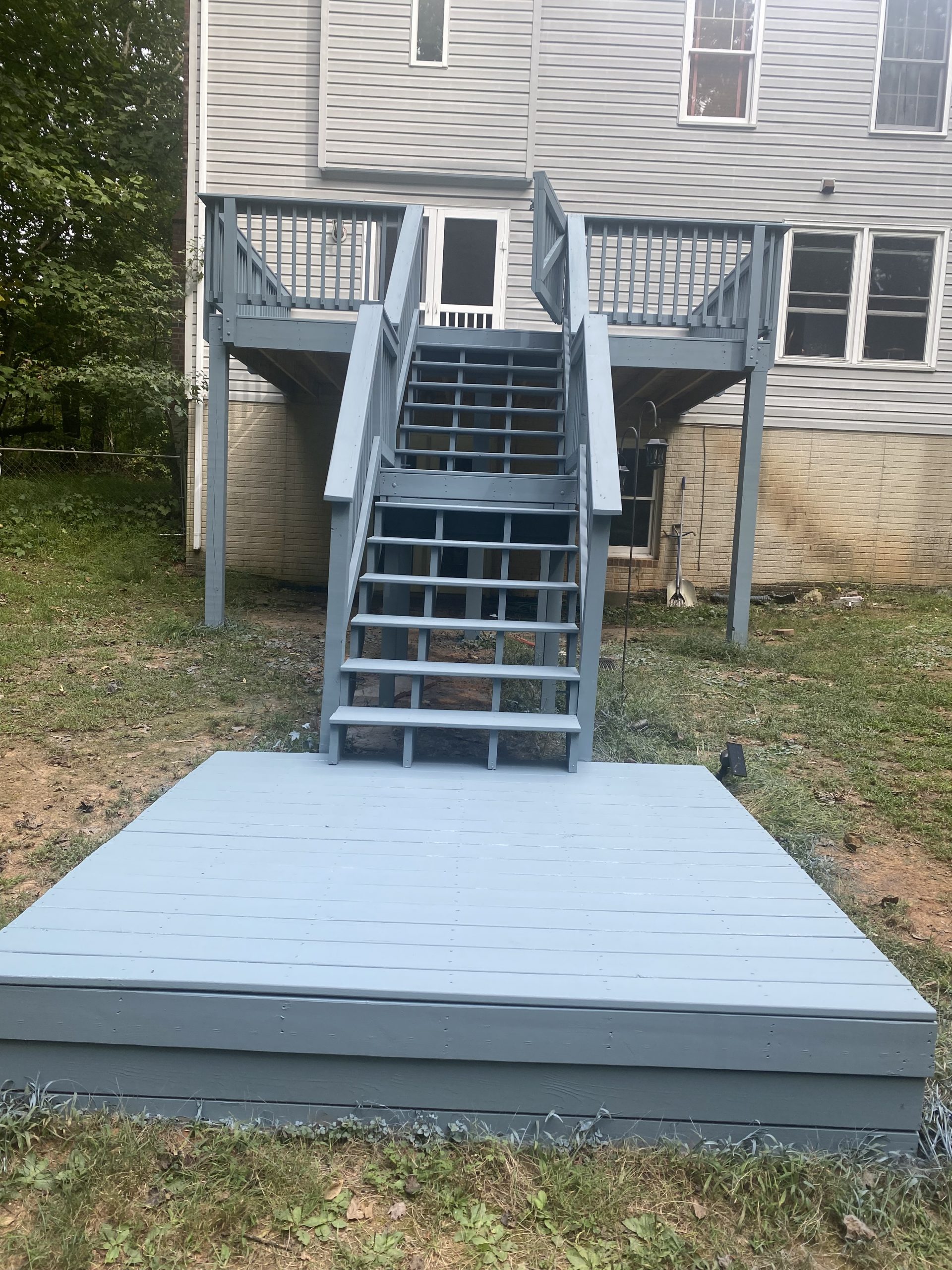
11. Use a Single Light Blue-Gray for an Elevated Deck and Stairs
Want a unique color without committing to something wild? A muted blue-gray is the answer. This project shows how a single, well-chosen paint color can unify a complex structure. Instead of spending a fortune on premium materials, you can make a standard pressure-treated wood deck look custom and intentional. A 5-gallon bucket of quality porch and floor paint will run you about $150-$200, which is enough to cover the deck, stairs, and platform. It’s a high-impact, low-cost strategy for making a functional structure feel like a design statement.
|
📋 Copy HEX 🔗 Share |
When painting an entire deck structure one color, the finish you choose is critical. Don’t use standard exterior house paint on the floor; it’s not designed to be walked on and will peel quickly. You need a dedicated ‘Porch & Floor’ paint with an acrylic or enamel base for durability. For the railings and vertical surfaces, you can use a standard exterior paint in the same custom-matched color, but opt for a semi-gloss finish. This will make them easier to wipe clean and provide a very subtle, professional-looking contrast to the satin finish of the floor.
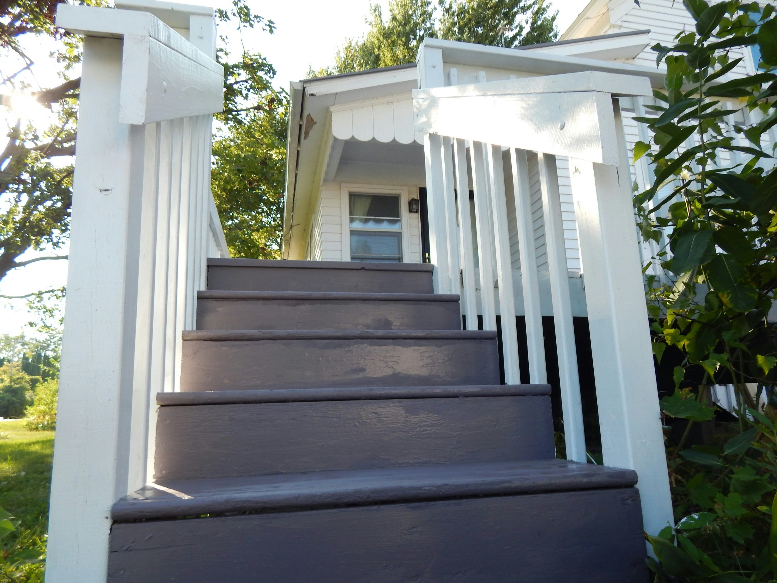
12. Refinish Deck Stairs with Dark Grey-Brown Treads and White Risers
Let’s talk about the reality of painted stairs. The treads (the part you step on) take a beating. The worn finish you see here isn’t a stylistic choice; it’s the inevitable result of foot traffic, weather, and sun exposure. A dark paint color will show scuffs and wear even faster. To keep this looking crisp, you’d need to touch up the treads at least once a year. The white-painted railings and risers will also show dirt and scuffs easily. It’s a classic look, but it requires a commitment to regular upkeep. An alternative is using a solid stain on the treads for better durability.
|
📋 Copy HEX 🔗 Share |
That saves this look from being purely utilitarian is the stark contrast. The crisp white of the railings and the house siding pops against the dark, earthy grey-brown of the steps. This isn’t just paint; it’s a deliberate design choice that adds architectural interest to a simple staircase. Without the white, the stairs would blend into the background. With it, they become a defined, graphic element that leads the eye up to the house. It’s a simple trick that adds a surprising amount of curb appeal and intention.
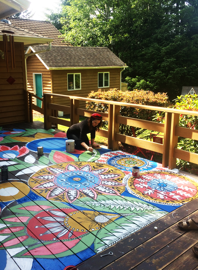
13. Cover Your Deck in a Hand-Painted Mandala and Floral Design
This is an absolutely incredible, artistic statement. But before you get out your paintbrushes, you need a reality check. This is not a project for the faint of heart or the impatient. The amount of time required is immense. More importantly, this beautiful artwork is directly exposed to the elements and foot traffic. Even with the best marine-grade varnish, it will fade, chip, and wear. This is a high-commitment, high-maintenance choice that you should consider semi-permanent. You will be touching this up regularly if you want to keep it looking vibrant.
|
📋 Copy HEX 🔗 Share |
Want to try painting a pattern on your own deck? Start small! Here’s how to create a single, durable medallion. Time: 8-10 hours. Cost: $75.
- Choose a low-traffic corner of your deck. Clean the area thoroughly and let it dry.
- Lightly sand the boards to give the paint something to grip.
- Use a large stencil or draw your design in chalk.
- Using high-quality exterior acrylic or porch paints, fill in your design. Use small artist’s brushes for details.
- Let the paint cure for at least 72 hours.
- Apply 3-4 thin coats of a clear, UV-protective, marine-grade spar urethane over the design, letting each coat dry completely.
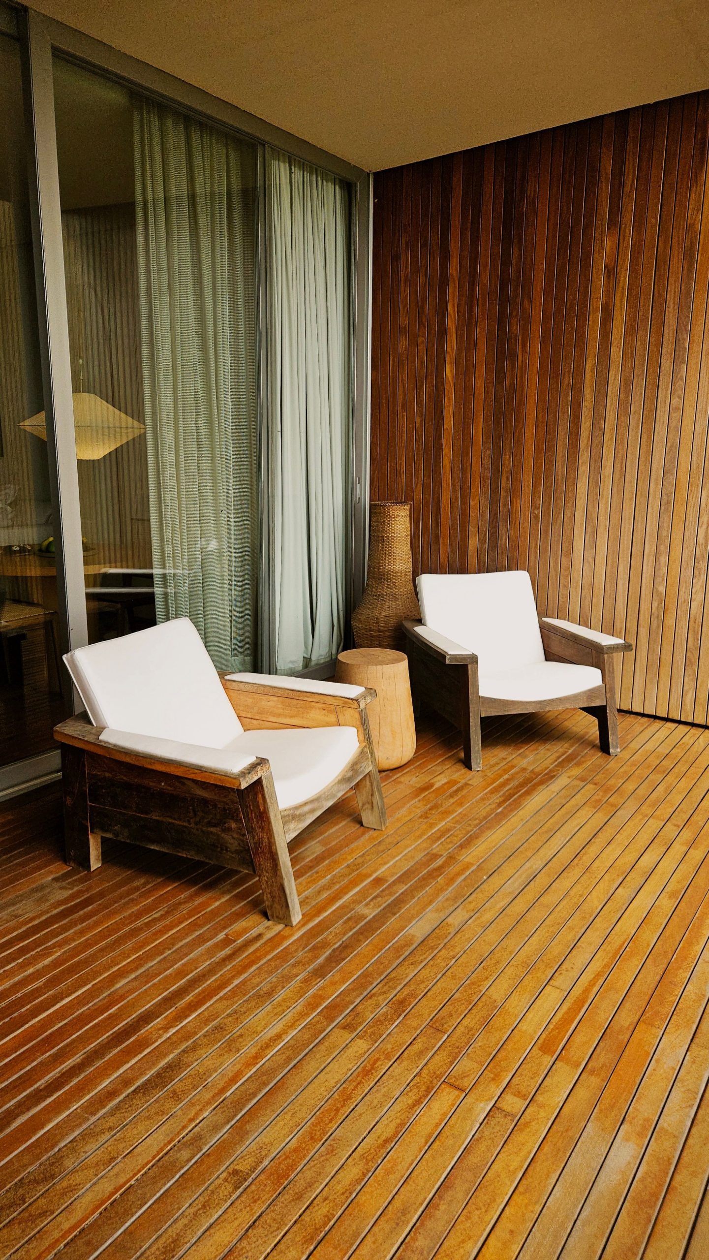
14. Create a Warm Wooden Lounge with Slatted Walls and Floors
This cozy corner works because it fully commits to a single material: wood. By using warm wooden slats for the deck floor, the privacy wall, and the furniture frames, the space feels incredibly cohesive and immersive, like a private little cabana. The diagonal lay of the deck boards adds a subtle dynamic energy, while the vertical slats of the wall draw the eye upward. The plush white cushions and natural woven accents provide just enough softness and textural contrast to keep the wood-on-wood look from feeling monotonous. It’s a masterclass in material harmony.
|
📋 Copy HEX 🔗 Share |
This look is a direct reflection of the ‘Japandi’ design trend—a hybrid of Scandinavian simplicity and Japanese rustic minimalism. It’s gaining huge traction on Pinterest because it champions natural materials, clean lines, and a focus on creating calm, uncluttered spaces. The emphasis on craftsmanship, seen in the slatted wood and robust furniture, and the connection to nature are central to this philosophy. People are craving serene, mindful spaces, and this outdoor lounge delivers that exact feeling, proving that minimalism can be incredibly warm and inviting.
15. A Quick Word on Bad Inspiration Photos
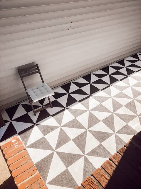
You’re scrolling Pinterest late at night, and you see it—a thumbnail that looks like *the one*. But it’s blurry, pixelated, and tiny, like this image here. Stop right there. A low-resolution photo is one of the most misleading things in the design world. You can’t see the true color, the texture of the material, or how the finish reflects light. Is that a smooth composite or a rough-painted wood? Is it matte or glossy? A bad photo hides all the critical details, and basing your expensive deck project on a guess is a recipe for disappointment.
|
📋 Copy HEX 🔗 Share |
Here’s a pro-tip for vetting your inspiration. When you find an image you love on Pinterest, don’t just save it. Click through to the source website. Is it a real designer’s portfolio, a reputable magazine, or a product page from a brand like Trex or Sherwin-Williams? If so, you’ll likely find high-resolution photos and, more importantly, specific details about the materials and colors used. If the pin leads to a spammy blog or a dead link, ditch it. High-quality inspiration comes from high-quality sources. Good design decisions cannot be made from bad data.
16. How to Vet Your Pinterest Deck Inspiration
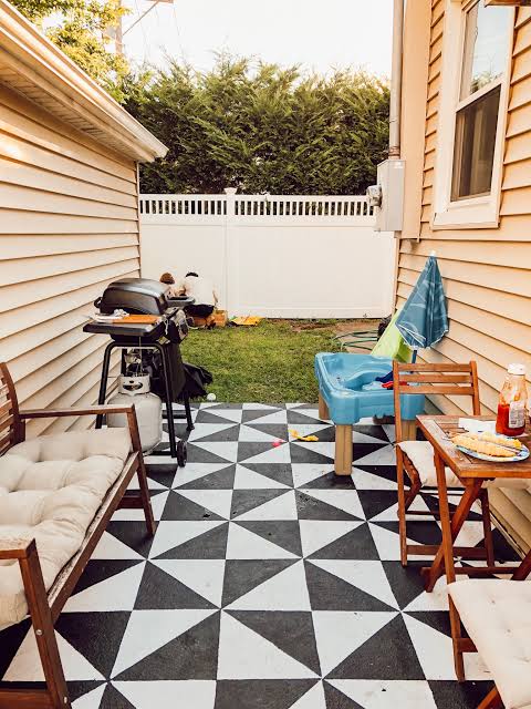
Don’t let a tiny, blurry image dictate your deck project. Here’s a quick process for finding high-quality, reliable inspiration images.
- On Pinterest, use specific, long-tail keywords. Instead of ‘gray deck,’ search for ‘Sherwin-Williams Iron Ore solid stain on pine deck.’
- Use the ‘visually similar’ search tool on a photo you like to find higher-resolution versions.
- Always click through to the original source. A professional’s blog or a brand’s website is a trustworthy source; a random aggregator site is not.
- Do a reverse image search on Google to find other places the photo has been published, which can often lead you to the original designer or photographer with more details.
|
📋 Copy HEX 🔗 Share |
This vetting process works because it shifts your focus from passive scrolling to active investigation. A beautiful design is the sum of its specific parts: the exact paint color, the type of wood, the finish, and the hardware. A high-resolution photo from a credible source gives you those specifics. It allows you to analyze the way light hits the surface, the texture of the grain, and the true undertones of the color. Relying on blurry images is like trying to follow a recipe with half the ingredients missing. Good research is the foundation of every successful project.
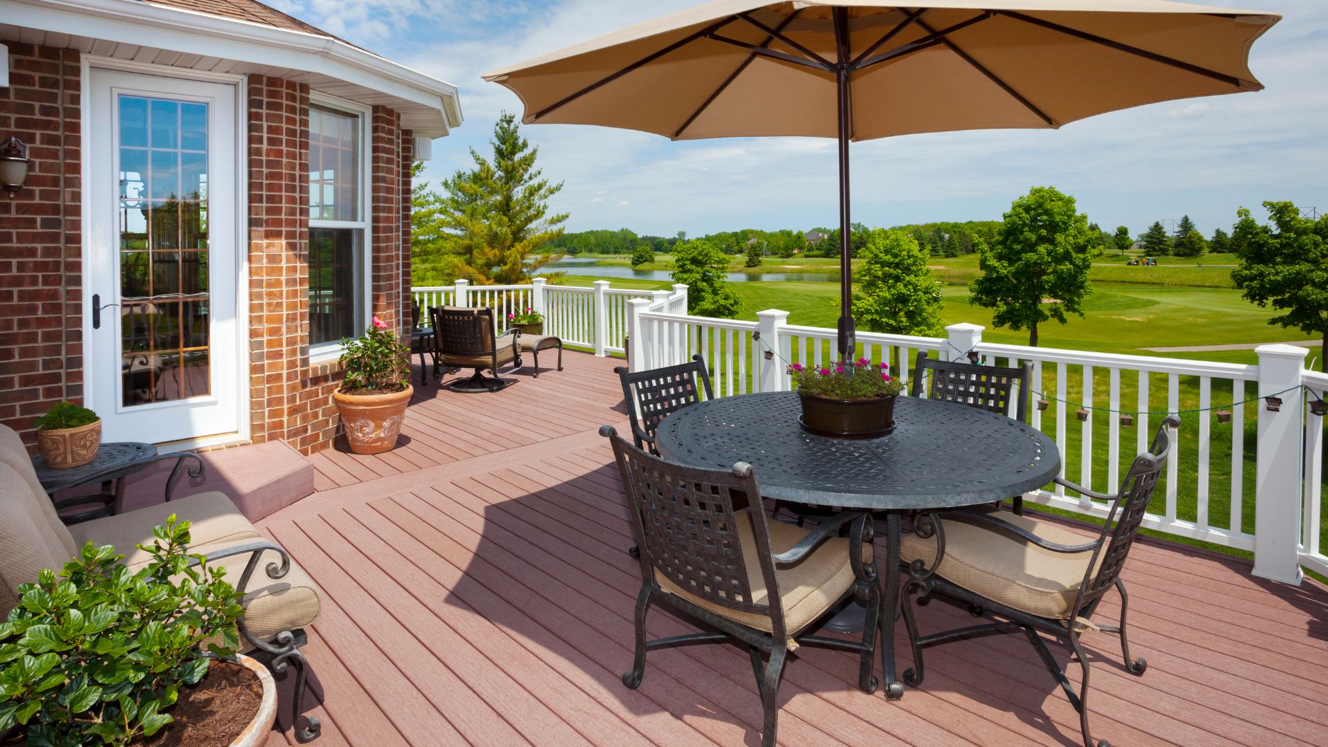
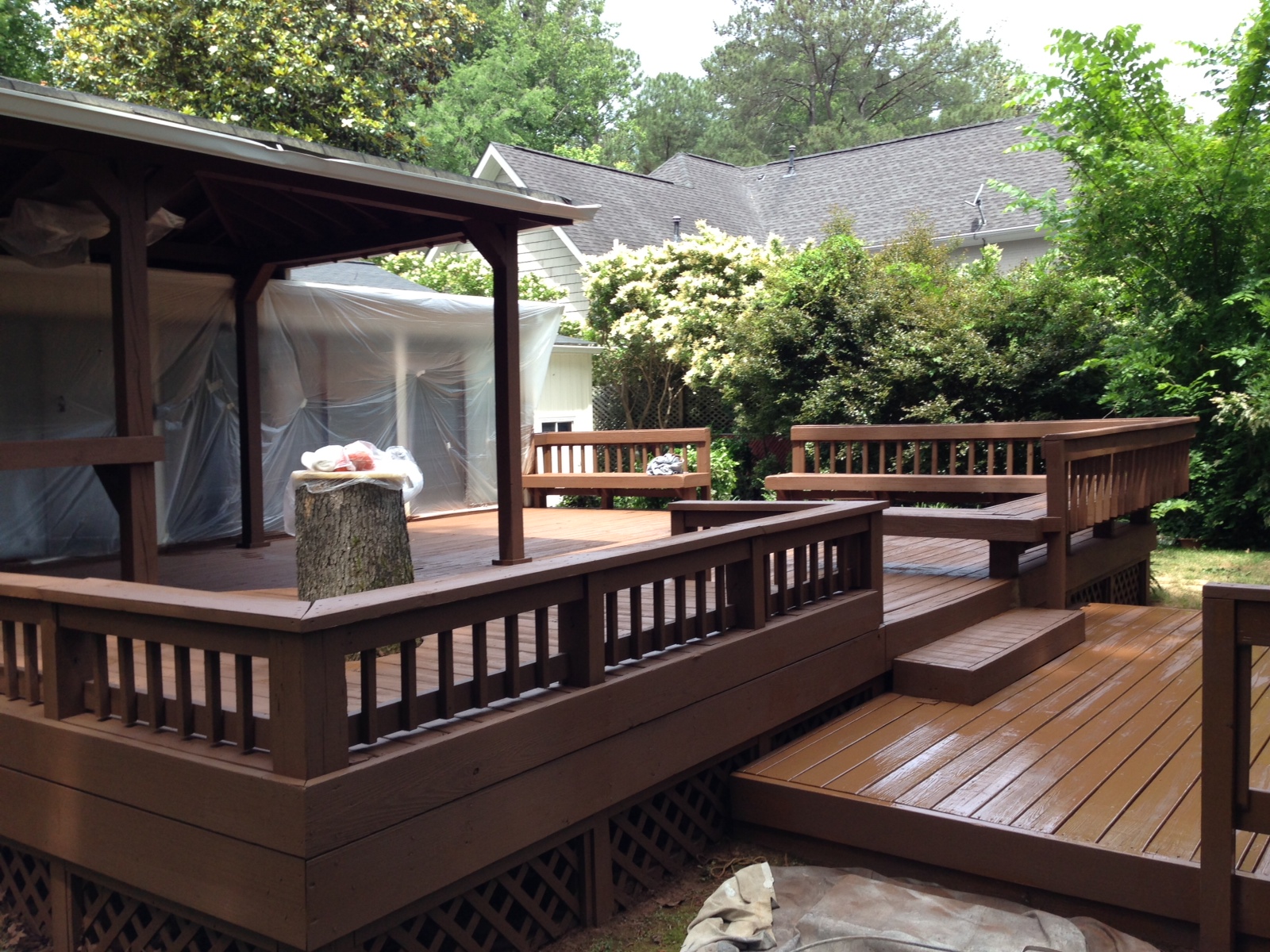
17. Choose a Reddish-Brown Deck with a Scenic Lake View
A large, open deck like this is perfect for a property with a killer view. To justify this scale—likely 500+ square feet—you need a destination. A lake, a golf course, or a mountain range are perfect backdrops. On a smaller, more enclosed lot, a deck this large would feel out of proportion. The key here is that the deck isn’t the main event; it’s the frame for the landscape. The simple white railing and reddish-brown floor are classic choices that don’t compete with the stunning scenery. For a more enclosed feel on a smaller lot, consider the design in Idea #5.
|
📋 Copy HEX 🔗 Share |
While the reddish-brown floor and white railings are lovely, the one thing that truly makes this space work is the thoughtful zoning of furniture. There isn’t just one giant seating group; there’s a distinct dining area under the umbrella and a separate, more casual lounging area. This division of space is what transforms a big, empty platform into a functional outdoor living room. It gives the deck purpose and makes it feel welcoming and usable, inviting you to both host a dinner party and relax with a book.
18. Use Deep Gray Paint with White and Natural Wood Railings
Here’s the visual recipe for this chic, modern look: 60% deep gray floor + 30% crisp white verticals + 10% natural wood warmth. The deep gray paint creates a sophisticated, solid base that feels very current. The white railings provide a sharp, clean contrast that defines the deck’s perimeter. But the crucial 10% is the natural stained wood handrail. It adds a touch of organic texture and warmth, preventing the gray-and-white scheme from feeling too sterile or cold. It’s the perfect finishing touch that ties it all together.
|
📋 Copy HEX 🔗 Share |
- Deck Paint (Solid Stain, Deep Gray): $100 – $180
- Railing Paint (Exterior Semi-Gloss, White): $40 – $70
- Wood Stain (Handrail): $20 – $30
- Prep & Application Supplies: $50 – $100
- TOTAL (DIY): $210 – $380
- Budget alternative: If you’re building new, using standard pressure-treated pine for the handrail and staining it costs a fraction of what a premium hardwood like Ipe or Teak would. The look is nearly identical for the first few years.
19. Install a White Pergola Over a Light Gray Deck
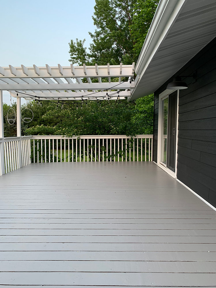
This combination is so popular on Pinterest for a reason: it’s a perfect balance of light, structure, and contrast. The light gray deck floor feels modern and clean, while the dark gray house siding provides a grounding, dramatic backdrop. The white pergola and railing work as a brilliant middleman. They pop against the dark siding, creating architectural interest, and their open, airy structure adds a sense of enclosure and ‘room-like’ definition without blocking light or feeling heavy. The string lights are the final touch, turning the area into a magical space at night. We see a similar winning combo in Idea #25.
|
📋 Copy HEX 🔗 Share |
Before you commit to adding a pergola, tick these boxes:
- Sun Path: Track how the sun moves across your deck throughout the day. Will the pergola actually provide shade when you need it most, or just look pretty?
- Structural Load: Your deck’s footings and frame must be sufficient to support the added weight of a pergola. Consult a builder or structural engineer if you’re unsure.
- Attachment Point: How will it attach to your house? This requires proper flashing and sealing to prevent water damage to your home’s exterior wall.
- Material Choice: Wood requires regular painting or staining. Vinyl or aluminum is low-maintenance but has a different aesthetic. Choose wisely.
20. Arrange Benches on a Dark Composite Deck with White Railings
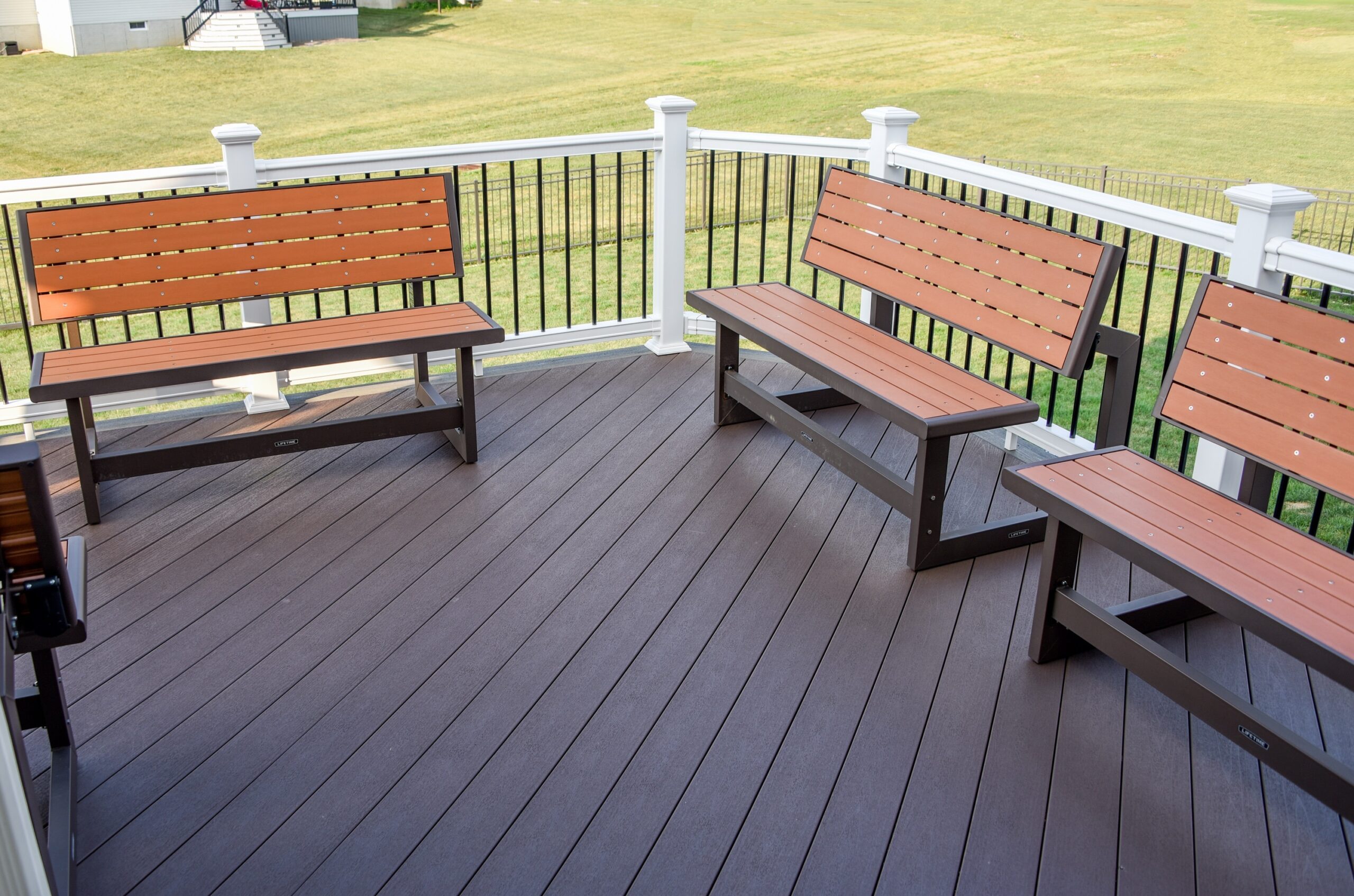
Composite decking is famously low-maintenance, but ‘low’ doesn’t mean ‘no.’ Dark brown or charcoal composite boards, while great for hiding dirt, can get incredibly hot in direct sun—hot enough to be uncomfortable on bare feet. They also show water spots and can develop a chalky-looking film over time if not cleaned properly. A simple scrub with soap and water or a dedicated composite deck cleaner once or twice a year is usually all it takes to keep it looking fresh. Unlike wood, you’ll never have to worry about staining, sealing, or splinters.
|
📋 Copy HEX 🔗 Share |
When you have a large, open deck, using multiple identical benches is a smart way to create flexible, modular seating. Unlike a fixed sectional, these can be easily rearranged for a large party, split into conversational groups, or pushed to the perimeter to open up space. The repetition of the bench form creates a sense of rhythm and order, making the large space feel intentional and curated rather than empty. For maximum versatility, choose benches that are durable but not too heavy to be moved by one or two people.
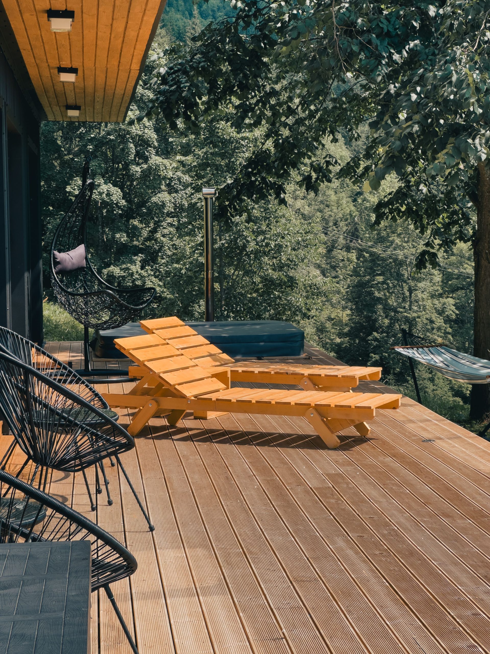
21. Embrace Natural Grooved Wood Decking with Forest Views
This expansive, natural wood deck is a dream, but its success is entirely dependent on its surroundings. This idea is tailor-made for a property that borders a forest, a lush ravine, or has extensive mature landscaping. The deck’s purpose is to be a viewing platform for nature. For this to work, you need a minimum of 400-600 square feet of deck space to feel generous, and it should ideally be low to the ground to feel connected to the landscape. In a typical suburban backyard with a small lawn and privacy fence, this look would lose all its immersive, serene power.
|
📋 Copy HEX 🔗 Share |
A deck this close to a forest means dealing with nature’s mess. You’ll be constantly battling fallen leaves, twigs, pollen, and pine needles. The grooved wood planks, while great for drainage, are notorious for trapping this debris, making it difficult to sweep clean. You’ll need a leaf blower and a pressure washer as your primary cleaning tools. Also, be prepared for more moisture, which can promote mildew and algae growth, especially in shaded areas. Sealing the wood every 1-2 years is not optional; it’s essential for survival.
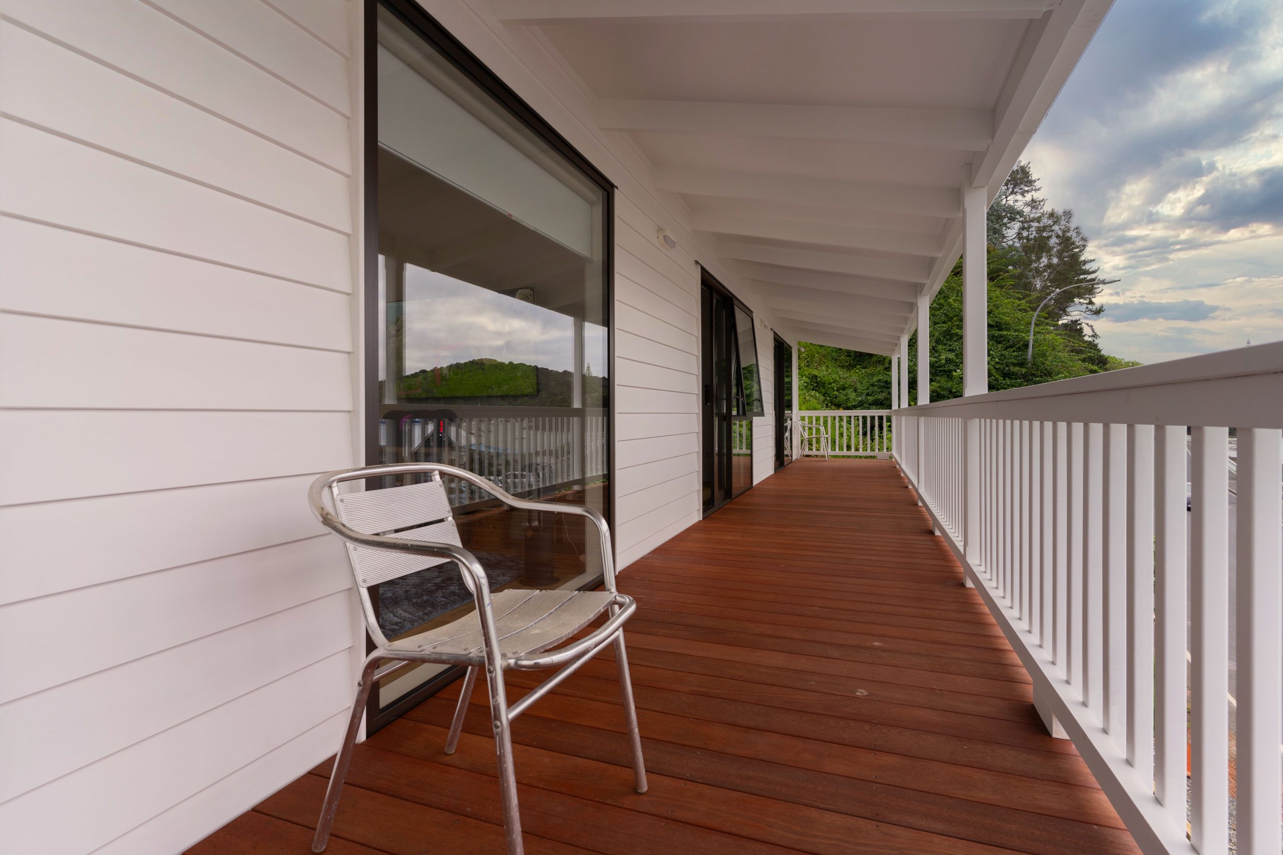
22. Pair a Dark Reddish-Brown Deck with White Siding and Railings
This is a high-contrast look that feels both classic and bold. It works because of the simple, powerful color pairing. The dark, rich reddish-brown of the deck floor creates a warm, grounding base. The brilliant white of the house siding and railings provides a crisp, clean frame that makes the deck color appear even richer. The black-framed windows add a final, sharp graphic element. This isn’t a complex palette, and that’s its strength. It’s confident, clean, and timeless. The use of white on the vertical surfaces makes the whole area feel bright and open, despite the dark floor.
|
📋 Copy HEX 🔗 Share |
You can achieve this exact high-contrast style on a shoestring budget. Standard pressure-treated pine lumber is your best friend here. For the deck floor, use a semi-transparent stain in a ‘Cedar’ or ‘Redwood’ tone to get that rich color while letting some wood grain show through; this will cost about $50 per gallon. For the railings, skip the expensive composite or vinyl sleeves and just use standard wood balusters painted with a durable exterior white paint. The whole look is achievable for the cost of stain and paint, saving you thousands compared to hardwood or composite materials.
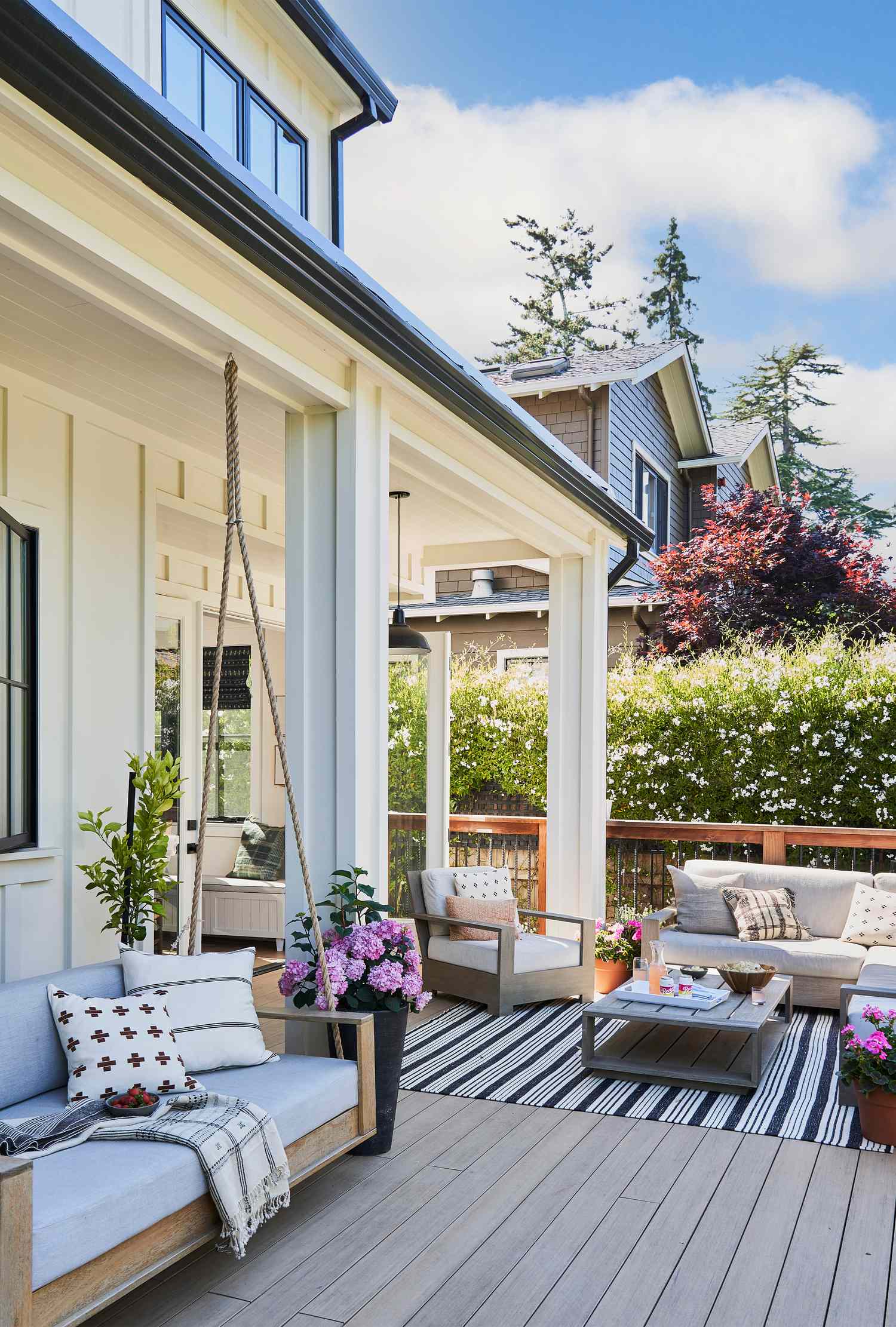
23. Style a Minimalist Light Gray Deck with Dark Furniture
The formula for this serene, minimalist look is beautifully simple: 80% calm, neutral surface + 15% sharp, dark accents + 5% soft, natural texture. The light gray painted deck creates a vast, quiet canvas. The dark gray chairs and table are the crucial accents; their clean lines and dark color provide a focal point and a sense of structure against the light floor. The final 5%—the green potted plants—is essential for breathing life into the space and preventing the monochrome palette from feeling too clinical. You could swap the gray for beige or white and get the same effect.
|
📋 Copy HEX 🔗 Share |
What makes this minimalist deck feel so calming is the lack of clutter. It’s not just about the color palette; it’s about what’s not there. There are no fussy pillows, no complicated patterns, and no unnecessary objects. The space is furnished with only the essentials: a place to sit and a place to set a drink. This restraint is a design choice in itself. By editing down to the bare minimum, the focus shifts to the clean lines, the subtle textures, and the overall feeling of tranquility. It’s a reminder that sometimes the most impactful design is about subtraction.
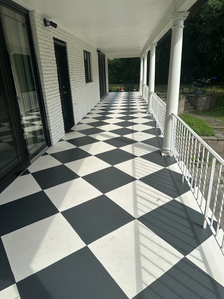
24. Paint a Bold Black and White Checkerboard Porch Floor
Creating a crisp checkerboard pattern is all about the prep work. Here’s the plan. Estimated time: 1-2 weekends. Cost: $120-$200.
- Clean the concrete or wood porch floor thoroughly. For concrete, you may need to etch it so the paint will adhere.
- Paint the entire surface with 2-3 coats of the lighter color (white) using a high-quality porch and floor paint. Let it cure completely for at least 48-72 hours.
- Measure your porch and decide on a tile size (12″ or 18″ squares are common). Use a chalk line to snap a perfect grid onto the floor.
- Using high-quality painter’s tape (like FrogTape), carefully tape off the squares that will remain white.
- Paint the remaining squares with your darker color (black). Apply two coats for solid coverage.
- Remove the tape before the second coat fully dries to get the crispest lines.
|
📋 Copy HEX 🔗 Share |
When painting a graphic pattern like this, scale is your most important decision. For a long, narrow porch, smaller squares (12×12 inches) will create a sense of energy and pattern. For a wider, more open porch, larger squares (18×18 or even 24×24 inches) will feel more stately and less busy. Before you commit, draw out a few different sized squares with chalk to see what feels best in your space. A pattern that’s too small can look chaotic, while one that’s too large can lose the checkerboard effect. Testing the scale first is a step you should never skip.
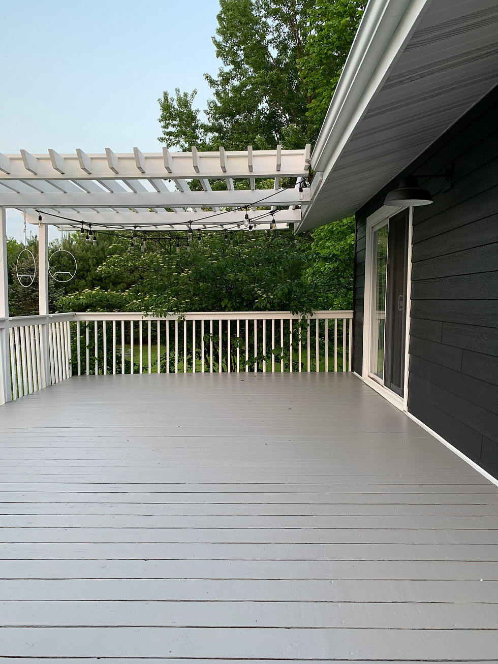
25. Hang String Lights from a Pergola Over a Gray and White Deck
This entire look—the gray deck, the white pergola, the dark siding, the string lights—is basically the official uniform of the modern, Pinterest-perfect backyard. Why is it so popular? Because it’s a nearly foolproof formula for creating an inviting outdoor ‘room. ‘The pergola defines the space, the neutral colors are sophisticated and easy to live with, and the string lights add instant ambiance and charm for a relatively low cost. It signals a comfortable, stylish approach to outdoor living that feels both aspirational and achievable. It’s the visual shorthand for ‘I have my life together, and my backyard is awesome. ‘ Compare with the very similar Idea #19.
|
📋 Copy HEX 🔗 Share |
A white-painted wood pergola looks stunning on day one, but it is a significant maintenance commitment. It is fully exposed to sun, rain, and temperature swings. You will be dealing with peeling paint, mildew, and potentially wood rot if it’s not meticulously maintained. Expect to be up on a ladder every 2-3 years, scraping, sanding, priming, and repainting. If that sounds like your personal nightmare, seriously consider a vinyl or powder-coated aluminum pergola instead. You’ll get a nearly identical look with a fraction of the upkeep.
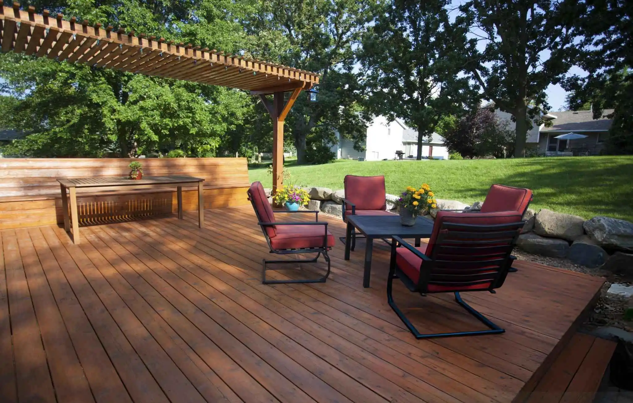
26. Stain a Deck a Warm Reddish-Brown with a Matching Pergola
- Wood Stain (Semi-Transparent): $200 – $400 (for deck and pergola)
- Built-in Bench Materials (Lumber): $150 – $300
- Patio Chairs (Set of 4): $300 – $800
- Cushions & Small Table: $150 – $400
- TOTAL (DIY build & stain): $800 – $1,900
- Budget alternative: Find a similar set of black metal chairs on Facebook Marketplace or at the end of the season for 50-70% off. Building the bench from standard pressure-treated pine instead of cedar will save hundreds.
|
📋 Copy HEX 🔗 Share |
This design feels so cohesive and inviting because it commits to the warm, reddish-brown wood tone across multiple elements. The floor, the pergola, and the built-in bench are all unified by the same stain color, creating a ‘wood-wrapped’ effect that feels intentional and cozy. The black metal of the chairs provides a strong, modern contrast, while the deep red cushions are a perfect color echo of the wood’s undertones. It’s a beautifully layered and harmonious palette that connects directly to the natural setting.
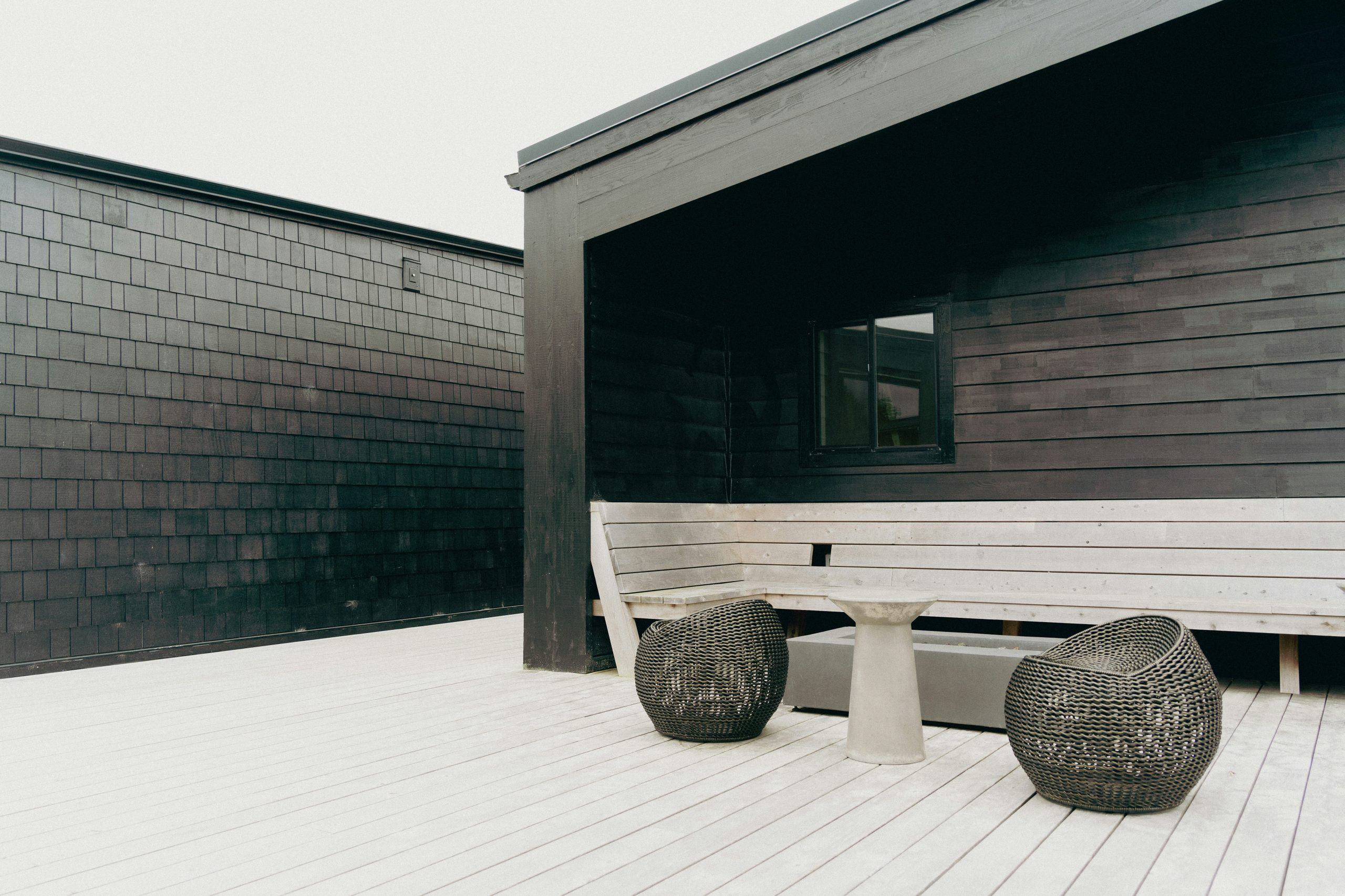
27. Create High Contrast with a Whitewashed Deck and Dark Siding
A whitewashed or semi-transparent white-stained deck offers a softer, more coastal vibe than solid white paint, but it comes with its own upkeep challenges. Because the coating is thin, it’s more susceptible to wear and tear from foot traffic and furniture. You’ll likely see wear patterns in high-traffic zones within a year or two. It’s also very prone to showing dirt, pollen, and especially mildew, which can appear as black or green spots. Plan on a thorough cleaning and a fresh maintenance coat every 12-18 months to keep it looking bright and not dingy.
|
📋 Copy HEX 🔗 Share |
The single element that makes this modern design so successful is the strong contrast in values. The almost-white deck creates a bright, reflective ground plane that feels expansive. This is set against the deep, light-absorbing color of the dark gray and black siding. This push-and-pull between light and dark is what creates the dynamic, graphic energy. If the deck were a medium gray or a natural wood tone, the effect would be far less dramatic. The stark contrast is everything here.
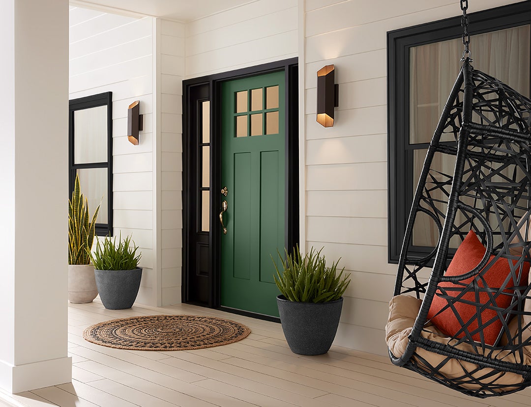
28. Pair a Beige Deck Floor with a Deep Green Front Door
The secret to making a bold front door color work is to keep everything around it neutral and consistent. Notice how the beige deck floor, cream siding, and even the gray planters are all soft, low-contrast neutrals. This creates a quiet backdrop that allows the deep green door to be the undisputed star. Furthermore, the use of matte black for both the door trim and window frames provides a sharp, graphic outline that contains the color and makes it feel intentional and crisp. Never pair a bold color with weak or mismatched accents.
|
📋 Copy HEX 🔗 Share |
Let’s break down the style math for this welcoming entryway: 50% warm neutrals (cream siding, beige deck) + 30% crisp, dark accents (black trim) + 15% bold color pop (green door) + 5% texture (woven chair, planters). This is a foolproof recipe for curb appeal. The large mass of neutrals creates a calm base. The black trim adds definition. The single, bold color provides personality and a clear focal point. The final touch of texture makes it feel layered and lived-in. You could swap the green for a deep navy or a burnt orange, and the formula would still work perfectly.
Your Perfect Outdoor Space Awaits
A beautifully finished deck can completely change how you experience your home. Hopefully, these 28 ideas have sparked some inspiration for your own outdoor project. Take what you’ve learned, check out your Pinterest boards with fresh eyes, and start planning the deck you’ve always wanted. It’s time to create an outdoor space you’ll love for years to come.