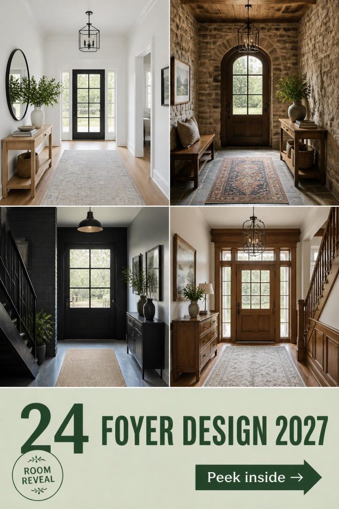
24 Foyer Design Ideas for 2027 That Will Elevate Your Home’s First Impression

You know that feeling when you finally find the foyer design that looks exactly right for your space? That little spark of yes, that’s it! is what we’re chasing here. After filtering through hundreds of options from high-end designers to finds on Facebook Marketplace and Target, we narrowed it down to the looks that truly deliver. We’ve covered ideas from a few hundred dollars to more luxurious custom entries.
Inside, you’ll find 24 curated foyers covering styles from modern minimalist and Japandi to timeless traditional. In 2026, the focus is all about creating an entryway that’s not just a pass-through but a true welcome home moment—functional, personal, and incredibly stylish. And stay until the end—we break down the most common mistakes that can ruin these looks. 📌 Save this to Pinterest for later—you’ll want to revisit these ideas.
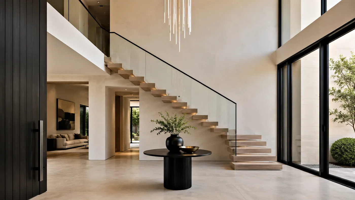
1. Modern Foyer with a Floating Staircase and Linear Pendants
This foyer is a masterclass in balancing presence and airiness. The floating light wood treads of the staircase feel light and open, preventing the structure from overwhelming the space. This is beautifully contrasted by the strong, graphic black lines of the console table base, window frames, and stair railing. The result is a look that’s substantial and grounded, yet feels incredibly spacious and full of light thanks to those massive glass doors.
|
📋 Copy HEX 🔗 Share |
The second key is the play on shapes. The severe vertical lines of the pendant lights and railing are softened by the perfectly round console table and the gentle curve of the greenery in the vase. It’s this intentional mix of hard and soft geometry that gives the space its serene, architectural quality.
When hanging long, linear pendant lights like these, the goal is to illuminate the space without creating a visual or physical barrier. A good rule of thumb is to hang the bottom of the fixture at least 7.5 to 8 feet off the floor in a standard-height foyer. For a double-height space like this one, you have more freedom, but you still want to ensure it relates to the human scale of the entry. Aim for the bottom of the fixture to be roughly level with the top of the ground floor’s door frames to create a cohesive sightline.
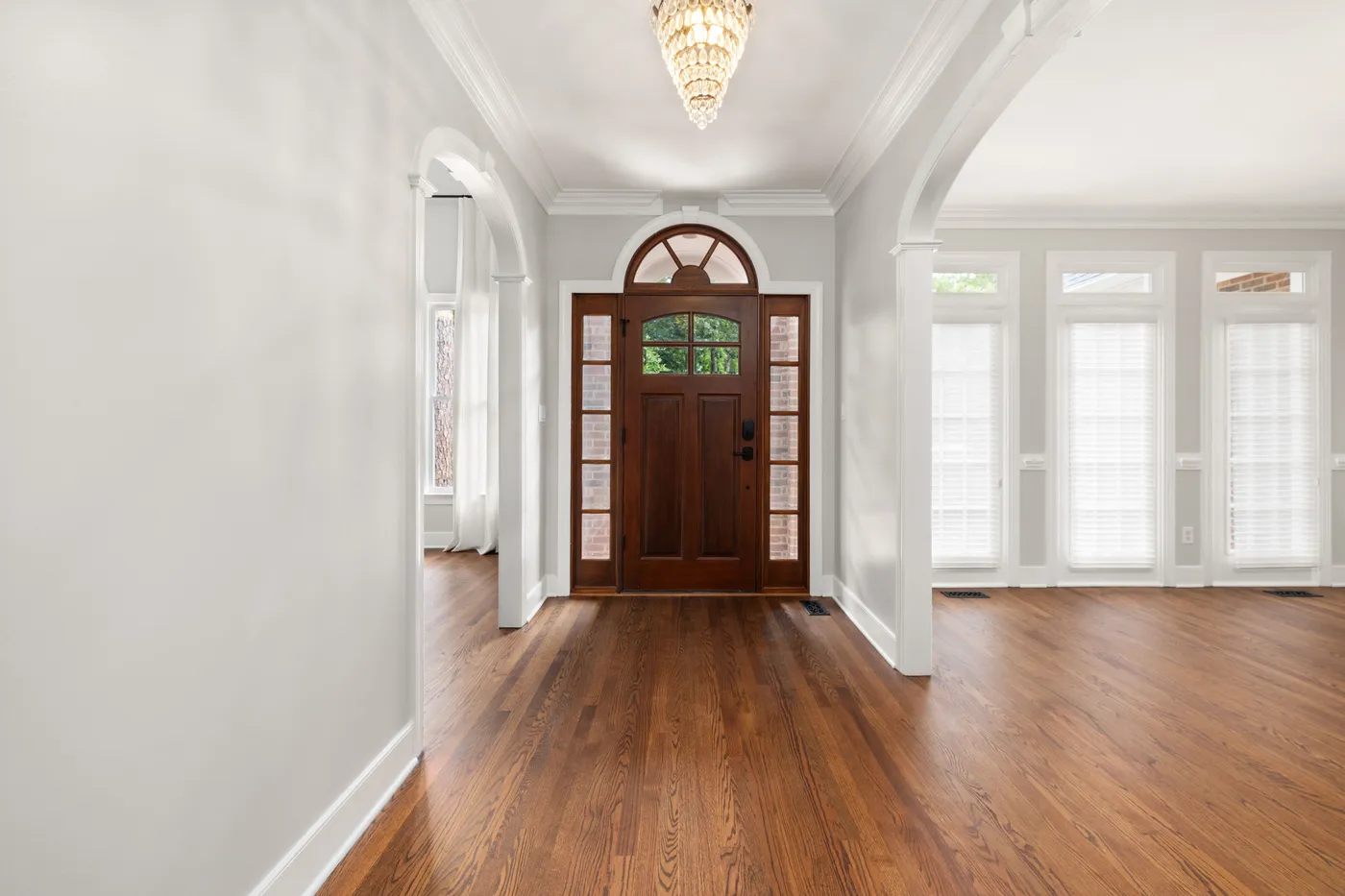
2. Classic Entry with an Arched Transom and Crystal Chandelier
This elegant, traditional look follows a timeless formula you can adapt. Think of it as 50% soft neutral walls + 30% crisp white architecture + 15% rich dark wood + 5% sparkling accents. The light gray walls create a calm, expansive backdrop. The white trim, crown molding, and arched doorways provide sharp, classical definition. The dark wood door acts as the strong, welcoming focal point, and that little bit of sparkle from the crystal chandelier and glossy floors adds the final touch of polish.
|
📋 Copy HEX 🔗 Share |
You can easily swap the elements: change the light gray to a soft beige or pale blue, or switch the dark wood door for a painted black or deep navy one, and the formula still holds perfectly.
Let’s be honest about glossy hardwood floors in an entryway. They are absolutely stunning and reflect light beautifully, which can make a foyer feel larger and more grand. However, they are the definition of high-maintenance in a high-traffic zone. Every speck of dust, every wet footprint, and every tiny scratch from a heel or a piece of gravel stuck in a shoe tread will be highly visible. If you have kids, pets, or live in a climate with lots of rain or snow, be prepared for daily sweeping or vacuuming to keep them looking this pristine.
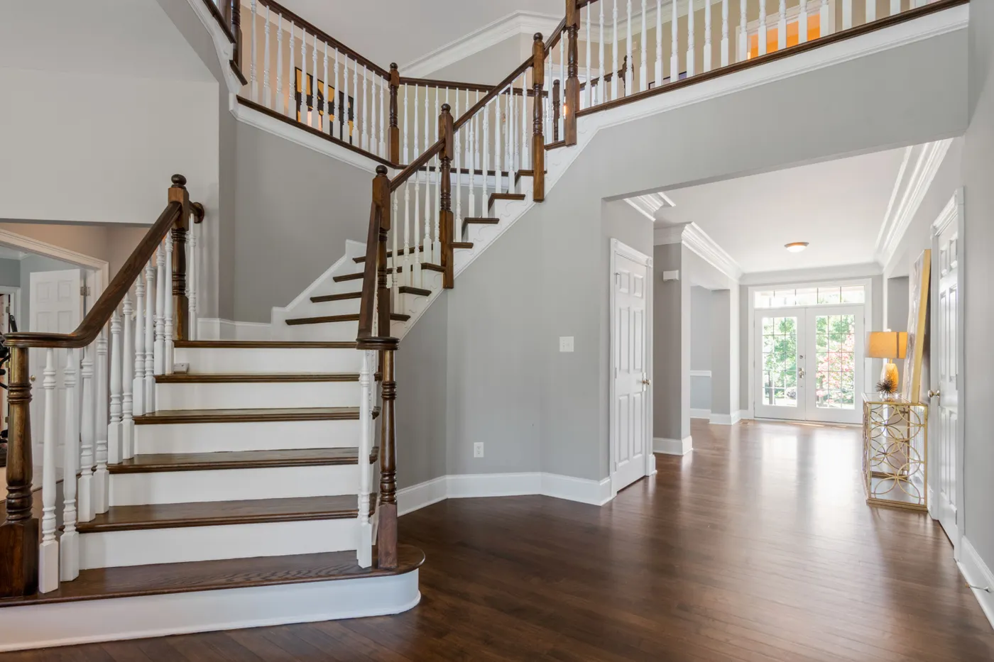
3. Timeless Foyer with a High-Contrast Dark Wood Staircase
The single element that makes this entire foyer work is the high contrast of the staircase. Without the dark stained handrail and treads against the bright white balusters and risers, the staircase would just be a functional element. With the contrast, it becomes a dramatic, architectural feature that draws the eye upward and adds a sense of rhythm and graphic punch to the entire space. It anchors the traditional feel while keeping it from feeling dated. The dark hardwood floor grounds it, and the light grey walls let it take center stage.
|
📋 Copy HEX 🔗 Share |
That gold geometric console table is a showstopper, but you don’t need a designer budget to get the look. Check out stores like Wayfair, Overstock, or even Target’s Studio McGee line for similar open-base console tables. You can often find a black metal version for around $150-$250. To get the gold finish, a can of high-quality metallic spray paint (like Rub ‘n Buff or Rust-Oleum Metallic) for about $15 and an hour of your time on a Saturday afternoon will give you a nearly identical vibe for a fraction of the cost.
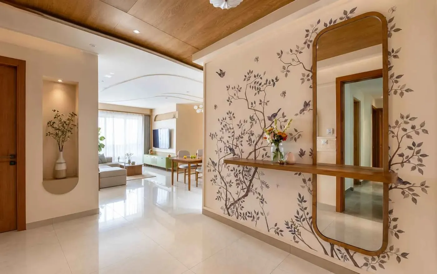
4. Welcoming Foyer with a Nature-Inspired Wall Mural
A wall mural can feel intimidating, but peel-and-stick versions make it a manageable DIY project. Here’s how to get it right:
|
📋 Copy HEX 🔗 Share |
- Prep the Wall: Clean the wall thoroughly with a mild soap and water, then let it dry completely for at least 24 hours. Fill any holes or cracks and sand smooth. A clean, smooth surface is non-negotiable for good adhesion.
- Plan Your Layout: Unroll your mural panels and lay them out on the floor in the correct order. Use a level and a pencil to draw a faint vertical guideline on the wall where the edge of your first panel will go.
- Apply Panel One: Peel back about 12 inches of the backing from the top of the first panel. Align it with your guideline and press it onto the wall. Slowly pull down the backing while smoothing the vinyl with a squeegee from the center outwards to push out air bubbles.
- Match and Repeat: Overlap the next panel slightly (most murals are designed for a 1/2 to 1-inch overlap) and carefully align the pattern. Repeat the process until the wall is covered. Use a sharp utility knife to trim any excess at the ceiling or baseboard.
Time Estimate: 2-4 hours. Material Cost: $150-$500 depending on mural size and quality.
A large-scale mural like this works best on an uninterrupted feature wall that’s at least 8 feet wide and has 9-foot or higher ceilings. This gives the pattern room to breathe and make an impact without feeling claustrophobic. It’s perfect for a foyer wall that runs parallel to the front door or at the end of a short hallway. Avoid using it on a wall that’s broken up by multiple doors or windows, as it will chop up the design and lose its effect. For smaller foyers, consider the more minimalist approach of Idea #18, which uses paneled walls for texture instead of a pattern.
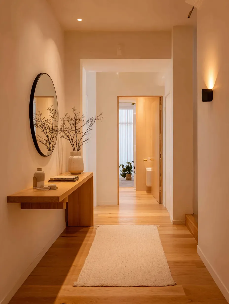
5. Minimalist Entry with a Floating Wood Console and Round Mirror
This little entryway nook feels so serene because of its mastery of texture and tone. Instead of bold colors, it builds interest by layering similar warm, neutral hues in different materials. You have the smooth grain of the wood floor, the slightly rougher texture of the floating console, the nubby weave of the cream rug, and the smooth, cool surface of the mirror. This tonal layering creates a space that feels calm, cohesive, and visually soft. The single point of contrast—the thin black frame of the mirror—is just enough to add definition without disrupting the peace.
|
📋 Copy HEX 🔗 Share |
A floating console is a fantastic choice for a small or narrow foyer because it keeps the floor clear, creating an illusion of more space. However, be aware of two things. First, installation is more involved than just placing a table. It needs to be securely mounted to wall studs to support any weight, which might dictate its placement. Second, it offers zero hidden storage. It’s a surface for a pretty vase and a key bowl, not a place to hide mail, chargers, or other daily clutter. If you need to stash things away, an option with drawers like in Idea #9 might be more practical.
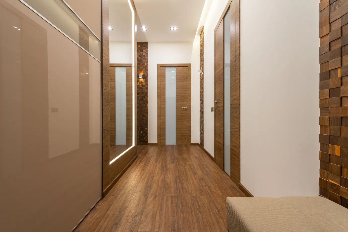
6. Sleek Foyer with a Textured Wood Block Accent Wall
The absolute game-changer here is the integrated lighting. Without the strip light bordering the mirror and the recessed ceiling spots, the expanse of medium-toned wood could feel heavy and a bit dated. But the lighting carves out the different elements, highlights the amazing texture of the wood block wall, and turns a simple hallway into a sophisticated, gallery-like experience. It’s not just about illumination; it’s about using light as a design material to add depth, drama, and a modern edge.
|
📋 Copy HEX 🔗 Share |
This look is a perfect example of the “Japandi” and “Organic Modern” trends that are dominating Pinterest right now. Homeowners are craving spaces that feel both clean and minimalist but also warm, natural, and tactile. The combination of warm wood textures, clean white walls, and smart, integrated lighting checks all those boxes. It moves away from the cold, sterile minimalism of the past and embraces a cozier, more livable version. This style has staying power because it’s rooted in natural materials and functional design, not fleeting colors or patterns.
7. Warm Modern Foyer with Wood Paneling and Integrated Lighting
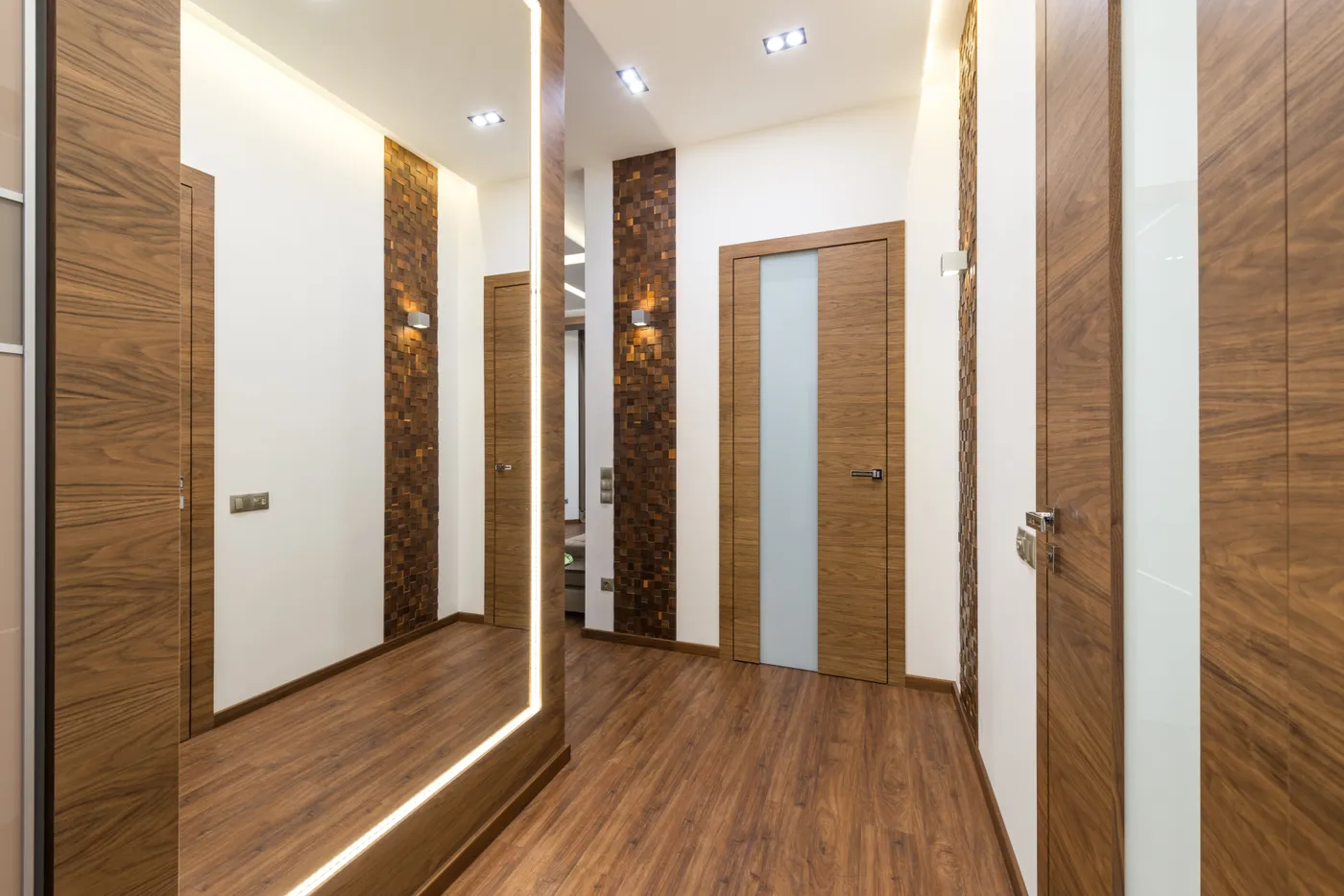
This space feels so balanced because it adheres to a simple but effective design ratio: 60% Warm Wood + 30% Crisp White + 10% Soft Light. The wood paneling and doors provide the dominant feeling of warmth and texture. The white walls act as a negative space, keeping the wood from feeling too heavy and providing a clean backdrop. The final 10% is the integrated lighting—the backlit mirror, sconces, and spotlights—which adds a layer of modern sophistication and prevents the other two elements from falling flat. It’s a formula that feels upscale and intentional.
|
📋 Copy HEX 🔗 Share |
When using a full-length mirror with integrated LED lighting, think of it as both a mirror and a light fixture. To make it a functional part of your home’s lighting plan, ensure it’s on a dimmer switch. This allows you to have it on a low, ambient glow for a welcoming beacon in the evening, but you can turn it up to full brightness when you need to do a final outfit check before heading out the door. The ability to control the intensity makes it infinitely more useful than a simple on/off switch.
8. High-Contrast Foyer with Dark Walls and a Light Wood Console
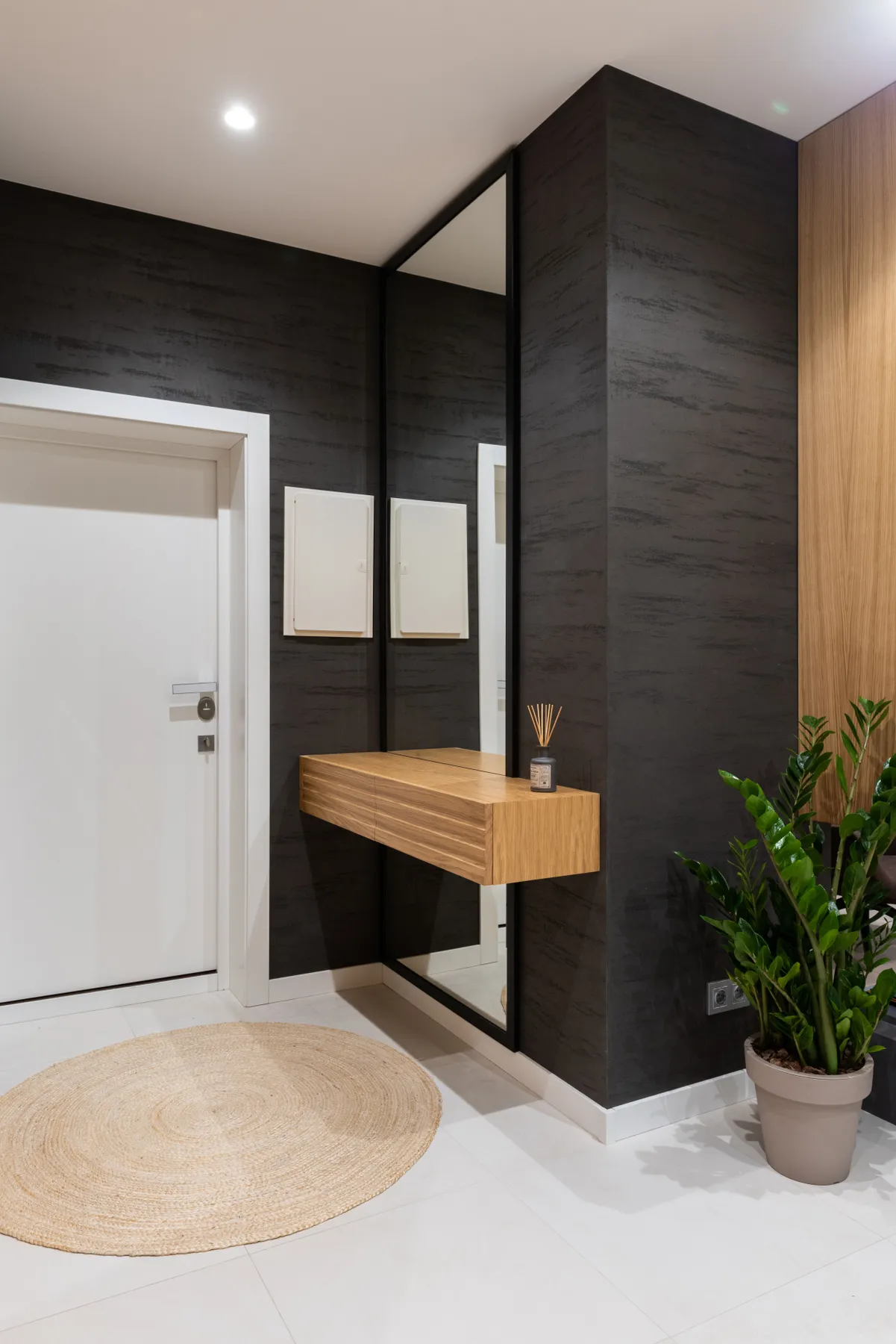
The success of this entryway lies in its bold use of contrast, not just in color but in texture. The dark charcoal walls have a subtle, almost concrete-like texture that absorbs light, making the space feel intimate and moody. Against this dark, textured backdrop, the floating console in a smooth, light natural wood pops dramatically. The sleek, reflective surface of the full-height mirror and the polished white floor tiles further amplify this contrast. It’s the dialogue between dark and light, and rough and smooth, that creates such a dynamic and curated feel. The minimalist approach of Idea #5 uses a similar console, but this version feels much more dramatic.
|
📋 Copy HEX 🔗 Share |
You can achieve this high-impact look without splurging on custom furniture. The key pieces are the floating console and the large mirror. IKEA’s MALM dressing table or a simple floating shelf can stand in for the console for under $100. For the mirror, look for simple, large-format mirrors like the HOVET from IKEA ($150) or similar full-length options from Target or Walmart. The real investment here is the wall treatment. A textured or limewash paint will give you that moody depth, and a good quality natural fiber rug from a store like Rugs USA can be found for under $80.
9. Organized Japandi Foyer with a Wood Slat Accent Wall
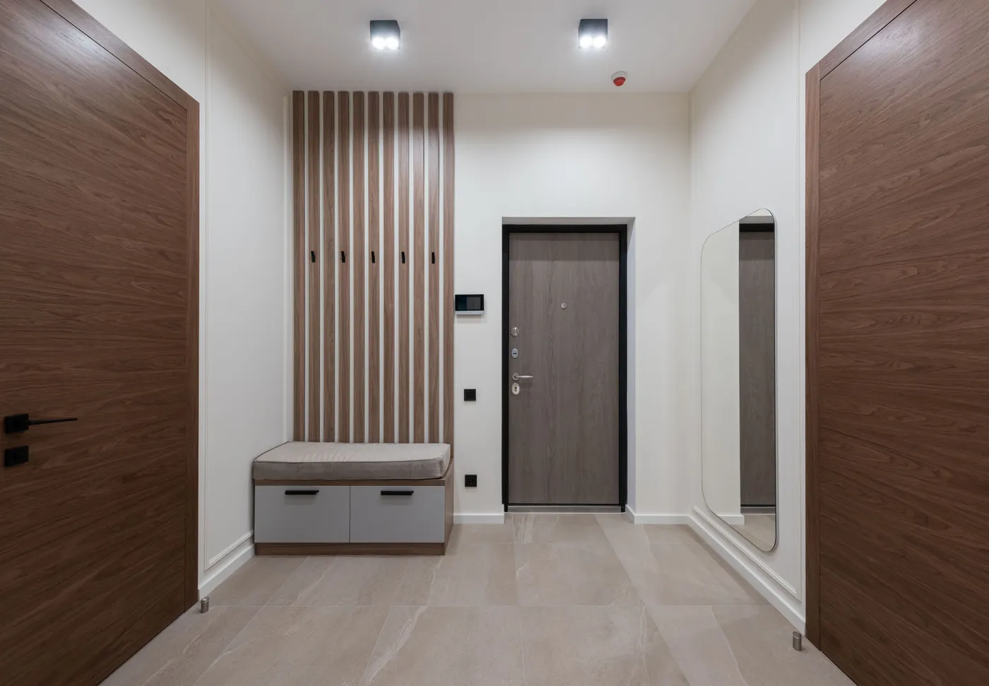
The single element holding this entire design together is the vertical wood slat wall. It’s doing triple duty. First, it adds warmth and texture, breaking up the otherwise plain white walls. Second, its vertical lines draw the eye upward, making the ceiling feel higher. And most importantly, it’s a functional anchor for the entire entry zone, providing a designated spot for the coat hooks. It neatly combines the bench, storage, and hanging space into one cohesive and intentional-looking unit, elevating it from a simple hallway to a designed drop zone.
|
📋 Copy HEX 🔗 Share |
This foyer is beautifully minimalist, but keeping it that way requires discipline. The large format beige floor tiles with matching grout are great for hiding a bit of dust, but light-colored grout lines can stain over time, especially in a high-traffic entryway. Plan on sealing the grout annually to prevent discoloration. The cushioned bench top is another area to watch; choose a high-performance fabric (like Sunbrella or Crypton) that’s resistant to stains and easy to clean. Otherwise, that pristine cushion will quickly show marks from bags, keys, and daily use.
10. Reflective Modern Entry with a Mirrored Wall and Geometric Screen
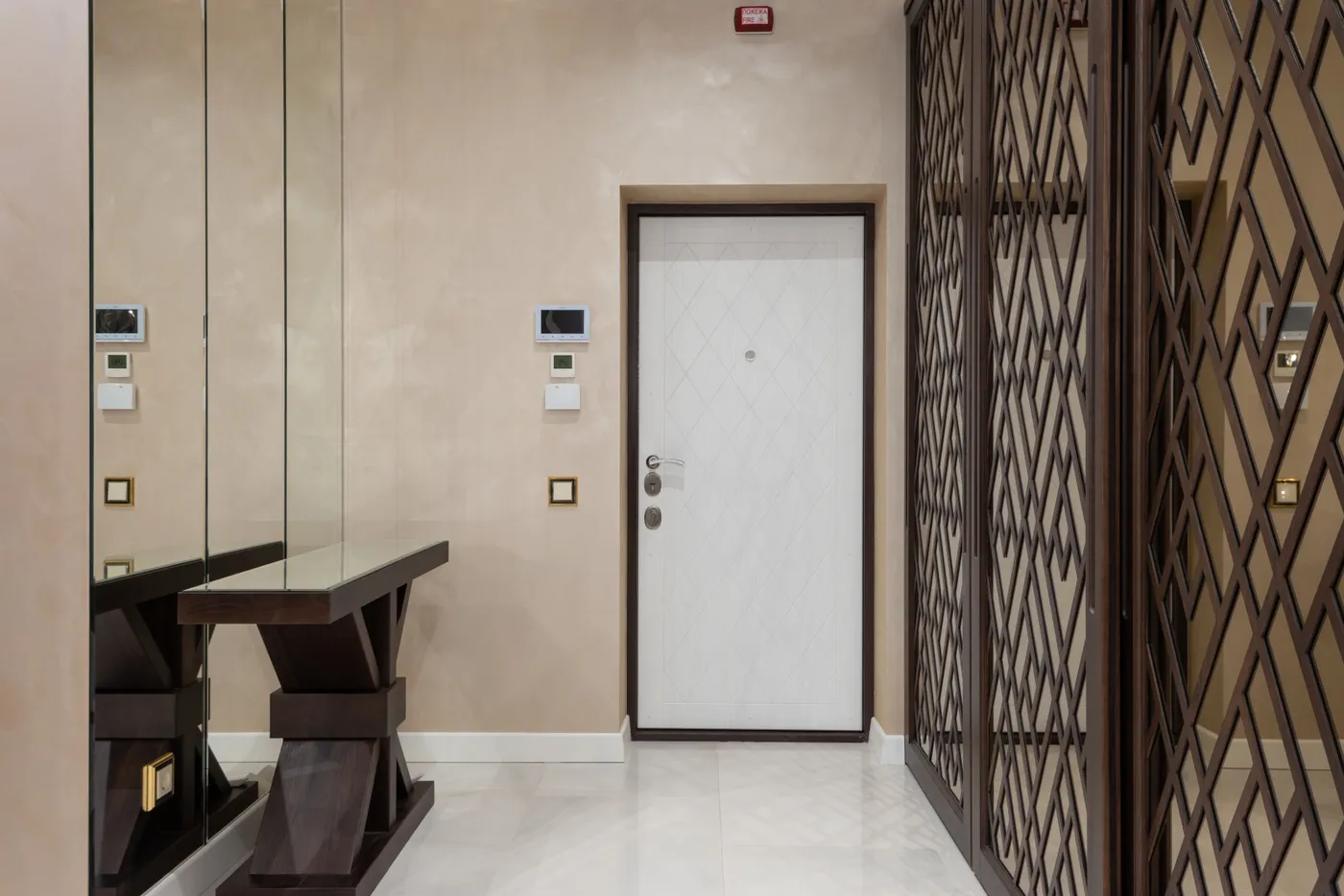
A full mirrored wall is a powerful tool, but it needs the right space to work. This look is ideal for a foyer that is relatively narrow but has at least 9-foot ceilings. The vertical reflection doubles the visual width of the space and bounces light around, making it feel significantly larger and brighter. A minimum width of about 5-6 feet is recommended, so you’re not uncomfortably close to your own reflection as you walk by. It’s less effective in a very wide, open-plan foyer where the effect can become disorienting.
|
📋 Copy HEX 🔗 Share |
A giant mirrored wall looks incredibly chic, but it means you’ve just doubled the amount of stuff you see. Every coat left on the console table, every pair of shoes kicked off by the door, and every fingerprint will be reflected for all to see. This is a look for the impeccably tidy. If your entryway is a chaotic drop zone for the whole family, a mirrored wall will only amplify the clutter and stress you out. A large piece of art or a more traditional framed mirror might be a more forgiving choice.
11. Modern Industrial Foyer with Textured Gray Walls
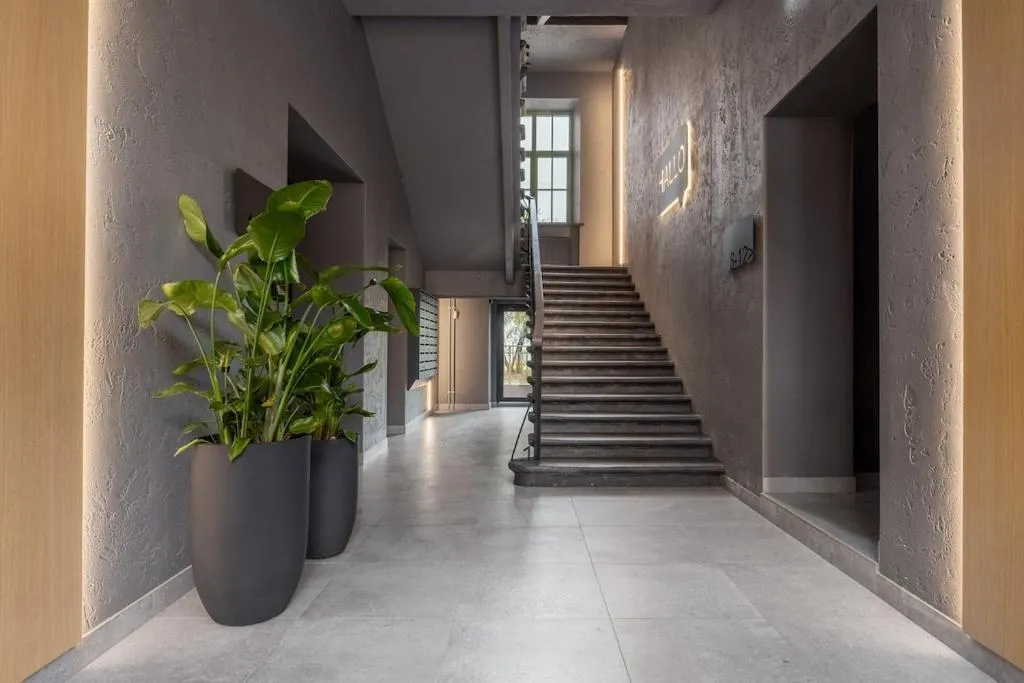
When incorporating novelty lighting like a neon sign, the key is to treat it like art, not just a light source. To avoid a college dorm vibe, choose a sign with a single, warm white color temperature (around 2700K-3000K) rather than bright colors. Also, placement is everything. By mounting it on the textured dark gray wall, it creates a focal point and a soft, ambient glow. Never rely on a neon sign as your primary light source. Always layer it with functional lighting like the vertical strips and overhead lights shown here.
|
📋 Copy HEX 🔗 Share |
Before committing to this sleek industrial look, run through this quick checklist:
- Check your outlets: That neon sign and those vertical strip lights need power. Do you have outlets where you need them, or will you need to hire an electrician to run new wiring? This can add significant cost.
- Assess your natural light: The dark gray walls are chic, but they can make a space feel like a cave without enough light. Is your foyer blessed with a nearby window, or will you be relying entirely on artificial light?
- Measure for greenery: Those large potted plants are crucial for adding life and softening the hard surfaces. Do you have at least a 24″ x 24″ footprint for a substantial pot without impeding traffic flow?
12. Dramatic Foyer with Patterned Tile and a Bold Art Wall
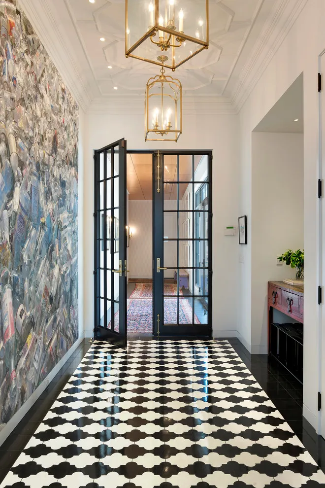
This foyer feels so confident and curated because it commits to just two main wow moments. The bold, graphic black-and-white patterned floor establishes a powerful base, while the large-scale abstract art wall provides a blast of color and energy. Everything else—the white walls, the coffered ceiling, the simple grid of the doors—is purposefully quiet. This restraint is crucial. By keeping the architectural envelope simple, the floor and the art are allowed to be the stars without competing, creating a space that’s dramatic but not chaotic. The brass lanterns add warmth and a touch of vintage glamour to the otherwise modern setting.
|
📋 Copy HEX 🔗 Share |
Take away the black and white patterned tile floor, and the entire soul of this space vanishes. A simple wood or plain tile floor would make the room feel disconnected; the art would feel random, the black doors too heavy. The tile is the design element that ties everything together. It bridges the classic architecture of the coffered ceiling with the modern art and doors, provides a graphic punch that can stand up to the scale of the artwork, and establishes the room’s bold, sophisticated personality from the moment you step inside. It’s the foundation of the entire design.
13. Grand Traditional Foyer with a Checkerboard Marble Floor
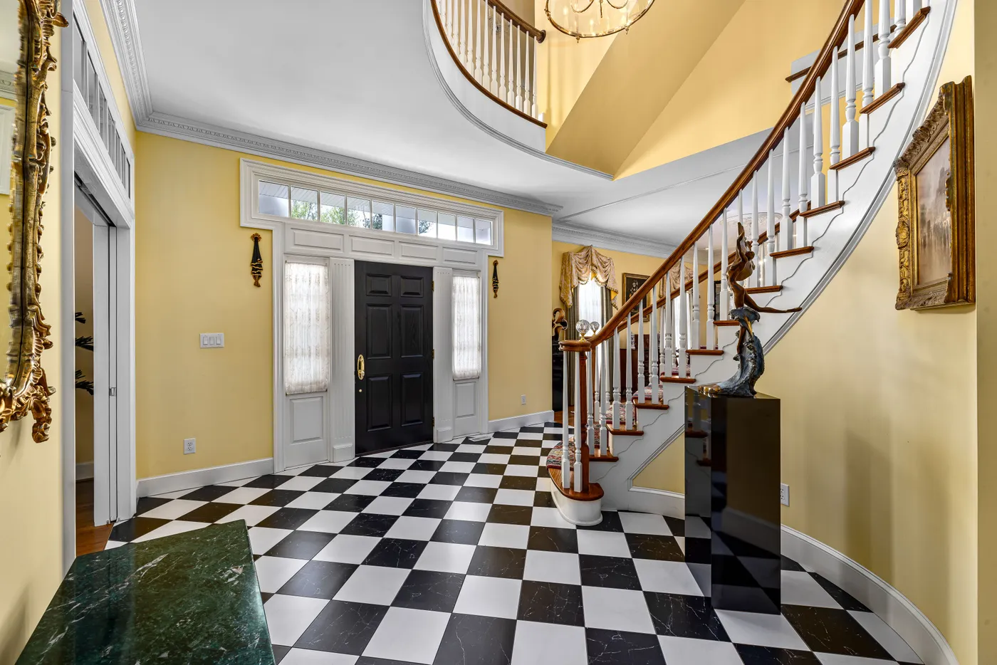
Checkerboard floors are having a major resurgence, and this foyer shows why they’re a timeless classic, not just a fleeting trend. In an era of minimalist, neutral-everything interiors, a bold checkerboard floor feels confident and personality-driven. It’s a nod to historical design—from Dutch paintings to Parisian apartments—that feels grounded and sophisticated. As people look to add more character and individuality to their homes, this pattern delivers instant architectural interest and a touch of drama that feels both elegant and playful. Compare this to the modern patterned floor in Idea #12 to see the versatility of graphic tiles.
|
📋 Copy HEX 🔗 Share |
A polished marble checkerboard floor is the definition of luxury, but it comes with a royal maintenance routine. Marble is a relatively soft, porous stone. It can be easily scratched by dirt and gravel tracked in on shoes, and it will etch or stain if acidic substances (like lemon juice from a grocery bag, or even some cleaners) are spilled on it. It requires regular sealing (at least annually) and must be cleaned with a pH-neutral stone cleaner. Using a vinegar-based or other harsh cleaner will ruin the finish. Be sure to use high-quality doormats both outside and inside the entry to minimize tracked-in grit.
14. Classic Foyer with a Dark Paneled Door and Cream Walls
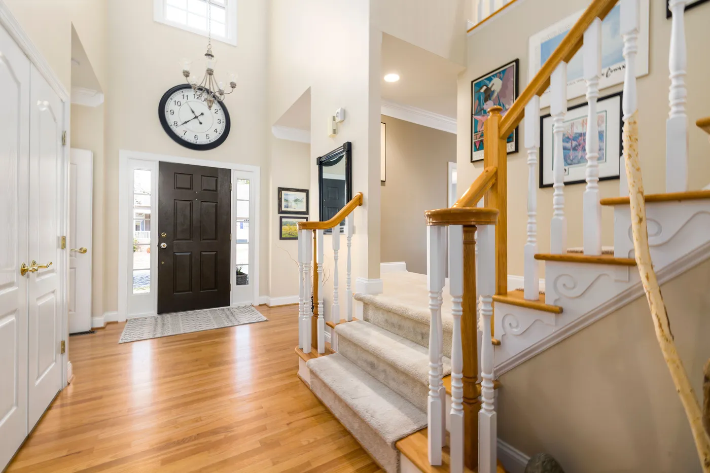
Here’s the recipe for a welcoming, classic American foyer: 60% Warm Neutral Walls + 25% Light Wood Floors + 10% Crisp White Trim + 5% Dark Accents. The cream-colored walls and light hardwood floors create a bright and airy base. The white trim and staircase balusters provide a clean, architectural frame. The dark brown door and the black wall clock act as grounding focal points, adding visual weight and a touch of contrast that keeps the space from feeling washed out. It’s a formula that feels comfortable, timeless, and effortlessly put-together.
|
📋 Copy HEX 🔗 Share |
When hanging art along a staircase, the biggest mistake is hanging it too high. The goal is to have the center of each art piece (or the center of a gallery wall grouping) at eye level as you walk up the stairs. A good method is to find the midpoint of the staircase and place a piece of painter’s tape on the wall 60 inches up from the tread of that middle step. Use that point as your vertical center and build your arrangement out from there, following the diagonal line of the stairs. This ensures the art feels connected to the person viewing it, not floating in space.
15. Bright Transitional Foyer with Wrought Iron Balusters
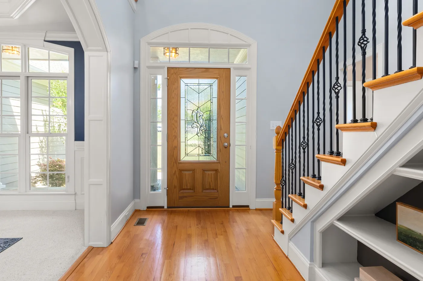
The light and airy feeling in this foyer is achieved through a clever mix of colors and materials. The light blue walls and crisp white trim create a fresh, open atmosphere that is amplified by the natural light from the door’s leaded glass and transom window. The key design choice, however, is the black wrought iron balusters on the staircase. Instead of heavy wooden balusters, the slim, dark iron provides a strong graphic element without blocking the view or the light. It adds a touch of modern elegance and contrast that keeps the traditional space from feeling too sweet.
|
📋 Copy HEX 🔗 Share |
Wrought iron balusters are a fantastic look, but be mindful if you have small children. The spacing between balusters is regulated by building codes (typically must be less than 4 inches) to prevent a child’s head from fitting through. However, the intricate twisted designs can sometimes create tempting (and dusty) handholds for little climbers. Also, those decorative knuckle elements can be painful to bump into if you’re rushing up and down the stairs. They’re incredibly durable, but can be a bit less forgiving than traditional smooth wood.
16. Cozy Transitional Foyer with a Warm Wood Door
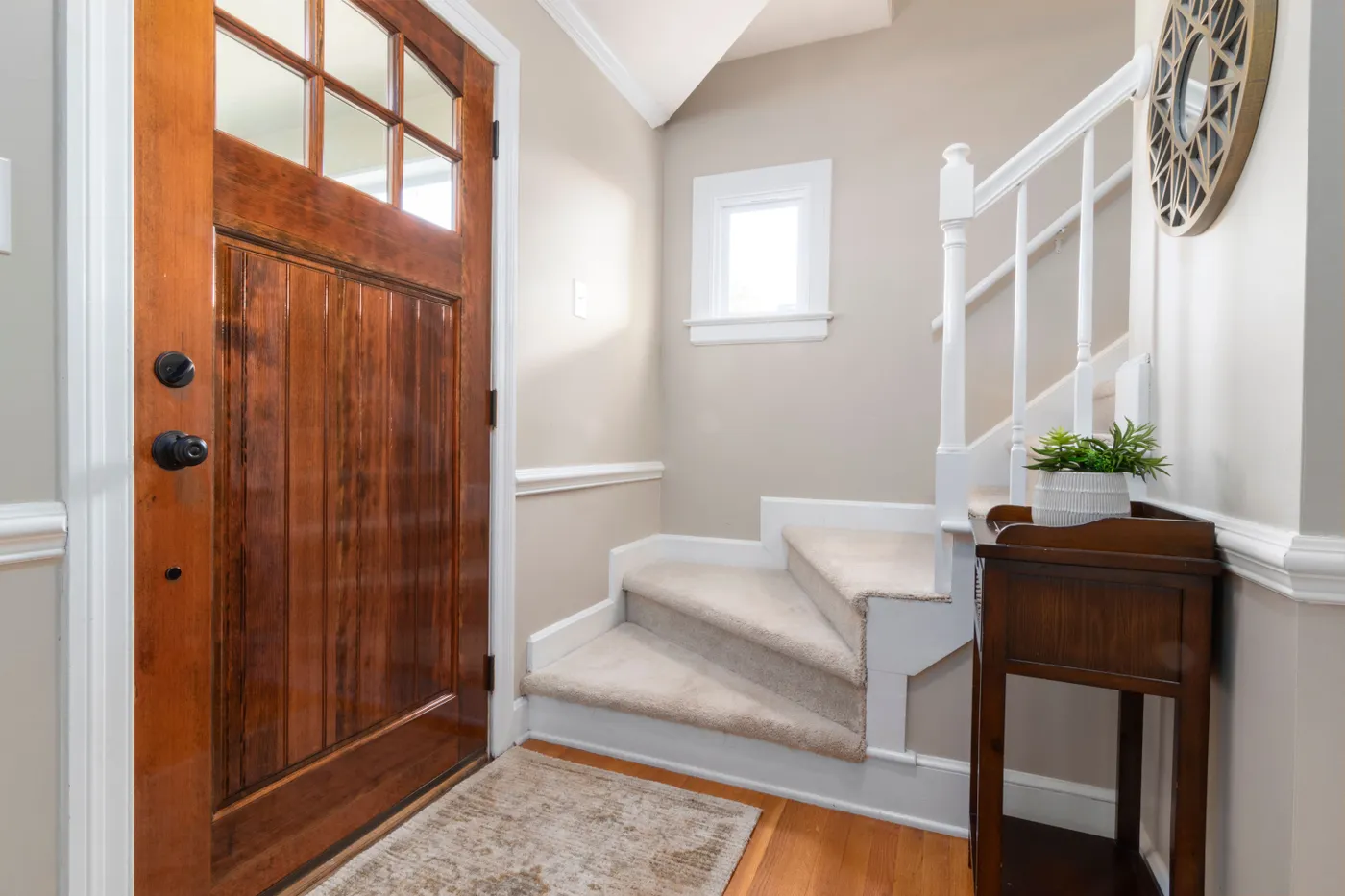
The undeniable heart of this cozy entryway is the warm, polished brown wooden door. It sets the entire tone. Paired with the light beige walls and white trim, it creates a feeling of warmth and welcome that a painted door might lack. The glass panes let in light while the rich wood grain adds texture and a sense of history. It feels solid and traditional, grounding the otherwise light and neutral space. It’s a great example of how a single, high-quality element can elevate a simple, straightforward design. It provides a much cozier feel than the grander entrance of Idea #2.
|
📋 Copy HEX 🔗 Share |
Love the look but can’t replace your front door? You can get a similar warm and welcoming vibe for much less. First, focus on warmth through lighting. Swap out cool LED bulbs for warm white ones (2700K). Second, find a dark wood console table on Facebook Marketplace or at a thrift store; a little scratch-and-dent piece can often be revived with some wood polish for under $50. Finally, add a mirror with a warm metallic or wood frame to bounce that warm light around the space. You’ll be surprised how much these small changes can shift the mood.
17. Modern Transitional Foyer with a White Geometric Console
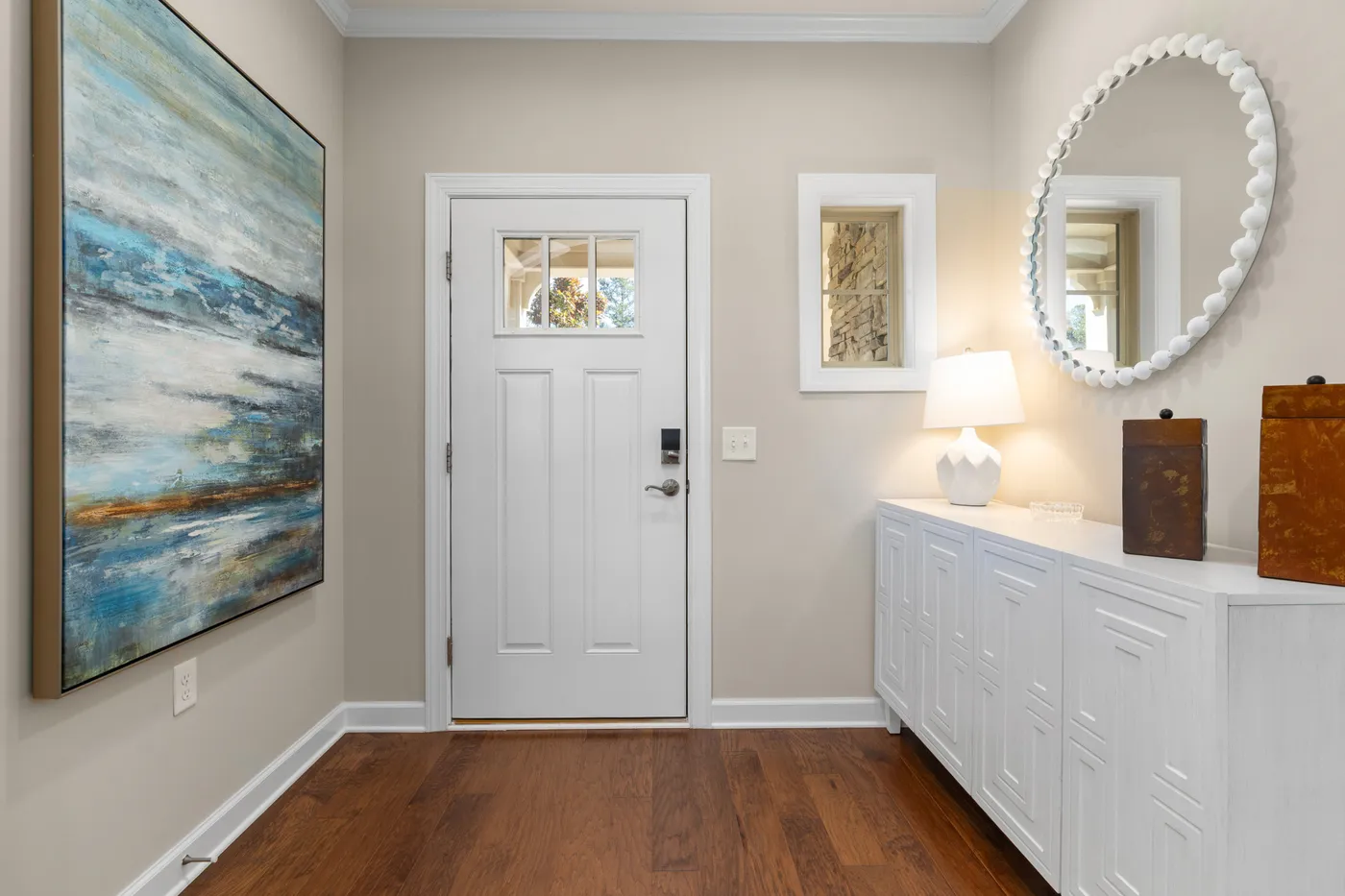
Creating a balanced vignette on a console table is an art. Here’s a quick guide to styling it like a pro:
|
📋 Copy HEX 🔗 Share |
- Anchor with Height: Start with your tallest item, usually a mirror or a piece of art. Center it on the wall above the console, hanging it about 6-8 inches above the tabletop.
- Add Light and Asymmetry: Place a lamp on one side of the console. This provides both functional light and breaks up the symmetry. The lamp should be tall enough that its base and shade don’t feel dwarfed by the mirror.
- Create a Visual Triangle: On the opposite side of the lamp, place a shorter, heavier object like the stack of decorative boxes shown here. This starts to create a ‘visual triangle’ of varying heights.
- Fill the Middle: Add a small, low object in the center, like a decorative bowl or tray, to bridge the gap and act as a convenient drop-zone for keys.
Time Estimate: 30 minutes. Material Cost: Varies, but uses existing decor.
This narrow console table setup is perfect for hallways or entryways that are between 4 and 6 feet wide. This width allows enough space for the console (typically 12-16 inches deep) while still leaving a comfortable 36-inch walkway, which is the standard minimum for a clear path. In a narrower space, you would need to opt for a much slimmer floating shelf. In a wider foyer, a console this small might feel lost; you’d want to choose a more substantial piece of furniture to properly anchor the space.
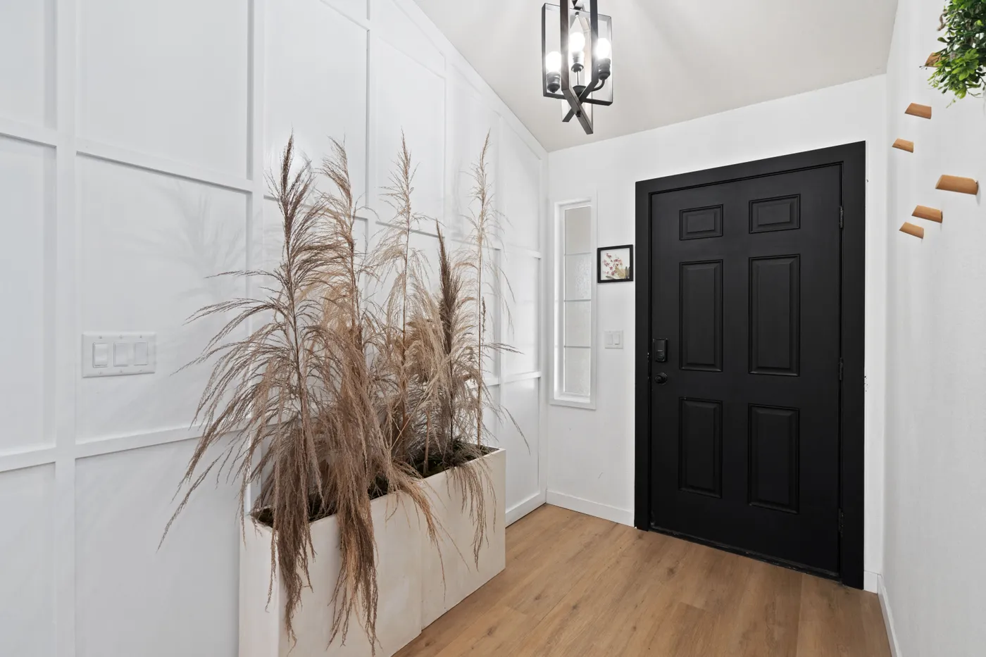
18. Serene Minimalist Entry with Pampas Grass and a Black Door
This entryway feels so calming and chic because it’s a study in quiet texture. The interest doesn’t come from color, but from the subtle interplay of surfaces. You have the crisp, geometric lines of the white paneled walls, the ultra-matte finish of the black door, the smooth grain of the light wood floor, and the soft, feathery explosion of the pampas grass. Each element has its own distinct tactile quality. This focus on texture over color creates a sophisticated, layered look that feels minimalist but not at all boring.
|
📋 Copy HEX 🔗 Share |
If you’re using dried pampas grass, give it a light coat of high-hold hairspray before bringing it inside. This seems like an odd tip, but it’s what the pros do! It helps to set the delicate plumes and dramatically reduces shedding. Give the stalks a gentle shake outside first, then lightly mist them all over with the hairspray and let them dry for about 10 minutes. This will keep your floor and console table free from the constant light dusting of pampas fluff.
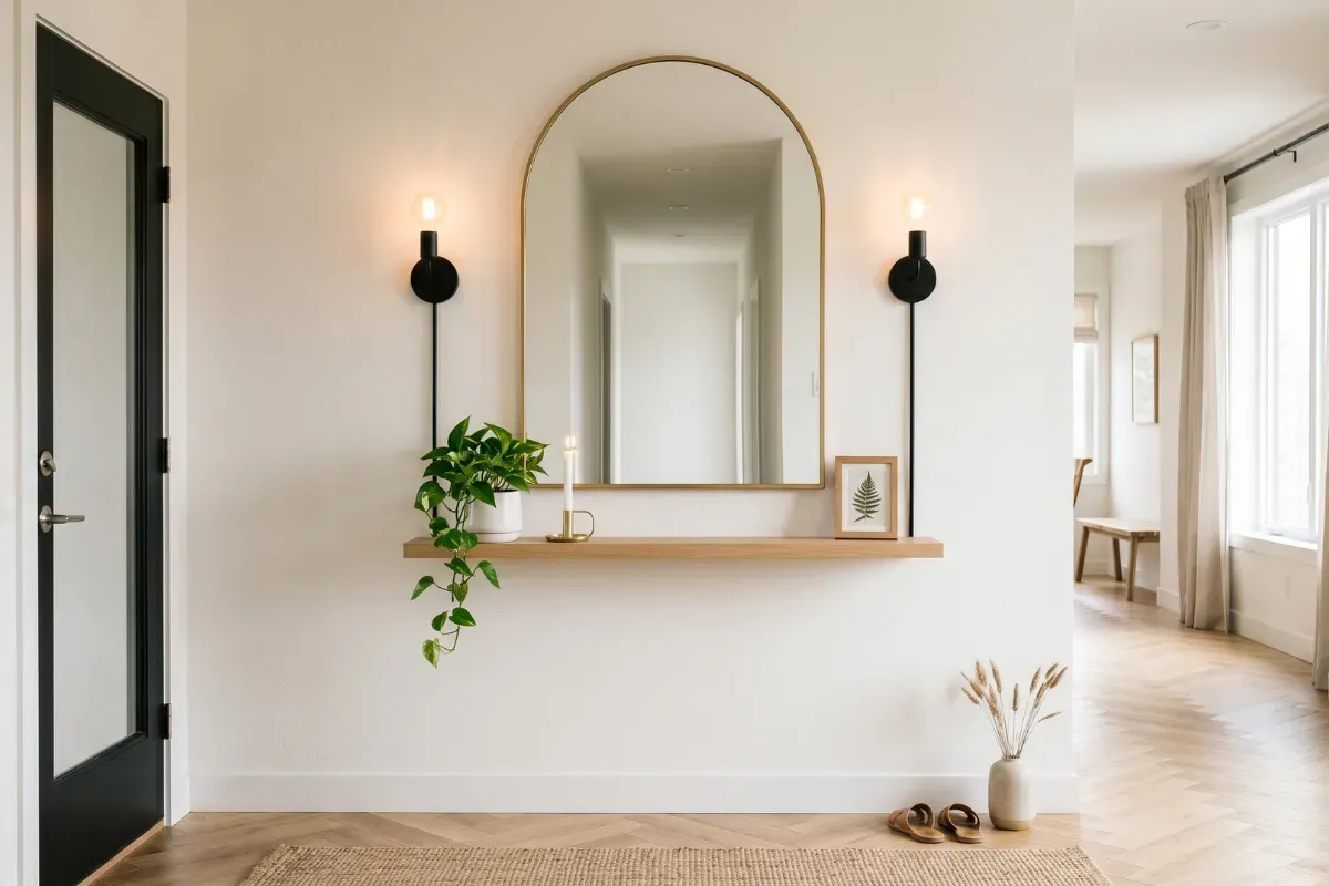
19. Warm Minimalist Nook with an Arched Mirror and Floating Shelf
This inviting little spot is all about a simple, warm minimalist recipe: 70% Bright Neutral Base + 20% Natural Wood & Greenery + 10% Black & Gold Accents. The white walls and light herringbone floor create an expansive canvas. The floating wood shelf and trailing plant introduce organic warmth and texture. Finally, the black sconces and door frame provide a grounding graphic element, while the thin gold frame of the mirror adds just a touch of glam. It’s a foolproof formula for a look that feels clean, modern, and welcoming.
|
📋 Copy HEX 🔗 Share |
Want to recreate this chic and simple entryway? Here’s a possible breakdown:
- Main Furniture: Arched Mirror ($150-$400), Floating Wood Shelf ($80-$200)
- Lighting: Pair of Wall Sconces ($100-$300)
- Decor/Accessories: Potted Plant & Vase ($40-$100)
- Flooring: Herringbone LVP/Wood (Varies widely, $8-$15/sq ft installed)
- TOTAL: $370 – $1,000+ (excluding flooring)
Budget alternative: Find a similar arched mirror at Target or HomeGoods ($80), a simple wood shelf from IKEA ($30), and plug-in sconces from Amazon ($60/pair) to get the same vibe for around $170.
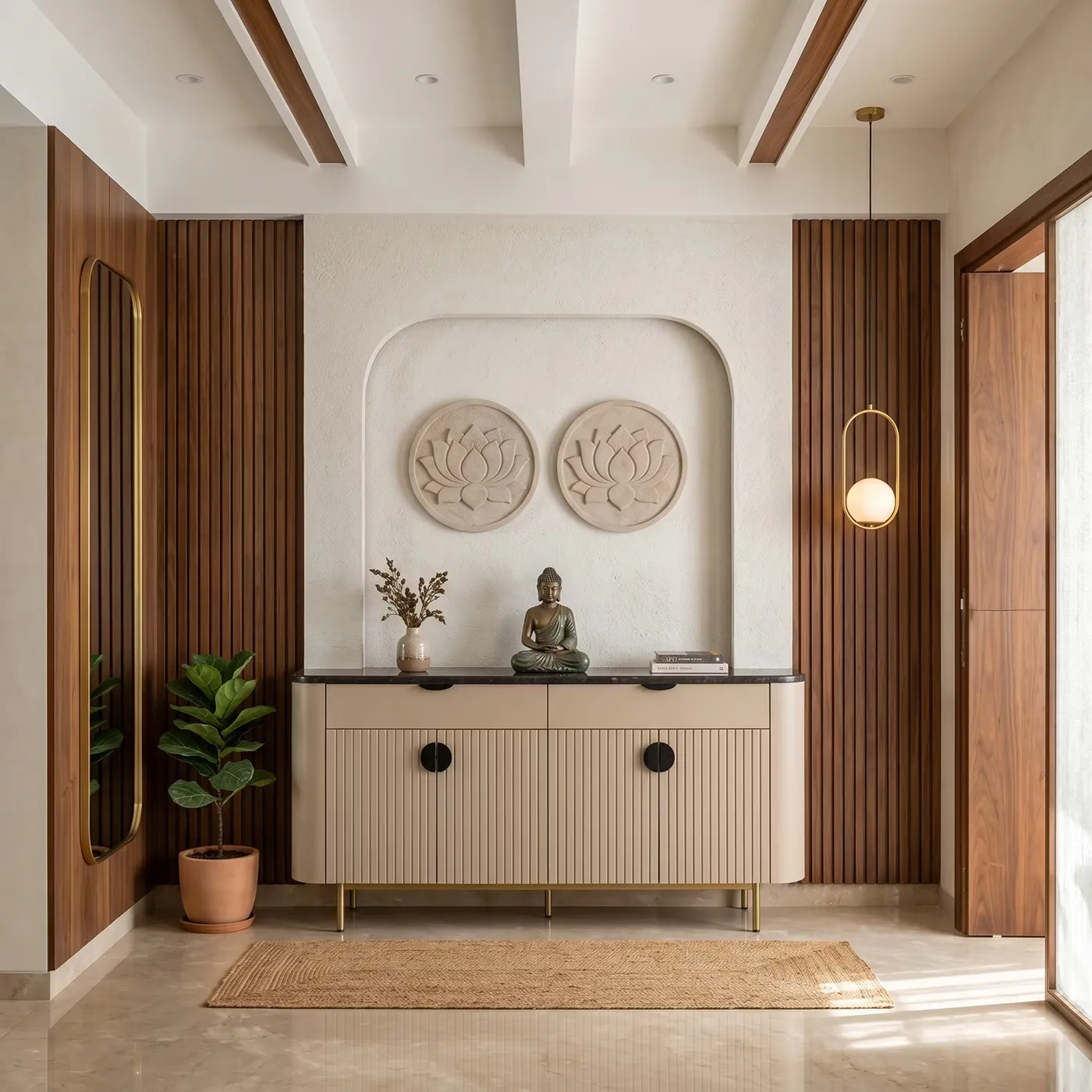
20. Serene Foyer with Ribbed Wood Panels and a Fluted Console
This space achieves its Zen-like quality through the repetition of vertical lines. Notice how the narrow, vertical ribs of the dark wood paneling are echoed in the wider, softer flutes of the beige console table. This repetition creates a sense of rhythm and harmony, drawing the eye upward and making the space feel taller and more graceful. The design is further softened by the repeated use of curves—the arched wall recess, the oval mirror, and the circular art pieces—which prevents the strong vertical lines from feeling too harsh. This is a very similar console concept to Idea #5, but with a much more textured, Japandi-inspired execution.
|
📋 Copy HEX 🔗 Share |
The fluted beige console table is the undeniable star of this vignette. It’s the piece that introduces the crucial element of softness and modern curvature. Without it, the dark ribbed wood and textured white wall might feel a bit stark and incomplete. The console bridges the two wall textures, its color tying into the off-white wall and its shape adding a sculptural quality that elevates the entire setup. It proves that a single, beautifully designed piece of furniture can define the character of a space.
21. Elegant Foyer with Cool Gray Walls and a Tufted Bench
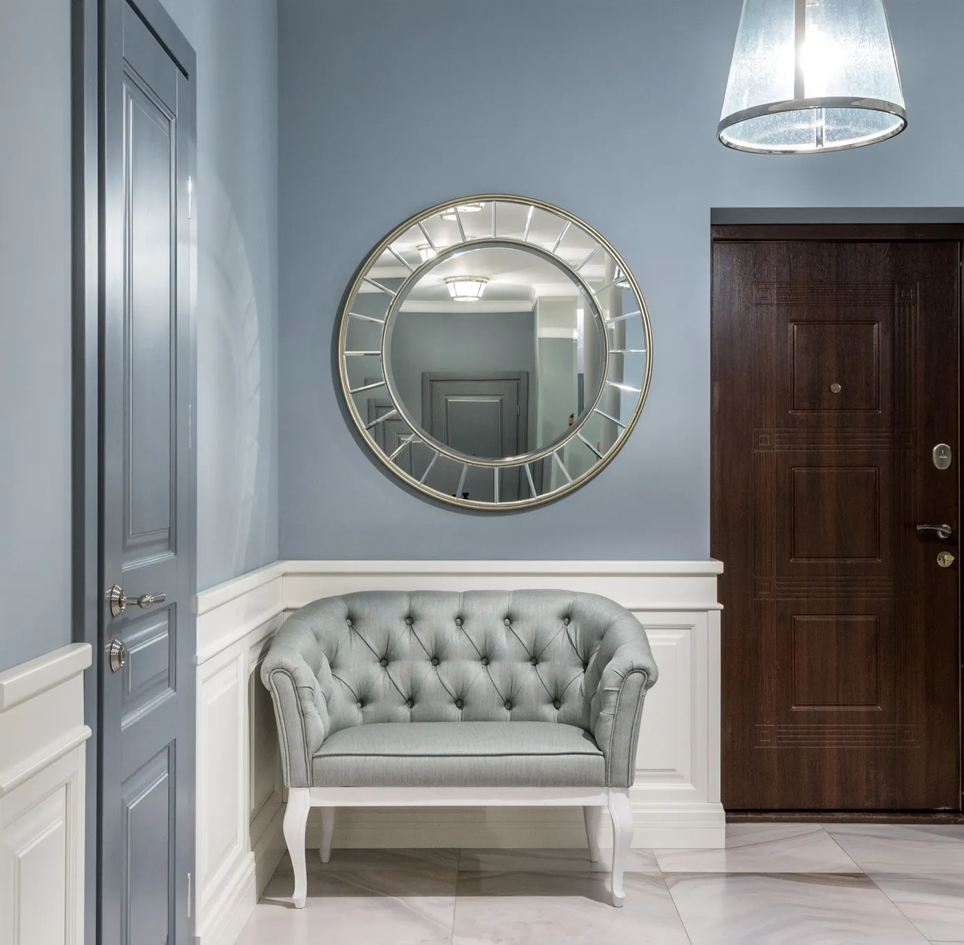
This calming, elegant look is surprisingly achievable. The biggest impact comes from the paint and wainscoting, which is a relatively low-cost architectural upgrade.
|
📋 Copy HEX 🔗 Share |
- Paint & Wall Treatment: Wainscoting Panels + Paint ($200-$600 for a small area)
- Main Furniture: Tufted Bench ($150-$400)
- Decor/Accessories: Large Decorative Mirror ($200-$500)
- Lighting: (Assuming existing)
- TOTAL: $550 – $1,500
Budget alternative: Skip the wainscoting and create a similar effect with a chair rail and two tones of paint. Find a bench and a statement mirror on Facebook Marketplace or Wayfair to bring the total cost down to the $250-$400 range.
The key to making two-tone walls with wainscoting look polished is the finish of the paint. Always use a more durable, higher-sheen paint for the bottom portion and the trim, like a satin or semi-gloss. This area takes the most abuse from scuffs, bags, and shoes. The higher sheen makes it much easier to wipe clean. For the upper wall portion, you can use a less-forgiving but more luxurious-looking finish, like eggshell or matte. This contrast in sheen adds subtle dimension and is also incredibly practical.
22. Bright Modern Foyer with a Floating Wood and Gray Console
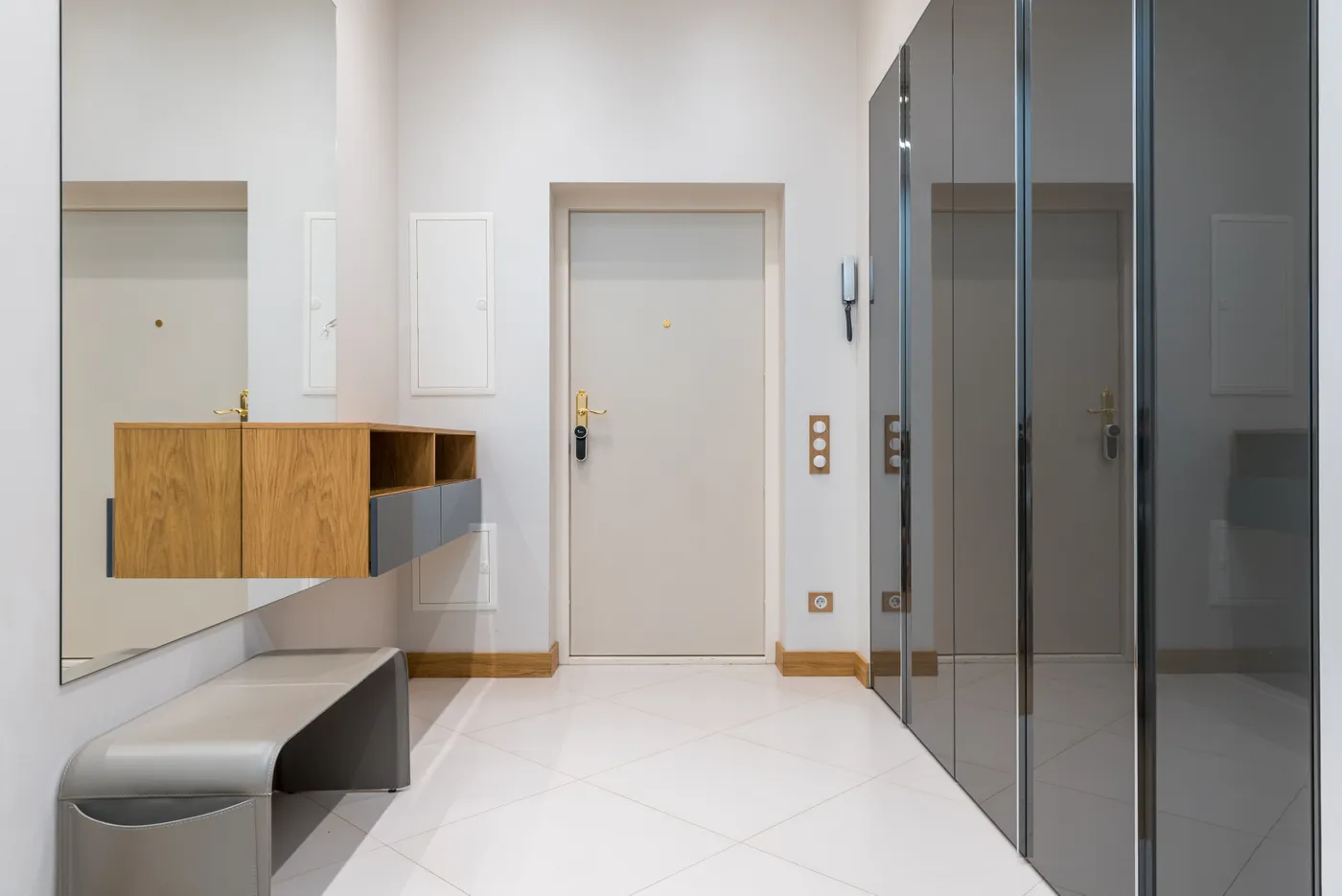
This foyer feels so spacious and bright due to a clever use of reflective and floating elements. The mirrored closet doors effectively double the visual space and bounce light all around the room, erasing a whole wall. The console unit is floated off the ground, which keeps the floor plane open and uninterrupted, enhancing the sense of spaciousness. Even the bench is visually light, with a thin profile and slim legs. The limited color palette of white, light gray, and natural wood keeps everything feeling cohesive and uncluttered. This is a great strategy compared to the storage in Idea #9 if you prefer a more concealed look.
|
📋 Copy HEX 🔗 Share |
Hanging a heavy, frameless mirror like this one requires precision and the right hardware. Here’s a simplified guide:
- Locate Studs: Use a stud finder to locate the vertical studs in your wall. Mark them lightly with a pencil. You absolutely must anchor a heavy mirror into studs.
- Plan Placement: Decide on the mirror’s final height. The center should be at about eye level (60″ from the floor is a good average). Mark where your top clips or brackets will go, ensuring they align with the studs.
- Install Top Clips: Use a level to ensure your marks are perfectly horizontal. Drill pilot holes into the studs and securely screw in the top mounting clips.
- Position Mirror & Bottom Clips: Carefully lift the mirror and rest its bottom edge on the wall while tilting it into the top clips. Have a helper hold it steady. Mark where the bottom clips need to go.
- Secure the Mirror: Tilt the mirror back out, install the bottom clips, then carefully place the mirror back in, ensuring it’s snug in all clips.
Time Estimate: 1 hour. Material Cost: $15-$30 for a heavy-duty mirror mounting kit.
23. Minimalist Entry with a Geometric Copper-Framed Mirror
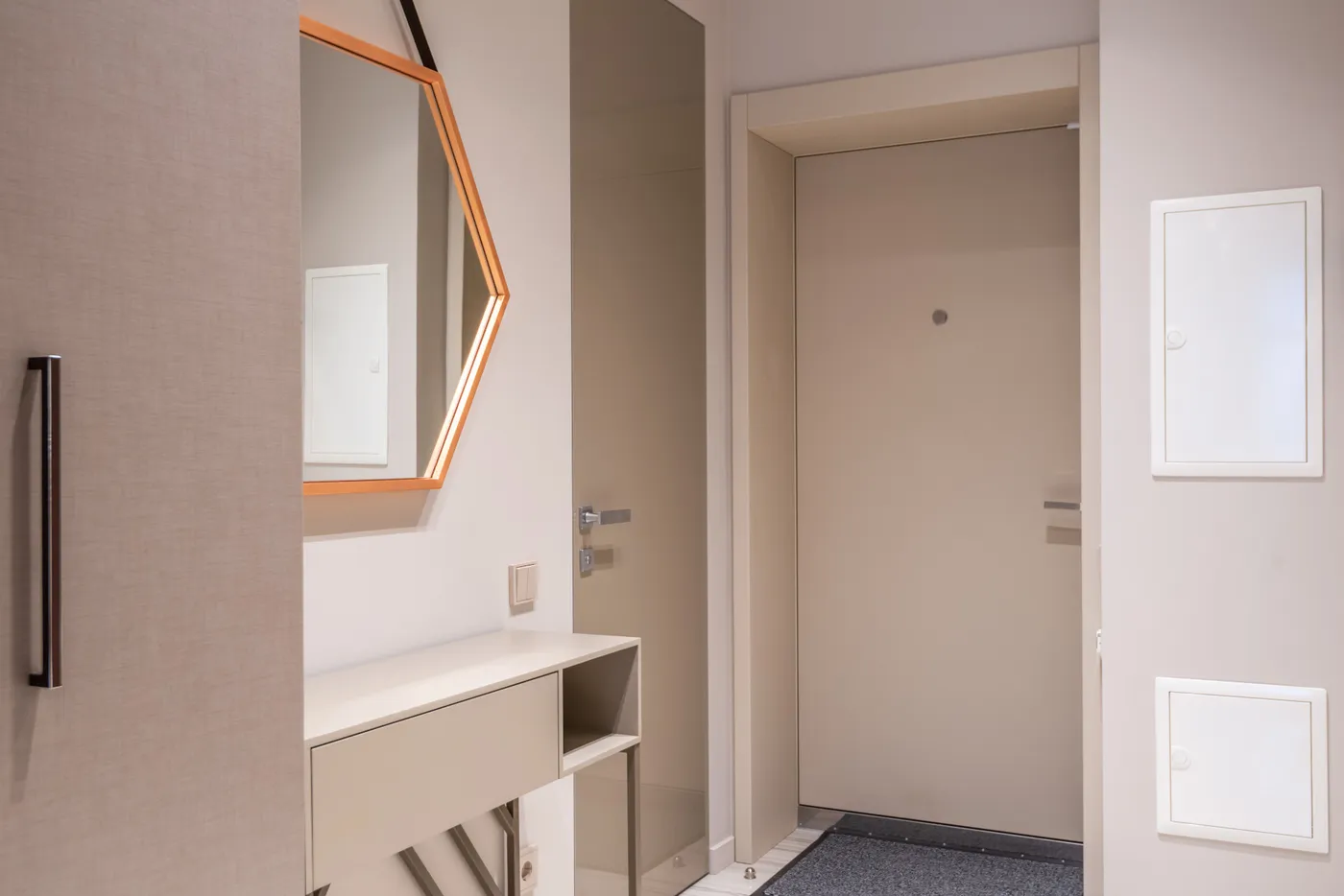
In this beautifully understated foyer, the geometric mirror is everything. The rest of the space is composed of simple, functional elements: a sleek console, a neutral door, plain walls. They are all perfectly nice but lack a strong personality. The mirror, with its unusual shape and warm copper-toned frame, injects a dose of artistry and character. It acts as functional wall sculpture, breaking up the straight lines and providing an interesting focal point that feels both modern and a little bit glamorous. Without it, the entryway would be clean but forgettable.
|
📋 Copy HEX 🔗 Share |
A sleek, minimalist console table like this is beautiful, but its functionality is limited. That single, small drawer and open bottom shelf offer very little in the way of practical, hidden storage. This setup is ideal for someone who is disciplined about clutter and only needs a surface for keys and a decorative object. If your entryway needs to handle mail, sunglasses, dog leashes, and outgoing packages, you’ll find this style frustrating. You might be better off with a piece that has more substantial drawers or doors to keep the mess out of sight.
24. Understated Modern Foyer with a Geometric Relief Mirror
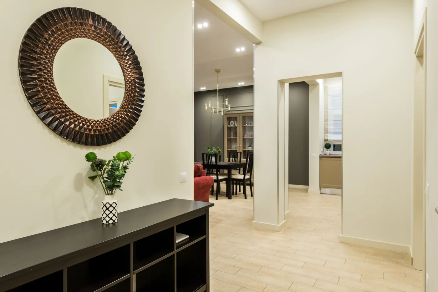
This space is a perfect example of how to create interest in a neutral room. The success lies in the balance of simple forms and one complex texture. The walls are a simple cream, the floor is a light wood-look tile, and the console table is a clean, dark block. These elements create a quiet, calm foundation. Against this simplicity, the highly textured, geometric relief frame of the mirror provides a single, powerful point of focus. It adds just enough detail and shadow-play to make the whole vignette feel curated and special without overwhelming the serene atmosphere. It’s a much more subtle approach than you’ll see in our design mistakes section, where elements often compete instead of complement.
|
📋 Copy HEX 🔗 Share |
Before you commit to a dark console table in a light-colored entryway, consider these points:
- Check the Finish: Is the console a matte, satin, or glossy finish? A glossy finish will show fingerprints and dust far more than a matte or wood-grain finish. Choose based on your tolerance for wiping things down.
- Measure Your Walkway: Ensure the console’s depth allows for at least 36 inches of clear walking space to avoid creating a bottleneck right at the front door.
- Consider Your Clutter: The open shelving on this console means anything you store there is on display. Are you okay with that, or would a model with drawers or doors be a better fit for your lifestyle?
Your Home’s First Impression Starts Now
Your foyer is the first hello and the last goodbye your home offers, so make it a good one! Whether you’re drawn to serene minimalism or timeless tradition, the right design sets the tone for your entire house. Pick the idea that speaks to you, adapt it for your space, and have fun creating a welcome you’ll love coming home to. Don’t forget to save your favorites to your Pinterest board to get started!