
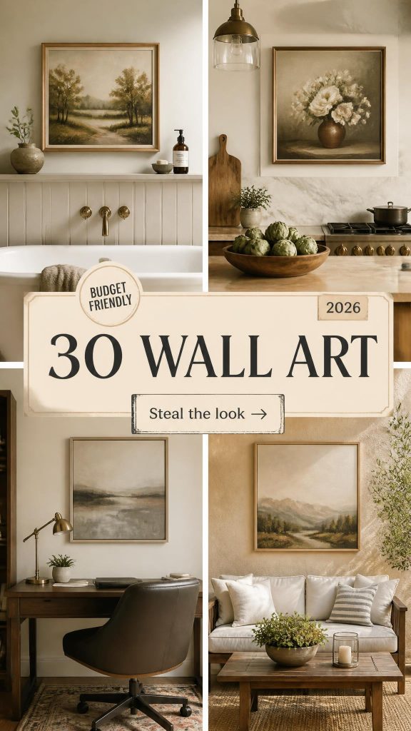
You know that feeling when you finally find the wall art that looks exactly right for your space? It’s like the entire room clicks into place. But getting there can feel like an endless scroll. After filtering through hundreds of options across West Elm, Minted, and Etsy, we narrowed it down to the 30 ideas that actually deliver. Inside, you’ll find everything from bold abstracts and serene botanicals to modern geometric pieces, with budget and luxury versions compared side-by-side. In 2026, we’re seeing a huge shift away from generic prints towards more personal, textured, and meaningful art that tells a story. And stay until the end—we break down the most common mistakes that can ruin these looks. 📌 Save this to Pinterest for later—you’ll want to revisit these ideas.
1. Vibrant Abstract Mural in a Modern Kitchen
This kitchen goes all in, and it pays off beautifully. The success here is all about contrast and balance. The wild, energetic impasto mural is the undeniable star, full of thick texture and saturated color. But it’s balanced by the clean lines and natural materials of the kitchen itself—the light wood island, simple woven bar stools, and rattan pendant. The mural brings the personality, while the rest of the room provides a calm, functional foundation. It’s a perfect partnership where neither element overpowers the other.
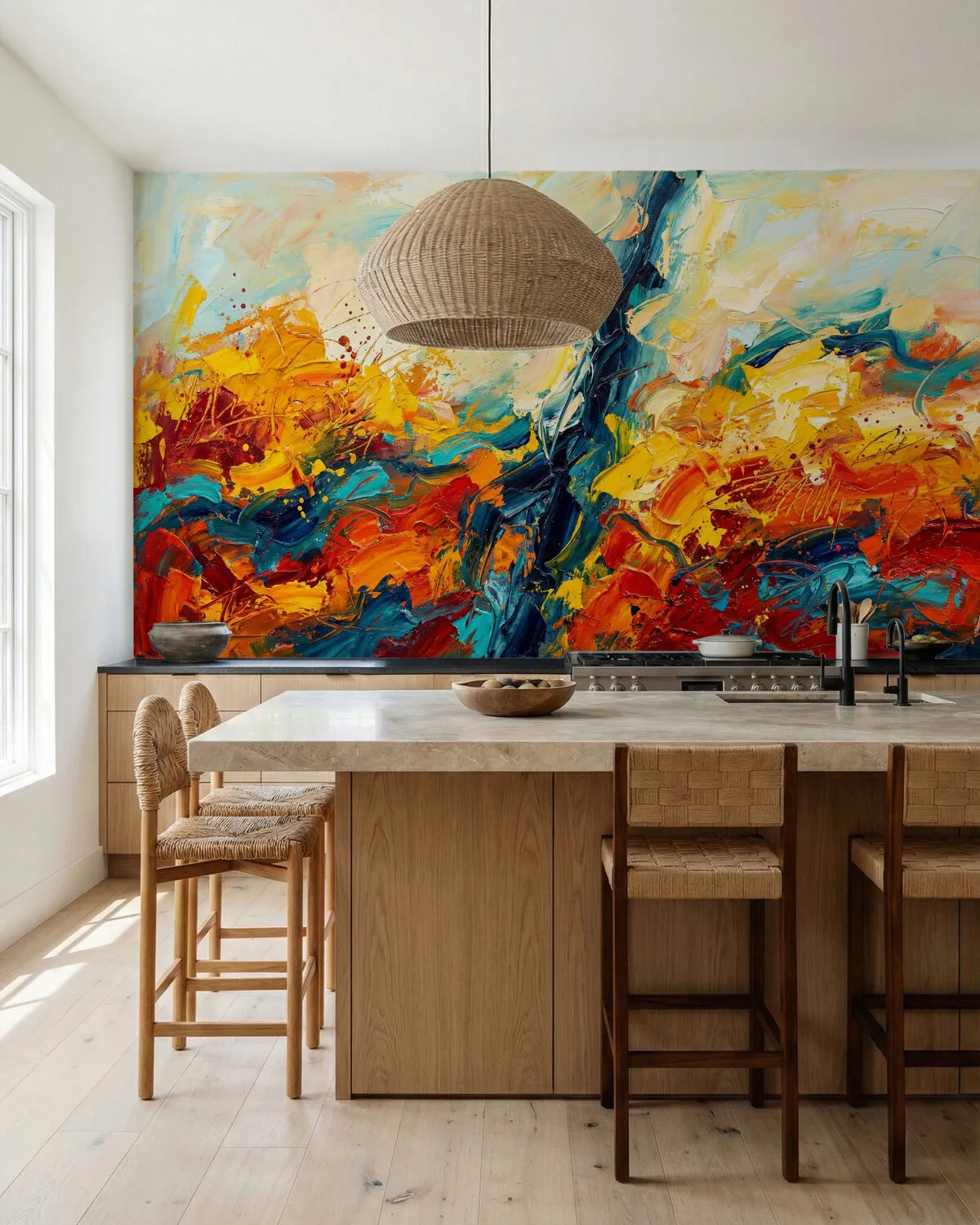
When installing a large-scale mural, especially in a high-traffic area like a kitchen, material choice is critical. Opt for a high-quality, scrubbable vinyl wallpaper instead of traditional paper. Many companies now offer Type II vinyl, which is durable, resistant to moisture and grease, and can be wiped clean with mild soap and water. Ensure the wall is properly primed with a product specifically designed for wallpaper to guarantee a smooth application and easy removal down the line, without damaging your drywall.
2. Framed Abstract Portrait with Japanese Influence
It’s the bold, graphic simplicity. This artwork commands attention not through clutter, but through its confident use of color and shape. The stylized profile of the Japanese woman is immediately captivating, but the single red circle is what anchors the entire composition. If you took away that circle, the piece would lose its focal point and its symbolic power. It’s a masterclass in saying more with less, turning a simple portrait into a powerful, expressive statement that feels both modern and timeless.
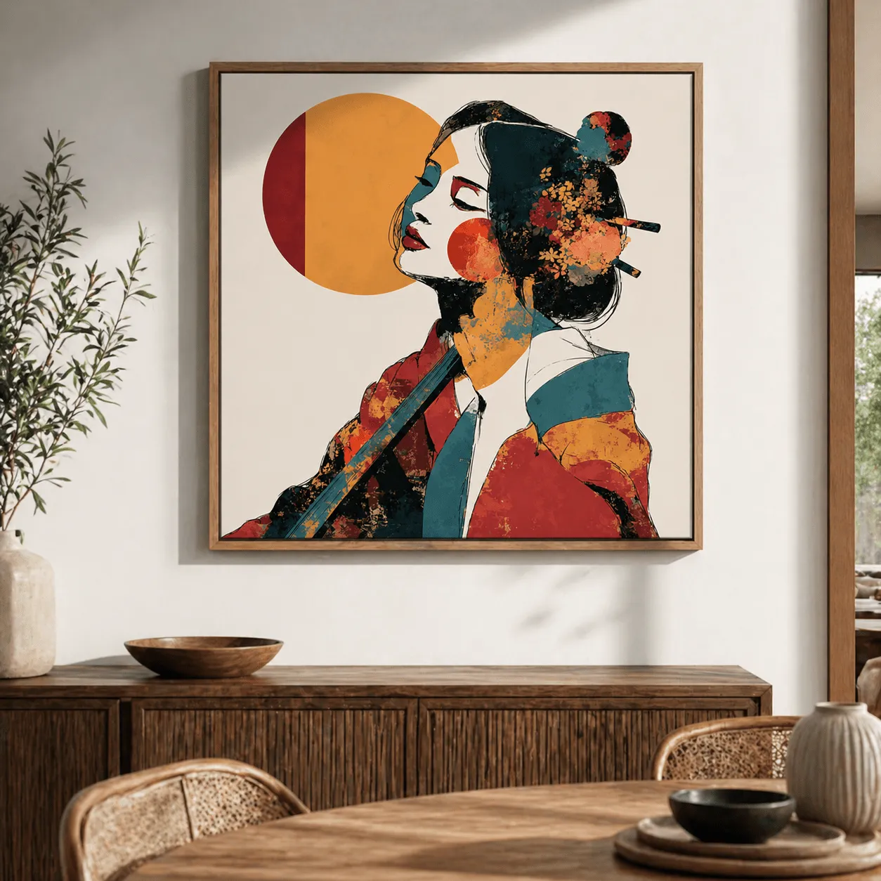
This look is a study in controlled vibrancy. Think of it as 50% Statement Art + 30% Natural Texture + 20% Negative Space. The art provides the color and personality. The textured wooden console table and frame ground the look with organic warmth. Finally, the clean white wall acts as negative space, giving the art room to breathe and preventing the bold colors from feeling overwhelming. You could swap the art for a different vibrant piece, but keeping the wood tones and white space is key to maintaining the balance.
3. Triptych of Abstract Botanicals with Gold Leaf
Here’s a look at what it might cost to bring this sophisticated trio into your home:
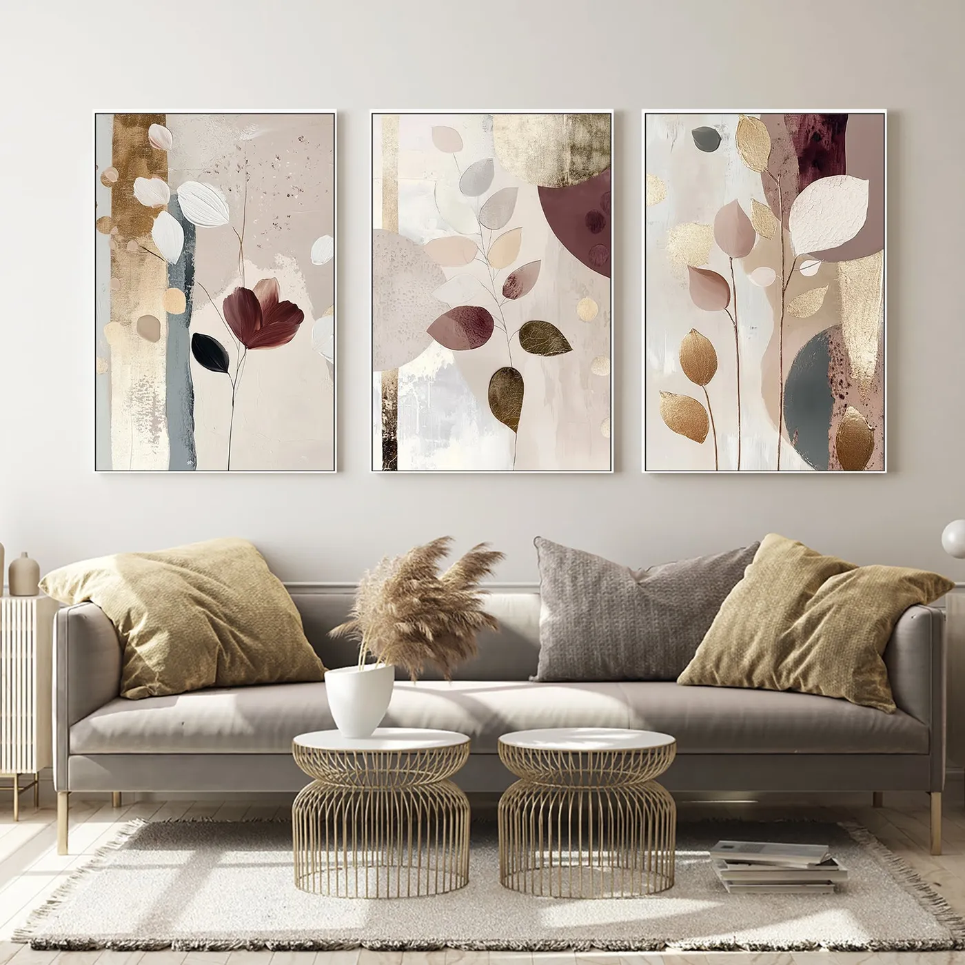
- Main Furniture (Sofa): $1,800 – $4,500
- Wall Art (Set of 3 framed prints): $450 – $1,200
- Textiles (pillows, throws): $150 – $400
- Decor/Accessories: $100 – $250
- TOTAL: $2,500 – $6,350
- Budget alternative: Source a set of three abstract botanical printables from Etsy for under $30. Buy simple white frames from IKEA or Target ($20 each). Find a similar comfortable sofa on Facebook Marketplace or at a consignment shop. Total cost could be as low as $800 – $1,200.
That metallic gold accent is gorgeous, but be mindful of your room’s lighting. In a dimly lit space or a room with very warm-toned light bulbs, the gold can lose its shimmer and just look like a murky brown. This look shines best in a room with plenty of natural light or with cool-toned, direct gallery-style lighting (like a picture light). Before you invest in art with metallic details, take a sample piece of gold leaf or even a gold picture frame and see how it looks on that wall at different times of the day.
4. Expansive Multi-Panel Art with Blue and Green Forms
A large multi-panel piece like this demands a significant amount of wall space to make an impact. This idea is best suited for a long, uninterrupted wall, like in a hallway, entryway, or above a long sofa or credenza. You’ll want a minimum wall width of 12-15 feet to prevent the art from feeling cramped. Ceiling height should be at least 8 feet, but 9 feet or more is ideal to allow for proper spacing above and below. For a smaller space, consider the vertical triptych shown in Idea #7, which uses height to its advantage.
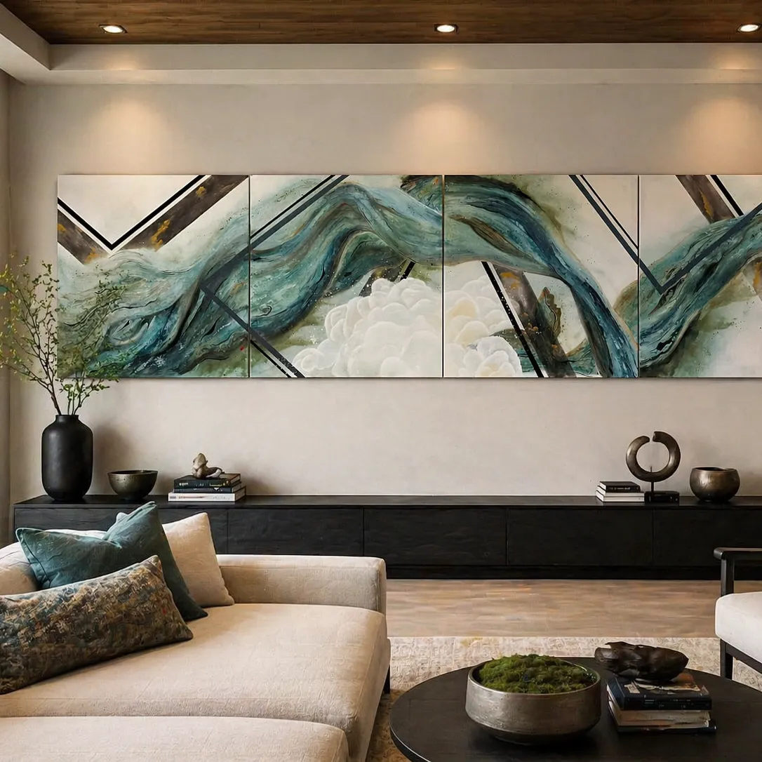
The magic here is the interplay between fluid motion and sharp interruption. The soft, swirling forms of blue, green, and white create a sense of organic movement, almost like looking at a storm over the ocean. But then, the stark, black diagonal lines cut through the scene. This creates a powerful visual tension. It’s the contrast that keeps your eye engaged, moving between the soft, blended colors and the hard, graphic edges. The recessed spotlights further enhance this by creating highlights and shadows, adding another layer of depth.
5. Vibrant Geometric Abstract in a Simple White Frame
When hanging a single, large, and visually busy piece like this, the height is everything. The rule of thumb is to hang art so its center is at 57 inches from the floor, which is the average human eye level. This ensures the art is part of the room’s living space, not floating above it. If you’re hanging it over a piece of furniture like a bookshelf or console, leave 6-8 inches of breathing room between the bottom of the frame and the top of the furniture. This connects the two pieces visually without making them feel crammed together.
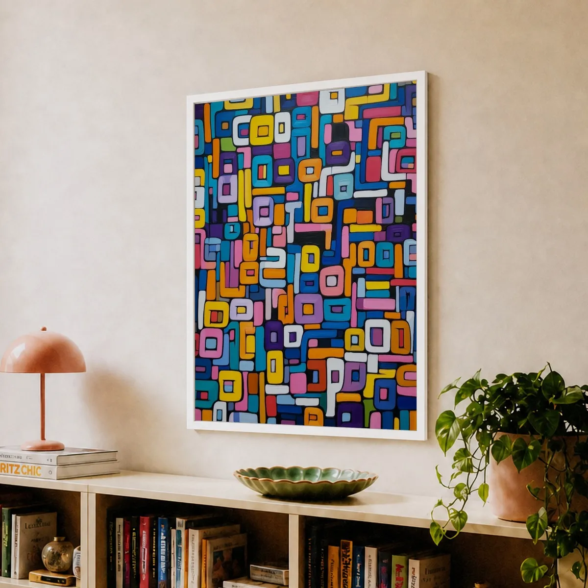
You don’t need to spend a fortune to get this playful, modern look. The key is finding a bold, colorful geometric print. Check out sites like Society6 or Fy! for affordable prints in a huge range of sizes. A large 24×36 inch print might cost you $50-$80. Then, head to Target or Michaels for a simple white poster frame, which will run about $30-$40. Pair it with an IKEA BILLY bookshelf ($60) and you’ve recreated the core vibe for under $200. It’s a high-impact look on a real-world budget.
6. Large Impasto Heart Painting in a Minimalist Room
The texture is everything. Without the thick, three-dimensional impasto paint, this would just be a colorful heart painting. But the tangible quality of the brushstrokes is what makes it feel so raw, emotional, and alive. It invites you to look closer and imagine the artist’s process. In a room with otherwise smooth, clean surfaces—the concrete floor, the plain walls—this heavy texture provides a necessary dose of organic, handmade character. It’s the one element that gives the minimalist space its soul.
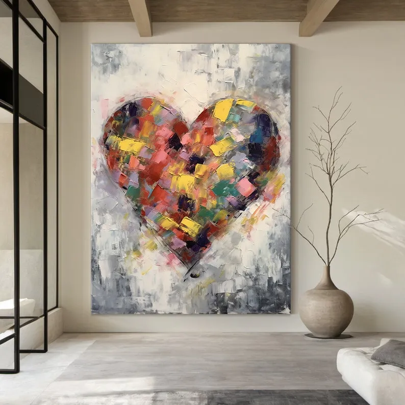
Thick impasto paintings are magnets for dust. The deep crevices created by the heavy paint application can trap dust particles that a simple feather duster won’t reach. To clean it, use a very soft-bristled brush (like a makeup brush or a soft paintbrush) and gently flick the dust out of the grooves. Never spray cleaner directly onto the canvas. For a deeper clean once a year, you can use a can of compressed air, holding it at least 12 inches away from the surface to avoid damaging the paint. Keep it out of direct sunlight to prevent the vibrant colors from fading over time.
7. Abstract Painting with Dark Green, Black, and Cream
This serene and modern look follows a simple but effective formula: 60% Dominant Art Color (dark green) + 20% Grounding Neutrals (black and cream in the art) + 20% Architectural Warmth (light wood frame, floors, and stairs). The art itself sets the primary mood with its deep, calming green. The black and cream shapes provide visual interest and contrast, while the consistent use of light wood throughout the space ties everything together and prevents the cool tones from feeling sterile. You could change the green to a deep navy for a different mood, but the math remains the same.
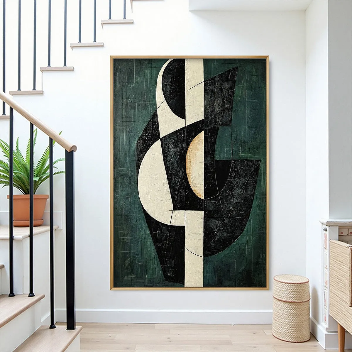
Before you commit to a piece this large, run through this quick checklist:
- Measure your wall. Does the artwork fill the space without overwhelming it? Aim for the art to occupy about two-thirds of the wall width it’s centered on.
- Check your light. Is there enough natural or artificial light to appreciate the deep green and subtle textures?
- Consider the flow. This is in a hallway near a staircase. Will the art impede foot traffic or feel too close as you walk by? Ensure there’s at least 3-4 feet of clearance.
- Match the woods. Does the light wood frame complement your existing wood tones (floors, furniture, trim)?
8. Large Abstract Art on a Dark Wood Panel Wall
This entryway makes a statement because it masterfully layers drama and softness. The dark wood-paneled wall provides a dramatic, moody backdrop that makes the light-colored abstract painting pop. It’s a high-contrast move that feels incredibly luxurious. Then, the cream-colored faux fur bench is introduced, adding a layer of plush, touchable softness that directly counters the hard, sleek surfaces of the wall and glass door. The brass hardware on the door adds a final touch of metallic warmth, completing a look that feels both bold and inviting.
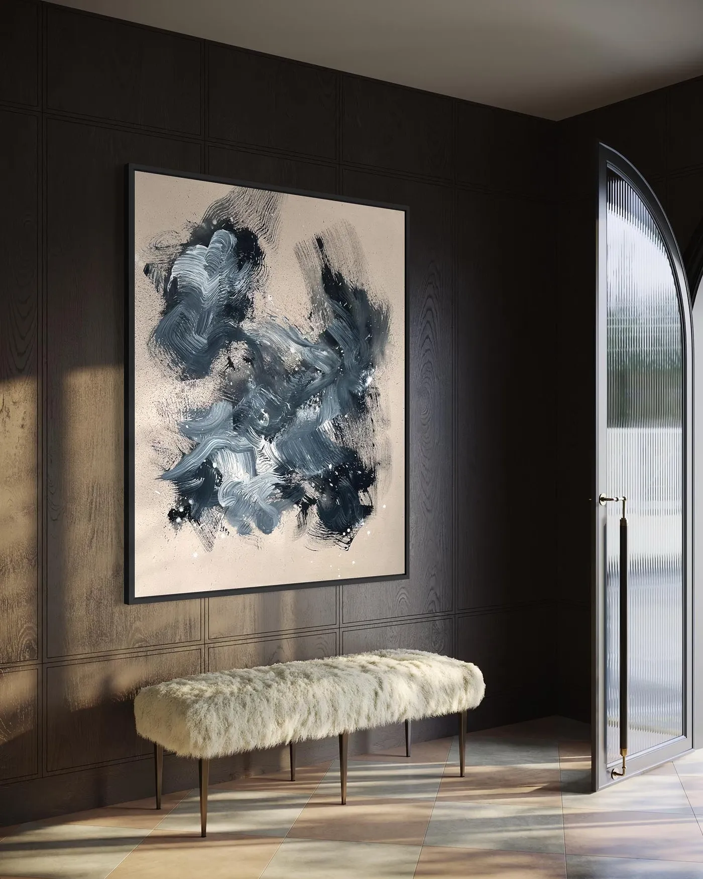
A dark wood-paneled wall is a stunning, high-impact choice, but it can make a room feel significantly smaller and darker. This look is best for an entryway or hallway that receives a lot of natural light, like the one shown with the large glass door. In a room without ample light, a wall like this can feel oppressive. Also, be prepared for dust. Dark, smooth surfaces show every speck of dust, so the wall paneling will require frequent dusting with a microfiber cloth to keep it looking sharp.
9. Large-Scale Abstract Art Over a Dark Wood Credenza
This minimalist setup relies on perfect proportions. To get this look right, the artwork should be approximately two-thirds to three-quarters the width of the credenza it hangs above. For a standard 60-inch credenza, you’d want art that is between 40 and 45 inches wide. Hang it 6-9 inches above the surface of the credenza to create a cohesive visual unit. This works best in a room with at least 8-foot ceilings to allow for enough negative space around the pairing. It’s a great solution for dining rooms, living rooms, or entryways.
It’s the scale. This entire composition would fall flat if the art were smaller. The power of this look comes from the bold, confident pairing of two large, simple shapes: the long, low credenza and the massive, rectangular artwork. The sheer size of the painting gives it presence and importance, turning a simple wall into a deliberate, curated focal point. It proves that you don’t need a lot of clutter or a gallery wall to make an impact. Sometimes, two well-chosen, large-scale pieces are all you need. Compare this with the gallery wall in Idea #15 for a completely different approach.
10. Vibrant Graffiti Portrait on a Light Gray Wall
Want this edgy, artistic vibe without commissioning a street artist? Printable art is your best friend. Search on Etsy for graffiti portrait print or ‘urban art digital download’ and you’ll find hundreds of options for under $15. You can have it printed as a large poster at a local print shop or an online service like Printful for around $40-$60. For the ultimate budget hack, get it printed on canvas and stretch it yourself using a DIY stretcher bar kit from an art supply store. The whole look can come in under $100.
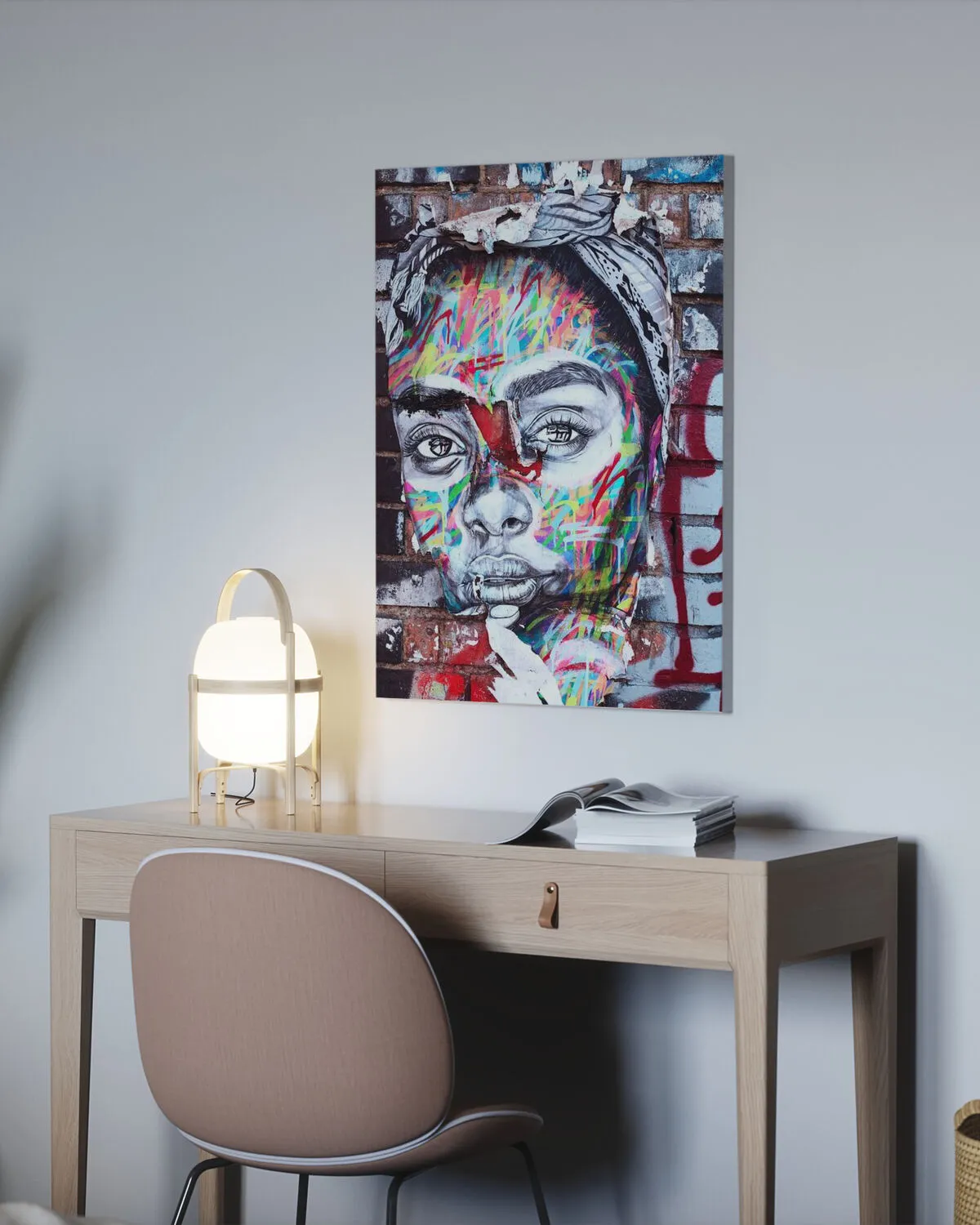
Street art and graffiti-inspired interiors are having a moment because they inject a dose of raw, authentic energy into our highly curated homes. In a world of beige aesthetics, a piece like this feels personal and rebellious. It’s a nod to urban culture and the move towards celebrating art forms that were once considered fringe. This trend has staying power because it’s about more than just decoration; it’s about bringing personality, story, and a bit of an edge into a space, which is a timeless design goal.
11. Triptych of Framed Botanical Prints on a White Wall
Hanging a perfect triptych is easier than it looks. Here’s how to get it right every time:
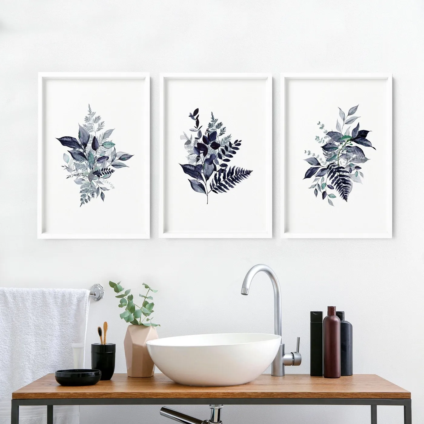
- Prep: Start by laying the three framed prints on the floor to confirm your desired spacing (2-4 inches is standard). Measure the total width, including the gaps.
- Mark the Center: Find the center of your wall space and mark it lightly with a pencil. Also mark the vertical center of the middle frame.
- Hang the Middle: Align the center marks and hang the middle picture first. Use a level to make sure it’s perfectly straight.
- Hang the Sides: Measure your desired gap distance from the edge of the middle frame and mark where the edge of the next frame should be. Use your level to ensure the tops of all three frames are perfectly aligned before making any holes.
- Final Check: Step back and check your work from a distance before celebrating. Total time: 20 minutes. Material cost: Picture hangers, level, tape measure.
For a clean, gallery-like feel with a series of prints, always use identical frames. Mixing and matching frames can work for an eclectic gallery wall, but for a symmetrical, orderly arrangement like this triptych, consistency is key. Using the same white frames and white mats allows the artwork itself—the deep blue and teal botanicals—to be the star. The frames should be a quiet, unifying element, not a distraction. The simplicity is what makes it feel so serene and intentional.
12. Geometric Terracotta Wall Shapes Above a Slatted Cabinet
This arrangement works because of its thoughtful repetition of color, material, and form. The warm, earthy terracotta of the wall art is directly mirrored in the decorative bowl on the cabinet below. This creates a strong visual connection and makes the whole vignette feel intentional. The geometric, curved shapes of the wall art are echoed in the rounded form of the bowl and even the soft texture of the beige vase. This repetition creates a sense of rhythm and harmony, making the composition feel cohesive and pleasing to the eye.
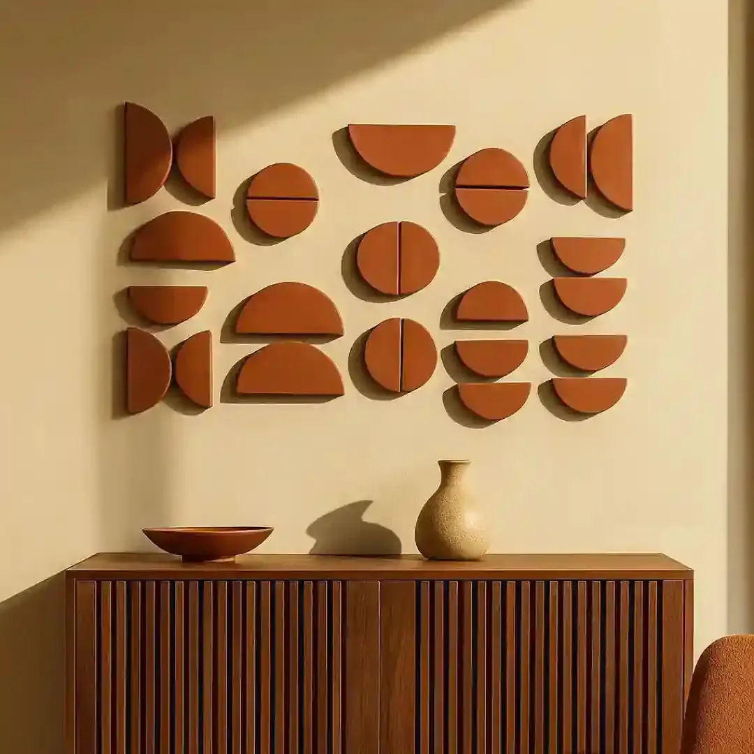
This look is a beautiful equation of warmth and minimalism. The formula is: 50% Sculptural Art + 30% Natural Wood + 20% Warm Neutral Tones. The 3D terracotta shapes provide the main visual interest and a handmade feel. The slatted wood cabinet adds organic texture and warmth, grounding the arrangement. The light beige wall and accessories provide a soft, neutral canvas that allows the terracotta and wood to stand out. You could swap the terracotta for a deep olive green, but you’d need to change the bowl to match to keep the formula working.
13. Large Framed Photo of a Vibrant Coastal Pool Scene
The color blue is the undeniable hero of this piece. It’s not just one blue, but a whole spectrum of them—the bright, electric blue of the pool, the deeper, moody blue of the sea, and the soft grey-blue of the striped umbrellas. This dominant use of a single color family is what gives the photograph its immersive, transportive quality. It feels less like a picture and more like a window you could step through. The color alone evokes feelings of vacation, relaxation, and serenity, making it the perfect escape for the mind.
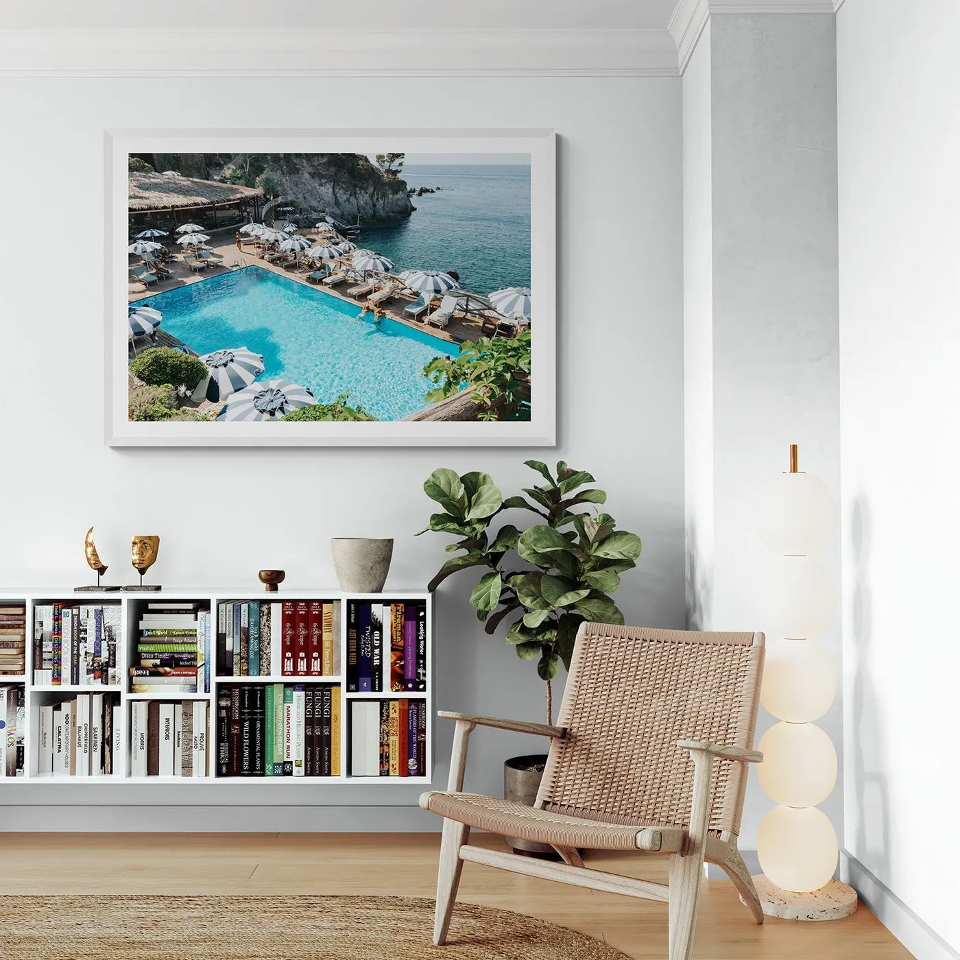
A large photographic print, especially one with a lot of white and bright color, is highly susceptible to fading from UV light. To protect your investment, make sure the print is framed with UV-protective acrylic or glass. It costs more than standard glass, but it’s essential for longevity, especially if the art will be in a room that gets any direct sunlight. Also, consider the reflective glare. A large piece of glass can act like a mirror in a bright room, so opting for a matte print and anti-reflective glass can make a huge difference in viewability.
14. Eclectic Mix of Abstract Figure Art and Woven Baskets
This textured, eclectic look is so achievable on a budget. The woven baskets are the key. You can find beautiful, unique baskets at thrift stores, World Market, or even Target’s home decor section, often for $15-$30 each. Look for varying sizes and patterns. For the large central art piece, search for abstract figure line art on Etsy or Society6. A large framed print can be had for under $150. The antler decor can be found at craft stores or online. You can pull this entire wall together for less than $250, making it look like a collection curated over years.
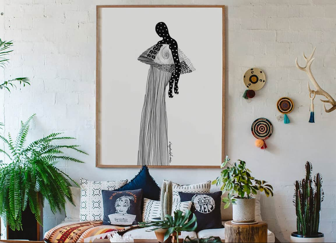
This collected gallery wall style is incredibly versatile. It works wonderfully on a large feature wall, like behind a sofa or bed, where you have at least 8-10 feet of horizontal space to let the arrangement breathe. However, it’s also a fantastic solution for awkward, smaller spaces like a stair landing or a wide hallway. The asymmetrical, organic layout allows you to adapt the collection to fit around windows, doors, or corners. The key is to have one large anchor piece (the framed art) and build the smaller items (baskets, decor) out from there.
15. Gallery Wall of Ornithological Prints with Textured Vases
For a grid-style gallery wall like this, a paper template is your secret weapon. Before you hammer a single nail, trace each frame onto kraft paper or newspaper and cut them out. Use painter’s tape to arrange these paper templates on your wall. This allows you to play with the layout, perfect the spacing, and step back to see the overall scale without committing to holes. Once you’re happy with the arrangement, you can nail directly through the paper where the hook should go, then just tear the paper away. It’s a foolproof method.
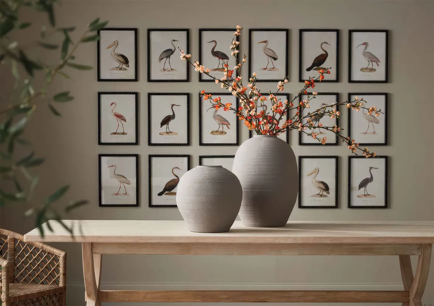
Planning a grid gallery? Don’t even think about picking up a hammer until you’ve checked these boxes:
- Identical Frames: Do you have enough matching frames for the entire grid? Using the same dark, narrow frames is what makes this look so cohesive.
- Consistent Matting: Is the mat board size the same for every print? This creates visual consistency even if the prints themselves are slightly different sizes.
- Measure the Grid: Have you calculated the total height and width of your final arrangement, including the 2-3 inch gaps between each frame? Make sure it fits the wall proportionally.
- Level and Tape: Do you have a good quality level and a roll of painter’s tape? You’ll need both for a perfectly aligned installation.
16. Large Urban Bridge Cityscape Art Over a Blue Sofa
This pairing of art and furniture works so well because of complementary color and form. The deep blue of the sectional sofa creates a cool, calming anchor for the room. The wall art above it picks up on that moodiness with its depiction of an urban landscape, but it introduces warmth and texture through the terracotta brick buildings. This color dialogue—cool blue and warm terracotta—is a classic design trick that creates visual interest. Furthermore, the strong horizontal lines of both the sofa and the rectangular art piece create a sense of stability and calm.
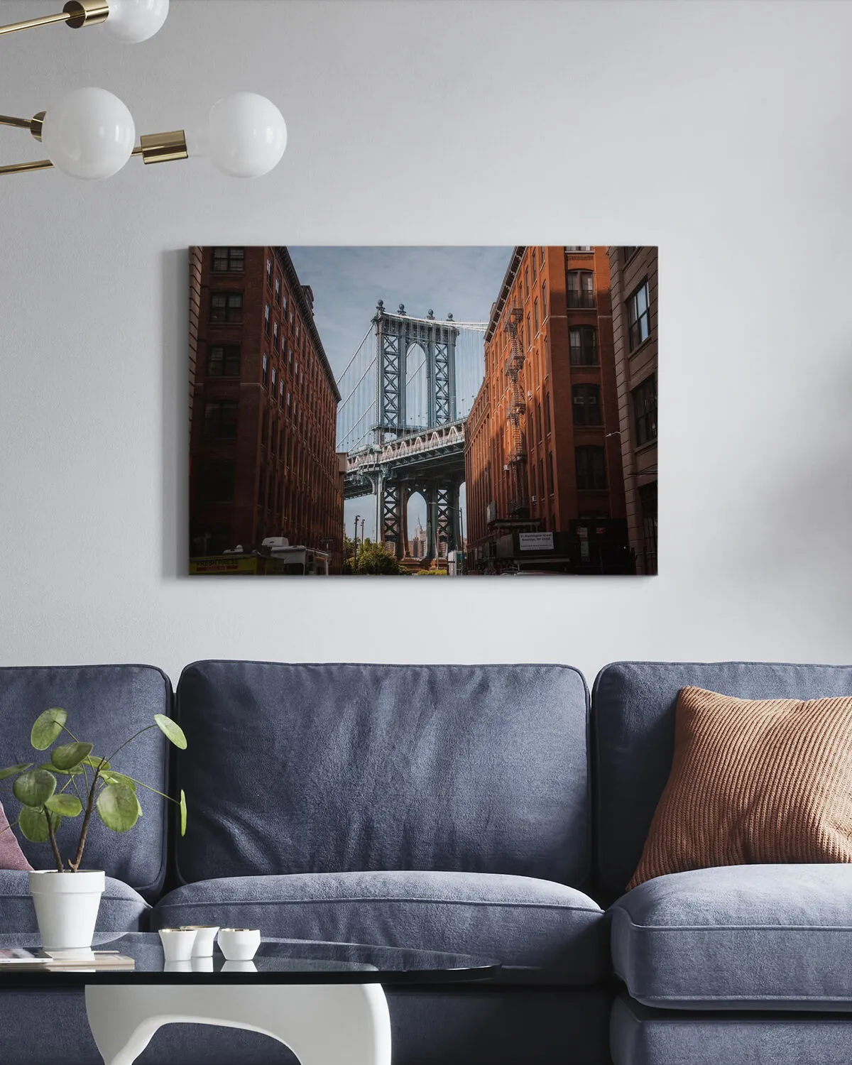
Achieving this modern urban look is more accessible than it seems. The key is the large art piece.
- Wall Art (Large framed cityscape print): $250 – $700
- Main Furniture (Dark blue sectional sofa): $2,000 – $5,000
- Lighting (Modern wall-mounted globe light): $150 – $450
- Accessories (Coffee table, plant, pot): $200 – $600
- TOTAL: $2,600 – $6,750
- Budget alternative: Find a similar cityscape photo from a stock photography site and have it printed yourself. Look for a blue sectional at an outlet store like Article’s warehouse sale or on Facebook Marketplace. An IKEA globe light can give a similar effect for under $50. Total cost could be closer to $1,500.
17. Abstract Dark Green Organic Art Above a Cream Sofa
This room’s calming, sophisticated vibe comes down to a simple recipe: 70% Soft Neutrals + 20% Deep Organic Color + 10% Natural Wood. The cream sofa, light walls, and beige pillows create a soft, cloud-like base that makes the room feel bright and airy. The large art piece injects a single, concentrated dose of rich, dark green, providing a necessary focal point and a connection to nature. The thin, dark wood frame is the final touch, adding a crisp, defined edge and a hint of organic warmth that ties the look together.
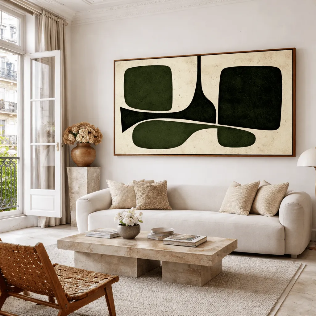
The single pop of deep green is what makes this room sing. Imagine the wall was blank, or held a beige-on-beige abstract piece. The room would still be nice, but it would be generic and forgettable. The dark green organic shapes in the artwork provide a focal point, a dose of drama, and a connection to the natural world that elevates the entire space. It’s the element of surprise and contrast against the sea of cream that gives the room its personality and sophisticated edge. It proves you don’t need a lot of color, just the right color in the right place.
18. William Morris-Inspired Floral Art Over a Green Sofa
When you have a piece of art with a very strong, dominant color—in this case, the deep blue-green background—pull a secondary or tertiary accent color from the art for your accessories. Notice how the pillows aren’t blue or green, but rather the pink and terracotta shades found in the flowers and vines of the print. This creates a more sophisticated, layered look than simply matching the main color. It shows that you’re looking at the whole palette of the artwork, not just the most obvious part.
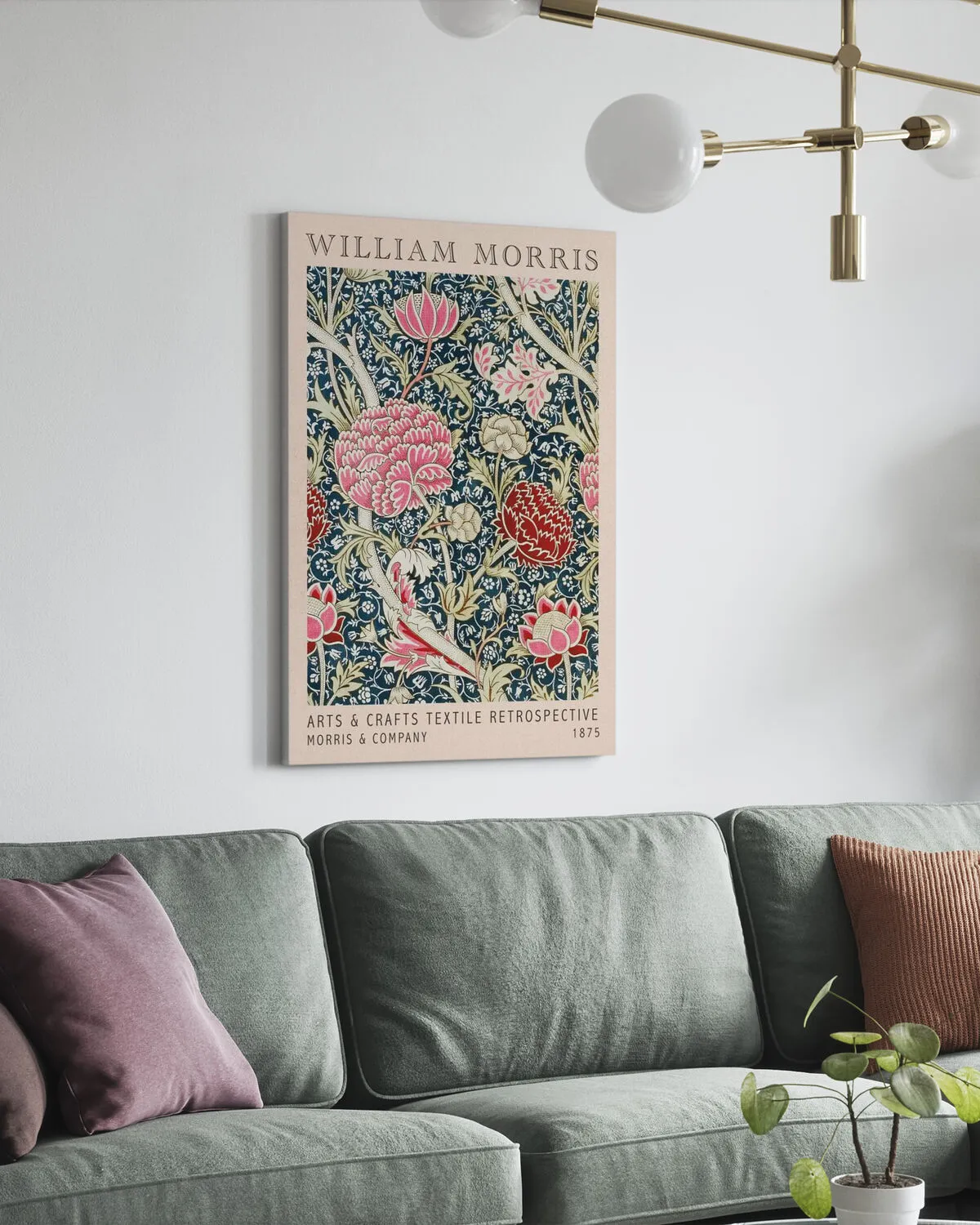
A large, bold floral pattern like this can be a big commitment. While it looks amazing here, be honest with yourself about your tolerance for pattern and color over the long term. This is not a quiet, neutral piece. It has a ton of energy and presence. If you’re someone who likes to redecorate or change your color scheme often, a piece this specific might feel limiting. Consider how it will work with seasonal decor or if you decide you’re tired of pink pillows in a year. It’s a fantastic statement, but statements can sometimes be hard to live with day in and day out.
19. Whimsical Folk Art Mural and Floral Chairs
This room is the perfect example of the Grandmillennial or Modern Traditional trend. It’s a rebellion against years of stark, gray-and-white minimalism. People are craving rooms with soul, story, and a bit of charming clutter. This folk art mural feels personal and handmade, while the floral chairs and patterned rug are a nod to classic, granny-chic comfort. It’s about mixing patterns, embracing color, and creating a space that feels collected and loved, rather than staged. It has staying power because it’s rooted in personality, not a fleeting fad.
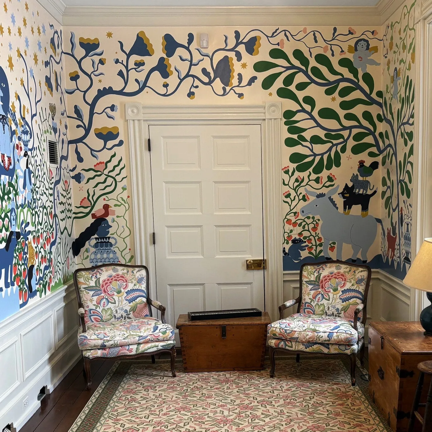
A hand-painted mural is a true work of art, but it requires careful upkeep. Unlike durable wallpaper, a painted surface can be susceptible to scuffs, scratches, and stains, especially in a room with furniture and traffic. It should be sealed with at least two coats of a high-quality matte or satin clear varnish to protect it. Cleaning should be done gently with a soft, damp cloth only—no abrasive sponges or harsh chemicals. Be prepared for occasional touch-ups, and make sure you save a small amount of each paint color used, clearly labeled, for future repairs.
20. Vibrant Abstract Painting Over a Mirrored Gold Console
This vignette is a masterclass in balancing bold elements. The abstract painting is loud and energetic, a riot of color and texture. The mirrored console table with its distressed gold finish is also a statement piece, full of glamour and reflection. They could easily clash, but they work together because the solid, muted blue wall acts as a calming mediator. It provides a simple, quiet background that allows both the art and the console to shine without competing. The simple white vase and green orchids add a final touch of organic simplicity, grounding all the drama.
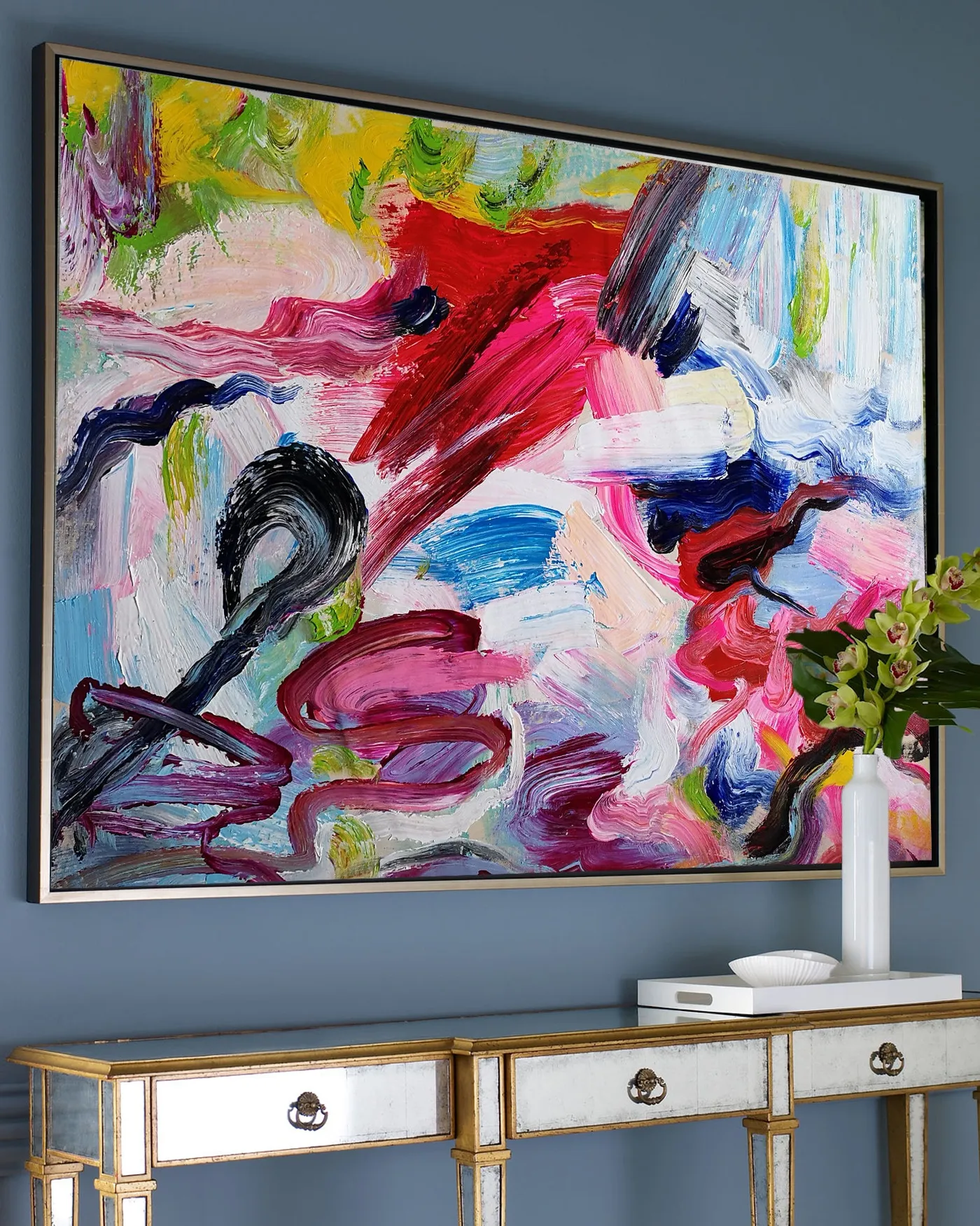
Love the glam, artistic vibe but not the price tag? Let’s break it down. Find a colorful abstract print on a site like Artfully Walls or even Amazon. A large 30×40″ print might be $100. Then, hit up Facebook Marketplace or a thrift store for a vintage console table. Don’t worry about the finish! A can of gold spray paint ($10) and some Rub ‘n Buff for a distressed look ($8) can transform any piece. A simple white vase from Target or HomeGoods ($25) completes the look. You get the same elegant, artistic feel for under $200, instead of potentially thousands.
21. Three Mediterranean Coastal Prints on a Textured Wall
This rustic Mediterranean style thrives in spaces with some architectural character. The textured plaster walls, exposed beams, and arched window are key players. This look is perfect for a bathroom, powder room, or kitchen nook, especially in a room that’s at least 60-80 square feet to accommodate a console or vanity. The key is verticality; the exposed beams draw the eye up, making a standard 8-foot ceiling feel taller. In a room with low ceilings or plain drywall, you can mimic the effect with faux wood beams and a textured paint finish or limewash.
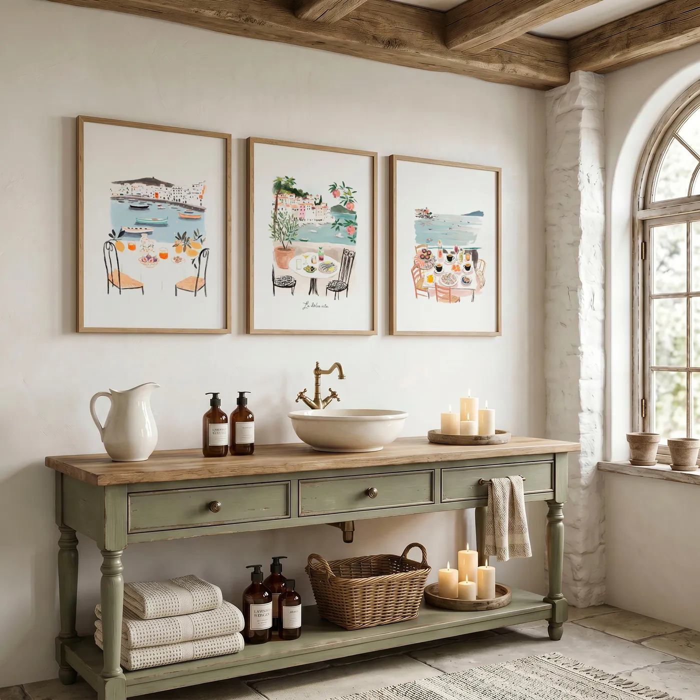
To truly capture that rustic, lived-in Mediterranean feel, don’t hang your art perfectly. While the horizontal alignment should be level, allow for some imperfections in the styling. The distressed finish on the olive green console, the slightly uneven texture of the plaster wall, and the antique brass faucet all contribute to the charm. Leaning one of the frames instead of hanging it, or using vintage-style hardware, adds to the story. It’s about embracing a little bit of wabi-sabi; the beauty of imperfection. This contrasts with the perfect grid of Idea #15.
22. Large Horizontal Abstract Art with Warm Hues
The shot of pure, unadulterated warm color is what makes this entire room come alive. The sofa, walls, and even parts of the artwork are a sea of calm, comfortable neutrals. It’s pleasant, but it’s the vibrant swath of yellow, orange, and red that gives the space its energy and focal point. Remove that artwork, and you’re left with a perfectly nice but bland room. The art acts like a jolt of caffeine, injecting warmth, passion, and personality into an otherwise quiet space. It’s a testament to the power of a single, bold color statement.
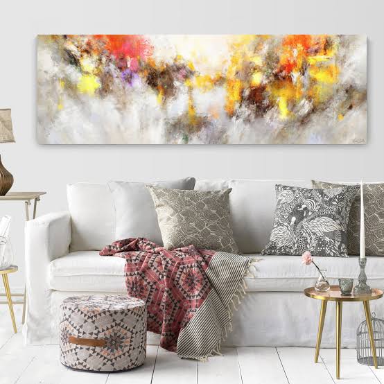
This room is all about creating energy through contrast. The formula is: 80% Cool & Calm Base + 20% Hot & Energetic Accent. The white slipcovered sofa and white walls provide a clean, cool, and expansive base. This creates the perfect gallery-like setting for the artwork to take center stage. The painting, with its fiery blend of yellow, orange, and red, provides the 20% of ‘heat’ that brings the room to life. The key is the ratio. Too much hot color would be overwhelming; too little would get lost. This 80/20 split is the perfect balance for a vibrant yet livable space.
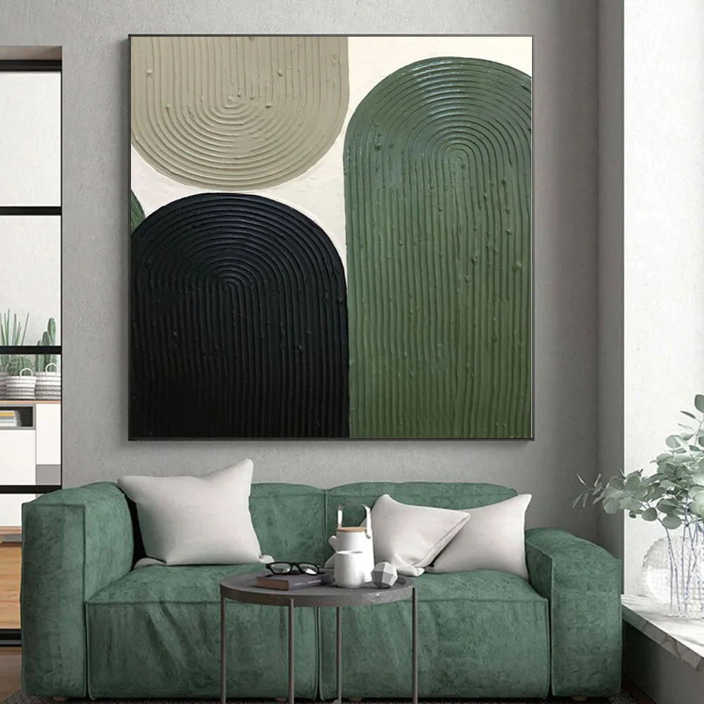
23. Textured Arches Canvas in Black, Green, and Beige
You can create a similar textured art piece yourself with a few simple materials. It’s a great weekend project.
- Source Your Base: Start with a large blank canvas from an art supply store.
- Sketch Your Design: Lightly pencil in your three arch shapes. Don’t worry about being perfect; abstract is the goal.
- Build the Texture: Mix pre-mixed drywall joint compound or plaster with a bit of water to get a thick, spreadable consistency. Use a putty knife or a notched trowel to apply it within your sketched arches, creating ridged patterns.
- Let it Dry: This is the most important step. Let the compound dry completely for at least 24-48 hours.
- Paint Your Shapes: Once dry, carefully paint your arches using matte acrylic paint in your chosen colors—black, dark green, and beige.
Total time: 3-4 hours of active work, 48 hours of drying. Material cost: around $60.
This piece is successful because it engages more than just the sense of sight; it engages the sense of touch (or at least, the idea of touch). The raised, ridged texture of the arches invites you to imagine how it would feel. This 3D quality adds depth and interest that a flat painting couldn’t achieve. By keeping the color palette simple and the shapes graphic, the texture becomes the main story. It’s a minimalist approach that feels rich and complex because of its tactile nature. The use of a simple black frame contains the composition and gives it a finished, intentional look.
24. Large Multi-Panel Abstract Art Over a White Console
When styling a console table under a large piece of art, think in triangles. Create a visual triangle with your decor items to create a balanced, dynamic arrangement. Here, the two textured vases of different heights form one side of the triangle, and the small gold sphere on the other side forms the opposite point. The apex of the triangle is the visual center of the artwork above. This technique creates a composition that feels professionally styled and intentional, guiding the eye smoothly across the entire vignette.
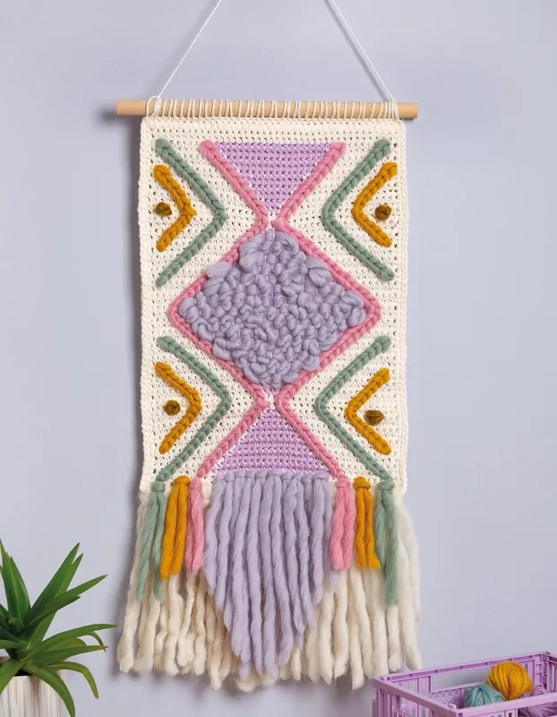
This minimalist and earthy look is all about investing in the right pieces. The art is the main event here.
- Wall Art (Large multi-panel piece): $700 – $2,000
- Furniture (White console table): $300 – $900
- Decor (Ceramic vases, gold sphere): $150 – $400
- TOTAL: $1,150 – $3,300
- Budget alternative: Look for a multi-panel printable art set on Etsy for under $40. Frame them in simple, affordable frames from IKEA. Find a basic white console on Wayfair or Amazon ($150-$250). Hunt for unique textured vases at HomeGoods or a thrift store. You could achieve this entire look for under $500.
25. Botanical Prints Above a Freestanding Tub
A bathroom is a high-humidity environment, and that can be a death sentence for paper art prints. Steam from the tub and shower can cause the paper to ripple, warp, and even grow mold over time inside the frame. To make this look last, ensure your bathroom has excellent ventilation. More importantly, choose your materials wisely. Opt for prints on vinyl or a synthetic substrate instead of paper, and make sure the back of the frame is professionally sealed to keep moisture out. This isn’t the place for a cheap, unsealed frame from a craft store.
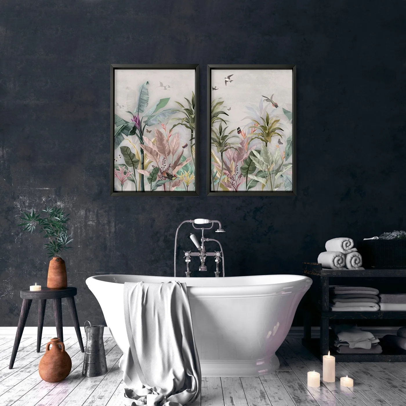
This look is specifically tailored for a setup with a freestanding tub against a feature wall. The art should be centered on the wall space directly above the tub. For this two-print arrangement to work, you need a wall that’s at least 5-6 feet wide to allow for breathing room on either side of the art. The ideal vertical placement is for the bottom of the frames to be 10-12 inches above the lip of the tub. This connects the art to the tub visually without being so low that it’s in the splash zone. It wouldn’t have the same spa-like effect over a standard tub/shower combo.
26. Large Abstract Painting of Marching Figures
The single, bold stroke of bright yellow is what makes this piece unforgettable. The rows of black figures are structured and repetitive, creating a sense of order and rhythm. It’s interesting, but it’s the vertical slash of yellow that disrupts the pattern and grabs your attention. It injects a dose of pure, unexpected energy into the composition. Without it, the piece would be a monochromatic study in pattern. With it, it becomes a dynamic conversation between order and chaos, predictability and spontaneity. It’s the single element that gives the art its voice.
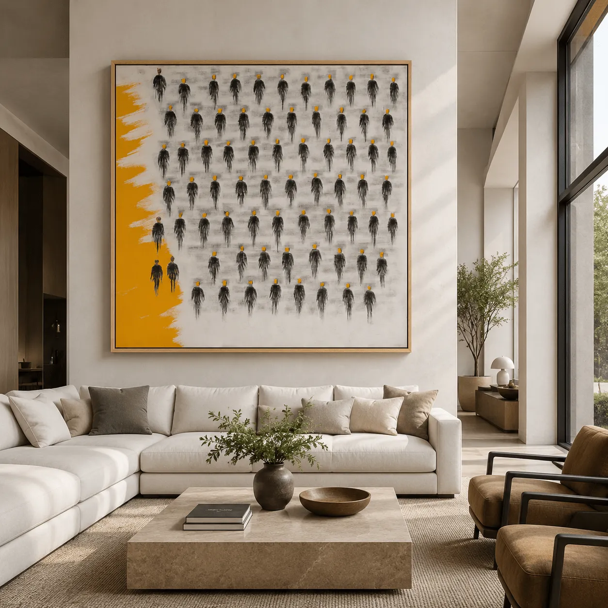
This piece uses a powerful visual formula: 70% Structured Repetition + 20% Disruptive Element + 10% Natural Frame. The repeating black figures on the grey background create a strong, predictable pattern that is easy for the eye to read. The vertical yellow brushstroke completely interrupts this pattern, creating immediate focus and energy. The simple, light wood frame acts as a quiet, natural border, containing the energy of the piece without competing with it. This balance of order and surprise is what makes it so visually compelling.
27. Art Deco-Inspired Couple Portrait in Black Frame
This chic, retro vibe is incredibly easy to recreate on a small budget. The key is the art print. Search on sites like Desenio, The Motivated Type, or Etsy for Art Deco print or retro couple illustration. You can often find a stylish print for $20-$40. Pair it with a simple black frame from Target or IKEA ($25). The viral mushroom lamp can be found on Amazon for under $30. The bookcase itself can be a simple, affordable piece from Walmart or a thrift store find. This entire stylish corner can be put together for well under $150.
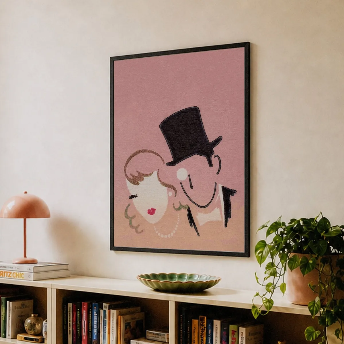
This little corner works because it tells a cohesive color and style story. The art sets the tone with its retro illustration and prominent pink background. The salmon-pink mushroom lamp then picks up on that color, reinforcing the palette. The simple black frame of the art is echoed in the stylized black hair and top hat within the print. The light wood of the bookcase provides a warm, neutral base that keeps the pink and black from feeling too harsh. Every item relates to the others, creating a vignette that feels curated and thoughtfully designed, not just randomly placed.
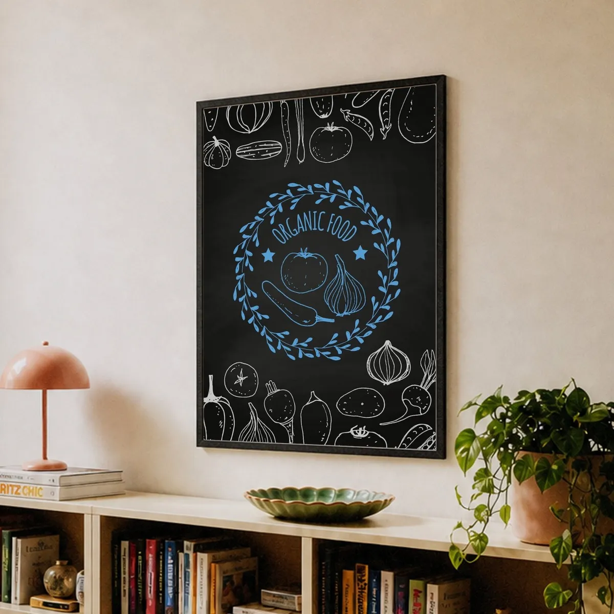
28. Chalkboard-Style Organic Food Poster with Blue Wreath
When styling a bookshelf vignette beneath a piece of art, always mix the height and shape of your objects. Notice how there’s a tall, vertical element (the plant), a short, wide element (the green bowl), and a medium, sculptural element (the pink lamp). This variation creates a more dynamic and interesting composition than lining up items of a similar size. Also, use books to create different levels, like the stack that the mushroom lamp sits on. This adds height and visual interest. This is a much more inviting approach than the minimalism of Idea #9.
|
📋 Copy HEX 🔗 Share |
The kitchen art trend is moving away from generic Bon Appétit signs and towards prints that reflect a more modern, conscious approach to food. This Organic Food print is a perfect example. It’s not just decorative; it’s a subtle nod to wellness, farmers markets, and a connection to where our food comes from. The chalkboard style feels rustic and approachable, while the clean graphics keep it modern. It’s popular because it aligns with a larger cultural shift towards mindfulness in our eating and living habits, making our decor feel more personal and value-driven.
29. Cubist Two-Face Portrait on a Textured Grey Wall
A large, bold, abstract piece like this is a strong statement. And you might hate it in six months. Cubism and highly stylized art can be polarizing. Before you invest a significant amount of money in a piece this specific, live with it for a bit. Buy a cheap poster version first, or find a similar image and set it as your phone’s wallpaper for a month. See how you feel looking at it every day. Does it still intrigue you? Or does it start to feel jarring? It’s better to know before you’ve spent the big bucks and put a big hole in your wall.
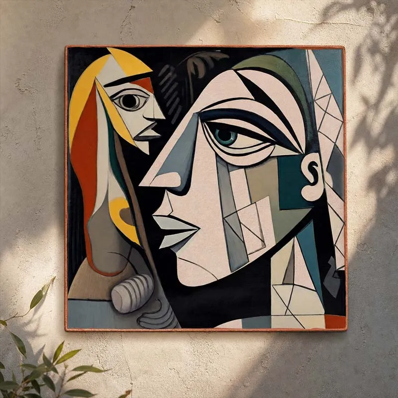
Love the dappled light effect but don’t have a perfectly placed tree outside your window? You can fake it! Here’s a quick guide to creating that ‘leaf shadow’ look for a photoshoot or a special evening vibe:
- Get a Light Source: A single, bright, bare-bulb lamp or a photography spotlight works best.
- Find Your Foliage: Grab a few leafy branches from your yard or even some faux branches from a craft store.
- Position the Light: Place the lamp on the floor or a low stool a few feet away from the wall.
- Create the Shadow: Hold the branches between the light and the wall. Move them closer or further from the light to make the shadows sharper or softer. Adjust the angle until you get a natural-looking pattern.
It’s a simple trick that adds instant mood and drama.
30. Vibrant Abstract Figure Art Above a Coral Armchair
This cozy, eclectic corner is a perfect example of the 60-30-10 color rule in action. The formula is: 60% Neutral Base (the white walls and light wood tones) + 30% Secondary Color (the bright turquoise in the art and the matching side table) + 10% Accent Color (the pop of coral in the armchair). The white walls provide a clean canvas. The turquoise creates the main color story, tying the art to the furniture. The coral chair is the surprising accent that makes the whole corner pop. It’s unexpected but works because it’s used in a small, confident dose.
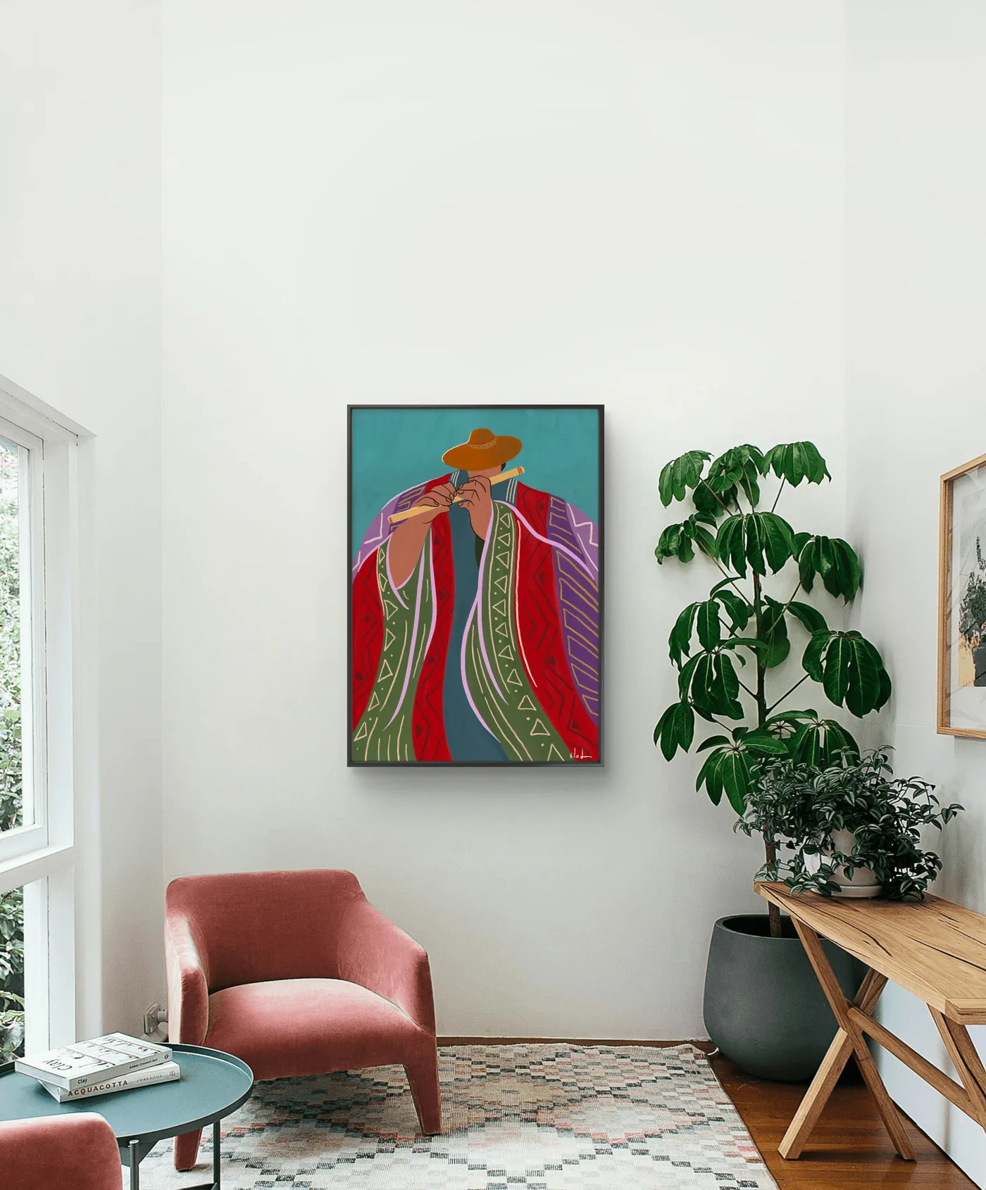
The brave color combination is what elevates this from a nice corner to a memorable one. Pairing bright turquoise with a warm coral is not for the faint of heart, but it’s what gives this space its personality and joy. The art provides the initial inspiration with its turquoise background, and the decision to pull in a complementary (opposite on the color wheel) shade like coral for the chair is a sophisticated design move. It creates a vibrant, energetic tension that is far more interesting than a simple monochromatic scheme. It’s a joyful, confident choice.
Your Walls Are Waiting
Blank walls are full of possibility, and now you have 30 incredible starting points. Whether you’re drawn to a single statement piece or a curated gallery wall, the goal is to choose something that makes you happy every time you see it. So go ahead, find that piece that speaks to you, and tell your story. Don’t forget to save your favorites to your Pinterest board to keep the inspiration flowing!