

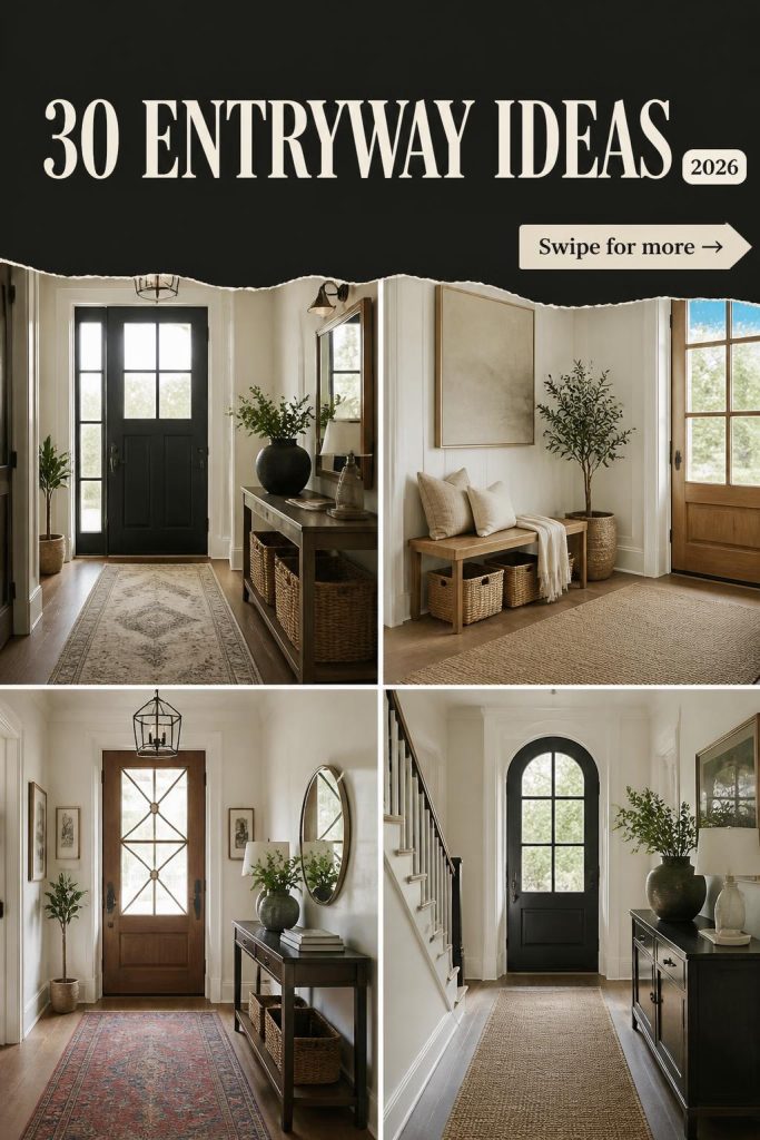
You know that feeling when you scroll through hundreds of pins, save a dozen entryway photos, and still end up with a pile of shoes by the door? It’s a special kind of home decor paralysis. We get it. Your entryway is the first impression your home makes, and it deserves to be more than just a dumping ground. It should feel like a welcoming hug.
We went deep, filtering through hundreds of real homes to find what actually works. After combing through looks from places like West Elm, Crate & Barrel, and even some clever IKEA hacks, we narrowed it down to 30 distinct ideas that deliver on both style and function, with options ranging from a simple $100 refresh to a $5,000 custom build-out.
Inside, you’ll find 30 curated entryways that showcase the best of modern, minimalist, coastal, and functional designs. We’re talking clever storage for small apartments, statement-making consoles for long hallways, and everything in between. And stay until the end—we break down the most common mistakes that can ruin these looks.
📌 Save this to Pinterest for later—you’ll want to revisit these ideas.
1. A Modern Entry with a Dark Wood Console and Abstract Art
This entryway is all about the power of contrast. The deep, rich stain of the wooden console table creates a strong anchor against the crisp white walls, preventing the space from feeling washed out. This high contrast is a classic design trick that adds instant sophistication. The large-scale abstract art then ties everything together, pulling in the black from the sconce, the brown from the console, and the white from the walls into one cohesive statement piece.
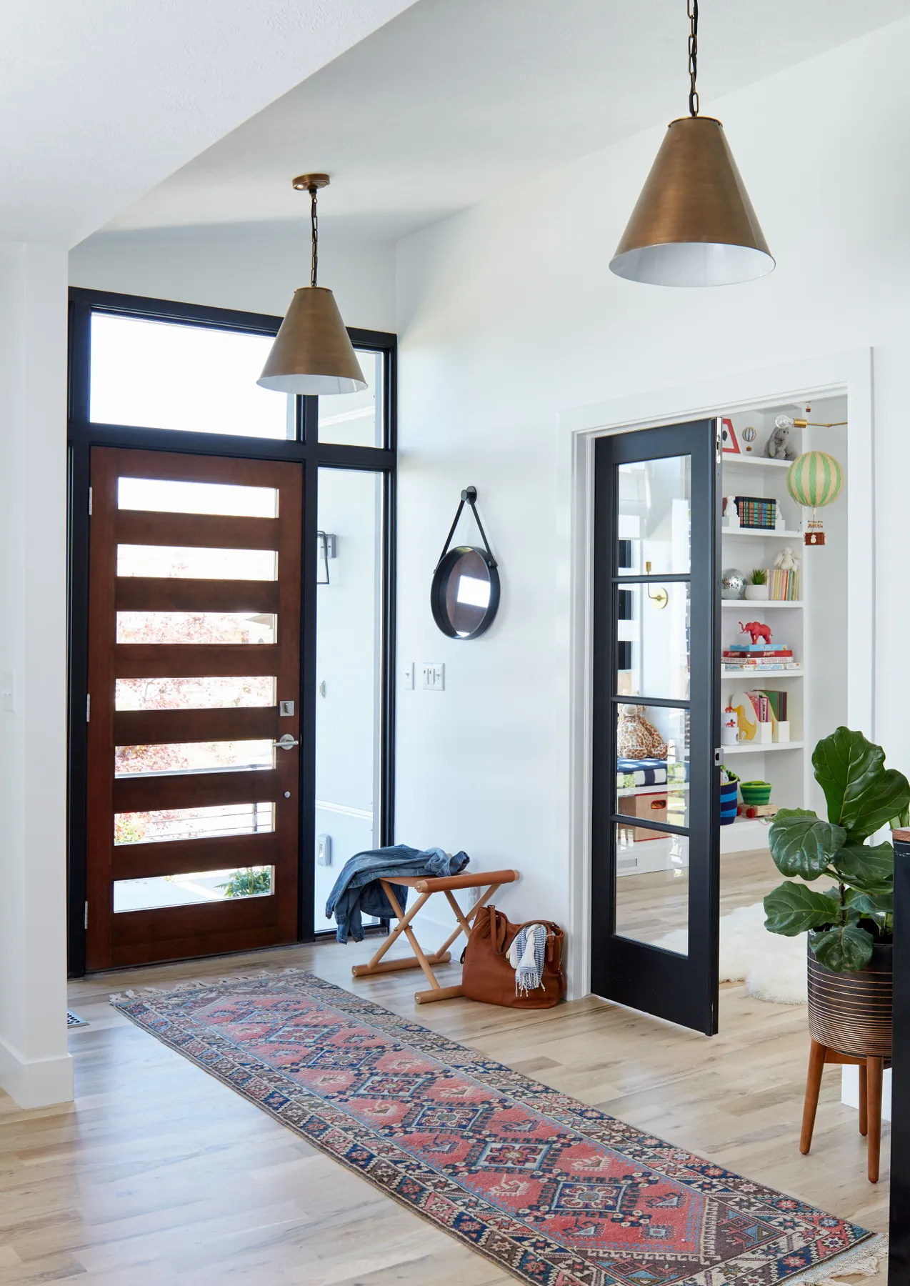
A single, sculptural wall sconce is a brilliant move here. Instead of a generic overhead light, the small, black cylindrical fixture acts as both task lighting for the console and a piece of wall sculpture in its own right. It draws the eye upward and highlights the artwork without overwhelming the minimalist aesthetic. It’s a choice that feels intentional and custom, even though it’s a relatively simple element to install.
2. Bright & Modern: Exposed Wood Beams and a Geometric Door
Here’s the formula for this bright, modern California vibe: 50% natural light wood + 30% clean white surfaces + 10% warm leather + 10% black accents. The light wood, seen in the ceiling beams, floating console, and door, creates a cohesive and warm foundation. The white walls and vase keep it feeling airy and spacious. A touch of tan leather on the bench adds softness and a different texture, while the black mirror frame and hooks provide just enough graphic punch to keep it from feeling bland.
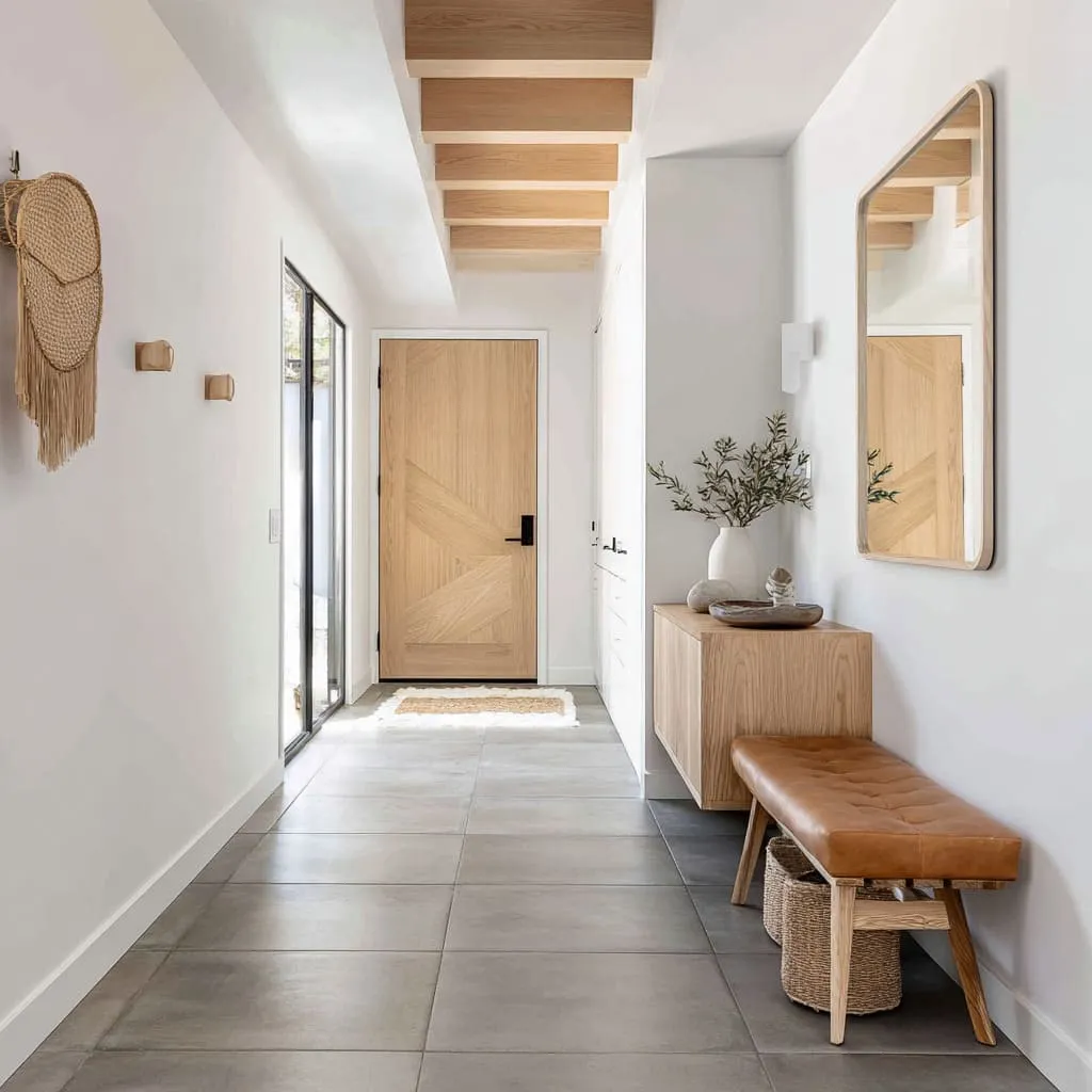
Let’s be honest: exposed wood beams are gorgeous, but they can be a dust magnet. If you’re considering adding them, be prepared for a little extra upkeep with a long-handled duster. Also, a floating console looks amazing, but it offers less hidden storage than a traditional piece. This look is perfect for people who are naturally tidy or have a great coat closet nearby. If you tend to accumulate clutter by the door, this might not be the most practical setup for you.
3. A Cheerful Entry with a Lime Green Door and Board-and-Batten Walls
You don’t need a huge budget to get this happy, organized look. The board-and-batten effect can be a DIY project for a weekend using MDF strips from Home Depot for under $100. For the furniture, hunt for a simple spindle bench on Facebook Marketplace (around $50-$75) and give it a fresh coat of black paint. A small side table from Target or IKEA could easily stand in for the console, and a quart of a bold paint color for the door is an affordable ($25) way to make a huge impact.
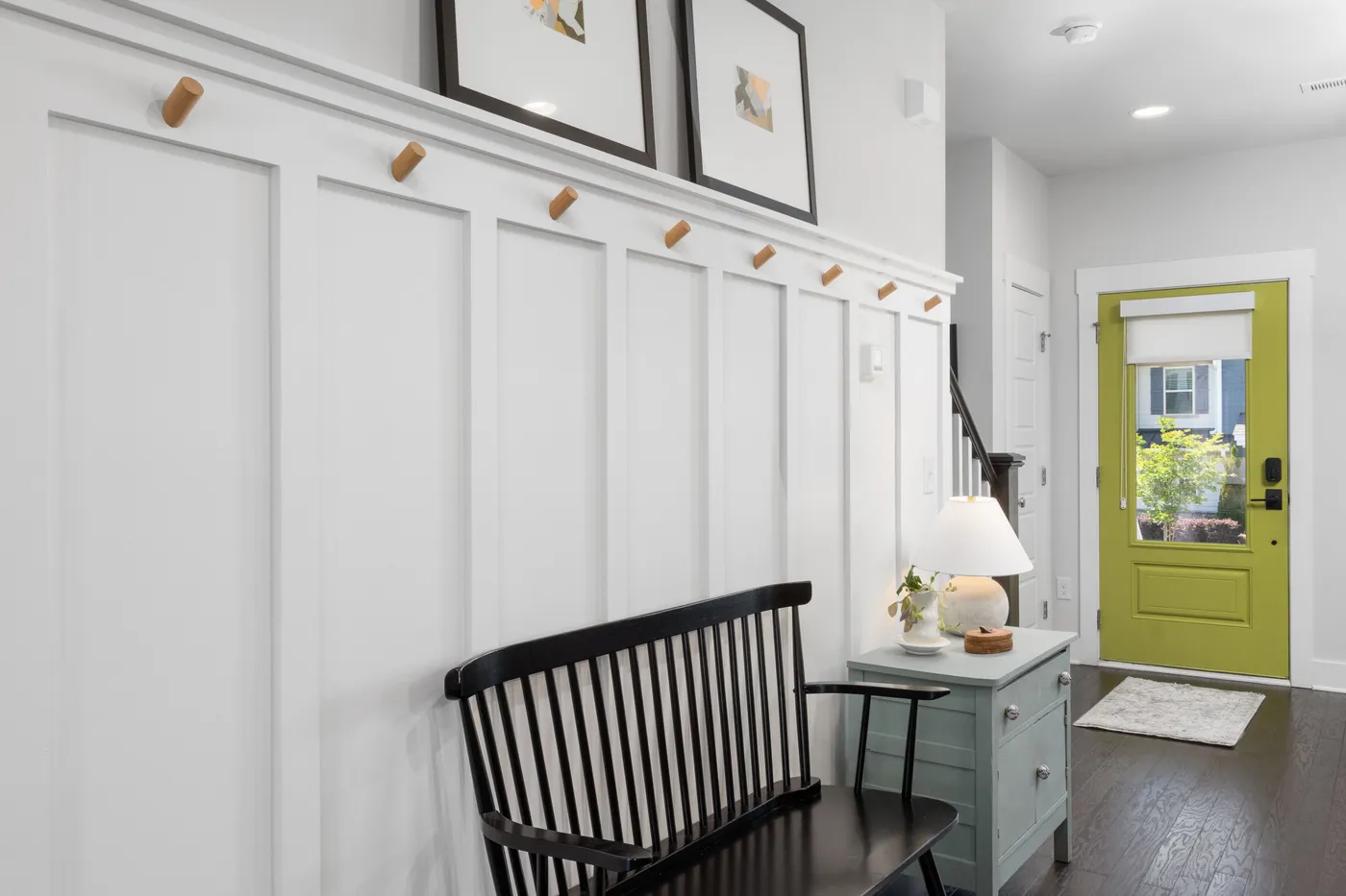
Without a doubt, the one thing that makes this entire space sing is that vibrant lime green front door. Remove it, and you have a perfectly nice, but much more conventional, entryway. The door is the exclamation point. It injects personality, fun, and a shot of pure energy into the room. It’s a brave choice that tells you something about the people who live here, and it’s a perfect example of how a single can of paint can completely define a space.
4. Textured Entry with a Wood Plank Ceiling and Organic Runner
This look is ideal for a long, relatively narrow entryway, at least 5 feet wide and 12 feet long. The wood-planked ceiling draws the eye forward, exaggerating the length of the hall in a beautiful way. The long, slatted console and the abstract runner rug reinforce this linear path. For this to work without feeling cramped, you need a ceiling height of at least 9 feet to accommodate the visual weight of the wood ceiling without it feeling oppressive.
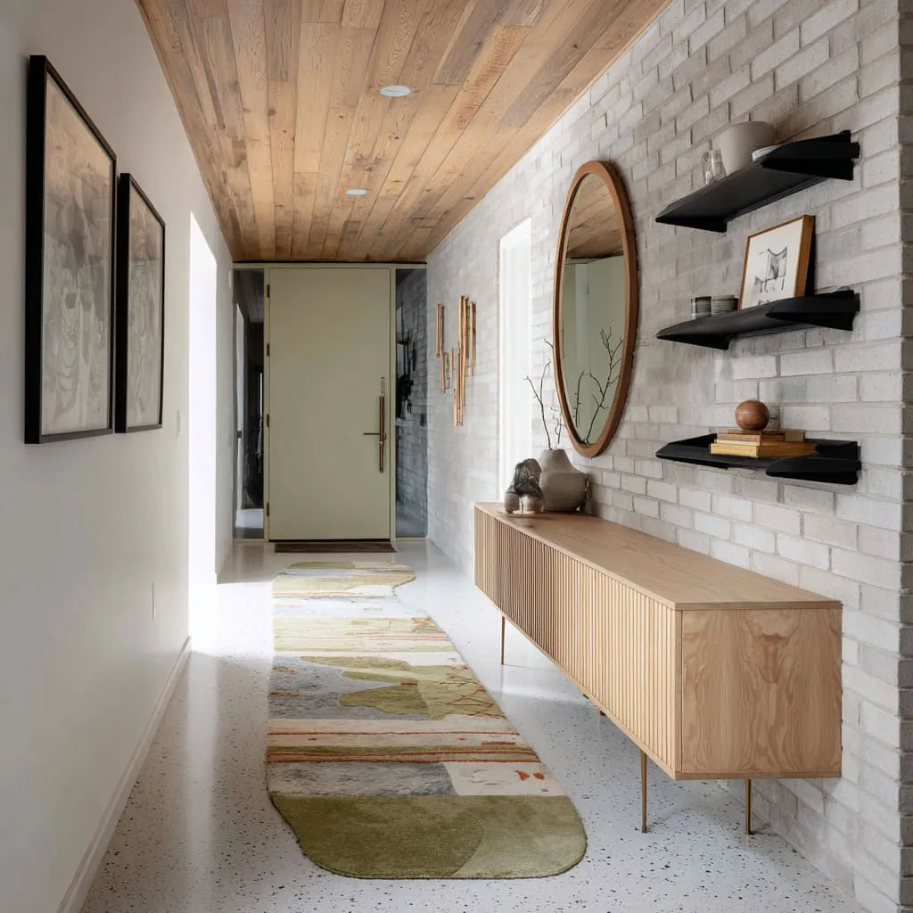
That gorgeous white-painted brick wall is a star, but it comes with some upkeep. The deep crevices are fantastic at catching dust and cobwebs. You’ll want to go over it with a vacuum brush attachment every month or so. The organic-shaped runner is also a bit of a commitment; it can’t just be swapped for any standard-sized rug. When it gets dirty, it will likely require professional cleaning due to its unusual shape and materials, which can cost more than a standard rug cleaning.
5. Airy Entryway Featuring a Fluted Wood Console and Round Mirror
You can create a similar fluted effect on a plain console table yourself. Here’s a quick guide:
- Measure the height and width of your console’s drawer fronts or doors.
- Buy half-round wood molding from a hardware store. Cut the pieces to the height of your drawer fronts. You’ll need enough to cover the full width.
- Lightly sand the molding pieces and the console surface.
- Using strong wood glue, attach the molding pieces vertically, side-by-side. Use a level to ensure they are straight. Clamp them and let the glue dry completely.
- Prime and paint the entire console for a seamless finish.
This weekend project should take about 4-6 hours of active work and cost around $50-$80 in materials.
When hanging a large round mirror over a console, aim for the bottom of the mirror to be 6-8 inches above the tabletop. This creates a pleasing visual gap that allows you to place decor on the console without it feeling cluttered or blocking the reflection. The center of the mirror should land somewhere around 60 inches from the floor, which is average eye level. This ensures the composition feels balanced and is functional for a quick look before you head out the door.
6. A Structured Entry with a Dark Paneled Door and Geometric Rug
This entryway feels so welcoming because it masters the art of balance. The dark, heavy door could easily overwhelm the space, but it’s perfectly counteracted by the light gray walls and the abundance of natural light from the glass panels. The geometric pattern on the rug repeats the rectangular shapes in the door and wall molding, creating a subtle, satisfying rhythm. Finally, the round flush-mount lights and the sprawling green foliage add organic shapes that soften all the straight lines.
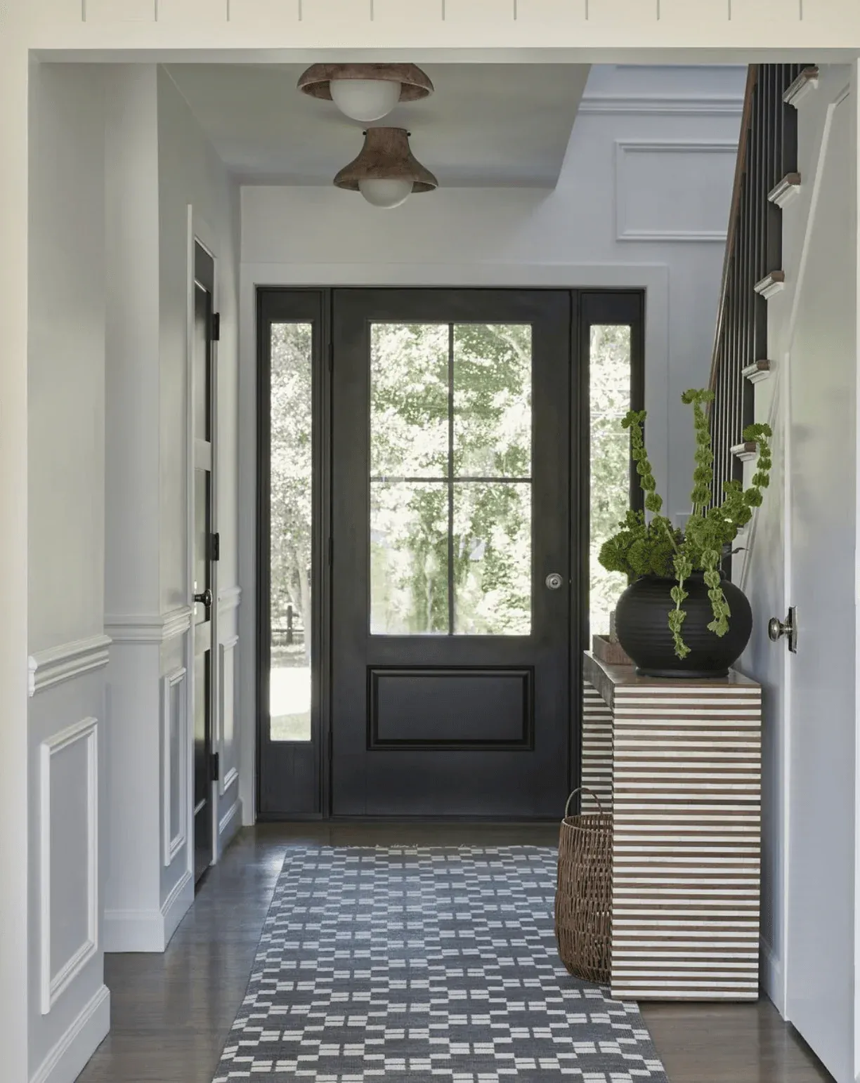
Want to recreate this balanced look? Here’s a potential cost breakdown:
- Main Furniture (Striped console table): $500 – $1,200
- Lighting (2 rustic flush mounts): $300 – $600
- Textiles (geometric area rug): $250 – $700
- Decor/Accessories (Large pot & plant): $150 – $300
- Wall Treatment (Panel molding & paint): $400 – $1,000 (Pro-installed)
- TOTAL: $1,600 – $3,800
Budget alternative: Get a similar vibe for about 40-50% less by using a stencil on a plain rug, finding a console on Wayfair, and installing the molding yourself.
7. The Ultimate Functional Entry: Bench, Hooks, and Shoe Storage
Before you commit to a full-on functional entryway setup like this, run through this quick checklist:
- Measure your traffic path: Make sure you have at least 36 inches of clear walkway past the bench, even with shoes on the floor. Don’t create a bottleneck.
- Count your coats: How many hooks do you really need for daily use? Plan for one per family member plus two for guests. More than that invites clutter.
- Assess your flooring: Dark grey tiles like these are great for hiding dirt. If you have light carpet or hardwood, you’ll need a durable, easy-to-clean mat underneath the bench to protect it from wet shoes.
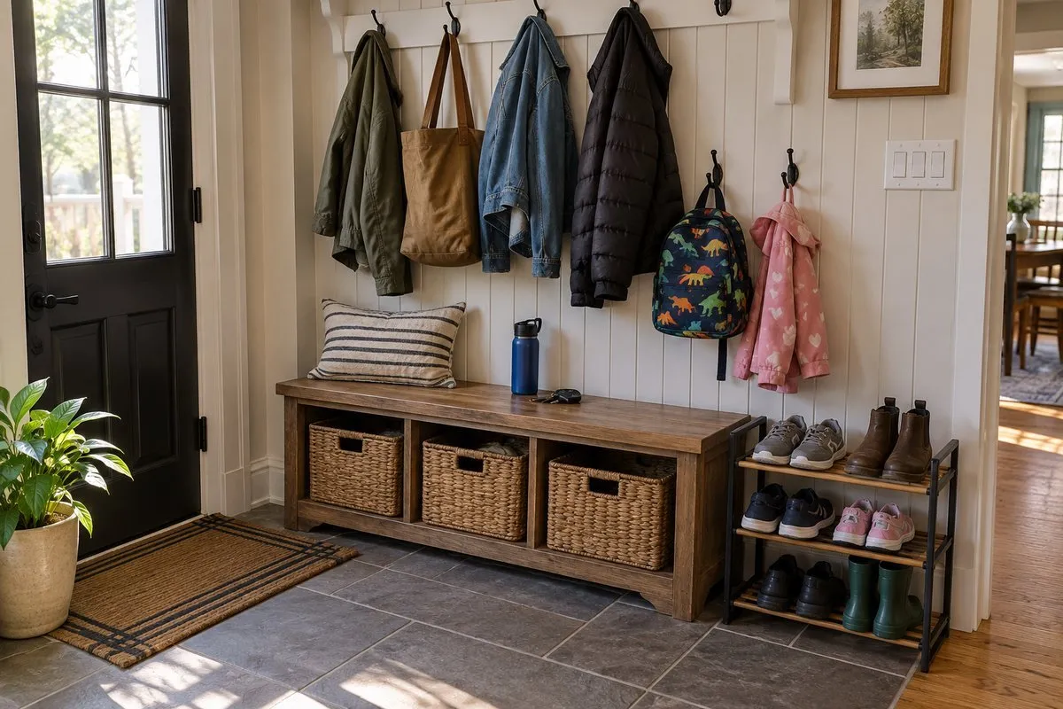
This is the dream for a busy family, but let’s be real: it only stays looking this organized if you have a system. Those woven baskets are perfect for hiding winter hats and gloves, but they can easily become black holes for junk mail and mismatched socks. The key is discipline. A setup like this requires a weekly tidying session to put away the out-of-season coats and return items to their proper place. It’s a functional solution, not a magical one. Compare this to the more minimalist approach in Idea #1 to see a different philosophy.
8. Serene & Minimalist: A Fluted Console and Single Pendant Light
The single dark dome pendant light is the hero of this space. It’s a deliberate choice that elevates the entire design. In such a minimalist setting, every single item has to justify its existence. The pendant does more than just provide light; its strong, simple shape acts as a sculptural focal point, perfectly balancing the large artwork and the low-slung console. Without it, the room would feel less anchored and far less intentional. It’s the quiet star of the show.
This look achieves its serene quality with a strict formula: 70% warm neutrals (the light beige walls and floor), 20% textural elements (the fluted console, the low stool), and 10% bold black accents (the artwork and pendant light). You could easily swap the palette—imagine dark charcoal walls, a light oak console, and brass accents—and as long as you maintain those ratios, you’ll achieve the same sophisticated, minimalist balance.
9. Custom Grey-Green Built-ins for a Complete Mudroom Entry
A custom-built-in unit is a major investment, but it pays off in organization. Here’s what a project like this could cost:
- Main Furniture (Custom cabinetry & bench): $5,000 – $12,000+
- Hardware (Brass hooks & pulls): $200 – $500
- Textiles (Natural fiber rug): $150 – $400
- Decor/Accessories (Wicker baskets): $100 – $250
- Flooring (Tile installation): $1,000 – $3,000
- TOTAL: $6,450 – $16,150+
Budget alternative: You can mimic this with stock cabinetry from IKEA or Home Depot, a pre-made butcher block benchtop, and some clever trim work for about 60% less. See Idea #10 for a similar but slightly different built-in concept.
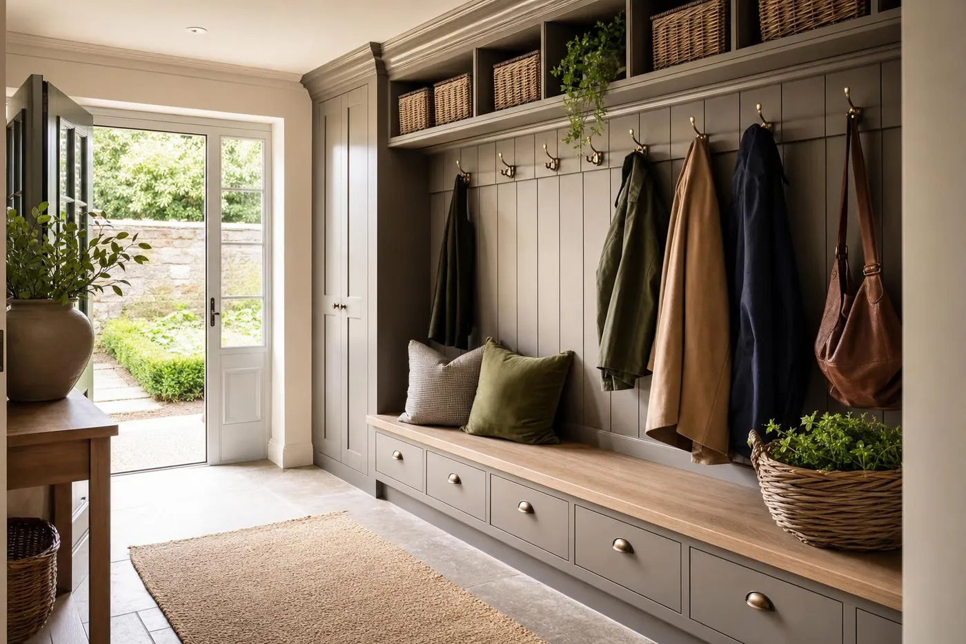
The painted finish on a high-traffic piece like an entryway bench will inevitably get scuffed and dinged from shoes, bags, and daily life. That beautiful grey-green paint will need touch-ups every year or two to keep it looking fresh. The wooden bench top is a smart choice for durability, but it should be sealed with a high-quality polyurethane to protect it from water from wet coats or boots. The natural fiber rug is great for texture, but it can be tricky to clean if it gets muddy.
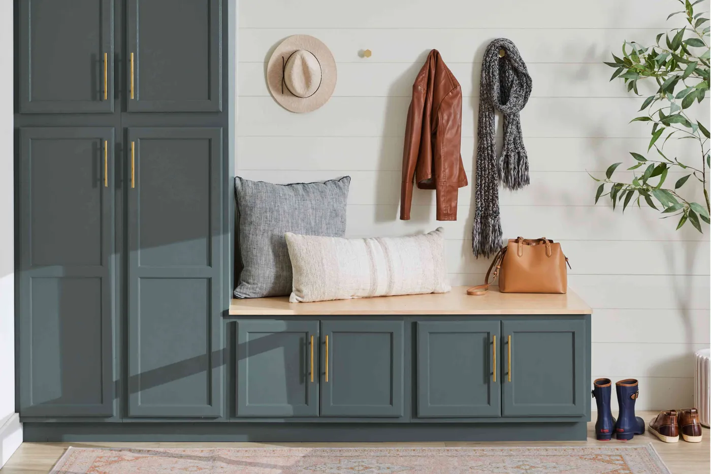
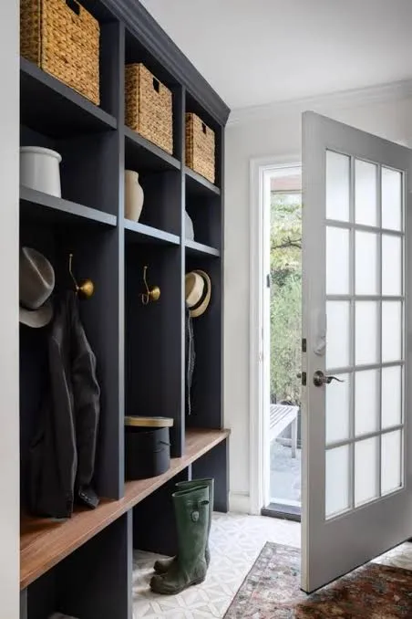
10. A Moody Blue-Gray Built-in Bench with Shiplap and Cubbies
This design is so successful because it layers texture and color within a very controlled footprint. The dark blue-gray paint creates a cozy, enveloping feel, which is a bold and effective choice for an entryway. The vertical lines of the shiplap draw the eye up, making the nook feel taller. Then, the warm tones of the light wood benchtop and the woven baskets provide a necessary dose of warmth and organic texture, preventing the dark paint from feeling cold or somber.
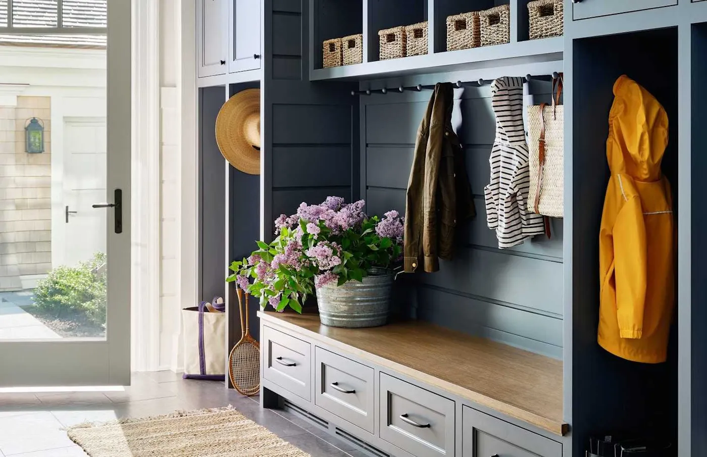
When designing a built-in bench, the standard seat height is 18 inches from the floor (including any cushion). This is the same as a typical dining chair, making it comfortable for putting on shoes. For the depth, aim for 16 to 20 inches. Any less, and it feels perched; any more, and it can feel awkward to sit on without back pillows. This specific depth also allows for standard-sized storage baskets and bins to fit neatly in cubbies underneath.
11. A Sun-Drenched Entry with a Natural Wood Door and Abstract Art
The star of this show is unquestionably the full-light natural wood door and its transom window. This feature transforms the entire space from a simple hallway into a bright, gallery-like entrance. It floods the area with natural light, making the grey tiles gleam and the colors in the abstract art pop. It’s not just a door; it’s a light source and a major architectural feature that defines the character of the home before you’ve even taken a step inside.
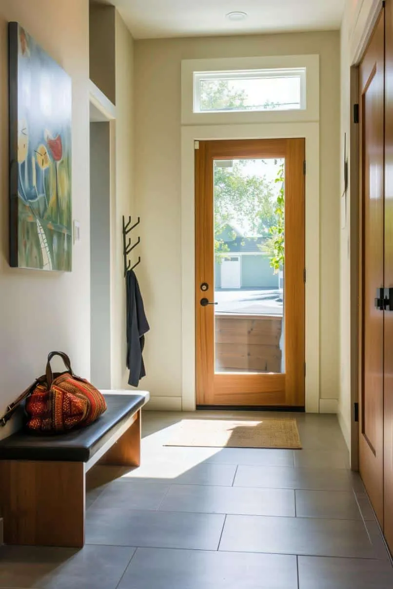
An entryway with this much open volume needs large-scale elements to feel properly furnished. This idea works best in a space that is at least 6 feet wide to accommodate the bench without impeding traffic flow. The wall for the artwork needs to be substantial—at least 8 to 10 feet wide—to allow a large painting to breathe. A small piece of art would look lost and insignificant here. This is a great example of using fewer, larger pieces to make a bigger impact.
12. Bright and Tidy: A Floating Bench with Cubbies and Hooks
A floating bench is a fantastic way to make a small entryway feel larger because you can see the floor underneath, creating an illusion of more space. However, be aware that “floating” isn’t magic. It requires significant structural support. The bench must be securely bolted into wall studs, and if you have metal studs or tricky walls, you might need to open the drywall to add extra wood blocking. This isn’t a simple picture-hanging job; it needs to support the weight of a person sitting down.
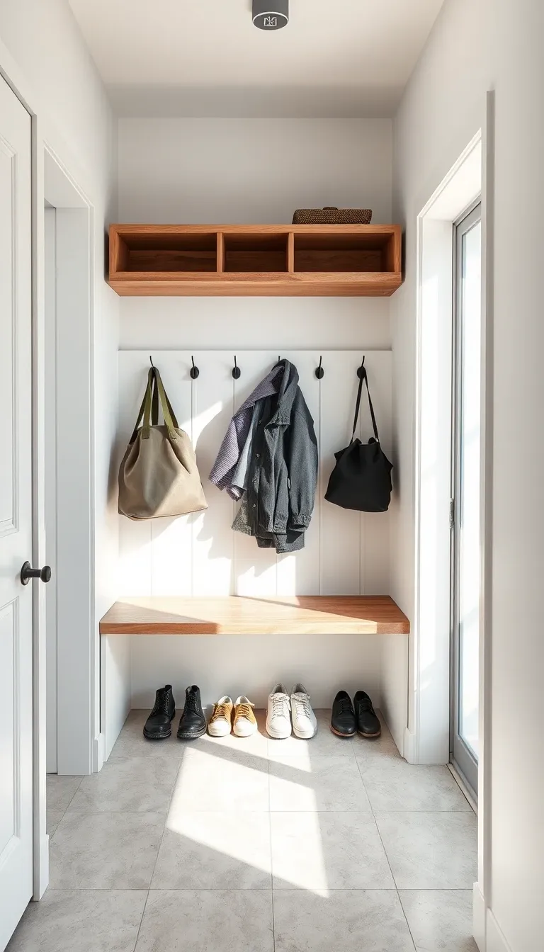
You can get this clean, functional look without the cost or complexity of a custom floating bench. Look for a narrow, leggy bench from a store like Wayfair or Target—the key is that it’s up off the floor. Pair it with a pre-made cubby shelf (like IKEA’s KALLAX, turned on its side and mounted to the wall) and a simple row of black hooks from any hardware store. You’ll get 90% of the look for about 25% of the price of custom work.
13. A Moody Entry with a Round Fluted Console and Textured Rug
This look is a masterclass in using texture to create interest in a minimalist space. You have the vertical lines of the fluted console, the plush, high-pile texture of the off-white rug, the smooth coolness of the mirror, and the organic form of the plant. The dark accent wall acts as a dramatic backdrop that makes all these different textures pop. It’s a perfect example of how to create a visually rich space using a very limited color palette of black, wood, and cream.
This style is so popular right now because it hits the sweet spot between minimalism and warmth. We’re moving away from the cold, stark minimalism of the 2010s and embracing what’s being called “sensory design.” People want their homes to not only look good but feel good. The emphasis on touchable textures like fluted wood and bouclé-style rugs is a direct response to this desire for more tactile, comforting, and organic interiors. This trend has legs because it’s rooted in a fundamental human desire for comfort.
14. Modern Glam: A Marble-Look Console with Gold Accents
The formula for this entry-level glam look is simple: 60% clean, modern basics + 30% high-contrast black + 10% warm metallic. The white walls, beige carpet, and simple console shape form the neutral base. The black frame of the console, the balusters, and the pot add necessary graphic definition. Then, the gold-framed mirror and vase provide that 10% of sparkle and warmth that elevates the whole look from just ‘modern’ to modern glam. You could swap the gold for brass or even chrome, but the formula remains the same.
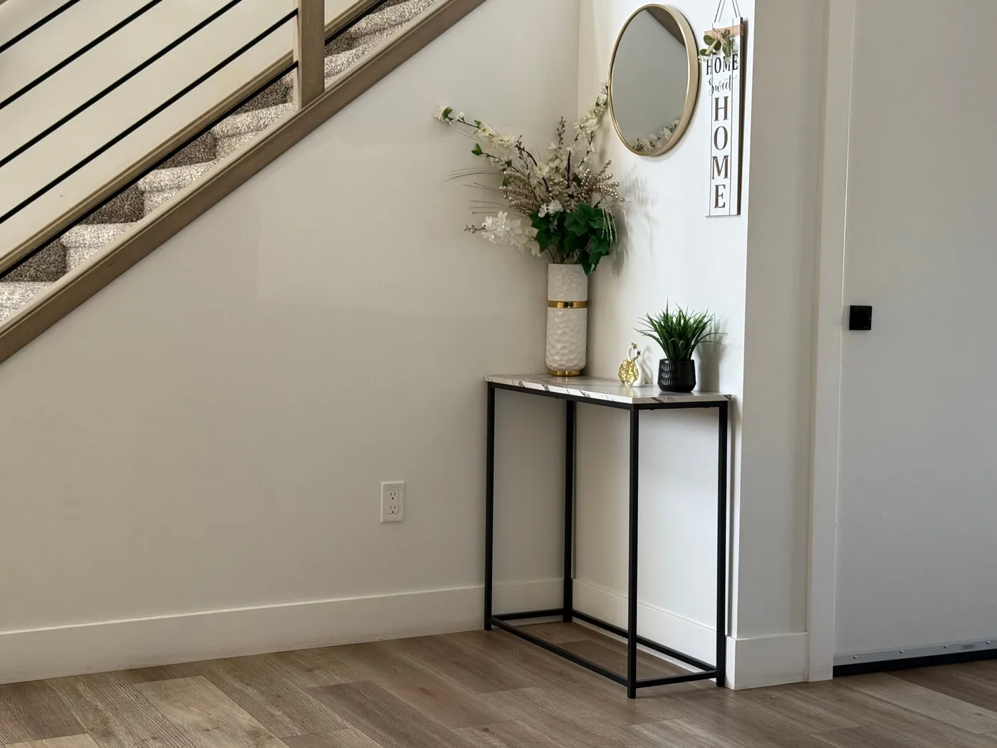
This is a super achievable look on a budget. The key is to fake the expensive materials. A console table with a marble-look laminate or faux marble top from Amazon or Wayfair can be found for $100-$150. A gold-framed mirror is a staple at stores like Target or HomeGoods for under $70. The real money-saver is the decor: use high-quality artificial plants and flowers. A good-looking faux floral arrangement will give you this lush look year-round with zero maintenance, unlike fresh flowers that need constant replacing.
15. A Cozy, Compact Entry with a Rattan Bench and Dark Wood
This is a brilliant solution for a truly tiny entryway, even one in an apartment that’s just a sliver of wall by the front door. We’re talking a space that’s maybe 4-5 feet wide. The key is using vertical space. The tall, narrow wooden unit provides a ton of storage without a large footprint, and the bench is compact. Every item is chosen for its multi-functionality: the bench is also shoe storage, the wall hooks hold hats that double as decor. This proves you don’t need a formal foyer to be organized.
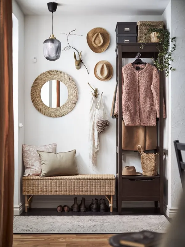
The woven rattan texture is the single element that ties this entire cozy corner together. It appears in the bench, the mirror frame, and the storage boxes, creating a cohesive story. This repetition of material is what makes the space feel intentionally designed rather than like a random collection of furniture. It brings a natural, slightly bohemian warmth that softens the dark wood and makes the small space feel incredibly inviting and thoughtfully curated.
16. Coastal-Inspired Entry with Shiplap and a Twisted Wood Lamp
This space nails the ‘modern coastal’ aesthetic by focusing on texture rather than kitschy motifs like anchors or shells. The crisp horizontal lines of the white shiplap walls provide a clean, bright backdrop. This is layered with the warm, organic texture of the light wood plank ceiling. The dark wood floor and door ground the space, preventing it from feeling washed out. Finally, the sculptural lamp, woven tray, and striped rug add layers of tactile interest, creating a look that feels breezy and sophisticated.
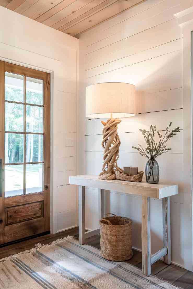
When using shiplap, the size of the gap between boards makes a huge difference. For a clean, modern look like this, use a nickel gap, which is about the thickness of a nickel. This creates a crisp, fine shadow line. For a more rustic, farmhouse look, you might want a wider gap, like a quarter of an inch. But for this breezy, coastal vibe, the subtle definition of a nickel gap is perfect. It adds texture without being visually noisy. Compare this with the vertical paneling in Idea #12.
17. Pure Minimalism: A Fluted Console and Frameless Round Mirror
The magic of this entryway is its restraint. In a space this minimal, the fluted detail on the console table does all the heavy lifting. It’s the single piece of ornamentation in the entire vignette. It provides texture, shadow, and visual interest without adding clutter or color. If this were a plain, flat-front console, the look would be significantly less impactful. The fluting is a testament to the idea that in minimalist design, texture is your most powerful tool.
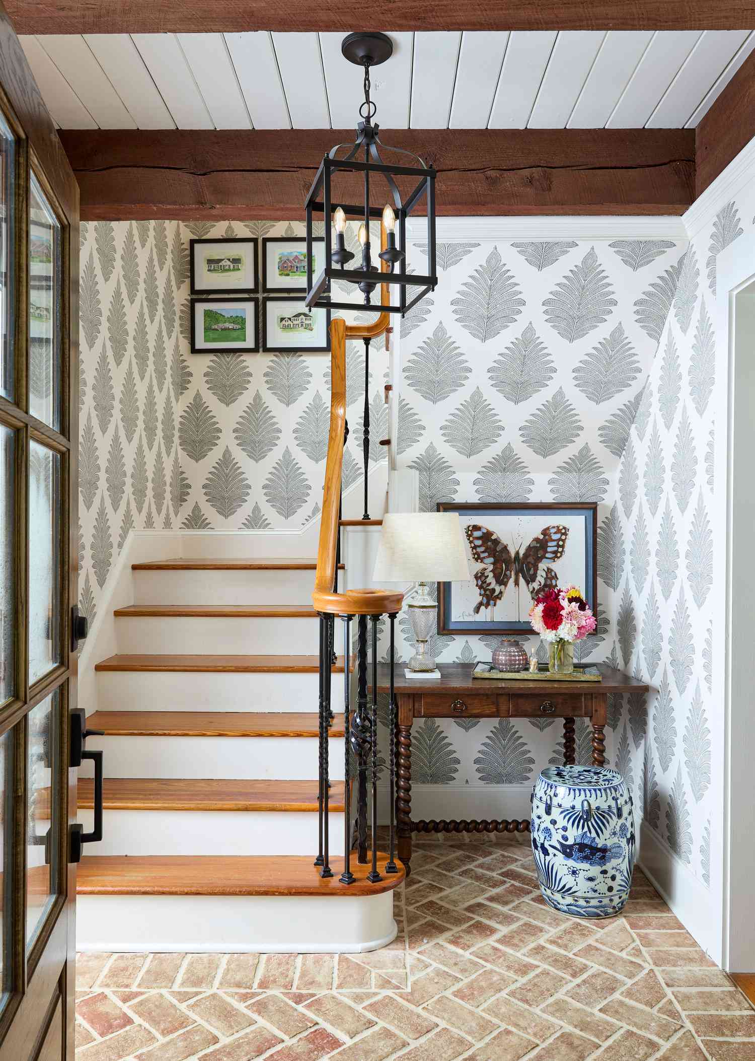
A look this minimal is beautiful, but it requires a life that is equally minimal, at least by the front door. There is nowhere to hide anything. No drawers for mail, no hooks for keys (unless they’re hidden in a decorative box), no basket for shoes. This aesthetic is a commitment to having a designated place for everything and putting it there, always. It’s gorgeous inspiration, but for many of us, it’s more of an aspirational goal than a daily reality. Be honest with yourself about your clutter tolerance before committing to this level of simplicity.
18. A Bright Entry with a White Fluted Console and Shiplap Walls
This bright and welcoming look is a study in layering neutrals. The formula is: 50% white textures (the fluted console, the shiplap), 30% serene color (the light gray upper walls), 10% warm wood (the floor), and 10% dark accents (the mirror frame and basket). This balance prevents an all-white space from feeling sterile. The gray adds softness, the wood adds warmth, and the black adds a necessary grounding point for the eye. This is a versatile formula that feels both timeless and fresh.
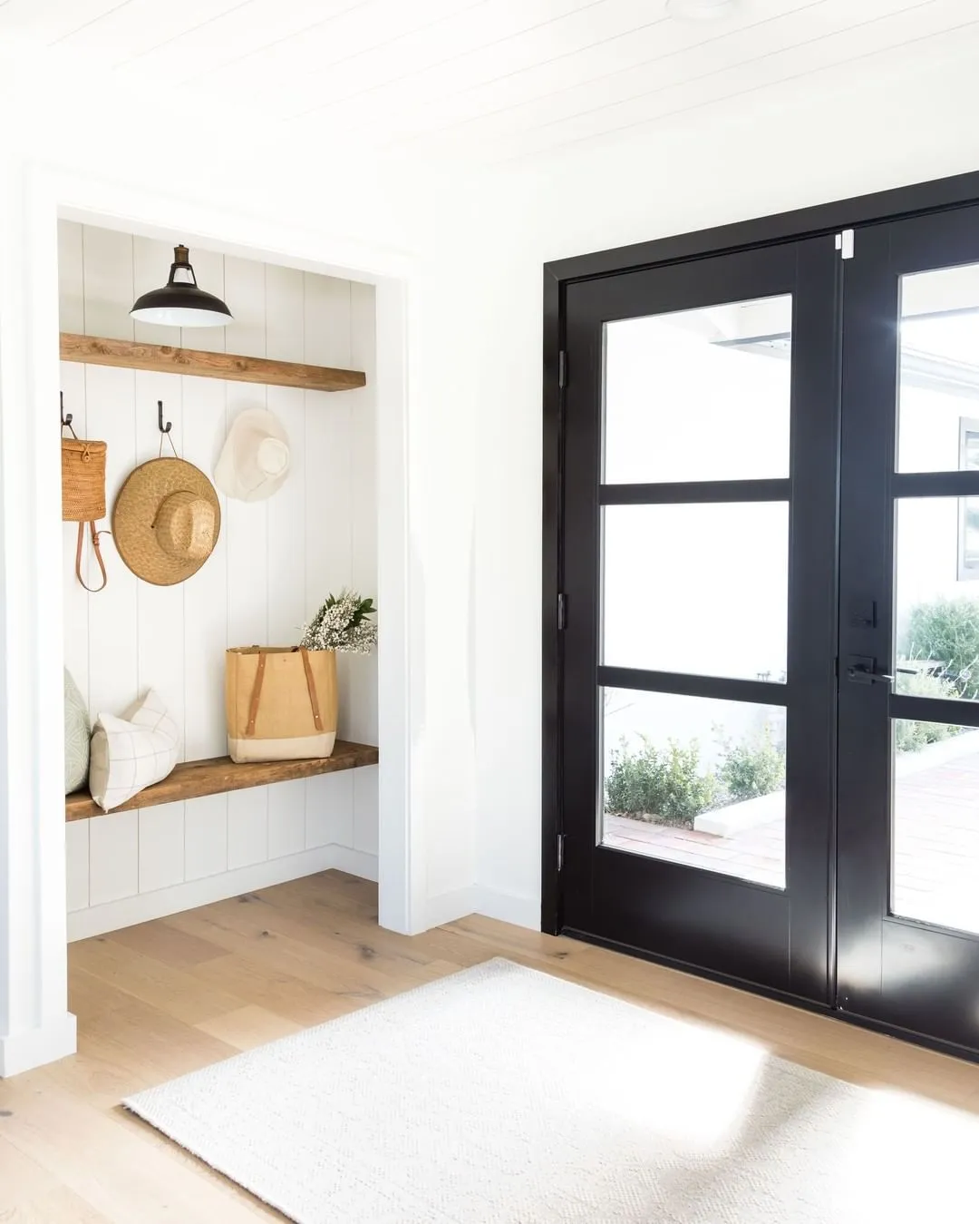
Installing a two-tone wall with a chair rail is a great way to add architectural interest. Here’s the short version:
- Decide on the height for your chair rail. A common height is 32-36 inches from the floor.
- Install your lower wall treatment (in this case, shiplap panels). Cut them to your determined height.
- Install the chair rail trim piece along the top edge of the shiplap, ensuring it’s level. Use a nail gun for a clean finish.
- Caulk the seams and fill any nail holes.
- Paint the upper wall, the chair rail, and the shiplap. Using painter’s tape will give you crisp lines between the colors.
This is a weekend project that dramatically changes a room’s character.
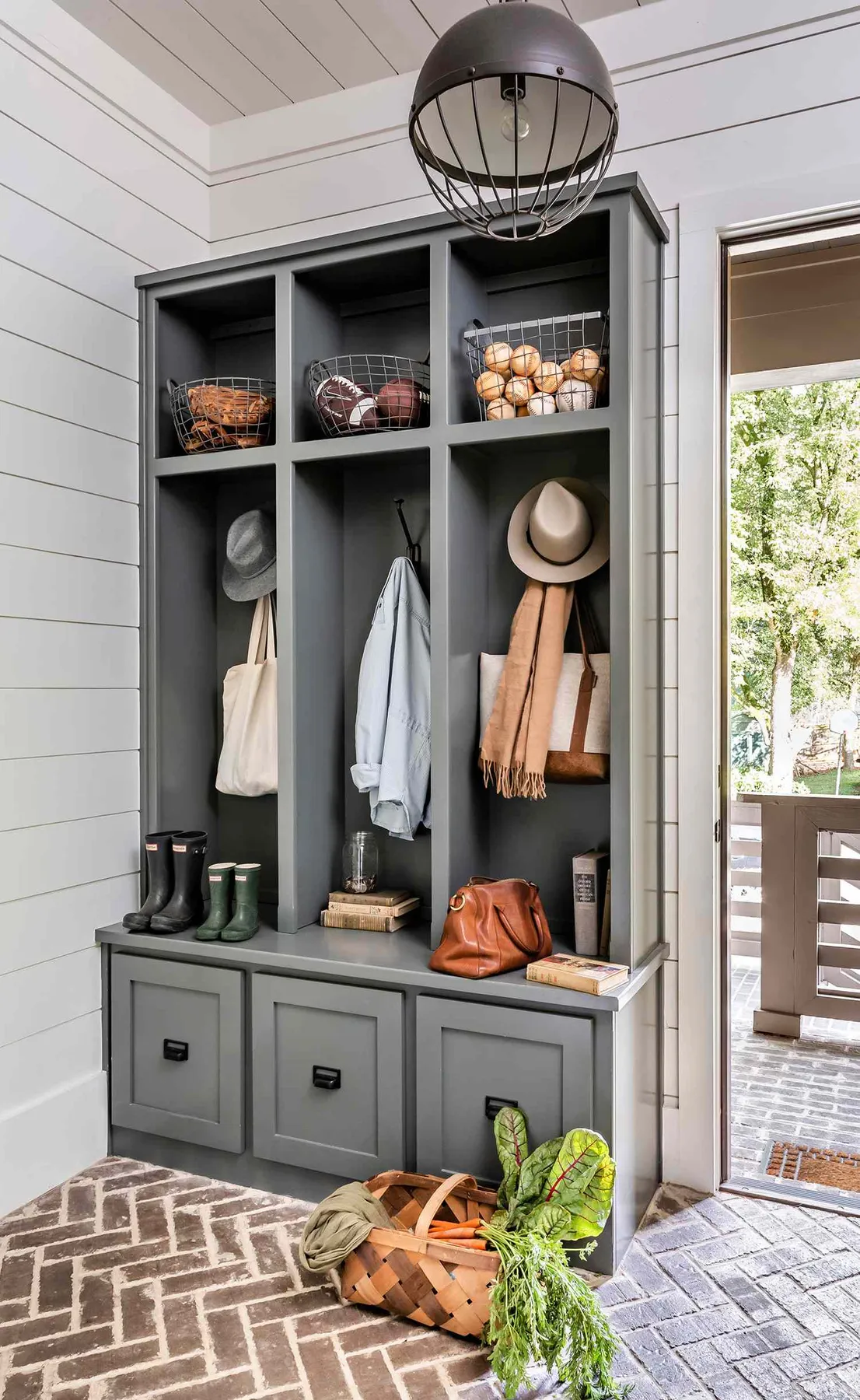
19. A Rustic Modern Mudroom with a Dark Gray Shiplap Unit
A dark, matte paint finish like this handsome gray looks incredible, but it’s not the most durable choice for a high-traffic mudroom bench. Matte finishes are notoriously difficult to clean; scuffs and smudges tend to show up easily and can’t be wiped away without leaving a shiny spot. For a bench that will see daily use, you’d be wise to use a satin or semi-gloss finish in the same color. It will be much more forgiving and wipeable. The wooden pegs are also prone to chipping the paint around them from metal hangers or keys.
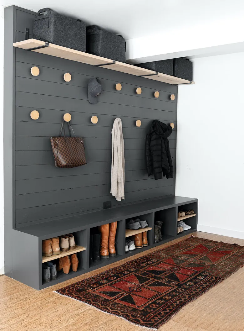
Don’t have the budget for a custom built-in? You can get a very similar look by faking it. Start by painting the entire wall niche a dark gray. Then, install a simple floating bench (or a leggy bench that fits snugly). Above it, mount a pre-made wooden peg rail from a store like The Container Store or Etsy. Finish with a floating shelf from IKEA or Target. You get the same layered, functional look for a fraction of the cost and with much less construction. The distressed rug is a key component you can find on sites like Rugs USA for under $150.
20. A Neutral Nook with Patterned Wallpaper and a Wood Bench
This small space feels so special because it expertly layers pattern and texture within a tight, neutral palette. The subtle, light-patterned wallpaper adds depth and a bespoke feel without overwhelming the narrow wall. The woven shelf on the bench, the textured rug, and the woven storage baskets all contribute different organic textures. The round gold mirror and the dark plant pot provide contrasting shapes and finishes, making the whole composition feel dynamic and thoughtfully curated, not cluttered.
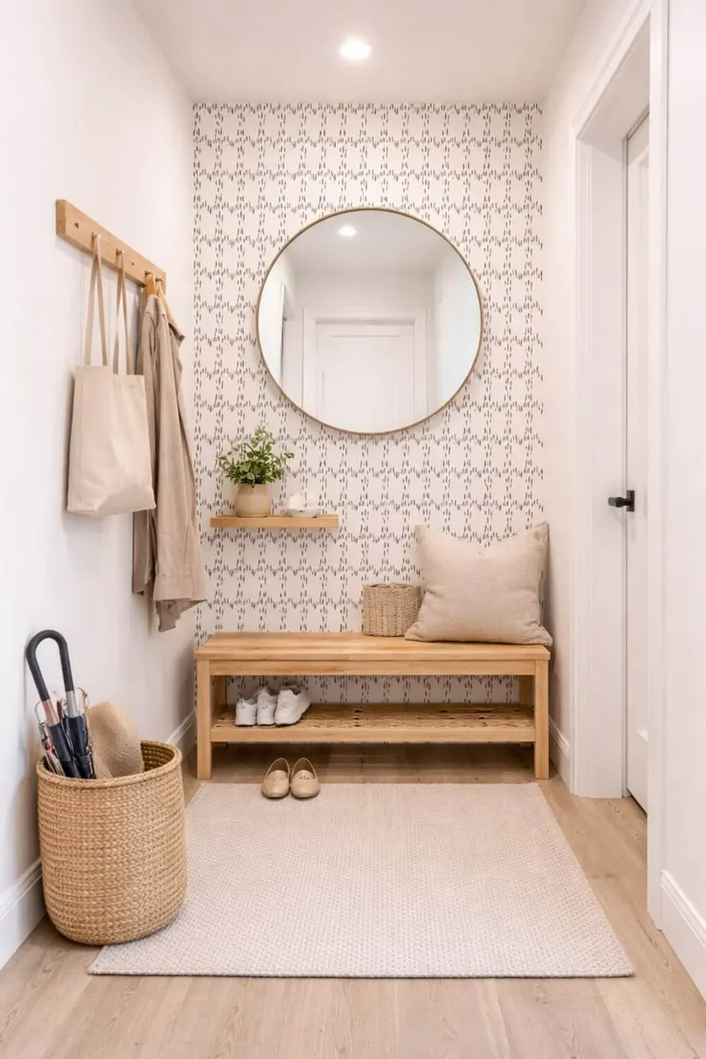
In a narrow hallway or entryway, a bench with legs is always a better choice than a solid one that goes to the floor. By allowing you to see the flooring underneath, it creates a sense of openness and makes the space feel wider and less crowded. This bench is a perfect example—the woven lower shelf provides useful storage while maintaining that airy, open feeling. It’s a simple visual trick that has a huge impact on the perception of space.
21. Symmetrical Style: Fluted Console with a Round Mirror and Twin Lamps
The single most important element making this entryway work is symmetry. The perfectly centered mirror, flanked by two identical black lamps, creates an immediate sense of calm, order, and formality. It’s a classic, foolproof design principle that just works. If you were to have only one lamp, or two different lamps, the entire feeling of the space would change from polished and intentional to something much more casual. The strict symmetry is what gives it that hotel-lobby-chic vibe.
This look is clean and beautiful, but it requires two outlets on that wall, or some creative cord management. Having two lamp cords dangling down can instantly ruin the sleek, symmetrical effect. You might need to have an electrician install an outlet behind the console, or use cord covers painted to match the wall. It’s a small, practical detail that is absolutely crucial to pulling off this polished look. Without it, you’ll be left with a beautiful setup undermined by messy wires. This is less busy than the setup in Idea #22, which uses wall sconces instead.
22. Elegant Entry with a Dark Wood Console and Brass Sconces
For wall-mounted sconces flanking a mirror, placement is everything. The general rule is to mount them so the center of the light source is at or just above eye level, which is typically 60-66 inches from the floor. This provides flattering, non-shadowy light. Spacing is also key. You want the sconces to be a few inches away from the edge of the mirror, not crowding it. For a large mirror like this one, placing the center of each sconce about 3-6 inches from the mirror’s edge creates a balanced and harmonious composition.
|
📋 Copy HEX 🔗 Share |
Hardwiring sconces is a commitment. Before you call the electrician, make sure this is the forever layout for your entryway.
- Confirm Furniture Placement: Is this console table the final piece? The sconces are being placed relative to its width and height. Swapping it for a different sized piece later could throw off the whole balance.
- Check Your Wall: Are there studs exactly where you need to mount the electrical boxes? Your electrician will check this, but it’s good to have a general idea.
- Consider the Switch: Where will the switch for the sconces go? Will it be conveniently located, or will you need to add a new one?
23. A Highly Organized Garage Mudroom with Grey Slatwall
This is the absolute peak of entryway function, and it works because of its cohesive system. The consistent use of light grey, dark grey, and black creates a clean, uniform look that belies the sheer amount of stuff being stored. The slatwall is the hero, offering incredible flexibility to move hooks and baskets as needs change. The integrated bench provides a place to sit, while the cubbies below keep shoes off the main floor. This isn’t just storage; it’s an organizational machine.
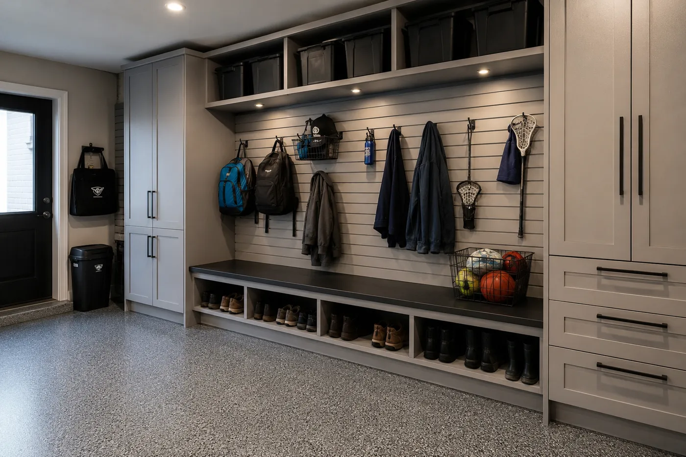
An entryway this close to the garage is going to see a lot of dirt, grease, and grime. The speckled epoxy floor is a brilliant choice here—it’s incredibly durable, easy to mop, and the pattern is exceptional at hiding dirt. The matte black hardware, while stylish, will show fingerprints and smudges, so keep a microfiber cloth handy. The biggest task will be periodic clear-outs of the open shelves and bins, which can easily become a graveyard for things that don’t have a proper home elsewhere.
24. Bright White Built-in Mudroom with Wood Benches and Colorful Bins
A full wall of built-in storage is a game-changer for a family. Here is a sample budget for a similar project:
- Main Unit (Semi-custom or custom cabinetry): $4,000 – $10,000
- Wood Bench Tops (Butcher block): $400 – $1,200
- Flooring (LVT or tile, installed): $800 – $2,500
- Decor/Accessories (Baskets and bins): $200 – $500
- Labor (Installation, paint): $1,500 – $4,000
- TOTAL: $6,900 – $18,200
Budget alternative: A row of IKEA’s BESTA or PAX units can be hacked with a wood top and trim to create a similar look for 60-70% less. It’s a popular project for a reason!
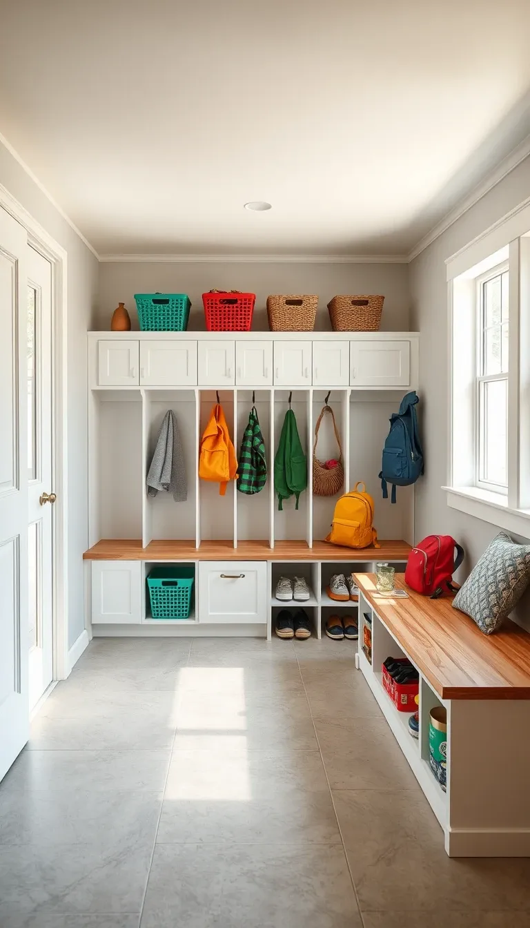
This is what an organized family entryway looks like in a magazine. What it looks like on a Tuesday morning in November is a different story. White built-ins in a high-traffic mudroom will show every single scuff, mud splatter, and crayon mark. You’ll need to be committed to frequent wipe-downs and yearly paint touch-ups to keep it looking this pristine. The light wood bench is also softer than tile or metal and can be dented by thrown-down backpacks or sharp objects. It’s beautiful, but it’s not indestructible.
25. Clean & Functional Entry with Mixed Wood Tones and a Round Mirror
This space proves you can mix wood tones successfully. The formula is: 60% neutral foundation (the light grey walls and white floors/cabinet), 20% dark wood (the doors), and 20% warm medium wood (the wall panel and mirror). The key is that the two wood tones are different enough to look intentional, not like a failed attempt to match. The white and grey act as a buffer between them, allowing both wood tones to shine without clashing. This is a much more sophisticated approach than trying to match everything perfectly.
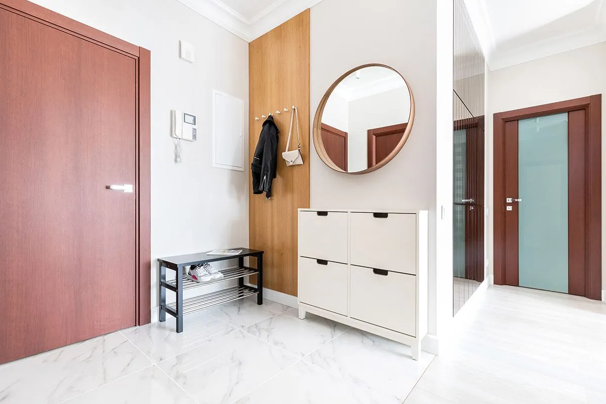
When you have multiple doors in an entryway, painting them all the same color—along with the trim—can help them recede and create a calmer, less busy space. However, if one door is the main entry and others are closets, consider using hardware to create a visual hierarchy. Here, the main doors have substantial black handles, which subtly signals their importance and adds a graphic element that ties in with the other black accents in the room, like the shoe bench and cabinet pulls.
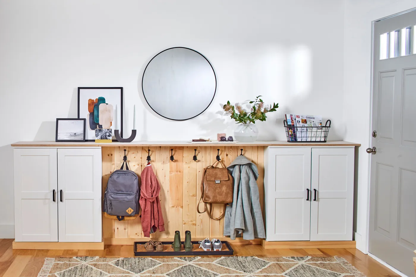
26. Minimalist Entry with a Light Wood Slat Wall and Floating Console
This design is a triumph of modern minimalism. The light wood slat wall is the star, adding warmth and deep texture without adding any clutter or color. It creates a focal point that feels architectural. The white floating console seems to emerge from it, enhancing the clean, weightless feeling. The large, frameless mirror is a clever choice; by not having a frame, it doesn’t compete with the slat wall, instead simply reflecting the space and amplifying the light. Every element is simple, but together they create a rich, layered look.
|
📋 Copy HEX 🔗 Share |
Creating a slat wall accent is a popular and impactful DIY project. Here’s the quick version:
- Choose your wood slats. 1×2 oak or maple boards are common choices.
- Prepare your wall. Paint it a dark color (black or charcoal) first. This will make the gaps between the slats disappear and create depth.
- Cut your slats to the desired height. Ensure they are all identical.
- Use a nail gun and construction adhesive to attach the slats to the wall. Use a spacer block (a scrap piece of wood) to ensure your spacing is perfectly consistent between each slat.
- Start from one end and work your way across, checking for level as you go.
This can take a full day, but the result is transformative.
27. A Breezy, Natural Entryway with a Woven Rattan Bench
The large natural fiber rug is the foundational piece that makes this whole casual, coastal vibe work. It immediately signals a relaxed, textured, and nature-inspired aesthetic. It defines the entryway zone, adds a huge dose of warmth to the light wood floors, and its organic material connects with the rattan bench and bamboo mirror. Without this rug, the bench and hooks would just be furniture against a wall; with it, they become part of a complete, cohesive look.
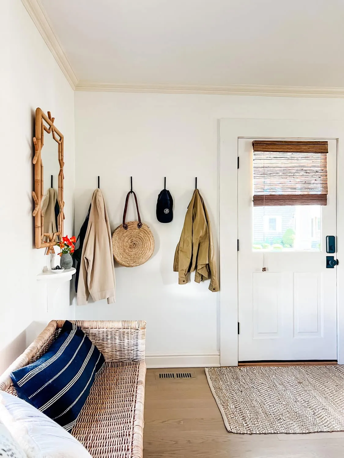
This breezy, natural look is one of the most budget-friendly styles to achieve. Rattan and natural fiber pieces are widely available at affordable prices. Look to IKEA for a similar bench (like the TOLKNING series), Target for woven rugs and baskets, and World Market for bamboo mirrors. The black wall hooks are a hardware store basic. You could recreate this entire organized and stylish entryway for under $300 if you shop smart. It’s proof that good style doesn’t require a huge budget.
28. Bright & Modern: Floating Console and White Vertical Paneling
The vertical white paneling on the accent wall is a brilliant trick for spaces with standard-height ceilings. The strong vertical lines draw the eye upward, creating the illusion of more height and making the entire entryway feel taller and more grand. It adds sophisticated texture and architectural interest without the cost of complex millwork. Paired with a floating console, which reveals the floor underneath, it makes the whole area feel more spacious and airy.
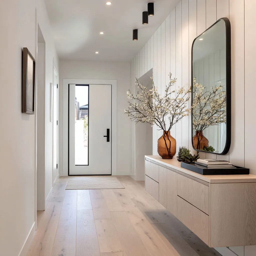
This composition is all about playing with proportion, and it works best in an entryway with at least 8-foot ceilings and a wall width of 6 feet or more. The large, rectangular mirror needs space to feel balanced, not cramped. A good rule of thumb is to choose a mirror that is about two-thirds the width of the console table it hangs above. Here, the mirror and console are perfectly scaled to each other and to the wall, creating a pleasing and harmonious focal point.
29. Fresh Entry with White Paneled Doors and Travertine-Style Floor
This entryway feels so fresh and clean due to the repetition of simple, strong elements. The three white paneled doors with their matching black hardware create a powerful rhythm and a sense of order. The dark, round mirror echoes the dark door hardware, tying the look together. The introduction of large green plants in textured white pots adds a vital layer of organic life and softness, preventing the space from feeling too stark or clinical. It’s a balanced mix of architectural structure and natural vitality.
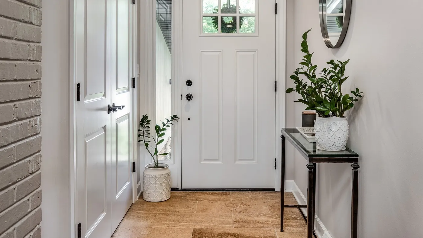
That beautiful travertine-style tiled floor is a great choice for an entryway. Ceramic or porcelain tile is durable and easy to clean. However, the grout lines are the weak spot. Light-colored grout will inevitably get stained and dingy from foot traffic and mopping. When installing, opt for a medium-gray or tan grout that complements the tile, as it will be much more forgiving. Also, make sure to seal the grout every year or two to protect it from absorbing dirt and moisture. This will keep it looking fresh for much longer.
30. Romantic Entry with a Distressed White Console and Pink Florals
The sheer, unapologetic abundance of the pink and white floral arrangements is what defines this look. This isn’t just a small bud vase; it’s a statement. The flowers transform a simple console table into a romantic, almost ethereal focal point. They introduce softness, color, and a sense of life that elevates the entire space. If you replaced the flowers with a lamp and a few books, the vibe would shift from soft and welcoming to something much more generic. The florals are everything here.
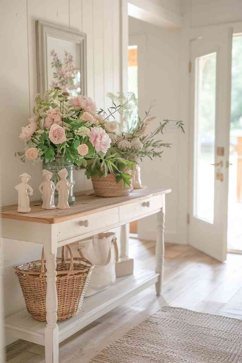
This look is a perfect example of the Romantic Academia or Cottagecore trends that have been huge on Pinterest. It’s about creating a soft, nostalgic, and idealized version of home. The distressed furniture, the vertical paneling, the natural fiber rug, and of course, the abundant florals all tap into this desire for a serene and beautiful sanctuary. While trends come and go, the core elements here—classic furniture shapes, natural textures, and bringing the outdoors in—have timeless appeal.
Your Home’s First Impression, Perfected
Your entryway is the first word in your home’s story, so make it a good one. Whether you’re working with a grand foyer or just a sliver of wall by the door, these ideas prove that a little intention goes a long way. Pick the detail you love most and start there.
Don’t forget to save your favorite looks to your Pinterest board. When you’re ready to make a change, you’ll have all your inspiration in one place.


