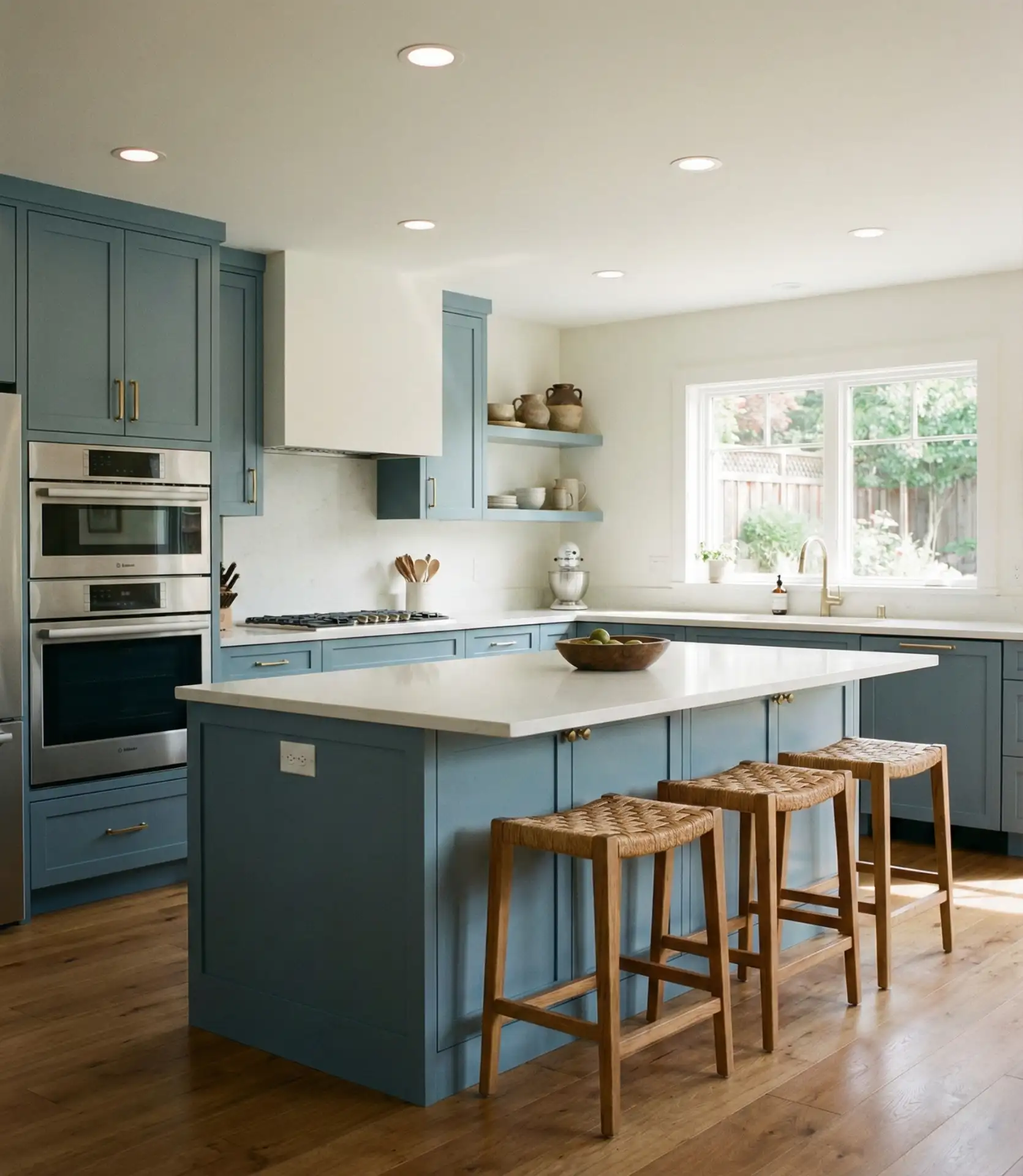
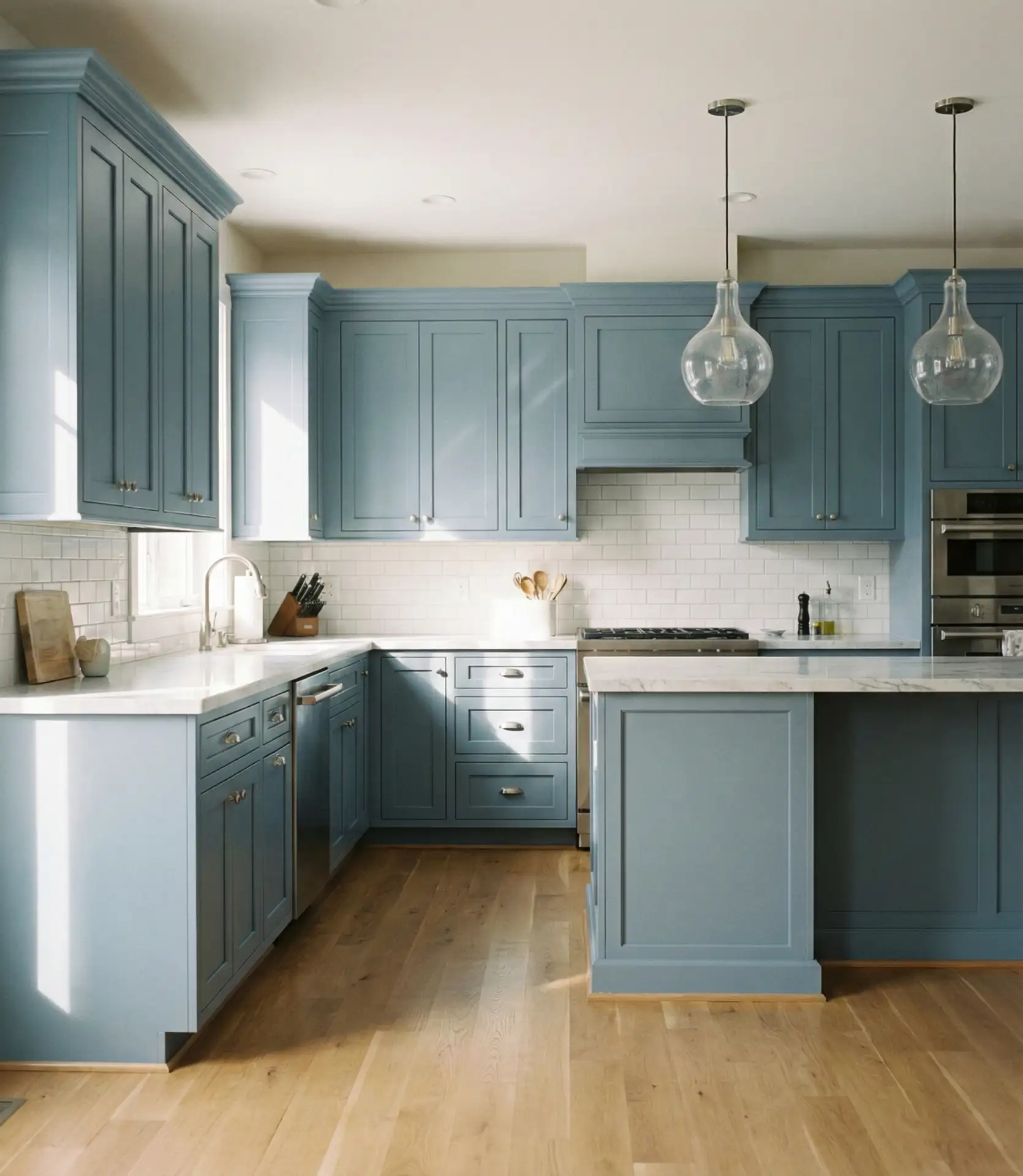
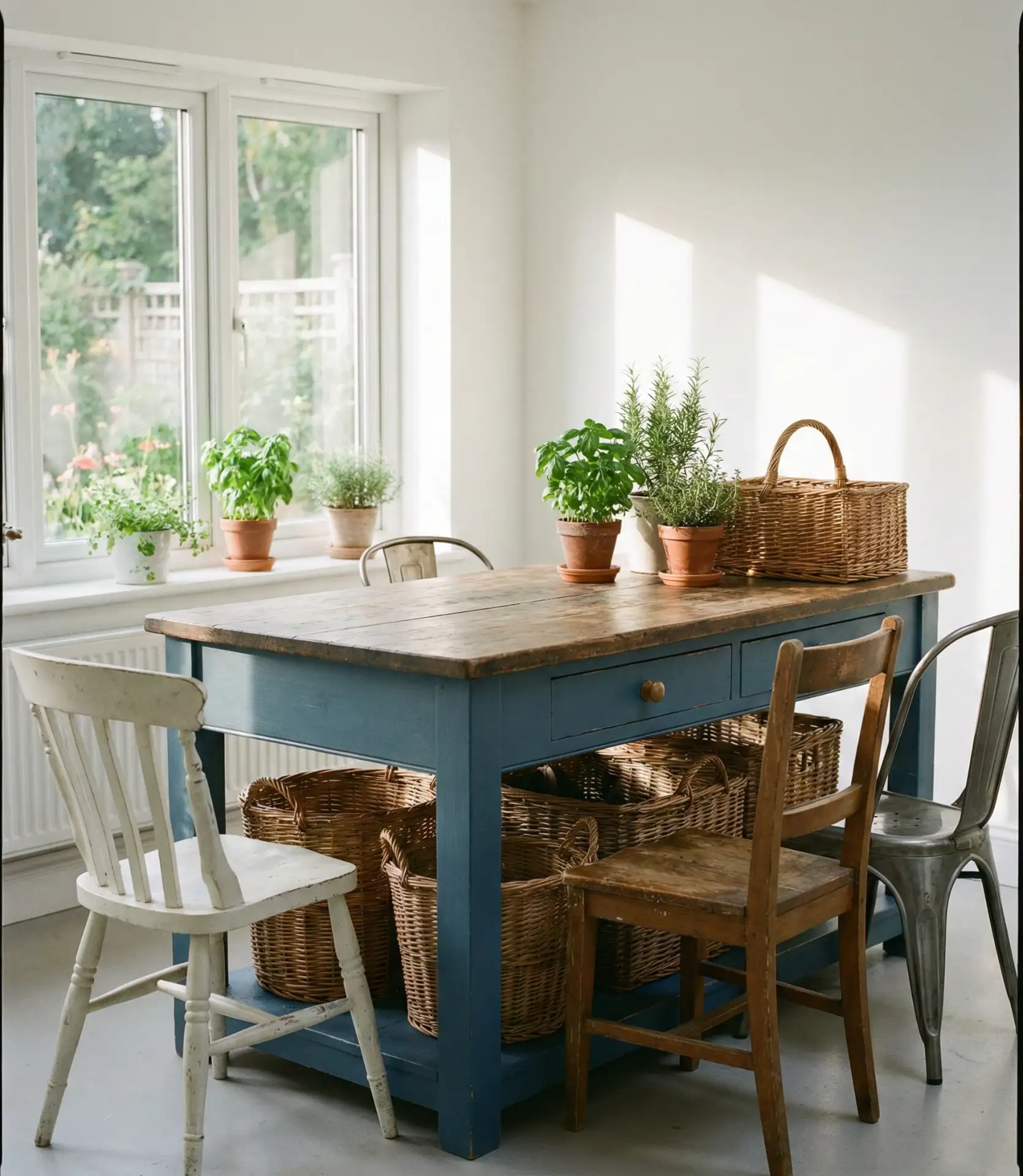
Blue kitchens have surged in popularity across American homes, transforming from a design risk into a confident statement of style. Whether your preference is for moody navy cabinetry or fresh pastel walls, 2026 is the year when blue becomes a prominent feature in kitchen design. Homeowners are turning to Pinterest for endless inspiration, searching for ways to bring depth, warmth, and personality into the heart of their homes. From coastal cottages to urban apartments, blue offers a versatile palette that works with nearly every aesthetic. In this guide, you’ll discover stunning blue kitchen ideas that balance timeless appeal with modern sensibility.
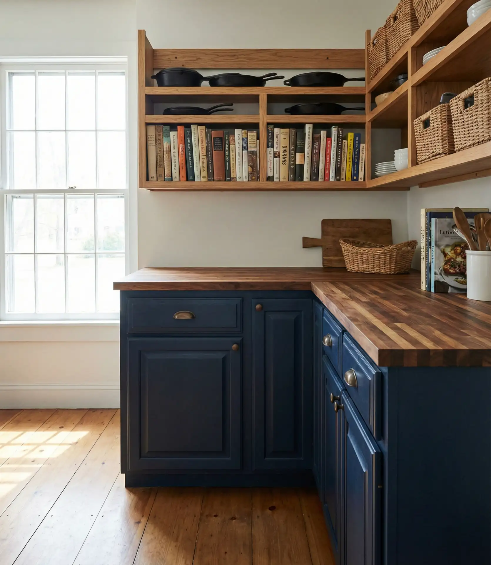
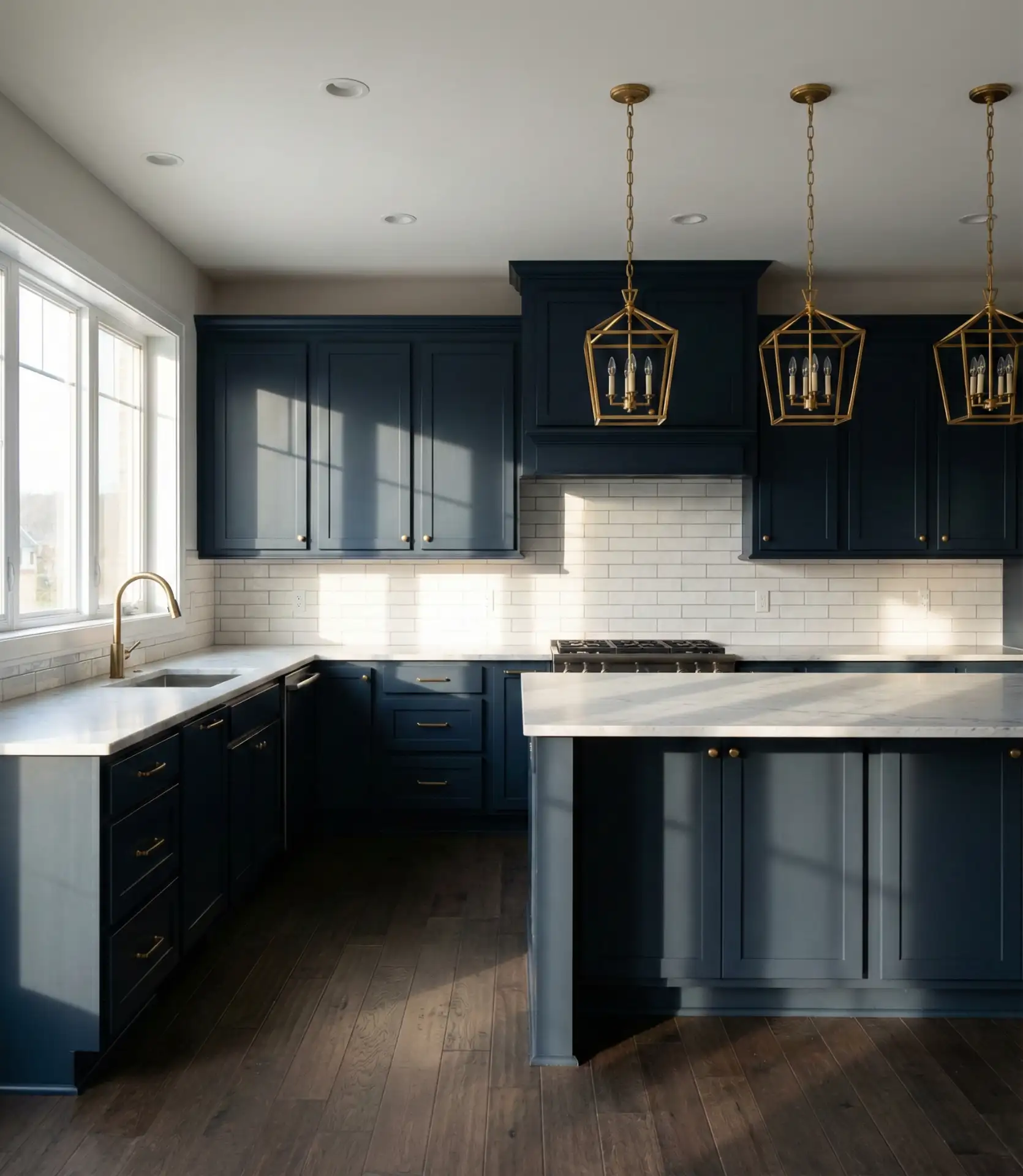
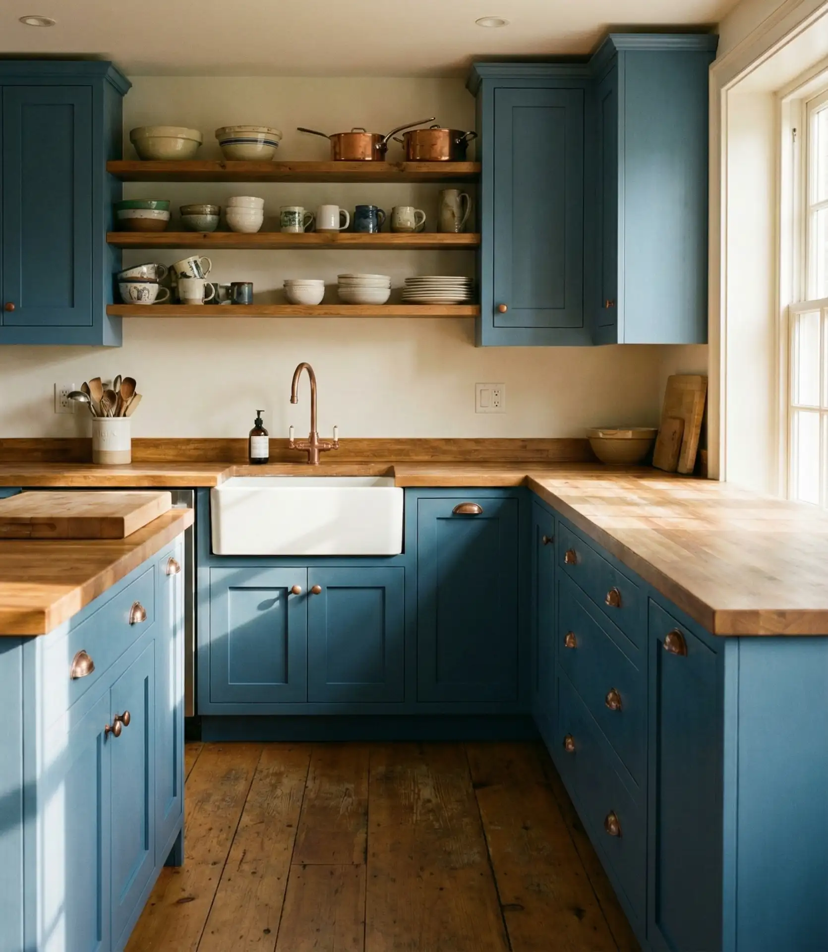
1. Classic Navy Shaker Cabinets
Shaker-style cabinetry in deep navy brings an anchor of sophistication to any kitchen layout. The clean lines and recessed panels create a backdrop that feels both traditional and modern, especially when paired with brass or matte black hardware. Navy cabinetry also hides everyday wear better than lighter tones, making it practical for busy families who want style without constant upkeep.
One common mistake is choosing navy that’s too dark for a small kitchen with limited natural light. Test samples in your actual space at different times of day before committing. If your kitchen faces north or has few windows, consider navy on an island only, keeping perimeter cabinets in a lighter tone to maintain brightness and prevent the room from feeling cave-like.
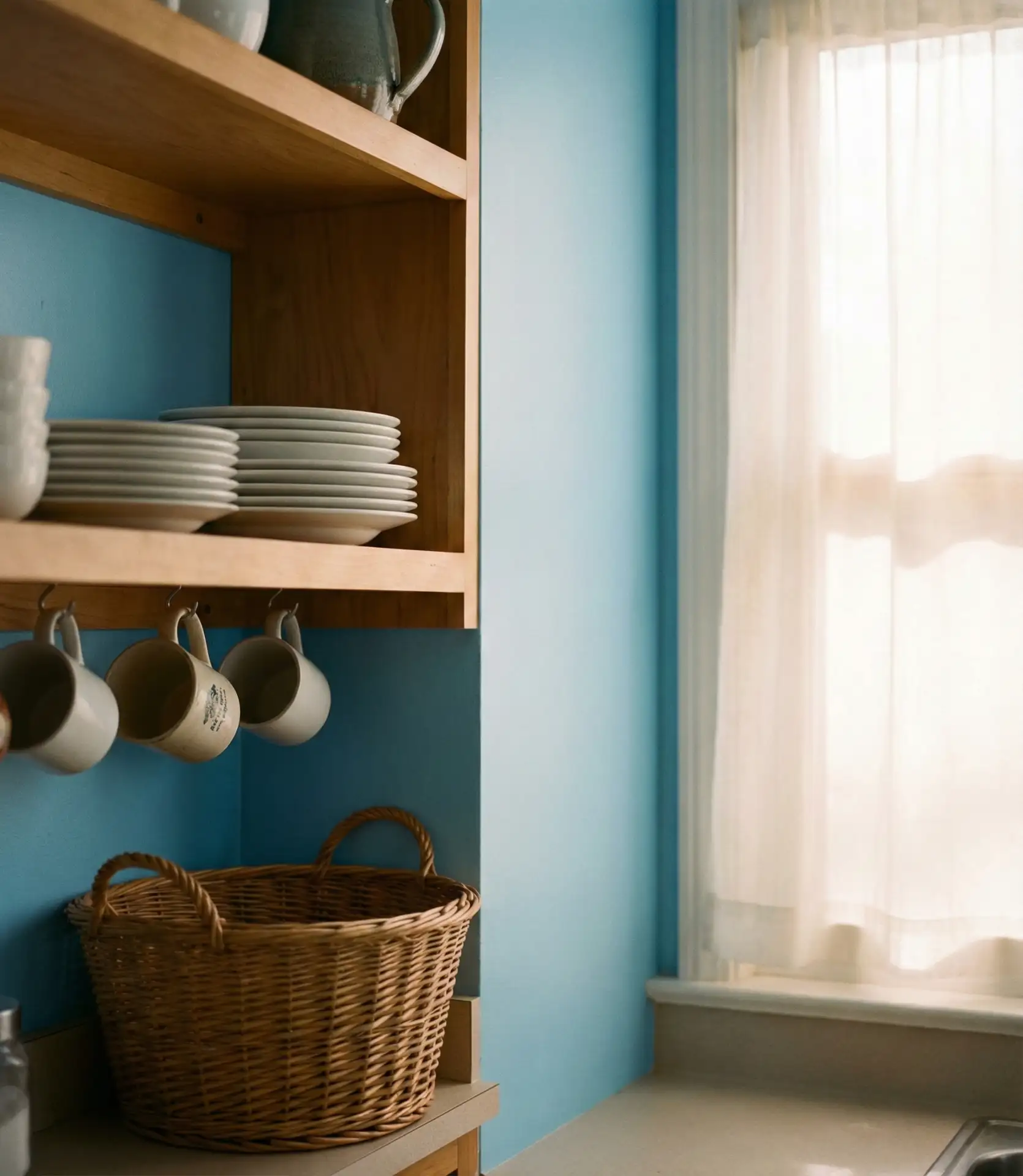
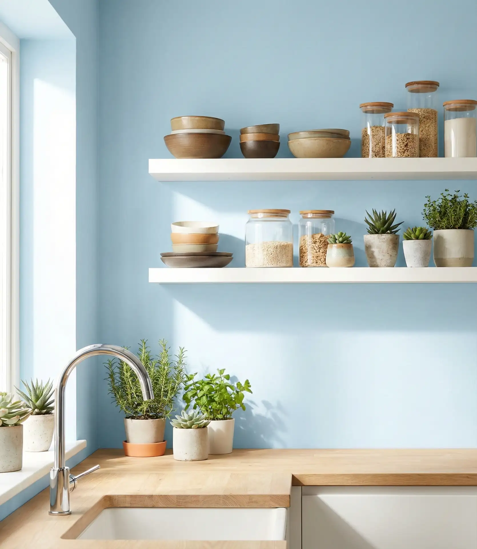
2. Soft Powder Blue Walls
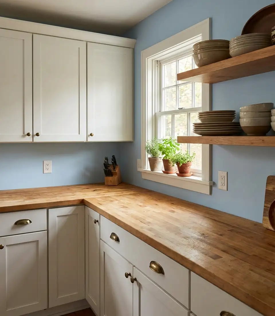
A wash of powder blue across kitchen walls creates an airy, calming atmosphere that feels especially at home in farmhouse and cottage-style spaces. This shade works as a gentle backdrop that doesn’t compete with cabinetry, allowing white or natural wood finishes to shine.
Powder blue works best in kitchens with plenty of natural light, where it reads as fresh rather than washed out. In Southern states like Georgia and the Carolinas, this shade pairs beautifully with white beadboard and vintage-inspired fixtures, echoing the region’s love for coastal and country aesthetics. It’s a forgiving color that hides minor imperfections and ages gracefully over time.
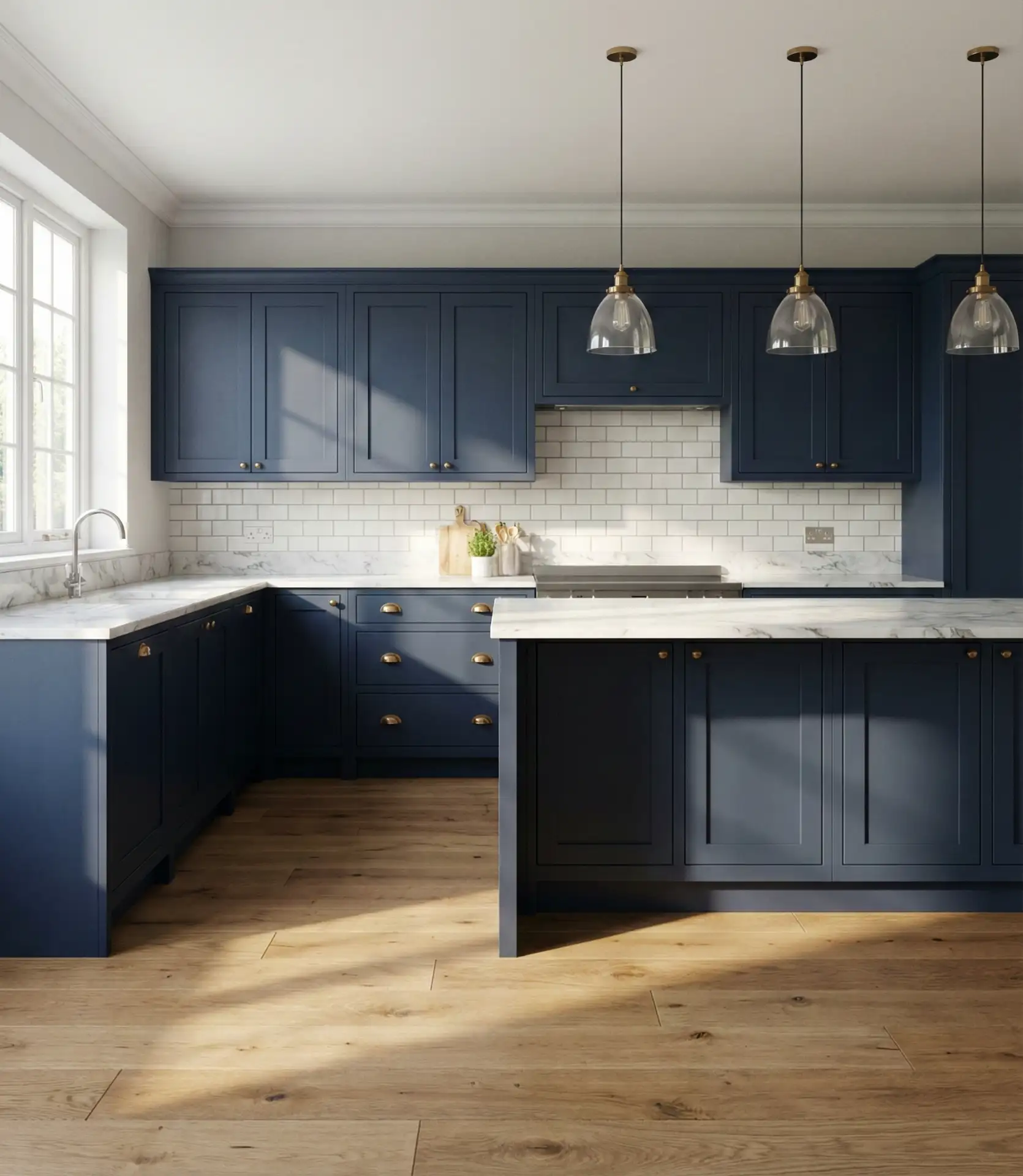
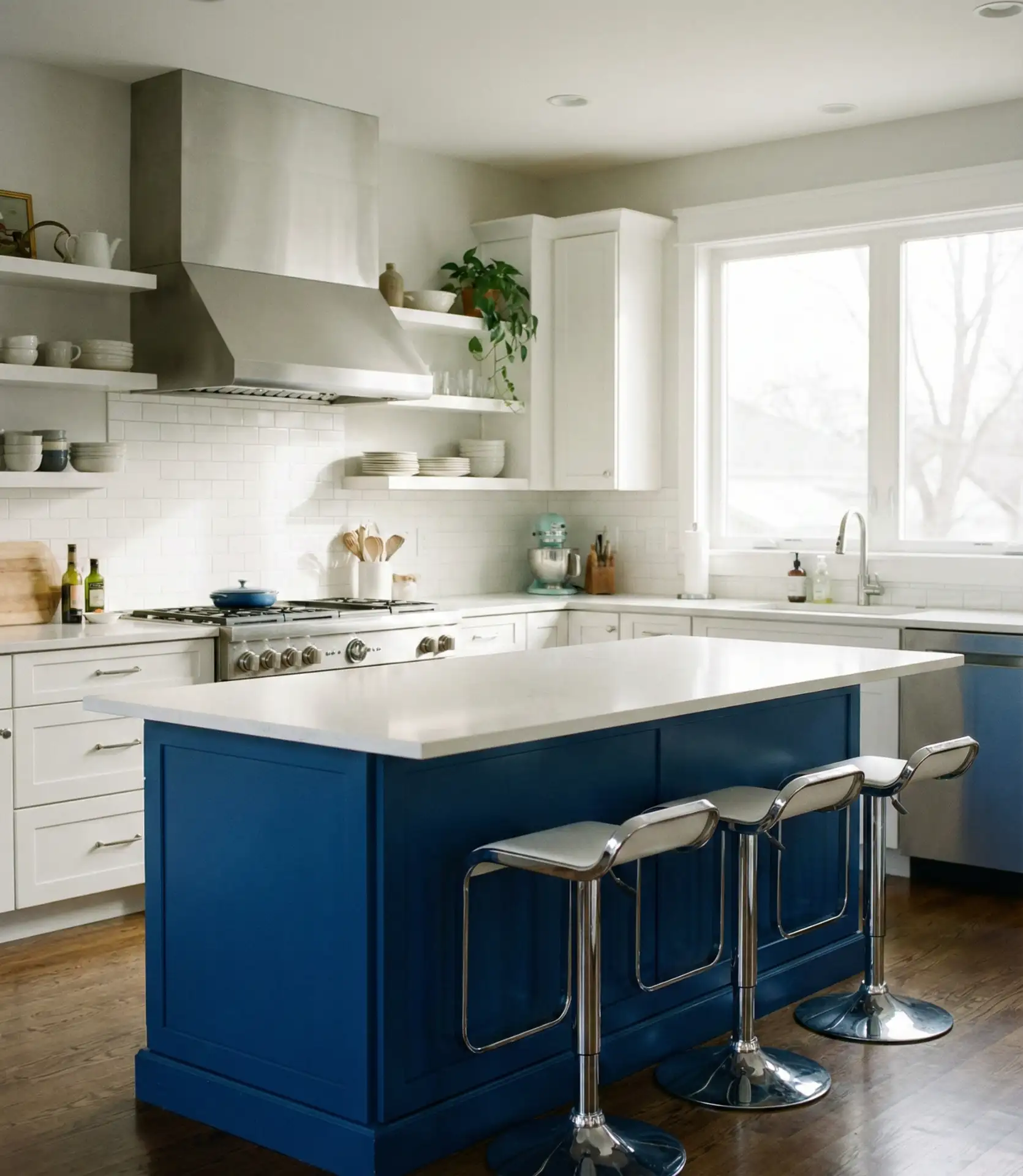
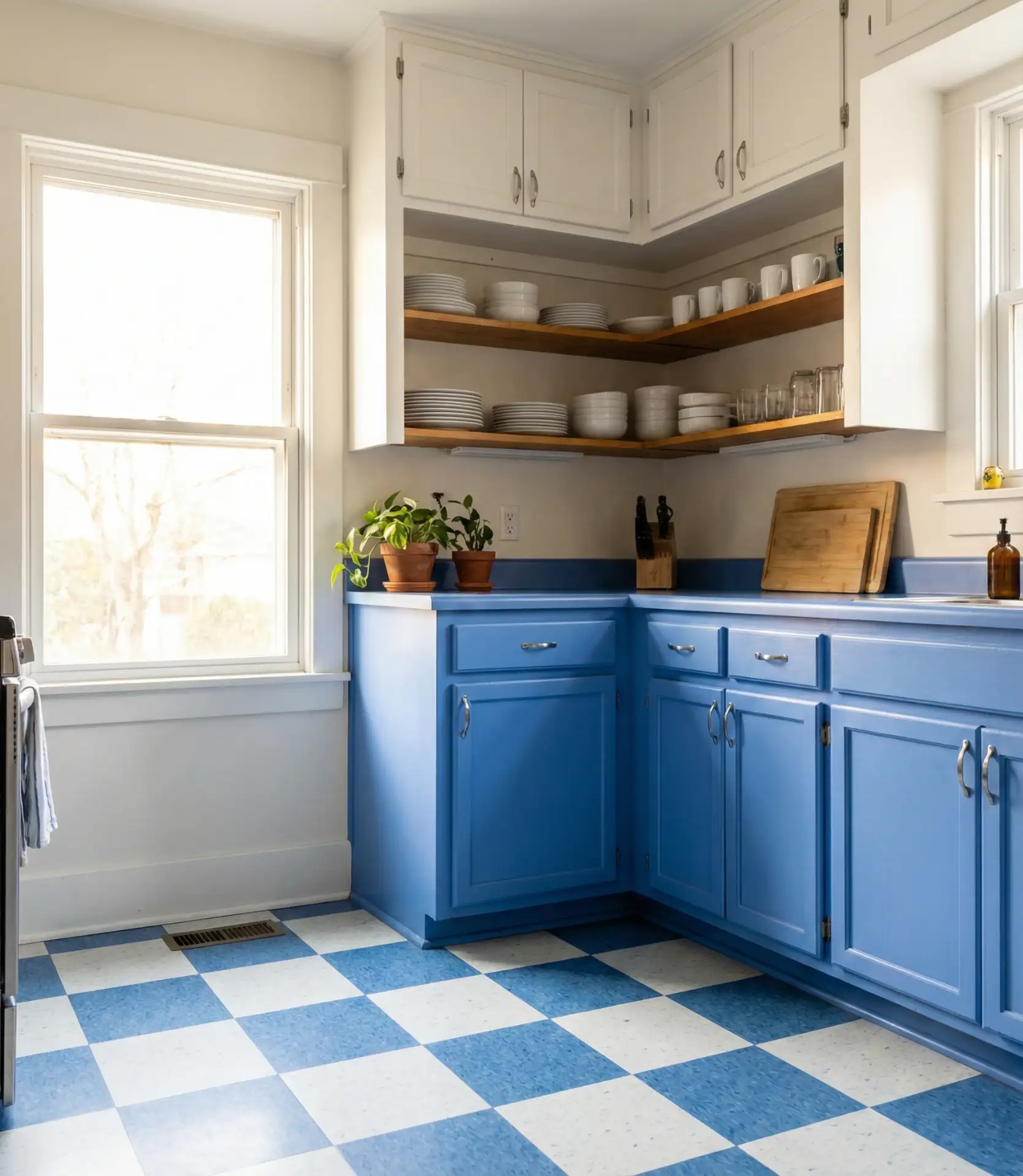
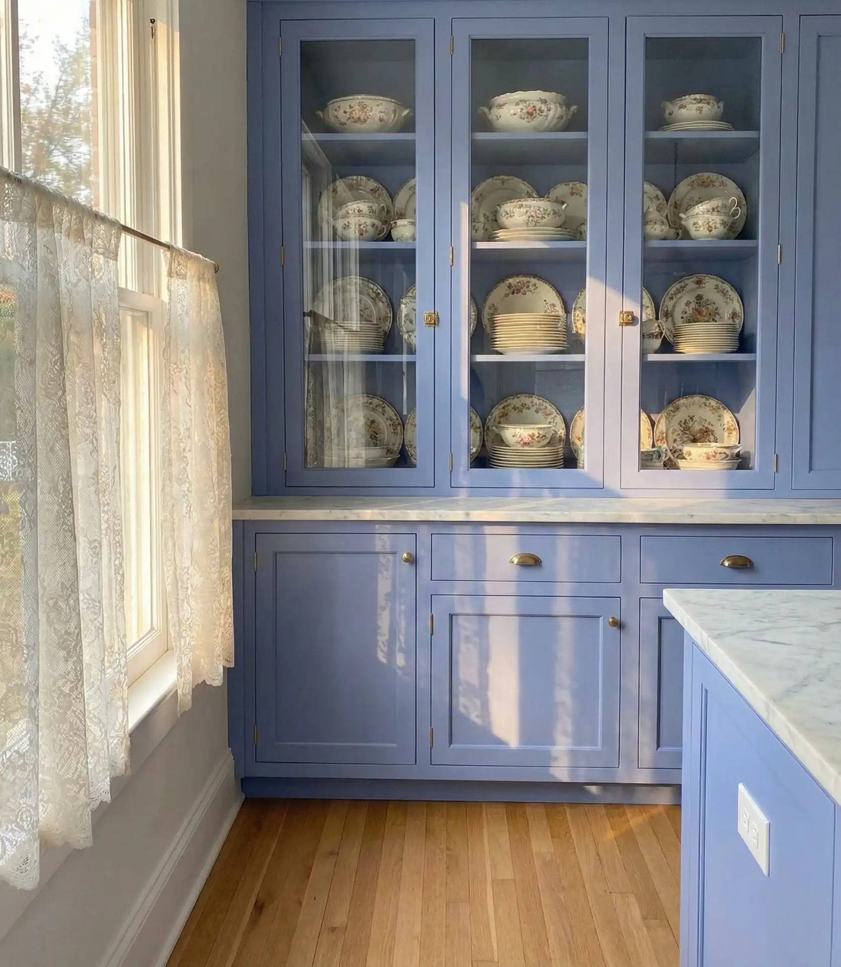
3. Two-Tone White and Navy Design
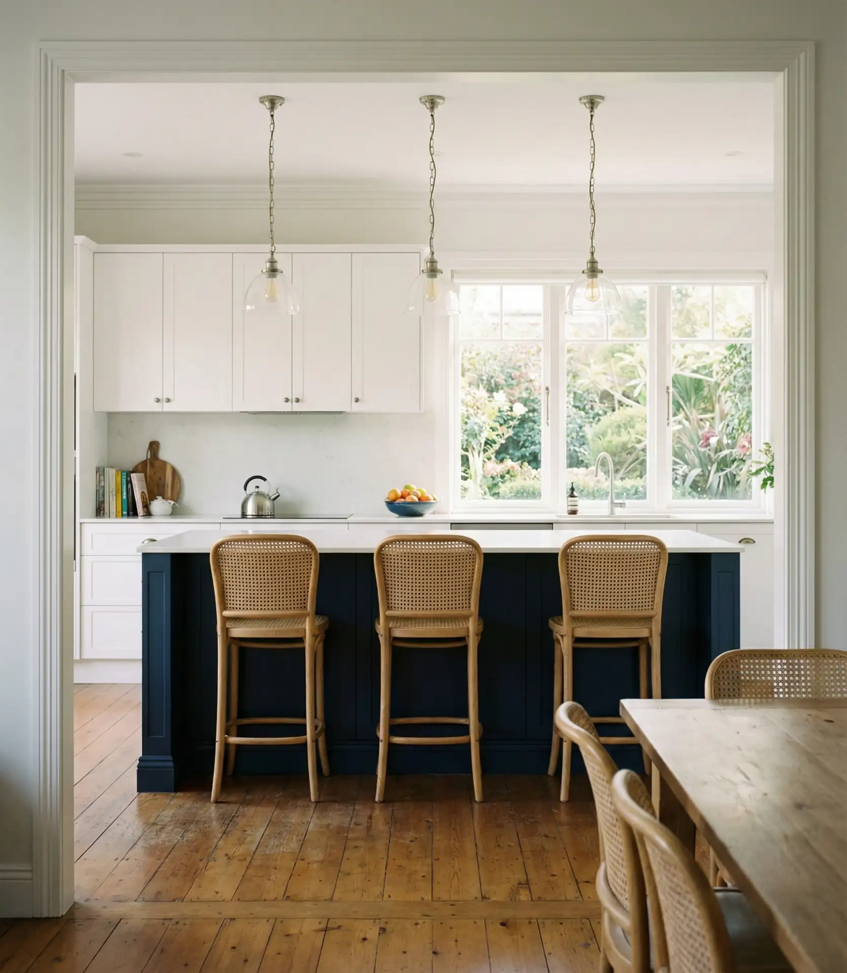
Combining white and navy cabinetry creates visual interest without overwhelming the space. Typically, designers place navy on lower cabinets or a kitchen island, with white uppers to keep the ceiling line open and bright. This two-tone approach adds depth while maintaining a clean, balanced look that appeals to both traditional and contemporary tastes.
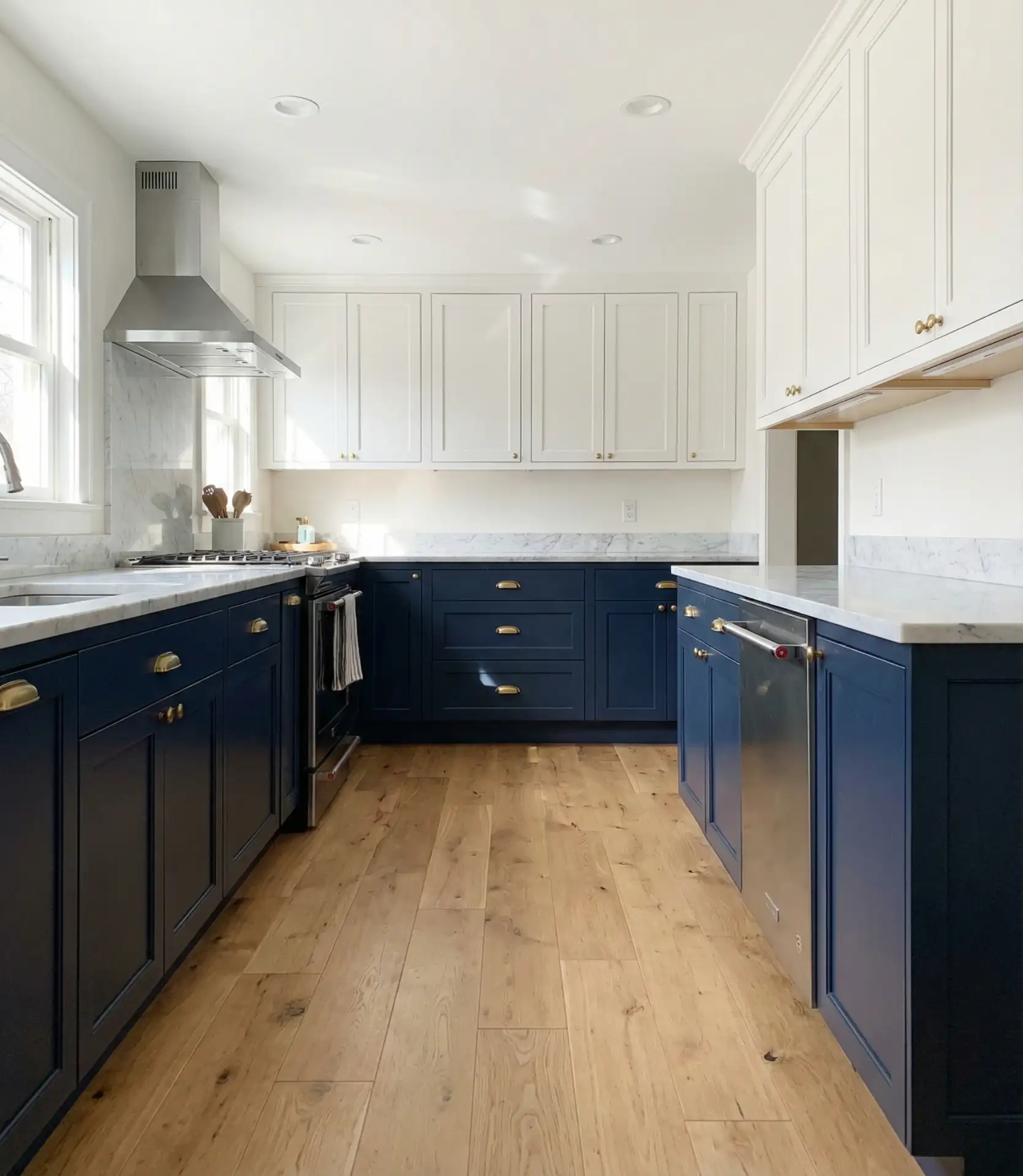
A designer once shared that the biggest advantage of two-tone kitchens is their ability to define zones. The navy grounds the cooking and prep area, while white cabinets keep the space feeling open. This design guides the eye through the room without creating visual clutter.
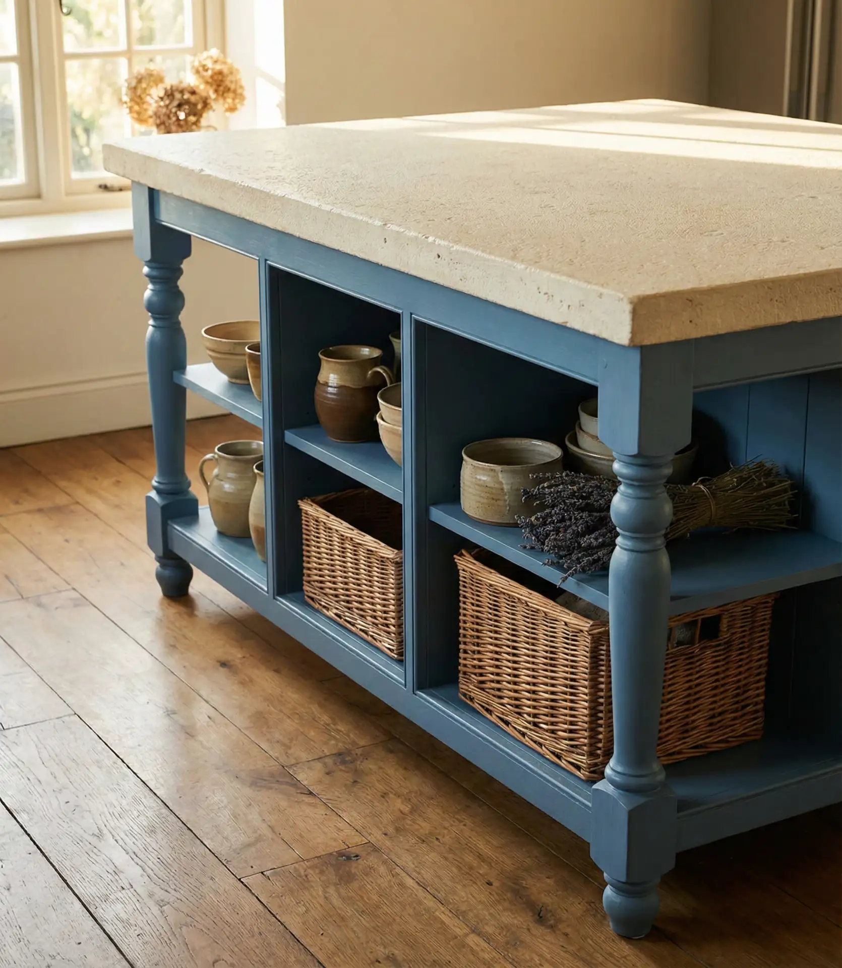
4. French Country Blue and Cream
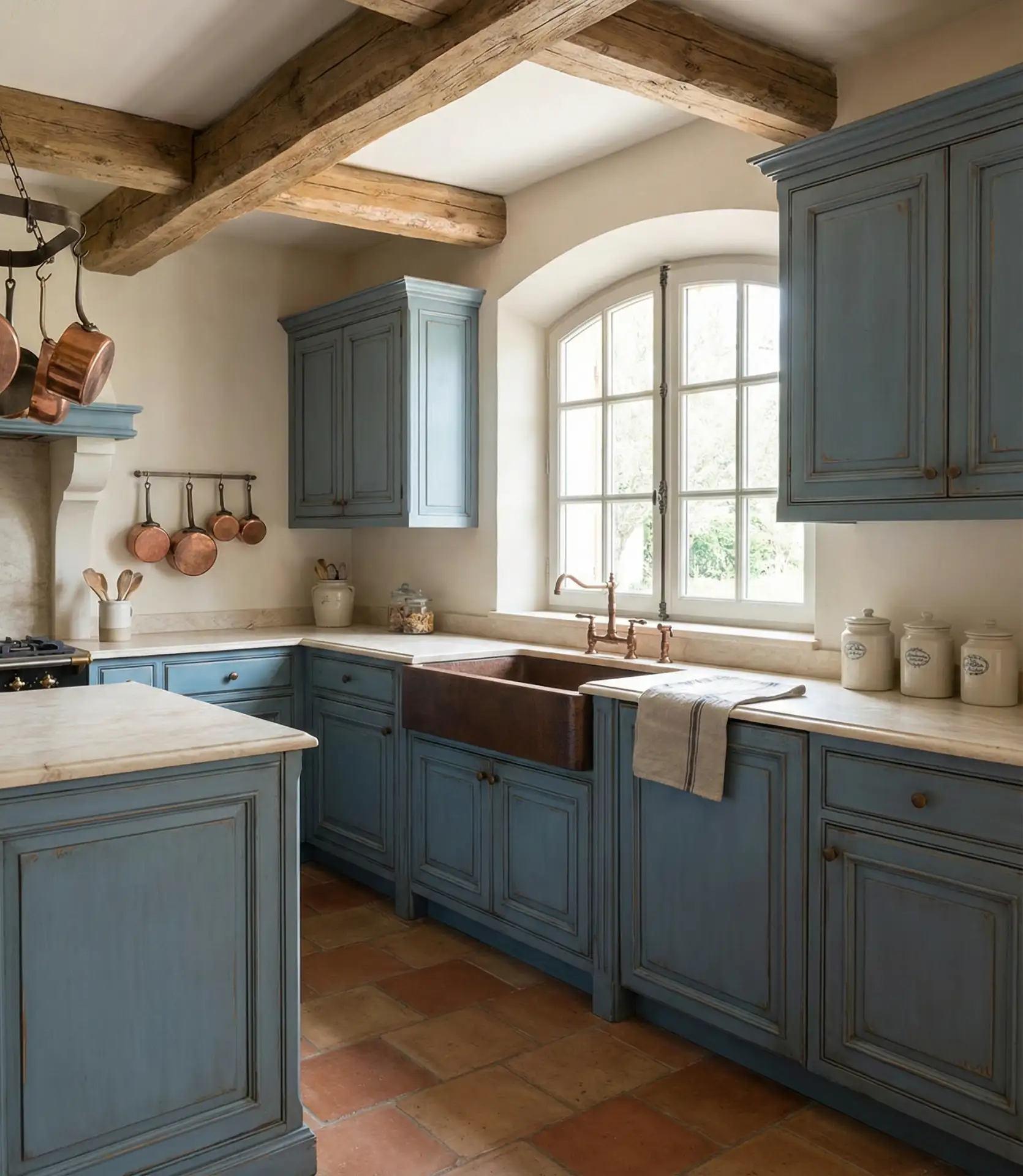
A French country kitchen embraces soft, muted blues paired with cream or ivory tones, evoking the relaxed elegance of Provence. Cabinet doors often feature raised panels or glass inserts, and hardware tends toward ornate brass or pewter finishes. This style thrives on layered textures—think exposed beams, stone counters, and linen curtains—that create a lived-in, collected-over-time feel.
On a budget, you can achieve this look by painting existing cabinets in a muted blue, swapping hardware for vintage-style pulls, and adding open shelving to display ceramics and glassware. Skip the expensive stone and use butcher block or soapstone alternatives. The key is in the details—distressed finishes, natural materials, and a refusal to make everything match perfectly.
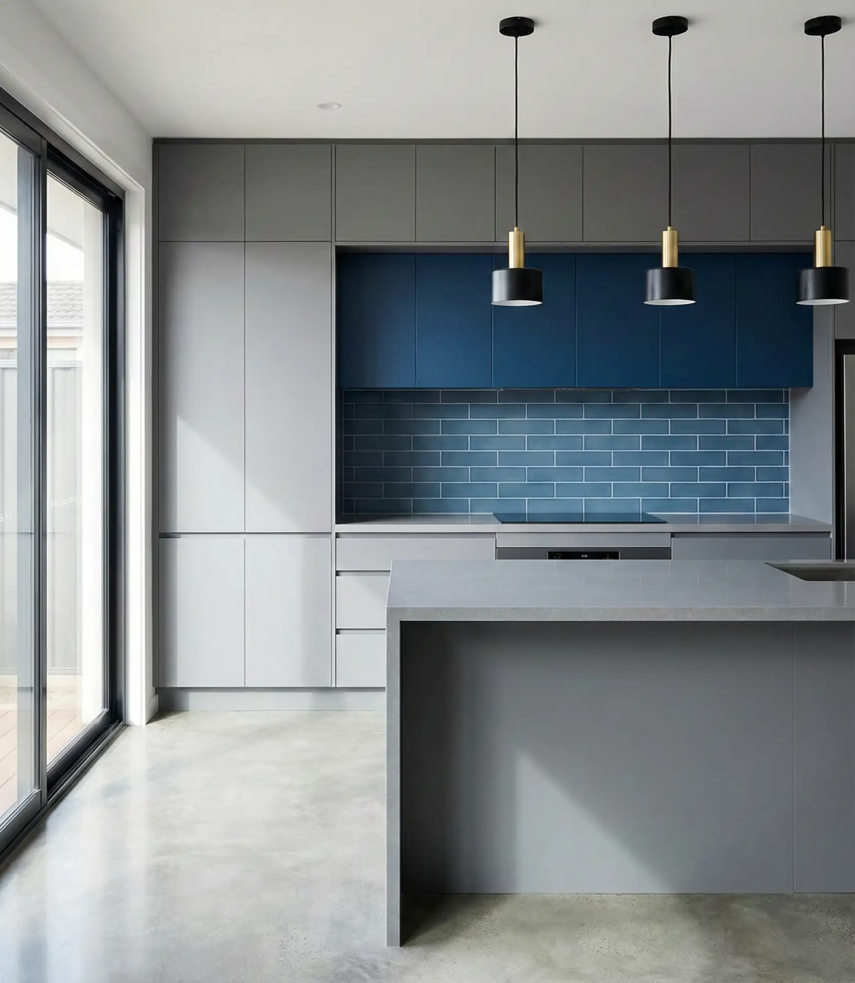
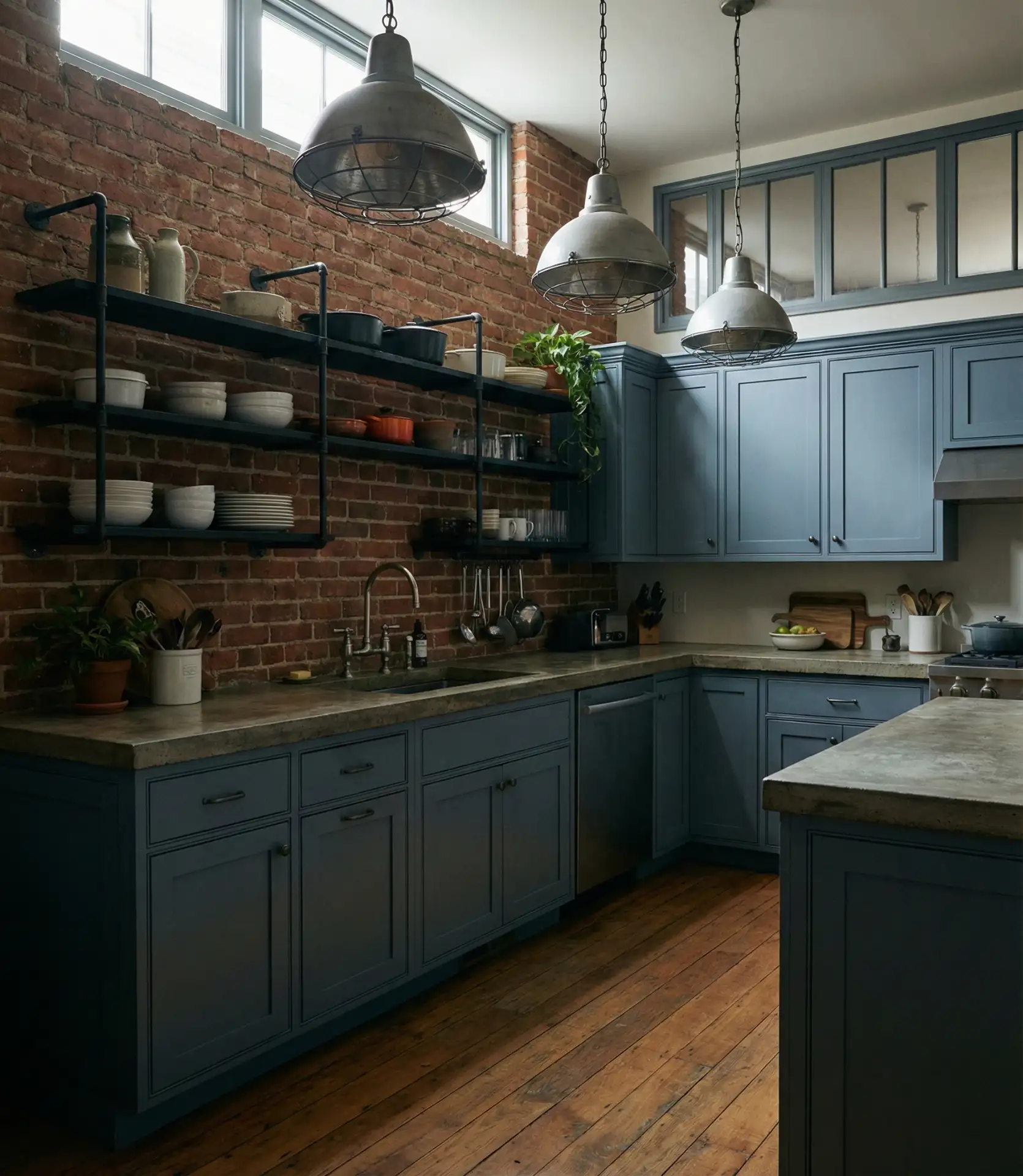
5. Moody Charcoal and Deep Blue
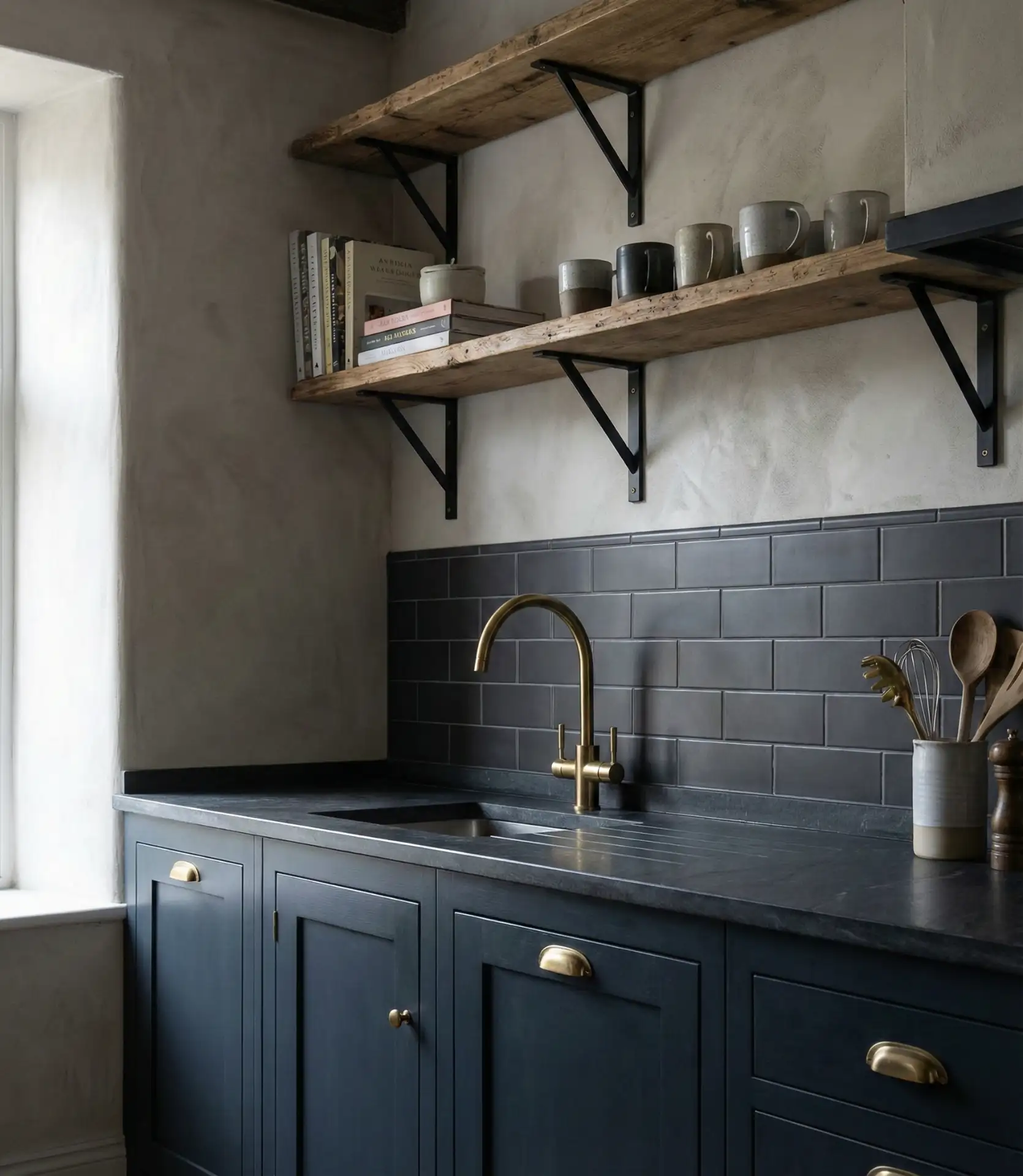
Moody kitchens layer deep blues with charcoal grays and black accents, creating a dramatic, cocooning effect that feels modern and intimate. This palette works especially well in loft-style apartments and urban homes where the kitchen is a statement room rather than a bright, cheerful gathering space. Dark cabinetry paired with matte black fixtures and concrete or soapstone counters delivers a sophisticated, gallery-like atmosphere.
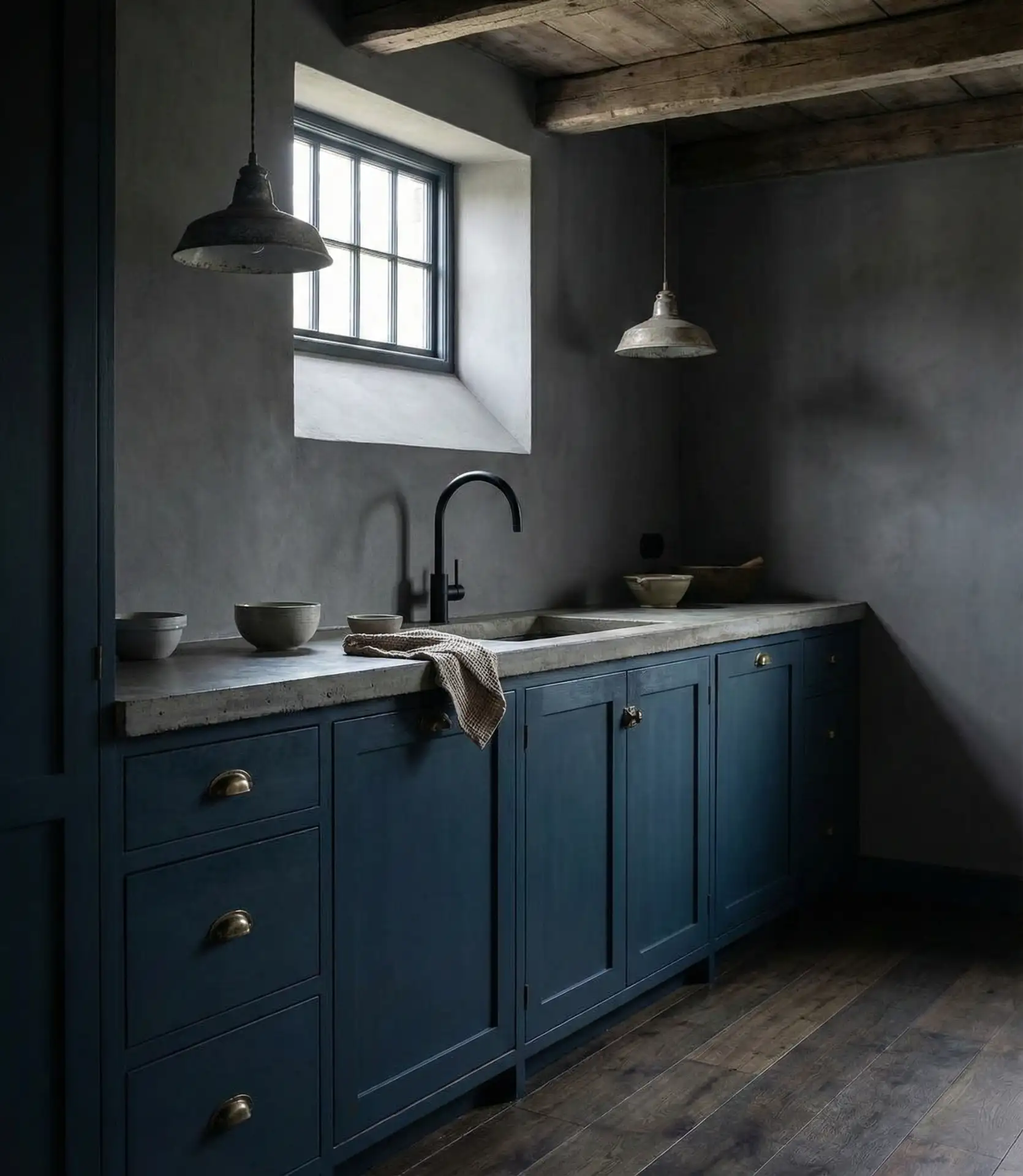
Real homeowners who commit to dark kitchens often install under-cabinet lighting and strategically placed sconces to avoid a cave-like feel. They also tend to keep countertops clear and use reflective materials—like polished stone or glass—to bounce light around. A moody kitchen requires confidence and a willingness to embrace shadows rather than fight them.
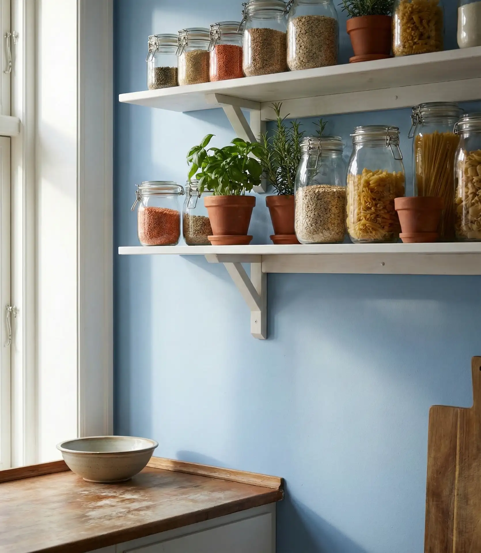
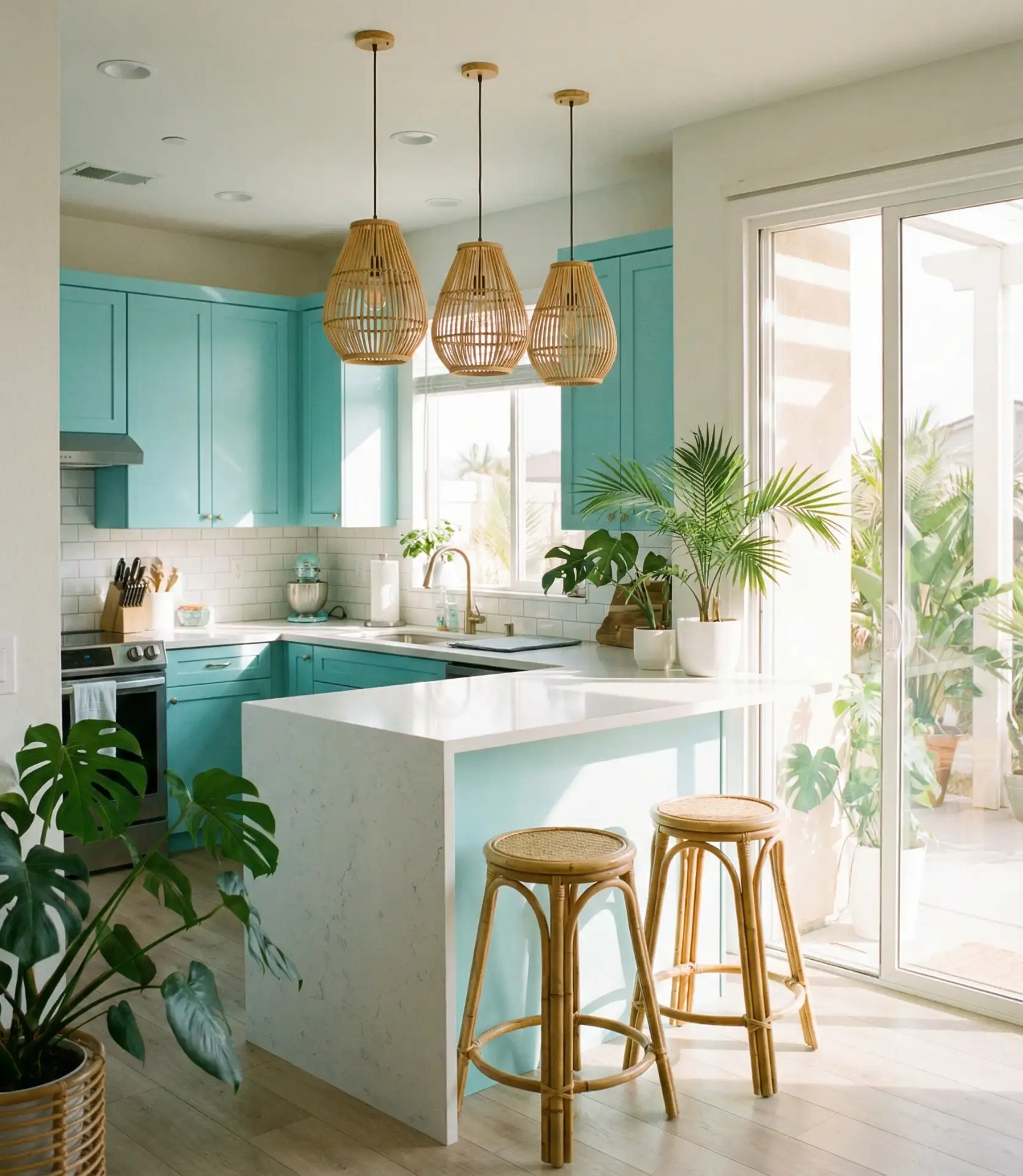
6. Pale Sky Blue Open Shelving
Pale sky blue painted on the wall behind open shelving brings a breath of coastal air to kitchens of any size. This shade is lighter and cooler than powder blue, evoking clear morning skies and breezy beach houses. Open shelving in natural wood or white keeps the look airy and approachable, while the blue backdrop adds just enough color to make the space feel intentional and styled.
This approach shines in coastal regions like California and the Carolinas, where the connection to ocean and sky feels natural. Inland, it can bring a sense of escape and lightness to kitchens that might otherwise feel landlocked. Sky blue is forgiving and versatile, complementing both warm wood tones and cooler stainless or chrome finishes.
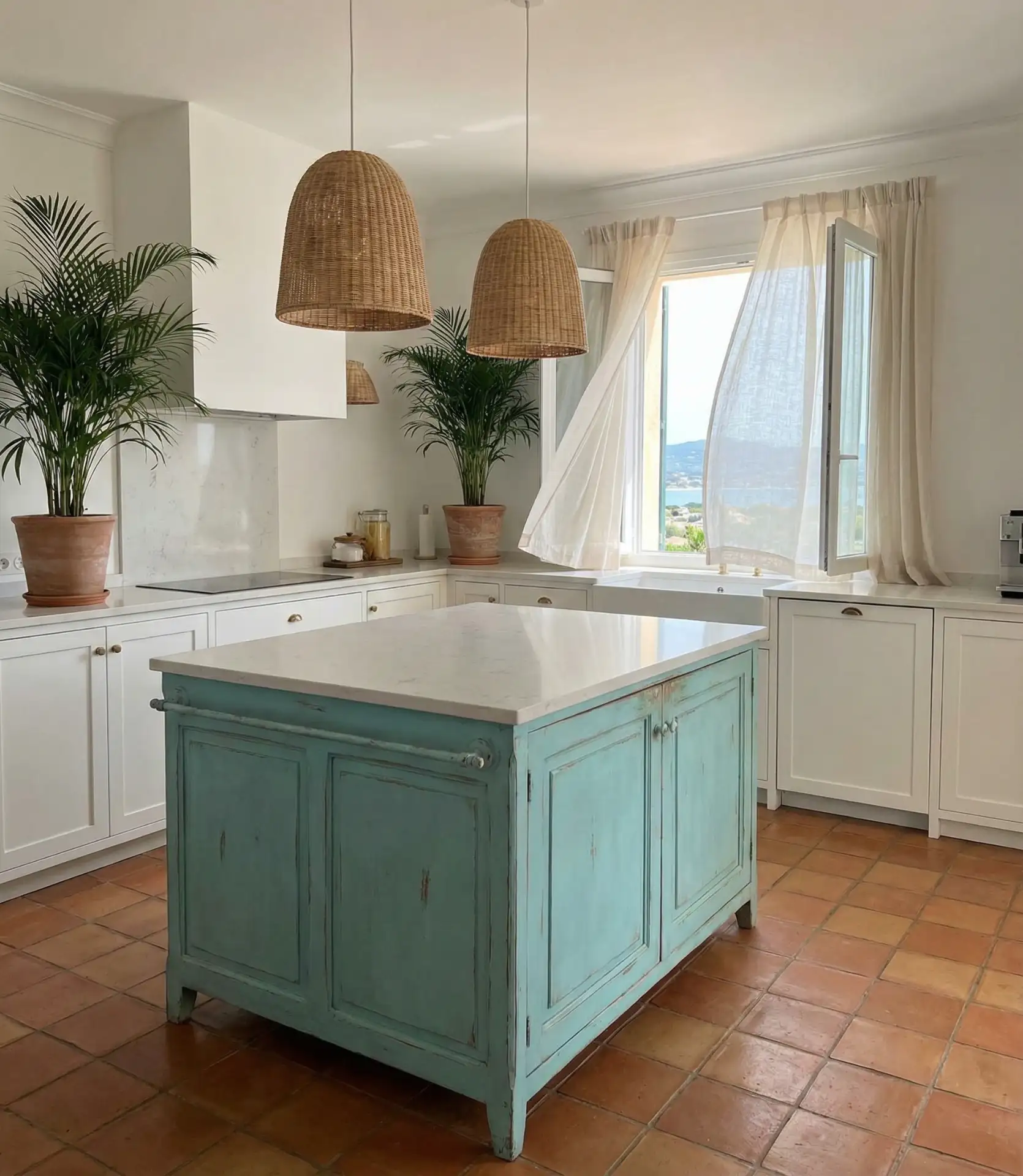
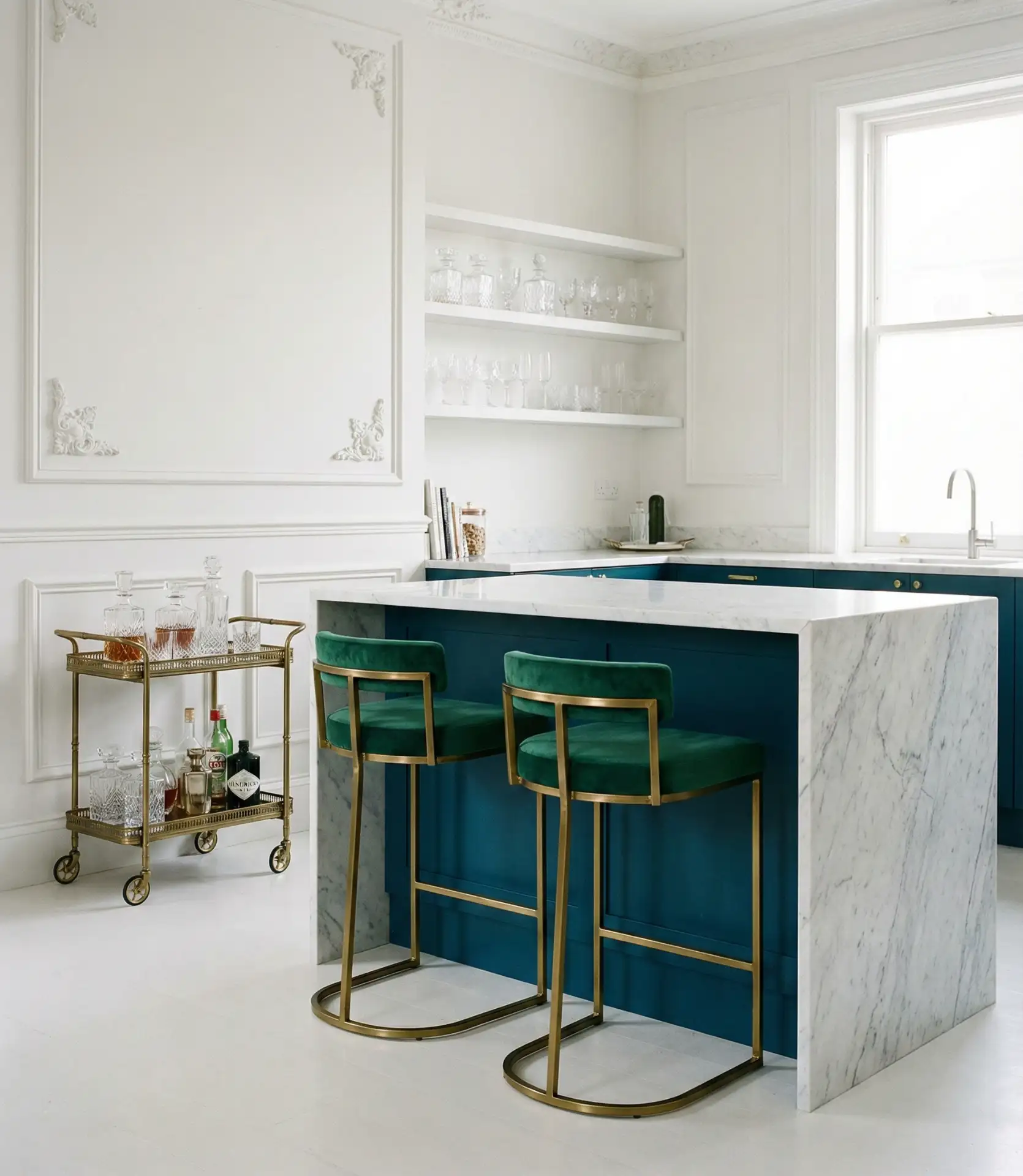
7. Cobalt Blue Island Statement
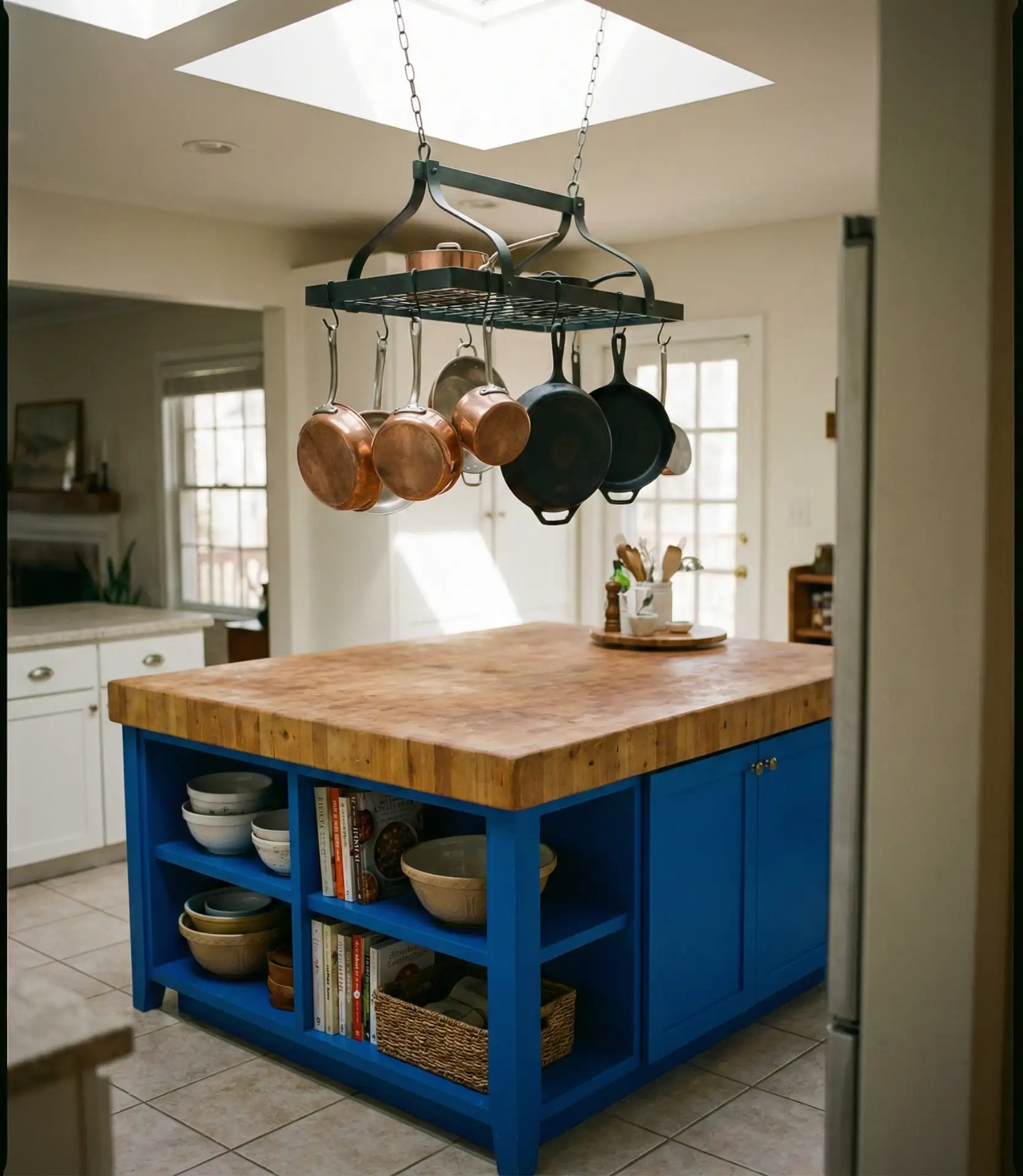
A cobalt blue kitchen island serves as a bold centerpiece, grounding the room with saturated color while keeping surrounding cabinetry neutral. Cobalt is brighter and more vibrant than navy, bringing energy and personality without feeling juvenile. This approach is ideal for homeowners who want color but aren’t ready to commit to an all-blue kitchen.
Expert designers note that cobalt works best in kitchens with plenty of white or light gray to balance its intensity. Pair it with warm metals like brass or copper to soften the look, or go modern with matte black fixtures for contrast. The island becomes a functional piece of art, anchoring the space and giving the eye a place to rest.
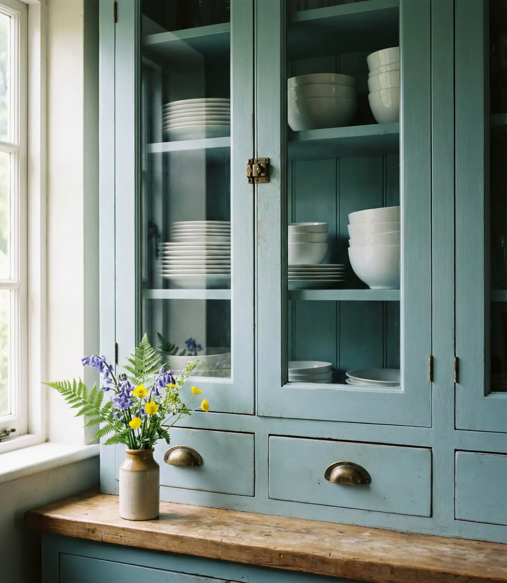
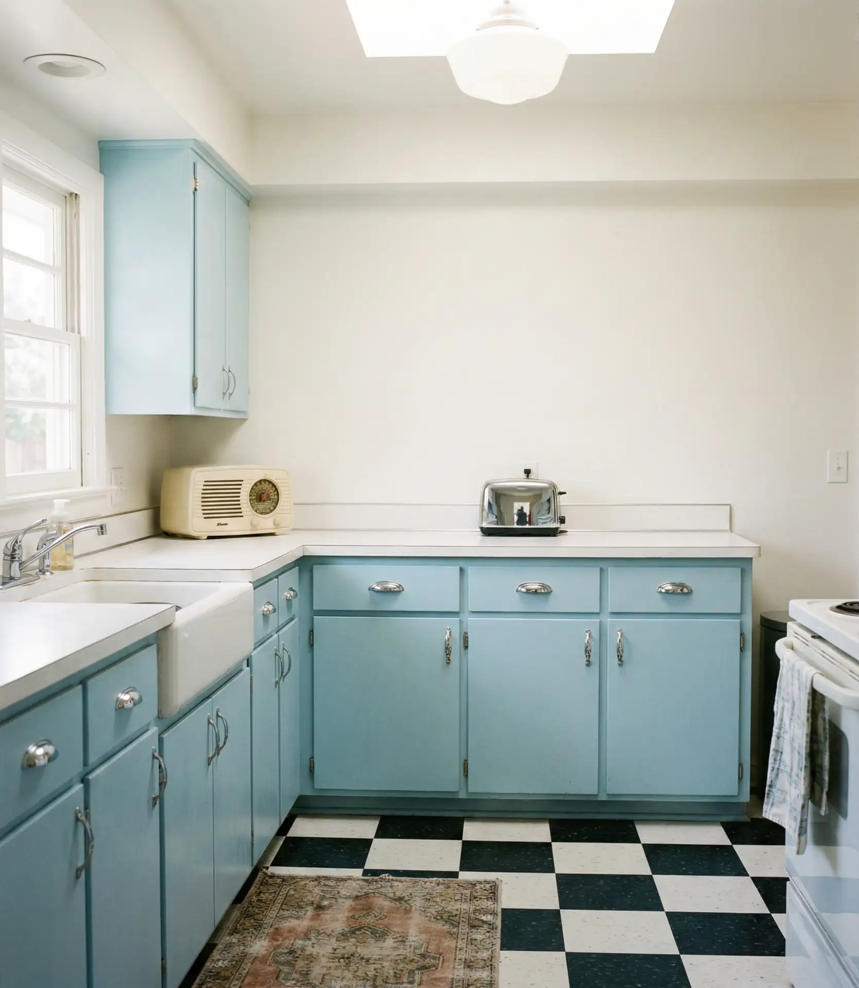
8. Duck Egg Blue Vintage Charm
Duck egg blue is a soft, muted blue-green that feels vintage and romantic, perfect for kitchens inspired by English cottages or shabby chic decor. This shade has a dusty, weathered quality that pairs beautifully with distressed finishes, porcelain knobs, and butcher block counters. It’s a color that feels collected rather than designed, as if the kitchen has been loved and lived in for decades.
A homeowner in Vermont painted her 1920s kitchen cabinets in duck egg blue and paired them with salvaged marble counters and a vintage stove. The result felt warm and inviting, a space that honored the home’s history while remaining fully functional. She noted that the color hides imperfections and scratches beautifully, developing a patina that only adds to its charm over time.
9. Blue and Yellow Sunny Accents
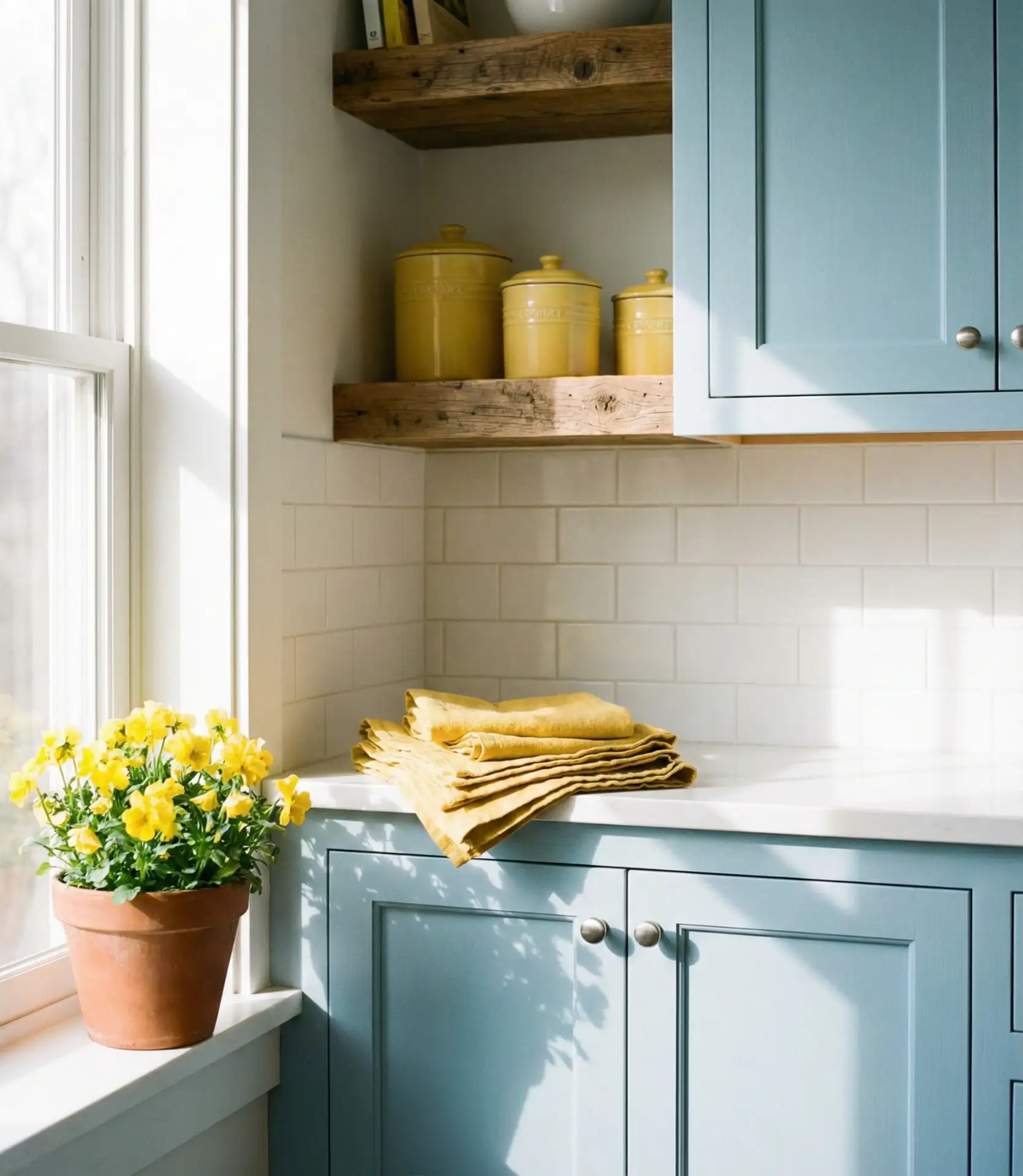
Pairing blue cabinetry with yellow accents creates a cheerful, energizing palette that feels fresh and optimistic. Think butter-yellow dish towels, marigold pottery, or a vintage yellow mixer on the counter. This combination works especially well in Scandinavian-inspired kitchens where color is used sparingly but intentionally to bring warmth and joy into a clean, minimal space.
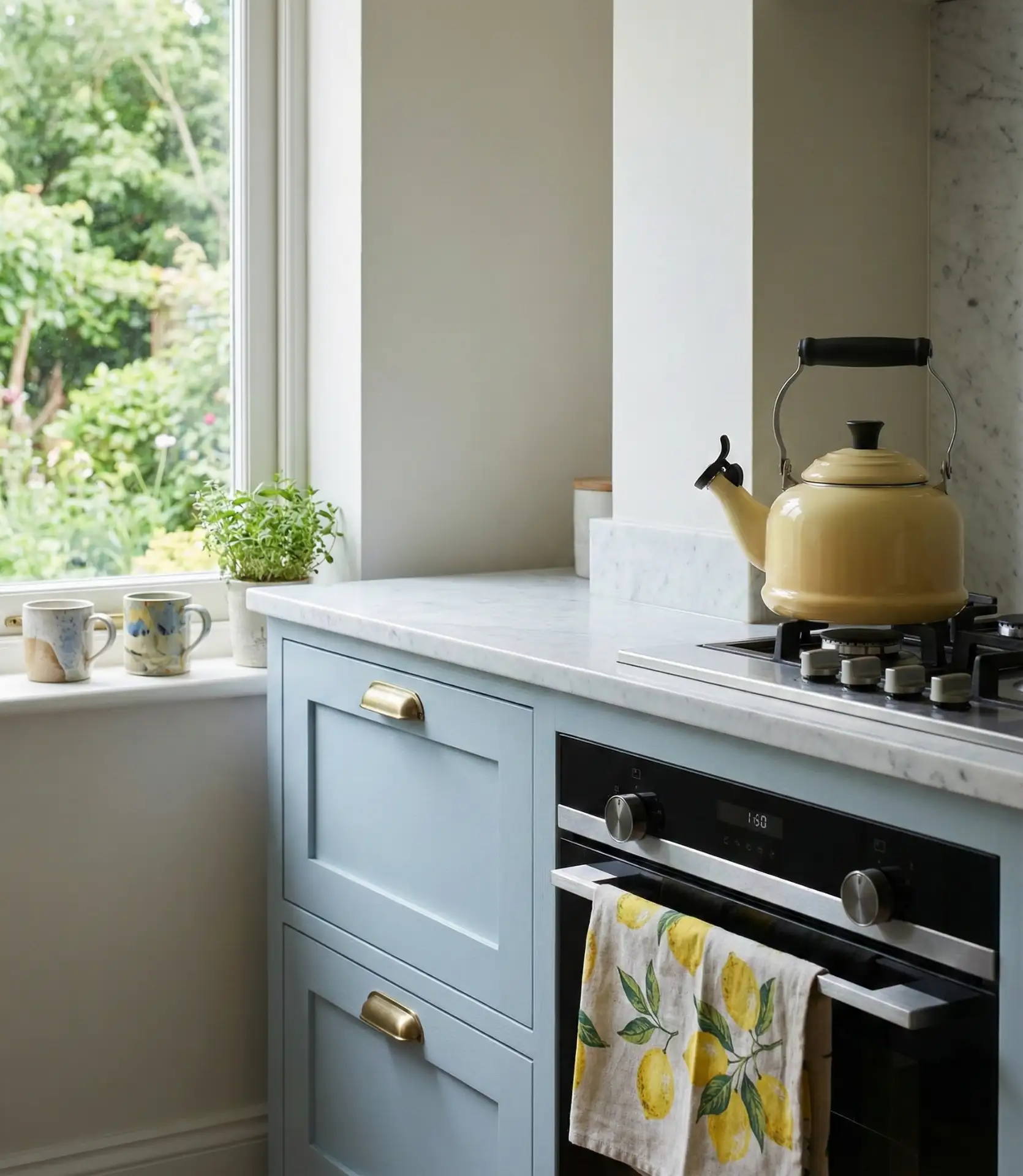
This palette thrives in kitchens that receive strong natural light, particularly in the Midwest and Pacific Northwest, where gray skies can make a space feel heavy. Yellow accents lift the mood without requiring a full commitment to bold color. It’s a practical way to test whether you enjoy color in the kitchen before painting walls or cabinets.
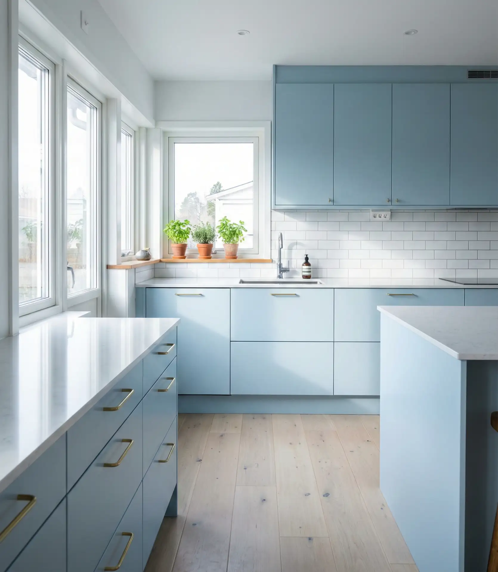
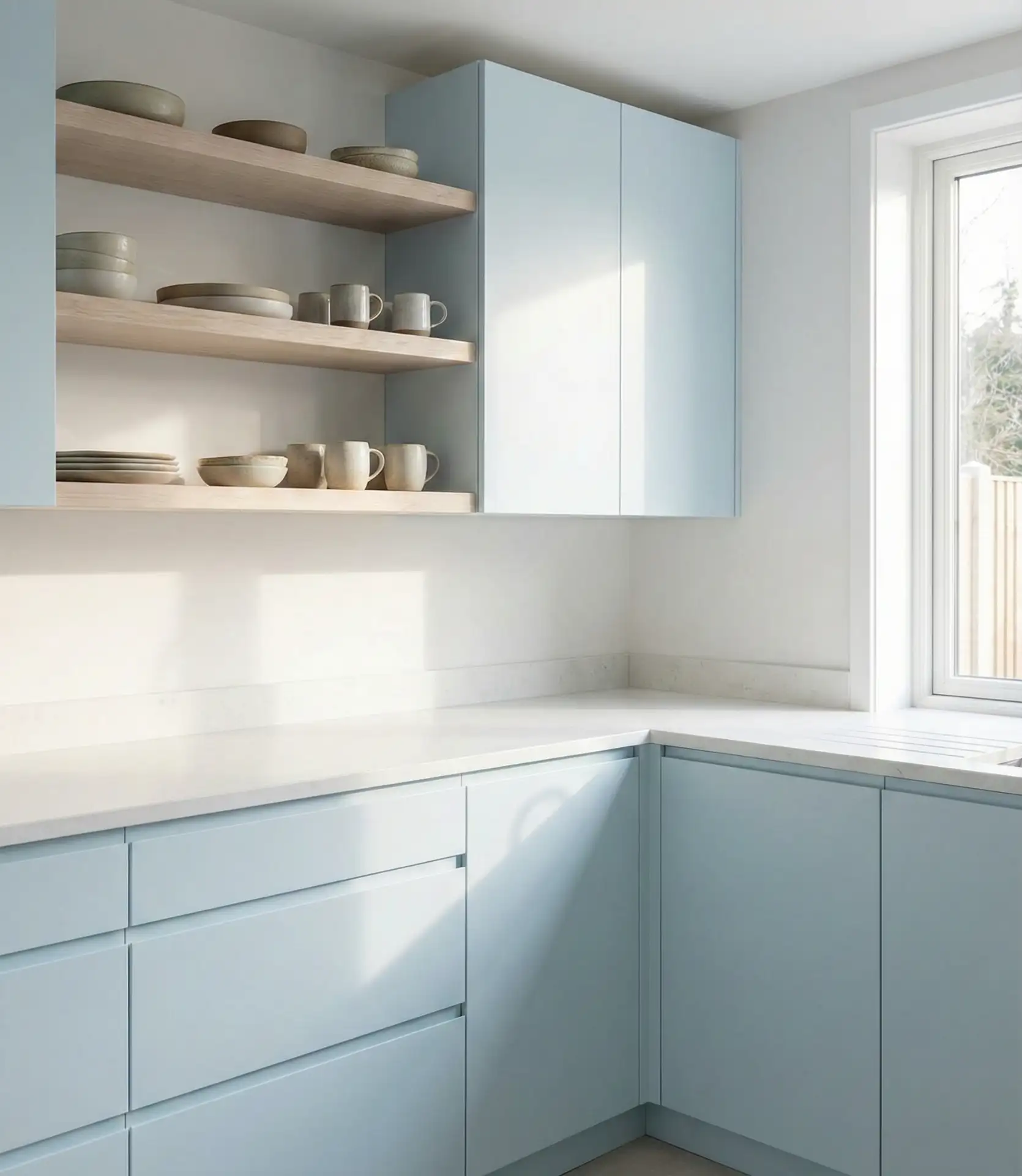
10. Grey and Blue Modern Minimalism
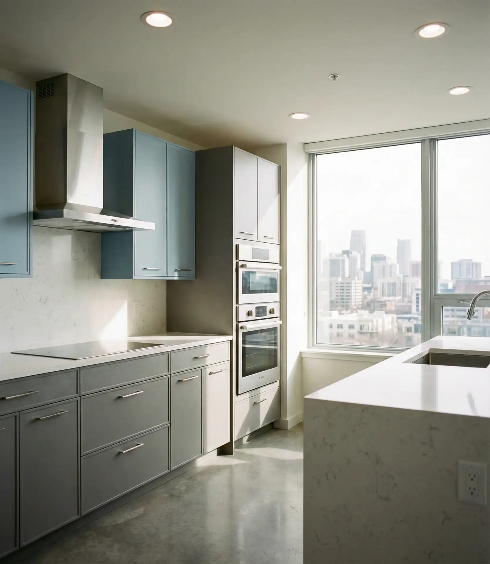
Soft grey paired with muted blue creates a calm, contemporary kitchen that feels sophisticated without being cold. This combination works beautifully in modern apartments and open-concept homes where the kitchen flows into living spaces. The gray tones down the blue, creating a subdued palette that’s easy to live with and ages gracefully as trends shift.
One practical insight: grey and blue hide fingerprints and smudges better than pure white, making it a smart choice for families with young children. The matte finishes common in modern kitchens also contribute to this ease of maintenance. This palette feels clean and current without the stark, clinical quality that all-white kitchens can sometimes project.
11. Pastel Blue Retro Revival
Pastel blue kitchens channel the playful optimism of mid-century design, often paired with chrome fixtures, checkered floors, and vintage-inspired appliances. This shade is softer and more nostalgic than powder blue, evoking 1950s diners and soda fountains. It’s a look that requires commitment but rewards with personality and a sense of fun that’s rare in kitchen design.
This style works best in smaller kitchens or breakfast nooks where the retro vibe feels intentional rather than overwhelming. In California bungalows and Portland craftsman homes, pastel blue kitchens have become a signature move, blending vintage charm with modern function. The key is balancing authenticity with livability—you want the look, not the outdated appliances.
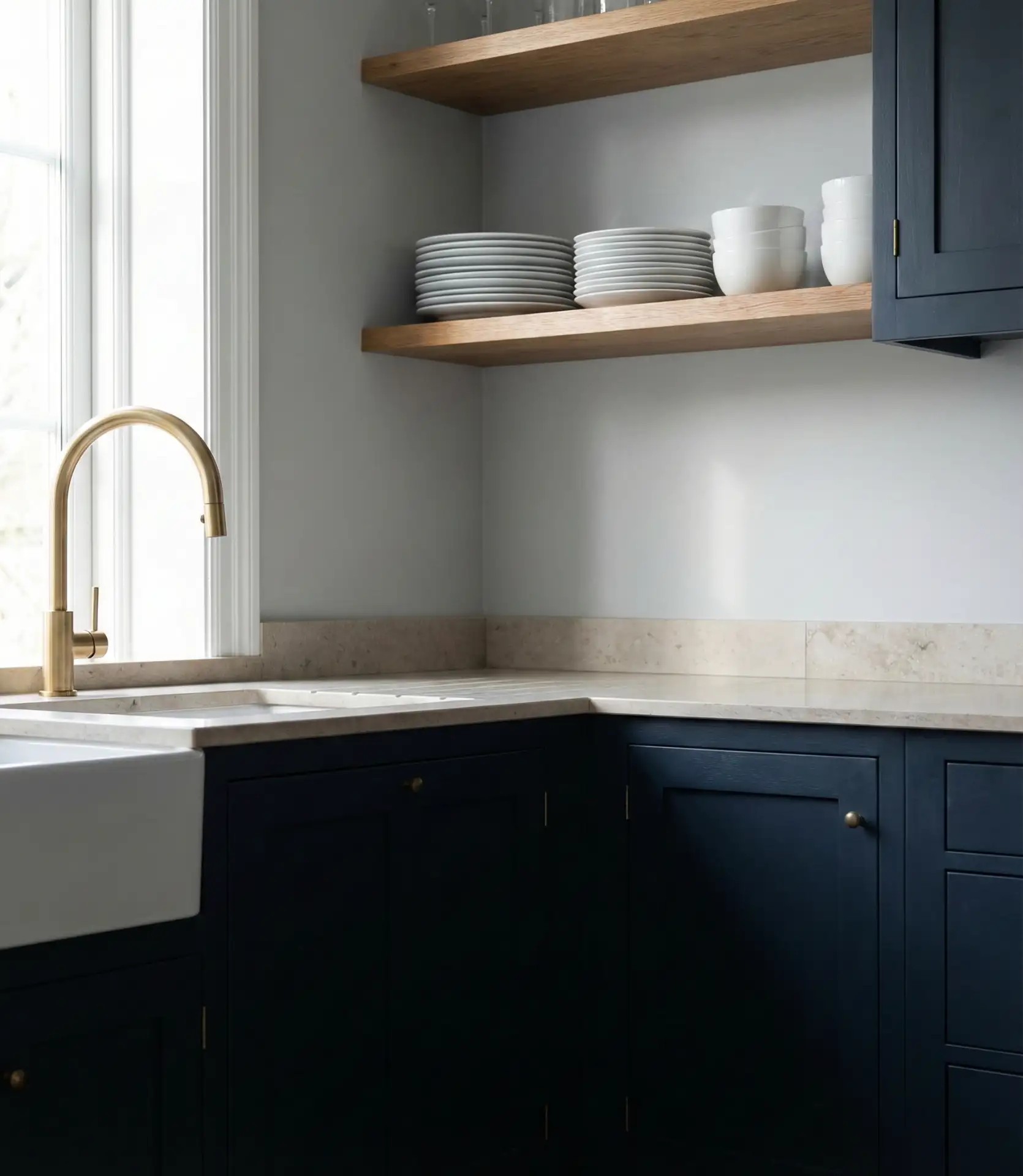
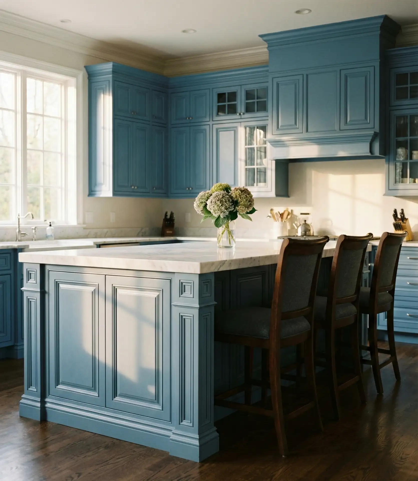
12. Dark Blue Wood Warmth
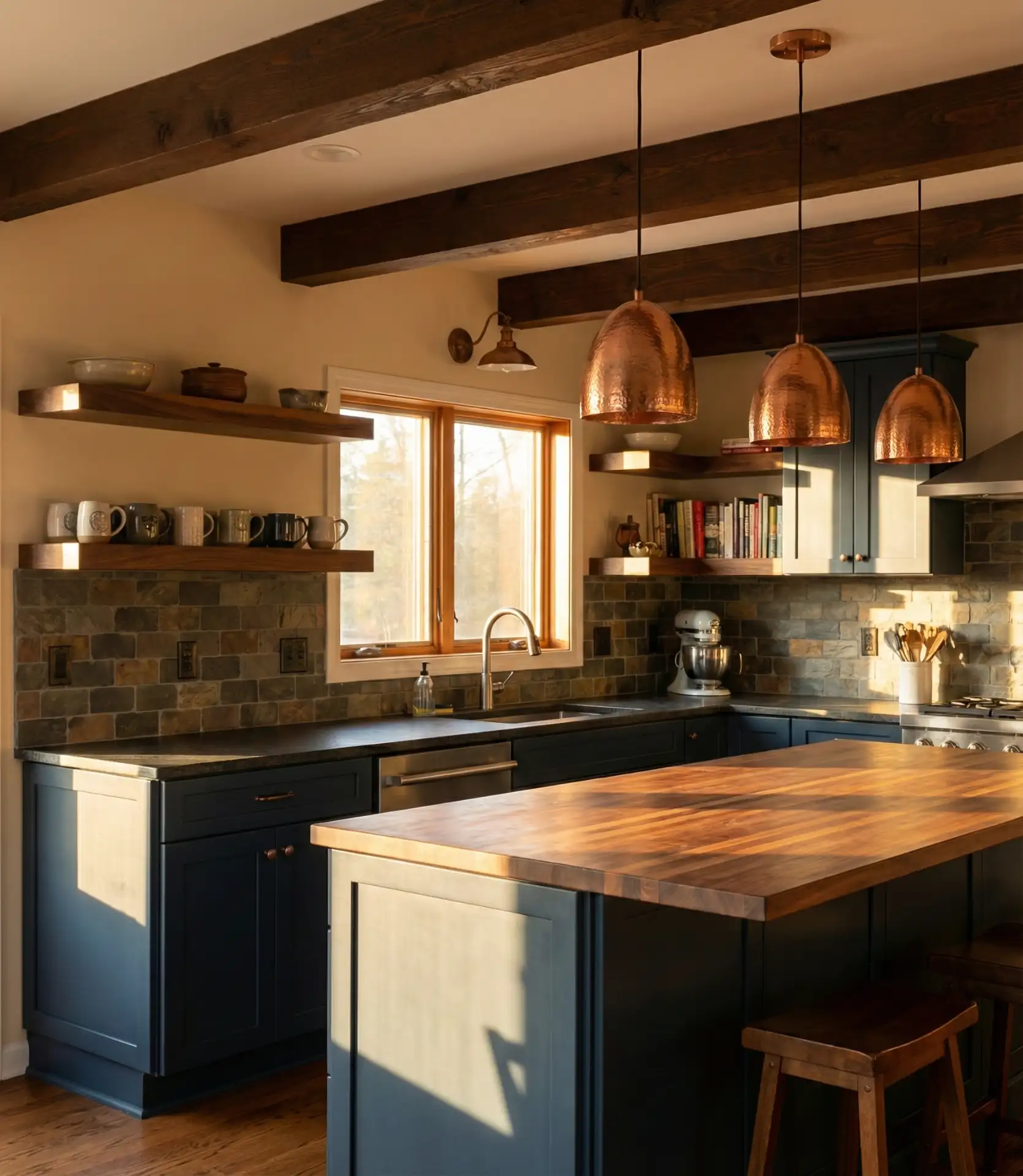
Dark blue cabinetry paired with natural wood elements creates a cozy, grounded kitchen that feels both modern and timeless. Wood countertops, floating shelves, or butcher block islands bring warmth that balances the coolness of deep blue. This combination is especially popular in mountain homes and lake houses, where the connection to natural materials feels essential.
Where it works best: cabins in Colorado, farmhouses in upstate New York, and coastal homes in Maine all embrace this aesthetic. The wood softens the intensity of dark blue, making the kitchen feel inviting rather than stark. It’s a palette that encourages gathering, lingering over coffee, and slow weekend cooking rather than rushed weeknight meals.
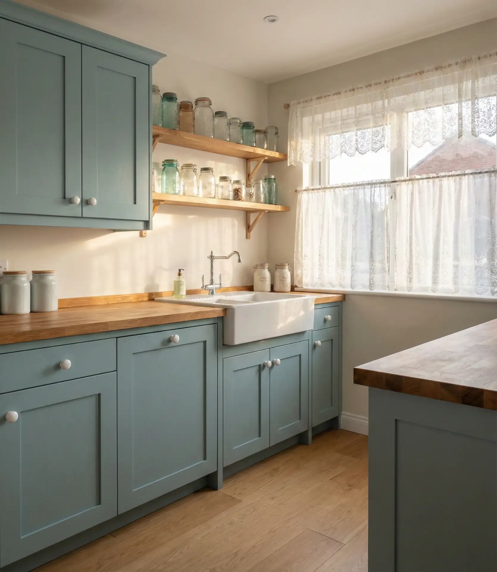
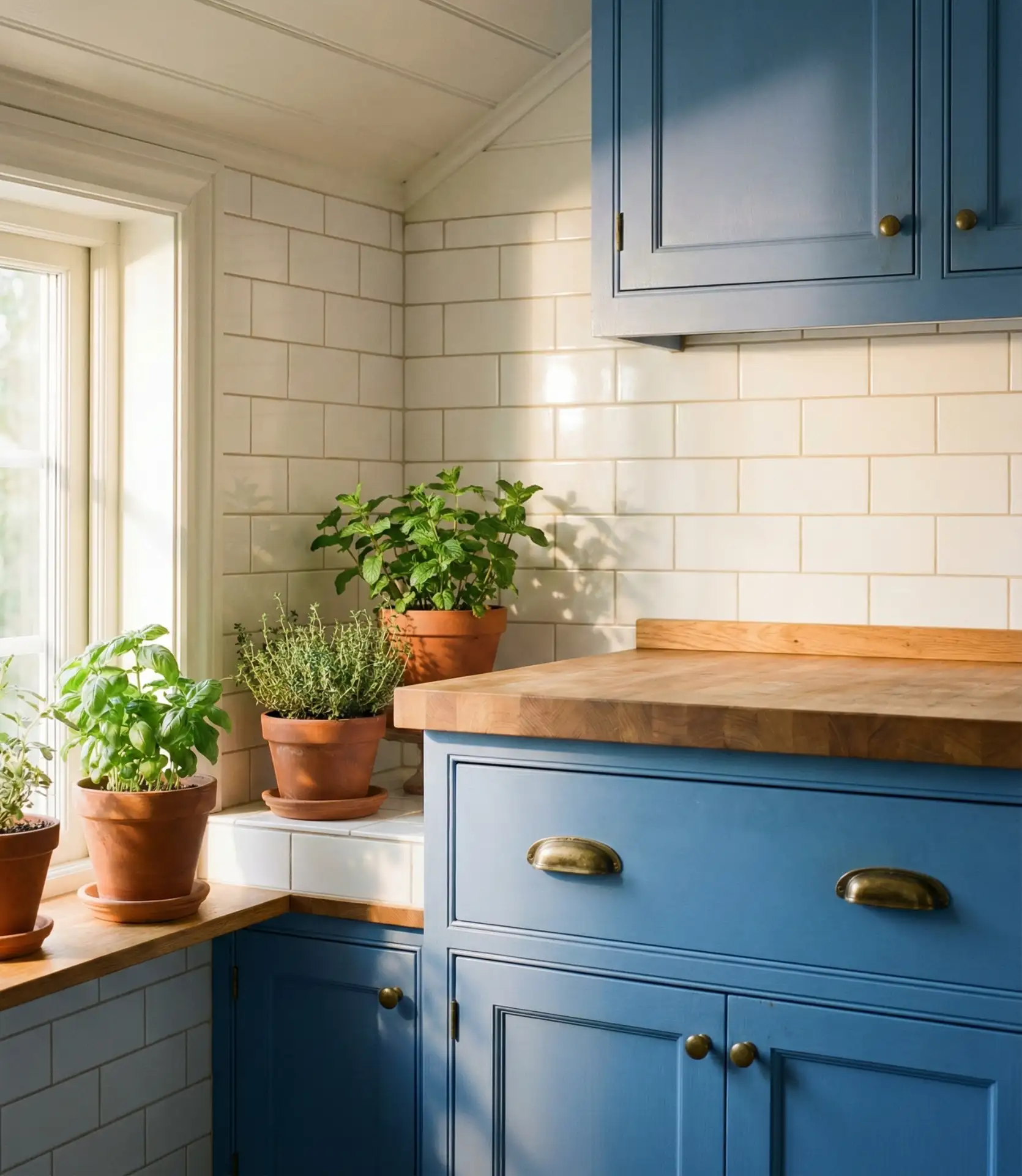
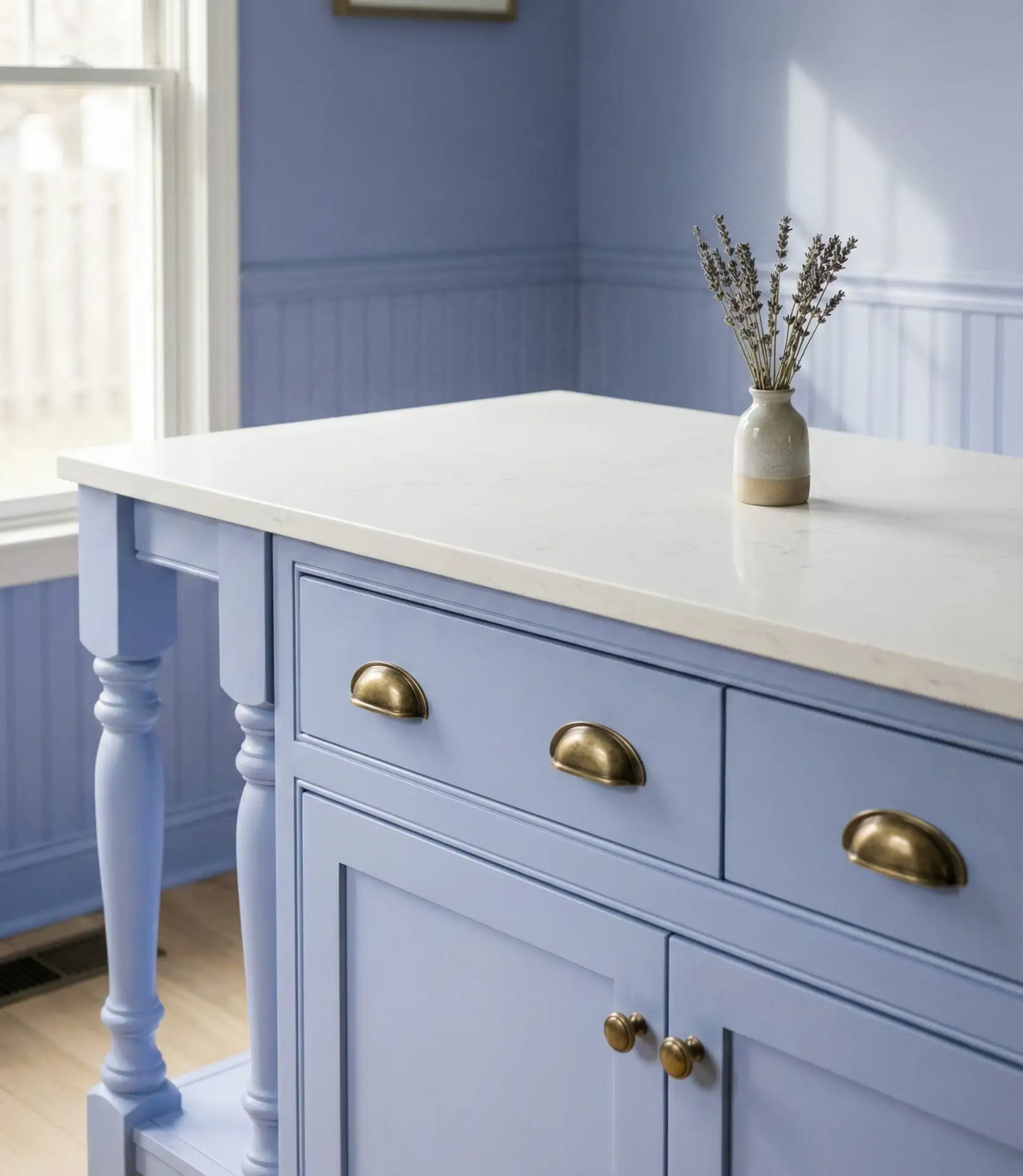
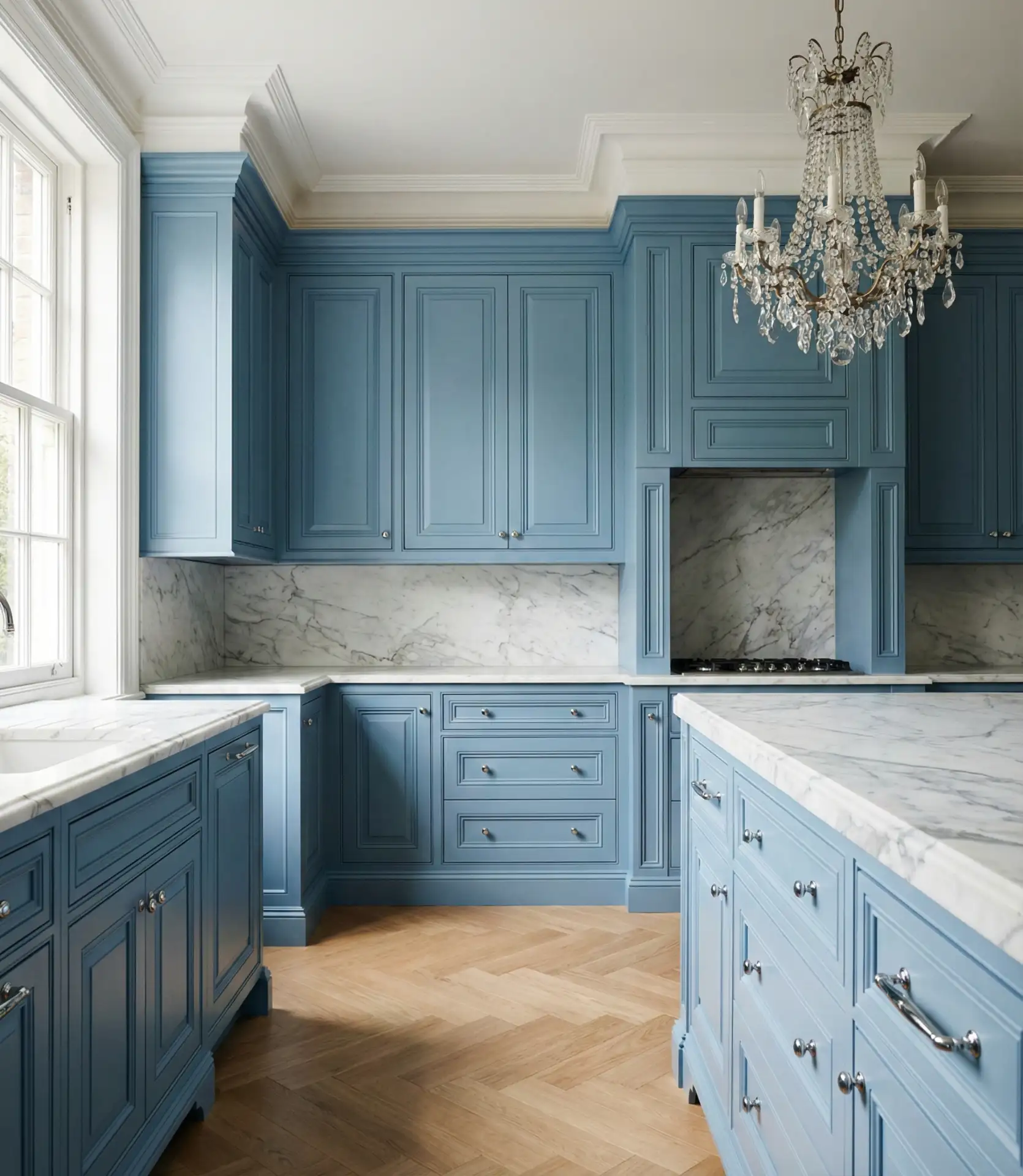
13. Dusty Blue Soft Elegance
Dusty blue is a muted, grayed-down shade that feels sophisticated and understated, perfect for homeowners who want color without boldness. This tone works beautifully in transitional kitchens that blend traditional and contemporary elements. Dusty blue cabinetry paired with marble or quartz counters and brushed nickel hardware creates a refined, elegant space that doesn’t shout for attention.
Dusty blue has become the go-to choice for homeowners who found gray too cold but weren’t ready for saturated color. It offers the same neutrality as gray but with a subtle warmth and complexity. This shade also photographs beautifully, making it a favorite for homeowners who plan to sell within a few years and want broad appeal.
14. Cornflower Blue Cheerful Energy
Cornflower blue is a bright, saturated shade that brings cheerful energy to kitchens without tipping into primary blue territory. This color works especially well in breakfast nooks and smaller kitchens where you want to create a lively, uplifting mood. Paired with white trim and natural wood, cornflower blue feels fresh and approachable, never stuffy or overly formal.
A common mistake is pairing cornflower blue with too many other colors, which can make the space feel chaotic. Stick to a simple palette—white, wood, and maybe one warm metal—to let the blue shine without overwhelming the senses. This shade is confident enough to stand on its own and doesn’t need a lot of supporting players.
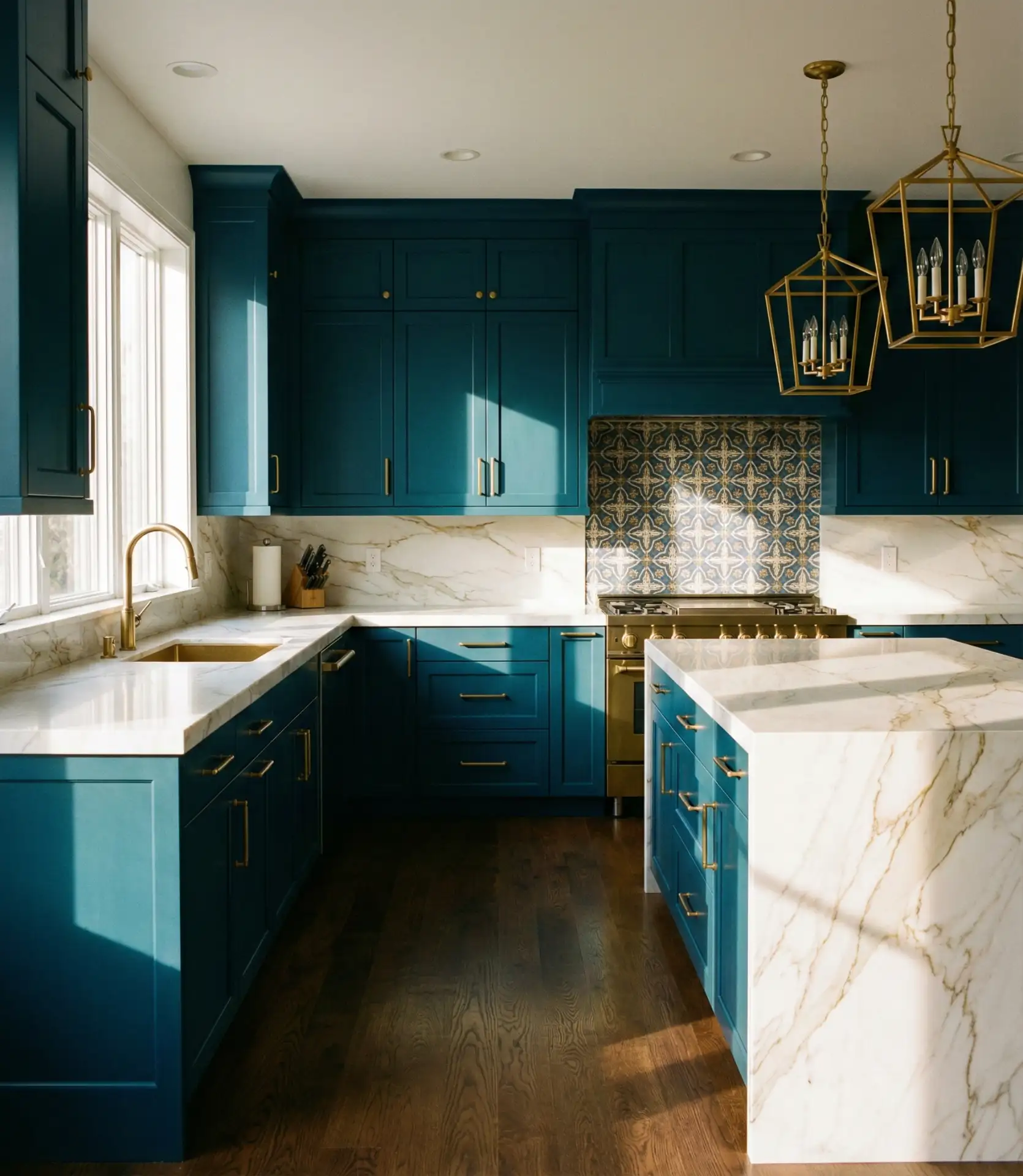
15. Teal Blue-Green Hybrid
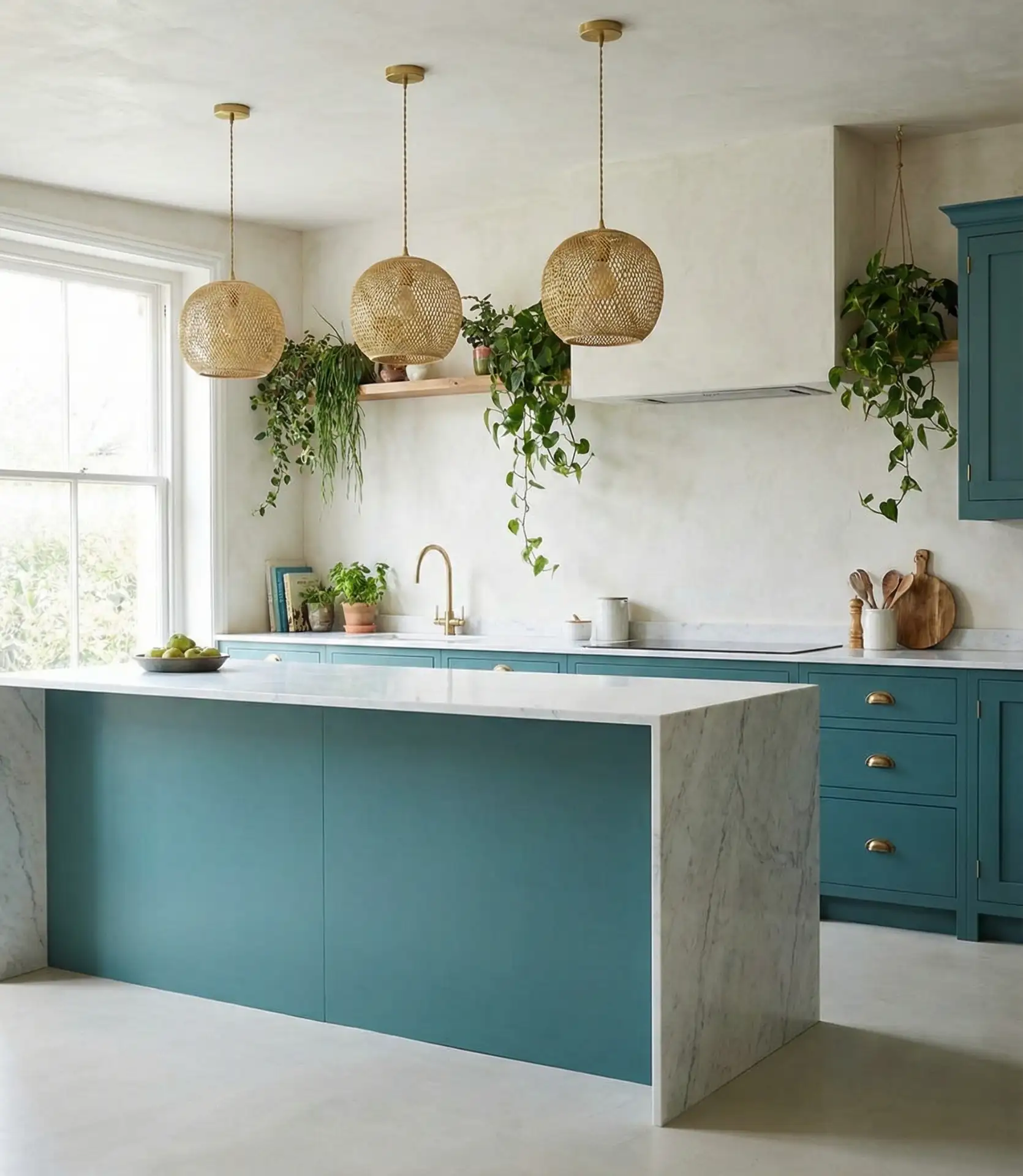
Teal sits at the intersection of blue and green, offering a versatile shade that feels both calming and energizing. This color works beautifully in kitchens with natural wood elements and plants, creating a connection to nature that feels organic and intentional. Teal cabinetry paired with brass or copper fixtures brings a jewel-toned richness to the space.
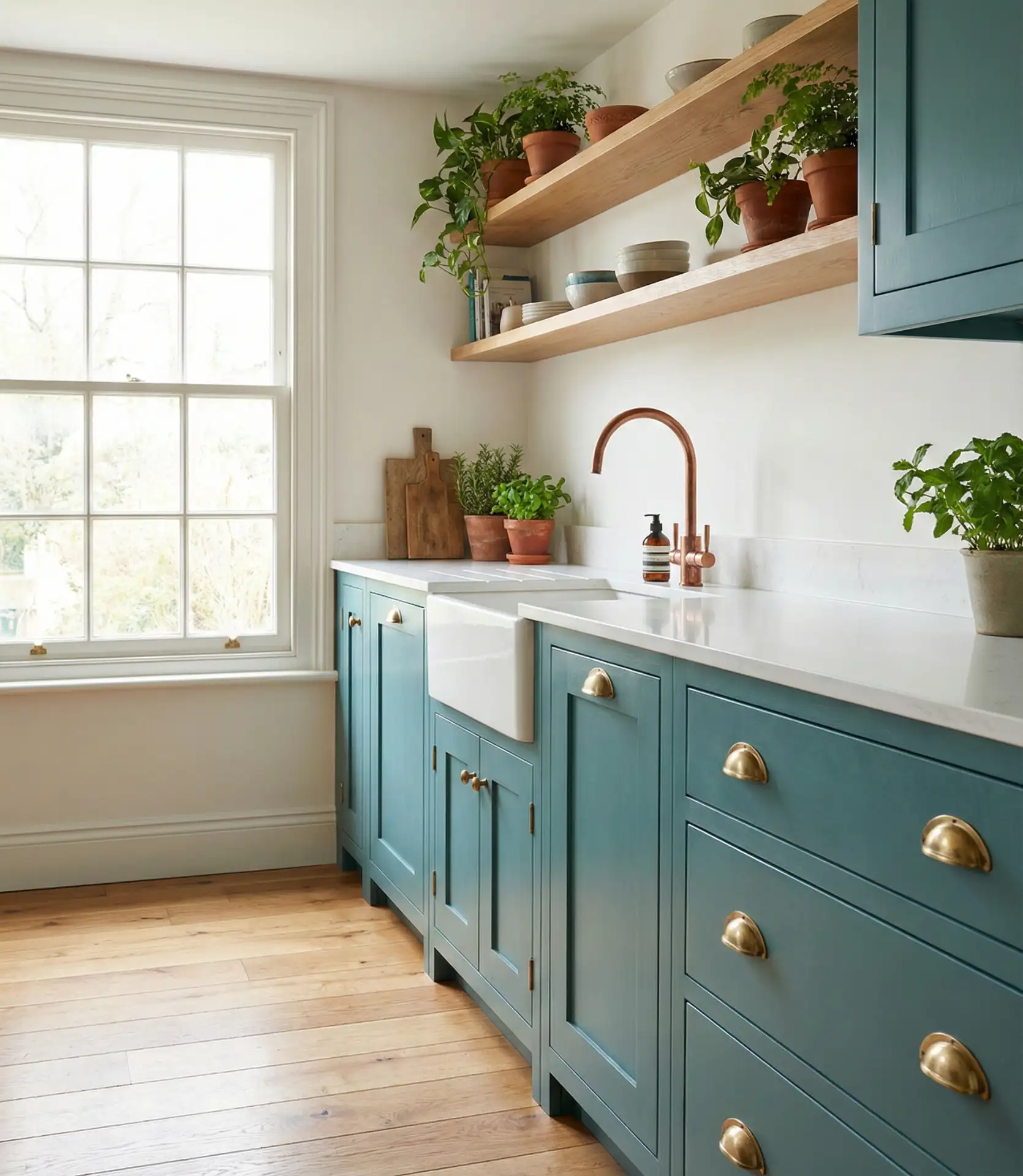
Teal is experiencing a surge in American kitchens, particularly in bohemian and eclectic homes where mixing styles and eras is encouraged. In the Southwest, teal pairs beautifully with terracotta and natural clay, while in the Pacific Northwest, it complements the lush greens visible through kitchen windows. It’s a color that adapts to its surroundings while maintaining its own distinct personality.
16. Navy and White Nautical Inspiration
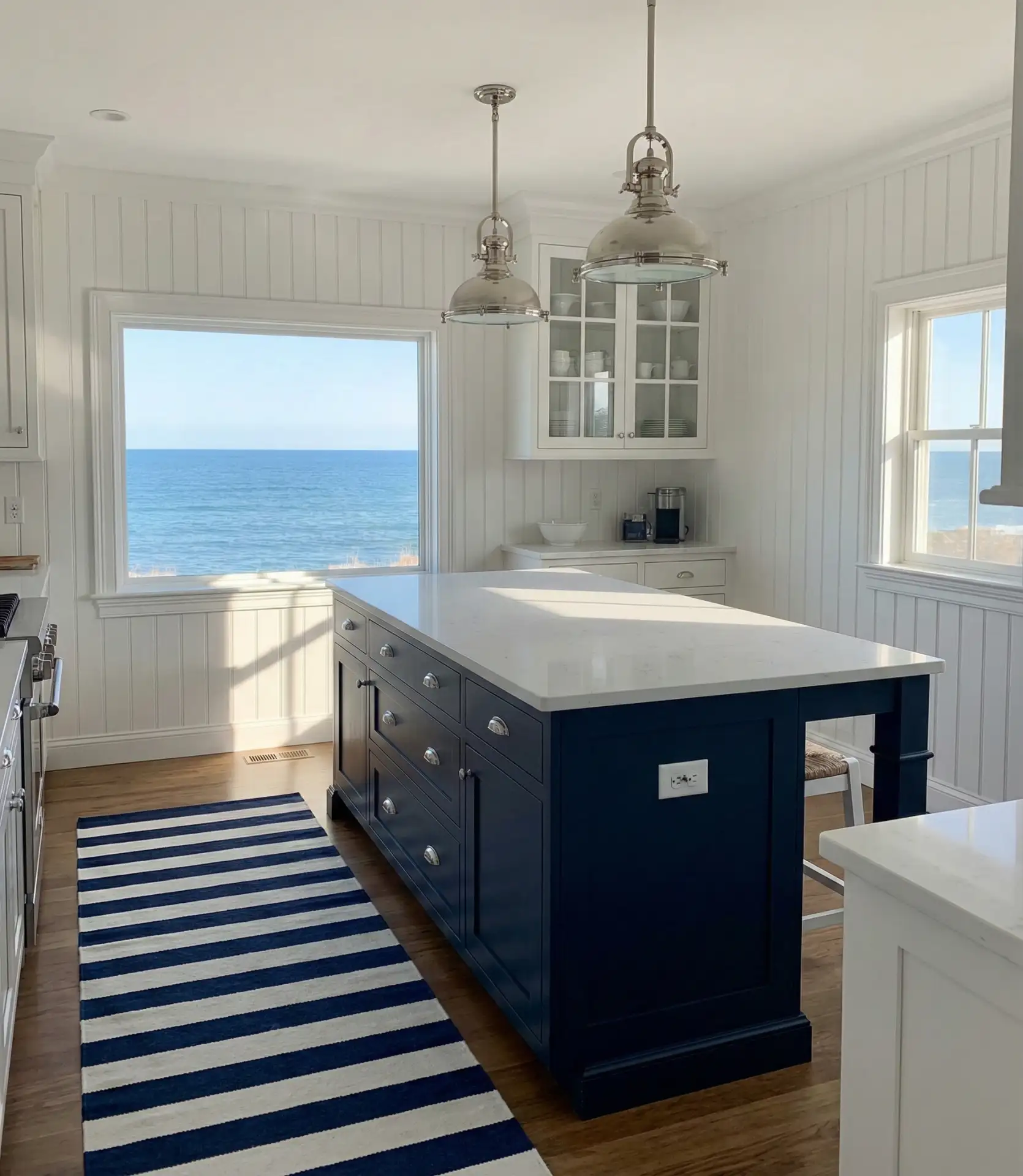
A crisp navy and white palette delivers classic nautical inspiration that feels at home in coastal regions but works anywhere. Striped accents, rope details, and maritime-inspired hardware enhance the theme without making the kitchen feel like a boat. This combination is timeless, never looking dated or overly trendy.
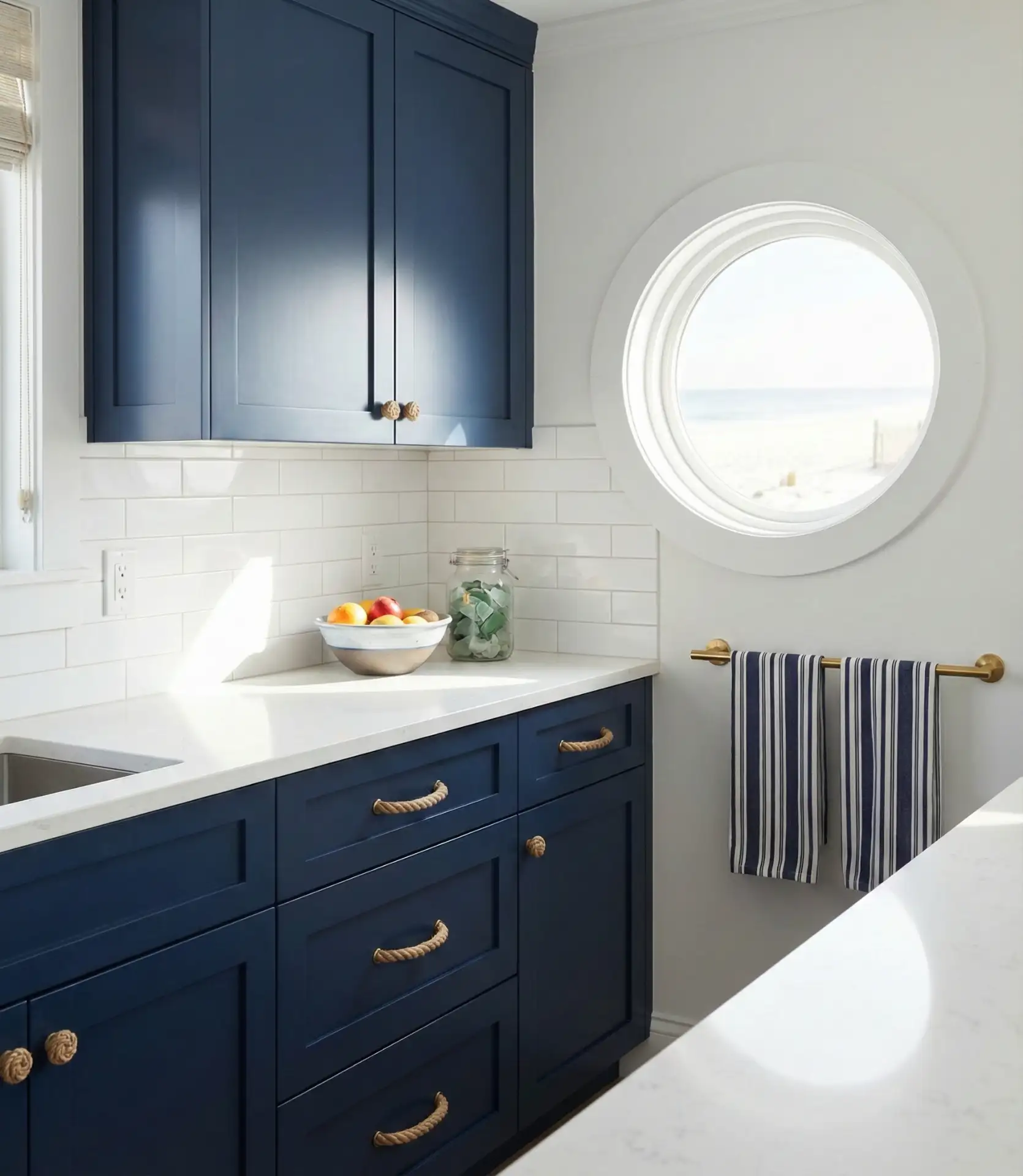
In beach towns from Cape Cod to San Diego, navy and white kitchens are a staple, offering a clean, fresh backdrop that doesn’t compete with ocean views. The palette works equally well in landlocked homes, bringing a sense of breezy escape to everyday cooking and gathering. It’s a safe choice that feels intentional rather than generic.
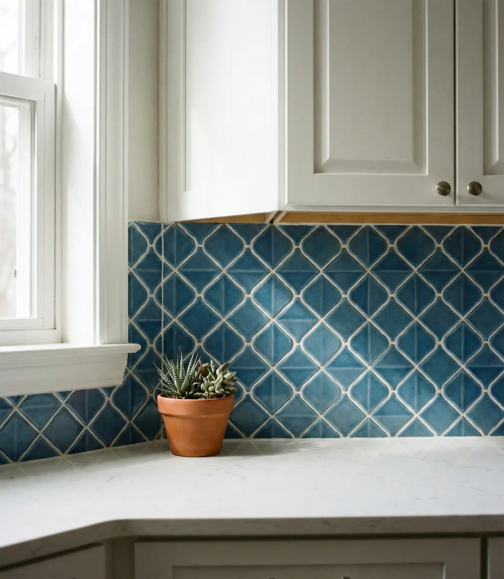
17. Blue Backsplash Focus
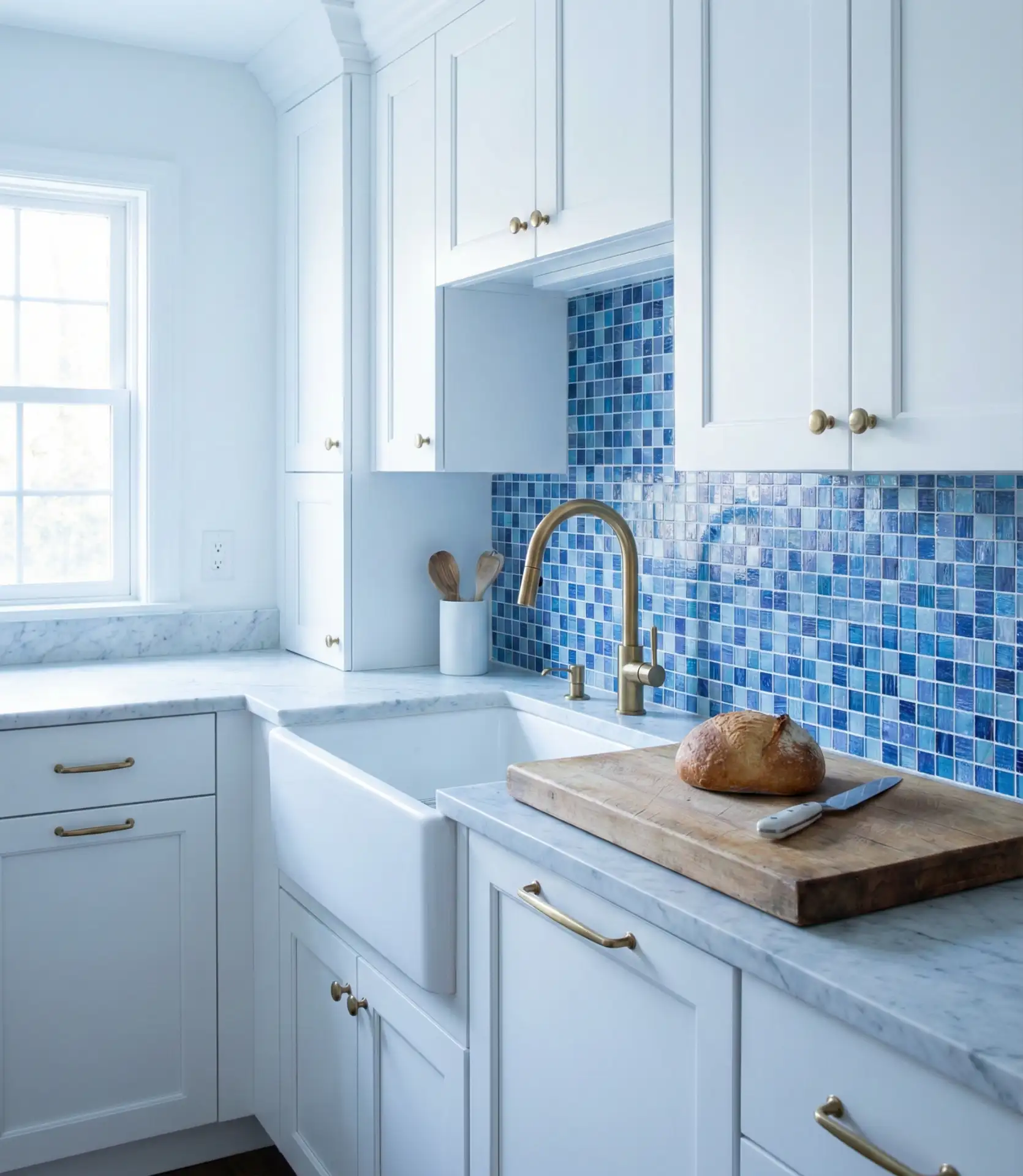
A blue backsplash offers a commitment-free way to introduce color into a neutral kitchen. Handmade ceramic tiles in varying shades of blue create texture and visual interest behind the range or sink. This approach allows you to test the waters with color while keeping cabinetry and counters in safe, resale-friendly tones.
Budget-wise, a backsplash is one of the most affordable ways to make a dramatic change. You can DIY with peel-and-stick tiles or invest in handmade ceramics from local artisans. Either way, the impact is significant without the cost and commitment of replacing cabinetry. It’s a smart entry point for homeowners testing their comfort level with color.
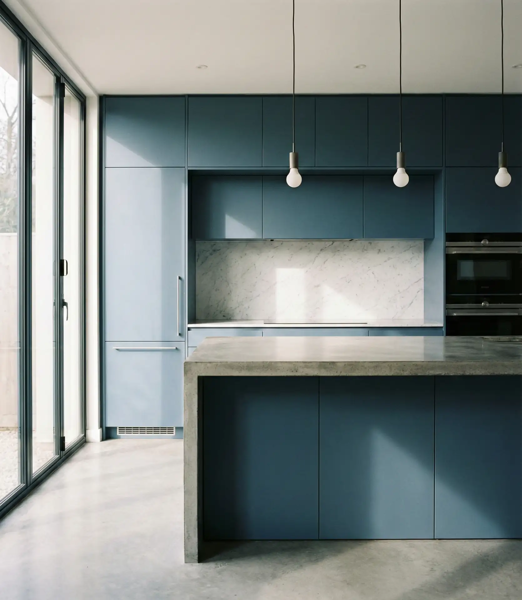
18. Slate Blue Industrial Edge
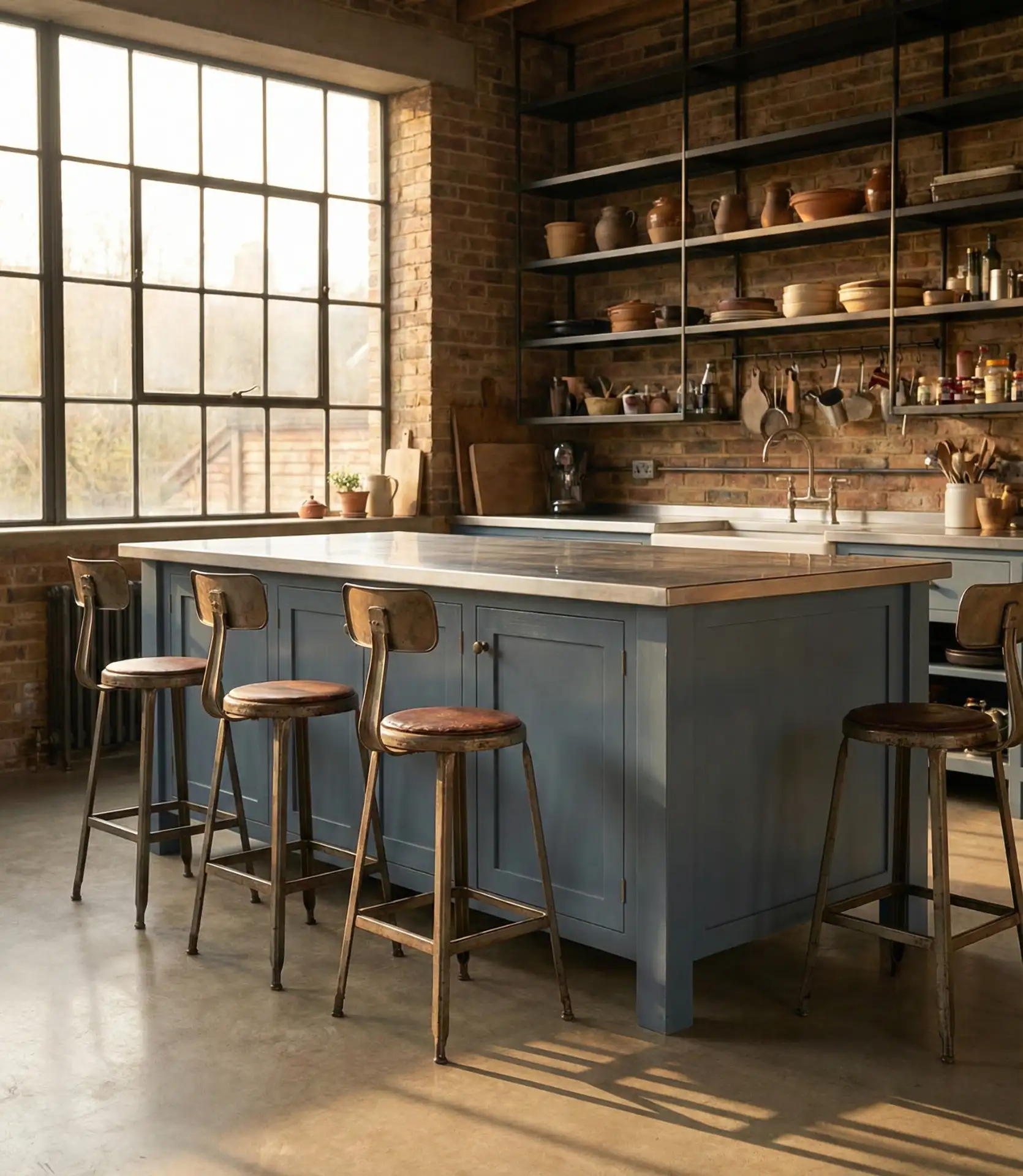
Slate blue brings an industrial edge to kitchens when paired with raw materials like concrete, exposed brick, and metal fixtures. This shade is darker and more subdued than cornflower or powder blue, offering a moody sophistication that works in lofts and converted warehouses. The color feels masculine without being heavy, grounding the space while allowing other textures to shine.
This palette thrives in urban environments—Brooklyn, Chicago’s West Loop, Portland’s Pearl District—where industrial aesthetics are celebrated. Real homeowners in these spaces often mix vintage finds with modern conveniences, creating kitchens that feel curated and personal. Slate blue provides a consistent thread that ties disparate elements together without imposing a rigid style.
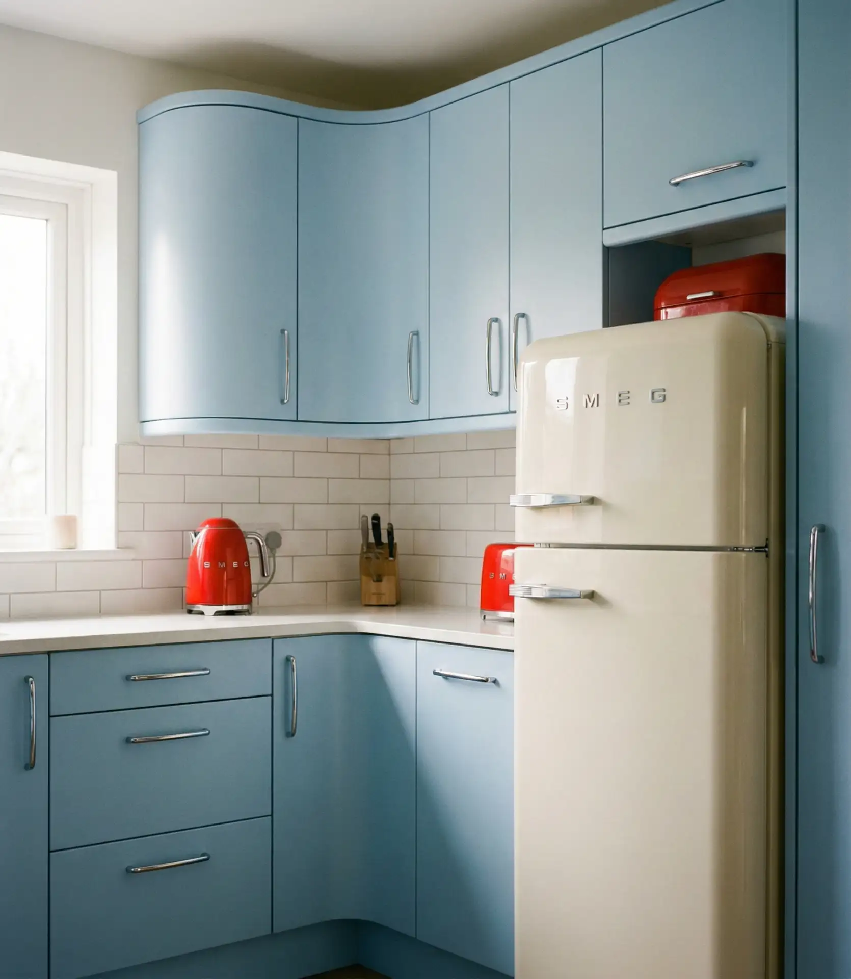
19. Robin’s Egg Blue Vintage Appliances
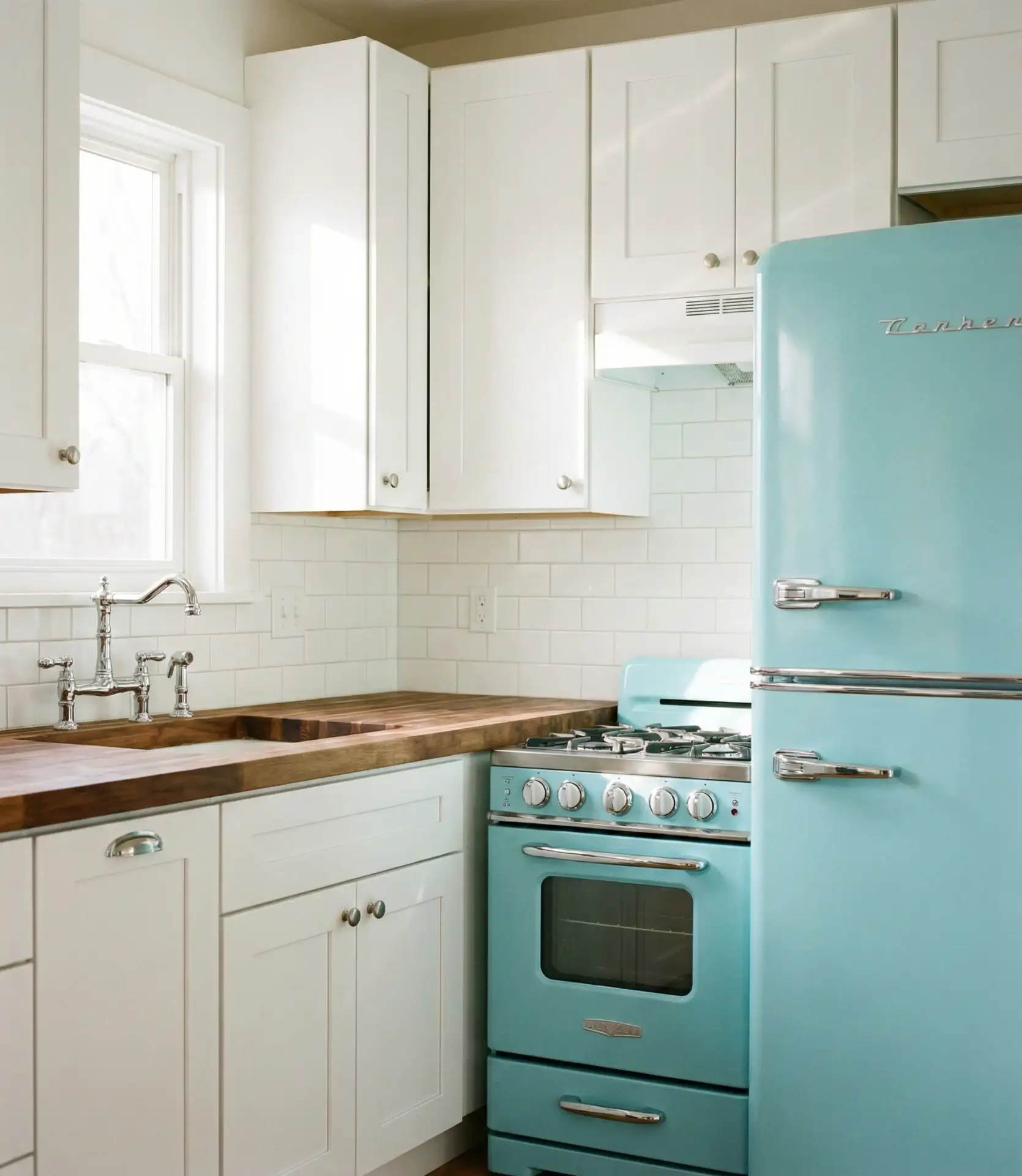
Robin’s egg blue appliances—think retro-style refrigerators and ranges—serve as sculptural focal points in otherwise neutral kitchens. This shade is bright and playful without being garish, evoking the optimism of mid-century American design. Modern manufacturers now offer ranges and refrigerators in this color, making the look accessible without hunting for vintage originals.
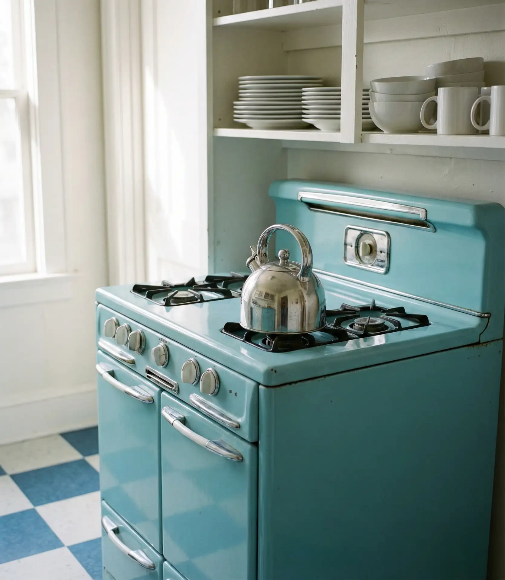
A designer noted that robin’s egg blue appliances work best when they’re the only strong color in the room. Keep walls white, cabinets neutral, and let the appliances do the talking. This creates a clean, gallery-like backdrop that makes the blue pop without overwhelming the space. It’s a strategy that’s both visually striking and surprisingly versatile.
20. Periwinkle Blue Soft Romance
Periwinkle is a soft, lavender-tinted blue that brings gentle romance to kitchen interior spaces. This shade works beautifully in cottage-style homes and vintage-inspired kitchens where femininity and softness are embraced. Paired with white or cream, periwinkle creates a dreamy, almost ethereal atmosphere that feels both nostalgic and fresh.
Where it works best: farmhouses in the South, coastal cottages in New England, and renovated Victorians where period details are preserved. Periwinkle is a niche choice that won’t appeal to everyone, but for those who love it, there’s no substitute. It creates a kitchen that feels like a sanctuary rather than just a functional workspace.
21. Blue and Pink Unexpected Pairing
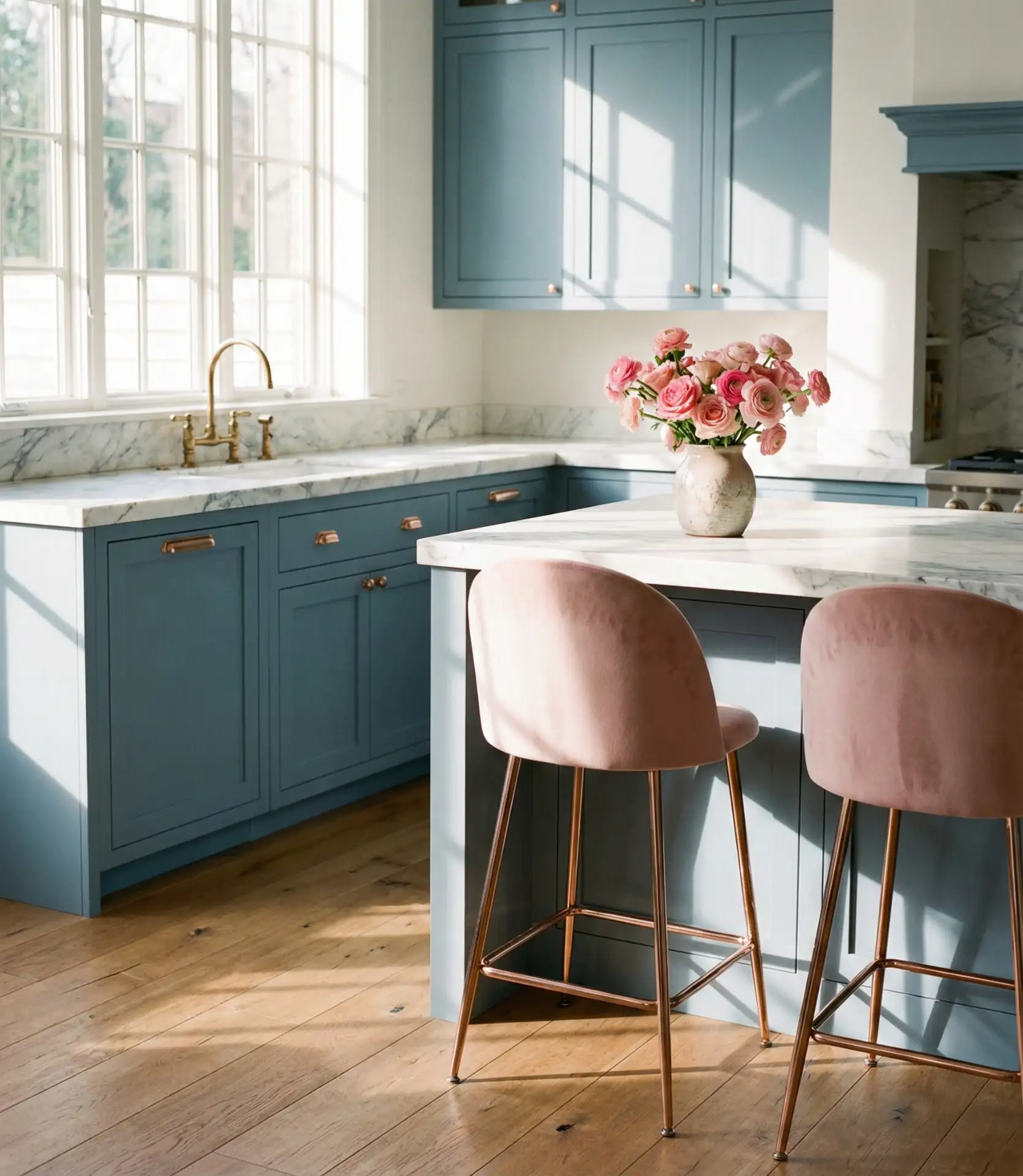
Blue and pink together create a sophisticated, unexpected palette that feels modern and playful. Think dusty blue cabinets with rose gold hardware or pale blue walls with blush-toned textiles. This combination challenges the traditional gender associations with these colors, creating something fresh and current that appeals to design-forward homeowners.
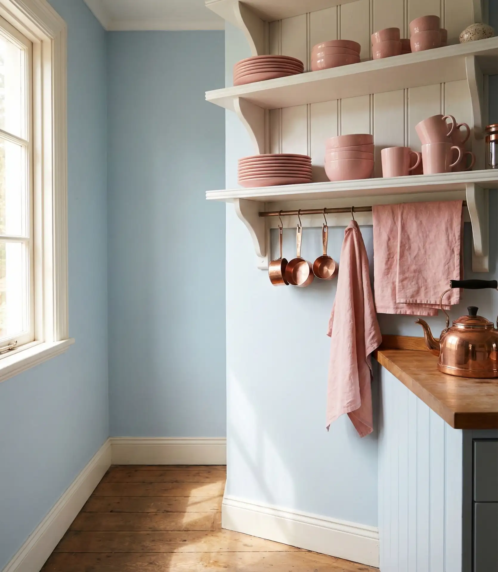
Real homeowners who embrace this palette often start with subtle touches—a pink kettle, blush dish towels—and build from there. The key is keeping both colors muted rather than saturated, which prevents the space from feeling juvenile or overly sweet. It’s a palette that rewards confidence and a willingness to break conventional design rules.
22. Midnight Blue Drama
Midnight blue is the darkest end of the blue spectrum, nearly black but with a rich, inky depth that feels luxurious and dramatic. This shade works in modern kitchens where high contrast and bold designs are desired. Paired with brass or gold fixtures and marble counters, midnight blue creates a sophisticated, almost jewelry-box effect.
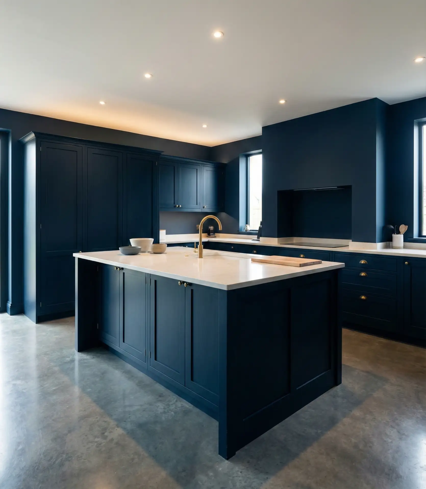
A common mistake with midnight blue is insufficient lighting. This color absorbs light, so you’ll need layered lighting—under-cabinet, pendant, and recessed—to keep the kitchen functional and inviting. Without proper lighting, the space can feel oppressive rather than cozy. Done right, though, midnight blue creates one of the most striking kitchen palettes available.
23. Wedgwood Blue Classic Elegance
Wedgwood blue is a medium-toned, slightly grayed blue that references the famous English pottery. This shade brings classic elegance to traditional kitchens, particularly those with detailed millwork and period details. It’s formal without being stuffy, offering a refined alternative to safe neutrals.
This shade appears frequently in historic homes throughout the Northeast and Mid-Atlantic, where period-appropriate colors are valued. Wedgwood blue updates a traditional kitchen without abandoning its character, offering a middle ground between stark white and more dramatic color choices. It’s a diplomat among blues—getting along with nearly everything while maintaining its own distinct presence.
24. Aqua Blue Tropical Vibes
Aqua blue brings tropical energy to kitchens, evoking Caribbean waters and beach house living. This bright, turquoise-leaning shade works best in homes with strong natural light and connections to outdoor spaces. Paired with white and natural materials, aqua creates a vacation-at-home atmosphere that feels perpetually sunny.
In Florida, Southern California, and Hawaii, aqua kitchens feel natural and appropriate, extending the outdoor color palette inside. In colder climates, this shade can bring much-needed warmth and optimism during long winters. It’s an escape color, transforming the everyday act of making coffee into something that feels more leisurely and intentional.
25. Steel Blue Modern Sophistication
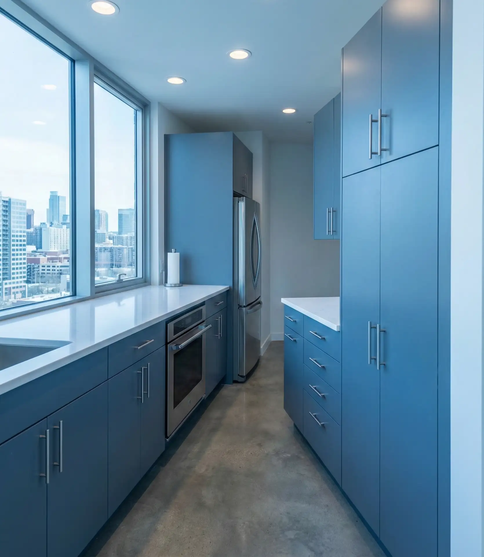
Steel blue is a cool, silvery shade that brings modern sophistication to contemporary kitchens. This color works beautifully with stainless appliances and metallic finishes, creating a cohesive, high-tech aesthetic. It’s a favorite in urban apartments and minimalist homes where clean lines and restrained palettes are valued.
Expert designers note that steel blue requires a deft touch—too much and the space feels cold; balanced with warm woods or textiles, it becomes sophisticated and livable. This shade is popular in condos and lofts where a sleek, gallery-like quality is desired. It’s a color that respects the architecture rather than competing with it.
26. Denim Blue Casual Comfort
Denim blue is a medium-toned, slightly washed shade that brings casual comfort to kitchen spaces. This color references the All-American fabric, creating an approachable, lived-in quality that works in family kitchens and casual entertaining spaces. It’s blue without pretension, offering color that feels as comfortable as your favorite jeans.
A homeowner in Texas painted her kitchen cabinets denim blue and found it perfectly suited her family’s relaxed lifestyle. The color hides fingerprints and daily wear while maintaining a fresh, intentional look. She noted that unlike more formal blues, denim invites you to actually use the kitchen rather than preserve it like a showroom.
27. Ice Blue Scandinavian Simplicity
Ice blue is an ultra-pale, almost ghostly shade that embodies Scandinavian simplicity and restraint. This color brings a sense of calm and spaciousness to kitchens, working especially well in smaller spaces where you want to maximize light reflection. Paired with white and natural wood, ice blue creates an airy, uncluttered aesthetic.
On a budget, achieve this look by painting existing cabinets in a quality pale blue with a matte finish. Scandinavian style prioritizes function and simplicity over expensive finishes, so focus on clean lines and decluttered surfaces rather than costly materials. The result is calming and timeless, a kitchen that feels like a refuge from visual noise.
28. Peacock Blue Bold Statement
Peacock blue is a rich, jewel-toned shade with green undertones that makes a bold statement in any kitchen. This color demands attention, working best in spaces where drama and personality are welcome. Paired with gold or brass fixtures, peacock blue creates a luxurious, maximalist aesthetic that celebrates color and pattern.
Real homeowners who choose peacock blue often have confident, eclectic personal style. They’re not interested in resale value or pleasing everyone—they want a kitchen that reflects their personality. This shade works in Victorian homes, art deco apartments, and bohemian bungalows where more-is-more is the guiding principle. It’s not for everyone, but for the right person, there’s no substitute.
Blue kitchens offer endless possibilities, from soft pastels to dramatic darks, each bringing its own mood and personality to the heart of your home. Whether you’re drawn to classic navy, playful aqua, or sophisticated dusty blue, there’s a shade that will transform your kitchen into a space that feels uniquely yours. We’d love to hear which blue kitchen idea resonates with you—drop a comment below and share your thoughts or your own blue kitchen journey.