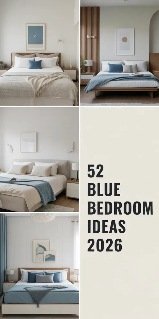
52 Blue Bedroom Ideas 2026: From Navy Drama to Pastel Dreams – Transform Your Space
Blue bedrooms have become one of the most searched home design topics on Pinterest in 2026, and it’s easy to see why. From calming coastal vibes to dramatic midnight tones, blue offers endless versatility for creating spaces that feel both personal and timeless. Blue adapts beautifully to any style, whether it’smodern minimalism, vintage charm, or eclectic maximalism. Americans across every region are turning to blue as a way to transform their bedrooms into sanctuaries that balance beauty with emotional comfort. Below, you’ll find inspiring ideas that showcase the range and power of blue in bedroom design.
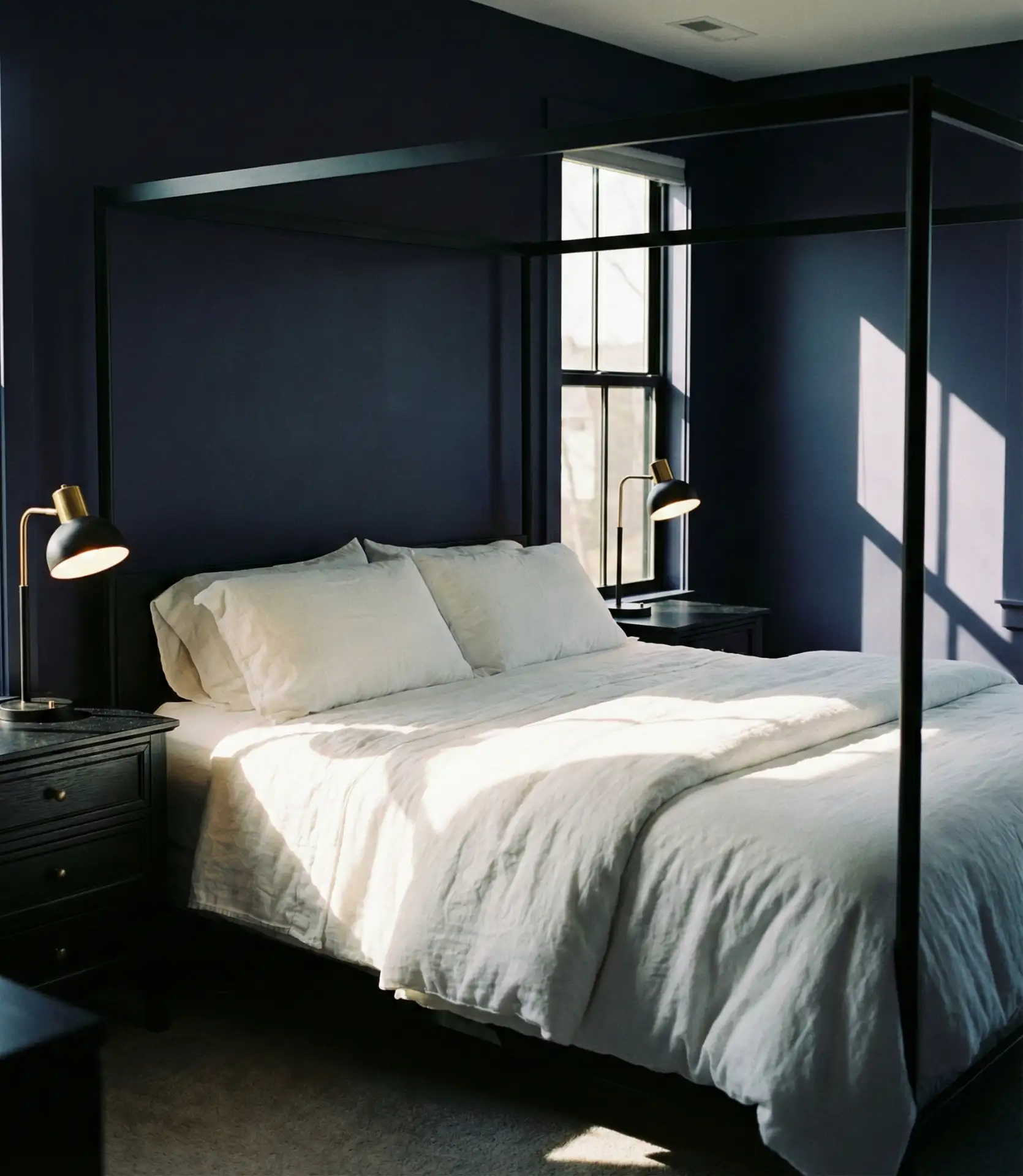
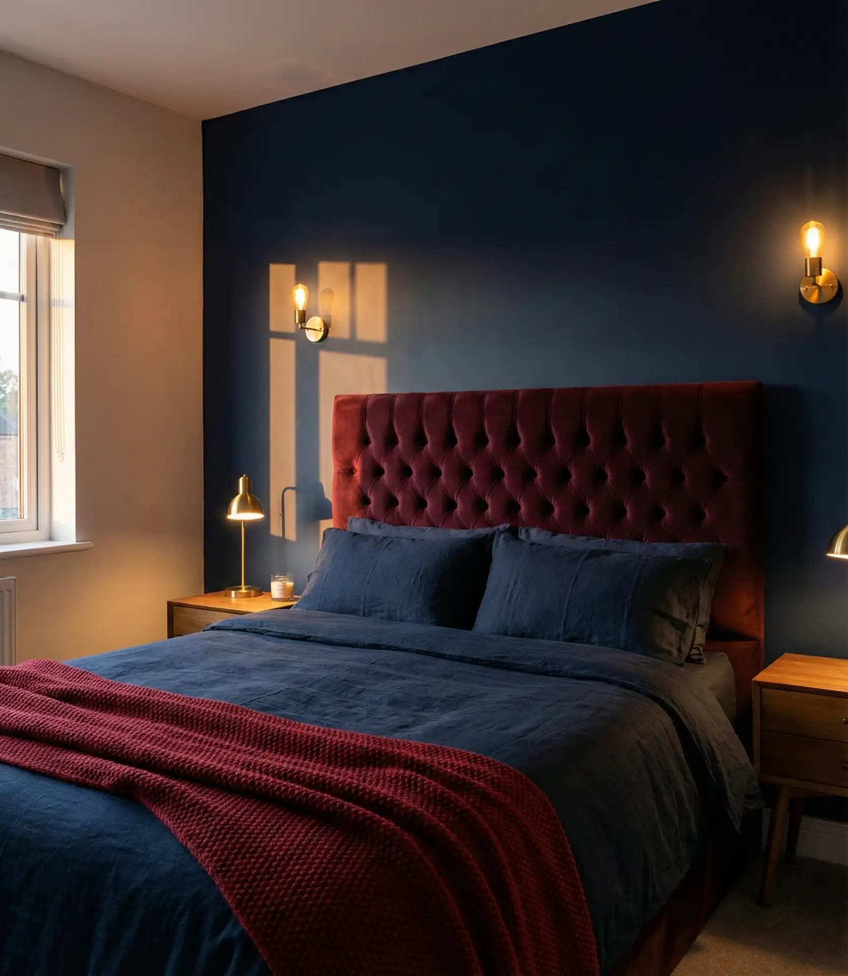
1. Dark Cozy Walls
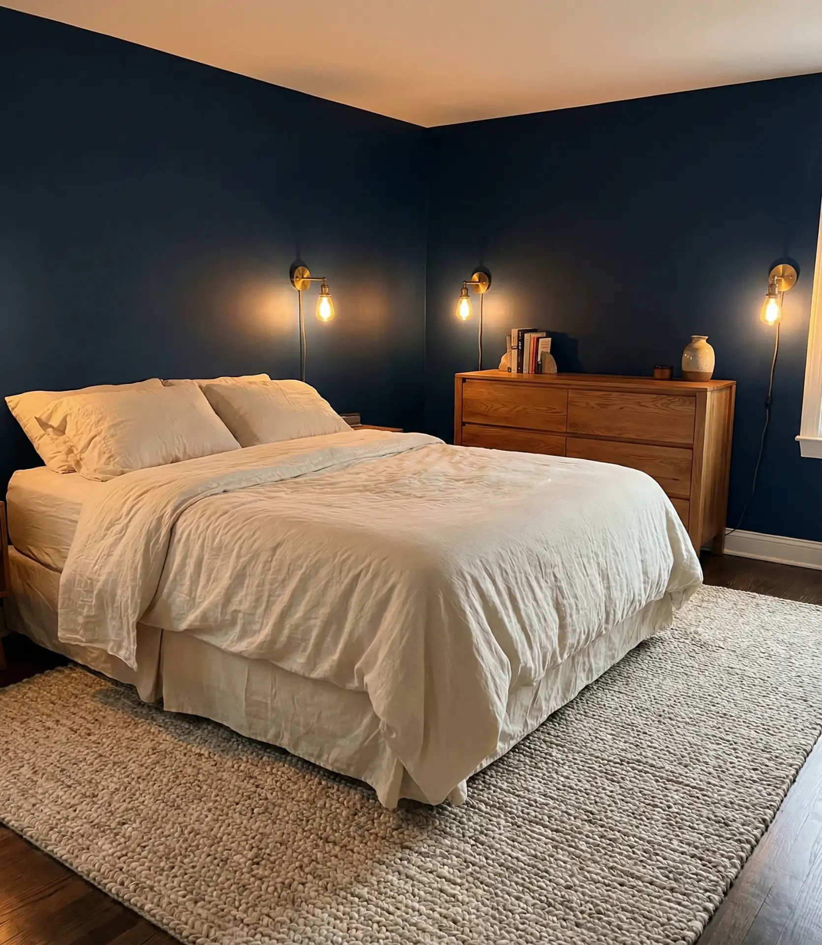
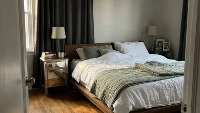
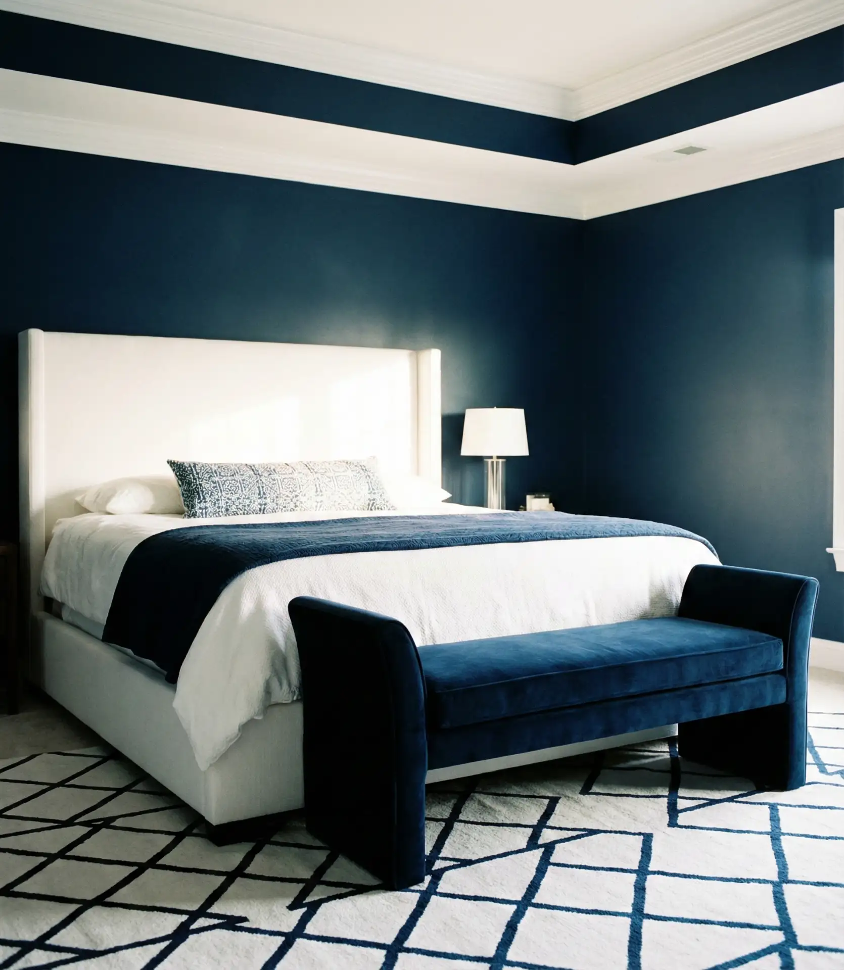
Painting your bedroom in a dark blue shade instantly creates a cozy, enveloping atmosphere that feels like a warm hug at the end of a long day. This approach works beautifully in larger bedrooms where the depth of color won’t overwhelm the space, and it pairs exceptionally well with warm wood furniture and brass or gold accents. The richness of dark blue walls makes white bedding pop and creates a sophisticated backdrop for layered textiles.
One common mistake is choosing a dark blue that’s too cool-toned, which can make the room feel cold rather than inviting. To avoid this, look for blues with subtle gray or green undertones, and always test samples in your actual bedroom lighting before committing. Layering in plenty of warm textures—velvet cushions, wool throws, and natural wood—will balance the drama and keep the space feeling livable rather than stark.
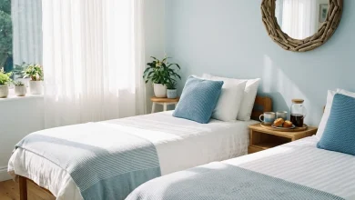
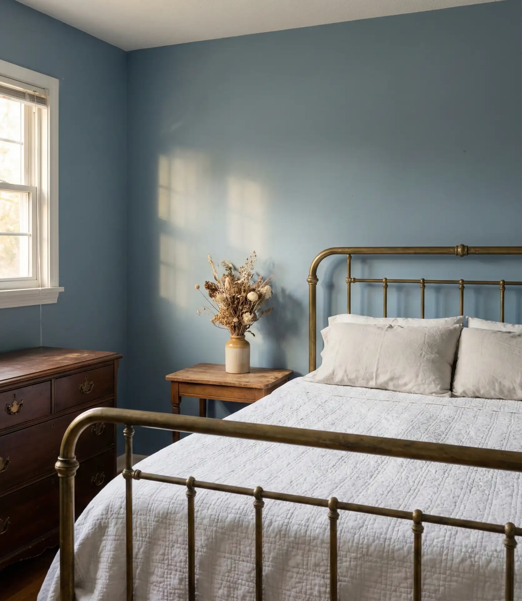
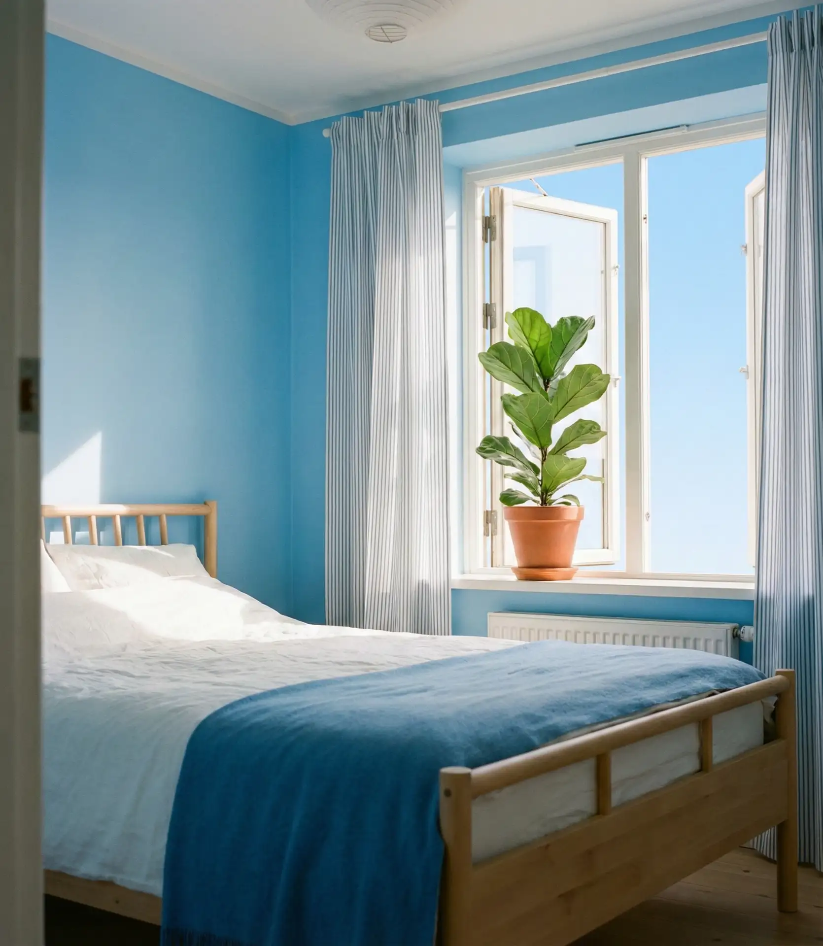
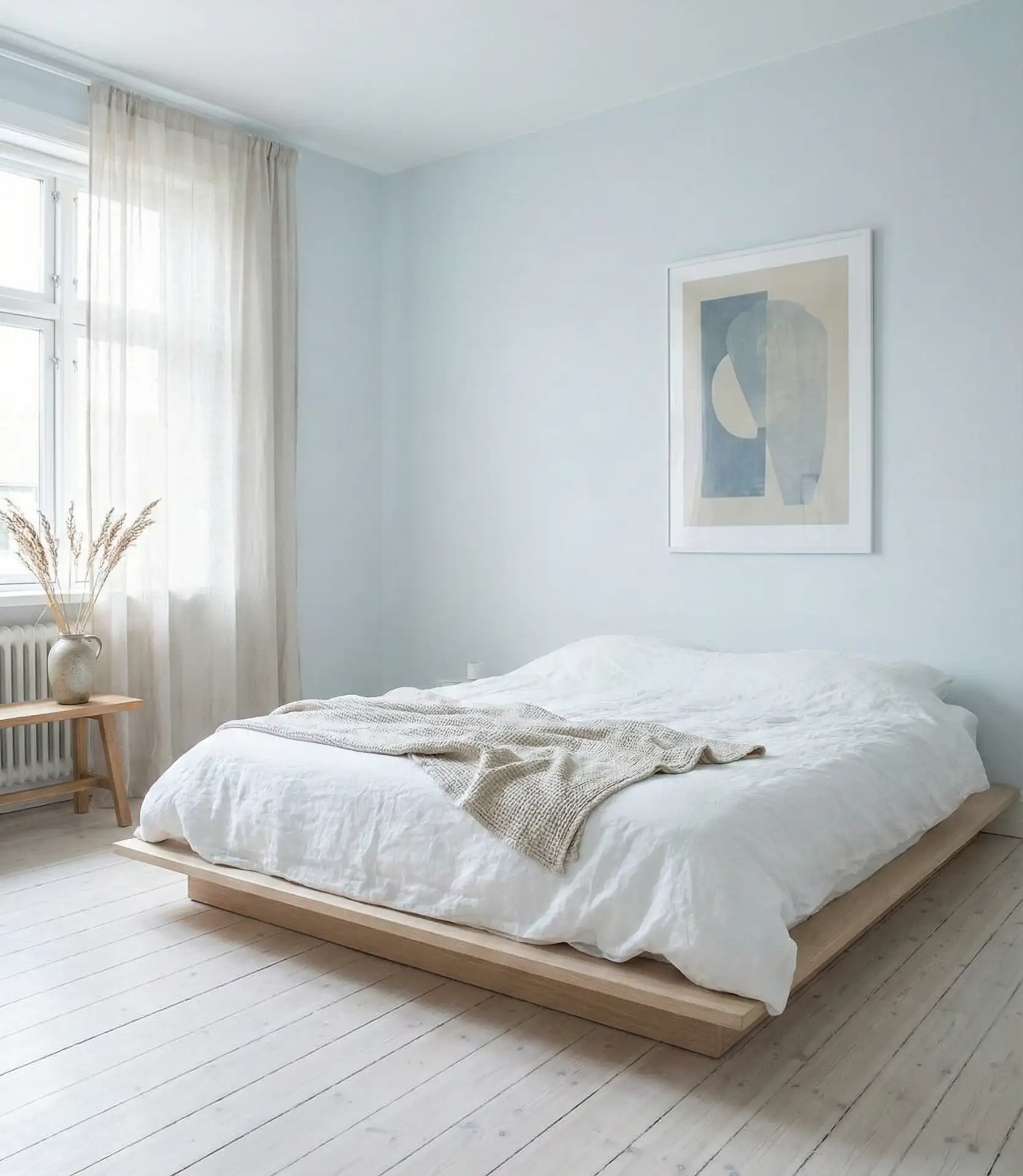
2. Light Airy Retreat
A light blue palette brings an airy, open feeling that makes even modest bedrooms feel more spacious and serene. This shade works exceptionally well in rooms with limited natural light, as it reflects what illumination is available while maintaining a gentle, soothing presence. Light blues pair beautifully with white trim, natural linen bedding, and bleached wood furniture for a breezy, effortless aesthetic.
This approach works best in coastal regions or homes with a beachy aesthetic, but it’s also surprisingly popular in urban apartments where residents crave a sense of escape. The psychology behind light blue is fascinating—studies consistently show it lowers blood pressure and heart rate, making it one of the most scientifically calming colors you can choose for a bedroom where rest is the priority.
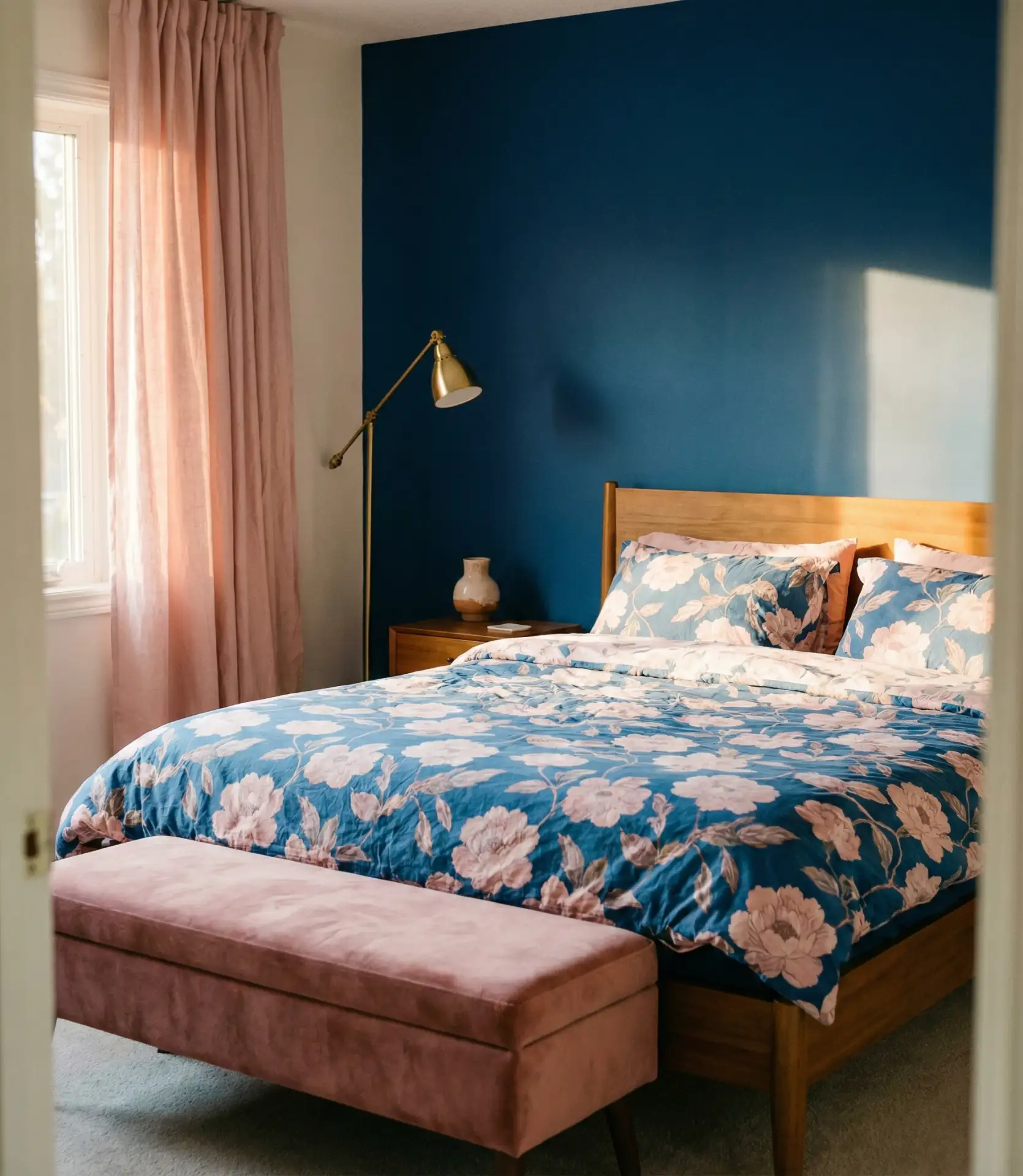
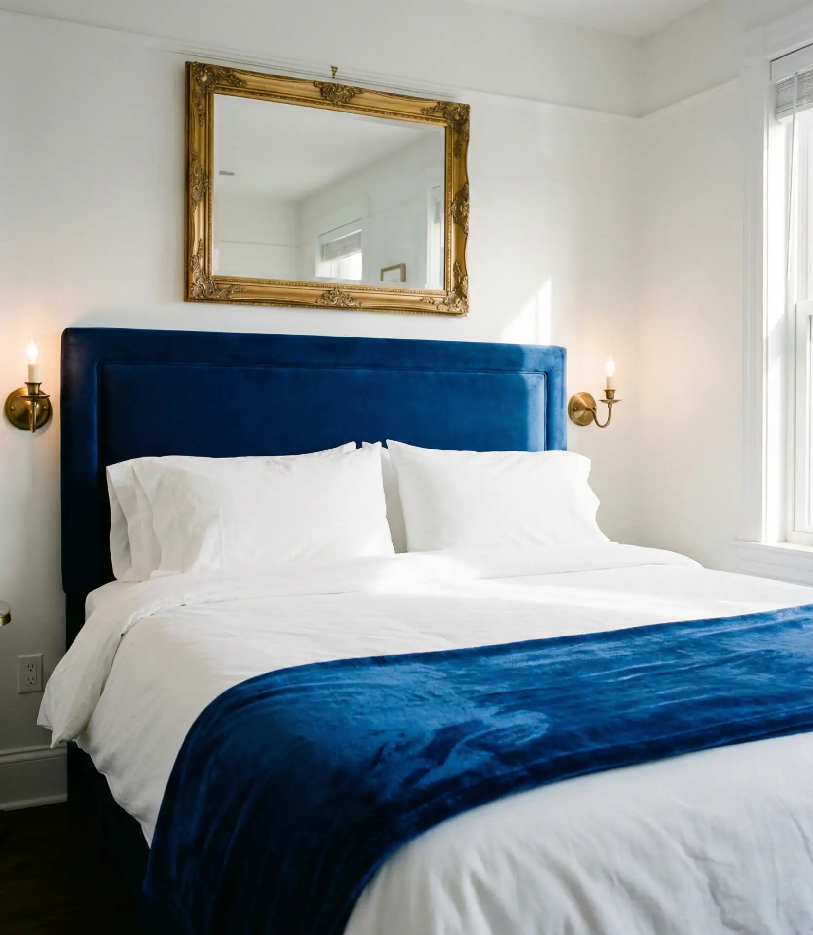
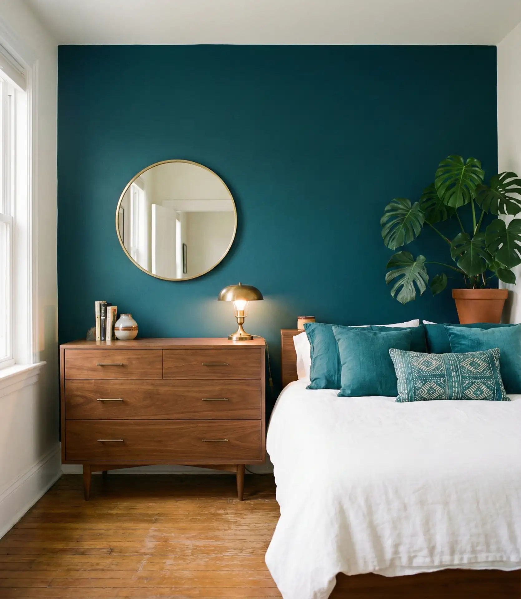
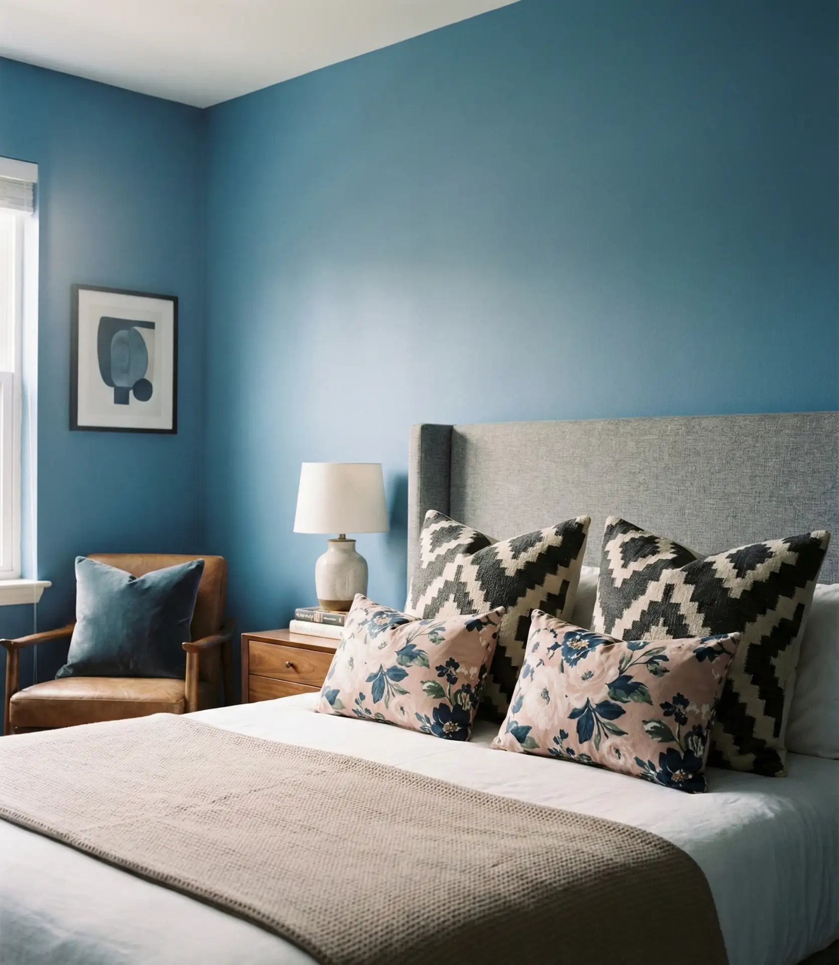
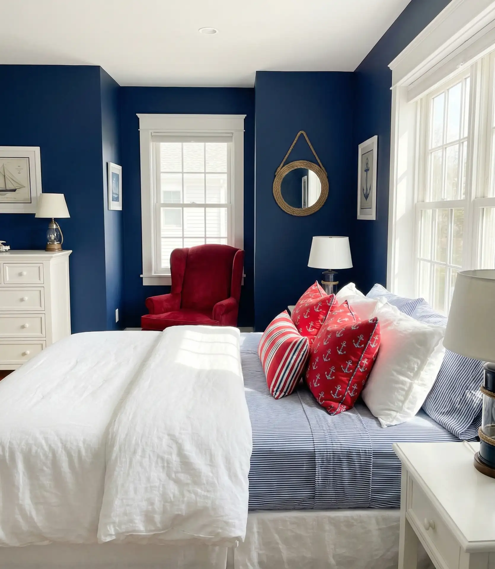
3. Navy and White Contrast
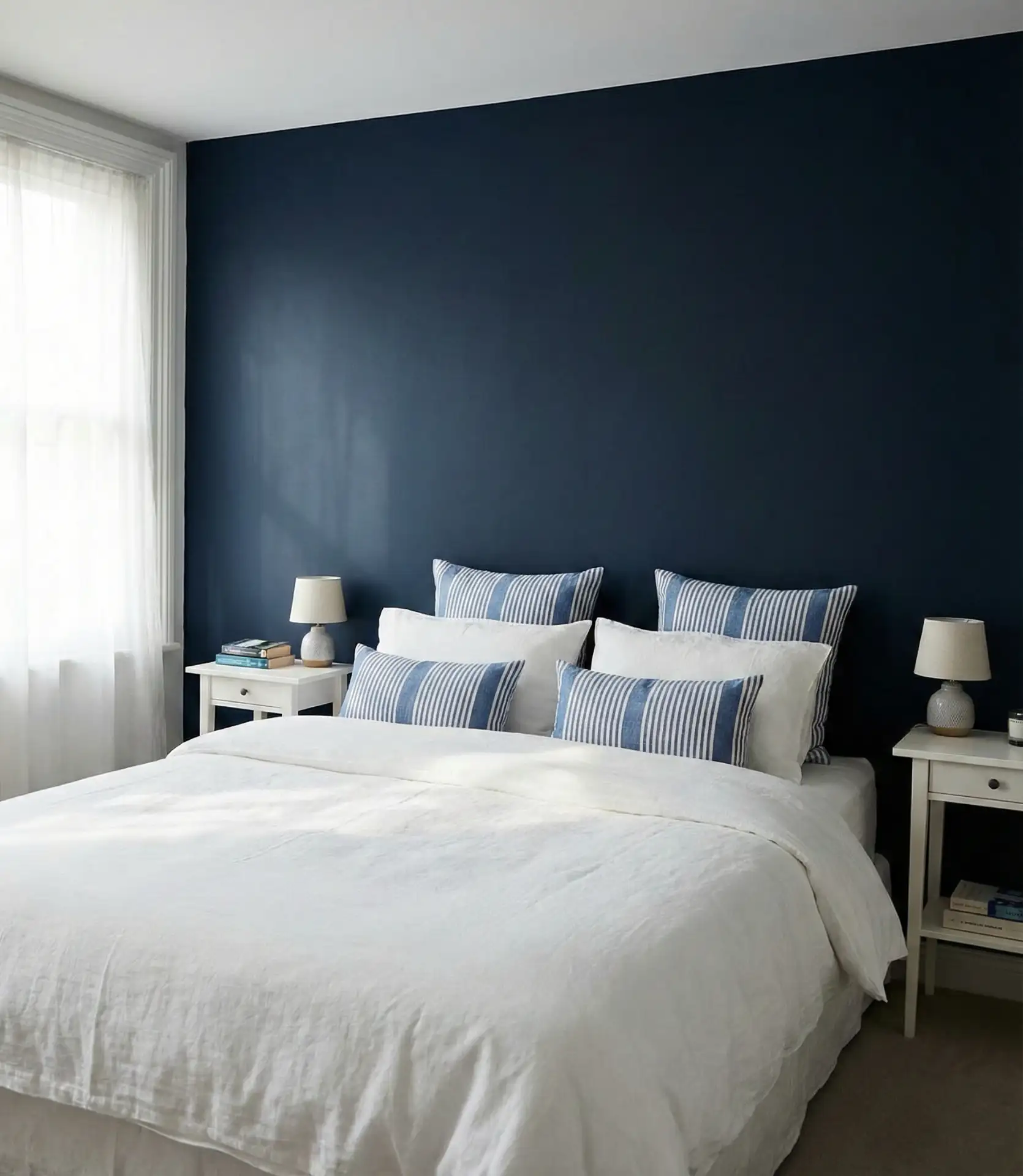
A timeless, sophisticated bedroom is created when navy blue and crisp white are paired. This classic combination works equally well in traditional, coastal, or modern contexts, and it provides a strong foundation that you can easily refresh with different accent colors as your tastes evolve. The high contrast between navy and white adds visual interest without feeling busy or overwhelming.
Budget-conscious decorators love this scheme because navy and white basics are widely available at every price point, from discount stores to high-end boutiques. You can start with affordable navy bedding and white furniture, then gradually add investment pieces like custom window treatments or quality artwork. The color combination is so versatile that your upgrades will always feel cohesive, regardless of when you add them.
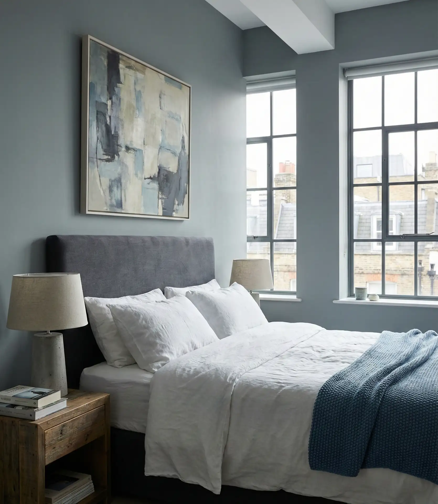
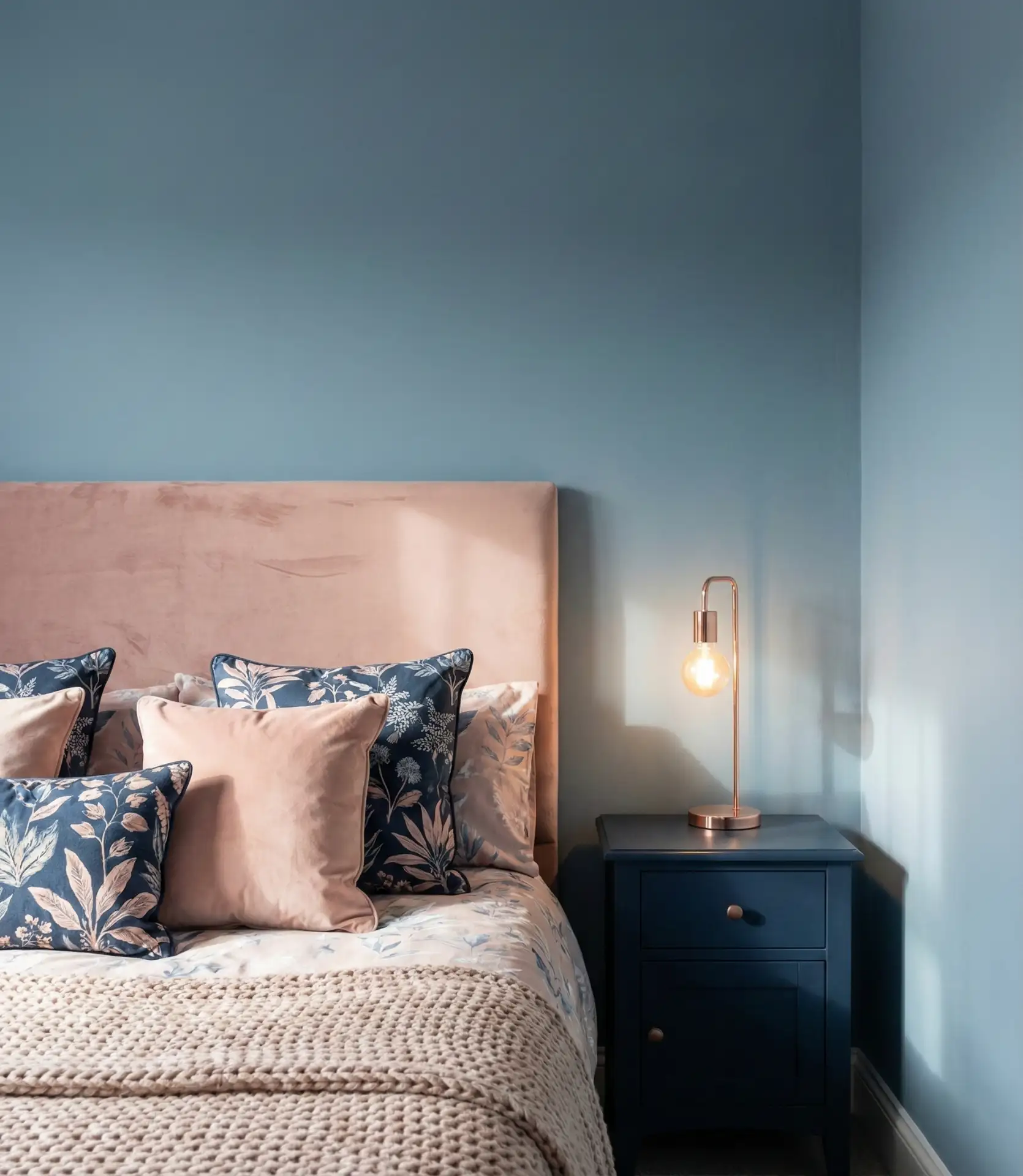
4. Dusty Blue Softness
Dusty blue has emerged as one of 2026’s most beloved bedroom shades, offering a muted, sophisticated alternative to brighter blues. This grayish-blue tone feels inherently calming and pairs beautifully with both warm and cool accent colors, making it incredibly flexible for couples who might have different style preferences. Dusty blue works particularly well in bedrooms with vintage or farmhouse-inspired furniture.
A designer I know in Charleston swears by dusty blue for primary bedrooms, especially in historic homes where the muted tone complements original architectural details without competing with them. She notes that clients consistently report sleeping better in dusty blue rooms compared to more saturated colors, and the shade photographs beautifully in both natural and artificial light, which matters to homeowners who love sharing their spaces on social media.
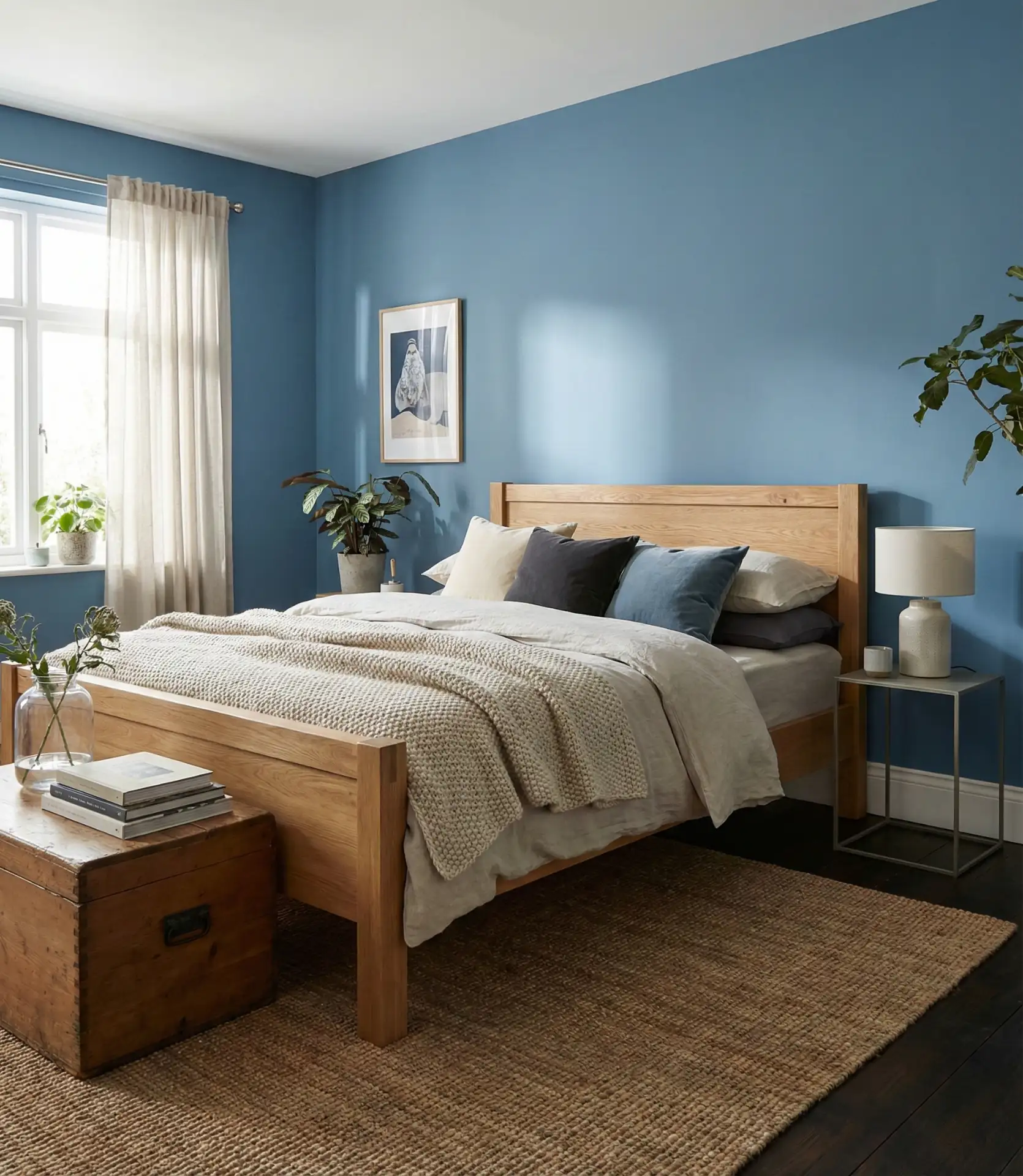
5. Grey-Blue Hybrid
The boundary between grey and blue creates some of the most versatile bedroom colors available in 2026, offering the calming properties of blue with the neutral flexibility of gray. These hybrid shades work exceptionally well in modern and contemporary bedrooms, where they provide color interest without demanding attention. Grey-blue tones also have the practical advantage of hiding minor wall imperfections better than pure white or lighter shades.
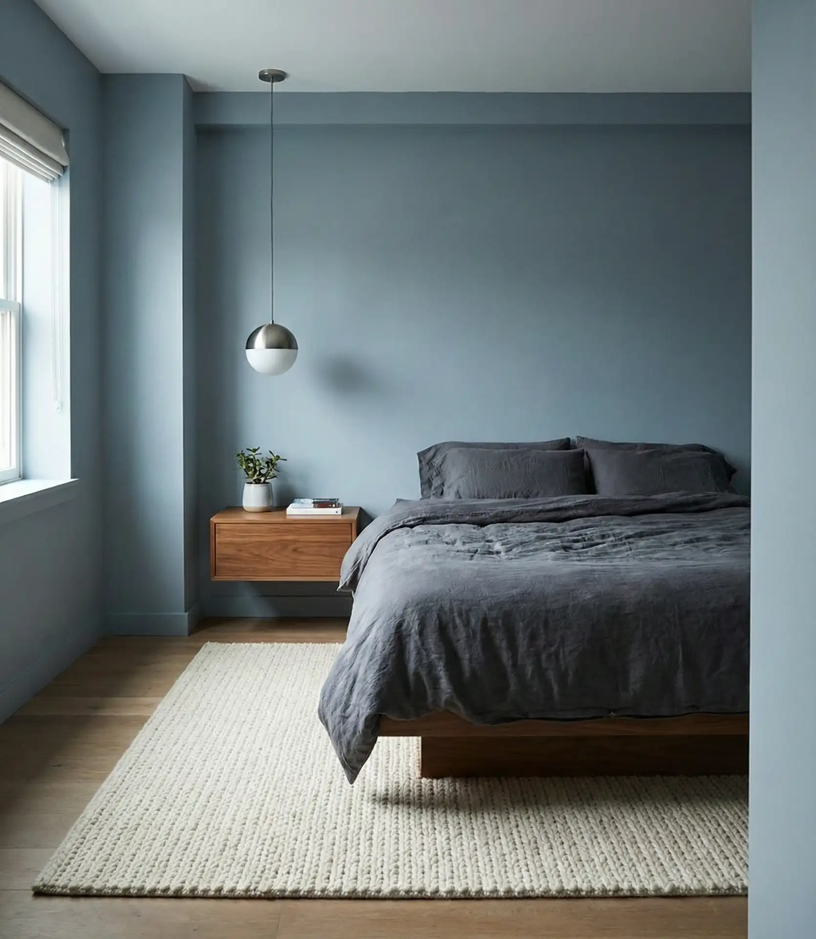
This color family is particularly popular in the Pacific Northwest and Northeast, where overcast skies make homeowners gravitate toward colors that feel natural in lower light conditions. The practical reality is that grey-blue never looks washed out on cloudy days, and it gains a beautiful luminosity when the sun does appear, giving you the best of both worlds regardless of weather conditions outside your window.
6. Aesthetic Minimalism
The current aesthetic movement on social media has made pale blue minimalist bedrooms wildly popular, especially among younger homeowners seeking Instagram-worthy spaces that also function as genuine retreats. This style emphasizes clean lines, carefully curated objects, and a restrained color palette where blue serves as the primary color interest. The key is choosing one perfect shade of blue and letting it breathe within an otherwise neutral space.
The biggest mistake people make when attempting this look is not editing ruthlessly enough—true aesthetic minimalism requires removing everything that doesn’t serve a clear purpose or bring genuine joy. Start by painting your walls in a soft blue, then add back only your absolute favorite pieces. You’ll likely find you need far fewer items than you think to create a bedroom that feels both complete and calming.
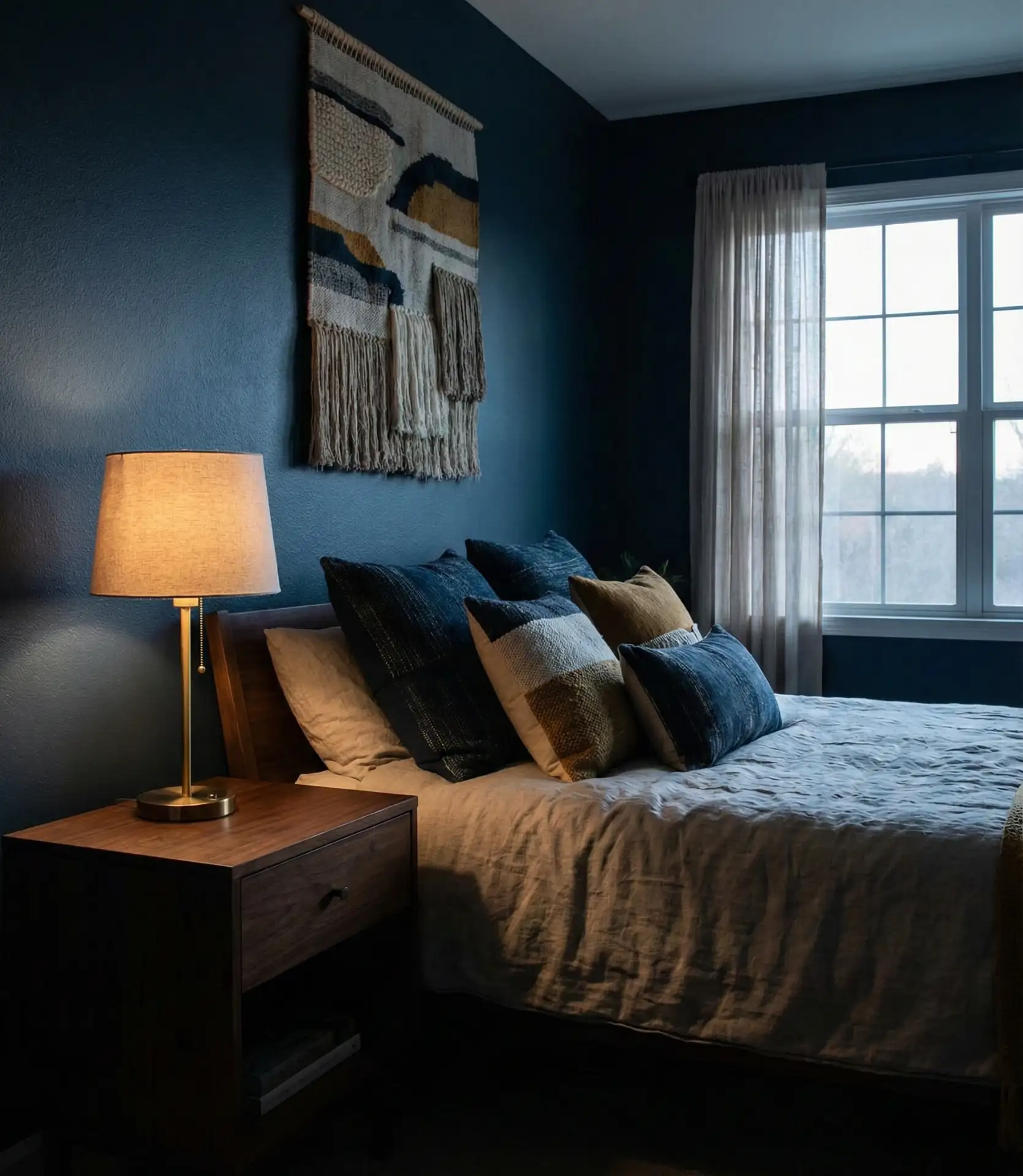
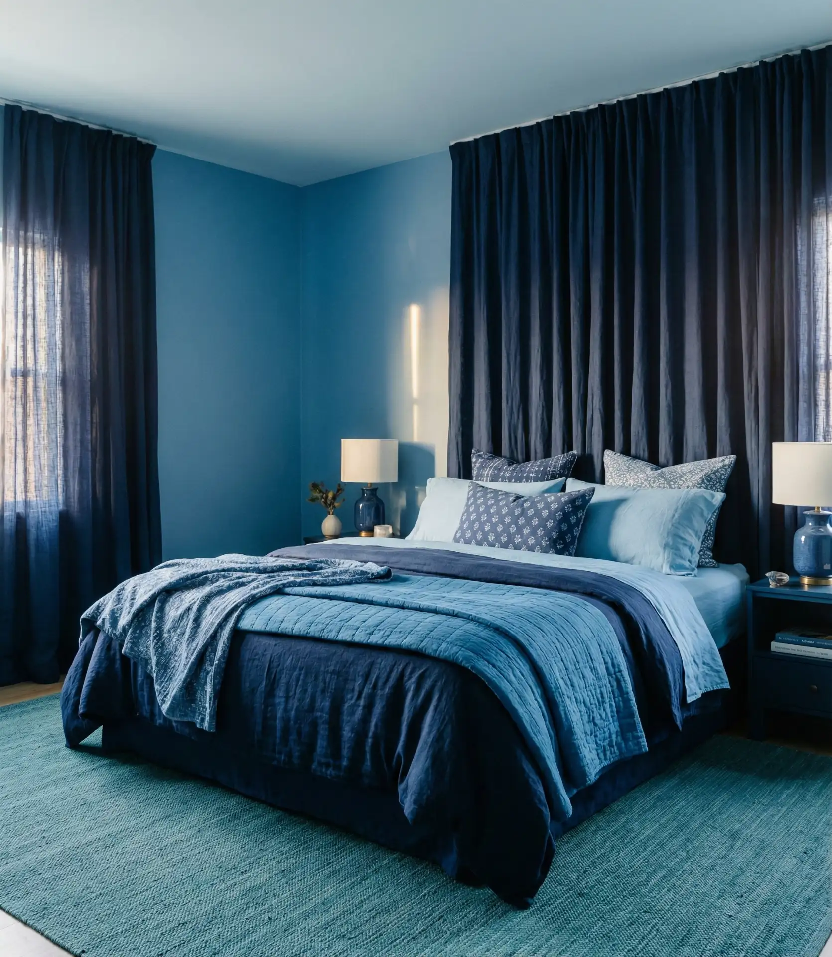
7. Black and Blue Drama
Combining black accents with deep blue creates a bedroom with genuine drama and sophistication that feels like a luxury hotel suite. This bold pairing works best in bedrooms with good natural light or strong artificial lighting plans, as the darker tones can make poorly lit rooms feel cave-like. The contrast between black metal bed frames or furniture and rich midnight blue walls creates stunning visual depth.

This combination is increasingly popular in urban lofts and contemporary homes, particularly among homeowners who want their bedroom to feel distinctly different from the rest of their living space. The psychology here is about creating a deliberate separation—when you walk into a black and blue bedroom, there’s no mistaking that you’ve entered a space designed specifically for rest and privacy, not for entertaining or working.
8. Midnight Sky Ceiling
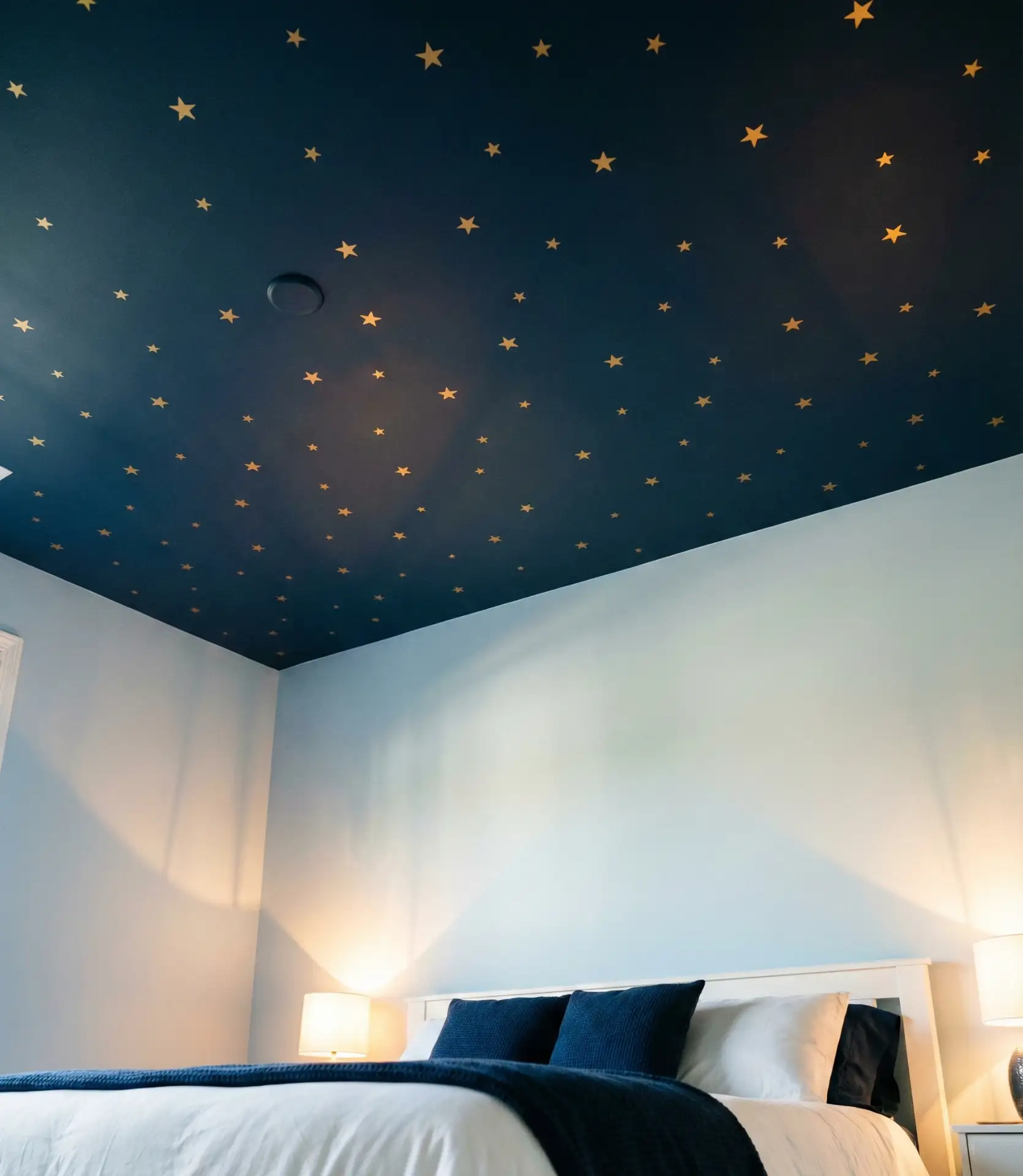
Painting your ceiling in midnight blue rather than the traditional white creates an unexpected and magical effect that genuinely mimics sleeping under the night sky. This approach works particularly well in bedrooms with high ceilings, where the dark color creates intimacy without feeling oppressive. The midnight ceiling paired with lighter walls gives you the drama of dark color without overwhelming the entire room.
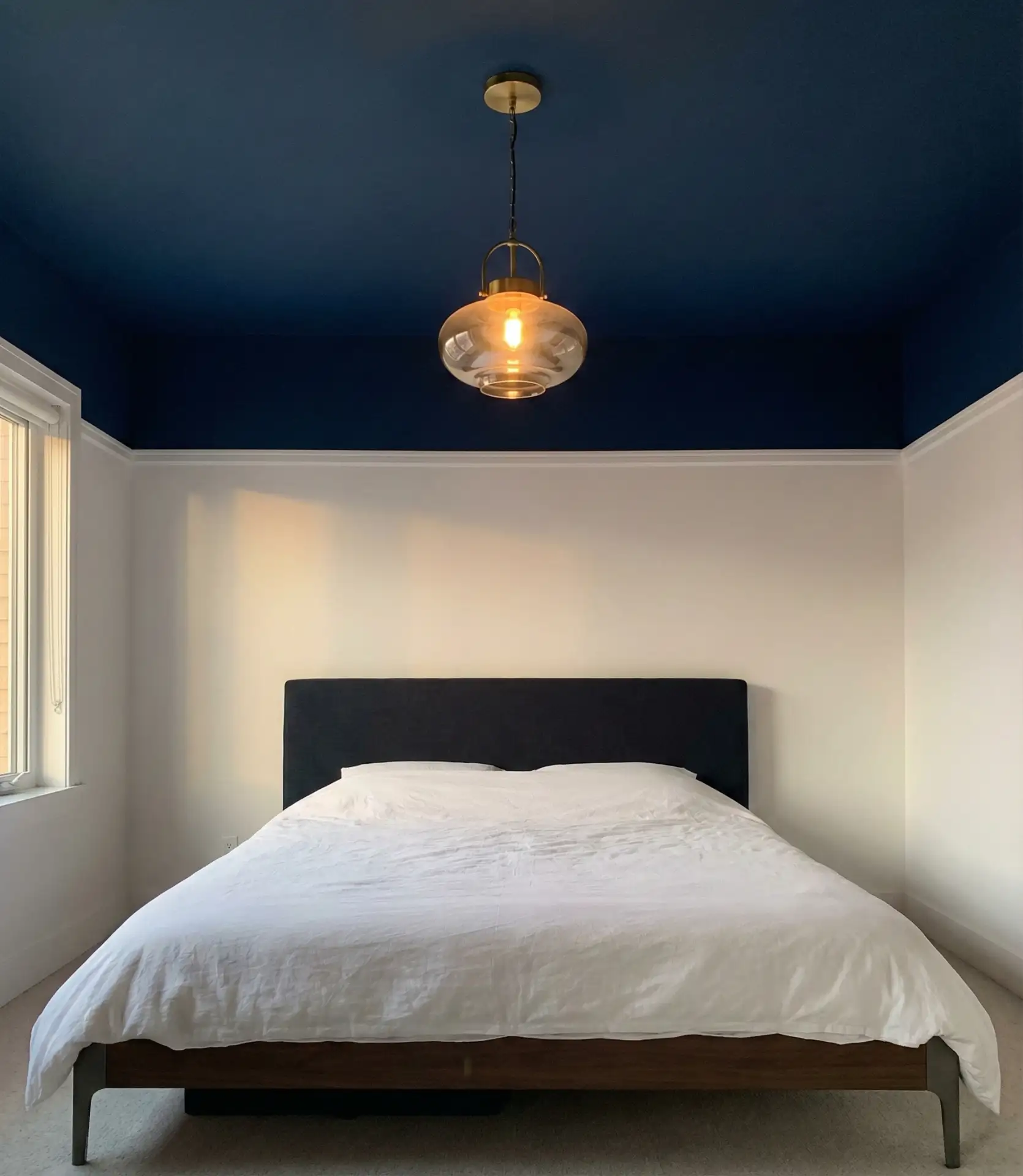
Ceiling color is one of the most underutilized tools in bedroom design, yet it can completely transform how a space feels without requiring much paint. The cost difference between painting a ceiling and painting walls is minimal since ceilings are typically smaller in square footage, making this a budget-friendly way to create significant impact. Just make sure to use paint specifically formulated for ceilings to avoid drips and ensure proper coverage.
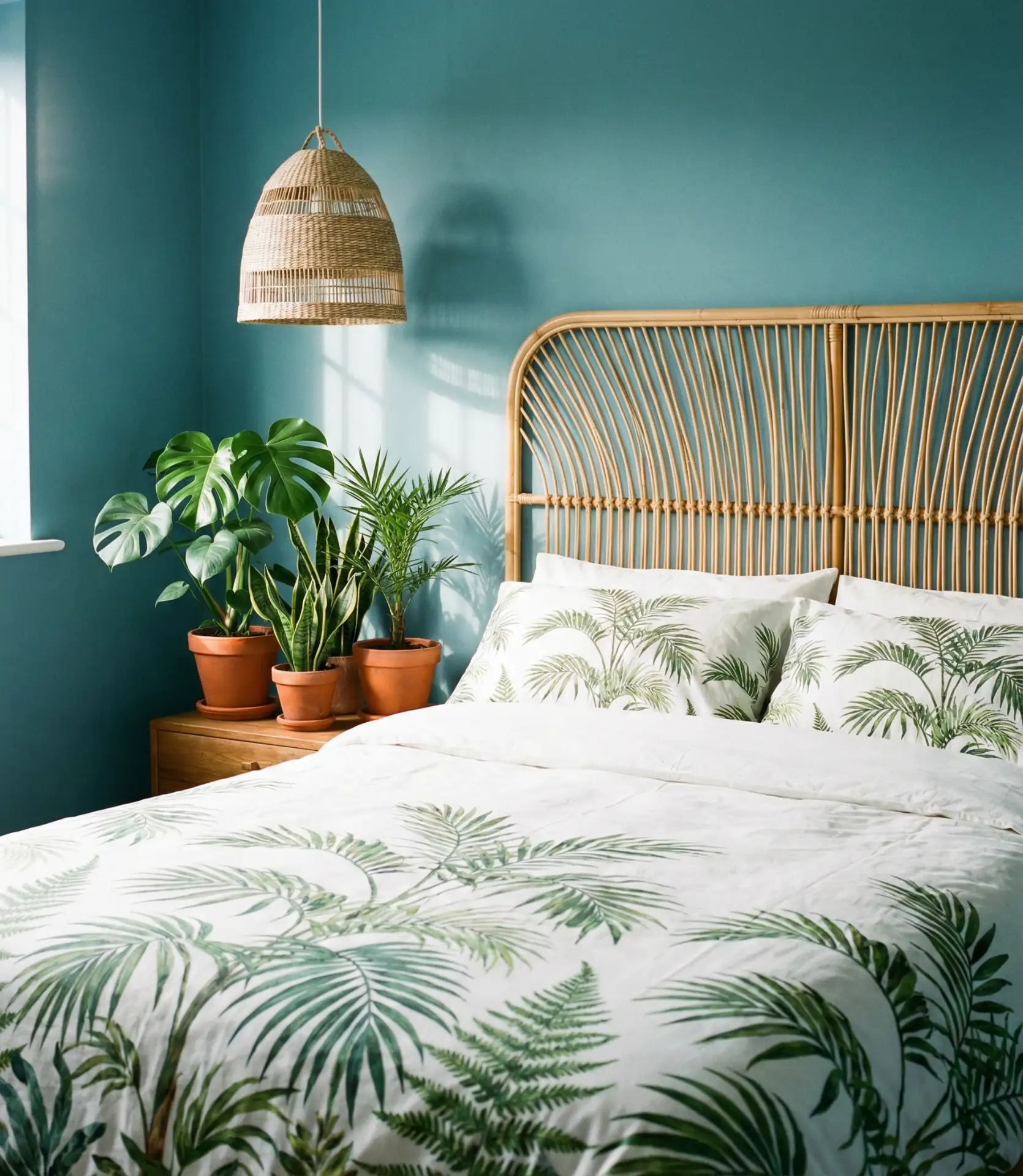
9. Green-Blue Fusion
The space where blue meets green creates some of the most naturally calming bedroom colors, evoking water, sky, and foliage simultaneously. These teal and aqua-leaning shades work beautifully in bedrooms where you want to bring an organic, nature-inspired feeling indoors. The color works across many design styles, from tropical and coastal to modern farmhouse, depending on how you style the surrounding elements.
Many real homeowners report that these blue-green shades were easier for their families to agree on than pure blues or greens, making them ideal for shared bedrooms. The transitional quality means different family members can see different undertones depending on their personal color perception, which reduces the likelihood of one partner feeling like they compromised too much on the bedroom color choice—a surprisingly common source of design tension.
10. White and Blue Serenity
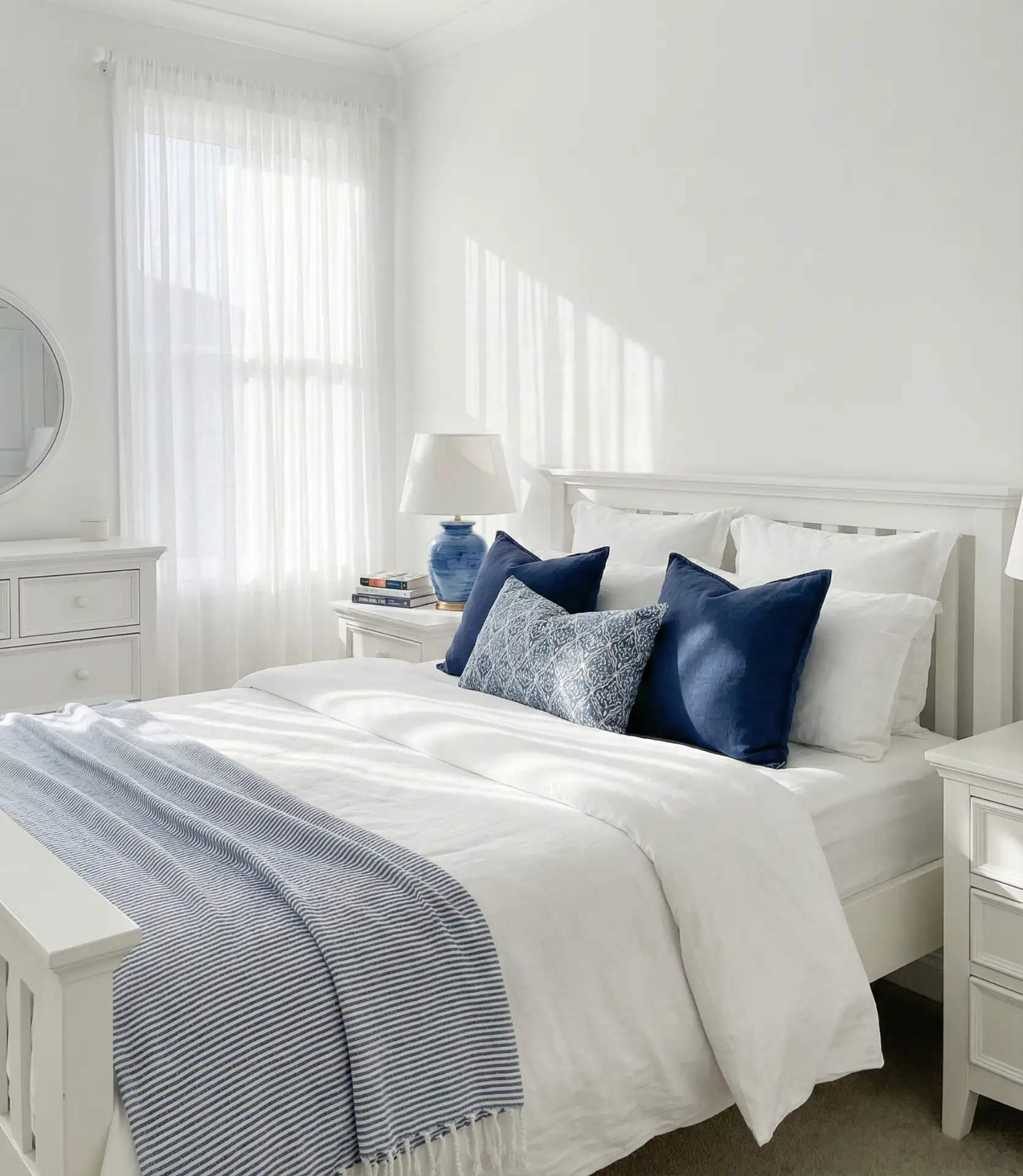
The combination of white as the dominant color with blue accents creates bedrooms that feel clean, fresh, and perpetually serene. This approach works particularly well in smaller bedrooms where you want to maximize the sense of space while still incorporating color personality. Using white for walls, ceilings, and major furniture pieces, then layering in blue through textiles and accessories, gives you flexibility to change the blue intensity seasonally.
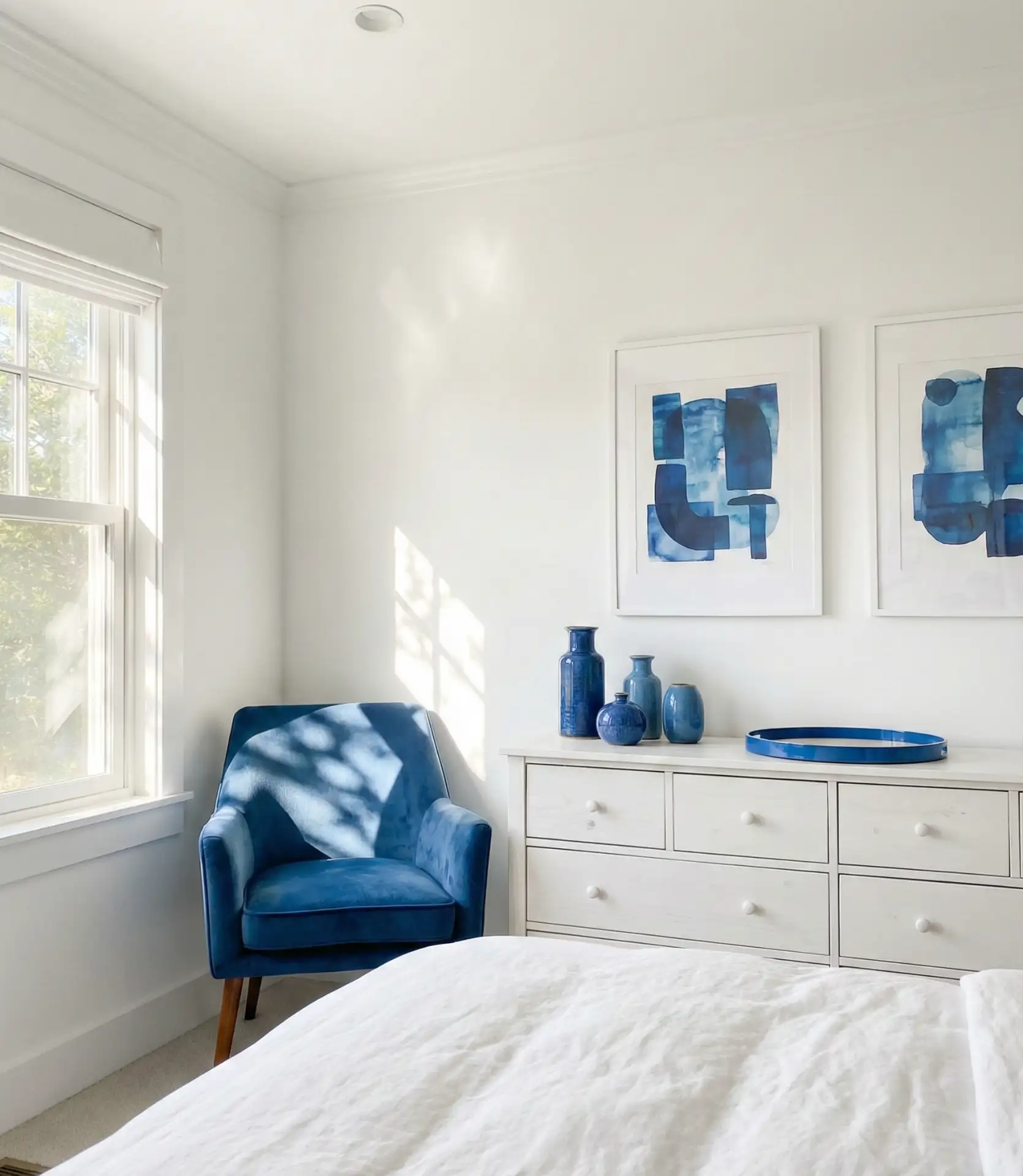
This color scheme is particularly popular in the South and Southwest, where the bright white helps reflect heat and keeps rooms feeling cooler during long, hot summers. From a practical standpoint, starting with an all-white base means you can easily experiment with different blue shades over time—swap out navy pillows for sky blue ones, or change from cobalt curtains to aqua—without repainting or replacing major furniture pieces.
11. Pink and Blue Together
The combination of pink and blue has evolved far beyond nursery colors, becoming a sophisticated and surprisingly versatile palette for adult bedrooms in 2026. The key is choosing the right shades—think blush pink with dusty blue or coral with navy—rather than primary pastels. This pairing creates bedrooms that feel both calming and optimistic, with enough visual interest to prevent monotony.
The expert perspective here is that pink and blue work because they sit opposite each other in temperature—pink reads warm while blue reads cool—creating a natural balance that prevents either color from overwhelming the space. Interior designers frequently use this combination in guest bedrooms specifically because it feels welcoming and non-gender-specific when executed with sophisticated, muted tones rather than bright primary versions of each color.
12. Royal Blue Statement
A royal blue accent wall or major furniture piece makes an undeniable statement in any bedroom, bringing richness and jewel-tone luxury to the space. This vibrant, saturated blue works best when used strategically rather than wall-to-wall, paired with neutral tones that let the royal blue truly shine. The intensity of this shade means it works particularly well in rooms with strong natural light that can handle the color’s boldness.
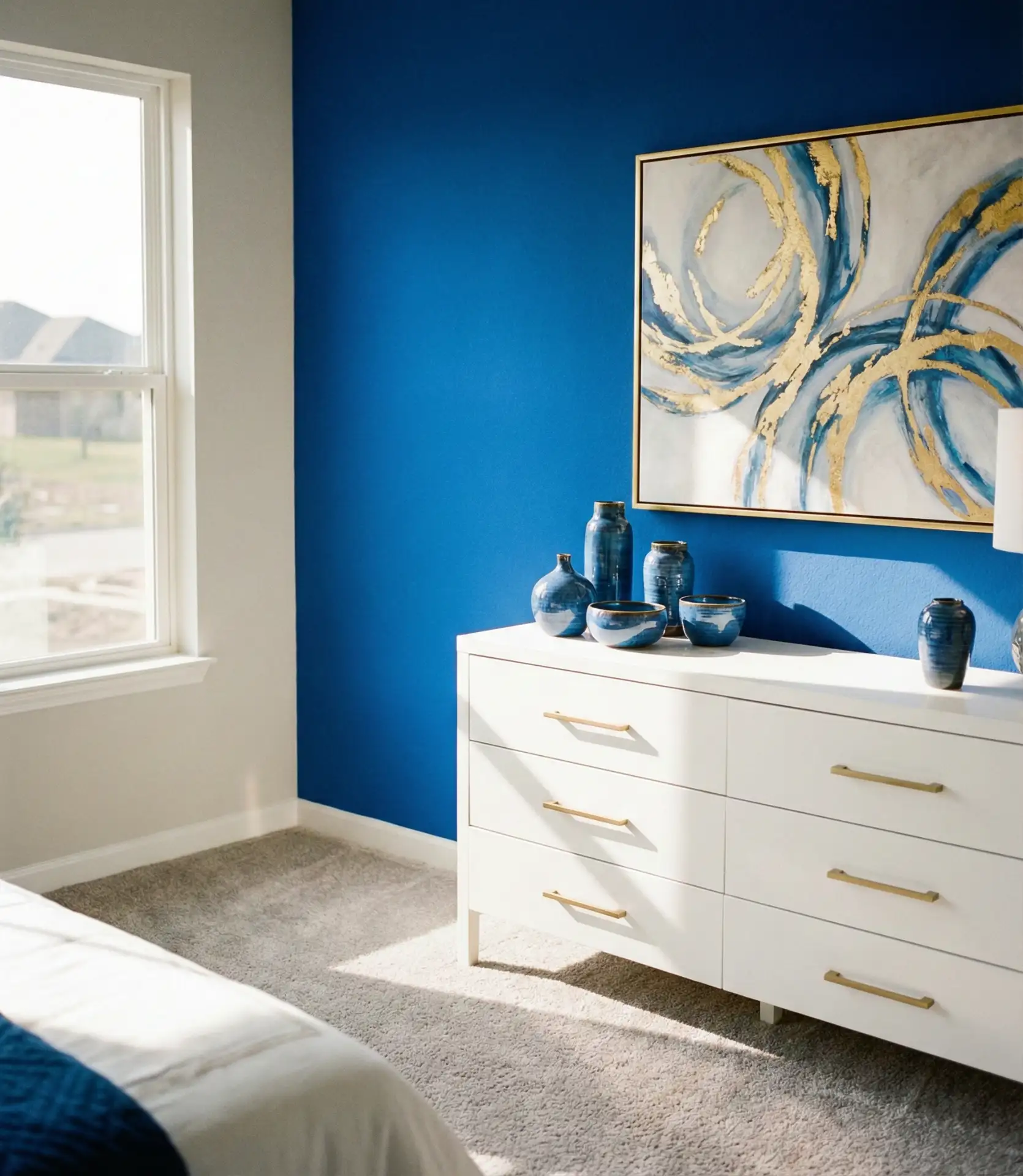
This approach works best in homes with either contemporary or traditional maximalist design, where bold color feels intentional rather than jarring. In suburban developments where many homes feature safe beige and gray palettes, a royal blue bedroom becomes a genuine personal statement that distinguishes your home. The color has historical gravitas too—it’s been associated with luxury and nobility for centuries, which subconsciously elevates how special the space feels.
13. Sky Blue Happiness
Sky blue brings an undeniable cheerfulness to bedrooms, evoking clear summer days and creating spaces that feel optimistic and energizing. Children’s rooms and teens’ spaces benefit greatly from this brighter, clearer blue, but it also works well in adult bedrooms, particularly for those who struggle with seasonal mood changes. The brightness of sky blue means it performs well even in rooms with limited natural light, reflecting and amplifying whatever illumination is available.
From a budget perspective, sky blue is widely available in every paint line at every price point, and the shade has remained consistently popular for decades, meaning you’ll always be able to find matching accessories and textiles. This is particularly valuable for families with children—you can easily find affordable bedding, rugs, and curtains in coordinating shades, then upgrade to higher-quality pieces over time without the color feeling dated or discontinued.
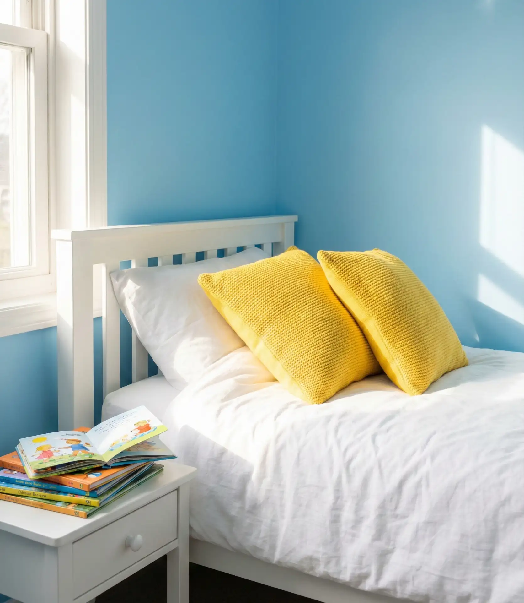
14. Yellow and Blue Sunshine
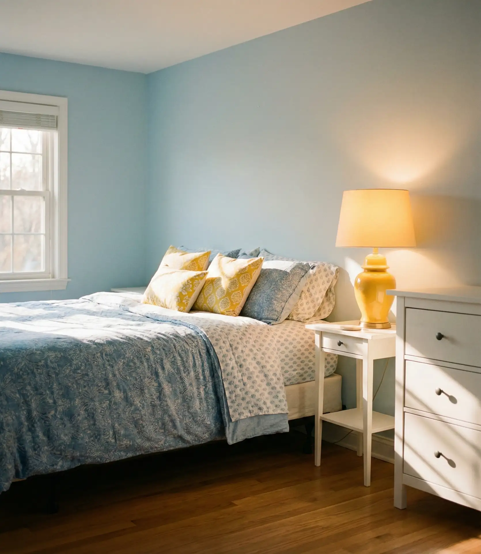
Pairing blue with yellow accents creates bedrooms that feel genuinely cheerful and energizing, perfect for people who want their morning routine to start on an upbeat note. The complementary nature of blue and yellow on the color wheel means they naturally enhance each other, with the yellow making the blue appear richer and the blue making the yellow glow brighter. This combination works across many styles, from Scandinavian modern to Mediterranean coastal.
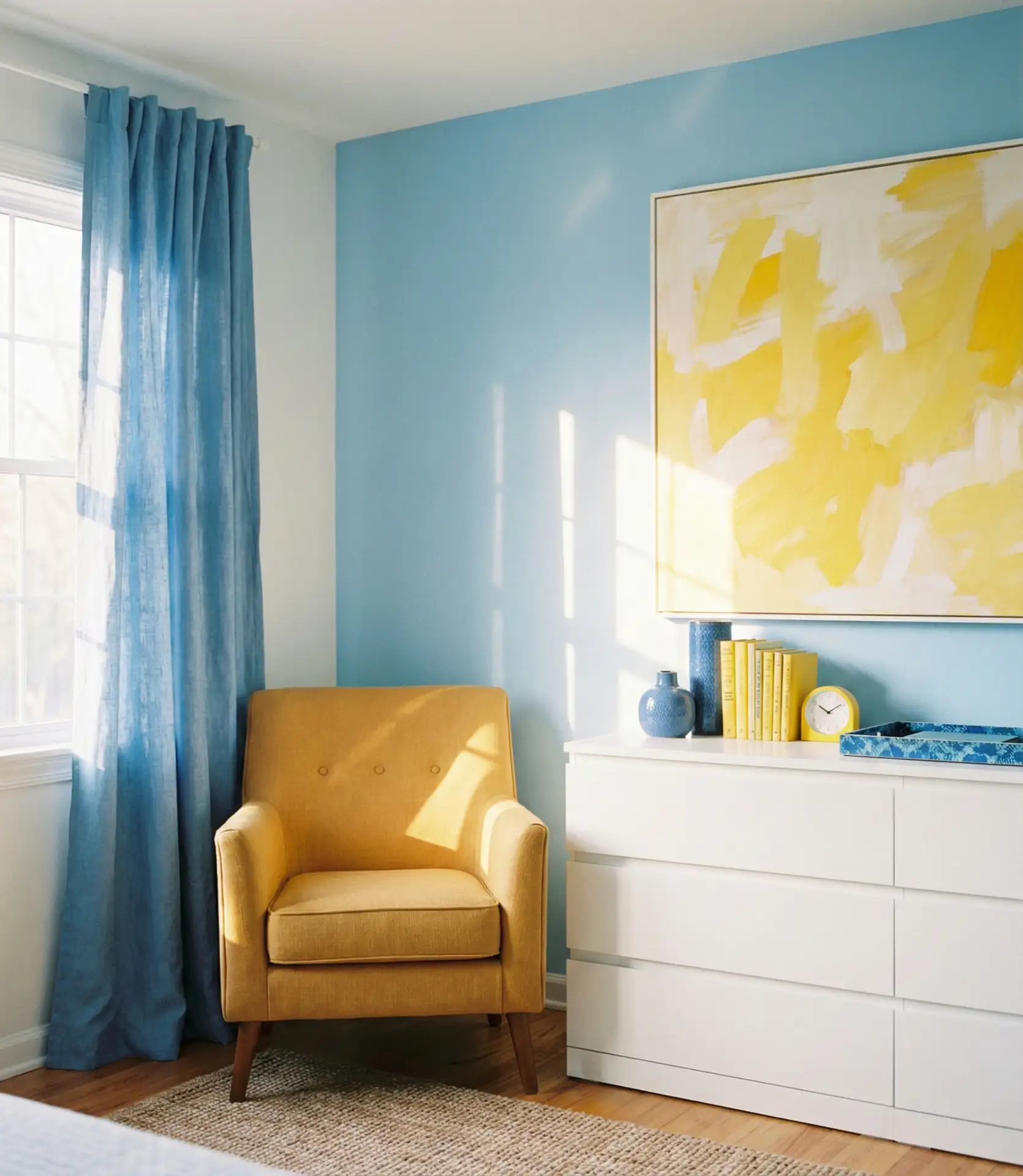
Real homeowners in northern climates especially appreciate this combination during dark winter months when both natural light and psychological brightness become precious commodities. The yellow doesn’t need to dominate—even small touches like mustard throw pillows or a sunny accent chair can provide enough warmth to balance cooler blue walls and transform how the entire room feels during the short, gray days of winter.
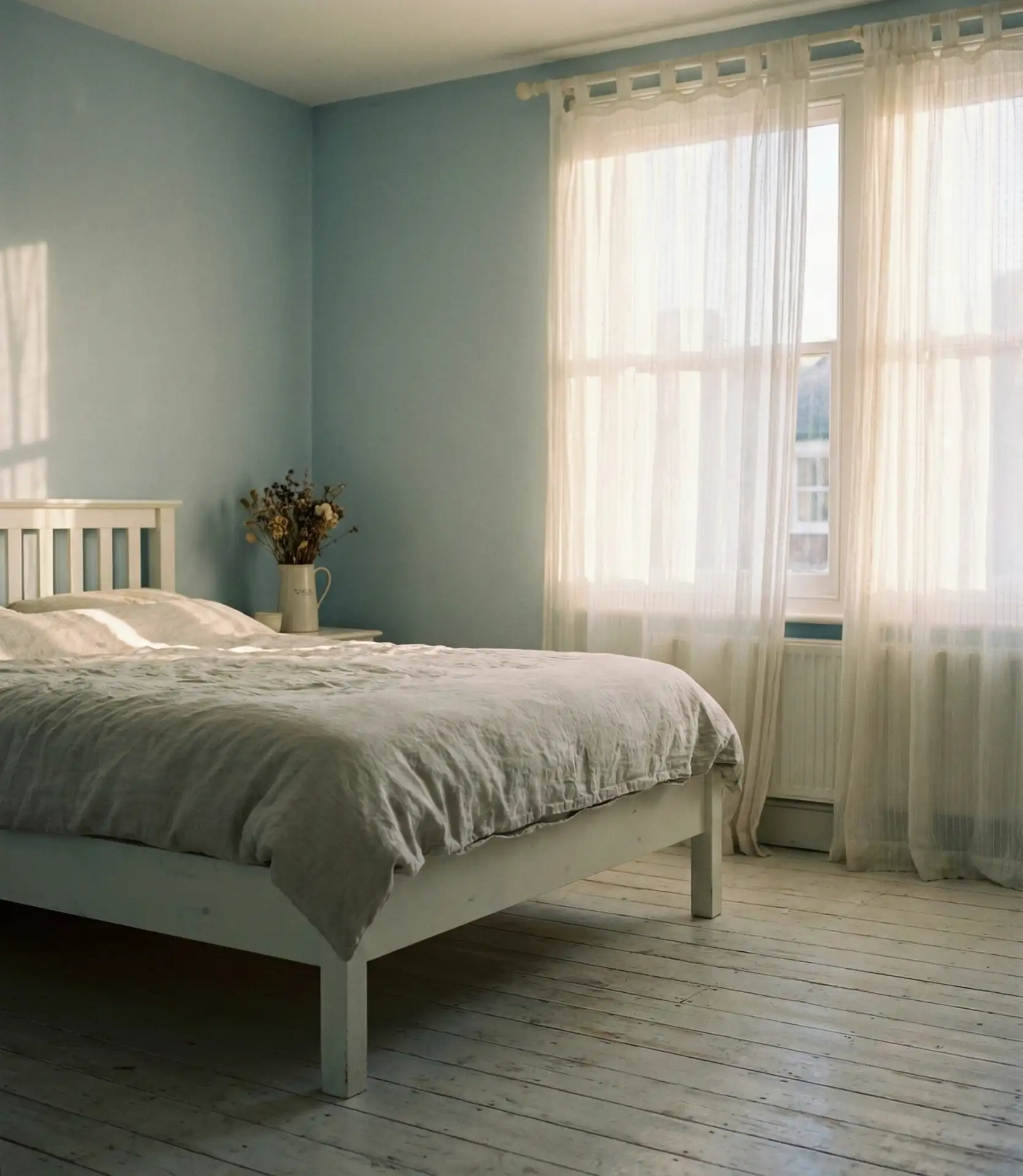
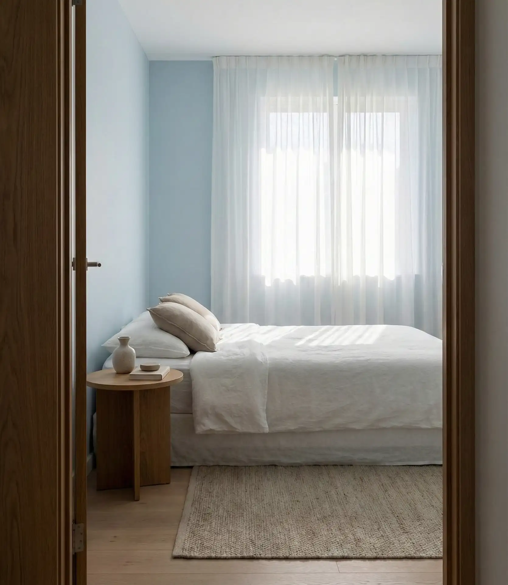
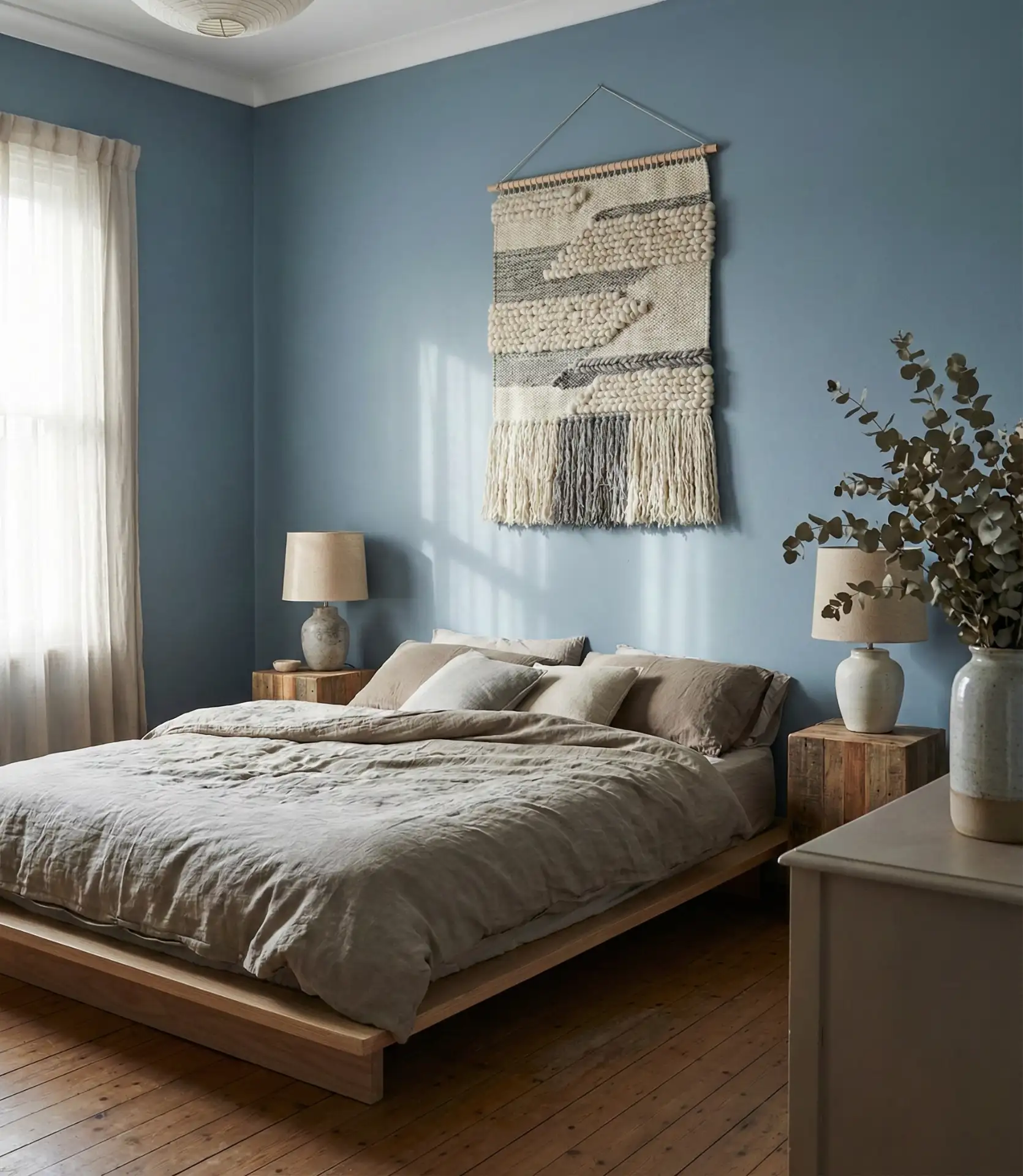
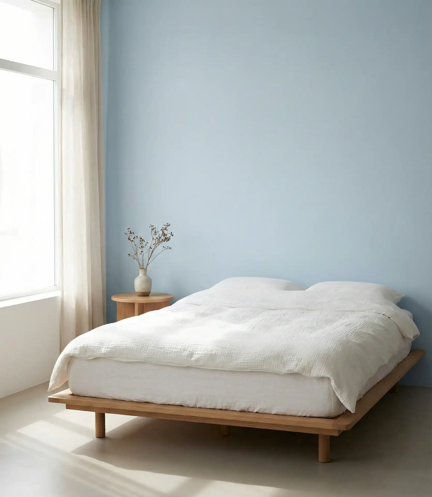
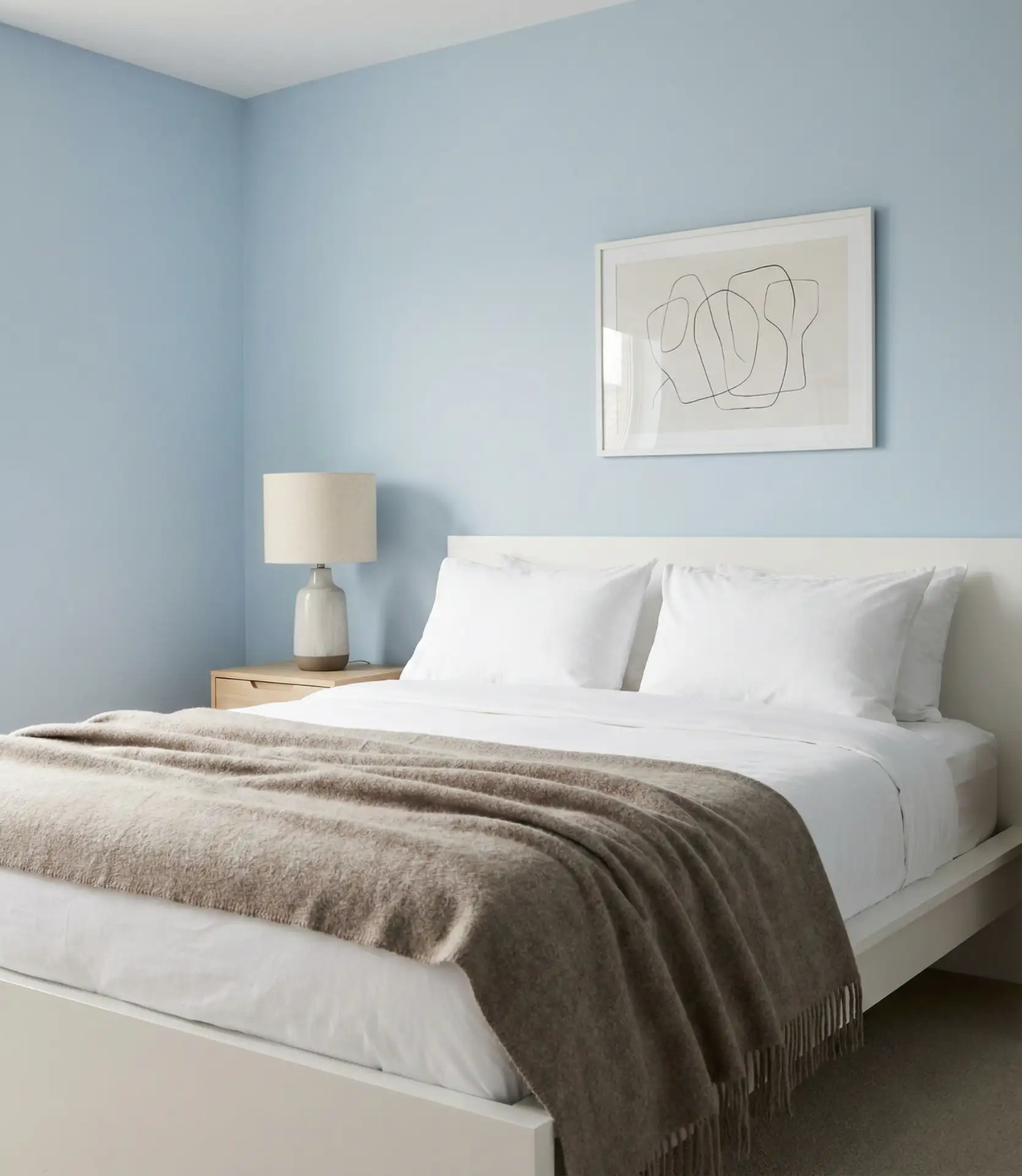
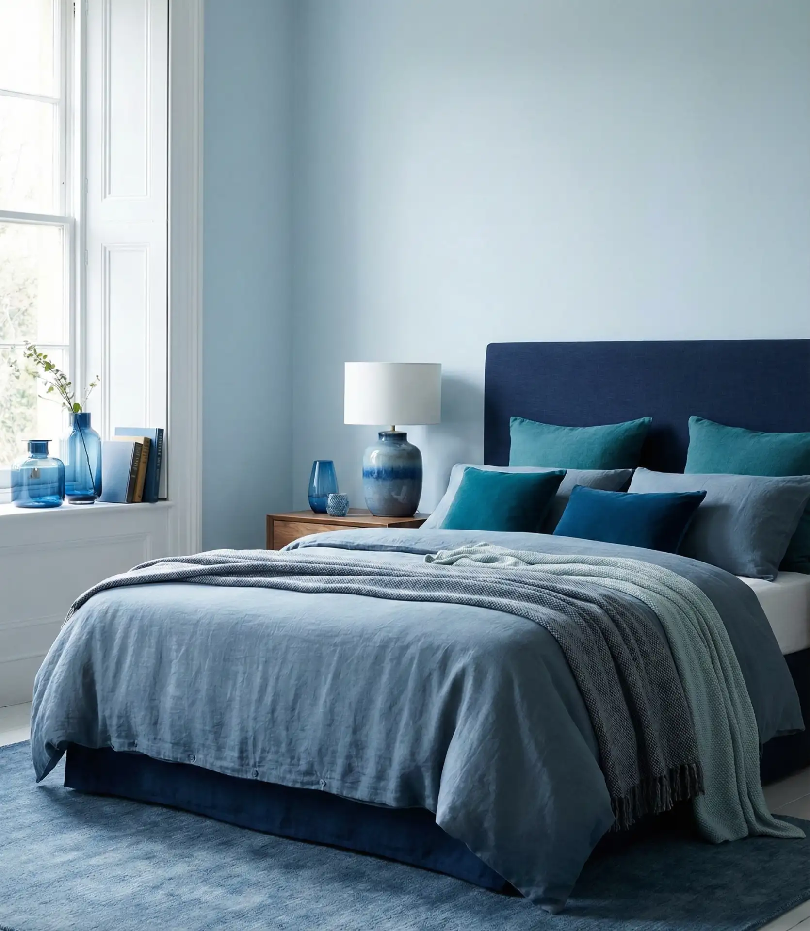
15. Pale Tranquility
Pale blue creates some of the most genuinely tranquil bedrooms possible, offering color presence without any visual aggression or stimulation. This almost-white blue works beautifully in vintage-inspired interiors, Swedish country styles, and any aesthetic where subtlety and sophistication matter more than bold statements. The pale tone reflects light beautifully, making rooms feel larger and more open while maintaining enough color to prevent the sterile feeling of pure white.
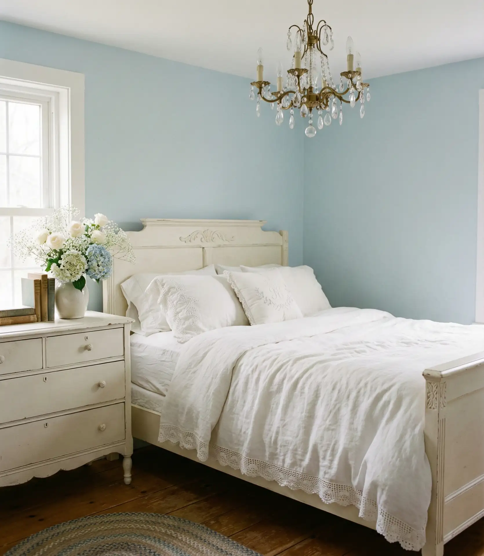
The mistake people make with pale blue is assuming it needs less careful selection than bolder colors, but the opposite is true—subtle differences in undertone become very noticeable in such delicate shades. Test multiple pale blues in your actual bedroom at different times of day, looking specifically for unwanted green, gray, or purple casts. The right pale blue will maintain its gentle blue identity from morning to evening without looking dingy or reading as a different color entirely.
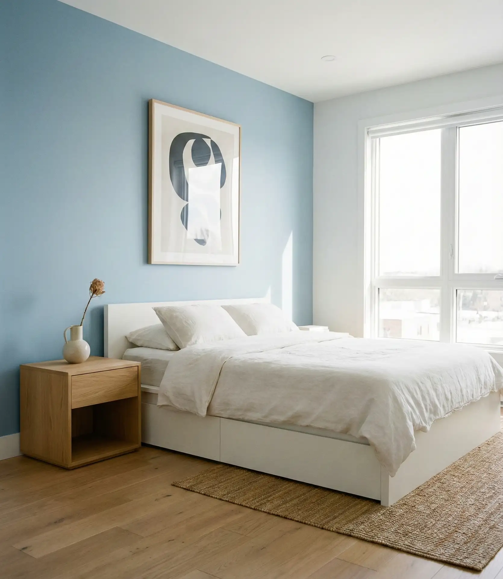
16. Pastel Softness
Pastel blue bedrooms have made a strong comeback in 2026, moving beyond their 1980s associations to become genuinely sophisticated and calming spaces. The key is pairing pastel blue walls with contemporary furniture and avoiding overly sweet or juvenile accessories that push the room toward childish rather than serene. Pastel blues work particularly well when layered with other soft neutrals like cream, taupe, and warm gray.
This palette is particularly popular in Southern California and Florida, where the soft color feels natural against bright sunshine and doesn’t absorb heat the way darker colors do. From an interior design perspective, pastel blue serves as a perfect middle ground for couples with different color preferences—it’s chromatic enough to satisfy someone who wants color, but soft enough to please someone who prefers neutrals, making it a diplomatic choice that everyone can live with happily.
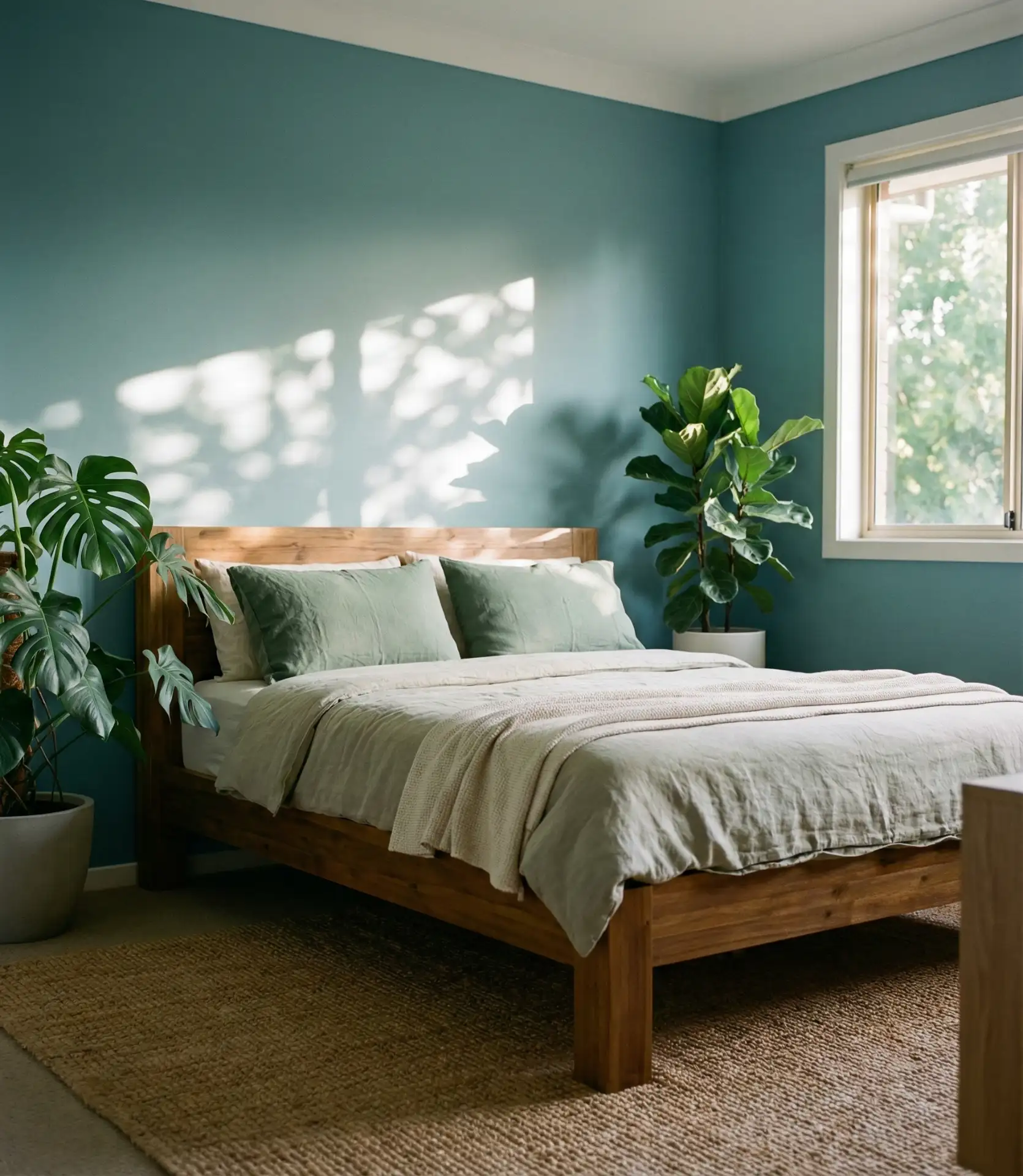
17. Teal Depth
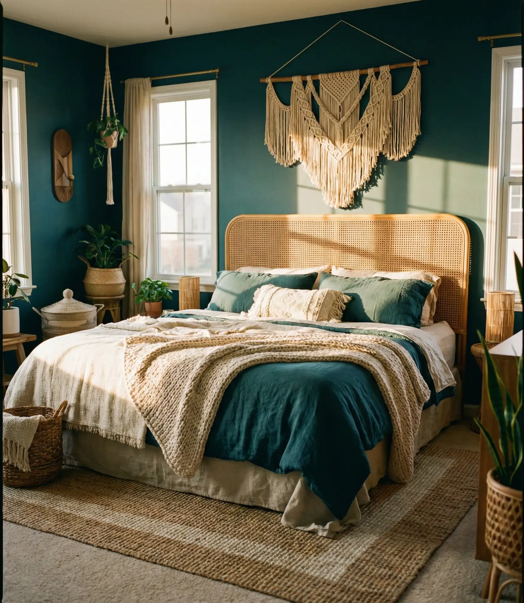
Teal brings a unique depth to bedrooms, sitting right at the intersection of blue and green and offering the calming properties of both colors simultaneously. This rich shade works beautifully in both modern and bohemian contexts, and it pairs exceptionally well with warm wood tones, brass metals, and natural textiles. Teal bedrooms exude a sense of collection and intentionality, complemented by a sophisticated edge that elevates them beyond conventional paint-by-numbers design.
A friend who recently painted her Seattle bedroom teal reports that it’s the first color that’s felt truly “right” after years of trying different blues and greens—the hybrid nature means it adapts to different lighting conditions without looking wrong, appearing more blue in morning light and more green in evening light. This chameleon quality makes teal particularly valuable in regions with variable weather, where your bedroom lighting conditions change dramatically from day to day.
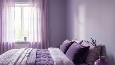
18. Purple-Blue Mystery
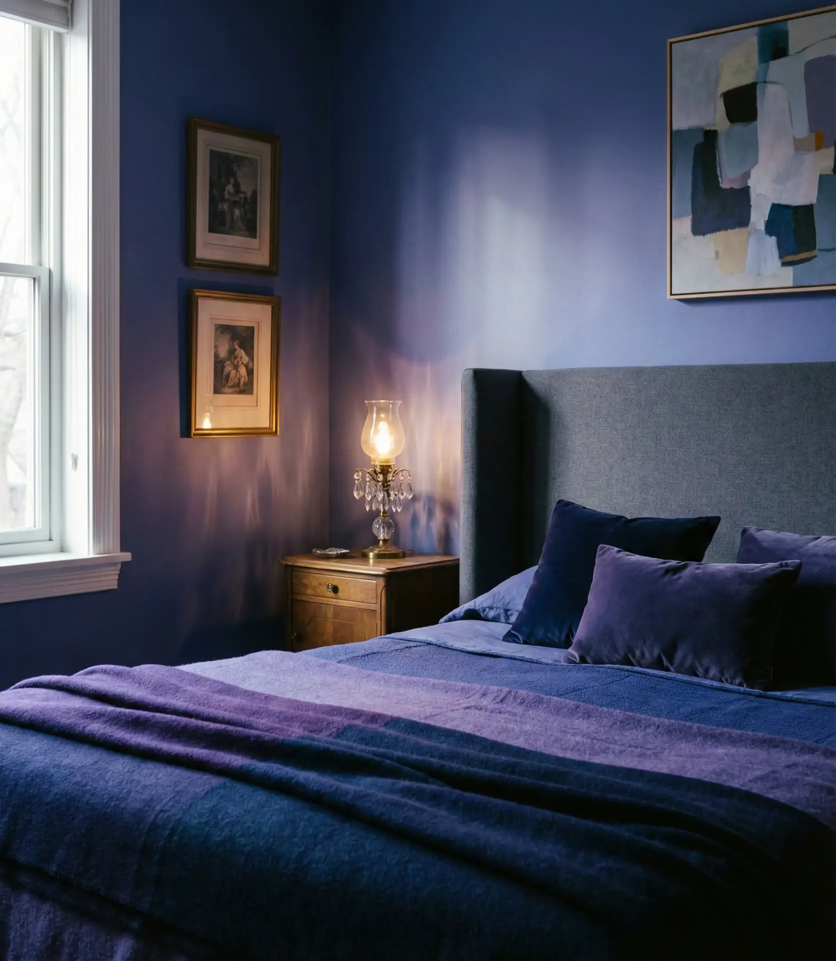
The space where blue meets purple creates bedroom colors with genuine mystery and romance, perfect for people who want their personal space to feel distinctly different from conventional design. These periwinkle and lavender-tinged blues work particularly well in bedrooms with vintage or eclectic furniture, where the unusual color choice complements the curated, individual nature of the space. The purple-blue spectrum also has the advantage of looking beautiful in both warm and cool artificial lighting.
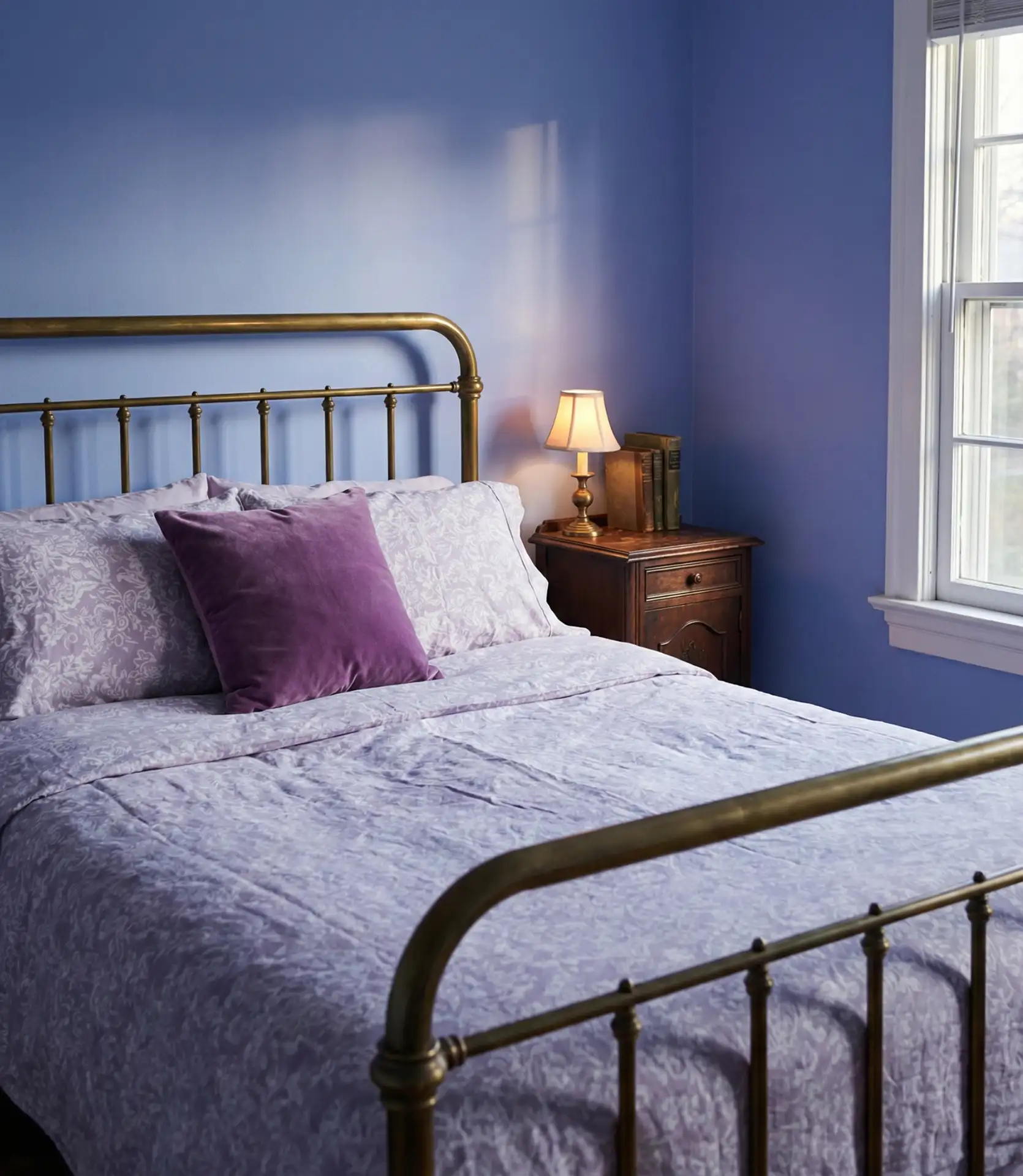
These transitional colors work best in bedrooms that don’t get harsh direct sunlight, where the subtlety of the purple undertone can be appreciated without being washed out. They’re particularly popular with creative professionals and artists who spend significant time in their bedrooms working or relaxing and appreciate having a color that stimulates imagination without being overly energizing. The key is choosing a shade that leans decidedly toward blue with just a whisper of purple, rather than a true periwinkle that reads equally as both.
19. Couples’ Compromise
Creating a blue bedroom that works for couples often means finding shades that balance masculine and feminine energy, with medium-toned blues offering the perfect middle ground. These versatile blues can be styled in countless ways, letting each partner incorporate their personal aesthetic through accessories, textiles, and furniture choices. The base blue acts as a unifying element that prevents the room from feeling divided or compromised.
Where this approach works best is in suburban and urban primary bedrooms where both partners work from home at least part-time and need their bedroom to feel like a true shared sanctuary. The practical strategy many successful couples use is choosing the blue together, then letting each partner “own” their side of the room for personalization—perhaps one nightstand has sleek modern accessories while the other features warmer, more organic elements, all unified by the blue walls that both agreed upon.
20. Red and Blue Contrast
The bold combination of blue and red creates bedrooms with genuine energy and visual punch, perfect for people who want their personal space to feel lively rather than purely restful. The key is using one color as the dominant tone and the other as a strong accent—typically blue walls with red textiles and accessories, or vice versa. This patriotic-adjacent palette works surprisingly well in nautical, Americana, and even certain modern contexts when executed with sophisticated shades rather than primary colors.
Expert designers caution that this combination requires confidence and commitment—it’s not a palette you can half-heartedly execute, or it will look confused rather than intentional. The best strategy is to start with the blue as your base, then gradually introduce red elements until you reach a balance that feels right to you. Some people will be satisfied with just red pillows and a throw, while others will want substantial red furniture pieces, and both approaches can work beautifully depending on your personal style and tolerance for visual energy.
21. Gray-Blue Balance
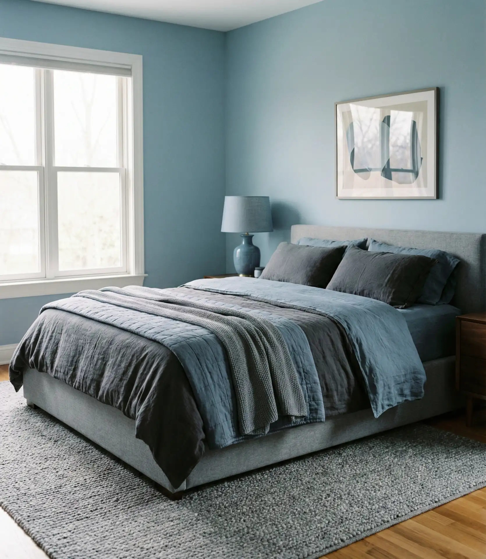
The balanced combination of gray and blue creates bedrooms that feel both contemporary and calming, offering the best qualities of both neutral and colored spaces. This pairing works exceptionally well in modern homes where gray already dominates other rooms, providing color continuity while giving the bedroom its own distinct identity. Gray furniture and textiles against blue walls create sophisticated layering that reads as polished and intentional.
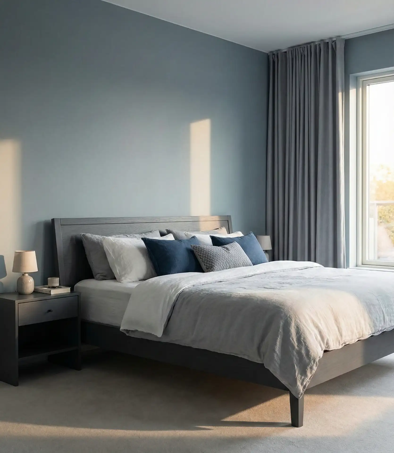
This combination is particularly practical for renters or people who move frequently, as gray furniture and accessories work in virtually any future color scheme, making your investment pieces genuinely portable across different homes and design phases. The gray grounds the blue and prevents it from feeling too whimsical or young, while the blue prevents the gray from feeling cold or institutional—a perfect symbiotic relationship that many homeowners stick with for years once they discover it.
22. Vintage Cottage Romance
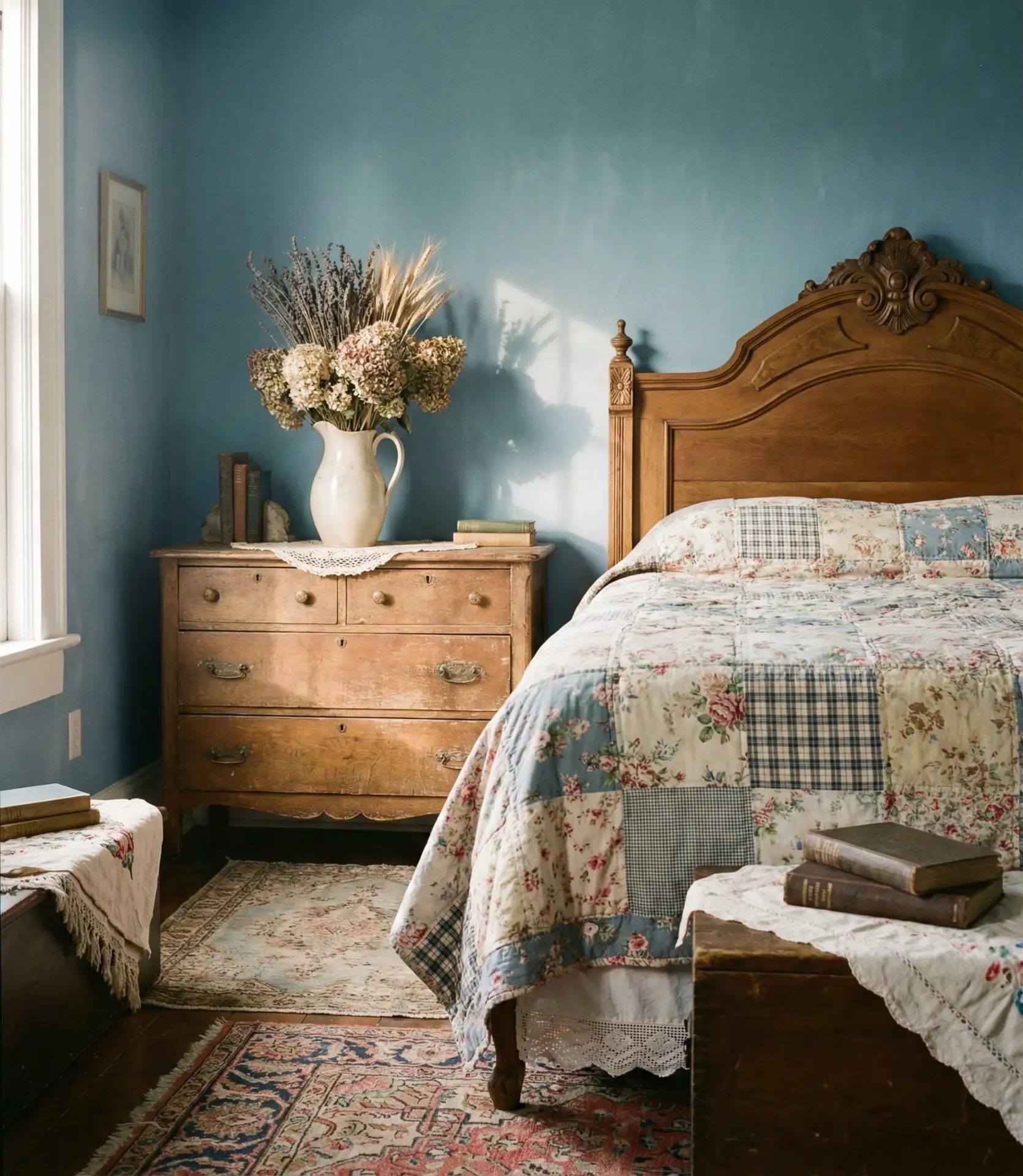
Soft, weathered blues paired with vintage furniture create bedrooms filled with nostalgic charm and timeless appeal that feels collected over generations. These gently aged blue tones work beautifully with distressed wood, antique textiles, and heirloom accessories to evoke cozy countryside retreats. The slightly dusty quality of the blue prevents it from looking too new or perfect, which is exactly the point in achieving authentic vintage character.
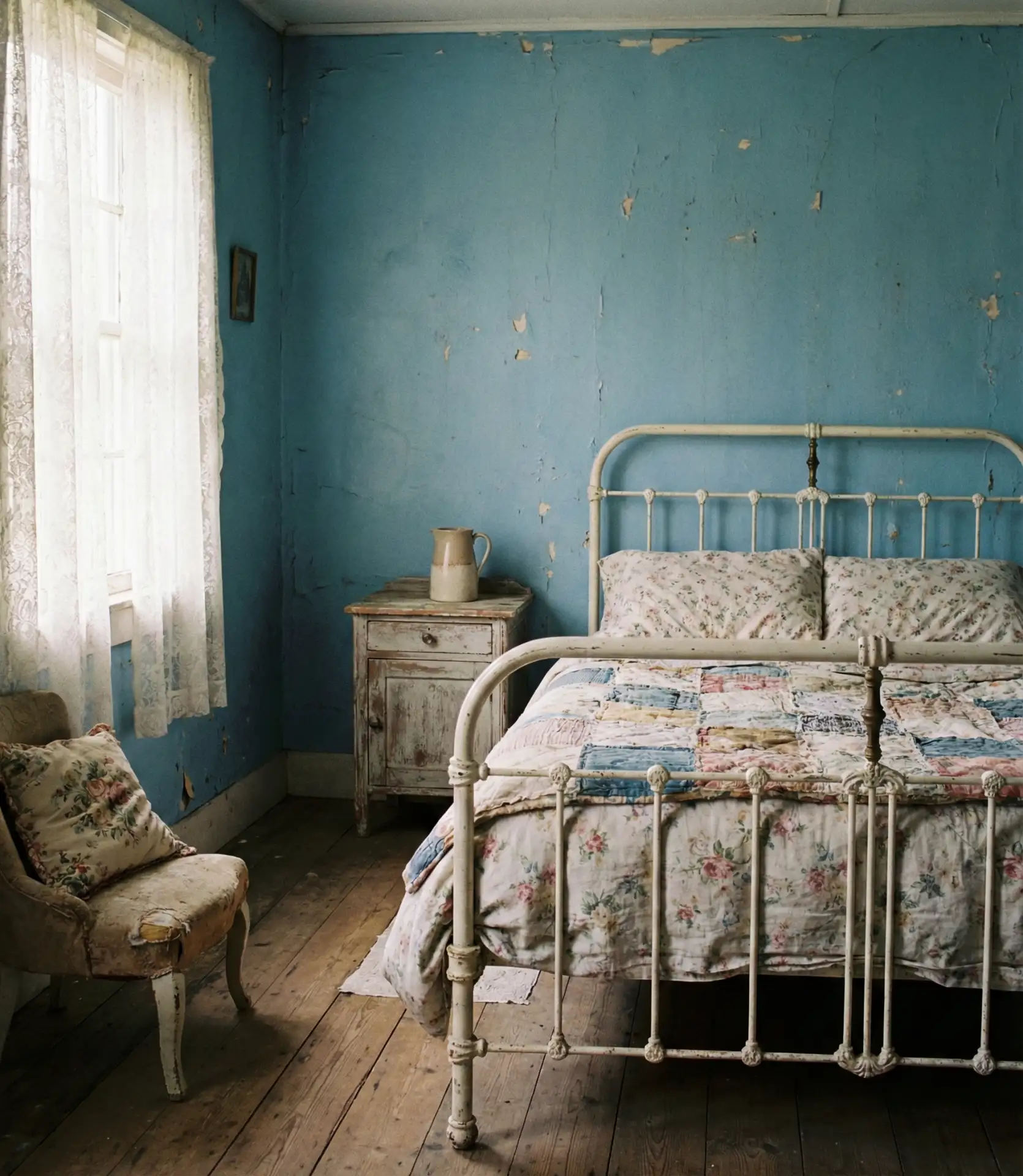
The common mistake with vintage-inspired blues is going too saturated or choosing colors that look freshly painted rather than timeworn. If you’re painting from scratch, consider layering techniques or adding subtle glazes that create depth and the appearance of age. The investment in achieving that perfectly imperfect vintage quality transforms a bedroom from merely decorated to genuinely atmospheric, creating a space that feels like it holds stories and memories even if it’s brand new.
23. Brown and Blue Warmth
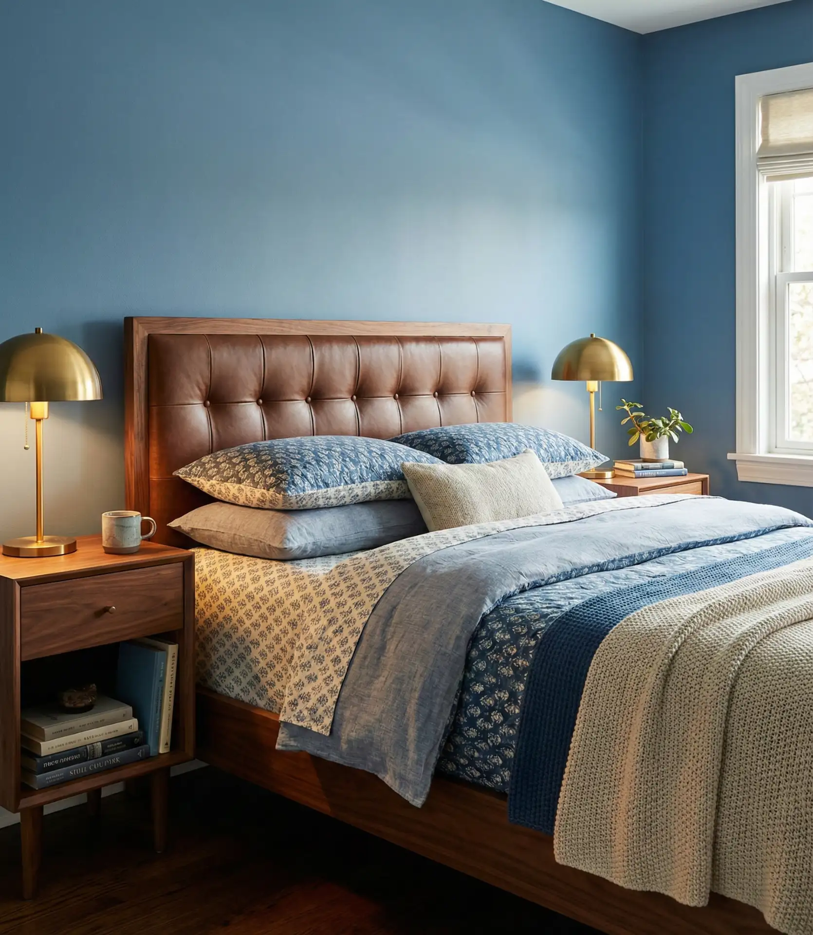
Pairing blue walls with brown furniture and warm wood tones creates bedrooms that balance coolness and warmth perfectly, preventing the blue from ever feeling cold or uninviting. This natural combination works across virtually every design style, from traditional to contemporary, because wood and blue have existed together in homes for centuries. The brown tones ground the blue and add organic texture that makes the entire room feel more livable and less designed.
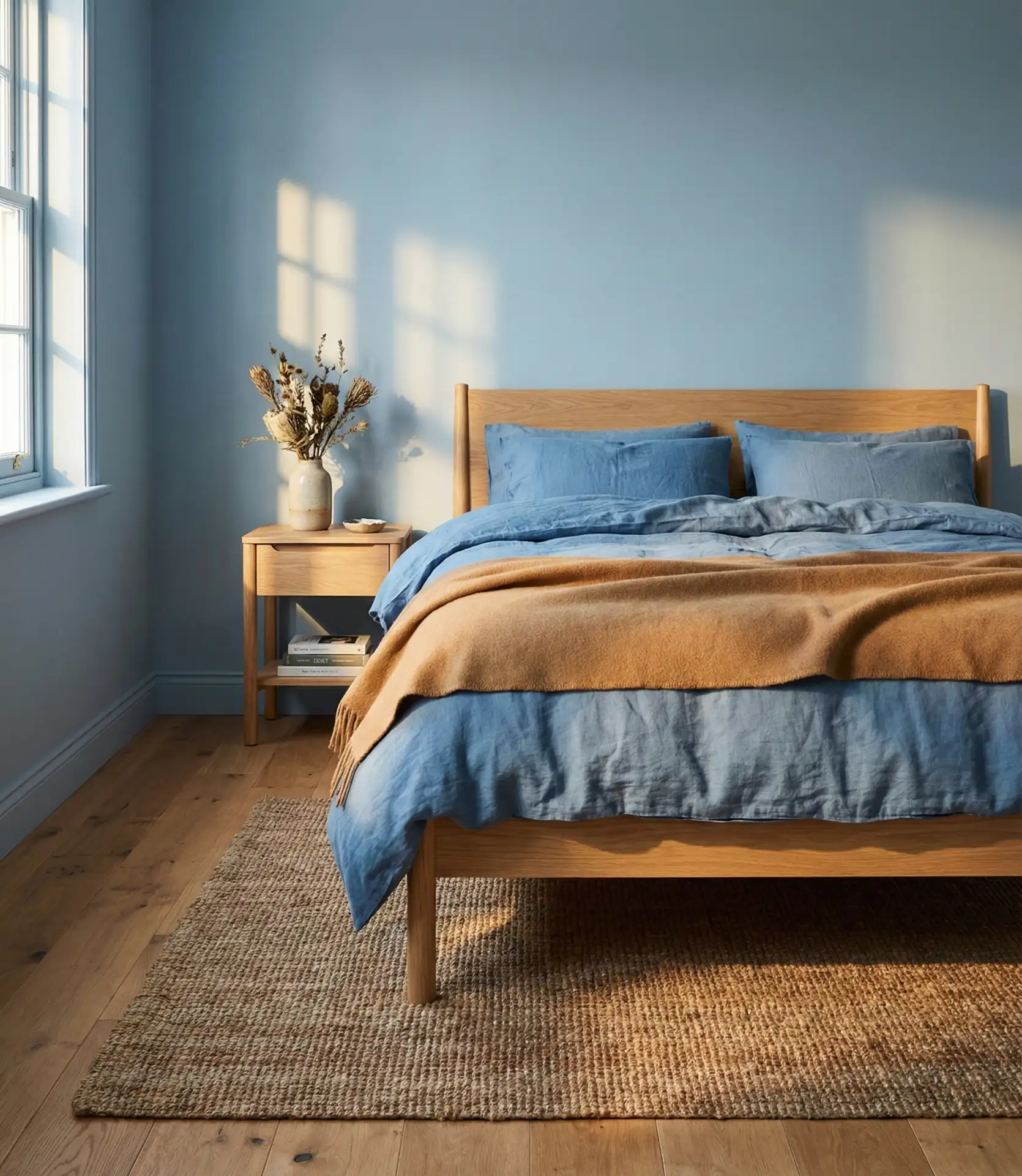
Many homeowners in regions with harsh winters specifically seek out this combination because it creates year-round comfort—the blue keeps the room feeling fresh in summer, while the brown wood tones provide psychological warmth during cold months. From a practical budget standpoint, this pairing means you can invest in quality wood furniture pieces that will work with virtually any future blue shade you might choose, making those furniture investments truly long-term rather than tied to one specific color moment.
24. Teens’ Personal Space
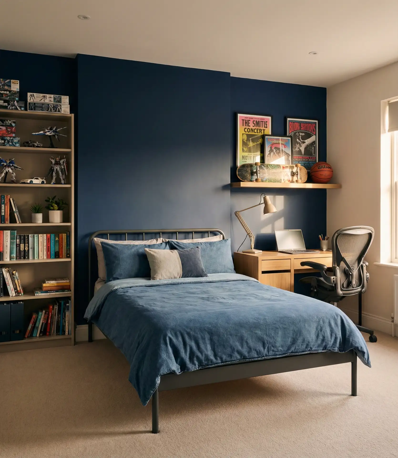
Blue bedrooms for teens work best when the blue shade and styling let the teenager express their evolving identity while remaining sophisticated enough to grow with them. Moving beyond childish primary blues toward more mature shades—teal, navy, or sophisticated sky blue—creates rooms that feel age-appropriate without being overly adult. The key is letting teens participate in the color selection and styling decisions so they feel ownership of their personal space.
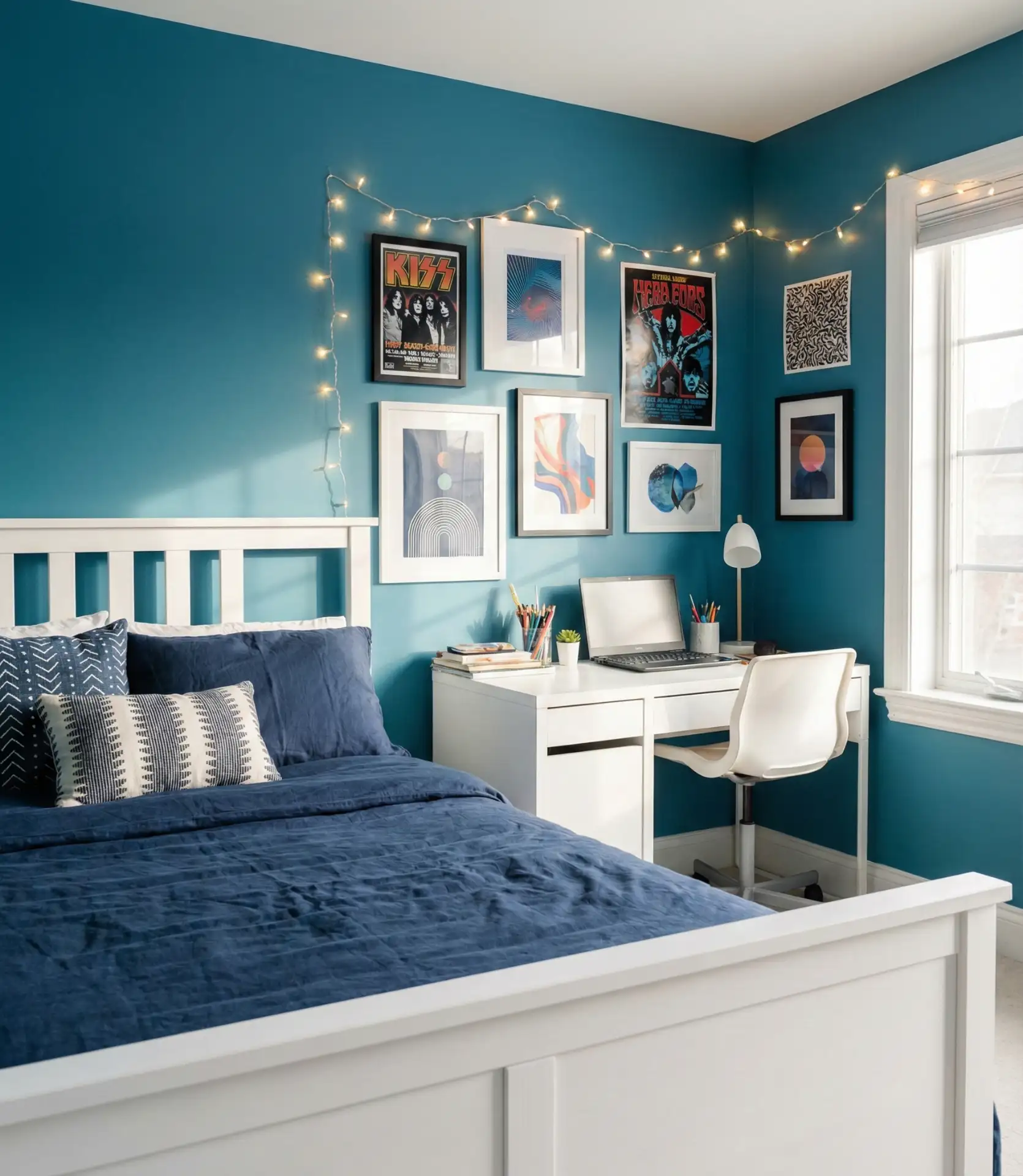
Real homeowners with teenagers report that blue is often the easiest color for families to agree on during the challenging teenage years, as it works for multiple genders and can be styled in countless ways to reflect individual personality. The practical wisdom is to invest in quality blue paint and basic furniture, then let your teenager personalize with removable elements like posters, string lights, and accessories that can change as their interests evolve without requiring a complete room overhaul every year.
25. Cozy Layered Textiles
Creating a genuinely cozy blue bedroom requires layering multiple textile textures and weights to counterbalance the visual coolness of the color. Think velvet pillows, chunky knit throws, linen sheets, and wool rugs, all in various shades of blue and complementary neutrals. The cozy factor comes from this tactile richness rather than from the paint color alone, transforming what could be a cold space into a warm, enveloping retreat.
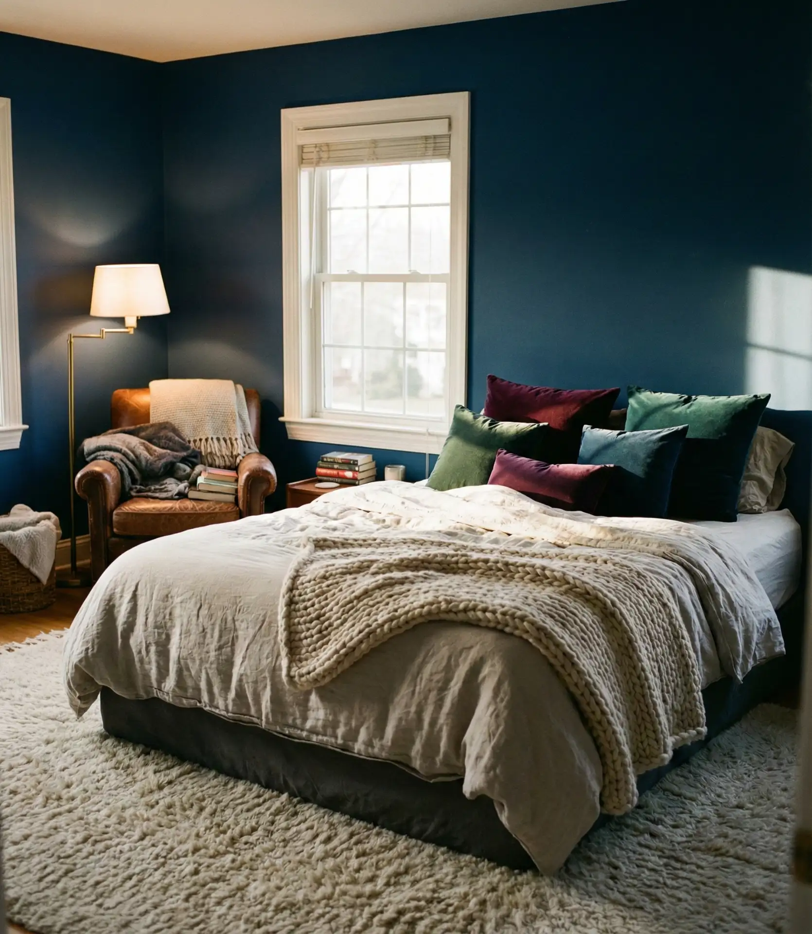
Where this approach works best is in master bedrooms where adults spend significant evening time reading, relaxing, or watching television before sleep. The multiple textile layers provide both visual interest and functional comfort, creating a space that invites you to settle in and stay awhile. Budget-wise, you can build this look gradually by starting with one quality throw or set of pillows and adding layers seasonally as you find pieces that speak to you, making it more financially accessible than a complete room renovation.
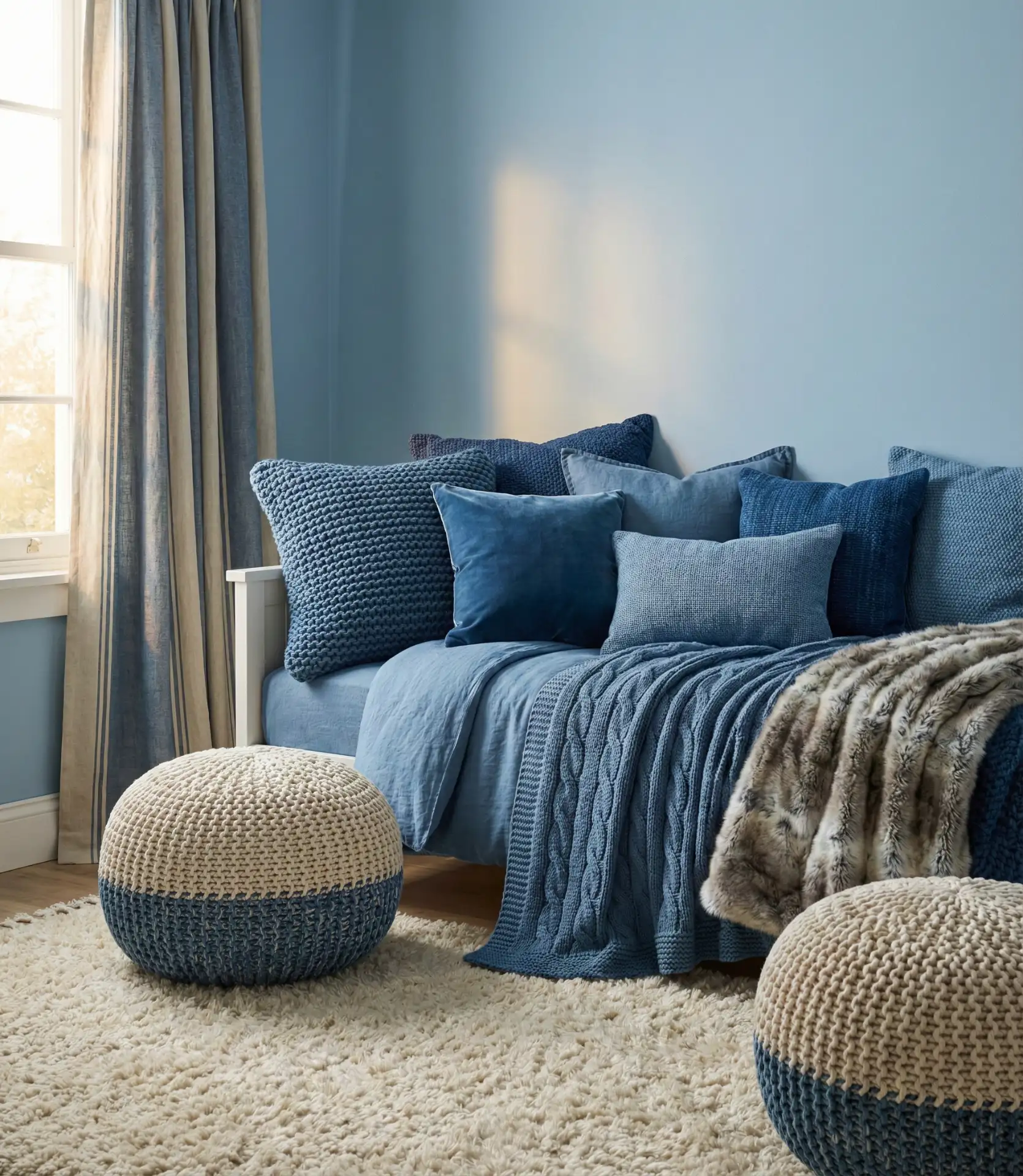
26. Monochromatic Blue Layers
A monochromatic approach using multiple shades of blue creates sophisticated bedrooms with genuine depth and interest without introducing other colors. Layer pale blue walls with navy accents, dusty blue textiles, and teal accessories for a room that’s entirely blue yet never monotonous. The key is choosing blues from across the spectrum—some warm-toned, some cool, some saturated, some muted—so the layers create visual complexity rather than flatness.
Common mistakes include choosing blues that are too similar in value, which creates a muddy rather than layered effect, or failing to include enough variation in texture to distinguish the different blue elements. The successful monochromatic blue bedroom typically includes at least five distinct blue shades, each clearly different in either saturation or lightness, distributed thoughtfully throughout the space so your eye moves naturally around the room, discovering new layers rather than landing on one flat, uniform surface.
These blue bedroom ideas demonstrate just how versatile this beloved color family can be in creating personal sanctuaries that range from energizing to deeply calming. Whether you’re drawn to bold navy statements or whisper-soft pastels, there’s a blue bedroom approach that will transform your space into exactly the retreat you need. We’d love to hear which of these ideas resonates most with you—drop a comment below sharing your favorite blue bedroom moment or telling us about your own blue bedroom journey.