50 Living Room Color 2026 Ideas: Cozy Schemes, Palettes & Combinations for Every Style
As we move into 2026, American homeowners are looking for fresh ways to transform their living rooms into spaces that feel both current and timeless. Pinterest feeds are filled with searches for living room color 2026 trends, from soft neutrals to bold statements that reflect personality and warmth. This year’s color directions cater to every style and space, whether you prefer cozy earth tones, bright energizing hues, or sophisticated neutral palettes. In this guide, you’ll discover inspiring ideas that blend expert interior design principles with real-world application, helping you choose colors that make your living room feel like home.
1. Warm Terracotta with Cream Accents
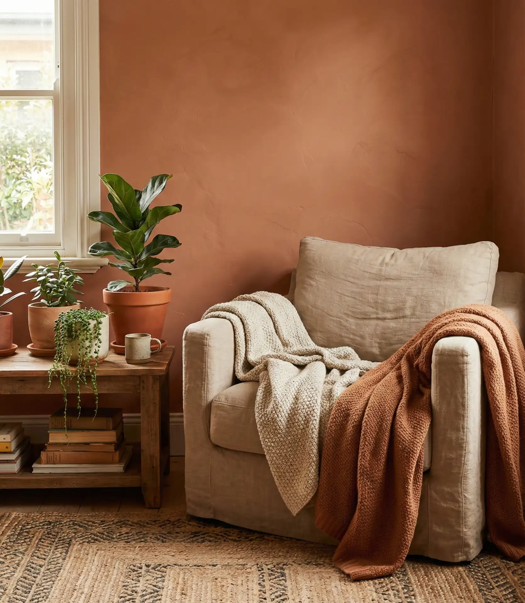
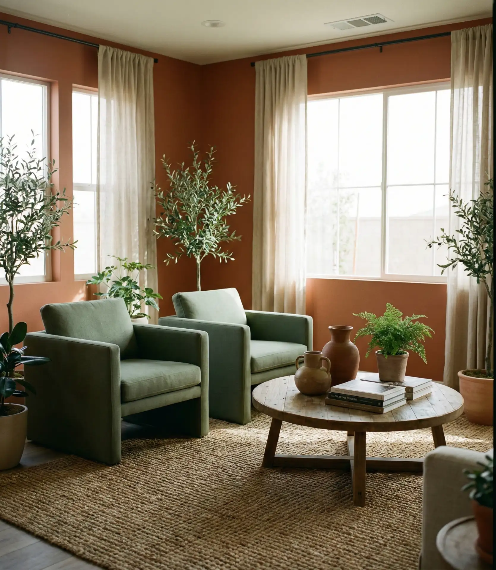
Terracotta brings an earthy warmth that’s perfect for creating a cozy living room atmosphere in 2026. This shade works beautifully as an accent wall behind a sofa or fireplace, paired with cream upholstery and natural wood furniture. The combination feels grounded and inviting, especially in homes with plenty of natural light. It’s a color that references Southwestern design traditions while feeling fresh and modern when balanced with lighter neutrals and woven textures.
One common mistake is choosing terracotta that’s too orange or rusty, which can overwhelm smaller rooms. Test samples in your actual lighting conditions—terracotta should read warm and earthy, not neon. Balance is key: use terracotta on one wall and keep surrounding surfaces in soft creams or whites. Add in natural materials like rattan, linen, and unfinished wood to complete the look without making the space feel heavy or dated.
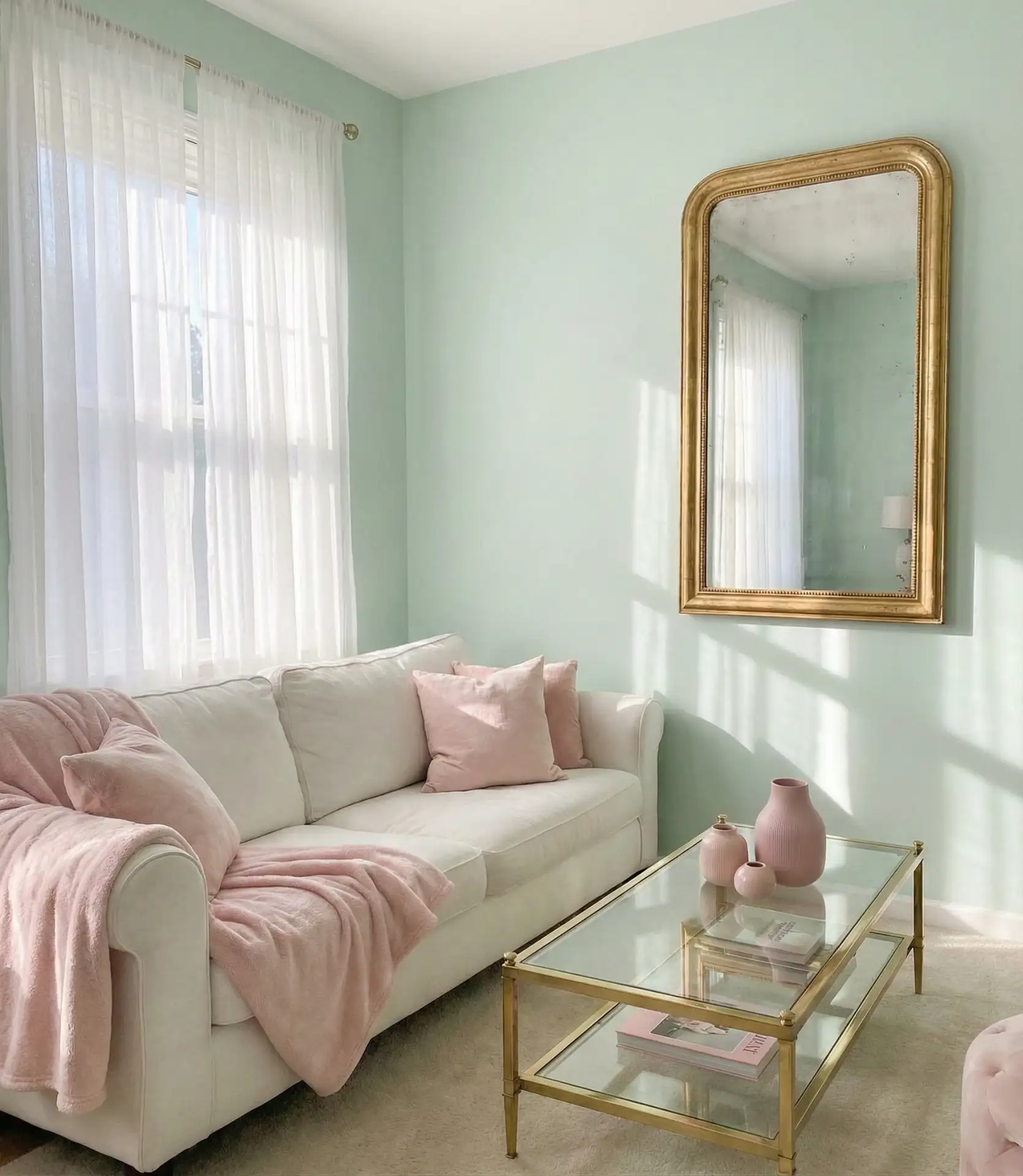
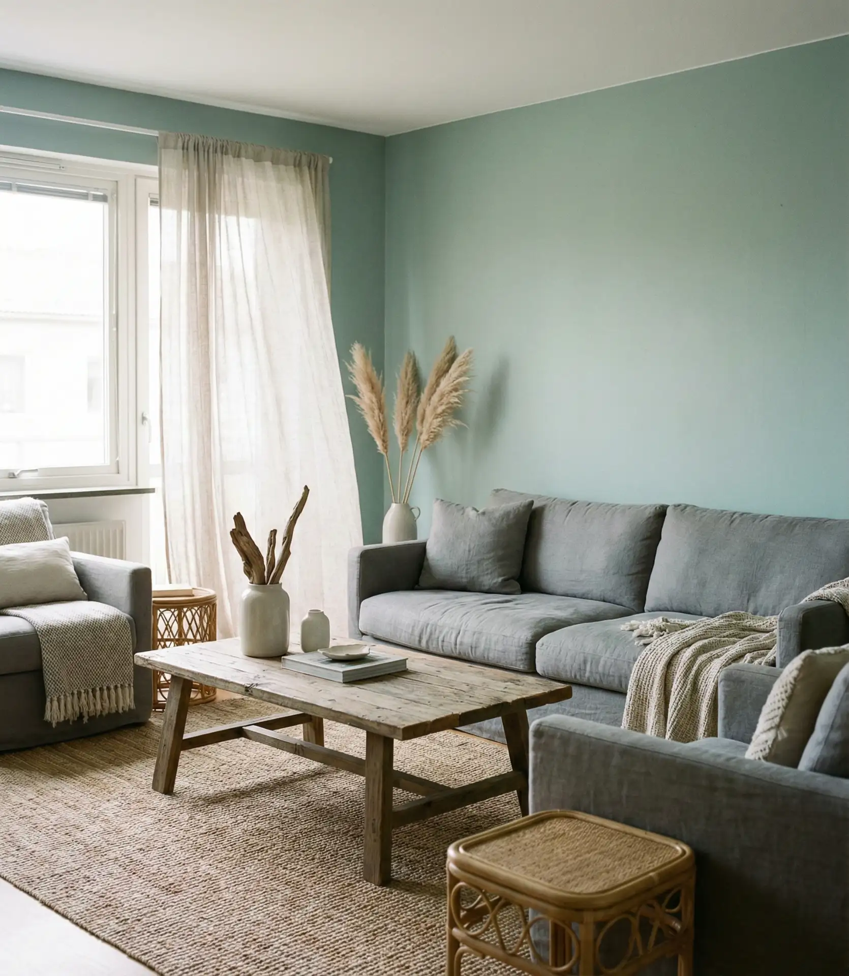
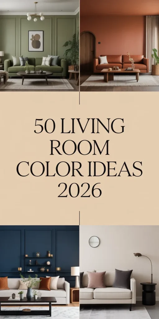
2. Sage Green and White Contrast
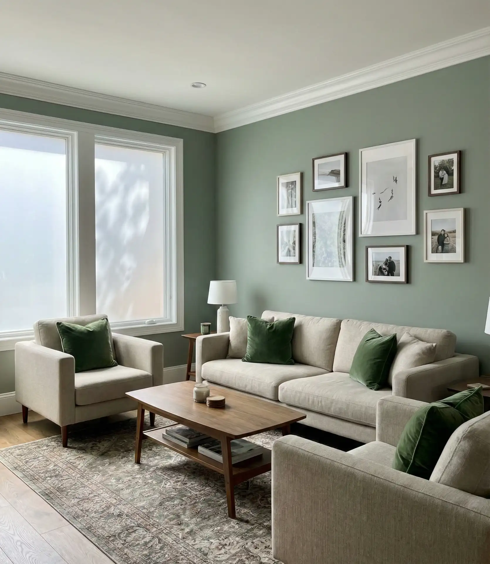
Sage green continues to dominate 2026 color trends, offering a calming yet sophisticated palette for living rooms. When paired with crisp white trim and ceiling, sage creates a fresh backdrop that works in both traditional and contemporary homes. This scheme is particularly popular among younger homeowners who want color without commitment to bolder hues. The combination feels naturally harmonious and brings the outdoors in, which resonates with biophilic design principles gaining traction across the United States.
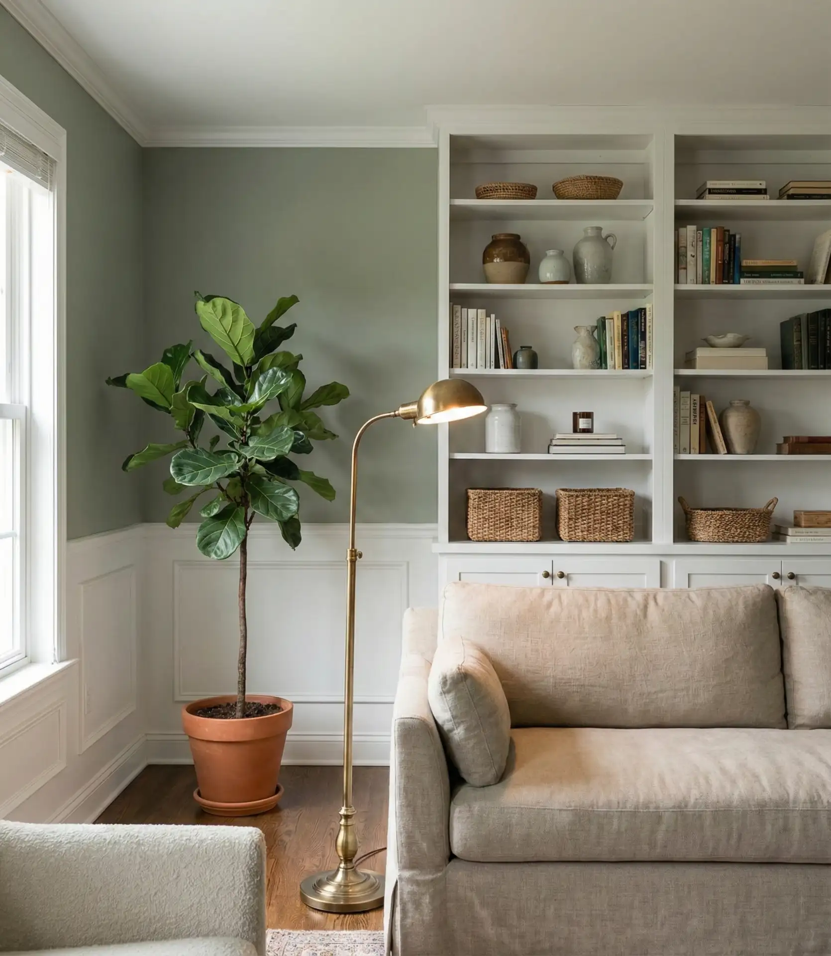
This palette works best in living rooms with ample natural light, where the green can shift beautifully throughout the day. In Pacific Northwest homes, where gray skies are common, sage adds warmth without feeling heavy. In sunnier climates like California or Texas, it stays cool and refreshing. The key is choosing a sage with gray undertones rather than yellow-greens, which can look dated. Pair with white oak floors and simple linen textiles for a look that feels current but won’t require updating in two years.
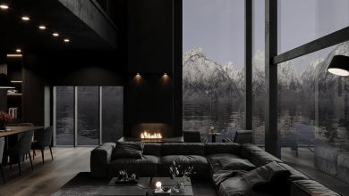
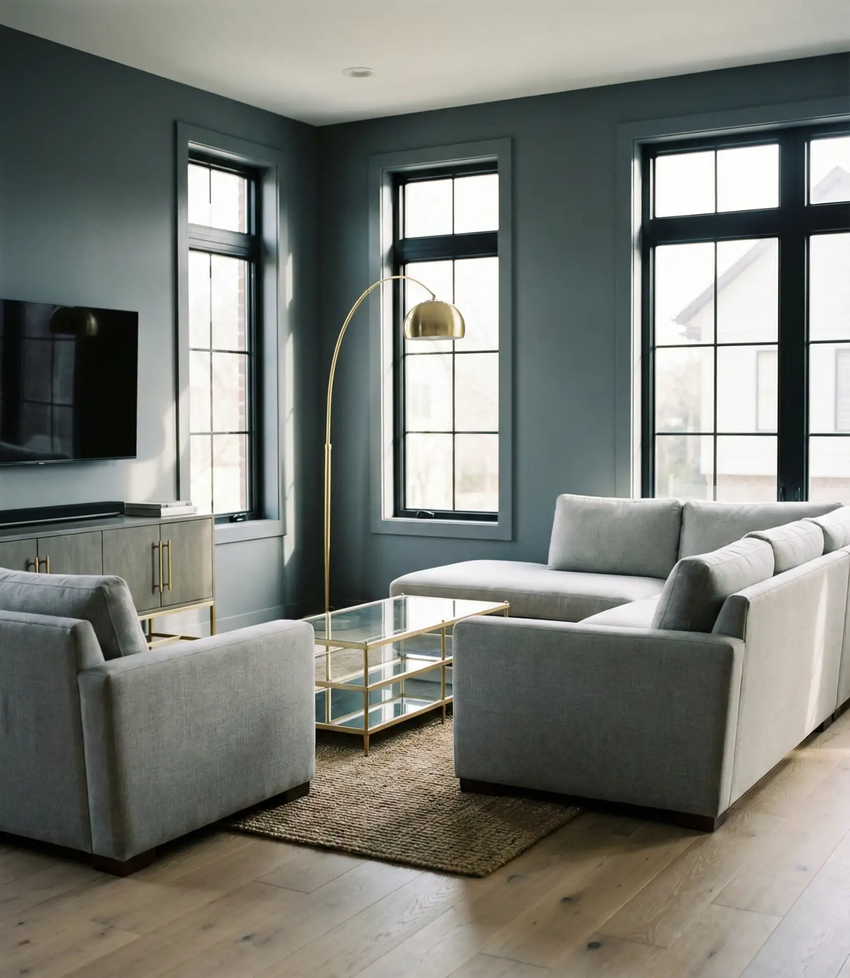
3. Deep Navy with Brass Details
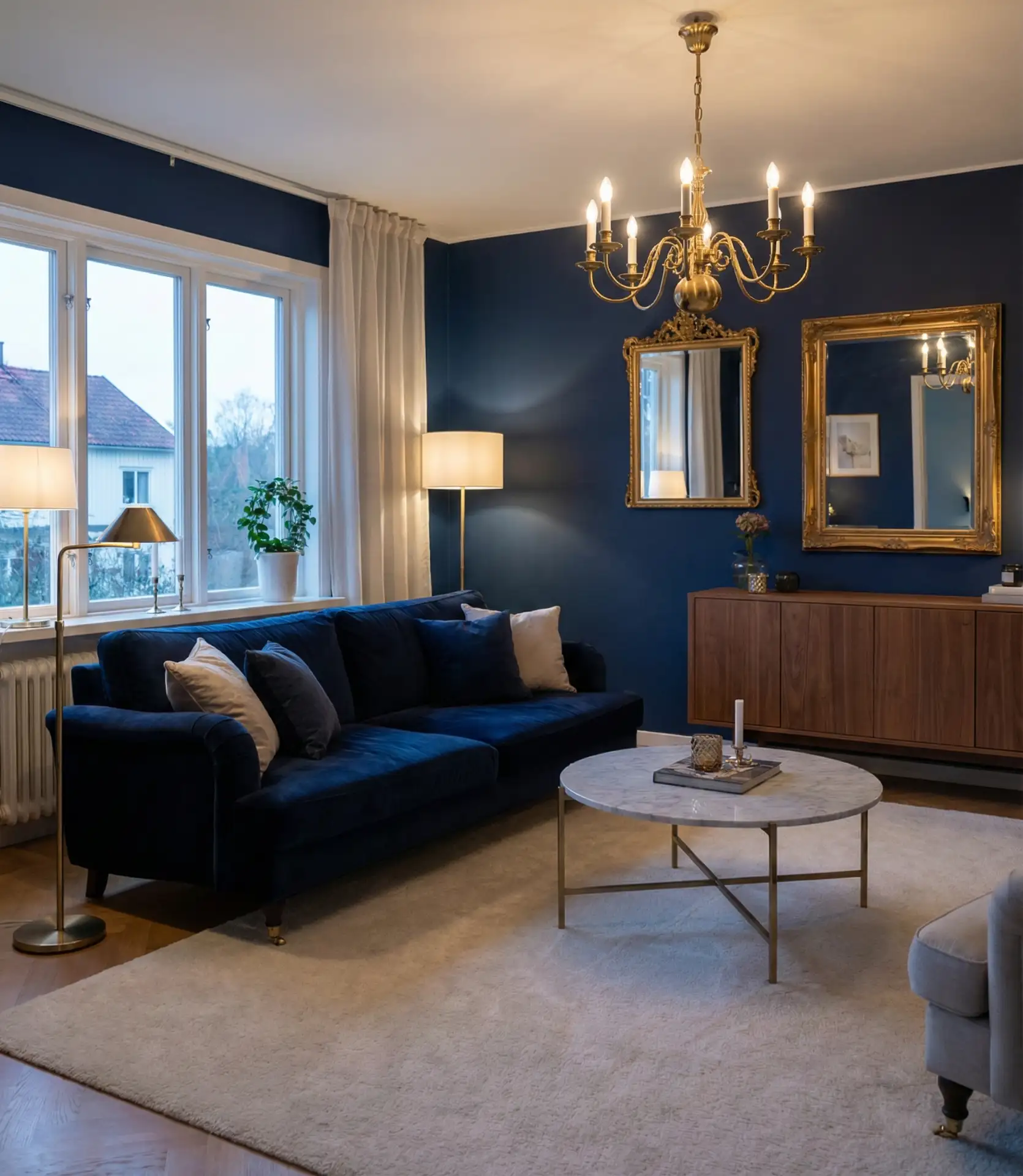
Navy blue offers a dramatic yet timeless foundation for living rooms seeking sophistication and depth. This rich blue shade works particularly well in rooms with high ceilings or generous square footage, where darker walls won’t overwhelm. The addition of warm brass hardware, light fixtures, and picture frames creates a luxurious contrast that elevates the entire space. This is a popular combination in both old and new homes, as well as in city apartments. It brings together classic and modern styles.
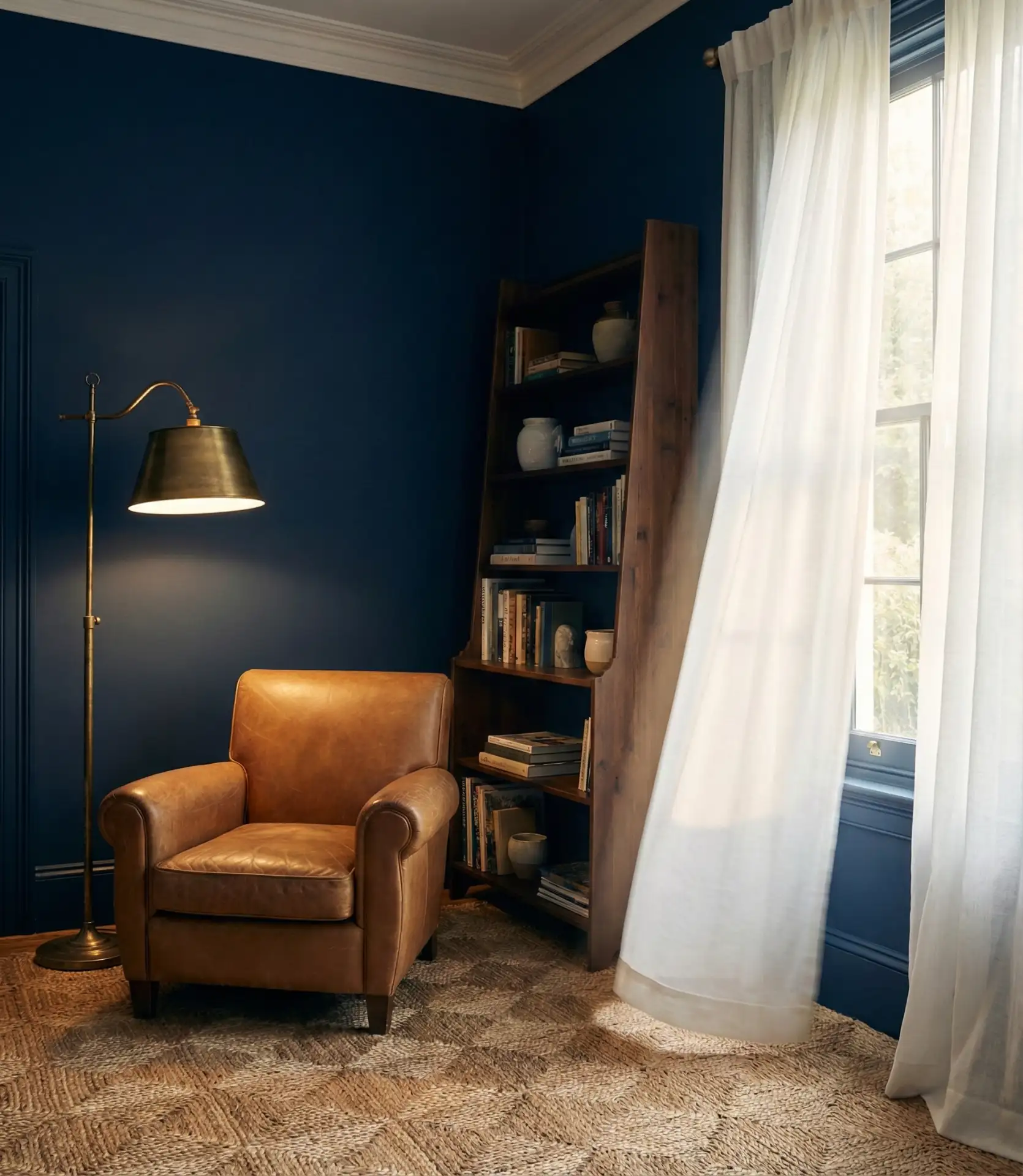
A friend recently painted her Brooklyn living room navy after years of hesitation, and the transformation was immediate—the space suddenly felt intentional and pulled together. She learned that lighting is everything: without adequate lamps and overhead fixtures, navy can feel cave-like. Install dimmer switches and layer your lighting with table lamps, sconces, and overhead options. Keep furniture lighter in tone to prevent the room from feeling too enclosed, and don’t skip the brass accents—they’re what makes navy feel warm rather than cold.
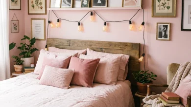
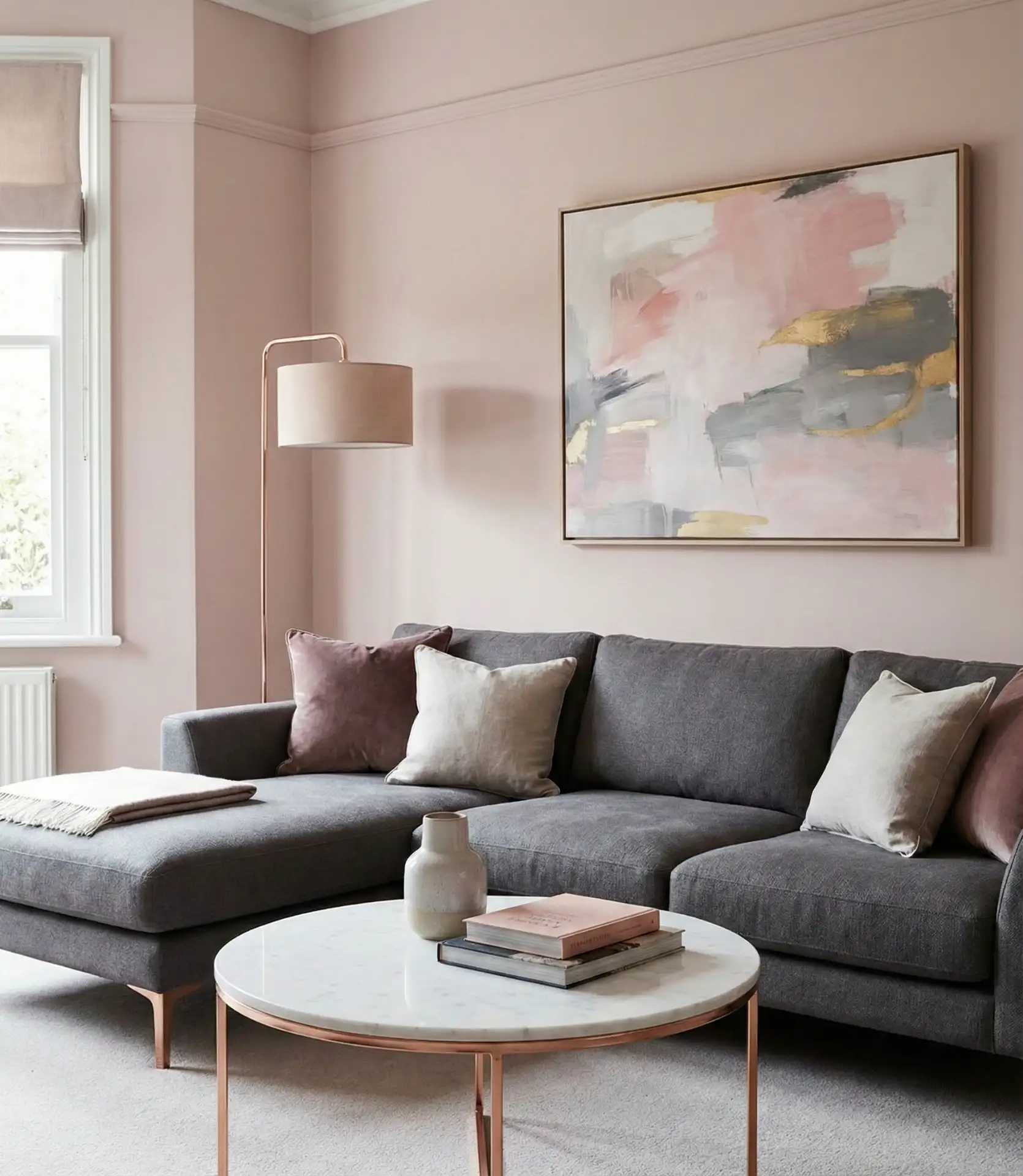
4. Soft Blush with Gray Undertones
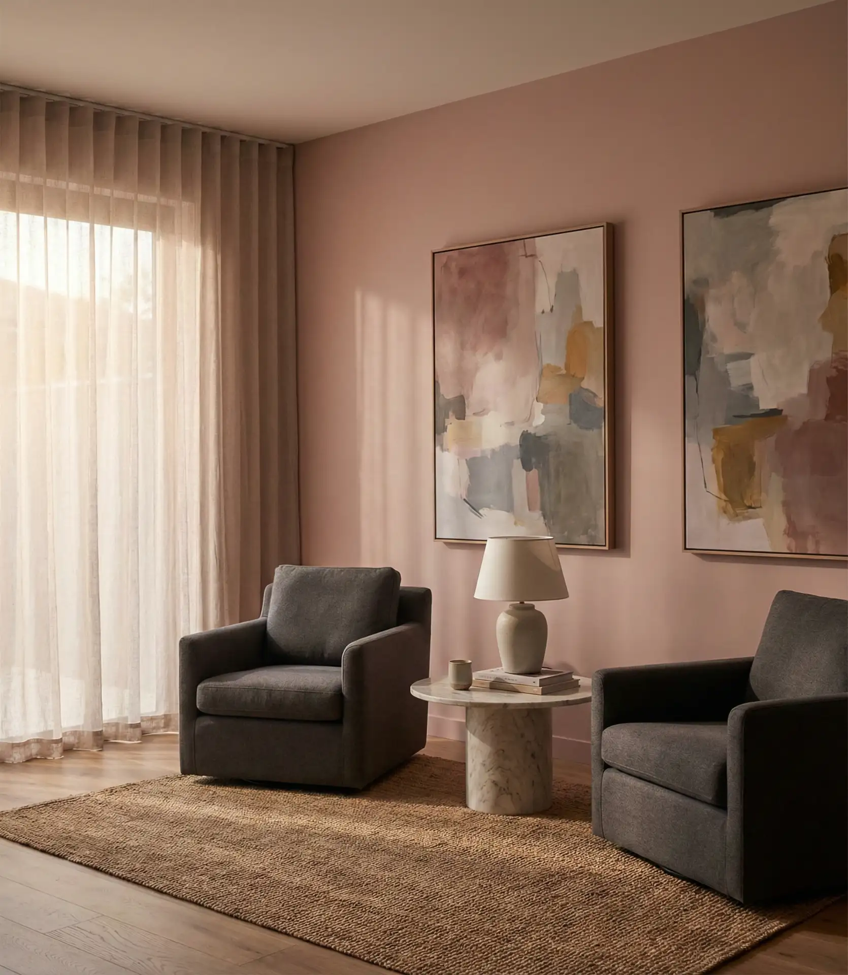
Blush pink has evolved beyond its trendy beginnings into a sophisticated neutral choice for 2026 living rooms. When you choose a blush with gray undertones rather than peachy tones, it reads as a warm neutral that pairs beautifully with both cool and warm accent colors. This shade works particularly well in living rooms with northern exposure, where it adds warmth without going orange. The result is a subtle, elegant backdrop that feels both modern and timeless, appealing to homeowners who want color without drama.
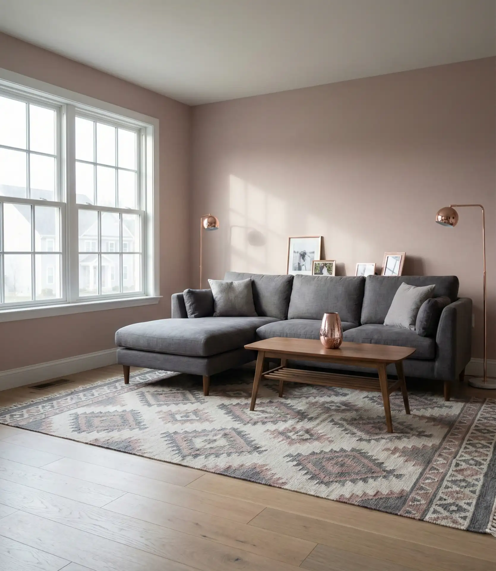
Budget-conscious homeowners will appreciate that blush works with existing furniture in grays, whites, and even darker woods without requiring a complete overhaul. A gallon of quality blush paint from Sherwin Williams or Benjamin Moore typically costs $50-80, making it an affordable refresh. The color is forgiving with decor changes—it transitions easily from season to season and accommodates different accent colors. Test your sample on all walls, as blush can look different depending on which direction the wall faces and how much natural light it receives.
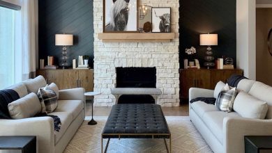
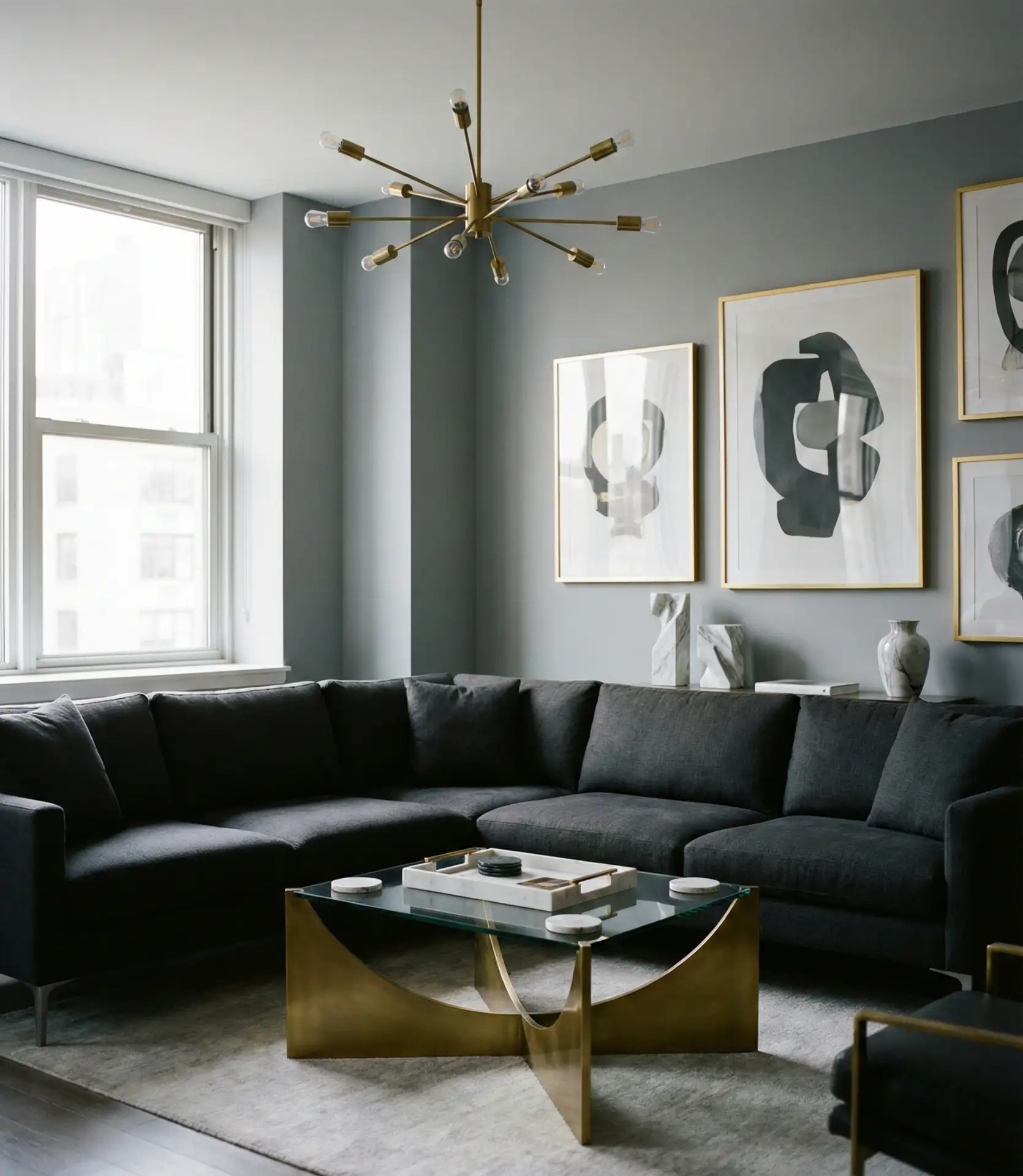
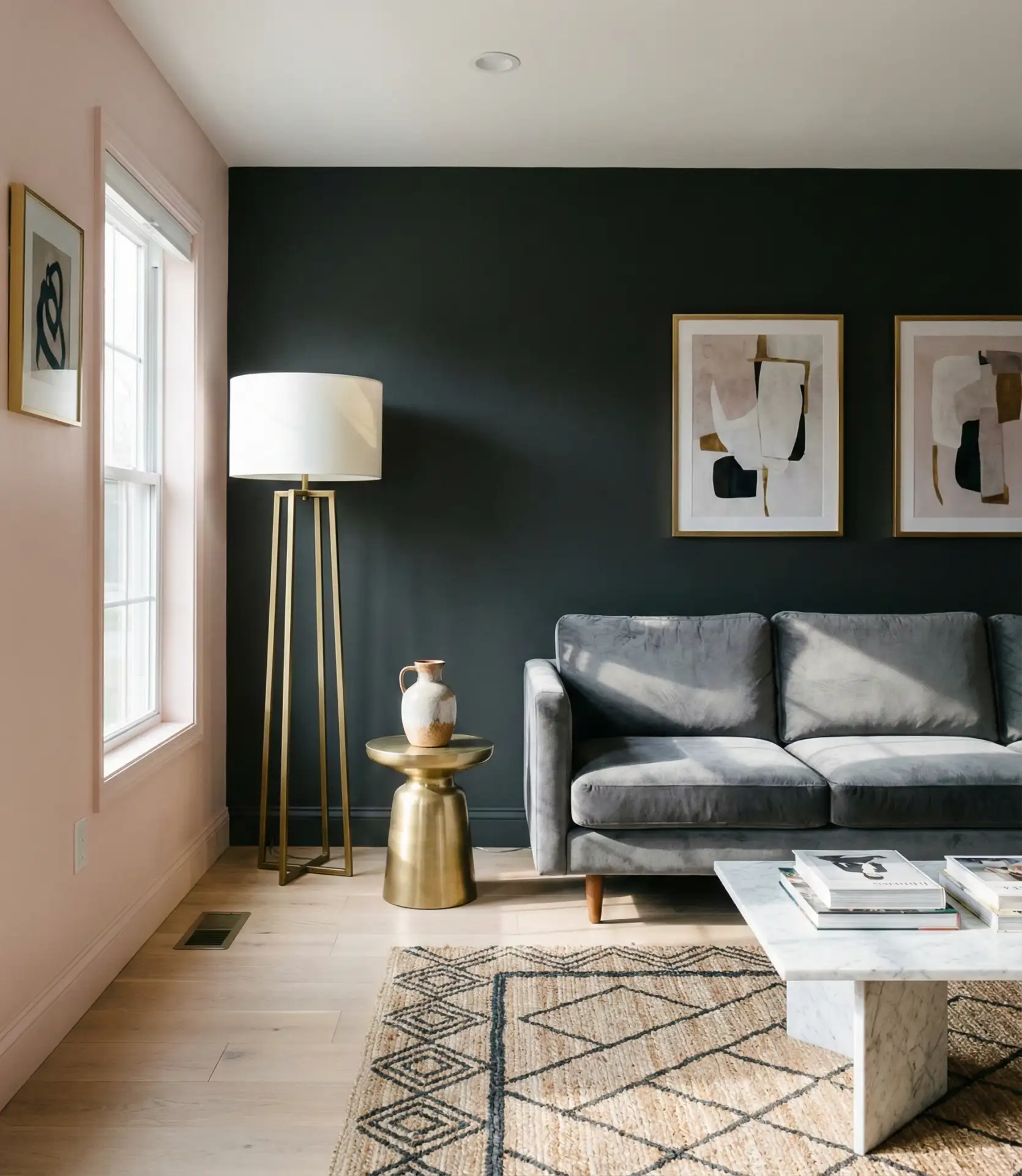
5. Charcoal Gray with White Trim
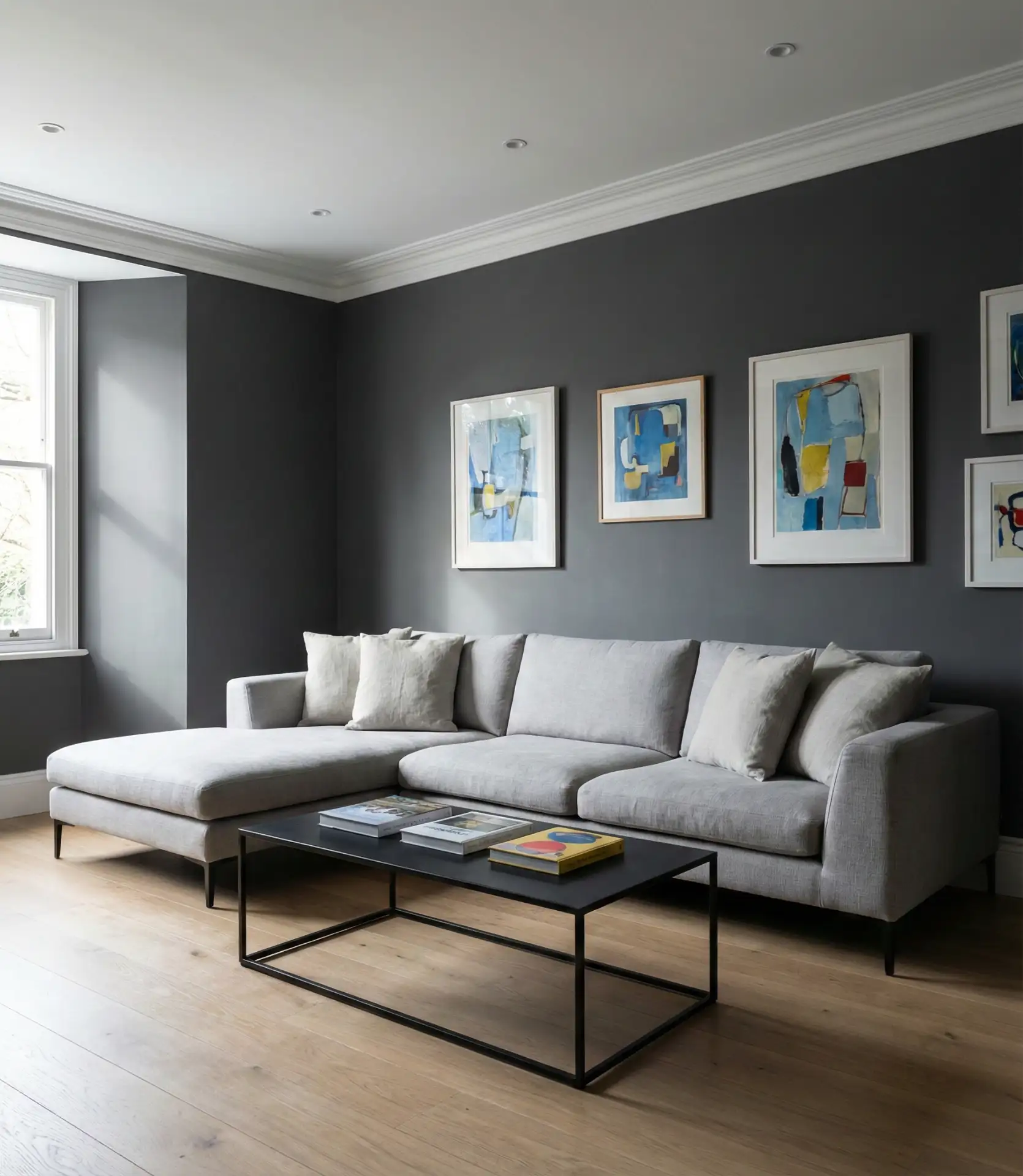
Charcoal creates a striking, modern foundation that’s especially popular in open-concept kitchen layouts where the living room needs to feel distinct yet connected. Paired with crisp white trim, baseboards, and ceiling, charcoal walls provide dramatic contrast without the commitment of black. This scheme’s approach works beautifully with a grey couch, creating a monochromatic look that’s anything but boring. The depth of charcoal adds architectural interest and makes artwork and decorative objects pop against the dark background.
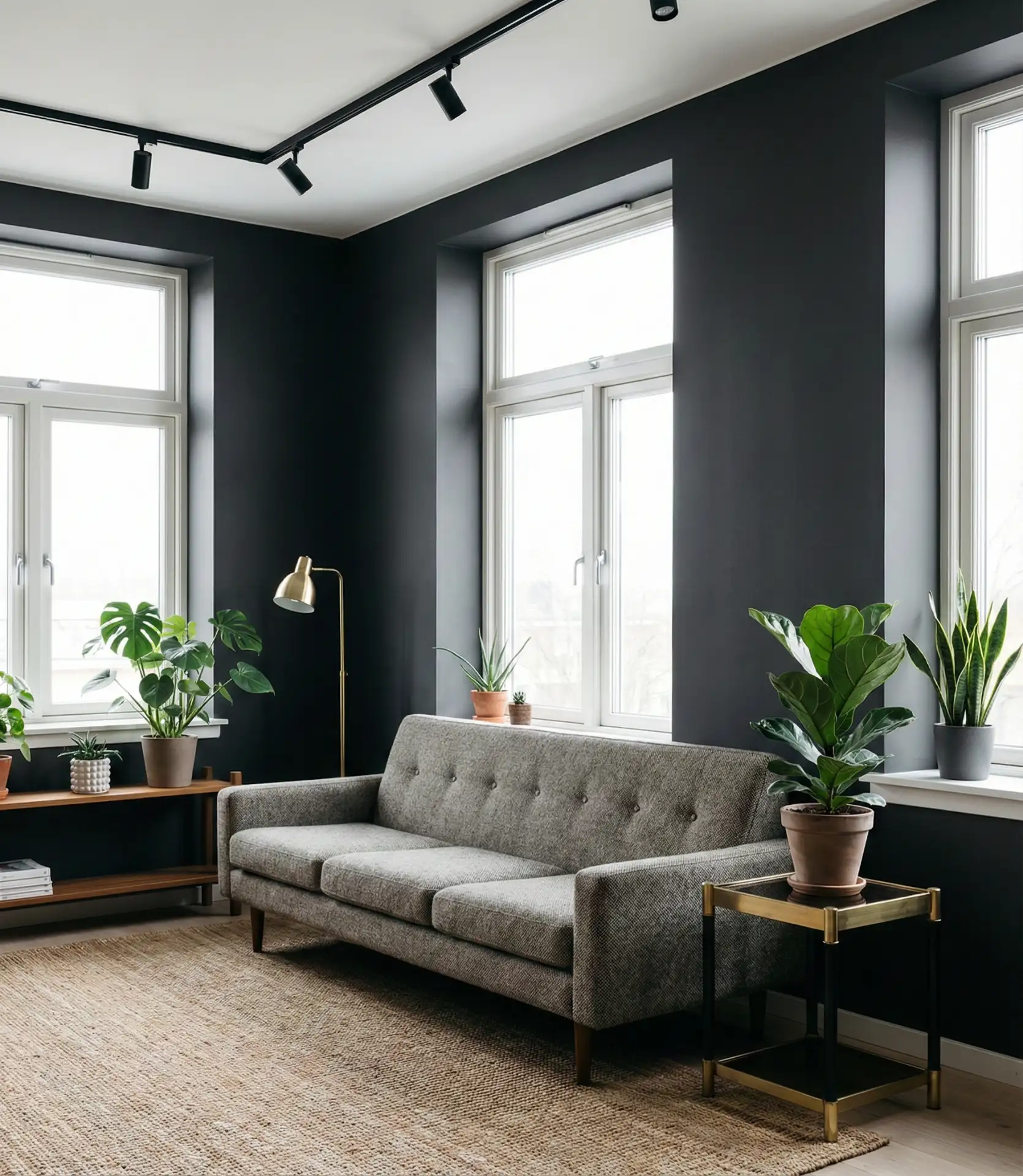
Real homeowner behavior reveals an intriguing pattern: people who commit to charcoal rarely regret it, but they do wish they’d planned lighting better from the start. Dark walls absorb light, so you’ll need more sources than you think. Install multiple light layers—overhead fixtures, table lamps, floor lamps, and even LED strips behind furniture. This creates depth and prevents the room from feeling flat. Charcoal also shows dust and marks more readily than lighter colors, so choose a paint finish with some sheen (eggshell or satin) for easier cleaning.
6. Warm Greige Throughout
Greige—the perfect marriage of gray and beige—remains a go-to neutral for living rooms in 2026, especially for homeowners seeking versatility. This chameleon color adapts to different lighting conditions and works with virtually any accent color or design style. Warm greige provides the sophistication of gray with the approachability of beige, making it ideal for combination white wall transitions in adjoining rooms. It’s particularly popular in Midwest and Southern homes, where traditional design sensibilities meet modern aesthetics.
Expert designers note that greige works best when you commit to either the gray or beige undertone throughout the entire room—mixing cool and warm greiges creates visual confusion. Look at your flooring and fixed elements first: if you have cool-toned tile or gray hardwood, choose a greige that leans gray. If you have honey oak or warm wood, go warmer. The beauty of greige is its flexibility with furniture and decor changes, making it a smart choice for homeowners who like to refresh their style without repainting.
7. Forest Green Accent Wall
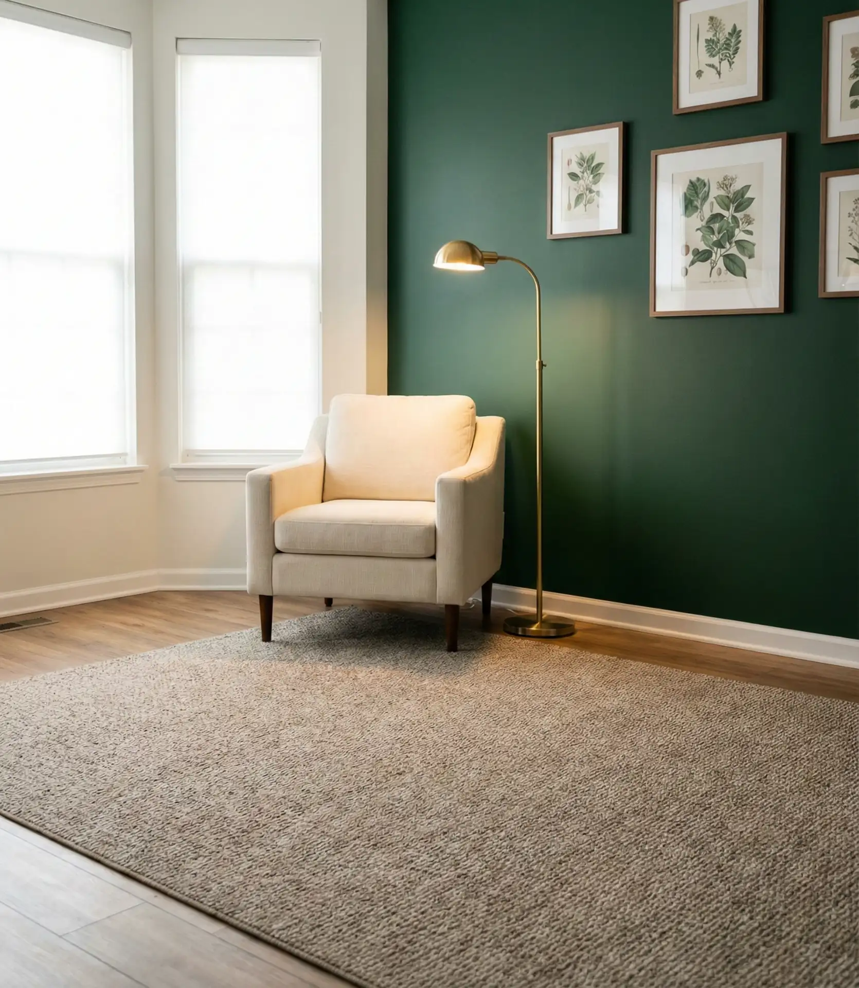
Deep forest green brings richness and drama to living rooms while maintaining a connection to nature that resonates with current interior design trends. As an accent wall choice, forest green creates a focal point without overwhelming the space—particularly effective behind a media console or fireplace. This palette option pairs beautifully with natural wood tones, leather furniture, and metallic accents. It’s a color that feels both traditional and fresh, referencing British drawing rooms while working in modern American homes.
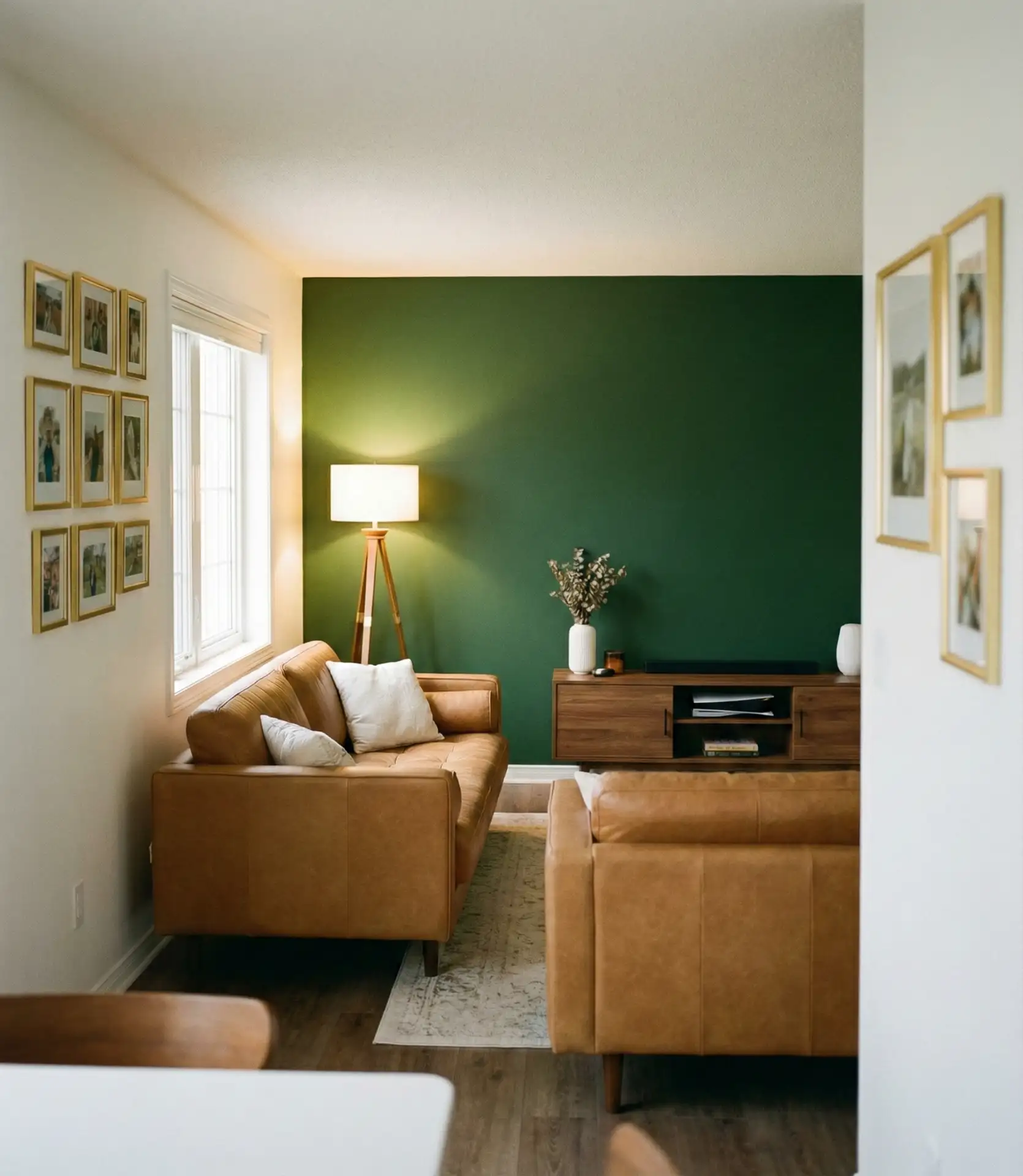
This approach works best in living rooms with at least one large window, where natural light prevents the green from feeling too dark or enclosed. In basement family rooms or spaces with limited windows, forest green can make the room feel smaller. If you’re working with a brown couch, forest green is an excellent choice—the combination creates a sophisticated, library-like atmosphere. Keep other walls in soft whites or creams to maintain balance, and incorporate plenty of warm wood tones and brass to prevent the space from reading too cool.
8. Soft Butter Yellow
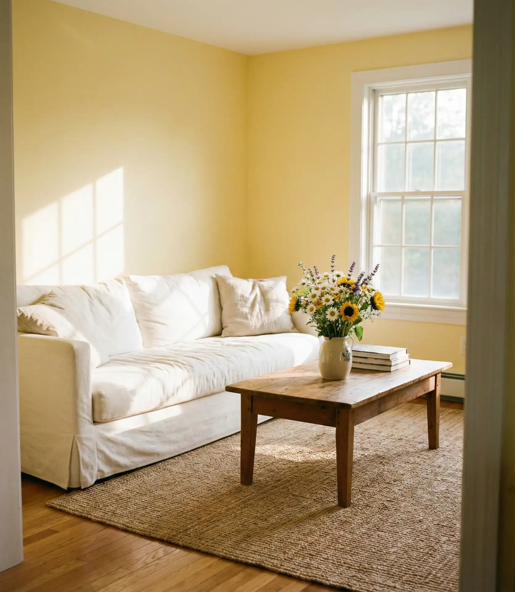
Butter yellow brings cheerfulness and light to living rooms, creating an instantly uplifting atmosphere that’s particularly welcome in 2026. Unlike brighter yellows that can feel aggressive, soft butter tones provide warmth without overwhelming the senses. This color works beautifully in homes with limited natural light, effectively brightening spaces that might otherwise feel dark. It’s a good choice for family living rooms where you want energy and positivity, and it pairs surprisingly well with both warm and cool accent colors.
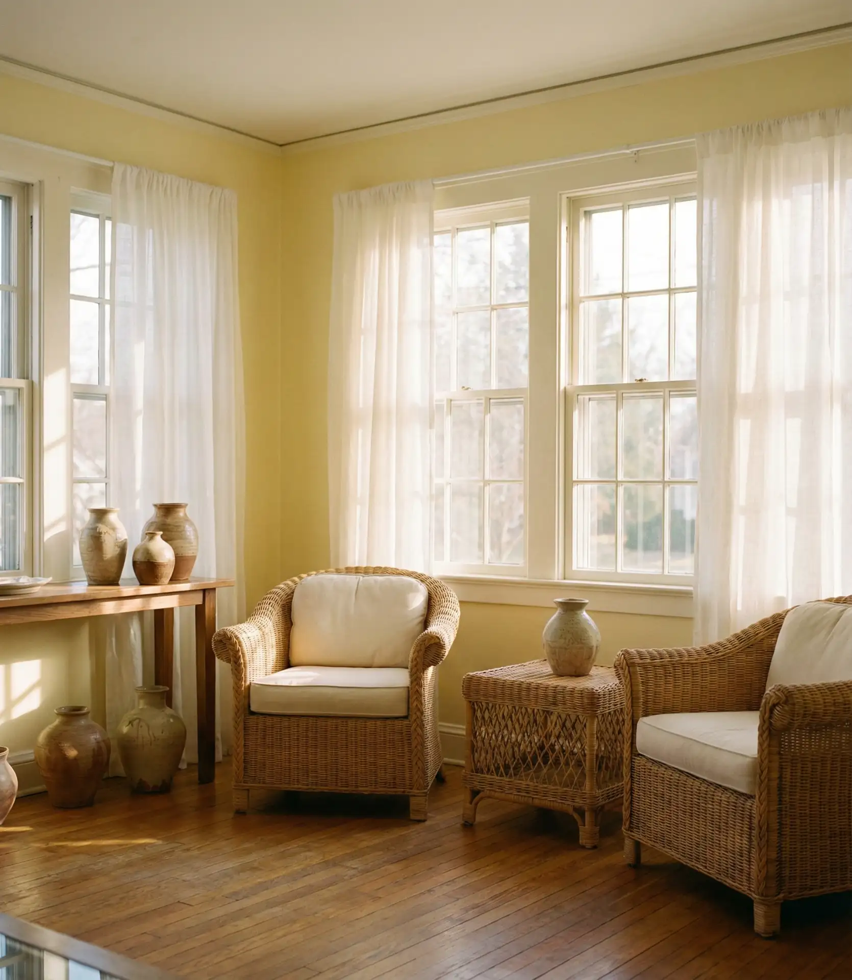
Yellow can be tricky—one shade too bright and it reads as aggressive; one shade too pale and it looks dingy. The ideal shade is a yellow with cream undertones, which conveys warmth without being fluorescent. Test samples at different times of day, as yellow shifts dramatically in changing light. Morning light makes it glow beautifully, while evening artificial light can intensify the warmth. Many homeowners find success using butter yellow in living rooms with white or cream furniture, which provides visual relief and keeps the overall effect from becoming too saturated.
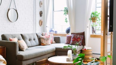
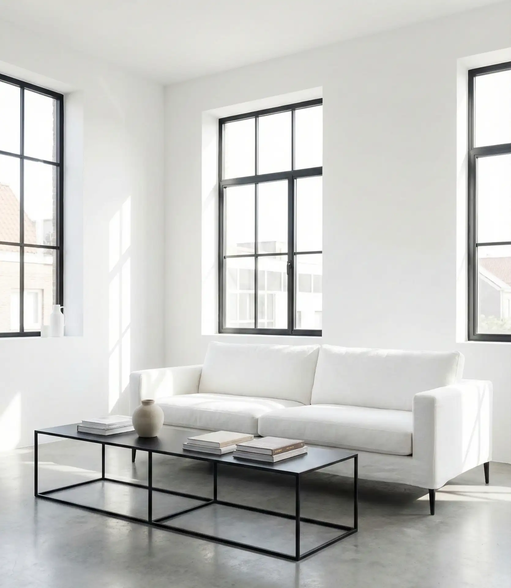
9. Crisp White with Black Accents
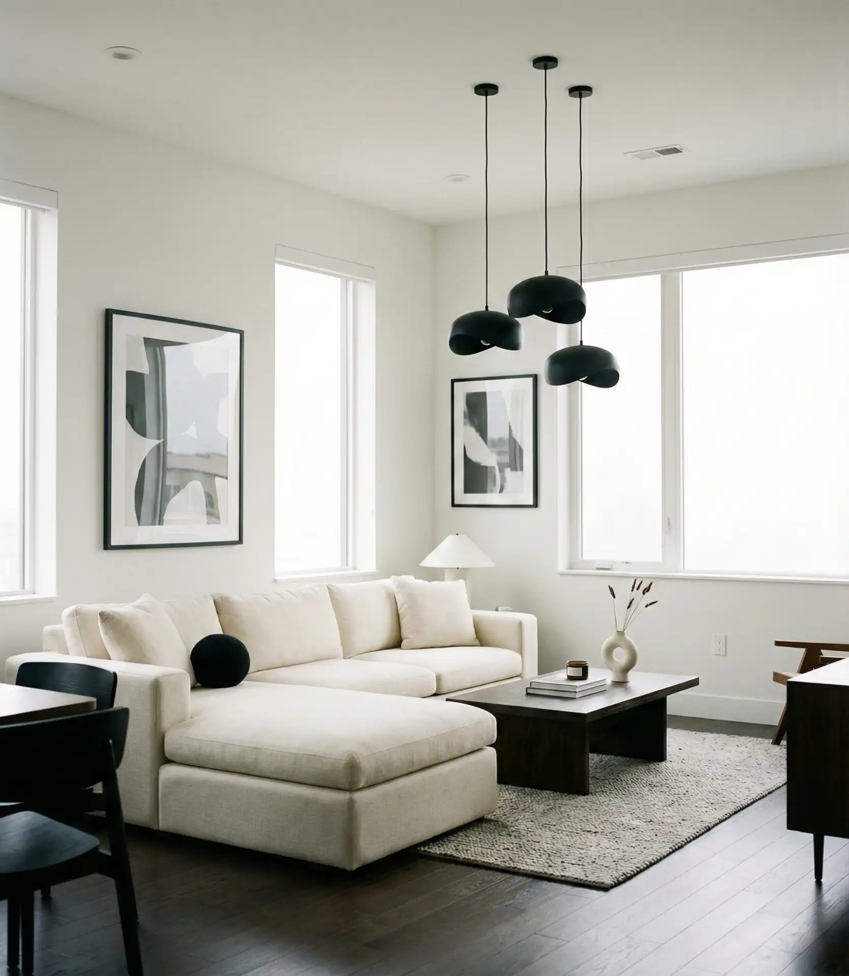
Pure white walls create a gallery-like backdrop that’s perfect for showcasing art, furniture, and architectural details in your living room. When paired with deliberate black accents—window frames, light fixtures, or furniture—the contrast creates a striking, modern aesthetic. This scheme’s bright approach maximizes natural light and makes small rooms feel larger. It’s particularly popular in minimalist and Scandinavian-inspired homes, where the focus is on clean lines and intentional design choices rather than color complexity.
In the American Northeast, where historic homes often feature beautiful millwork, painting walls white lets the architectural details shine, while black accents add a contemporary edge. The key is using a true white rather than warm or cool-tinted whites—Benjamin Moore’s Simply White or Sherwin Williams’ Pure White are reliable choices. This palette requires commitment to keeping things uncluttered, as every object shows against the stark background. It’s ideal for homeowners who appreciate a clean, edited aesthetic and don’t mind regular touch-ups, as white shows scuffs more readily than colored walls.
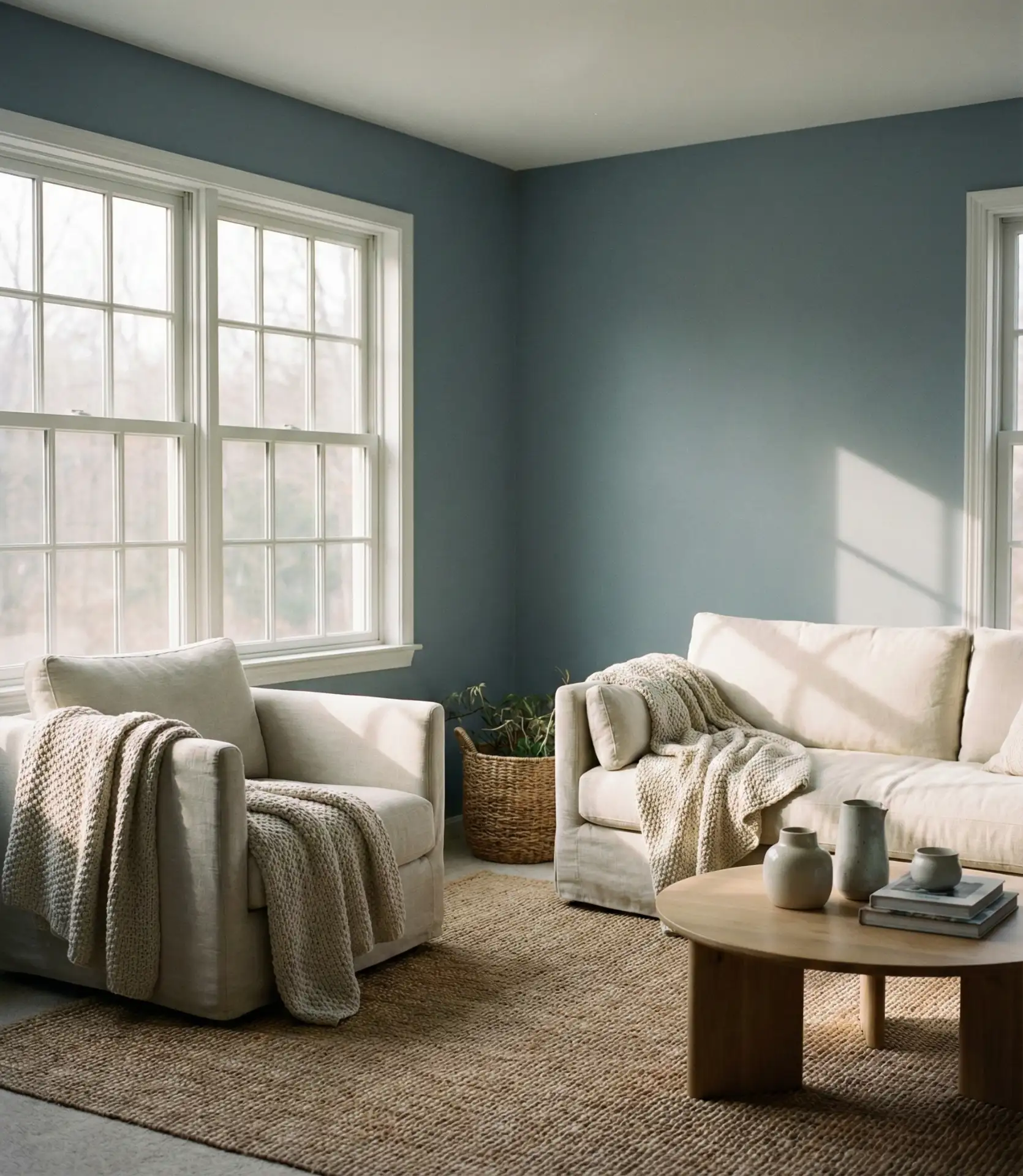
10. Dusty Blue and Warm Wood
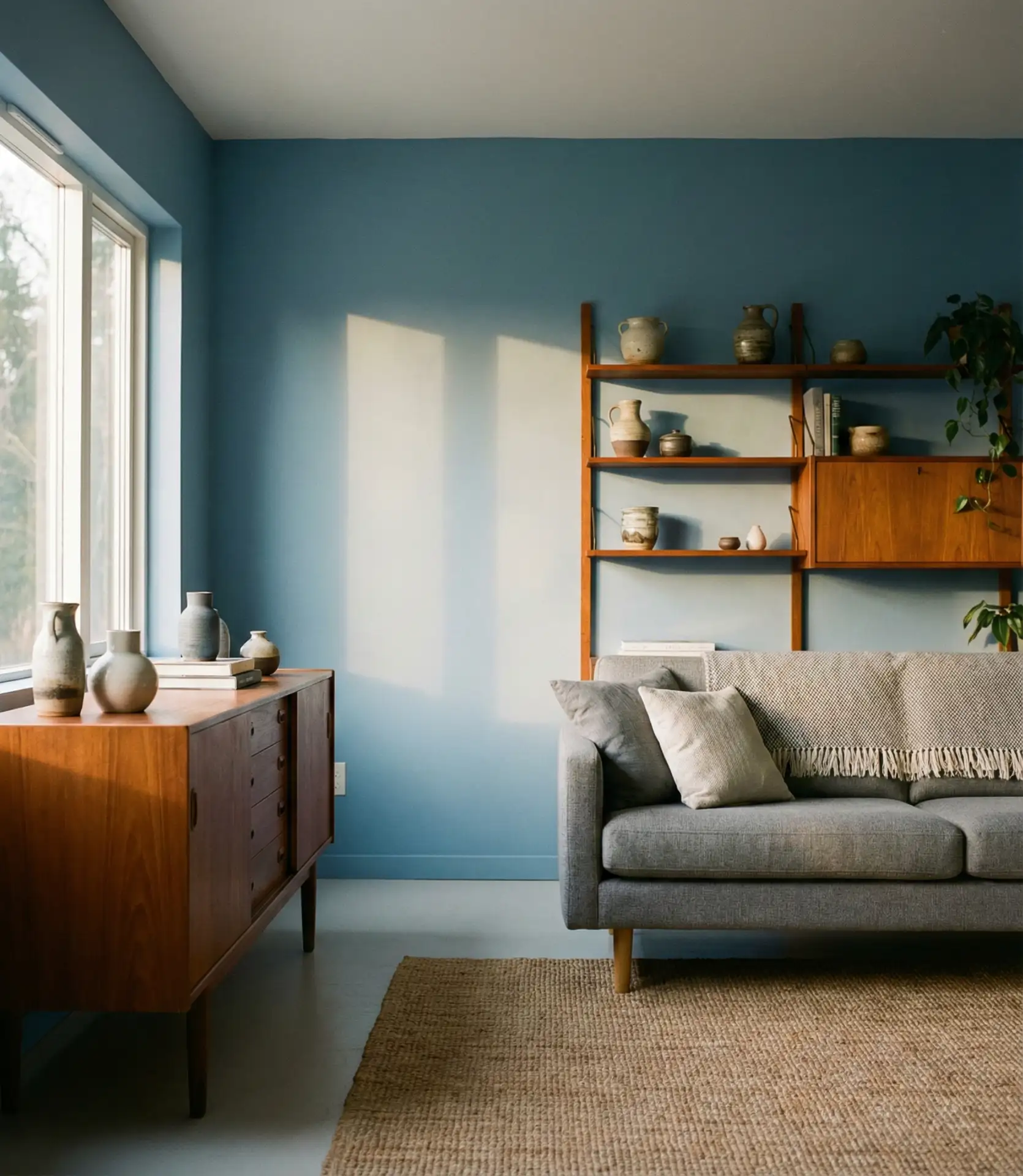
Dusty blue offers a sophisticated alternative to both navy and traditional sky blue, creating a calming yet intentional palette for living spaces. When combined with warm wood furniture—walnut, oak, or teak—the cool blue becomes grounded and livable rather than cold. This combination of balanced ideas works beautifully in both traditional and mid-century modern settings. The muted quality of dusty blue prevents it from feeling childish while still providing color interest, making it appropriate for adult living spaces seeking tranquility without blandness.
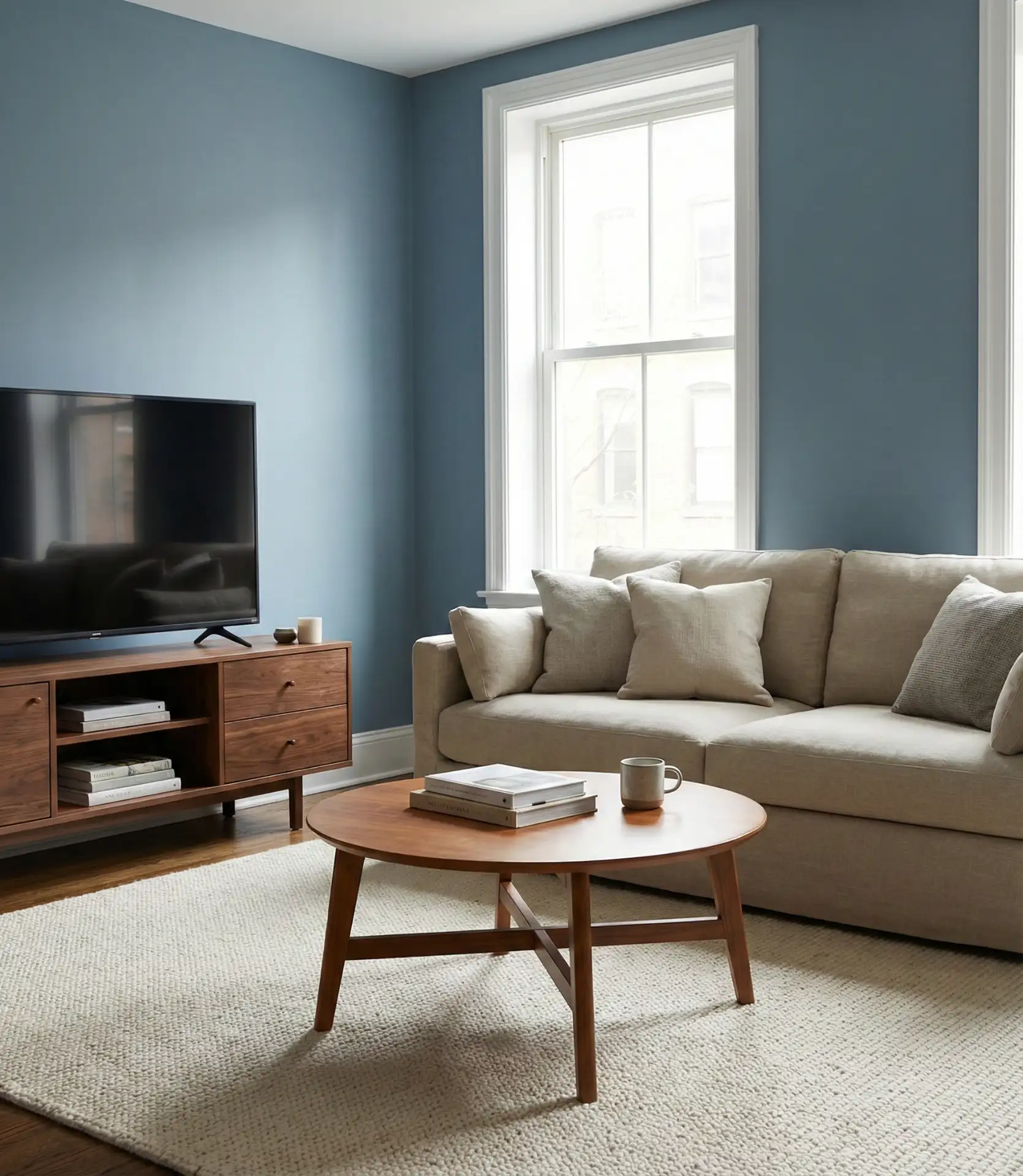
A common mistake with blue living rooms is adding too many additional cool tones, which creates a space that feels cold and unwelcoming. The solution is balancing with warm elements: wood furniture, brass or gold accents, warm-toned textiles like rust or terracotta, and plenty of layered lighting. Dusty blue works particularly well in southern-facing rooms where warm light softens the blue throughout the day. In cooler climates or north-facing rooms, consider using dusty blue on just one or two walls with warmer neutrals on the others to prevent a chilly feeling.
11. Taupe with Cream Trim
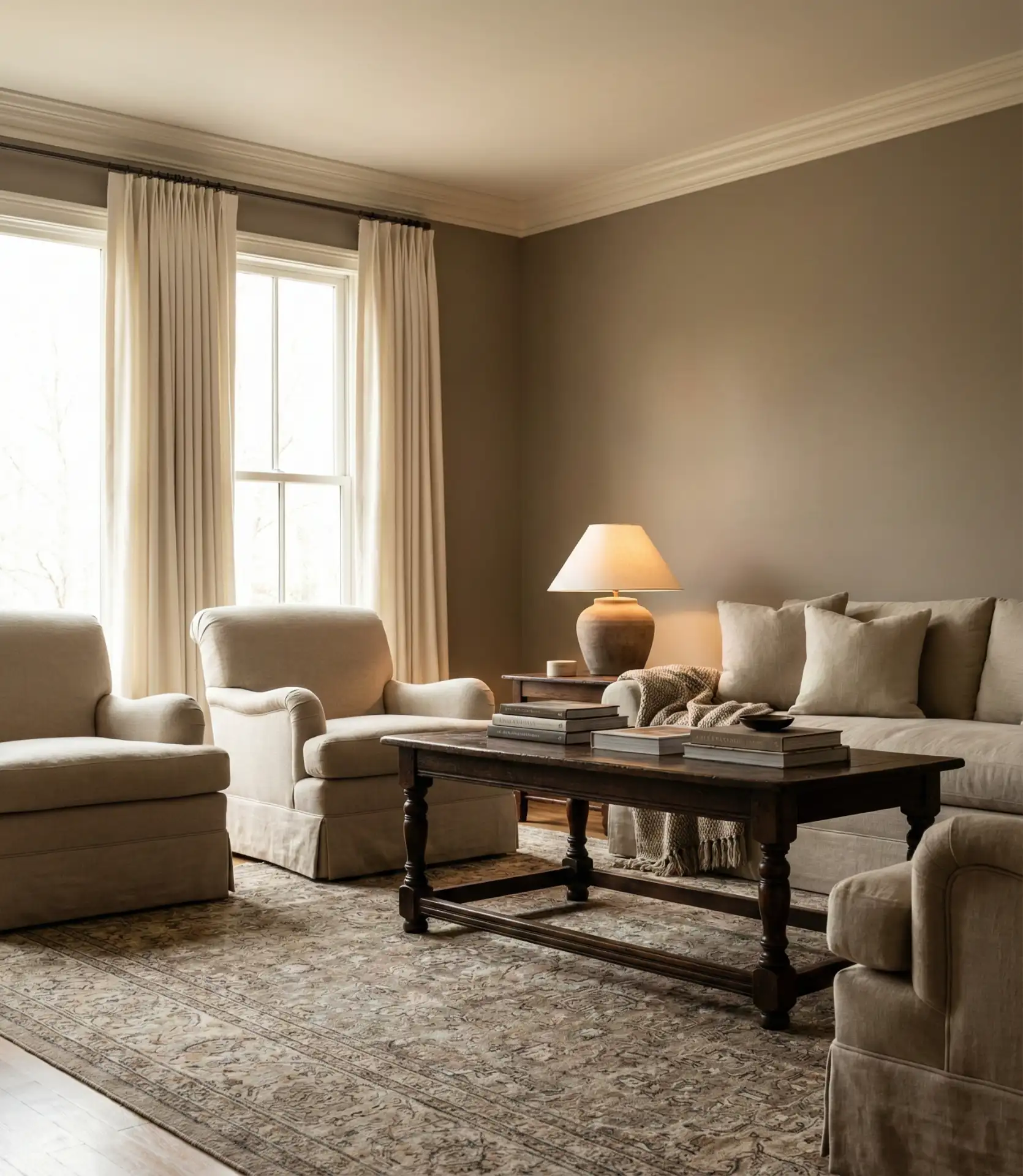
Taupe continues to prove its versatility as a foundational living room color, offering more warmth than gray and more sophistication than beige. When paired with cream-colored trim and moldings, taupe creates subtle definition without harsh contrast. This cozy combination works across diverse American home styles—from Colonial to Craftsman to contemporary. Taupe reads as inherently elegant and accommodates a wide range of furniture styles and accent colors, making it a safe but never boring choice for homeowners updating their living spaces.
Practical insight: taupe is remarkably forgiving when it comes to decorating mistakes. Unlike stark whites or bold colors, taupe doesn’t clash with much, making it ideal for homeowners who like to change throw pillows, artwork, and accessories seasonally. It also hides minor wall imperfections better than lighter colors while not showing dust as obviously as dark walls. When selecting taupe, pay attention to undertones—some lean pink, others green or gray. Choose based on your existing flooring and fixed elements to ensure harmony throughout the space.
12. Pale Mint with Gold Accents
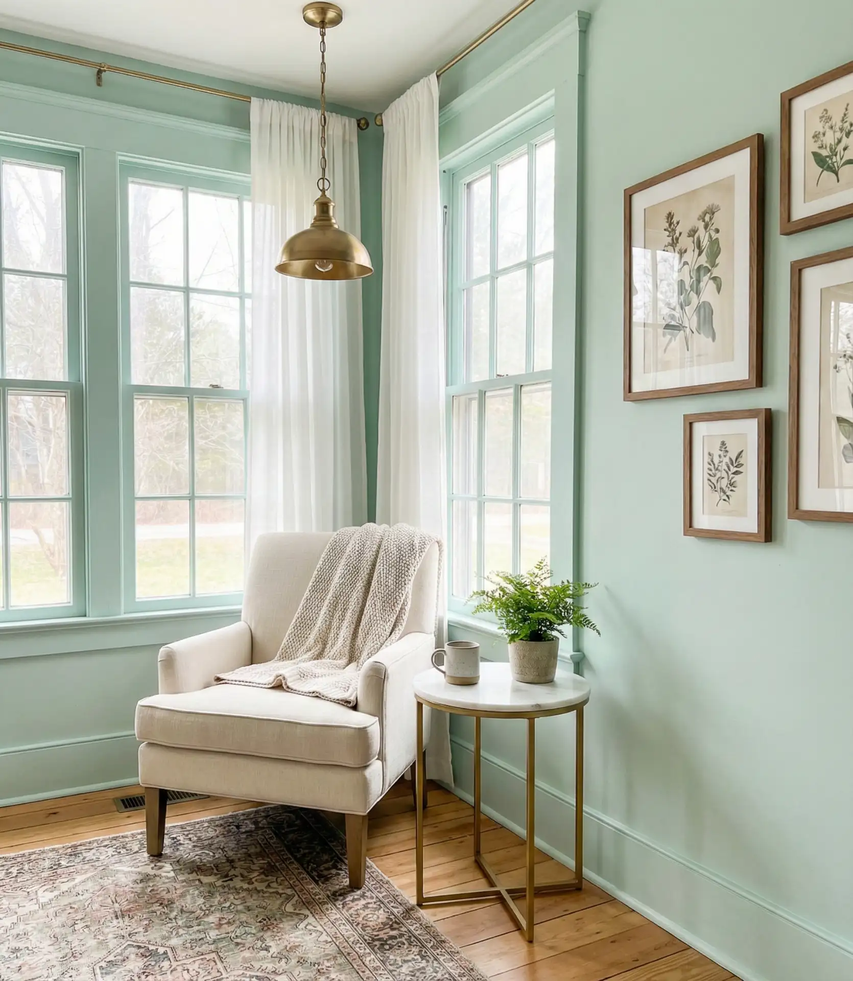
Pale mint brings a fresh, unexpected quality to living rooms in 2026, offering color without the seriousness of deeper greens or blues. This light shade creates an airy, vintage-inspired atmosphere that feels both nostalgic and current. When accented with warm gold hardware, picture frames, and light fixtures, mint gains sophistication and avoids feeling juvenile or overly pastel. The combination works particularly well in homes with Art Deco or mid-century influences, and it’s gaining traction in Southern and coastal homes where the cooling effect is welcome.
This palette works best in living rooms with abundant natural light, where the mint can breathe and shift beautifully throughout the day. In darker rooms, mint can look flat or institutional. Consider using mint on walls that receive direct sunlight, keeping shadowy corners in crisp white. The gold accents are essential—they add necessary warmth and prevent the space from feeling too cool or hospital-like. Incorporate various shades of green through plants and textiles to create depth, and add warm wood tones to ground the overall look.
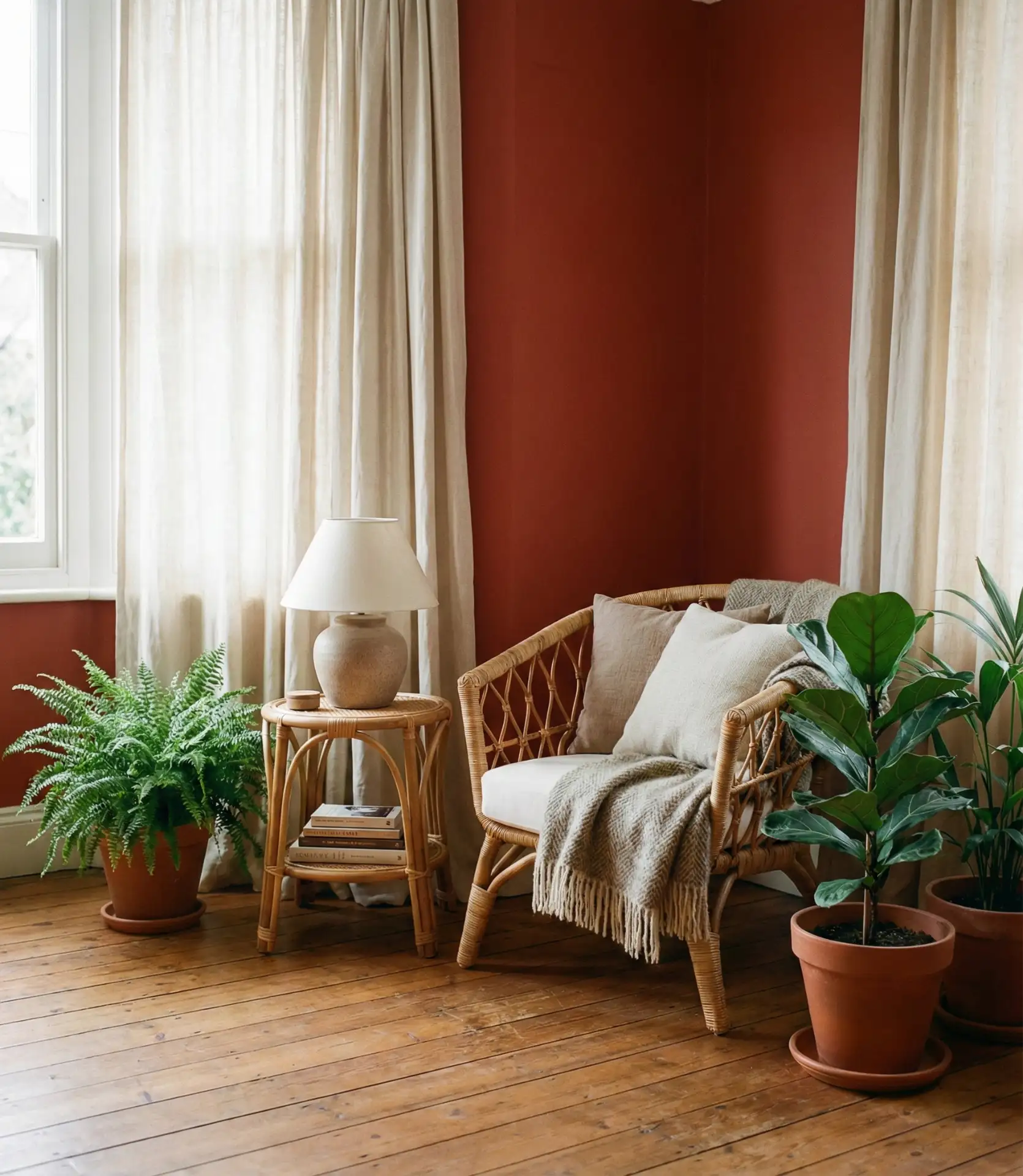
13. Moody Plum with Brass
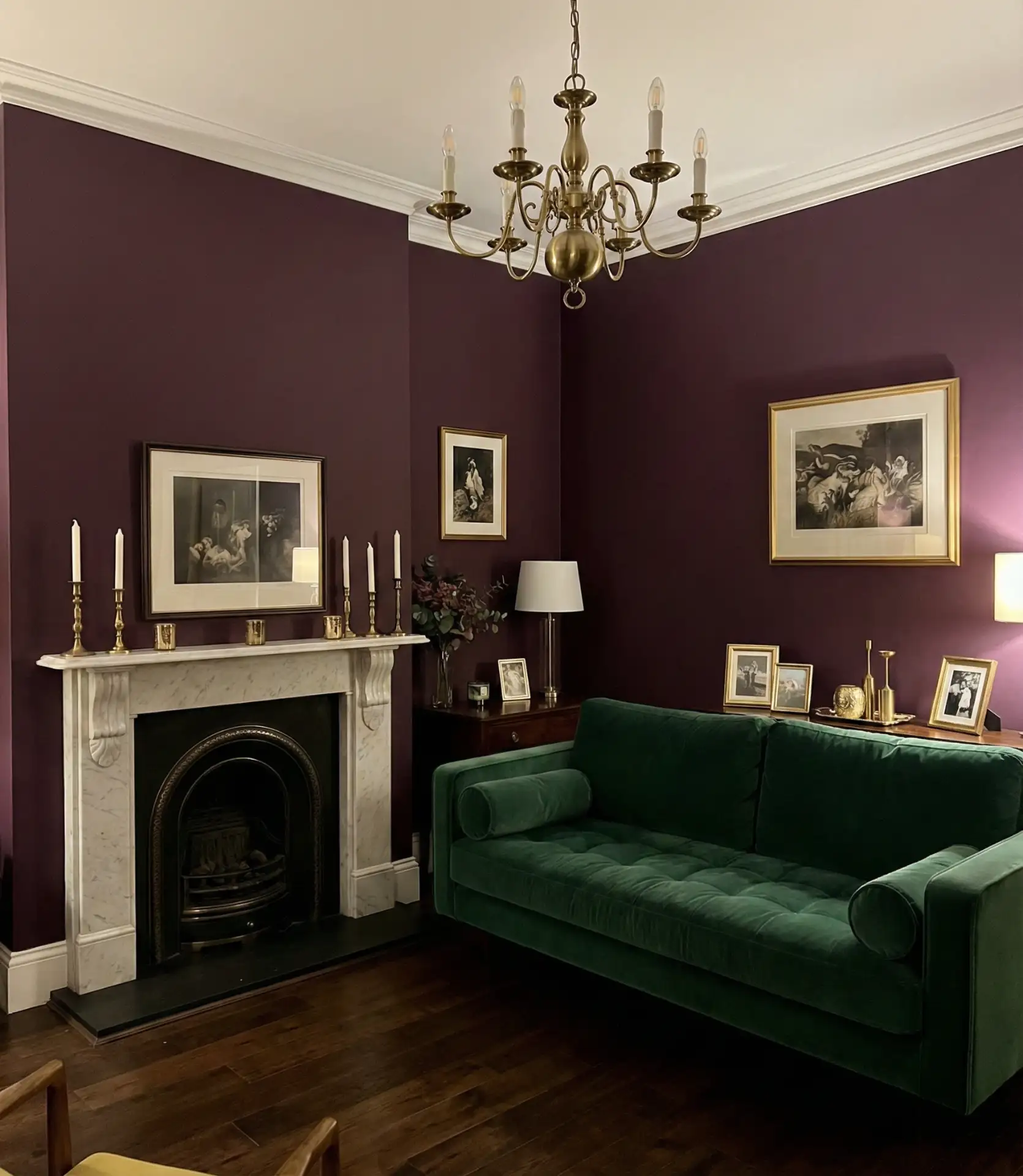
Deep plum creates a jewel-toned living room environment that’s both dramatic and surprisingly livable when executed correctly. This rich color works beautifully in formal living rooms or spaces used primarily in the evening, where its depth creates intimacy and sophistication. Brass hardware, light fixtures, and decorative elements provide essential warmth against the cool purple, creating a luxurious scheme that references Victorian parlors while feeling thoroughly modern. It’s a bold choice that rewards homeowners willing to commit to a strong color statement.
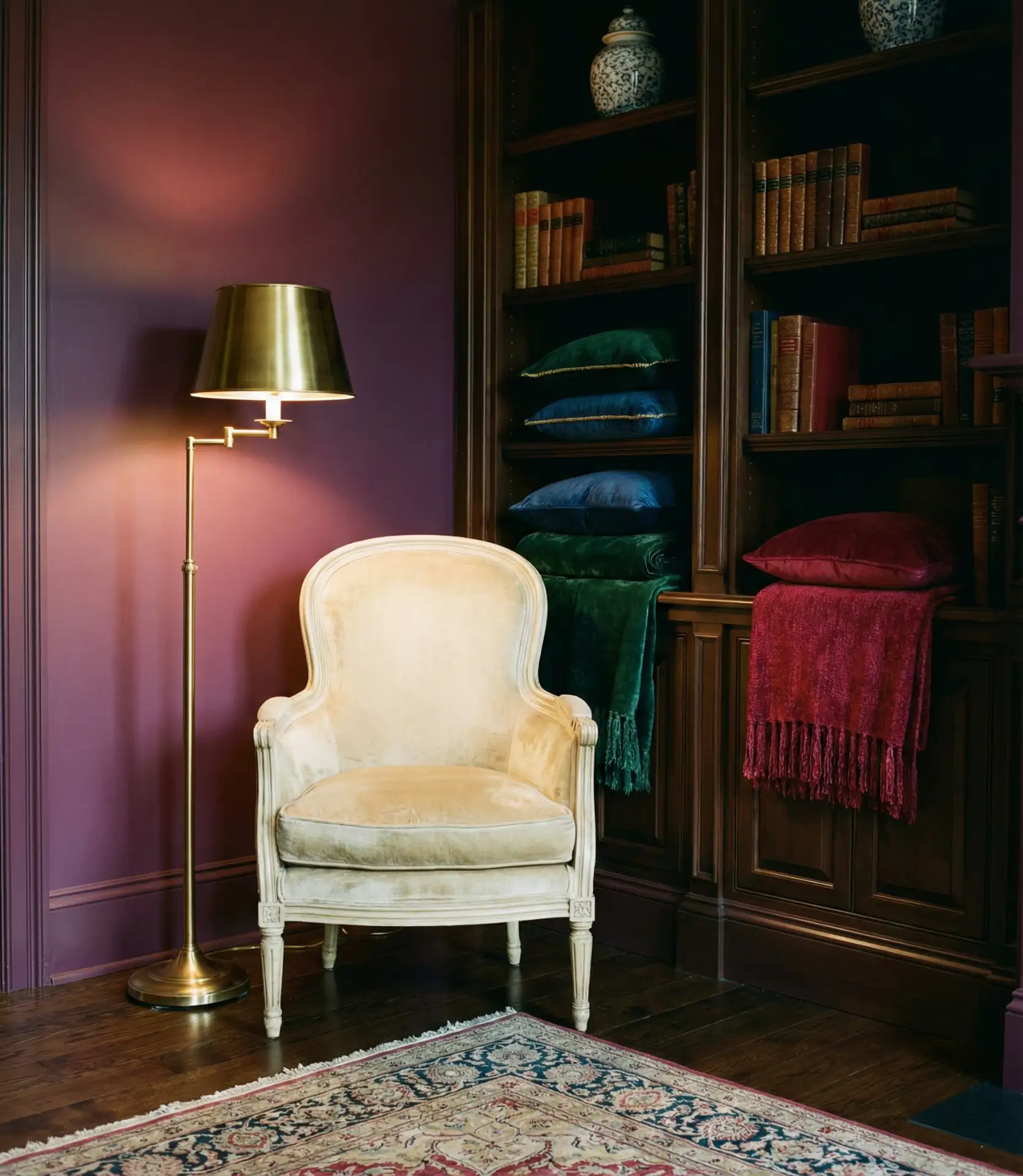
Where it works best: Plum shines in formal living rooms, libraries, or dedicated sitting areas in larger homes. It’s less successful in family rooms or open-plan spaces that connect directly to kitchens, where the formality can feel out of place. The color requires excellent lighting—plan for multiple light sources, including overhead fixtures, table lamps, sconces, and floor lamps. Without proper illumination, plum walls can disappear into darkness. Keep furniture lighter in value to provide necessary contrast, and incorporate metallics generously to reflect light and add glamour.
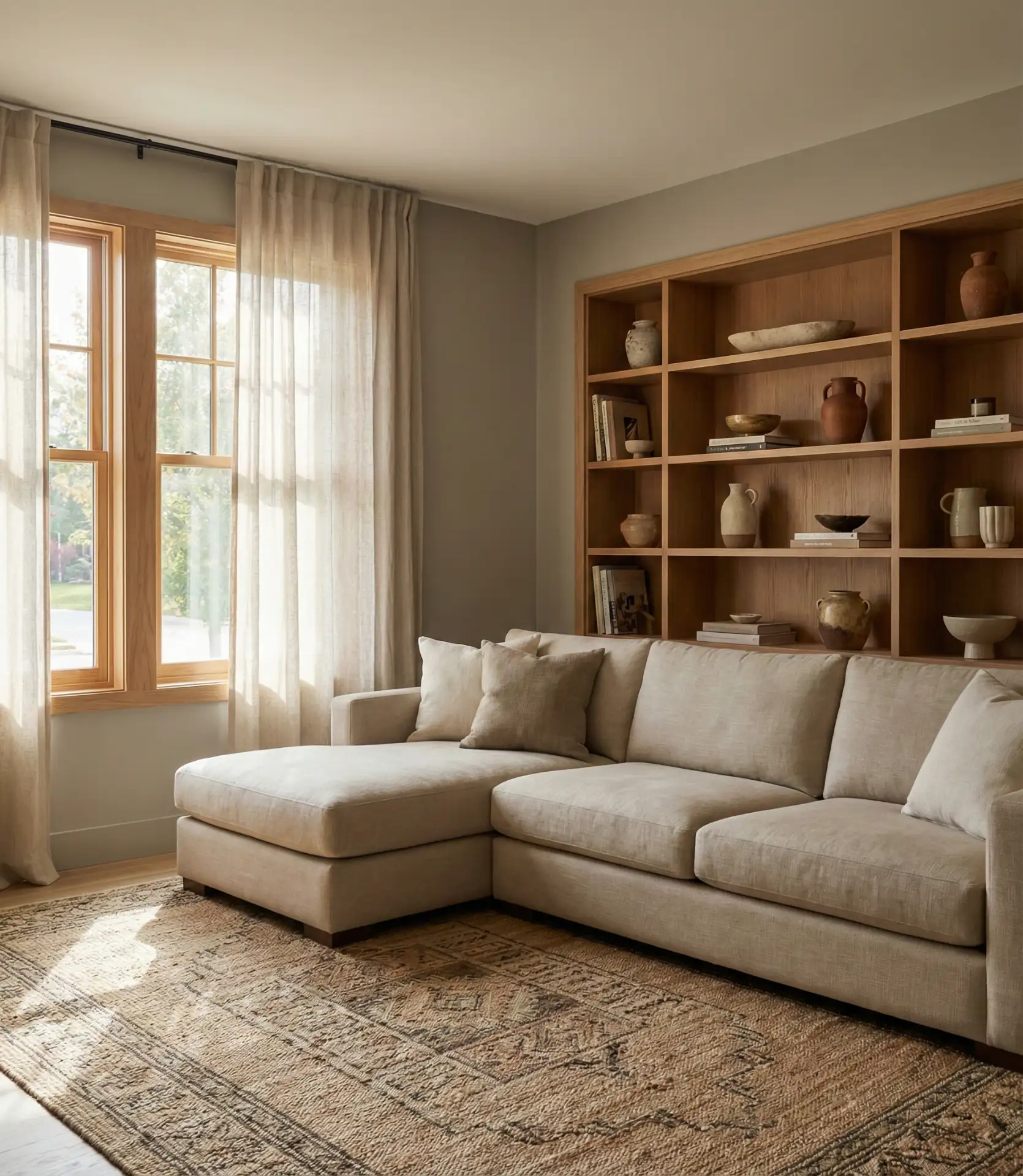
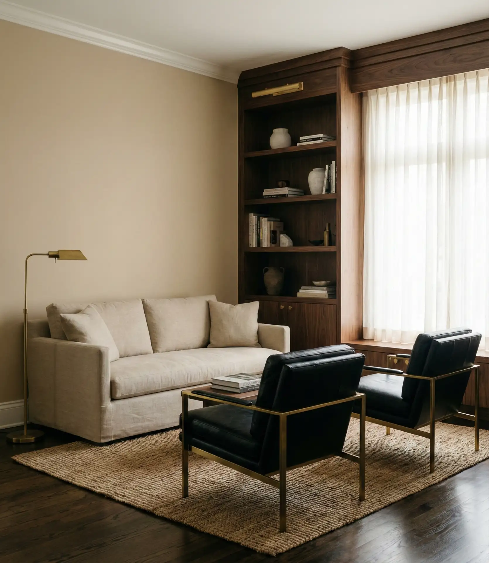
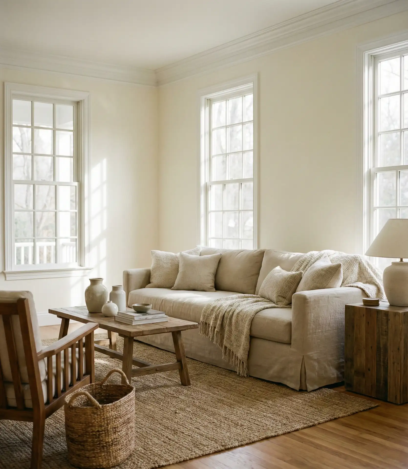
14. Warm White with Natural Wood
Warm white walls create a bright canvas that lets natural wood furniture and architectural elements take center stage in your living room. Unlike stark whites, warm whites have subtle cream or yellow undertones that make spaces feel inviting rather than clinical. This approach is particularly effective in homes with beautiful hardwood floors, exposed beams, or wood-clad ceilings. The neutral backdrop allows wood tones to vary—from light oak to dark walnut—without creating visual conflict, making it ideal for homeowners who collect furniture over time.
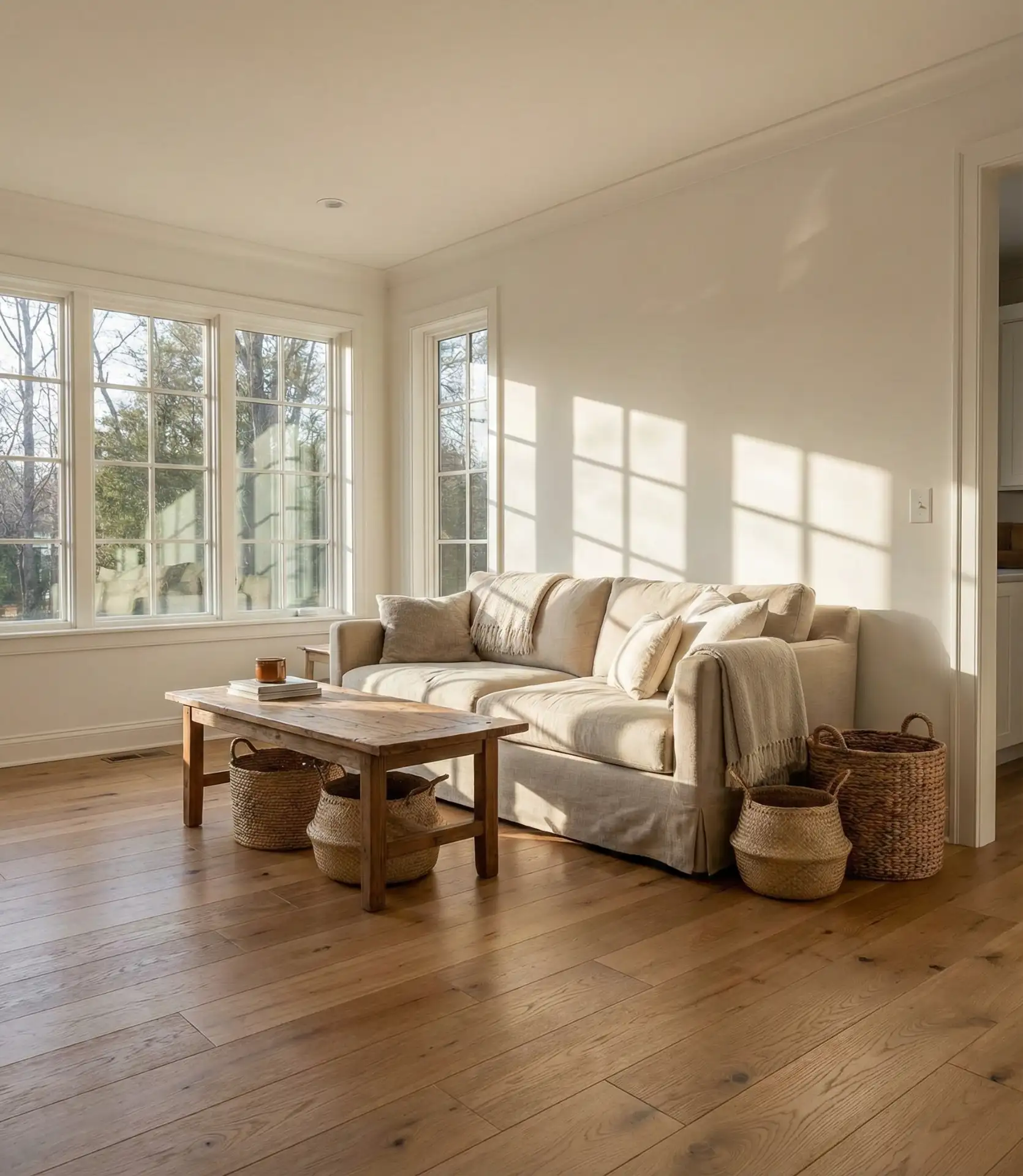
Many California homeowners favor this combination in their living rooms, where the indoor-outdoor lifestyle benefits from a neutral backdrop that doesn’t compete with garden views. The warm white enhances natural light without creating glare, making spaces feel larger and more open. For those who worry that white feels too plain, the solution lies in texture: incorporate woven textiles, natural fiber rugs, varied wood finishes, and organic shapes. The room gains interest through material contrast rather than color, creating a sophisticated, timeless look that won’t require frequent updates.
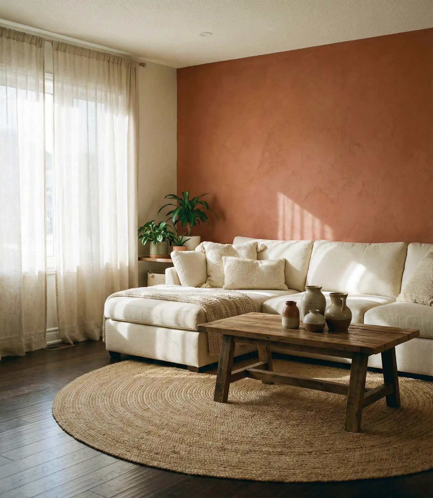
15. Clay Red and Natural Linen
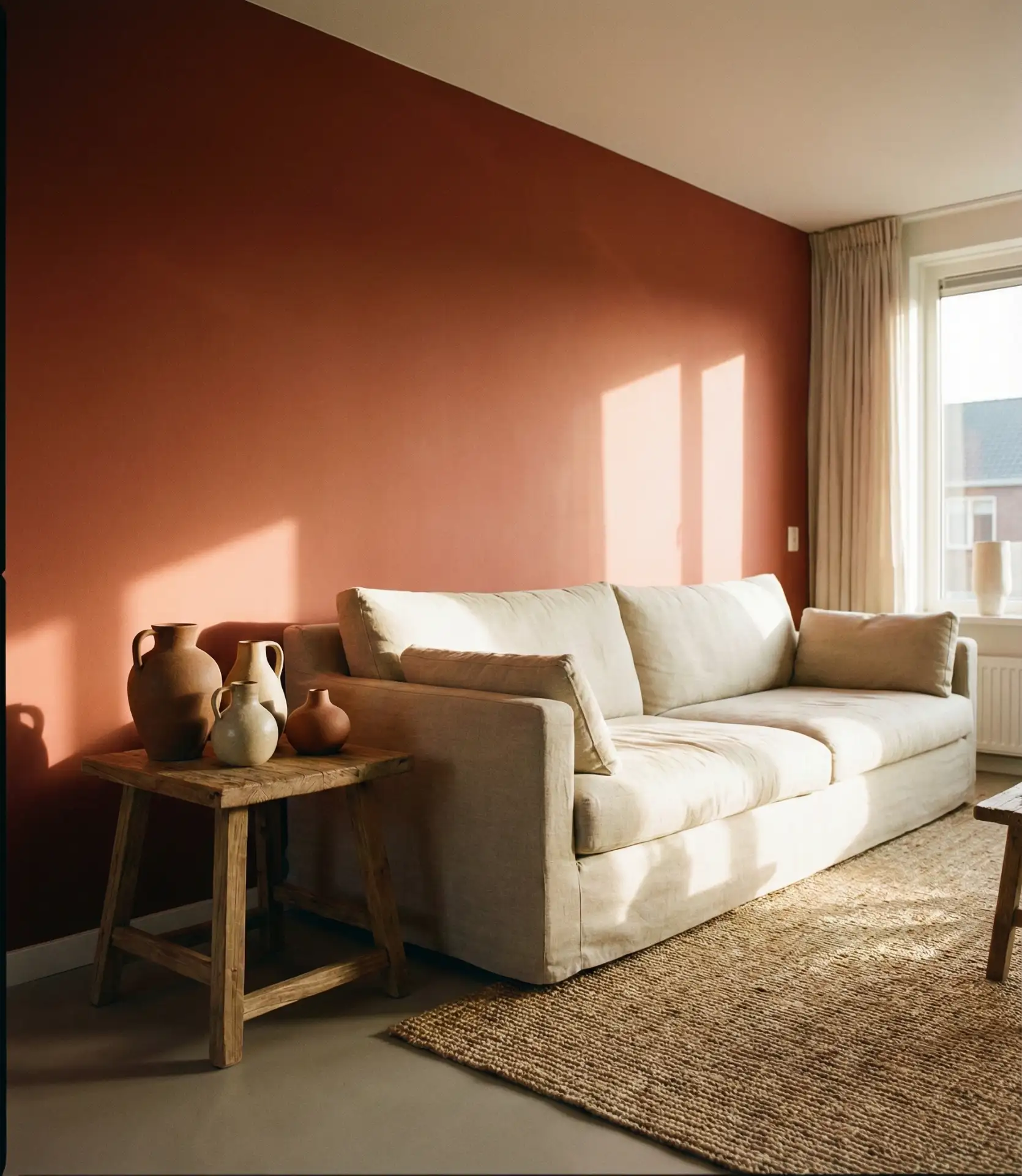
Clay red brings an earthy warmth that’s richer than terracotta but less aggressive than true red, creating a distinctive palette of ideas for 2026 living rooms. This shade references Mediterranean and Southwestern design traditions while feeling completely current when balanced with natural linen textiles. The combination creates immediate coziness and works beautifully with both modern and traditional furniture styles. Clay red is particularly effective as an accent wall or in smaller living rooms, where its warmth creates intimacy without overwhelming the space.
Expert designers recommend using clay red in living rooms with warm-toned flooring—honey oak, terracotta tile, or warm-stained concrete. Against cool-toned gray floors or tile, the red can look disjointed. The key to making clay red work is balance: use it on one or two walls, maximum, and keep other surfaces in soft neutrals like cream, sand, or warm white. Natural linen in upholstery and curtains provides necessary visual relief and prevents the space from feeling too saturated. Add plenty of greenery through plants to create contrast and freshness.
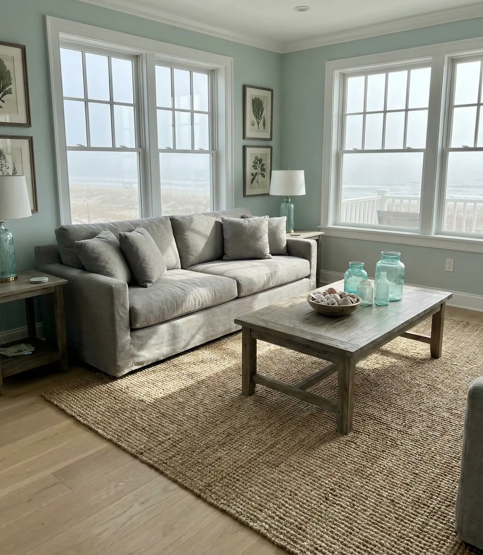
16. Pale Gray-Blue Throughout
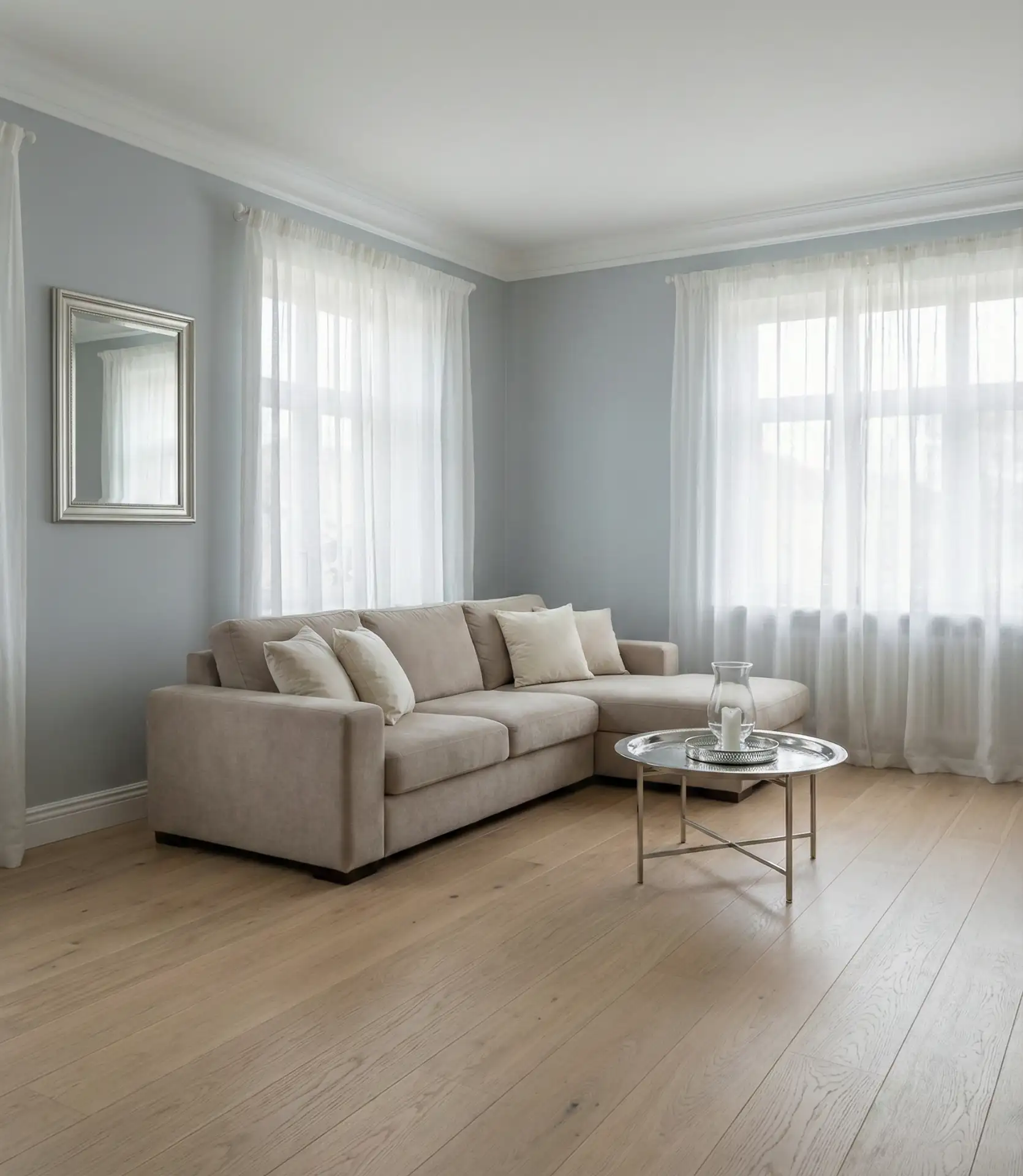
This soft gray-blue creates a serene, cohesive look when used throughout the living room, offering subtle color without strong commitment. The shade works particularly well in open-concept kitchen layouts where you want the living area to feel distinct but harmonious with adjacent spaces. This shade, cooler than greige but warmer than true gray, occupies a harmonious spot that complements both silver and gold metal finishes. This versatile color appeals to homeowners seeking calm, sophisticated spaces that work year-round and across different design trends.
This color performs best in rooms with good natural light, where it shifts beautifully from a cool blue in the morning to a soft gray in the evening. In darker rooms or those with only artificial lighting, it can read flat or even dingy. Test your sample at different times and under both natural and artificial light. The beauty of pale gray-blue is its flexibility—it works with a gray couch, cream upholstery, or even darker furniture without clashing. Layer in textures through rugs, throws, and pillows to prevent the monochromatic scheme from feeling flat.
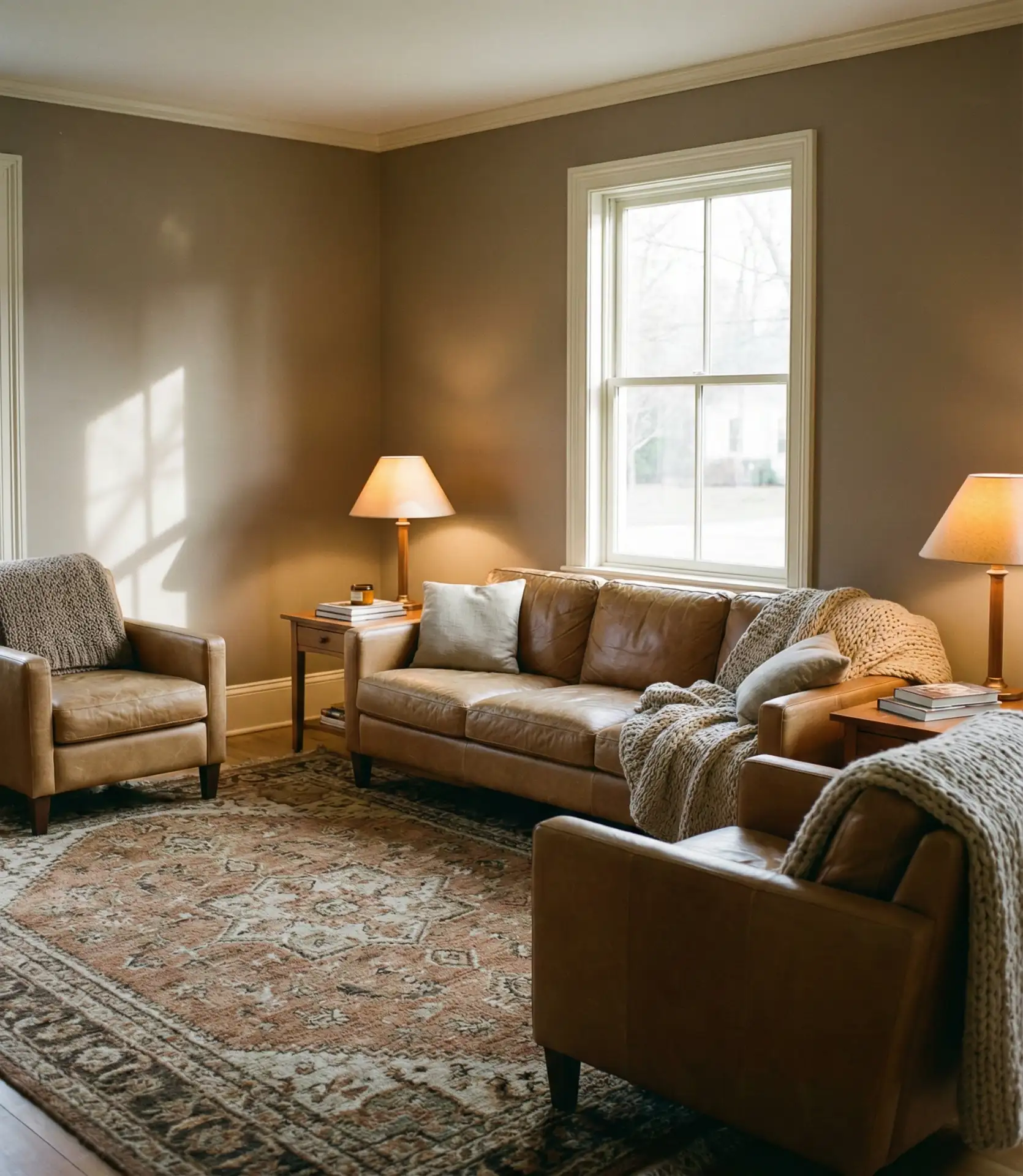
17. Warm Caramel and Ivory
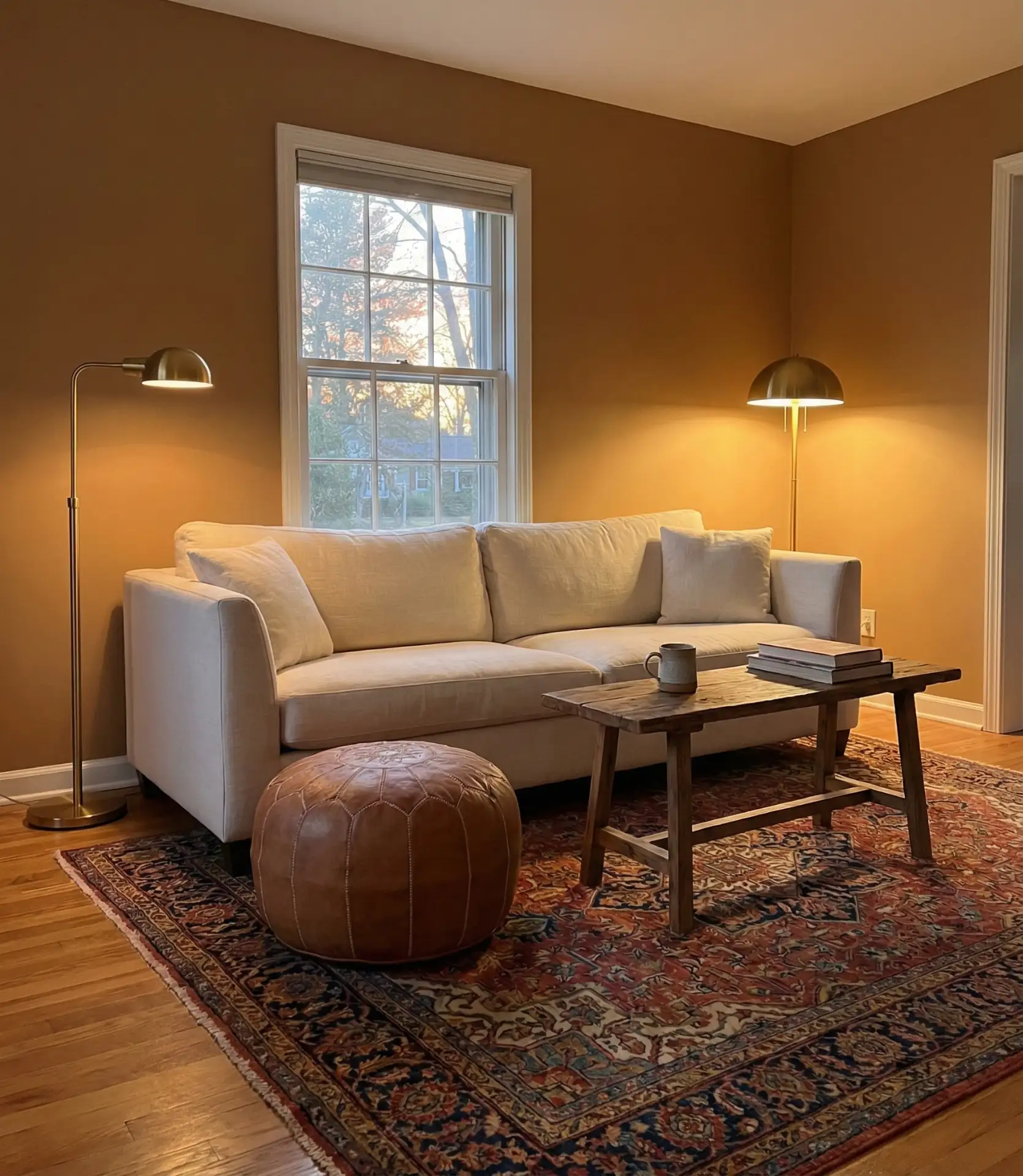
Caramel brings a rich, enveloping warmth that’s perfect for creating cozy living rooms that invite relaxation and conversation. When paired with ivory furniture and trim, caramel walls provide depth without darkness, creating a sophisticated scheme and cozy environment. This combination works beautifully in traditionally styled homes and spaces with lots of wood trim or built-ins. The warm tones complement leather furniture, brass accents, and natural materials, making it particularly popular in Midwestern and Northeastern homes where warmth is welcome year-round.
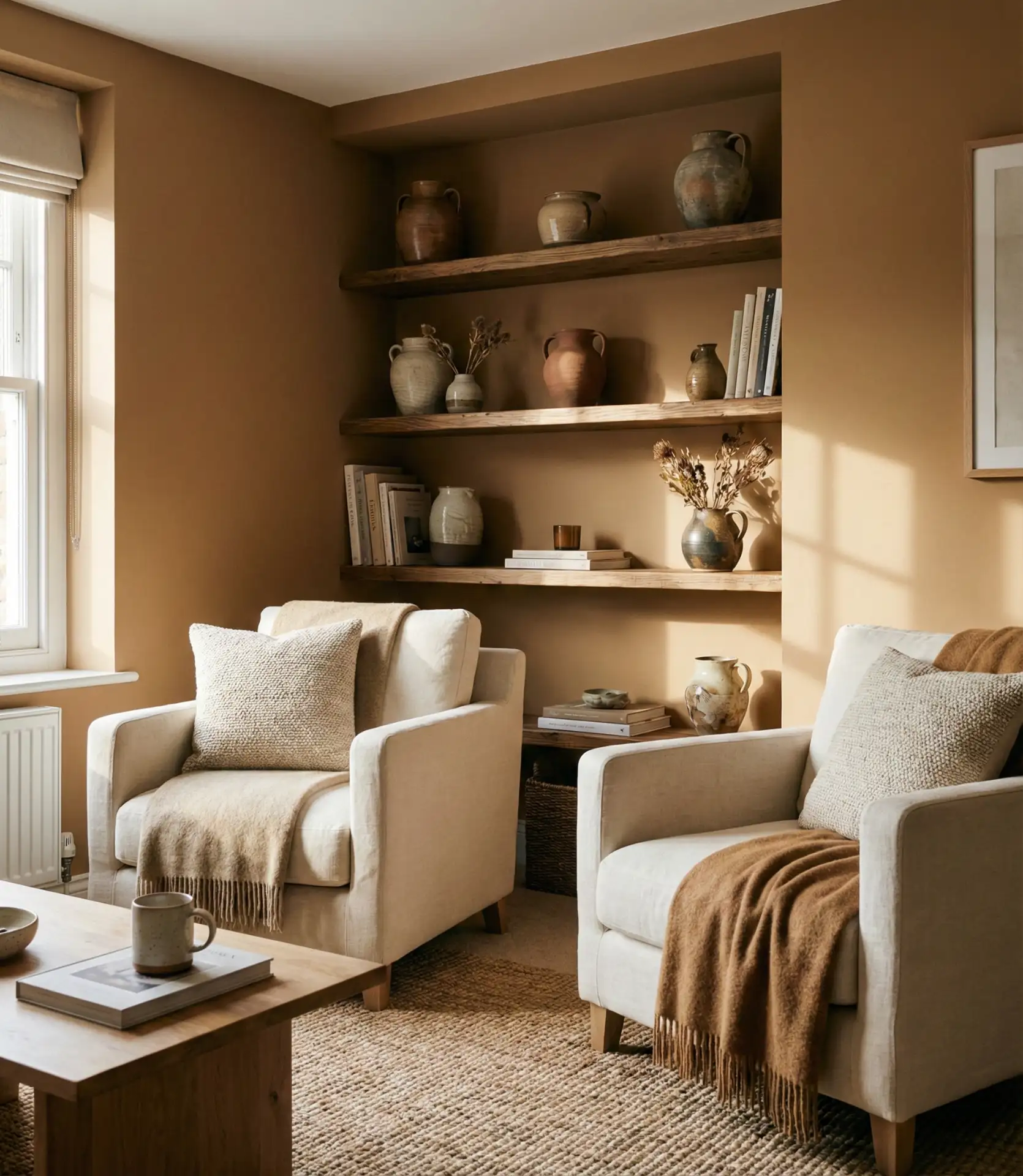
A designer in Chicago recently noted that caramel is making a comeback specifically because it provides warmth without the yellow undertones that made 1990s gold tones feel dated. Modern caramels lean toward brown-beige rather than orange-brown, creating a more sophisticated effect. The color works best in rooms with cool or neutral lighting—warm LED bulbs can make caramel read too orange. Balance is essential: use plenty of ivory, cream, and white in furniture, curtains, and accents to prevent the room from feeling dark or heavy.
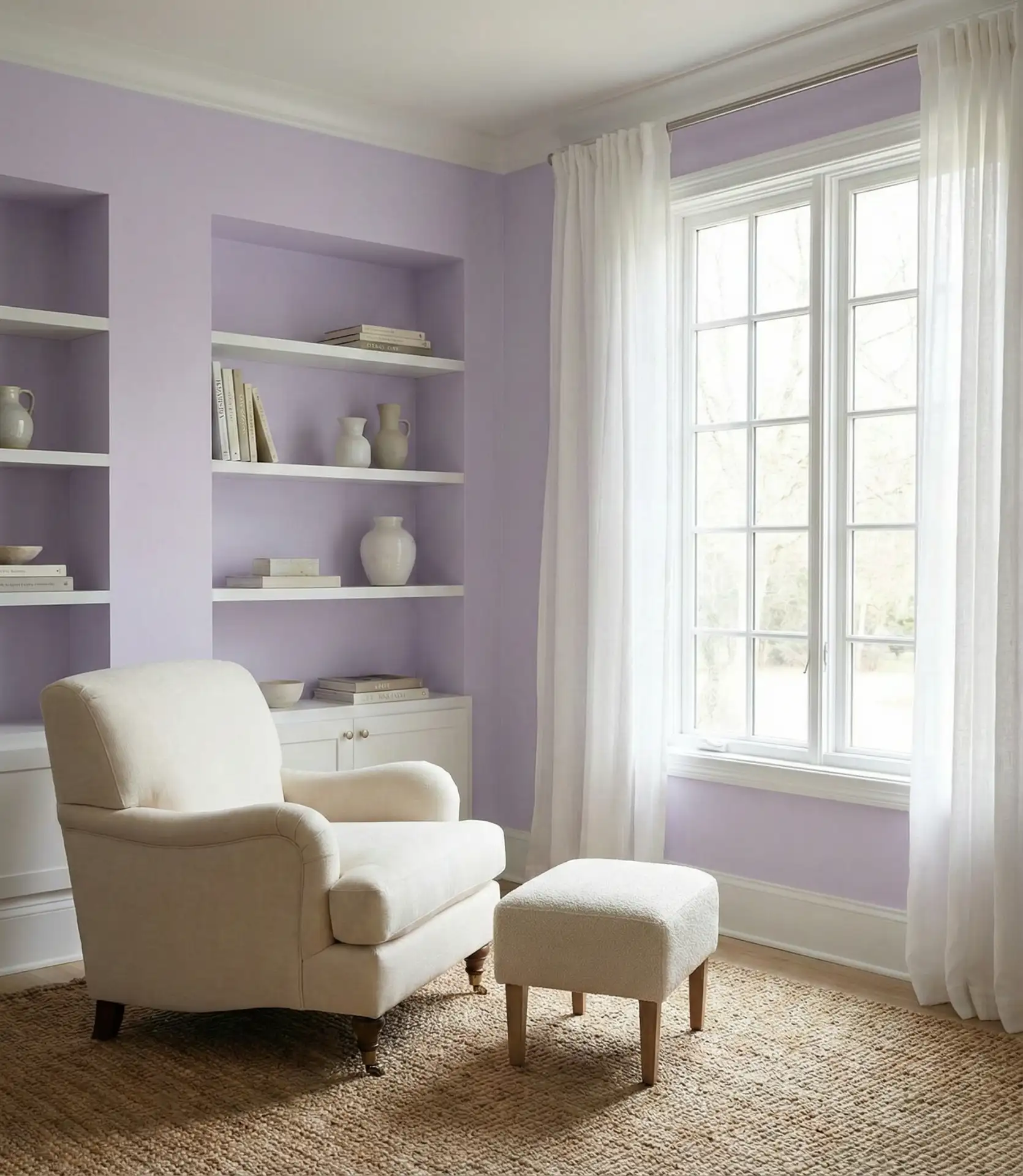
18. Soft Lavender and White
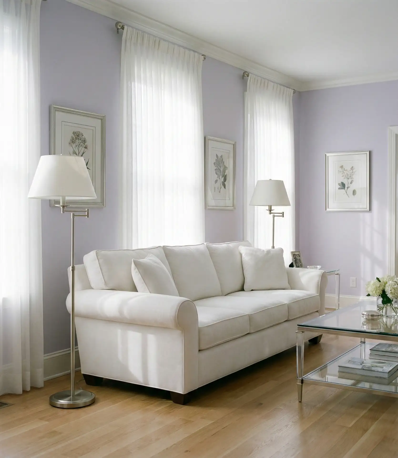
Lavender brings unexpected softness and sophistication to living rooms, offering a gentle alternative to gray or beige neutrals. When kept very pale and paired with crisp white trim and furnishings, lavender creates an ethereal, calming atmosphere that works surprisingly well in modern settings. This palette choice is gaining popularity among younger homeowners who want color personality without bold saturation. The key is choosing a lavender with significant gray undertones, which prevents it from reading as too sweet or childish.
Budget considerations: lavender is fairly forgiving in terms of paint quality, though premium paints from Benjamin Moore or Sherwin-Williams offer better color consistency in pale tints. At $50-70 per gallon, these brands ensure your lavender doesn’t look blotchy or inconsistent. The color works well with both silver and gold accents, making it adaptable to different decorating styles. To prevent the space from feeling too feminine or precious, incorporate masculine elements like leather, dark wood, or geometric patterns in rugs and textiles.
19. Chocolate Brown Feature Wall
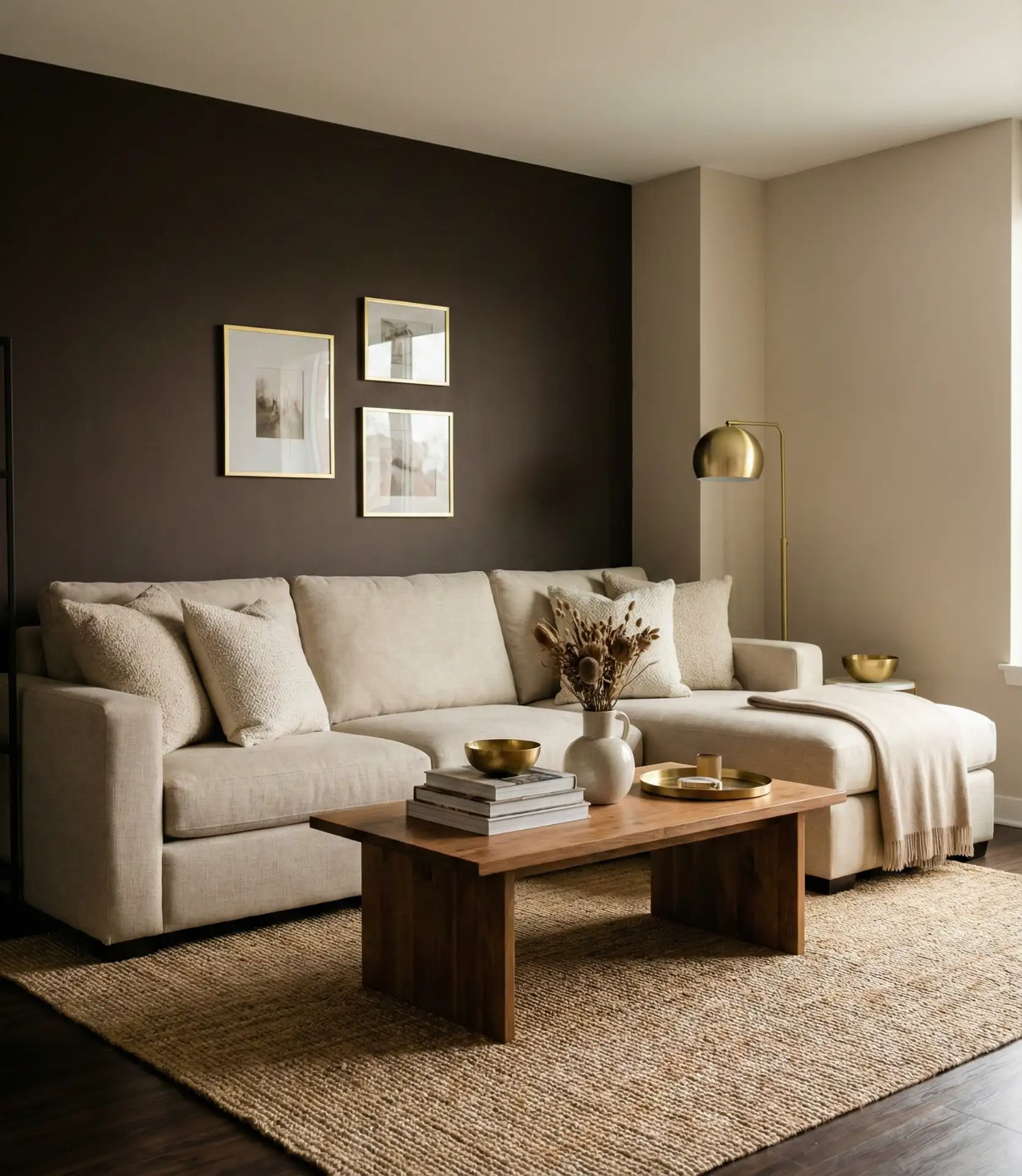
Deep chocolate brown creates dramatic impact as a feature wall in living rooms, providing rich depth that grounds the space and highlights architectural features. This approach works particularly well behind built-in shelving, a fireplace, or a media wall, where the dark color adds definition and focus. When paired with lighter walls in cream or warm white, chocolate brown prevents the room from feeling enclosed while still delivering visual impact. It’s an excellent backdrop for displaying art, books, or collectibles, and it pairs beautifully with a brown couch without creating monotony.
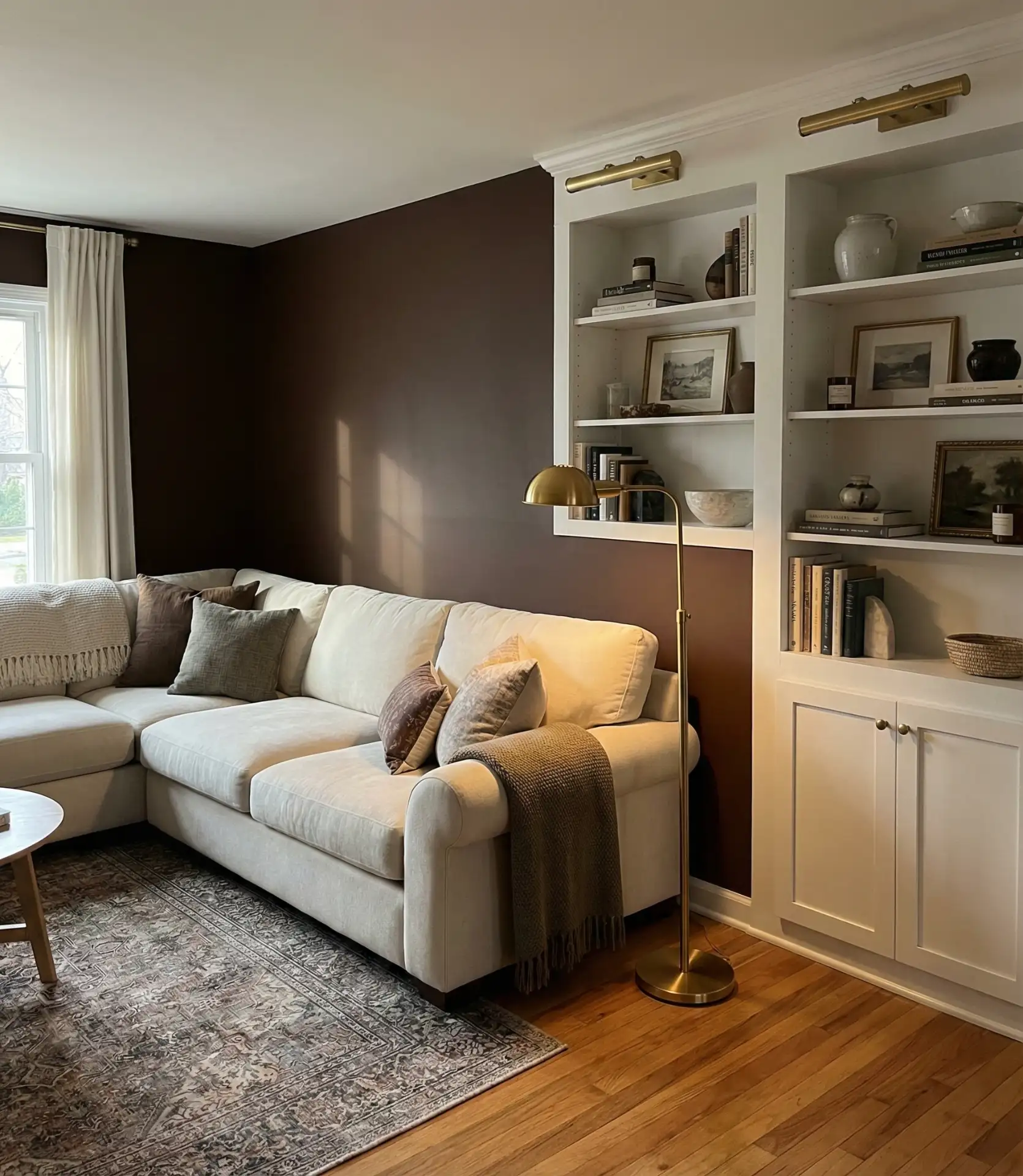
Common mistakes include using chocolate brown in rooms with insufficient lighting or on all four walls, which creates a cave-like effect. Instead, limit it to one feature wall and ensure the room has multiple light sources, including overhead, task, and ambient lighting. The brown should enhance coziness, not create darkness. This approach works especially well in rooms with high ceilings or large windows where the dark wall anchors the space without overwhelming it. Add warm metallics like bronze or copper to complement the brown and create a cohesive, inviting atmosphere.
20. Seafoam and Driftwood Gray
Seafoam green paired with driftwood gray creates a coastal-inspired living room palette that works beyond beach houses, bringing calm sophistication to urban and suburban homes alike. This combination references natural elements—water and weathered wood—creating an inherently harmonious scheme. The muted tones prevent the coastal theme from feeling literal or kitschy, instead offering a subtle nod to nature that works year-round. It works best in homes with a lot of natural light, where the colors change beautifully throughout the day.
Warm light keeps the cool tones from feeling chilly, so this color scheme looks best in living rooms that face south or west. In northern-facing rooms, consider using seafoam as an accent color on just one or two walls rather than throughout. The combination is naturally low-contrast, so add definition through varied textures: smooth linen, nubby bouclé, rough jute, and smooth ceramics. White accents keep the look fresh, while natural wood in varying tones adds necessary warmth. The result is a living room that feels simultaneously relaxing and pulled together.
21. Terracotta and Sage Combination
Pairing terracotta and sage creates a nature-inspired palette idea scheme that’s both trending and timeless for living rooms in 2026. These earth tones work together beautifully—the warm terracotta grounds the cooler sage, while the sage prevents terracotta from feeling too intense. Consider using sage on three walls with terracotta as an accent wall, or vice versa, depending on your preference for warmth versus coolness. This combination references Southwestern and Mediterranean design traditions while feeling thoroughly contemporary when executed with modern furnishings and clean lines.
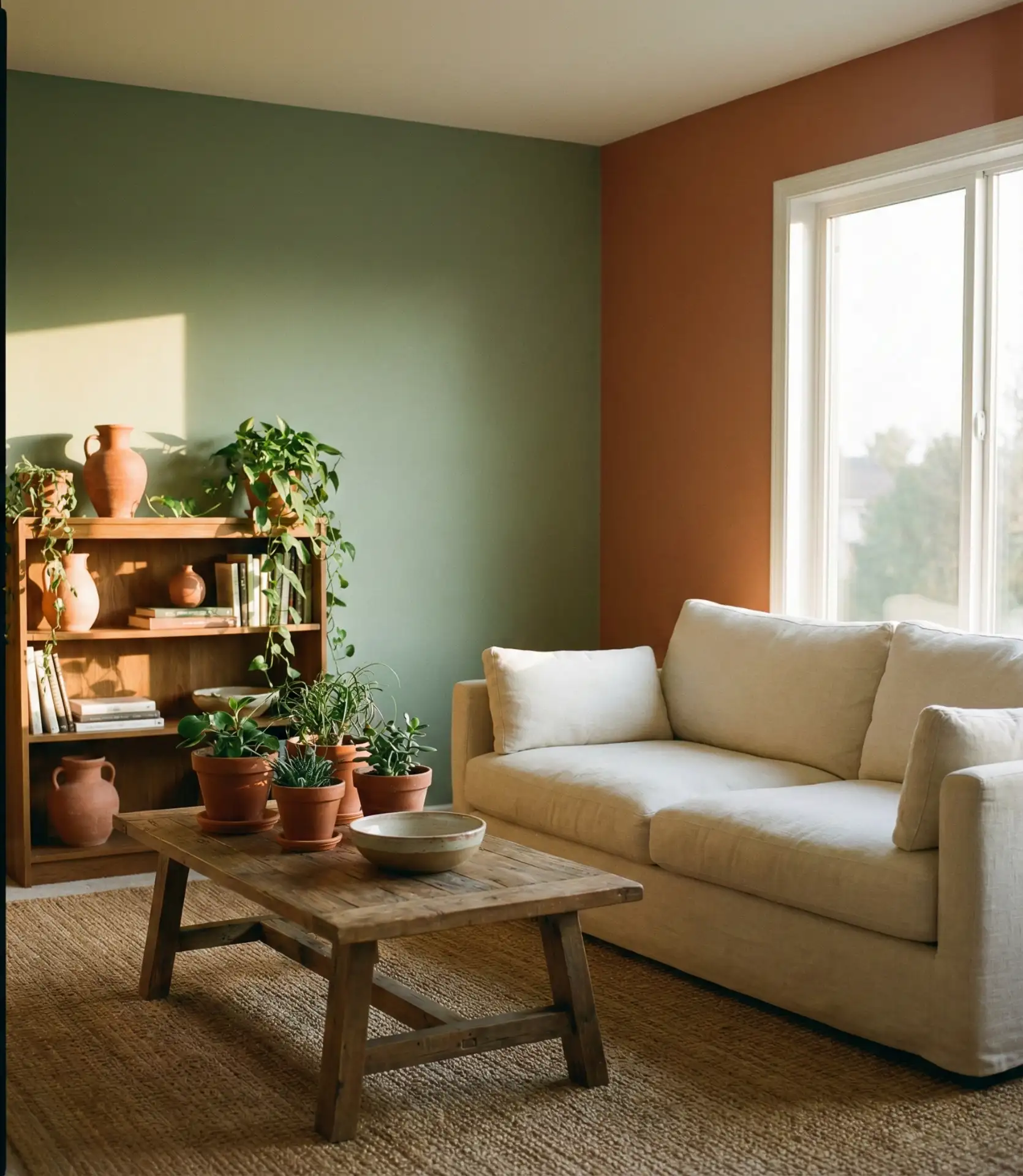
Real homeowners who’ve implemented this combination say it feels immediately “right” and livable, creating spaces that feel collected over time rather than decorated all at once. The scheme is forgiving with varied furniture styles and ages, making it ideal for those furnishing gradually or incorporating inherited pieces. Balance is key: if your terracotta leans very warm and orange, choose a sage with significant gray undertones to cool it down. Add in plenty of natural materials—wood, rattan, jute, and linen—to reinforce the organic, grounded feeling these colors naturally create.
22. Cool Gray and Warm Brass
Cool gray walls provide a sophisticated neutral foundation that lets furniture and accessories shine while maintaining a contemporary edge. When warmed with brass hardware, light fixtures, and decorative accents, cool gray becomes inviting rather than stark. This scheme’s approach works beautifully with a grey couch, creating a monochromatic base that’s anything but boring. Urban settings and modern homes, which value clean lines and edited aesthetics, particularly favor the gray-brass combination.
This combination looks best in living rooms with a lot of natural light and in homes with modern or transitional architecture. The cool gray can feel institutional in traditional spaces with dark wood trim or in rooms with limited windows. The brass accents are essential—they provide necessary warmth and visual interest that prevents the gray from feeling cold or corporate. Use brass liberally in light fixtures, cabinet hardware, picture frames, and decorative objects. Add warmth through textiles in cream, camel, or rust to complete the look.
23. Warm Beige with Black Accents
Warm beige creates a neutral envelope that’s both calming and versatile, while strategic black accents add definition and a contemporary edge. This combination prevents beige from feeling bland or builder-grade by introducing deliberate contrast through black window frames, light fixtures, or furniture legs. The approach works across various American home styles and is particularly effective in smaller living rooms where the light walls expand space while black details add visual interest. It’s a sophisticated take on neutral decorating that feels intentional rather than safe.
Expert commentary: Interior designers appreciate this combination because it provides a neutral foundation that clients can easily personalize with colorful accessories and artwork. The beige doesn’t compete with art or collectibles, while the black accents create structure and prevent the neutral palette from disappearing. The key is using warm beige rather than cool-toned beiges that can read gray or dingy. Look for beiges with slight yellow or pink undertones that maintain warmth. Distribute black accents throughout the room rather than clustering them in one area for the best visual balance.
24. Soft Pink and Charcoal
This unexpected combination brings together the softness of blush pink with the strength of charcoal gray, creating a living room scheme that’s both bold and approachable. The contrast prevents pink from feeling too sweet while adding warmth to charcoal’s inherent coolness. Consider pink on three walls with a charcoal accent wall, or charcoal throughout with pink in upholstery and accessories. This pairing works particularly well in modern and contemporary homes where traditional gender associations with pink are challenged by sophisticated, intentional design choices.
Recently, a Portland homeowner revamped her living room with this combination, noticing that guests often remark on its unexpected yet harmonious feel. The trick is choosing the right pink—it should be soft and dusty rather than bright or peachy, with gray undertones that echo the charcoal. Avoid warm-toned pinks that can clash with cool charcoal. Incorporate both black and brass metallics to bridge the warm-cool gap, and use white or cream in trim and accents to provide visual relief and prevent the scheme from feeling too heavy.
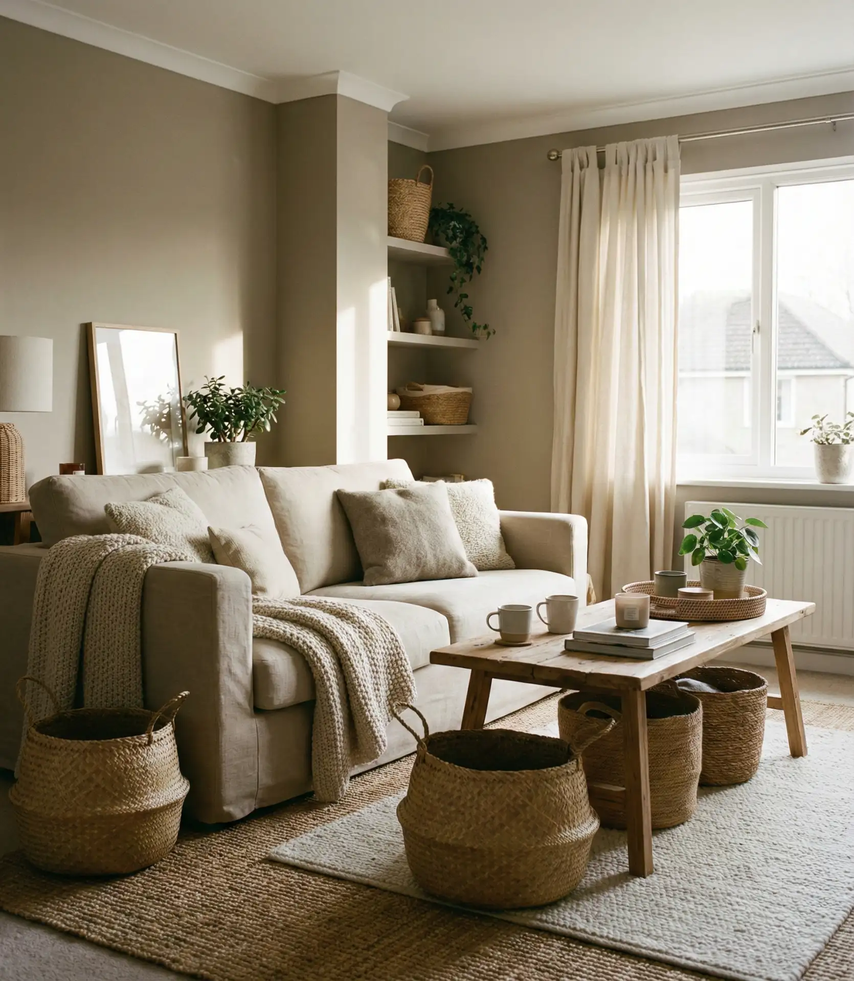
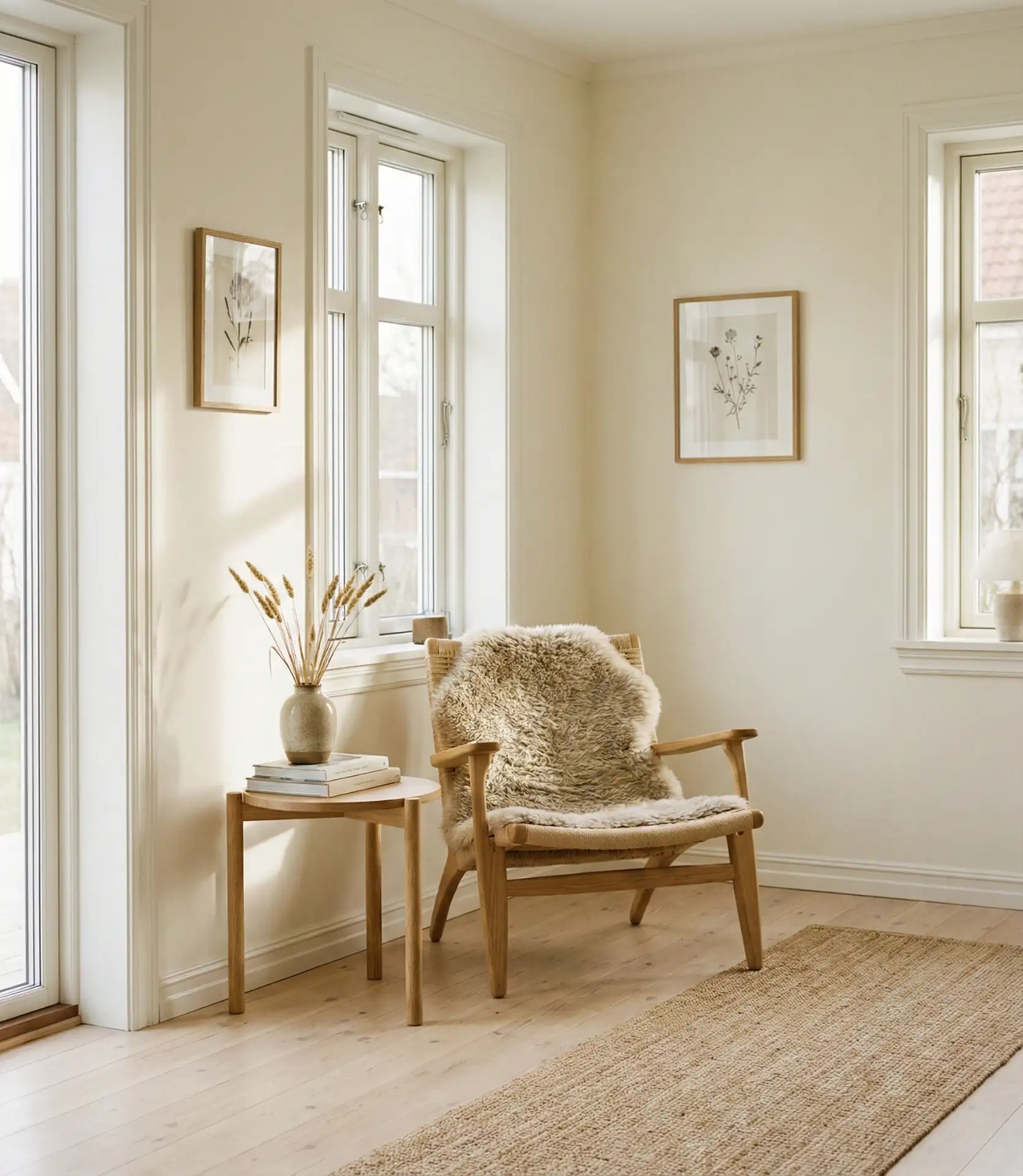
25. Creamy Off-White Throughout
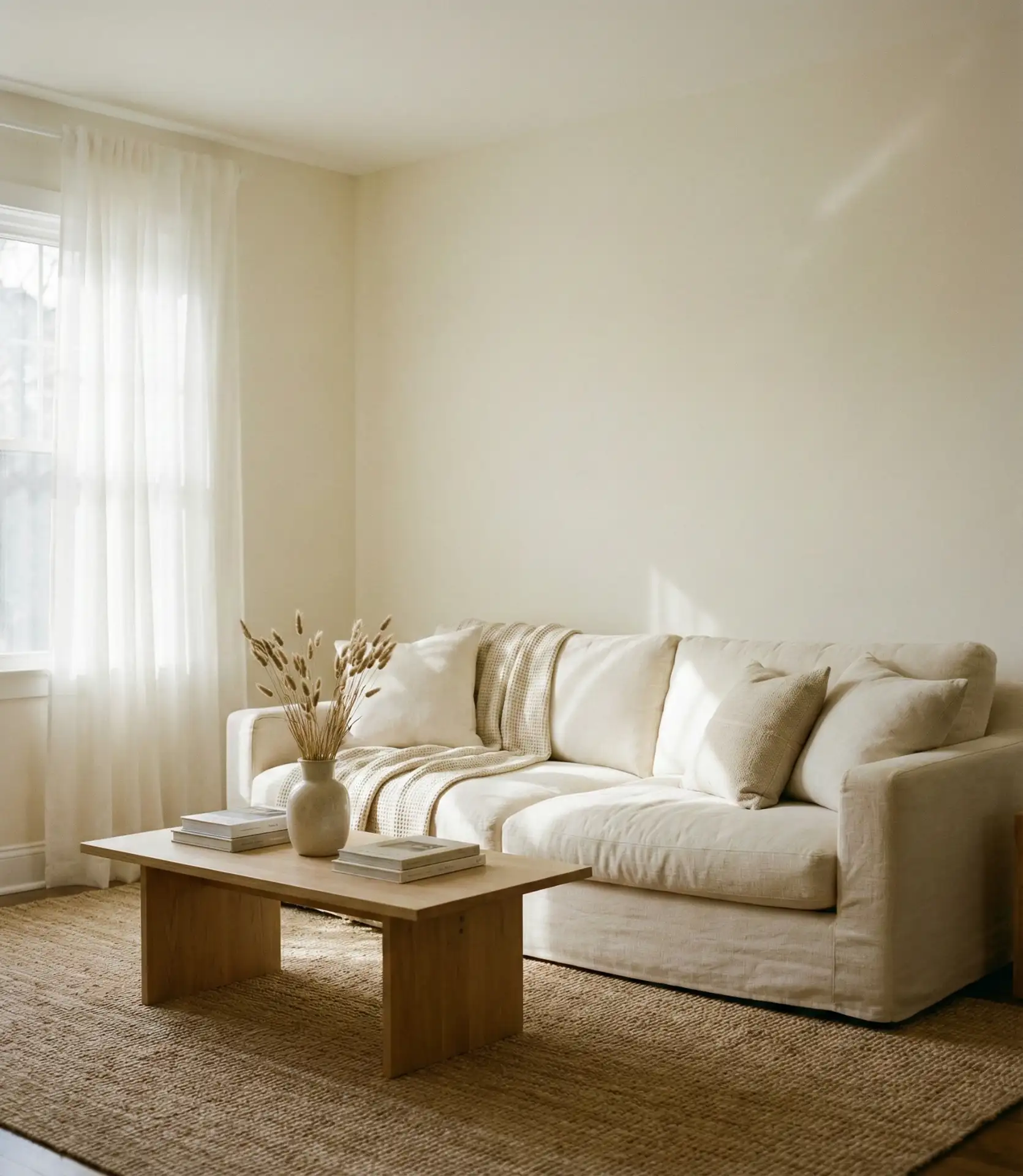
Creamy off-white creates a serene, timeless atmosphere in the living room that never goes out of style and provides the perfect backdrop for life’s changes. This neutral shade, warmer than pure white but lighter than beige, occupies a versatile space that complements virtually any home style and complements any furniture collection. It maximizes natural light, makes rooms feel larger, and creates a calm foundation that supports rather than competes with furnishings and accessories. It’s the ultimate safe choice that doesn’t sacrifice style—a reliable foundation for homeowners who change their minds frequently or who want a long-term solution.
Practical insight for budget-minded homeowners: creamy off-white is one of the most economical long-term color choices because it doesn’t require frequent updating to stay current. Unlike trendy colors that might feel dated in a few years, creamy white remains perpetually appropriate. It also provides maximum flexibility when selling a home, appealing to the broadest range of buyers. The key to preventing it from feeling boring is layering textures, patterns, and varied shades of white and cream through furniture, textiles, and accessories. This creates depth and interest within a calm, cohesive palette that feels intentional and sophisticated.
These color ideas for living rooms in 2026 offer something for every style, from bold statements to subtle sophistication. Whether you’re drawn to earthy terracottas, calming blues, or timeless neutrals, the right color scheme can transform your living room into a space that truly reflects your personality and lifestyle. Keep in mind that the most effective color choice is one that evokes a sense of comfort and familiarity; experiment with samples in your actual space, take into account your lighting, and don’t hesitate to follow your instincts. What color direction are you leaning toward for your living room? Share your thoughts and any questions in the comments below—we’d love to hear about your color journey and help you create a space you’ll love for years to come.