50 Blue Living Room Ideas for 2026: From Navy Elegance to Sky Blue Serenity
Blue living rooms are having a major moment in 2026, and it’s easy to see why. From deep navy anchoring a moody den to soft sky tones creating an airy retreat, blue offers a versatility that few other colors can match. American homeowners are turning to Pinterest in droves for inspiration, drawn to blue’s ability to feel both timeless and refreshingly current. Whether you’re layering neutrals with dusty blue accents or going bold with midnight walls, this color adapts to nearly any style. In this guide, you’ll discover distinct ways to bring blue into your living room—each one designed to inspire your next refresh.
1. Dark Navy Walls with Warm Brass Accents
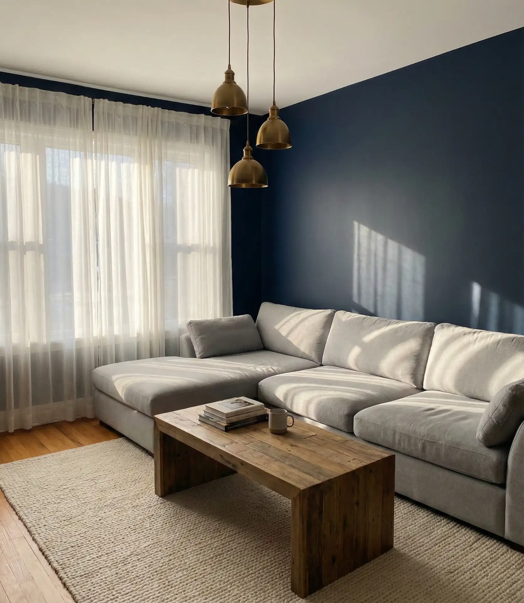
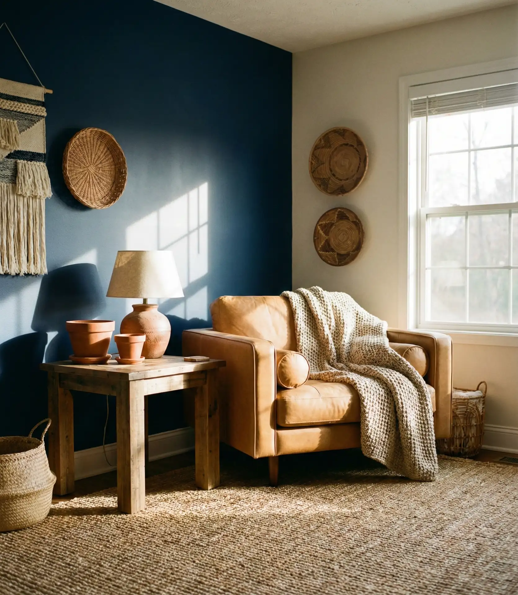
A dark navy living room creates instant drama, especially when balanced with warm metallics. Navy walls provide a rich backdrop that makes lighter furniture and artwork pop, while brass fixtures—think sconces, coffee table legs, or picture frames—add a golden glow. This approach works beautifully in rooms with limited natural light, as the contrast between deep walls and metallic shine creates its own sense of luminosity.
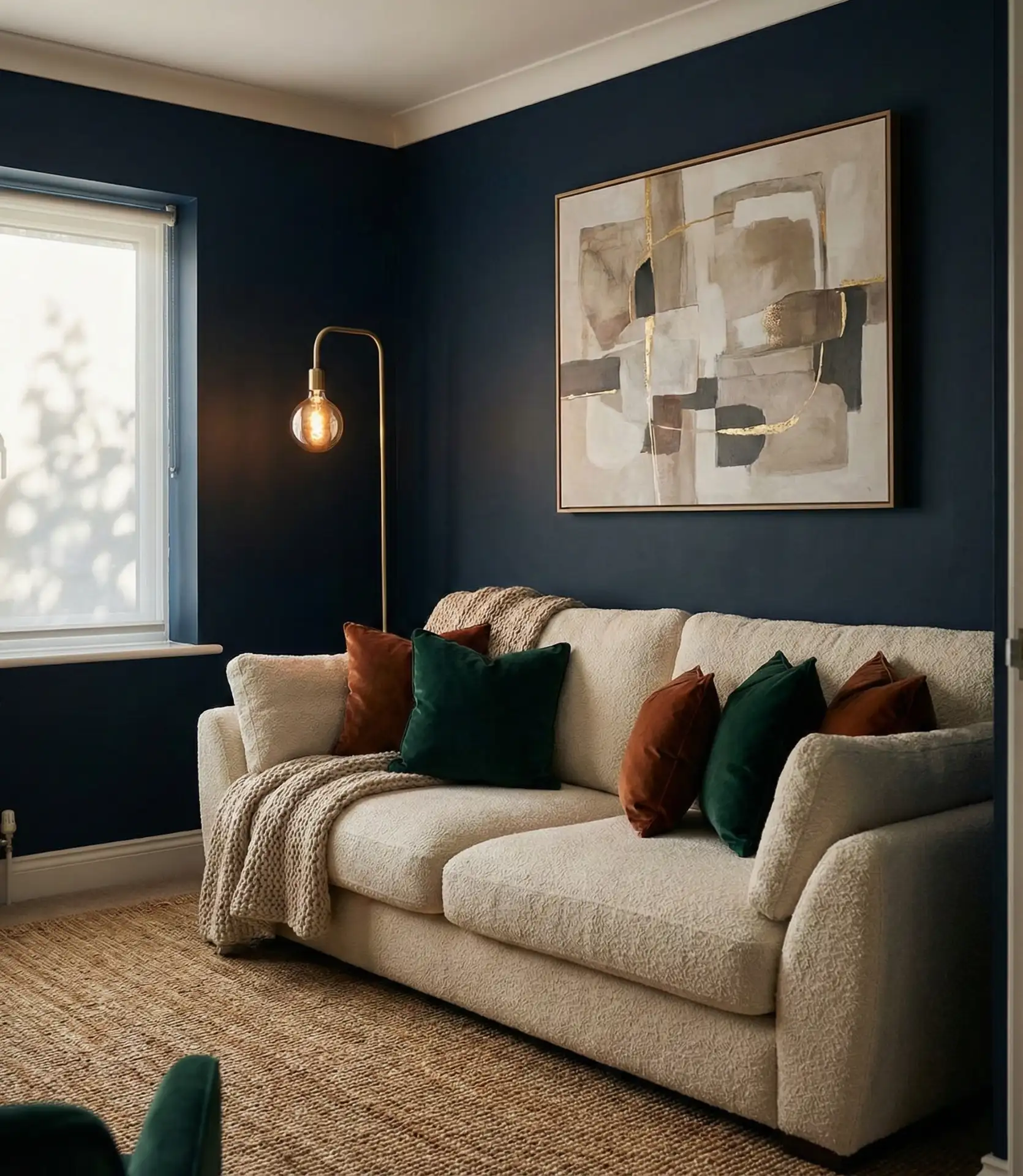
In the Midwest and Northeast, where winters are long, homeowners are embracing navy as a cozy alternative to gray. It holds up well against seasonal shifts—feeling sophisticated in summer and deeply enveloping come December. A common mistake is pairing navy with too many cool tones, which can make the room feel cold. Instead, bring in caramel leather, terracotta ceramics, or honey-toned wood to keep the space inviting.
2. Light Blue and Beige Coastal Retreat
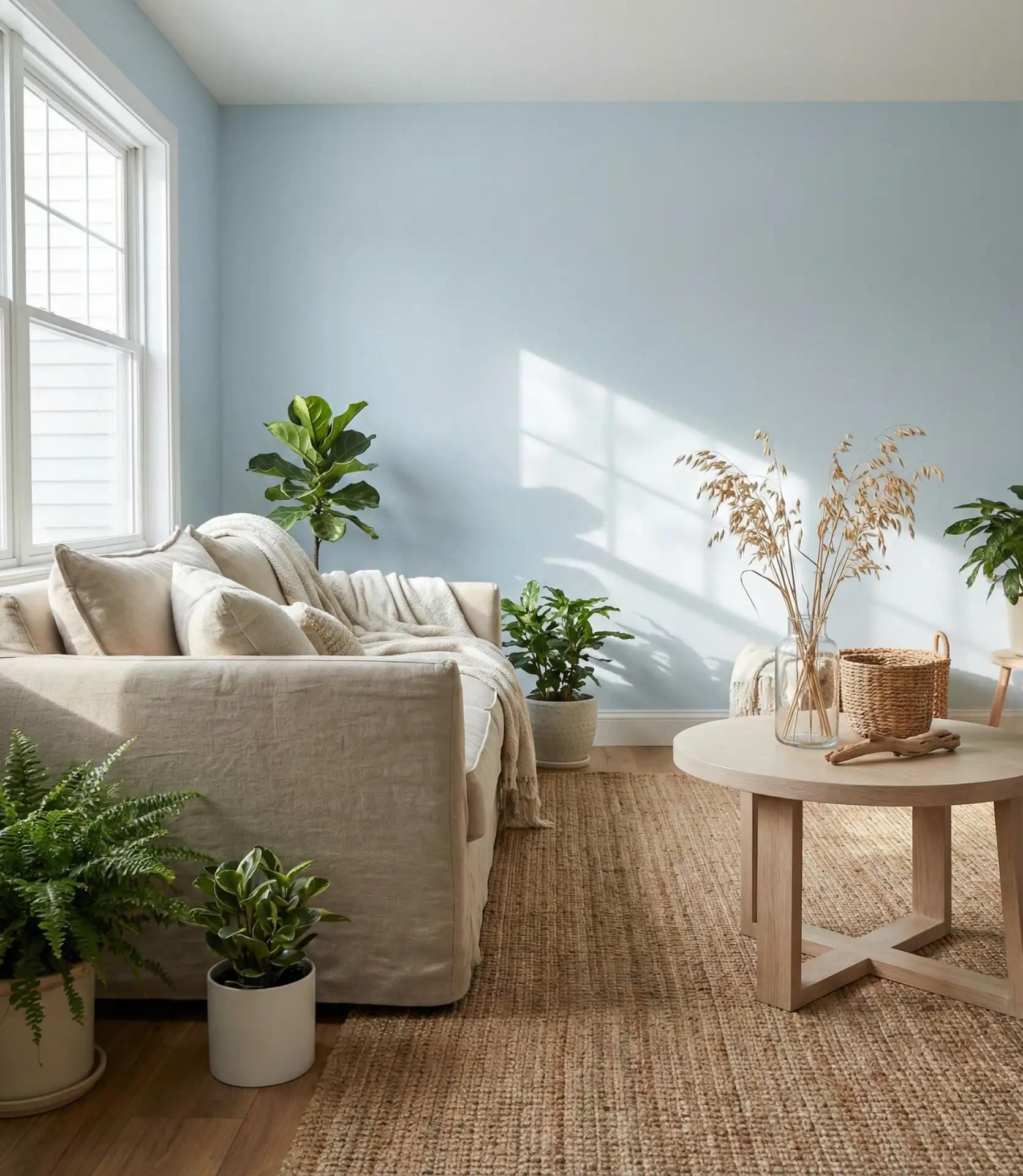
Soft light blue paired with beige and natural textures channels effortless coastal living without resorting to nautical clichés. Think linen slipcovers, woven baskets, and driftwood-inspired decor. This color scheme feels airy and open, making it ideal for smaller living rooms or spaces that don’t get a lot of direct sunlight. The beige grounds the blue, preventing it from feeling too cold or sterile.
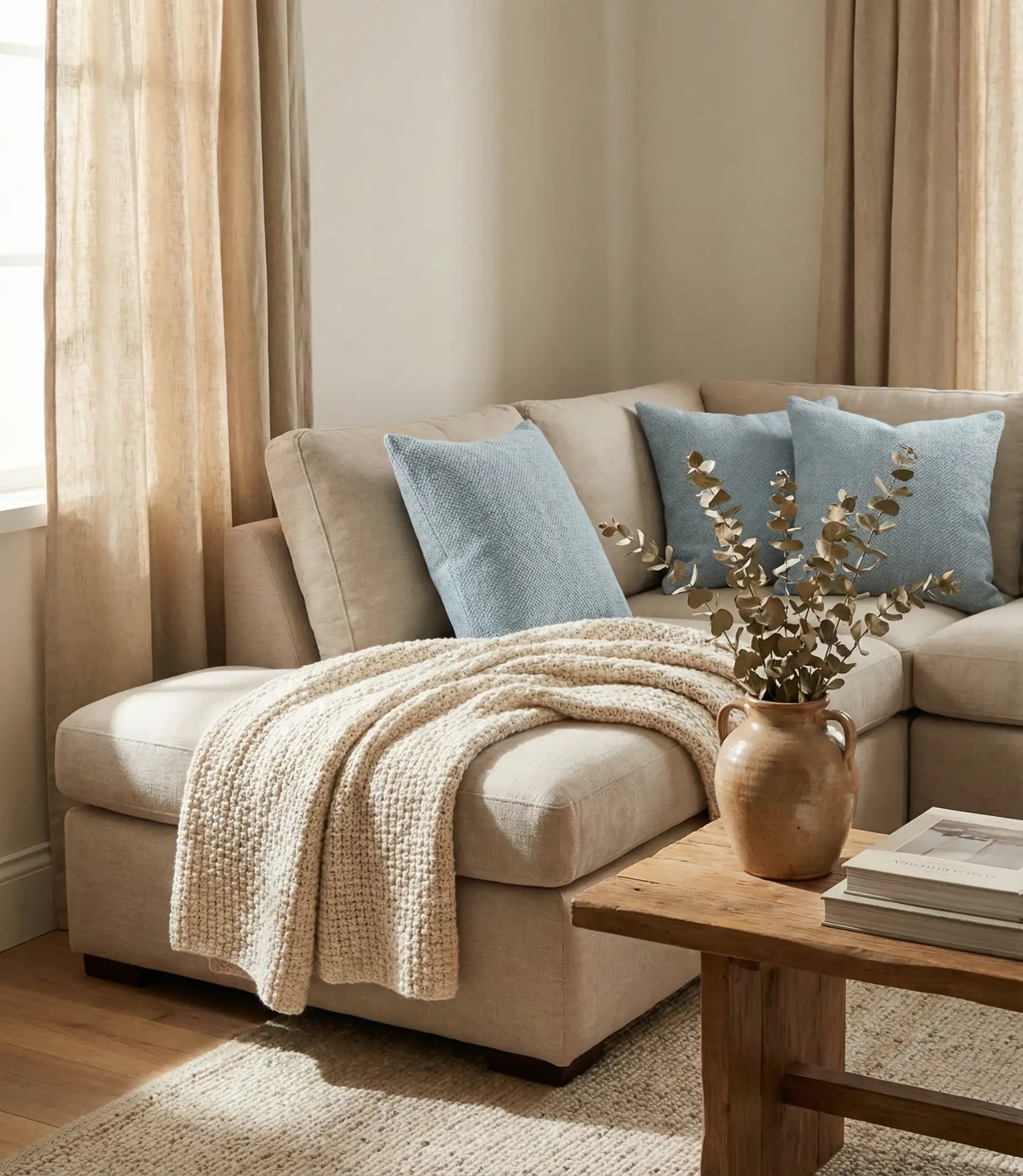
This palette works best in sunrooms, open-plan living areas, or homes near water—from Cape Cod cottages to California bungalows. Real homeowners often layer in subtle patterns through striped throws or textured pillows to add visual interest without overwhelming the serene base. It’s a low-risk, high-reward combination that feels both polished and lived-in.
3. Moody Midnight Blue with Velvet Upholstery
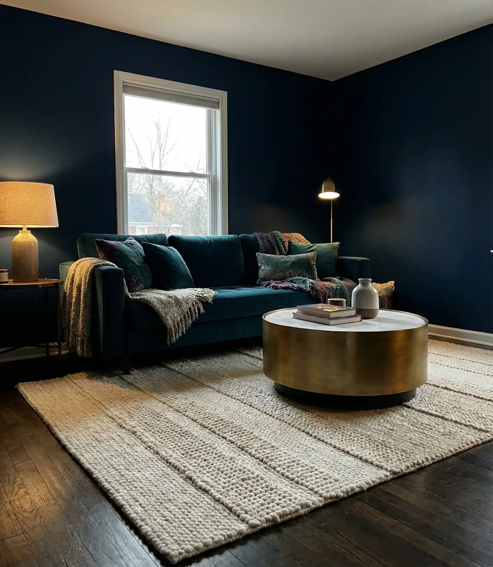
For a truly moody aesthetic, midnight blue walls paired with deep velvet seating create a jewel-box effect. This isn’t a look for the faint of heart—it’s bold, immersive, and unapologetically dramatic. The richness of velvet amplifies the depth of the blue, making the room feel luxurious and intimate. Add in gold or black accents, and you have a space that feels both modern and timeless.
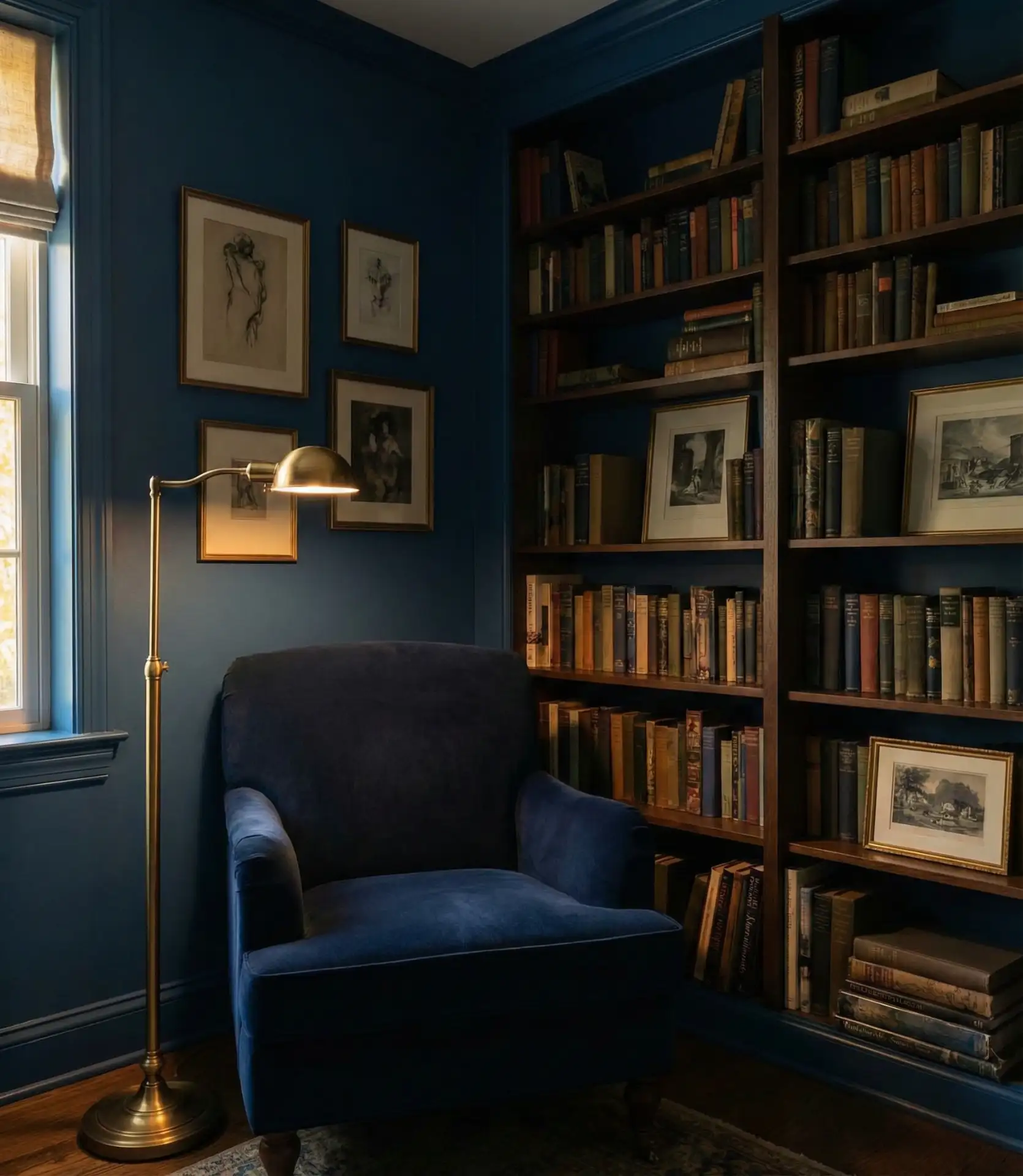
A designer once told me that midnight blue reads as “serious elegance” in a way that black never quite does. It’s softer and more forgiving with fingerprints and dust, and it plays beautifully with both warm and cool lighting. If you’re nervous about committing, try it first on a single accent wall before going full immersion.
4. Duck Egg Blue and Neutral Minimalism
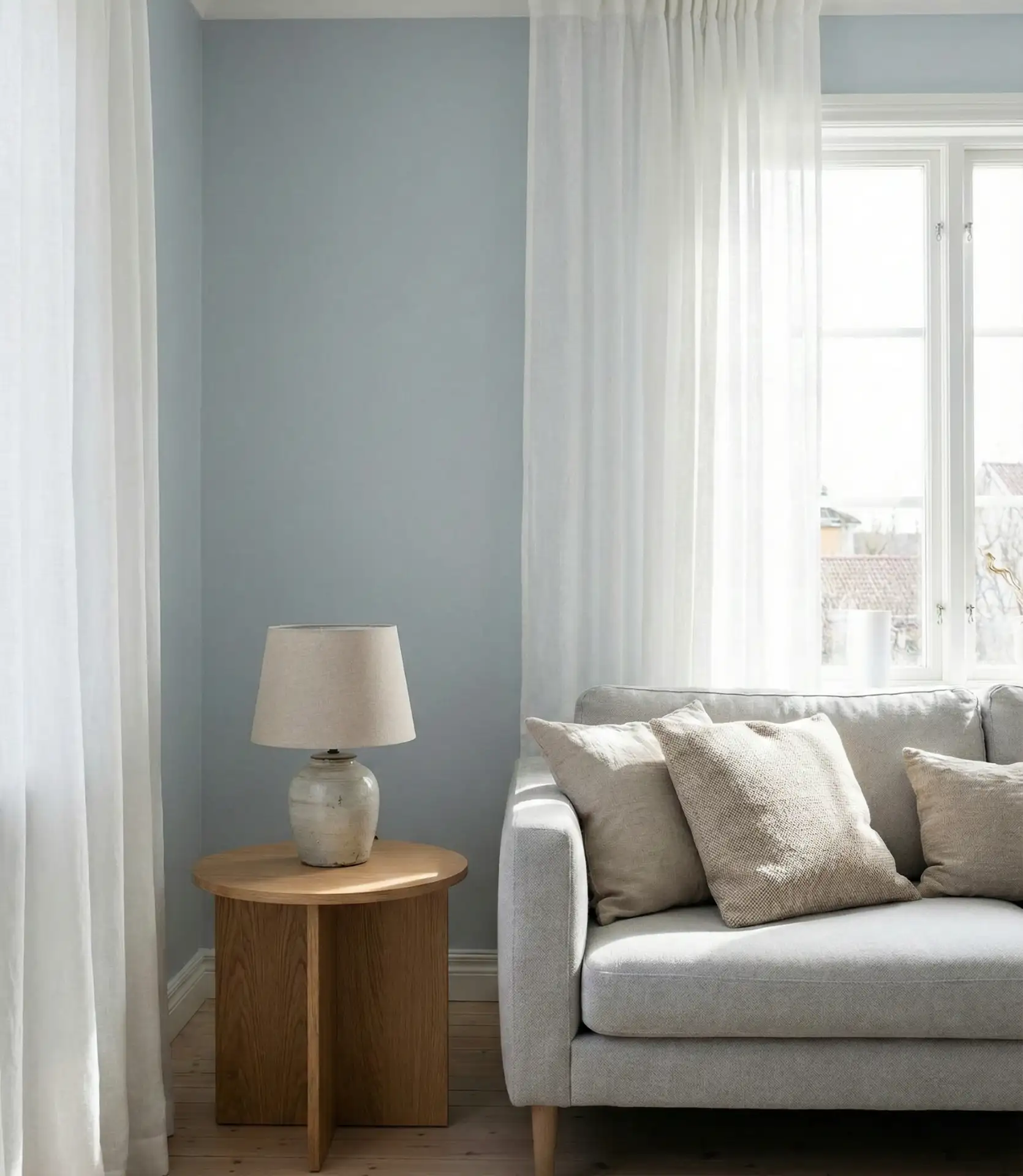
The soft, muted tone of duck egg blue brings calm without feeling icy. Paired with neutral and white tones, this color creates a Scandinavian-inspired minimalism that’s both serene and sophisticated. It’s a favorite among those who want color but don’t want it to dominate the room. The result is a living space that feels clean, open, and gently layered.
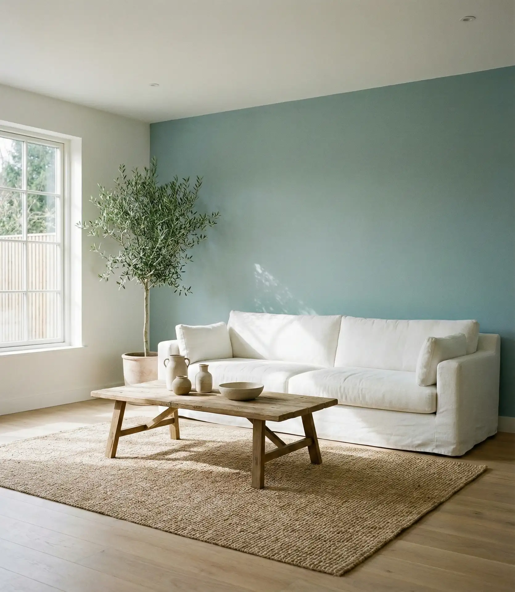
This palette is especially popular in urban apartments and small homes where visual clutter needs to be kept at bay. Duck egg is a favorite among budget-conscious decorators due to its minimal additional spending requirements—white walls, natural wood, and a single accent color can effectively transform the entire room. It’s proof that restraint can be just as impactful as abundance.
5. Sky Blue with Green and Botanical Accents
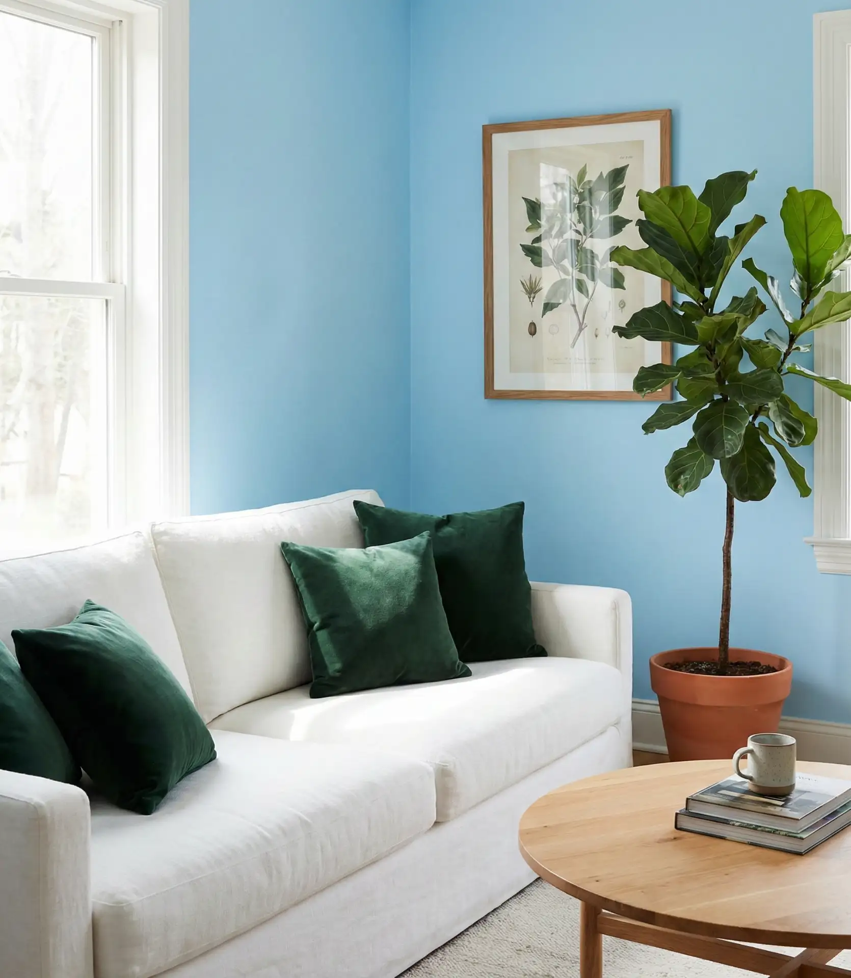
A sky blue backdrop paired with green and botanical elements brings the outdoors in. This combination feels fresh, organic, and full of life—perfect for nature lovers or anyone looking to create a biophilic living space. The blues and greens work together harmoniously, evoking coastal gardens, morning skies, and peaceful landscapes. Layer in houseplants, printed fabrics, or even green-toned ceramics for a cohesive look.
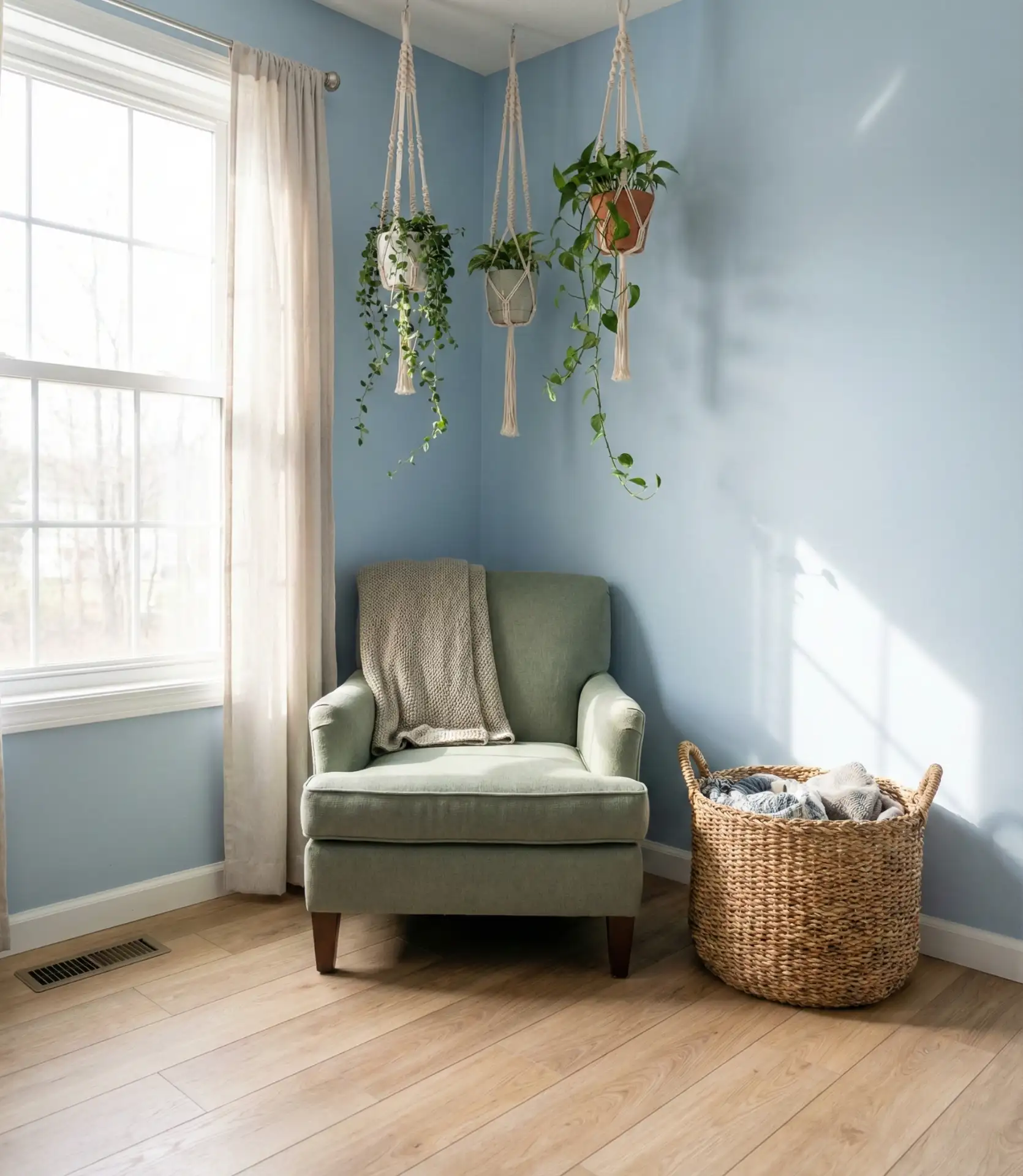
In the Pacific Northwest and parts of New England, where lush greenery is part of the landscape, this palette feels like a natural extension of the environment. Real homeowners often rotate in seasonal greenery—eucalyptus in winter, ferns in spring—to keep the look dynamic. It’s a forgiving scheme that adapts well to both modern and traditional furniture styles.
6. Grey and Blue Industrial lofts
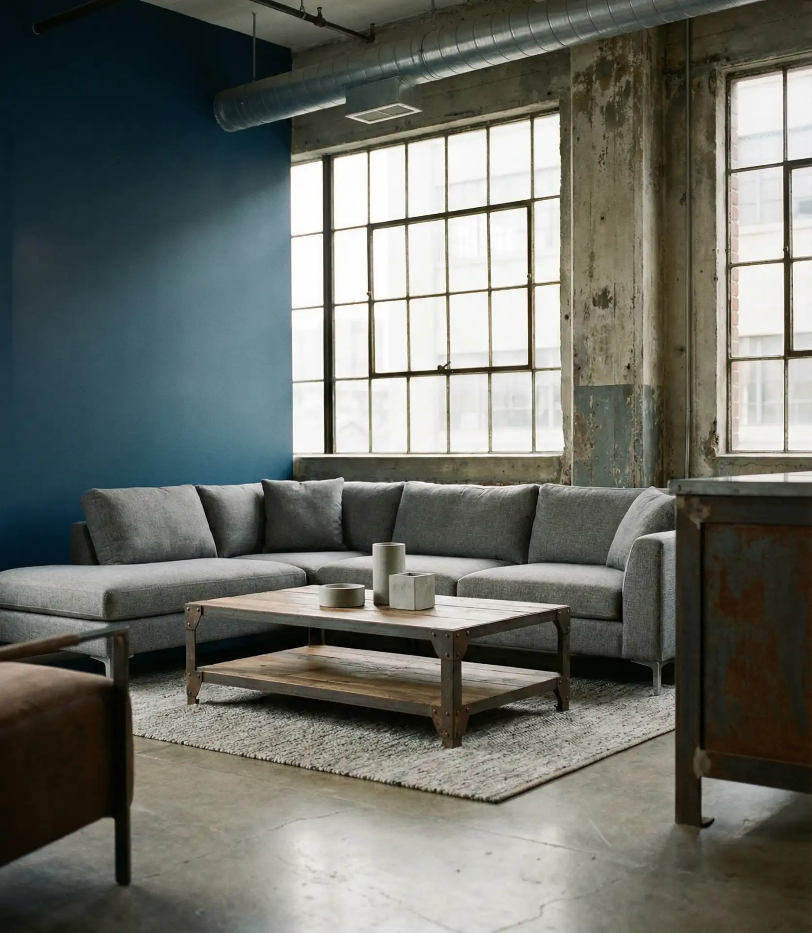
Pairing grey and blue tones in an industrial setting creates a refined, urban aesthetic. Exposed brick, concrete floors, and metal fixtures provide the structure, while blue upholstery or painted accents add warmth and personality. This color scheme is ideal for loft apartments or open-plan homes where you want to soften hard surfaces without losing the raw, edgy vibe.
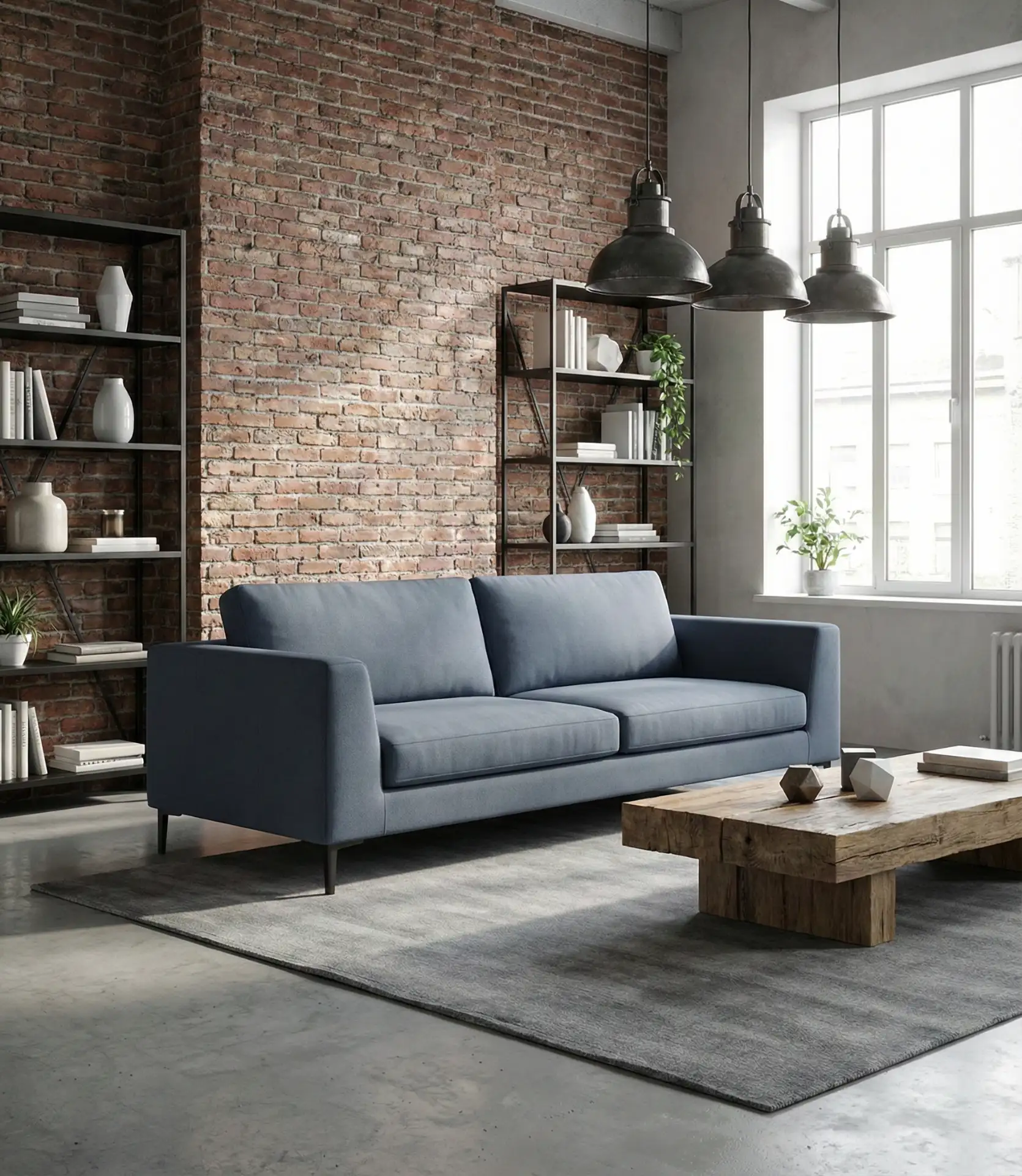
This look works best in cities with a strong loft culture—think Brooklyn, Chicago, or converted warehouses in LA. Designers often recommend keeping blue to one or two key pieces to avoid overwhelming the room’s industrial character. A velvet blue sofa against gray concrete, for instance, becomes an instant focal point without competing with the architecture.
7. Cozy Blue Throws and Layered Textures
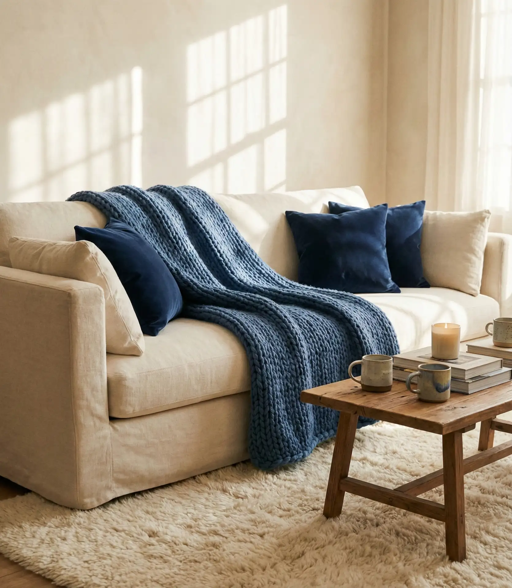
If you’re hesitant to commit to blue walls, start with cozy textiles. A chunky knit throw, velvet pillows, or a wool area rug in shades of blue can transform a neutral living room into something far more inviting. Decor like this allows you to experiment with color without permanent commitment, and it’s easy to swap out seasonally. Layering textures—linen, cotton, wool—adds depth and warmth.

Practical insight: blue textiles hide stains better than white or cream, making them a smart choice for homes with kids or pets. They also photograph beautifully, which is why they’re so popular on Pinterest. Real homeowners often start here before graduating to bolder blue choices elsewhere in the room.
8. Hague Blue Statement Wall
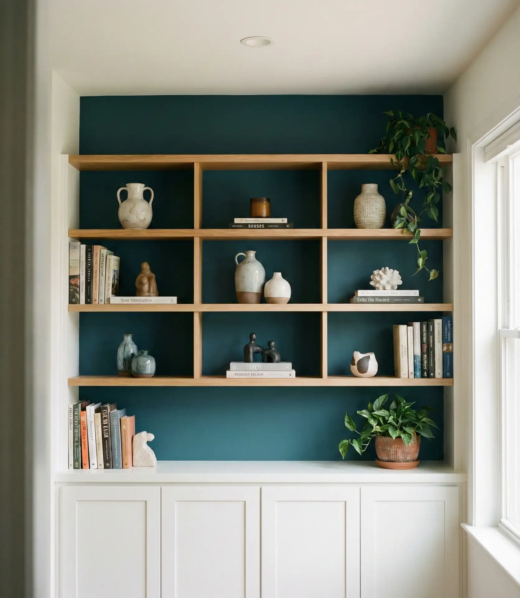
Hague blue—a deep, saturated blue-green hybrid—has become a cult favorite for accent walls. It’s richer than navy but not as dark as midnight, offering a sophisticated middle ground. This shade works particularly well behind a fireplace, a gallery wall, or a media console, where it can serve as a dramatic backdrop without overwhelming the room. Pair it with crisp whites and natural wood for balance.
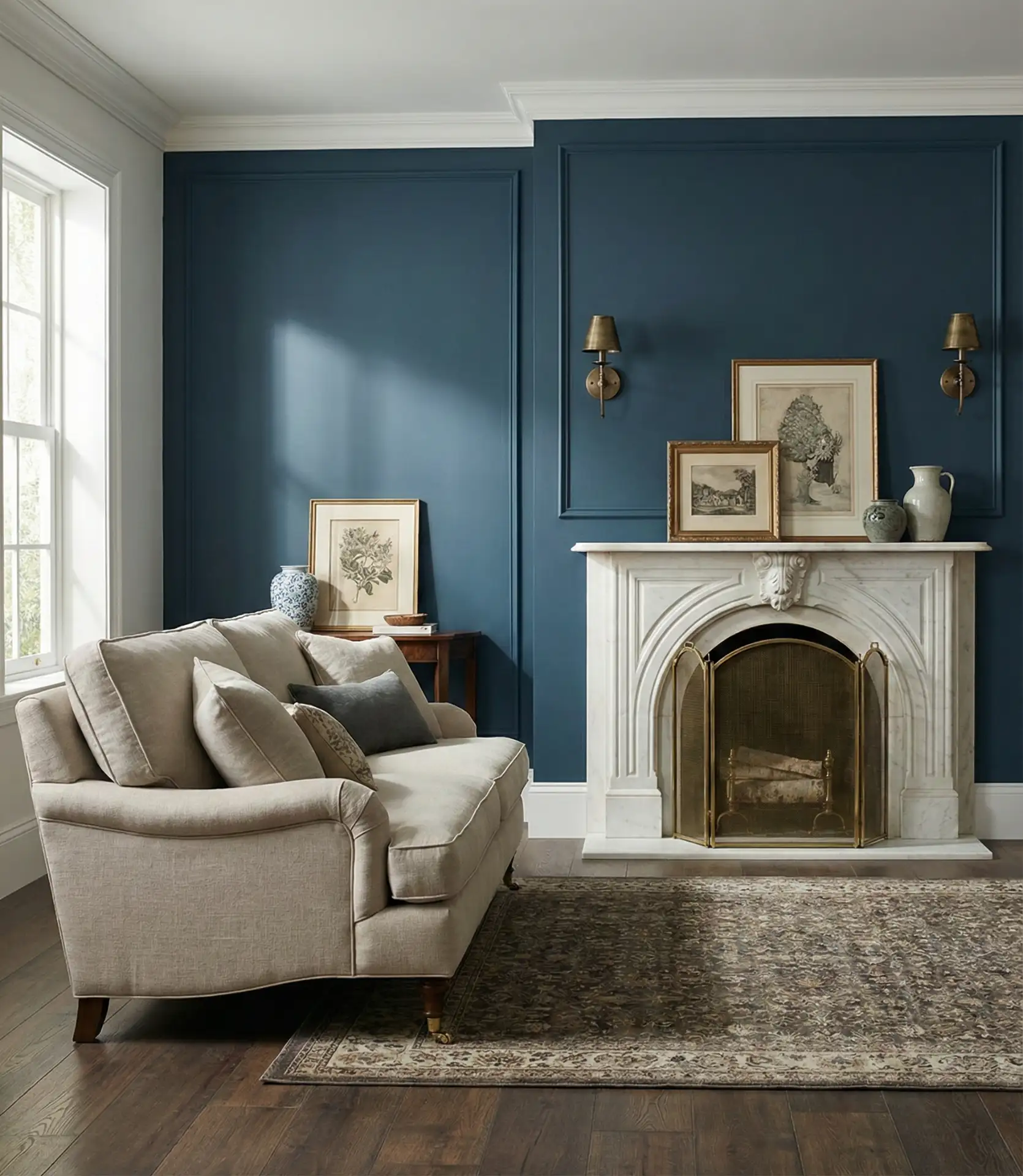
Expert-style commentary: Hague blue has a chameleon-like quality—it reads more blue in natural light and more green under warm artificial lighting. This makes it versatile but also worth testing with paint samples at different times of day. Many designers recommend using it in rooms with high ceilings or ample natural light to fully appreciate its complexity.
9. Dusty Blue and Blush Pink Feminine Touch
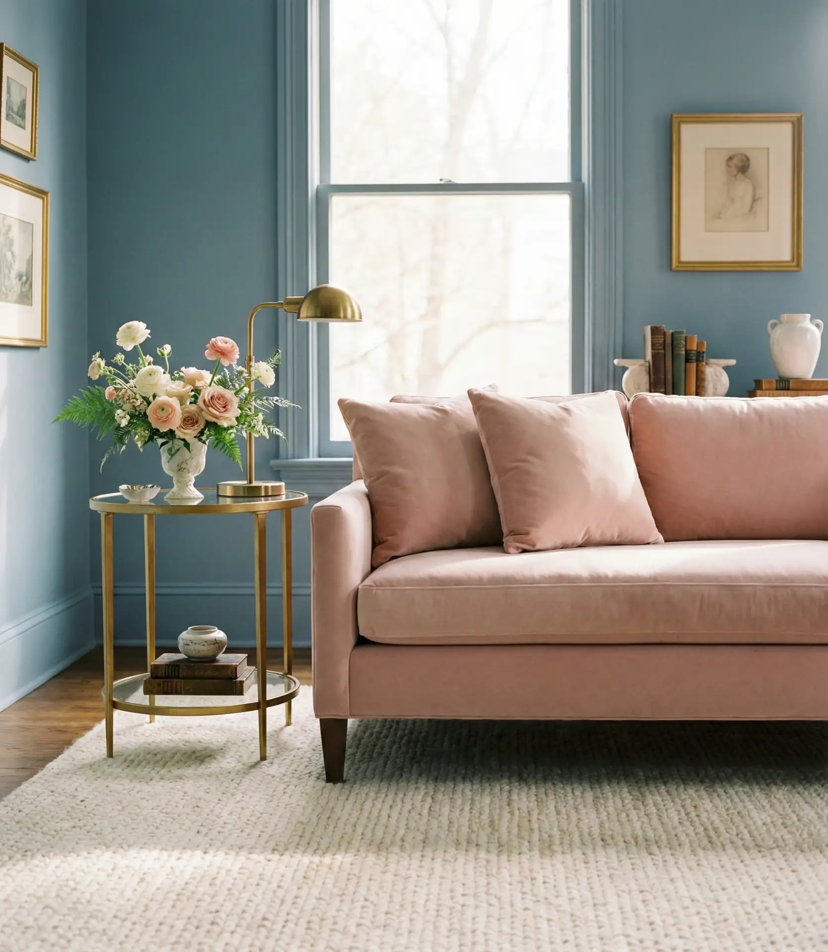
Dusty blue paired with pink and blush tones creates a soft, romantic palette that’s grown-up and sophisticated. This isn’t bubblegum pink—it’s muted, earthy, and surprisingly versatile. The combination works beautifully in living rooms that lean traditional or transitional, especially when balanced with natural textures like rattan, linen, or aged wood. It’s a favorite among those who want a feminine space that doesn’t feel overly sweet.
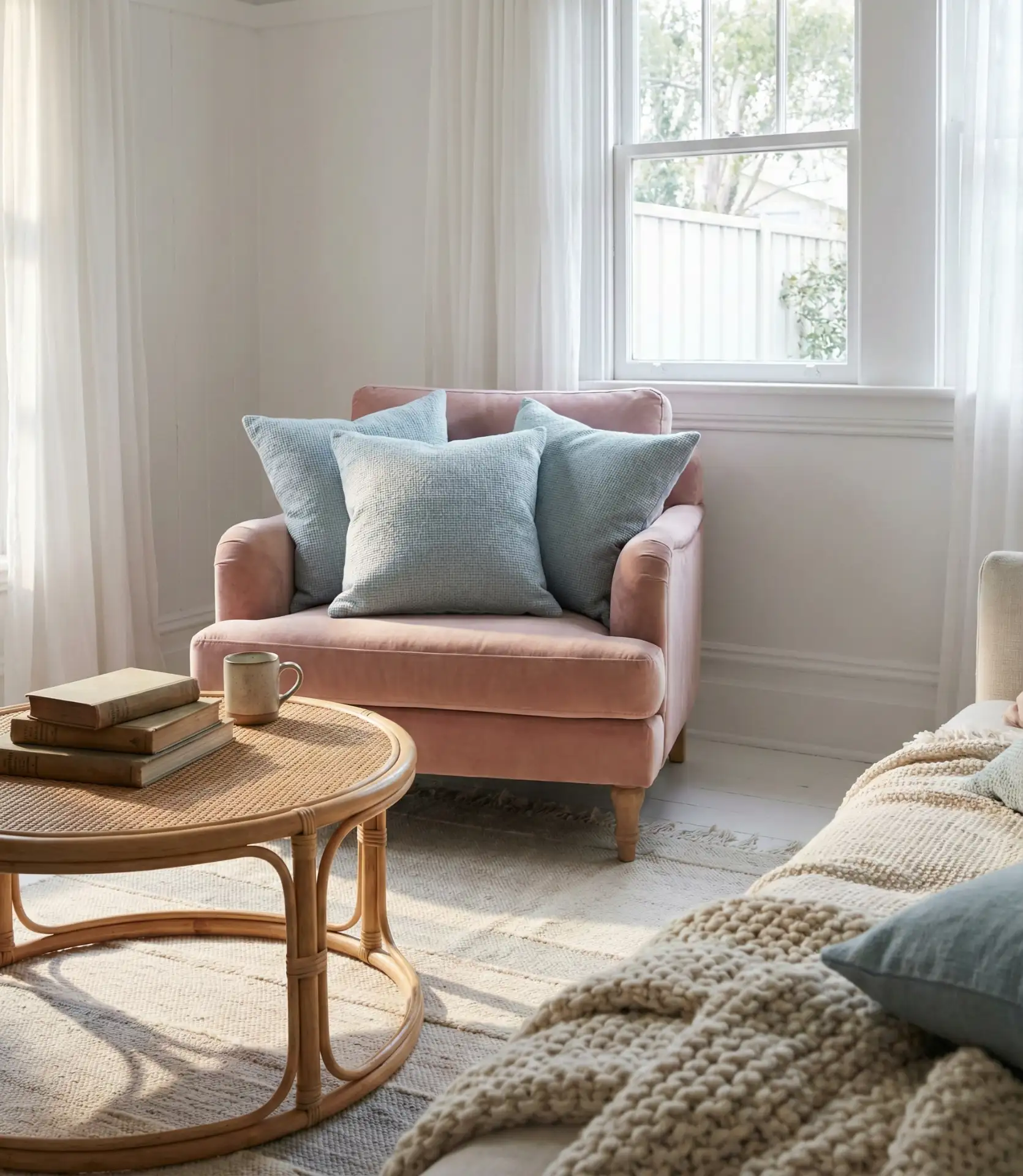
Where it works best: This palette shines in sunlit rooms with white or off-white walls, where the colors can glow without competing. Southern homes with large windows and bright interiors are perfect candidates. Avoid using this combination in dim or north-facing rooms, where the muted tones can feel washed out or dull.
10. Brown and Blue Earthy Contrast
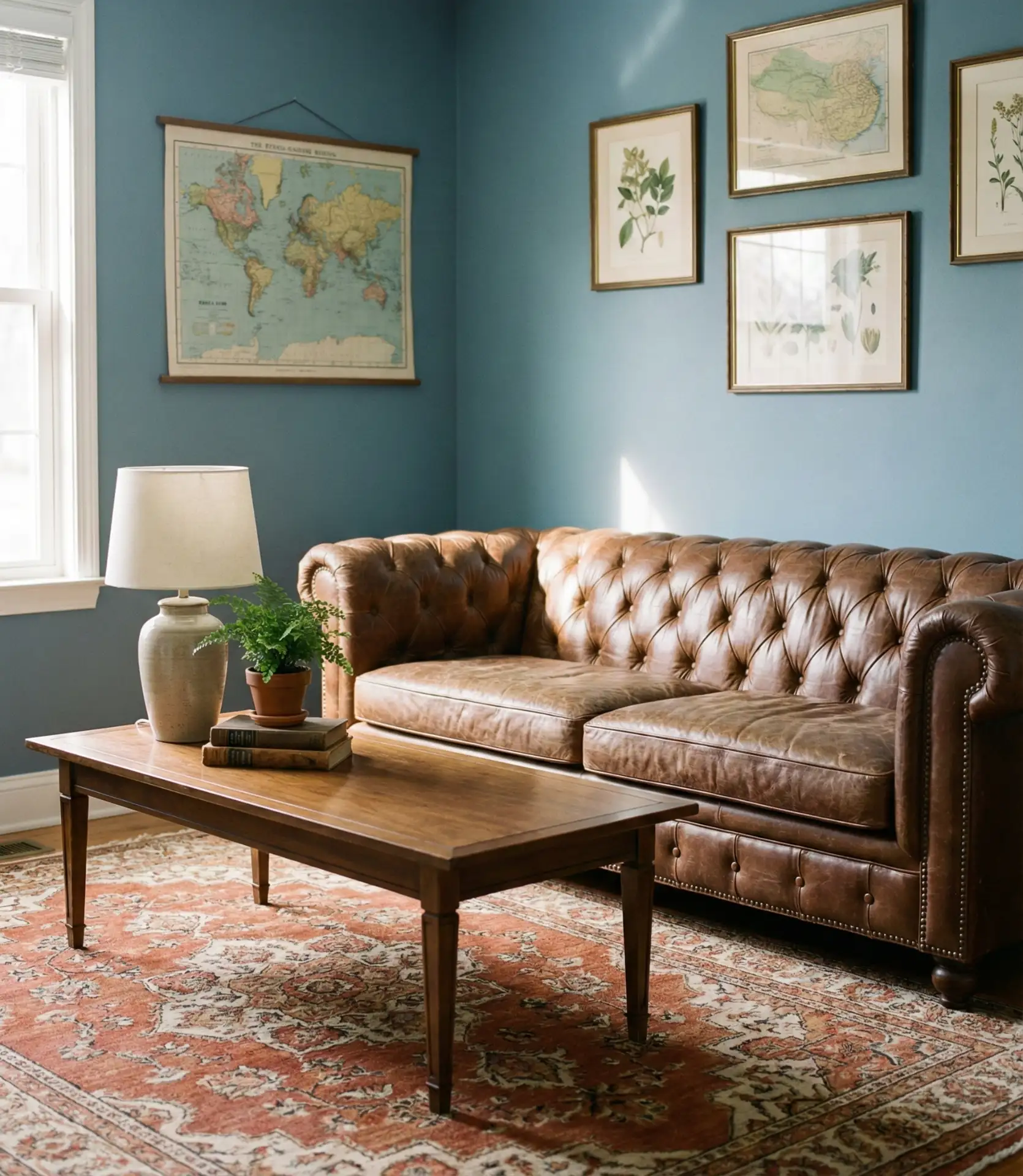
The pairing of brown and blue is underrated but incredibly grounding. Rich walnut furniture, cognac leather, or warm terracotta against a backdrop of blue creates an earthy, lived-in feel. This color scheme works across styles—from mid-century modern to rustic farmhouse—and it’s particularly effective in homes that blend vintage and contemporary pieces. The warmth of brown keeps blue from feeling too cool or sterile.
Real homeowner behavior: Many people inherit brown furniture—vintage pieces, hand-me-downs, thrifted finds—and assume it won’t work in a modern space. Pairing it with blue is an easy way to make those pieces feel intentional rather than dated. The blue updates the palette without requiring you to replace beloved items.
11. Inchyra Blue for a Scottish-Inspired Study
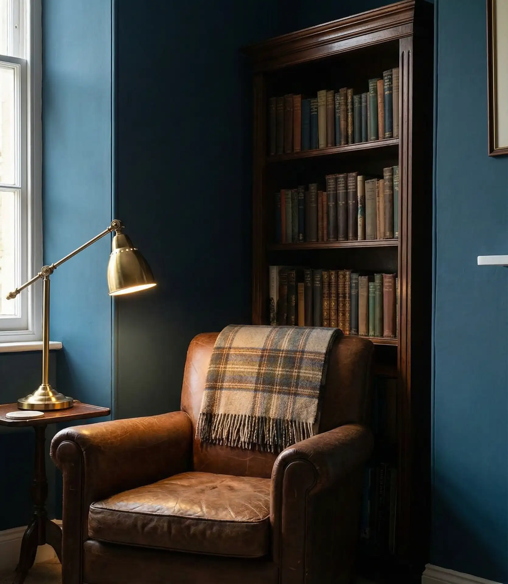
Inchyra blue—a moody, greenish-gray blue—brings a sense of heritage and depth. It’s a color that feels old-world but not stuffy, making it ideal for libraries, sitting rooms, or spaces where you want a contemplative, cocooning atmosphere. This shade has gained traction among homeowners looking for something more nuanced than standard navy, and it pairs beautifully with dark woods, tartan textiles, and vintage brass.
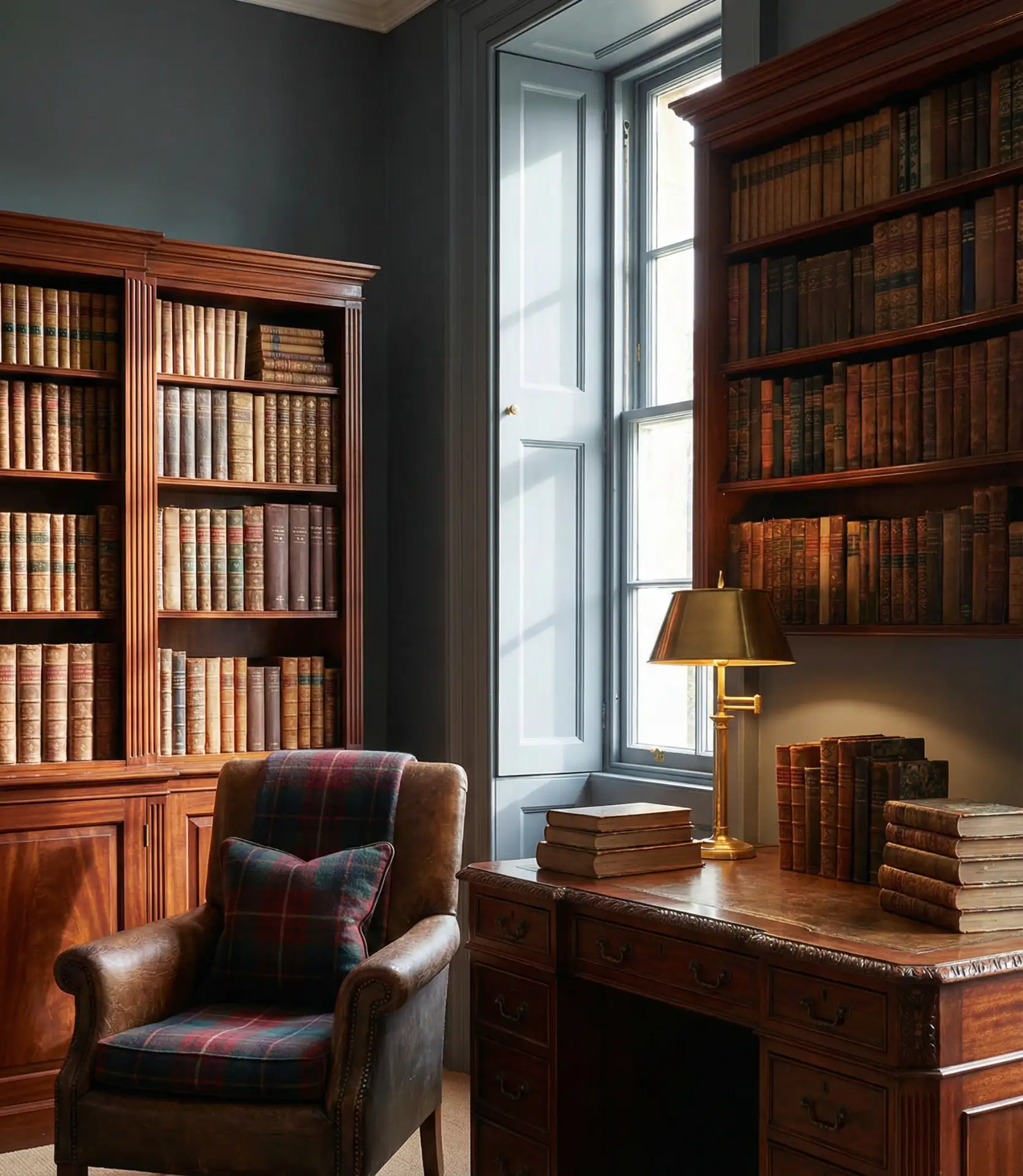
A friend who renovated a Victorian home in Boston used Inchyra blue in her living room and said it completely transformed the space—suddenly, the original crown molding and wood floors made sense in a way they hadn’t before. It’s a color that honors history while feeling fresh and current.
12. Orange and Blue Bold Complementary Scheme

For the adventurous, pairing orange and blue creates a high-energy, complementary contrast that’s both bold and balanced. This isn’t a look for minimalists—it’s for those who love color and aren’t afraid to use it. Think burnt orange pillows against a slate blue sofa or terracotta ceramics on navy shelving. The key is to use one color as the dominant player and the other as a punchy accent.
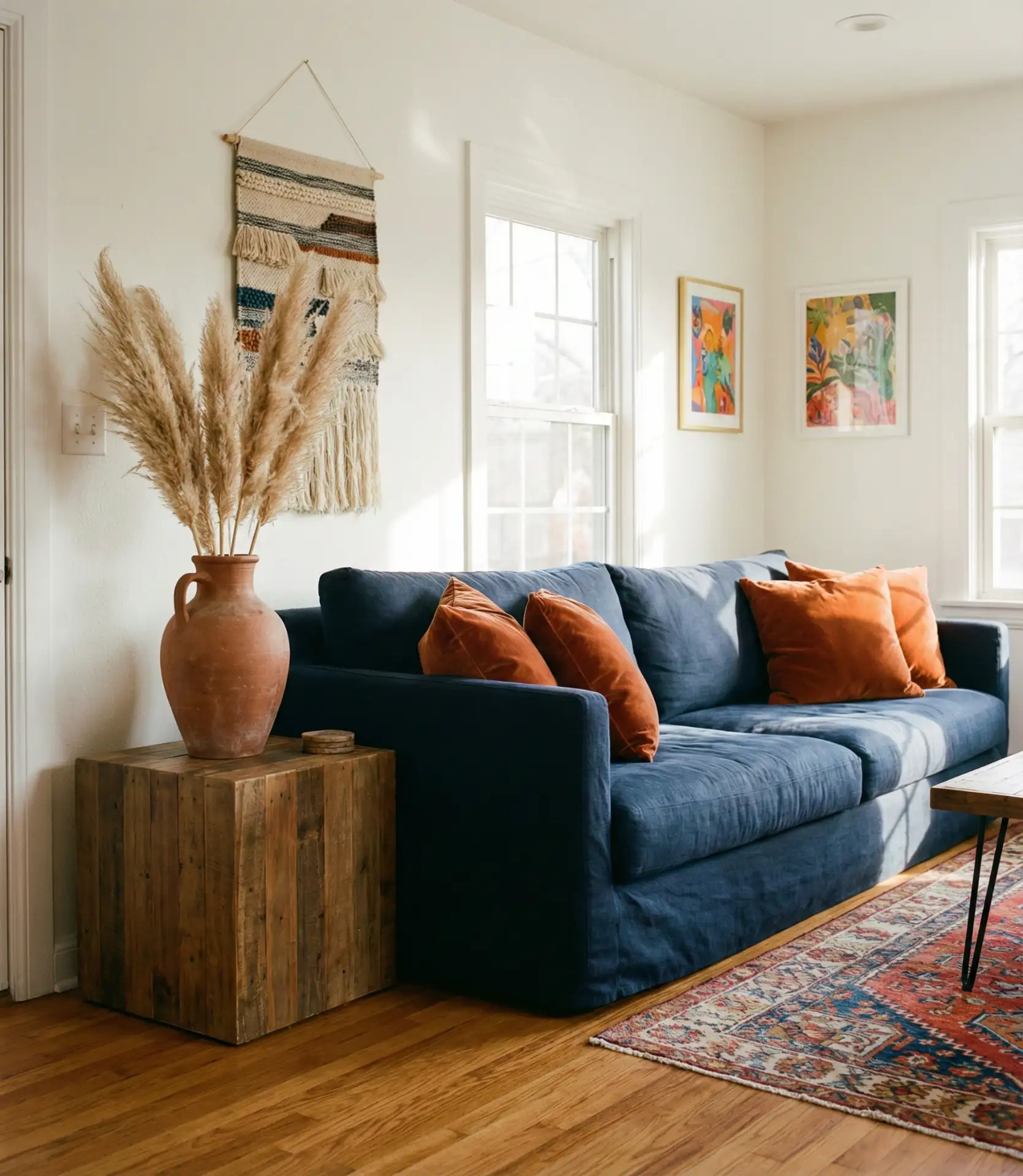
Common mistake: Using too much of both colors in equal measure can feel chaotic. Instead, let blue dominate and use orange sparingly—maybe 20% of the room’s color story. This creates visual interest without overwhelming the senses. Many designers also recommend grounding the palette with neutrals like white, cream, or natural wood.
13. French Blue and Antique White Elegance
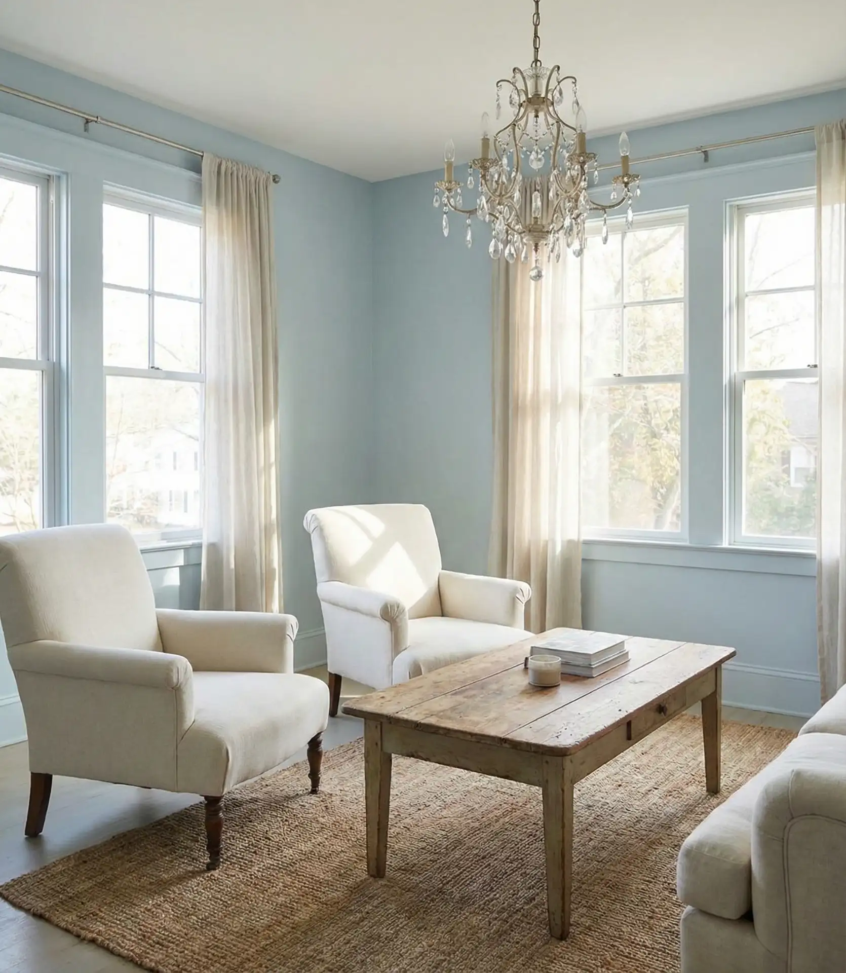
French blue—a soft, chalky mid-tone—paired with antique white creates a classic, elegant look that feels timeless. This combination is a staple of French country interiors, but it translates beautifully to American homes, especially those with traditional architecture. The colors work together to create a sense of lightness and space while still feeling warm and lived-in. Add in some gilded mirrors or linen drapery for extra polish.
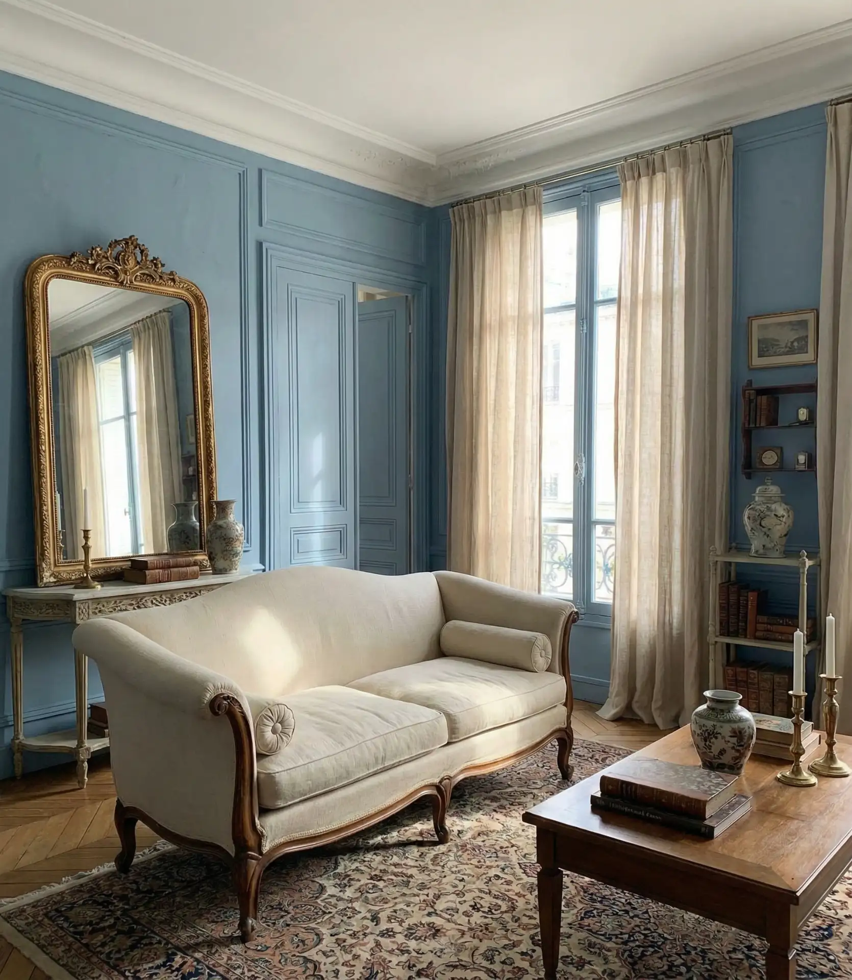
Budget angle: You don’t need expensive antiques to pull off this look. Flea market finds, chalk-painted furniture, and affordable linen slipcovers can achieve the same effect. Many homeowners DIY their way into this style by painting existing furniture in soft blues and whites, then distressing the edges for a worn, romantic finish.
14. Blue Walls with Natural Wood Warmth
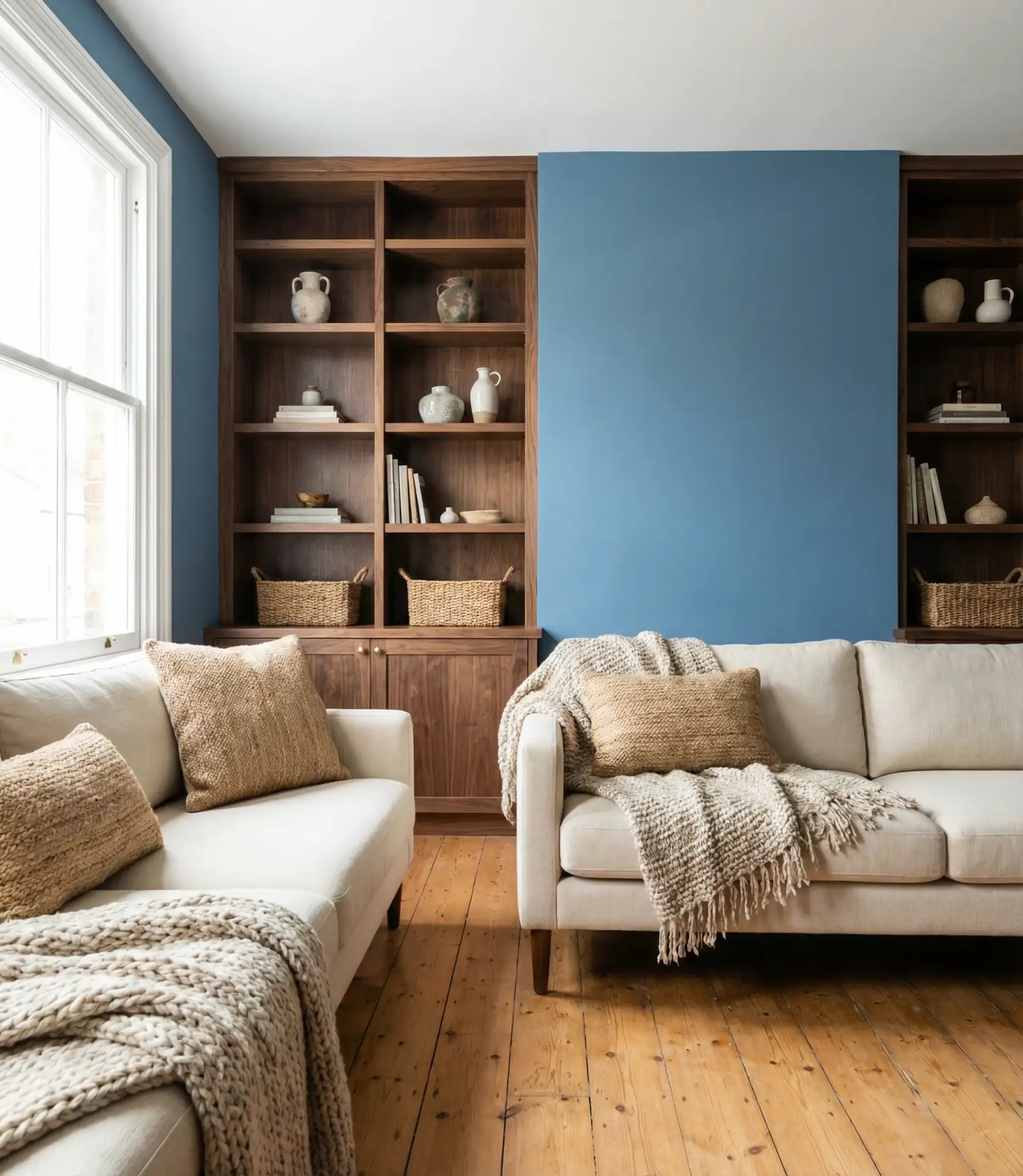
Pairing walls painted in any shade of blue with exposed natural wood creates an organic, grounded aesthetic. Whether it’s oak beams, pine floors, or walnut furniture, the warmth of wood tones prevents blue from feeling cold or sterile. This combination is popular in mountain homes, cabins, and contemporary spaces that want to bring in natural elements. The wood gives the blue a more inviting look and feel by adding texture and warmth.
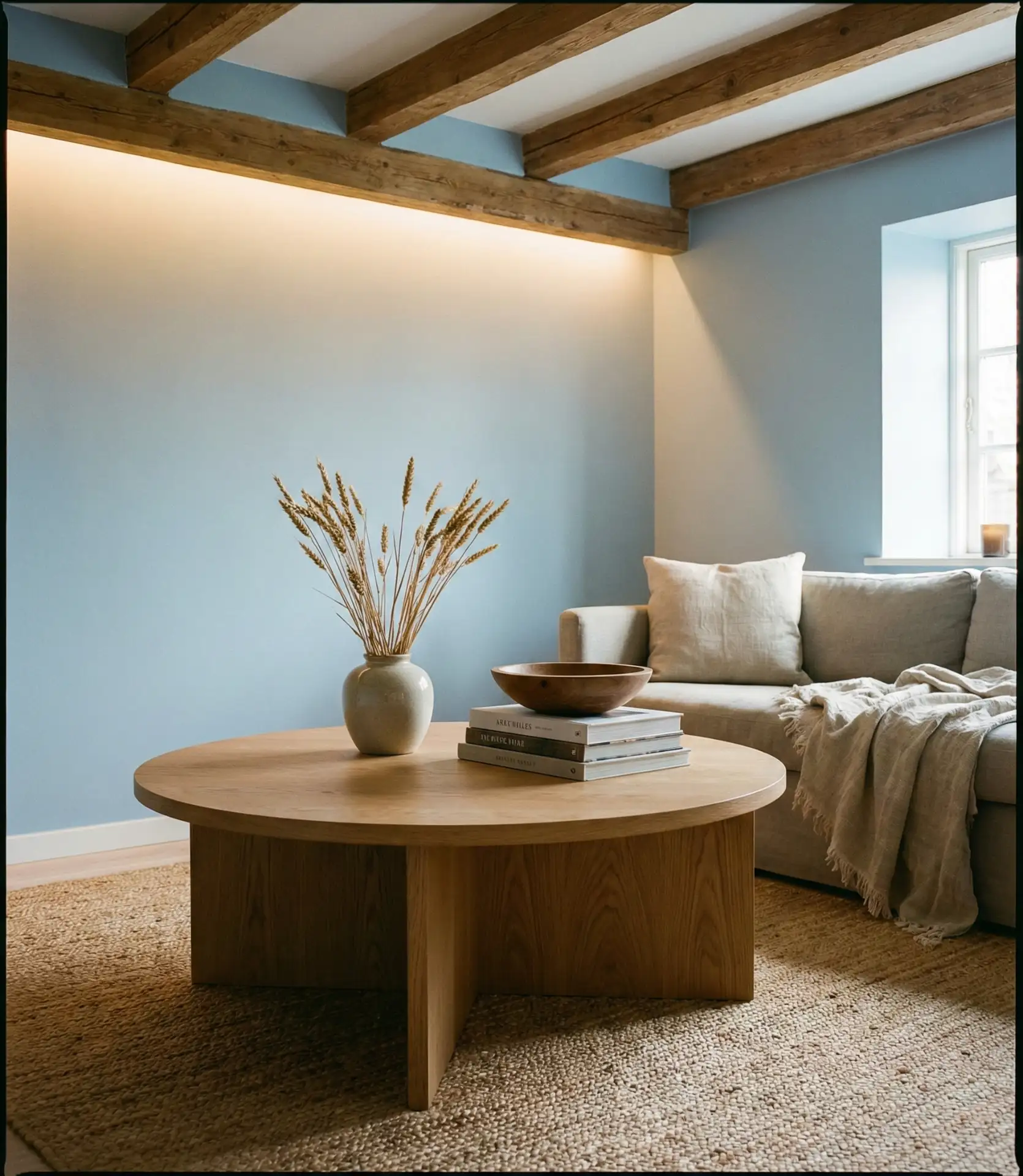
This pairing works especially well in rural and suburban homes across the Rockies and Appalachia, where wood is already part of the architectural DNA. Homeowners often choose softer blues—like powder or sky—to keep the space from feeling too heavy. The result is a room that feels both modern and rooted in place.
15. Gray and Blue Monochromatic Calm
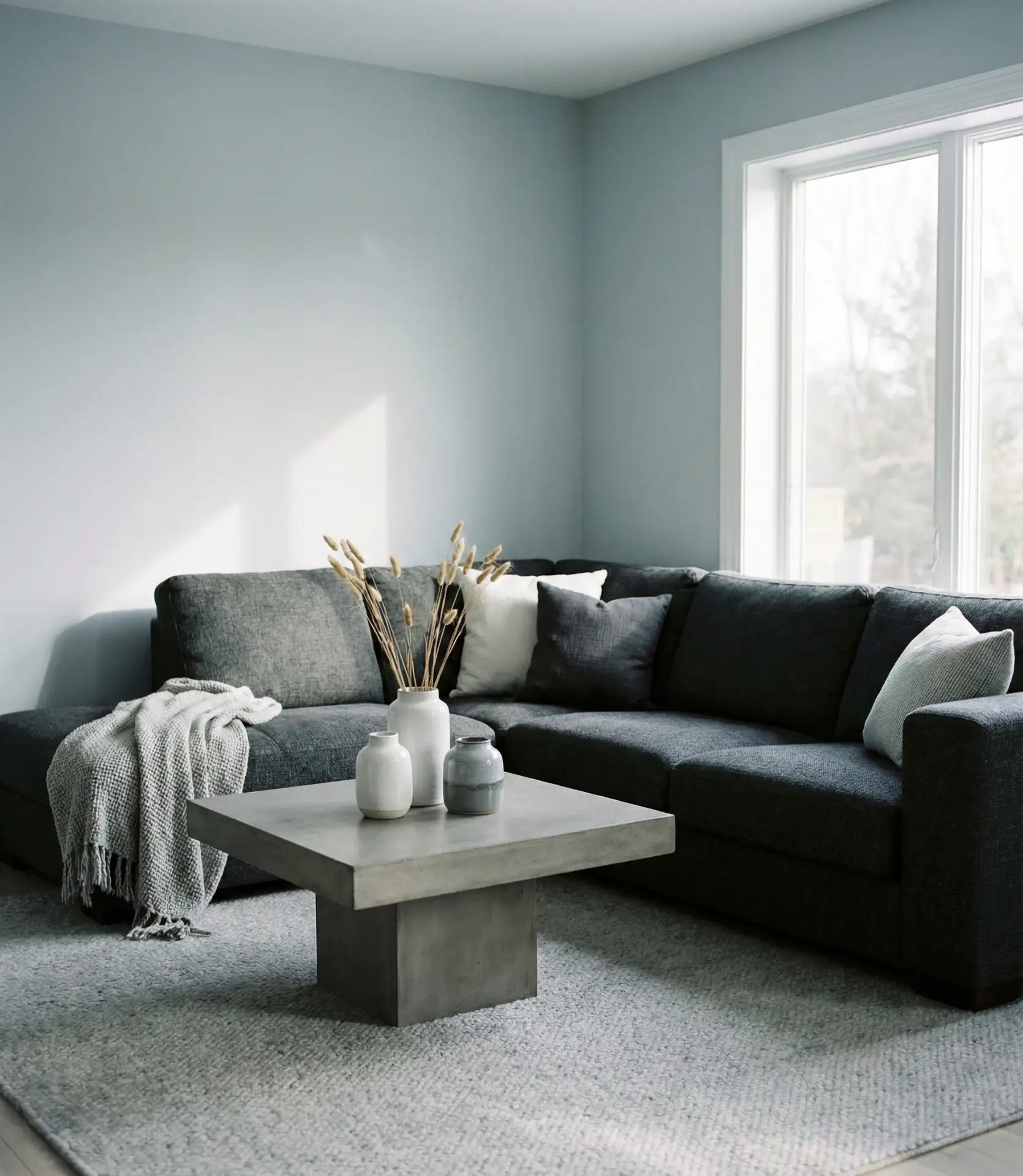
A gray and blue palette, kept within a narrow tonal range, creates a serene, monochromatic calm. This approach works beautifully in minimalist or Scandinavian-inspired spaces, where the focus is on simplicity and quiet sophistication. By layering different shades of gray-blue—from pale silver to deep slate—you create depth without introducing competing colors. It’s a look that feels curated and intentional.
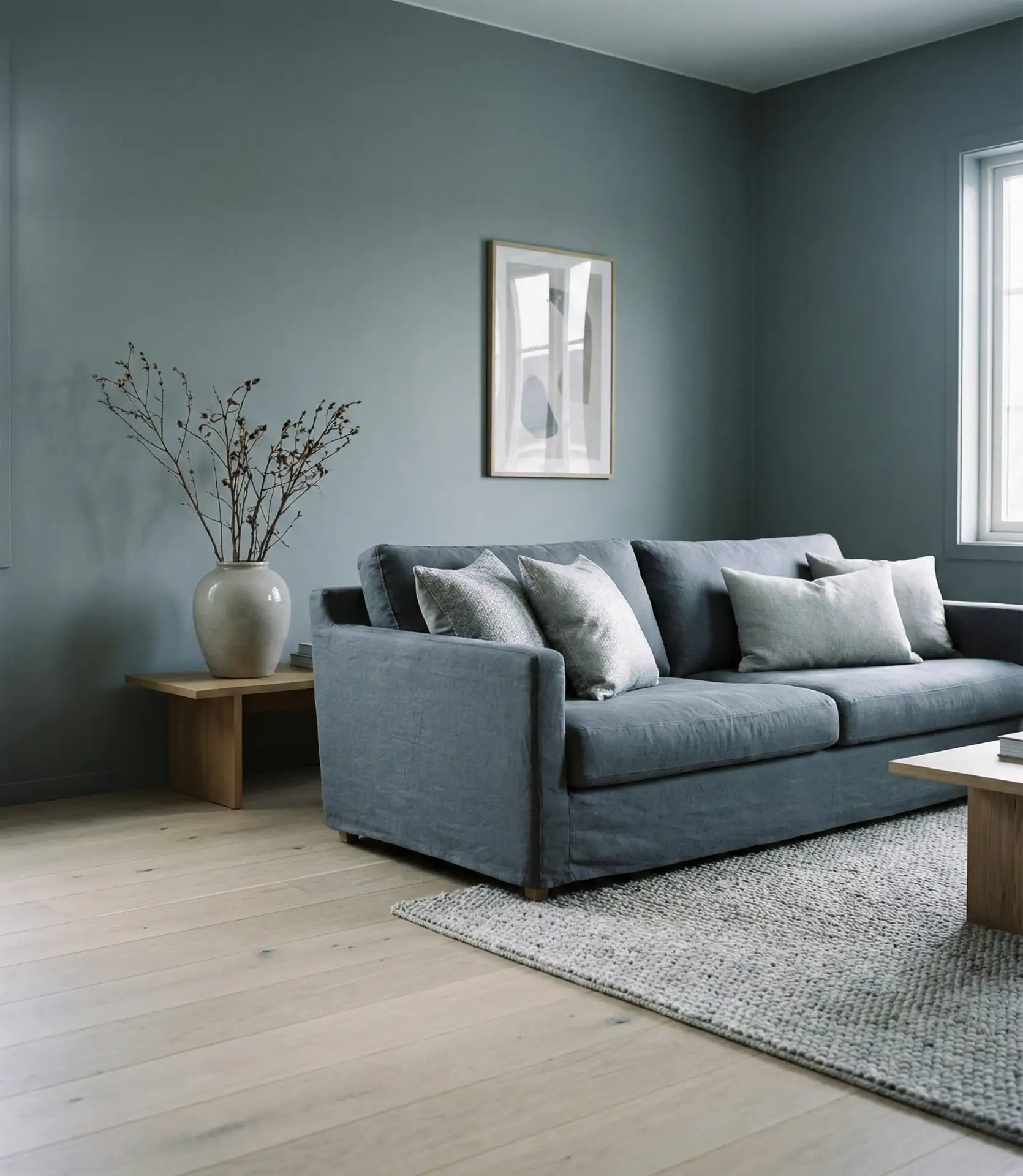
Expert insight: This palette can feel flat if you don’t vary the textures. Mix matte paints with glossy finishes, pair smooth upholstery with nubby throws, or introduce glass and metal accents. These small contrasts keep the eye engaged and prevent the room from feeling one-dimensional. It’s a subtle art, but the payoff is a space that feels both restful and refined.
16. Bright Blue Accent Furniture
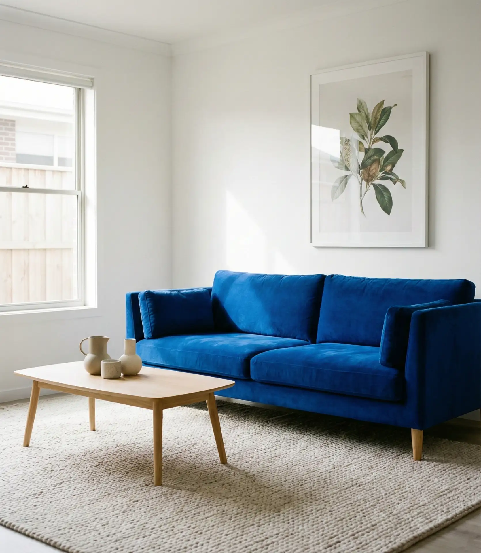
If painting walls feels too permanent, consider a bold blue piece of furniture instead. A cobalt velvet sofa, a cerulean armchair, or even a painted credenza can serve as the room’s anchor without requiring a full commitment to blue. This approach allows you to keep walls neutral while still enjoying a strong dose of color. It’s also easier to swap out down the line if your tastes change.
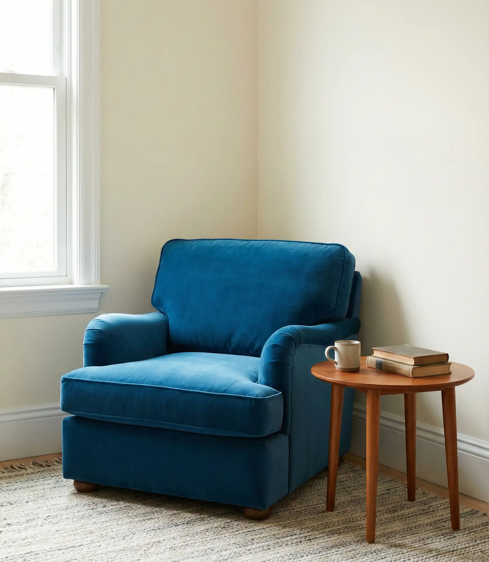
Real homeowner behavior: Many people start here—one bold piece—and then gradually add more blue through pillows, art, or rugs. It’s a low-risk way to test whether you love living with the color before committing to something more permanent. Plus, a standout blue piece photographs beautifully, which explains its popularity on design boards and social media.
17. Navy and White Nautical Refresh
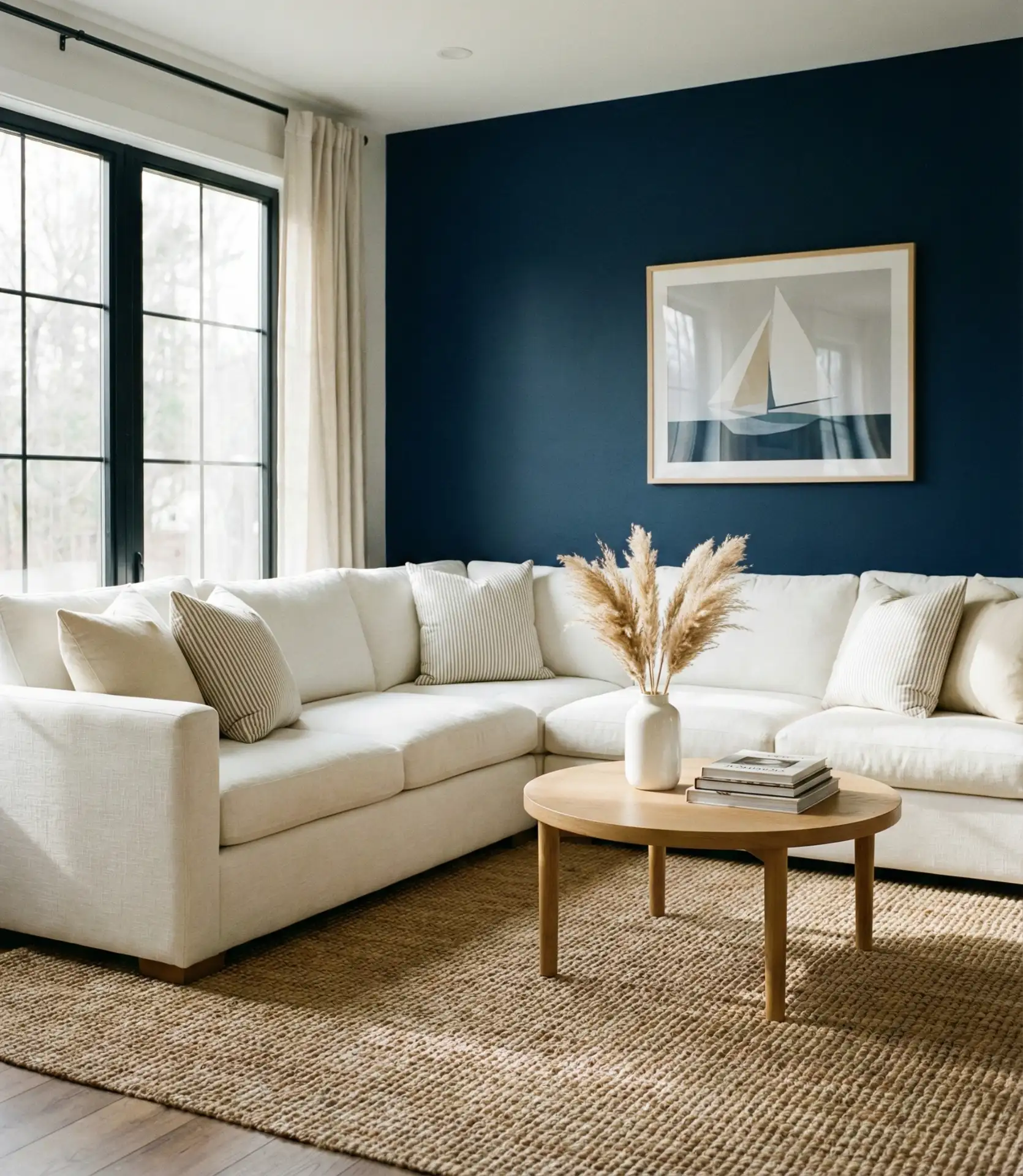
The classic navy and white combination gets a fresh update when you skip the obvious nautical clichés. Instead of anchors and rope, think crisp white walls, navy upholstery, and clean-lined furniture. This pairing feels coastal without being literal, and it works just as well in urban apartments as it does in beach houses. The high contrast between navy and white creates a sharp, polished look.

Where it works best: This palette thrives in sunlit spaces—think coastal towns from Maine to Southern California. The bright white amplifies natural light, while the navy grounds the room and prevents it from feeling too stark. It’s also a smart choice for rental properties, since it’s easy to achieve with slipcovers and accessories rather than paint.
18. Teal and Mustard Retro Revival
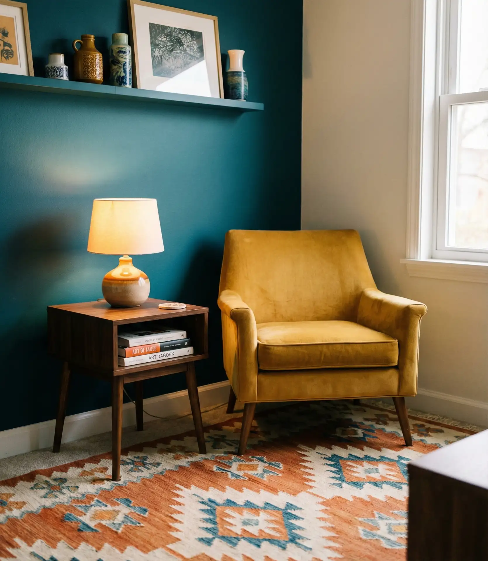
Pairing teal (a blue-green hybrid) with mustard yellow creates a retro-inspired palette that’s having a moment. This combination nods to mid-century design but feels fresh and current when styled with modern furniture and clean lines. The warmth of mustard balances the coolness of teal, and the result is energetic without being overwhelming. Use one as the dominant color and the other as a supporting player.
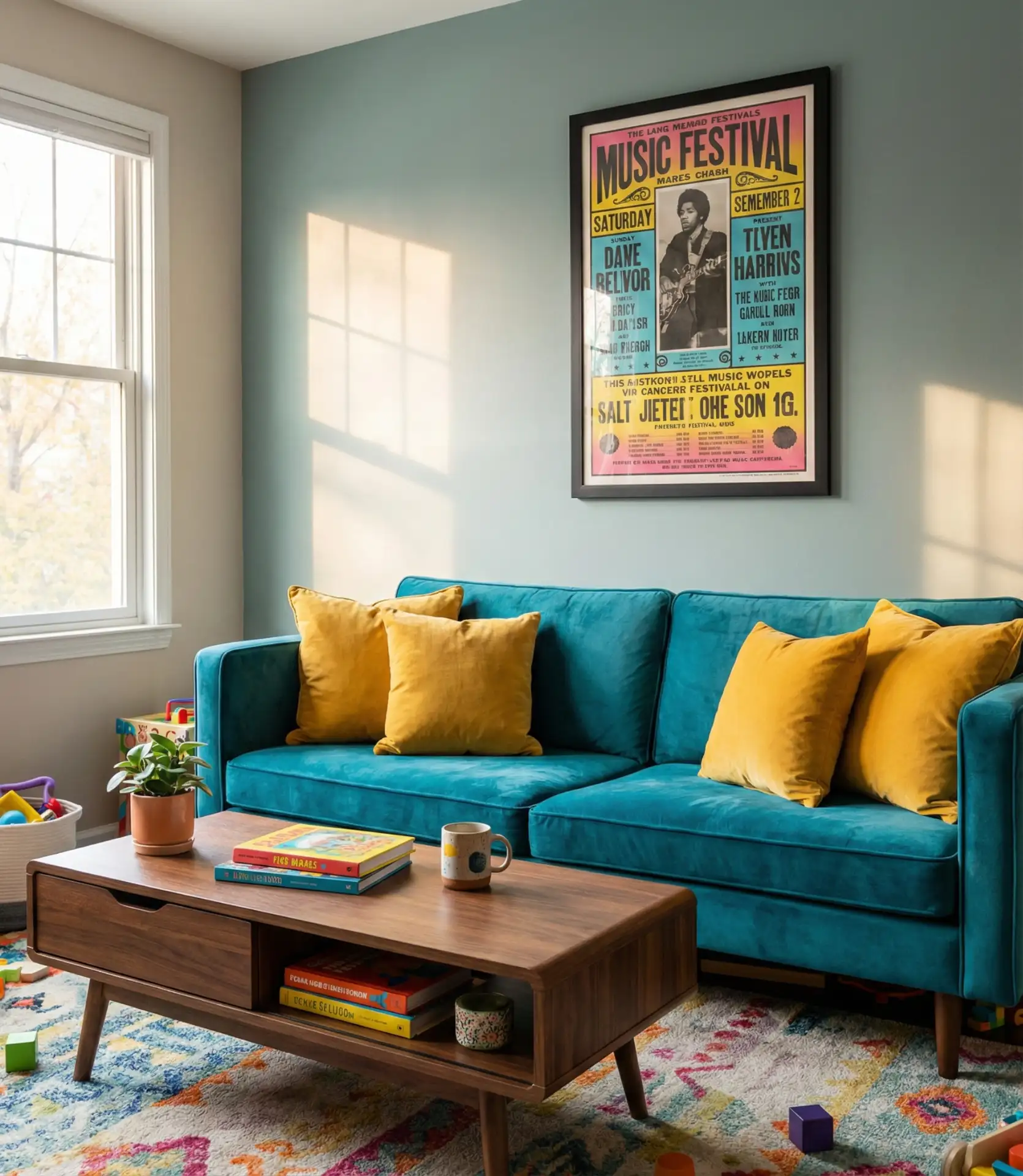
Common mistake: Using these colors in overly saturated tones can feel garish. Instead, opt for muted or dusty versions—think faded teal and ochre rather than electric turquoise and neon yellow. This keeps the palette grounded and sophisticated while still delivering on visual impact.
19. Icy Blue and Marble Luxury
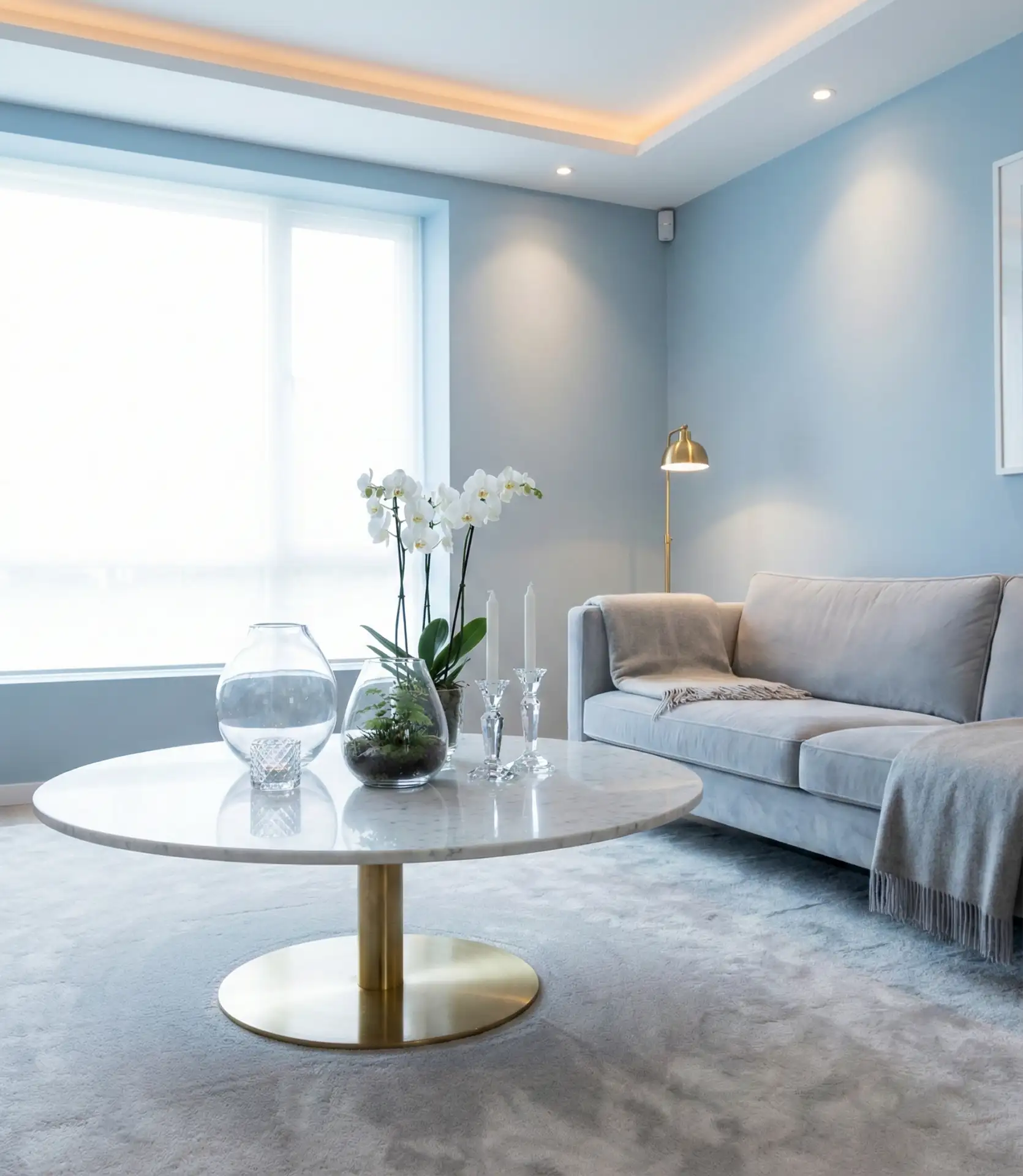
Pale, icy blue paired with white marble creates an atmosphere of cool luxury. High-end interiors often feature this combination, which evokes elegance and refinement in formal living rooms and other spaces. The veining in marble picks up the subtle blue tones, creating a cohesive, monochromatic effect. Add in glass or crystal accents to amplify the sense of sophistication.
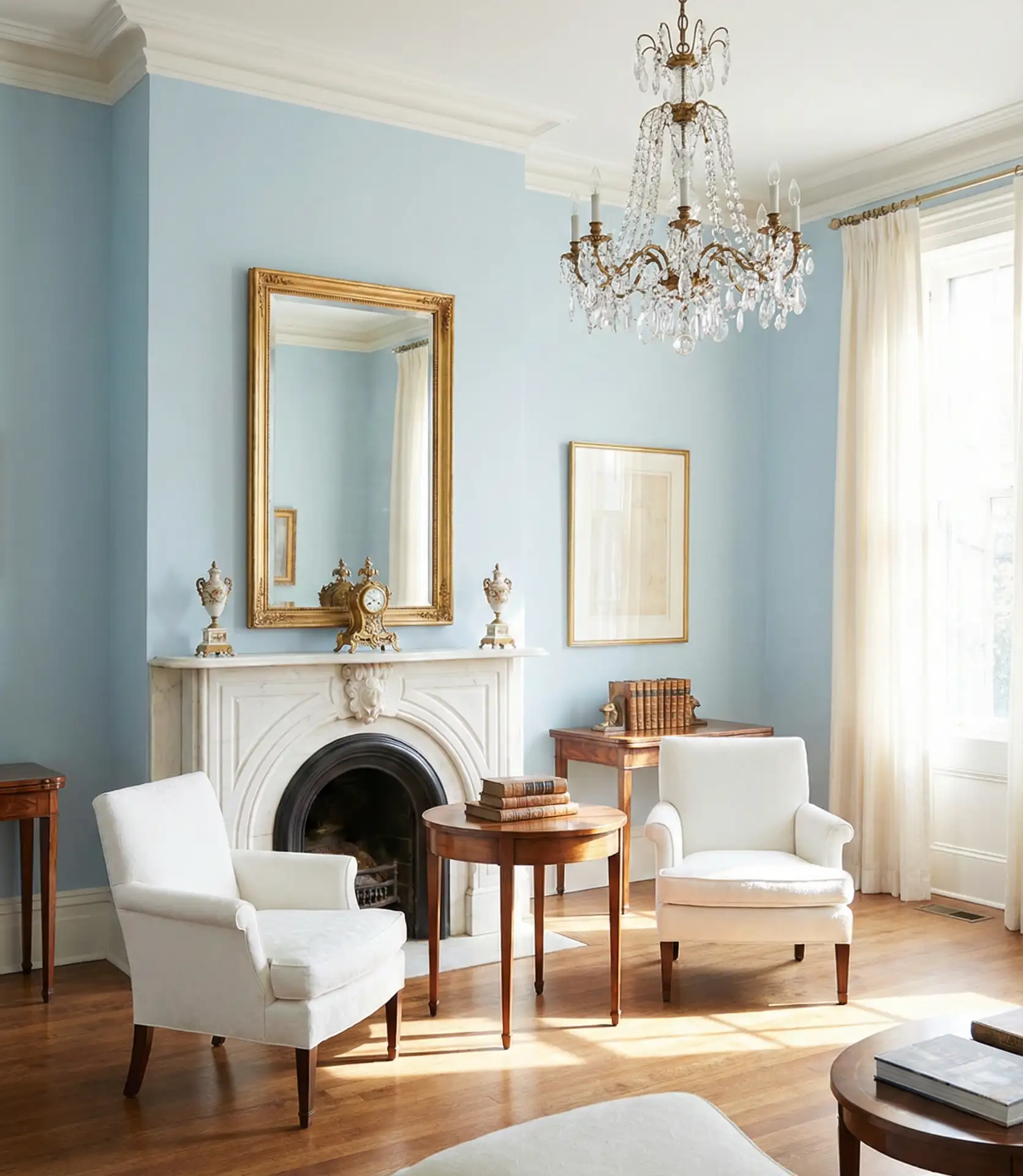
Budget angle: Real marble can be pricey, but high-quality faux marble or porcelain tiles offer a similar look at a fraction of the cost. Pair these with a soft blue paint—like Benjamin Moore’s Polar Sky or Sherwin-Williams’ Iceberg—and you can achieve a luxe aesthetic without the luxe price tag. It’s all about the illusion of elegance.
20. Cobalt Blue and Gold Maximalist Drama
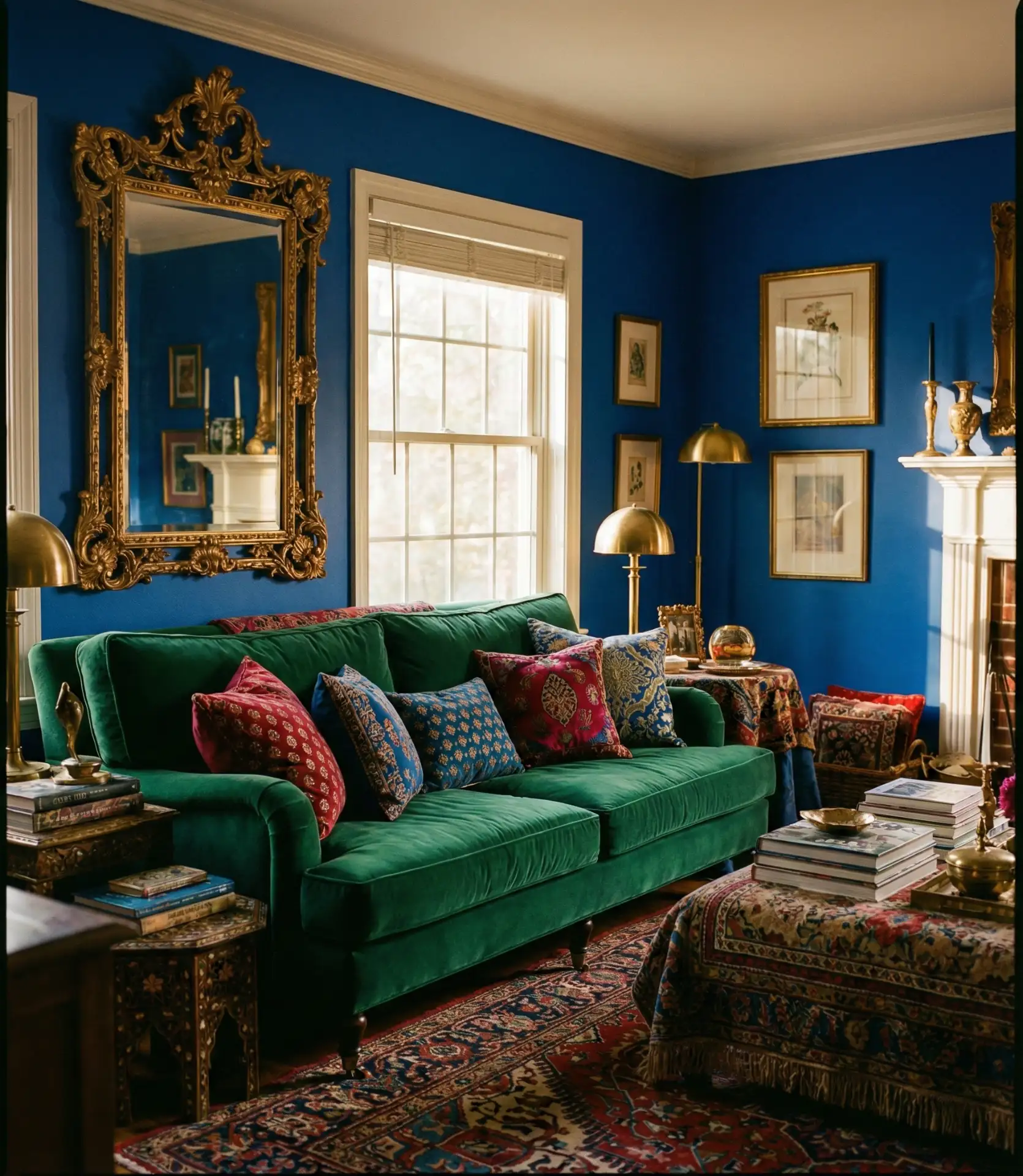
For those who love bold, saturated color, cobalt blue paired with gold creates a maximalist dream. This isn’t a palette for the faint of heart—it’s rich, opulent, and unapologetically dramatic. Think cobalt walls, gold-framed mirrors, and jewel-toned upholstery. The combination feels regal and confident, perfect for those who want their living room to make a statement. Balance is key: use white or cream as a third color to give the eye a place to rest.
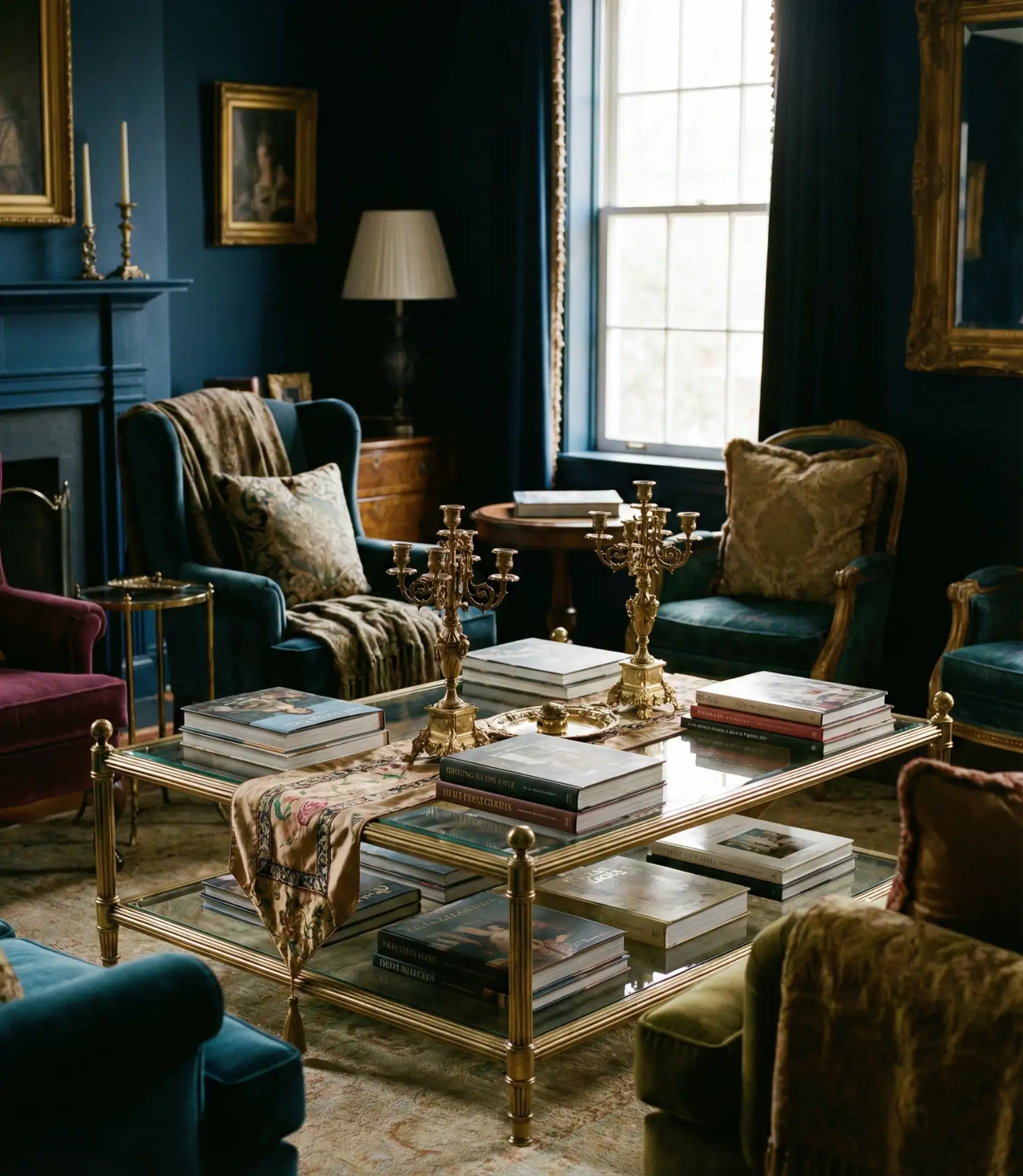
A designer once told me that cobalt and gold is the palette of people who “know what they want and aren’t afraid to own it.” It’s a look that requires confidence but delivers serious visual payoff. If you’re drawn to this combination, commit fully—half measures will feel timid rather than bold.
21. Soft Blue Ombré Walls
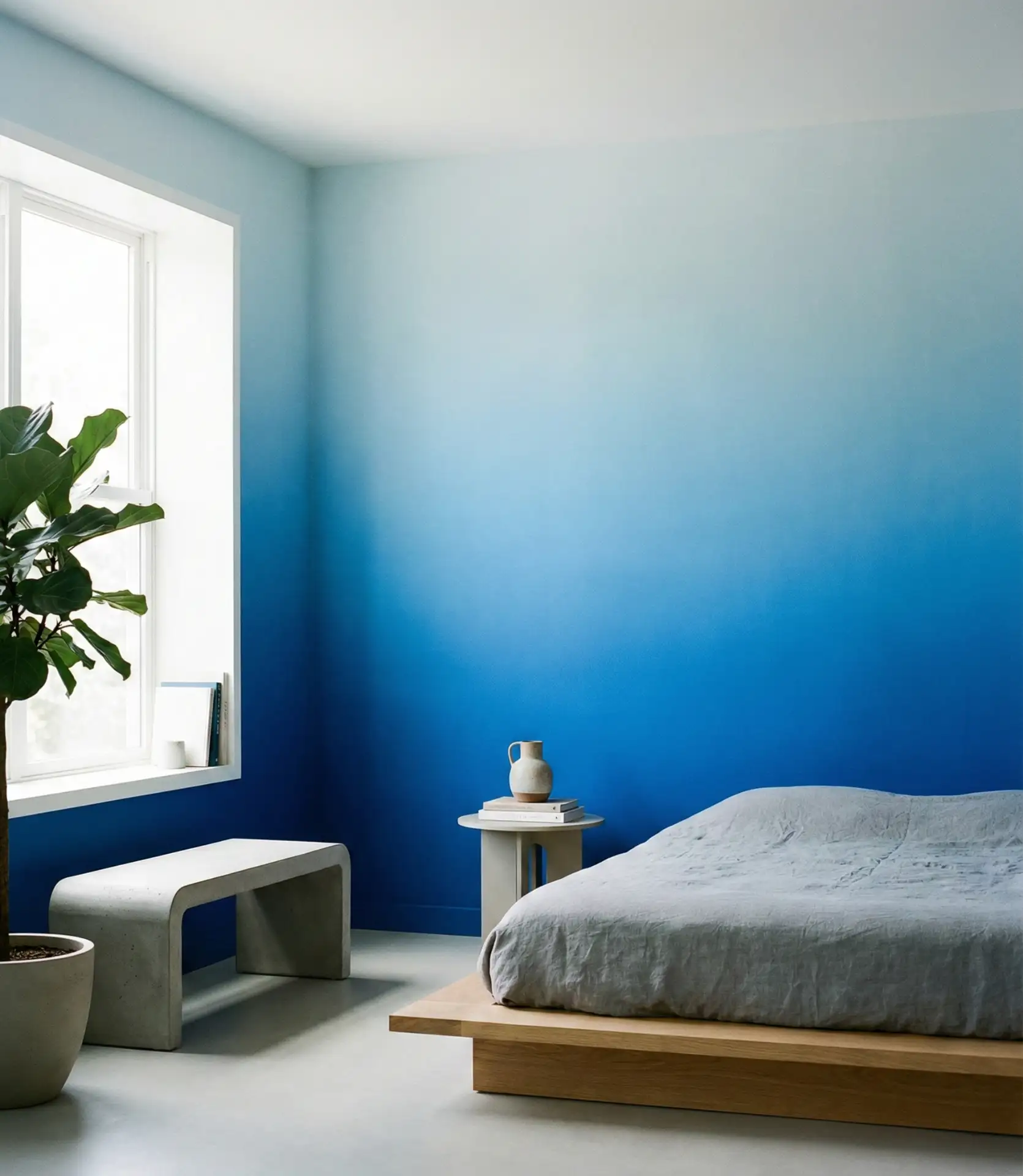
An ombré effect—transitioning from light blue at the ceiling to deeper blue near the floor—adds artistic flair without requiring bold furniture or decor. This technique creates a sense of movement and depth, making the room feel taller and more dynamic. It’s particularly effective in rooms with high ceilings or where you want to create a focal point without hanging art. The gradient can be subtle or dramatic, depending on your preference.
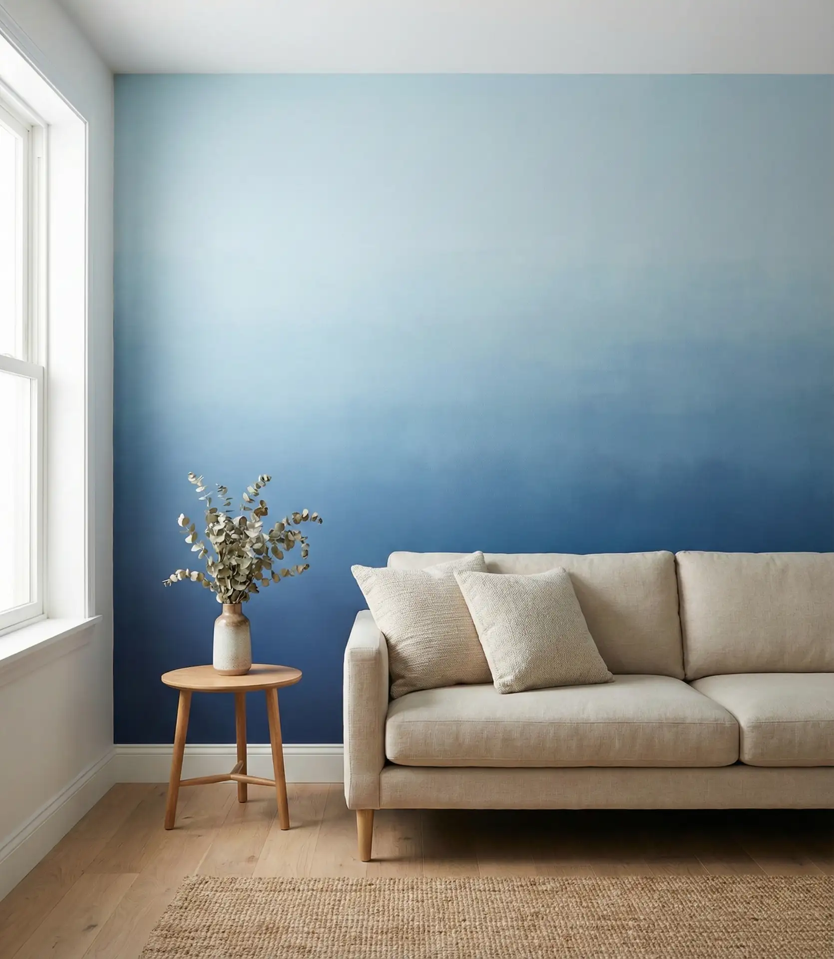
Practical insight: Achieving a smooth ombré requires patience and a powerful blending brush. Many DIYers recommend starting with the lightest shade at the top and gradually mixing in the darker shade as you move down the wall. It’s more forgiving than it looks, and imperfections often add to the hand-painted charm.
22. Blue Ceiling as Fifth Wall
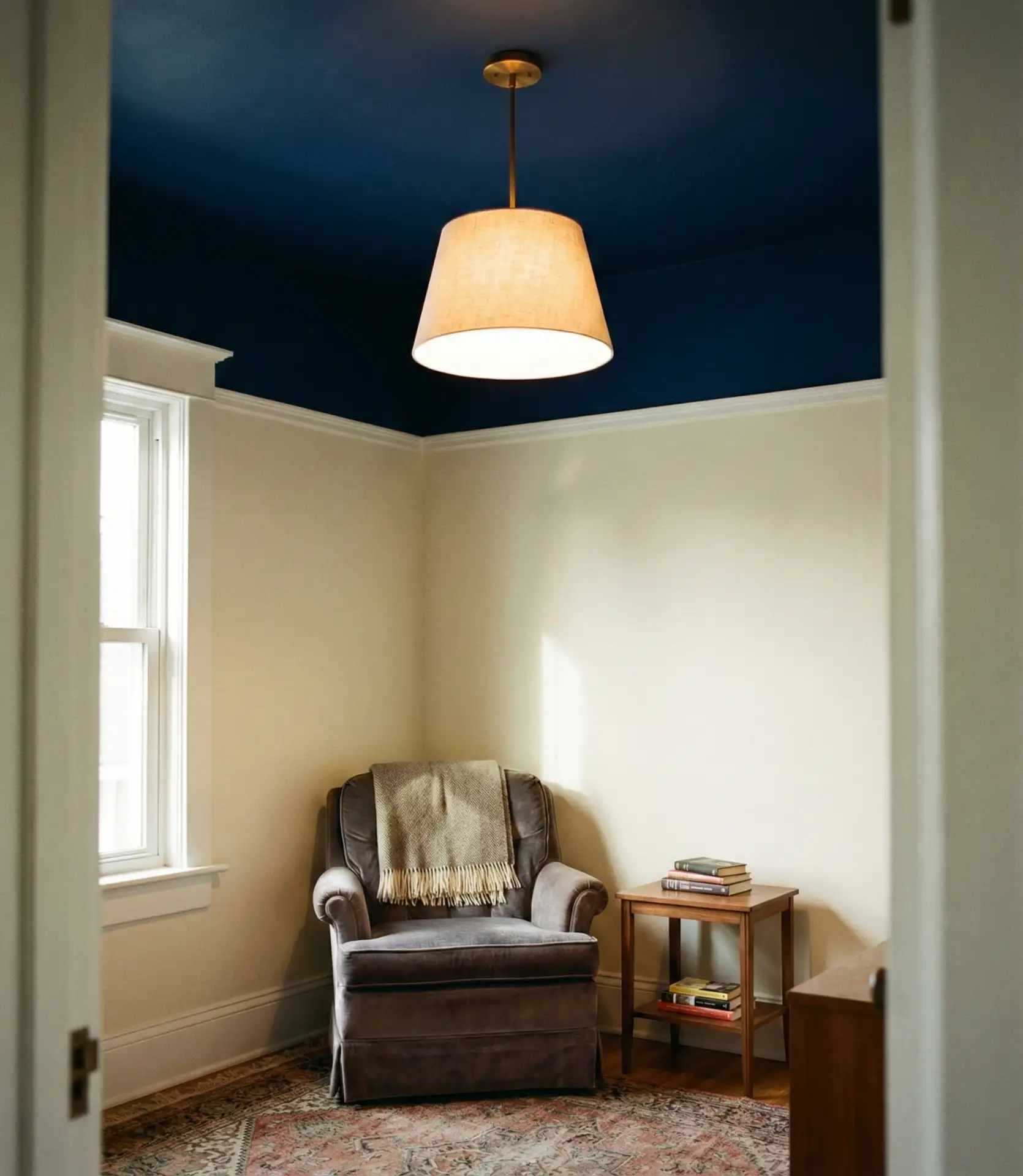
Painting the ceiling blue—often called the “fifth wall”—is an unexpected way to introduce color without committing to blue walls. A pale blue sky ceiling can make a room feel taller and more open, while a deeper navy can create a cocooning, intimate effect. This approach works particularly well in rooms with white or neutral walls, where the ceiling becomes a surprising pop of color.
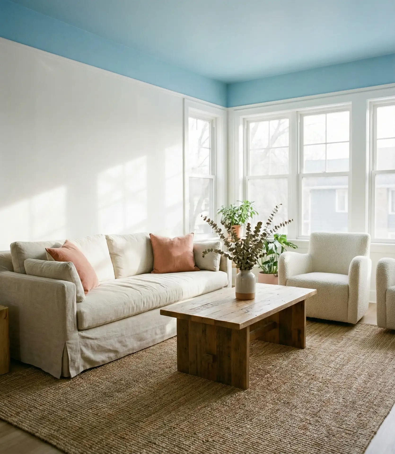
Where it works best: This technique is especially popular in bedrooms and reading nooks, but it’s gaining traction in living rooms, too. Southern homes with high ceilings often use pale blue to evoke the sky, while Northern spaces might opt for deeper blues to add warmth during long winters. It’s a small change that makes a big impact.
23. Blue and Brass Library Vibes
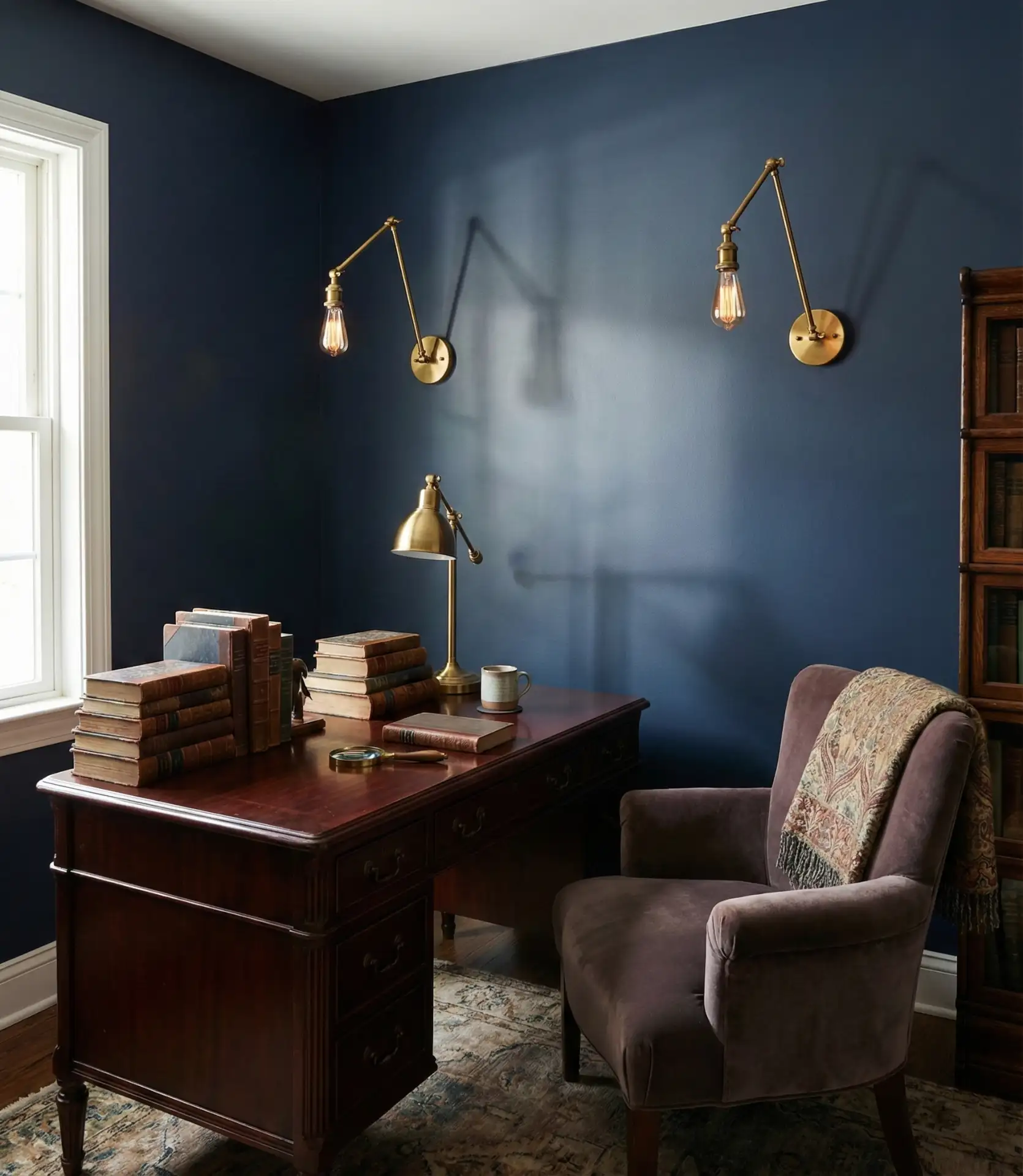
Deep blue paired with warm brass creates a scholarly, library-like atmosphere that’s both sophisticated and inviting. Think floor-to-ceiling bookshelves, leather seating, and brass task lighting. This combination works beautifully in cozy dens, home offices, or any space where you want to encourage reading and quiet contemplation. The brass adds a vintage, timeless quality that keeps the blue from feeling too modern or stark.
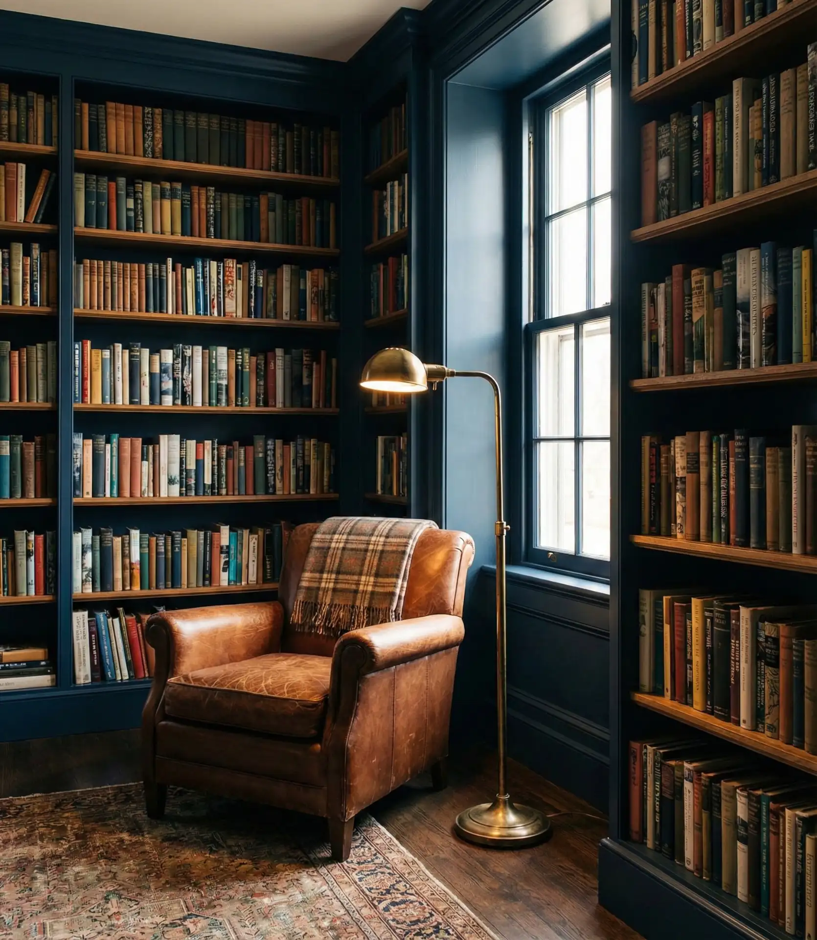
Real homeowner behavior: People often use this palette in multi-functional spaces—living rooms that double as home offices, or guest rooms that include reading nooks. The blue signals “this is a serious space,” while the brass keeps it from feeling cold or unwelcoming. It’s a balance that encourages both productivity and relaxation.
24. Periwinkle and Cream Cottage Charm
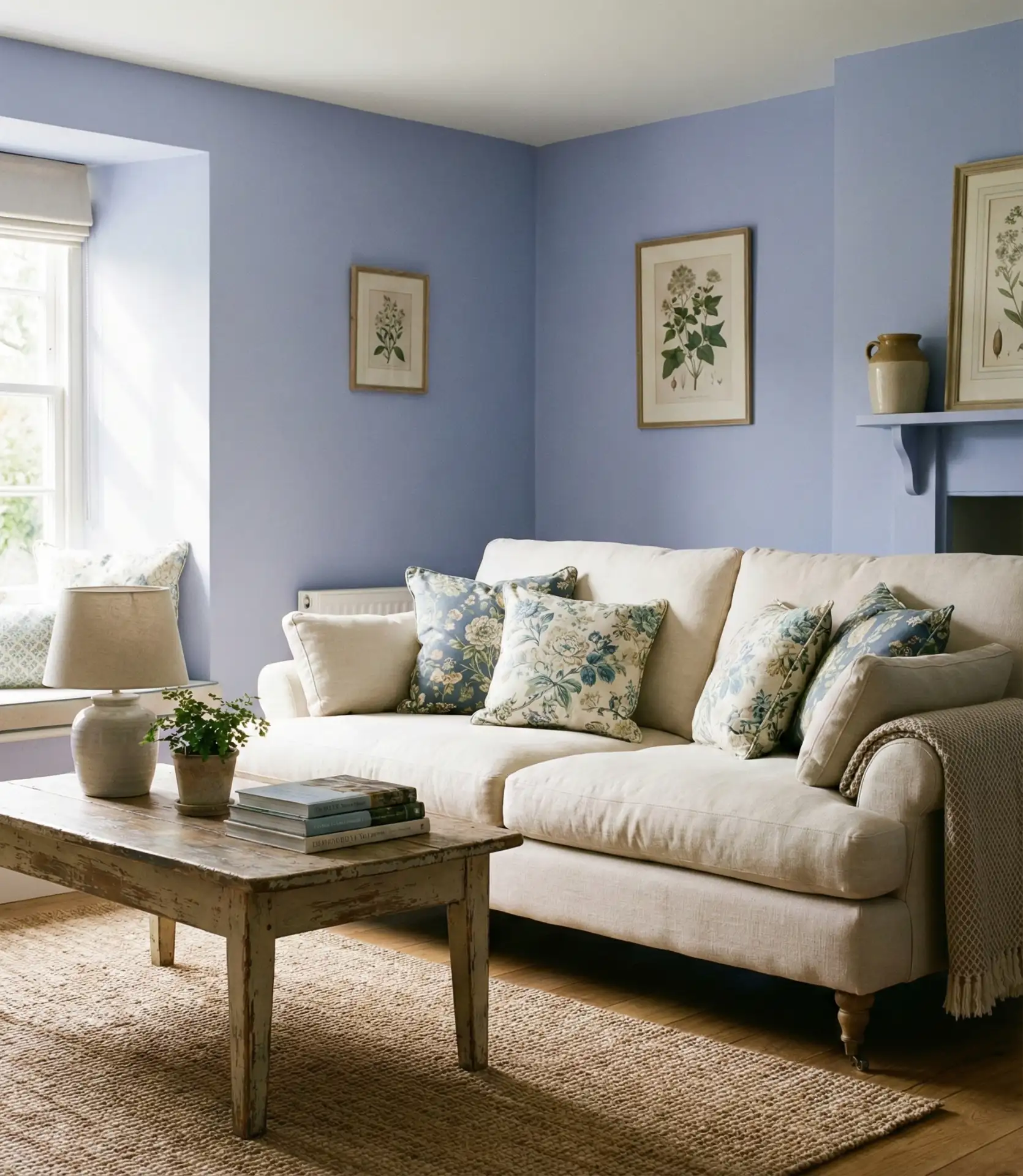
Periwinkle—a soft, lavender-tinged blue—paired with cream creates a gentle, cottage-inspired palette. This combination feels nostalgic and comforting, perfect for homes with vintage charm or those looking to create a cozy, welcoming atmosphere. The periwinkle adds just enough color to keep things intriguing, while the cream provides a warm, neutral base. Layer in floral prints or distressed wood for extra charm.
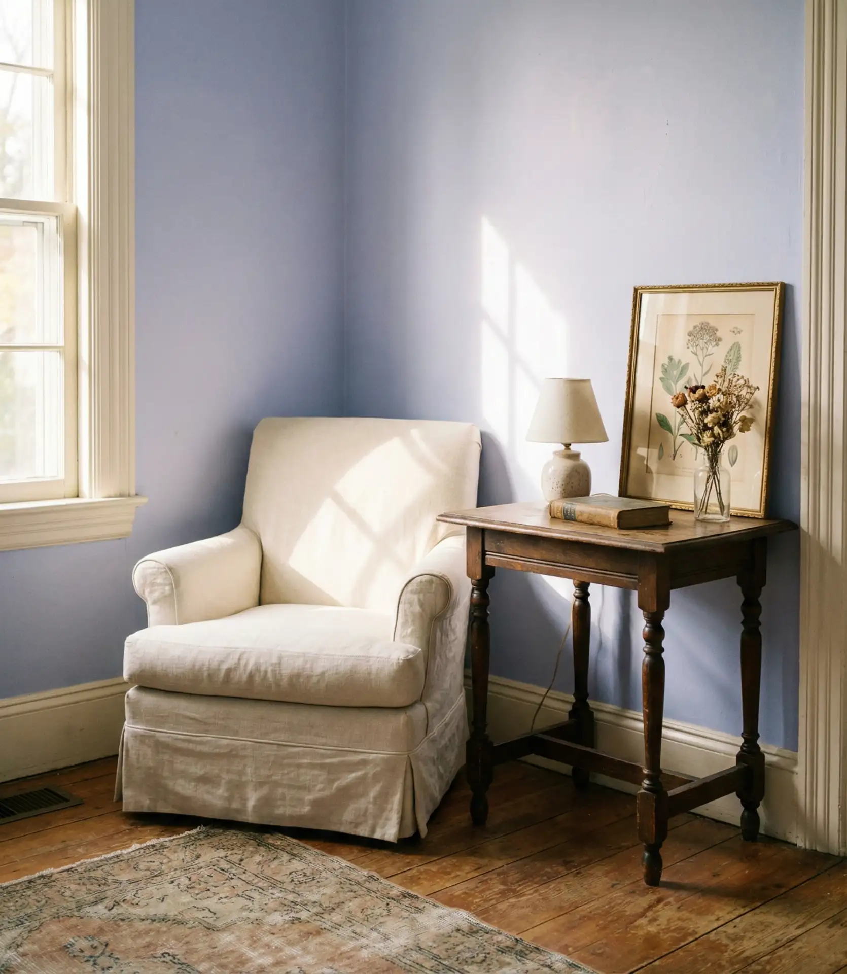
Common mistake: Periwinkle can read as too juvenile if paired with overly sweet or pastel accessories. To keep it sophisticated, ground the palette with natural textures—linen, jute, raw wood—and avoid anything too frilly or cutesy. The goal is cottage charm, not nursery whimsy.
25. Blue and Black Modern Edge
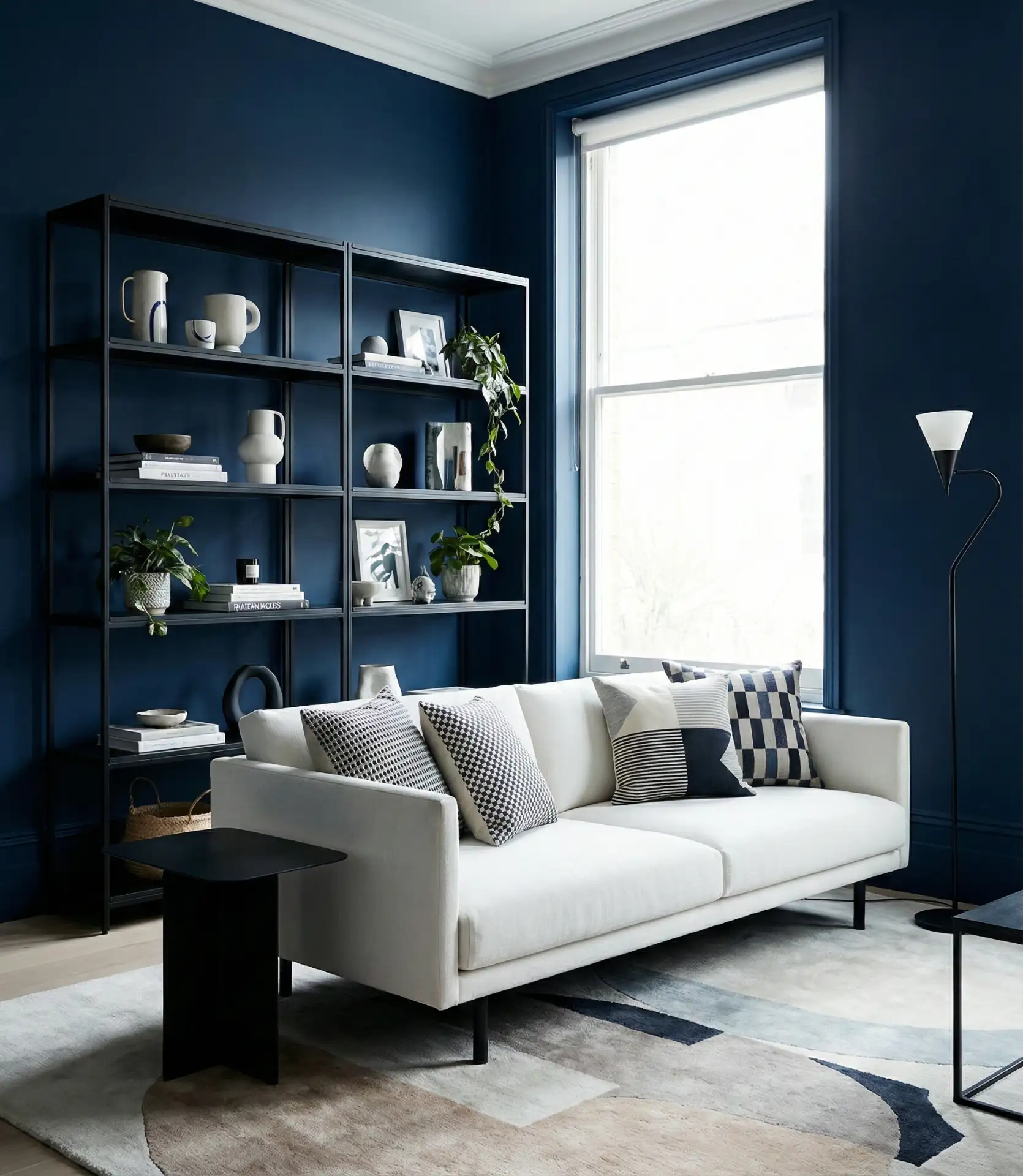
Pairing blue with black creates a striking, modern edge that’s both bold and sophisticated. This isn’t a common combination, but when done well, it delivers serious visual impact. Think navy walls with black window frames or a cobalt sofa against black built-ins. The key is to keep the proportions balanced—too much black can feel heavy, while too much blue might lose its punch. Add white or cream as a third color to keep things from feeling too dark.
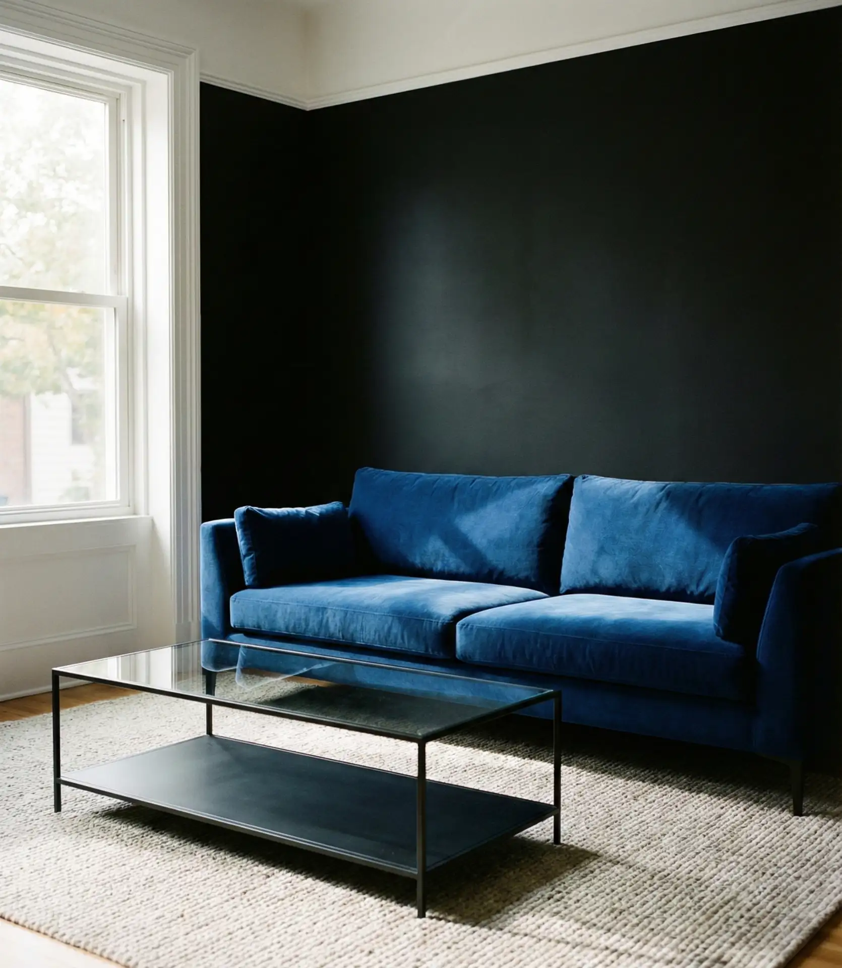
Expert-style commentary: This palette works best in spaces with ample natural light, where the dark tones won’t make the room feel cave-like. Urban lofts, modern condos, and homes with large windows are ideal candidates. It’s a look that demands confidence but rewards those willing to risk creating a space that feels uniquely theirs.
Blue living rooms offer endless possibilities, whether you prefer the drama of midnight walls or the serenity of duck egg accents. The key is choosing shades and pairings that reflect your lifestyle and the mood you want to create. Don’t be afraid to experiment—start small with textiles or a single accent piece, then build from there. Share your favorite blue living room idea in the comments below, or tell us which combination you’re planning to try in your own space.

