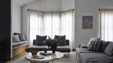
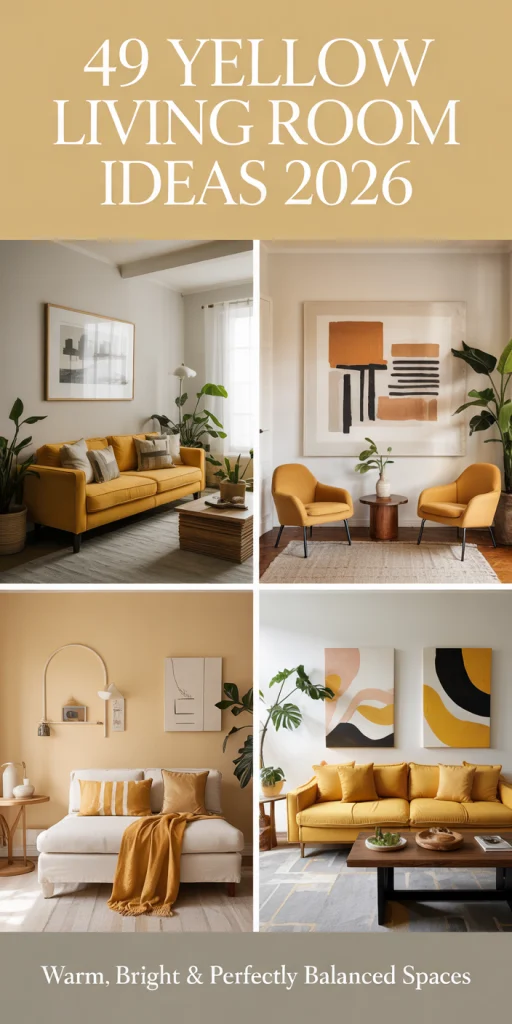
According to Pinterest, yellow is going to reclaim popularity over the entire color spectrum in American living rooms in 2026. Psychologically, yellow is the happiest color, and the connotations of butter yellow multiply its positive influence. This guide shows how to add yellow to your living room, from subtle accents to painting a wall. This guide is designed to let the reader and potential user discover the combinations of colors, furniture, and ideas that Americans value. This book is a guide filled with sunshine and all of the potential of American living rooms.
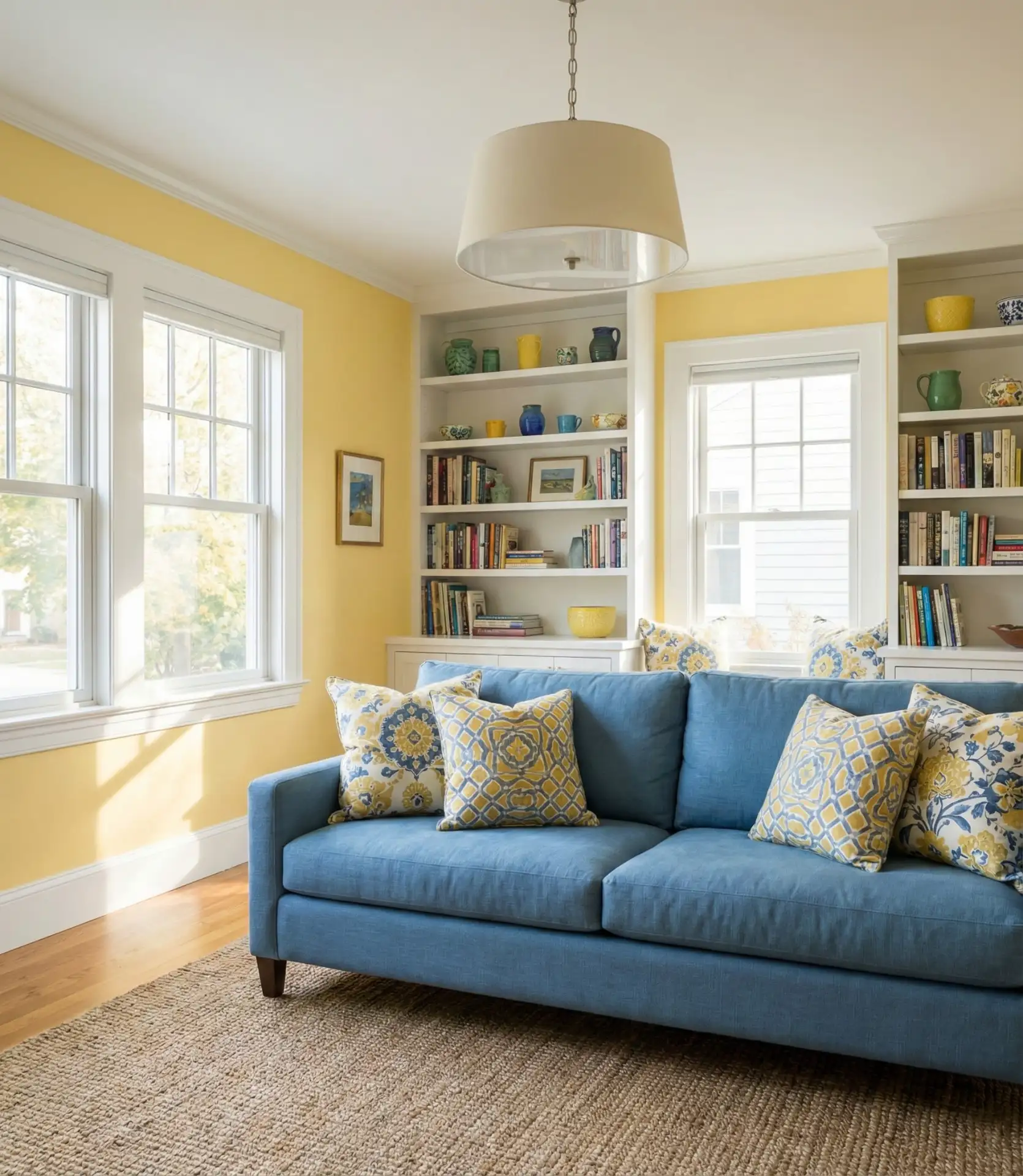
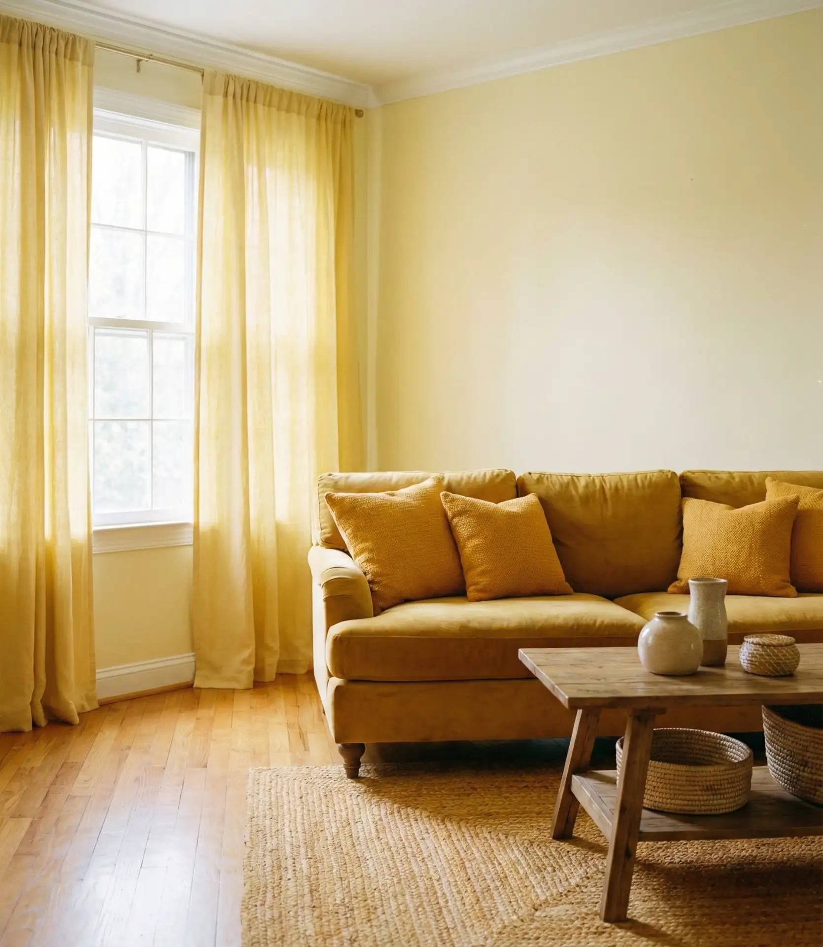
1. Butter Yellow Walls with Navy Accents
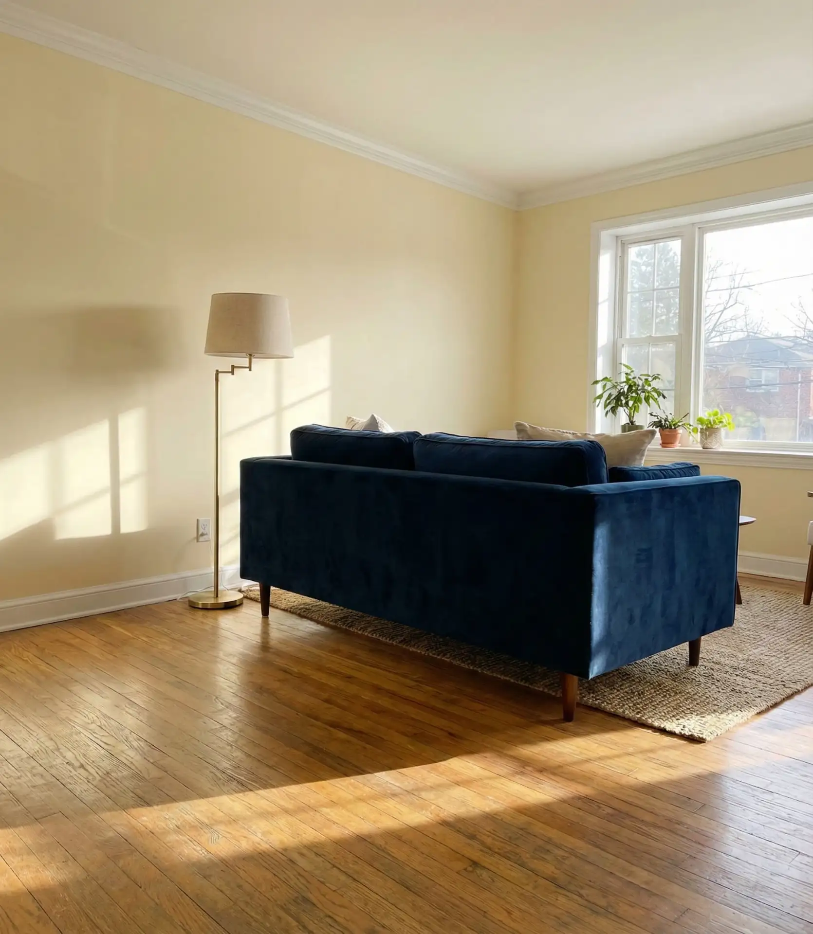
Bright white walls are a wonderful place to start in your rooms in preparation to create a blank canvas to let your butter yellow walls complement your navy and yellows. This makes a wonderful place to let the contrast of the different fabrics and warm colors, navy and yellow, create a warm, shallow, sophisticated depth. This mixture is a popular wall color combination in all home styles in the Northeast but particularly in Colonial and Craftsman styles. 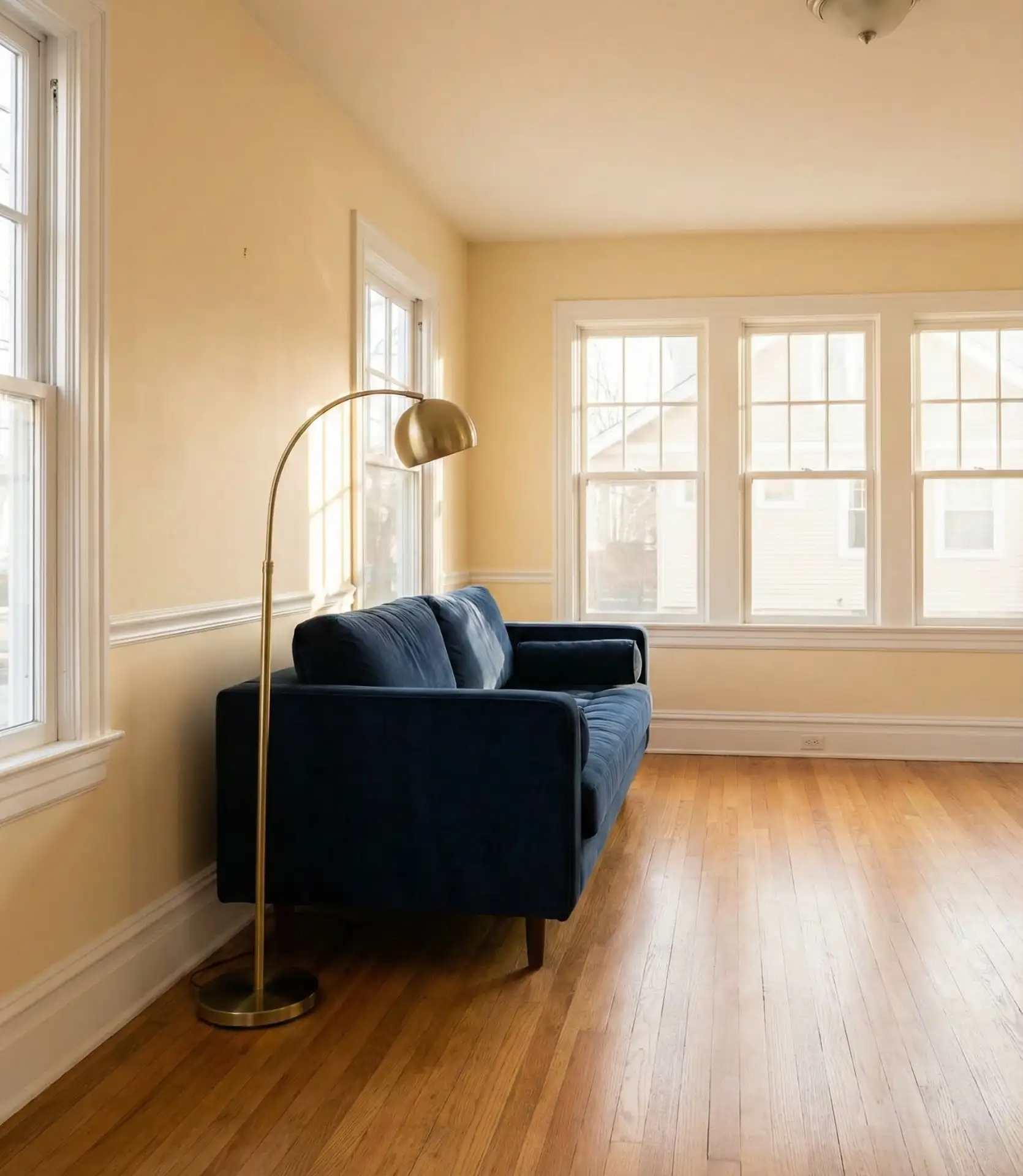
Many homeowners worry that yellow walls will feel too bold, but butter tones are surprisingly versatile. The key is balancing the warmth with cool navy pieces—think a structured sofa, patterned throw pillows, or even navy window treatments. This pairing photographs beautifully for those Instagram-worthy moments, and the color scheme remains timeless enough that you won’t tire of it after a season. Consider adding white or cream accents to keep the palette from feeling too heavy.
2. Pale Yellow and Grey Modern Minimalism
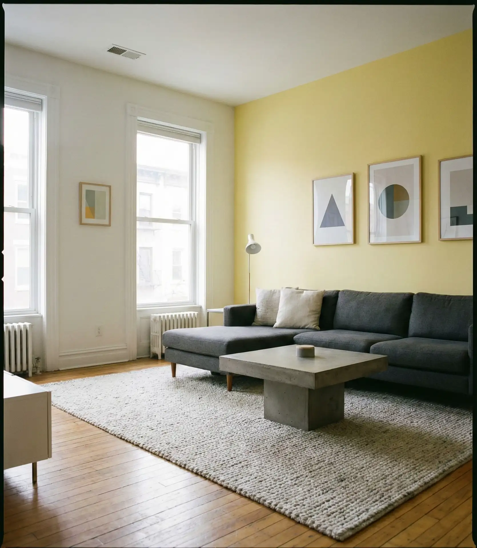
For those who love understated elegance, pale yellow paired with grey and white creates a serene, contemporary atmosphere perfect for modern living spaces. This color scheme works beautifully in open-concept apartments and loft-style homes where you want brightness without visual clutter. The gentle yellow acts as a warm neutral, while various shades of grey add architectural interest and sophistication. 
This combination works best in homes with abundant natural light, particularly those with south- or west-facing windows that amplify the yellow’s warmth throughout the day. Urban dwellers in cities like Seattle or Portland often gravitate toward this palette because it counters the grey exterior weather with interior sunshine. Keep furniture lines simple and uncluttered, and let the color pairing do the visual work. A single statement piece in deeper grey provides just enough contrast without disrupting the calm aesthetic.
3. Mustard Yellow Velvet Furniture Statement
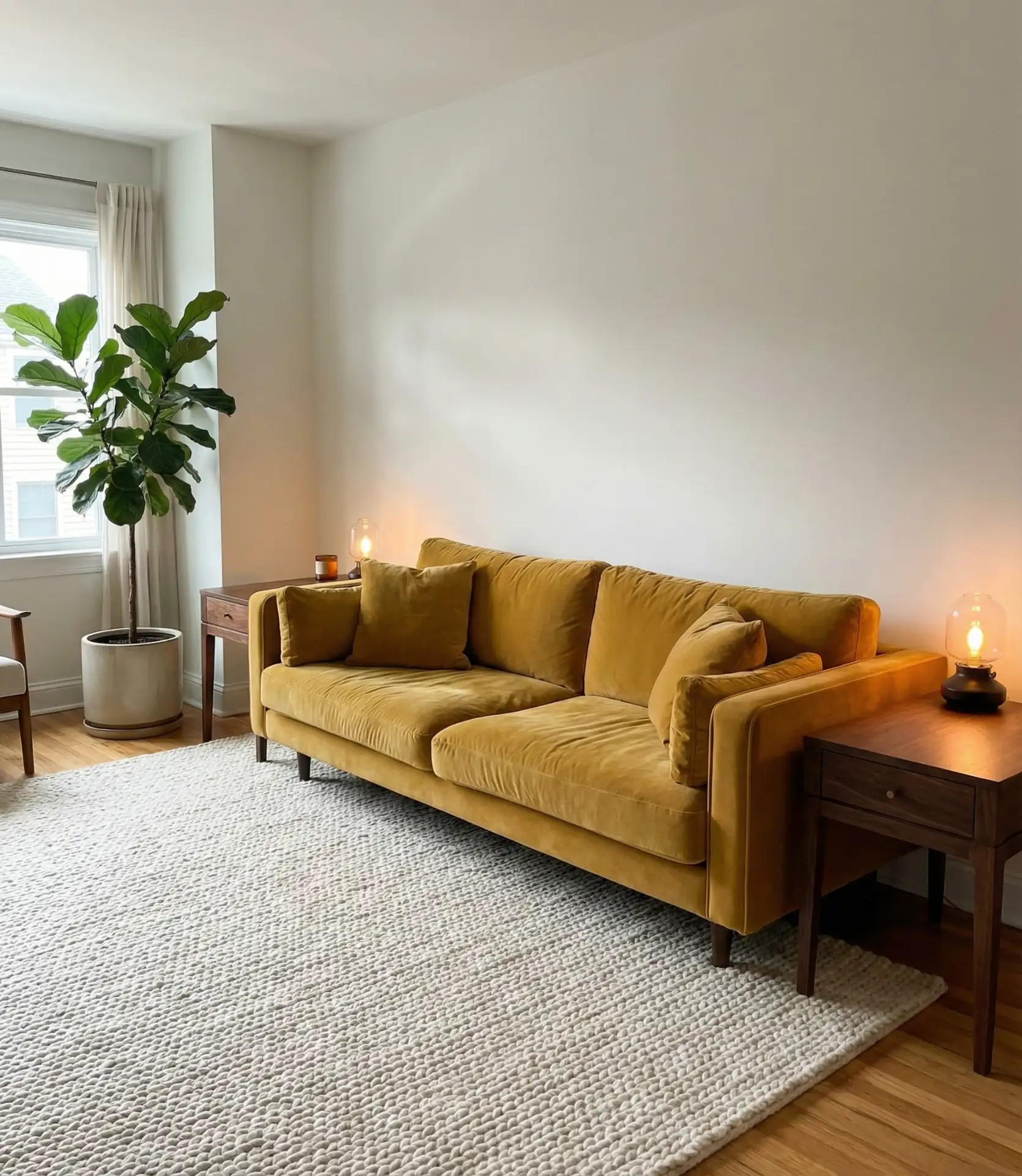
A mustard yellow velvet sofa or armchair instantly becomes the focal point of any yellow living room, offering both visual drama and luxurious texture. This deeper, earthier yellow tone gained massive traction on Pinterest throughout 2025 and continues to dominate inspiration boards. The rich hue pairs beautifully with warm wood tones, brass accents, and even unexpected pink and coral touches for those who love layered color. 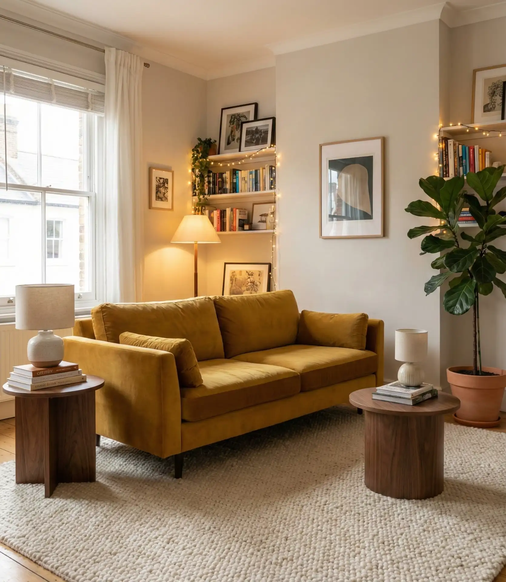
I spoke with a designer in Austin who noted that mustard velvet furniture has become her most-requested item from clients in their thirties. The fabric catches light beautifully, creating depth that flat cotton simply can’t match. Budget-wise, expect to invest $800-$1,500 for a quality accent chair in velvet or $2,000-$4,000 for a substantial sofa. The good news? Mustard is versatile enough to work with future decor changes, unlike trendier shades that date quickly.
4. Light Yellow and Teal Coastal Vibes

Light yellow walls combined with teal and aqua accents evoke a breezy, coastal aesthetic that feels perpetually vacation-ready. This refreshing combination works exceptionally well in beach communities along both coasts and even in landlocked states where homeowners crave that seaside energy. The yellow provides warmth like morning sun on sand, while teal brings the cool, calming essence of ocean water. 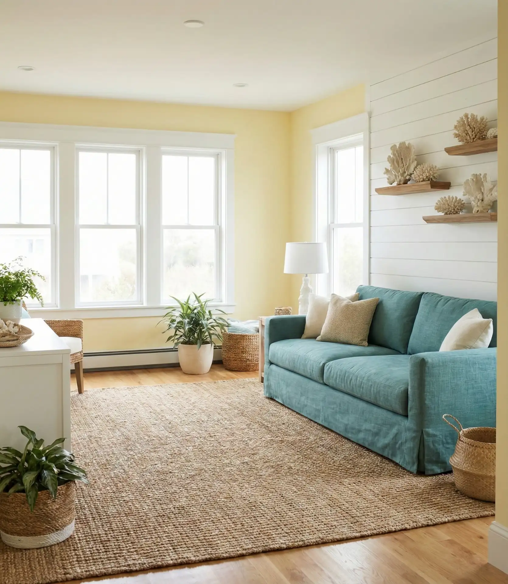
Depicting the coastal atmosphere can be done through a nautical style, but in a subtle way. Rather than literal depictions like sailboats, ropes, and anchors, opt for organic textures like weathered wood, rattan, and linen, and allow the colors to speak for themselves. This allows the home to maintain sophistication while still embodying the depth of the yellow and teal.
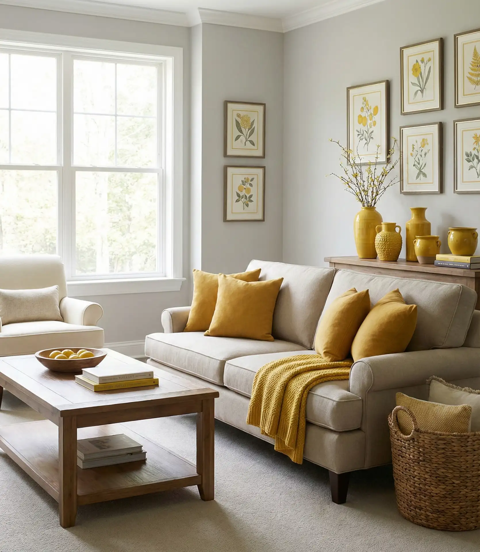
5. Yellow and Beige Warm Neutral Foundation
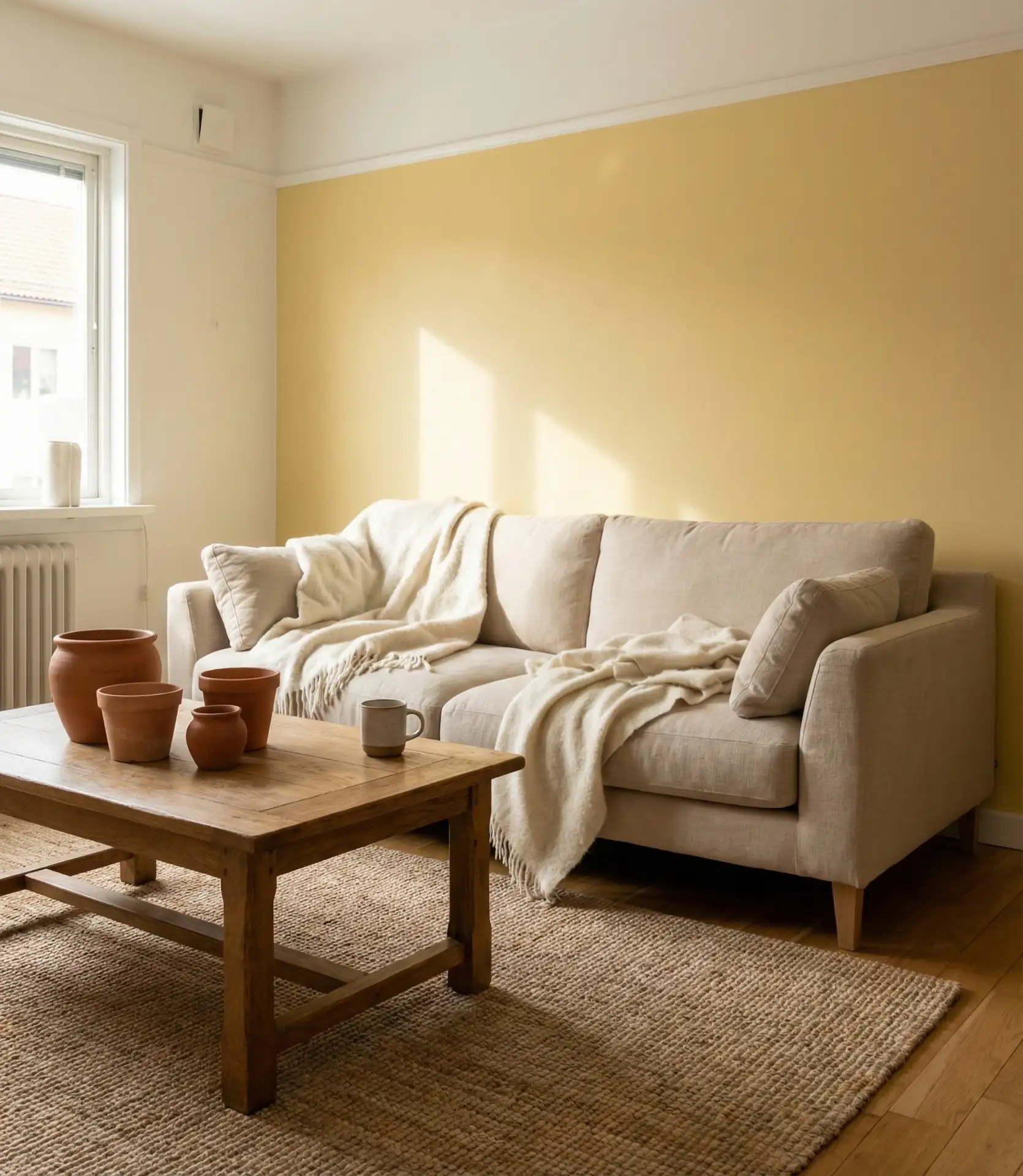
Combining soft yellow with beige and cream tones creates an enveloping warmth that’s become increasingly popular as homeowners move away from stark white interiors. This color scheme provides the perfect backdrop for layered textures and natural materials, creating spaces that feel collected over time rather than decorated all at once. The subtlety makes it ideal for those who want color without committing to bold statements.
This palette works best in homes across the Midwest and Southwest, where natural light can be intense during certain hours. The warm neutral base prevents yellow from appearing too sharp or overwhelming in the bright afternoon sun. Real homeowners often start with beige foundational pieces—sofa, rug, curtains—then gradually introduce yellow through paint, pillows, and artwork. This phased approach makes the color transition feel natural and allows you to adjust the yellow intensity to your comfort level.
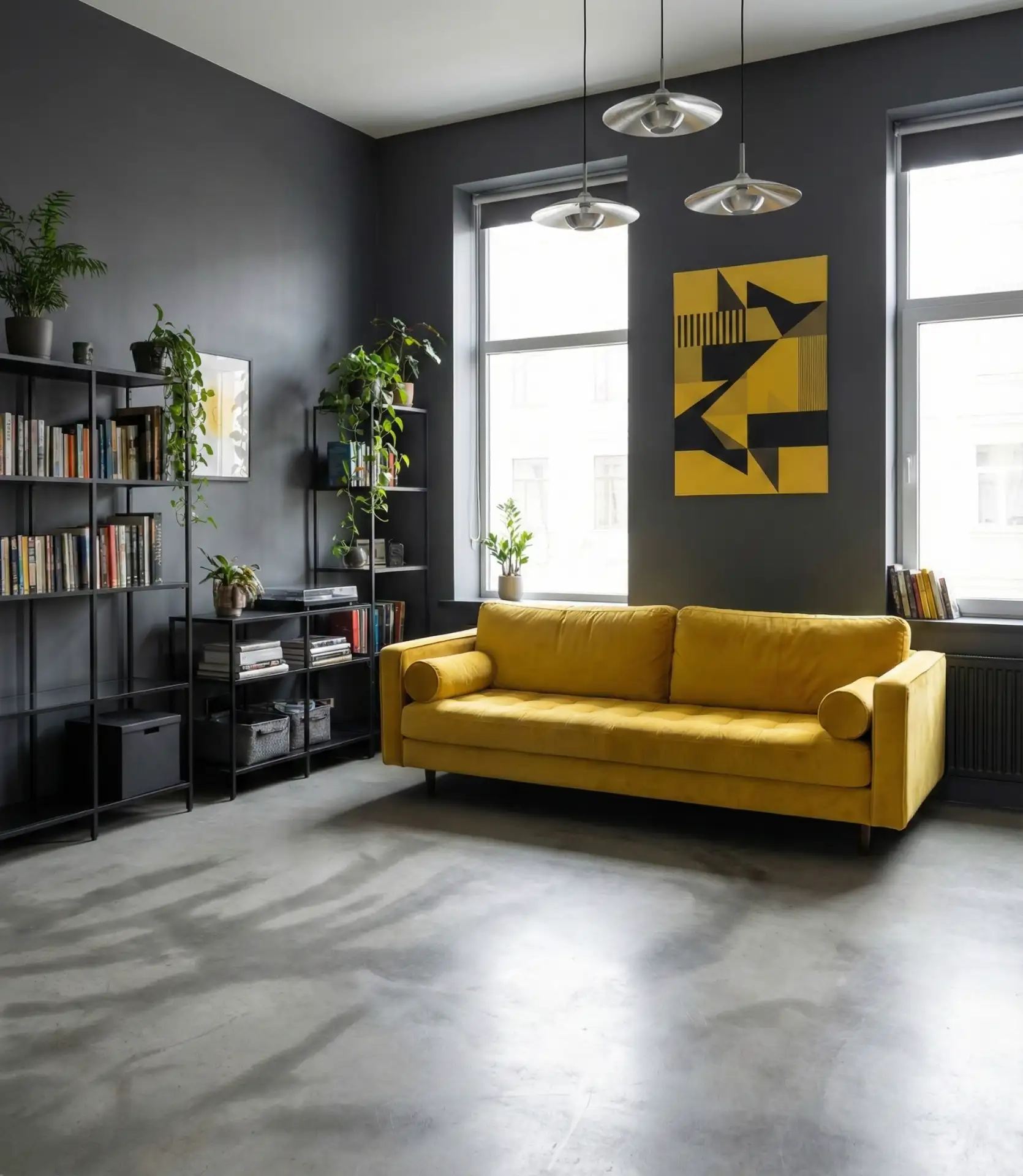
6. Bold Yellow and Black Graphic contrasts
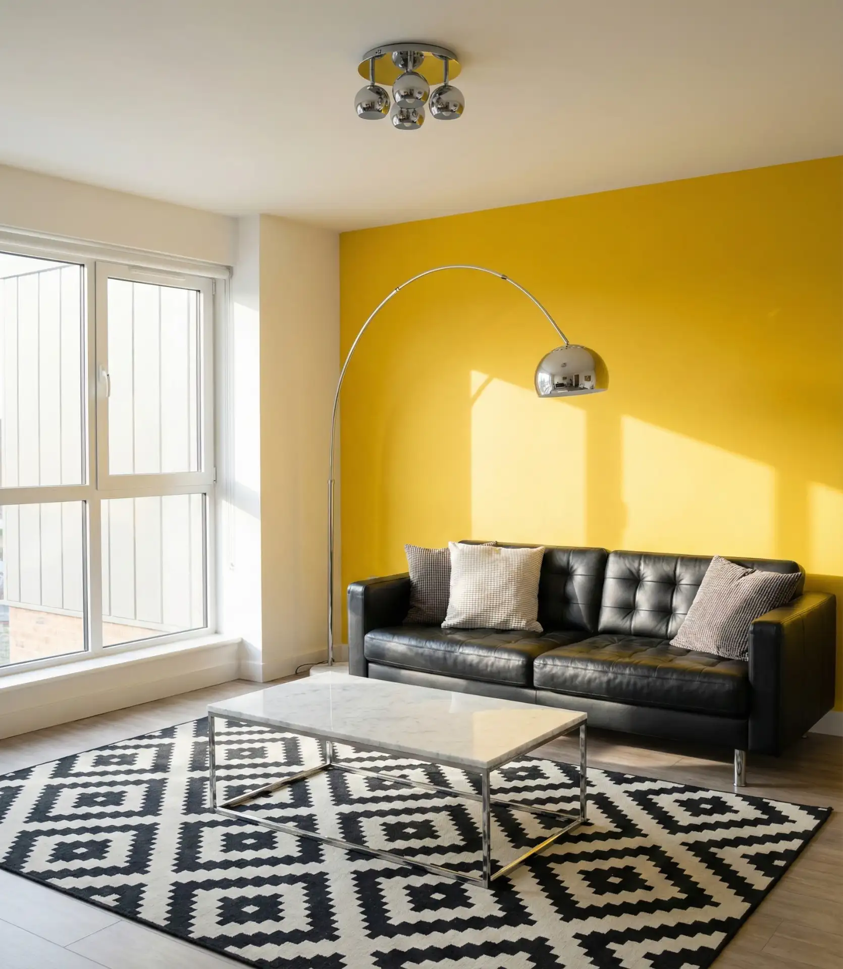
For the design-confident, pairing bright yellow with black and white creates striking graphic impact reminiscent of mid-century modern designs. Urban lofts and contemporary homes that celebrate bold choices particularly benefit from this high-contrast approach. The black grounds the yellow’s energy while adding sophistication and edge that prevents the space from feeling too cheerful or childlike. 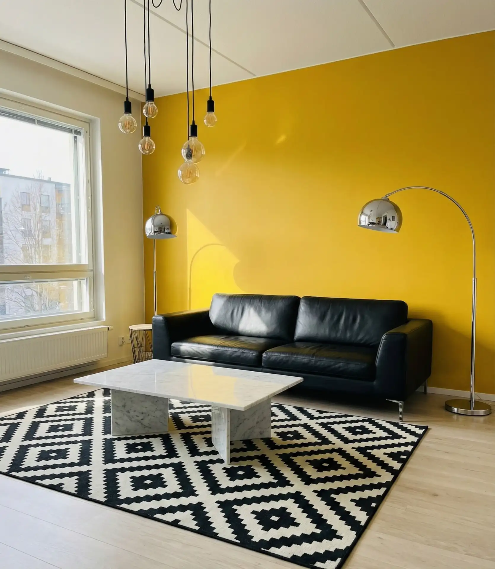
This color combination demands commitment and confidence, making it less suitable for those who prefer safe, neutral spaces. However, it photographs incredibly well and creates rooms with memorable personality. Expert designers suggest using the 60-30-10 rule: 60% neutral (white/grey walls), 30% black (furniture, frames), and 10% yellow (accents, art, one statement piece). This balance prevents the drama from tipping into overwhelming territory while maintaining the bold aesthetic that makes this color pairing so compelling.
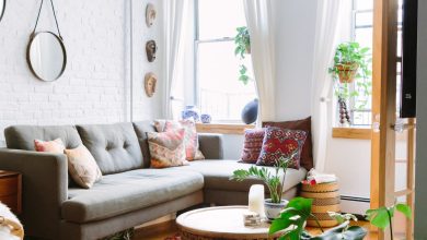
7. Soft Yellow and Green Natural Harmony

Soft yellow paired with various green and botanical elements creates an organic, nature-inspired living room that feels restorative and fresh. This combination has seen massive growth on Pinterest as people seek biophilic designs that connect indoor spaces with the natural world. The yellow recalls sunlight filtering through leaves, while greens ground the palette with earthy calm. 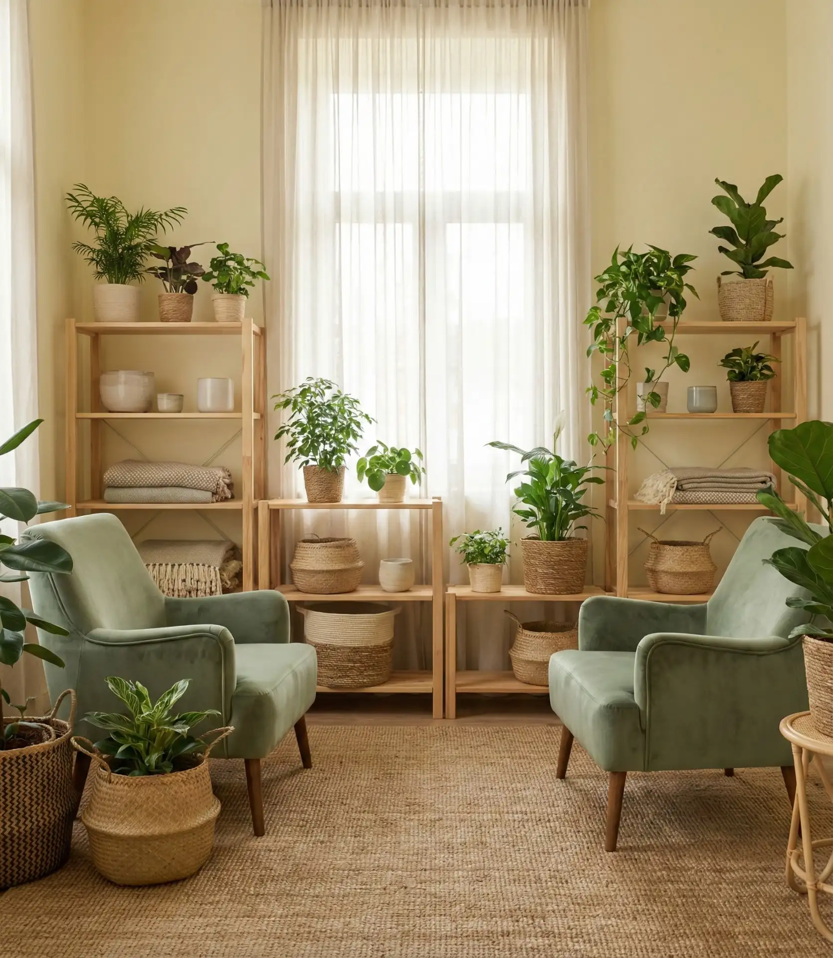
A colleague recently transformed her Denver bungalow using this palette, and the change was remarkable. She painted one wall a gentle yellow, added sage green curtains, and filled the space with plants—pothos, snake plants, and a dramatic monstera. The room went from feeling dark and closed-off to open and breathing. The beauty of this combination is its flexibility; you can lean heavily into the green with furniture or keep it mostly in living plants and artwork, adjusting the balance seasonally.
8. Pastel Yellow Nursery-to-Living-Room Evolution
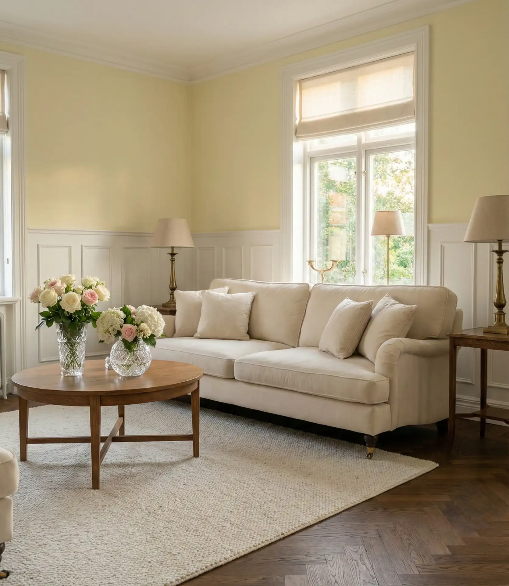
Pastel yellow offers a gentle, approachable entry into the yellow living room trend, and it’s no longer just for nurseries. This soft, sophisticated shade works beautifully in formal living rooms, particularly when paired with white trim and natural wood furniture. The barely-there quality of pastel yellow provides warmth without demanding attention, making it perfect for those who want subtle color influence. 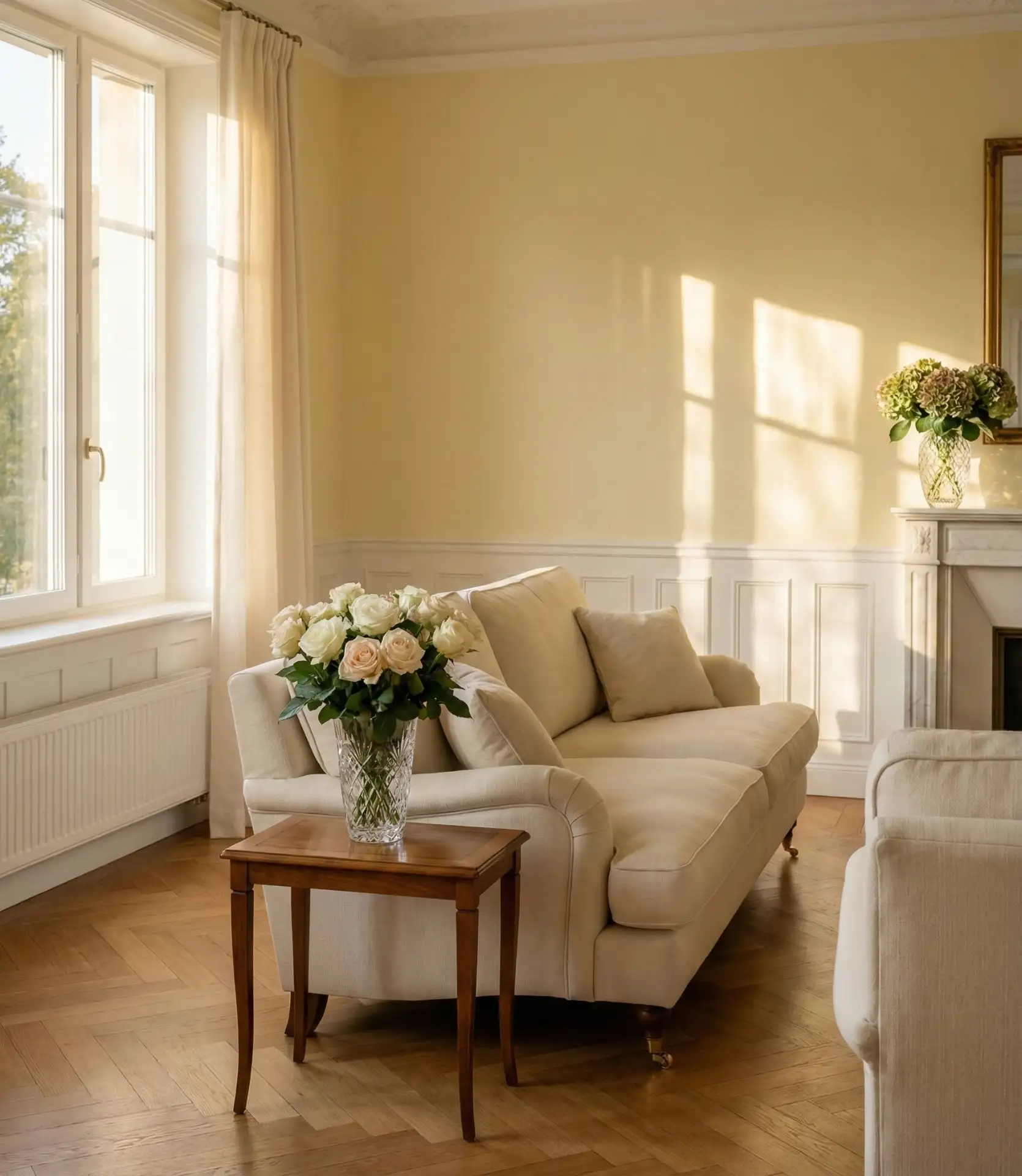
This shade works best in rooms with excellent natural light, particularly those facing east or south, where morning and midday sun enhance the color’s luminosity. Northern-facing rooms can handle pastel yellow, but you’ll want to add warm lighting to prevent the space from feeling too cool or washed out in the evening. Consider using warmer LED bulbs (2700K-3000K) to maintain the cozy ambiance after sunset. The softness makes pastel yellow incredibly forgiving—it rarely clashes with existing decor and transitions beautifully through seasonal styling changes.
9. Yellow and Blue Complementary Energy
The classic combination of yellow and blue harnesses complementary color theory to create vibrant, balanced living spaces that feel both energetic and harmonious. This pairing appears constantly in inspiration feeds because it works across design styles—from traditional to contemporary. Whether you choose royal blue for drama or powder blue for softness, the relationship between these colors creates instant visual interest. 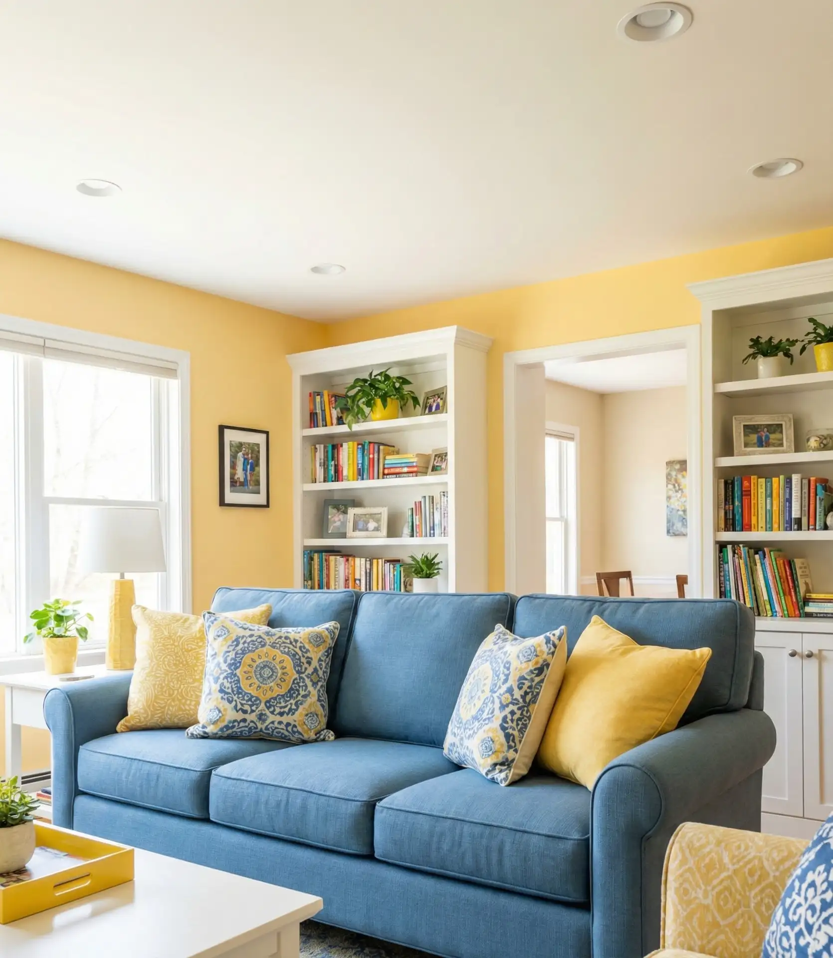
One common mistake is using equal amounts of both colors, which can feel chaotic or too primary-school bright. Instead, choose one color as your dominant shade (usually 60-70% of the room) and use the other as a strong accent (20-30%), with neutrals filling the remaining space. For example, if you have blue walls, bring in yellow through a statement chair, artwork, and accessories. This hierarchy prevents the space from feeling visually competitive and creates a more sophisticated result.

10. Warm, yellow, and red sunset-inspired drama
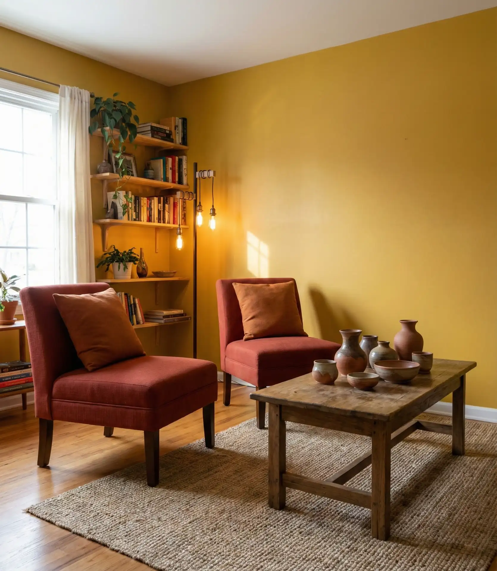
Combining golden yellow with red and orange tones creates a warm, enveloping atmosphere reminiscent of sunset skies. This bold color scheme works particularly well in Southwestern and Spanish Colonial homes, where warm earth tones feel architecturally appropriate. The combination radiates energy and passion, making it ideal for social spaces where you want to encourage conversation and connection. 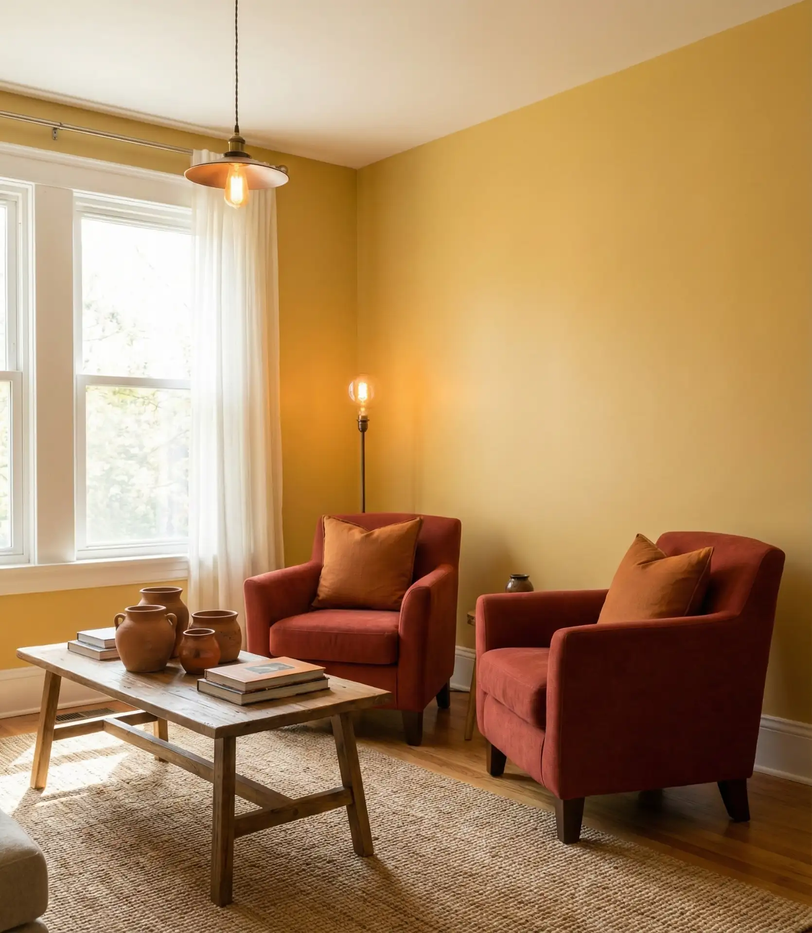
One of the most budget-friendly options to bring southwestern warm tones to these walls starts at about $40–60 per gallon, and the first step is to paint all the walls gold yellow. Then, to build the decor, shop secondhand and target the fall colors red and orange. Look for southwestern pottery, woven textiles, and ethnic rugs from Turkey and Morocco to complete the decor. It is a rich color combination that can be built at any budget level, as it doesn’t have to be designer.
11. Yellow Decor Accents for Commitment-Phobes
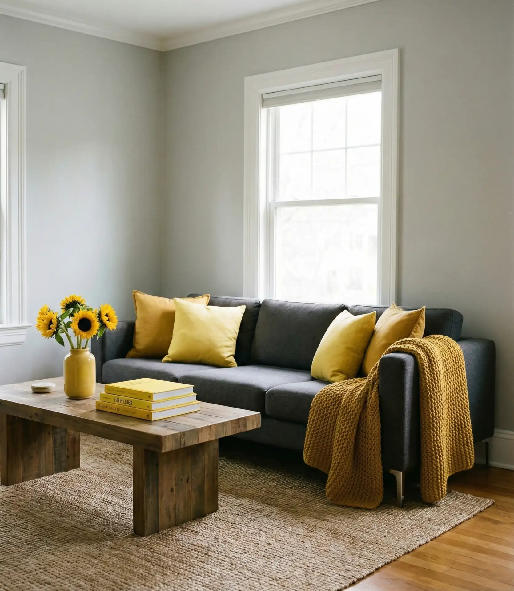
Not ready to paint the walls yellow? Strategically introduce the color with decor first, and aim for items that can easily be swapped out, like throw pillows, artwork, and other accessories. It is an excellent and safe choice to test for yellow tolerance, as it can be adjusted with the seasons to increase or decrease color intensity. Ideas to consider for decor would be a yellow vase, some prints of yellow flowers, mustard cushions, or a yellow lamp to brighten the space. 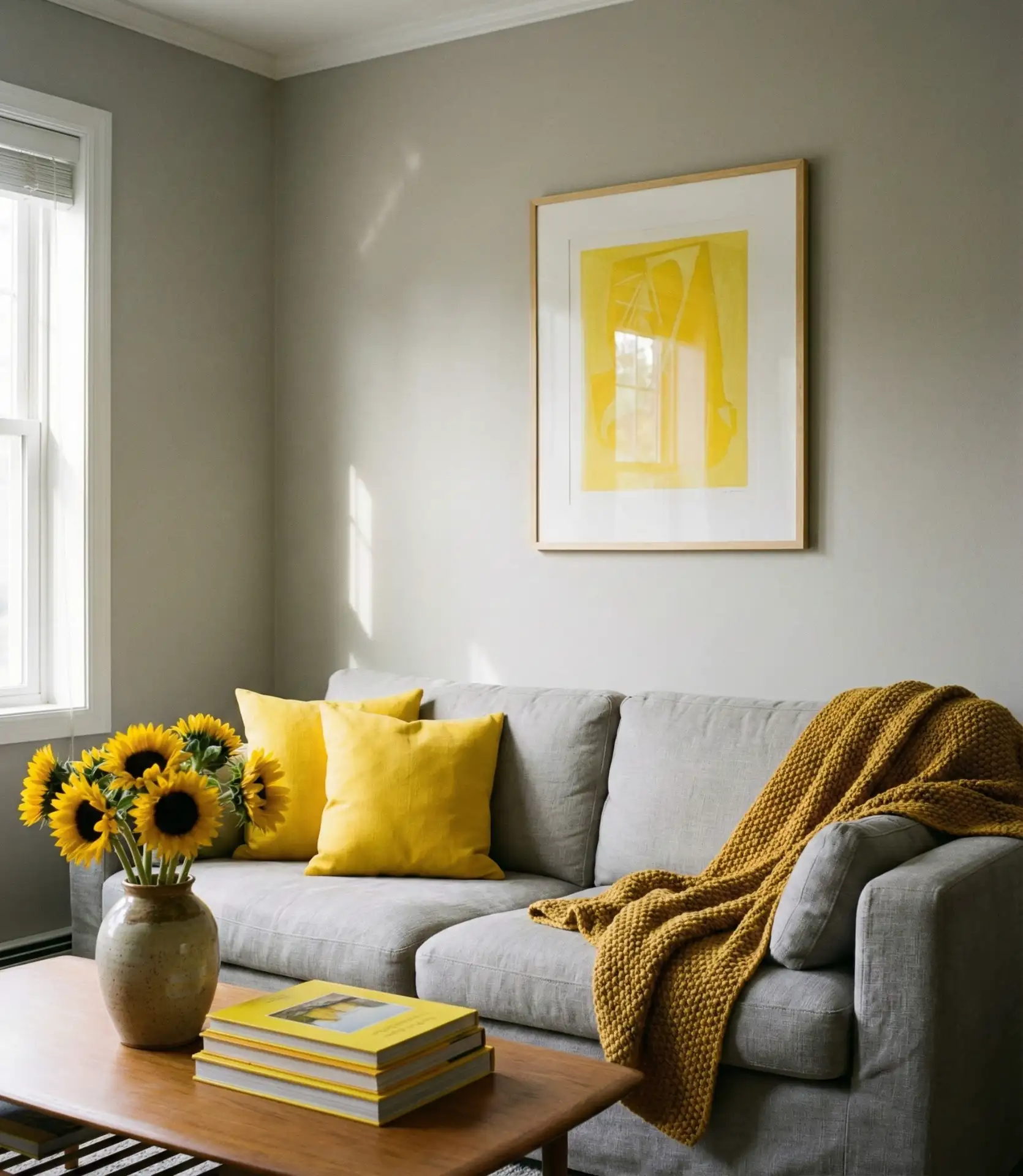
Real homeowners often follow a gradual color introduction process: they’ll buy one yellow throw pillow, live with it for a month, then add a second coordinating piece if it feels right. This slow layering prevents buyer’s remorse and allows you to discover which shade of yellow actually works in your specific lighting conditions. The beauty of the decor-only approach is its flexibility—swap out yellow for another color next season if you’re ready for change, with minimal investment or commitment required.
12. Yellow and Orange Warm Gradient Effect
Blending yellow with orange and peachy tones creates a warm gradient effect that’s both unexpected and inviting. This analogous color relationship feels naturally harmonious because the colors sit next to each other on the color wheel. The combination works beautifully in mid-century modern interiors and eclectic spaces where playful color mixing is encouraged. 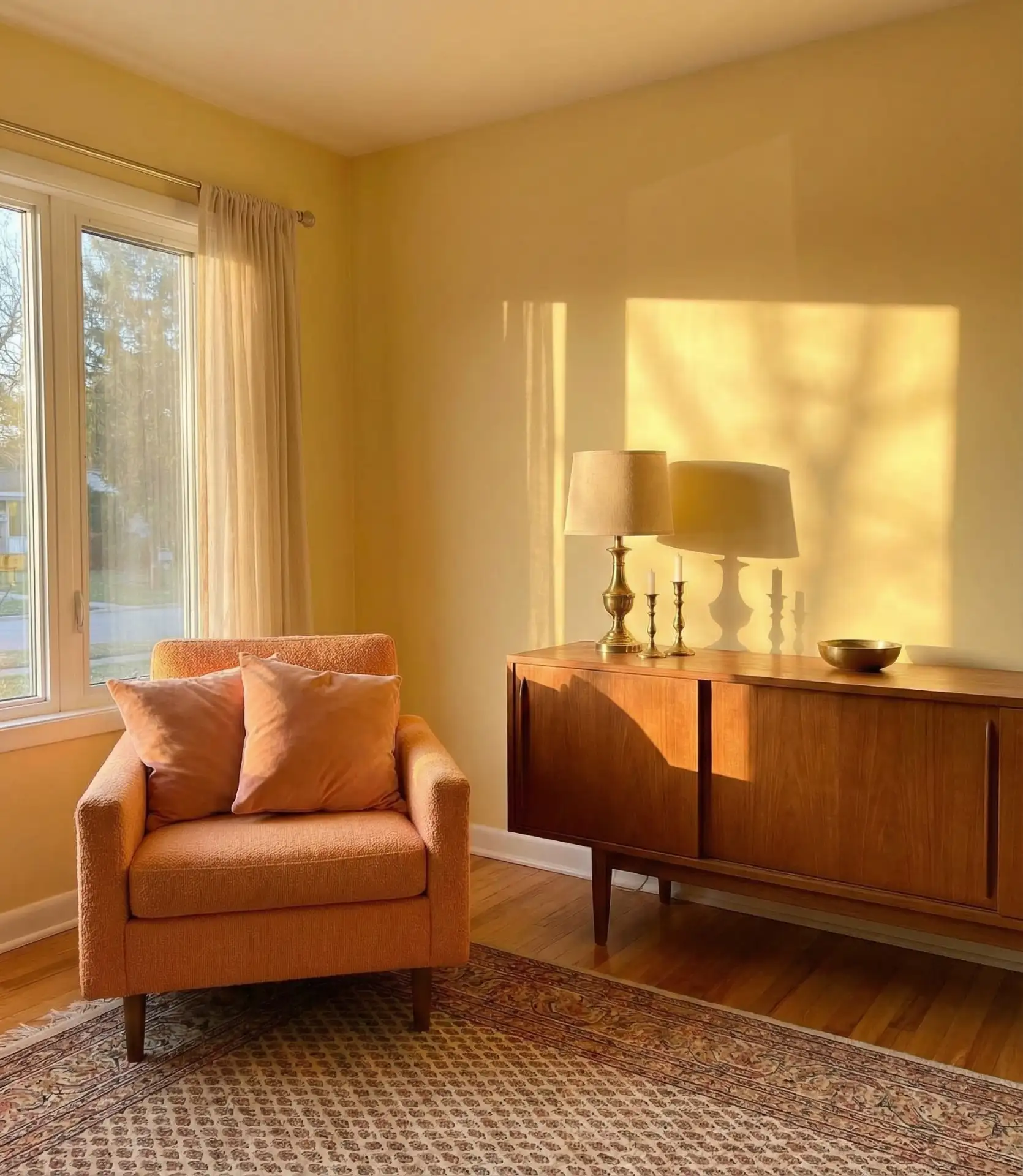
This palette works best in rooms with western exposure, where you can maximize the gorgeous evening light that makes these warm tones glow. California and Arizona homeowners particularly embrace this combination because it echoes their natural landscape—think desert sunsets and citrus groves. The gradient effect prevents any single color from dominating, creating instead a warm wash of color that feels cohesive and intentional rather than scattered or mismatched.
13. Blue-Green and Yellow Garden-Fresh Palette

The sophisticated combination of blue-green (like teal or turquoise) with buttery yellow creates a refreshing, garden-inspired aesthetic that feels both classic and current. Nature serves as the inspiration for this pairing, with yellow daffodils juxtaposed against blue-green foliage, creating an inherently pleasing aesthetic. The combination works across various design styles from traditional to contemporary. 
Such color pairings shine with traditional architectural-style homes like Colonials, Victorians, and Craftsmen, where the combination also reflects the historical color palette and is also modern. You can use the blue-green shade for your anchor color in bigger furniture pieces, and yellow is for arts, textiles, and paints. The key here is to make sure that you have the right shade of each color. It will be helpful to test paint samples in actual light conditions because blue-green colors can be very responsive and will change color from cool to warm based on how much light, natural or otherwise, the area is being lit from.
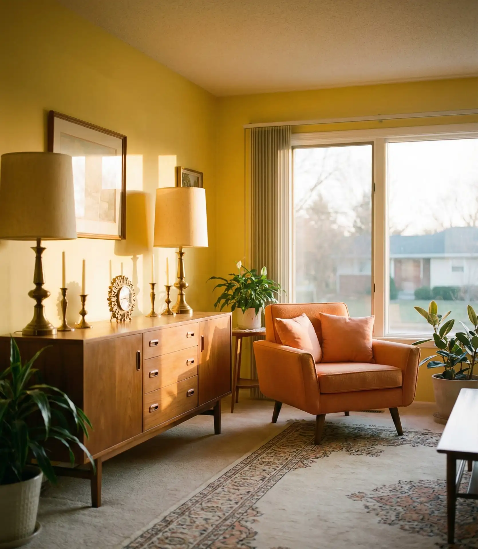
14. Monochromatic Yellow Layers and Textures
Using a monochromatic yellow palette, create a living room with shades from buttery yellow to deep yellow-brown, also known as the mustard color. Such a living room palette is very polished and inviting; it also gives a hot and cozy room feeling, and your guests will also like it. The monochromatic color approach creates the illusion of the room never being bright during the day due to the sun’s illumination.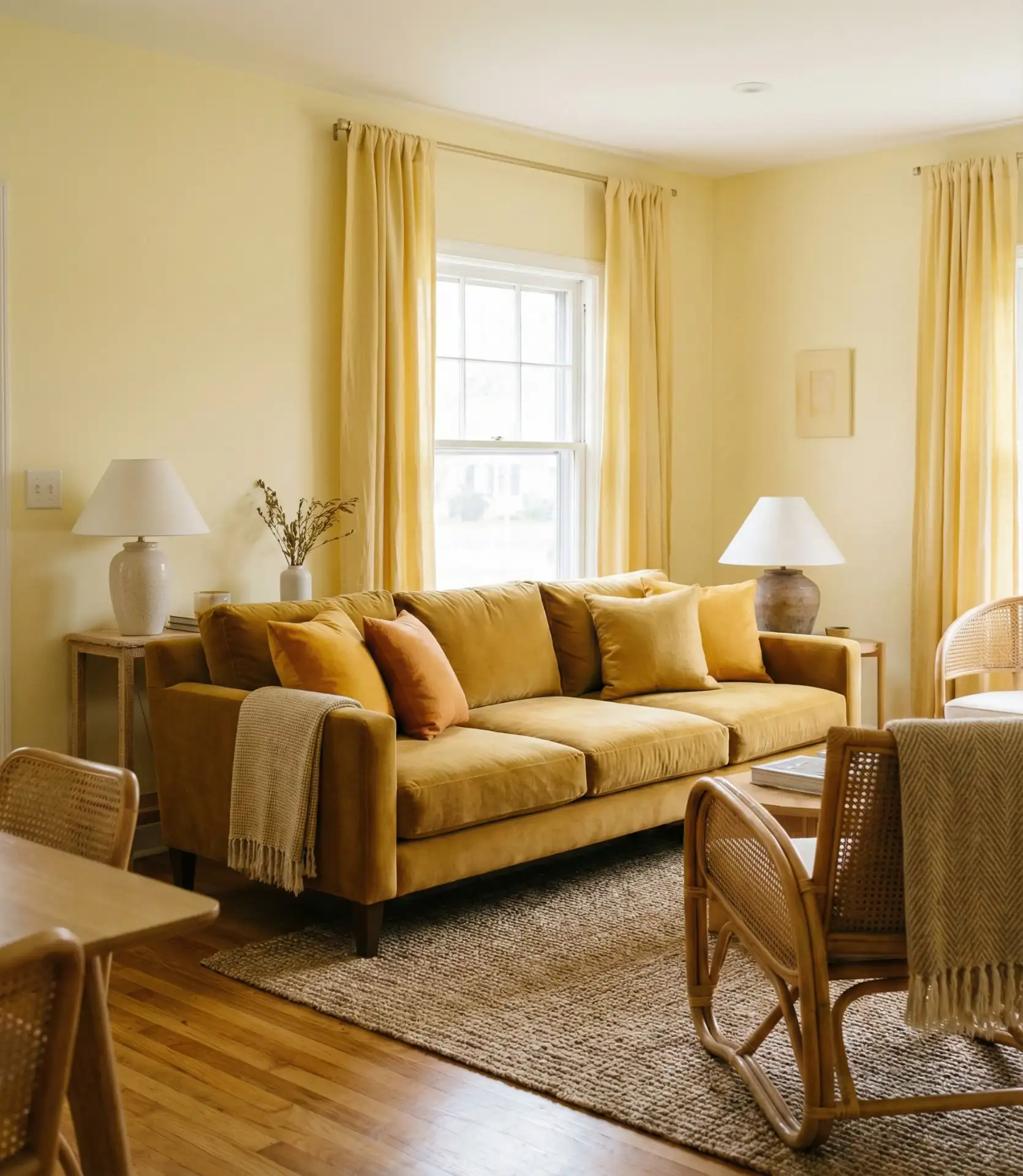
One of my designer friends in Nashville recently finished a living room for a client who was very skeptical but ended up being very pleased with how the monochromatic yellow living room turned out.
The walls were a dull yellow; they flowed into the mustard linen couch and through the soft golden velvet pillows to the soft yellow mohair throw. The walls were smooth, while the pillows and the throw were fluffy, which made the seamless flow of texture more noticeable. The updated client has now stated that it is presently their favorite and the happiest room of their house. It is now proven that a monochrome color does not have to be boring. The paint finish you pick out is important. A soft matte contemporary and warm finish is a soft warm finish, while a satin eggshell finish is more luminescent. Yellow is a more treacherous color to paint over rough surfaces with. Monochrome color walls mean even more painting rough, uneven yellow surfaces with the color. Usually apple or lemon yellow works best, but you can even go with paints that have the tip of a yellow color.
15. Yellow Paint Techniques and Finishes
The paint finish you choose for yellow walls dramatically affects the final look—matte creates soft, contemporary warmth, while satin or eggshell adds subtle luminosity. Yellow shows brushstrokes and imperfections more than neutral colors, so wall preparation matters. Consider techniques like color blocking with two yellows, an ombré fade, or even a textured limewash finish for added dimension. 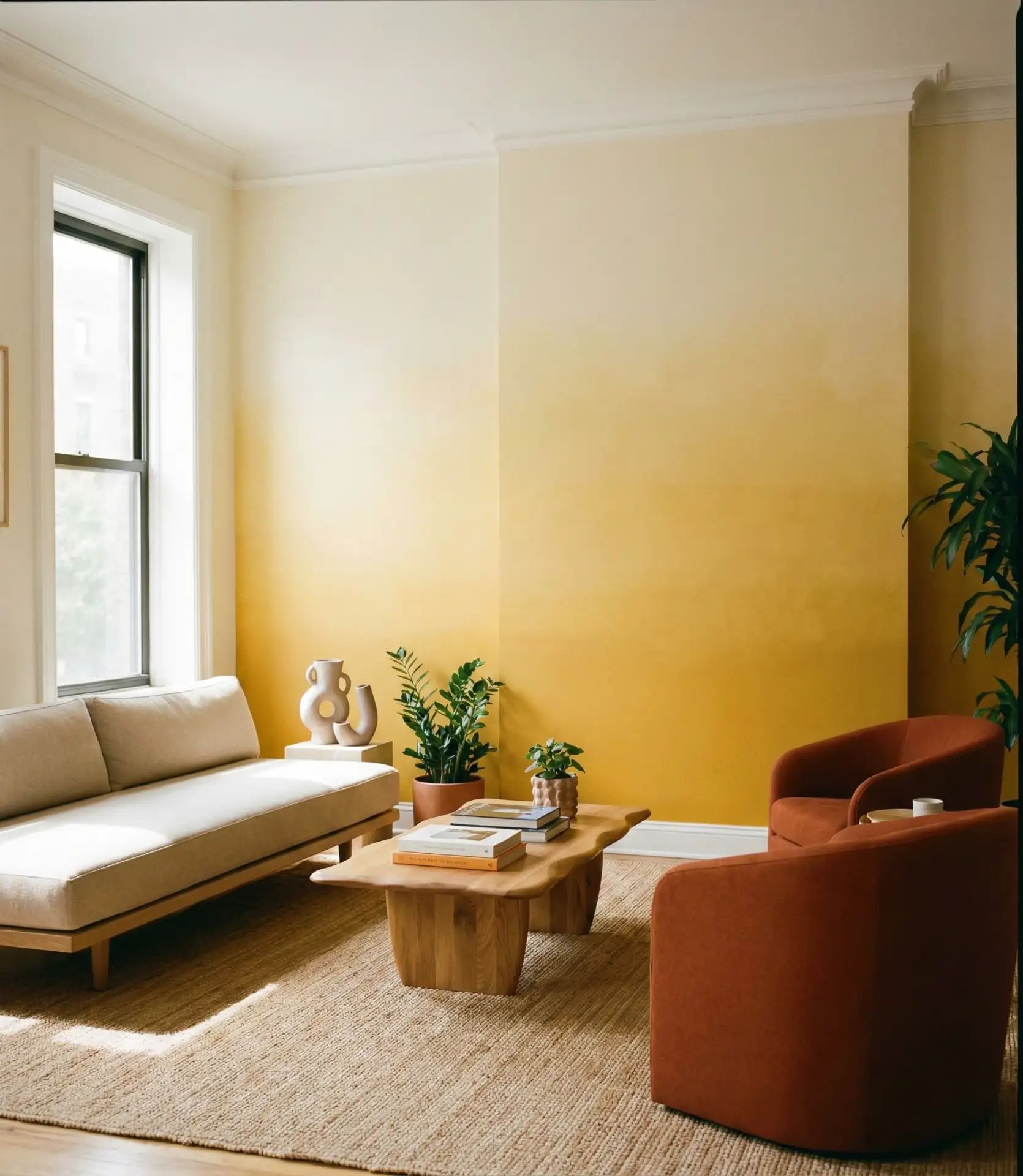
Practical insight: Always paint a large sample board (at least 2’x2′) and observe it in your room for several days before committing. Yellow shifts dramatically throughout the day—a shade that looks perfect in morning light might appear sickly green by evening. Test it on different walls if possible, as the direction of natural light significantly impacts how yellow reads. Most paint professionals recommend eggshell or satin finishes for living room walls, as they’re durable enough to clean while maintaining a sophisticated appearance.
16. Yellow and Gray Contemporary Sophistication
Combining warm yellow and cool gray with charcoal creates an even, modern look, and for good reason, this palette has become a Pinterest favorite. The gray tones neutralize the space, creating a sophisticated atmosphere. The yellow is warm and inviting, energizing the room and counteracting a corporate or cold atmosphere. This look works very well in modern apartments and open-concept spaces. This match is great when you are trying to achieve a warm look without the traditional country-style coziness. 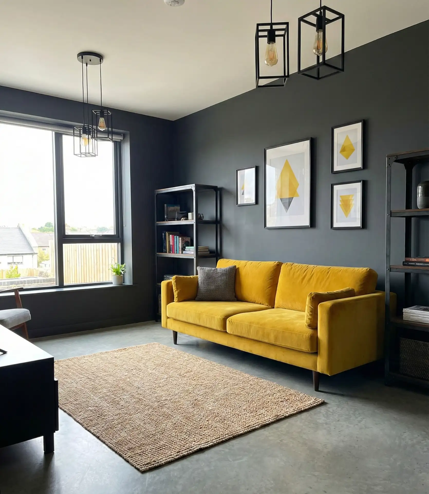
This pairing works best in urban settings and newer construction where clean lines and modern finishes are already present. The cool grey makes yellow feel less country-cottage and more design-forward. Budget considerations: grey paint is typically the same price as any quality interior paint ($40-70/gallon), but investing in one high-impact yellow piece—like that statement sofa—creates more impact than spreading your budget across multiple small yellow accessories. Quality grey textiles (linen, wool, and performance fabrics) typically range from mid- to high-price points but offer longevity that justifies the investment.
17. Vintage Yellow and Pink Retro Revival: The cheerful pairing of soft yellow with pink and coral tones channels mid-century optimism while feeling fresh for today’s designs.
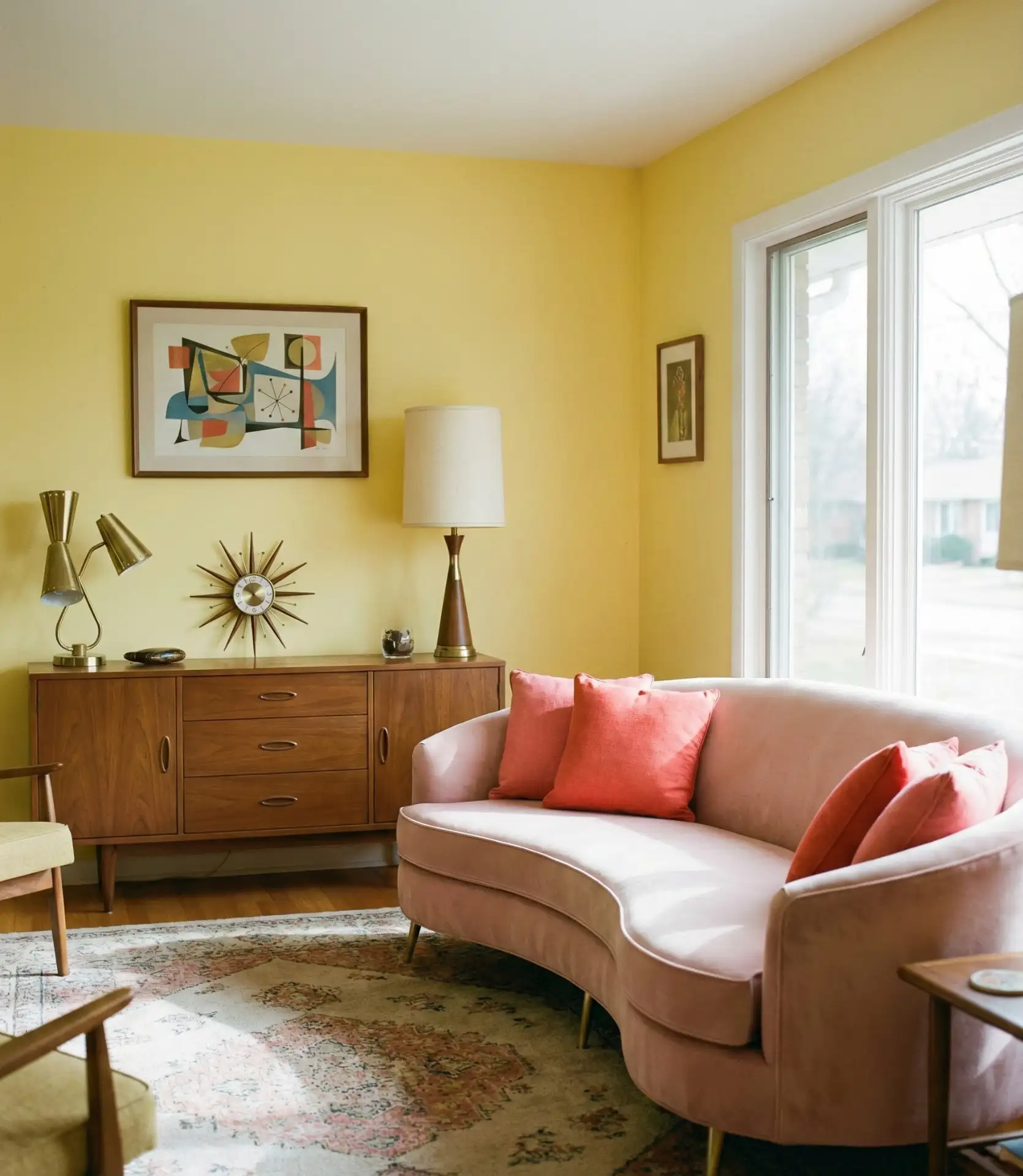
The cheerful pairing of soft yellow with pink and coral tones channels mid-century optimism while feeling fresh for today’s designs. This combination has exploded on Pinterest as millennials and Gen Z embrace nostalgic color palettes with contemporary twists. The warmth of both colors creates an enveloping, friendly atmosphere perfect for social spaces.
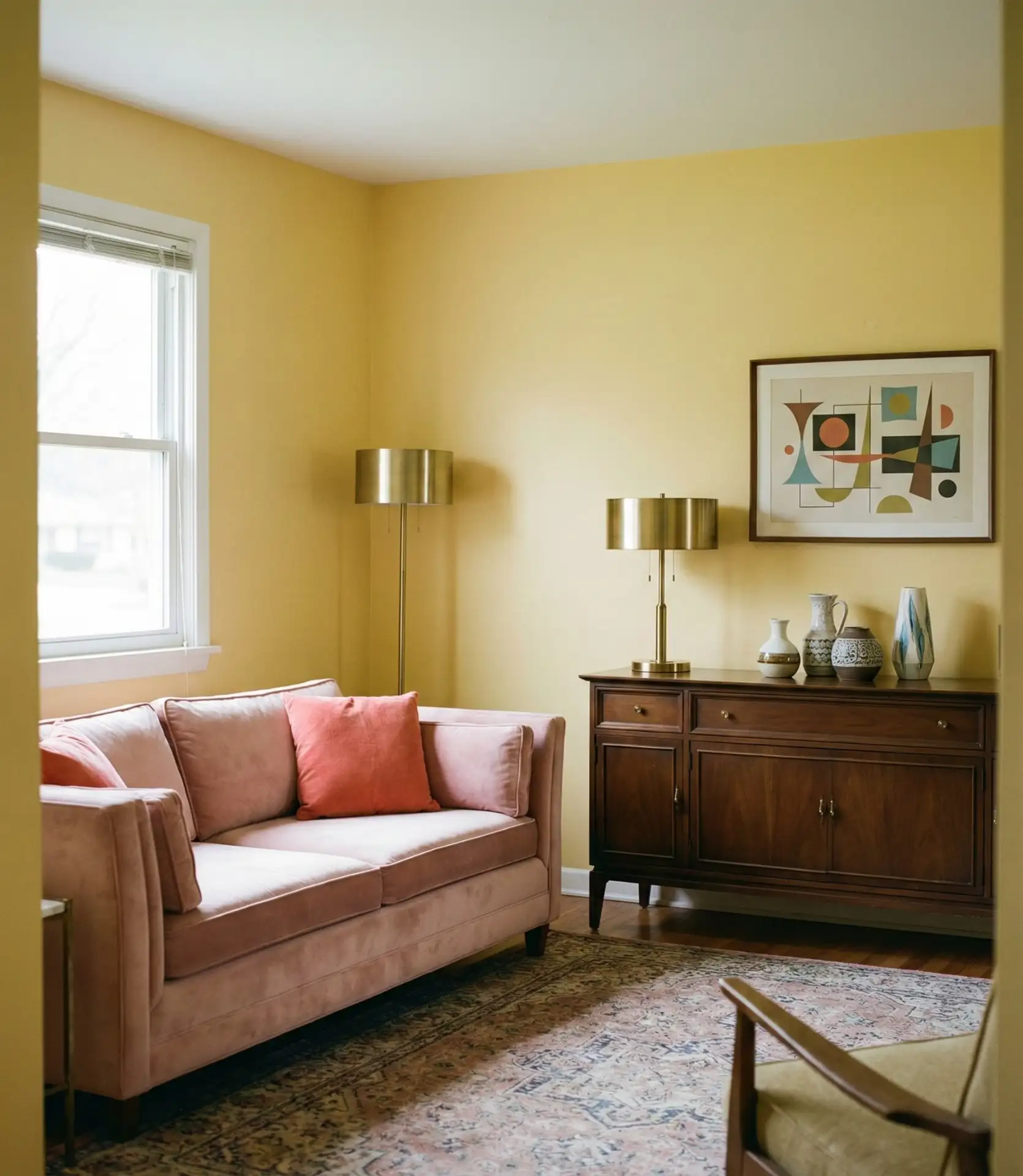
Ideal applications: This palette works well in vintage-style bungalows, mid-century ranches, and updated vintage apartments that already have architecture from retro periods. Ultra-contemporary styles with harsh lines, however, work less well, as that can feel out of place. The trick is balancing the softness—too much pink or yellow can feel cartoonish, so the palette should be anchored with some natural wood, brass, and a darker neutral like grey or cream for a rug.
18. Yellow Statement Furniture Pieces

This yellow furniture focal point lets you keep walls neutral while still leaning into the trend. Common examples are yellow accent chairs, sofas, ottomans, and even yellow bookcases. This strategy is nice because it allows you to easily swap pillows and accessories to change the mood of the room while the yellow piece remains as the focal point. 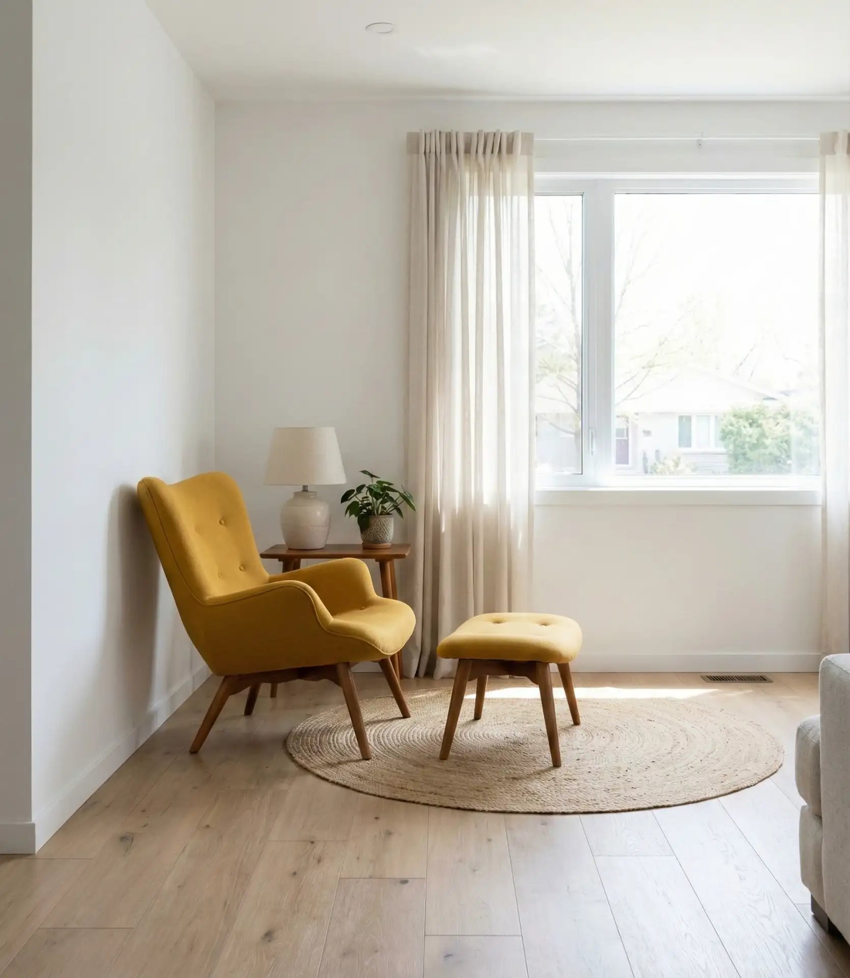
Common issues include selecting a yellow furniture piece that is either oversized for the room or in a yellow tone that does not match the existing undertones. Bring fabric swatches home, and observe them with the room’s lighting for 48 hours before making the purchase.
Keep your wall colors in mind; if they have a cooler tone, yellow and other warm-toned fabrics will complement them perfectly. If your walls have warm beige in them, you can contrast a cooler lemon yellow upholstery, and it will do wonders. With cheaper upholstery like accent chairs around $600 and sofas $1,800+, it will make a lasting impact.

19. Yellow Living Room Ideas for Small Spaces

Yellow can potentially create the visual illusion of a bright and open space. Painting yellow on the walls that receive the most sunlight will enhance the brightness of the room without creating a claustrophobic feeling. If you are wondering, yellow pastel or other light yellow shades can make a room feel more open and airy.
Real homeowner behavior: People in studio apartments and small urban rentals often hesitate to use color, fearing it will shrink their space. The opposite is true with yellow—it reflects light and creates warmth that makes small rooms feel welcoming rather than cramped. The trick is keeping the shade relatively light (nothing darker than mustard) and pairing it with space-maximizing strategies like mirrors, multi-functional furniture, and vertical storage. Even a small yellow accent wall behind a sofa can transform a cramped living area into a cozy retreat.
20. Yellow and Royal Blue Classic Contrast
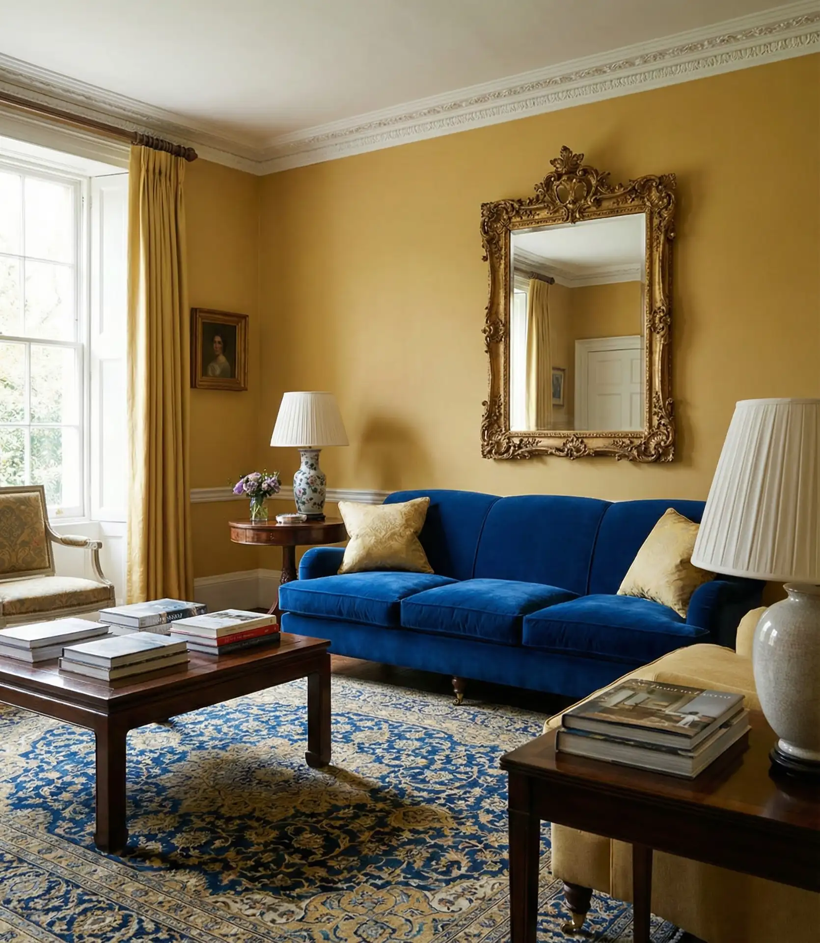
The regal combination of golden yellow with royal blue creates instant drama and sophistication worthy of historical European interiors. This high-impact pairing works beautifully in formal living rooms, libraries, and spaces where you want to make a memorable impression. The depth of royal blue balances yellow’s brightness, creating equilibrium between warm and cool tones. 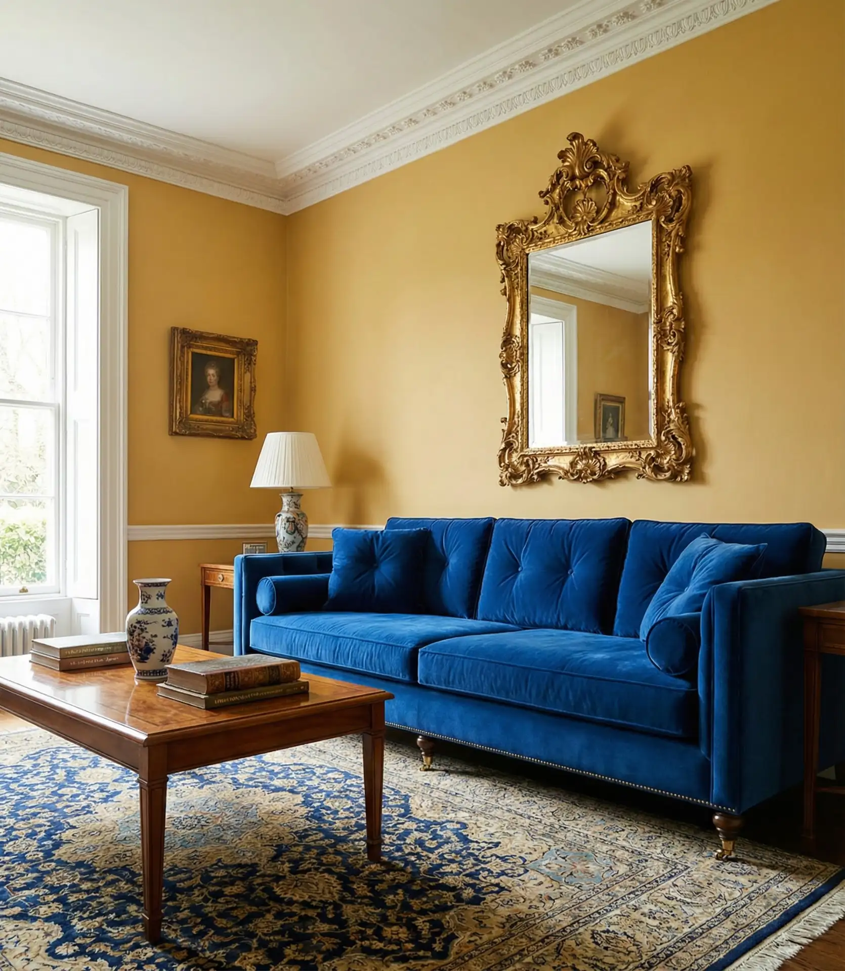
Expert-style commentary suggests using this palette in homes with traditional or transitional architecture where the formal color combination feels appropriate. Modern minimalist spaces can also incorporate this palette, but it’s important to keep furnishings simple to allow the color relationship to shine. Consider the 70-20-10 rule: 70% neutral (creams, whites), 20% royal blue (sofa, curtains), and 10% yellow (accent wall, pillows, art). This prevents the space from feeling like a flag or too theme-driven while maintaining the powerful visual impact.
21. Yellow Decor Ideas for Seasonal Flexibility
Rotating yellow decor ideas seasonally keeps your living room feeling fresh throughout the year. Spring welcomes pale lemon yellows with floral patterns, summer embraces bright sunny yellows with natural textures, fall brings in mustard and gold tones with rich fabrics, while winter pairs warm yellows with cozy textiles. This approach lets you enjoy yellow year-round without visual fatigue. 
Practical insight: Create a rotation system with storage bins for off-season yellow decor. Keep your base room neutral—grey, beige, or white walls and major furniture—then swap yellow accessories seasonally. Spring: pale yellow cotton pillows and fresh flowers. Summer: sunny yellow outdoor-inspired textiles. Fall: mustard velvet and brass accents. Winter: golden yellow knits and warm lighting. This strategy costs less than constantly redecorating and prevents yellow fatigue by giving the color regular breaks, making you excited to welcome it back each season.
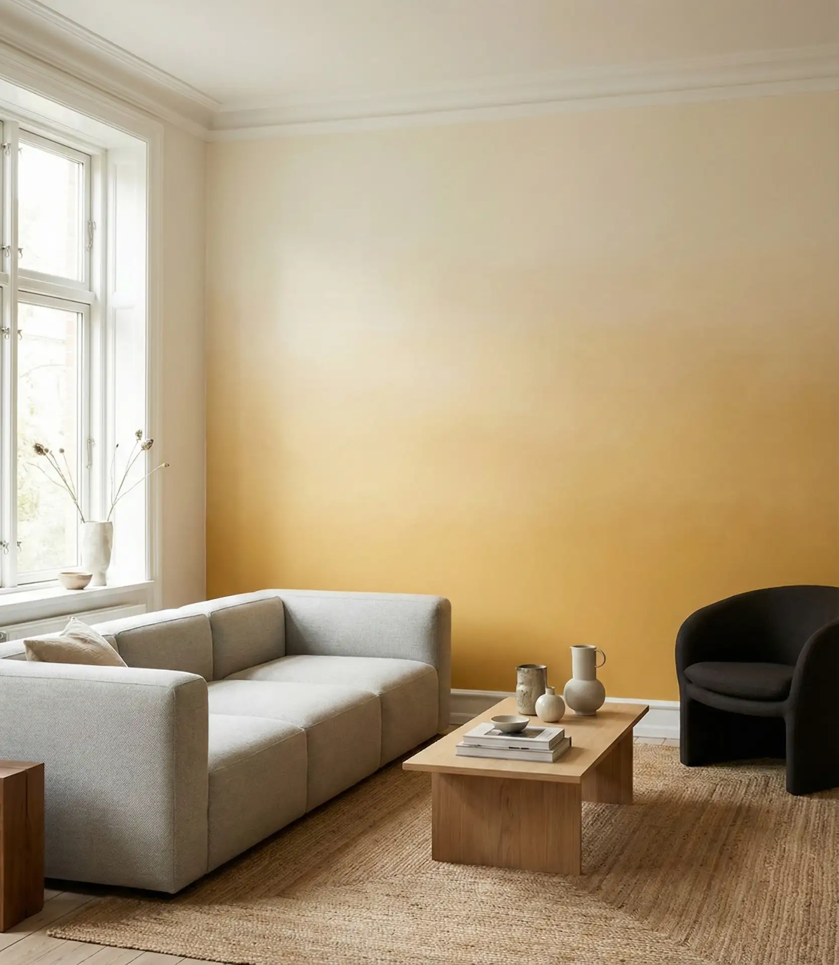
22. Yellow Accent Wall Color Blocking

Strategic color blocking with a single yellow accent wall creates instant architectural interest without the commitment of painting an entire room. This technique works particularly well in open-concept spaces where you want to define the living area visually. The yellow wall attracts attention and establishes a natural focal point for arranging furniture and artwork. 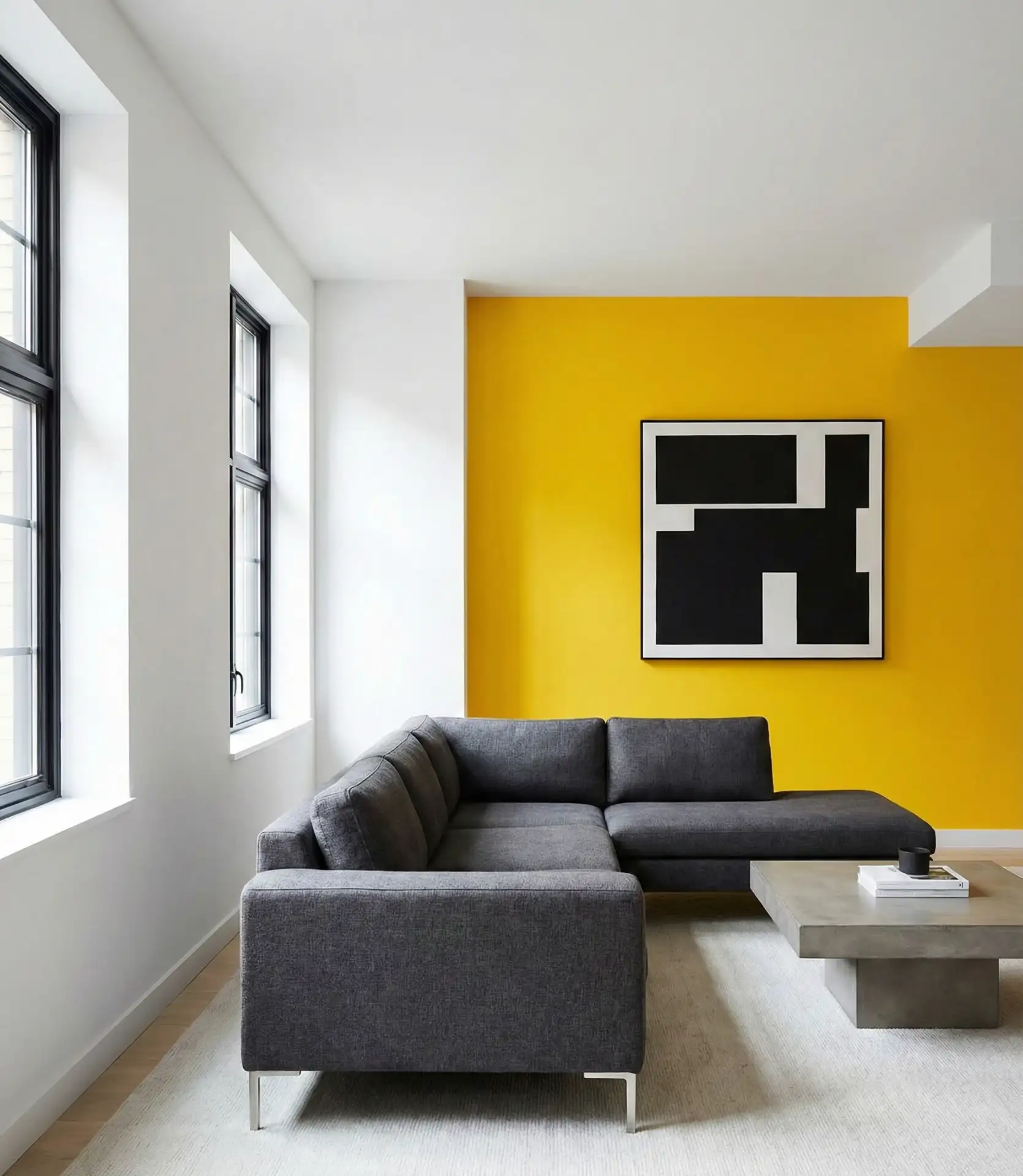
Recommended Use: Accent walls look best on the wall that is directly in front of you as you walk into the room and the wall right behind your most-used seating. Rectangular rooms can feel very off proportionally if you have a large wall. Painting the shorter wall yellow can help balance the room. If you have large windows, try to avoid painting walls yellow, as you will lose the contrast in color when the curtains are drawn. Instead, look for a wall that is a solid color and will be able to showcase the color you choose throughout different times of the day.
23. Mixing Yellow Patterns and Prints

Layering different yellow patterns on top of each other most perfectly achieves visual richness and personality in your yellow living room. The most important thing is to create different representations of scales together, such as large yellow floral prints along with small geometrical prints and a medium stripe. Furthermore, try to keep the yellow family with the same tone for all the different patterns. If all of the yellows are warm golds or cool lemons, you will have more cohesion in the design. 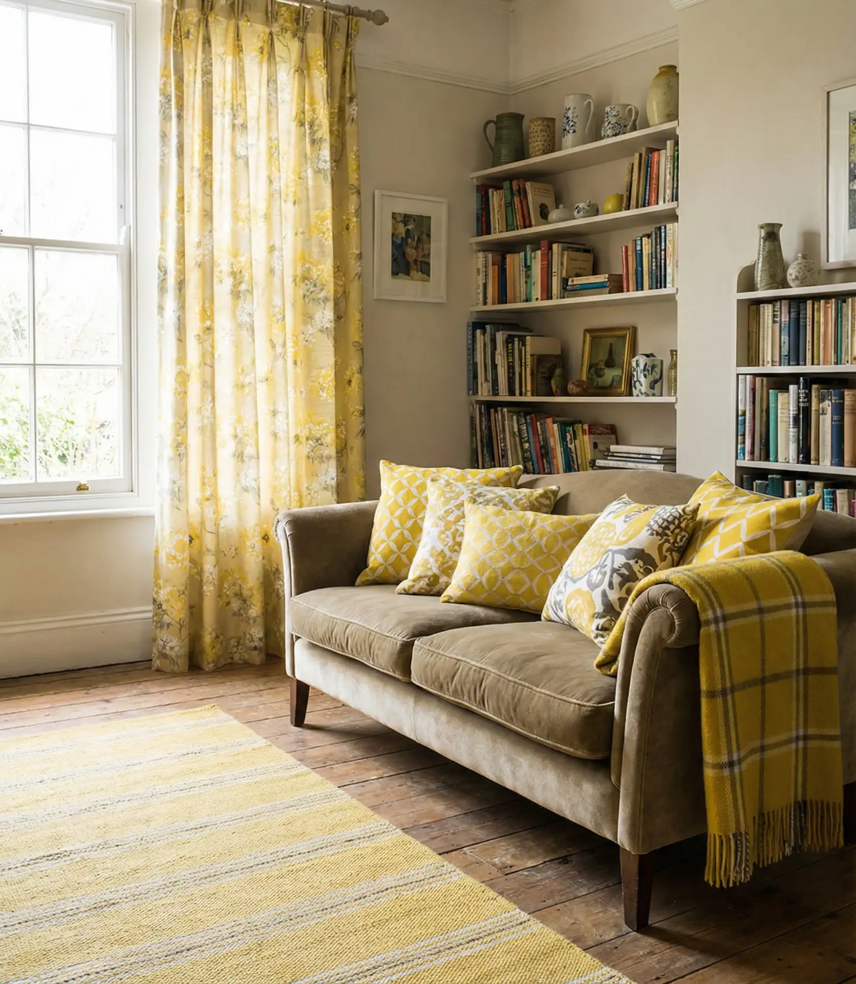
The most common mistake in designing a yellow living room is excessively matching patterns of the same design. Such designs can create a showroom theme when we have a more collected, over-time design in mind. Instead, it is better to have more tone variations in your yellow family. Mix in different patterns of the same color with a botanical pattern. A design with a more organic and rectangular shape can create a unique theme. It is also important to have at least one large, solid yellow piece to rest the eyes and ground the design.
24. Yellow Living Room Lighting Considerations
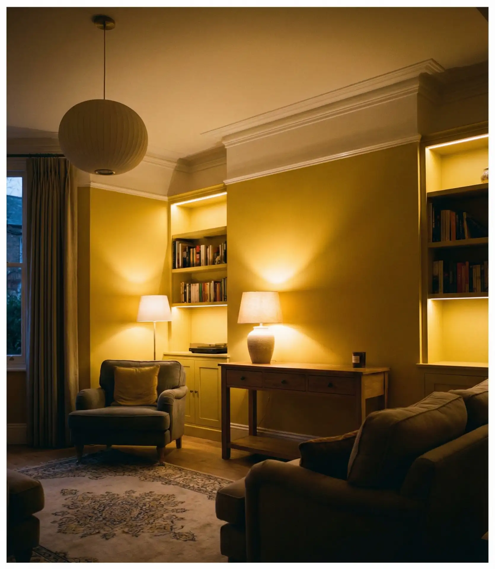
Lighting dramatically affects how yellow appears in your living room—warm bulbs enhance golden yellows, while cool bulbs can make them look greenish or sickly. Layer different light sources at varying heights: overhead fixtures, table lamps, floor lamps, and even LED strips behind furniture. This creates dimensional lighting that shows yellow’s full potential throughout the day. 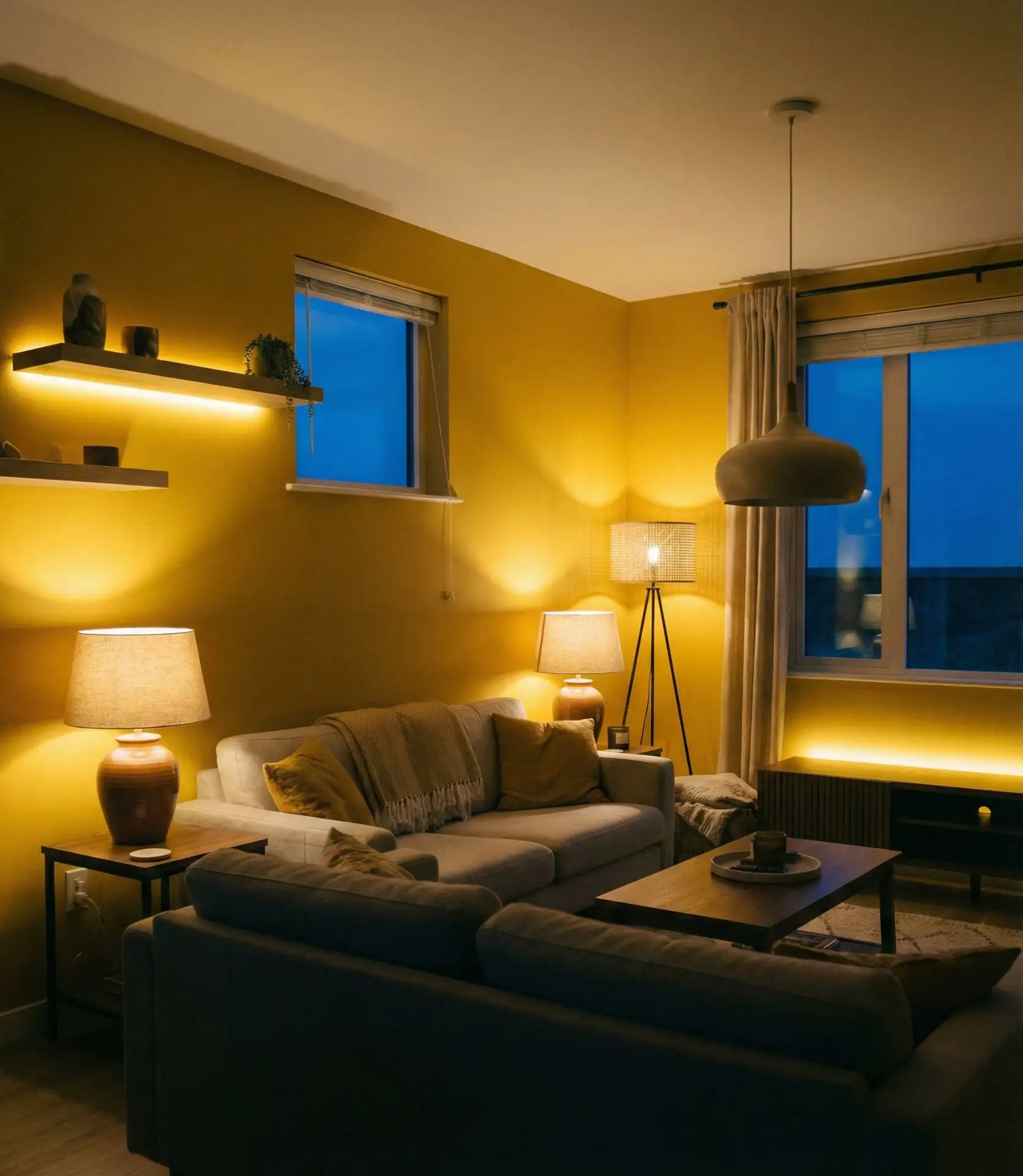
Expert designers emphasize that yellow rooms need warm white bulbs (2700K-3000K) rather than cool daylight bulbs (5000K+). The warm tones enhance yellow’s inherent warmth and prevent the afternoon/evening shift, where yellow can appear chartreuse or dingy under improper lighting. Install dimmer switches to adjust brightness throughout the day—you’ll want different intensities for bright afternoon gatherings versus cozy evening relaxation. This control lets you modify how intensely the yellow reads, giving you flexibility without repainting.
25. Yellow Living Room 2026 Trend Predictions

2026 is predicted to see the yellow living rooms of 2025 integrate more texture and a warmer shade of yellow. These rooms will incorporate various innovative sustainable materials, such as naturally dyed antique textiles and sustainably produced furniture. Tech-integrated smart lighting that softens yellow tones will also become more mainstream. Pinterest data suggests a developing earth color palette centered around a deep saffron yellow, the heavily layered maximalist design aesthetic, and yellow sustainable furniture. 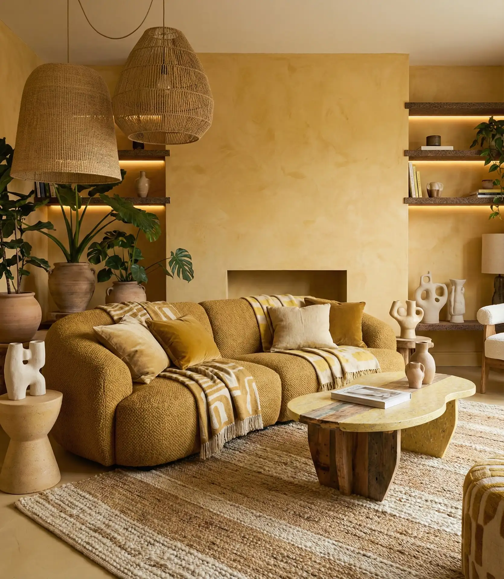
2025 is predicted to highlight yellow living rooms of 2025 with deep plum, forest green, and warm terracotta. These combinations will feel more elevated and refined than the warmer yellow tones and deep green combinations of the previous years. Bolder yellow choices are becoming more mainstream. Tech integrated to shift yellow’s undertones. The yellow living room trend is not dying; it is growing into more personalized and unique emerging design styles.
What a wonderful journey starting with a few yellow accents or painting walls entirely yellow with no wrong approach. What is most important is how these combinations and shades make you feel. We’d like to know what yellow accents inspire you or what yellow spaces you have. Comment any ideas you have or share your experience with yellow spaces!