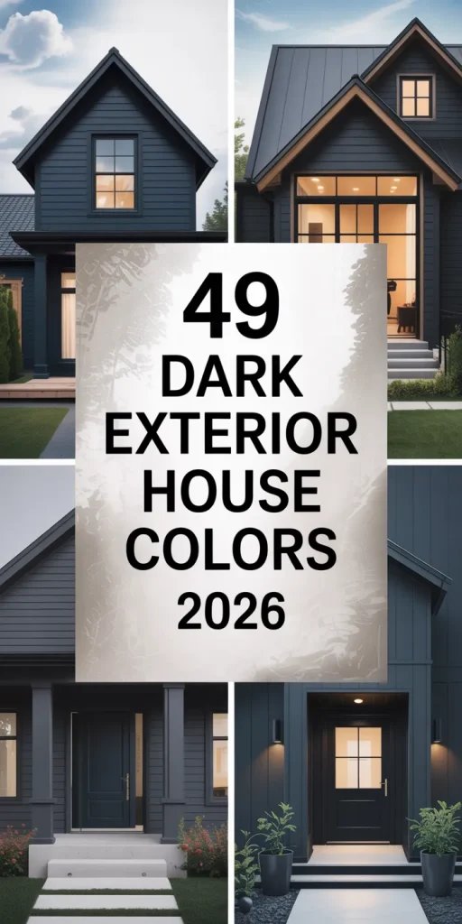
Dark exterior house colors have been quietly taking over Pinterest boards, neighborhood inspiration feeds, and new-build conversations across the country—and in 2026, they’re not slowing down one bit. Whether you’re refreshing a decades-old ranch or designing a brand-new build, deep, moody tones are giving American homes a dramatic, grounded presence that brighter palettes simply can’t match. From charcoal and forest green to slate navy and warm near-black, these shades photograph beautifully, age gracefully, and make a statement that feels both timeless and completely of the moment. In this guide, you’ll find inspiring ideas to help you visualize exactly what a dark exterior could look like on your home—whatever the style, size, or budget.
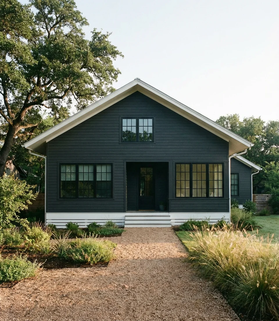
1. Charcoal Gray on a Modern Farmhouse
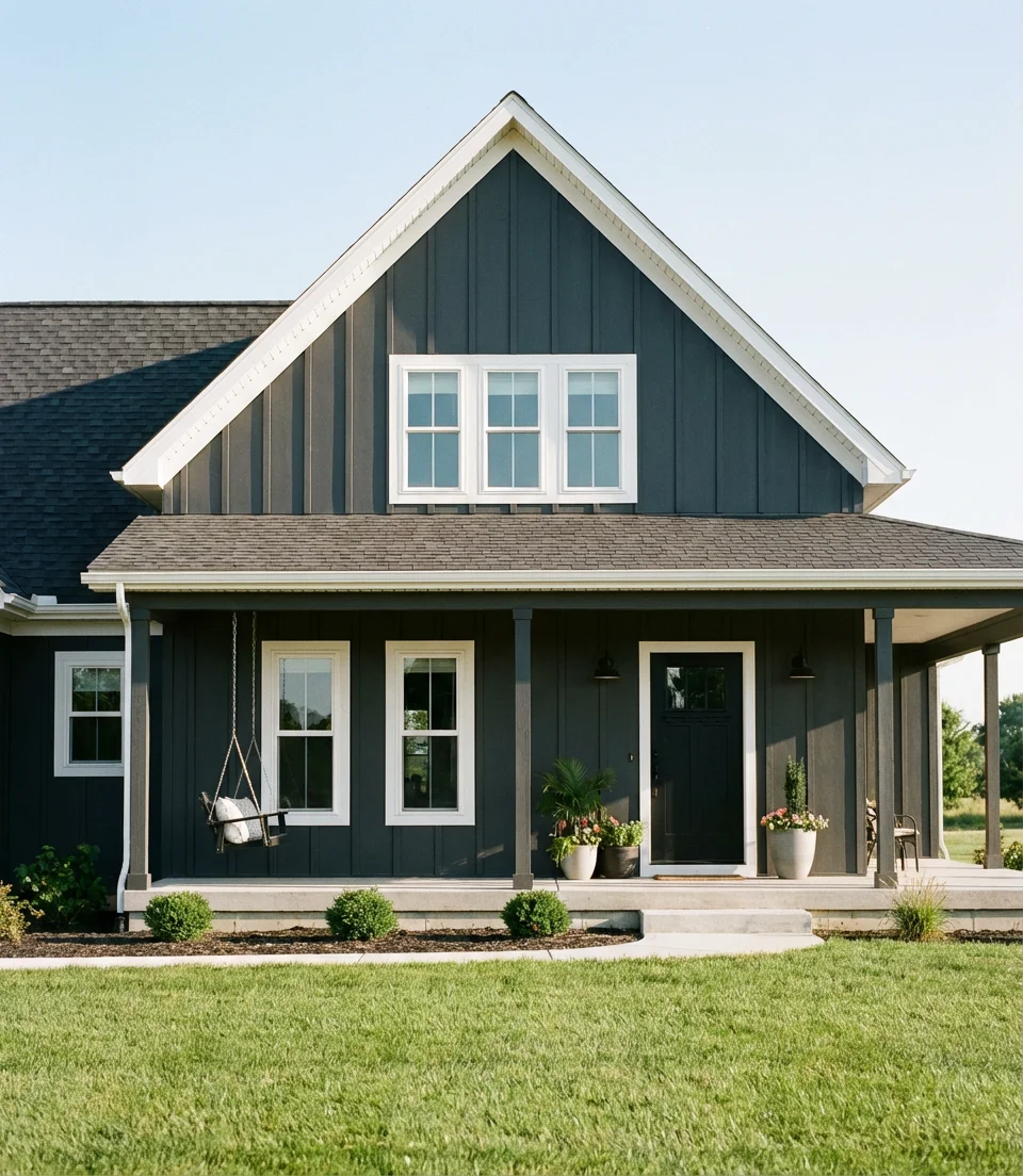
There’s something quietly powerful about a modern farmhouse wrapped in deep charcoal gray. The color bridges the gap between industrial edge and rural warmth—a combination that’s dominated Pinterest saves for the past two years and shows no signs of fading. Charcoal works especially well against crisp white trim, turning what could feel heavy into something that reads as sharp, intentional, and deeply livable. It’s the kind of exterior that looks expensive without necessarily costing that much.
If you’re working with a traditional gabled roofline or a board-and-batten facade, charcoal is one of those rare colors that enhances the architecture rather than fighting it. Designers often recommend pairing it with black hardware and matte fixtures for a pulled-together look. One thing to know going in: charcoal absorbs heat, so in climates like the Southwest or Southeast, factor in reflective roofing or added attic ventilation to keep energy costs from creeping up.
2. Deep Forest Green with Natural Wood Accents
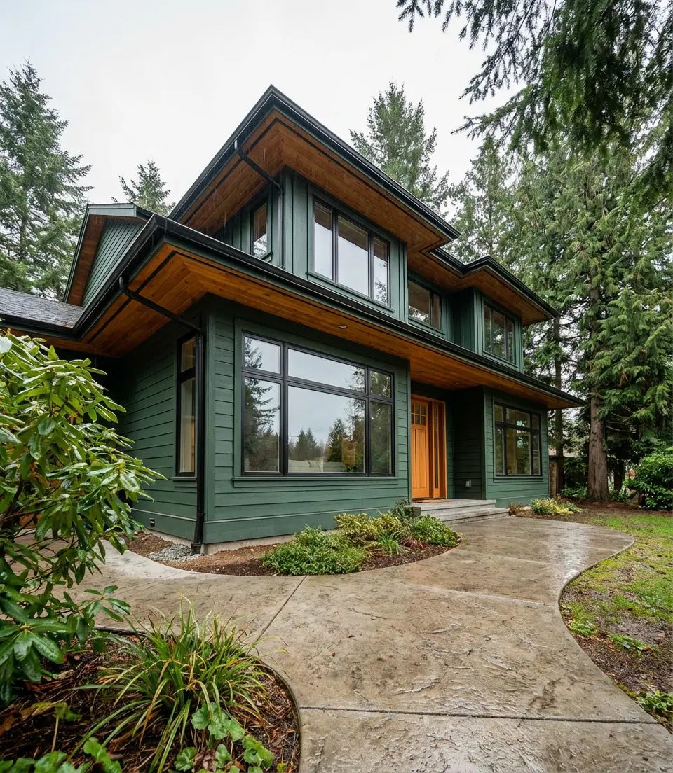
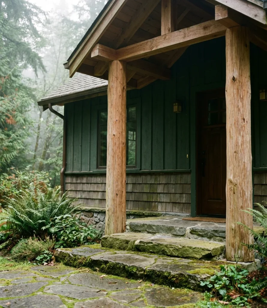
Deep forest green has become the defining dark exterior color of the mid-2020s, and paired with natural wood accents—think cedar soffits, stained garage doors, or wood-clad columns—it creates an exterior that feels rooted in the landscape rather than dropped on top of it. This combination draws directly from Pacific Northwest architectural traditions, where homes are designed to complement their surroundings rather than contrast them. The earthy warmth of exposed wood softens the intensity of the green in a way that feels organic and never overdone.
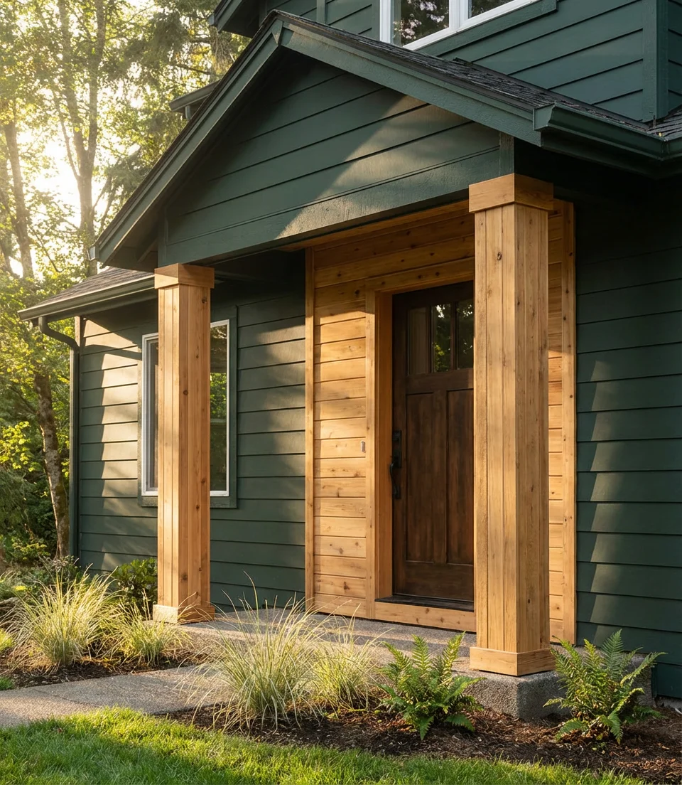
For homeowners who love the look but worry about maintenance, the good news is that dark greens tend to hide dirt and weathering remarkably well between paint cycles. A semi-gloss or satin finish on the main body paired with a matte natural wood stain keeps the textural contrast alive without one finish overpowering the other. This palette works beautifully on suburban lots with mature trees—the green seems to pull the foliage into the design itself.
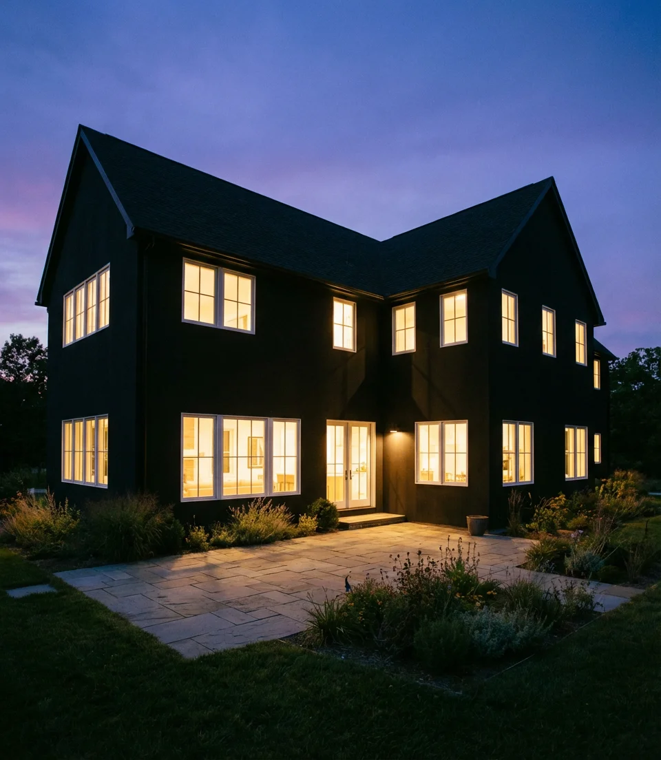
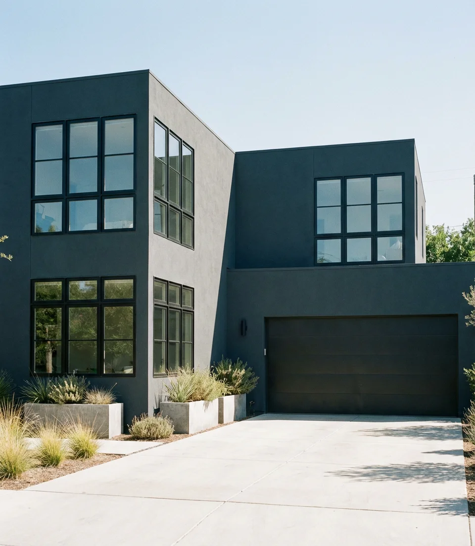
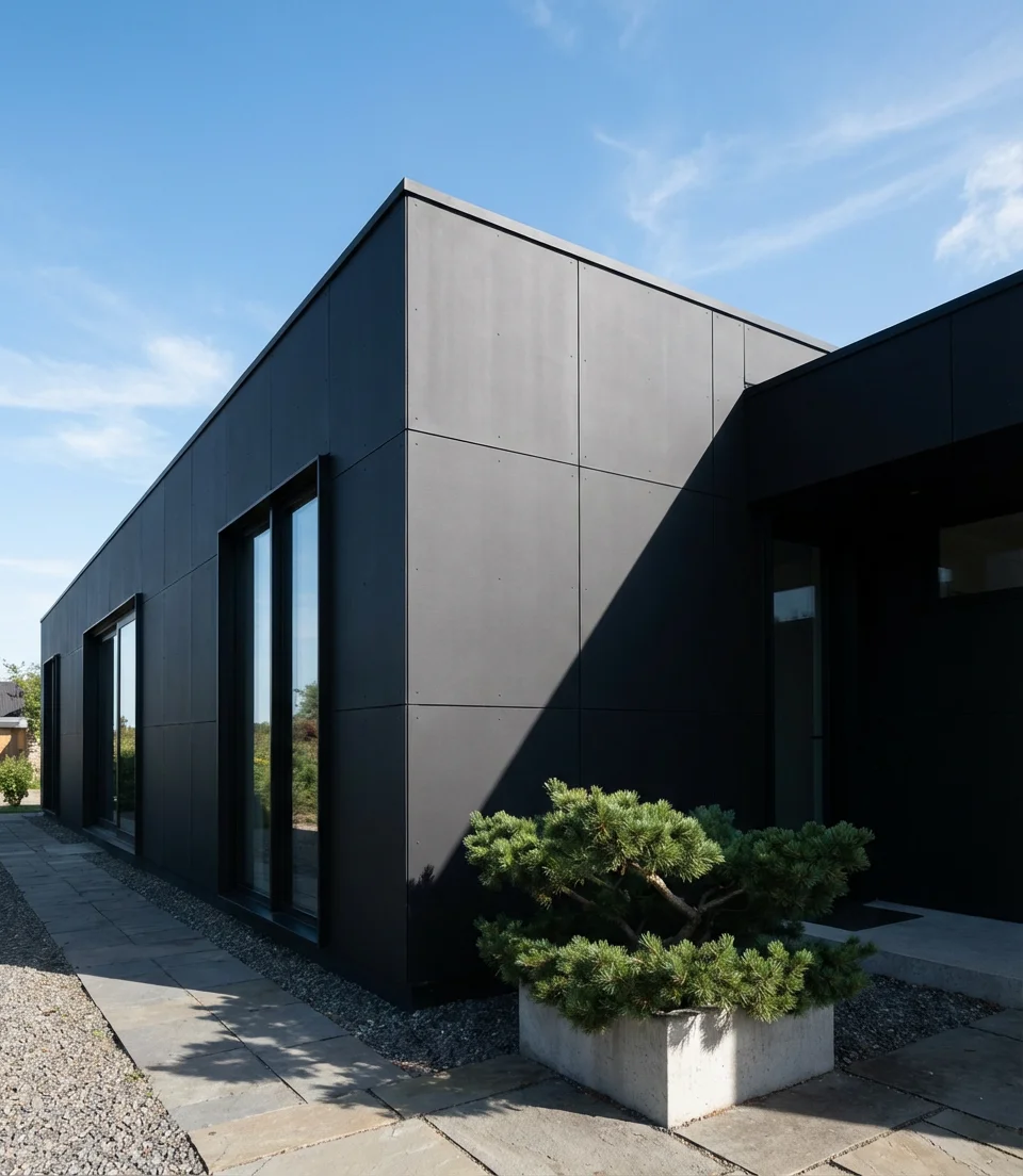
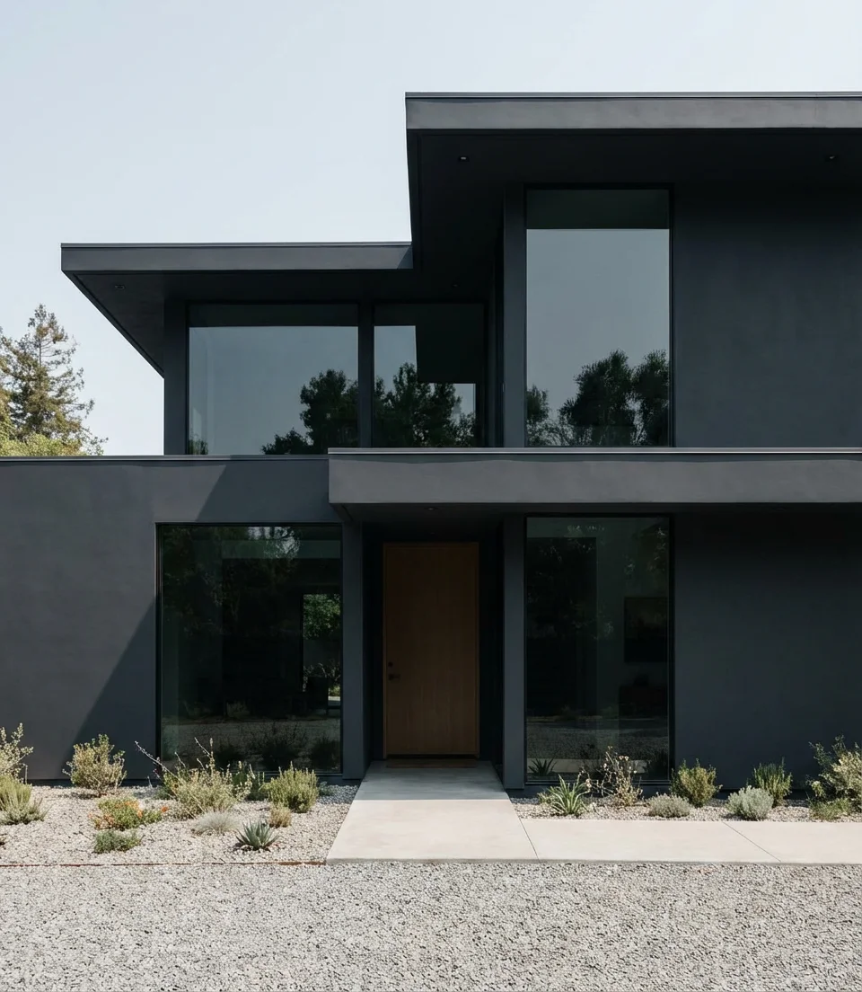
3. Near-Black with Black Windows and Bold Minimalism
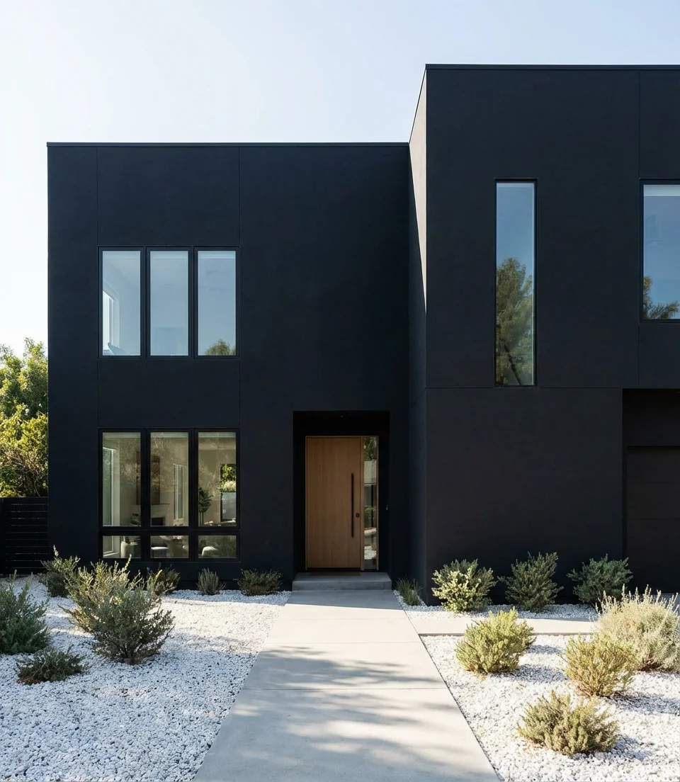
The full-dark approach—near-black body paired with black windows—is the boldest move in exterior design right now, and it’s a look that suits the minimalist aesthetic perfectly. Eliminating contrast by adopting a tone-on-tone approach elevates the architecture, showcasing clean lines, sharp angles, and deliberate proportions. This approach is most popular on new construction and modern remodels, where the geometry of the home is clean enough to support that level of visual intensity.
A common mistake homeowners make with the all-dark look is forgetting landscaping contrast. Without some relief—a concrete pathway, a band of white gravel, or a cluster of ornamental grasses—a fully black exterior can flatten visually, especially in overcast light. The homes you see on Pinterest that nail this look almost always have thoughtful hardscaping providing that ground-level contrast. Consider planning the outdoor space in conjunction with the paint selection, rather than afterwards.
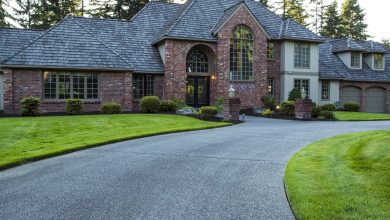
4. Sherwin-Williams Iron Ore on Board and Batten
Sherwin-Williams Iron Ore (SW 7069) has quietly become the most-pinned dark exterior paint color of the decade, and on a modern board and batten facade, it’s easy to see why. This near-charcoal with the faintest green undertone plays beautifully in natural light—it never reads as flat black, catching the sun with a warmth that shifts through the day. The vertical lines of board and batten amplify its depth, creating an exterior that looks far more architecturally considered than the effort involved might suggest.
Interior designer and renovation blogger Claire Jeffords once described Iron Ore as “the color that photographs like a dream at every hour,” a sentiment echoed by anyone who has seen it on a real facade in afternoon light. It’s versatile enough to work on a traditional farmhouse or a sleek modern build, which explains its consistent ranking as one of Sherwin-Williams’ top-selling exterior shades. For best results, apply it over a quality primer, particularly on new fiber cement or wood board and batten installations.
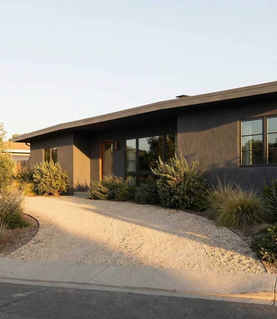
5. Dark Slate Blue on a Ranch-Style House
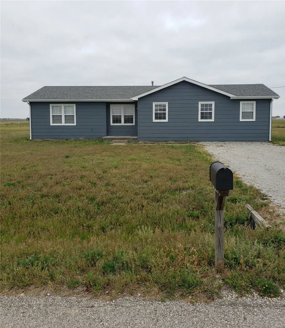
The single-story ranch-style house gets a serious upgrade when dressed in deep slate blue—a color with enough navy in it to feel moody but enough gray to stay sophisticated rather than nautical. Ranch homes often get overlooked in design conversations, but their long, horizontal silhouettes are actually a perfect canvas for dark colors, which visually anchor the structure into the landscape. Slate blue in particular gives these homes a midcentury dignity that feels genuinely current.
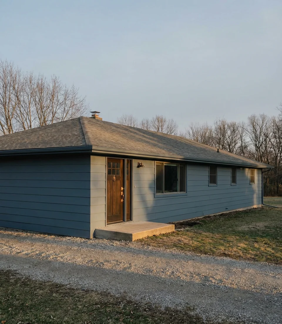
This palette is especially popular in the Midwest and Mid-Atlantic states, where slate blue harmonizes with the natural tones of the landscape—gray skies, brownish grasses, and the cool tones of local stone. Pair it with warm brass or bronze hardware to keep it from feeling too cold. For trim, white is classic, but a lighter blue-gray can create a more tonal, European-inspired look that’s gaining traction in American markets right now.
6. Dark Stucco in Warm Charcoal Tones
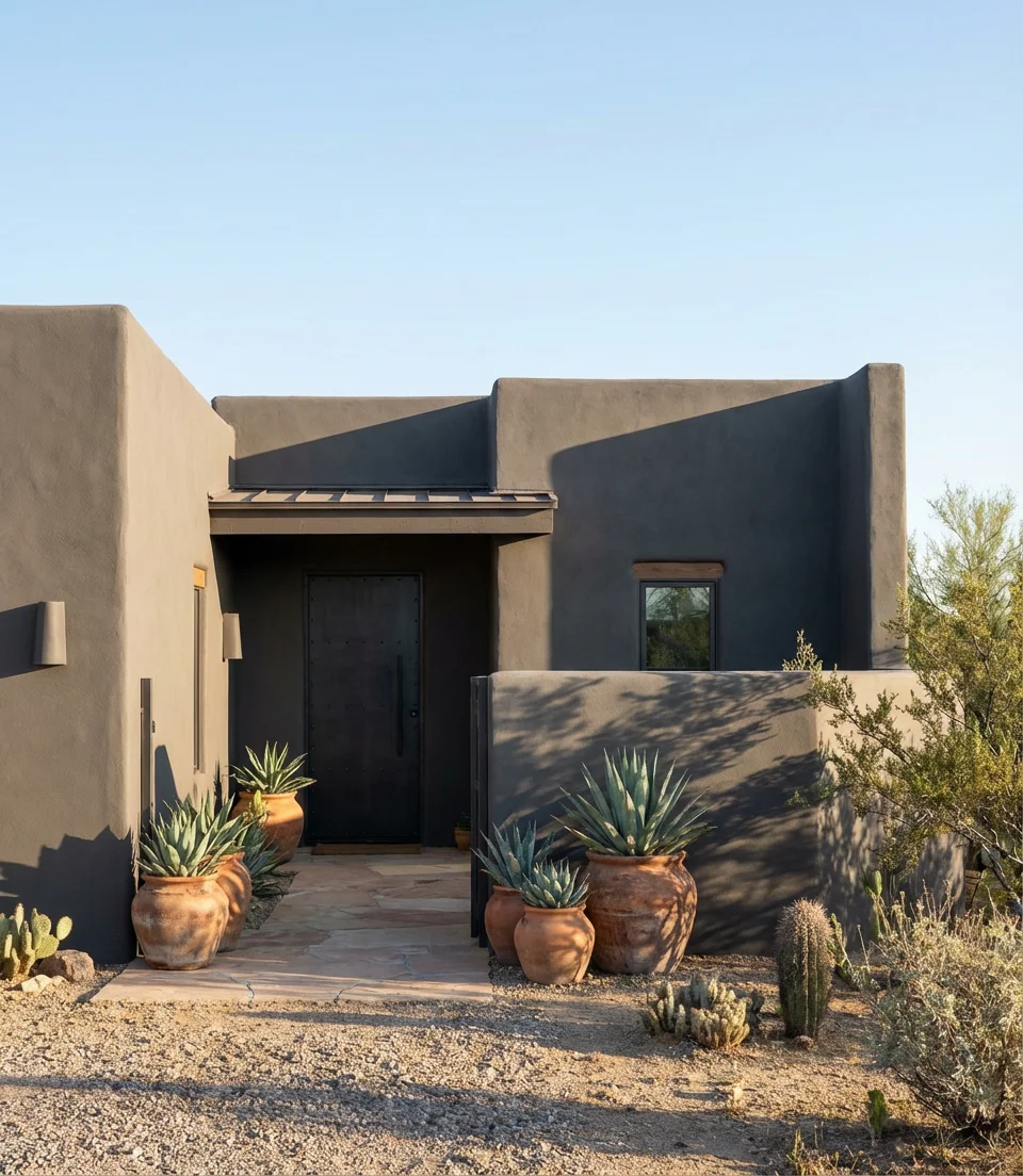
Stucco in a deep, warm charcoal is one of those combinations that reads differently depending on the region—in the Southwest, it feels like a natural evolution of adobe tradition; in California and Florida, it has a contemporary Mediterranean quality. The textured surface of stucco adds dimension to dark colors in a way that smooth siding simply can’t replicate. Light catches every undulation, creating a subtle visual richness that makes the color feel alive rather than flat. Paired with terracotta pots or desert landscaping, warm charcoal stucco is quietly one of the most compelling exterior looks of 2026.
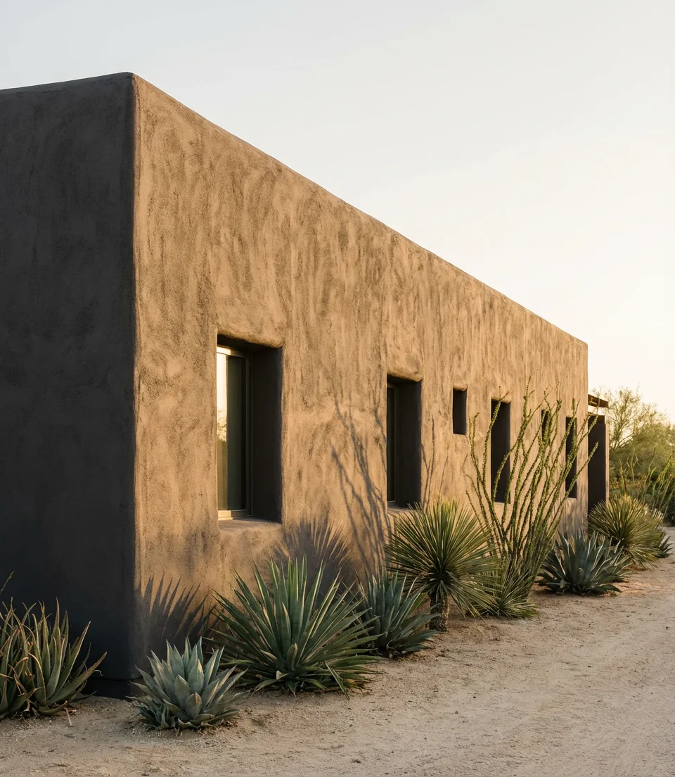
For homeowners in hot climates, it’s worth requesting a paint formula with heat-reflective pigments—several major manufacturers, including Sherwin-Williams and Behr, now offer “cool color” technology that reduces heat absorption by up to 40% compared to standard dark paints. This makes the warm charcoal dream entirely livable even in Phoenix or Austin. Ask your painter specifically about elastomeric stucco paint, which also helps prevent cracking in dry, high-temperature environments.
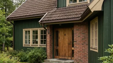
7. Ebony and Brick—Dark Paint Meets Red Brick
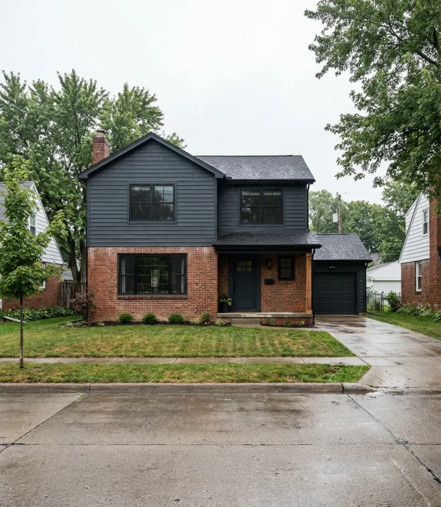
Painting the non-brick portions of a facade a near-black or deep charcoal while leaving red brick exposed is one of the most dynamic exterior moves available to homeowners right now. The warmth of brick and the coolness of dark painted siding create a tension that reads as intentional, sophisticated, and—importantly—not overly trendy. This approach works on everything from 1960s split-levels to newer craftsman builds that incorporate a brick base or chimney detail. It’s a way to modernize without erasing history.
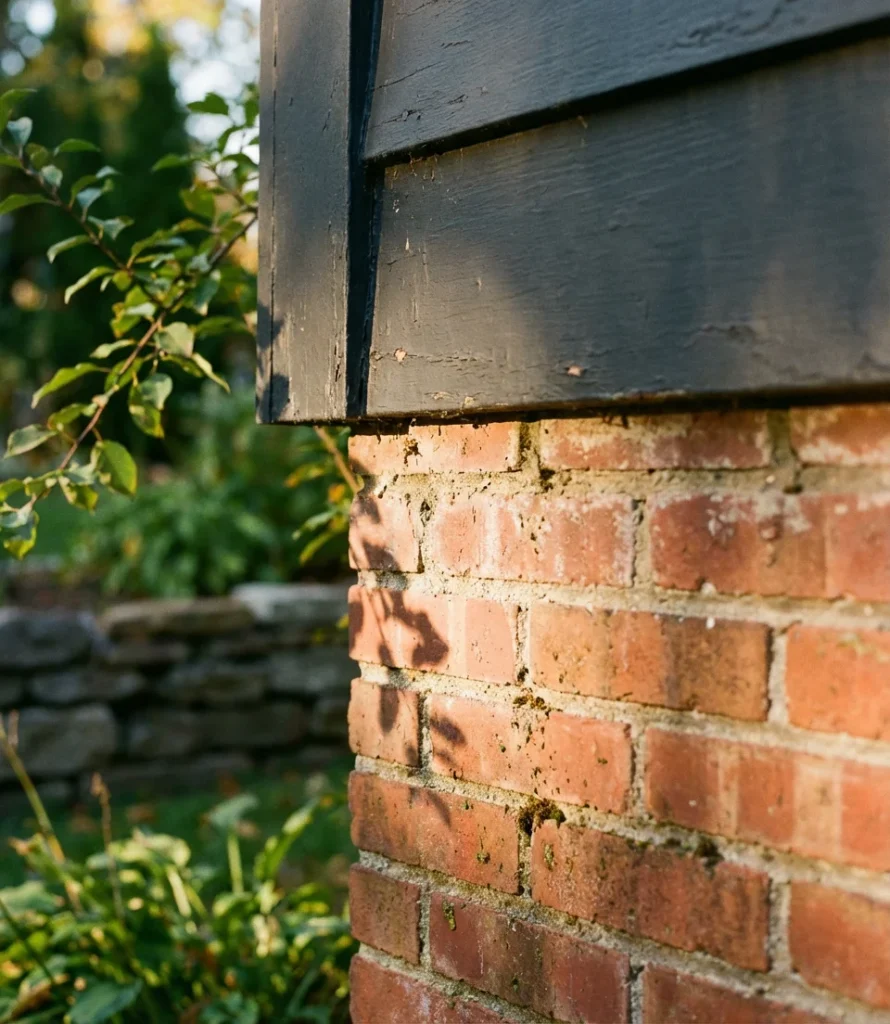
One piece of practical advice: if your brick is older and has existing mortar staining or color variation, embrace it. That natural patina plays beautifully against a fresh dark paint, creating the layered, authentic quality that most homeowners are actually after. The mistake to avoid here is painting the brick itself—once that decision is made, it’s very difficult to reverse, and unpainted brick will always be a design asset that painted brick can’t quite replicate.
8. Modern Mid-Century Dark Brown with Stone Details
The modern mid-century revival is alive and well in exterior design, and dark chocolate brown paired with stone cladding is one of its most compelling expressions. Think flat rooflines, horizontal cedar siding in a deep espresso stain, and a low stone retaining wall or accent panel—the palette of Case Study houses updated for modern production. This combination has a warmth that most dark exteriors lack, making it particularly appealing for homeowners who love the moody aesthetic but find black or charcoal too stark.
“Brown is having its moment,” a Denver-based architect told Dwell magazine recently, and the data backs it up—brown-family exterior colors have seen a 60% increase in search volume over the past eighteen months. Specifically for the mid-century look, the key is restraint: select a single stone type, maintain a low profile, and allow the horizontal lines to flow freely. Overcrowding the facade with multiple materials kills the clean midcentury logic that makes these homes so satisfying.
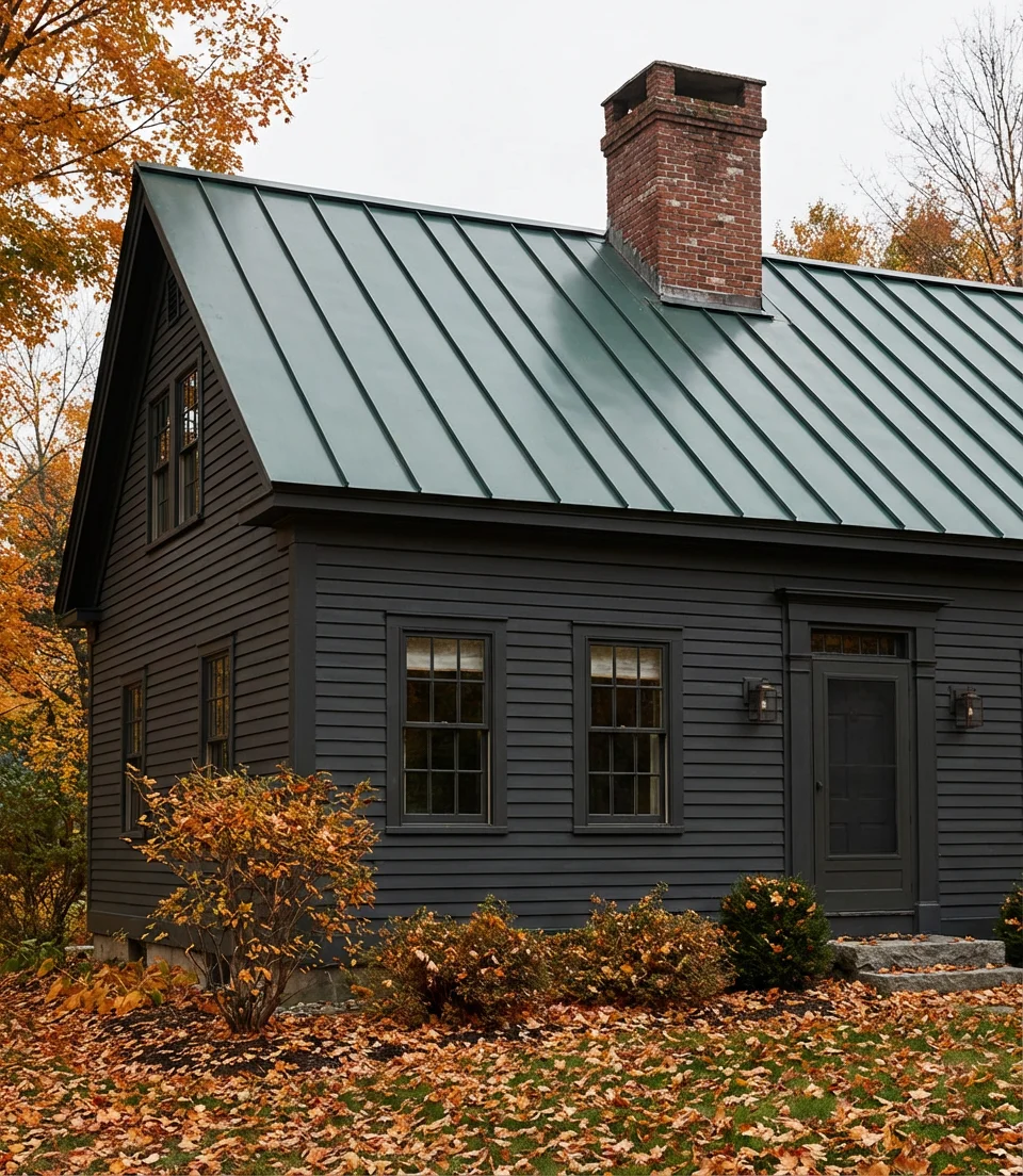
9. Dark Green Roof with Matching Dark Body
A green roof—meaning dark green shingles or metal roofing—paired with a similarly toned dark body creates a tone-on-tone exterior that looks like the house grew out of the hillside. This is a particularly strong look for homes surrounded by natural landscape, where the goal is to minimize visual disruption rather than announce the structure. In New England, the Pacific Northwest, and the Blue Ridge region, this approach is increasingly popular among homeowners who want their homes to feel like they belong to the land. The tonal relationship between roof and body is everything here.
Where the technique works best: wooded or semi-rural lots where the home is partially set into a slope or surrounded by mature evergreens. On a flat suburban lot with few trees, the tone-on-tone green can feel slightly heavy without enough natural context to anchor it. The solution is contrast at the entry—a natural wood door, a white or cream porch detail, or bold plantings at the foundation. This single moment of relief provides the eye with a focal point and enhances the overall composition.
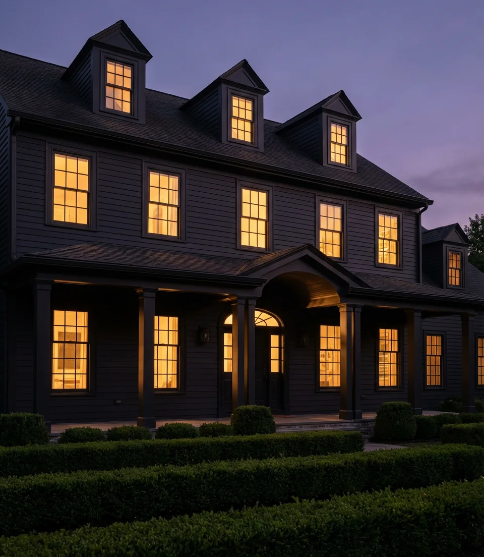
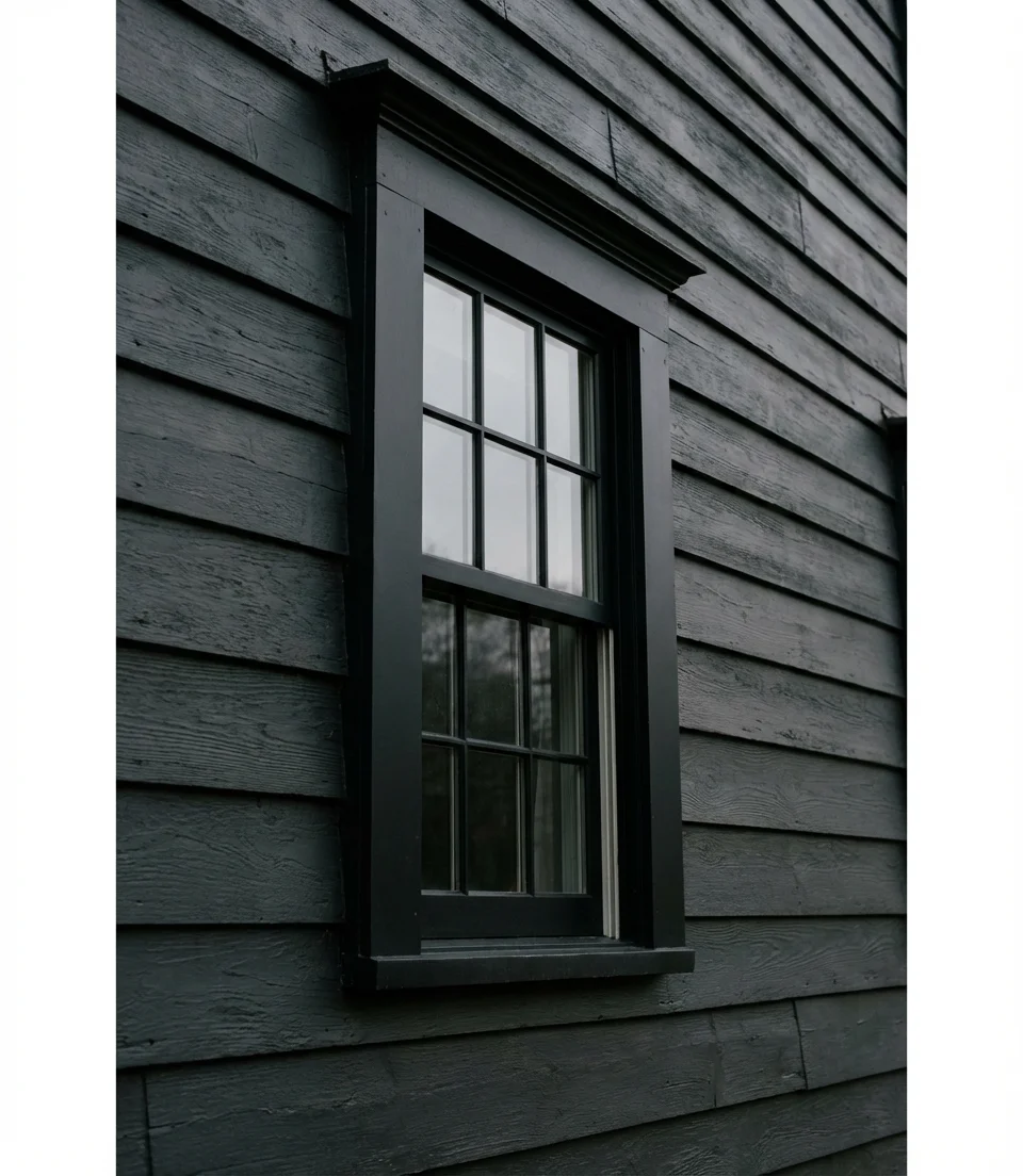
10. Matte Black on Large Houses with White Trim
On large houses, matte black makes a statement that’s impossible to ignore—and when offset by crisp white trim, it becomes something genuinely architectural rather than just bold. The white trim acts as a framing device, drawing attention to every cornice, window surround, and corner board, turning the entire facade into a kind of graphic composition. A home with strong architectural bones, such as defined rooflines, symmetrical windows, or a clearly articulated entry sequence, is best suited for this look.
Budget-minded homeowners should know that matte finishes, while gorgeous, require more frequent repainting than satin or semi-gloss—typically every five to seven years versus eight to ten. Consider this factor in the long-term cost picture, especially for a large home where the paint job itself is a significant investment. Some painters recommend a satin black as a practical compromise: it still reads as dark and rich, but it’s easier to clean, touch up, and maintain over time.
11. Deep Olive on a Small House with Black Accents
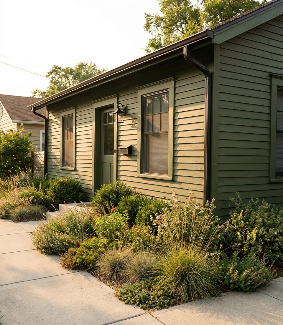
Many homeowners find dark colors on small houses counterintuitive, as conventional wisdom suggests opting for lighter hues to create a sense of spaciousness. But deep olive with black accents on shutters, gutters, and light fixtures actually gives a compact home a presence it would otherwise lack. Instead of trying to look bigger, a small house in deep olive simply looks intentional, curated, and completely confident. It’s one of the smartest reframes in exterior design right now.
A homeowner in Austin, Texas, painted her 1,100-square-foot bungalow deep olive green last spring and reported that three neighbors stopped to ask for the paint information within the first week. What she noticed immediately was that the black gutters and downspouts she’d considered removing suddenly looked like intentional design features rather than eyesores. Small details that read as functional on a lighthouse transform into bold graphic statements against a dark background.
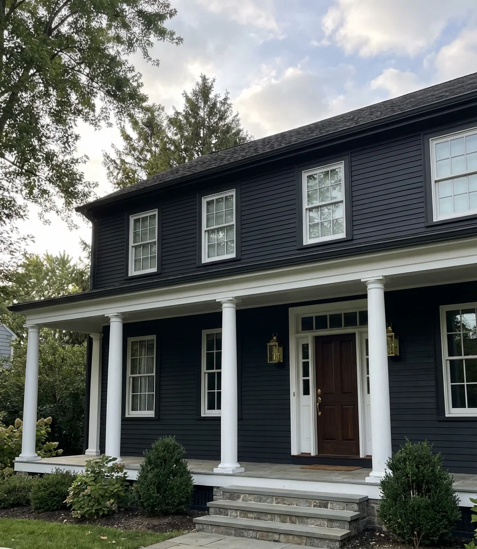
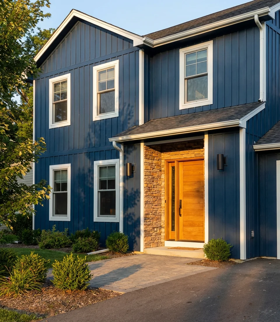
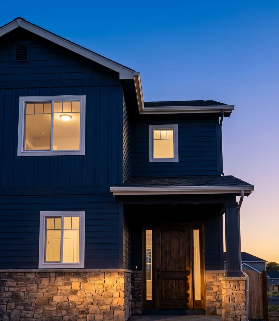
12. Dark Navy on a Farmhouse with Stone Accents
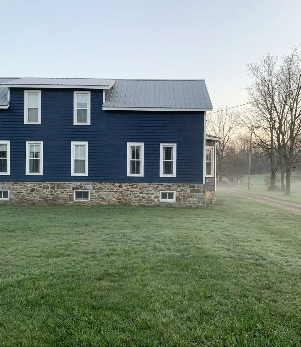
Deep navy on a farmhouse with stone foundation accents is the kind of exterior that stops people on country roads. The navy reads warm or cool depending on the light, which means it pairs beautifully with the natural variation in fieldstone or ledgestone without either element competing for dominance. This combination has roots in traditional New England vernacular architecture, but in 2026 it feels entirely fresh—especially when finished with white sash windows and a simple metal roof.
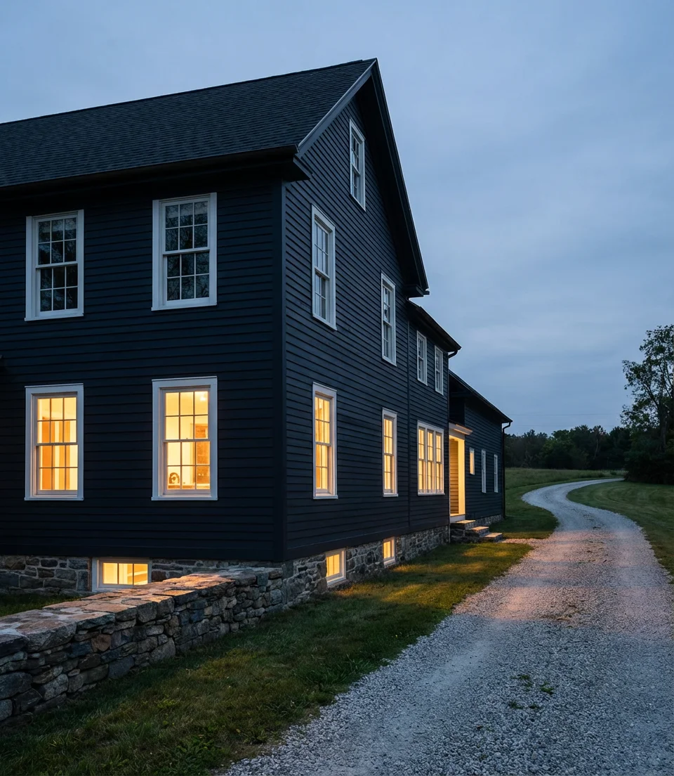
The relationship between navy and stone is forgiving in a way that not all dark colors are: even if the stone has warm tan undertones and the navy pulls slightly blue-green, the two still work together because stone’s natural variation acts as a visual buffer. This makes it an ideal choice for homeowners who are inheriting an existing stone feature they can’t change—the navy gives them a sophisticated backdrop that makes what’s already there look deliberate.
13. Dark Exterior Paint Palette with Warm Wood Accents
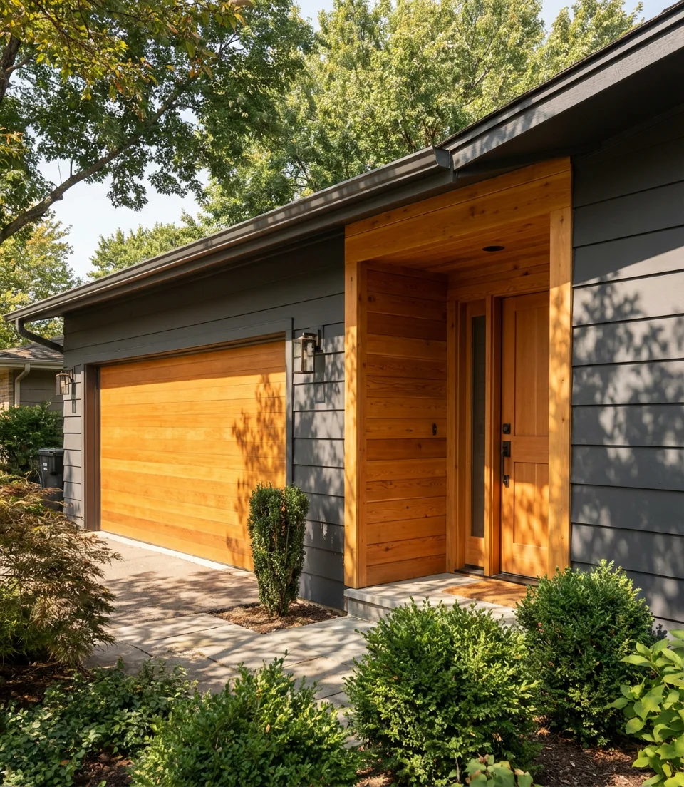
Most homeowners tend to overlook the crucial step of building a cohesive dark exterior palette, which involves selecting body color, trim, accent, and door tones that function as a system rather than independently. A thoughtful palette for a dark exterior in 2026 might combine a deep charcoal body, soft black trim, warm honey-toned wood accents on the garage and front door, and brushed bronze hardware throughout. Each element earns its place, and the whole reads as curated rather than assembled.
The practical way to test a dark palette before committing is to paint large (at least 24×24 inch) swatches of each color on the actual facade and observe them at different times of day—morning, noon, and dusk. Colors behave dramatically differently in raking morning light versus flat midday sun. At midday, a color that appears as warm charcoal may take on a nearly purple hue during golden hour. This simple step prevents expensive surprises and is advice every experienced exterior painter will give you unprompted.
14. Modern Dark Paint on a Bloxburg-Style Build
The Bloxburg aesthetic—clean-lined suburban homes with strong architectural geometry and a carefully considered exterior—has migrated from gaming inspiration boards to real-world Pinterest searches in a big way. Homeowners (and many aspiring ones) search “Bloxburg house exterior ideas” to find approachable modern design references, and dark paint is consistently central to those inspirations. Modern paint in deep slate, charcoal, or near-black gives a Bloxburg-style build that has game-perfect crispness translated into real materials.
What makes this aesthetic translate so well to real homes is its emphasis on clean geometry and deliberately placed windows—both of which benefit enormously from a dark exterior treatment. Dark paint eliminates visual clutter, making the form of the house the primary attraction. For anyone building new or doing a full exterior renovation, Bloxburg-inspired references are actually incredibly useful design tools because they force you to think about the exterior as a composed whole rather than a series of individual decisions.
15. Warm Espresso Brown on a Modern Board and Batten
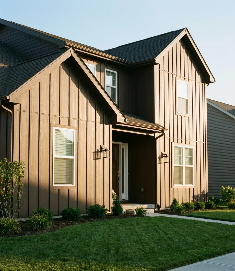
Warm espresso brown on a board and batten exterior is the dark color move for homeowners who find black too severe and charcoal too cold. The deep brown-black reads as rich and grounded without the harshness of cooler darks—it has a quality similar to dark walnut furniture, immediately suggesting craft and longevity. Against a clear blue sky, it photographs with a warmth that pure black can’t match, which may explain why it consistently outperforms charcoal in Pinterest saves among the 30–50 age demographic.
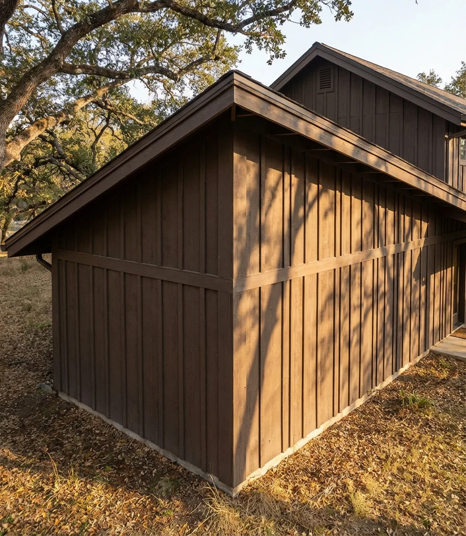
Expert commentary from residential architect Marcus Webb: “Warm dark colors work with a home’s aging process rather than against it. Charcoal can look stark in new construction and then fade unevenly. A deep brown, particularly on a textured surface like board and batten, tends to age gracefully—the slight weathering often makes it look more intentional over time. For longevity, he recommends a 100% acrylic exterior paint in a satin finish, with a five-year recoat schedule in most American climates.
16. Dark Exterior with White Windows and Brick Base
The combination of a dark body, white windows, and an unpainted brick base creates a three-element exterior composition that feels complete and considered without a single extraneous detail. The white windows serve as the organizing visual element—they pop against the dark body, frame each opening with clarity, and echo any white trim elements elsewhere on the facade. The brick base grounds the whole composition, both literally and visually, adding texture and permanence at eye level, where it has the most impact.
This combination is particularly popular among homeowners remodeling homes built in the 1970s and 1980s, when brick foundations and lower courses were common in American residential construction. Rather than covering the brick—a decision that costs money and erases character—the dark paint above it suddenly makes the existing brick feel like a feature. What was once a dated detail becomes a defining design element. This is exactly the kind of low-intervention, high-impact thinking—where minimal changes lead to significant visual effects— that makes renovation projects deeply satisfying.
17. Dark Charcoal on a Modern Minimalist Home
A truly minimalist exterior in deep charcoal is about subtraction—removing every element that isn’t load-bearing or intentional. There are no decorative shutters, no contrasting gable trim, and no busy landscaping. All that’s left are clean planes of dark color, precise window placement, and perhaps a moment of warmth at the entry. This approach requires confidence and architectural discipline, but when it’s executed well, it produces homes that photograph at a magazine level and age without ever looking dated. Modern paint formulas in zero-sheen matte amplify this effect beautifully.
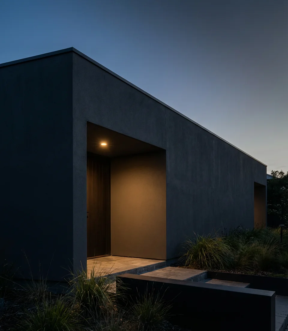
Real homeowner behavior data from renovation platforms shows that minimalist dark exteriors receive the highest rate of “save” and “share” actions on Pinterest—but they also generate the most questions in comment sections, with the most common being “does this design look good in person?” The truthful response is affirmative, but only when the surrounding site is taken into account. A minimalist dark facade surrounded by overgrown shrubs and a cracked driveway communicates neglect rather than intention. Both the exterior design and the site maintenance should convey the same message.
18. Dark Green with Stone and Natural Wood—Pacific Northwest Style
Pacific Northwest exterior design has become a national reference for dark colors done right, and the trifecta of deep green, exposed stone, and raw natural wood accents is its most recognizable expression. This palette doesn’t try to stand out from nature—it tries to be part of it. Cedar cladding on a gable, a basalt stone chimney breast, and walls in a deep hunter or bottle green create an exterior that looks like it was designed by the landscape itself. The appeal extends well beyond the region, as homeowners across the country seek that same organic quality.
Where it works best outside the Pacific Northwest: wooded lots in the Appalachian region, the Upper Midwest lake country, and coastal Maine, where the natural context is dense enough to support this kind of color immersion. On open suburban lots, you’ll want to compensate with generous plantings—particularly evergreen shrubs and ornamental grasses—to create the naturalistic frame that makes this palette feel intentional rather than random. Without greenery to reference, the green on the house can look unanchored.
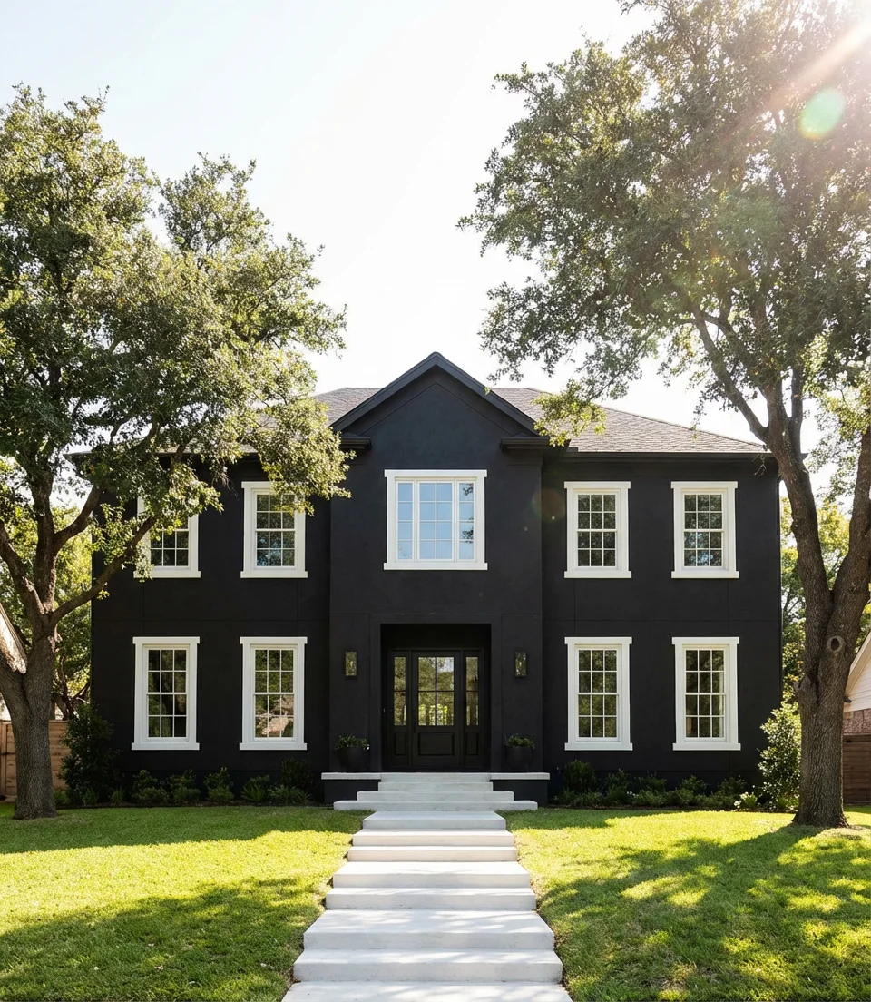
19. Sherwin-Williams Caviar on a Traditional Colonial
Sherwin-Williams Caviar (SW 6990) is the darkest of the dark, a near-true black with the faintest warm gray undertone that keeps it from feeling harsh. On a traditional Colonial with its symmetrical window placement and formal entry, Caviar produces one of the most dramatically beautiful dark exterior looks available—bold enough to command attention from the street but grounded enough to feel appropriate on a classically proportioned home. The contrast with white columns, black shutters, and polished brass hardware is simply exceptional.
This is a look with genuine regional momentum on the East Coast, where Colonial architecture is ubiquitous and homeowners are looking for ways to modernize without compromising the formal character their homes were designed to project. The color says authority—it’s confident in a way that lighter neutrals simply can’t be. For anyone on a budget considering this transformation: the paint itself is the most cost-effective part of any exterior renovation, and on a Colonial with good bones, the return on investment (ROI) on a dark repaint is consistently among the highest of any exterior improvement.
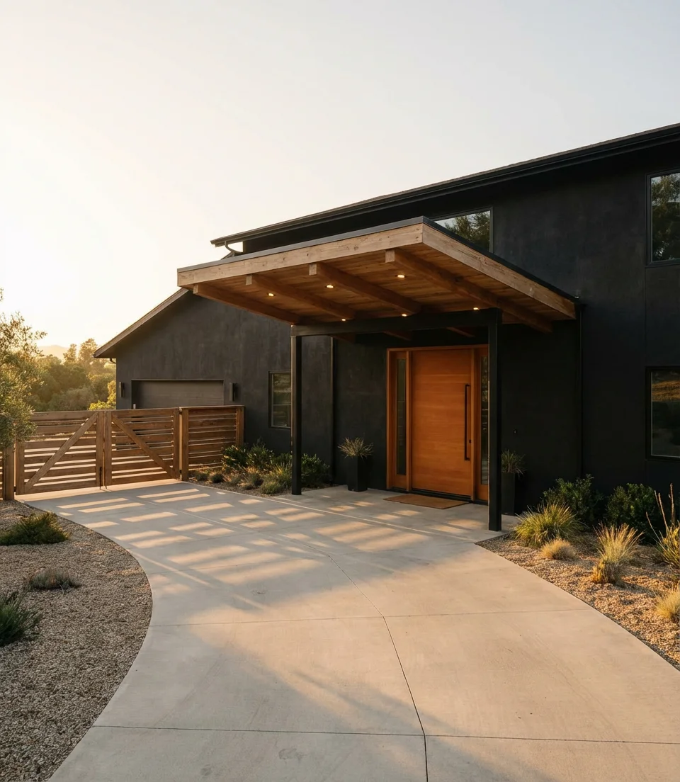
20. Deep Plum Black on a Modern Craftsman
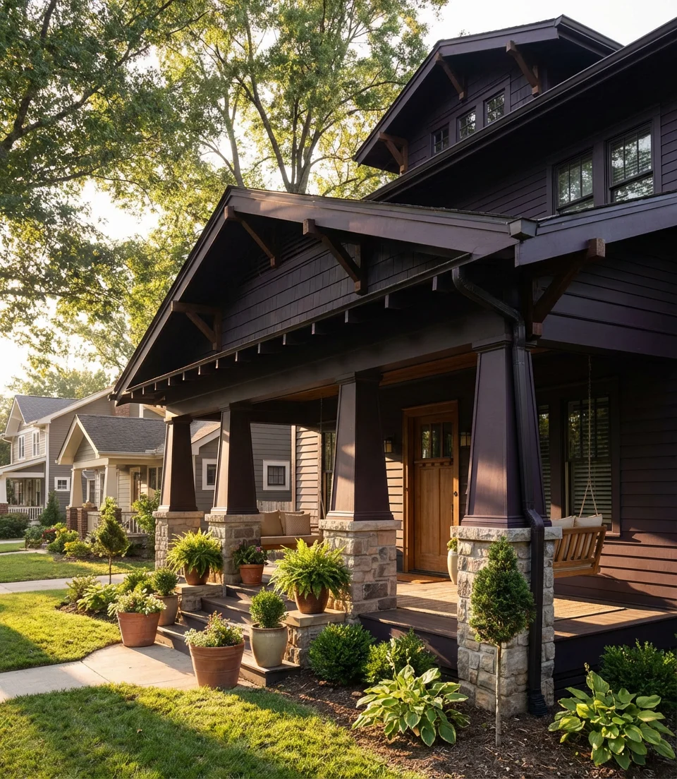
One of the more unexpected dark exterior moves gaining traction in 2026 is the deep plum-black—a color that reads as near-black in most conditions but reveals a rich purple-brown warmth in raking afternoon light. This extraordinary color enhances a modern Craftsman, which features characteristic exposed rafter tails, tapered columns, and a deep front porch. The Craftsman style was always meant to celebrate material richness, and a complex, layered dark color is a contemporary expression of exactly that value. It’s the kind of exterior that rewards attention.
The American lifestyle context here matters: Craftsman homes are deeply embedded in the culture of cities like Chicago, Portland, Seattle, and Los Angeles—places where homeowners tend to be design-literate and willing to take exterior risks. In these markets, deep plum-black stands out not by being shocking but by being unexpected and considered. It signals taste rather than trend-following. If you’re sitting with a Craftsman and considering a bold dark move, this is the nuanced option that will age better than any straightforward black.
21. Dark Exterior with Green Roof and Brick Chimney
Layering a dark body color, a standing-seam green roof, and an unpainted red brick chimney creates an exterior palette that feels like it was assembled by a colorist rather than arrived at by default. Each element occupies a distinct role: the dark body recedes, the green roof references the landscape above, and the brick chimney provides the warm, textural punctuation that keeps the whole composition from feeling too designed. This kind of material layering is where American residential architecture is most compelling right now.
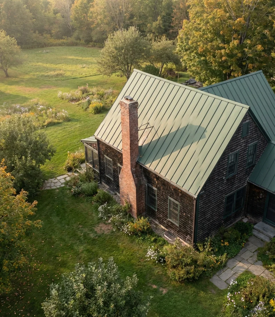
Standing-seam metal roofing in forest green has become increasingly accessible in American residential markets over the past five years—what was once a premium specialty product is now available at competitive price points from regional metal roofing suppliers in most states. Pair the investment in a quality metal roof with a simple repaint of the body in a complementary dark tone, and you’ve created an exterior transformation that will last twenty-plus years with minimal maintenance. The brick chimney, if you have one, costs you nothing and gives you everything.
22. Charcoal Black on a Stucco Ranch
A stucco finish in deep charcoal on a ranch-style home is one of the Southwest’s signature exterior looks for 2026, and it’s spreading rapidly to markets in Texas, Southern California, and Nevada. The horizontal sprawl of a ranch is beautifully complemented by the enveloping quality of a deep, smooth stucco—the color wraps the form, emphasizing its low, ground-hugging proportions rather than fighting them. Paired with desert landscaping, it reads as completely regional while still feeling thoroughly contemporary.
A detail worth knowing: dark stucco on a ranch will look dramatically different depending on texture choice. A smooth Level-5 finish amplifies the graphic, modern quality of the dark color; a sand or dash texture softens it toward something more traditional and adobe-adjacent. Neither is wrong, but they tell very different stories. Before committing to a finish, ask your stucco contractor to prepare small test panels in both textures—the difference in natural light will make the decision obvious.
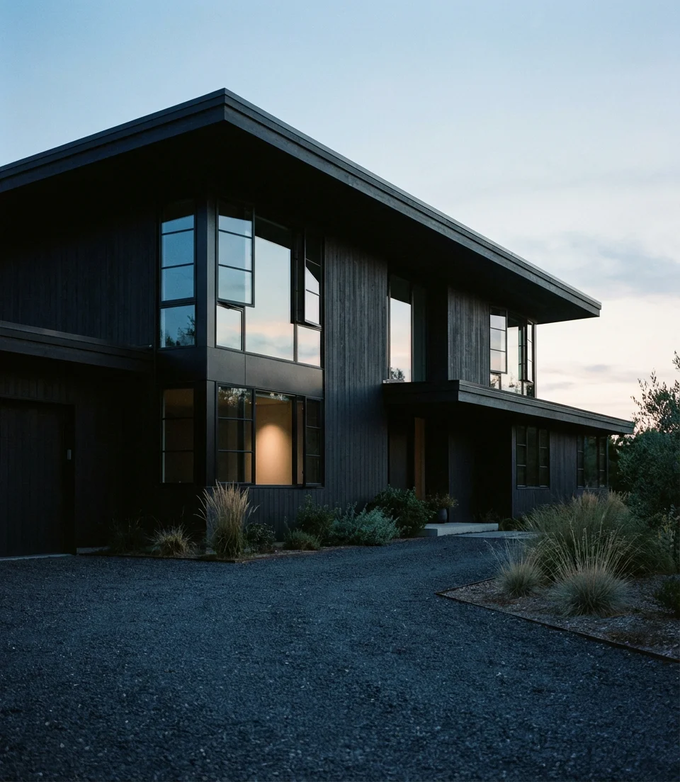
23. Near-Black Exterior with Wood Accents on Large Houses
On large houses, near-black paired with warm wood accents—cedar garage doors, a teak entry surround, or stained timber beams at the porch—prevents the scale from feeling oppressive. Without the wood warmth, a huge dark home can feel more institutional than residential. However, introducing one substantial natural wood element immediately humanizes the entire composition. This interplay is central to some of the most admired new custom homes in markets like Denver, Charlotte, and Austin right now.
For large homes specifically, the scale of the wood element matters enormously. A small ornamental wood detail on a 5,000-square-foot home will be lost—it needs to be substantial. A full-width cedar garage door, a wide timber entry gate, or an extensive wood-clad gable is the kind of gesture that actually registers from the street and creates the warmth the design needs. Consider the home’s proportions and avoid undersizing the natural elements that should be restrained.
24. Best Dark Colors for a Farmhouse with Black Windows
When people search for the best dark exterior colors for a farmhouse, they almost invariably end up on a page that includes black windows—and for good reason. The pairing of a deep body color (charcoal, hunter green, or navy) with matte black window frames has become the defining visual signature of the modern American farmhouse. The black windows unify the design, giving every opening the same visual weight and creating a grid-like rhythm across the facade that feels both historical and entirely current.
A common mistake with this approach is choosing a body color that’s too close to the window color—when the window frames blend into the wall, you lose the graphic contrast that makes the look work. A body color two to three shades lighter than the window frames, or a body color with a distinctly different undertone, works best (a green body against black frames, for instance, reads much more dynamically than a charcoal body against black frames). This tonal gap is what gives the facade its energy.
25. Midnight Blue Modern Exterior with Full Material Contrast
Midnight blue exterior—that deep, barely-there navy that photographs almost black but reveals its color in sunlight—is the dark exterior choice for 2026 that feels simultaneously modern and timeless. On a home that layers it with stone, white trim, natural wood, and black window frames, midnight blue becomes the organizing intelligence that makes all those materials cohere. It’s complex enough to hold the composition together, versatile enough to work with warm and cool materials simultaneously, and distinctive enough to make the home immediately memorable.
This is the idea to land on if you’ve been scrolling Pinterest for weeks and haven’t found something that feels like a fully realized vision—midnight blue with full material contrast is that vision. It works on nearly any architectural style, from craftsman to colonial to contemporary, because it functions as a backdrop rather than a statement. Whatever’s happening on your facade, midnight blue makes it look like you meant it. Start with a sample pot, put it up next to your trim, your stone, your wood—and watch everything click into place.
Dark exterior colors are one of the most transformative—and most searchable—choices you can make for your home right now, and the ideas above are just the beginning of what’s possible. Whether you’re leaning toward Iron Ore charcoal, deep forest green, or a daring midnight blue, the right dark color will make your home feel more intentional, more architectural, and more like yours than any light neutral ever could. We’d love to hear which direction you’re considering—drop your questions, your color picks, or photos of your own dark exterior project in the comments below. What’s your house calling for?