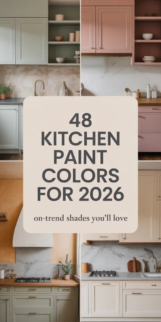
Kitchens remain the heart of the home, and as we move through 2026, the color palettes emerging reflect a thoughtful balance between comfort and creativity. Americans searching Pinterest for kitchen paint inspiration this year are discovering trends that honor timeless appeal while embracing bolder, more personalized choices. Whether you’re refreshing tired cabinets or planning a full renovation, the colors dominating 2026 offer something for every style—from serene neutrals that complement existing wood tones to moody, dramatic hues that transform the entire space. In this guide, you’ll find fresh ideas spanning modern farmhouse warmth, cottage charm, and contemporary sophistication, each designed to help you envision your perfect kitchen transformation.
1. Soft Greige Walls with White Shaker Cabinets

This pairing has become a go-to for homeowners wanting a warm neutral backdrop that doesn’t compete with architectural details. The greige tone—a hybrid of gray and beige—adds depth behind white cabinets without the starkness of pure white walls. It’s particularly effective in open-concept homes where the kitchen flows into the living room, creating visual continuity. Popular Sherwin-Williams shades like Accessible Beige or Agreeable Gray deliver this effect beautifully.
Where it works best: homes with north-facing kitchens that need warmth or spaces with cool-toned flooring that require balance. The greige prevents the room from feeling too clinical while maintaining enough neutrality to let colorful décor, artwork, or a bold backsplash take center stage. It’s also forgiving with imperfections on older walls, unlike bright white, which can highlight every flaw.
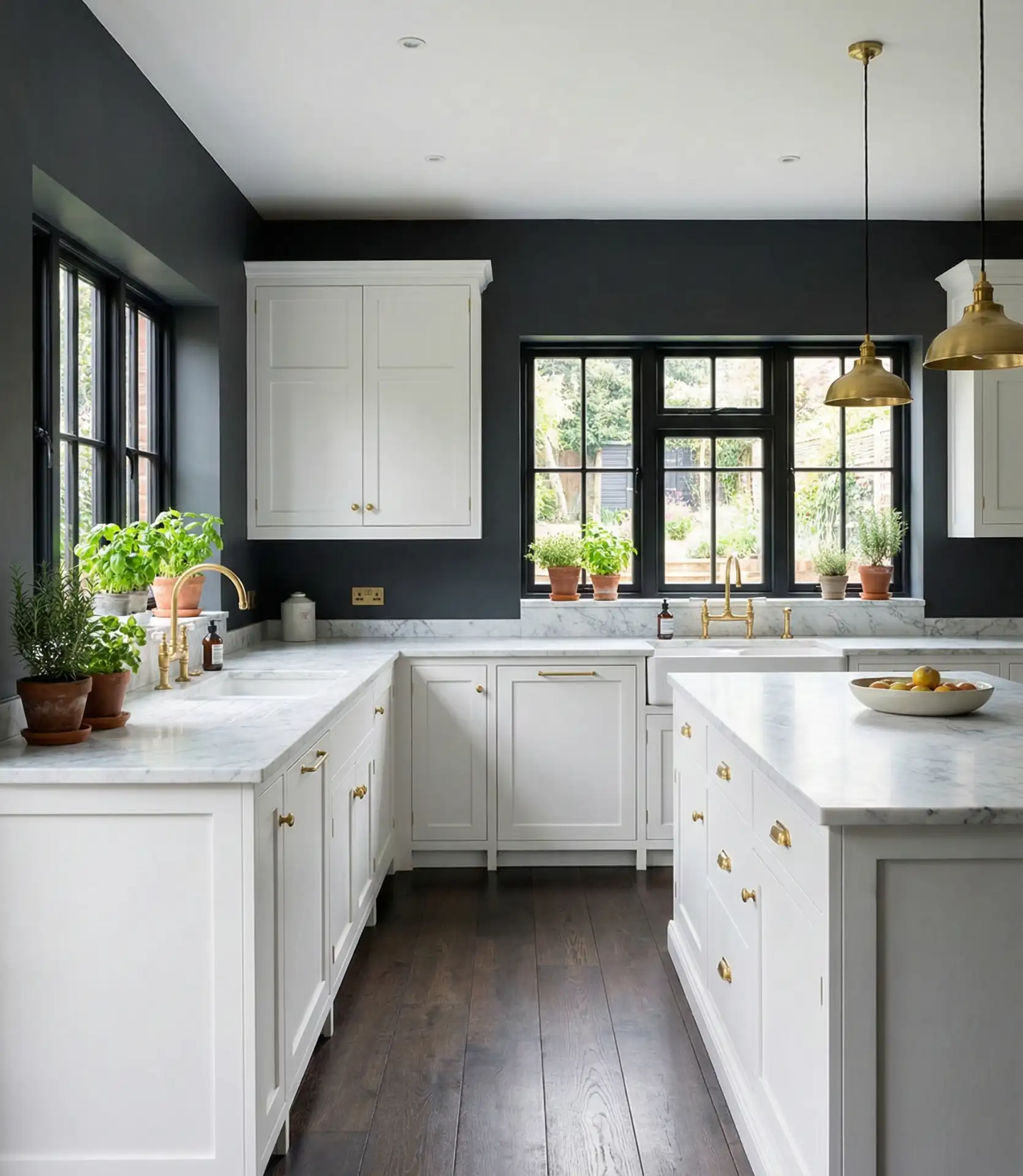
2. Deep Charcoal Accent Wall Behind Open Shelving

A single moody charcoal wall creates dramatic contrast in an otherwise neutral kitchen. This approach works especially well behind floating shelves or open storage, where the dark backdrop makes dishware and glassware appear curated and intentional. It’s a 2026 trend that appeals to homeowners wanting sophistication without committing to painting the entire room in dark tones. The charcoal can pick up undertones from existing wood cabinets or complement stainless steel fixtures.
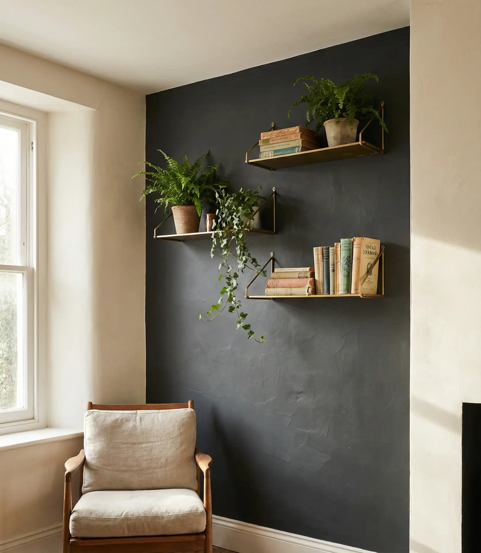
Real homeowner behavior shows this choice often emerges during phased renovations—when someone isn’t ready for new cabinets but wants immediate visual impact. The accent wall becomes a test run for bolder color choices, and many find they love the drama enough to eventually extend it to adjacent surfaces or even the ceiling for a cocooning effect that defines the cooking zone.
3. Sage-green lower cabinets with cream upper walls
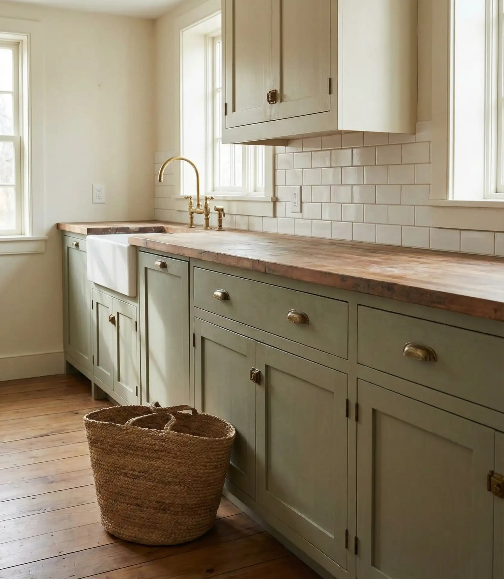
Two-toned kitchens continue gaining momentum, and green cabinets on the lower level paired with soft cream walls above create an earthy, grounded feel. This cottage-inspired combination softens the visual weight of base cabinets while keeping upper walls light and airy. The sage tone—neither too yellow nor too blue—complements both rustic farmhouse sinks and sleek modern fixtures, making it remarkably versatile for various design aesthetics.

Practical insight: when painting existing cabinets this color, proper preparation makes the difference between a DIY success and a sticky mess. Sand thoroughly, use a bonding primer designed for laminate or wood, and apply thin coats of a durable cabinet-specific paint. Many homeowners report that brands like Benjamin Moore Advance or Sherwin-Williams ProClassic hold up better than standard wall paint in high-traffic kitchen environments.
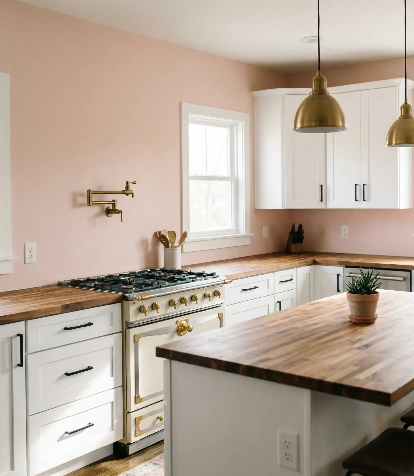
4. Warm Terracotta Walls with Natural Oak Cabinetry
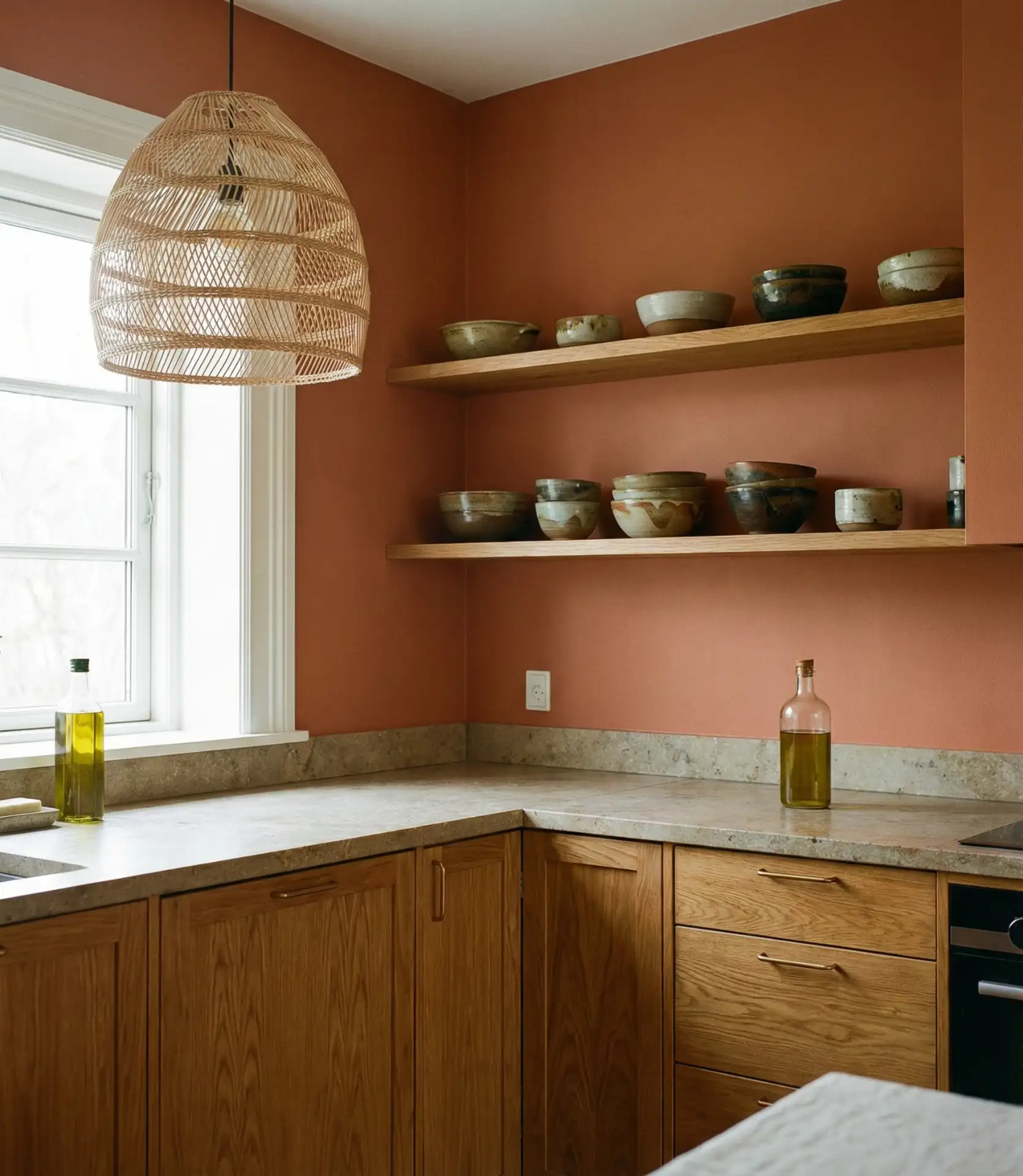
Terracotta is making a comeback as homeowners embrace warmer, earthier palettes. Painted on walls surrounded by oak cabinets, this burnt orange-clay hue creates a sun-drenched Mediterranean vibe that feels both cozy and elevated. It’s especially stunning in kitchens with plenty of natural light, where the color shifts throughout the day from soft peach in morning hours to rich amber by evening. The tone harmonizes beautifully with the golden undertones naturally present in oak grain.
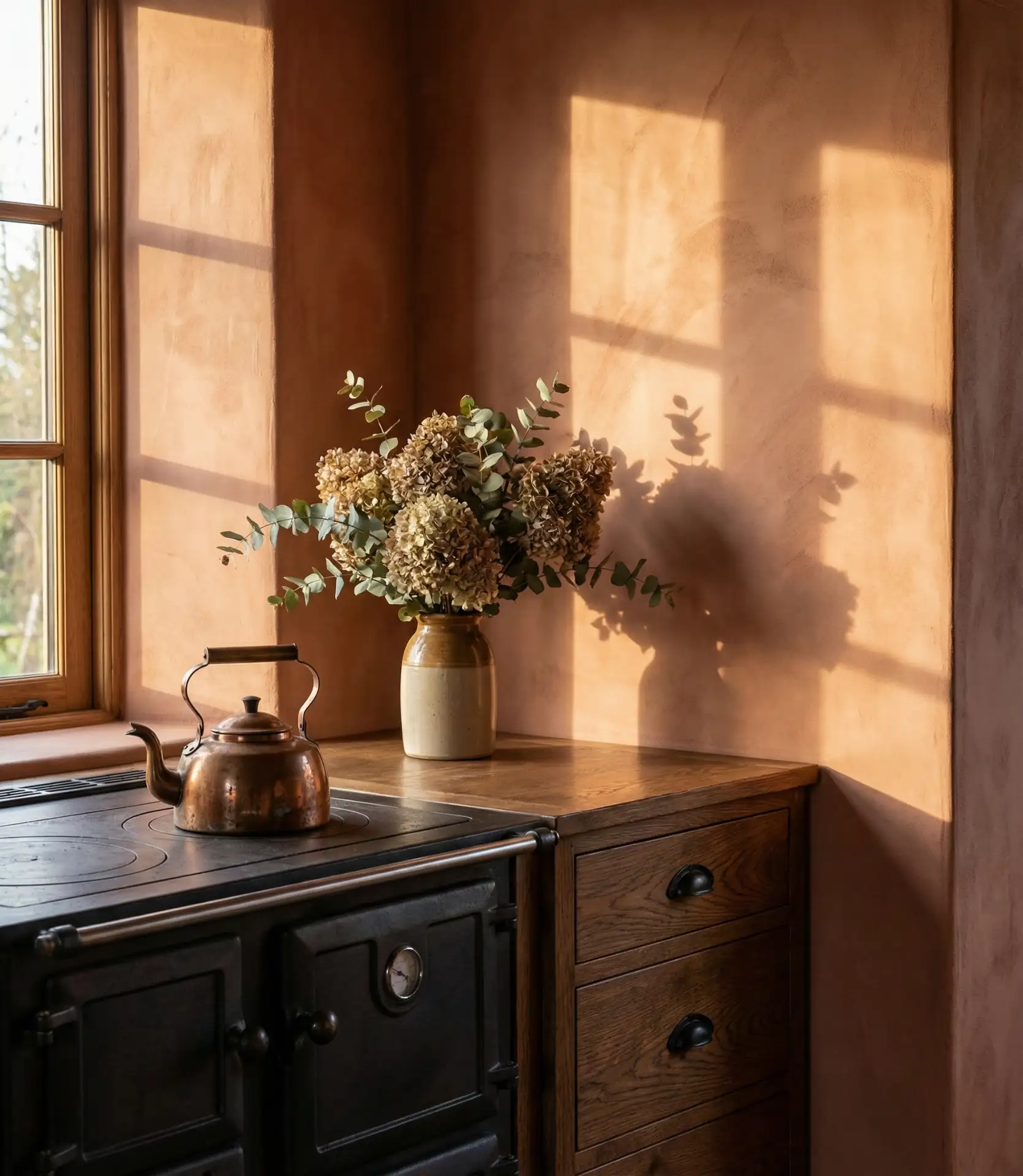
The American lifestyle context plays into this trend’s popularity—particularly in Southwest regions where terracotta roofing and adobe architecture already inform design preferences. But it’s also appearing in unexpected places like Pacific Northwest homes, where the warm wall color provides psychological comfort during gray winter months. The color works equally well in modern farmhouse settings and more contemporary spaces when balanced with clean-lined furniture.
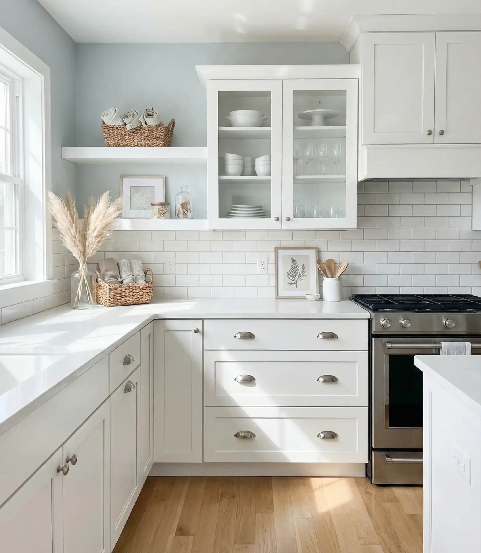
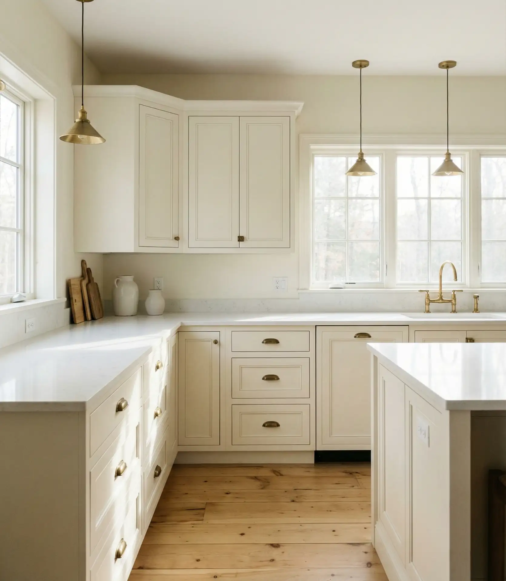
5. Crisp White Everything for Maximum Light Reflection
All-white kitchens remain timelessly popular, but the 2026 iteration focuses on layering different whites—warm-toned paint on walls like Sherwin Williams Pure White, cooler whites on cabinets, and bright white trim. This creates subtle dimension rather than the flat, sterile look some associate with monochrome spaces. The strategy relies on texture and material variety—matte walls, semi-gloss cabinets, glossy backsplash tiles—to add visual interest without introducing color.
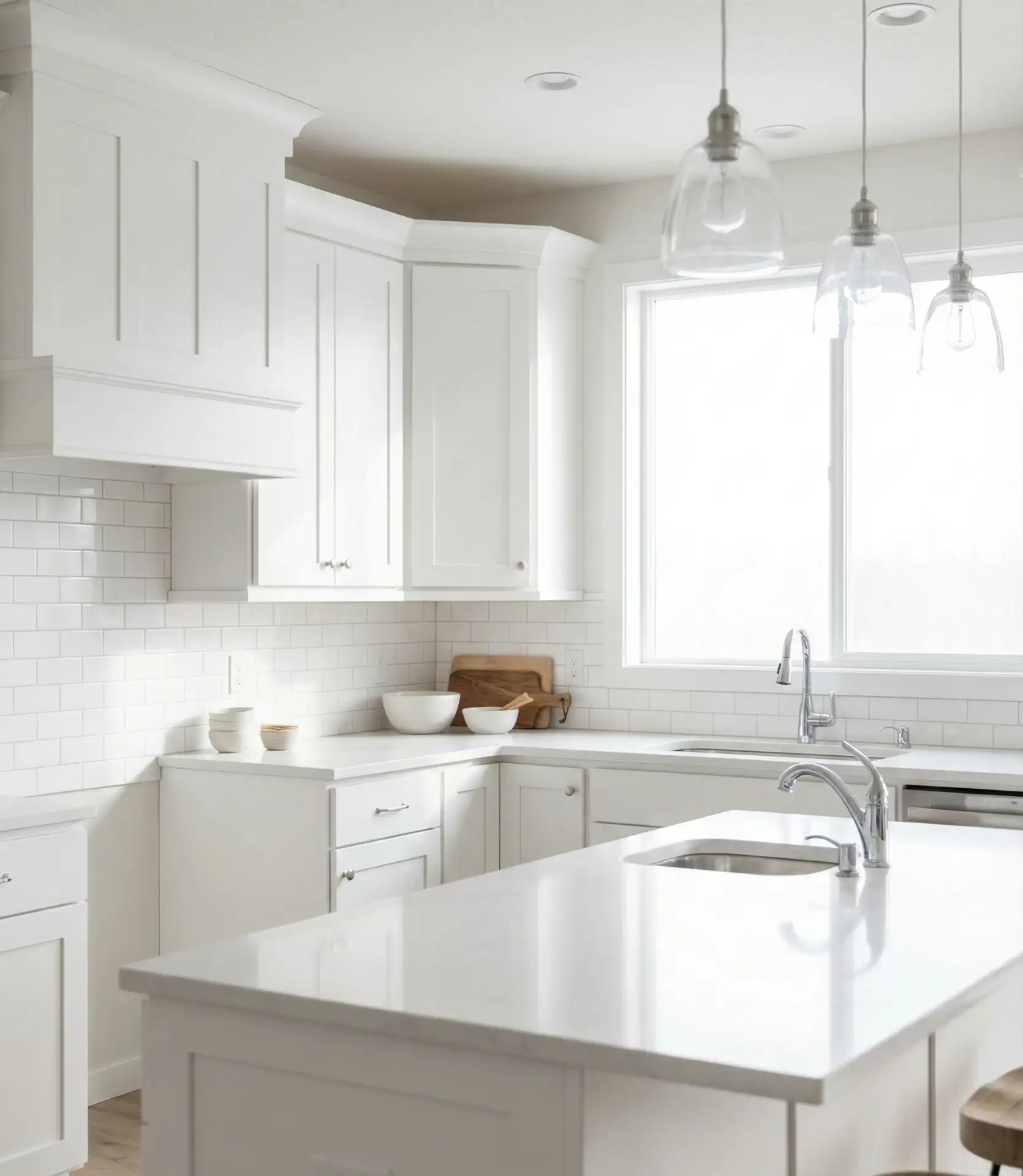
Common mistake to avoid: choosing builder-grade “contractor white” in a flat finish for everything. This creates a cold, unfinished appearance. Instead, invest in quality white paint with subtle warm or cool undertones that complement your lighting. North-facing rooms benefit from warmer whites with slight cream or yellow undertones, while south-facing spaces can handle cooler, crisper whites without feeling icy.
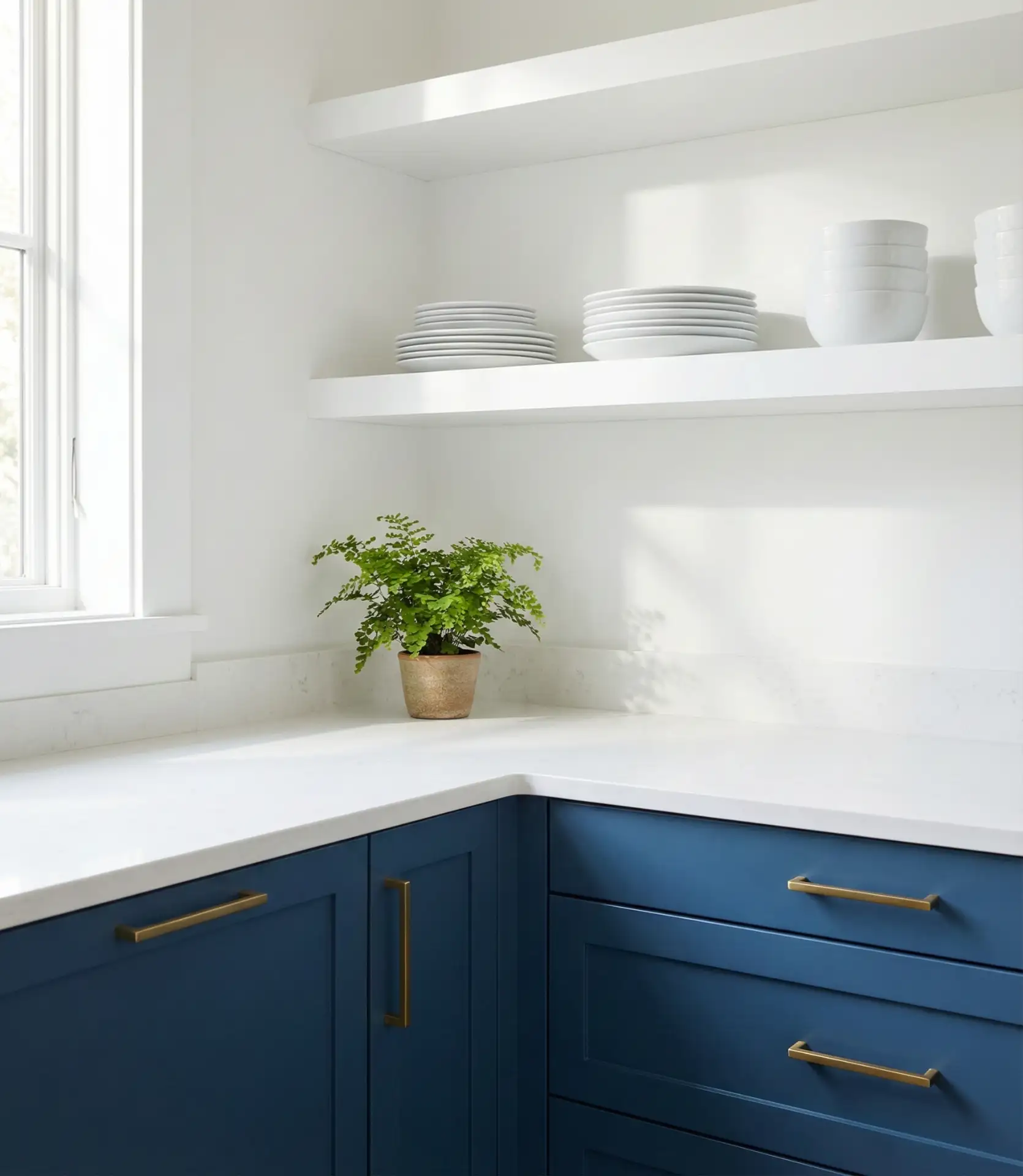
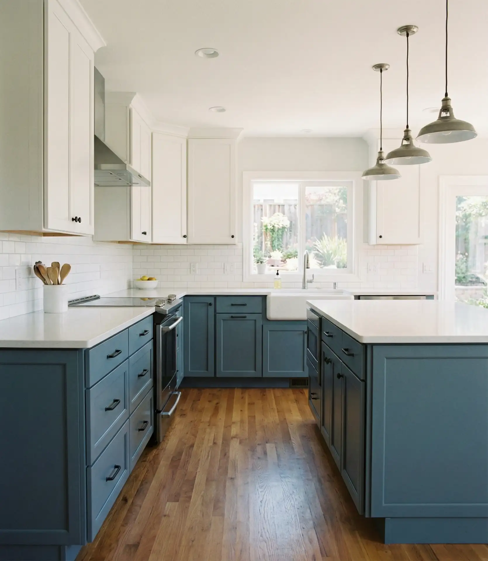
6. Navy Blue Island with Contrasting Neutral Perimeter
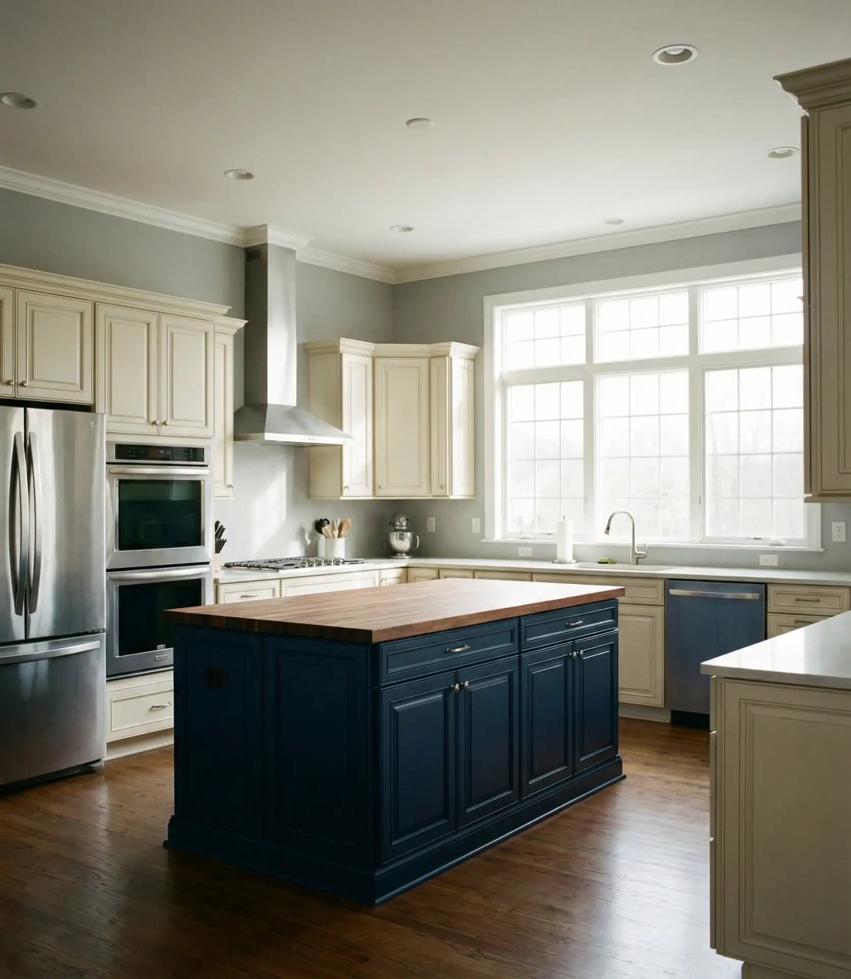
Painting just the kitchen island in deep navy creates an instant focal point while keeping the space feeling open. This approach works for those wanting moody sophistication without overwhelming the room. The neutral perimeter cabinets—whether white, cream, or light gray—allow the navy to command attention. It’s particularly effective in larger kitchens where the island serves as both workspace and gathering spot, visually anchoring the room’s center.
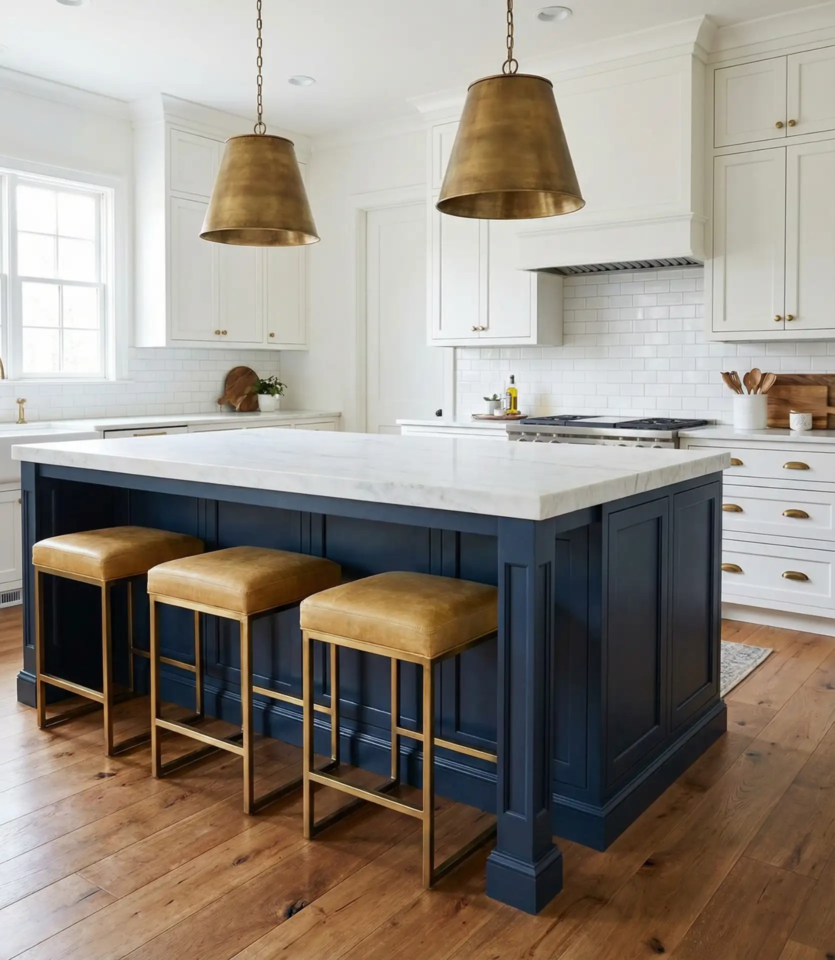
Budget angle: painting an existing island is one of the most cost-effective updates you can make. A gallon of quality cabinet paint costs $50–80 and covers a standard island with two coats. Compare this procedure to replacing the island entirely ($2,000-5,000) or installing new countertops ($1,500+), and the paint investment delivers dramatic visual change for minimal expense. Many homeowners tackle the painting process as a weekend project once they master the prep-and-prime technique.
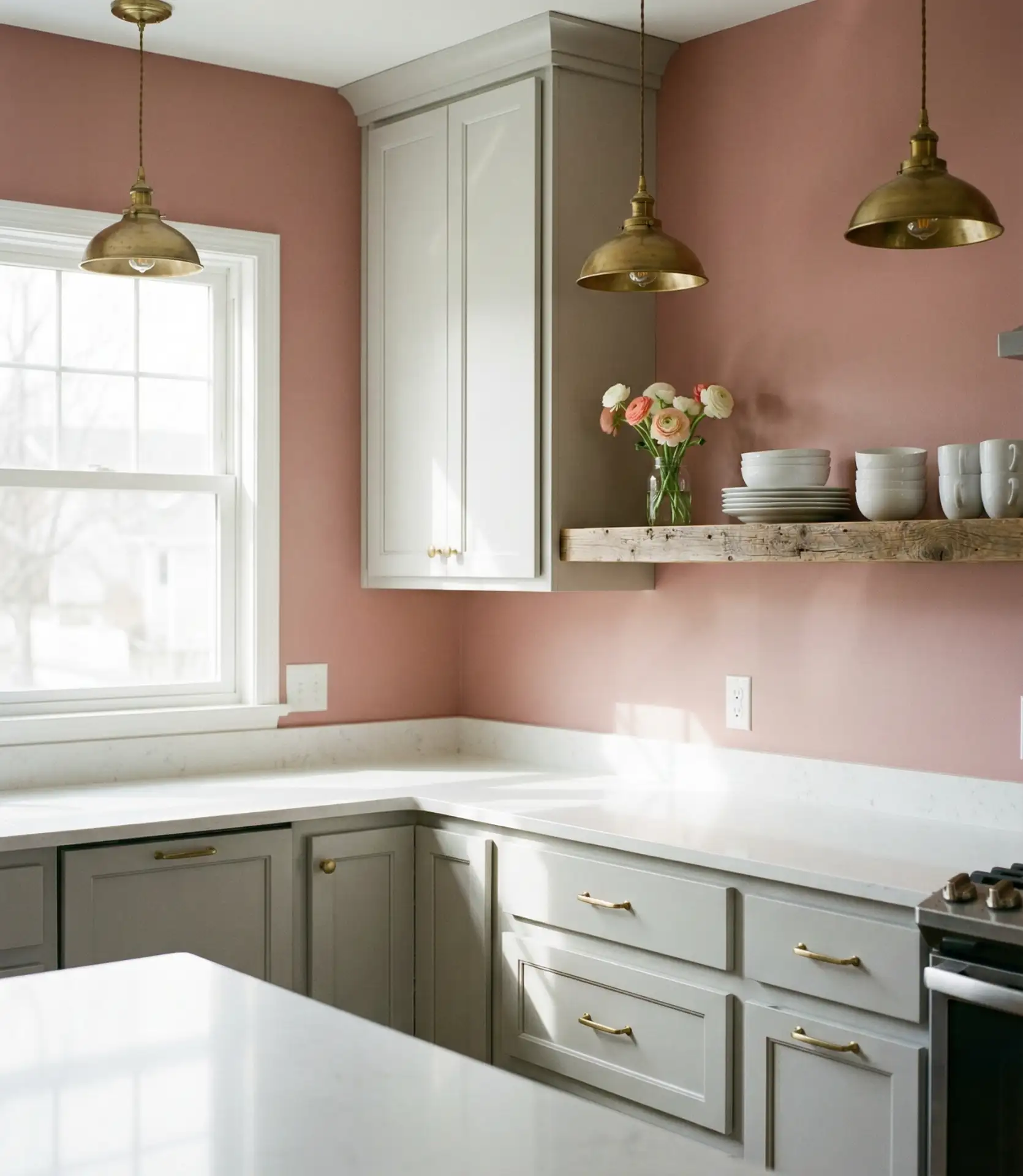
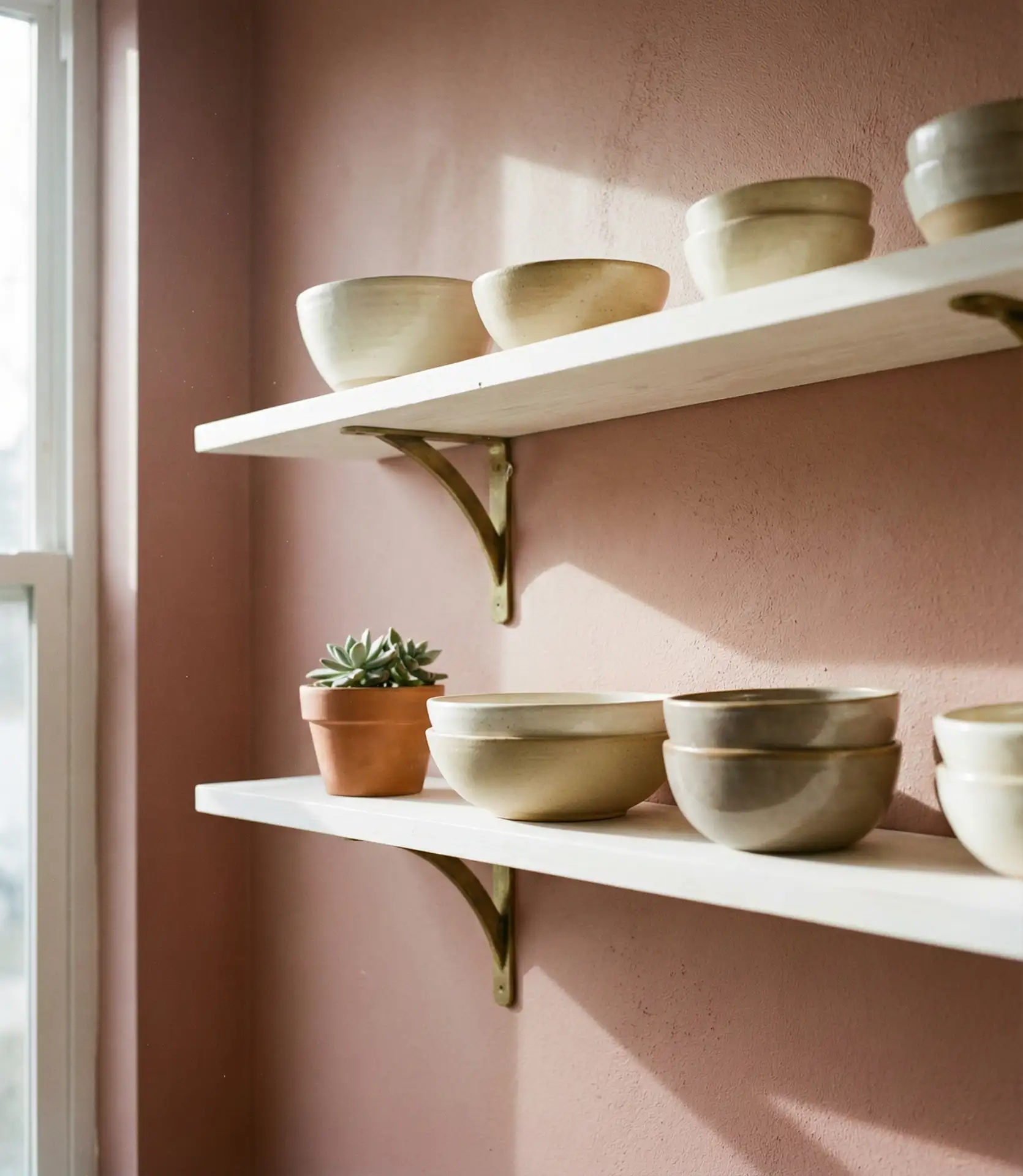
7. Soft blush pink adds a feminine yet sophisticated touch.
Dusty blush pink has evolved beyond nursery walls to become a surprisingly versatile kitchen choice. Used for walls or on upper cabinets, this muted pink brings warmth without reading overtly feminine when balanced with darker accents like black hardware or dark wood flooring. It’s showing up in cottage-style remodels and even industrial lofts, where the unexpected softness creates welcome contrast against concrete or exposed brick.
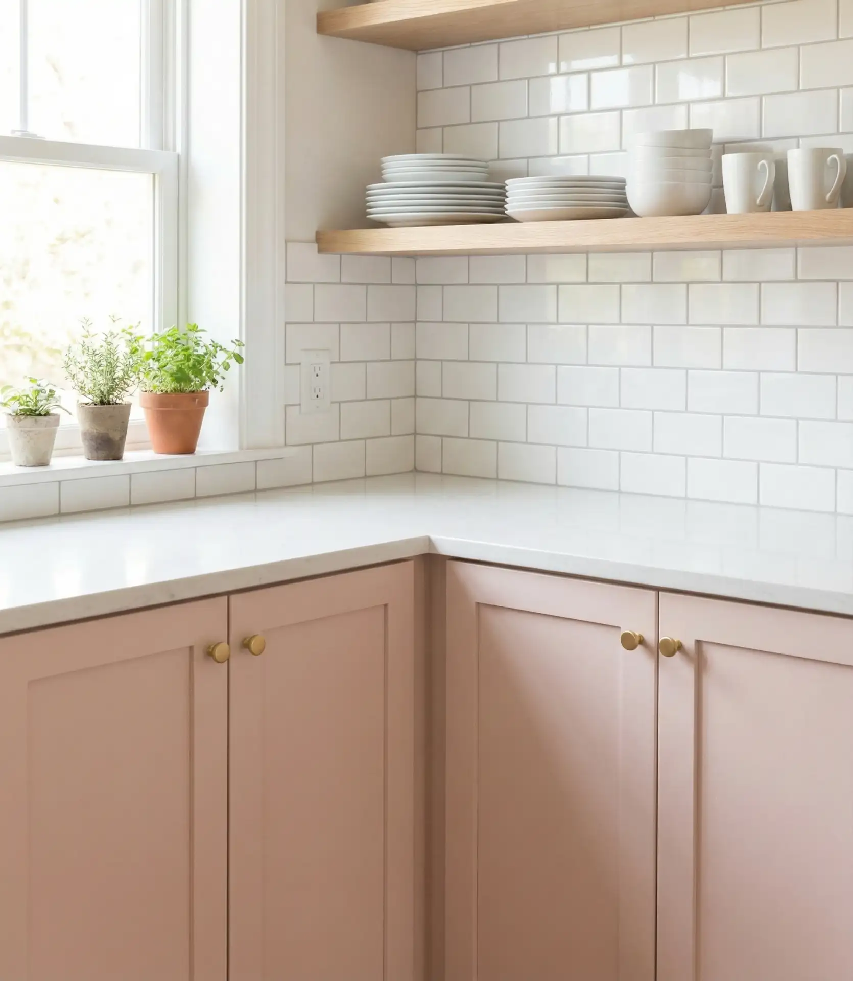
Where it works best: smaller kitchens or galley layouts where the soft color keeps the space from feeling cramped. Unlike darker hues that can close in tight spaces, blush reflects light while adding personality. It also photographs beautifully, which matters to homeowners who enjoy sharing their spaces on social media. Pair with brass or copper fixtures rather than chrome to enhance the warm, rosy undertones.
8. Forest-green cabinets with warm oak open shelving
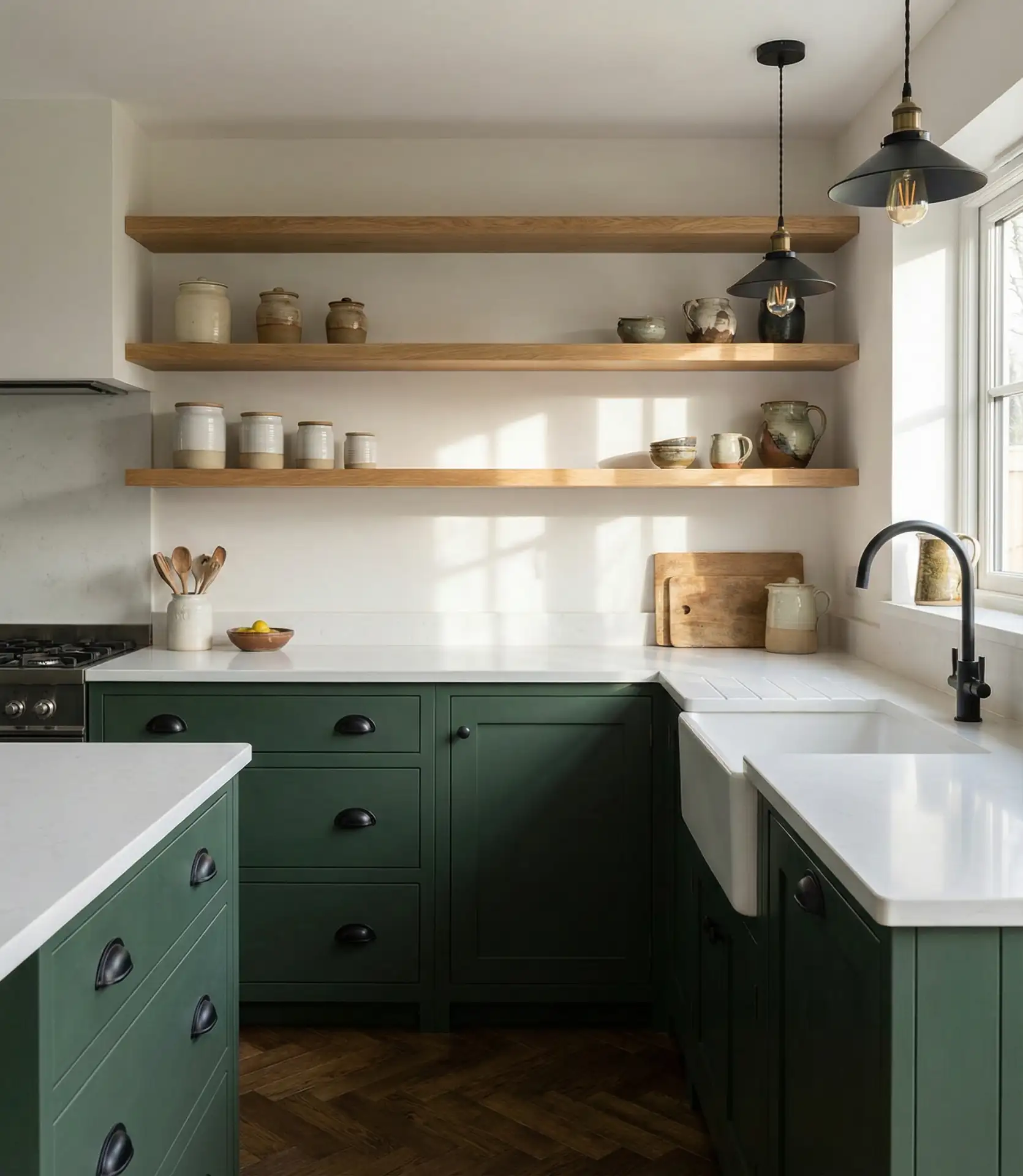
Deep green cabinets paired with natural wood cabinets or shelving create an organic, layered look that feels current yet timeless. The forest green—richer than sage, less blue than teal—evokes a connection to nature that resonates with 2026 wellness-focused design trends. When combined with unstained oak or walnut floating shelves, the pairing balances sophistication with approachability, working equally well in rustic farmhouse kitchens and sleek urban spaces.
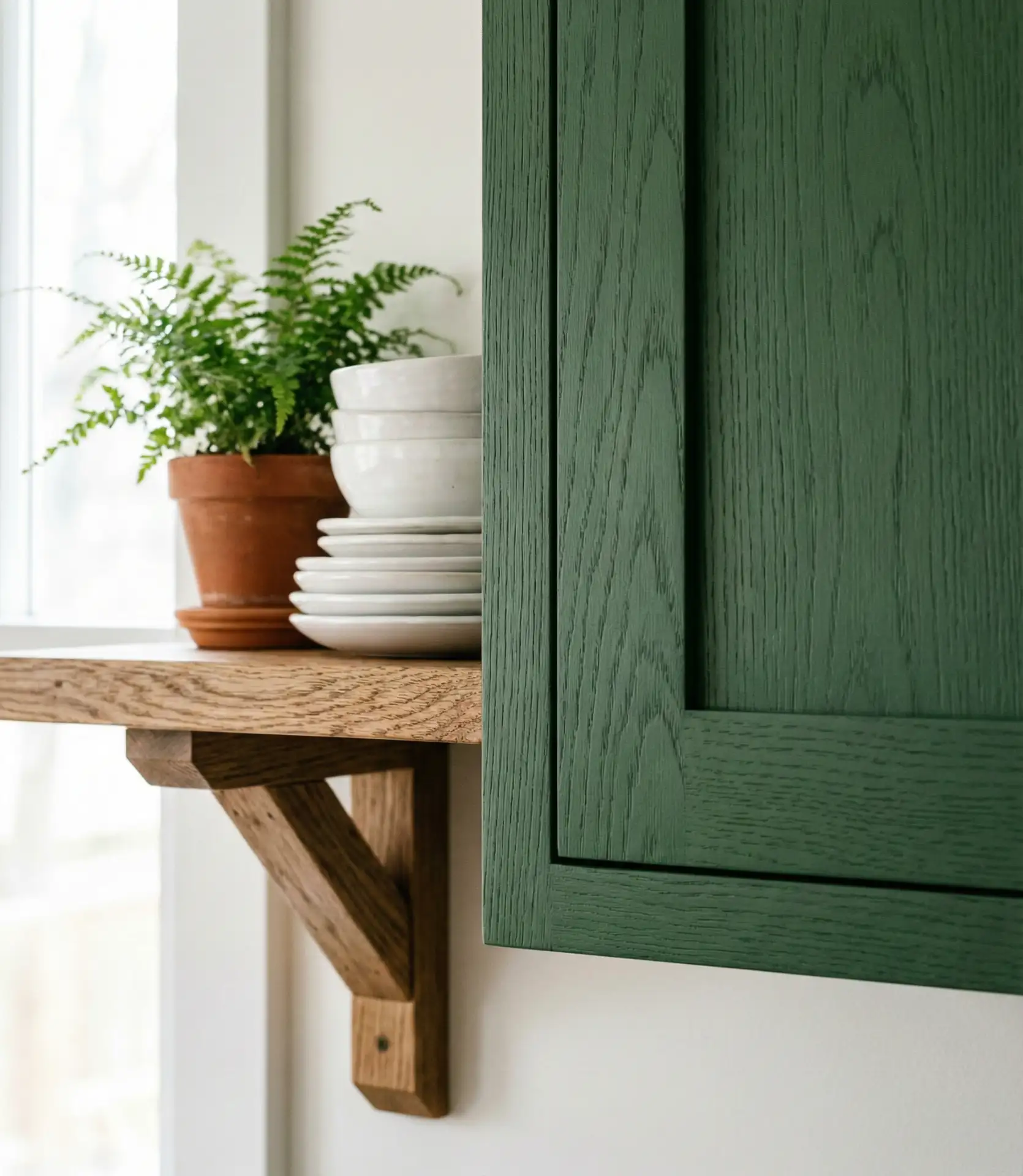
Expert-style commentary: designers recommend testing paint samples on large foam boards rather than directly on cabinets. Move these boards around the kitchen at different times of day to see how natural and artificial light affect the green’s appearance. What looks sophisticated in the afternoon sun might read as too dark or muddy under the evening pendant lights. This simple step prevents expensive regrets after committing to a full paint job.
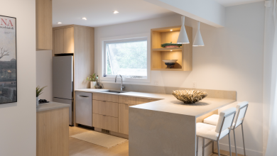
9. Warm beige walls complement honey maple cabinets.
Many homeowners with existing maple cabinets struggle to find wall colors that complement rather than clash with the wood’s golden-orange undertones. Warm beige—specifically shades with yellow or tan bases rather than gray—creates harmony by echoing the maple’s warmth. This combination works beautifully in country-style kitchens where the goal is cohesion rather than contrast, creating an envelope of warmth that makes the space feel welcoming and lived-in.
Micro anecdote: A neighbor recently transformed her 1990s kitchen simply by repainting walls from builder beige to a richer, warmer tan with slight peach undertones. The maple cabinets she’d considered replacing suddenly looked intentional and updated, saving her thousands. Sometimes the problem isn’t the cabinets—it’s that the wall color fights them instead of supporting them.
10. Charcoal gray walls ground a white kitchen.

For those finding all-white kitchens too stark, charcoal gray walls provide dramatic grounding while letting white cabinets remain the primary visual element. This inversion of the typical white-walls-dark-cabinets formula creates a gallery-like backdrop that makes cookware, artwork, and even appliances appear more curated. It’s particularly effective in kitchens with excellent natural light or in spaces designed with moody, intimate dinner party hosting in mind.
Where it works best: open-concept homes where defining the kitchen zone is desirable but not through physical barriers. The dark walls create a visual boundary that signals “cooking space” while maintaining sightlines to adjacent living areas. It also works in kitchens with abundant windows, where the dark color never feels oppressive because natural light constantly shifts the perceived tone throughout the day.
11. Soft Butter Yellow for Cheerful Vintage Charm
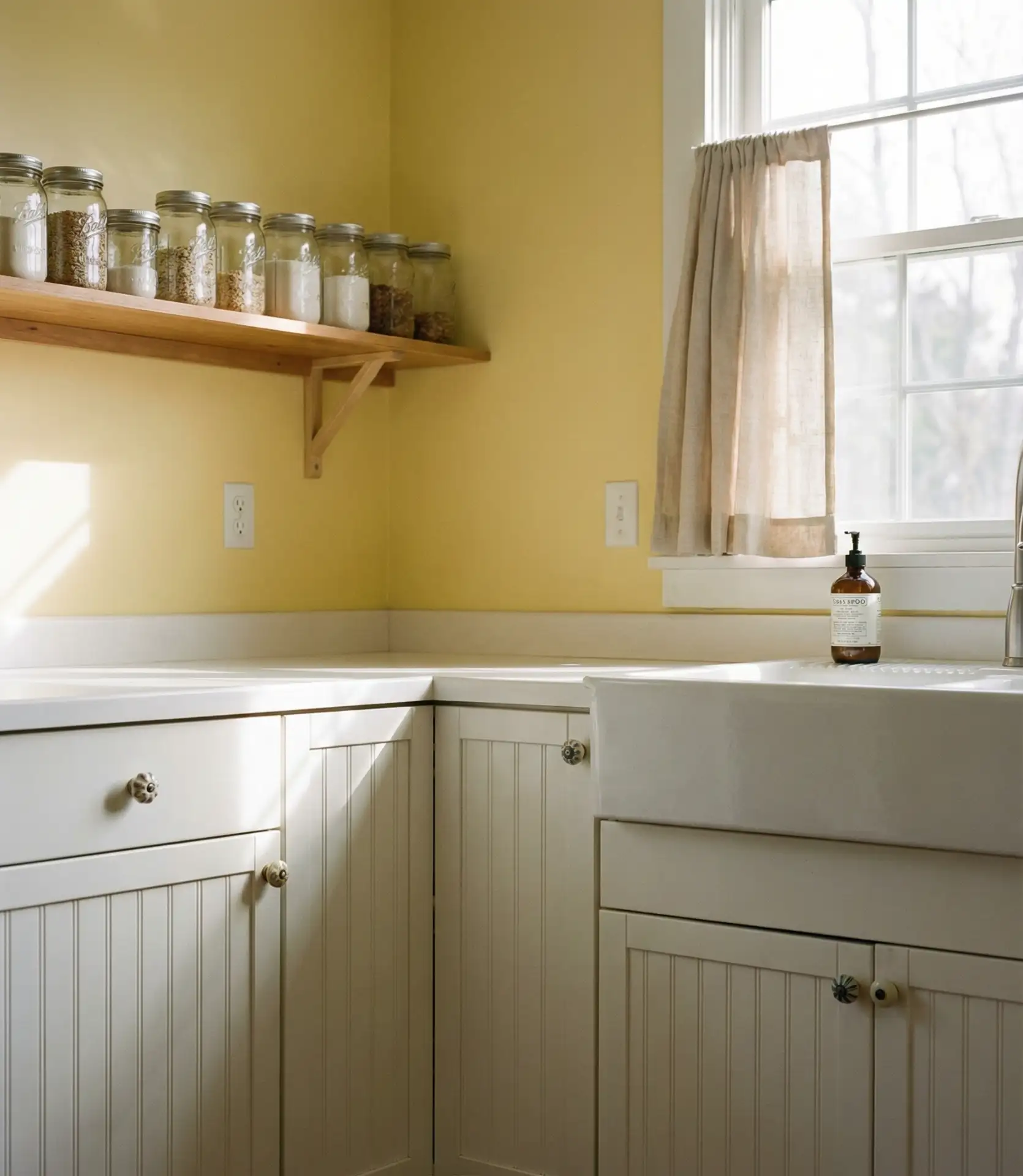
Butter yellow brings nostalgic warmth to cottage and country kitchens without the intensity of true primary yellow. This soft, creamy tone works beautifully with white cabinets and wood cabinets alike, adding instant cheerfulness to spaces that might otherwise feel dark or dated. It’s particularly stunning in kitchens with white trim and vintage-inspired fixtures, where it enhances rather than competes with traditional details like beadboard panels or farmhouse sinks.
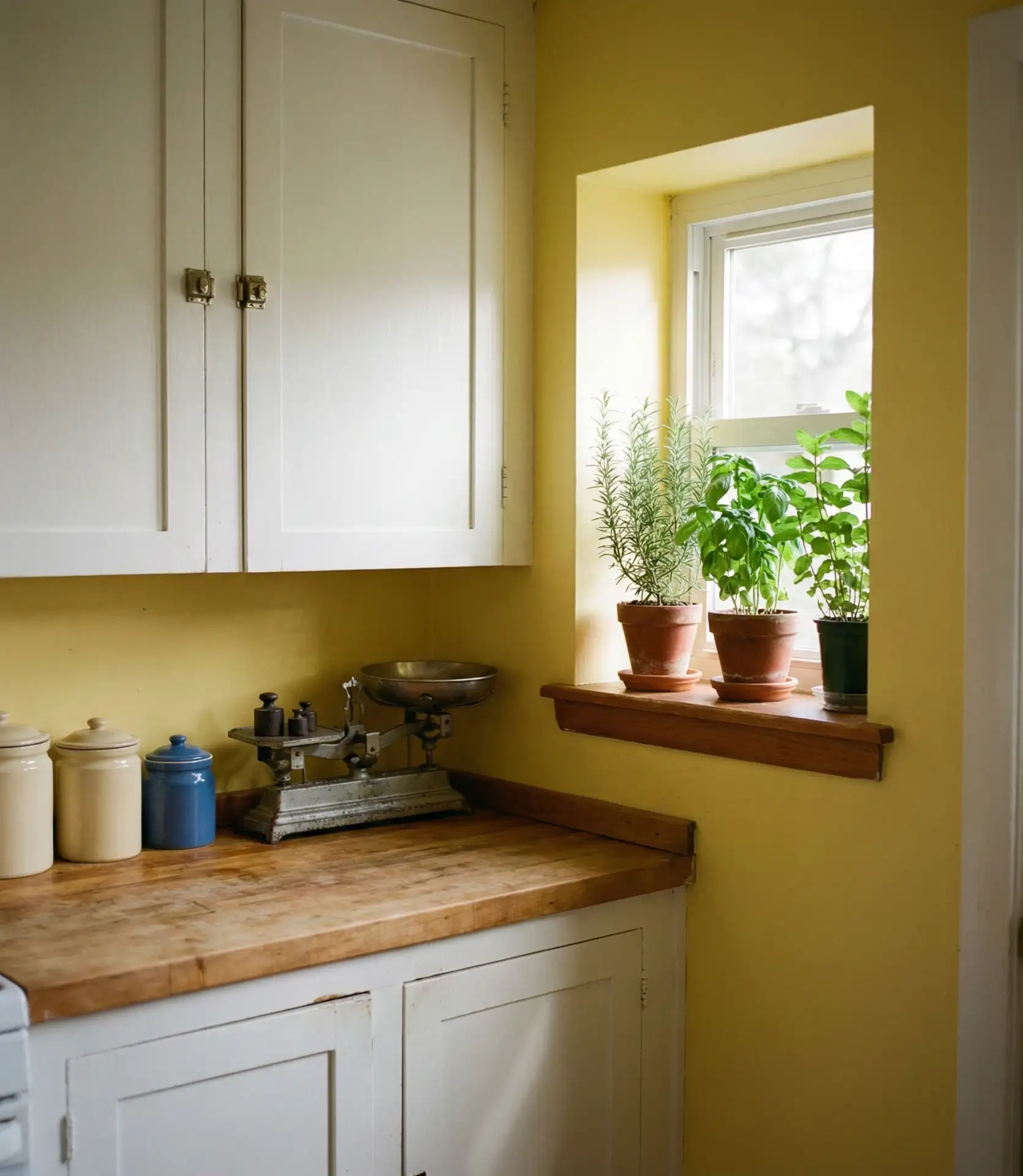
Real homeowner behavior shows that yellow kitchens often become the heart of social gatherings—there’s psychological research suggesting yellow stimulates appetite and conversation. Many report that guests naturally gravitate to kitchens painted in warm yellows, making these spaces perfect for those who enjoy hosting breakfast gatherings or afternoon coffee with friends. The color also photographs well in daylight, capturing the warmth that makes these kitchens feel so inviting.
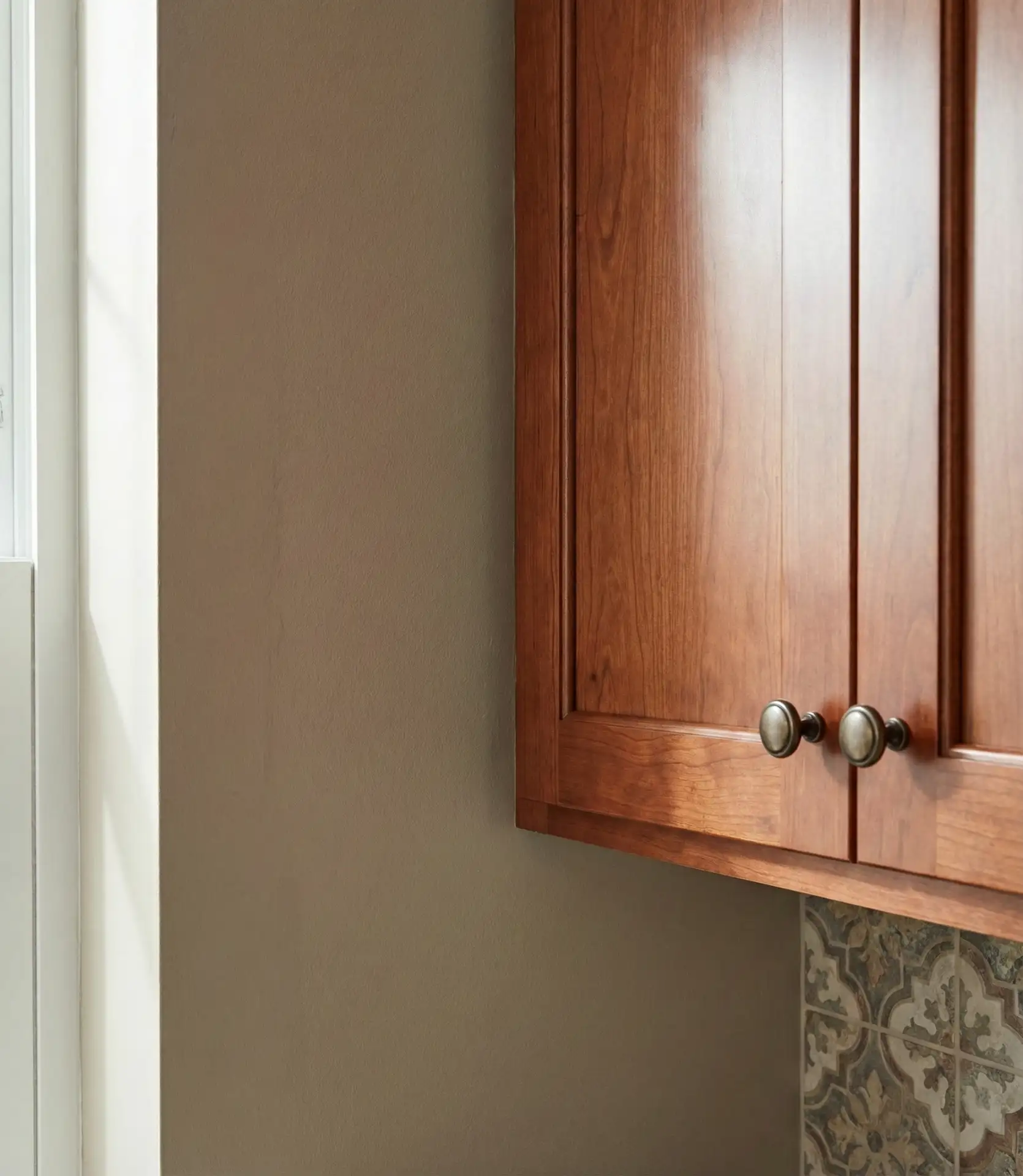
12. Deep Brown Cabinets with Cream-Colored Walls
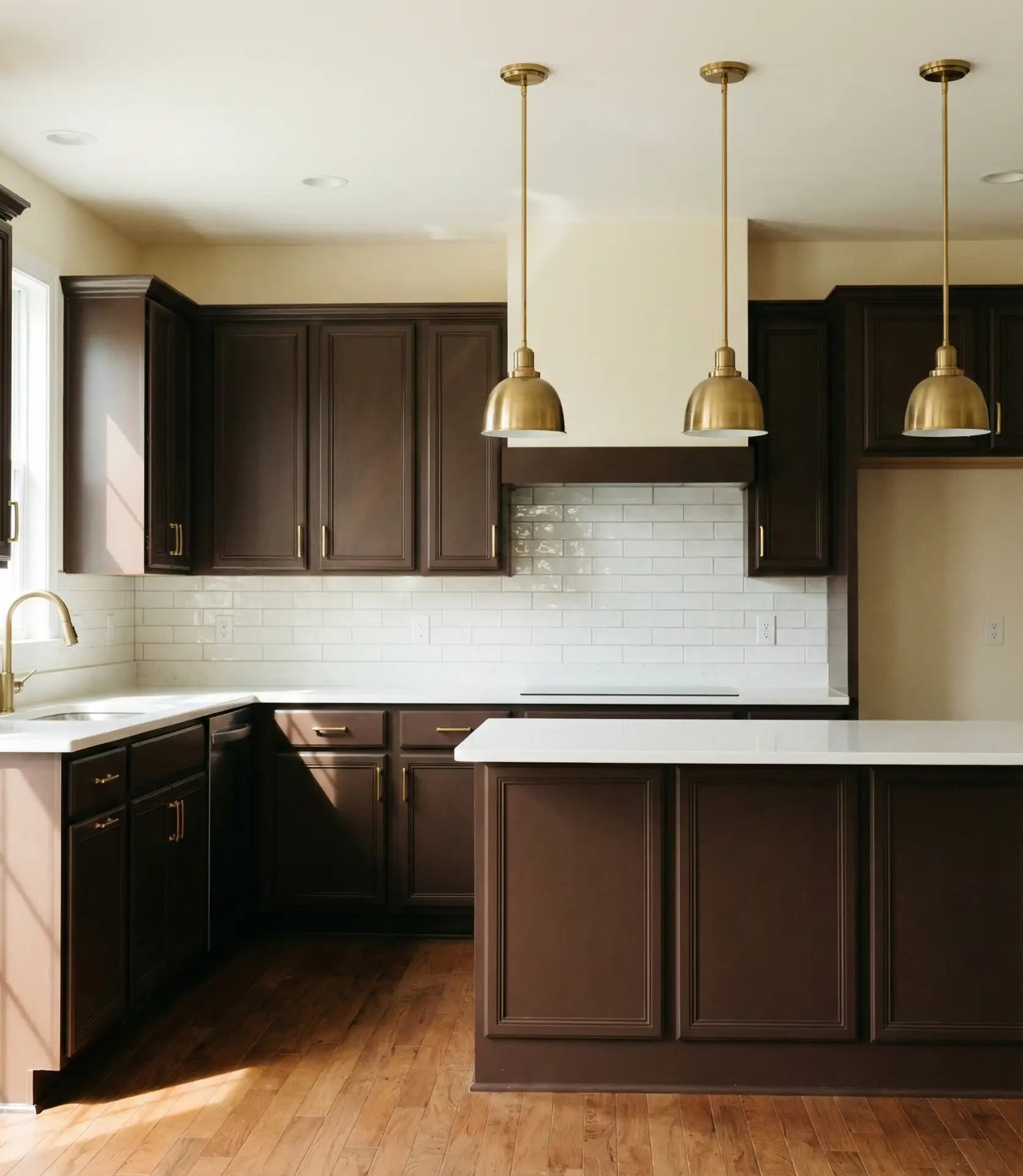
Brown cabinets are experiencing a renaissance as homeowners move away from exclusively cool-toned palettes. Rich chocolate or espresso cabinets paired with soft cream walls create a sophisticated, library-like atmosphere that feels both timeless and thoroughly modern for 2026. The combination works especially well with brass or gold hardware, which bridges the warm brown and cream tones beautifully. This pairing suits rustic and traditional styles while also appearing in contemporary designs seeking warmth.
Practical insight: brown cabinets require specific lighting considerations to prevent the space from feeling cave-like. Layer lighting sources—recessed ceiling lights, under-cabinet strips, and pendant fixtures—to ensure the rich color reads as luxurious rather than dim. Pay particular attention to task lighting at prep areas, where shadows can make detailed work difficult. The cream walls help bounce light around the room, but strategic lighting placement remains essential.
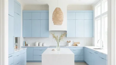
13. Pale Blue-Gray for Calming Coastal Vibes
Soft blue-gray tones bring serene coastal energy to kitchens far from any shoreline. This neutral shade reads differently depending on light—sometimes more blue, sometimes more gray—creating visual interest without drama. It pairs beautifully with white cabinets in cottage-style kitchens and also complements natural wood cabinets when the goal is a relaxed, beachy feel. Popular Sherwin-Williams options like Sea Salt or Rainwashed deliver this effect consistently.
American lifestyle context: this color trend emerged strongest in coastal states but has spread inland as remote work allows people to bring vacation-home aesthetics into primary residences. The calming blue-gray creates a kitchen environment that feels like a retreat rather than just a functional workspace. It’s particularly popular among homeowners seeking to reduce visual stimulation in a space that can become chaotic during meal prep.
14. Black Cabinets with Warm White Walls for drama..
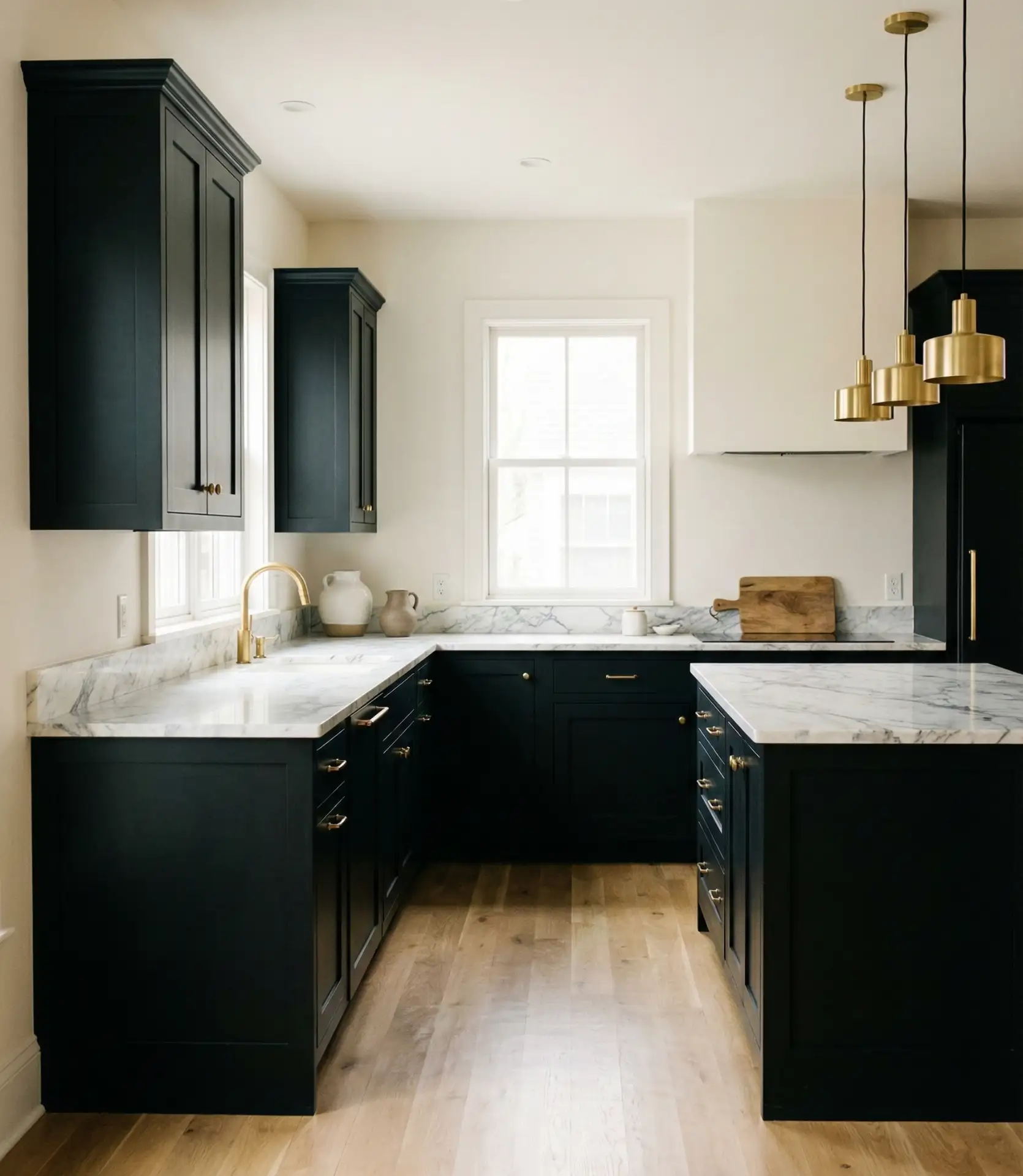
Matte black cabinets create instant sophistication, especially when surrounded by warm neutral walls in soft white or cream. This high-contrast approach defines the cabinetry as furniture rather than just storage, giving the kitchen an intentionally designed, gallery-quality feel. The strategy works particularly well in modern farmhouse renovations where traditional elements meet contemporary finishes or in urban lofts where the black reads as industrial-chic.
Common mistake to avoid: using glossy black paint, which shows every fingerprint and smudge. Instead, opt for matte or satin finishes that hide daily wear while maintaining the color’s depth. Another pitfall is insufficient lighting—black cabinets demand abundant light sources to prevent the space from feeling gloomy. Install under-cabinet lighting and ensure natural light reaches all corners, particularly if the kitchen lacks windows on multiple walls.
15. Olive Green for Earthy, Grounded Sophistication
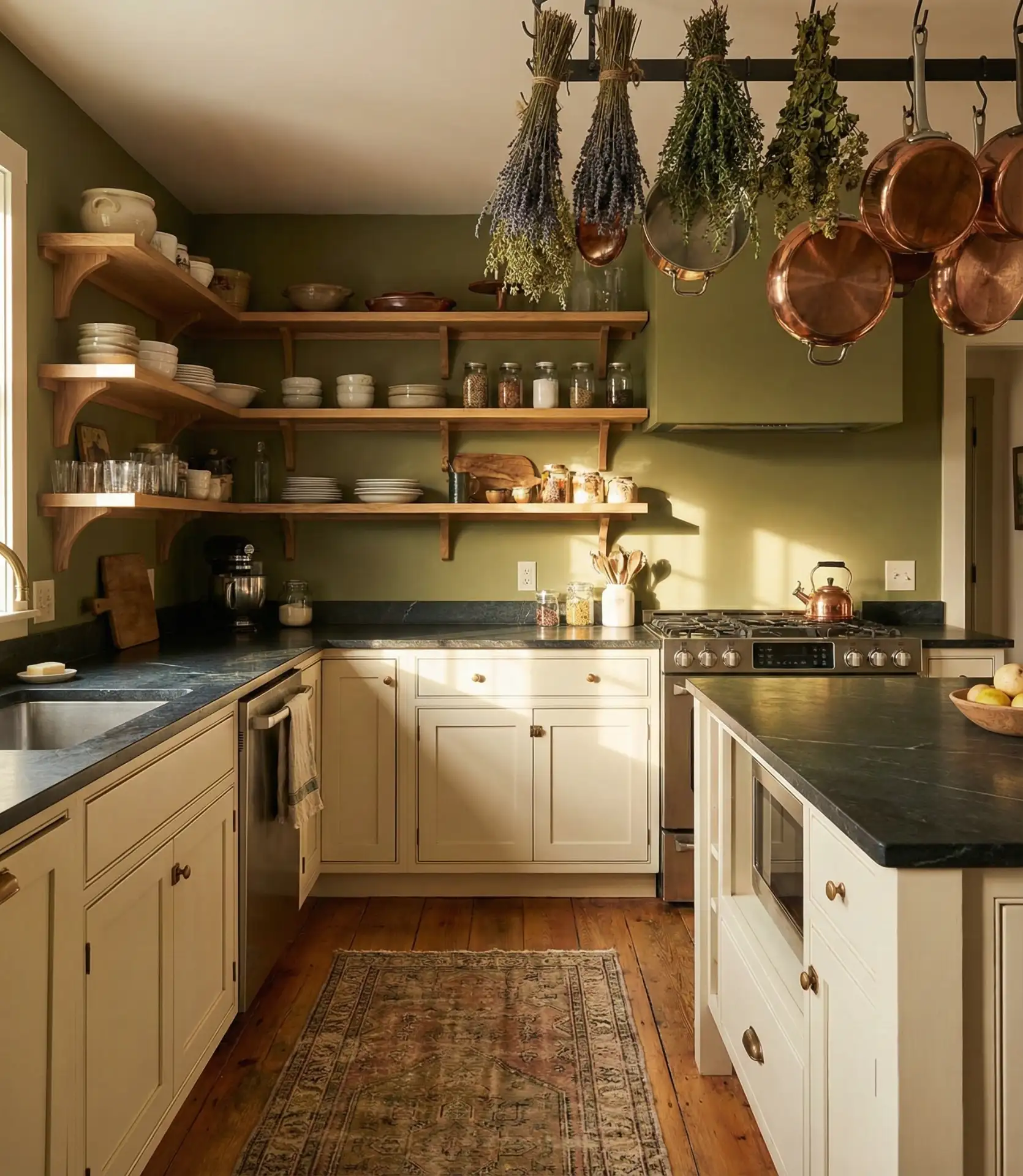
Olive green sits between sage and forest tones, offering a muted earthiness that appeals to those drawn to witchy, botanical, or nature-inspired aesthetics. Used for walls or lower cabinets, it creates a grounded, organic feel that pairs beautifully with natural materials like stone countertops, terracotta tiles, or raw wood. The color has surged in popularity alongside the broader 2026 trend toward biophilic design—bringing elements of the natural world indoors.
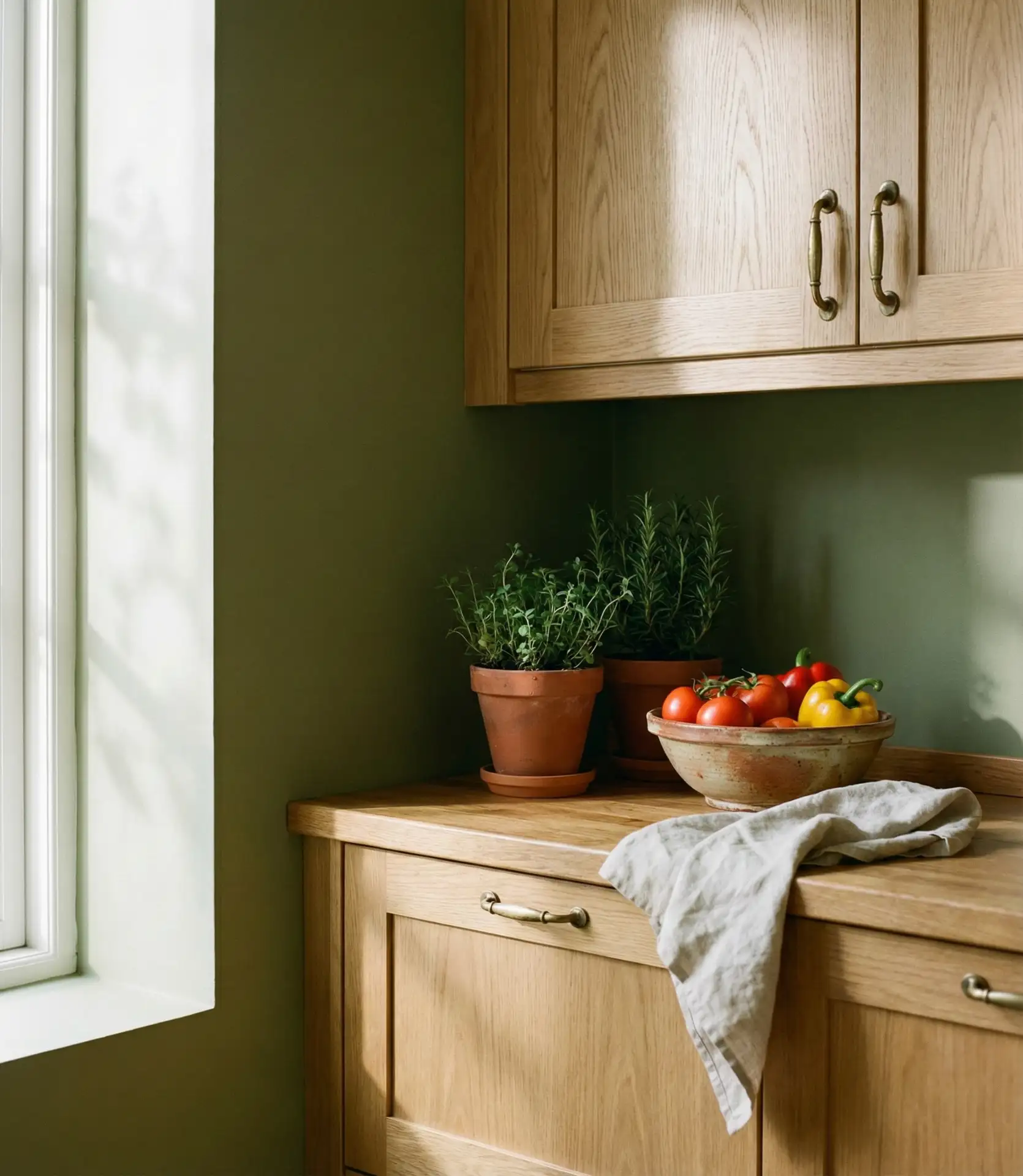
Where it works best: kitchens with abundant natural light and connections to outdoor spaces. The olive tone creates a visual bridge between the interior and the garden or patio, making the kitchen feel like part of a larger ecosystem. It’s also ideal for smaller urban kitchens where access to nature is limited—the color provides psychological benefits of greenery without requiring actual plants, though adding them certainly enhances the effect.
16. The combination of taupe walls with cherry or mahogany wood cabinets creates a sophisticated look.
Taupe—a sophisticated blend of gray and brown—provides the perfect neutral backdrop for reddish wood cabinets like cherry or mahogany. Where cooler grays can make red-toned wood appear garish, taupe’s warmth creates harmony by sharing similar undertones. This combination appears frequently in traditional and transitional kitchens where the goal is to honor existing quality cabinetry while updating the surrounding space. It’s a smart choice for ideas that maximize existing investments.
Budget angle: many homeowners with 1990s-era cherry cabinets consider replacement until they discover that simply repainting walls from cool gray or stark white to warm taupe transforms the entire look. This single change—costing $200-400 in paint and supplies—can eliminate the “dated” feeling and extend the life of quality cabinets by another decade. It’s one of the highest-return cosmetic updates available.
17. Dusty Rose for Unexpected Warmth
Dusty rose—deeper than blush but softer than mauve—brings sophisticated warmth to kitchen spaces. Used for walls in cottage or eclectic designs, it pairs surprisingly well with gray, white, or even green cabinets, creating a layered, collected-over-time aesthetic. The color has gained traction as more homeowners embrace personalized spaces over magazine-perfect neutrality, seeking walls that reflect personality rather than playing it safe with beige.
Expert-style commentary: when introducing unconventional colors like dusty rose, start with smaller commitment areas—an accent wall behind open shelving or just the space above cabinets. This allows you to test how the color feels in your specific light conditions and with your daily routines before committing to painting the entire kitchen. Many designers recommend this “pilot wall” approach for any color that deviates from safe neutrals.
18. Cool gray cabinets with warm walls for balance.
Gray cabinets can read cold or sterile unless balanced with warm neutral wall colors. Pairing cool-toned gray cabinetry with walls in soft beige, warm greige, or even pale terracotta creates necessary contrast and prevents the kitchen from feeling like a commercial space. This combination works particularly well in modern farmhouse designs, where the gray provides contemporary polish while warm walls maintain the coziness expected of farmhouse style.

Practical insight: the key to making this combination work is understanding undertones. Gray cabinets with blue undertones need walls with yellow or tan undertones to create balance. Gray with purple undertones pairs better with walls that have pink or beige bases. Test paint samples side-by-side with your cabinet color in both natural and artificial light before committing—what looks balanced at 2pm might clash under evening pendant lights.
19. Pale Mint Green for Retro Charm
Soft mint green evokes 1950s diners and vintage kitchens but feels fresh rather than dated when executed with contemporary finishes. Used on cabinets or walls in cottage or eclectic spaces, it brings playful energy without overwhelming the senses. The color pairs beautifully with white trim, natural wood accents, and brass fixtures, creating a cheerful environment that still reads as sophisticated. It’s particularly popular in smaller city kitchens where personality matters more than resale appeal.
Real homeowner behavior: mint kitchens often start with a vintage appliance—a restored mint green stove or refrigerator—that inspires the entire color scheme. Owners then paint cabinets to match or complement, creating cohesive retro designs that feel personal rather than decorator-prescribed. This bottom-up design approach results in spaces with authentic character, where the color story emerges organically rather than being imposed from a predetermined palette.
20. Rich Burgundy Accent Wall Behind Breakfast Nook
Deep burgundy or wine-colored walls create a jewel-box effect, particularly in breakfast nooks or dining areas adjacent to kitchens. This moody choice adds dramatic sophistication without painting the entire cooking space in dark tones. The rich color makes these gathering spots feel intimate and special, perfect for morning coffee or evening wine. It works especially well with neutral kitchen cabinets that keep the main workspace light and functional.
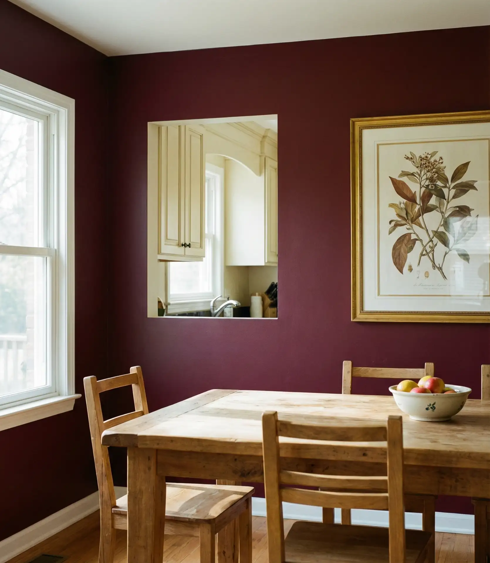
Where it works best: open-plan spaces where defining different zones enhances functionality. The burgundy wall signals “dining area” while keeping the cooking space neutral, allowing one room to serve multiple purposes without physical division. This approach is particularly valuable in homes where the kitchen flows into living room spaces, providing visual breaks that improve the sense of organization and purpose in each area.
21. Creamy Off-White Everything for Seamless Flow
Rather than crisp white, many 2026 kitchens embrace creamy off-white tones on both walls and cabinets for a softer, more forgiving aesthetic. This monochromatic approach in warm whites creates a seamless envelope that makes small kitchens feel larger and busy kitchens feel calmer. The subtle warmth prevents the sterile feeling sometimes associated with all-white spaces while maintaining the light-reflecting benefits. It’s particularly effective in farmhouse and transitional designs.
Common mistake to avoid: using the exact same off-white on every surface in the same finish. This flattens the space rather than creating the intended cohesion. Instead, use the same color family but vary the sheen—matte on walls, satin on cabinets, and semi-gloss on trim. The different finishes reflect light differently, creating subtle dimension that prevents the monochrome look from reading as flat or unfinished.
22. The design features slate blue lower cabinets paired with white upper cabinets.
Two-toned cabinetry continues trending, with slate blue lower cabinets and white uppers creating a balanced, sophisticated look. The darker blue grounds the space, while white uppers maintain an open, airy feeling. This combination works beautifully in both modern farmhouse and contemporary kitchens, offering visual interest without the commitment of painting everything in a bold color. The approach also makes upper cabinets recede visually, which is helpful in kitchens with lower ceilings.
Budget angle: painting just lower cabinets allows homeowners to test bold color without full commitment or expense. A gallon of quality cabinet paint covers approximately 350 square feet, meaning most lower-only projects require just two gallons ($100-160 total). If the color works, adding it to an island or accent wall later extends the look. If it doesn’t resonate after a few months, only the lower cabinets need repainting—a much smaller project than starting over entirely.
23. Warm Mushroom Gray for Contemporary Neutrality
Mushroom gray—a warm gray with subtle brown undertones—provides contemporary neutrality without the coldness of true gray. Used for walls or cabinets, it creates a sophisticated backdrop that works across multiple design styles, from minimalist to rustic. The color is particularly effective with wood cabinets or natural wood elements, where it provides calm contrast without competing. Sherwin-Williams Mindful Gray exemplifies this increasingly popular neutrality.
Where it works best: contemporary homes seeking warmth without traditional styling or transitional spaces bridging modern and classic aesthetics. The mushroom tone reads sophisticated in urban lofts with concrete floors and stainless appliances, while also working in suburban homes with wood floors and granite counters. Its versatility makes it valuable for homeowners who redecorate frequently—the neutral allows for shifting accent colors without requiring repainting.
24. Terracotta cupboards with Soft White Walls
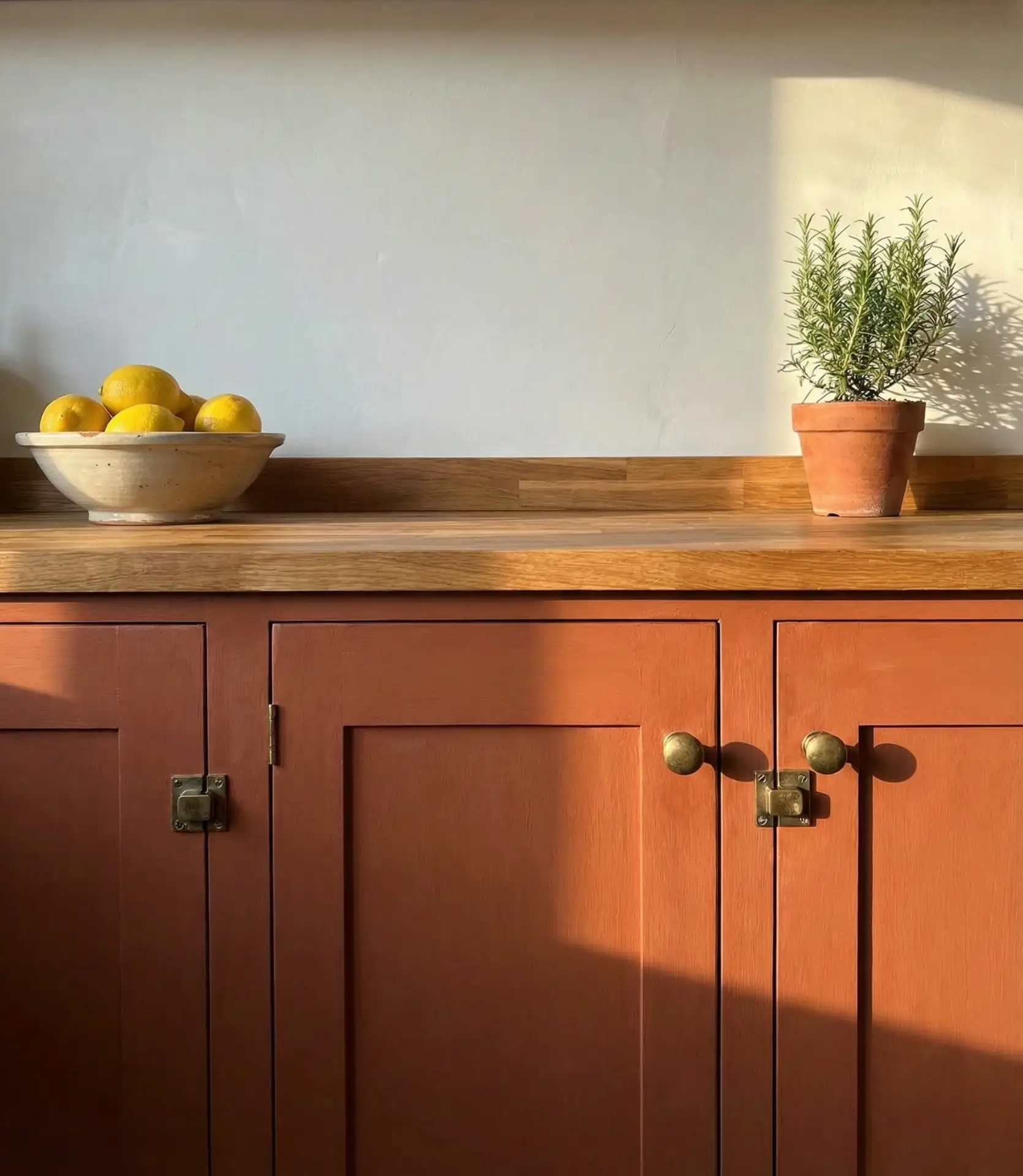
For the truly adventurous, terracotta-painted cabinets bring earthy warmth and unmistakable personality. Paired with white or cream walls, the burnt orange-clay tone creates a kitchen that feels traveled, globally inspired, and utterly unique. This bold choice works particularly well in cottage or bohemian designs where eclectic choices are celebrated and where the terracotta can be balanced with natural wood, rattan, and woven textiles. It’s definitely a 2026 trend for design-forward homeowners.
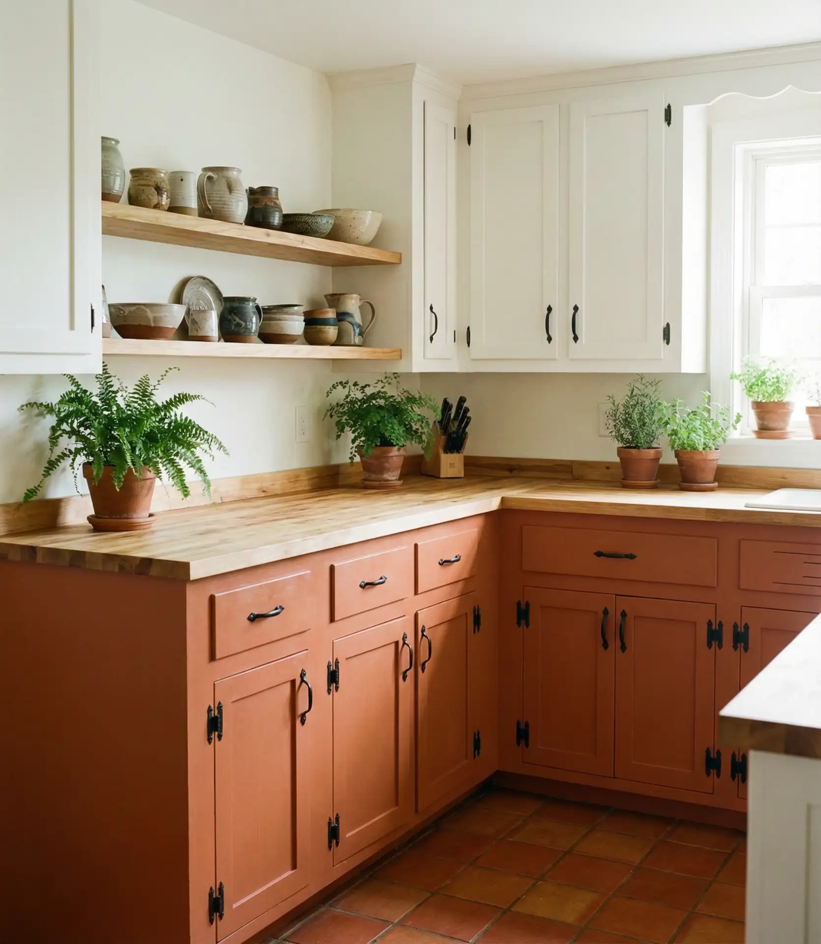
Expert-style commentary: terracotta is a commitment color that requires confidence and complementary choices throughout the space. It pairs best with warm metals (brass, copper, bronze), natural materials (wood, stone, clay), and warm-toned whites. Avoid mixing it with cool silvers or stark whites, which create jarring contrast. When done right, a terracotta kitchen becomes the home’s most memorable space—the room guests talk about and admire for its courage and cohesiveness.
Choosing kitchen paint colors for 2026 means balancing personal taste with practical considerations—how light shifts through your space, what existing elements you’re working with, and how you want the room to feel during daily use. The ideas here represent the diversity of options available, from safe neutrals that honor traditional styling to bold color statements that transform kitchens into true design moments. Whatever direction you choose, remember that paint is one of the most reversible design decisions you can make. If a color doesn’t work as expected, you can repaint. But often, taking that initial leap toward a more personalized palette results in a kitchen that finally feels like yours. We’d love to hear which of these ideas resonates with your vision—share your thoughts in the comments below.