Color is having a serious moment in American homes, and if your Pinterest feed is any indication, people are done playing it safe with all-white walls and beige everything. The living room—that central gathering place where life actually happens—is becoming the canvas where homeowners are finally taking risks. Whether you’re drawn to moody jewel tones, soft pastels, or a single bold accent wall that changes the entire energy of a room, 2026 is the year to commit. In this article, we’re sharing real, actionable ideas to help you build a colorful living room that feels personal, layered, and completely alive—no design degree required.
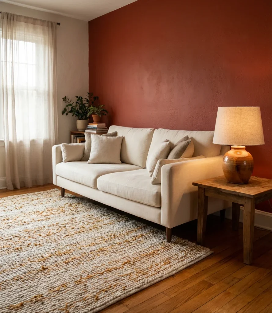
1. Warm Terracotta Accent Wall
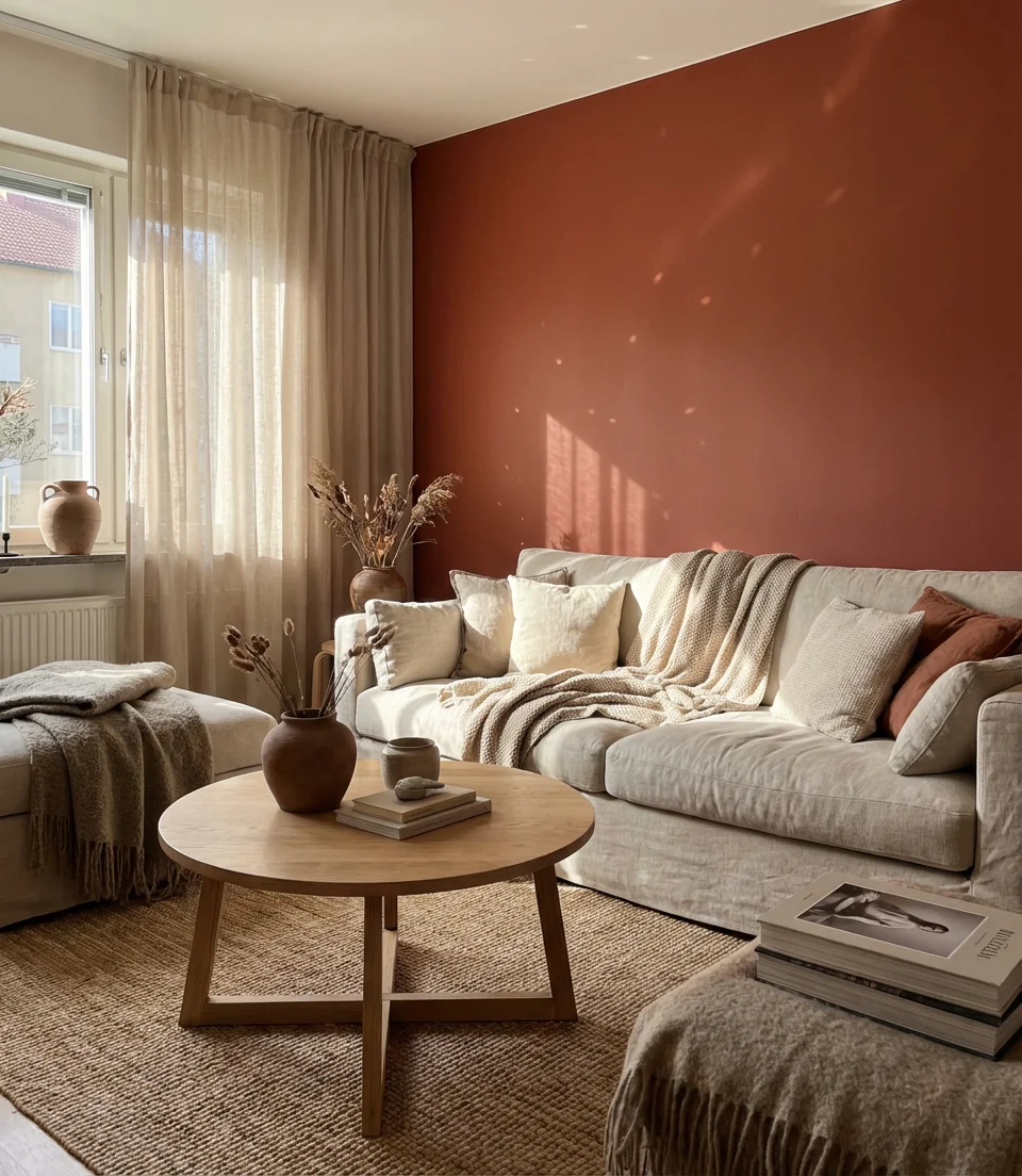
A warm earth tone like terracotta is one of the most transformative things you can do to a living room without touching a single piece of furniture. When used as an accent wall, it creates an instant focal point—something Pinterest-worthy that also feels genuinely livable. Terracotta pairs beautifully with natural wood tones, linen upholstery, and aged brass hardware, making it one of the most versatile shades in the 2026 interior palette.
Terracotta works especially well in Southwest and California-style homes, but don’t let that limit you—it adapts beautifully in East Coast apartments and Midwest craftsman bungalows alike. A quart of sample paint is available for under ten dollars, so it would be advisable to test it on a large poster board before making a commitment. If the full wall feels like too much, consider painting just the fireplace surround or a recessed niche. Small commitment, big impact.
2. Moody Navy Living Room
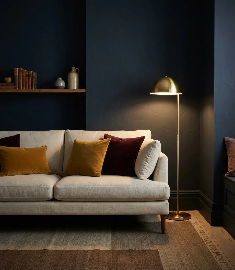
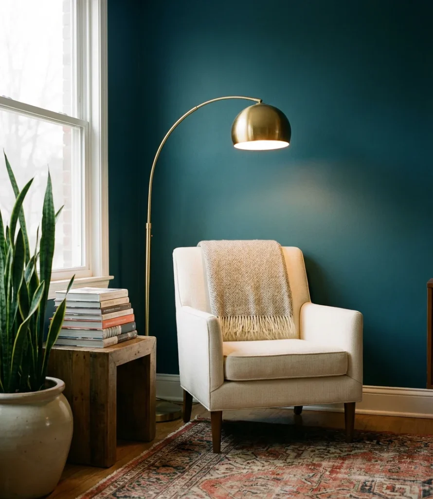
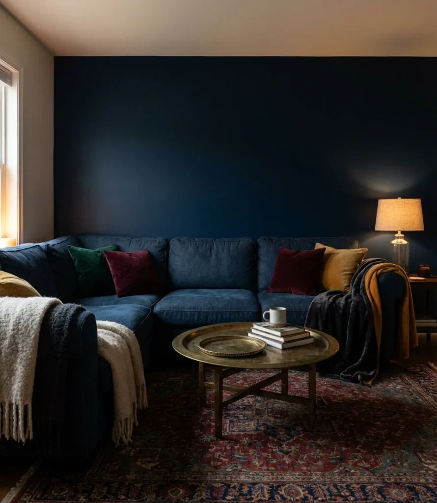
There’s something undeniably sophisticated about a moody, deeply saturated navy living room. This isn’t the timid, pale blue of a beach cottage—this is a commitment to depth, drama, and atmosphere. Dark walls in a living room used to feel risky, but designers and homeowners alike have embraced the envelope-pushing shift, especially in north-facing rooms where natural light is already limited and you might as well lean into the drama.
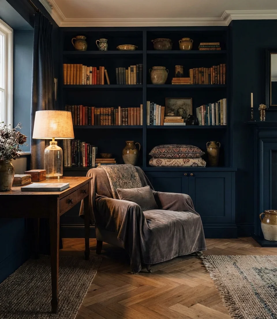
Interior designers often describe going dark as “the best mistake their clients ever made.” The key is to extend the navy to the trim and ceiling as well—partial application can feel unfinished, while a full envelopment reads as intentional and luxurious. Pair it with warm lighting: a mix of table lamps and sconces keeps the room inviting rather than cave-like. Benjamin Moore’s “Hale Navy” and Sherwin-Williams’ “Naval” are consistently among the most-pinned colors for this look.
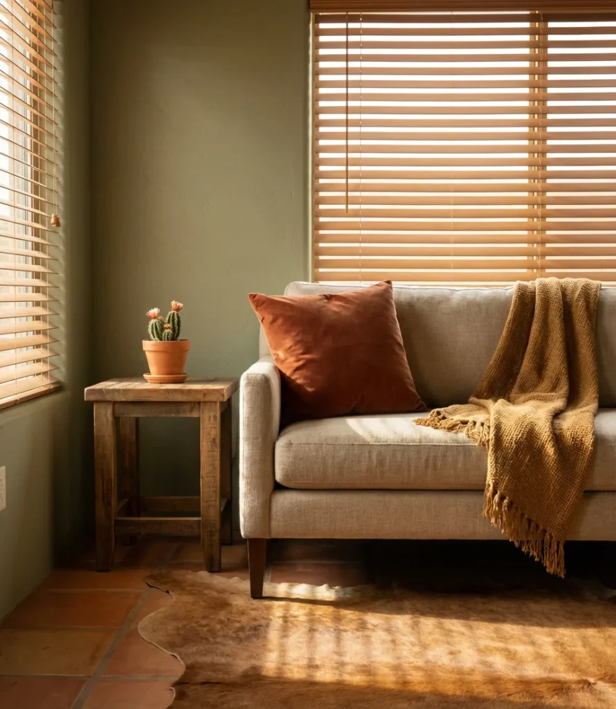
3. Sage Green Walls with a White Couch
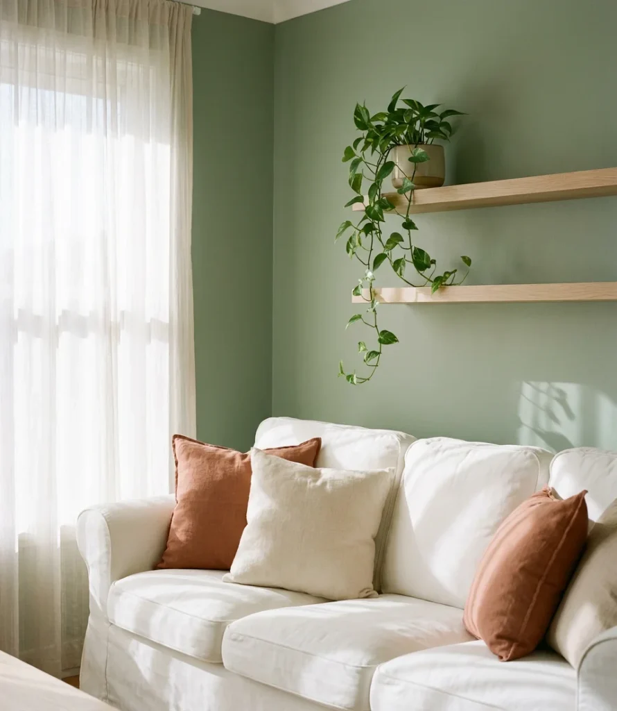
The combination of soft sage green wall paint and a white couch is one of those pairings that feels simultaneously fresh and timeless. Sage sits in that magical middle ground between green and grey—it reads as natural and organic without feeling too earthy or too cold. For homeowners who want color but aren’t ready to go bold, this pairing is the perfect entry point.
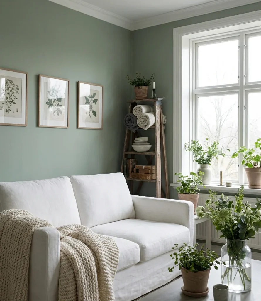
White slipcover sofas have seen a massive resurgence, especially among younger homeowners who appreciate both the clean look and the machine-washable convenience. One homeowner in Austin shared that the sage-and-white combo made her 900-square-foot apartment feel like a treehouse—grounded and bright at the same time. For the walls, look at Behr’s “Seawashed” or Farrow & Ball’s “Mizzle” as starting points for a muted, sophisticated sage.
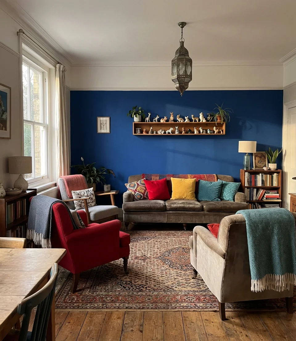
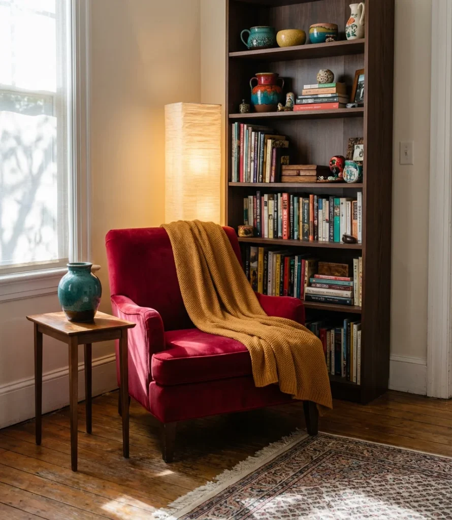
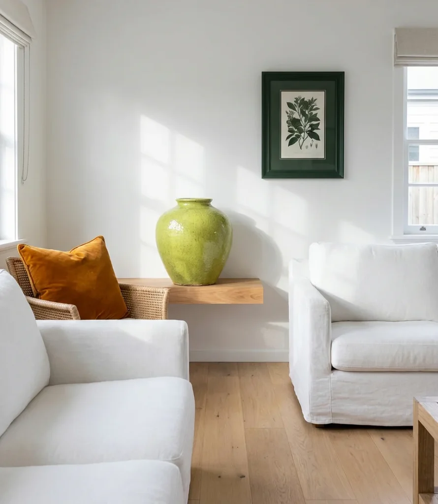
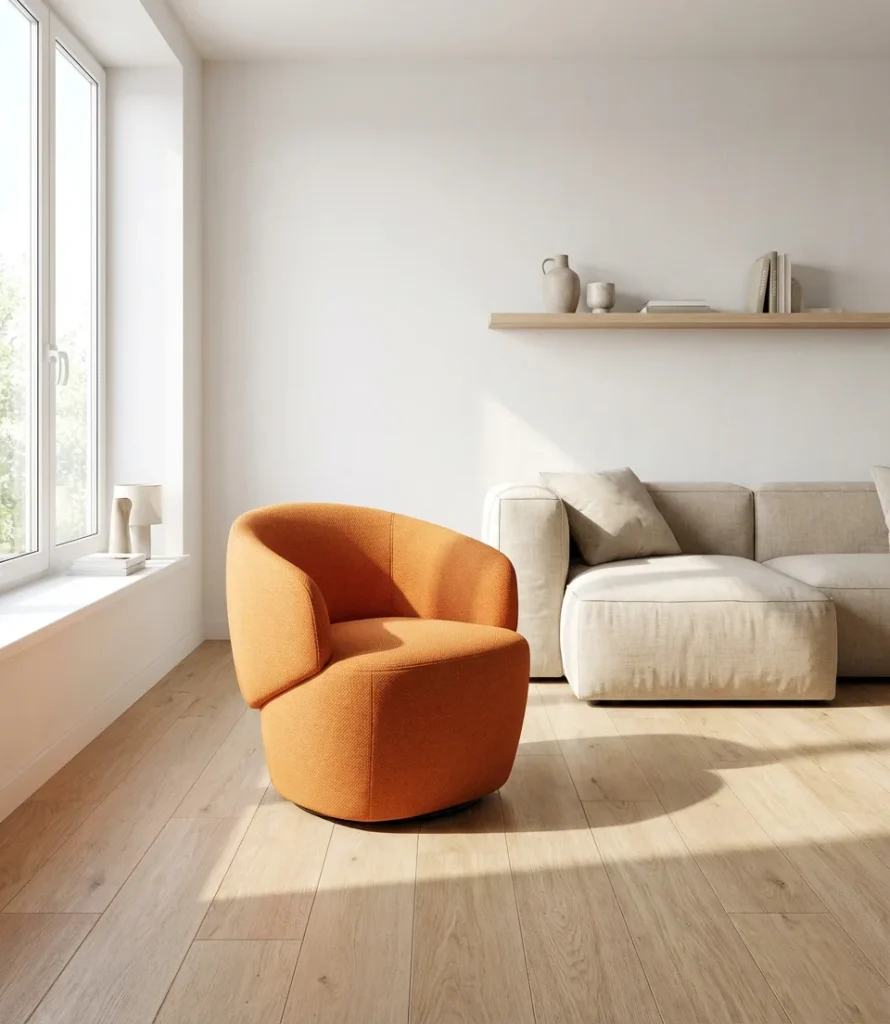
4. Pop of Color with a Bold Sofa
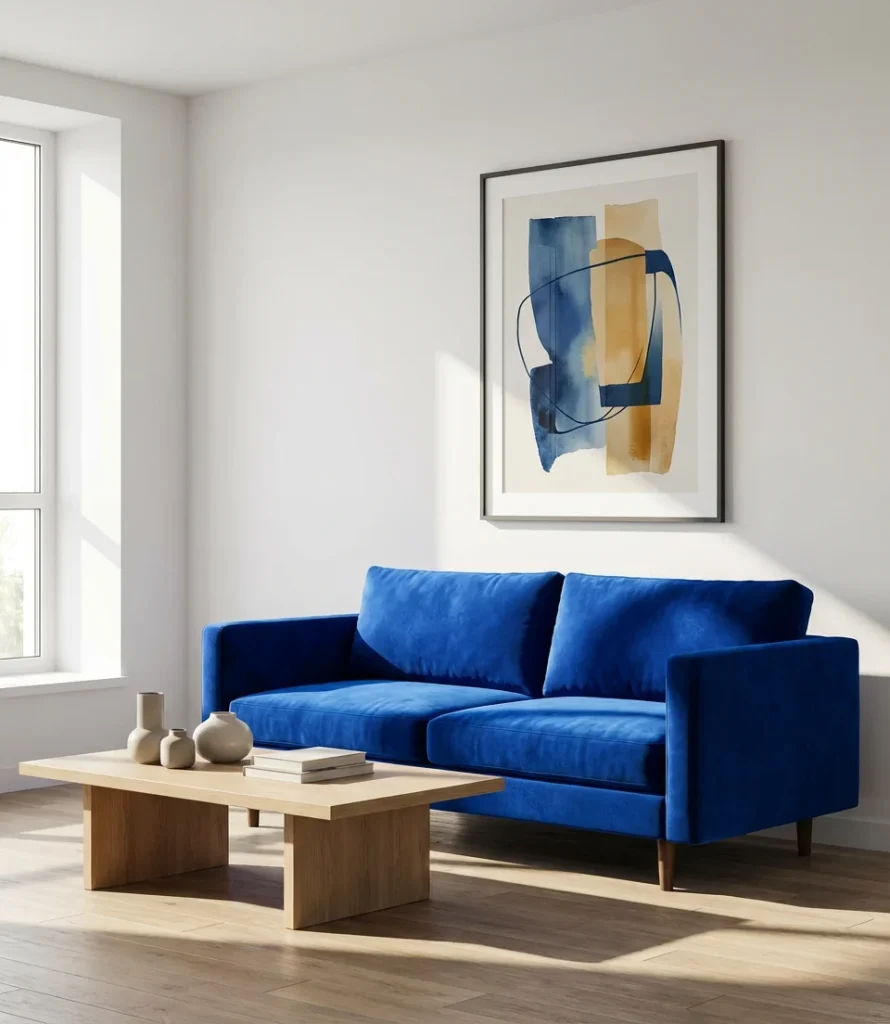
Sometimes, a single piece of furniture can make a significant impact. Introducing a pop of vivid color through a statement sofa—think ochre velvet, cobalt bouclé, or forest green chenille—can completely redefine a neutral room without repainting a single wall. This approach is increasingly popular among renters and first-time homeowners who want personality without permanence.
The most common mistake with a bold sofa is choosing a color that doesn’t connect to anything else in the room—it ends up looking stranded rather than styled. Solve this by repeating the sofa’s color at least twice more: in a throw pillow, a vase, or a piece of art. This “rule of three” is a designer shortcut that makes even the most unexpected sofa choice feel considered and complete. Budget tip: Article, Interior Define, and West Elm all offer vibrant sofa options under $1,500.
5. Pastel Living Room with Layered Softness
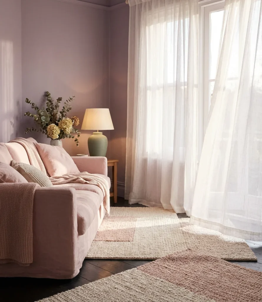
The pastel living room isn’t the washed-out, barely-there palette of the early 2000s—in 2026, pastels are bolder, more intentional, and layered with texture for depth. Think dusty lavender walls with a blush sofa and sage green ceramic lamps. The result is dreamy but not precious, cozy but still visually intriguing. This approach thrives in bedrooms converted to sitting rooms, studio apartments, and light-filled sunrooms.
Pastel rooms photograph exceptionally well in natural light, which explains their continued dominance on Pinterest and Instagram. The key to keeping a pastel room from feeling flat is texture: think bouclé, woven baskets, linen drapes, and handmade ceramics. Where it works best: south-facing rooms with abundant light, where soft hues won’t wash out under flat overcast skies. Avoid pastels in north-facing rooms, where they can read as murky.
6. Eclectic Maximalist Color Mix
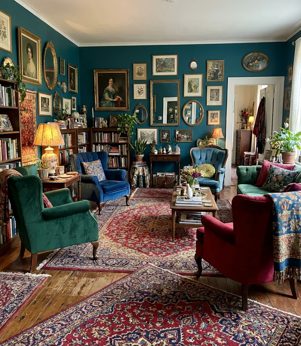
For those who believe more is more, the eclectic maximalist living room is a full-throated embrace of color, pattern, and personality. This isn’t chaos—it’s a curated cacophony. Think primary color blocking on the walls, vintage Persian rugs layered on sisal, and mismatched velvet chairs that somehow, miraculously, work together. The unifying element isn’t color; rather, it’s the deliberate design and the assured touch of an individual who understands their passion.
Think of a real maximalist home the same way you’d think about a magnificent record collection: it reflects decades of discovery, nothing is accidental, and every piece has a story. The biggest mistake maximalist beginners make is buying everything at once from the same store. Instead, build slowly—one meaningful piece at a time. Thrift shops, estate sales, and online vintage markets such as Chairish offer a wealth of unique objects that elevate a maximalist room.
7. Greige and Gold—The Grown-Up Neutral
Greige paint—that perfect hybrid of grey and beige—has cemented itself as the elevated neutral of the decade. It’s warmer than grey, cooler than beige, and sophisticated enough to anchor a living room that wants to feel expensive without looking sterile. Paired with gold accents (light fixtures, picture frames, hardware), a greige base becomes a genuinely glamorous backdrop that works across styles from transitional to contemporary.
Greige is one of the most-searched paint tones among American homeowners aged 35–55, and it’s easy to understand why—it satisfies both partners in a household where one wants warmth and the other wants cool sophistication. Behr paint offers several popular greige options, including “Sculptor Clay” and “Warm Pewter,” both of which have become perennial bestsellers at Home Depot. The expert tip: sample greige in both artificial light and midday sun before committing, since it can swing noticeably between warm and cool depending on the light source.
8. Bold Jewel Tones on Every Surface
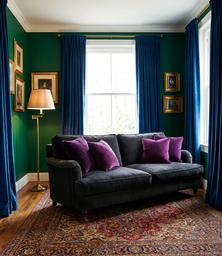
Going bold doesn’t have to mean going monochromatic—in fact, some of the most stunning living rooms of 2026 are mixing jewel tones across every surface, from emerald walls to sapphire curtains and amethyst throw pillows. This bright multi-hue approach works because jewel tones are all deeply saturated; they’re related in terms of intensity even when they differ wildly in hue, giving the room a cohesive richness.
A real homeowner in New Orleans transformed a formerly sterile white living room into a jewel-box experience over three years—one piece at a time, starting with the emerald velvet sofa. “People walk in and they gasp,” she said. The gasping reaction is exactly what makes this interior look so shareable on Pinterest. Just remember: in a jewel-tone room, restraint in furniture silhouette keeps the room from tipping into clutter. Clean-lined pieces let the color do all the talking.
9. Cream and Caramel—A Cozy Tonal Story
A tonal palette built around cream and caramel shades is one of the quietest, coziest approaches to a colorful living room—and yes, it counts as colorful when it’s done with real intention. Layering warm whites with buttery yellows, soft tans, and toasted amber creates a room that feels like a cashmere sweater: enveloping, warm, and endlessly inviting. The cozy factor is unparalleled, particularly during the autumn and winter months.
This look performs particularly well in mountain towns and colder climates—think Bozeman, Montana, or Bend, Oregon—where people genuinely want their homes to function as warm retreats. It’s also a smart choice for open-plan homes because the tonal consistency helps the eye flow easily from kitchen to living area without abrupt breaks. Budget-conscious tip: cream and caramel tones are widely available at every price point, and thrift stores are excellent sources for caramel leather and warm-toned wood pieces.
10. Grey Couch with a Colorful Rug
A gray couch is the blank canvas that millions of American living rooms are already working with—and a vibrant, pattern-rich rug underneath it is the single fastest way to inject color and personality without buying new furniture. In 2026, the most-pinned versions of this combo feature vintage Moroccan rugs, bold geometric kilims, and hand-tufted florals in jewel tones that completely transform the room’s energy.
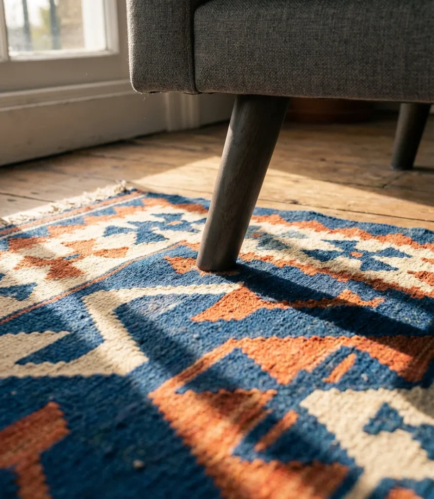
The grey-sofa-colorful-rug formula works because the grey acts as a visual anchor, preventing the rug’s pattern from overwhelming the room. One common mistake: choosing a rug that’s too small. The front legs of all major seating should sit on the rug—for a typical sofa and two chairs, that usually means at least an 8×10 or 9×12. Rugs from Ruggable, eSaleRugs, and vintage platforms like Oaxacan Textile often deliver the most visual impact at mid-range price points.
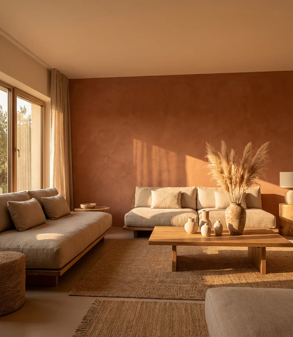
11. Sage and Rust—An Earth-Toned Love Story
Earth-toned pairings are having a full-on revival, and the combination of sage green with rust orange might be the most beloved duo of the decade. These colors draw directly from the American Southwest landscape—canyon walls, desert sage, dried grasses—and bring a grounded, regional warmth to interior wall treatments and textiles alike. Together, they create a palette that feels rooted without being rustic.
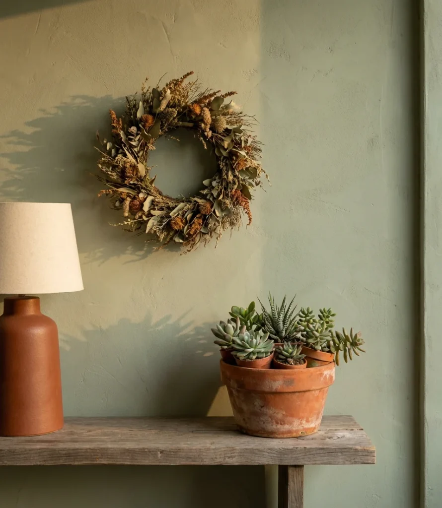
Interior designers working in markets like Scottsdale, Santa Fe, and Austin frequently cite this palette as their most requested. But it works equally well outside the Southwest—in New England farmhouses, Pacific Northwest cabins, and even Manhattan apartments, where the warmth offers a counterpoint to urban greyness. For the walls, try a muted, complex sage rather than a clean mint to keep the earth-tone connection intact. Farrow & Ball “Mizzle” and Benjamin Moore “Dry Sage” are reliable starting points.
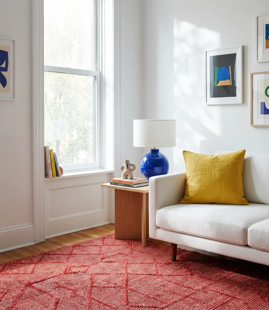
12. Bright White Base with Pops of Unexpected Color
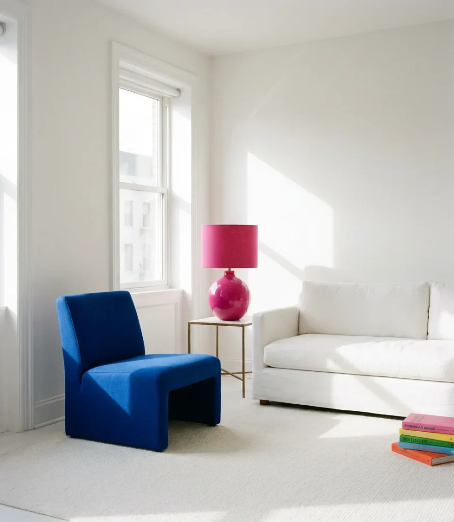
A bright white room is often the safest choice—but in 2026, the most exciting version of this look deploys small, unexpected doses of color in unusual places. A fuchsia lampshade. A cobalt blue side chair completes the ensemble. The room features a single deep forest-green picture frame. The white background serves as a quiet stage, while each colorful accent acts as a performer. This technique is the inspirational approach that keeps white rooms from feeling cold or generic.
This strategy is particularly smart for renters or homeowners who know they’ll want to change things up seasonally. Swapping out two or three objects can completely repaint the mood of the room without any actual paint involved. It’s also the approach most commonly used by professional home stagers who need to make a space feel memorable on a tight timeline. The key is restraint—two or three pops maximum, chosen deliberately, create far more impact than a scattered rainbow approach.
13. Moody Green—The Room That Breathes
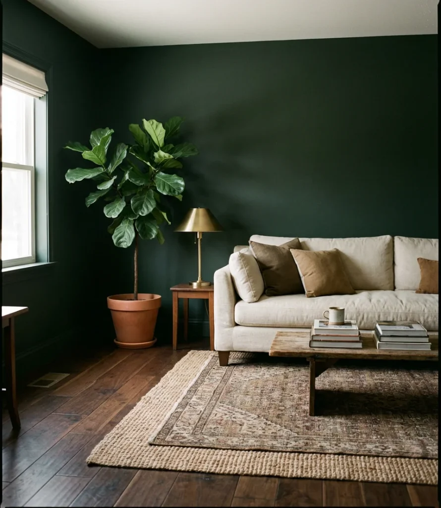
Moody deep greens—think hunter, forest, and bottle green—have emerged as perhaps the defining wall paint trend of the mid-2020s. Unlike navy or charcoal, dark green has an organic quality that feels simultaneously sophisticated and connected to nature. It works particularly well in living rooms that contain a lot of natural wood, plants, and warm-toned textiles, creating a layered depth that feels almost like being inside a terrarium.
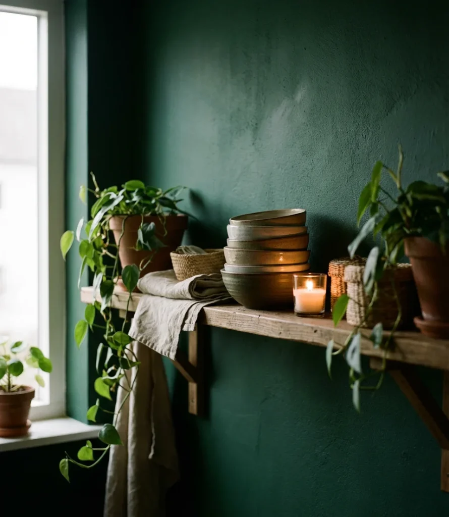
This look resonates strongly with what designers call the “biophilic turn” in American home design—a growing desire to bring natural, living elements indoors. Dark green walls essentially turn your living room into a backdrop for plants, amplifying the greenery and making even a single potted fern feel like a full indoor garden. Common mistake to avoid: choosing a green that reads blue in artificial light. Always test under evening lamp conditions before finalizing the color choice.
14. Neutral with a Pop of Citrus
When the pop in question is a citrus tone, such as tangerine, lemon yellow, or fresh lime, the neutral with a pop approach becomes particularly captivating. A single citrus-colored piece, set against a backdrop of warm whites and natural linen, commands the entire room, akin to a punctuation mark at the end of a carefully constructed sentence. This style is the living room equivalent of a great pair of statement earrings—the rest of the look is quiet, and that one thing says everything.
Citrus tones have a remarkable ability to make people feel energized and happy—not a coincidence, given how much color psychology research supports warm, sunny tones as mood lifters. For American living rooms that serve double duty as home offices or work-from-home spaces, this kind of strategic brightness can actually improve focus and mood during the workday. Without requiring any renovations, a single tangerine pillow or a lemon-yellow ceramic lamp can achieve the desired effect.
15. Aesthetic Dusty Blue and Warm Wood
Dusty, muted blues paired with warm wood tones represent one of the most aesthetic pairings in contemporary interior design—a combination that feels both Scandinavian in its restraint and American in its warmth. This palette speaks to a generation of homeowners who grew up bookmarking cabin interiors and Japanese minimalism in equal measure, and it delivers something genuinely serene: calm without being cold, simple without being bare.
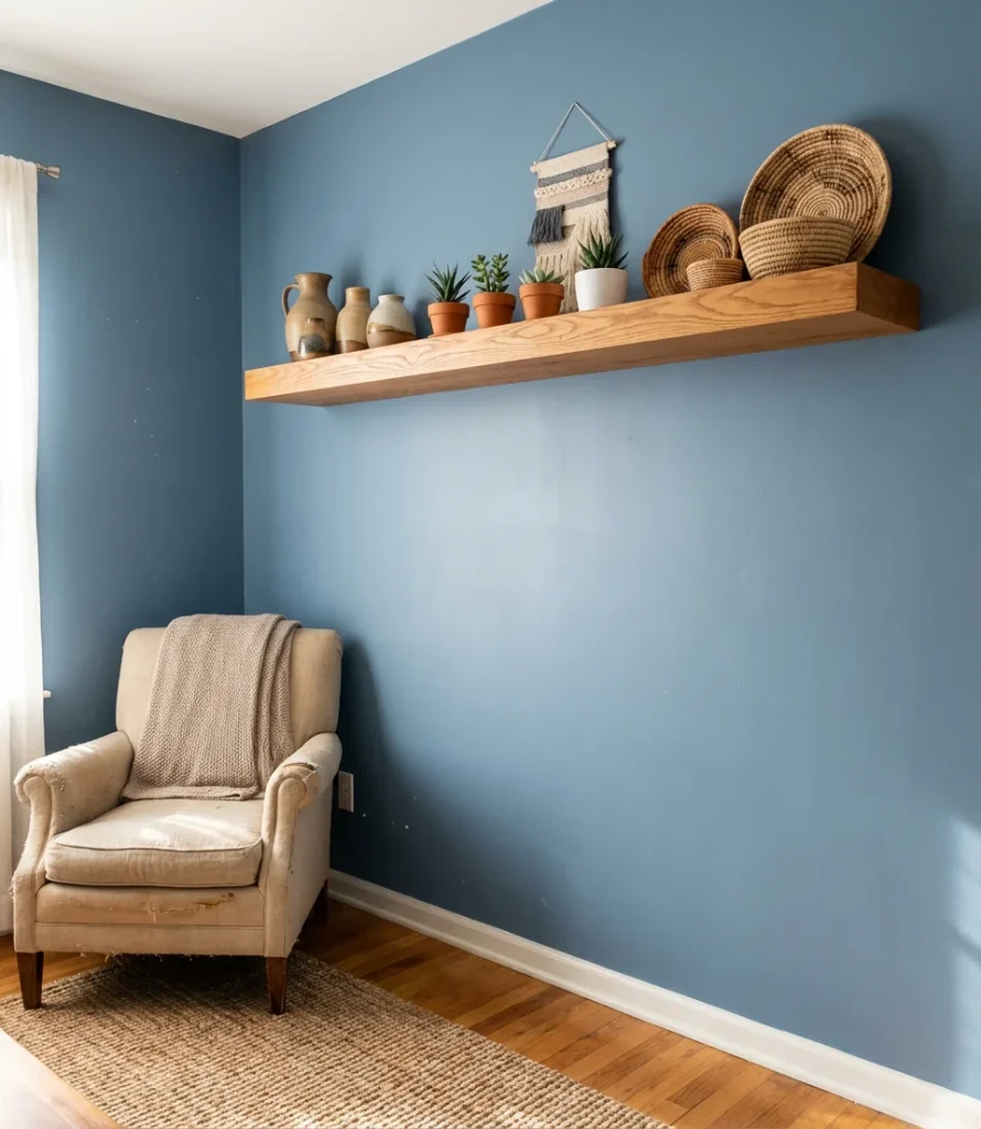
An interior designer based in Portland, Oregon, describes this palette as “the answer to everyone who got tired of all-grey interiors but wasn’t ready for a full commitment to color.” The warmth of the wood prevents the blue from reading cold, and the blue keeps the wood from feeling too rustic. For a budget-friendly version of this look, IKEA’s warm-toned wood pieces pair surprisingly well with mid-range wall paints in the blue-grey family—Sherwin-Williams’ “Rainwashed” is a particularly strong match.
16. Indoor Plant Paradise with a Colorful Backdrop
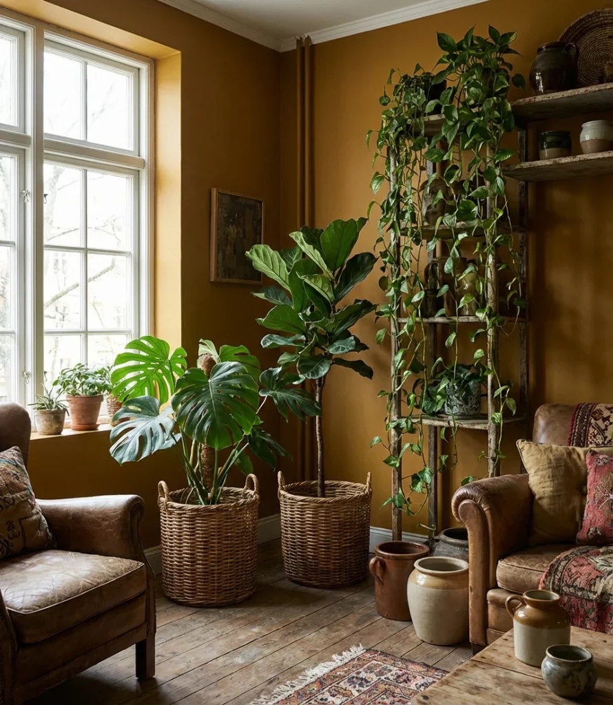
The living room as a plant sanctuary is a fully established lifestyle category now, and the most visually compelling versions layer lush greenery against a deliberately colorful backdrop. Indoor paint in warm ochre, rust, or deep plum makes plant leaves practically pop off the wall. The contrast between living, breathing green and saturated painted surfaces creates a dynamic tension that photographs beautifully and feels genuinely joyful to live in.
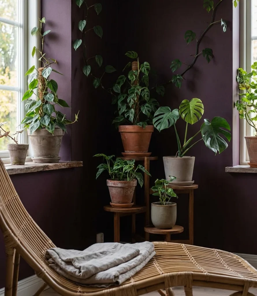
The practice of treating plants as interior design elements rather than afterthoughts has exploded among millennial homeowners, and the data backs it up: listings with plant-filled rooms consistently perform better on real estate platforms and rental sites. If you’re starting from scratch, five well-chosen plants—a tall statement specimen, two mid-height plants, and two trailing varieties—can transform a bare room into a lush, layered environment in a single afternoon.
17. Warm Rust and Cream—Pure Comfort
If there’s one color combination that keeps reappearing on the most-saved boards across Pinterest in 2026, it’s the pairing of warm rust red with soft cream. This duo has roots in classic American farmhouse design, but the contemporary versions are sleeker, less country-cute, and far more sophisticated. Used on walls, textiles, and accessories, rust and cream feel generous without being heavy—a palette of genuine inspiration.
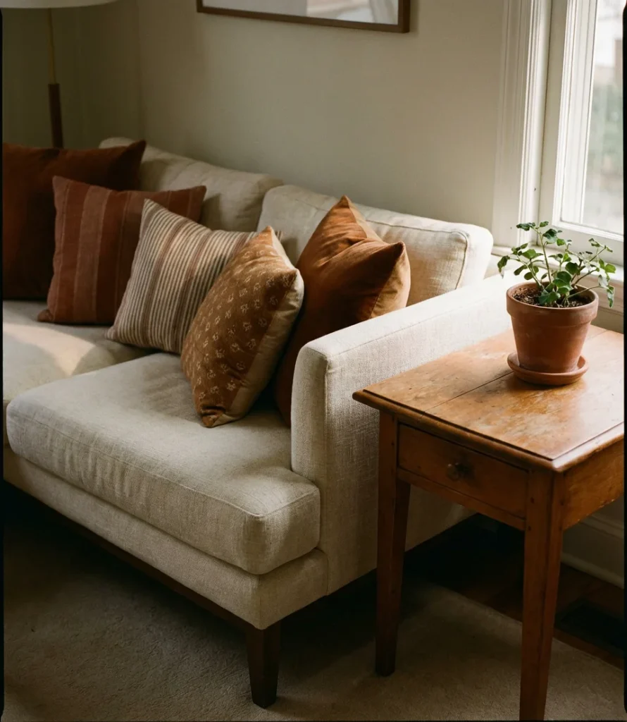
This palette is particularly forgiving for homeowners who are still building their furniture collection. Because rust and cream are both deeply rooted in warm neutral territory, almost everything looks appealing against them—wood tones, metals, plants, and patterns all integrate easily without creating visual conflict. It’s a palette that grows with you rather than boxing you in, which makes it especially popular among first-time homeowners who are furnishing gradually over several years.
18. Behr Paint Feature Wall in Deep Teal
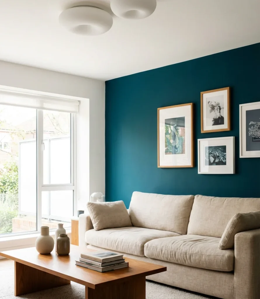
Deep teal occupies a fascinating spot in the color spectrum—it’s simultaneously cool and warm, drawing from both blue and green in a way that feels completely unique. As a feature wall painted with Behr, deep teal creates a richly saturated focal point that works beautifully with both warm neutrals (caramel, cream, natural wood) and cooler tones (white, brass, slate). It’s one of the most photographed accent wall colors in American interior design right now.
Behr’s “Pressed Fern” and “Spiced Teal” are two specific options that have developed dedicated followings among the DIY renovation community online. One homeowner documented her teal accent wall transformation on a home blog—total project cost was $58 for paint and supplies, and the room was transformed in a single Saturday afternoon. Teal works best in living rooms that also receive warm artificial lighting in the evenings, which brings out the green undertones and keeps the room from reading too cool.
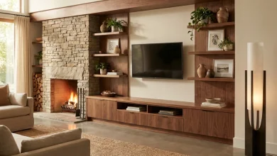
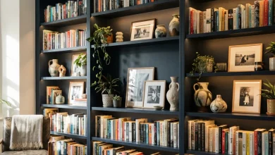
19. Colorful Built-In Shelving as Wall Art
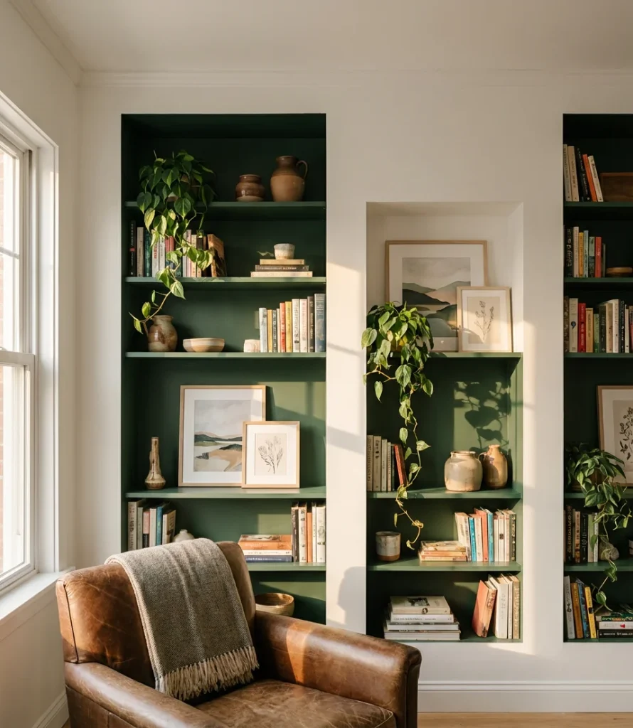
Painting built-in shelving a contrasting color to the walls is one of the smartest interior moves in a colorful living room—it turns functional storage into a genuine aesthetic statement. Imagine dove grey walls with forest green built-ins, or a cream room with terracotta-painted shelving. The shelves transform into a self-contained gallery, amplifying the impact of the carefully chosen objects set against the vibrant pop of color.
This approach is particularly impactful in older American homes that already have original built-ins—features that many homeowners have long painted white to minimize when they should be doing the opposite. Interior designers consistently report that painting built-ins a bold contrasting color is among the highest-return cosmetic investments in a room renovation. It requires only paint and a weekend, yet dramatically elevates the perceived value and character of the space.
20. Primary Color Blocking—Bold and Playful
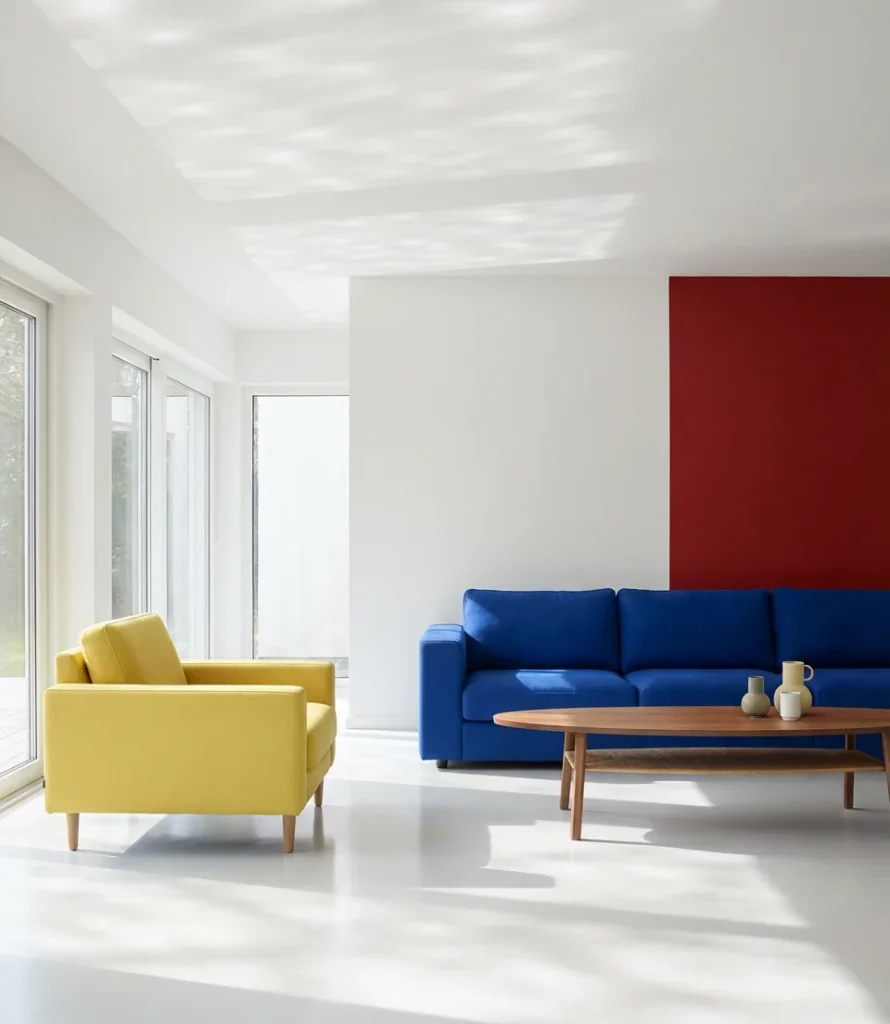
When executed with precision, true primary color blocking in a living room can yield extraordinary results. Think of the Mondrian influence filtered through a contemporary residential lens: red, blue, and yellow deployed in deliberate geometric sections—painted wall panels, upholstery choices, and area rugs working in concert to create a living space that feels like a work of art.
This approach resonates strongly with art-school-trained homeowners and creative professionals who treat their living spaces as extensions of their visual practice. It can also work brilliantly in children’s playrooms that double as family living spaces. The ground rule for primary blocking: use white liberally as a separator—it prevents the color sections from competing too aggressively and keeps the whole composition from reading as chaotic rather than intentional.
21. The Organic Modern Living Room
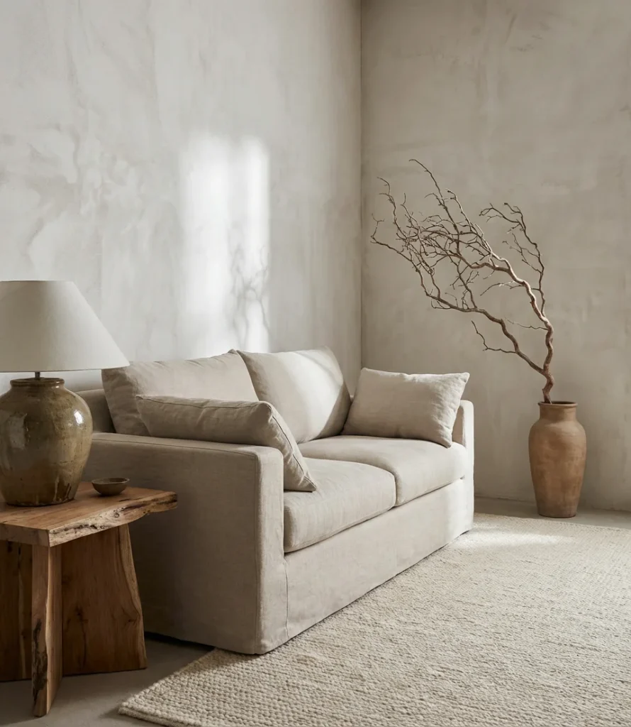
Natural materials meet neutral color in the organic modern aesthetic—one of the fastest-growing interior design movements among American homeowners in 2026. Organic modern prioritizes raw linen, hand-thrown ceramics, sculptural wood pieces, and undyed textiles. The color palette draws from the natural world: bone, driftwood, warm stone, and raw sisal. It reads as effortless, but every piece is deliberately chosen.
Organic modernism is where interior design and sustainability intersect most naturally. The environmental alignment of this aesthetic—natural, undyed materials, locally sourced wood, and heirloom-quality pieces purchased secondhand—draws many homeowners who pursue it. An interior designer in Austin who specializes in this style notes that the most common obstacle is resisting the urge to buy everything at once. “This look grows over time,” she said. “It gets better as pieces settle and age together.” That patience is, ironically, the most countercultural thing about it.
22. Lavender and Gold—Unexpected Elegance
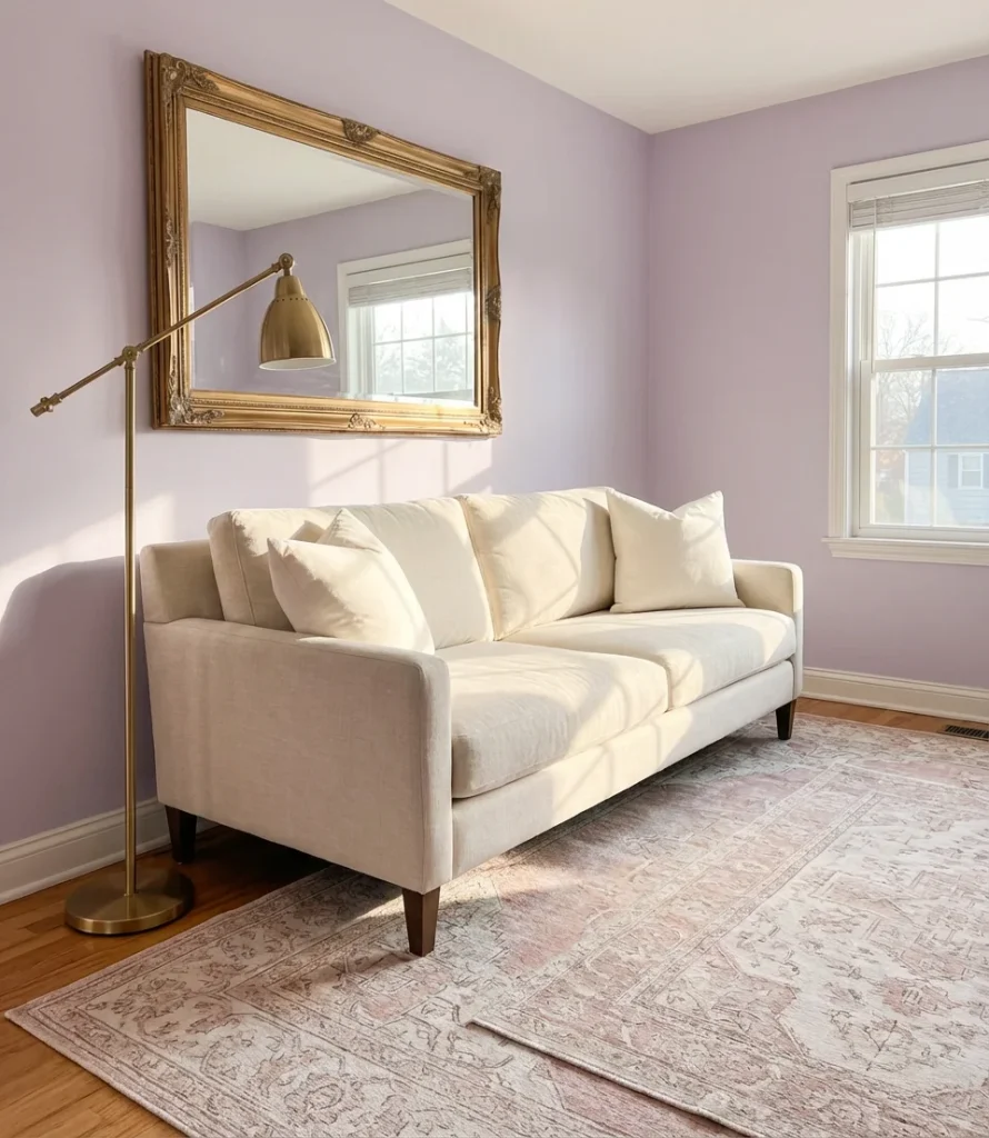
Lavender isn’t just for bedrooms anymore—as an accent wall in the living room or a full-room color, it delivers a kind of soft, unexpected elegance that neutral rooms simply can’t achieve. Paired with gold and warm brass tones, lavender transcends its bedroom-pastel reputation and becomes something genuinely sophisticated. The combination feels fresh for 2026 precisely because it’s a departure from the greige and greens that have dominated the previous five years.
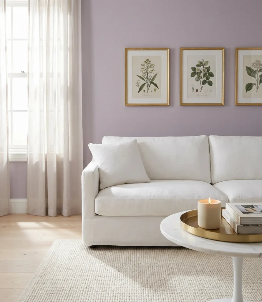
Lavender as a living room choice often surprises people by how versatile it is—it shifts dramatically depending on the undertone. A cool, grey-leaning lavender reads almost like a neutral and works in contemporary settings; a warmer, violet-leaning version feels more romantic and bohemian. The key to making it feel intentional rather than accidental is to pair it with deliberate metallic accents—gold or rose gold—that signal the shade was a choice, not a compromise between purple and grey.
23. Dark Accent Wall Behind the Sofa
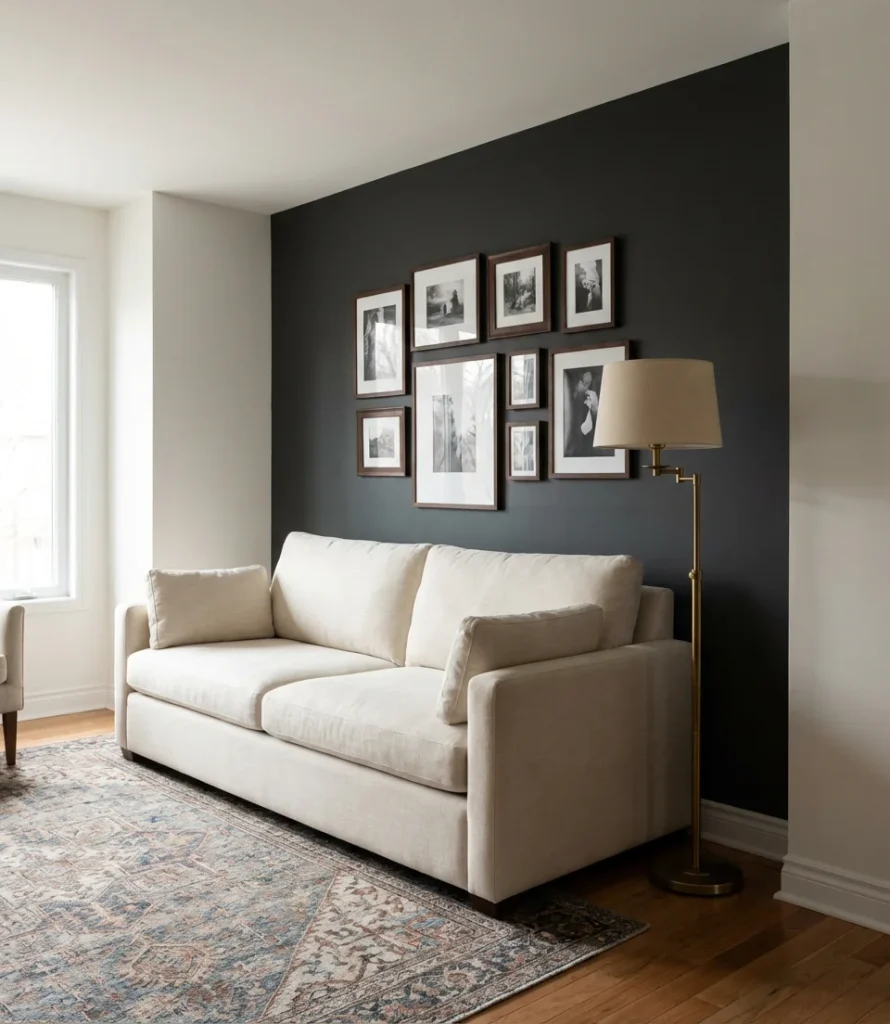
Painting the wall directly behind the sofa a dark tone—charcoal, deep plum, or midnight navy—is one of the most dramatic and effective design moves in a living room. It creates an instant sense of architectural depth, makes the sofa feel grounded and important, and gives the eye a strong resting point. This single wall treatment can transform a forgettable builder-grade living room into a space that feels genuinely designed.
The sofa wall is the most-photographed wall in any living room—it’s where family portraits happen, where furniture arrangements center, and where any potential buyer’s eyes immediately go. Investing in that single wall with a bold paint color is therefore the highest-return cosmetic choice in the room. Most homeowners complete this project in three to four hours with a single gallon of paint, making it one of the most impactful, low-cost upgrades in the entire home improvement playbook.
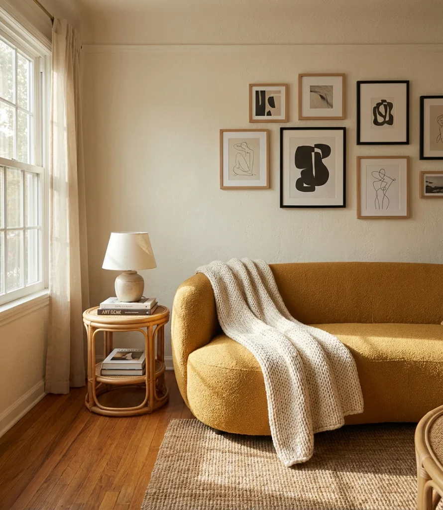
24. Eclectic Gallery Wall in Full Color
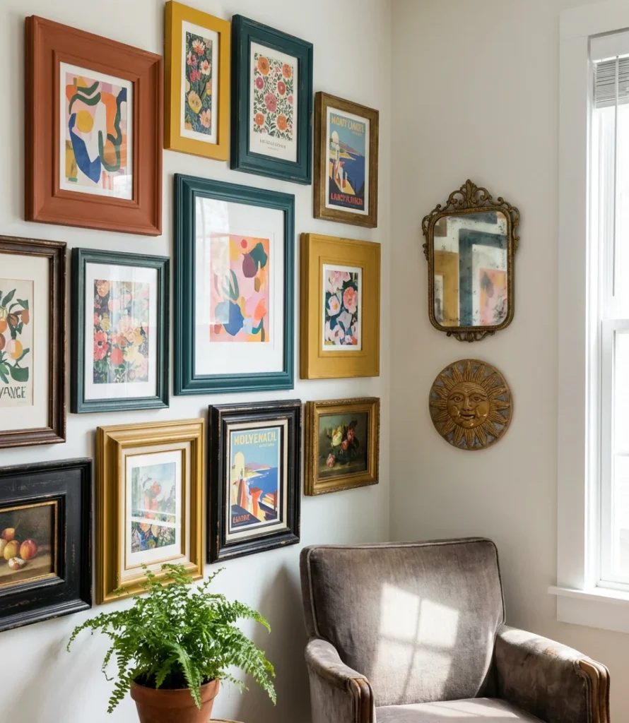
A gallery wall that embraces color—mixing colorful frames, vibrant prints, and boldly toned objects—is one of the most eclectic and personally expressive things you can do in a living room. Unlike the all-white-frame gallery wall that dominated the mid-2010s, the 2026 version is richer, more playful, and deeply individual. Bold color choices in the frames themselves—rust, teal, and mustard—turn the gallery from decoration into an art installation.
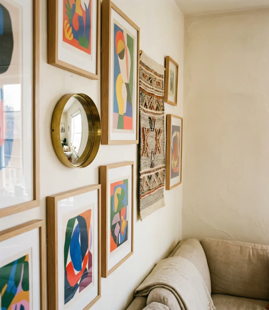
Building a colorful gallery wall is genuinely a DIY project that evolves—the most charming versions look like they’ve been curated across years of travel, thrift store finds, and meaningful gifts, because they have been. Start with one anchor piece (usually the largest or most visually strong), then build outward with complementary pieces. Use painter’s tape to map the arrangement on the wall before committing any nails. Remember, a little asymmetry in a colorful gallery wall is beneficial—perfect grid layouts can make it feel institutional rather than alive.
Living rooms are having a genuine creative renaissance in America right now, and color is right at the center of it. Whether you took notes on the dark moody walls, the eclectic gallery, or the simple swap of a colorful rug—the best thing you can do next is start somewhere small and see how it makes you feel. We’d love to hear which of these ideas stopped your scroll. Drop your thoughts in the comments below: which look is going to be in your living room this year, and which one surprised you the most?