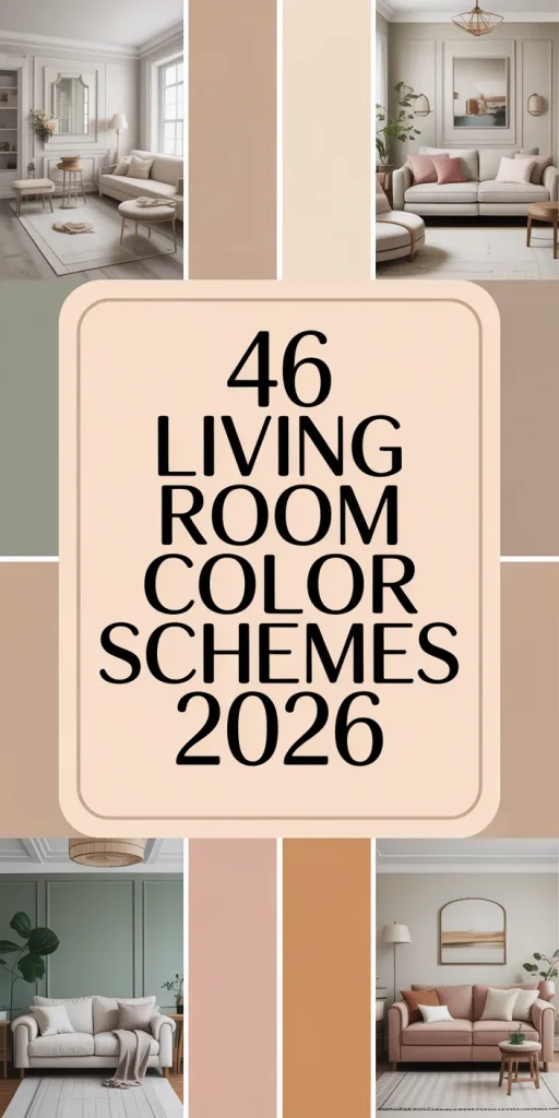
46 Living Room Color Schemes 2026: Sage, Navy, Earthy Tones & Bold Ideas That Work
American living rooms are experiencing a surge in color, and 2026 is poised to be the most deliberate design year in history. Whether you’ve been pinning dusty sage rooms or moody navy lounges at midnight, you’re part of a broader shift—people want their homes to feel considered, layered, and deeply personal. This article walks you through color scheme ideas that are genuinely trending right now, from earthy terracotta combos to bold two-tone pairings that photographers can’t stop shooting. By the time you reach the last section, you’ll have a clear picture of what works, what to avoid, and how to make any palette feel like it was always yours.
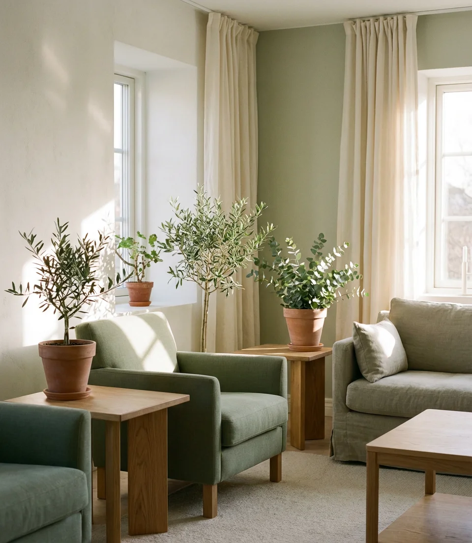
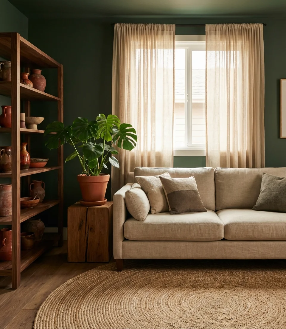
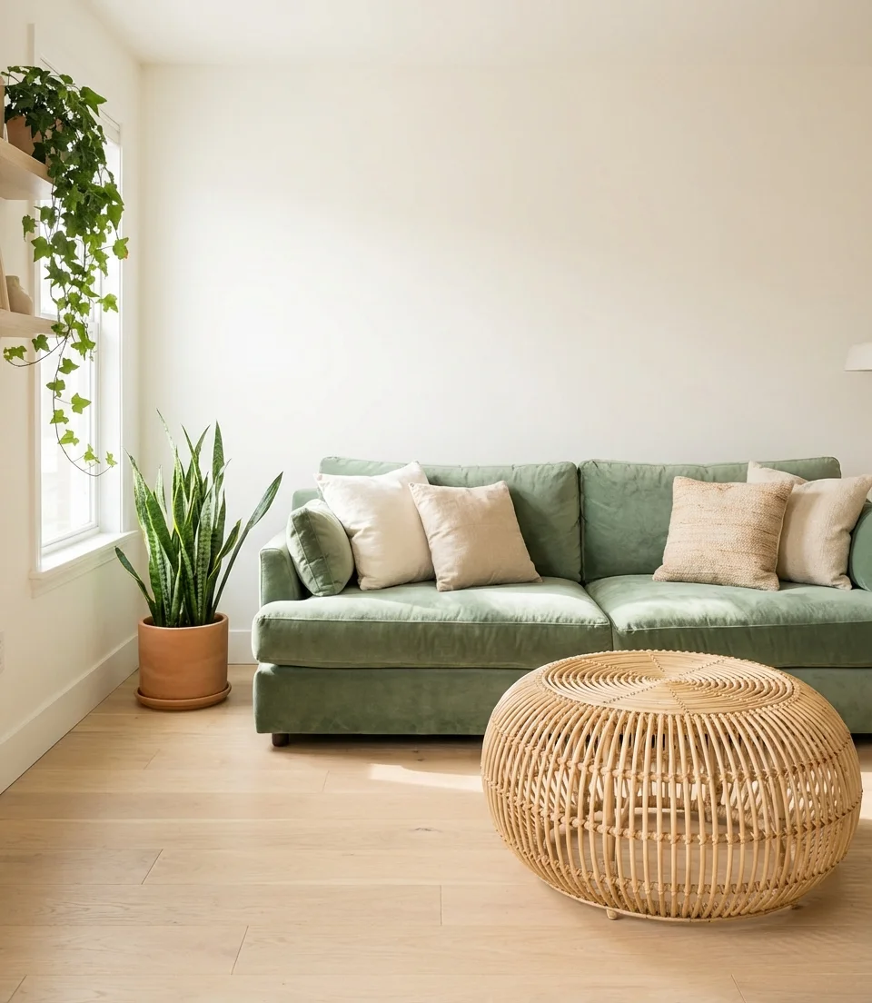
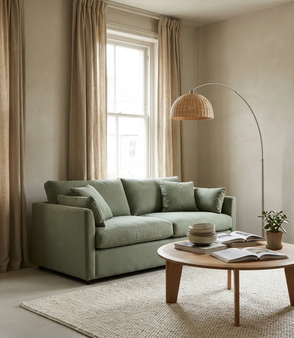
1. Sage Green With a Linen Sofa
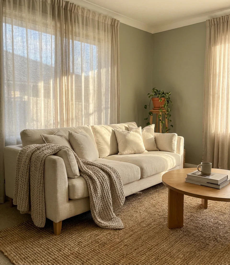
Sage green has remained a calming color on Pinterest for a reason. Pair it with a natural linen or cream sofa, and you’ve created a space that reads simultaneously fresh and timeless. The mid-tone green pulls warmth from the fabric and bounces soft daylight back into the room without overpowering it. Our pick is the color scheme that makes a modest-sized living room feel curated rather than crowded, and it works in everything from Craftsman bungalows to contemporary condos.
Where it works best: north-facing rooms that tend to read cold actually benefit the most from sage. The green’s yellow undertone warms things up without the heaviness of mustard or terracotta. Style tip—keep accessories in warm whites and natural wood tones and resist the urge to introduce too many accent colors. One rust-colored ceramic vase or a bouclé cushion in oat is all the contrast this palette needs to feel complete.
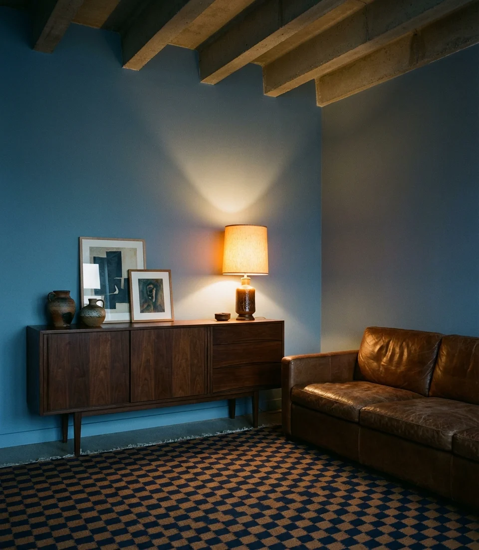
2. Navy Blue Walls With a Cream Couch
Deep, saturated, and undeniably sophisticated—navy blue walls are the design world’s answer to every “but I’m scared of dark color” reservation. Anchor the room with a cream couch, and the contrast becomes the focal point: crisp, editorial, and surprisingly warm once layered with textiles. This pairing is especially popular in East Coast homes where the nautical reference feels native, but it translates beautifully across regions when you keep the styling grounded. Think brass hardware, warm wood shelving, and a sisal or wool rug to soften the floor plan.
Budget-conscious decorators should know: you don’t need to paint all four walls navy to get the effect. A single dramatic accent wall behind the sofa achieves most of the visual impact at a fraction of the paint cost and commitment. If you later decide the look is too bold, repainting one wall is a far more manageable Saturday project than tackling the full room.
3. Earthy Terracotta and Warm Beige
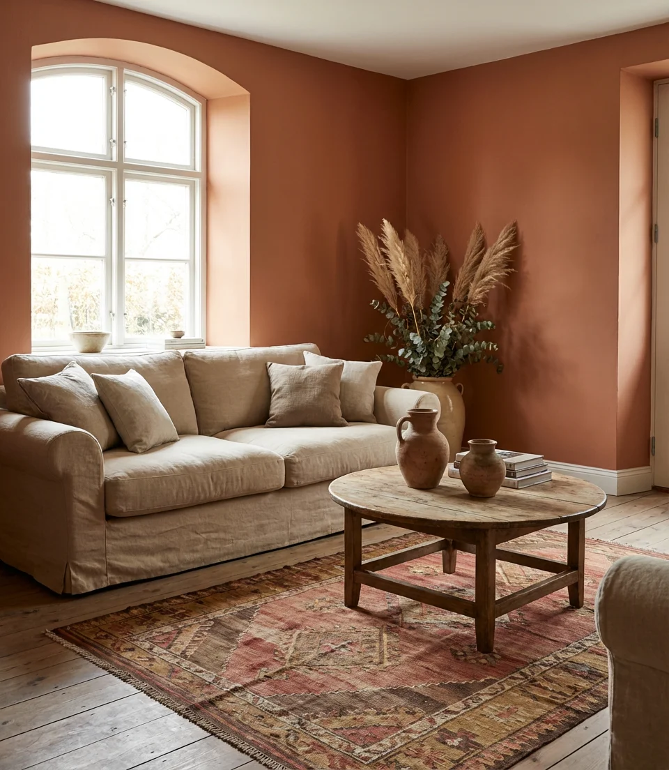
The earthy palette movement isn’t slowing down—if anything, 2026 is deepening the commitment. Terracotta paired with warm beige sofa tones creates a room that feels like a long exhale: grounded, honest, and deeply comfortable. This is the color family that drives searches from desert-style Arizona homeowners and Brooklyn brownstone renters alike, which tells you something about its broad appeal. The key is to keep the terracotta in the mid-tones—not orange or red, but a specific sun-baked clay shade—and allow the beige furnishings to complement it.
A real homeowner behavior worth noting: people who commit to this palette almost always end up expanding it into adjacent rooms. The terracotta-beige combination is one of the most cohesive transitional palettes in residential design—it reads differently under morning light versus evening lamplight, which means the room genuinely never looks the same twice. When you incorporate raw linen curtains and unglazed ceramics, the room becomes a captivating sight for even a professional photographer.
4. Blue and Green Color Blocking
Bold, graphic, and surprisingly livable—blue and green color blocking is one of the most talked-about living room directions for 2026. Unlike the safe approach of matching tones, this trend embraces intentional contrast: a deep forest green wall meeting a cobalt or teal accent through furnishings, pillows, or a statement rug. The combination references nature (think: a pine forest at dusk with glimpses of lake water), which is likely why it doesn’t read as jarring despite the contrast. Done well, it feels both artistic and incredibly at home.
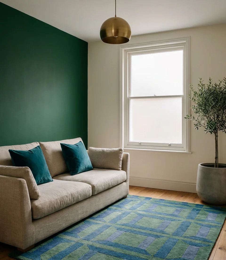
Expert-style commentary: interior designers often cite blue-green pairings as the most forgiving bold palette for beginners because the two colors share enough of the same wavelength that mismatches are rare. Start with green walls and introduce blue through a single velvet throw or painted side table before committing to a full teal accent chair. You’ll be surprised how confidently the palette builds on itself.
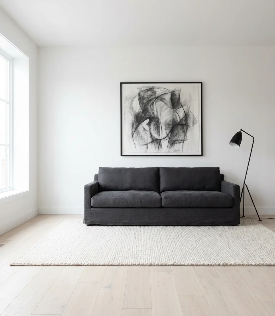
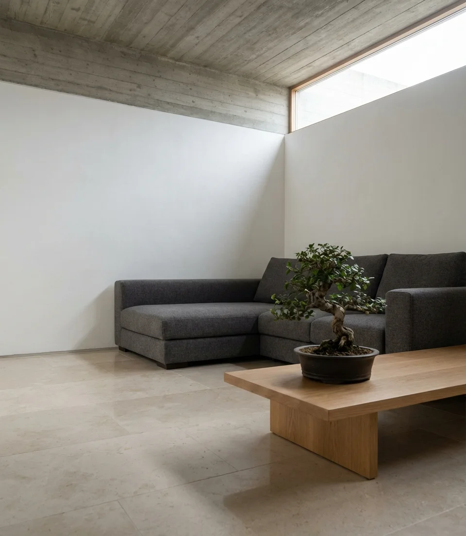
5. Charcoal Couch Against a White Room
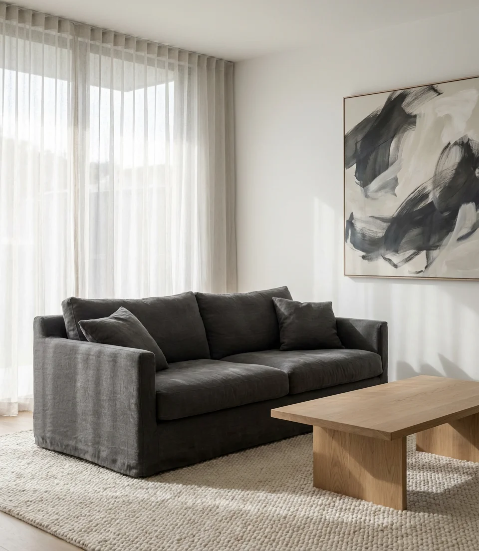
The charcoal couch is the workhorse of the modern American living room, and it earns that reputation by being endlessly versatile. Against bright white walls, charcoal makes an effortlessly modern statement without the heaviness of all-dark rooms. The combination is especially popular with first-time homeowners who want a clean, photogenic space that doesn’t require a complete redo every two years. The grey family in general—and grey sofa options in particular—continues to dominate the sales floor because it plays well with every accent color you might want to rotate in seasonally.
Common mistake to avoid: people often choose a charcoal sofa thinking it will hide stains, but textured woven charcoal fabrics actually show lint and pet hair more visibly than most mid-tones. If you have dogs or cats, look for a performance velvet or tightly woven version rather than a loosely textured bouclé. The visual result is nearly identical, but the maintenance story is entirely different—and you’ll thank yourself during every TV-watching snack session.
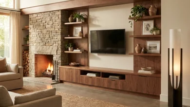
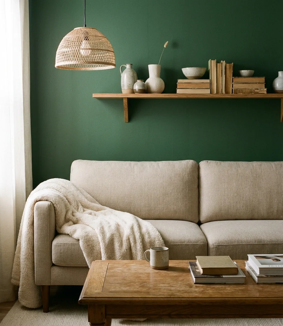
6. Olive Green Walls With Natural Wood
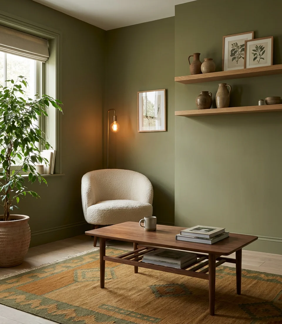
Olive green sits in that rare middle ground between dramatic and neutral, which makes it one of the most versatile wall colors you can choose in 2026. Pair it with warm natural wood tones—think medium oak, walnut, or even reclaimed pine—and you get a room that feels simultaneously cabin-cozy and design-forward. This palette is especially popular in the Pacific Northwest and mountain states, where the exterior environment already looks like an olive-and-wood painting, but it imports beautifully into any home that wants organic warmth without going full dark academia.
The result is a palette that genuinely improves under candlelight and lamp glow. One family in Portland described switching from white walls to olive mid-renovation as the single decision that made their living room feel “like a real home for the first time.” That anecdotal reaction gets repeated constantly in design communities—olive green triggers a sense of being sheltered that cooler or brighter colors simply don’t achieve at the same emotional depth.
7. Red Sofa as a Statement Piece
A red sofa is the most courageous move in living room design, and 2026 is the year people are finally making it. It’s important to opt for deeper, brick-toned reds, such as vermilion, burgundy-adjacent, or that unique Italian leather red that exudes sophistication rather than loudness. The trick is treating the sofa as the room’s artwork and letting everything else play a supporting role: neutral walls in warm off-white or putty, natural materials, and restrained accent choices. Dark green cushions or a muted olive throw are a surprisingly beautiful complement that grounds the boldness.
In the context of American lifestyle, cities such as New York, Chicago, and Los Angeles have made the red sofa a design staple, a bold choice that distinguishes “I decorated this” from “I designed this.” Real estate stagers actually avoid red seating for good reason: it’s personal. But for a home you intend to live in deeply, a red sofa is the fastest way to make a space feel irreversibly and wonderfully yours.
8. Dark Blue Velvet Sofa in a Light Room
Velvet and dark blue are a pairing that interior designers have relied on for decades, and it shows no sign of fading from relevance. A navy blue sofa or deeply saturated indigo velvet piece placed against pale, light-filled walls creates the kind of visual anchoring that makes a room feel settled and complete. The light walls amplify how rich the velvet reads, while the sofa’s weight prevents the room from feeling too airy or unresolved. This technique is a particularly good strategy for open-plan living spaces where you want to visually define the seating zone without physical barriers.
Practical insight: velvet shows directional marks from sitting and brushing, but a quick pass with your hand in the direction of the pile restores it instantly. Navy velvet in particular tends to show lighter streaks more than other colors, which is worth factoring into your decision. That said, most owners describe the maintenance as “a 10-second ritual” rather than a burden—and the visual payoff of velvet in a well-lit room is genuinely difficult to replicate with any other fabric.
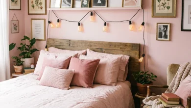
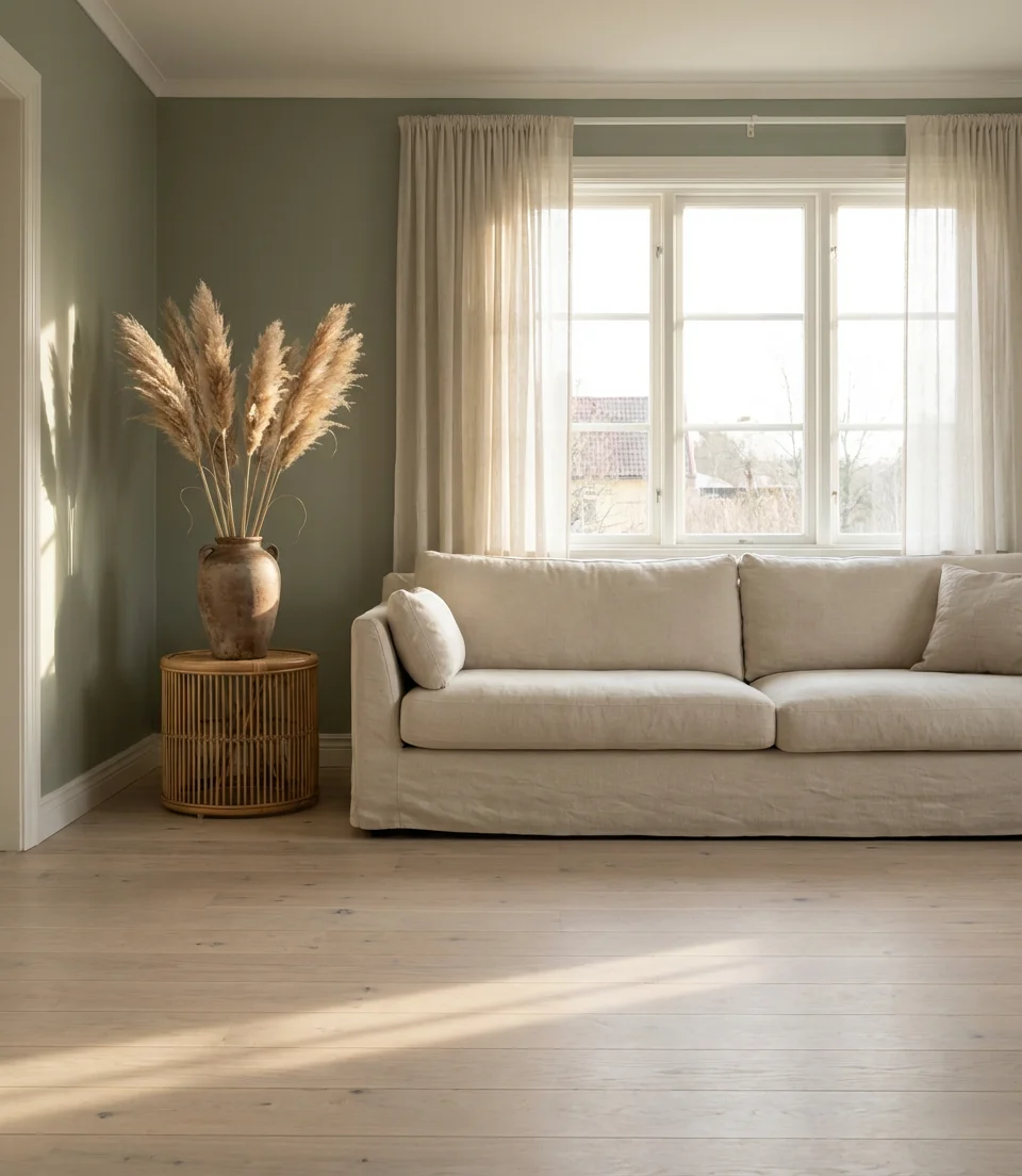
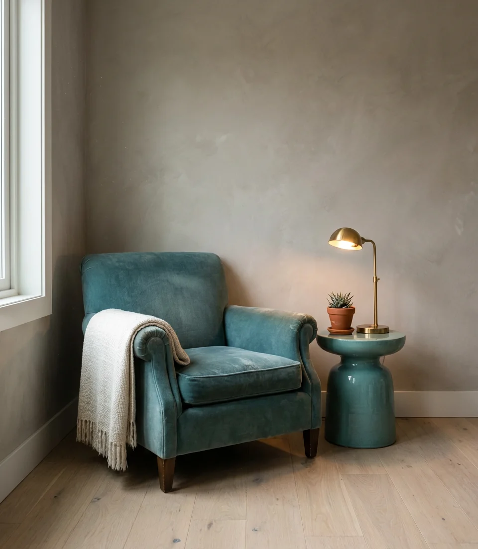
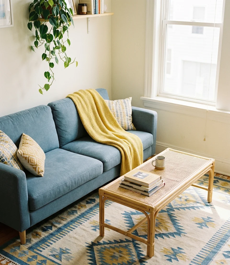
9. Sage and Warm White for a Serene Retreat
If sage is currently dominating the living room color conversation, warm white is its most dependable companion. Unlike stark white, warm white—characterized by a hint of cream or yellow—softens the slightly cool edge of sage and creates a palette that resembles a tasteful blend of a spa and a library. This mix is the combination you see over and over in Scandinavian-influenced interiors, wellness-brand photography, and high-engagement Pinterest boards—usually with raw linen, terracotta accents, and the kind of natural light that makes you feel like you’re on a much-needed vacation.
Where it works best: this palette is a transformative choice for small apartments where you can’t afford for the room to feel closed-in. The sage and warm white combination expands perceived space optically while still delivering enough color to feel designed and intentional. Avoid cool-toned white trim—it will fight the warmth. Stick with an eggshell or antique white for all woodwork, and your room will feel like a single, unified breath.
10. Teal Accents in a Neutral Living Room
Teal is the color that designers keep calling “underrated,” and for once, the consensus is right. Used as an accent in a room built on greige or warm grey, teal becomes a kind of visual caffeine—it sharpens the whole palette and makes neutral rooms feel finished rather than unresolved. You don’t need much: a pair of teal cushions on a cream sofa, a ceramic vase in deep teal on a shelf, or a single accent chair in a blue-green fabric. The key is letting teal exist in pockets rather than as a dominant force—it earns its impact through restraint.
Expert-style commentary: teal is chemically intriguing to work with because it reads differently depending on the lighting temperature of a room. In warm incandescent or Edison bulb light, teal shifts toward green and feels earthy. Under daylight or cool LED light, it reads bluer and more crisp. This color-shifting quality is exactly why designers often use teal in statement pieces rather than large surfaces—it keeps the room dynamic across different times of day.
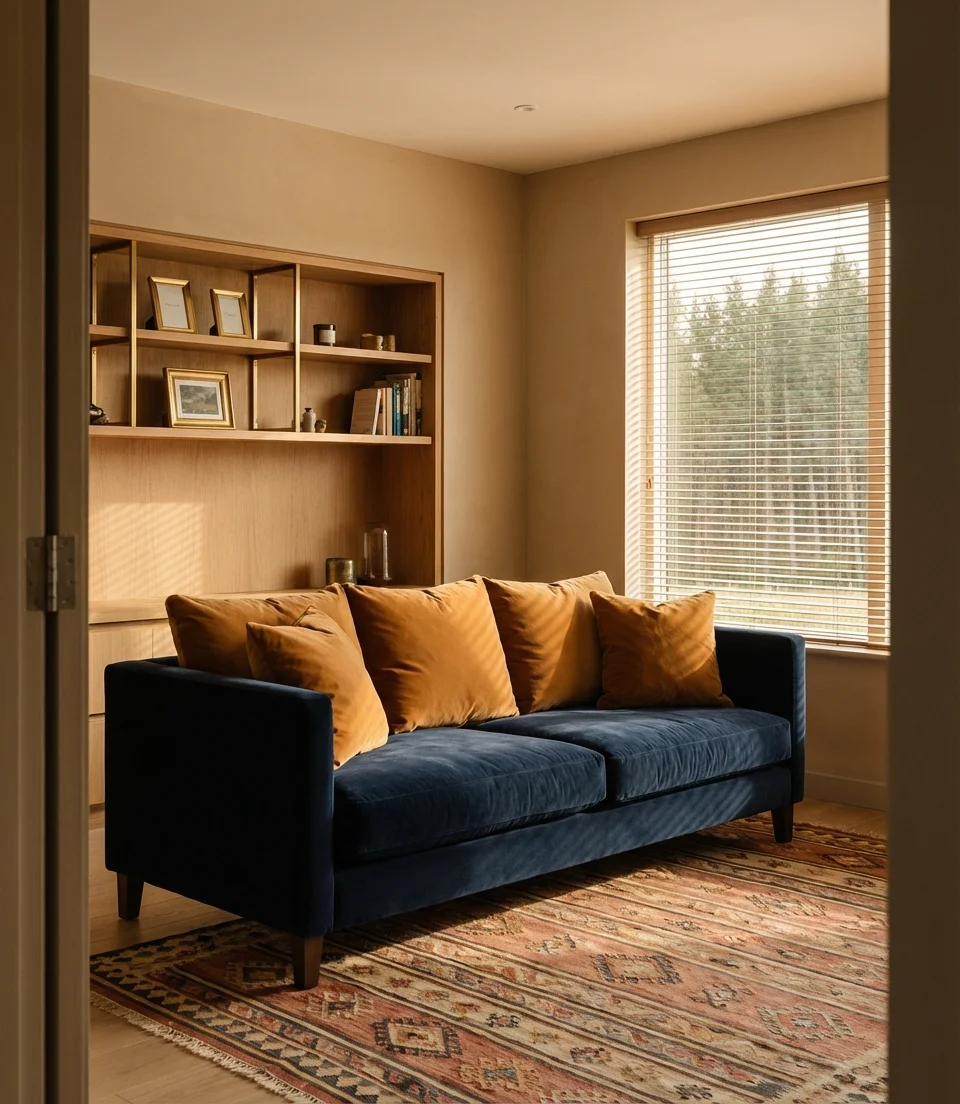
11. Blue and Brown: The Classic Updated
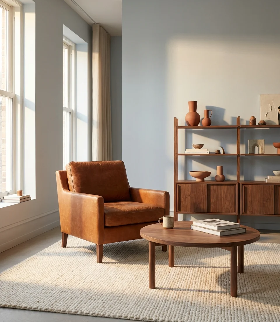
The blue and brown pairing never really went away—it just spent about five years waiting for its comeback. In 2026, it’s back in a more evolved form: not the overdone mid-2000s version with chocolate walls and baby blue accessories, but a sophisticated remix with rich cognac leather, warm walnut wood, and a light blue or slate blue backdrop that feels genuinely contemporary. The combination works because warm brown anchors the coolness of blue, creating a room that’s neither too cold nor too cozy—the interior design equivalent of perfect room temperature.
Practical insight: when combining blue walls with brown furniture, the rule of thumb is to make sure the brown is warmer and lighter than the blue. A very dark espresso chair against very dark navy walls creates a low-contrast muddle that reads as murky rather than rich. The pairing sings when there’s clear tonal differentiation—a mid-blue wall paired with a warm cognac piece maintains visual rhythm even in low light conditions.
12. Camel Couch With Moody Walls
A camel couch is one of those design choices that ages so well it almost feels unfair. In 2026, camel—that warm golden tan reminiscent of a vintage leather bag—is being paired with moody, saturated wall colors: deep forest greens, inky charcoals, and even dusty mauves. The warmth of the camel stops dark walls from reading as oppressive, while the depth of those walls gives the camel piece the dramatic backdrop it deserves. It’s the kind of combination that photographs beautifully and somehow looks even better in person when evening light hits it.
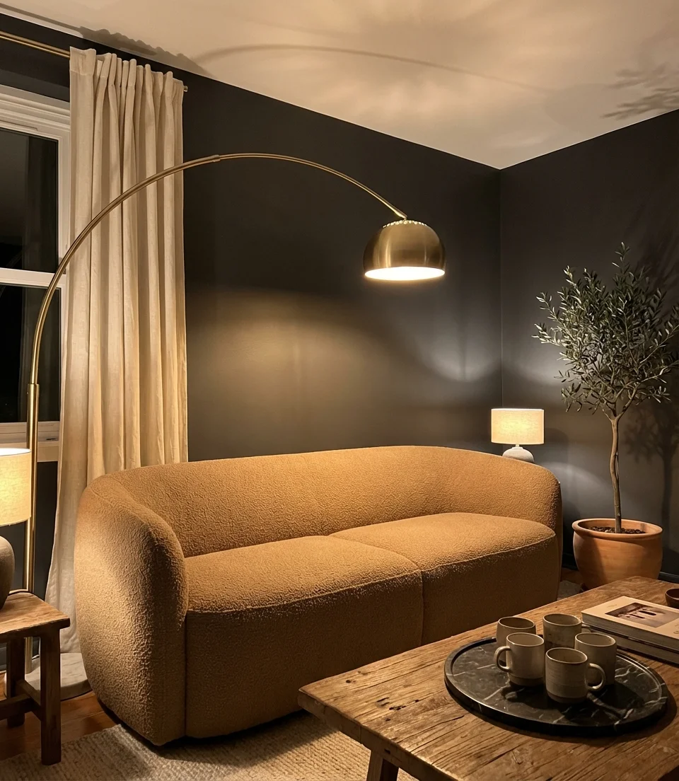
Micro anecdote: a designer working on a brownstone renovation in Brooklyn described the moment her clients saw the camel sofa arrive against freshly painted dark walls: “They both went completely quiet, then one of them said, ‘this is the best decision we’ve ever made.’ That’s a feeling you can’t manufacture—it just happens when the warm and dark tones find each other. ” That reaction is almost universal with this pairing.
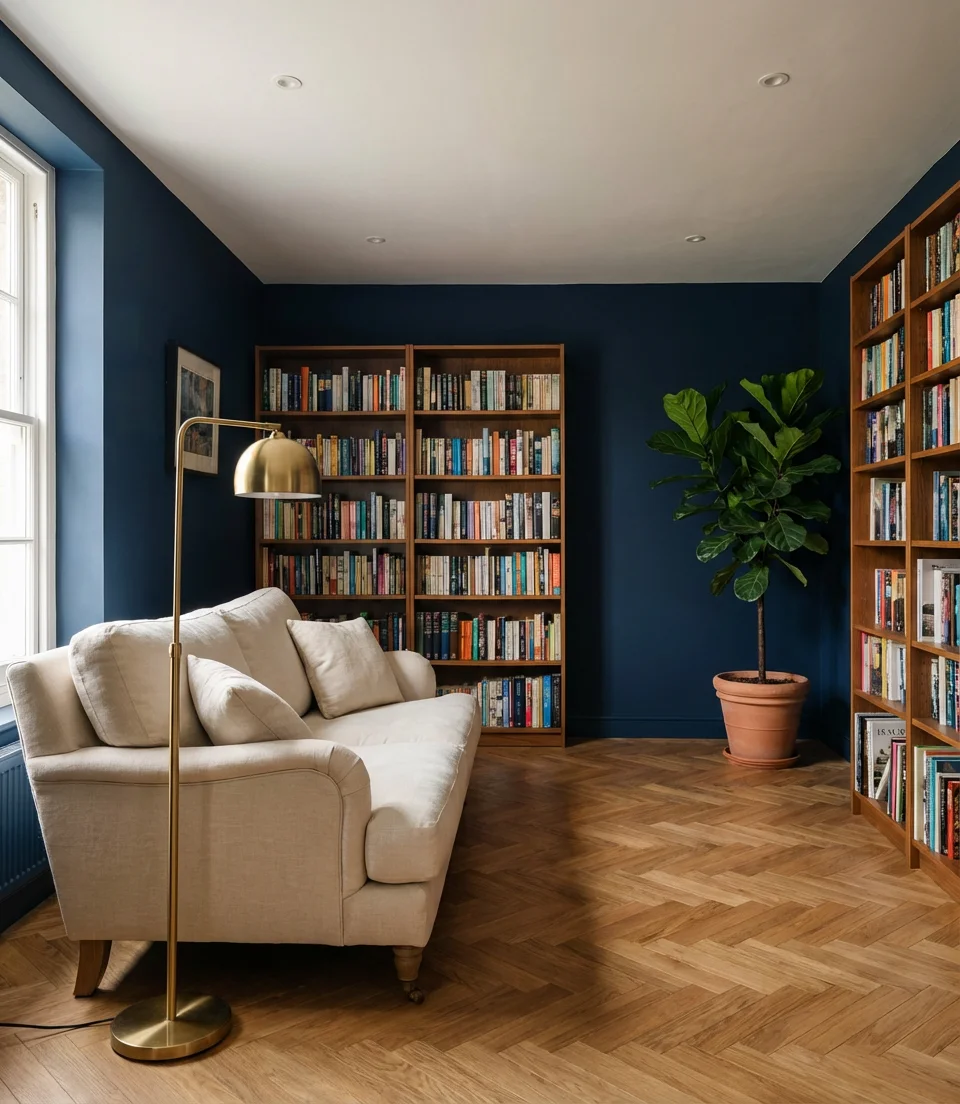
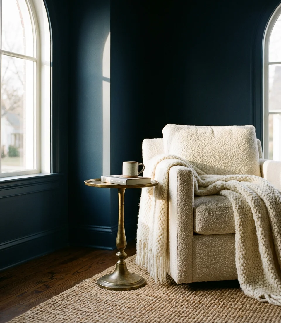
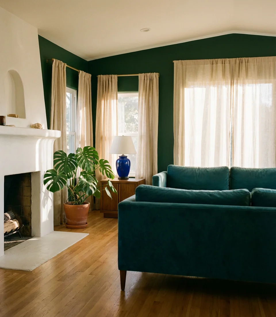
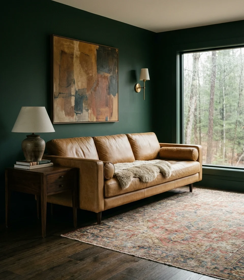
13. Dark Green Maximalism
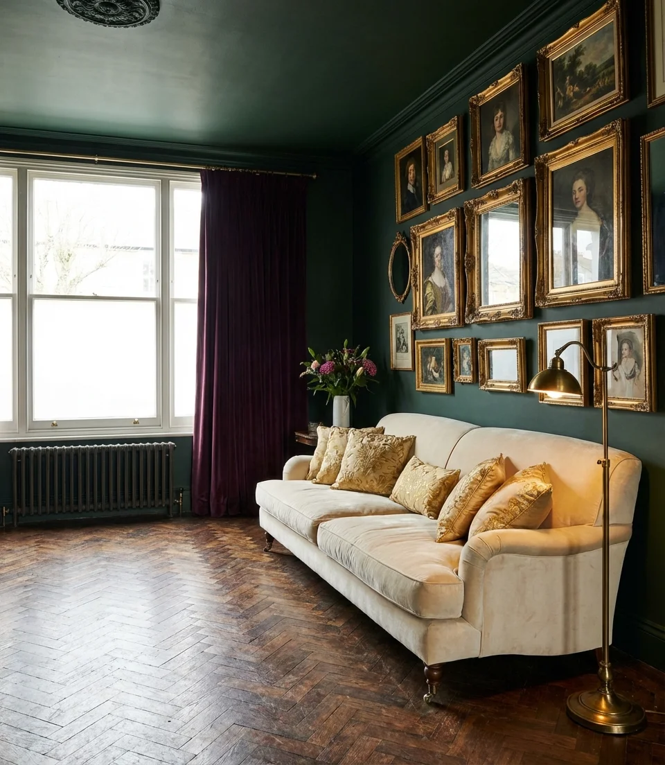
Dark green is moving out of the accent wall phase and into full-room commitment in 2026. Painting all four walls—and ideally the ceiling—in a deep hunter, bottle, or forest green creates an enveloping, jewel-box quality that turns a living room into an experience rather than a pass-through. This look is maximalism with structure: instead of mixing many colors, you’re intensifying one. Layer in rich textiles in gold, rust, and deep plum; add brass or burnished gold hardware, and you get a room that reads as deeply sophisticated without a single flashy piece.
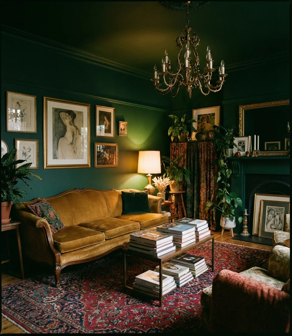
Where it works best: dark green maximalism thrives in rooms with high ceilings and ample natural light during the day. It is not ideal for low-ceilinged basement rooms where the enveloping quality becomes overwhelming rather than cozy. However, even modest rooms with 8-foot ceilings can carry a dark green if the lighting plan is deliberate—multiple warm light sources at different heights prevent the room from feeling like a cave.
14. Blue and Yellow: Cheerful and Considered
The blue and yellow living room has long been associated with coastal cottages and Scandinavian kitchens, but the 2026 version is more restrained and editorial. Think: a dusty or slate blue and green-adjacent wall with ochre or maize yellow accents in ceramics, art, and textiles—not primary school colors, but muted, paint-box versions of each. This pairing triggers immediate warmth and optimism in a space, which is part of why it performs so well as Pinterest content. It makes people feel positive just looking at it, and that’s exactly what living room design should do.
Budget angle: Blue and yellow is a cheap color change since you can build the palette with accessories. A gallon of dusty blue paint (averaging $45–$60 at major retailers) and three to five carefully selected yellow accessories from thrift stores or Target’s designer collaborations can completely transform a living room for under $150 total. The visual return on investment is extraordinary compared to most renovation projects.
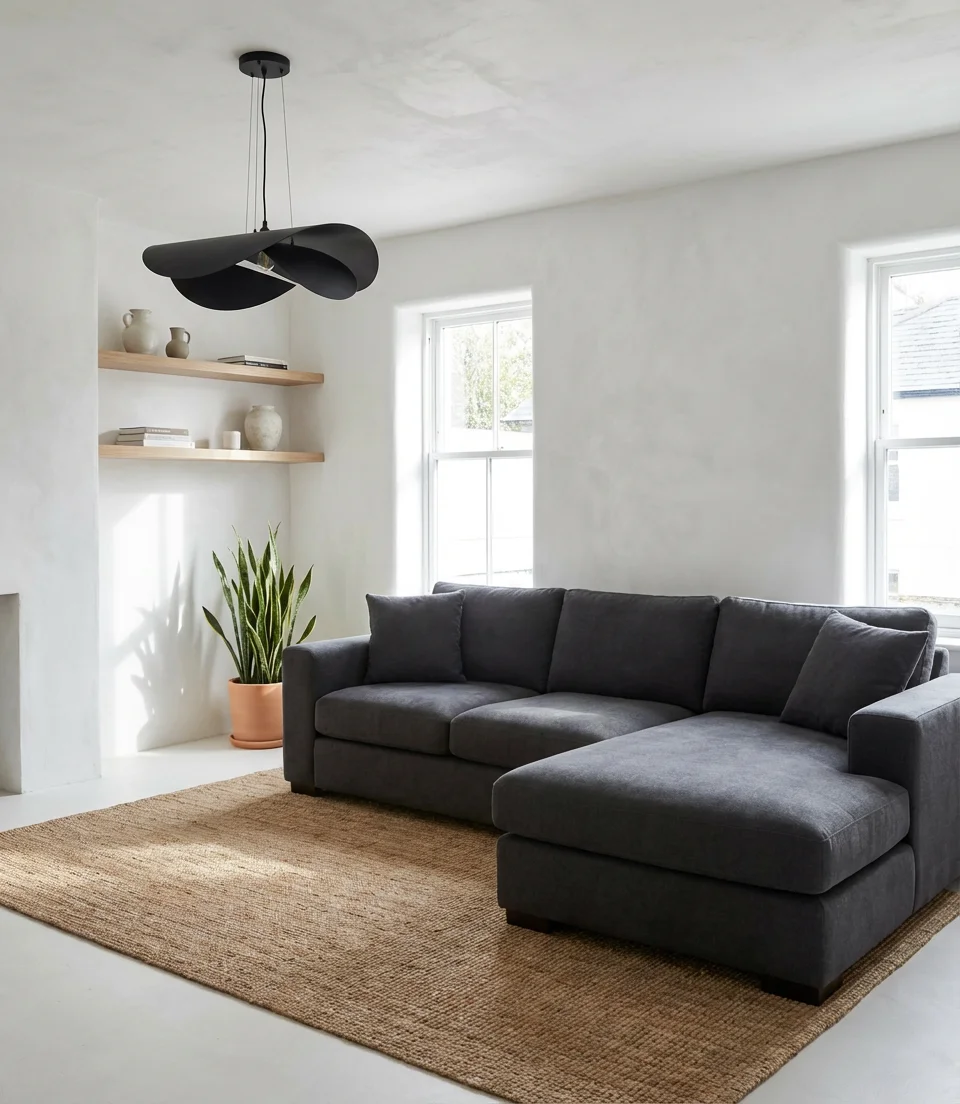
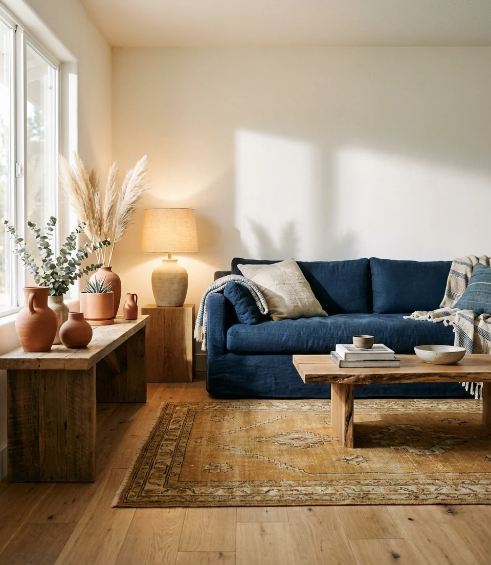
15. Navy Couch as a Design Foundation
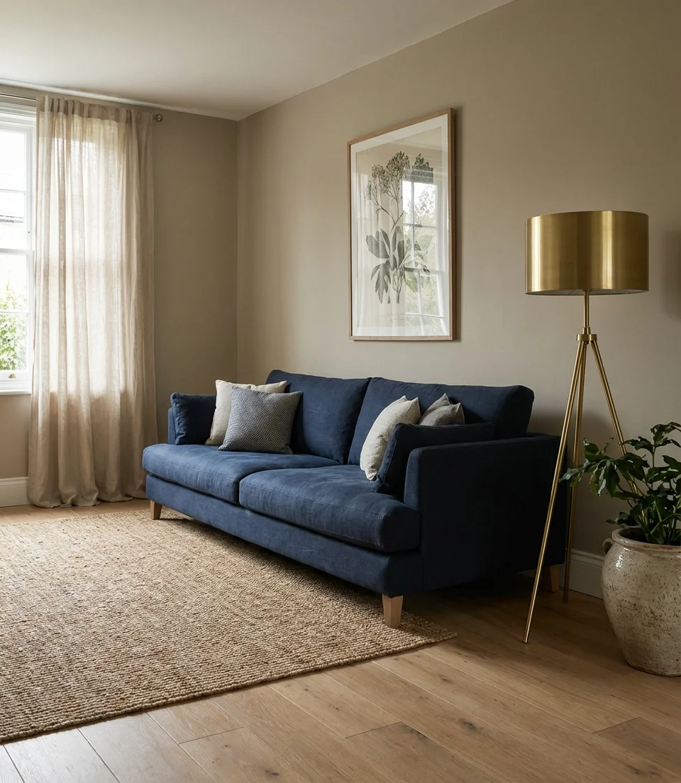
A navy couch is the piece that a living room can be built around with complete confidence—it’s one of the very few furniture colors that works with warm neutrals, earthy tones, bright accents, and even soft pastels without contradiction. The navy blue family sits at that perfect sweet spot between classic and current: it will remain relevant in three years, yet it stands out. Build around it with brass, warm wood, and linen, and you’ll have a room that looks like it belonged in Architectural Digest and your family album simultaneously.
Real homeowner behavior: navy sofas are consistently among the highest-rated furniture purchases in customer reviews—not because of how they look on the day of delivery, but because of how owners feel about them five years later. The color depth means they rarely look dirty or worn out, and the blue reads differently under every season’s light. Multiple reviewers across major furniture retailers specifically note, “It still looks as good as the day we bought it”—a rarity in upholstered furniture feedback.
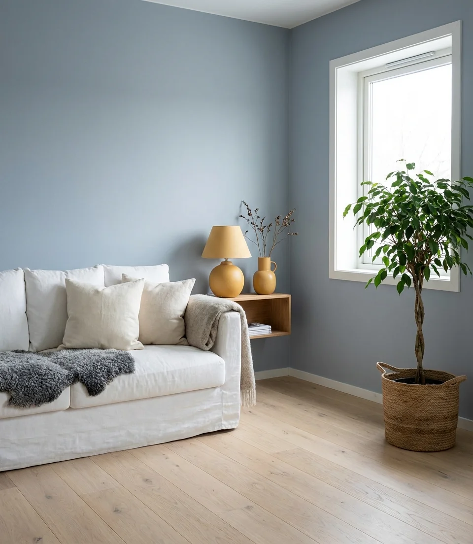
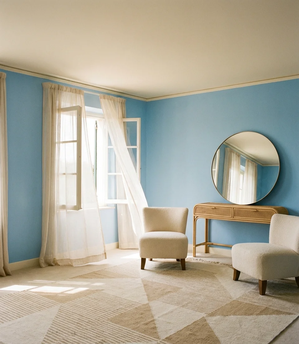
16. Light Blue Walls for an Airy Open Feel
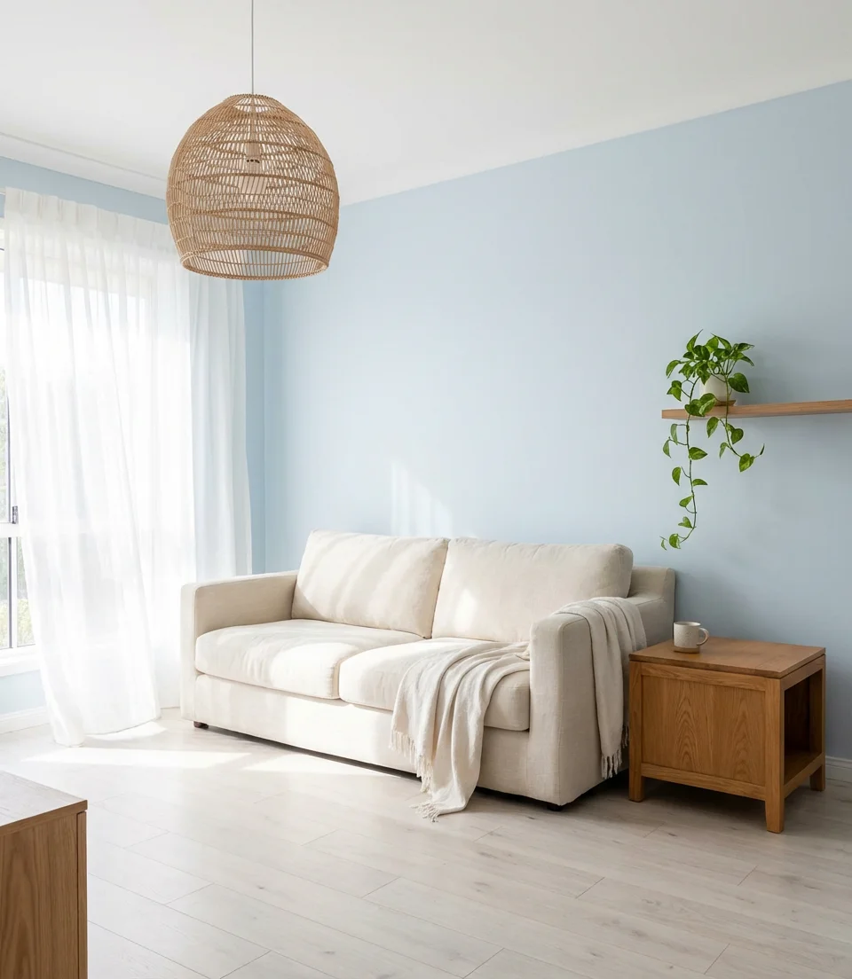
Light blue walls are having a very specific kind of renaissance in 2026 — not the powdery baby blue of nurseries, but a more considered sky, ice, or pale powder blue that reads sophisticated in natural light. This is the color that makes a room feel like it has twice the square footage, and it pairs remarkably well with a cream sofa or any upholstery in the warm white family. The key to keeping it from feeling cold is layering warm materials: wood, rattan, wool, and leather all neutralize the cool quality of light blue and give it the grounded quality it needs to feel like a real living room.
American lifestyle context: light blue rooms consistently outperform other color schemes in both home sale photographs and short-term rental platforms. Rooms photographed in pale blue generate more engagement and inquiry than equivalent rooms in white or grey—likely because the color reads as fresh and inviting online, where other neutrals can flatten and lose dimension in photographs. If you’re designing with resale or rental potential in mind, this is the data point that makes light blue an unexpectedly smart financial choice.
17. Grey Sofa With Deep Jewel-Tone Accents
A gray sofa is often where a design conversation starts and stops—but it doesn’t have to. The grey sofa’s greatest strength is how willingly it accepts bold accent colors around it, and in 2026 the most compelling direction is jewel tones: deep emerald, sapphire, amethyst, and warm topaz. These rich, saturated colors make a grey sofa look intentional rather than default, and they bring a warmth to the room that straight grey-on-grey styling never achieves. The jewel tone doesn’t need to be everywhere—one large piece, like a rug or gallery wall, is often enough to change the entire energy of the room.
Common mistakes and how to avoid them: the most frequent error with grey sofas and jewel tones is choosing accents that are too saturated for the room’s light level. In a dim room with limited natural light, very intense jewel tones can fight each other and create visual tension rather than richness. Choose toned-down versions—a dusty emerald rather than neon green, a muted sapphire rather than cobalt—and the combination becomes luxurious rather than overwhelming.
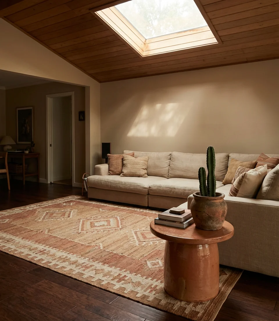
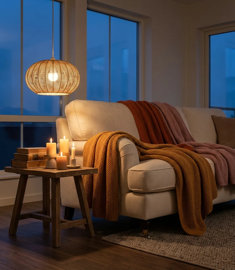
18. Ideas Cozy: The Warm Layered Look
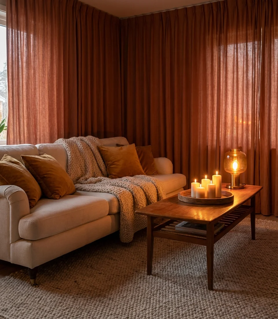
When people search “cozy ideas” on Pinterest, they’re not looking for a specific color—they’re looking for a feeling. And in 2026, that feeling is being built through layering: warm terracotta tones, amber lamplight, a cream couch draped in chunky knit throws, and the kind of dense textile arrangement that makes you want to cancel your plans and stay in for the weekend. The palette that delivers this most reliably combines amber, burnt orange, dusty rose, and warm cream—colors that perform beautifully under warm incandescent light in the evening, which is when most people actually live in their living rooms.
Expert-style commentary: what distinguishes a genuinely cozy room from a room that’s simply cluttered is intentional material variety—pairing rough textures with smooth ones, matte finishes with sheen, and lightweight fabrics with heavy ones. Interior stylists talk about this as the “five texture rule”: if you can identify at least five distinct material textures in your seating area, the room reads as layered and warm. If you’re finding your cozy styling still looks flat, count your textures—it’s almost always the missing variable.
19. Dark Grey Sofa in a Bright White Space
There’s something undeniably clean about a dark grey sofa set against bright white walls and bleached floors—it’s the living room equivalent of a very good suit. The minimalist and contemporary design communities favor this palette, as it allows the architecture and the quality of materials to shine. No one color competes for attention; instead, the composition itself becomes the interest. Done right, the space looks expensive without a large budget, which is part of why this combination is one of the most pinned aesthetics from Scandinavian and Japanese interior design accounts.
Budget/price angle: the dark grey sofa is consistently one of the best-value furniture investments you can make because of its versatility and longevity. Mid-range fabric options from retailers like Article, West Elm, and IKEA in this colorway all review consistently well and tend to hold their appearance over time. Compared to more fashion-forward colors, dark grey also has lower depreciation—if you ever sell the piece, secondhand dark grey sofas retain their value remarkably well on platforms like Facebook Marketplace and Craigslist.
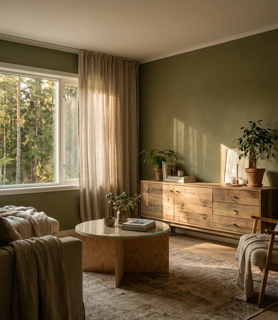
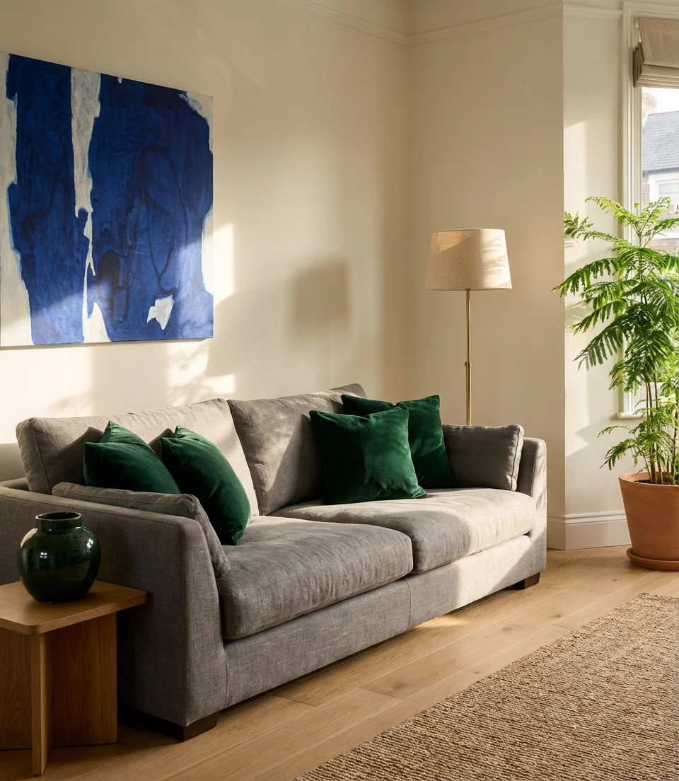
20. Beige Sofa With Forest Green and Wood
A beige sofa in 2026 is not the beige of the ’90s—it’s a warm, considered neutral that anchors rooms with a botanical edge. Paired with forest green in the walls or accent pieces and surrounded by warm wood tones, the beige sofa becomes the quiet center of a very intentional design story. This palette is the palette that’s driving significant traffic in the “organic modern” search category: clean lines, natural materials, and a color story rooted firmly in what you’d find outside on a late autumn afternoon. The combination flatters nearly every room proportion and style category, which makes it one of the safest bold choices in this list.
Where it works best: this palette excels in homes with existing wood-heavy architecture—wood beams, wood-trimmed windows, and wood floors—because the green and beige combination amplifies what’s already there rather than fighting it. In homes with little wood detailing, add it deliberately: a wood tray, a pair of oak stools, or even a reclaimed wood picture frame introduces the material richness the palette needs to feel complete rather than sparse.
21. Navy Blue Sofa With Earthy Warm Tones
The navy blue sofa paired with earthy warm tones—terracotta, ochre, and raw sienna—is a color combination that’s showing up in virtually every corner of the design world right now. It should be a contradiction (cool navy against warm earth), but in practice it reads as deeply satisfying, perhaps because it mirrors the contrast of dusk over a desert landscape. The navy grounds the palette and provides stability, while the earthy tones infuse warmth and life. This is a combination that rarely needs significant styling intervention—the two color families do the work independently.
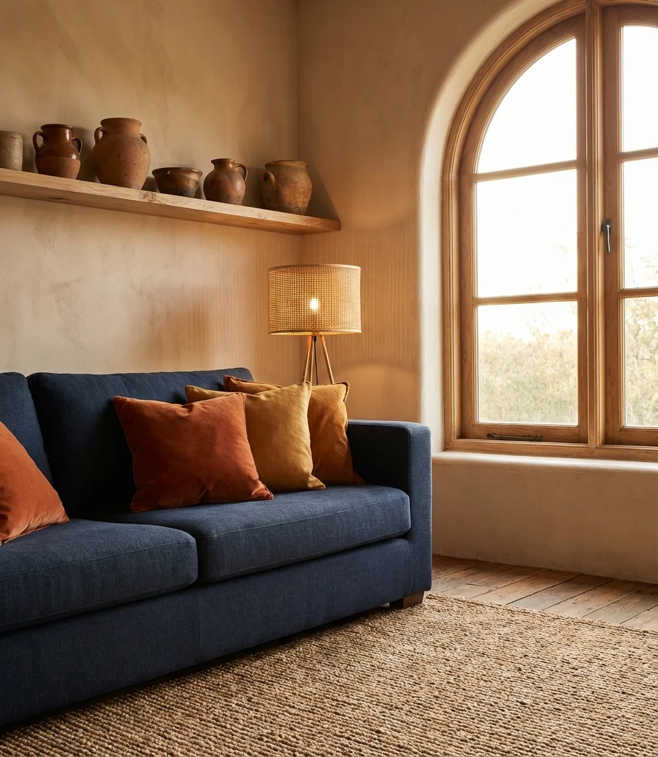
Practical insight: one of the most effective ways to bridge navy and earthy tones is through a single pattern—a kilim, a vintage Persian rug, or even a printed pillow that holds both color families. The pattern serves as a translator, signaling to the eye that these colors complement each other, creating a sense of design rather than haphazard assembly in a room.
22. Sage Green Sofa in a Neutral Room
Flipping the formula—instead of sage walls, a sage upholstered sofa in a neutral room—delivers something unexpectedly fresh. Against warm white, putty, or greige walls, a sage green sofa reads as a color accent without the permanence of painted walls. This style is the option for commitment-phobic decorators who still want the dopamine hit of the sage palette. Everything else in the room, such as warm wood, natural textiles, and a few well-chosen plants, naturally flows from the sofa. The result is a living room that feels designed and personal without asking too much of the surrounding architecture.
Common mistakes and how to avoid them: many people choose a sage sofa and then try to echo the color everywhere—sage cushions, sage candles, sage artwork—which flattens the whole design into a monochromatic exercise that feels more like a set than a room. The sage sofa works because it’s the single color moment in an otherwise neutral space. Resist the urge to repeat it and instead contrast it with warm amber, ivory, and natural wood to let the sage do its work from its one powerful position.
23. Charcoal, Cream, and Blush: The Modern Triad
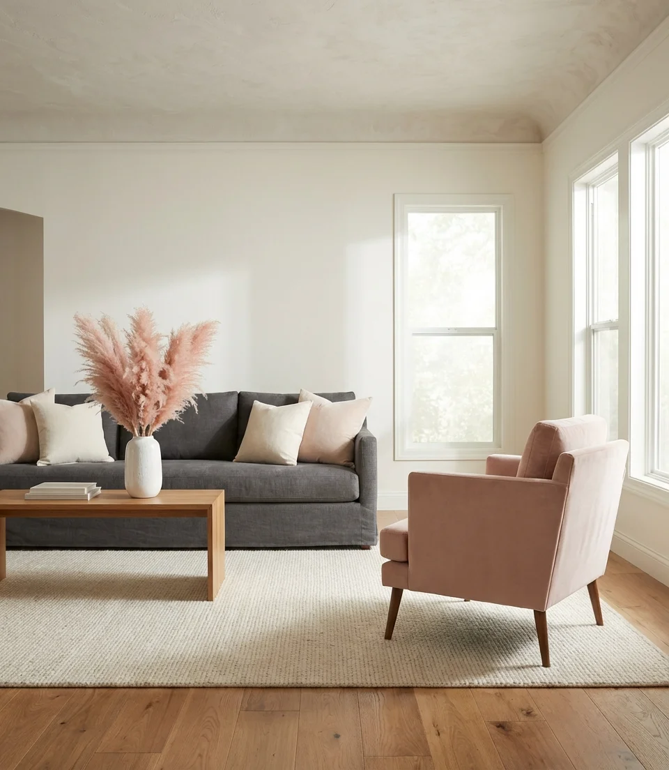
The three-color living room—built on charcoal, cream, and blush—is the sophisticated palette for people who’ve outgrown all-grey but aren’t ready to commit to a bold color story. The charcoal couch anchors the room with weight and seriousness; cream walls and furnishings bring light and spaciousness; and blush—in textiles, art, or a single ceramic piece—adds warmth and femininity without the busyness of pattern. This triad has been quietly influential in American interior design for the past three years and shows no sign of retreating because it photographs effortlessly and reads as both timeless and current.
Micro anecdote: a New York-based stylist described shooting this three-color combination in twelve different apartments across Manhattan and Brooklyn: “Every single time, regardless of the size or layout, the room looked better on camera than almost anything else we’d shot that month. The charcoal-cream-blush balance captivates the lens. That kind of cross-setting consistency is the clearest possible evidence that a palette has found its moment.
Whether you’re gravitating toward the calm drama of dark green walls, the breezy confidence of light blue and cream, or the layered warmth of an earthy terracotta room, the ideal color scheme for your living room is always the one that makes you feel something when you walk through the door. These ideas are starting points, not prescriptions—take what resonates and leave what doesn’t. We’d love to hear which palette you’re considering for your home or which combination surprised you most. Please share your thoughts in the comments below, and let’s discuss color.