46 Kitchen Color Ideas for 2026: Stunning Palettes, Schemes & Trendy Combinations
Kitchen color is one of the most searched design topics on Pinterest in 2026, and for good reason. Americans are rethinking their cooking spaces with bold palettes, soothing neutrals, and unexpected combinations that reflect personality and function. Whether you’re planning a full remodel or just refreshing your walls and cabinets, the right color scheme can completely transform how your kitchen feels. This guide explores inspiring ideas that blend current trends with timeless appeal, offering something for every style—from cozy cottage vibes to sleek modern looks. Let’s dive into the colors shaping kitchens this year.
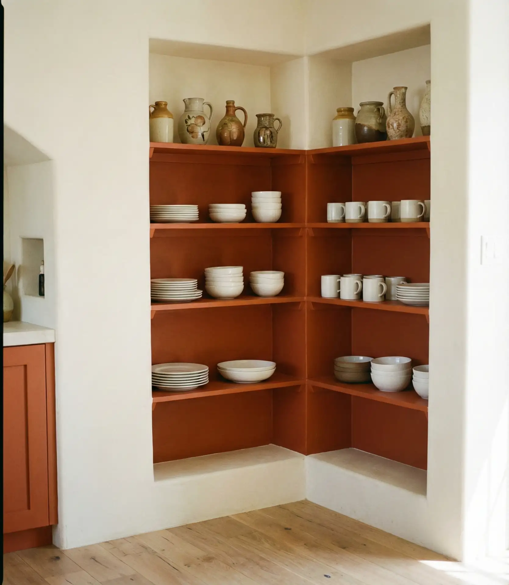
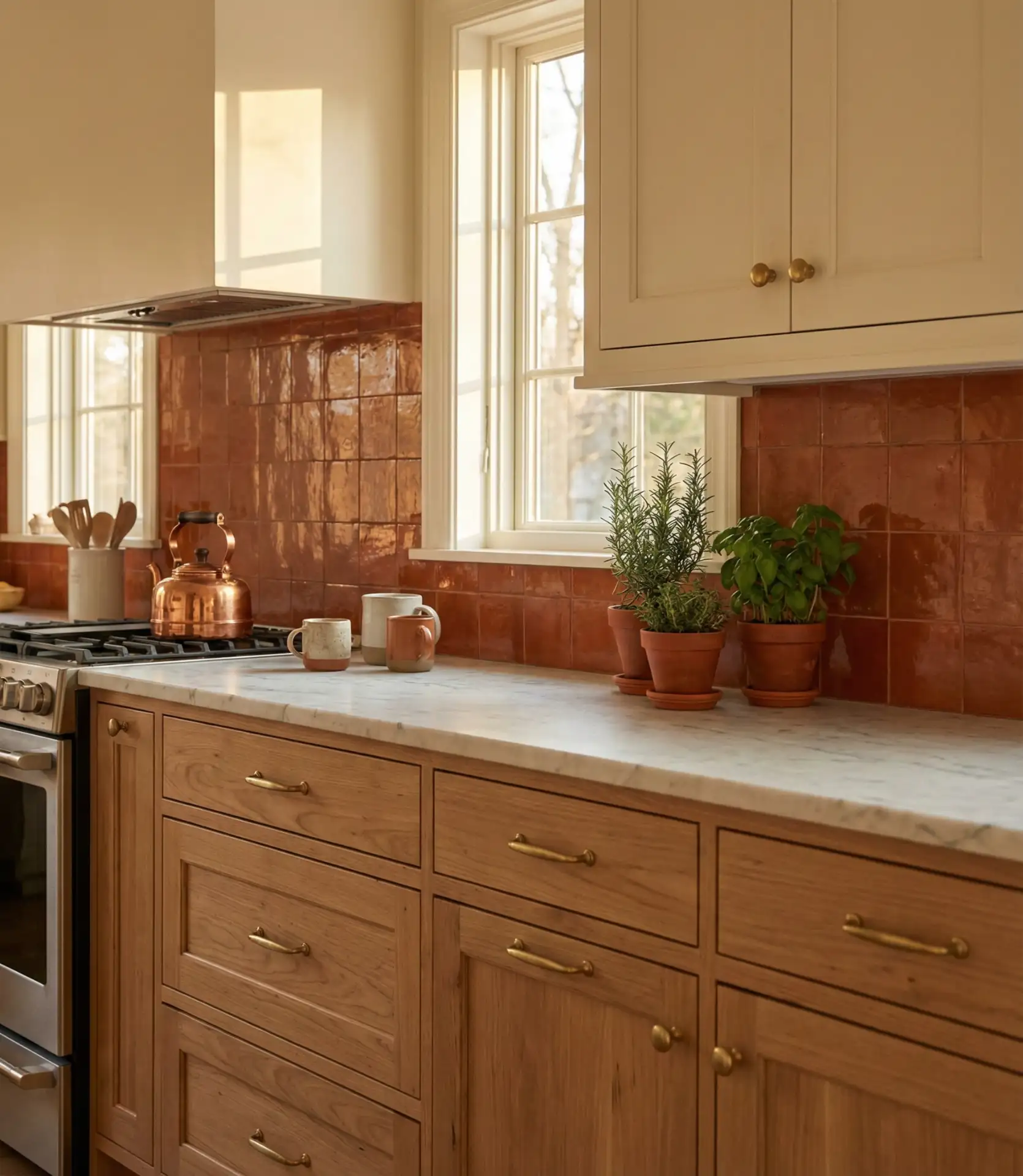
1. Warm Terracotta and Cream Palette
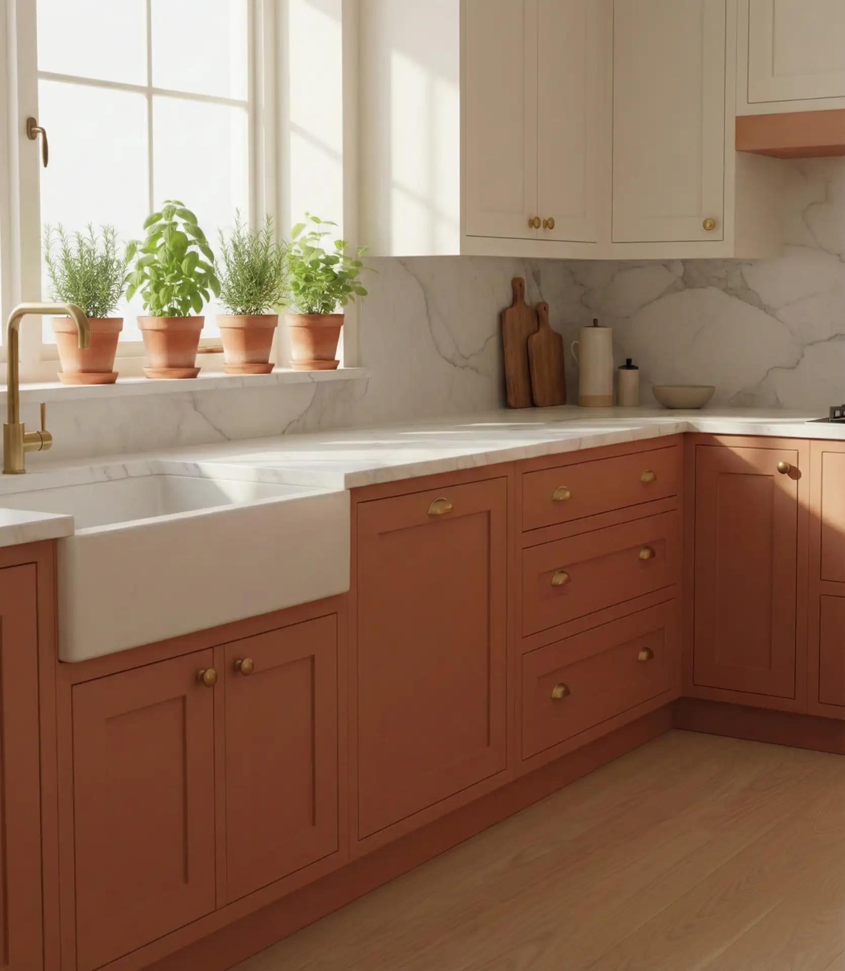
Terracotta has emerged as one of the best neutral alternatives for kitchens in 2026, especially when paired with soft cream tones. This palette brings warmth without overwhelming the space, making it ideal for open-plan homes where the kitchen flows into living areas. The earthy richness of terracotta works beautifully on accent walls or lower cabinets, while cream keeps upper cabinetry and countertops feeling light and airy.
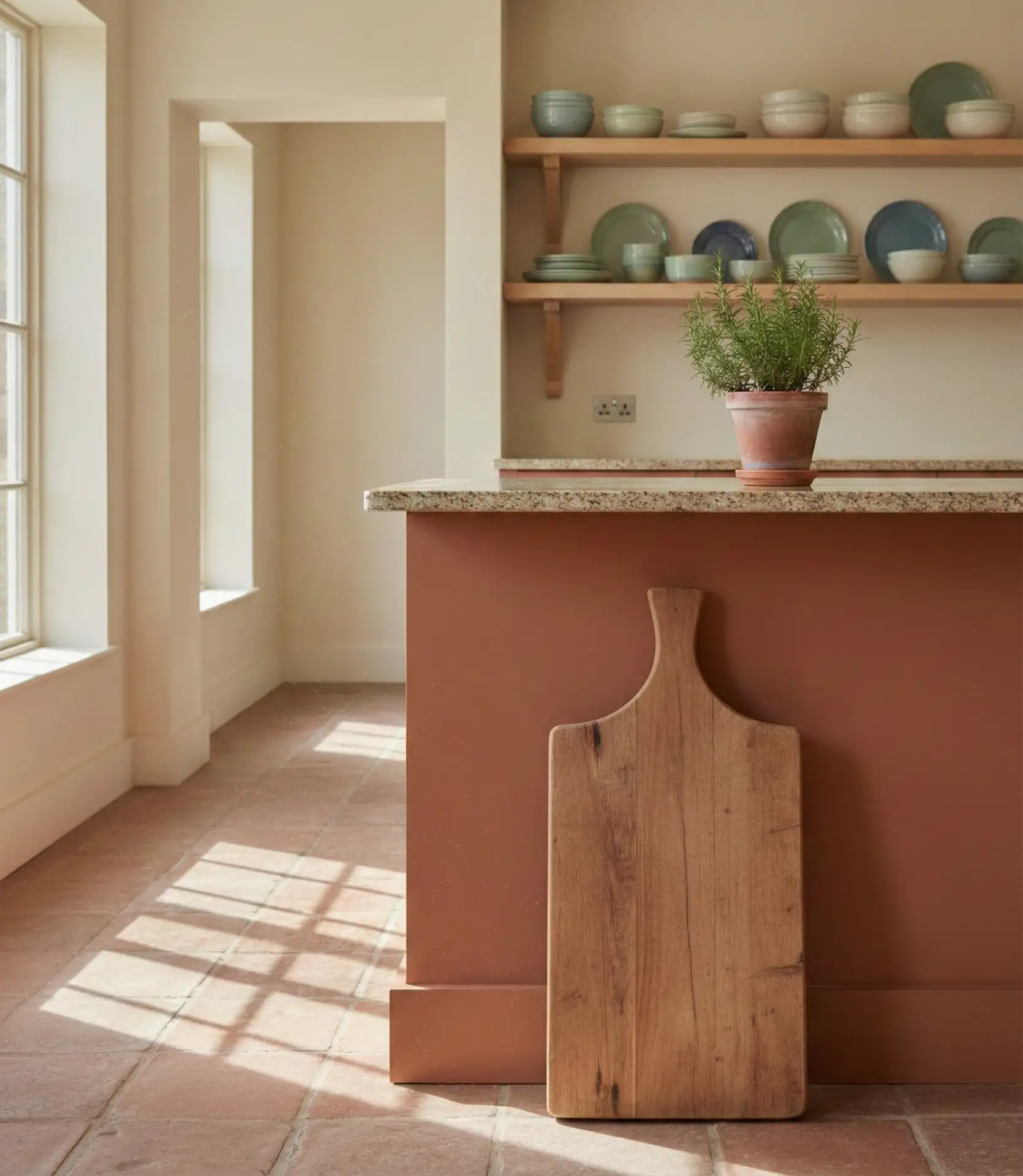
This combination works best in kitchens with ample natural light, as the terracotta tones can appear muddy in dimly lit spaces. Many homeowners pair this palette with natural wood flooring and woven textures to enhance the organic, grounded feel. It’s a forgiving choice for families, as the warm tones hide minor smudges and wear better than stark white.
2. Deep Green with Brass Accents
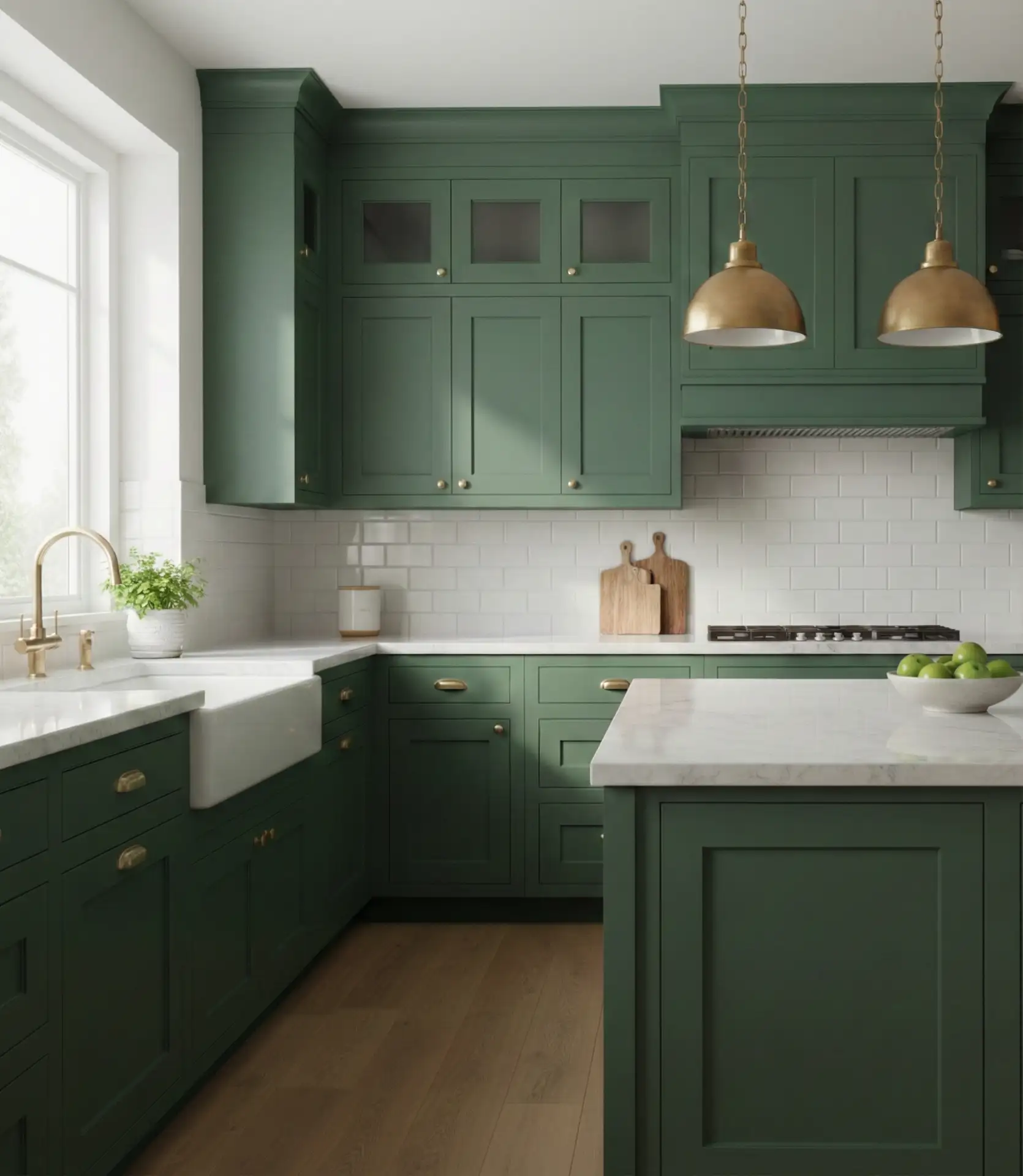
Deep forest green has become a signature trendy choice for painted cabinets in American kitchens this year. When combined with warm brass fixtures and hardware, it creates a sophisticated, jewel-toned aesthetic that feels both classic and current. This scheme appeals to homeowners who want drama without going too dark, as green maintains a sense of vitality that black or charcoal can lack.
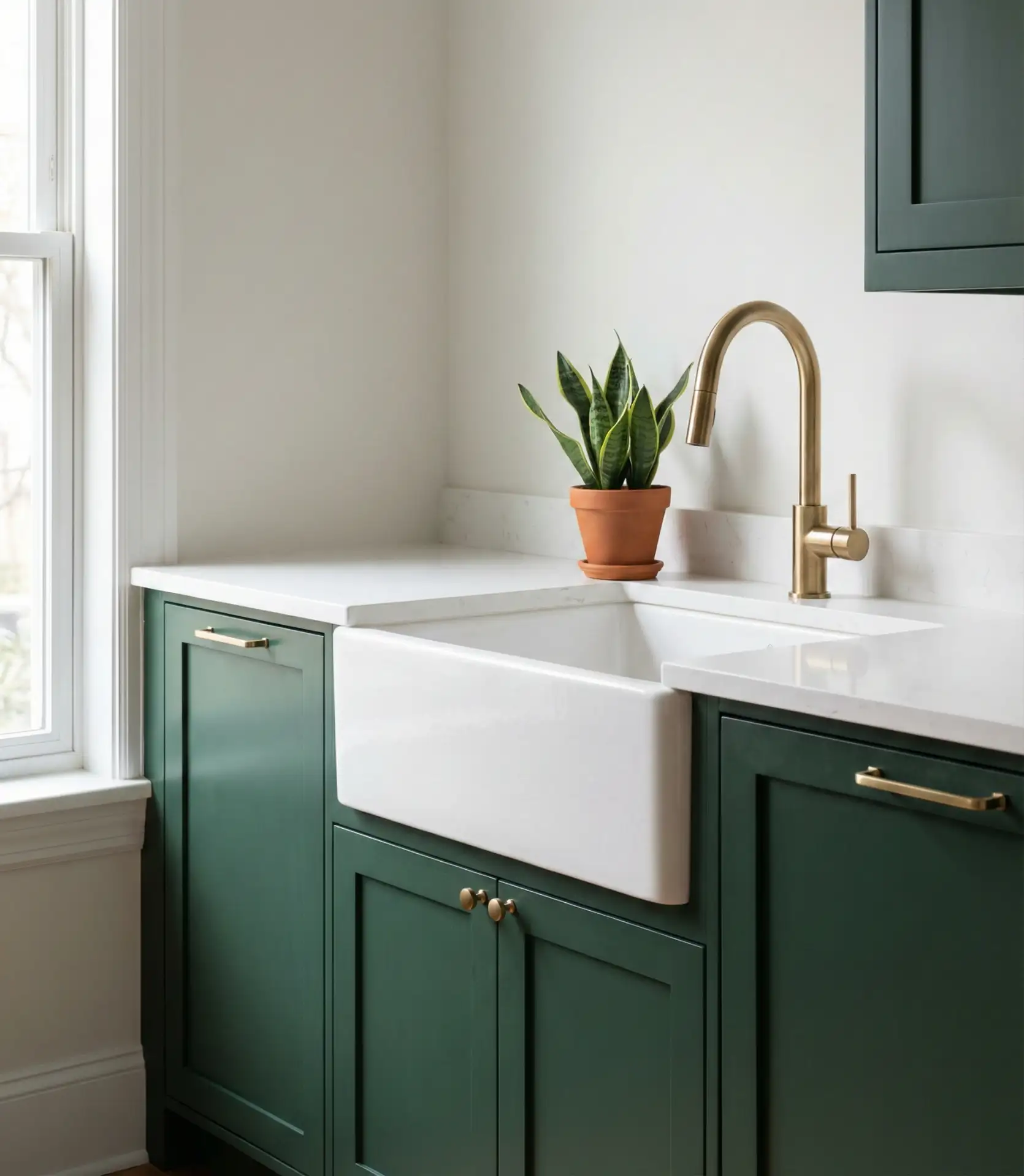
A common mistake is pairing deep green with cool-toned metals like chrome or nickel, which can make the space feel disjointed. Stick with warm brass, aged bronze, or even copper to maintain cohesion. If you’re hesitant about committing to green cabinets, start with a green island and keep perimeter cabinets neutral—it’s a low-risk way to test the palette.
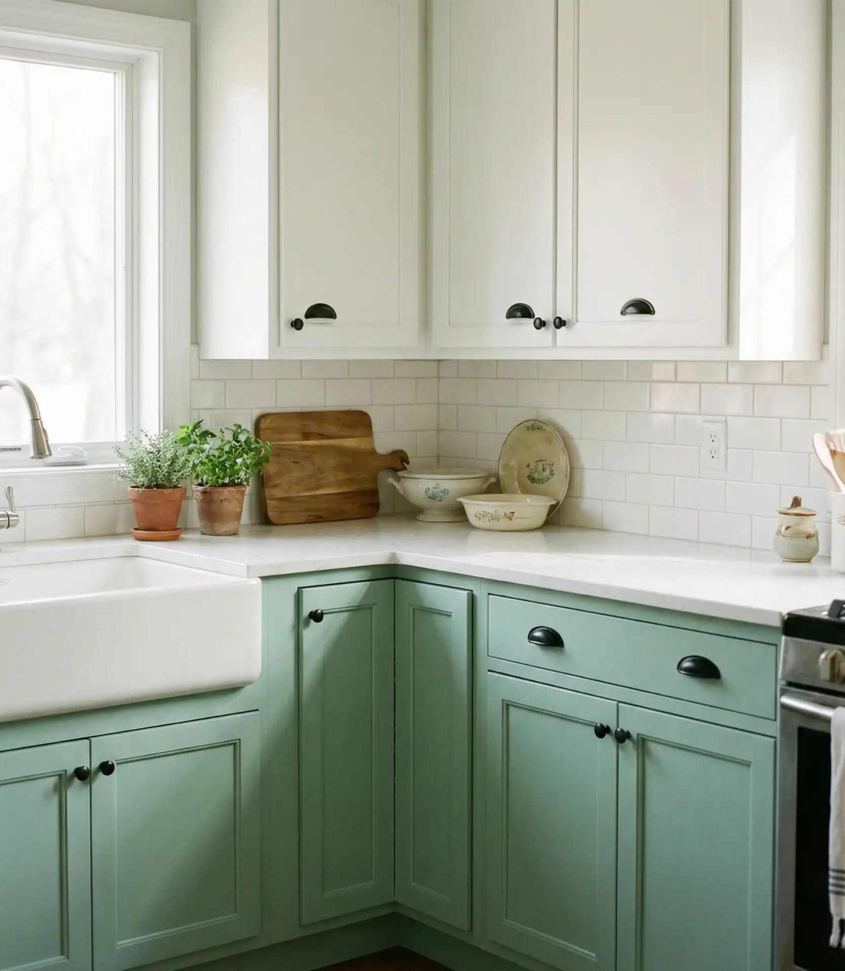
3. Soft Sage and White Combination
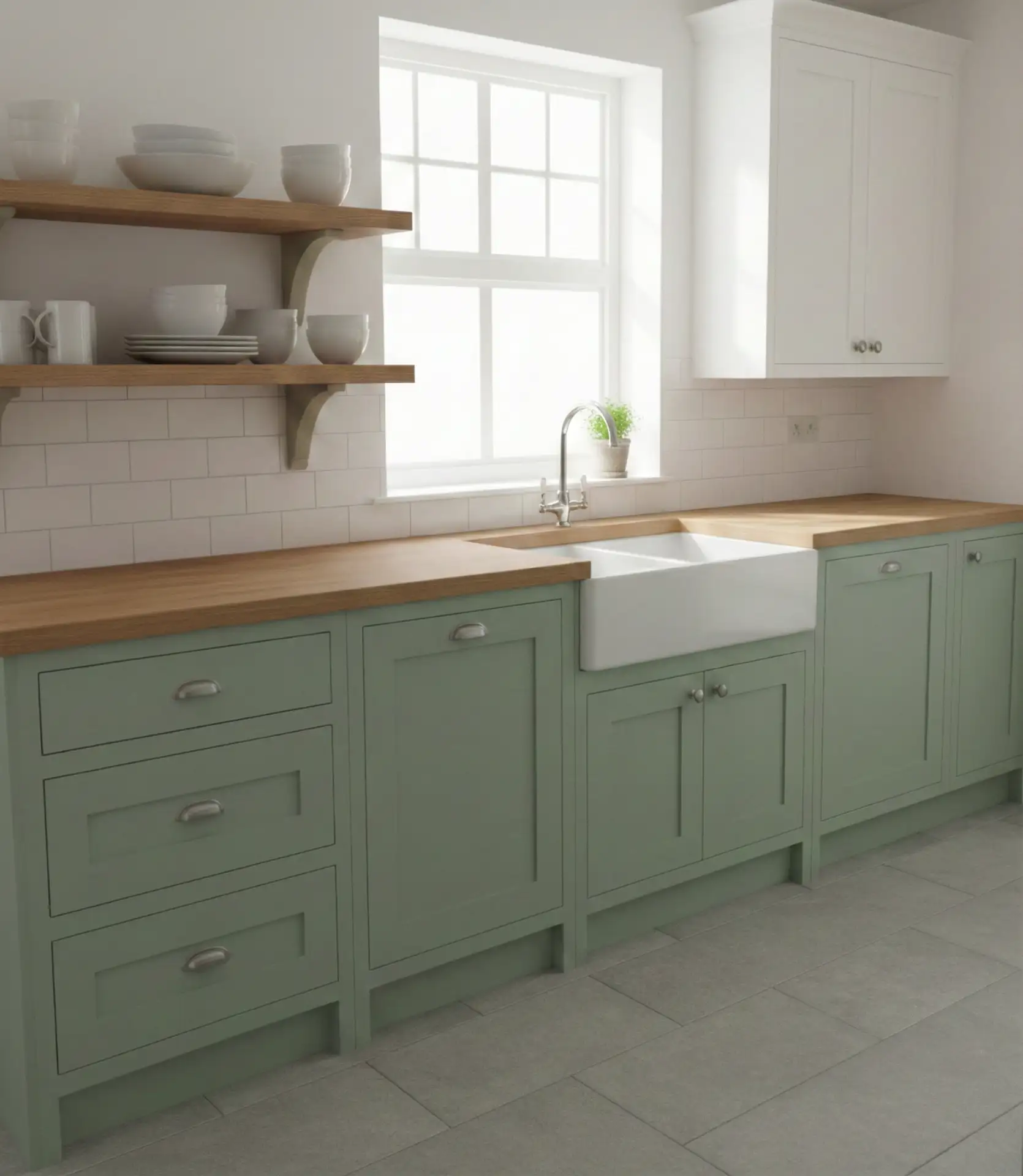
Soft sage offers a gentle alternative to stark white kitchens, and it’s one of the most popular combination ideas for those seeking a calming, nature-inspired space. This muted green pairs effortlessly with white cabinets on uppers or islands, creating a two-tone look that’s fresh and understated. Sage works particularly well in cottage- and farmhouse-style homes, where its soft tone complements vintage fixtures and reclaimed wood elements.
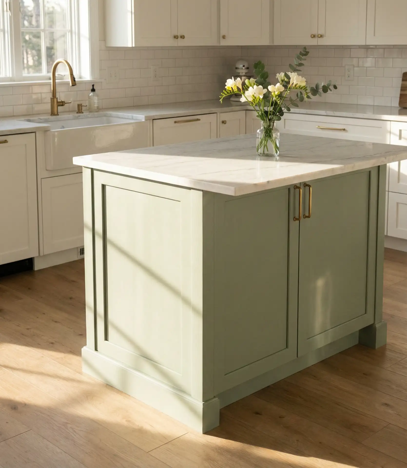
In the Pacific Northwest and New England, sage kitchens have seen a noticeable uptick, likely due to regional design preferences that favor muted, nature-inspired palettes. The color hides fingerprints and minor scuffs better than pure white, making it practical for busy households. Pair it with matte black or oil-rubbed bronze hardware for a more modern edge, or stick with brushed nickel for a traditional feel.
4. Charcoal Gray and Marble Scheme
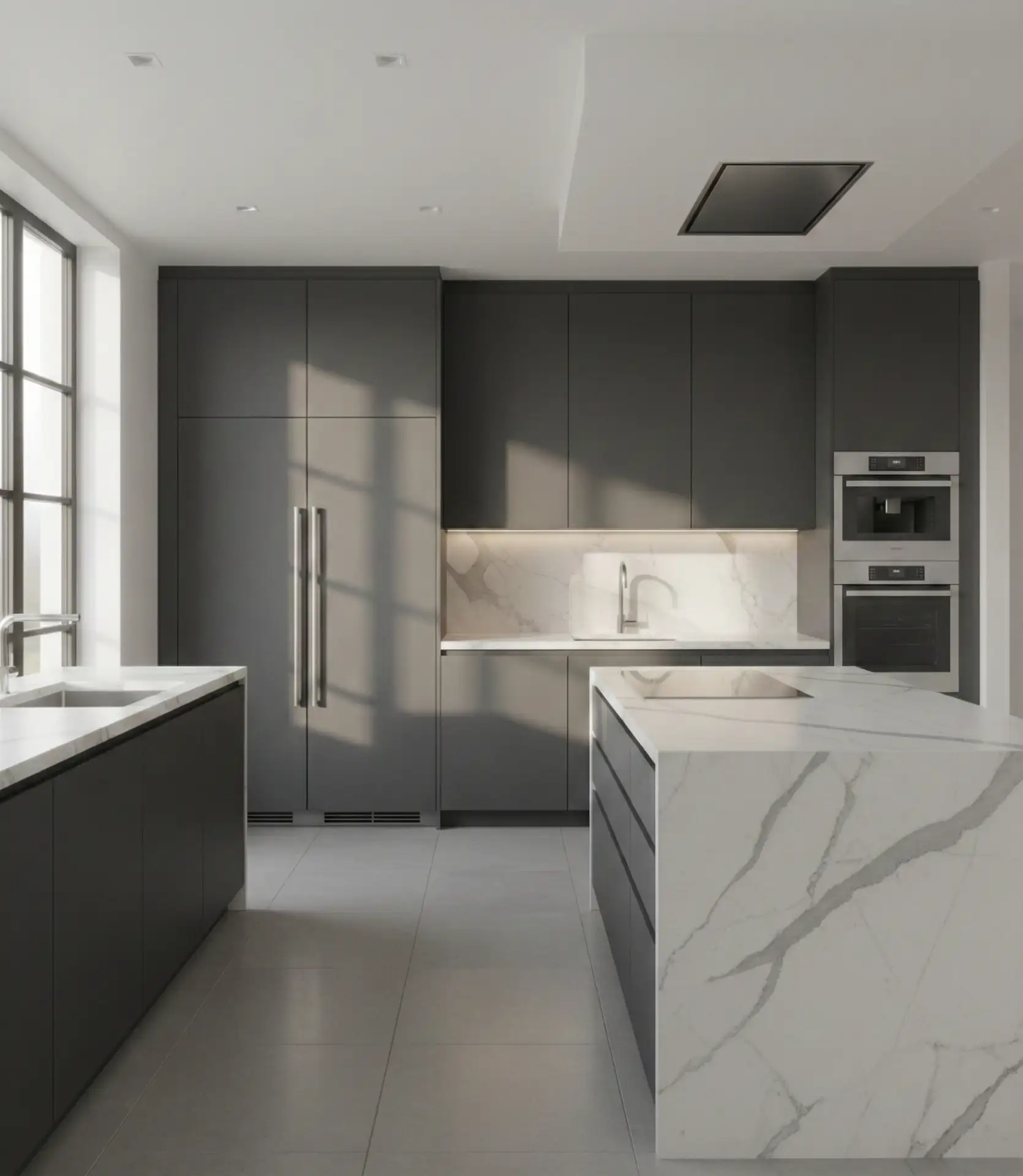
Charcoal gray cabinets paired with white or gray-veined marble create a sleek, modern palette that’s especially popular in urban lofts and contemporary homes. This combination delivers high contrast without the starkness of pure black, making it easier to live with day-to-day. The veining in marble adds organic movement that softens the boldness of charcoal, preventing the space from feeling too industrial.
Where it works best: kitchens with ample natural light or strong artificial lighting, as charcoal can absorb light and make smaller spaces feel closed-in. Consider adding under-cabinet lighting to brighten work surfaces and prevent the room from feeling cave-like. This palette also pairs beautifully with light wood floors or large-format white tile for balance.
5. Navy Blue with Gold Hardware
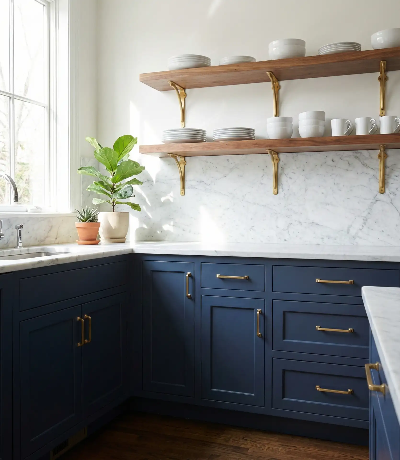
Navy continues to be a popular and timeless option for kitchen cabinetry. When accented with brushed gold or champagne-toned hardware, it takes on a refined, almost coastal elegance that appeals to a wide range of tastes. This scheme works equally well in traditional and transitional kitchens, offering depth and sophistication without reading as overly masculine or heavy.
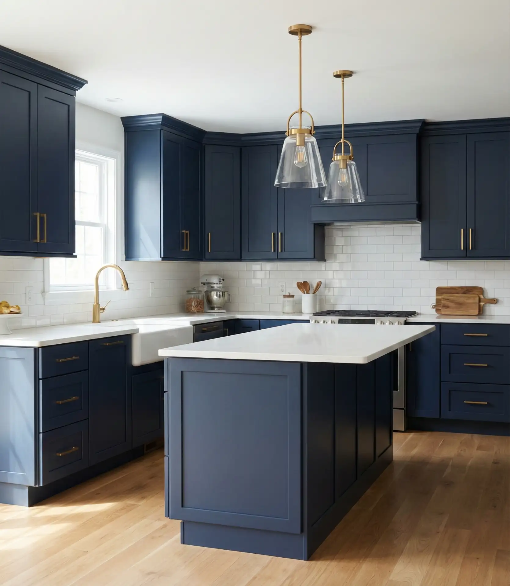
Budget-conscious homeowners often achieve this look by painting existing cabinets navy and swapping out hardware—a relatively affordable update that delivers high visual impact. The key is choosing a true navy rather than a blue-black or royal blue, as those can skew too bold or juvenile. Pair with warm white walls and natural wood accents to keep the space from feeling too cool.
6. Buttery Yellow Accents on Neutral Base
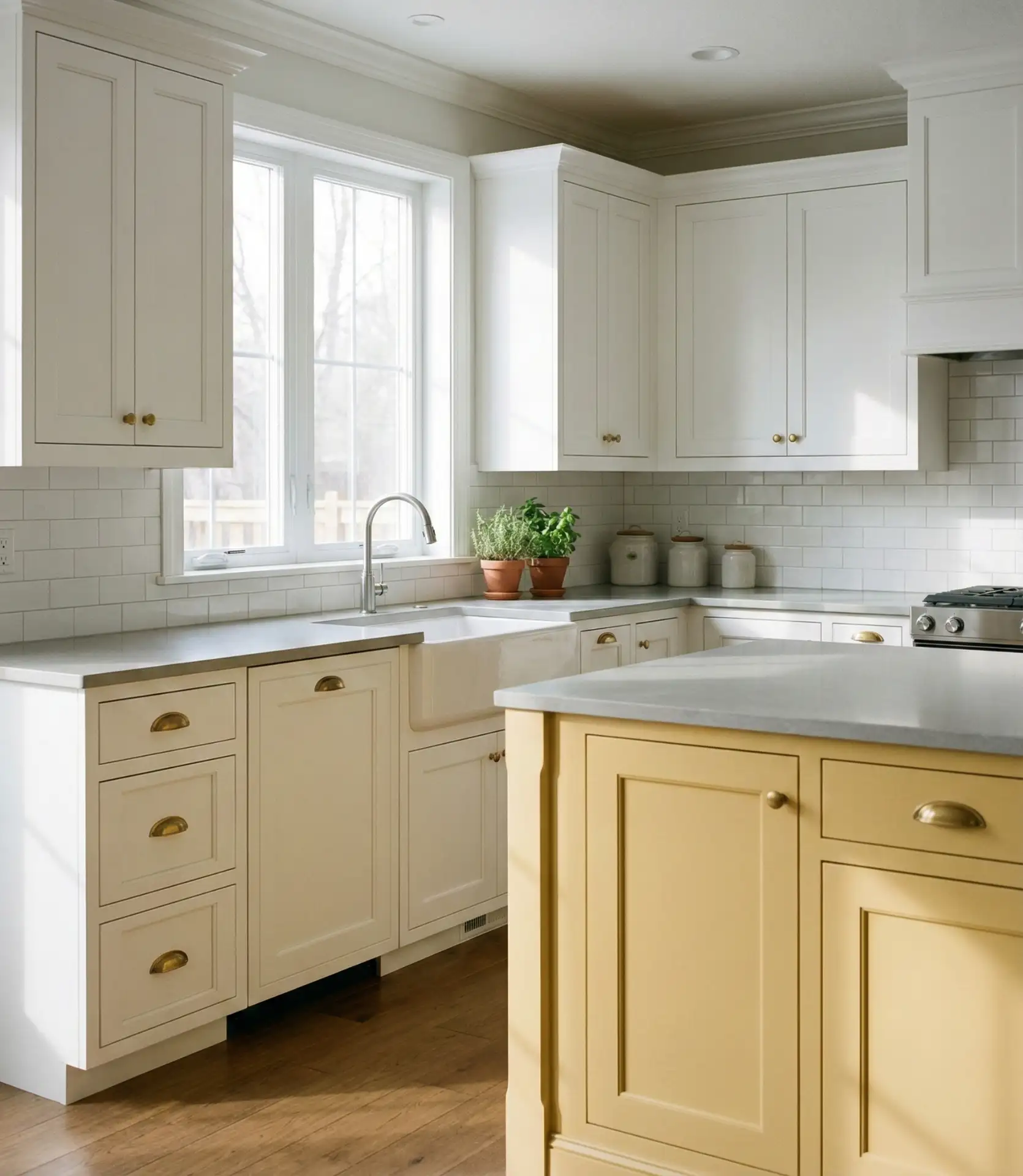
A warm, buttery yellow used sparingly—on an island, open shelving, or backsplash—can inject personality into an otherwise neutral kitchen. This approach has gained traction on Pinterest as homeowners look for ways to add color without overwhelming the space. The softness of buttery yellow makes it more versatile than brighter shades, pairing beautifully with grays, whites, and even wood tones.
Real homeowner behavior shows that people are more willing to experiment with color when it’s confined to one element rather than the entire kitchen. A yellow island can be repainted if tastes change, making it a lower-commitment way to embrace color. Avoid pairing yellow with cool grays or stark whites, which can make the yellow appear sickly—opt for warmer neutrals like greige or cream instead.
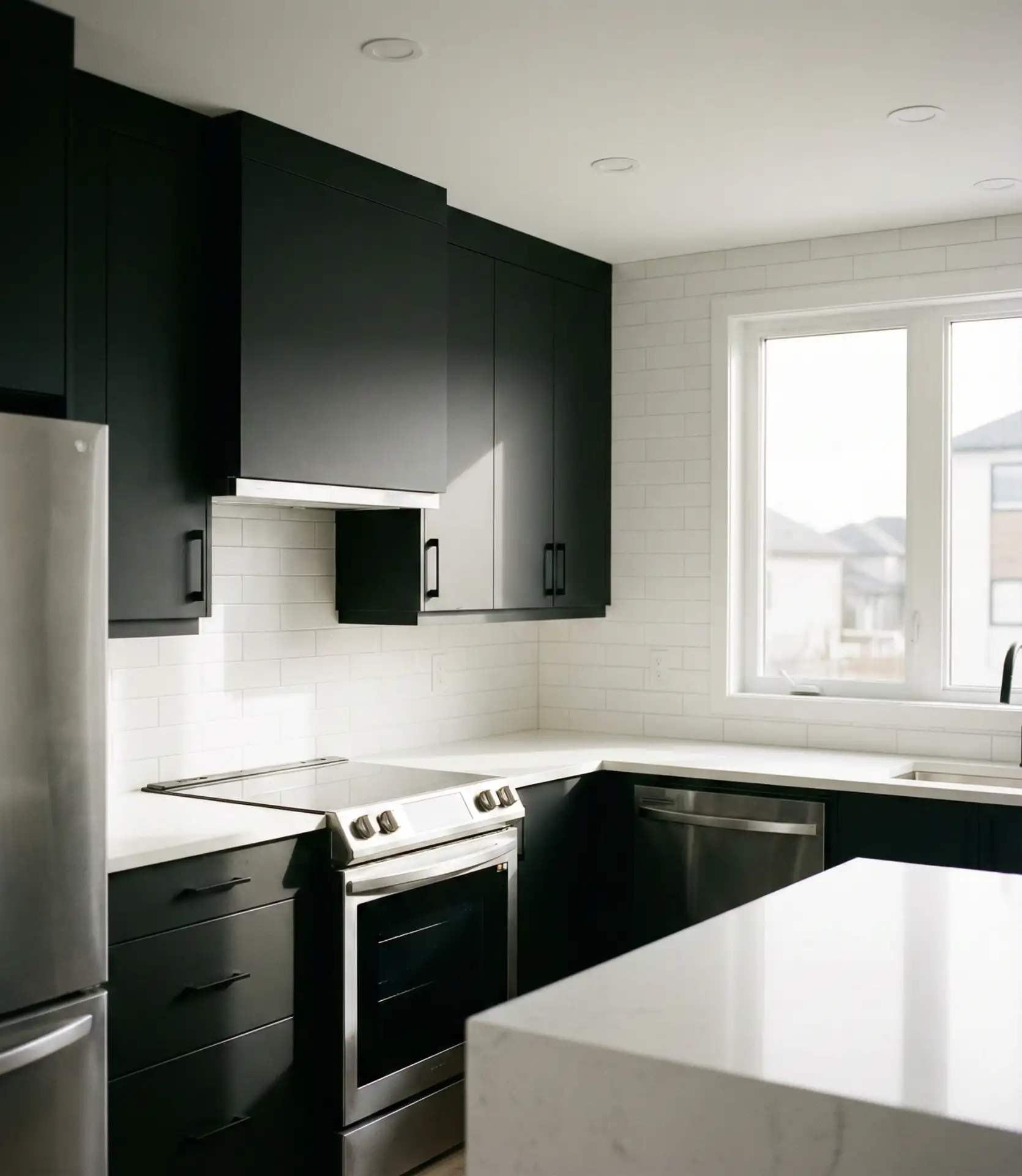
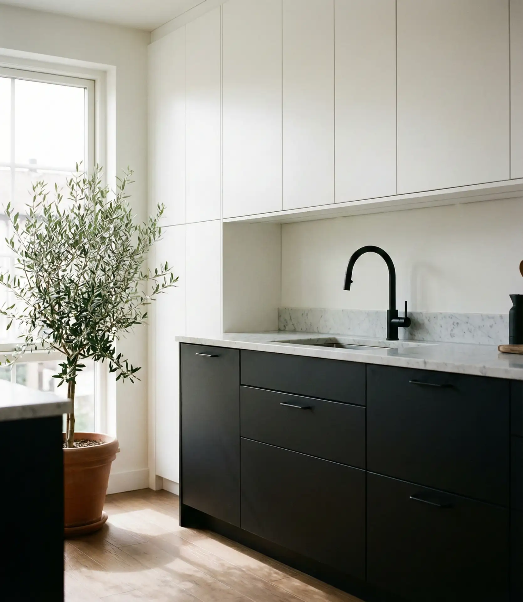
7. Black and White High-Contrast Combo
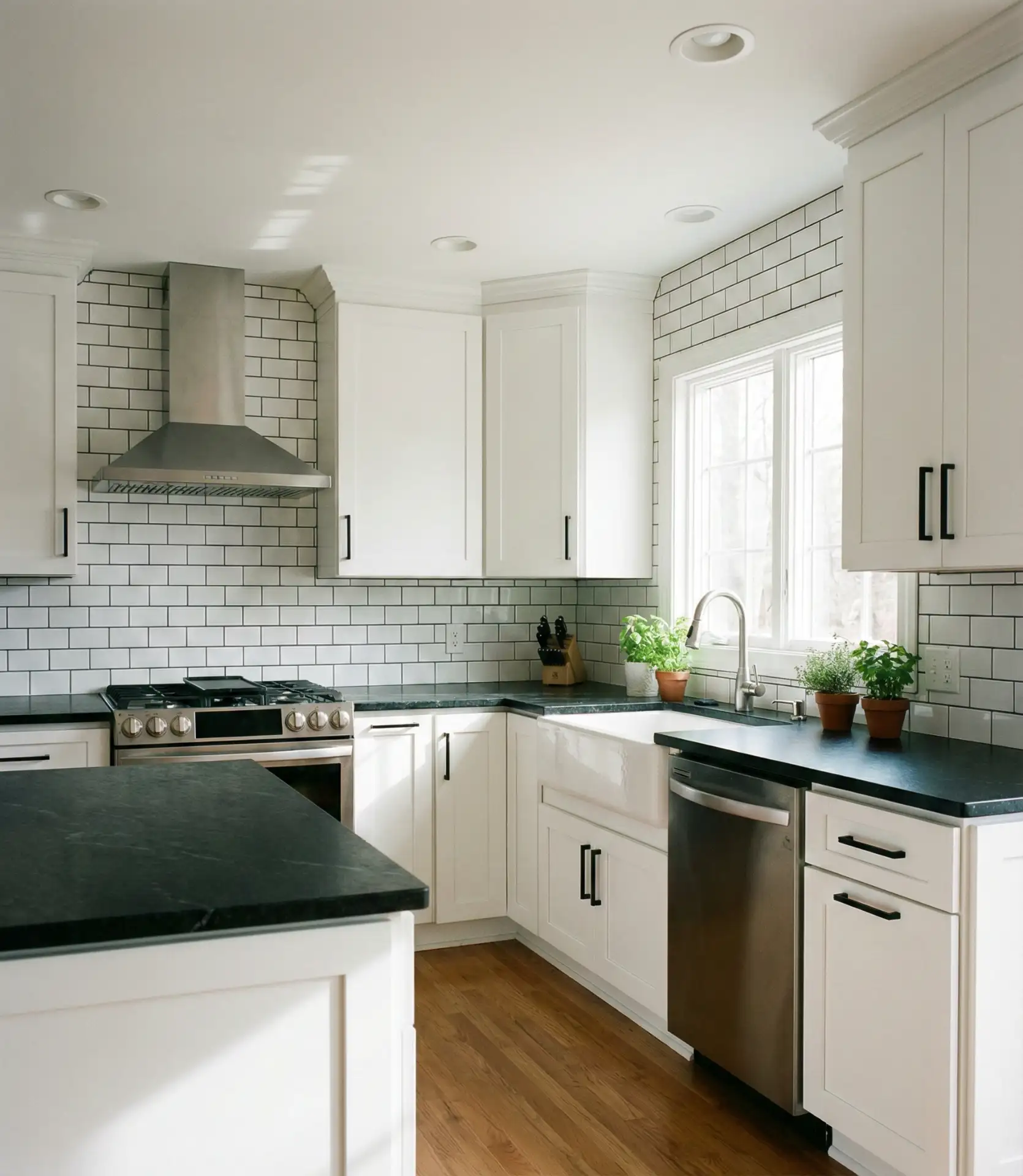
The classic black and white kitchen remains one of the best high-impact combos for those who love bold, graphic design. Black countertops paired with white cabinets create instant drama, while the inverse—black cabinets with white counters—offers a moodier, more contemporary feel. This timeless pairing works in kitchens of any size, though it’s particularly striking in spaces with strong architectural details or open shelving.
A neighbor of mine tried this scheme and quickly realized that black countertops show every water spot and crumb—she switched to a honed black granite, which hides smudges better than polished. If you’re considering this combination, please take into account your comfort with visible mess and select finishes accordingly. Matte black cabinets, for instance, are more forgiving than glossy ones.
8. Warm Oak Cabinets with Olive Green Walls
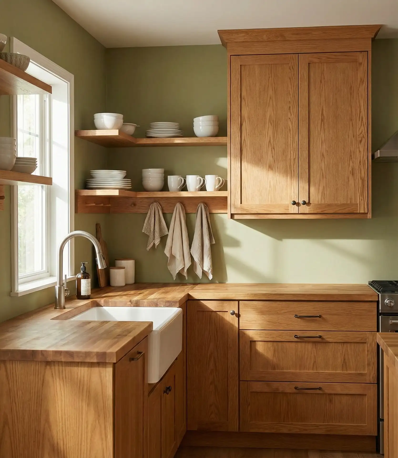
One of the most flattering schemes for natural oak cabinets is to pair them with muted olive or sage green walls. This combination honors the warmth of the wood grain while introducing a soft, organic color that doesn’t compete. It’s a particularly smart choice for homeowners who inherited oak cabinetry and want to update the space without a full remodel.
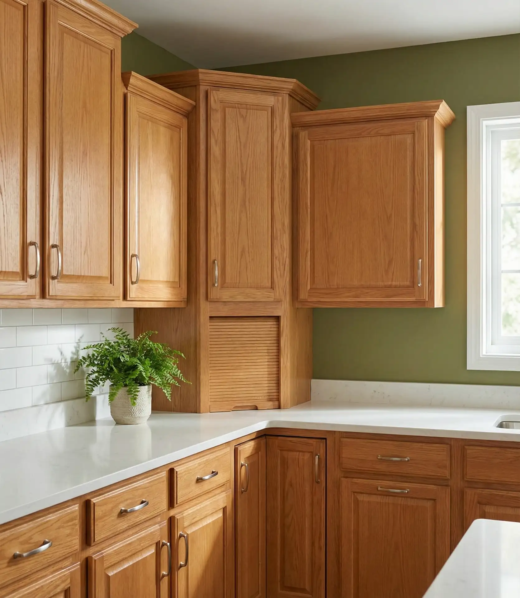
Expert designers note that this pairing works because both oak and olive have warm undertones, creating harmony rather than clash. If your oak skews more orange, opt for a greener olive; if it’s cooler and ashier, a grayer sage works better. This color scheme color scheme is also a budget-friendly update—paint costs far less than new cabinets, and the transformation can be dramatic.
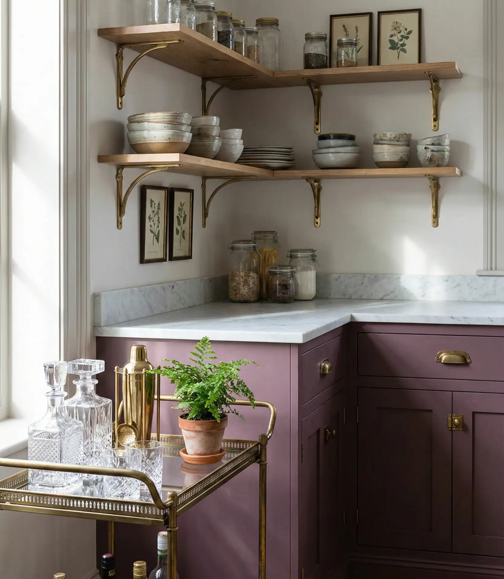
9. Dusty Rose and Cream Scheme
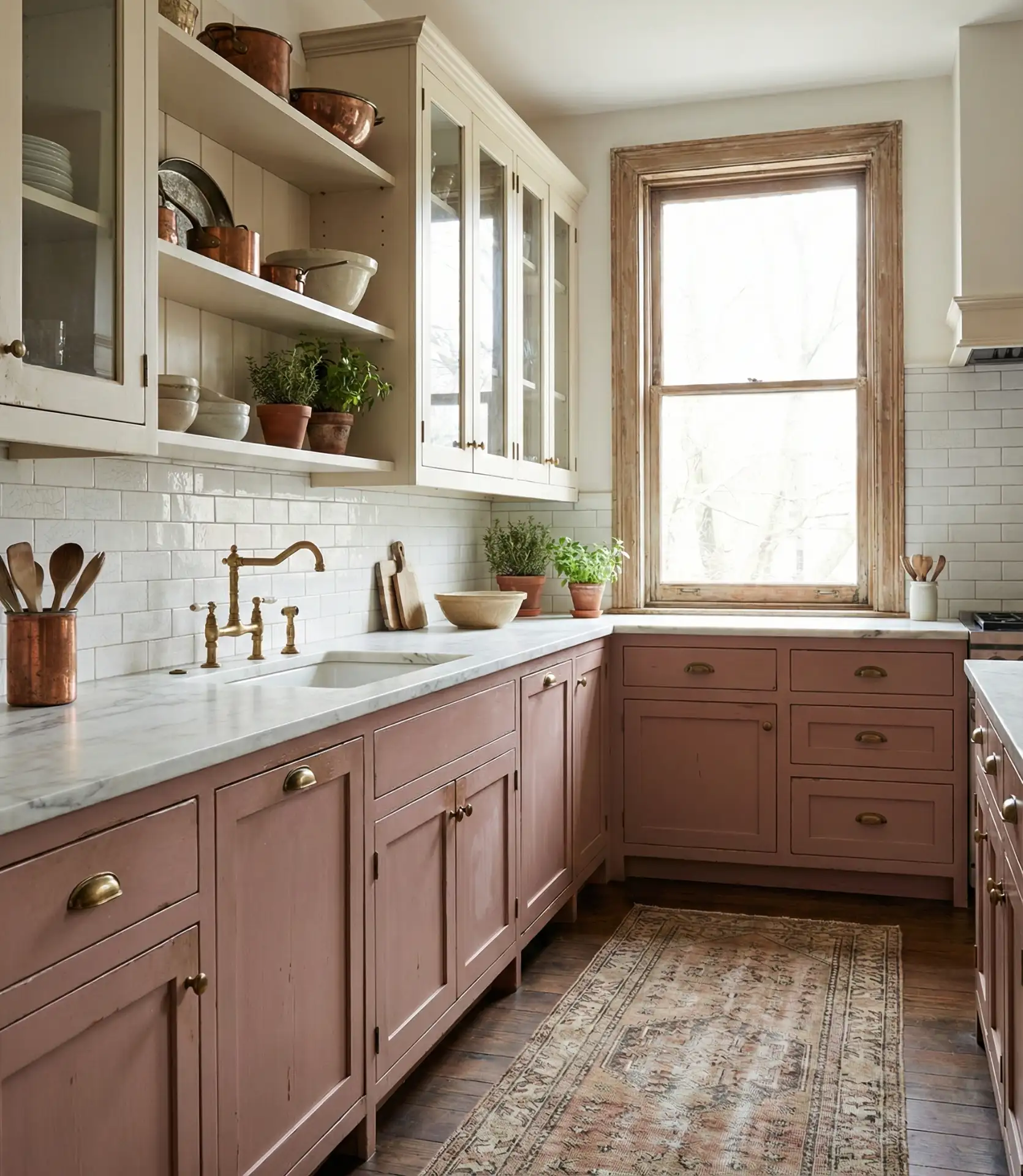
Dusty rose has emerged as a surprisingly versatile palette choice for kitchens, especially when paired with warm cream or ivory tones. This soft, earthy pink feels cozy without being overly sweet, making it appealing to adults who want color but not kitsch. It’s a popular scheme idea for cottage-style homes or anyone drawn to vintage-inspired aesthetics with a modern twist.
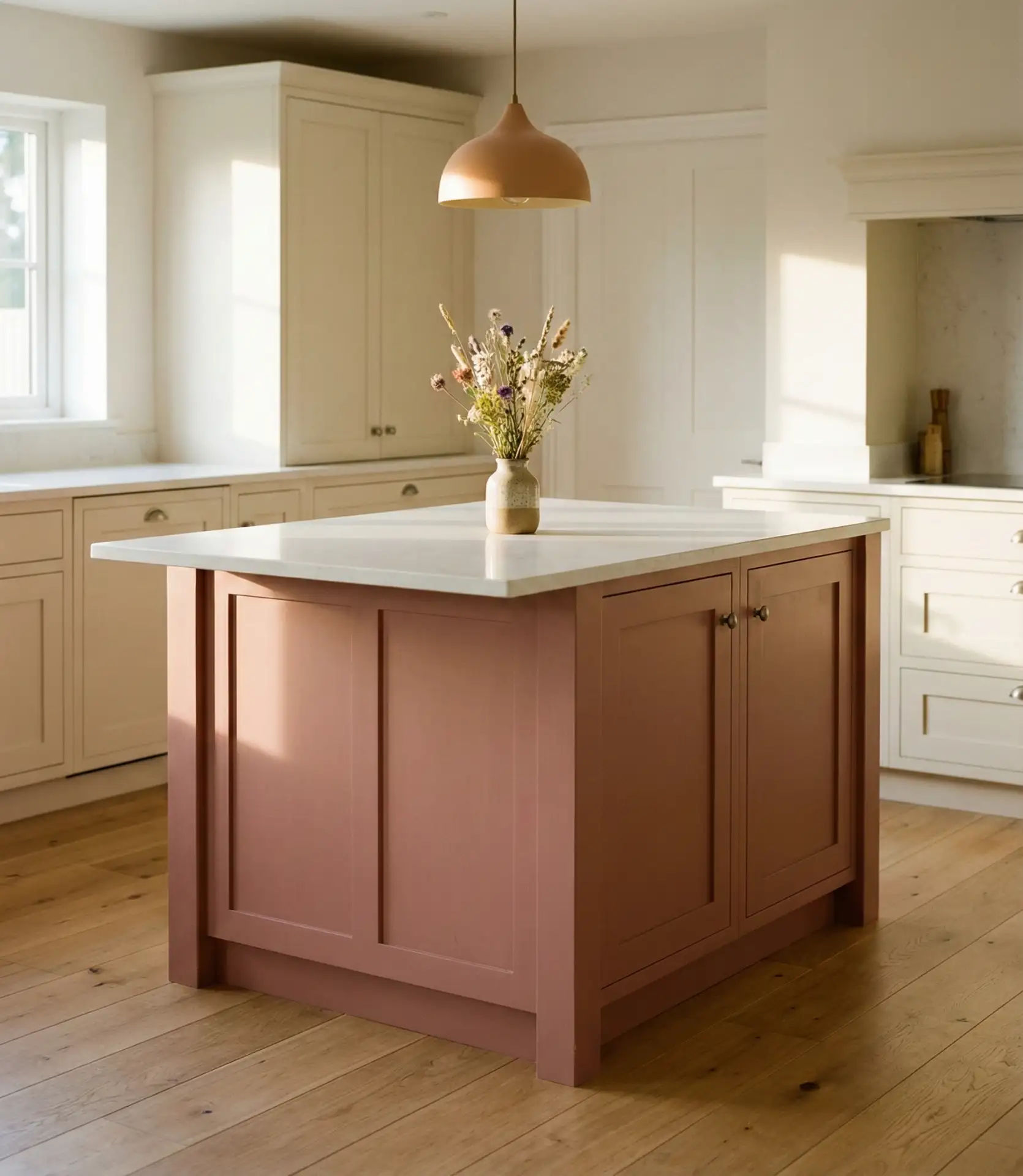
Dusty rose has found a welcoming audience in Midwestern and Southern states, where traditional design sensibilities still hold sway. The key is keeping finishes and fixtures understated—too much ornamentation can tip the palette into overly feminine territory. Pair with matte black or aged brass hardware, and avoid pink-on-pink overload by keeping walls and backsplashes neutral.
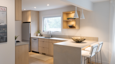
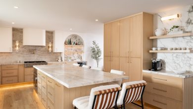
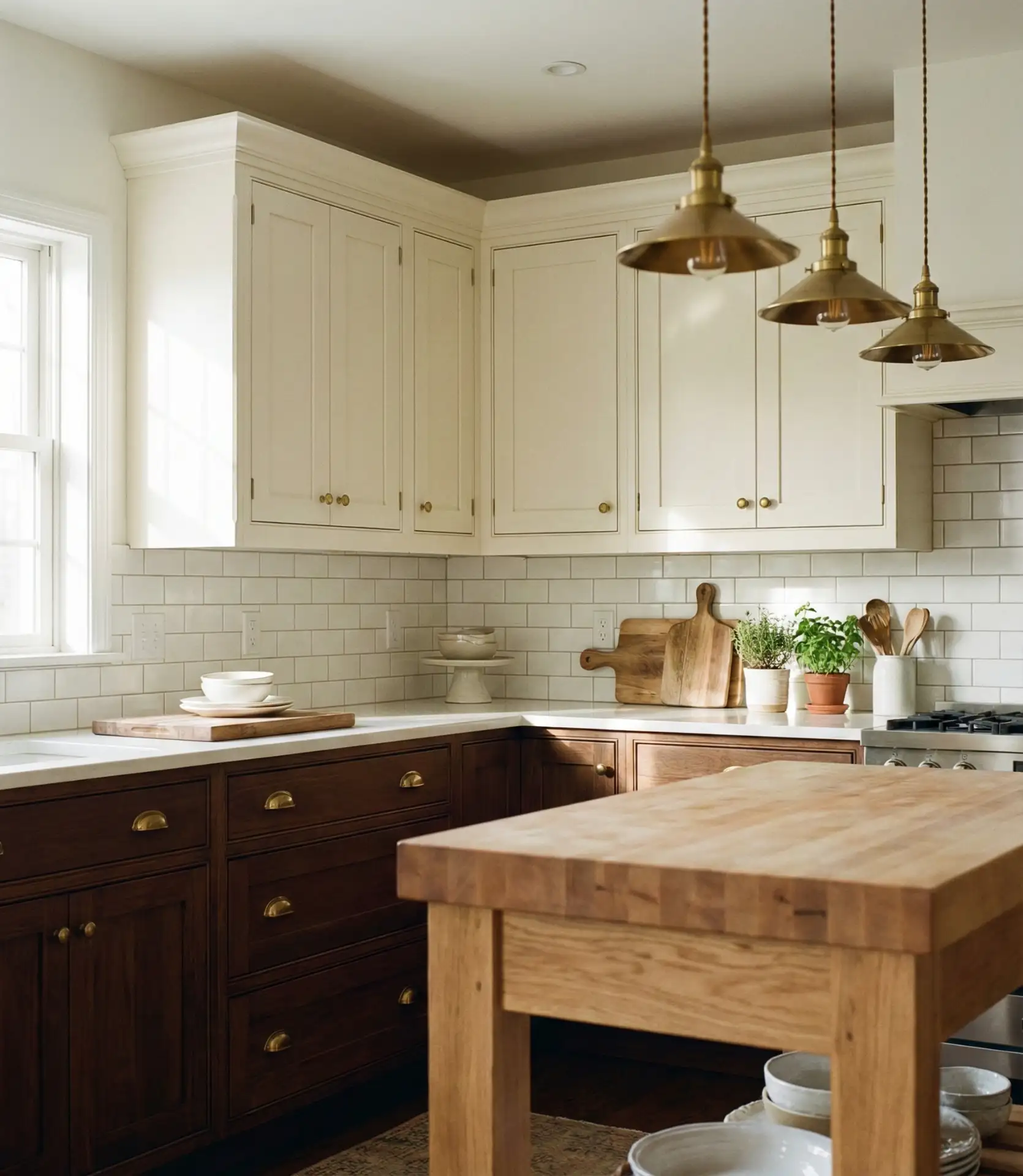
10. Crisp White with Natural Wood Tones

An all-white cabinet kitchen warmed with natural wood elements—think butcher block counters, floating shelves, or wood-beam ceilings—remains one of the most enduring scheme ideas in American homes. This combination feels clean and timeless, while the wood prevents it from reading as sterile or cold. It’s a go-to for homeowners who want flexibility, as the neutral base allows for easy seasonal decor swaps.
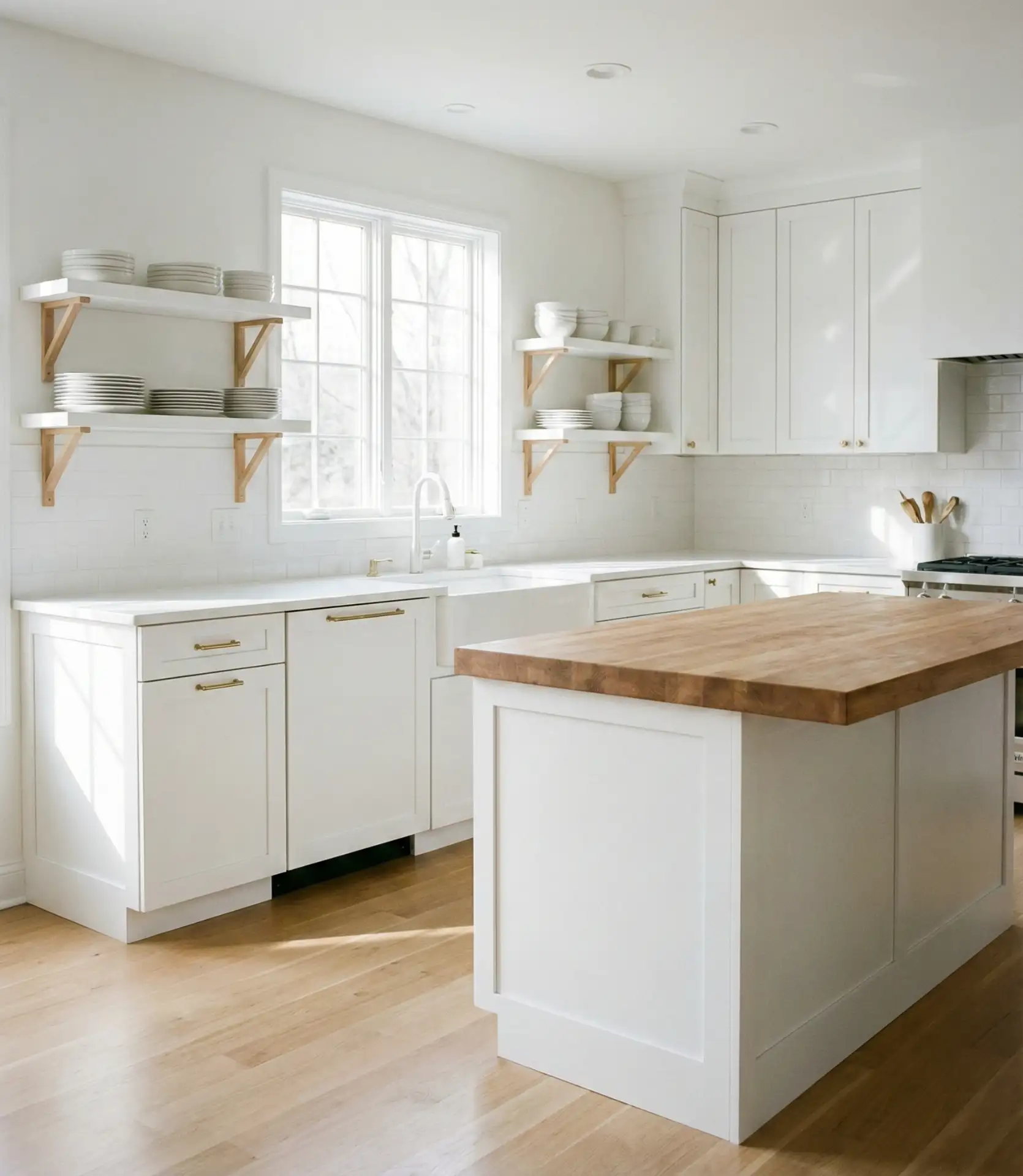
Common mistake: choosing a cool, stark white when the wood tones are warm—this creates visual tension. Instead, opt for whites with warm undertones like ivory, alabaster, or linen white. Many homeowners also underestimate how much wood is needed to make an impact; a single wood cutting board won’t cut it—aim for larger surfaces like countertops, open shelving, or a wood-topped island.
11. Moody Plum with Brass and Marble
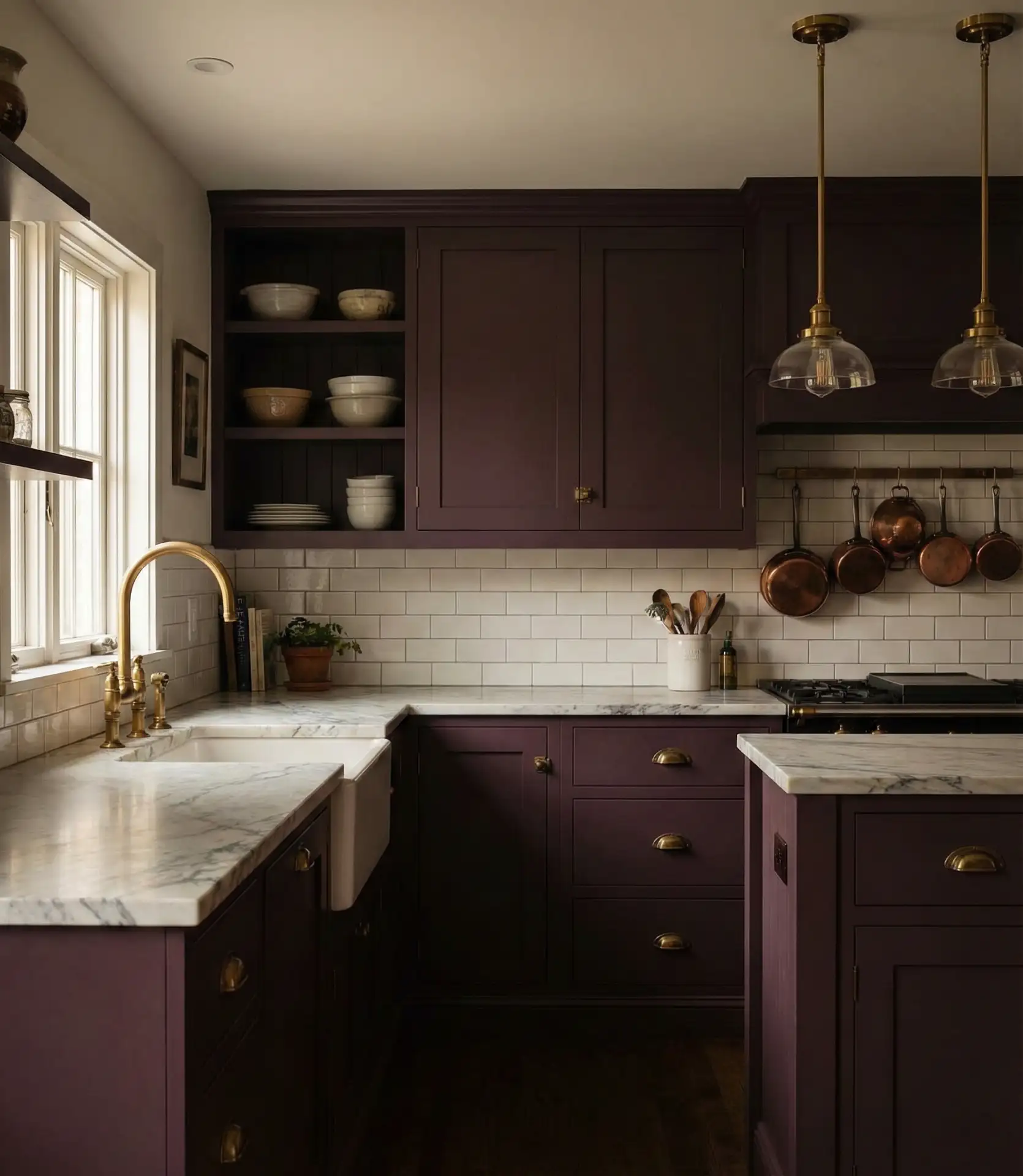
Plum and deep aubergine tones are gaining ground as trendy alternatives to navy or black, offering richness and warmth that feels both luxurious and unexpected. When paired with brass fixtures and white or gray marble, this palette becomes a showstopper—ideal for homeowners who want a kitchen that feels more like a jewel box than a utilitarian workspace. It’s a bold move, but one that’s increasingly common in design-forward homes.
Real homeowner behavior shows that people who commit to dark, saturated colors like plum tend to be confident decorators who aren’t afraid of making a statement. If that’s not you, test the color on a small piece of furniture or a single cabinet door before committing to the whole kitchen. Also, ensure your space has strong lighting—both natural and artificial—to keep plum from feeling oppressive.
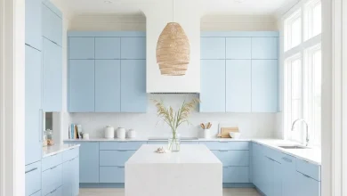
12. Pale Blue and White for Coastal Vibes
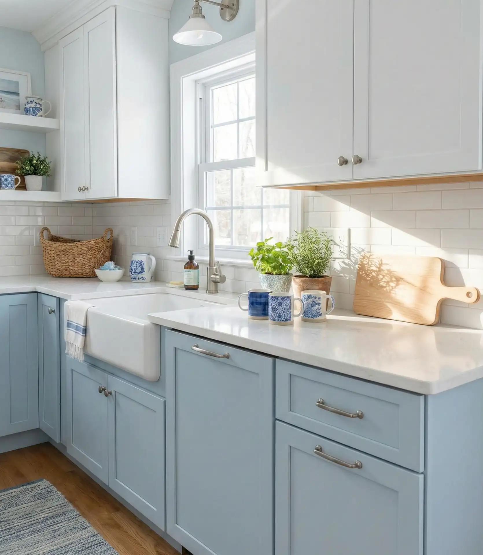
Soft, pale blue paired with white cabinets evokes seaside living and remains a perennial favorite in coastal regions and beyond. This scheme feels breezy and relaxed, perfect for homes where the kitchen is a gathering space for family and friends. The lightness of pale blue keeps the space feeling open and airy, while the white grounds it and prevents it from skewing too themed or kitschy.
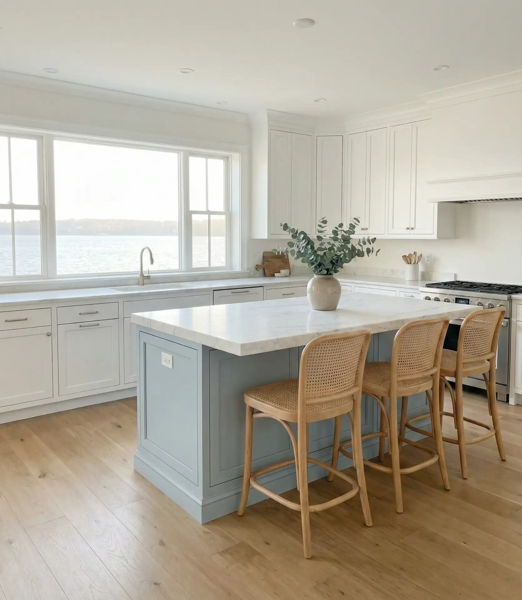
This palette works best in kitchens with abundant natural light, and it works especially well in beach towns from the Carolinas to Southern California. Pair with natural fiber rugs, woven baskets, and light wood accents to enhance the coastal feel. Avoid overdoing nautical motifs—the color itself should evoke the coast without literal anchors and ship wheels cluttering the space.
13. Soft Gray with Warm Wood and Brass
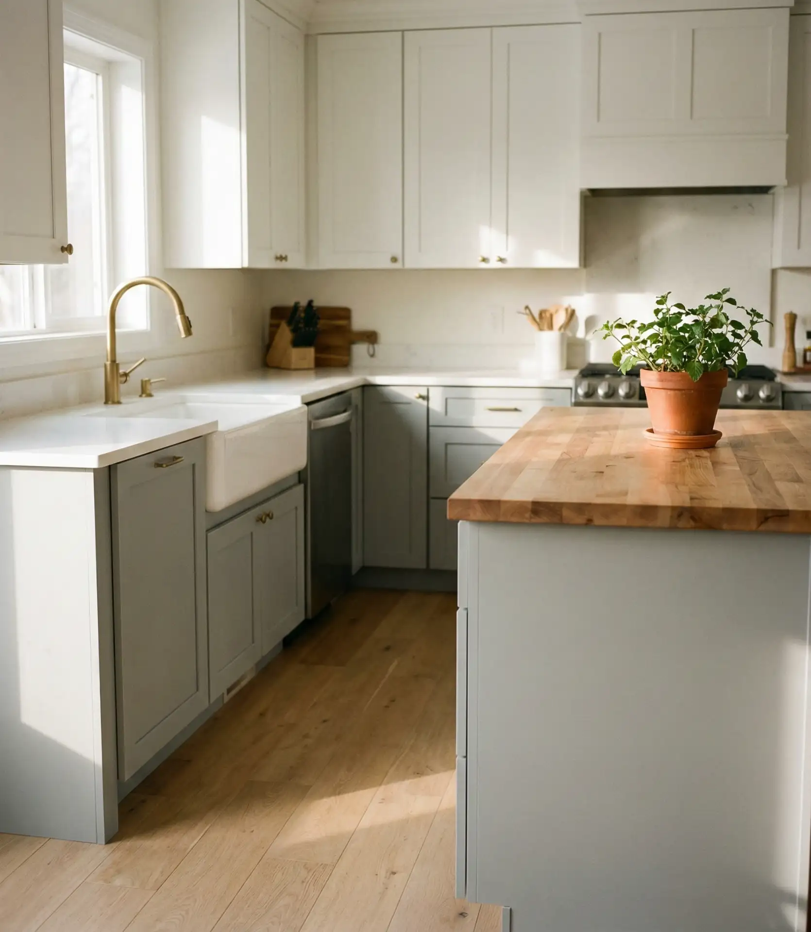
Soft gray cabinetry paired with warm wood tones and brass accents is one of the most balanced palette ideas for those who want a contemporary look without going too cool or stark. The gray provides a modern, sophisticated backdrop, while the wood and brass introduce warmth and character. This combination-of-ideas approach works beautifully in transitional kitchens that blend traditional and modern elements.
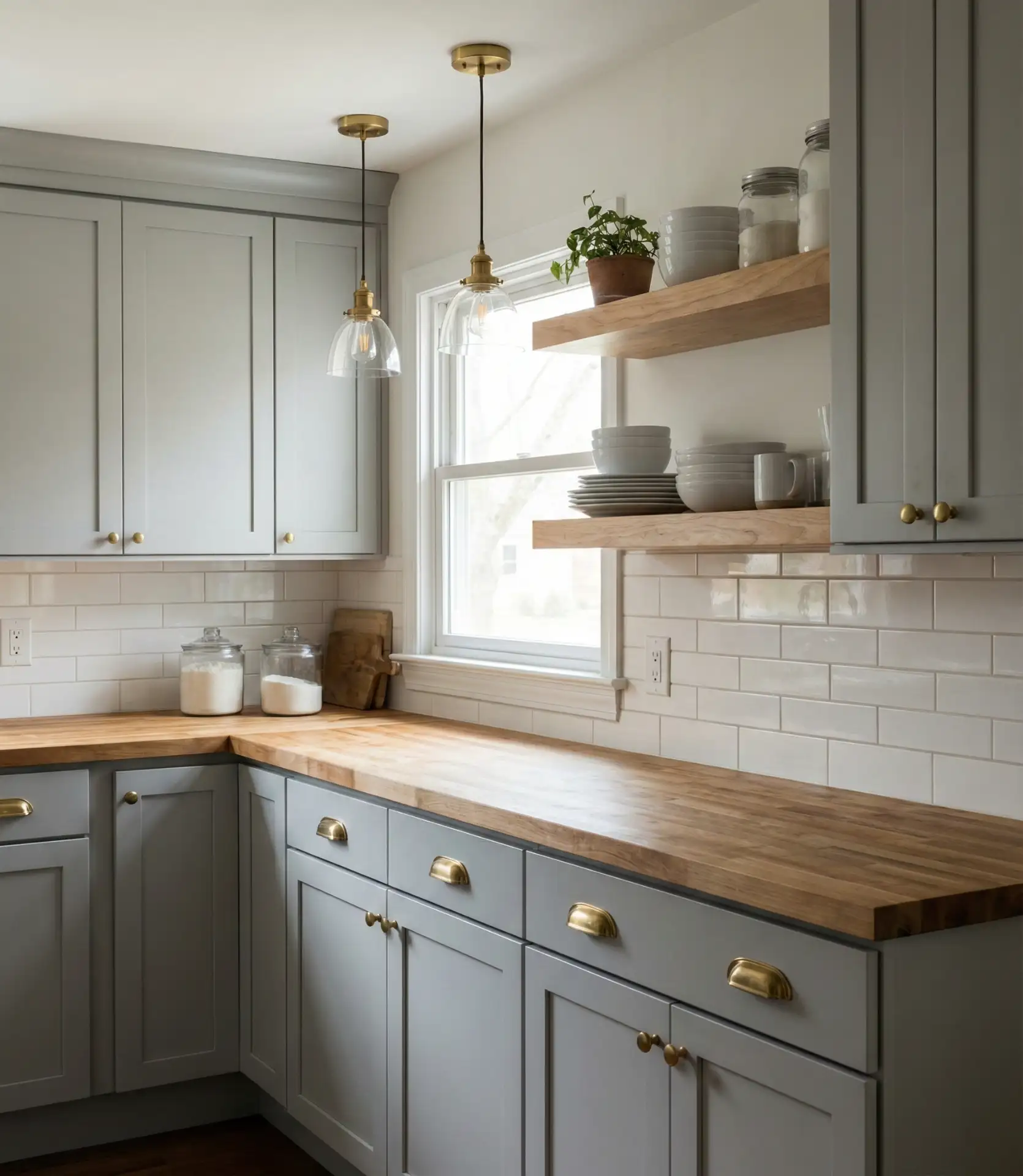
Budget tip: if new cabinets aren’t in the cards, consider painting existing ones a soft gray and upgrading hardware to brass—it’s a relatively affordable transformation. The key is choosing a gray with warm undertones rather than a cool, blue-gray, which can clash with warm wood. Test paint samples in different lighting conditions before committing, as gray is notoriously difficult to get right.
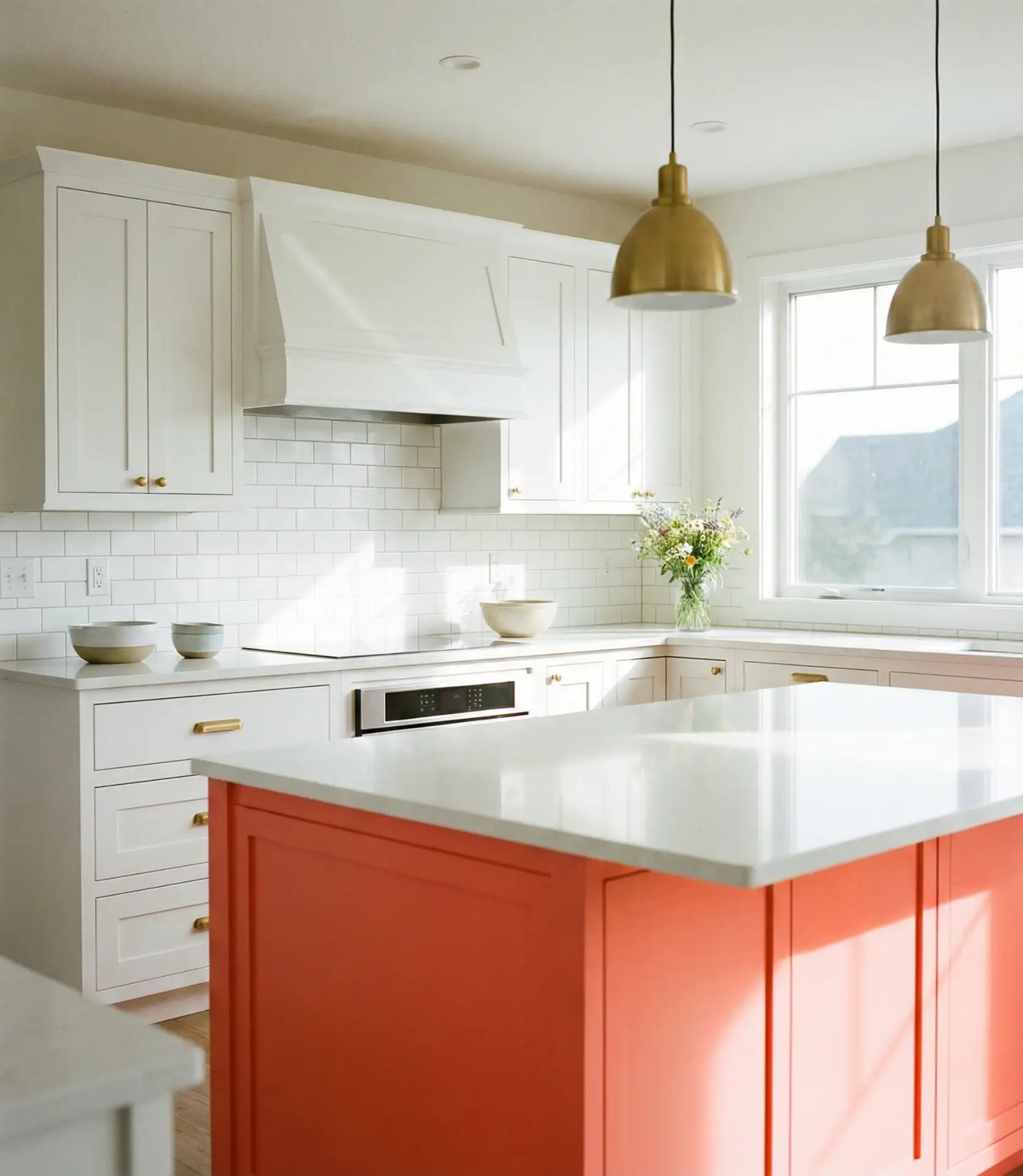
14. Burnt Orange Accents on Cream Base
Burnt orange used as an accent color—on a backsplash, open shelving, or a single wall—adds warmth and energy to an otherwise neutral kitchen. This earthy, retro-inspired hue has seen a resurgence in 2026, particularly among homeowners drawn to ’70s-influenced design. When kept to small doses, burnt orange feels intentional and curated rather than overwhelming.
Where it works best: eclectic or vintage-inspired kitchens where a bit of personality and playfulness is welcome. This isn’t the palette for minimalists or those who prefer a calm, monochromatic space. Pair with natural materials like terracotta, wood, and woven textures to keep the orange feeling grounded and organic rather than jarring.
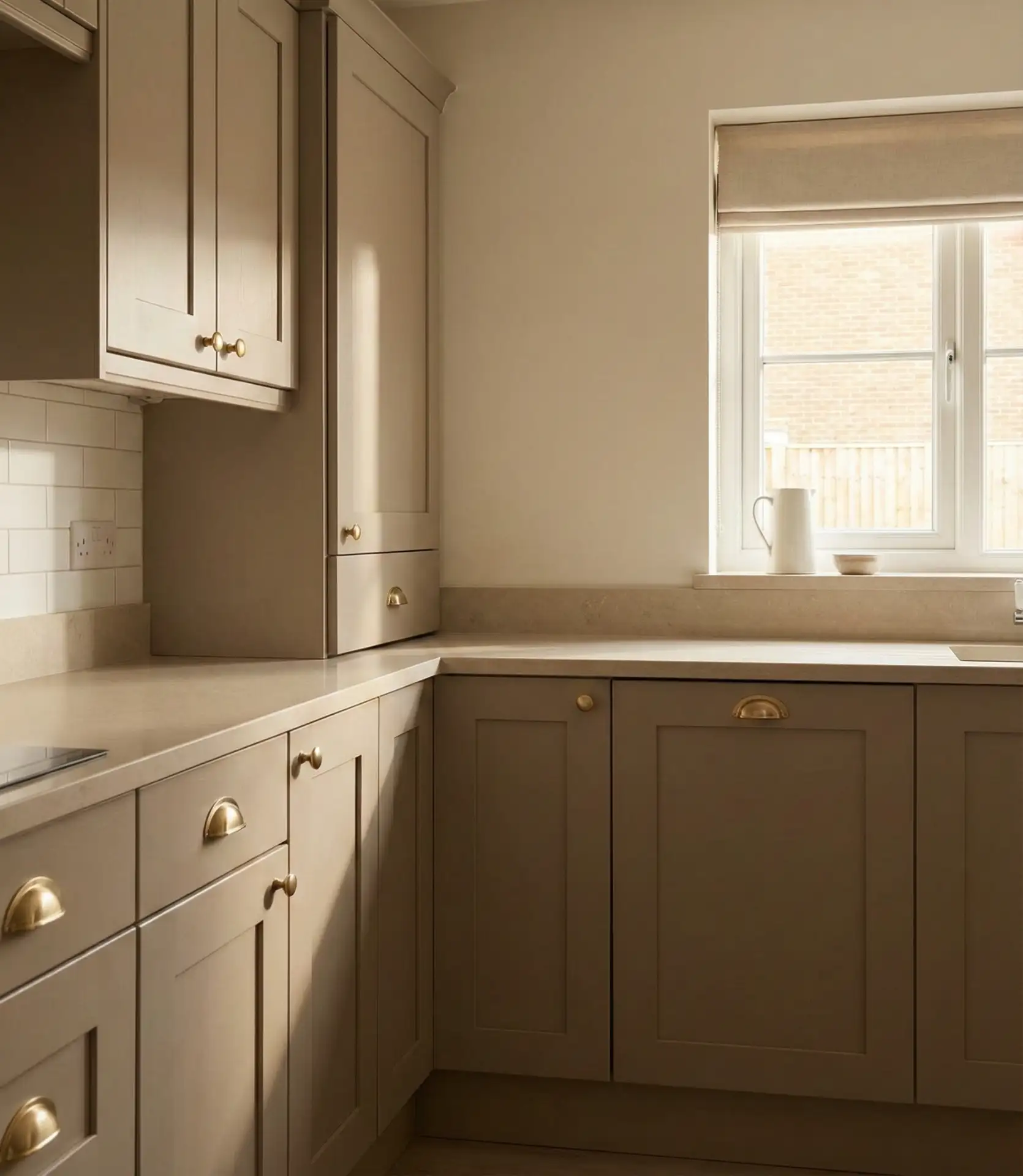
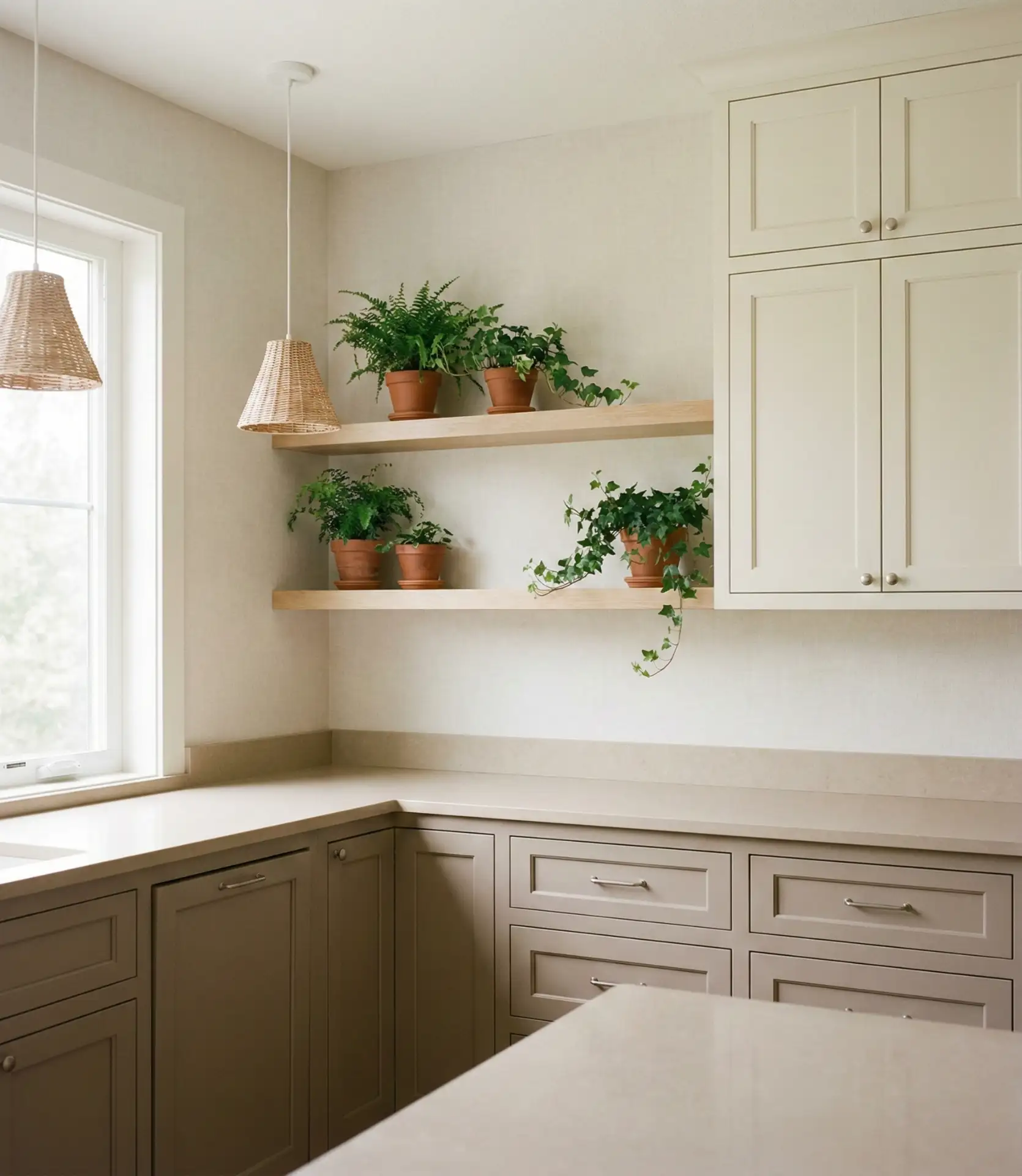
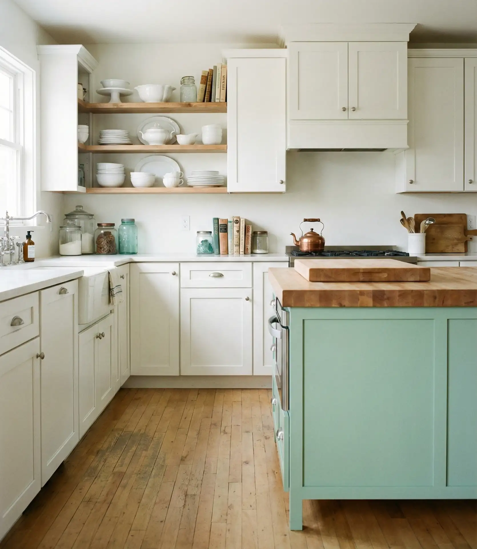
15. Monochrome Beige for Calm Minimalism
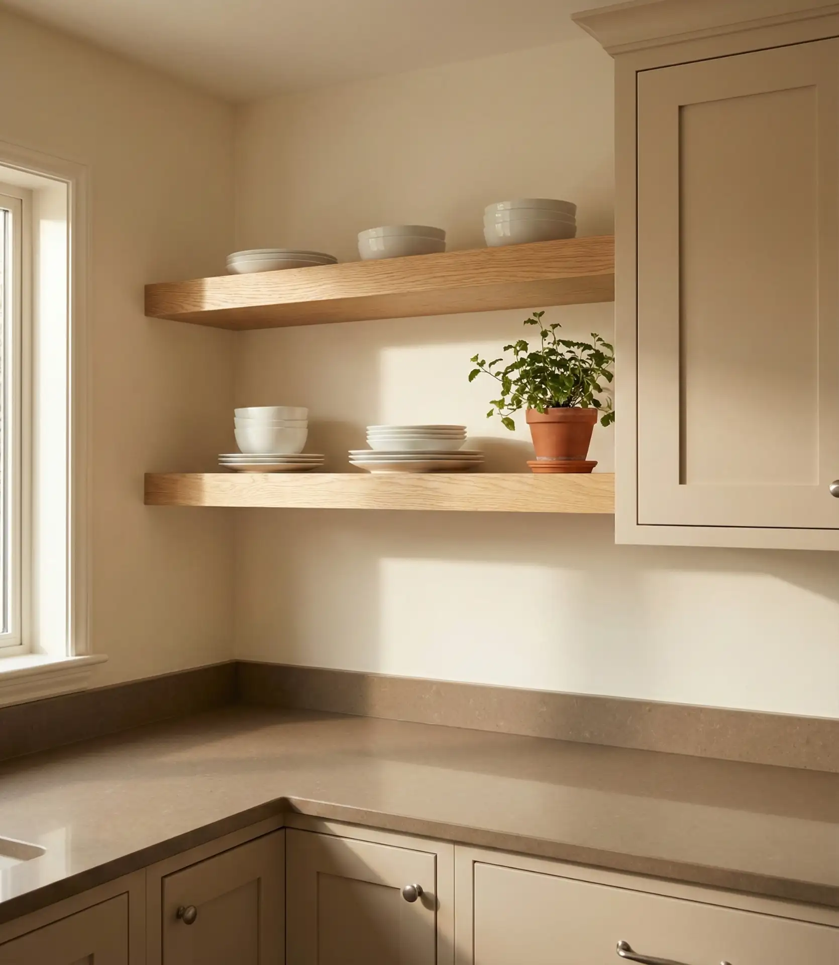
An all-beige kitchen—with tonal variation in shades from cream to taupe—creates a serene, minimalist space that’s become increasingly popular among homeowners seeking calm, clutter-free environments. This monochrome approach relies on texture and subtle shifts in tone rather than bold color contrasts, resulting in a cozy, enveloping aesthetic. It’s one of the best neutral strategies for those who want warmth without visual noise.
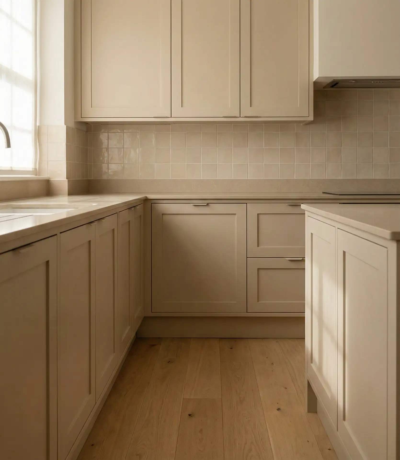
All-beige kitchens, according to a designer friend, provide a visual respite from Pinterest’s excessive maximalism. To keep the space from feeling flat, layer in different textures: matte cabinets, honed stone counters, woven baskets, and linen curtains. Texture and natural light can enhance the absence of color.
16. Teal and Copper for Vintage Charm
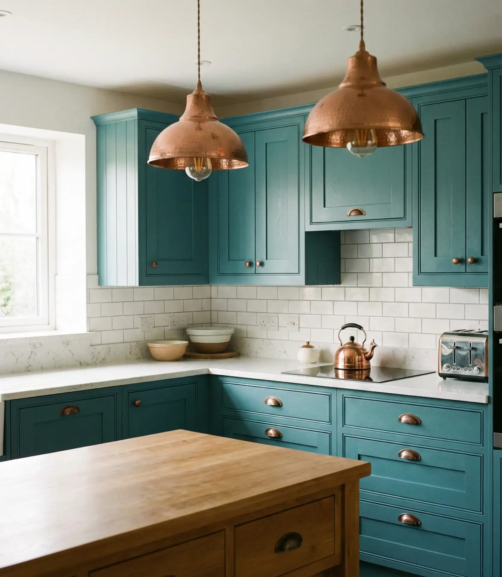
Teal cabinets paired with copper or rose gold hardware deliver a vintage-meets-modern aesthetic that’s both playful and sophisticated. This scheme has found favor among homeowners who appreciate retro design but want something more current than the standard mid-century palette. The warmth of copper balances teal’s coolness, creating a harmonious, jewel-toned look.
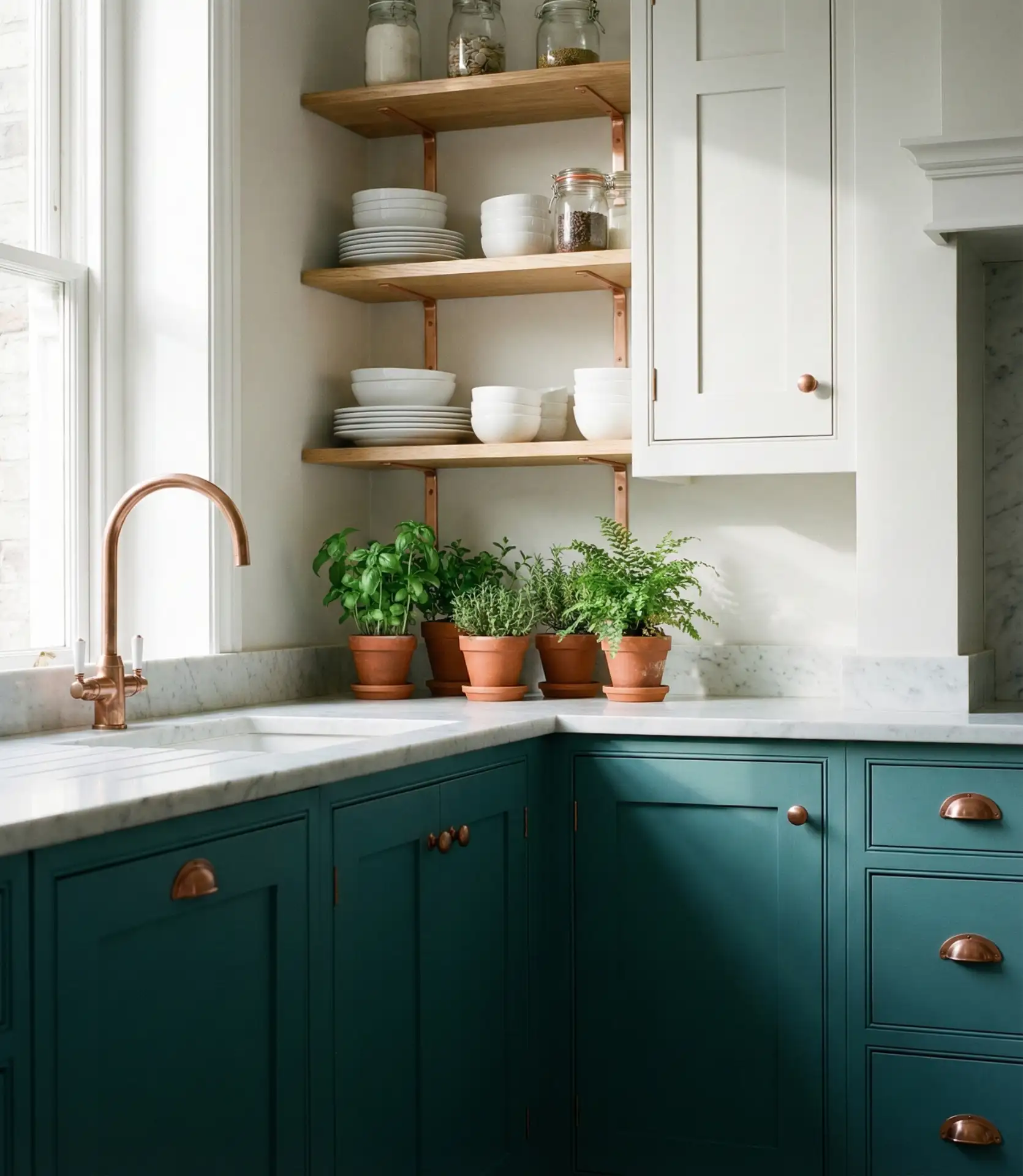
Budget-conscious homeowners can achieve this look by painting cabinets teal and swapping out hardware—copper pulls and knobs are widely available and affordable. Be mindful that copper will patina over time, developing a darker, aged appearance. Some people love this character; others prefer the bright, shiny look and should plan to polish regularly.
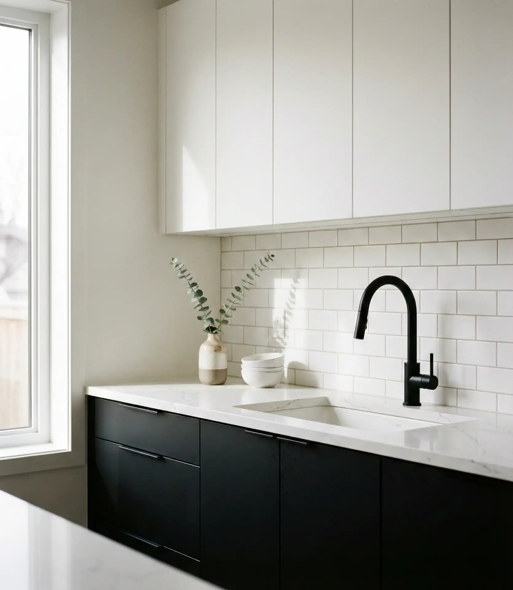
17. Matte Black Cabinets with Light Counters
Matte black painted cabinets paired with light quartz or marble countertops create a striking, modern look that’s become one of the most pinned combinations in 2026. The matte finish is more forgiving than glossy black, hiding fingerprints and smudges better while still delivering dramatic impact. This high-contrast palette works especially well in kitchens with strong natural light or minimalist design sensibilities.
Common mistakes include pairing matte black with too many other dark elements—dark floors, dark walls—which can make the space feel oppressive. Instead, keep floors light, use bright white or soft gray walls, and maximize natural light. Also, invest in quality paint or finishes; cheap black paint will show every flaw and scuff.
18. Warm Taupe with Natural Linen Tones
Warm taupe cabinetry combined with linen-toned walls and soft beige countertops creates a sophisticated, calming environment that feels both contemporary and timeless. This palette is ideal for homeowners who find pure white too stark but want the versatility and light-reflecting qualities of a neutral space. It’s a particularly smart choice for cozy kitchens where comfort and approachability are priorities.
Expert commentary: designers note that taupe is having a major moment because it bridges the gap between the cool grays that dominated the 2010s and the warmer, earthier tones gaining traction now. When selecting taupe, look for undertones that lean slightly pink or beige rather than gray or green, which can read as murky. Layer in natural textures—wood, stone, and linen—to add depth and interest.
19. Bright Coral Island in White Kitchen
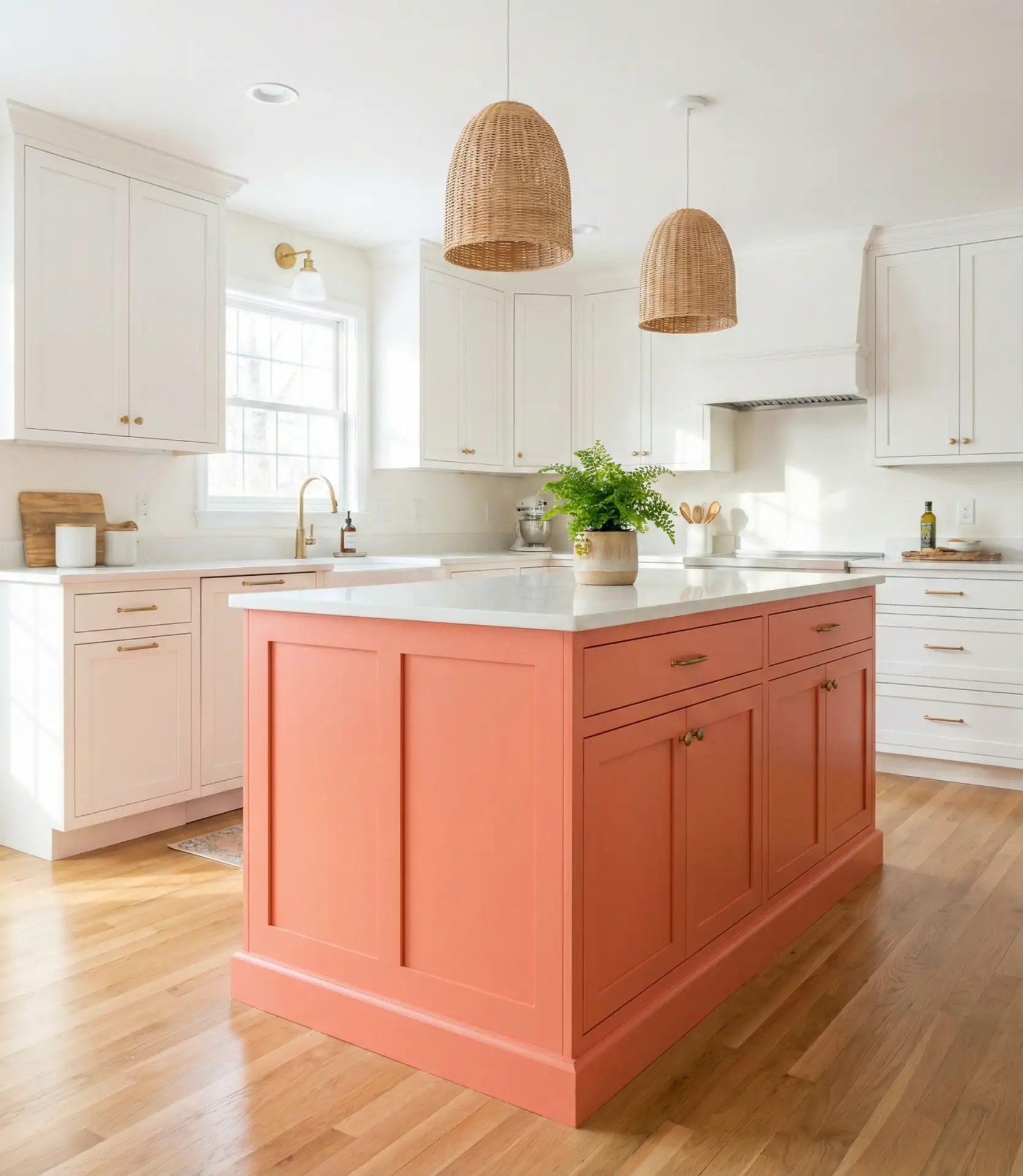
A bright coral-painted island in an otherwise all-white kitchen creates an instant focal point and injects playful energy without overwhelming the space. This bold move has become a popular scheme idea for homeowners who want personality and color but aren’t ready to commit to an entire kitchen of saturated hues. Coral’s warm, peachy undertones make it surprisingly versatile and flattering in various lighting conditions.
In Sunbelt states like Florida, Arizona, and Southern California, coral kitchens have seen notable uptake—likely because the color complements the bright, warm light of these regions. The key to making coral work is keeping everything else simple: white cabinets, minimal decor, and natural materials. Too much patterning or additional color will compete with the coral and create visual chaos.
20. Soft Lavender and Gray Combination
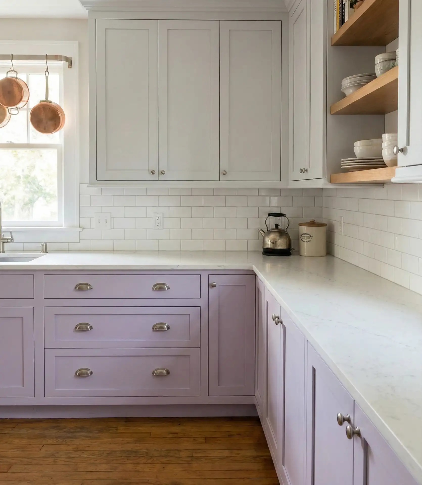
Cool gray and soft lavender combine to create a soothing, almost ethereal kitchen palette that has gained popularity among homeowners looking for an alternative to traditional neutrals. This unexpected combination works particularly well in cottage-style or vintage-inspired kitchens, where the gentle color feels romantic without being overly sweet. The gray grounds the lavender, preventing it from skewing too precious or childlike.
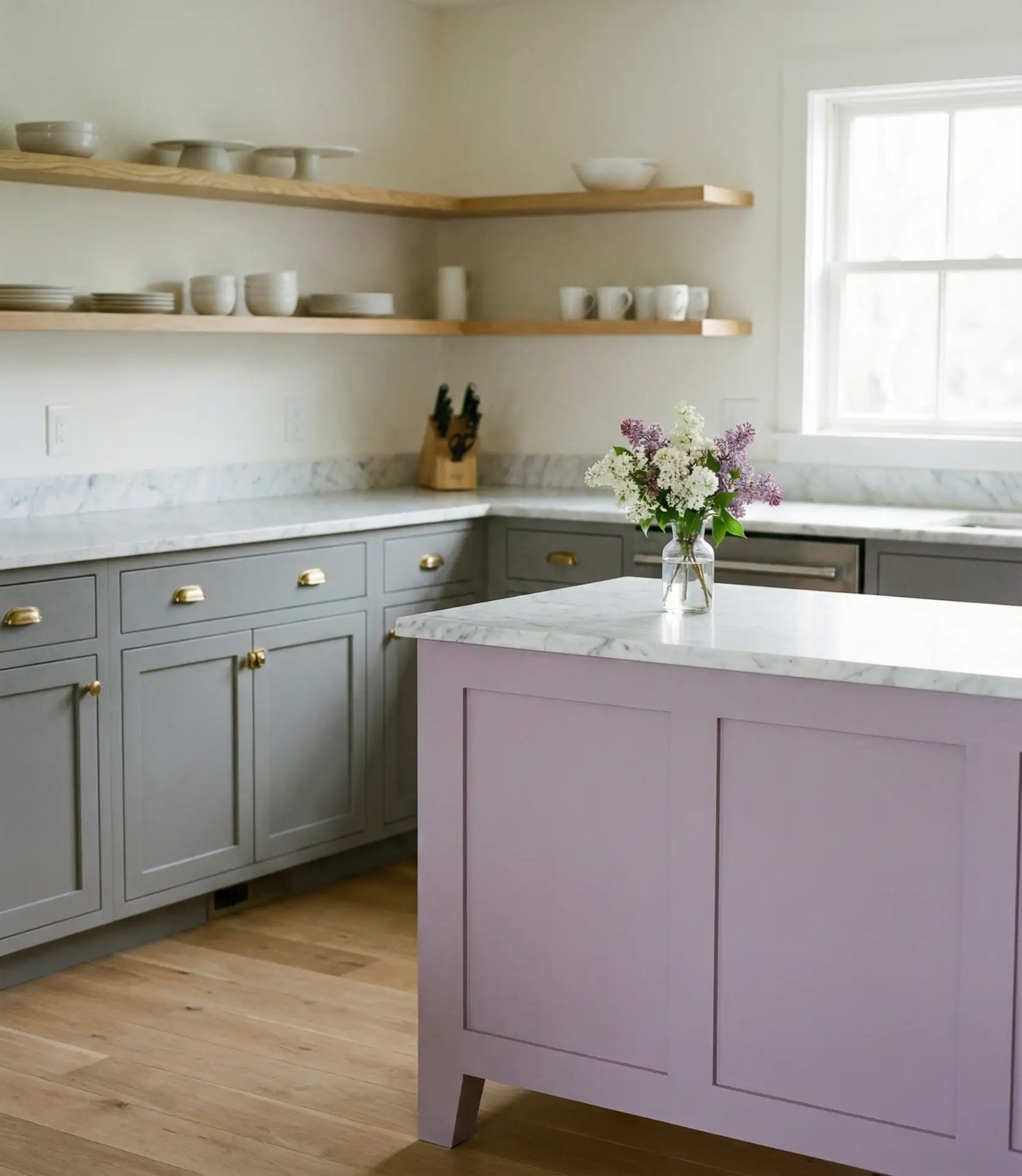
Common mistake: choosing a lavender that’s too saturated or too cool, which can make the kitchen feel more like a child’s room than a sophisticated adult space. Opt for muted, dusty lavender with gray undertones, and test samples in your actual kitchen lighting before committing. Pair with simple, unfussy fixtures, and avoid overly ornate details that can tip the look into excessively feminine territory.
21. Deep Brown with Cream and Brass
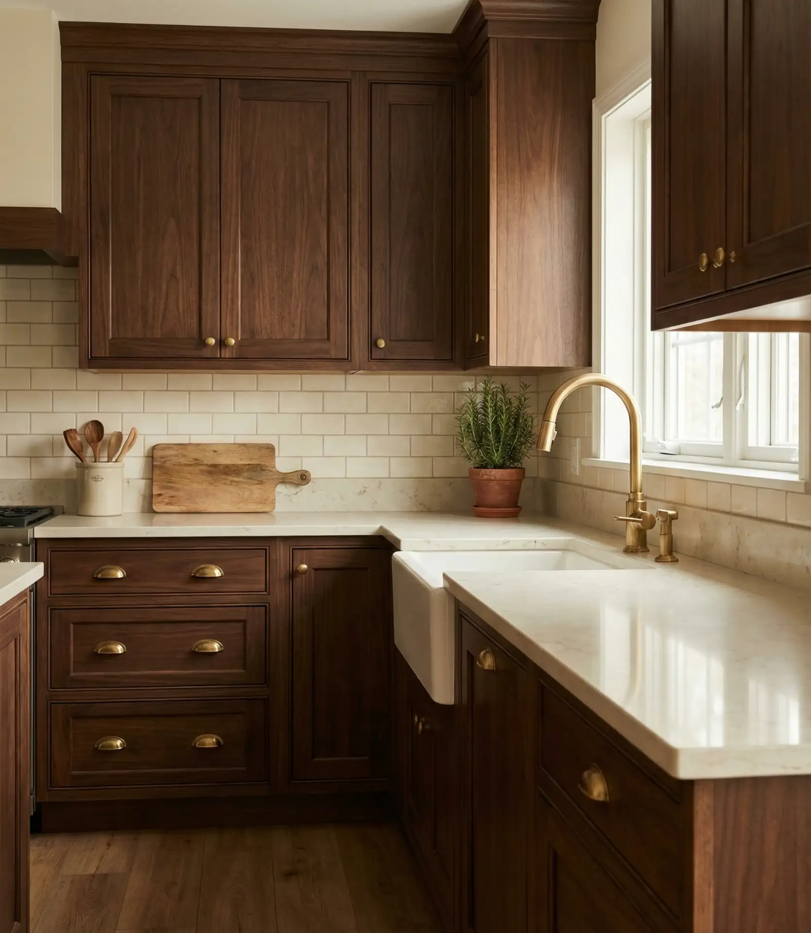
Rich, deep brown cabinetry paired with cream countertops and brass accents evokes a warm, traditional aesthetic that feels both grounded and elevated. This scheme appeals to homeowners who appreciate country or traditional design but want something more refined than typical rustic kitchens. The combination of brown and cream is inherently warm and welcoming, while brass adds a touch of elegance and polish.
Real homeowner behavior shows that people who choose brown kitchens often prioritize warmth and tradition over trend. This is a safe, enduring choice that won’t feel dated in five years. However, brown does absorb light, so ensure your kitchen has strong natural or artificial lighting to prevent it from feeling cave-like. Consider under-cabinet lighting to brighten work surfaces.
22. Mint Green and White Country Kitchen
Soft mint green paired with white cabinets delivers a fresh, retro-inspired look that’s perfect for country or farmhouse kitchens. This cheerful palette feels both nostalgic and modern, evoking mid-century diners and vintage kitchenware while still feeling current. Mint is forgiving and versatile, pairing beautifully with natural wood, white subway tile, and simple black or brass accents.
This palette works best in kitchens with vintage or farmhouse character—think Shaker cabinets, apron-front sinks, and simple open shelving. Mint may not fit well in a sleek, ultra-modern kitchen. If you’re drawn to mint but worried about commitment, consider using it on an island or lower cabinets only, keeping upper cabinets white for flexibility and brightness.
23. Charcoal Blue with White and Wood
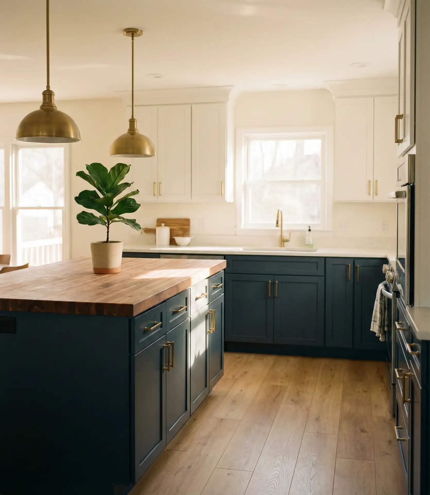
Charcoal blue—a deep, moody blue with gray undertones—paired with white countertops and natural wood accents creates a balanced, sophisticated palette that’s one of the trends defining kitchens this year. This color sits between navy and charcoal gray, offering depth without the severity of black or the formality of true navy. It’s a smart choice for homeowners who want a contemporary feel with warmth and character.
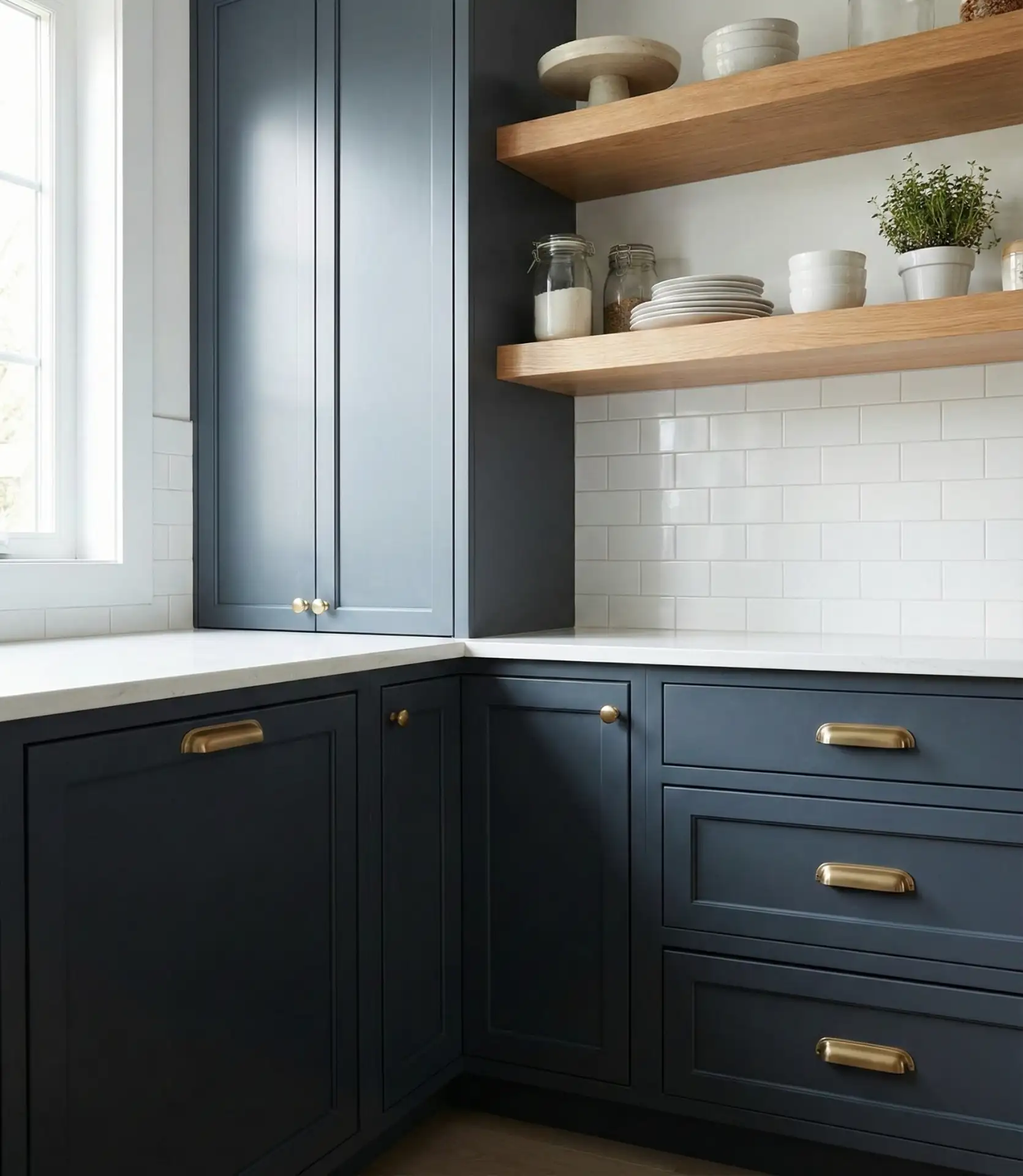
Where it works best: kitchens with ample natural light and open floor plans, where the deep blue won’t make the space feel closed in. Pair with light wood floors and white walls to make the overall feel bright and balanced. This combination is also a great palette for blending traditional and modern elements—think Shaker-style cabinets in charcoal blue with sleek, minimal hardware and contemporary lighting.
These kitchen color ideas offer something for every style and comfort level, from bold statement palettes to soothing neutrals. The beauty of today’s design landscape is that there’s no single “right” way to approach color—whether you’re drawn to the warmth of terracotta, the elegance of plum, or the simplicity of all-white with wood accents, the key is choosing hues that make your kitchen feel like home. What’s your favorite palette from this list? Drop a comment below and let us know what colors you’re considering for your kitchen.