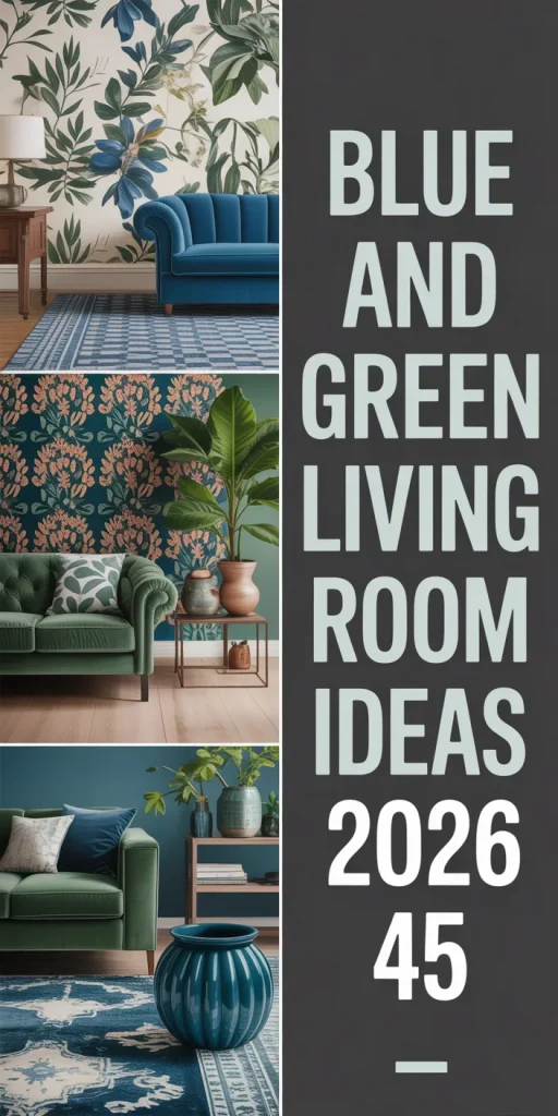
45 Blue and Green Living Room Ideas for 2026 That’ll Make You Want to Redecorate Right Now
Blue and green have quietly become the most popular color combination for living rooms on Pinterest—and in 2026, they’re not just trending; they’re taking over. From moody jewel-toned sitting rooms to breezy coastal nooks, this hue pairing taps into something deeply satisfying about the way color makes us feel at home. Whether you’re embarking on a new project or simply looking to update your existing space, this palette offers endless possibilities. In this article, you’ll find distinct ideas that range from bold and dramatic to soft and layered—each one designed to spark something real.
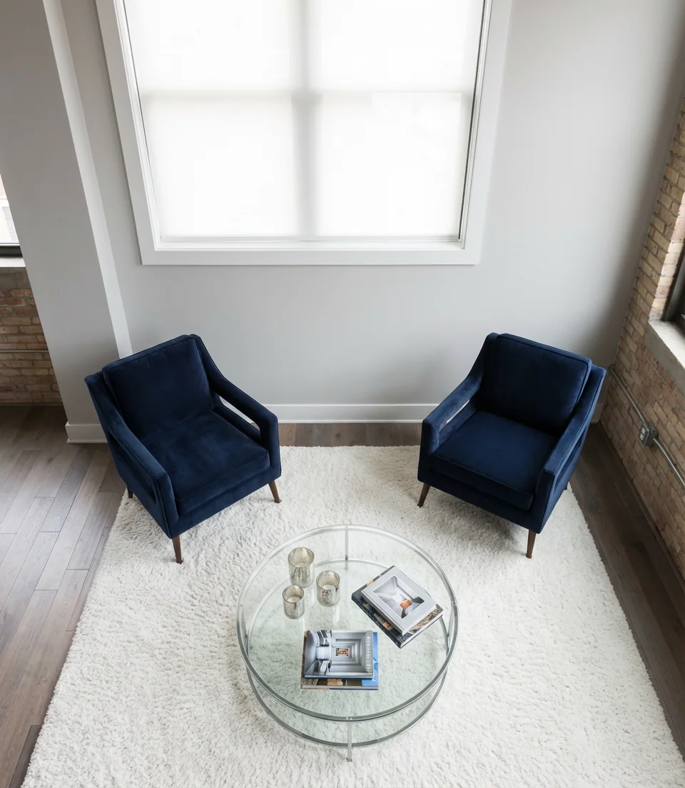
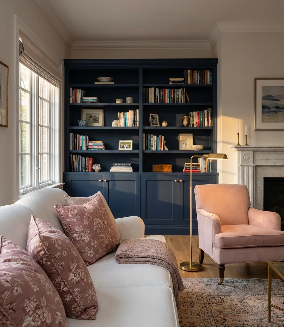
1. Navy and White Classic Living Room
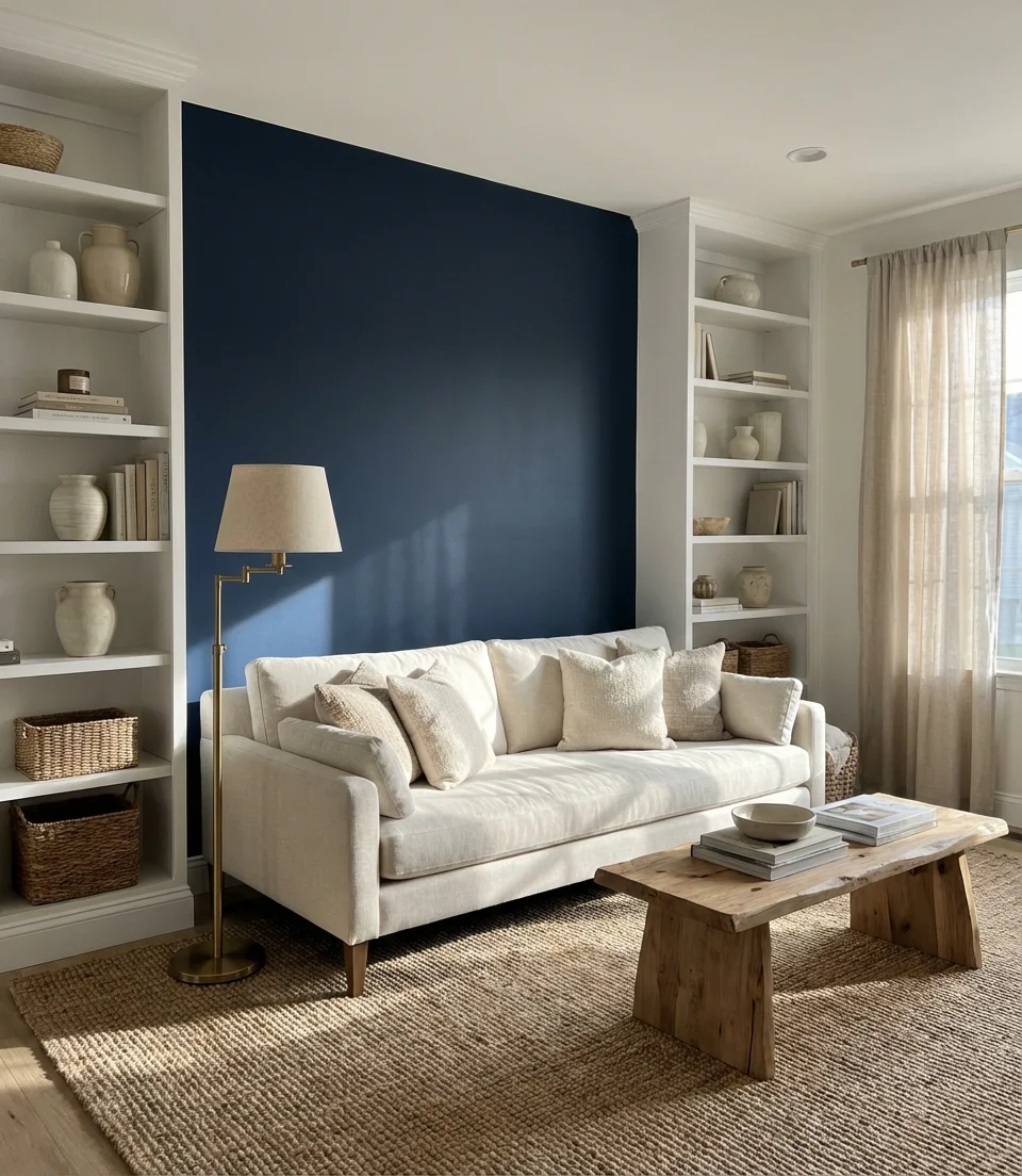
There’s a reason navy keeps showing up in living room designs year after year—it’s one of those rare colors that feels both timeless and completely current. Paired with crisp white, it creates a color scheme that reads as polished without ever feeling cold. Think deep navy walls anchored by a white linen sofa, layered with natural wood accents and a woven rug in ivory or oatmeal. It’s the kind of room that photographs beautifully and feels even better in person.
This color combination has long been a favorite in New England and coastal mid-Atlantic homes, where the visual connection to sea and sky feels entirely natural. What makes it work in 2026 is the way designers are leaning into contrast rather than softening it—bold navy directly alongside bright white, with very little in between. If you’re nervous about committing to dark walls, start with a single navy accent wall or a navy velvet sofa against white walls. The key is committing to at least one strong navy element so the room feels deliberate rather than tentative.
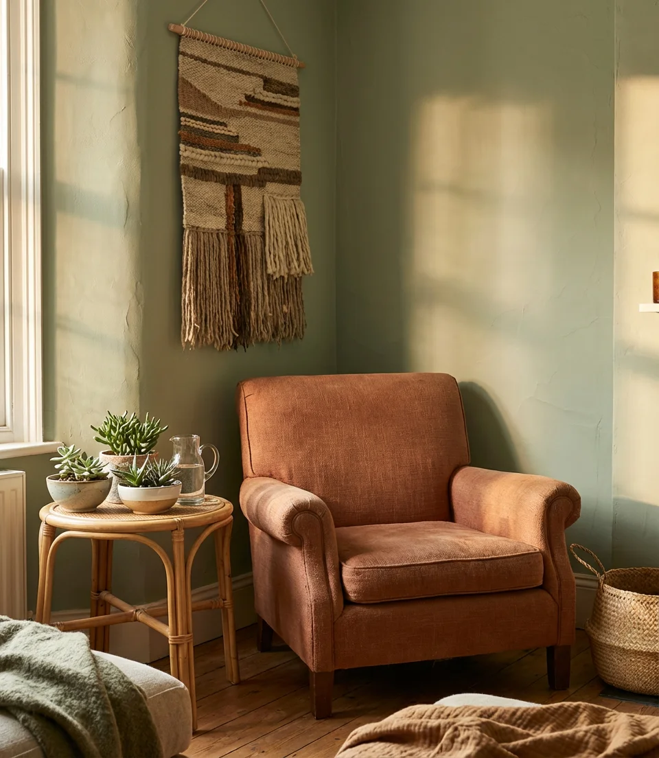
2. Sage Green and Terracotta Warmth
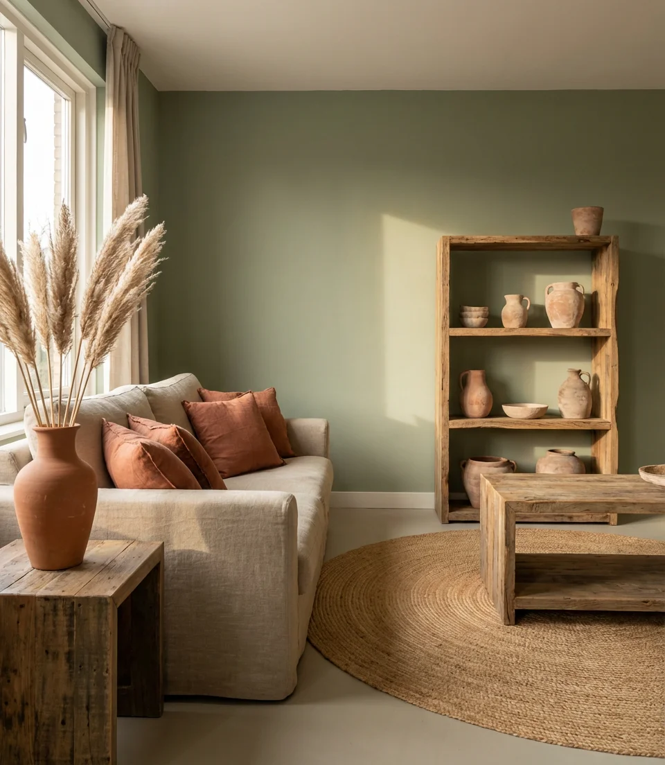
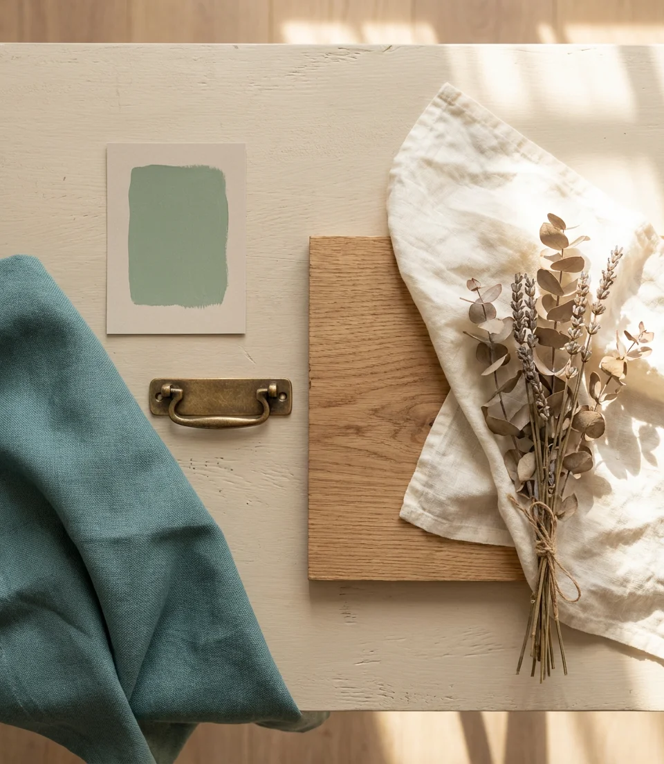
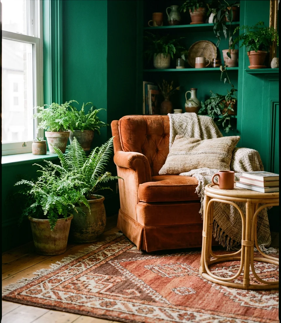
Sage green and terracotta is one of those combinations that shouldn’t work on paper but absolutely does in practice. The muted earthiness of sage brings calm, while terracotta adds the warmth that keeps the room from feeling clinical. This mood board of colors reads distinctly aesthetic and bohemian—perfect for anyone who loves collected, lived-in spaces with a hint of the Southwest or Mediterranean. Layer in a tan jute rug, raw linen curtains, and ceramic pottery in earthy tones to complete the look.
One homeowner in Austin described painting her living room sage green as “the best $80 I ever spent.” She added terracotta throw pillows from a local market, and suddenly the room felt like it had always belonged to her. That’s the magic of this palette—it taps into something instinctive. It works beautifully in homes with lots of natural light, but even in darker rooms, sage green acts as a grounding neutral rather than a cave-maker. If terracotta feels too bold, try it in smaller doses: a single accent chair, a few candles, or a clay lamp base.
3. Moody Dark Green Walls with Brown Leather
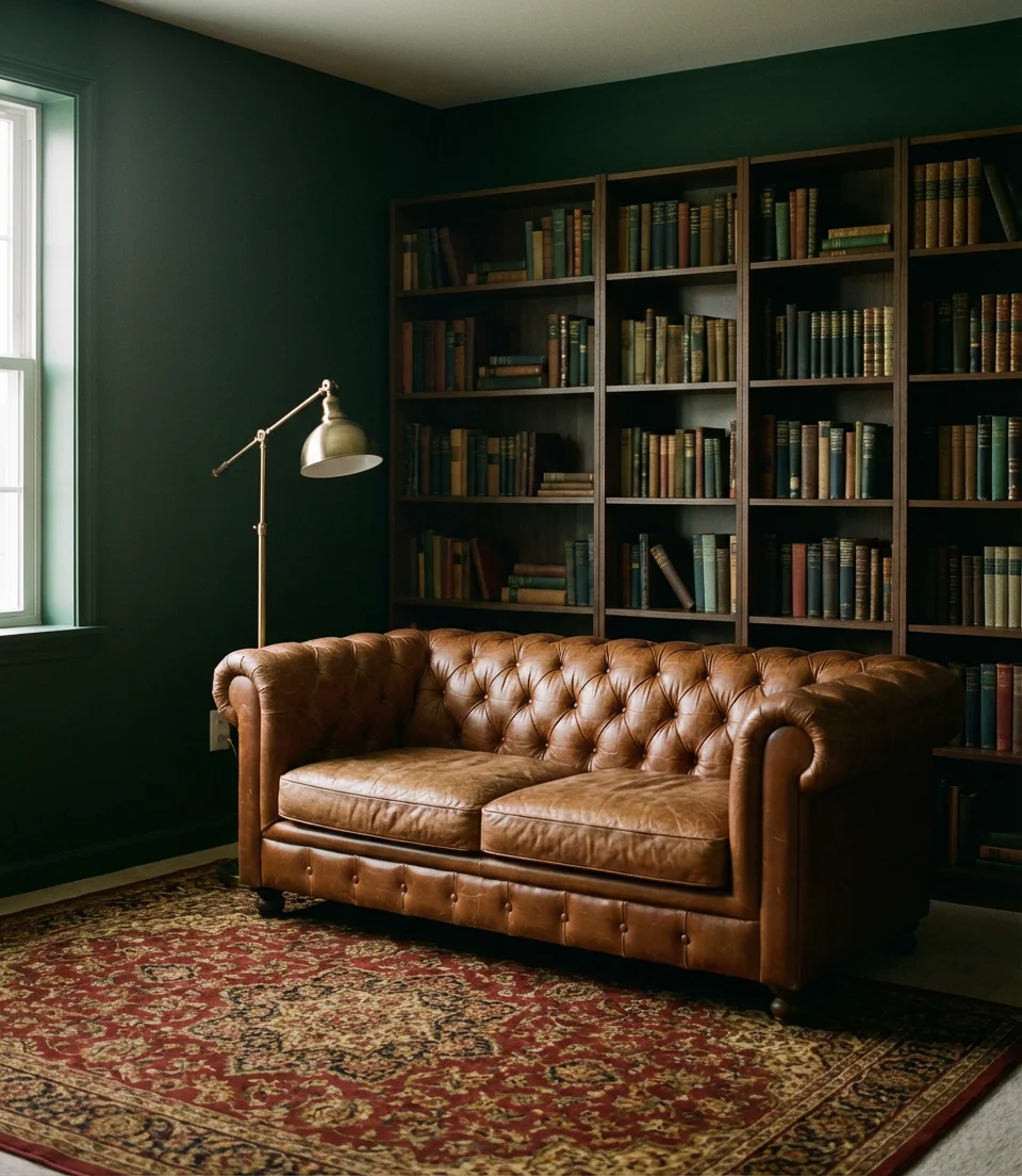
In 2026, moody deep green walls paired with cognac or chocolate brown leather will dominate the dark living room trend. This combination exudes sophistication, evoking the feel of a well-appointed library, a gentleman’s study, or a New York apartment featured in a movie. Deep forest green or hunter green walls set the stage, while rich brown leather seating provides warmth that prevents the room from feeling heavy or oppressive.
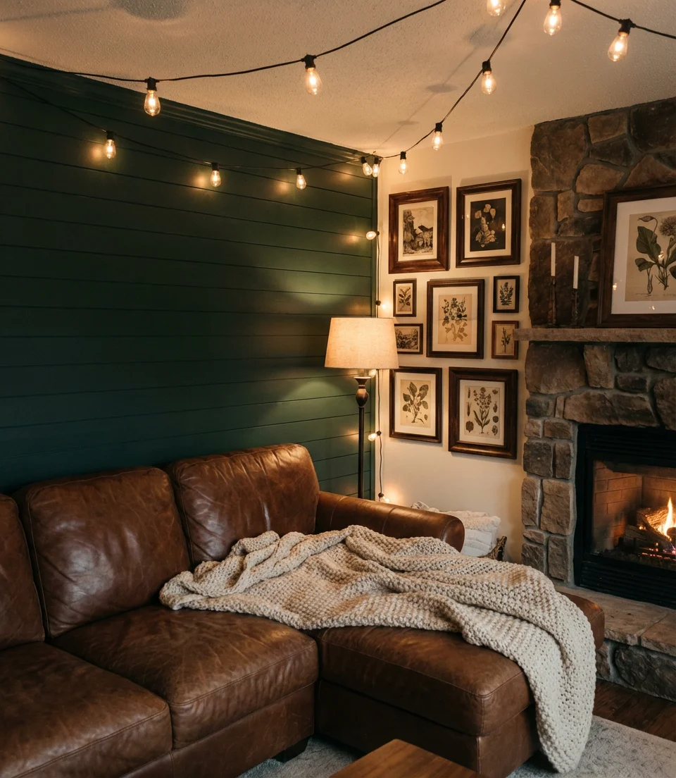
Designers consistently recommend going all-in when you commit to a dark-walled room—half measures can make the space feel unfinished. That means painting the trim in a complementary deep tone (not white), choosing lighting fixtures in brass or aged bronze, and embracing the drama rather than fighting it. Living rooms with high ceilings or architectural details that demand attention benefit greatly from this setup. Keep the floor light—a pale wool rug or whitewashed oak—to balance the weight of the walls and furniture.
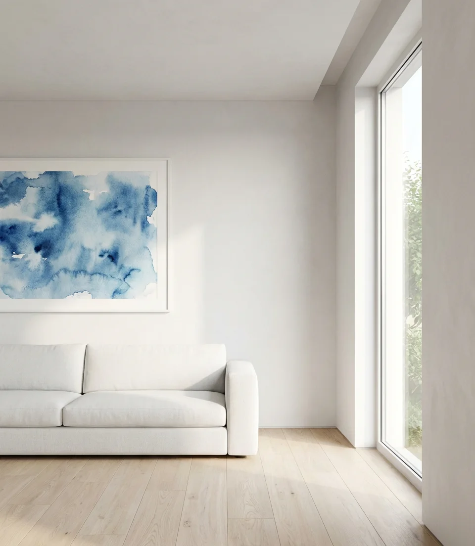
4. Pale Blue and Cream Coastal Calm
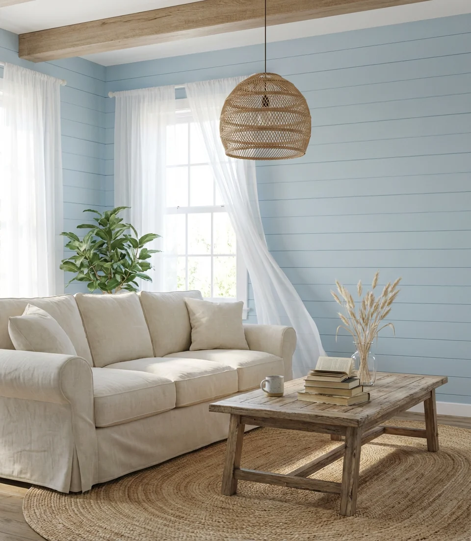
Few combinations are as reliably beloved as pale blue and cream—and for good reason. This coastal pairing evokes something almost universally comforting: sea mist, salt air, and sun-bleached wood. It reads bright and airy without ever feeling stark, and it works in spaces of almost any size. A pale powder blue wall with cream or off-white furniture, layers of textured linen, and driftwood accents creates a room that feels effortlessly calm—the kind of place where people naturally want to slow down and stay awhile.
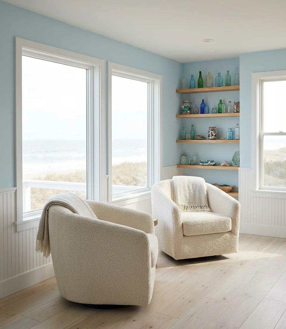
This palette performs best when you avoid going too matchy-matchy. The mistake most people make is choosing everything in exactly the same blue-and-cream tone, which flattens the room. Instead, vary your textures dramatically—a slubby linen sofa, a chunky knit throw, a rattan side table, and a polished ceramic lamp. Those material contrasts are what give the room its depth. It works beautifully in beach houses and suburban family rooms alike, and it’s one of the easiest palettes to refresh seasonally with accessories.
5. Royal Blue Velvet and Gold Accents
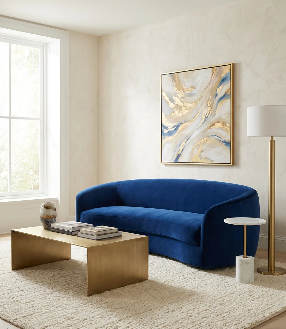
When you want your living room to feel genuinely luxurious, royal blue velvet paired with brushed gold is an almost unfailing formula. This is a color scheme inspiration that borrows from historic European interiors but translates into something completely fresh and modern when handled with a light touch. A royal blue velvet sofa against a soft greige or white wall is a statement piece that doesn’t require much else—let the furniture do the talking and keep everything around it restrained and elegant.
Interior designers often describe this combination as “high-low friendly”—it elevates even budget-conscious rooms. When paired with the right lamp, a simple gold-framed mirror, and a neutral rug, a $400 royal blue velvet sofa from a big-box retailer can transform into an opulent piece. The trick is to avoid overdoing the gold—two or three carefully placed metallic elements are far more effective than ten. Think: one lamp, one mirror, and perhaps a single small side table. The blue should always be the star, with gold playing a supporting role.
6. Light Green and Pink Playful Living Room
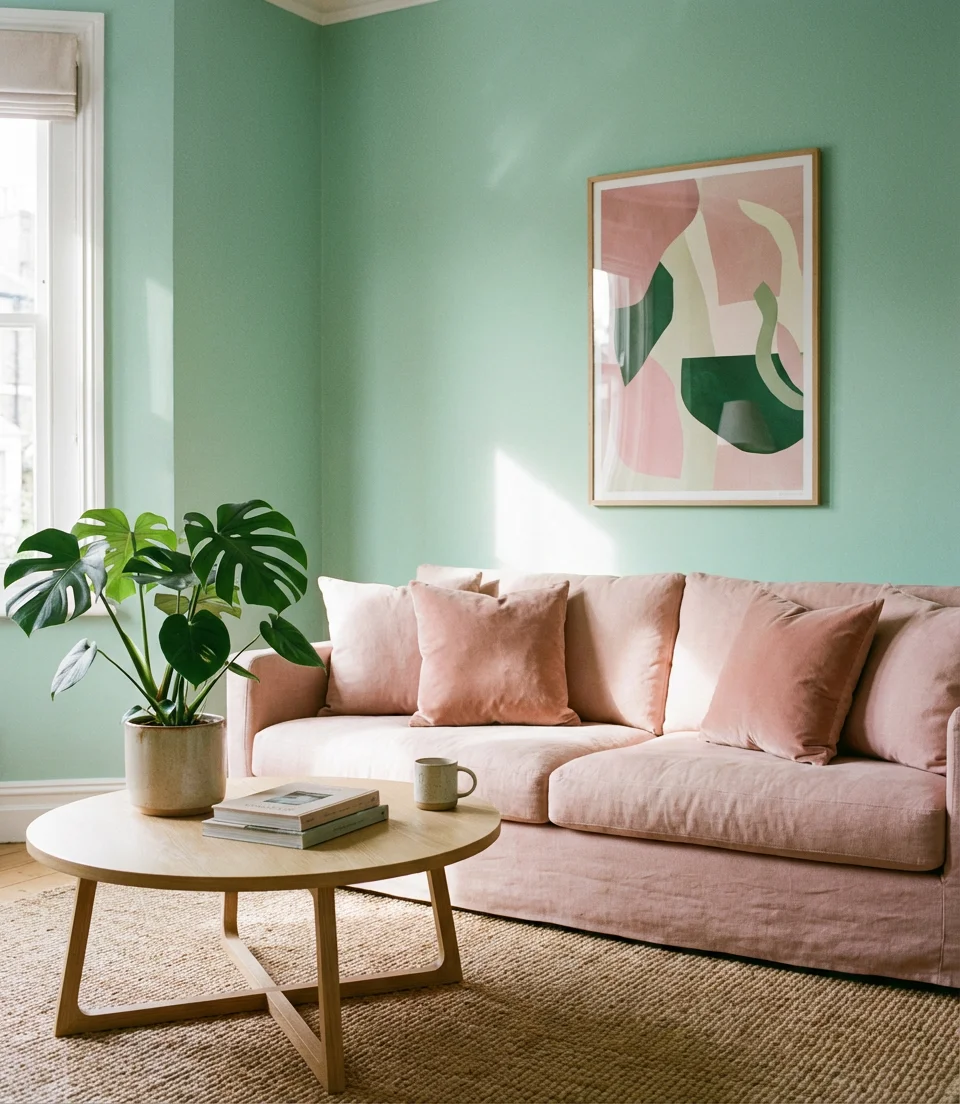
The combination of light green and pink is having a genuine moment—and it’s not just for nurseries or maximalist apartments anymore. In 2026, this pairing shows up in sophisticated living rooms where it reads as joyful and intentional rather than cutesy. Soft celadon or mint green paired with blush or dusty rose creates a palette that’s surprisingly versatile—it works with natural wood, white, and even warm brass. Think of it as the interior equivalent of a garden in early spring.
This palette tends to attract younger buyers on Pinterest—particularly those in their late 20s and 30s who want something that feels personal and cheerful without being overwhelming. Where it works best is in rooms with ample natural light, which helps the colors remain fresh rather than washed out. To keep it from feeling too sweet, ground the room with at least one natural material: a sisal or jute rug, a raw wood element, or an unglazed ceramic. That bit of roughness is what gives the palette its sophistication.
7. Modern Navy and Gray Color Scheme
Navy and gray is the contemporary color pairing that consistently tops “most-saved” lists on Pinterest—and for good reason. It’s sophisticated, versatile, and works in nearly every living room size and style. A medium grey sofa against a deep navy wall creates a layered, tonal color scheme that gives the mood board a modern look, making it feel effortlessly pulled together. Add chrome or brushed nickel hardware, pale gray linen curtains, and a geometric rug in the same tones for a look that’s simultaneously edgy and comfortable.
One common pitfall with navy and gray rooms is that they can veer into feeling cold or corporate if you’re not careful. The fix is simple: warm up the room with texture. A chunky knit throw in caramel or rust, a boucle accent pillow, or a warm-toned wood side table can completely shift the energy. You don’t need to introduce a new color—just a different material temperature. Think of the blue and gray as the room’s architecture and the textures as the warmth that makes it human.
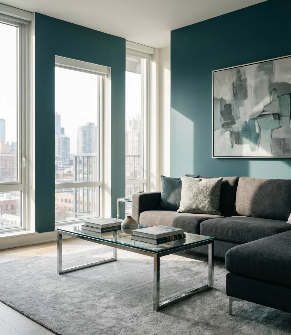
8. Blue and Green Color Scheme Mood Board
Building a true blue and green color scheme mood board for your living room means thinking about the relationship between the two colors rather than just picking one of each. The most successful rooms in this palette treat blue and green as a continuous spectrum—choosing tones that are closely related (both cool and muted or both saturated and vibrant) rather than fighting each other. A teal sofa against a sage wall, for example, reads as a natural ombre rather than a clash. Start your mood board with fabric swatches and paint chips before committing to anything.
Design professionals often spend more time on the mood board phase than clients expect—and that investment pays off enormously. When you’re combining two colors as closely related as blue and green, the risk isn’t clash but rather muddle. You want the eye to be able to distinguish the two tones clearly even while they harmonize. The solution is usually contrast in finish or texture: a matte green wall with a glossy blue ceramic lamp, or a rough linen green sofa with smooth blue velvet cushions. The visual clarity created by these material differences makes the room sing.
9. Emerald Green and Orange Statement Room
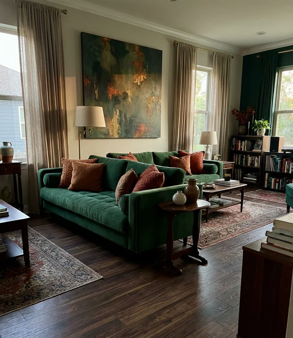
Emerald green and orange is one of the boldest combinations you can bring into a living room—and when it’s done right, it’s absolutely electric. This pairing draws from complementary color theory: green and red-orange sit opposite each other on the color wheel, which means they naturally amplify each other’s intensity. The key is treating it like a professional maximalist would—ideas in this space lean on rich jewel-toned upholstery, saturated wall decor ideas, and grounding neutrals that keep everything from feeling chaotic.
If you’re drawn to this pairing but nervous about the intensity, consider using orange only in accessories rather than furniture. A few strategically placed terracotta and orange ceramics, a warm-toned abstract print, or even a single orange velvet pillow can introduce the color without overwhelming the room. Think of the emerald as your main investment and the orange as your accent—and you’ll land somewhere unexpected and genuinely exciting rather than visually overwhelming.
10. Dusty Blue and Yellow Sunshine Living Room
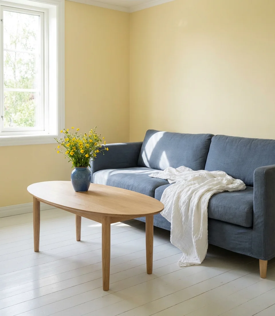
There’s something deeply cheerful about yellow paired with dusty or muted blue—it calls to mind Scandinavian interiors, French country kitchens, and classic American farmhouse style all at once. In a living room context, this combination is best handled with restraint: a warm butter yellow on the walls with slate or blue steel upholstery, or the reverse. The color scheme inspiration here is about creating a room that feels sunny even on gray days—a quality that’s deeply appealing to anyone living in the northern United States or Pacific Northwest.
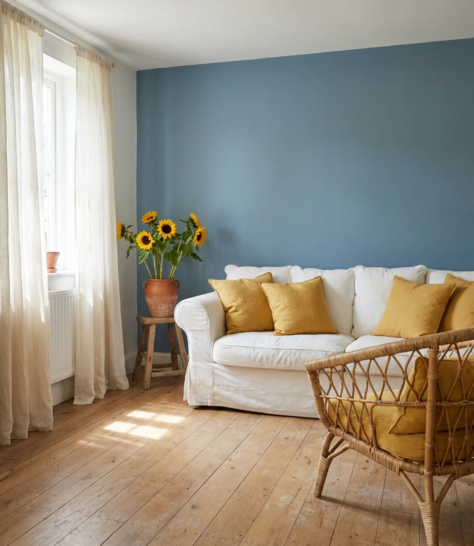
This palette genuinely performs across American regional styles—it works in a New England cottage, a Midwest farmhouse, or a California craftsman bungalow. What ties them all together is the quality of warmth that yellow introduces. Even a small amount—a few pillows, a lampshade, a striped rug with yellow accents—can fundamentally shift a blue room from feeling cool and reserved to feeling genuinely welcoming. Keep the yellow on the warm side (amber or honey rather than chartreuse) and the blue on the cool-muted side for the best results.
11. Teal and Gray Contemporary Design
Teal is one of the most versatile colors in the blue-green spectrum—it’s warm enough to feel inviting, cool enough to feel sophisticated, and distinctive enough to give a room genuine character. Paired with various shades of grey, teal creates a contemporary palette that’s popular across age groups. This color scheme works beautifully in open-plan living areas where you need a color that can anchor the space without fighting with adjacent rooms. A teal feature wall with charcoal and light gray furnishings creates a perfectly balanced, visually intriguing composition.
An interior designer specializing in mid-century modern spaces once said that teal is “the color that works hardest in any room it enters”—and this concept holds true in contemporary settings. Unlike some trendy shades that date quickly, teal has enough historic precedent (think 1950s American kitchens, Nordic design, and Moroccan tile) to feel both fresh and rooted. When working with a teal-and-gray palette, the expert move is to vary your gray tones: cool blue-gray in the rug, warm greige in the throw, and medium charcoal in the main upholstery. This tonal variation keeps the room from feeling monochrome.
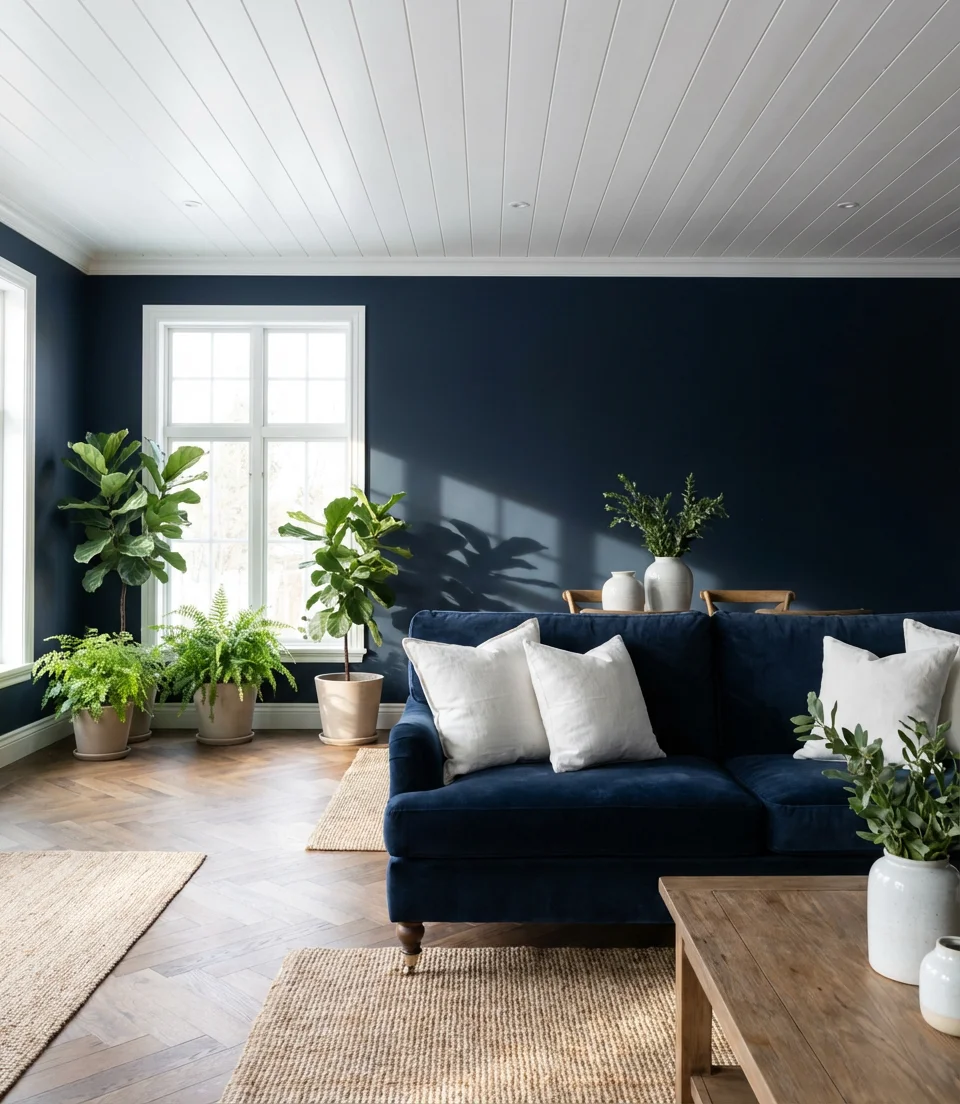
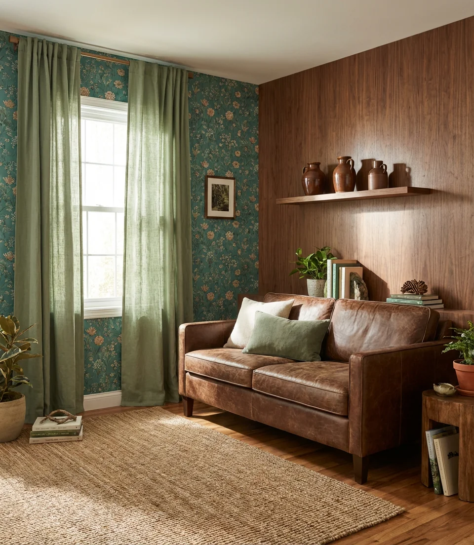
12. Dark Blue and Tan Warm Contrast
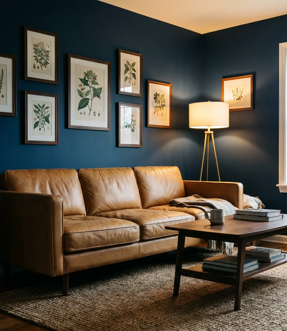
Dark blue and tan is the living room pairing that designers reach for when they want something that reads as both masculine and warm—a combination that isn’t as common as you might think. Deep midnight or indigo blue walls alongside warm tan leather, camel wool, or sandy upholstery creates a rich, layered palette that works especially well in spaces used by multiple people. It has a clubby, library-like quality without being stuffy, and it ages incredibly well. This color scheme is the kind that looks just as appealing after five years of family use as it did on day one.
This palette is particularly practical for families with kids or pets. Deep navy and similar dark blues hide scuffs and dings on walls far better than light colors, and tan or camel fabrics in performance or leather materials are among the easiest to maintain. Choosing dark blue for your walls is actually a smart long-term investment: you’ll repaint less frequently because every day’s wear simply isn’t visible. It’s a case where the most beautiful choice also happens to be the most sensible one—which is a rarity in interior design.
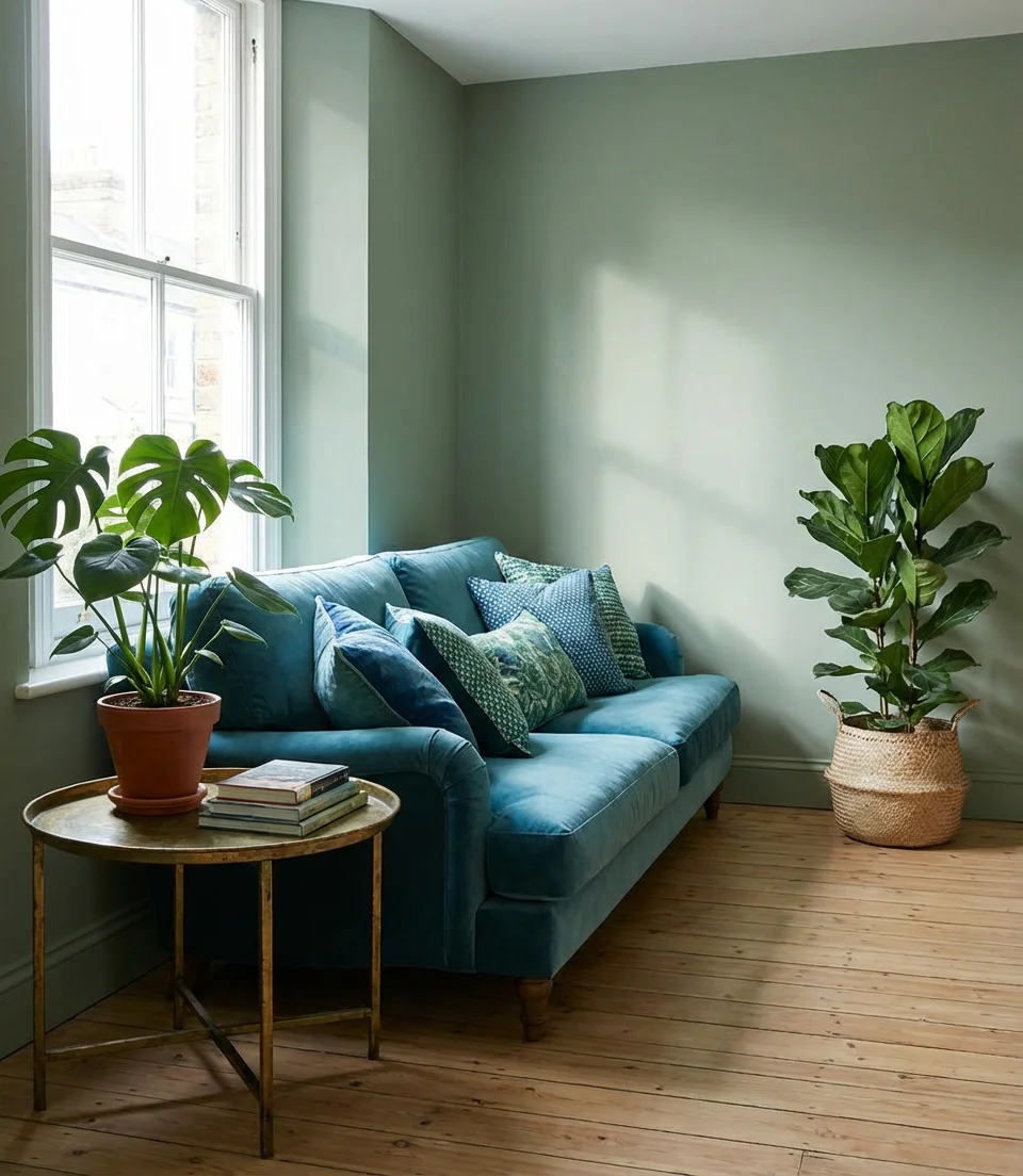
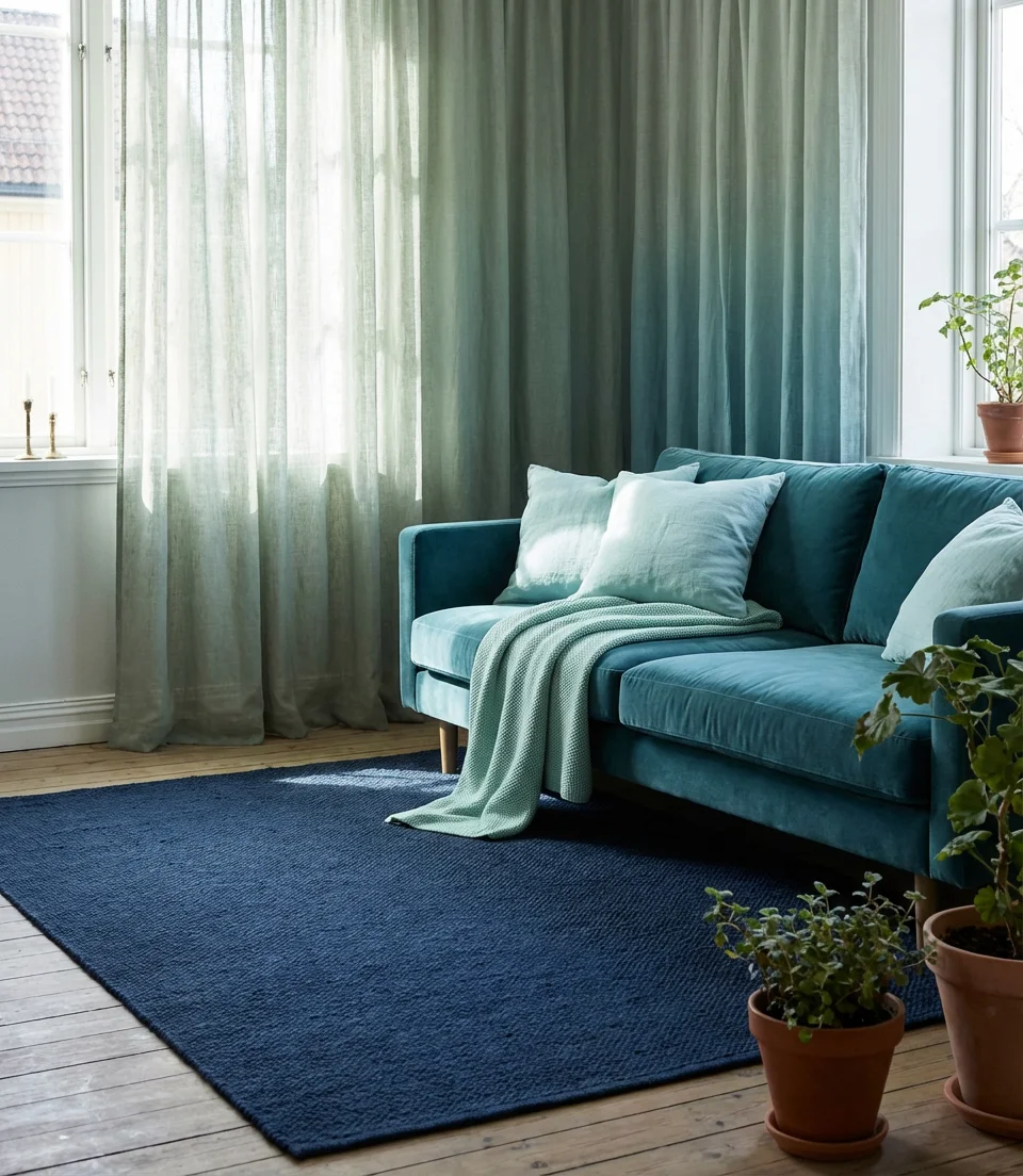
13. Coastal Blue and Green Layered Retreat
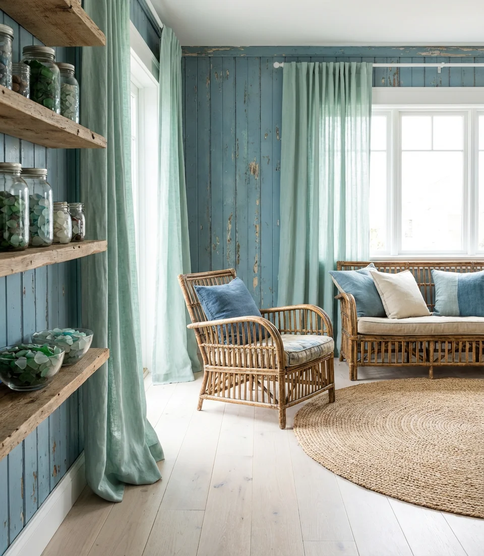
A coastal living room that layers both blue and green—rather than choosing one or the other—creates something that feels genuinely like being near water. Sea foam, aqua, ocean blue, and moss green can coexist in the same room when they’re handled through texture and material variation rather than flat paint. This approach is central to the most pinned ideas in the coastal category right now: a weathered blue board-and-batten wall alongside green linen drapery, sea glass accessories, and a bleached wood floor. It’s relaxed, layered, and completely timeless.
One of the most common mistakes in coastal decorating is choosing colors that are too bright and too new-looking—the result ends up feeling more like a hotel lobby than a home. The best coastal living rooms look slightly faded, as though the sun and sea have softened everything over time. Seek fabrics in slightly muted versions of your blue and green tones, choose furniture with visible grain or patina, and lean toward organic shapes. The lived-in quality is what makes a coastal room feel genuinely restful rather than performatively beachy.
14. Green and Gray Sophisticated Minimalism
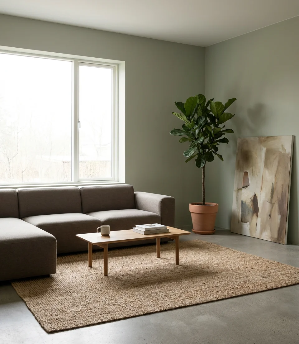
Green and gray together in a minimalist living room create one of the most serene, gallery-like atmospheres possible in residential design. The combination feels fresh without being loud—a quality that makes it especially appealing to anyone who loves clean lines and negative space. Deep sage or olive green against concrete gray or warm greige reads as naturally organic and architecturally resolved. This mood board approach for the color scheme is essentially anti-trendy: it’s about creating a room that will feel right in ten years just as much as it does today.
The restraint required to pull off green-and-gray minimalism is real—and most people overstuff the room before giving the palette a chance to breathe. The cardinal rule is simple: fewer, better things. You should only have one sofa, one coffee table, one rug, one lamp, one plant, and one piece of art. Let each element have space around it. What looks sparse in an empty room feels balanced and intentional once you’re actually living in it. If you’re someone who naturally accumulates stuff, build in concealed storage from the beginning so your clutter has somewhere to go.
15. Bold Blue Wall Decor Ideas Gallery
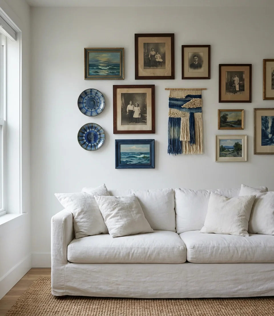
A thoughtfully curated gallery wall is one of the most impactful ways to bring blue into a living room. Wall decor ideas in 2026 lean heavily into mixing mediums—oil paintings, photography prints, textile art, and sculptural elements—all unified by a color story that incorporates blue in different tones and saturations. Against a white or off-white wall, a gallery arrangement that weaves in cobalt, navy, powder blue, and teal creates a visual narrative that’s endlessly captivating. The wall itself becomes the room’s primary piece of furniture.
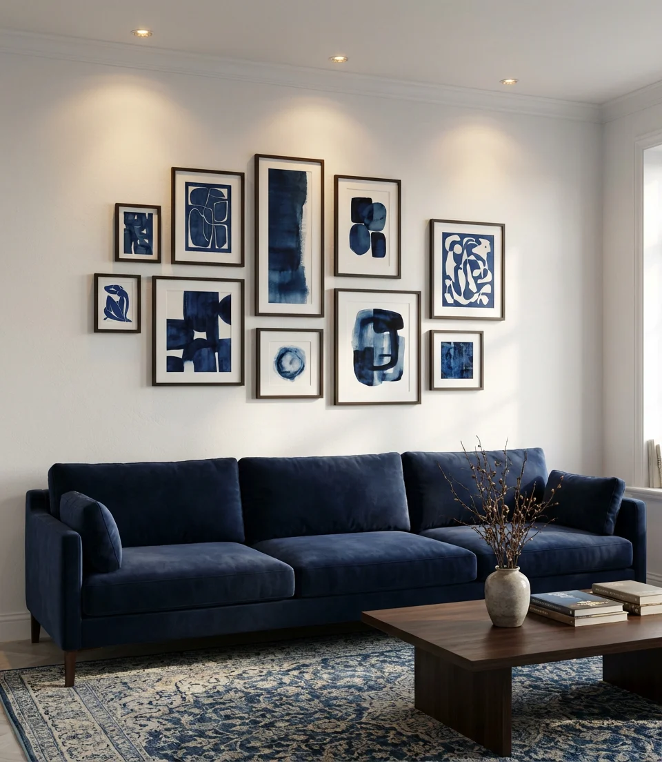
Gallery walls have a reputation for being fussy and difficult to pull off—but the reality is that the most successful ones are built intuitively rather than mathematically. Start by laying your pieces on the floor and moving them around until the arrangement feels right. The most common mistake is spacing frames too far apart; push them closer together than feels natural, and the result will look intentional. For a blue-themed gallery wall, include at least two pieces that are distinctly different in format—one large anchor piece and one textile or object—and let the rest fill in around them.
16. Ocean Blue and Cream Rug-Anchored Room
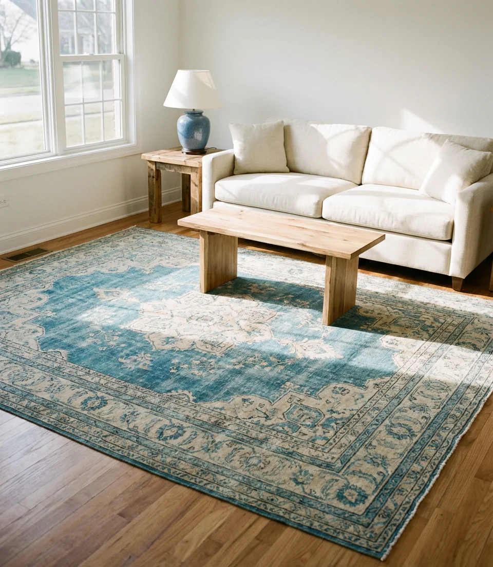
A great rug often determines the success or failure of a living room, and in a blue-and-green color story, it often serves as the unifying element. An ocean blue and cream rug in a classic pattern (Persian, Oushak, or kilim) can anchor an entire room’s palette, allowing you to pull from its tones in every other element you choose. This approach is especially powerful in rooms where the walls are relatively neutral: the rug does the heavy color lifting, and everything else simply responds to it.
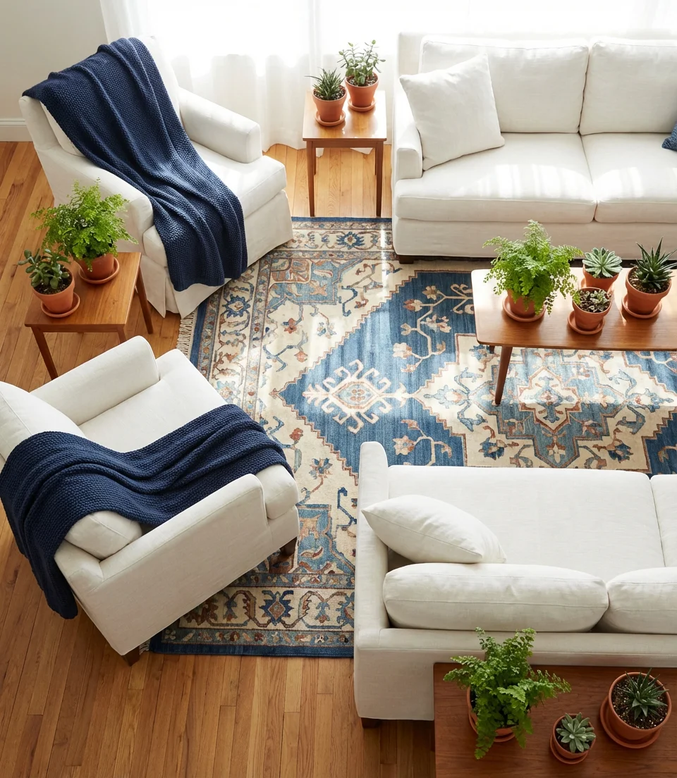
The most common rug mistake in a living room is choosing one that’s too small. In American homes, the standard recommendation is that the front legs of all seating should rest on the rug—which means you almost always need a larger size than your first instinct suggests. In a typical living room, that’s at least an 8×10 or 9×12. The good news about using a patterned blue-and-cream rug as your anchor is that it naturally gives you permission to be slightly more neutral everywhere else, which tends to make rooms feel larger and more serene.
17. Green and Blue Moody Bohemian Space
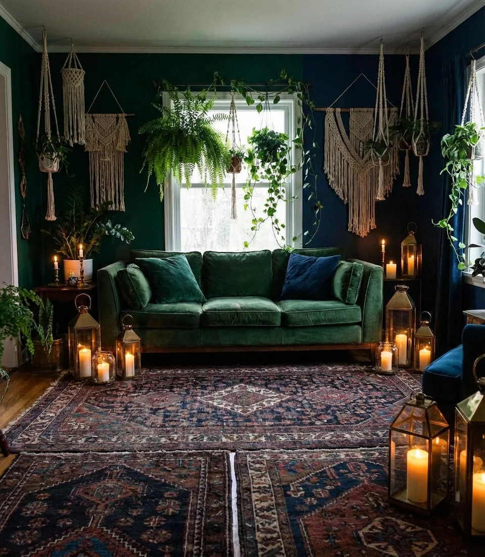
A moody bohemian living room that plays with deep greens and inky blues creates a space that feels almost otherworldly—dark, layered, and full of character. This is the aesthetic that dominates the “dark academia” and “witchy cottage” corners of Pinterest, and it translates into genuinely beautiful real-world rooms when executed with care. Think jewel-toned velvet, hanging macramé in deep forest tones, Moroccan-influenced lanterns, and an abundance of trailing plants. The darkness isn’t oppressive—it’s intentional and deeply cocooning.
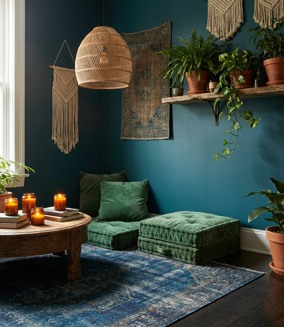
If a room like this appeals to you, the single most important decision you’ll make is your lighting plan. Moody bohemian spaces rely heavily on their light sources, with overhead lighting often being too harsh and office-like. Instead, layer multiple low-level light sources: floor lamps, table lamps, candles, and string lights woven through shelving. The goal is to make every corner glow warmly rather than to illuminate the whole room evenly. This kind of layered lighting is what transforms a room from “dark” to “atmospheric.”
18. Sky Blue and White Fresh Modern Room
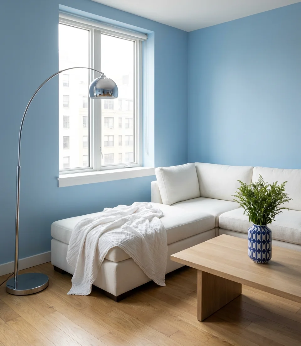
Sky blue and white in a modern living room captures something that feels both optimistic and effortlessly chic—the visual equivalent of a clear morning. This is a light and airy palette that works brilliantly in smaller apartments or rooms with limited natural light, where heavy colors can make a space feel closed-in. Sky blue on the walls with crisp white furniture creates maximum brightness while still providing color interest. Add chrome accents, simple white cotton textiles, and a few strategic pops of sky blue in accessories to keep the palette feeling intentional.
This combination is particularly popular among renters in cities like Chicago, Seattle, and Boston—people who want to make an impact with color in apartments where they can’t permanently alter the walls. Sky blue paint (or even a removable blue-tinted wallpaper) can dramatically transform a white box apartment. The key insight is that sky blue reads as an almost-neutral when used alongside true white—it brightens rather than dominates, which means you can use it liberally without the room feeling overpowering.
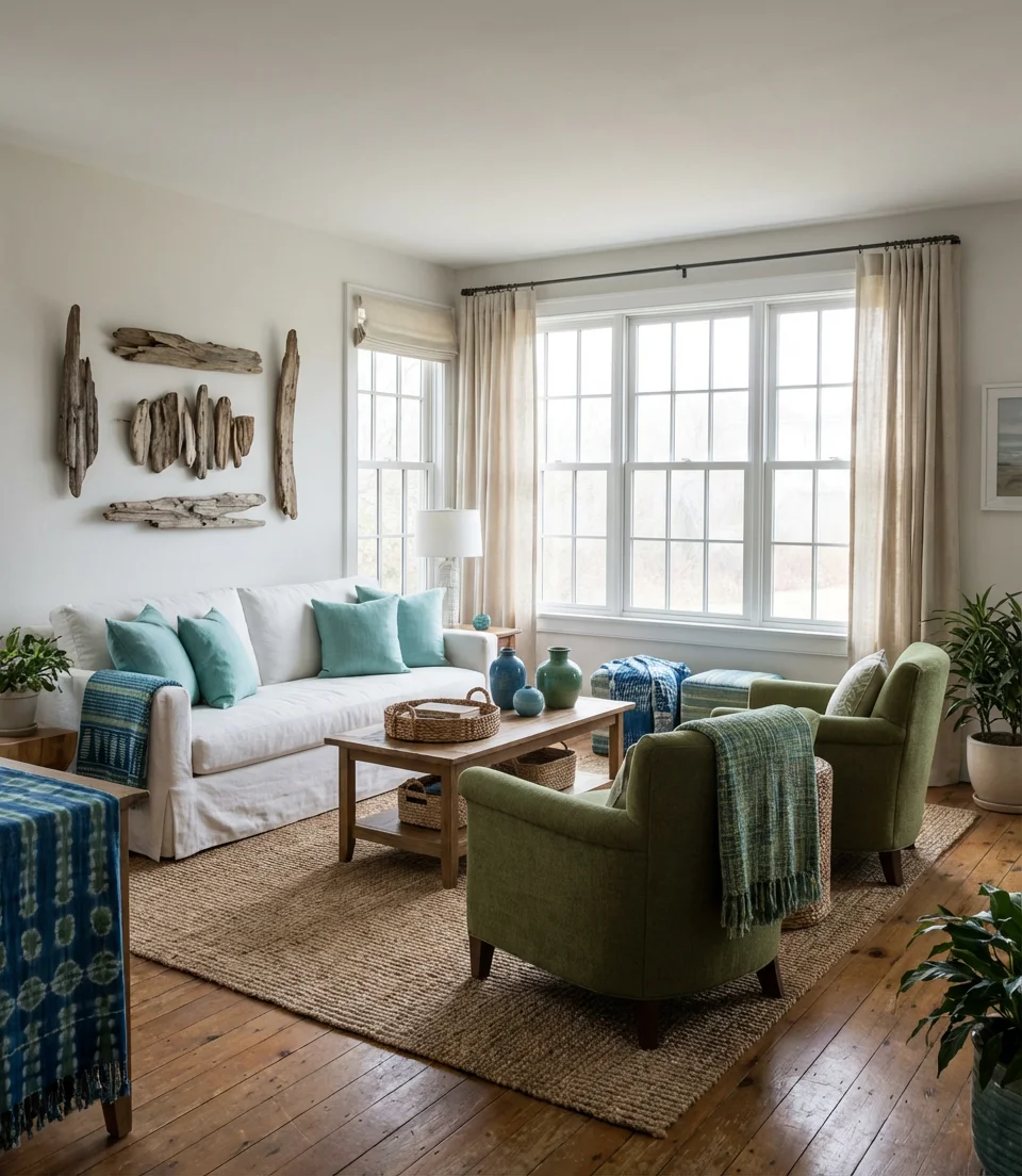
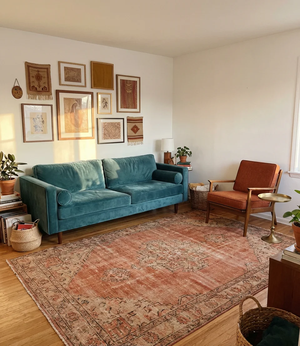
19. Blue, Green, and Brown Earthy Harmony
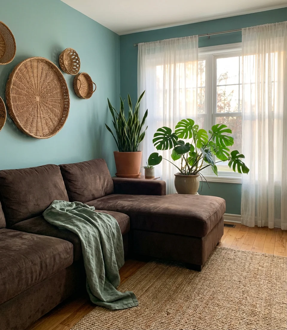
Blue, green, and brown together create one of the most naturally harmonious palettes in interior design—it’s essentially the color palette of a forest or riverbank translated into domestic terms. This combination reads as deeply grounded and organic, and it’s growing significantly in popularity as more Americans gravitate toward biophilic design principles. A room with soft teal walls, walnut wood furniture, and sage green accents doesn’t need much else to feel complete. The decor in this space leans on natural materials: woven baskets, ceramic vessels, linen throws, and live plants.
What makes this palette so appealing to American homeowners right now is that it aligns with a broader cultural shift toward nature connection and slow living. Post-pandemic, surveys consistently show that people want their homes to feel like sanctuaries—restful, tactile, and disconnected from the noise of screens and work. Blue, green, and brown together deliver exactly that feeling. For the best results, choose brown tones that are warm rather than gray-leaning: walnut, chestnut, and saddle tan. Cool browns can make the palette feel muddy rather than earthy.
20. Navy Blue and Pink Chic Feminine Living Room
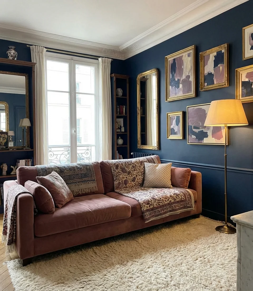
Navy blue and pink is a combination that’s undergoing a genuine image rehabilitation in 2026 — it’s moved decisively out of the “little girl’s bedroom” category and into sophisticated, adult living rooms. The key is pairing deep, saturated navy with a dusty or mauve pink rather than a bright bubblegum tone. This creates a palette that feels grown-up, even glamorous—like a Parisian apartment or a high-end boutique hotel. Use color scheme mood boards in these tones before committing: a sample on your actual wall will look very different from anything you see on a screen.
Color experts often point out that navy and pink is actually a classic preppy combination with deep roots in American style—think Lilly Pulitzer, Nantucket, and traditional New England collegiate aesthetics. What’s new in 2026 is the way these references have been stripped of their coastal preppy connotations and redesigned with a more global, fashion-forward eye. The combination is now showing up in rooms that are equally influenced by Parisian minimalism and Brooklyn maximalism—which speaks to how versatile it truly is across different design sensibilities.
21. Pale Green and Cream Scandinavian Serenity
Pale green and cream in a Scandinavian-influenced living room create some of the calmest, most livable interior spaces imaginable. The palette draws on the Nordic tradition of using nature-derived colors to bring the outdoors inside during long, dark winters—a principle that resonates strongly with Americans in northern states. Think celadon or sage walls, cream wool upholstery, light birch wood furniture, and minimal accessories that feel hand-selected rather than mass-purchased. Everything in the room should feel like it belongs—nothing decorative for its own sake.
There’s a micro-trend within this aesthetic that’s worth noting: the deliberate use of handmade or artisanal objects to add humanity to what might otherwise become a too-perfect, showroom-like space. A slightly asymmetrical ceramic, a hand-thrown pot, or a textile with slight weave irregularities are the visual equivalent of a breath of fresh air. They remind you that a room is for living in, not just looking at. In a pale green and cream room, one or two such objects per surface is enough to make the space feel genuinely warm rather than just aesthetically correct.
22. Deep Teal and Orange Eclectic Mix
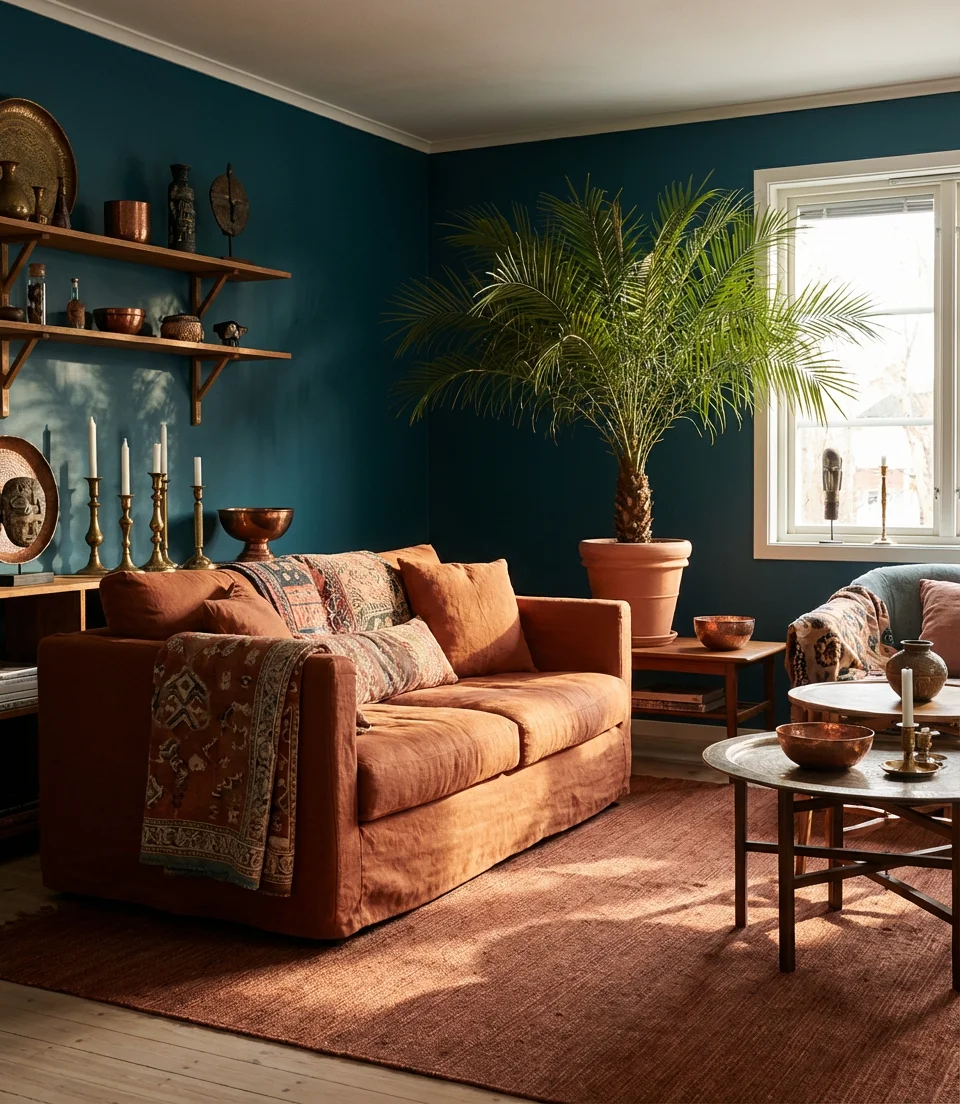
Deep teal and orange is the kind of color pairing that stops you mid-scroll—it’s bold, unexpected, and deeply satisfying in the way only complementary color combinations can be. In a living room, this palette works best when teal is the dominant color and orange plays a supporting accent role: deep teal walls or upholstery with terracotta, rust, or amber orange accessories. The result has strong references to both mid-century modern American design and global influences from India and Morocco. This style is an aesthetic that rewards confidence—half-measures tend to look confused.
Teal and orange has a long and prestigious history in American design—it’s essentially the color DNA of mid-century modern interiors from Palm Springs and Los Angeles, where hot desert light made vibrant color combinations feel completely natural rather than overwhelming. Today’s version is less retro and more globally influenced, but the underlying logic is the same: use complementary colors to create visual energy. If you’re building this palette on a budget, teal paint is one of the most accessible ways to make a dramatic impact—and orange throws and cushions are widely available at mid-range price points.
23. Blue and Green Ombre Gradient Living Room
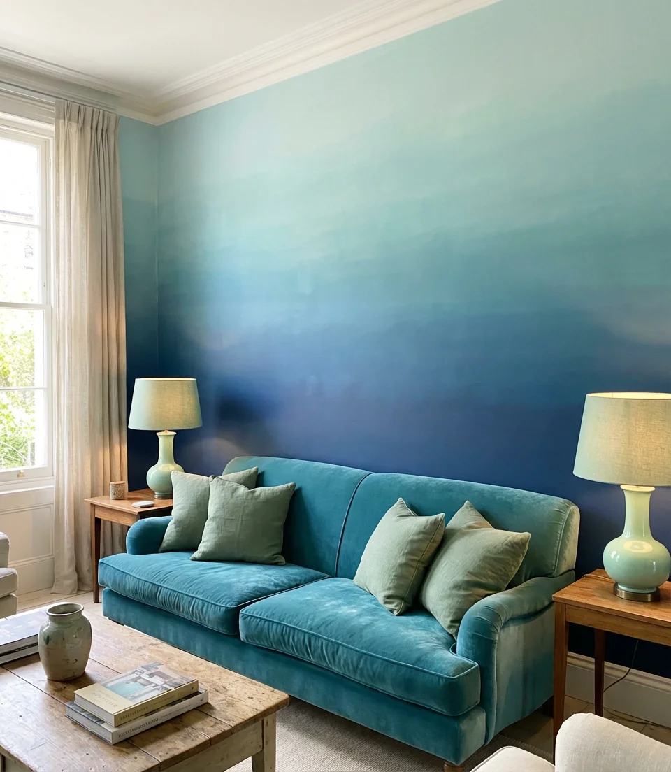
One of the most innovative ideas for color schemes circulating in design circles right now is the ombre gradient approach—using a seamless transition from blue to green across a single wall or throughout the room’s textiles. Rather than choosing either blue or green, this technique embraces both as a continuous spectrum. When done well, it creates a room that feels like it’s inside a wave or a prism of light. The most accessible way to experiment with this concept is through layered textiles: a navy rug, a teal sofa, sage green curtains, and mint accessories, arranged so the eye naturally travels from deep to pale.
This style is genuinely one of the more advanced techniques in the blue-green living room universe—and it’s worth taking your time with. The best gradient rooms look natural rather than contrived, which means the transitions between tones need to be gradual enough that you can’t pinpoint exactly where one color ends and the next begins. If you’re attempting a painted ombre wall, practice extensively on large boards before touching your actual walls, and consider hiring a decorative painter if you’re not confident in the blending. Done well, it’s one of the most stunning things you can do to a room in 2026.
Whether you’re drawn to the drama of moody navy and brown, the freshness of pale blue and cream, or the earthy warmth of blue-green and tan layered together, there’s genuinely a version of this palette that works for your home, your light, and your life. The most exciting part of this color story is that it’s still evolving—new combinations are being discovered every season, and your living room might just be the next one worth pinning. Drop a comment below and tell us which of these ideas resonated with you most—or share how you’re using blue and green in your space. We’d love to see what you create.