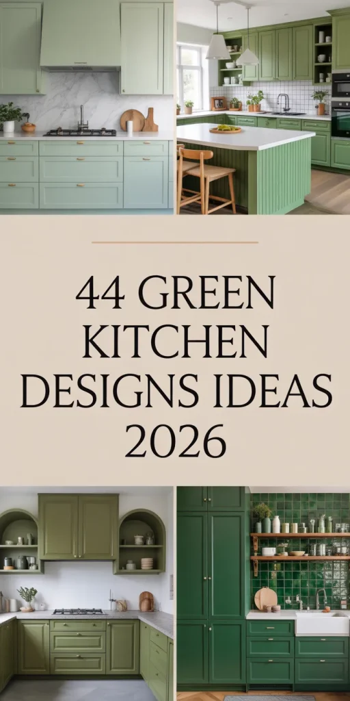
Green kitchens are having a major moment in 2026, and it’s not hard to see why. Americans are turning to Pinterest in droves, hunting for ways to bring nature-inspired calm into their homes without sacrificing style or function. Whether you’re drawn to deep forest hues or breezy pastel tones, green offers a rare combination of versatility and warmth that works in nearly any space. This guide walks you through fresh, actionable ideas that blend timeless appeal with the latest design trends. You’ll find inspiration for every budget, layout, and personal taste.
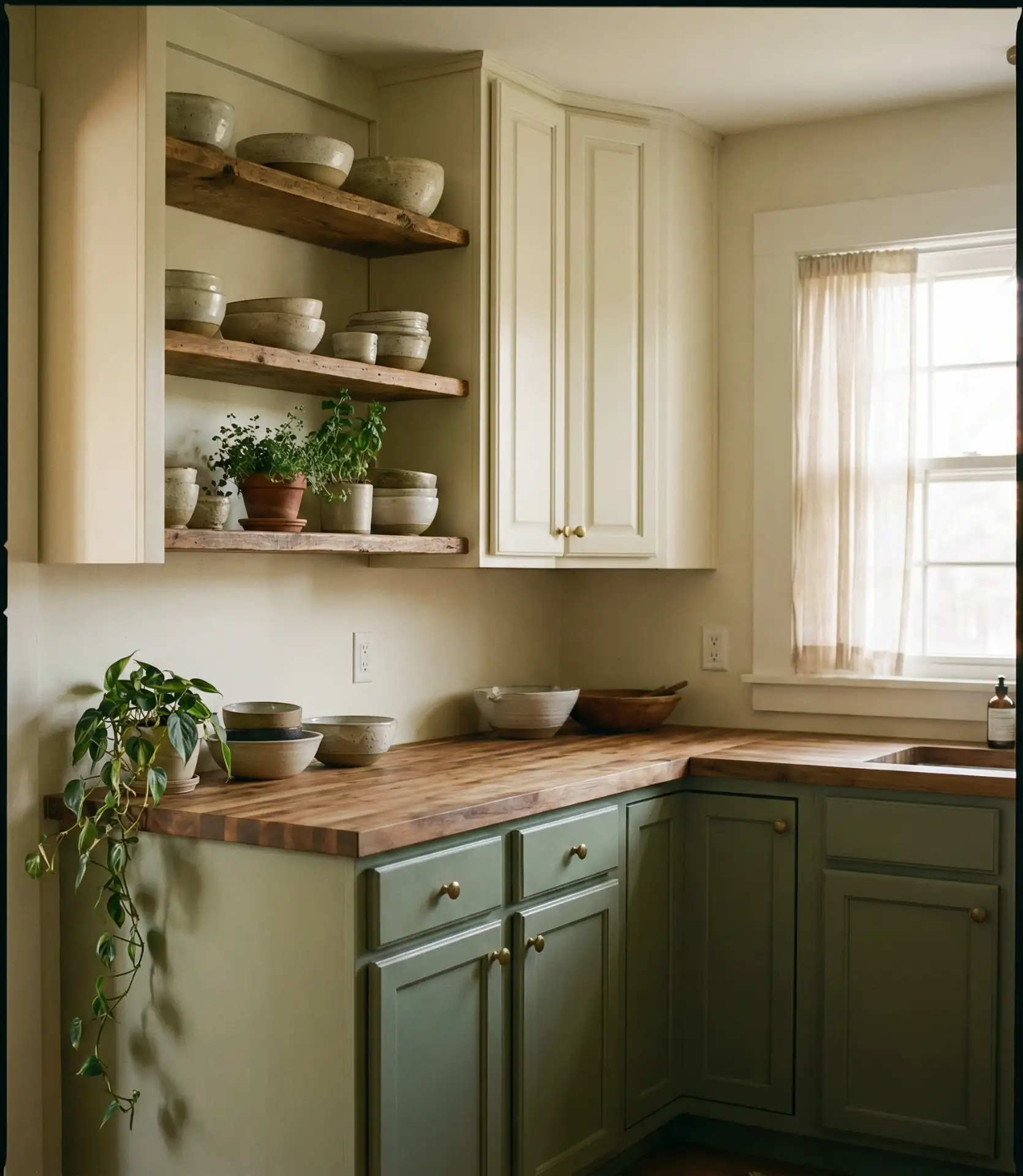
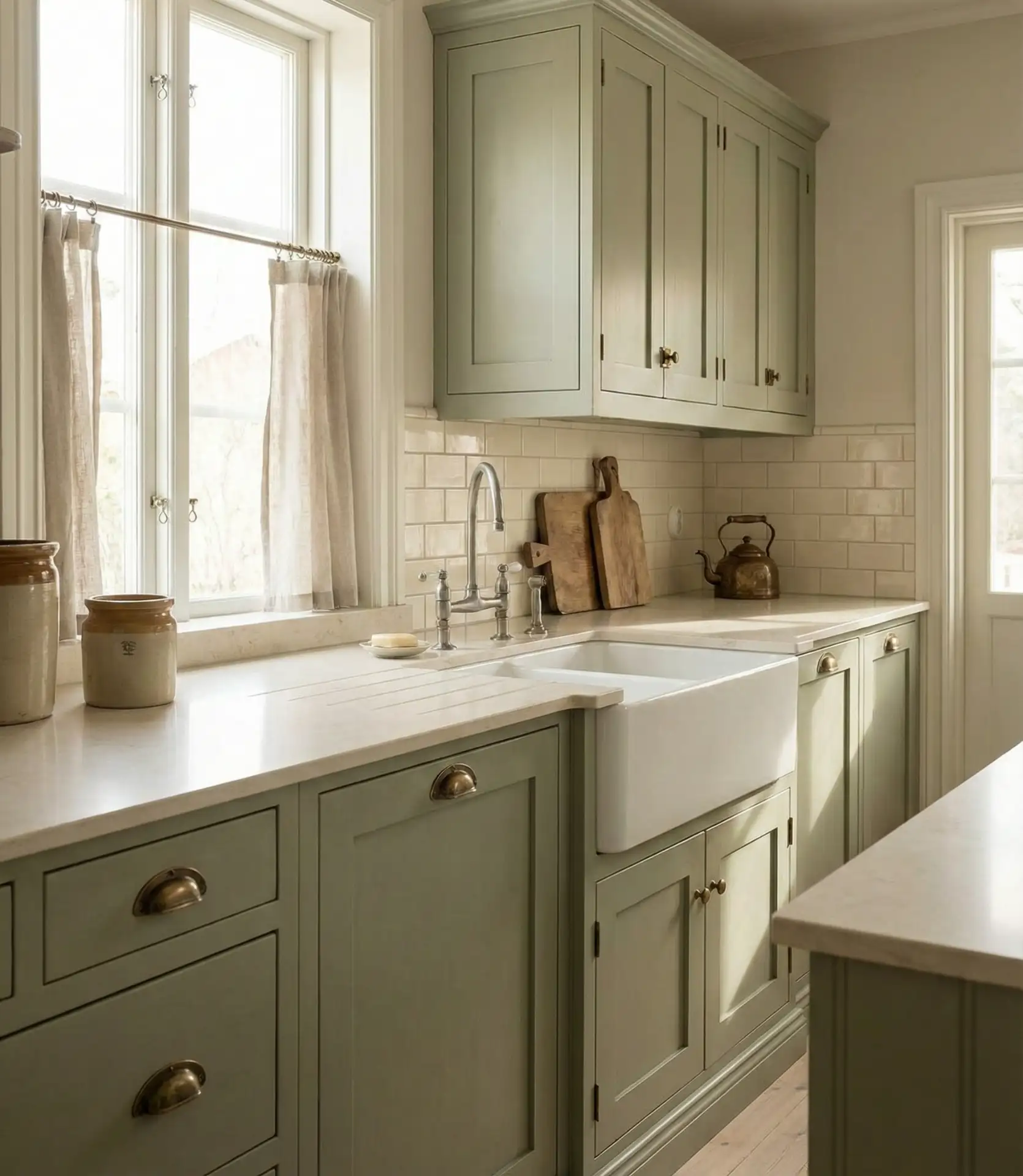
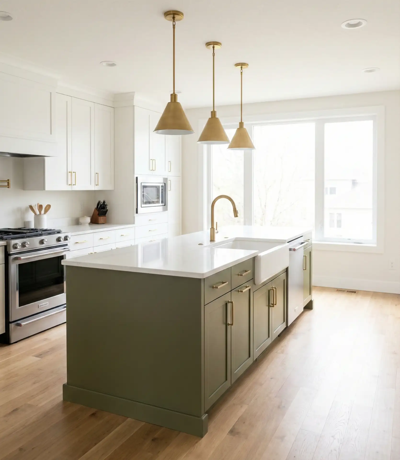
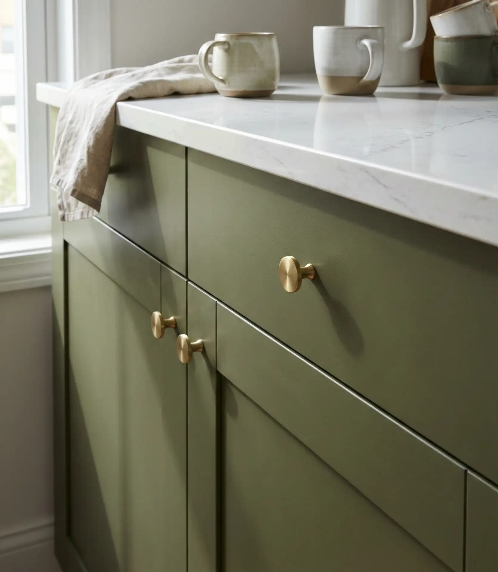
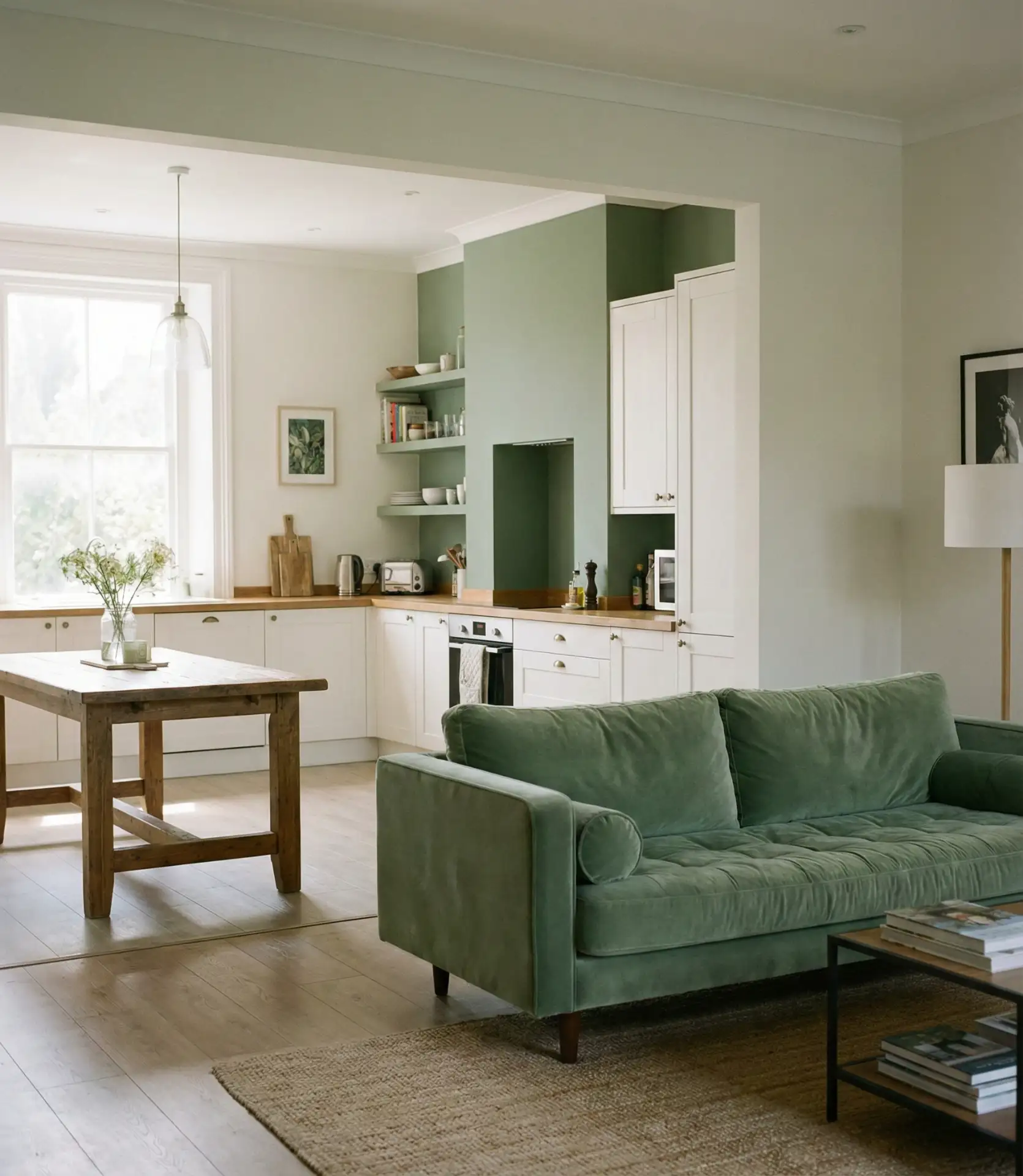
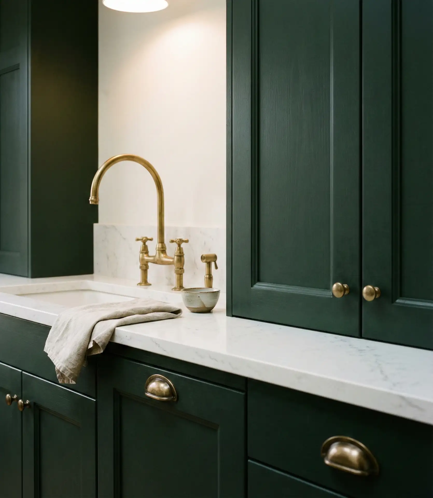
1. Olive Green Cabinets with Brass Hardware
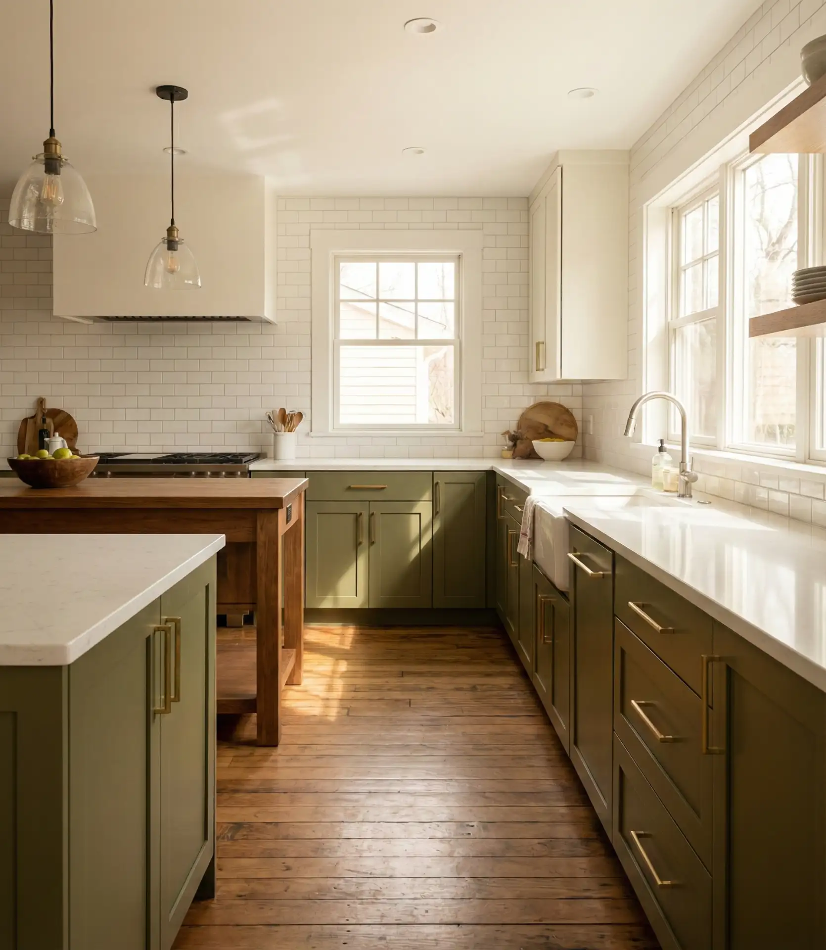
Olive green cabinetry brings an earthy sophistication that feels both modern and rooted in tradition. Paired with warm brass pulls and knobs, this look suits American kitchens that crave a bridge between farmhouse charm and contemporary elegance. The muted tone works beautifully in both open-plan spaces and smaller galley setups, anchoring the room without overwhelming it. It’s a color that ages gracefully, avoiding the trendiness trap while still feeling undeniably fresh for 2026.
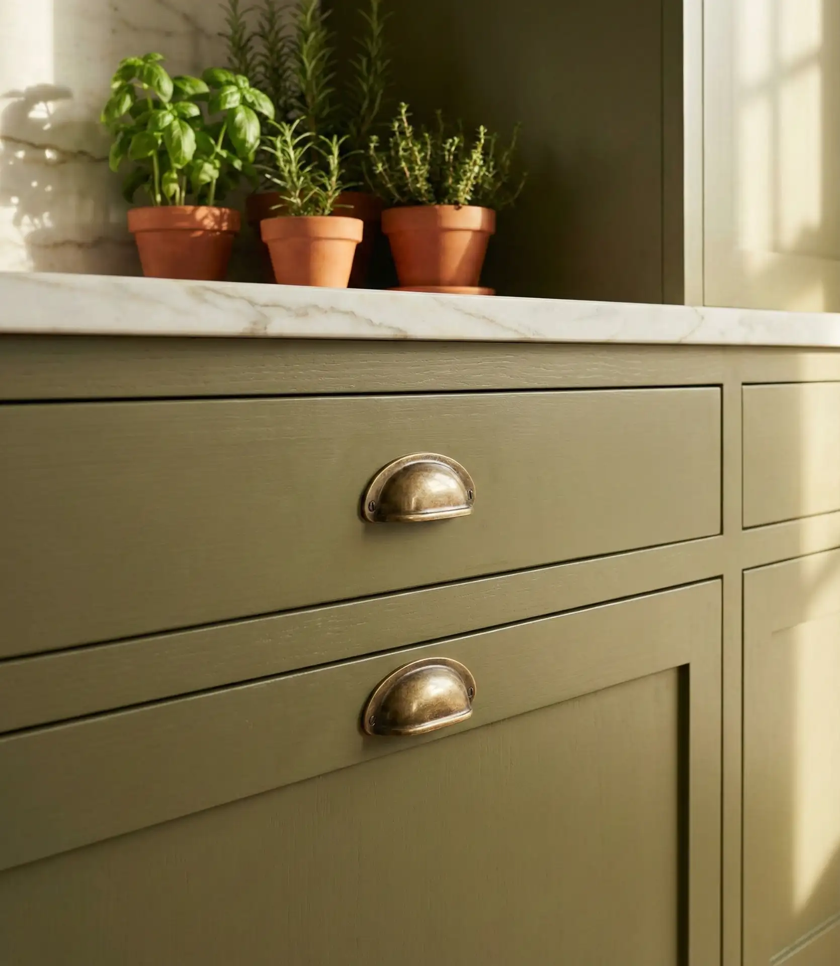
This combination thrives in open-concept homes where the kitchen flows into the dining or living area. The brass reflects light beautifully, adding warmth without the clinical feel of stainless steel. Olive tones also play well with natural wood, stone, and linen textiles, making it easy to layer in personal touches. One common mistake is choosing hardware that’s too shiny or modern—stick with satin or brushed finishes to preserve the organic, grounded vibe this palette promises.
2. Pastel Sage Walls in a Small Apartment Kitchen
Pastel sage paint transforms cramped apartment kitchens into airy retreats. This soft, muted green reflects light beautifully, making tight spaces feel larger and more inviting. It’s especially popular in urban areas where renters want to personalize without committing to bold color. Paired with white cabinetry and open shelving, the look is effortlessly chic and adaptable to changing décor moods over time.
In Brooklyn and Portland, renters are using peel-and-stick wallpaper in sage tones to achieve this look without losing their security deposit. The color pairs beautifully with natural wood accents and matte black fixtures, creating a balanced, contemporary feel. Keep the upper cabinets light or skip them entirely to maximize the sense of openness—sage works best when it has room to breathe and isn’t boxed in by heavy cabinetry on all sides.
3. Dark Green Lower Cabinets with White Uppers
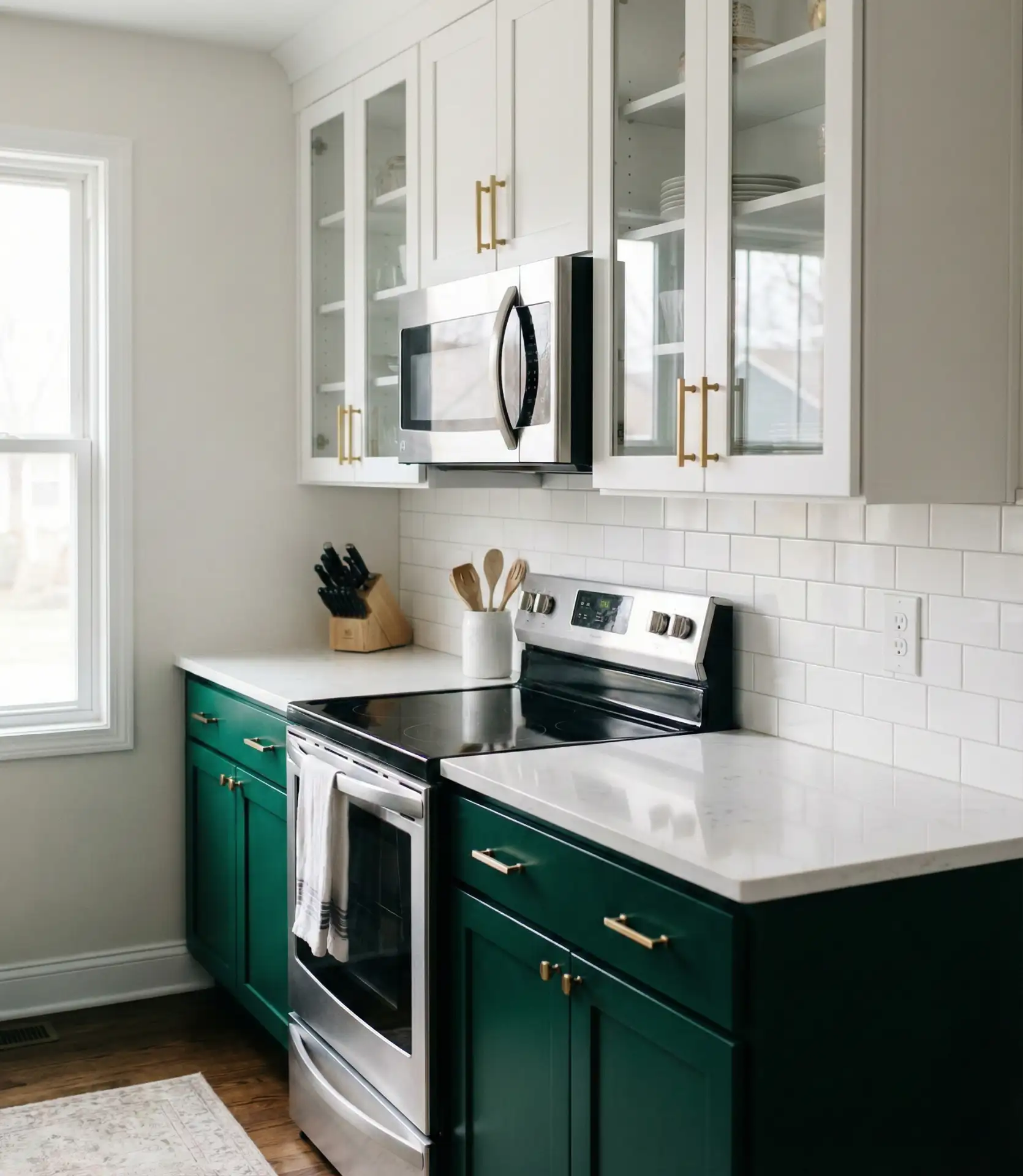
Dark green lower cabinets paired with crisp white uppers create a high-contrast look that feels both grounded and expansive. This two-tone approach is perfect for American homes seeking visual interest without pattern overload. The dark base anchors the room, while the white keeps sightlines open and airy. It’s a favorite among homeowners who want personality but also resale appeal, since the white cabinets soften the commitment to color.
This setup works best in kitchens with ample natural light, where the dark green won’t feel cave-like. Experts recommend using a semi-gloss or satin finish on the lower cabinets to reflect light and prevent the space from feeling too heavy. Avoid pairing this with dark countertops—stick with white, light gray, or natural stone to maintain balance and keep the room from feeling too moody or closed in.
4. Pista Green Backsplash Tiles
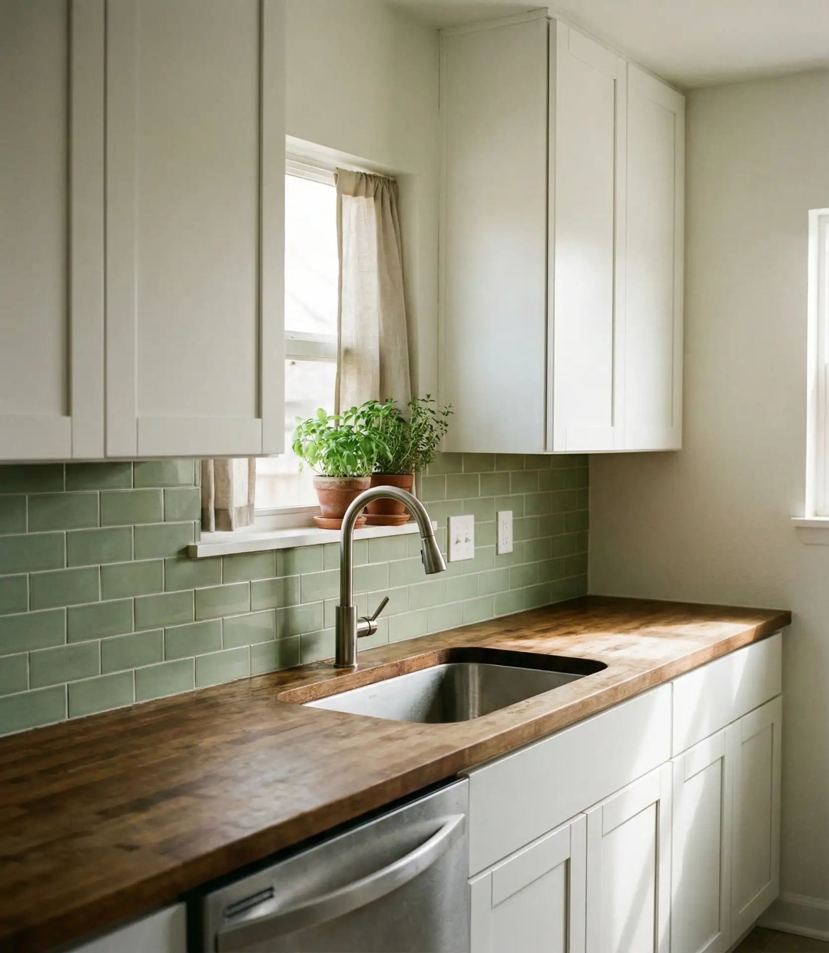
Pista green—a pale, yellowish-green inspired by pistachio—is showing up on tiles across American kitchens in 2026. This delicate shade brings a vintage charm that feels playful yet sophisticated. It pairs beautifully with white or cream cabinetry and works equally well in modern or retro-inspired spaces. The color is soft enough to avoid overwhelming a small kitchen but distinctive enough to make a statement in larger layouts.
Budget-conscious renovators love this option because backsplashes are relatively affordable to update. A mid-range ceramic tile in this shade typically runs $8–$15 per square foot installed, making it an accessible way to introduce color without a full cabinet remodel. It’s especially popular in Southern and Southwestern states, where homeowners appreciate the cheerful, sun-washed quality it brings to everyday cooking spaces.
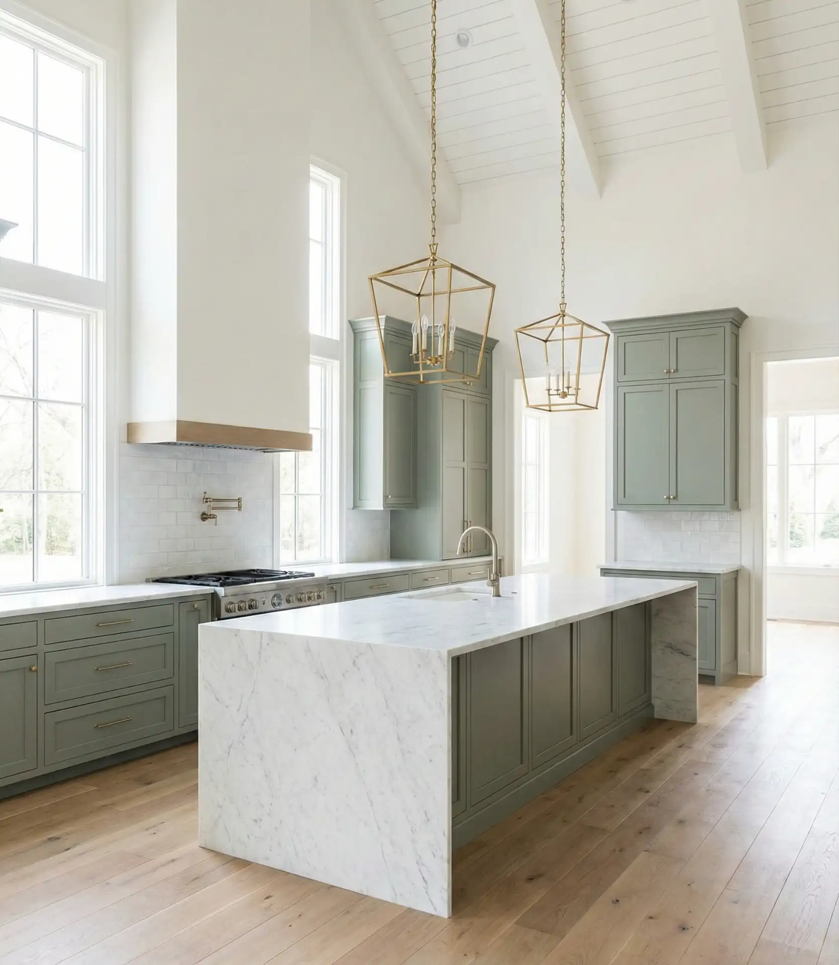
5. Modern Olive Green Kitchen Island
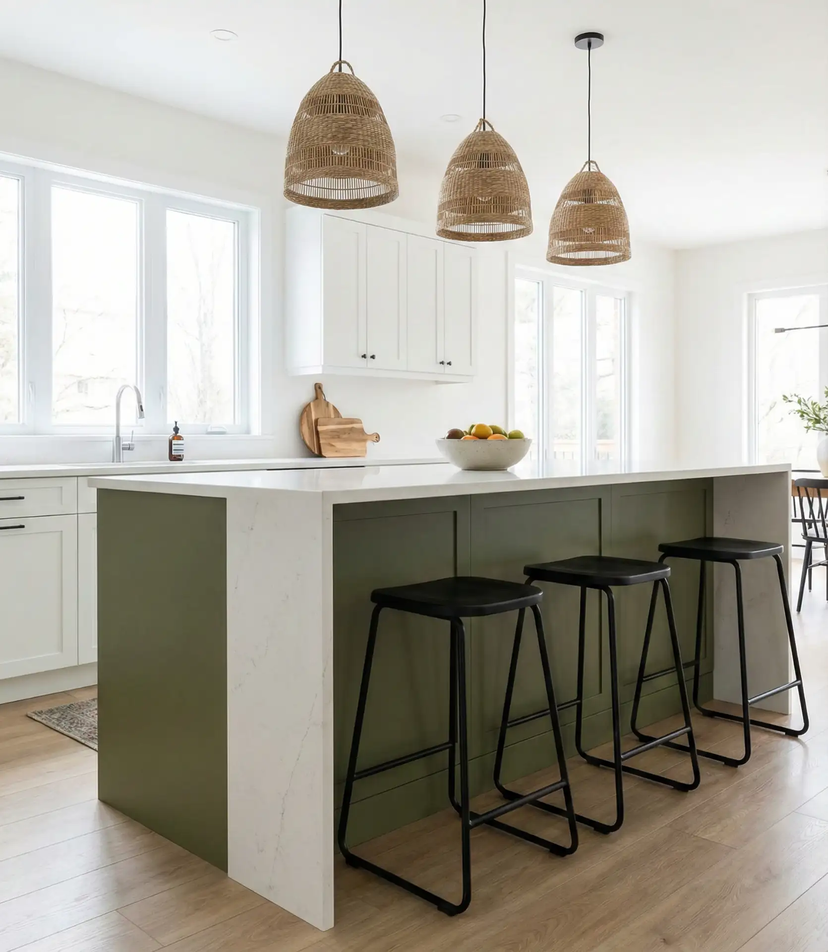
A modern olive green island serves as the heart of the kitchen, offering both function and a bold focal point. This approach is ideal for homeowners who want to test green without committing to full cabinetry. The island can be a different finish or style than the perimeter cabinets, giving you creative freedom. Olive tones work especially well with white, black, or natural wood surroundings, allowing the island to stand out without clashing.
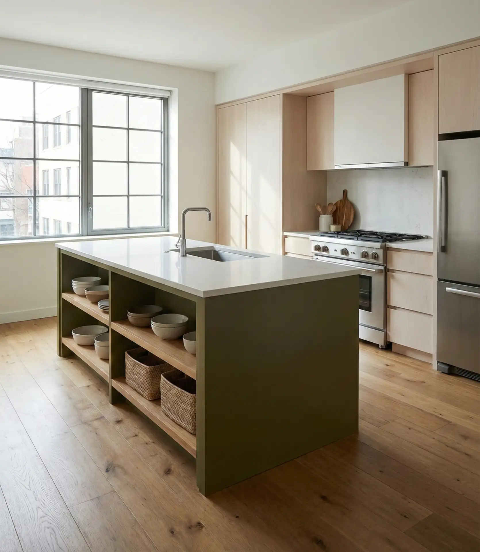
A friend in Austin recently painted her builder-grade island in a custom olive and says it completely transformed the space for under $200 in materials. The key is choosing a durable, scrubbable paint formulated for cabinetry—not standard wall paint—and sanding between coats for a smooth, professional finish that holds up to daily use and spills.
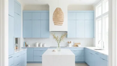
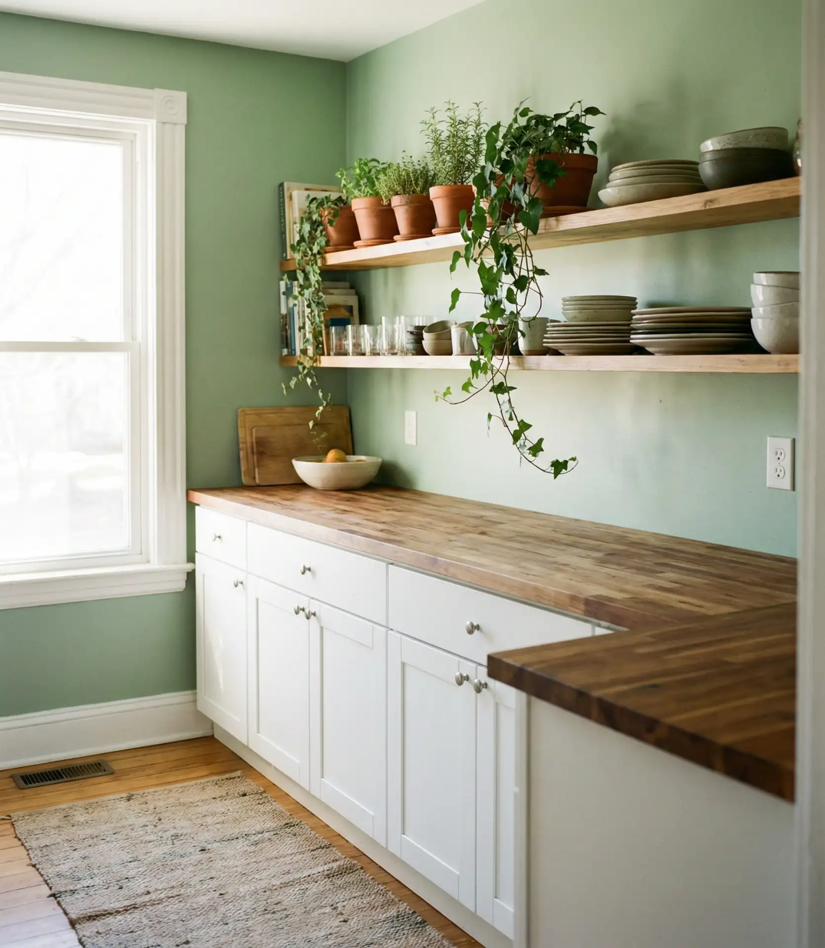
6. Light Green Walls with White Shaker Cabinets
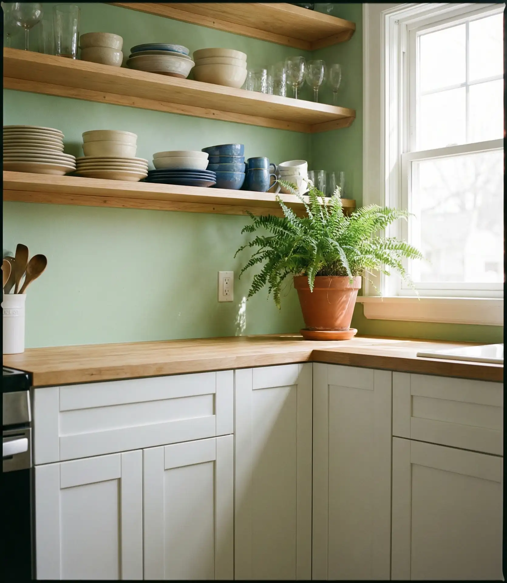
Light green walls bring a gentle, nature-inspired backdrop to kitchens anchored by classic white cabinetry. This pairing is timeless, flexible, and easy to personalize with art, textiles, and accessories. The soft green adds just enough color to prevent the space from feeling sterile, while the white cabinets keep things bright and airy. It’s a go-to combination for families who want a kitchen that feels cheerful without being overly styled or precious.
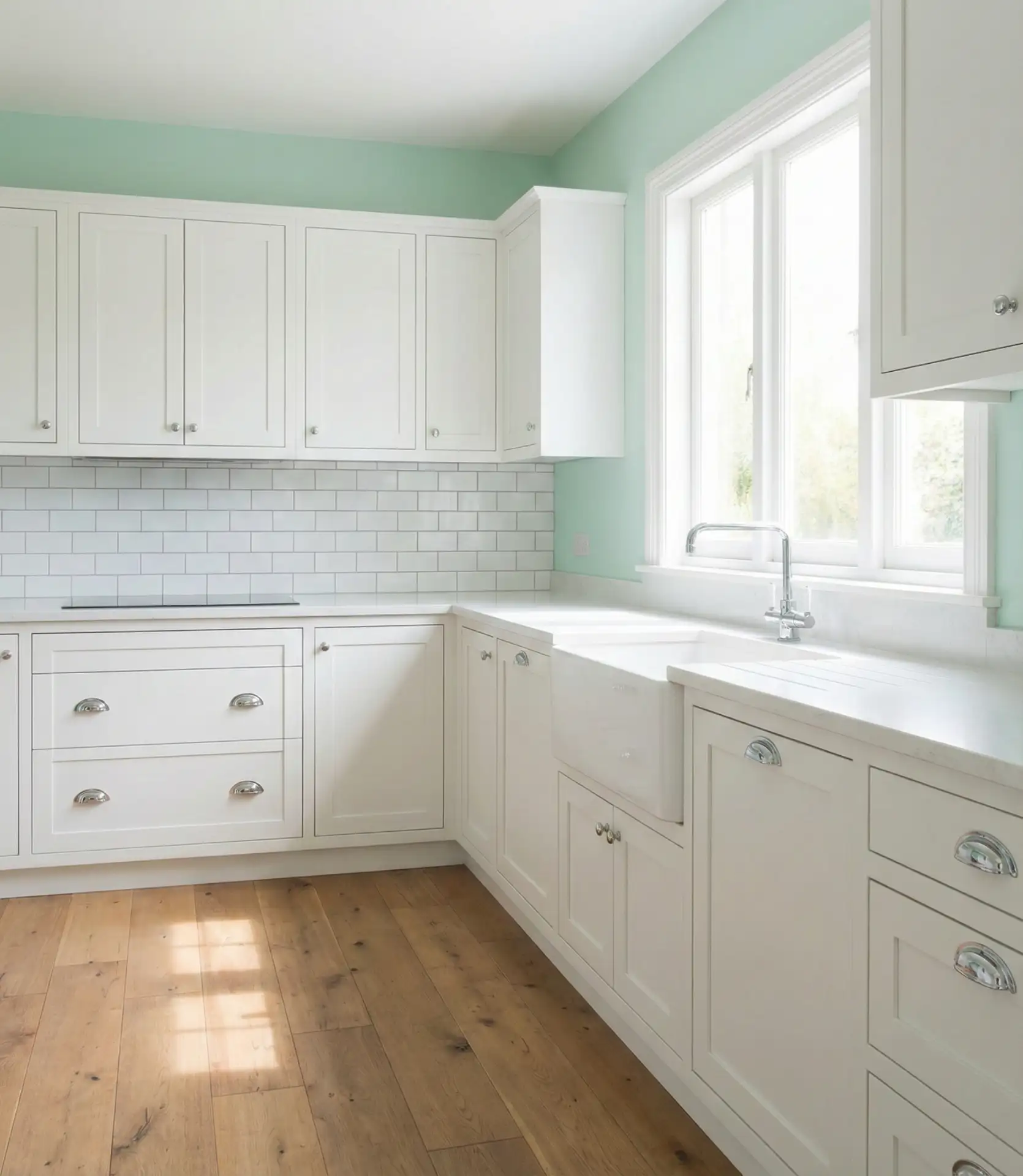
This setup works best in kitchens with ample natural light, particularly those facing east or south. The light green reflects sunlight beautifully, creating a warm, inviting glow throughout the day. In spaces with limited windows, consider adding under-cabinet lighting to prevent the green from feeling flat or dull—good task lighting keeps the color vibrant and prevents it from reading as gray or washed out.
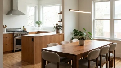
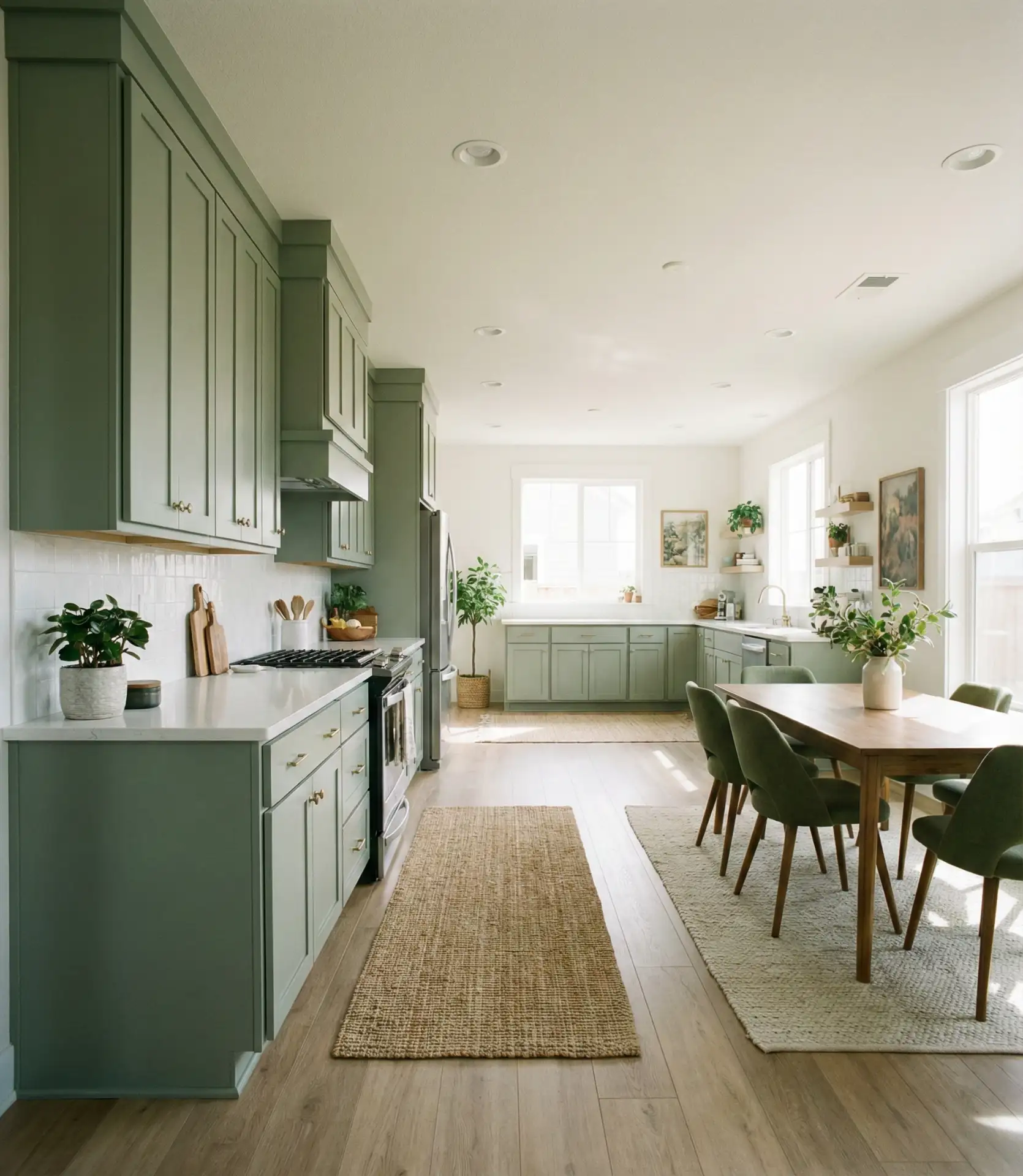
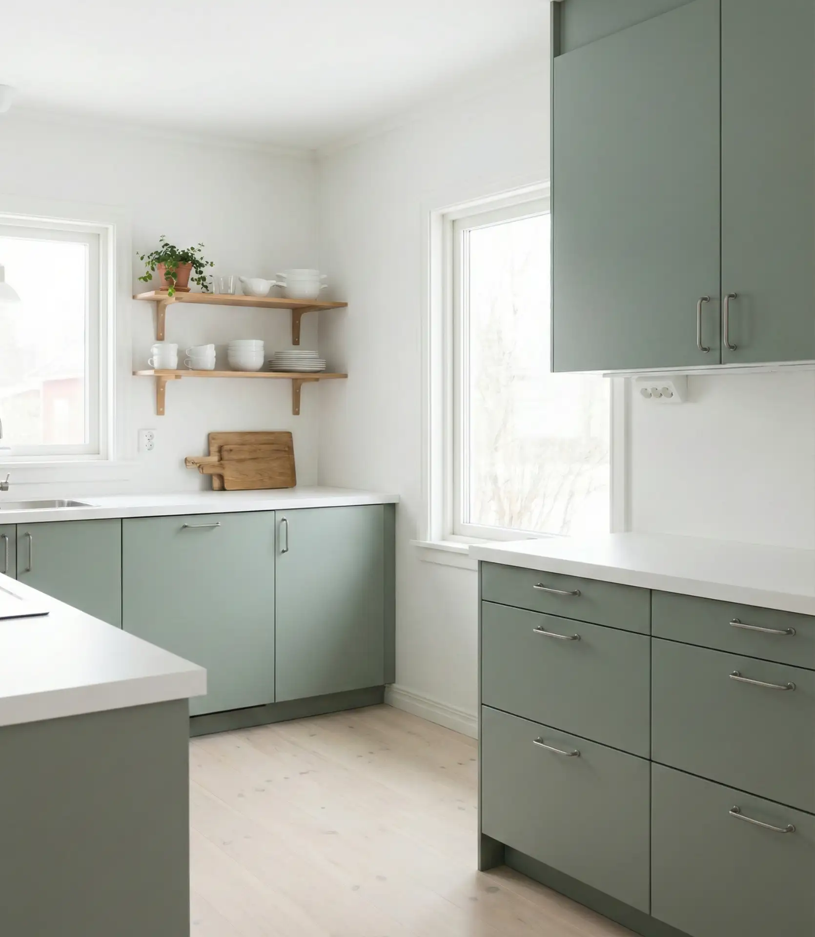
7. White and Green Color Palette with Natural Wood
A white and green palette layered with natural wood creates a balanced, organic feel that’s hugely popular in 2026. This trio works because each element complements the others: white brightens, green soothes, and wood warms. It’s a versatile foundation that adapts to farmhouse, Scandinavian, or modern aesthetics depending on the lines and finishes you choose. The result is a kitchen that feels collected and intentional rather than theme-driven or overly coordinated.
Where it works best: open-plan homes where the kitchen connects to a dining or living area. The natural wood serves as a bridge between zones, creating visual continuity without requiring every space to match exactly. This palette also photographs beautifully, which is why it’s a favorite among Pinterest users looking for ideas that translate well from screen to real life.
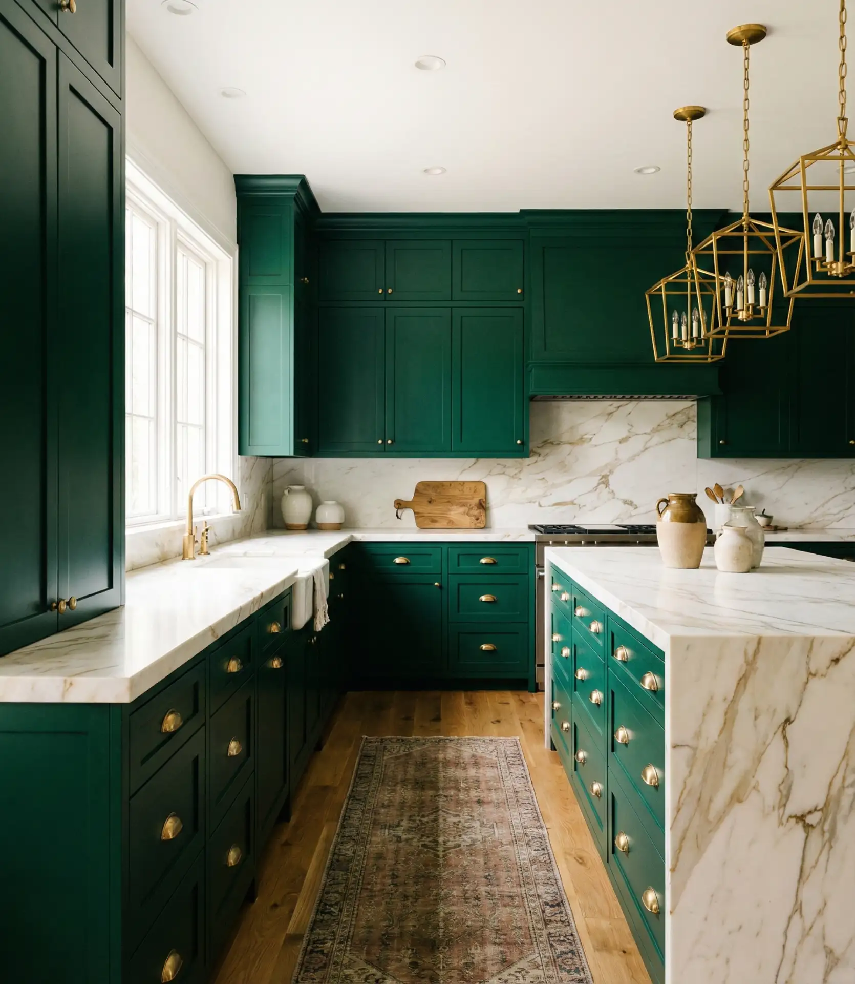
8. Luxury Green Kitchen with Marble Countertops
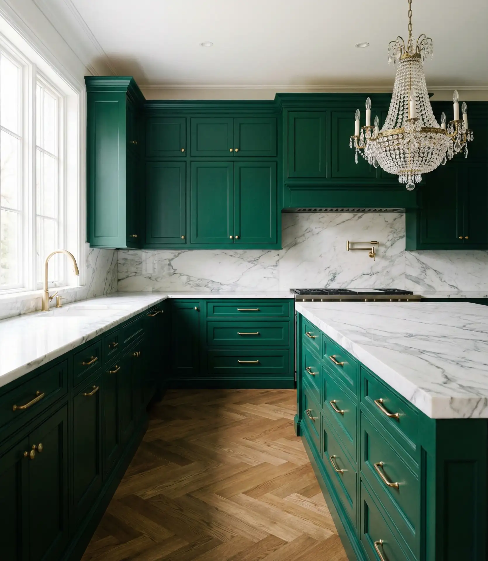
Luxury green kitchens pair deep, saturated cabinetry with veined marble countertops for a look that’s unapologetically elegant. Think emerald or hunter green cabinets topped with Calacatta or Carrara marble. The combination feels formal yet livable, offering a sense of occasion to everyday routines. This style is popular in historic homes and new builds alike, where homeowners want a kitchen that feels like a showpiece without sacrificing warmth or function.
Real homeowners investing in this look often spring for custom cabinetry with inset doors and soft-close hinges, which elevate the overall feel. The marble requires regular sealing—typically every six to twelve months—but the payoff is a surface that develops character and patina over time. Keep this palette away from kitchens where young kids frequently walk, unless you’re ready to endure inevitable wear and the occasional stain.
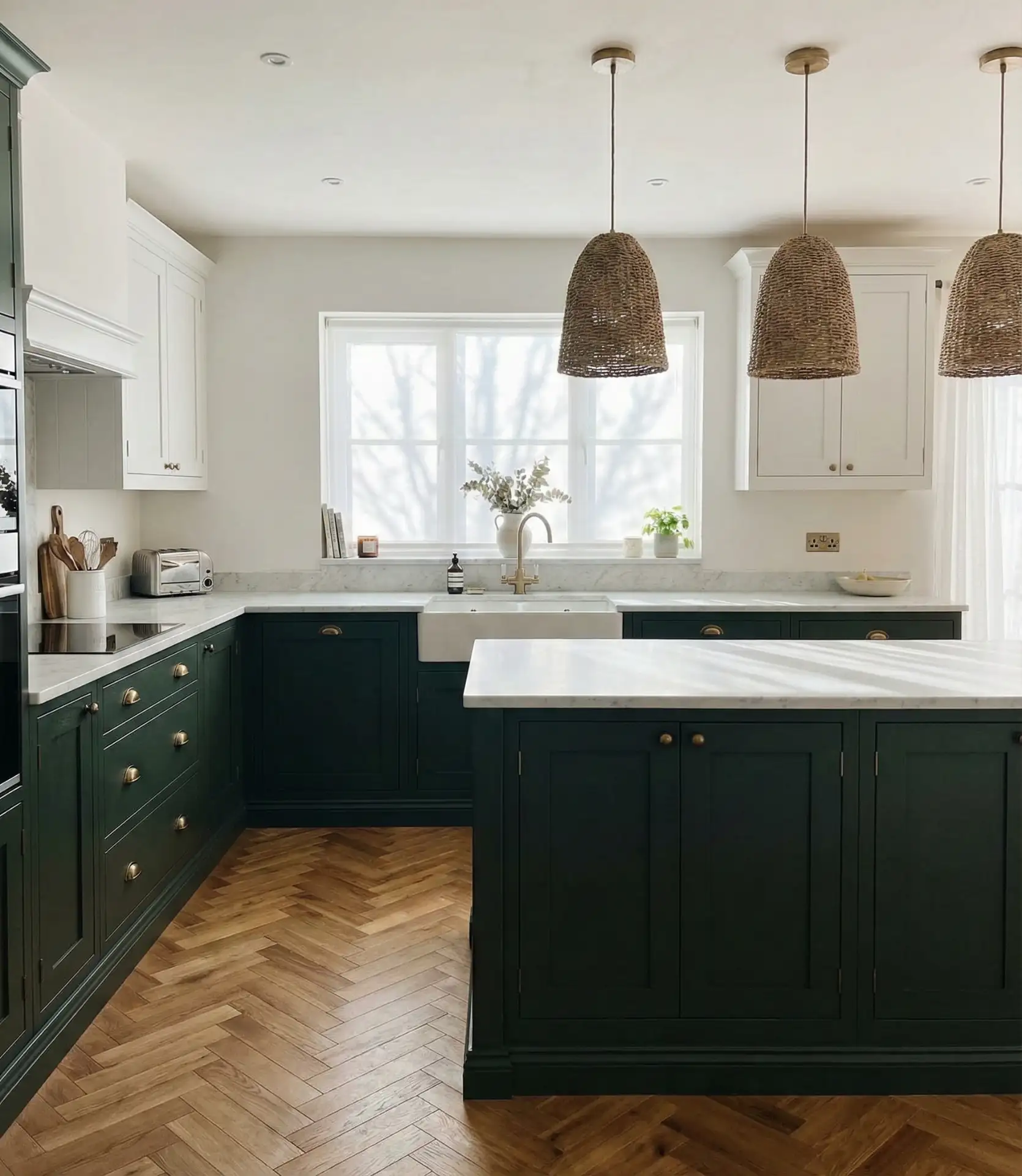
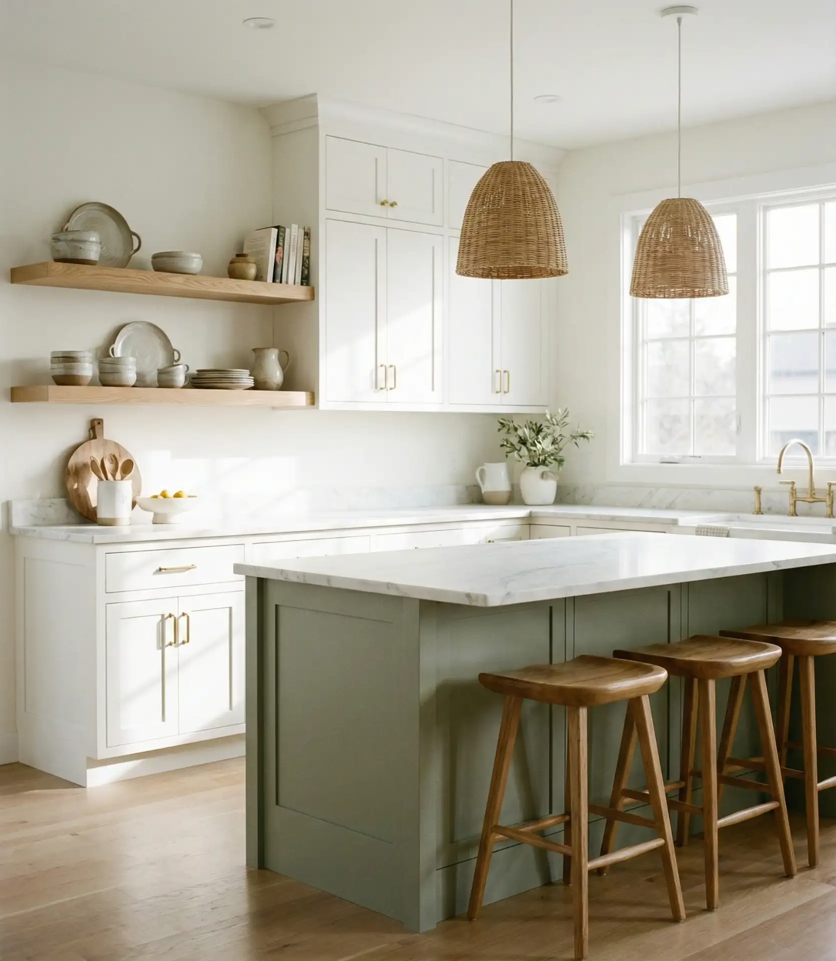
9. Green Kitchen Island with Seating
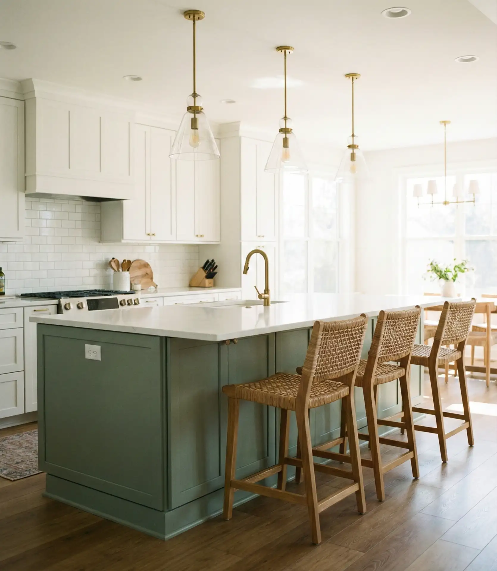
A green island with integrated seating serves double duty as a prep zone and gathering spot. This setup is ideal for families who use the kitchen as a central hub for homework, conversation, and casual meals. The green adds personality and warmth, while the seating makes the space inherently social. It’s a practical choice that doesn’t sacrifice style, and it works in both traditional and contemporary settings depending on the cabinet door style and finish.
In suburban homes, this island often becomes the true heart of the house. Kids eat breakfast there, parents catch up on emails, and friends linger during dinner parties. The green makes it feel intentional and designed rather than purely utilitarian. One common mistake is skimping on the overhang—aim for at least 12 inches of clearance to comfortably accommodate knees and allow people to sit without feeling cramped or squeezed against the cabinetry.
10. Mint Green Cabinets in a Retro-Inspired Kitchen
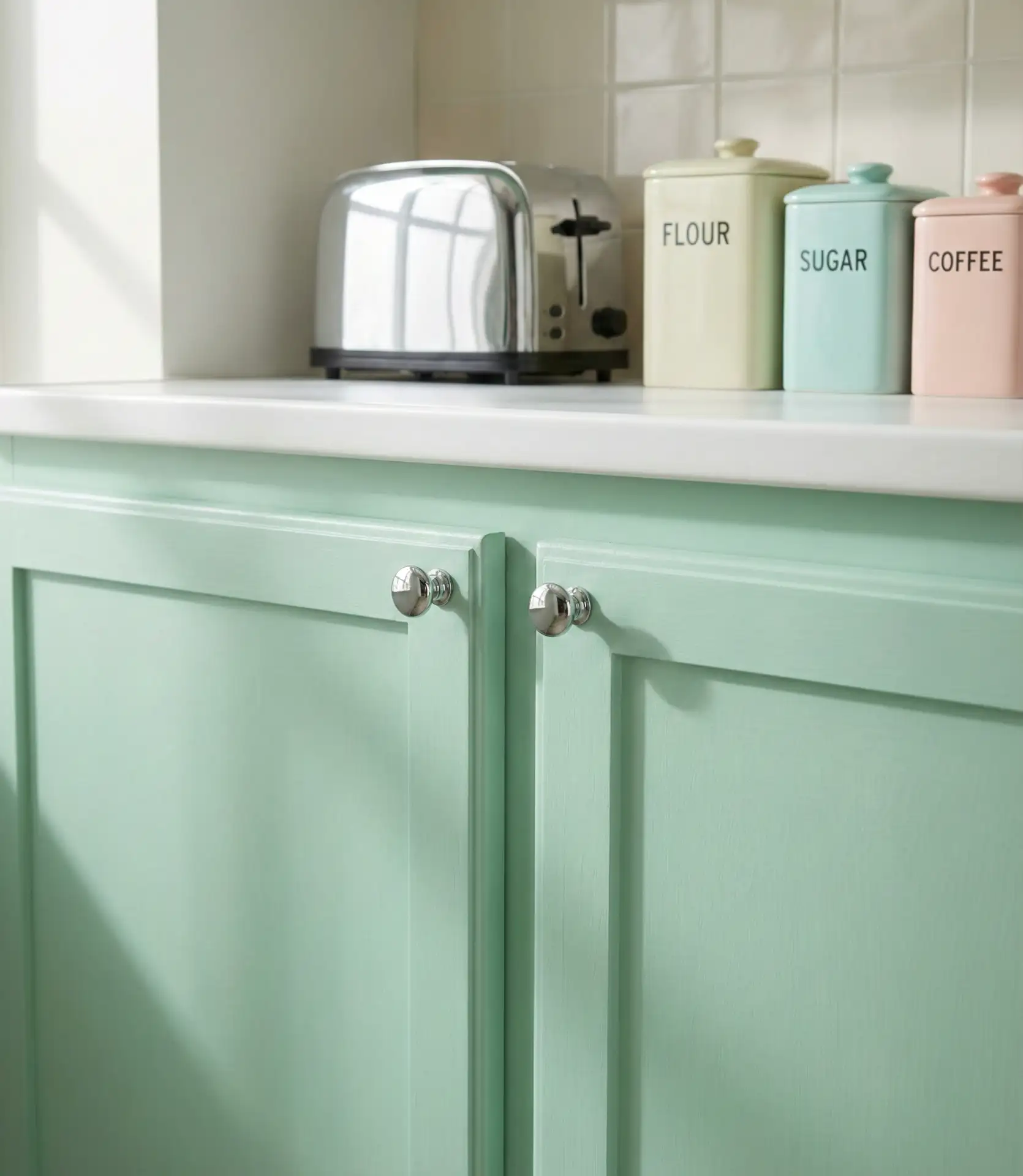
Mint green cabinetry channels mid-century charm and works beautifully in retro or vintage kitchens. This shade is brighter and cooler than sage, with a nostalgic quality that feels cheerful and optimistic. Paired with checkerboard floors, chrome accents, and rounded edges, it creates a playful, time-capsule vibe that’s both stylish and approachable. It’s especially popular among younger homeowners who grew up with Pinterest and are drawn to color-forward, personality-rich interiors.
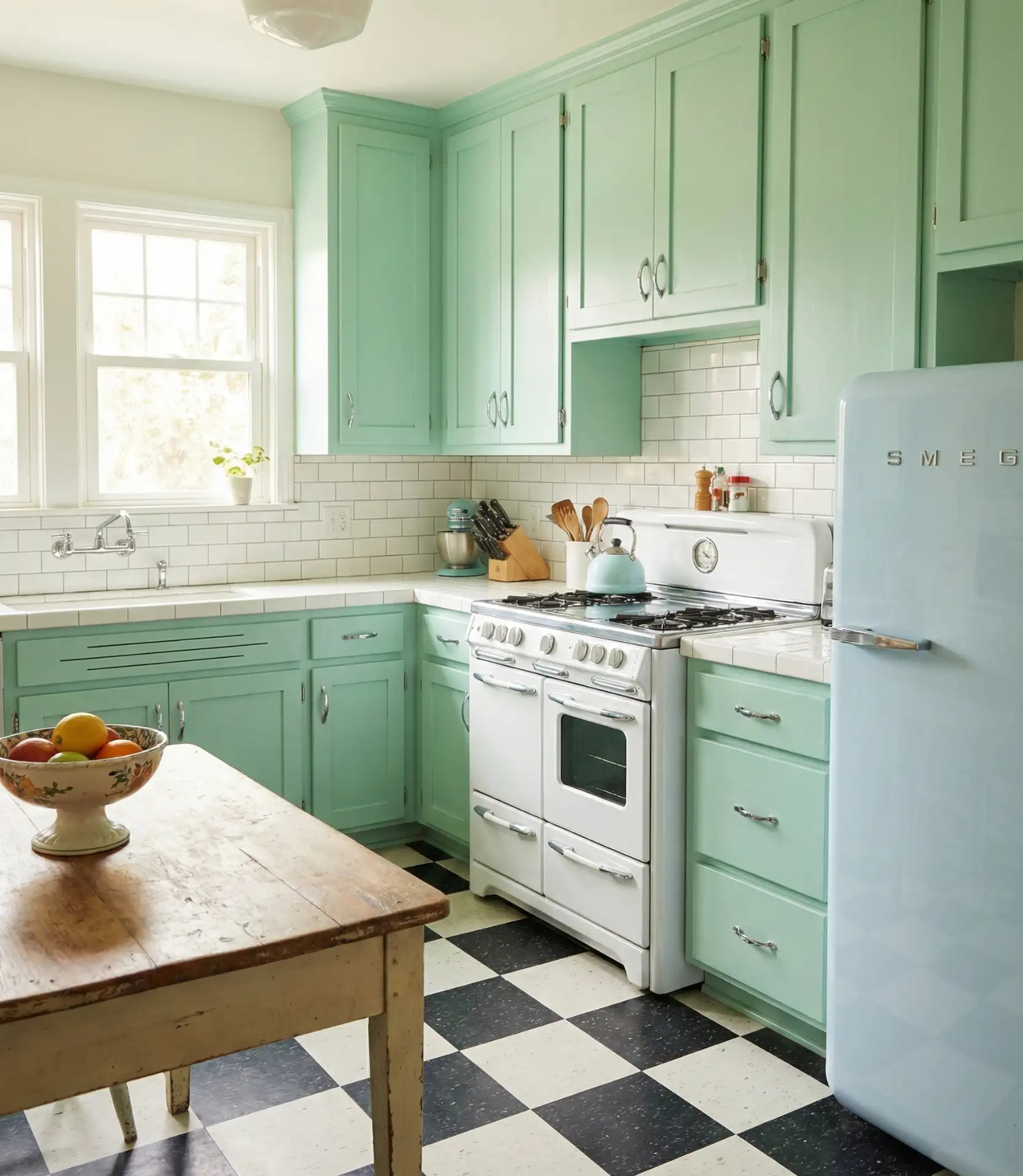
Practical insight: Mint works best when balanced with neutrals. Too many competing pastels can make the space feel overly sweet or thematic. Stick with white, black, or natural wood for countertops and floors, and let the mint cabinets be the star. This palette also pairs beautifully with brass or copper accents, which add warmth and prevent the cool mint from feeling too icy or clinical.
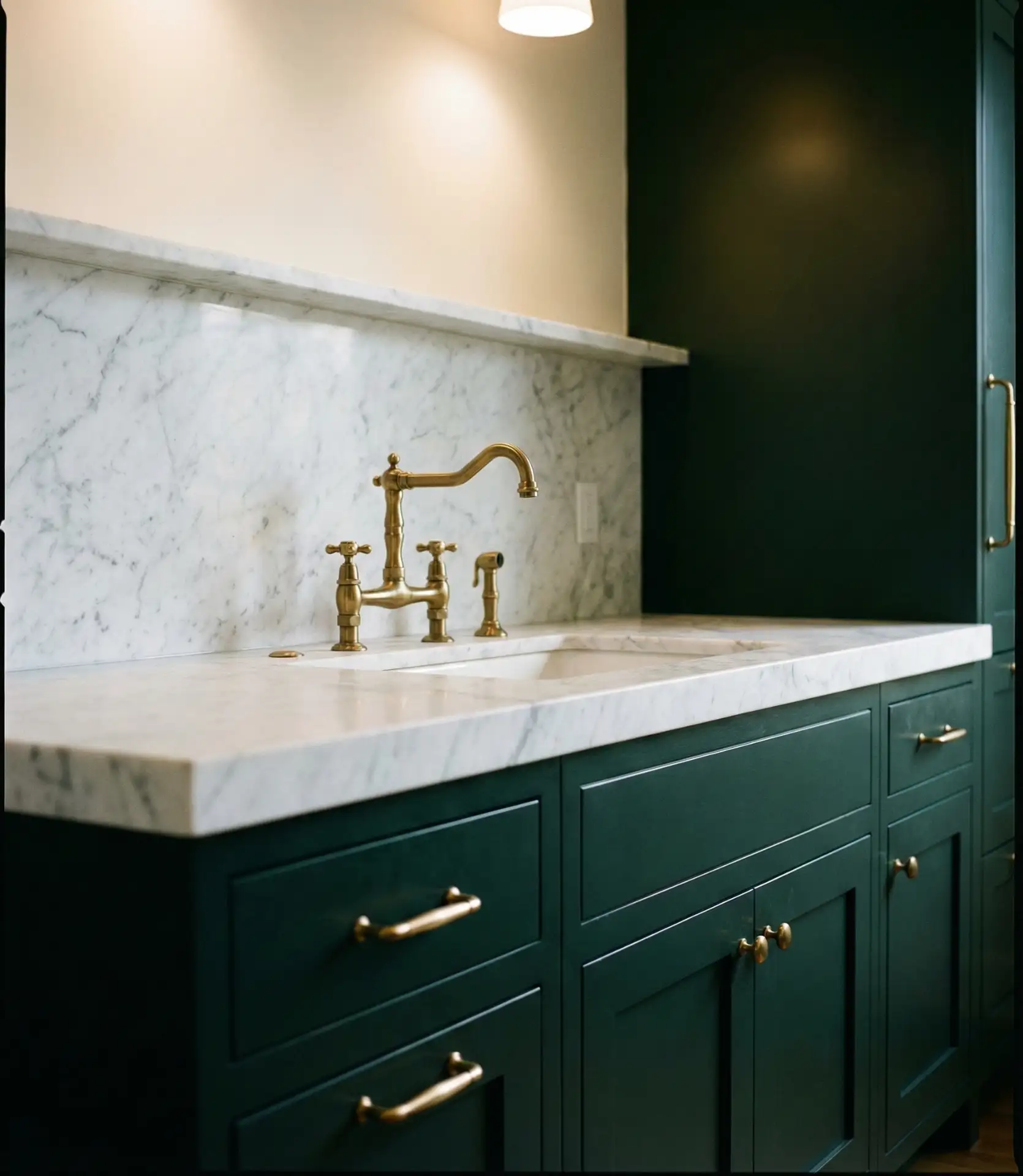
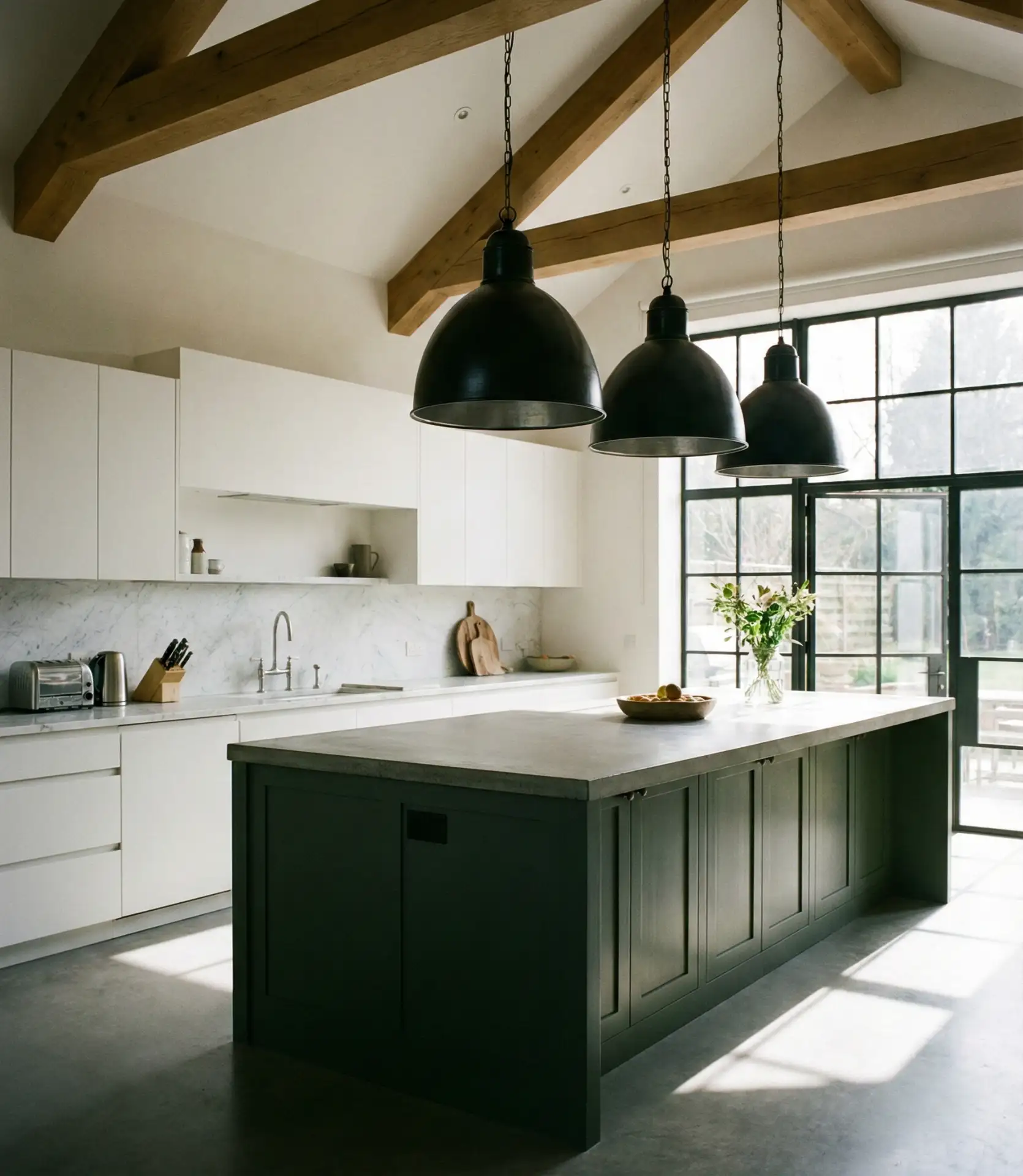
11. Dark Green Cabinets with Black Countertops
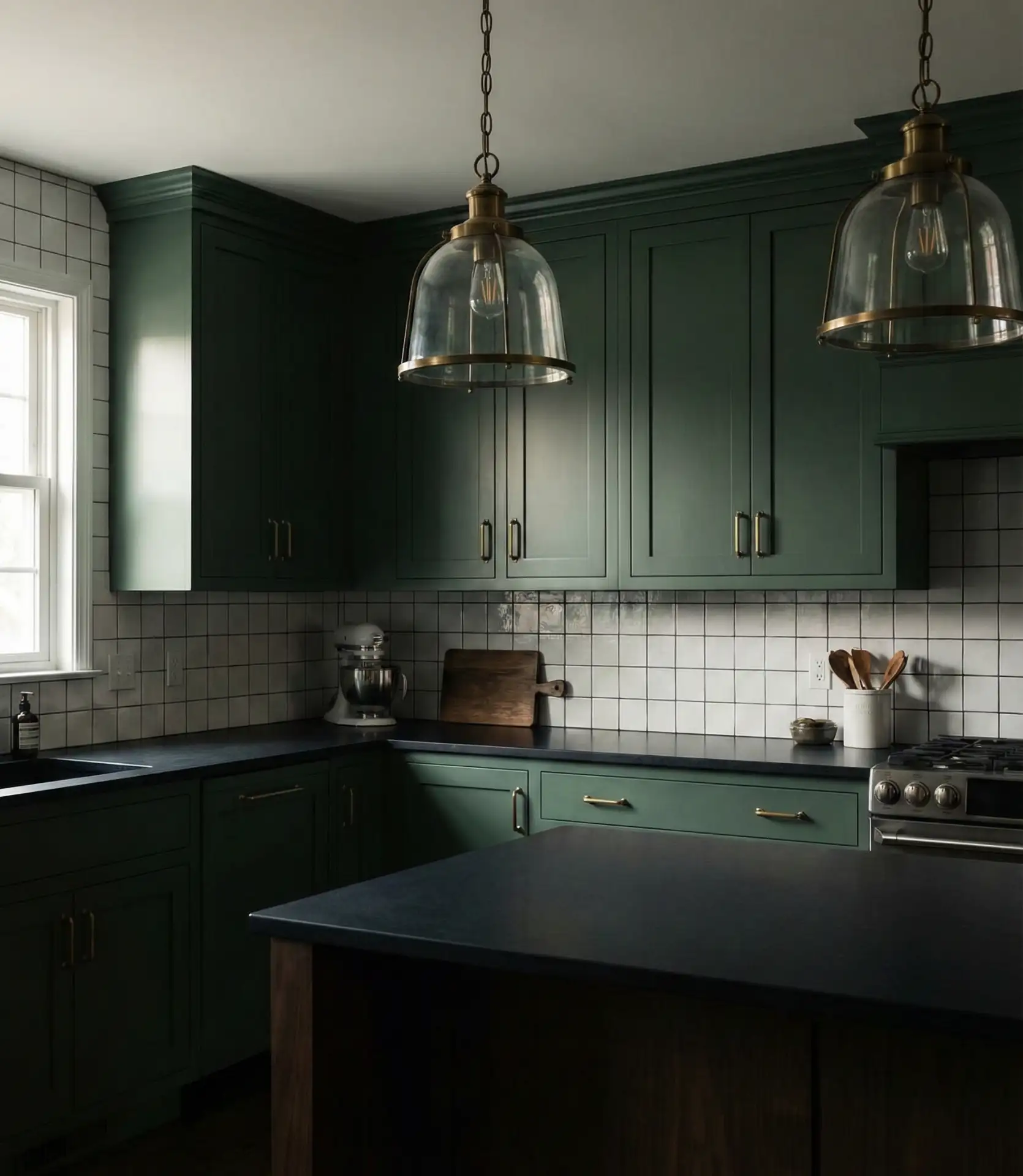
Dark green cabinets topped with black countertops create a moody, dramatic kitchen that’s perfect for design-forward homeowners. This bold pairing reads as sophisticated and grounded, especially when balanced with plenty of natural light and warm metal accents. It’s a look that defies the bright-white kitchen trend and instead embraces depth, contrast, and a bit of edge. Expect this combination to feel intimate and enveloping—ideal for evening entertaining and cozy weeknight dinners.
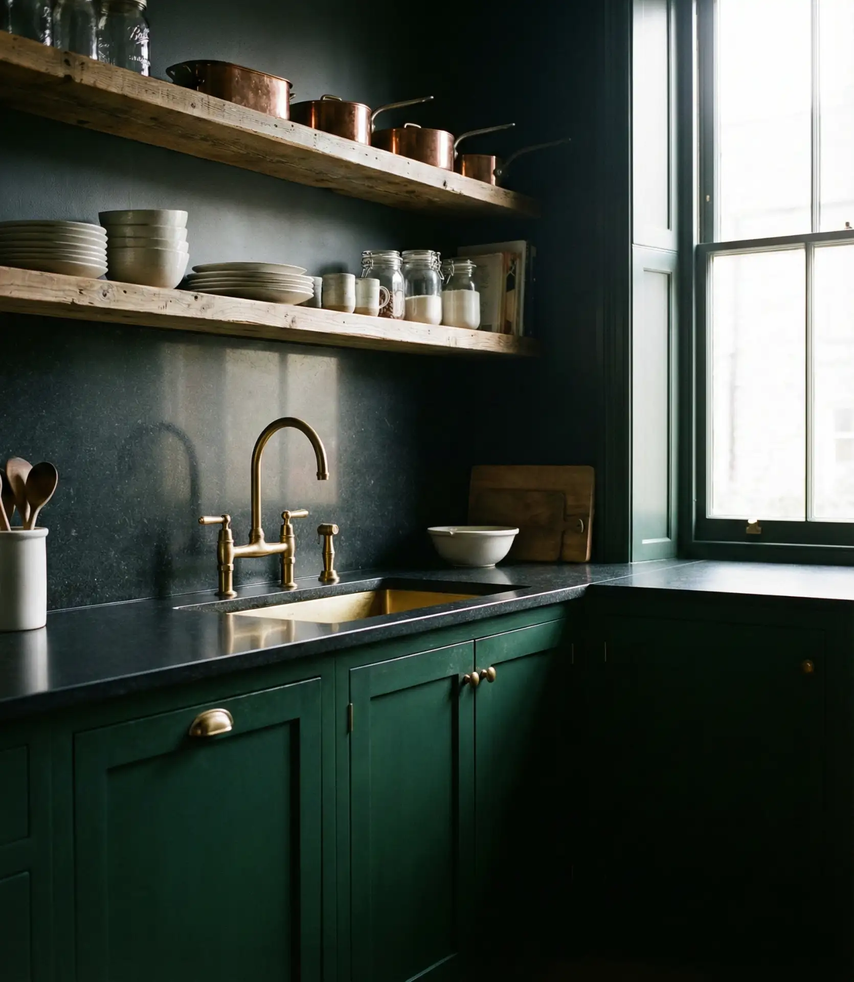
In the Pacific Northwest, where overcast days are common, homeowners are embracing this palette with layered lighting—under-cabinet LEDs, pendant lights, and even toe-kick lighting—to prevent the space from feeling too dark. The black countertops hide coffee stains and watermarks beautifully, making them surprisingly low-maintenance for busy households. Just avoid skimping on task lighting, or you’ll struggle to see what you’re chopping and cooking.
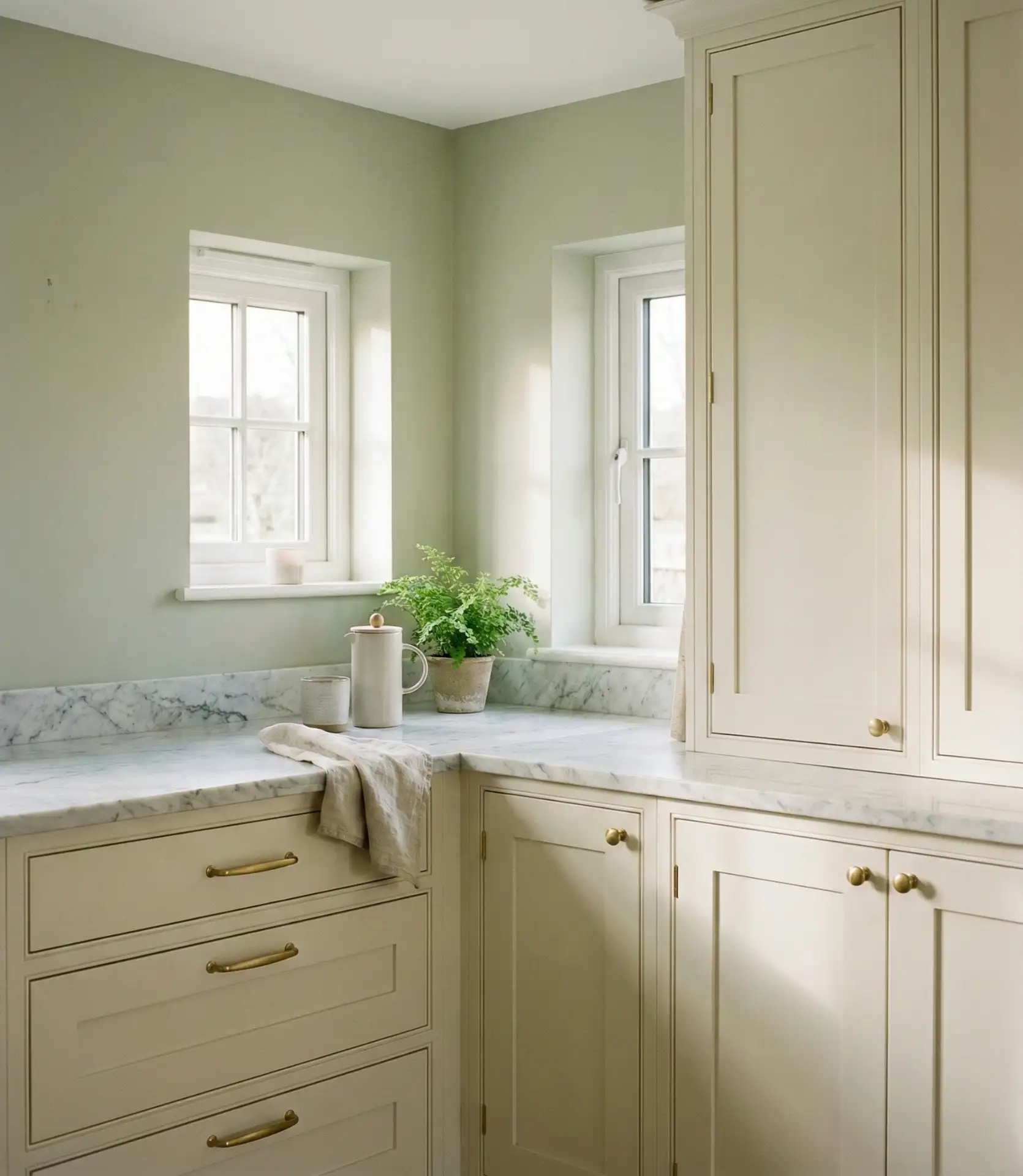
12. Vintage Green and Cream Kitchen
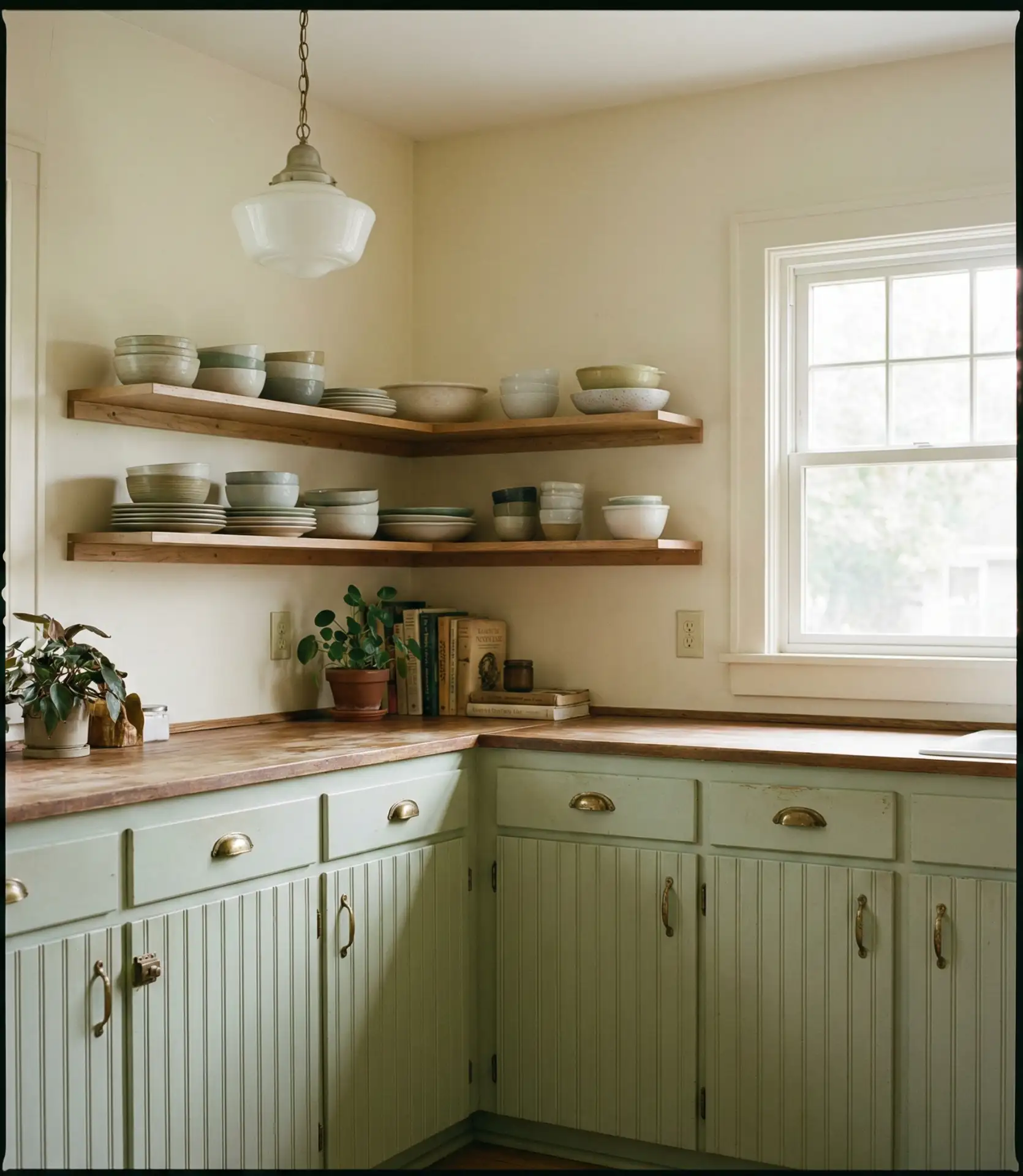
A vintage green and cream palette brings soft, old-world charm to American kitchens. Think muted sage or celadon cabinets paired with cream walls, countertops, or backsplashes. This combination feels collected and lived-in, perfect for older homes or new builds aiming for a cottage or farmhouse aesthetic. The warmth of cream softens the coolness of green, creating a balanced, inviting space that feels like it’s been loved for generations.
Where it works best: in kitchens with original architectural details like crown molding, wainscoting, or vintage tile. The green-and-cream palette enhances these features rather than competing with them. It’s also a forgiving combination that hides minor imperfections and wear, making it ideal for homes with character and history. Avoid ultra-modern appliances or fixtures—they’ll clash with the vintage vibe.
13. Green Kitchen Color Palettes for Open-Concept Homes
Choosing the right color palettes for an open-concept home means thinking beyond the kitchen. Green works beautifully when it’s echoed in adjacent spaces through textiles, artwork, or accent walls. Soft greens like sage or celadon create flow, while darker greens can define the kitchen as its zone. The key is balance—too much color can feel overwhelming, while too little makes the green feel random or disconnected from the rest of the home.
Experts suggest using green as your anchor color and repeating it in two or three other places—a rug, a piece of art, or even dining chairs. This creates a visual rhythm without feeling overly coordinated or matchy-matchy. In open-concept homes, the kitchen often sets the tone for the entire first floor, so the green you choose here will influence paint colors, furniture, and accessories throughout the space.
14. Modern Green Kitchen with Island and Pendant Lighting
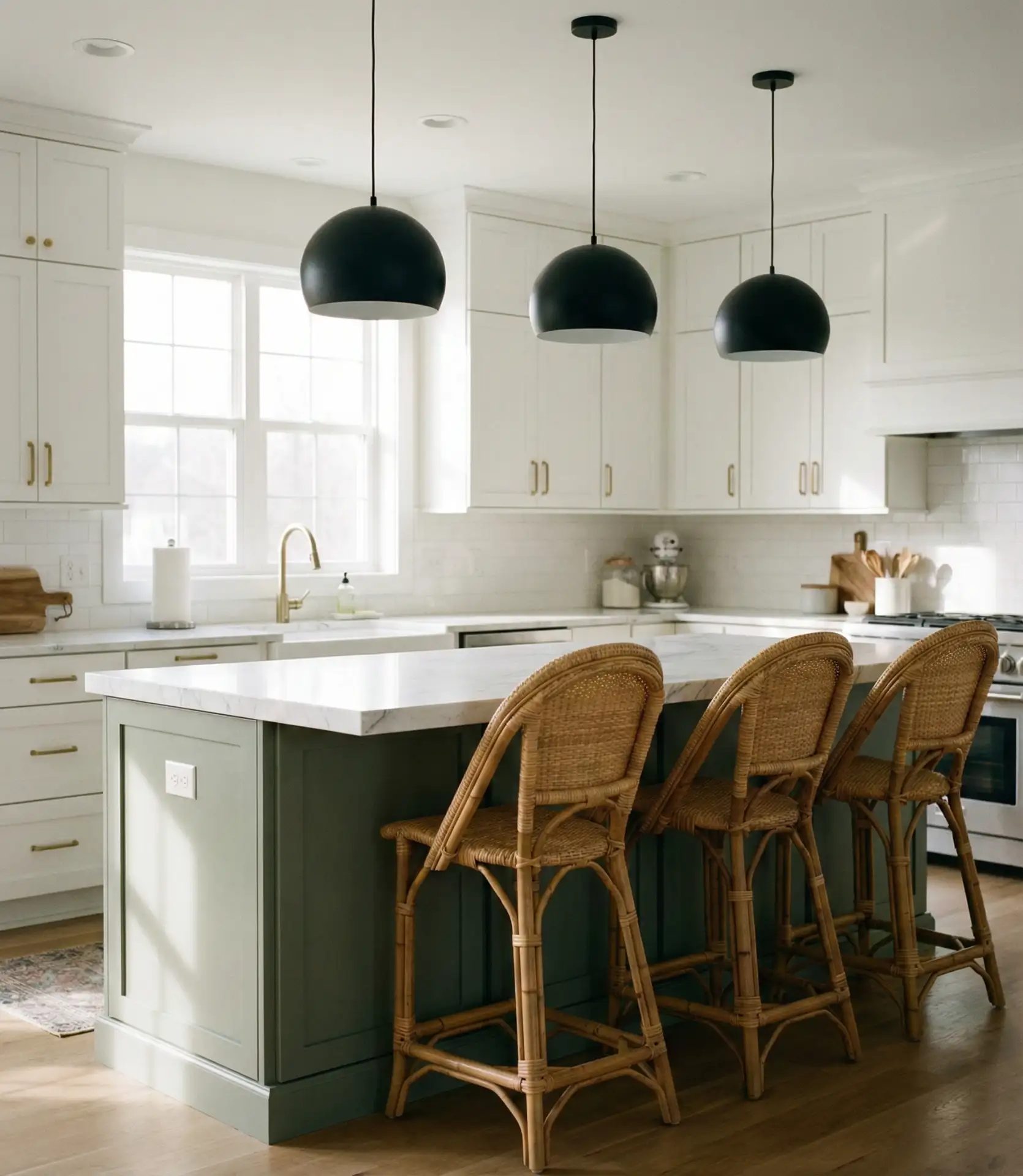
An island and statement pendant lighting in a modern green kitchen create a harmonious blend of functionality and design. The island anchors the space, while the pendants draw the eye upward and add visual interest. Green cabinetry grounds the look, and the lighting becomes an opportunity to introduce metallics—brass, black, or even copper—that complement the green without overwhelming it. This setup is especially effective in kitchens with high ceilings, where the pendants help fill vertical space.
A neighbor in Denver recently installed oversized dome pendants in matte black above her sage green island, and the transformation was immediate. The lighting added drama and definition, turning the island into a true focal point. She mentioned that choosing pendants with dimmers was key—it allowed her to adjust the mood from bright and task-focused during meal prep to soft and ambient during dinner parties.
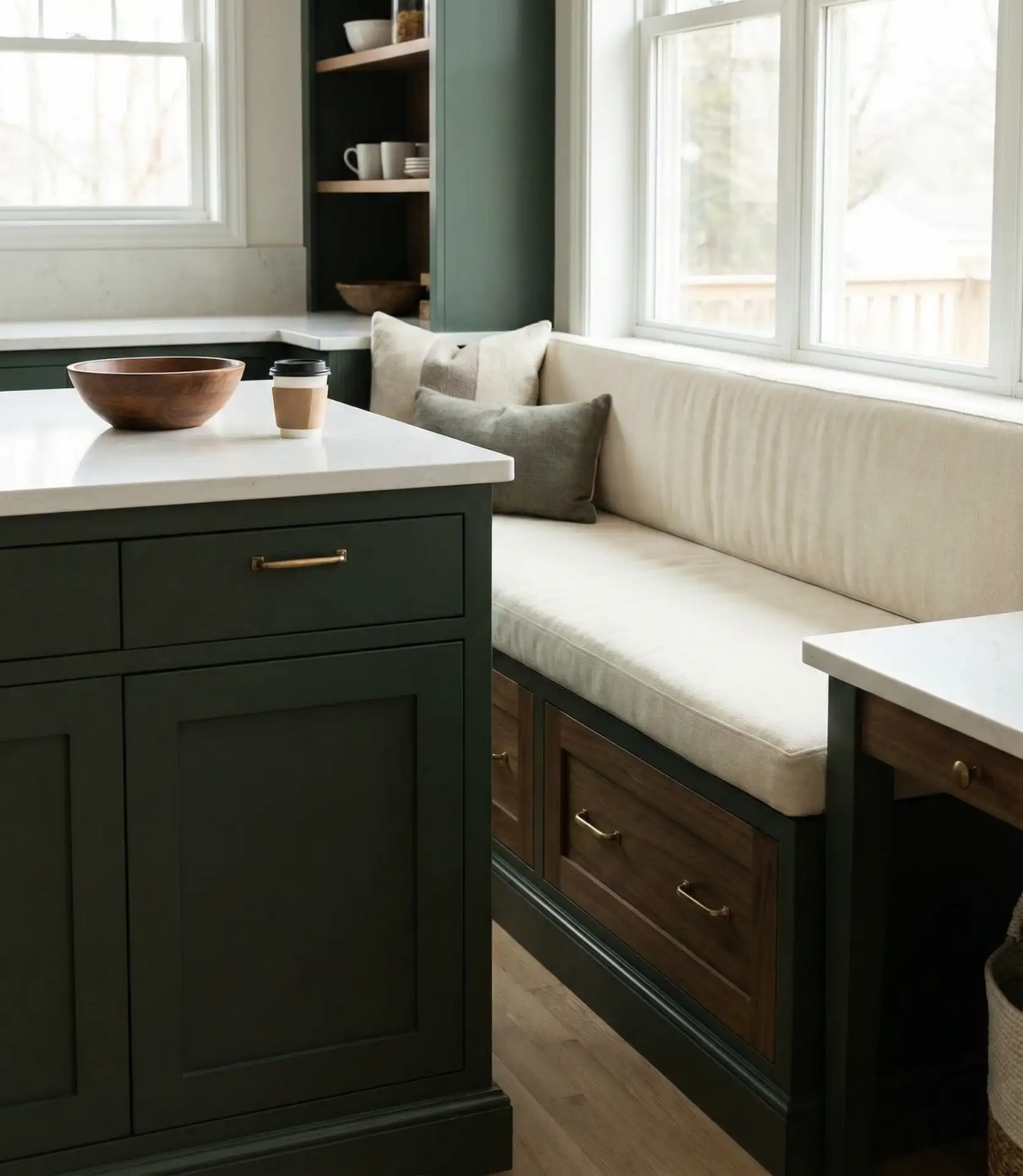
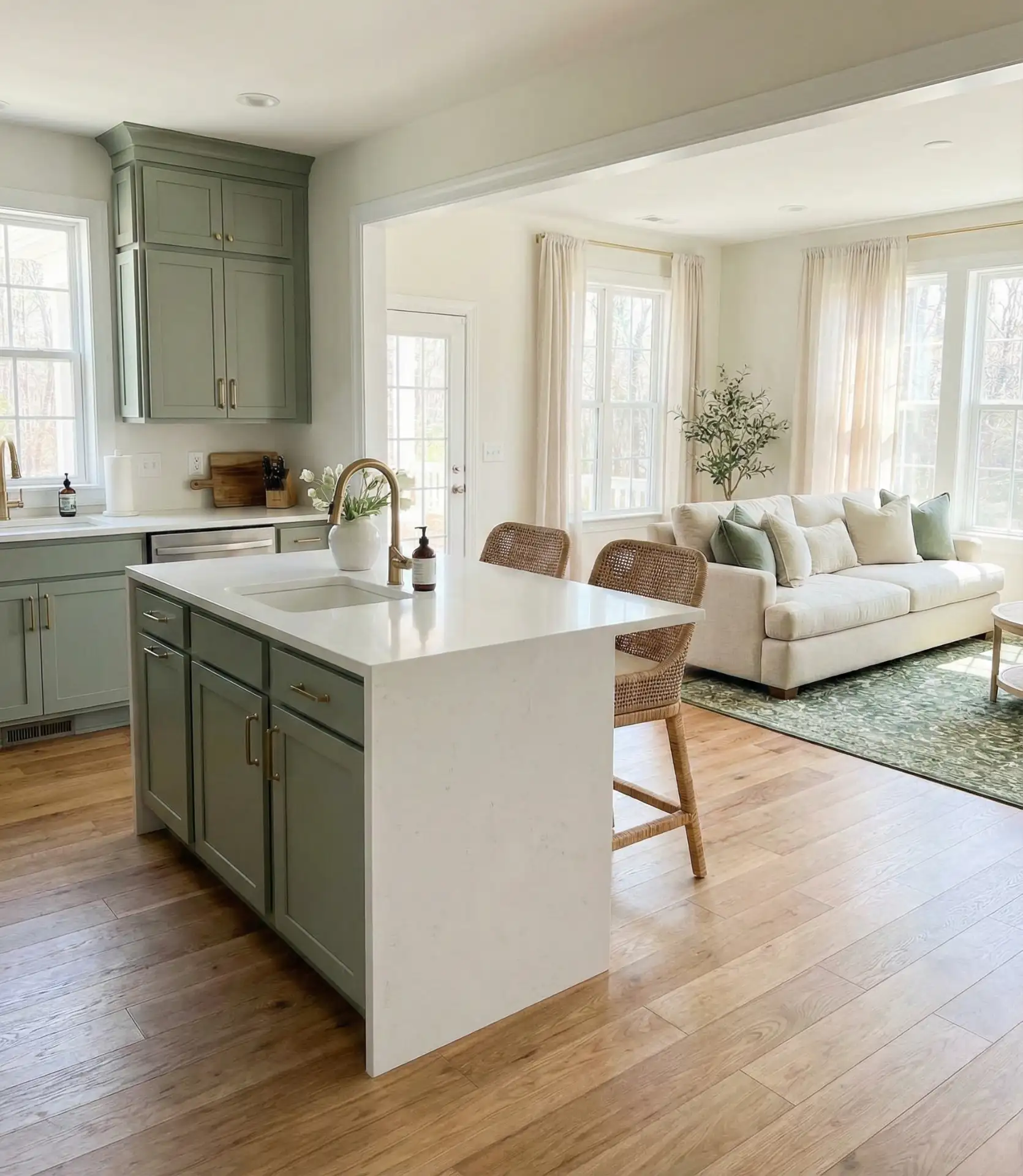
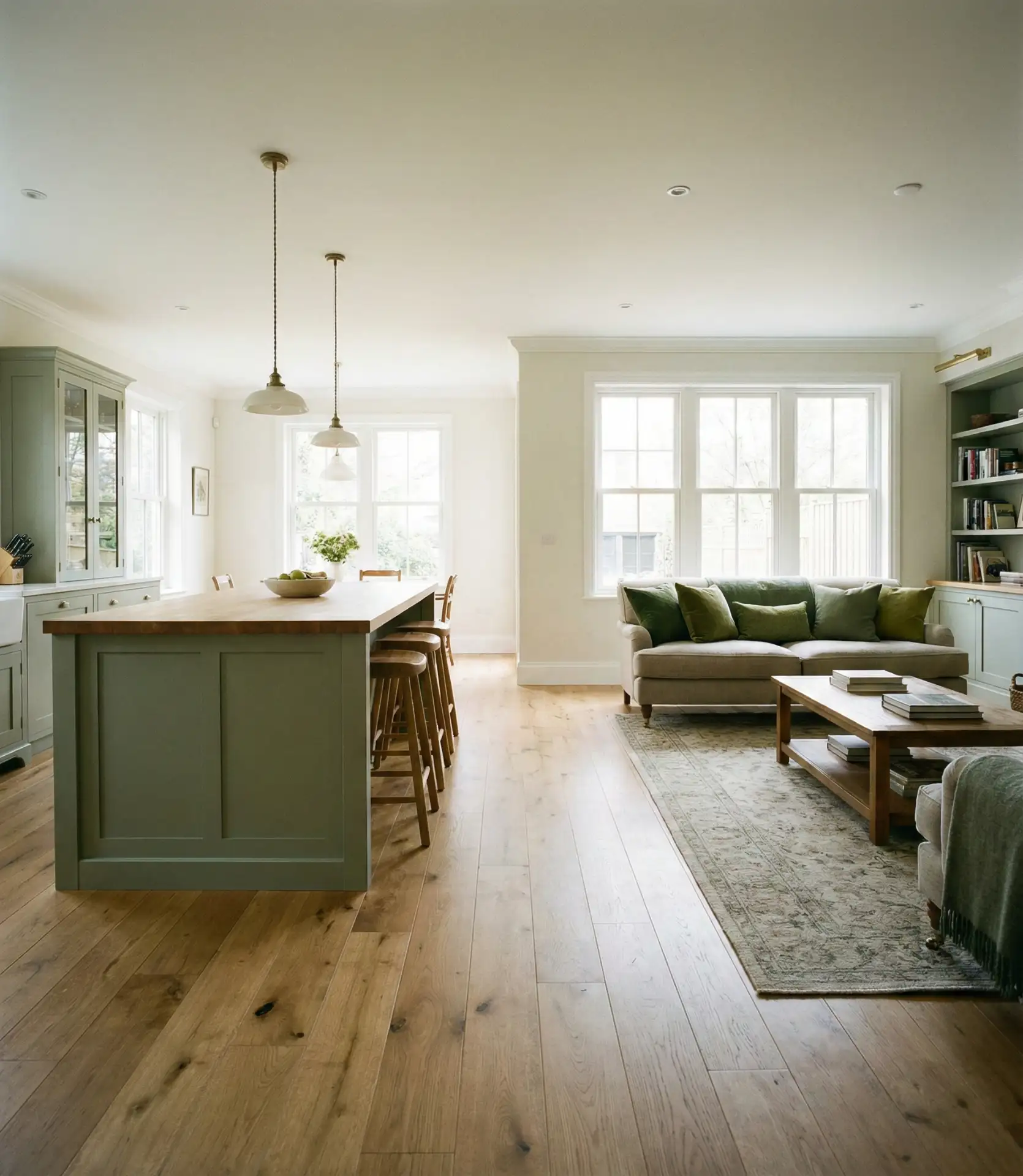
15. Green Kitchen with Living Room Integration

Integrating a green kitchen with a living room requires thoughtful color coordination and spatial planning. Green can either blend seamlessly with the living area or serve as a subtle divider, depending on the shade and how it’s applied. Lighter greens like mint or sage create continuity, while darker greens provide definition. The goal is to make both spaces feel connected yet distinct, allowing for effortless flow while maintaining visual interest and purpose in each zone.
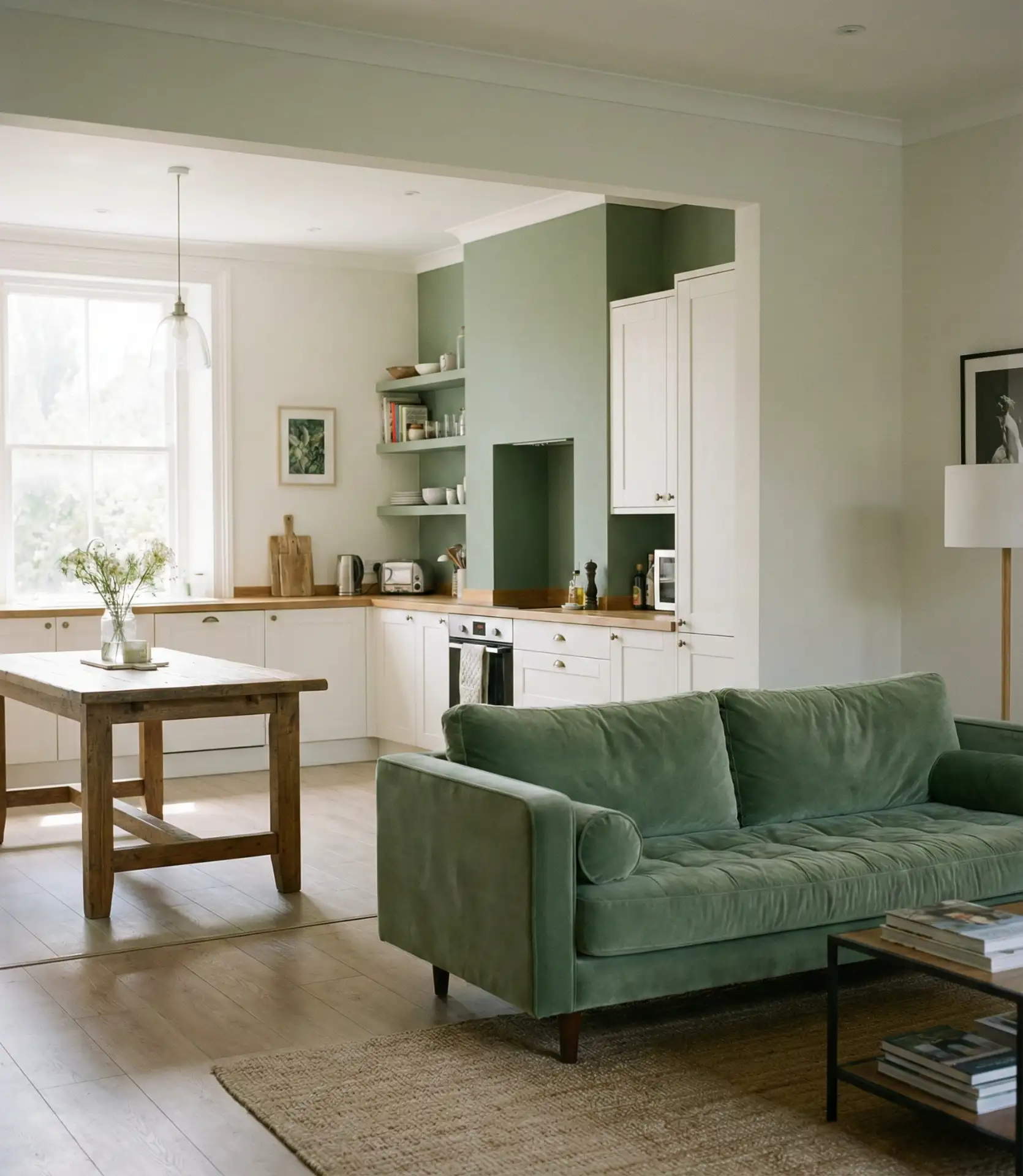
In American ranch-style homes, this layout is increasingly common. Homeowners are using green as a unifying thread—perhaps green cabinets in the kitchen and a green accent chair or throw blanket in the living room. This creates harmony without requiring every surface to match. It’s a flexible approach that allows each space to have its identity while still feeling like part of a cohesive whole.
16. Indian-Inspired Green Kitchen Design
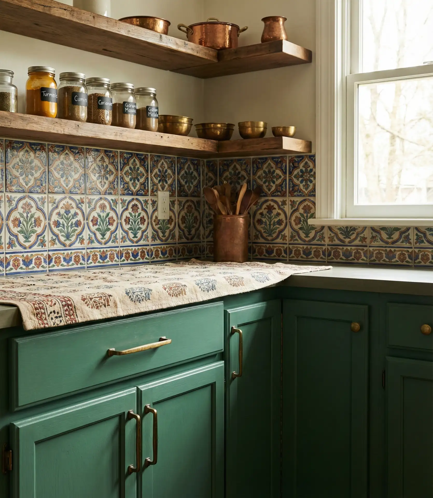
Indian design influences bring rich, saturated greens into American kitchens, often paired with intricate tile work, brass accents, and warm wood tones. Think deep jade or emerald cabinetry with hand-painted or patterned backsplash tiles. This style celebrates color and craftsmanship, creating kitchens that feel vibrant and full of life. It’s a departure from minimalist trends and appeals to homeowners who want their kitchen to reflect global influences and personal heritage.
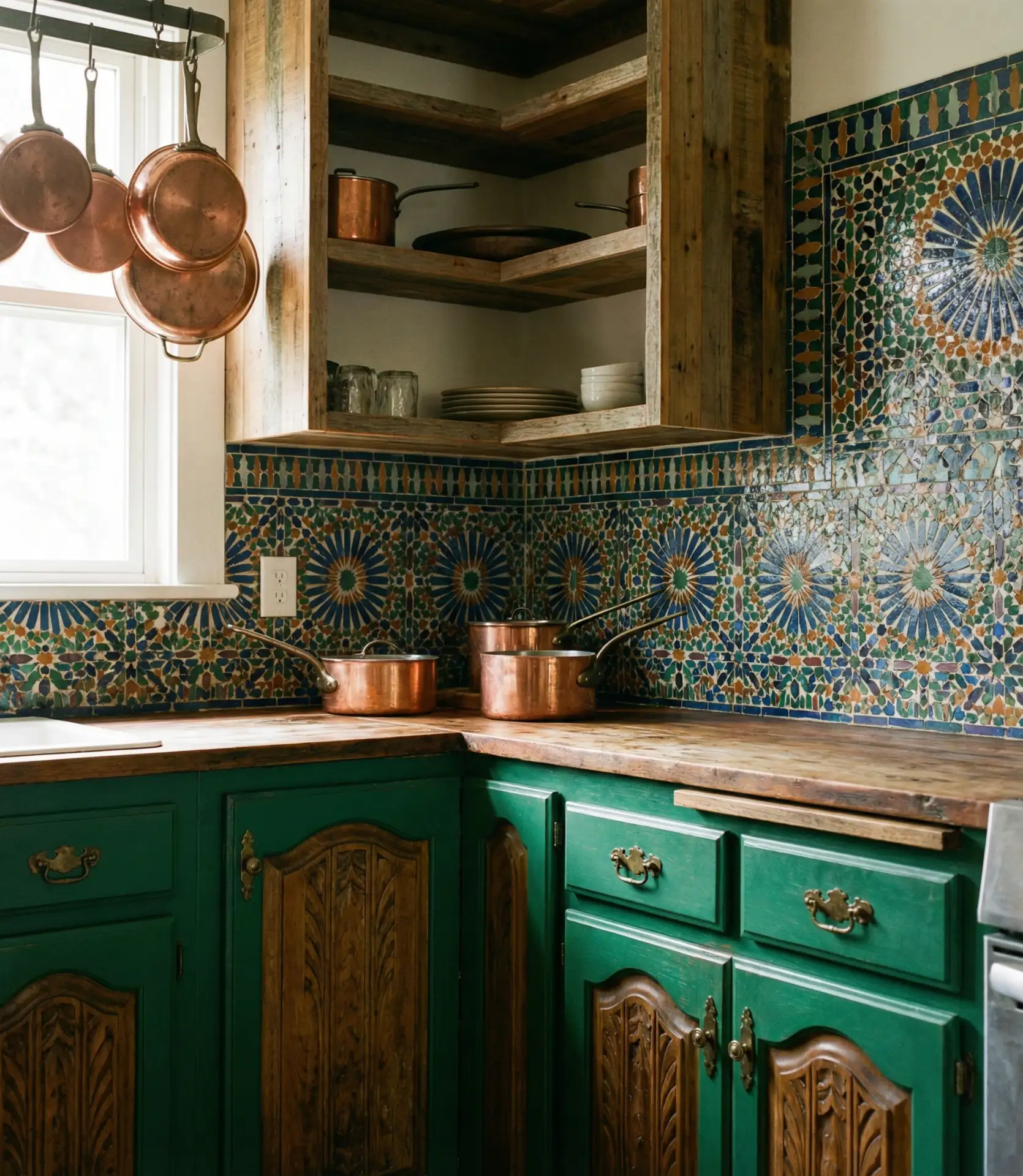
Budget angle: Indian-inspired tile can range from $5 to $40 per square foot depending on whether you choose mass-produced ceramic or hand-painted artisan pieces. The green cabinetry itself can be achieved affordably with paint, making this a look that adapts to various price points. By balancing the cost, you can achieve the desired aesthetic without going over budget.
17. Green Kitchen Walls with Neutral Cabinetry
Painting walls green while keeping cabinetry neutral is a smart, low-commitment way to introduce color. This approach is ideal for renters or homeowners who want flexibility—paint is simple to change, while cabinets are a bigger investment. Soft greens like celadon or seafoam work beautifully with white, cream, or light wood cabinets, creating a calm, cohesive backdrop that’s both personal and adaptable to evolving tastes and trends over time.
Real homeowner behavior: Many people start with green walls to test the color before committing to cabinets. If they love it, they might later add a green island or swap out a few cabinet doors. If they tire of it, repainting is a weekend project rather than a full renovation. This staged approach reduces risk and allows homeowners to live with the color before making permanent decisions.
18. IKEA Green Kitchen Cabinets Customization
IKEA kitchens are a budget-friendly base that many Americans customize with paint or aftermarket fronts. Green is a popular choice for this DIY transformation—homeowners buy white or wood-grain IKEA cabinets and either paint them or order custom green fronts from third-party suppliers. This method offers a luxurious appearance at a significantly lower cost, while also providing the satisfaction of a DIY project that showcases personal style and creativity.
Common mistake: skipping proper prep work. IKEA laminate fronts require a suitable primer designed for slick surfaces, or the paint will chip and peel. Sanding lightly and using a bonding primer ensures durability. Many DIYers report excellent results with this method, achieving custom color for around $500–$1,000 in paint and supplies—far less than buying pre-finished custom cabinets from a specialty supplier.
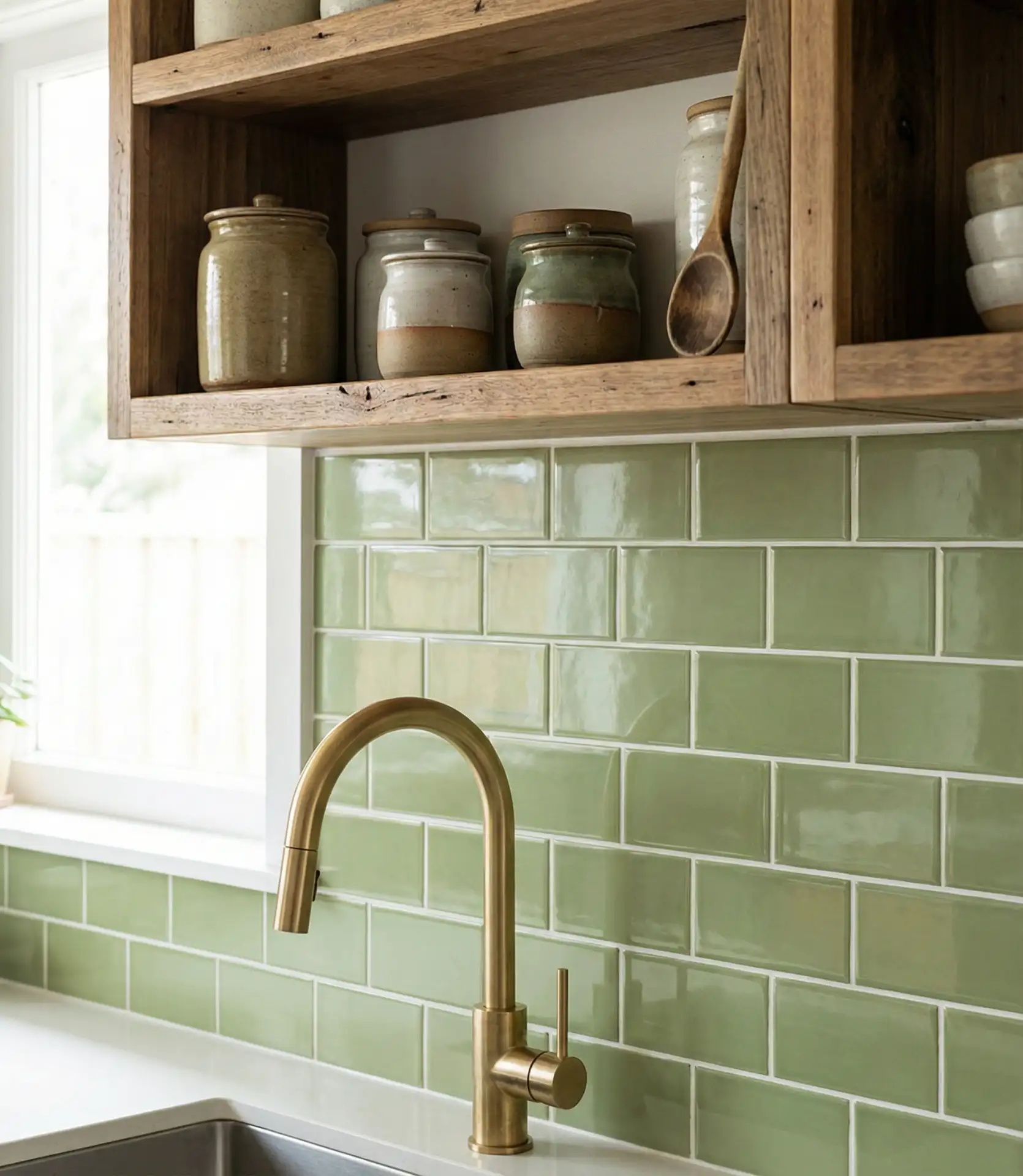
19. Green Tile Accent Wall in Modern Kitchens
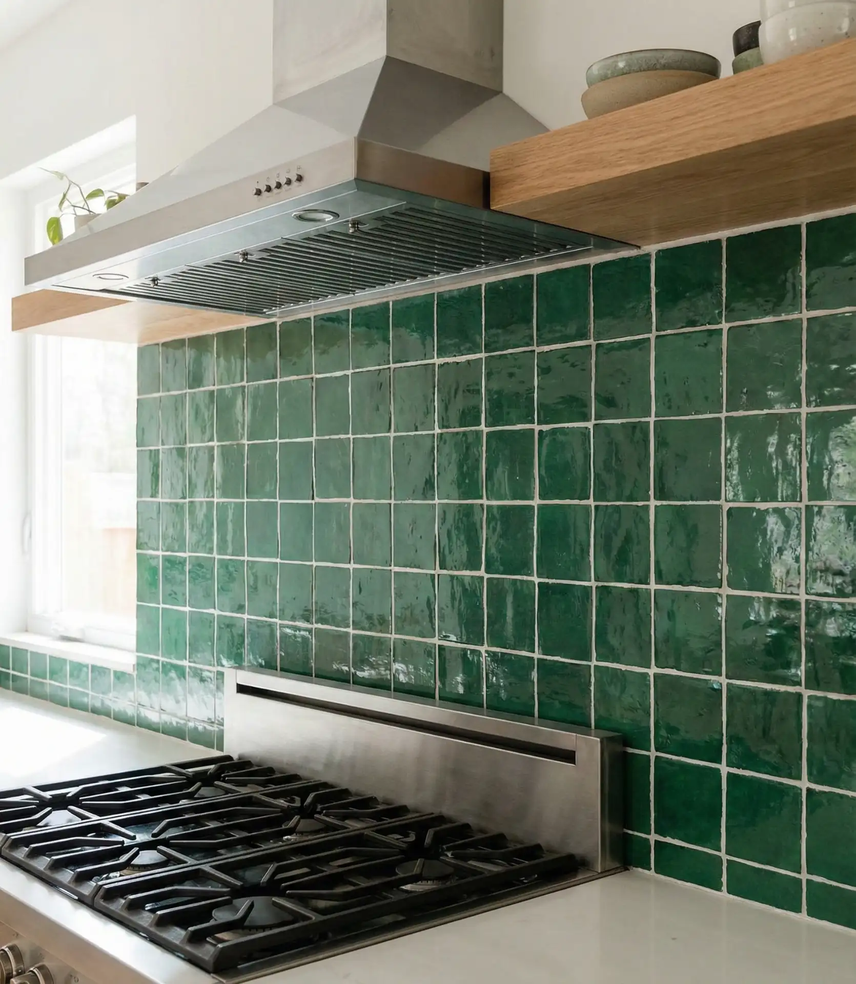
A green tile accent wall—often behind the range or sink—adds a bold focal point without overwhelming the entire kitchen. This strategy works especially well in modern spaces where clean lines and restrained palettes dominate. The tiles can be glossy subway, matte zellige, or geometric shapes, each offering a different texture and vibe. It’s a way to introduce color in a controlled, impactful way that elevates the kitchen from functional to memorable.
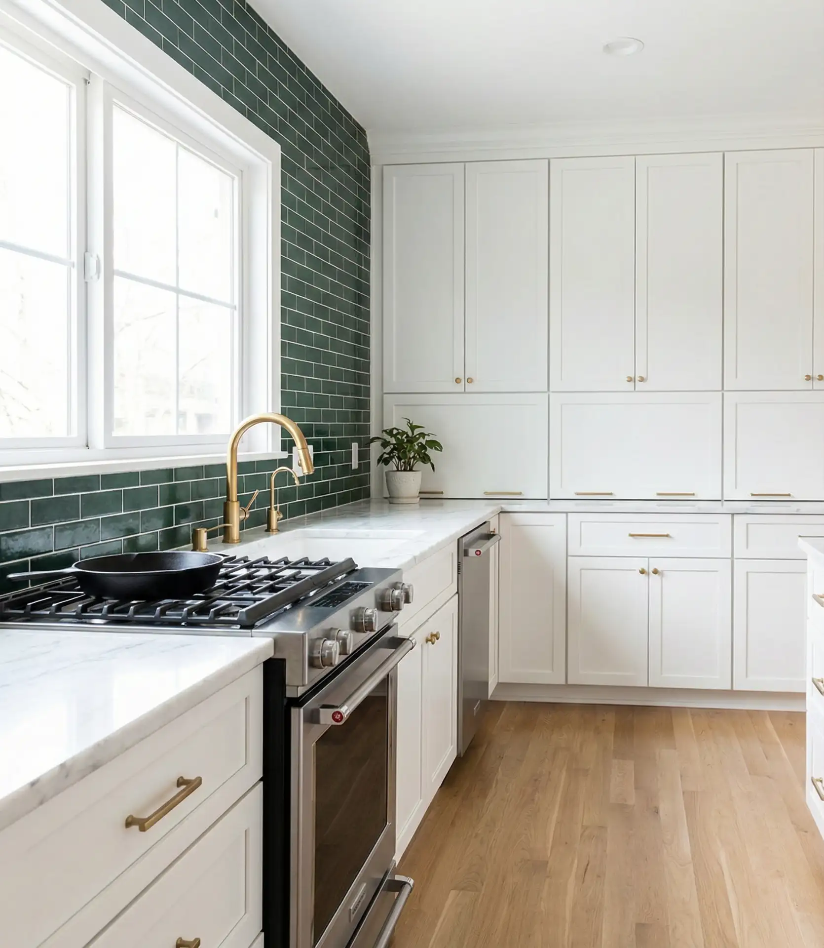
Where it works best: in kitchens with simple, neutral cabinetry where the tile can truly shine. If your cabinets are already busy or colorful, a green tile wall may feel like too much. But in a white or light wood kitchen, it becomes the perfect pop of personality. The glossy finish reflects light beautifully and is simple to wipe clean—a practical bonus in a hardworking kitchen.
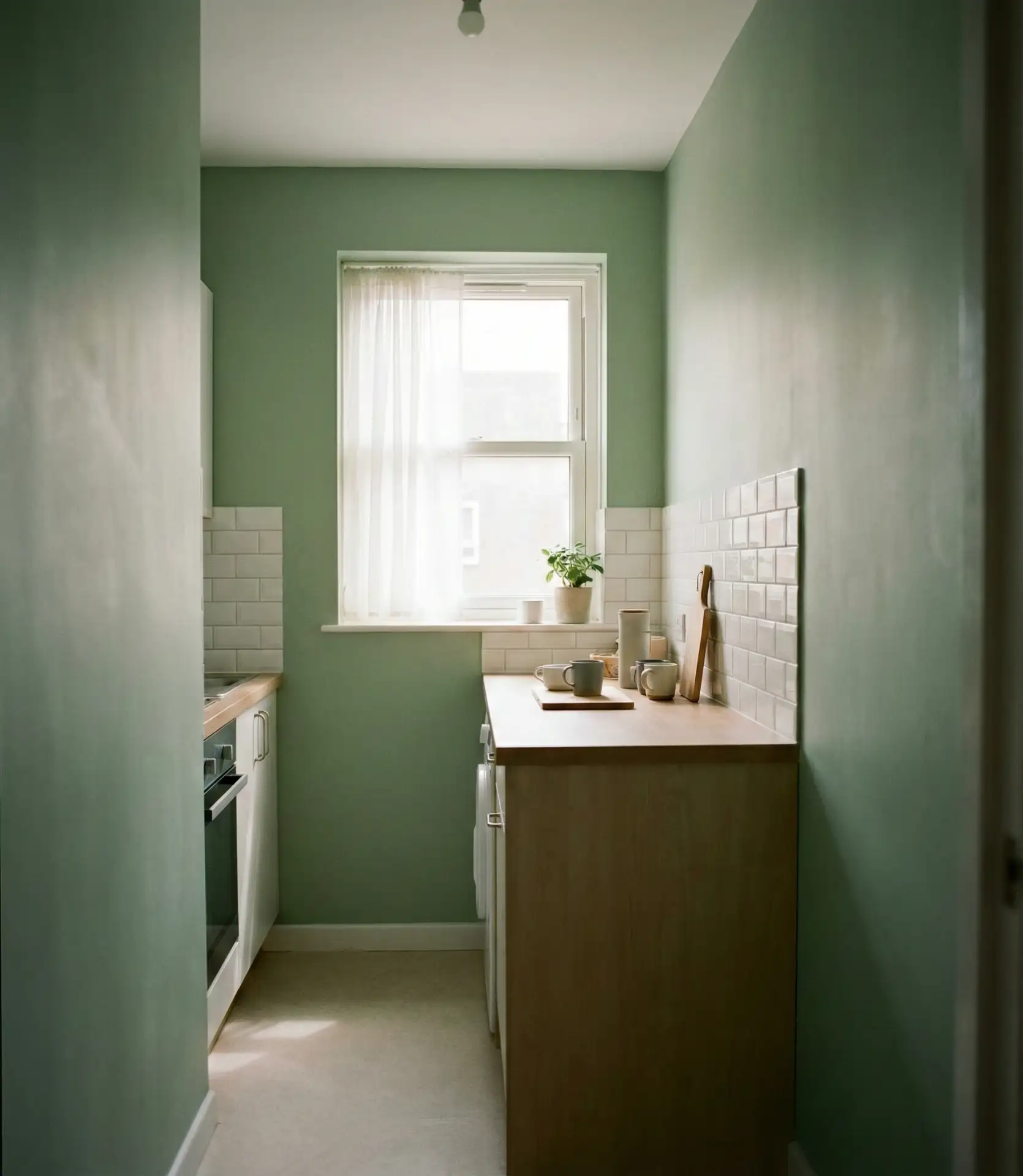
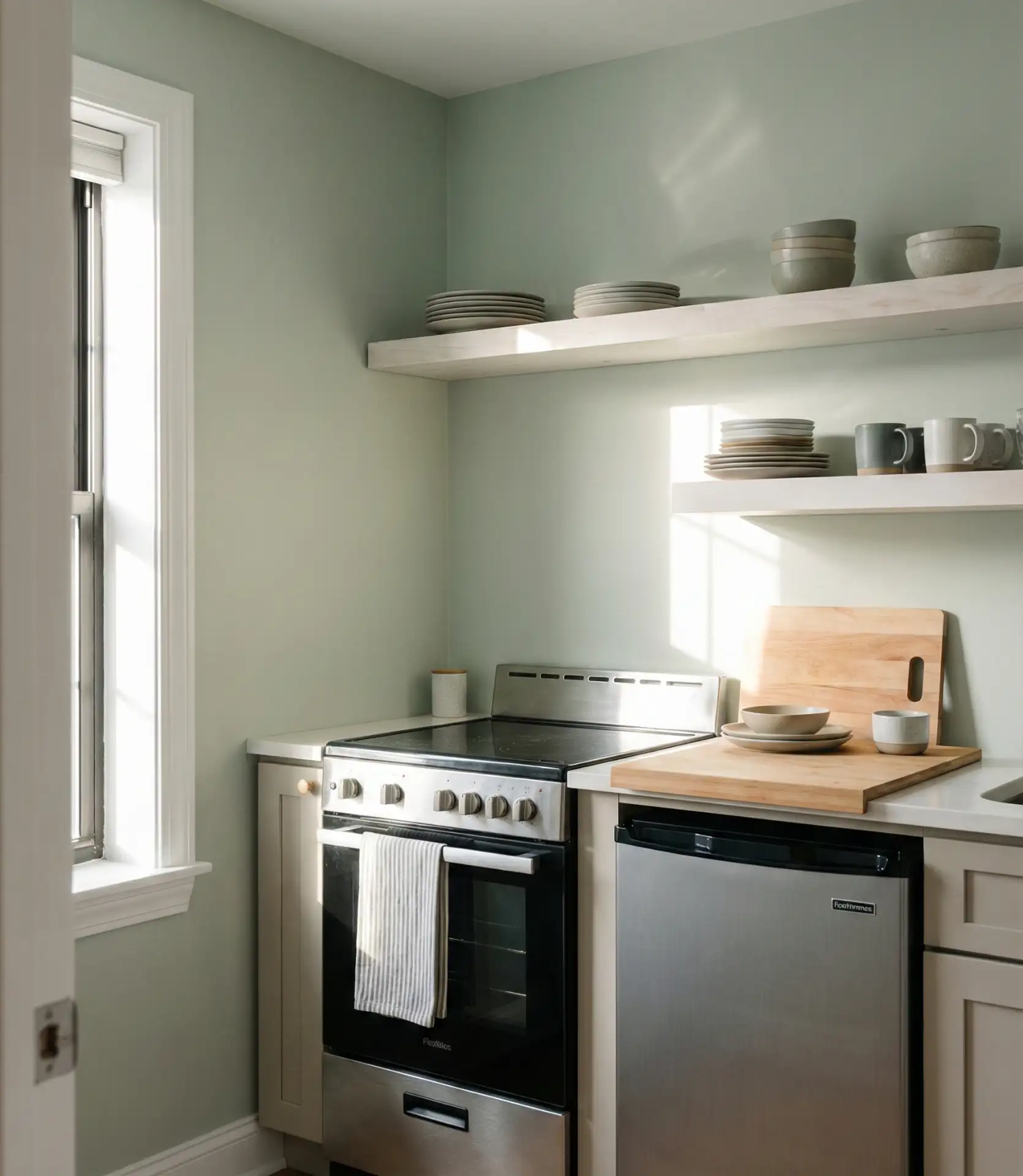
20. Green Kitchens in Small Apartment Spaces
Small apartment kitchens benefit from light- to mid-tone greens that reflect natural light and create a sense of openness. Avoid very dark greens in tight spaces unless you’re prepared to add significant artificial lighting. Soft sage, mint, or celadon work beautifully, especially when paired with white or light wood. The green adds personality and warmth without making the space feel cramped, and it photographs well—important for renters sharing their spaces on social media.
Practical insight: removable wallpaper in green tones is a game-changer for renters. It allows full customization without losing a security deposit. Many brands now offer peel-and-stick options that look remarkably like paint or tile, giving renters the freedom to express personal style in even the most restrictive lease situations. It’s also an affordable way to test a color before committing to something more permanent.
21. Green Kitchen with Statement Lighting Fixtures
Pairing green cabinetry with statement lighting fixtures creates a layered, designer look. The lighting becomes jewelry for the kitchen—whether it’s a sculptural chandelier, industrial pendants, or modern sconces. This approach works because the green provides a rich, grounded backdrop that allows the lighting to pop. It’s especially effective in kitchens with high ceilings or open layouts, where dramatic lighting can fill vertical space and create visual interest at multiple levels.
Expert-style commentary: lighting designers recommend thinking about layers—ambient, task, and accent. In a green kitchen, ambient light might come from recessed cans, task light from under-cabinet strips, and accent light from statement pendants or a chandelier. The green absorbs light differently than white, so you’ll often need more lumens to achieve the same brightness. Dimmer switches are essential to control mood and functionality throughout the day.
22. Green and Gold Kitchen for a Luxe Look
Green and gold is a classic pairing that exudes elegance and warmth. Whether it’s brass hardware, gold-toned light fixtures, or even gold-veined marble, the combination feels instantly luxurious. Deep greens like emerald or hunter work especially well with gold, creating a rich, jewel-toned palette that’s both timeless and on-trend. This look is popular in homes aiming for a collected, sophisticated aesthetic that feels intentional rather than builder-grade or generic.
American lifestyle context: this combination is especially popular in historic neighborhoods and renovated brownstones, where homeowners want to honor traditional craftsmanship while adding modern function. The green-and-gold palette nods to classic design while feeling fresh and current. It’s a look that appeals to homeowners who value quality, longevity, and a bit of glamour in their everyday spaces.
These green kitchen ideas prove that color doesn’t have to be risky—it can be grounding, versatile, and deeply personal. Whether you’re drawn to soft pastels or moody jewel tones, there’s a green that fits your space, budget, and style. We’d love to hear which idea resonates with you most. Drop a comment below and share your thoughts or your green kitchen journey.