If your bedroom walls are starting to feel a little worn out, you’re not alone—search trends and Pinterest boards in 2026 are overflowing with Americans ready to repaint, refresh, and reimagine their most personal spaces. From moody midnight blues to sun-warmed sage greens, this year’s palette is all about intention: colors chosen not just to look beautiful but to actually change how a room feels to live in. Whether you’re designing a compact spare room or a sprawling master suite, the right paint color can significantly enhance the space more than any furniture. In this article, you’ll find some of the most inspiring bedroom paint ideas trending right now—with real context for how and where each one works best.
1. Sage Green Serenity
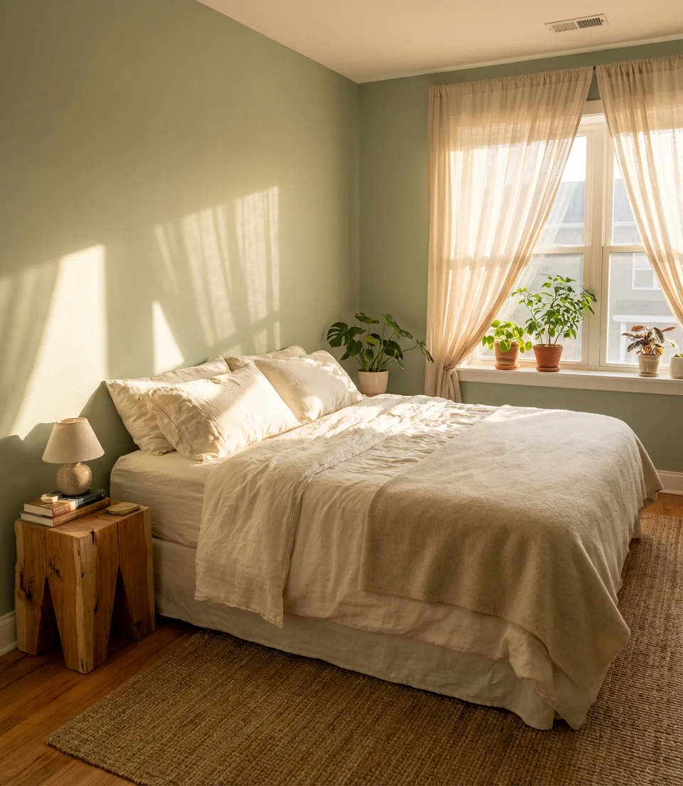
Sage green maintains its popularity because it strikes a unique balance between warmth and coolness, earthiness and airiness. In a master bedroom, it creates an instant sense of exhale. When combined with linen bedding, raw wood furniture, and ample natural light, the room becomes a serene sanctuary. It’s one of those neutral tones that reads differently at dawn versus dusk, which is exactly why designers keep reaching for it.
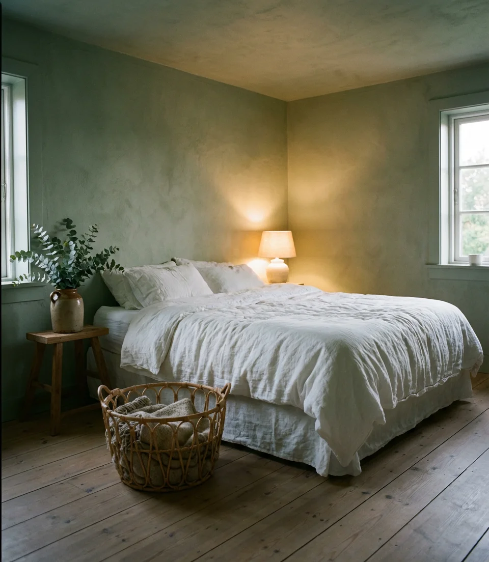
Sage green pairs especially well with warm whites on trim and ceilings—it keeps the palette cohesive without flattening the room. For the best results, test the paint in natural light at multiple times of day before committing. Some sage greens lean yellow in the afternoon and nearly gray by evening, so the undertone matters more than the chip in the store.
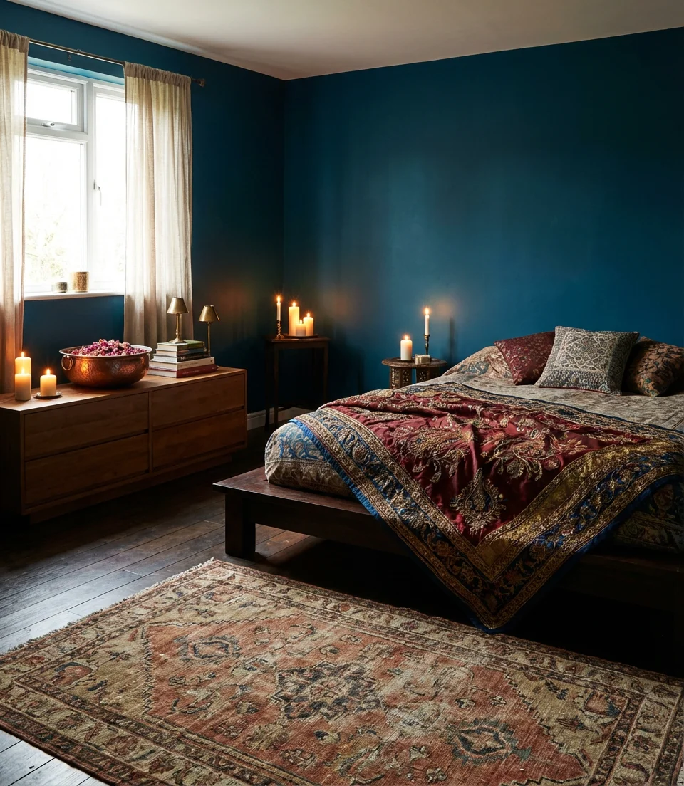
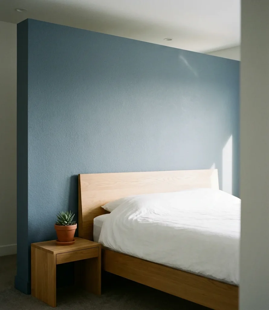
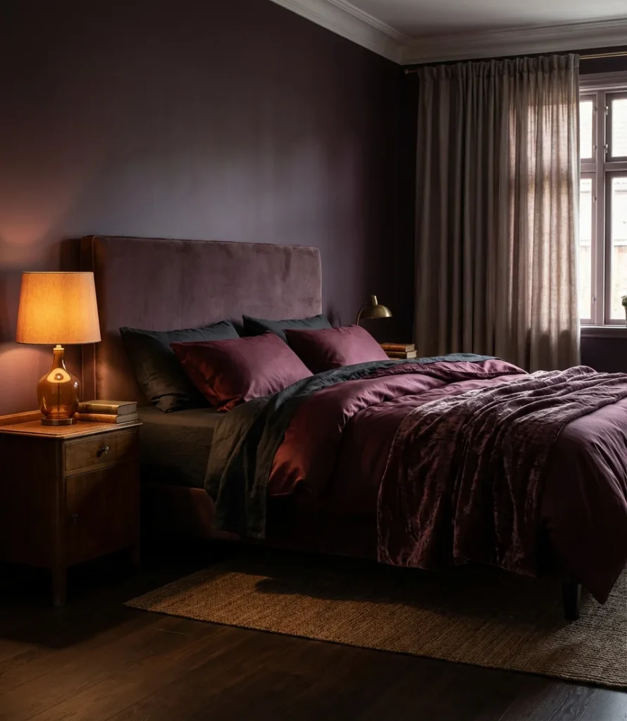
2. Moody Midnight Blue
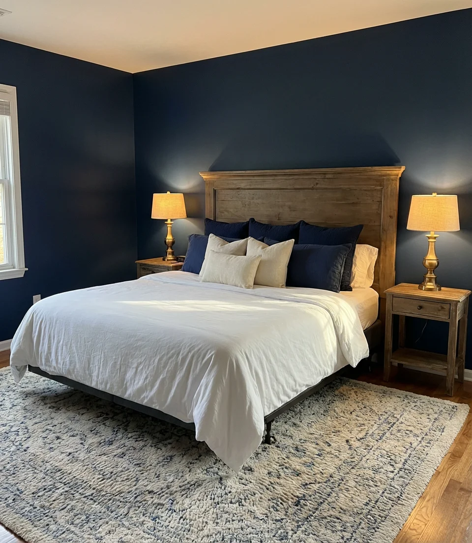
A deep, inky blue on all four walls might sound like a bold leap, but the effect in a bedroom is surprisingly intimate. Moody hues like navy, indigo, and slate blue wrap a room in the kind of cocoon-like calm that makes sleep feel inevitable. This aesthetic has become a Pinterest staple precisely because it photographs beautifully—rich, dramatic, and layered—and because it feels genuinely different from anything most people have lived with before.
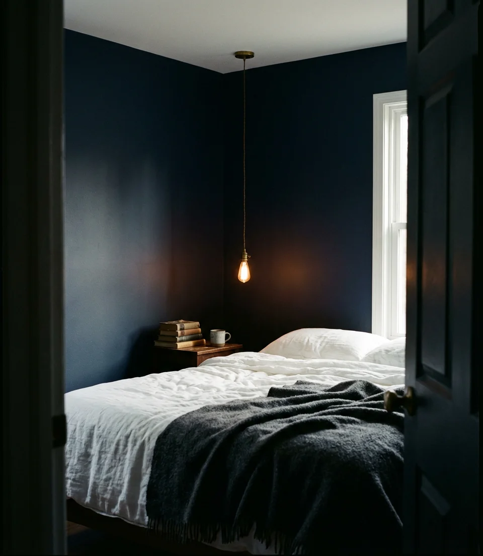
One common mistake is pairing a very dark blue with cold-toned lighting. Warm-spectrum bulbs (think 2700K) are essential here—they pull out the richness of the paint and keep the room from reading as a basement. Brass or gold hardware and fixtures help tremendously, adding just enough warmth to balance the depth of the walls.
3. Warm Terracotta for a Cozy Master
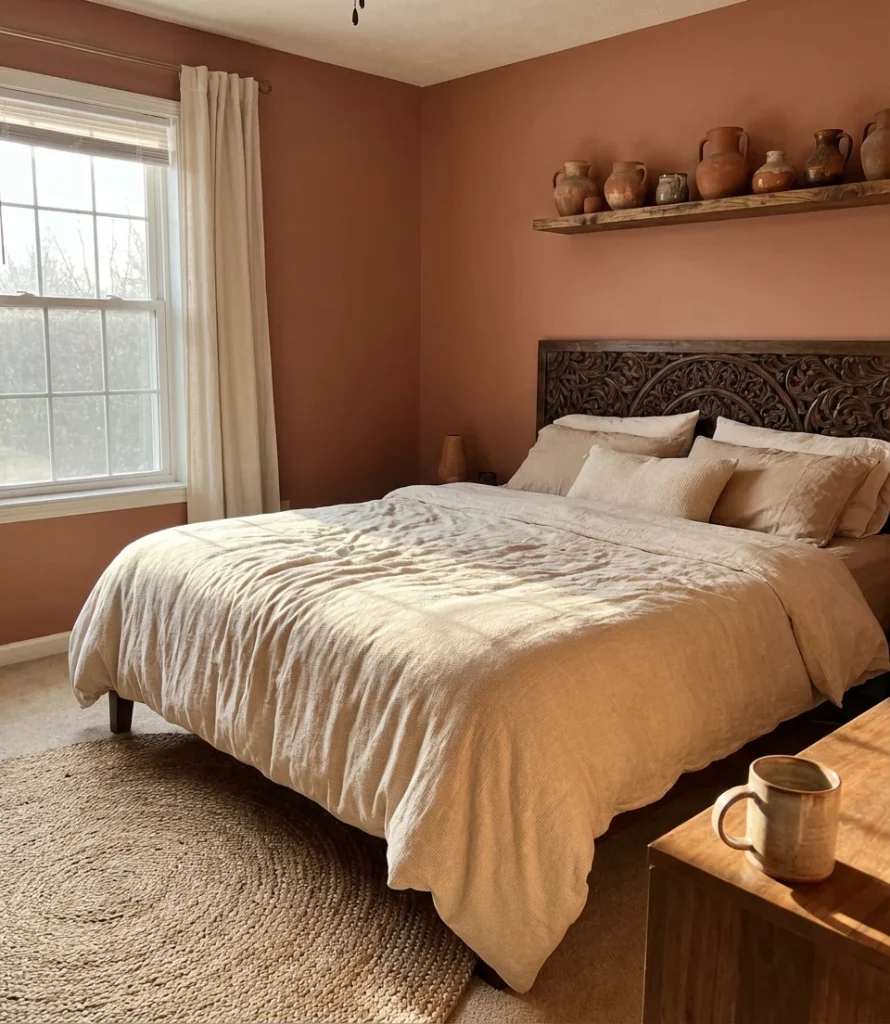
Terracotta never really went away—it just got more sophisticated. In a master color scheme for 2026, dusty terracotta reads as grounded and warm without the heaviness of a true red. It’s the color of sun-dried clay, of adobe walls in the Southwest, of slow mornings with coffee in bed. When used across all four walls in a master bedroom, it creates that golden-hour glow even at midnight.
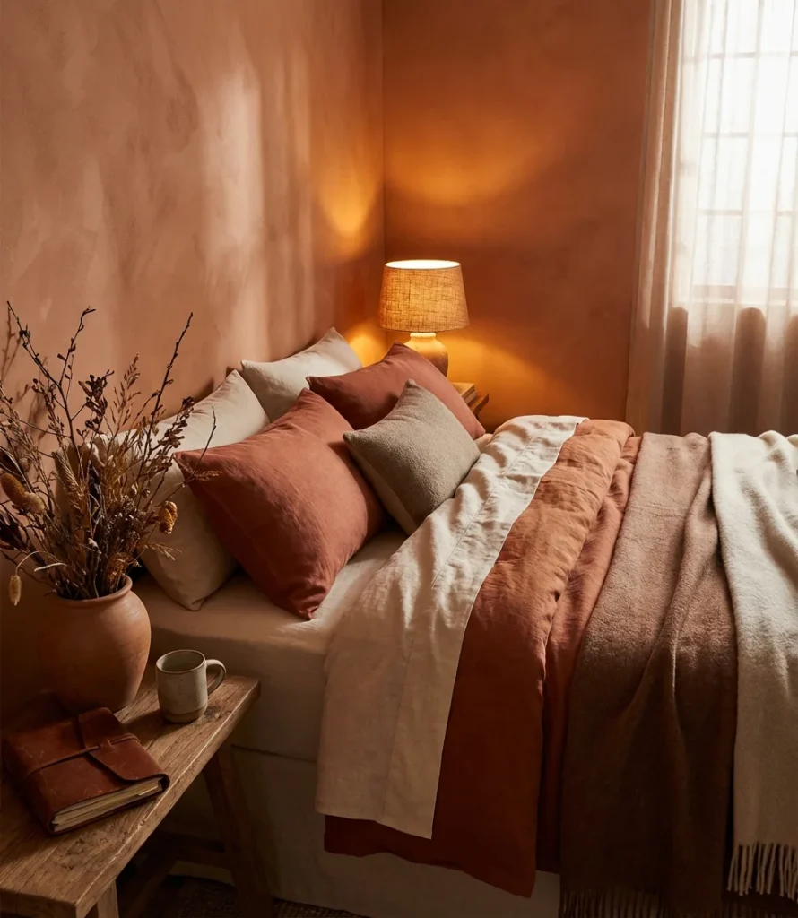
Terracotta works especially well in rooms with south- or west-facing windows. In those spaces, afternoon light transforms the walls into something almost amber. A Denver-based interior designer once described painting her client’s master bedroom in terracotta as “the single decision that made the whole house feel like a home.” The color has that kind of weight to it—it’s not just paint, it’s atmosphere.
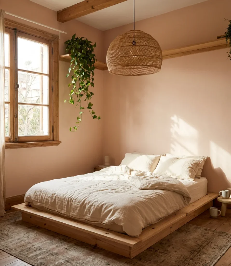
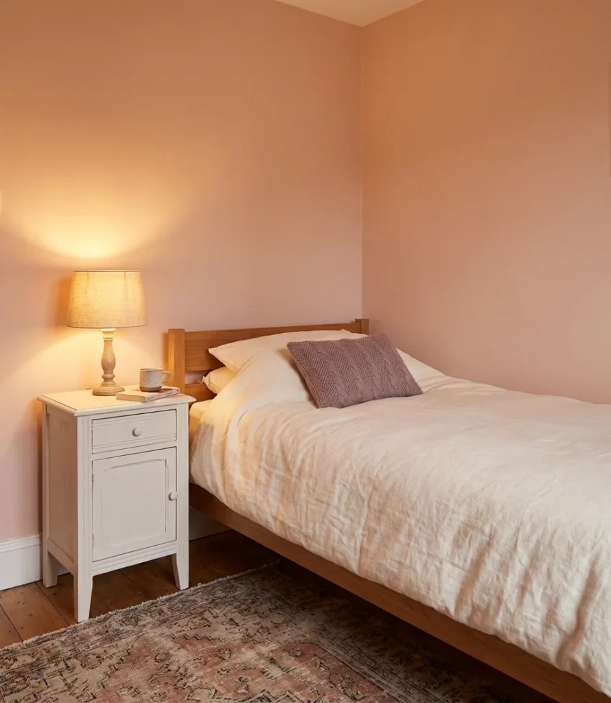
4. Soft Pink for a Spare or Guest Room
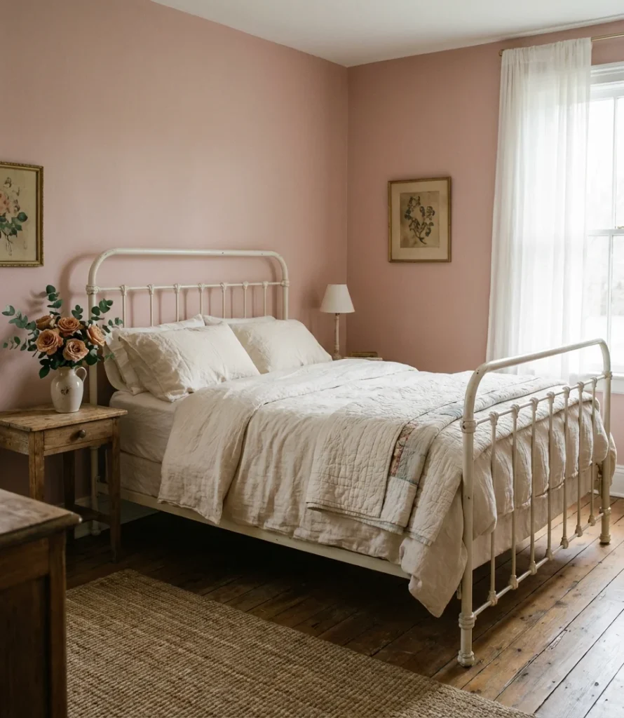
Dusty, muted pink is having a serious moment in spare and guest bedrooms—and it’s not the bubblegum pink of childhood rooms. Think closer to a faded rose, a barely blush mauve, or a warm antique white with the faintest pink undertone. In a guest room, this palette feels welcoming and gentle, the kind of color that says “stay a while” without any fuss. It’s also a forgiving shade for rooms with mixed or changing light.
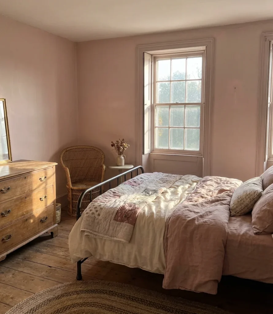
Budget-conscious homeowners love this choice because soft pinks are widely available in affordable paint lines and tend to require fewer coats than deeper colors. A single gallon can often cover a small guest room completely, which means the full transformation—paint, trim touch-ups, and a new throw—can come in well under $100. It’s one of the highest-impact, lowest-cost refresh moves in any home.
5. Dark Green Accent Wall
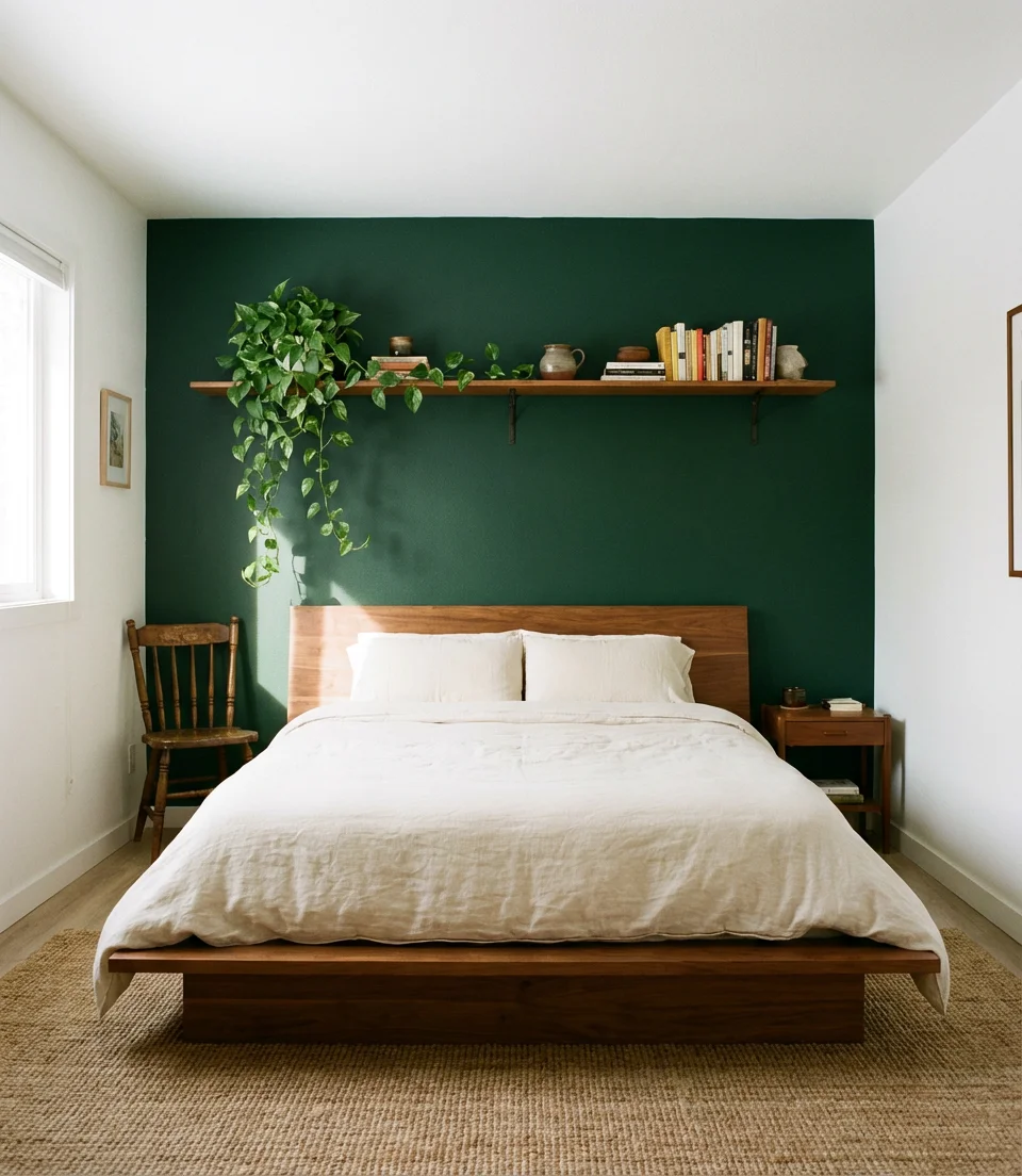
If you’re not ready to commit to four dark walls, a deep green accent wall is the perfect entry point. Forest green, bottle green, and hunter green are all showing up strong on bedroom headboard walls in 2026 — anchoring beds with dramatic richness while keeping the rest of the room light and breathable. This approach lets the color do its work without overwhelming the space, especially in rooms where natural light is limited.
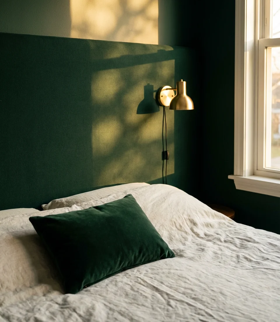
Where it works best: rooms with white or off-white on the remaining three walls and, ideally, some natural wood tones in the furniture. The contrast between a dark green focal wall and lighter surroundings creates depth and visual interest without sacrificing brightness. For renters who can only paint one wall, this technique is also one of the most landlord-friendly transformations possible—one coat of white brings it right back.
6. Cozy Warm White for Small Rooms
In small rooms, the distinction between a cold, stark white and a cozy, warm white is crucial. Warm whites with yellow, pink, or peach undertones breathe life into tight spaces, making them feel curated rather than clinical. In a small room’s cozy setup, the goal isn’t to make the room look bigger—it’s to make it feel intentional, soft, and genuinely pleasant to be in.
Real homeowners often make the mistake of choosing the coldest, brightest white because they assume it will “open up” a small bedroom. In practice, a crisp cool white in a north-facing room can feel more like a hospital corridor than a sanctuary. A warm white—something like a Swiss Coffee or Navajo White—keeps the room bright while adding an unmistakable sense of comfort that cold whites simply can’t replicate.
7. Indian-Inspired Jewel Tones
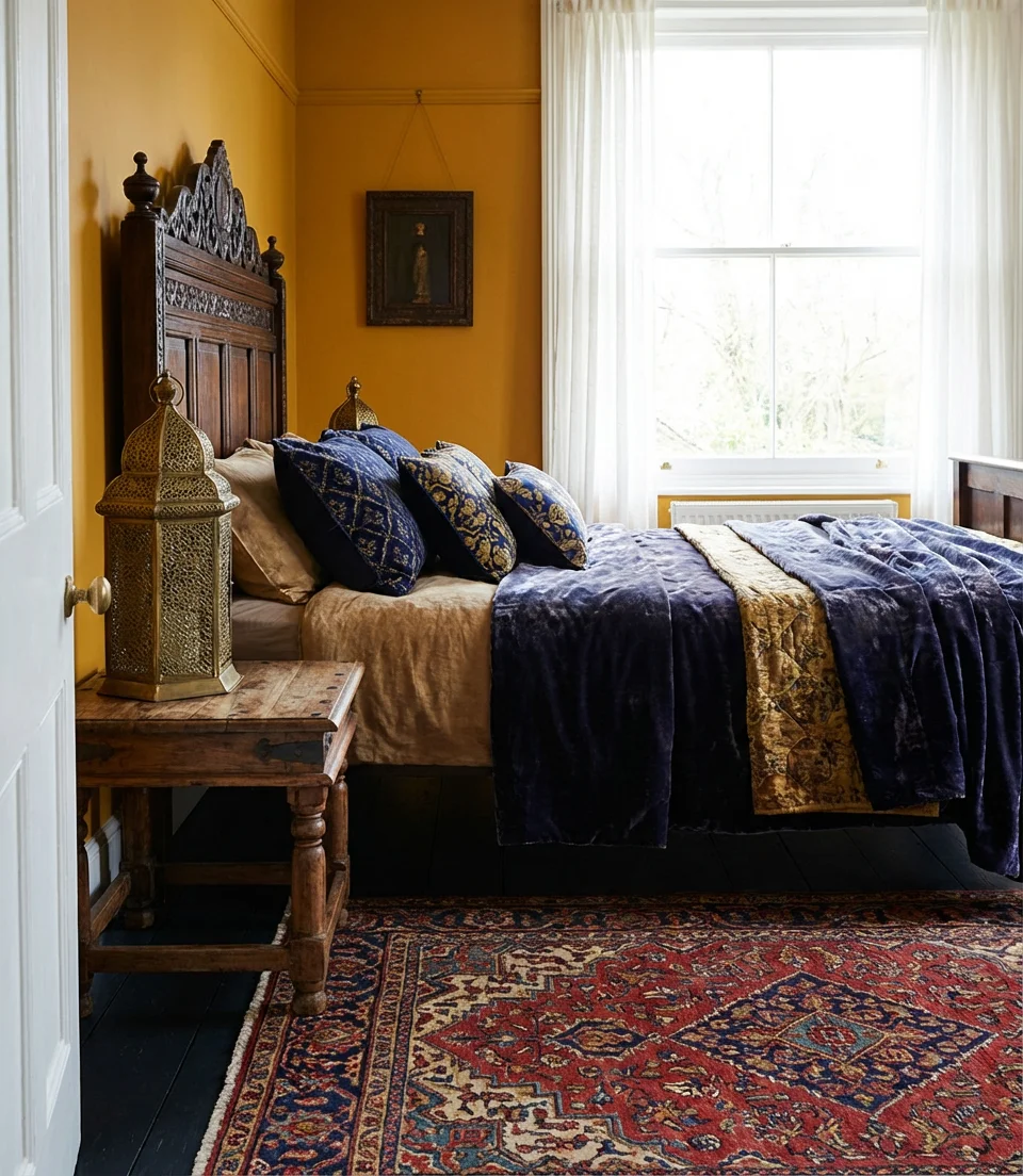
The rich, saturated palette of Indian design—saffron, turmeric, peacock blue, and deep magenta—translates beautifully into bedroom paint choices when applied thoughtfully. The Indian aesthetic isn’t about replicating a specific look; it’s about embracing color with confidence and layering it with texture and pattern. A deep saffron wall behind a carved wooden headboard with indigo textiles creates a bedroom that feels genuinely transported, grounded in warmth and craft.
This method works best in rooms where the furniture already has natural wood tones, brass accents, or hand-embroidered fabrics. The key is treating the color as part of a whole rather than a standalone statement—every decorative choice in the room should speak to the warmth and richness of the palette. Start with one jewel-toned wall and build from there rather than all four at once.
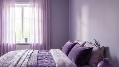
8. Dusty Lavender for a Unique Aesthetic
Dusty lavender is quietly becoming one of the most unique bedroom paint choices of 2026 — sophisticated enough to feel grown-up, soft enough to feel dreamy. Unlike bright purple, which can feel energizing and difficult to pair, a muted lavender with gray undertones reads as nearly neutral in certain lights. It’s an ideal choice for anyone who wants something more personal than beige but isn’t ready for a truly dramatic commitment.
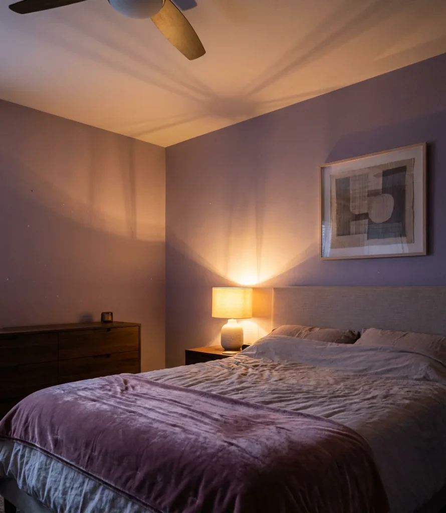
From a practical standpoint, dusty lavender pairs remarkably well with natural wood, matte black hardware, and neutral linen. It also photographs exceptionally well in both natural and artificial light—which is no small thing for the Pinterest-minded homeowner. If you’re going for a truly personal, non-generic bedroom space in 2026, this shade is one of the most underused colors in the residential palette right now.
9. Western Desert Warm Neutrals
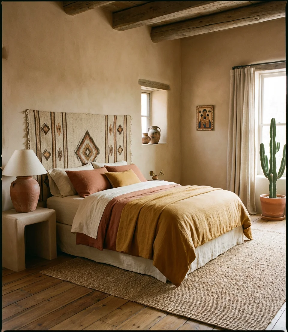
The Western interior design movement—rooted in the landscapes of New Mexico, Arizona, and West Texas—has found its way into bedroom paint choices across the country. Sand, warm taupe, dusty blush, and sun-bleached adobe are the color schemes that define this aesthetic. These aren’t cold neutrals; they’re alive with warmth and carry the feeling of wide-open skies and natural materials. In a bedroom, they create a grounded, unhurried atmosphere that’s perfect for unwinding.
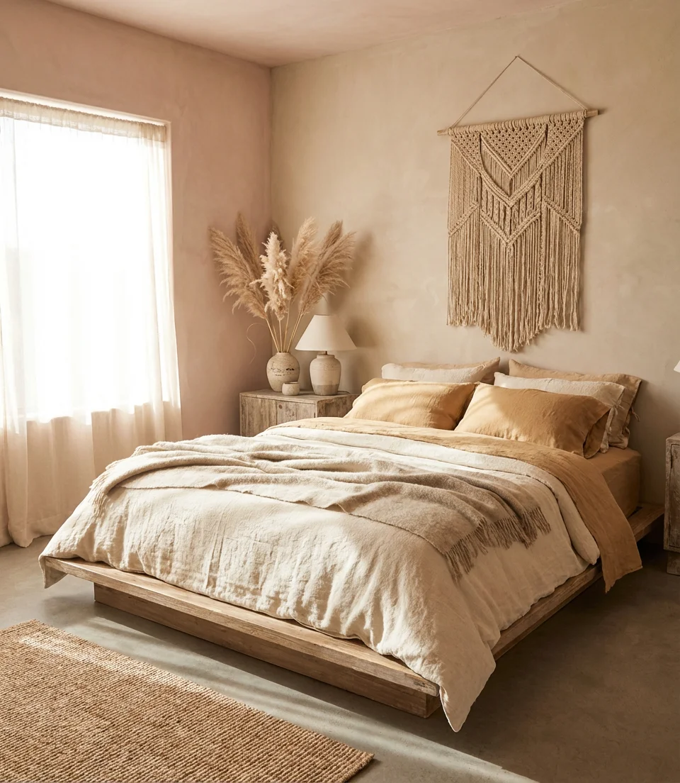
This palette works best when it extends beyond the walls—into the bedding, the rug, and the furniture finishes. Think woven textiles, natural ceramic, and unfinished wood. The color on the walls should feel like an extension of the material world in the room, not a backdrop to it. In parts of the American Southwest and Pacific Northwest, this aesthetic has become essentially the default setting for well-designed homes.
10. Charcoal and Slate for a Modern Master
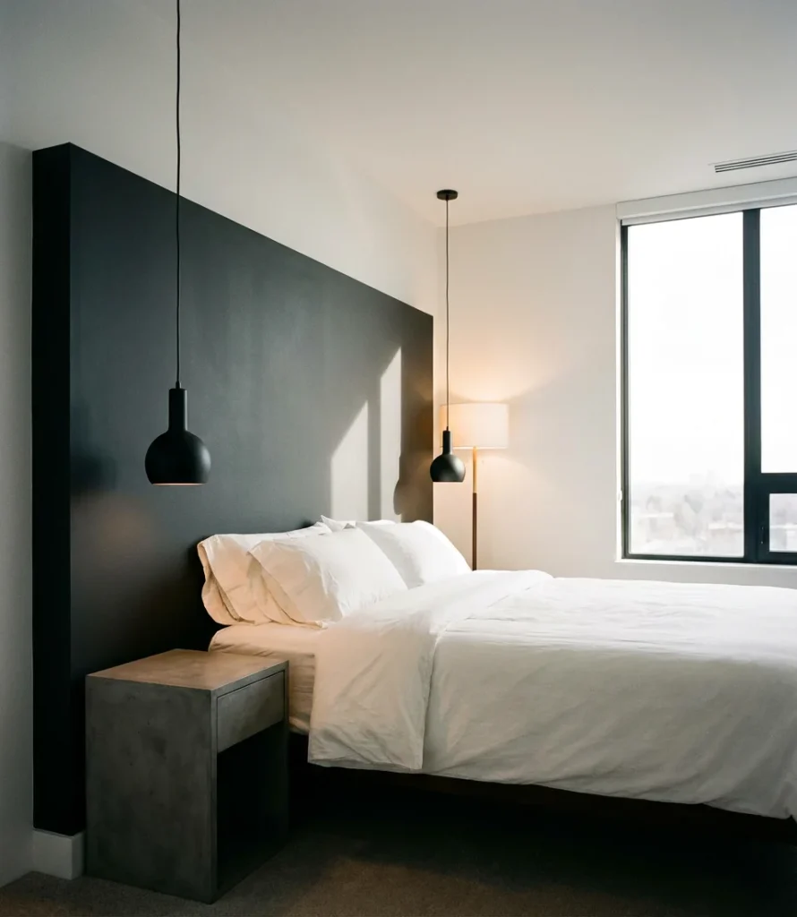
For the accent wall, a modern approach using charcoal and slate offers something that softer neutrals cannot: real weight. A deep charcoal headboard wall in a modern master bedroom commands the space without asking for attention—it’s confident, quiet, and endlessly versatile. Paired with crisp white bedding and concrete-finish nightstands, the result is a bedroom that looks like it belongs in an architecture magazine without feeling cold or uninviting.
The key insight most homeowners miss: charcoal and slate are not the same. Charcoal leans black-brown and feels warmer; slate leans blue-gray and feels cooler. In a south-facing room with plenty of natural light, slate can be stunning. In a north-facing room, charcoal is often the safer, warmer choice. Test both side by side before deciding—the difference in natural light is significant and changes the entire mood of the room.
11. Sky Blue for a Light Airy Feel
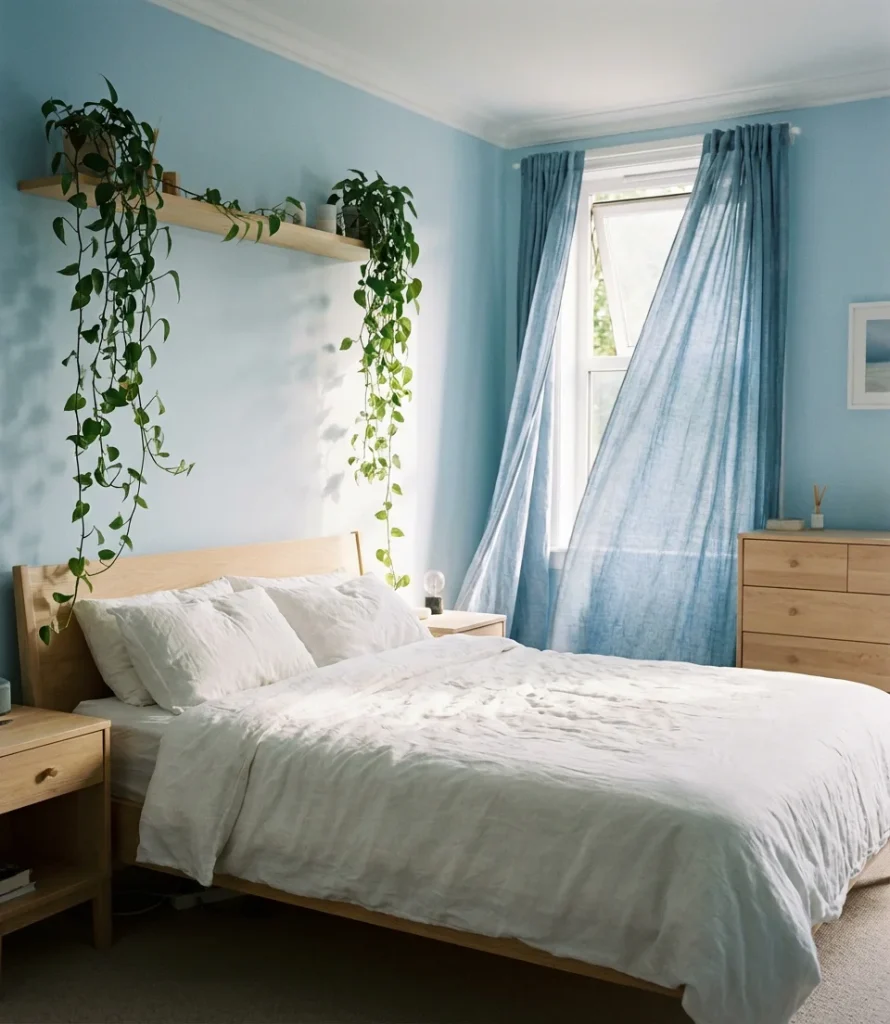
A soft, clear blue ceiling or walls can lift the energy of any bedroom—particularly in spaces where the ceiling height is lower or the layout is a bit boxy. Sky blue has a genuinely psychological effect on sleep: studies have consistently shown blue environments tend to lower heart rate and encourage calm. For a 2026 bedroom that feels fresh and optimistic without being loud, sky blue is one of the most reliable choices in the paint store.
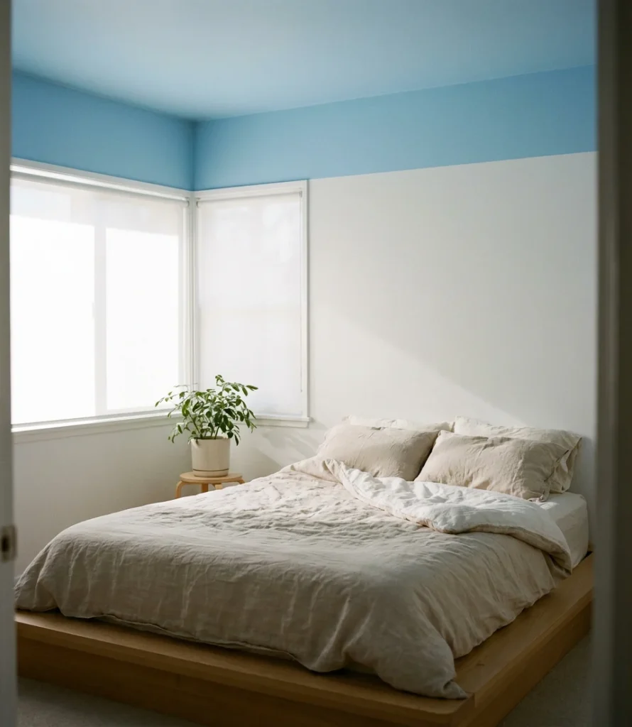
One creative technique gaining popularity is painting just the ceiling in sky blue while keeping the walls white or off-white. This “fifth wall” treatment draws the eye upward and creates an unexpected sense of depth, almost like lying in a room with a window to the sky permanently overhead. It’s a particularly effective move in bedrooms where natural light is limited or the room tends to feel closed-in during winter months.
12. Deep Burgundy for a Fun Bold Statement
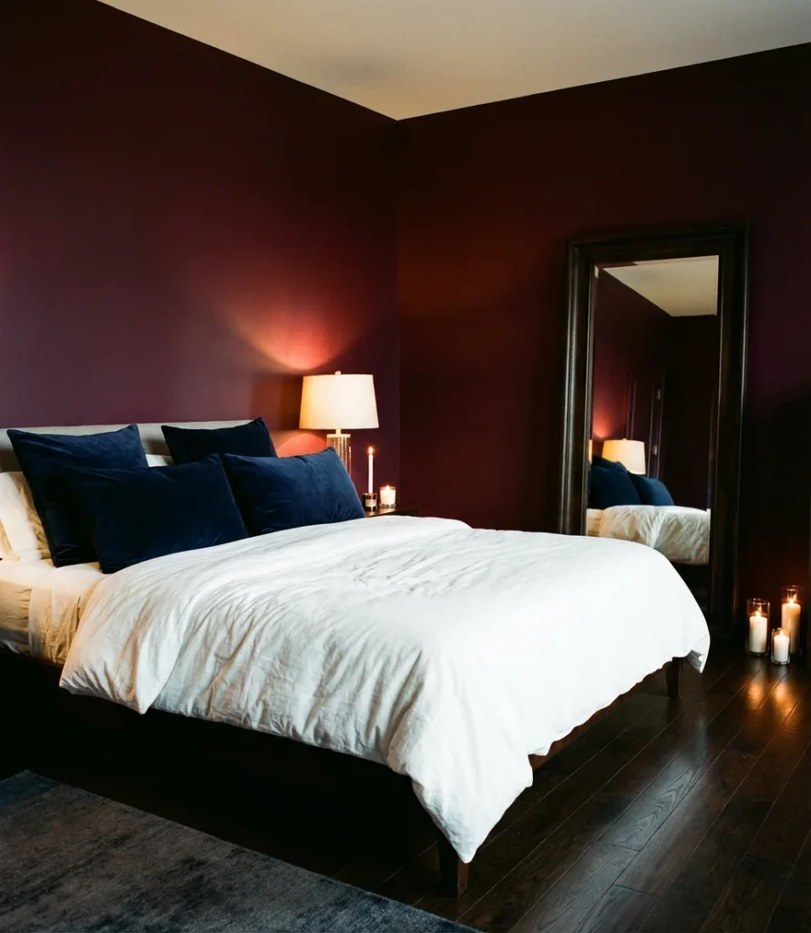
If your bedroom needs more personality—a jolt of fun energy that still feels grown-up—deep burgundy is one of the bolder moves delivering serious results this year. It’s a rich, wine-dark red that feels more moody than aggressive, especially in a matte finish. Pair it with warm lighting and plush textures—velvet cushions, a chunky wool throw—and the room transforms into something that feels deeply indulgent and completely intentional.
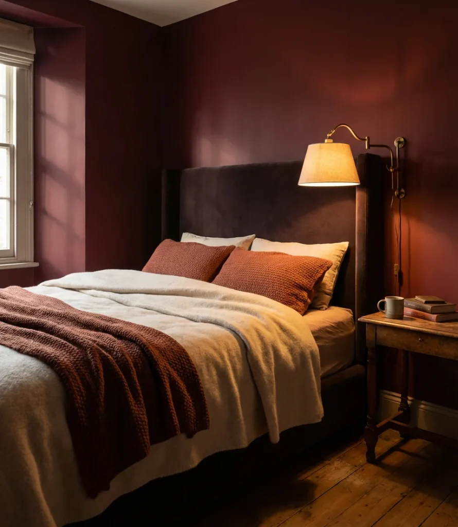
Burgundy belongs in rooms where the goal is atmosphere over airiness. It’s not a color for minimalists—it thrives with layers, patterns, and richness. Expert-level advice: apply burgundy in an eggshell finish rather than flat matte if you want the color to glow rather than absorb all the light. The subtle sheen picks up candlelight and lamp glow in a way that flat paint simply doesn’t, giving the room a depth that photographs and lives in beautifully.
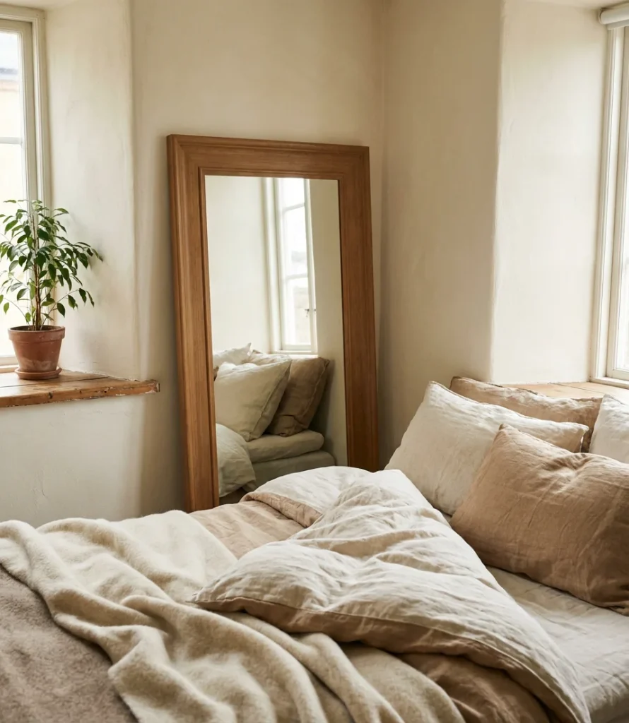
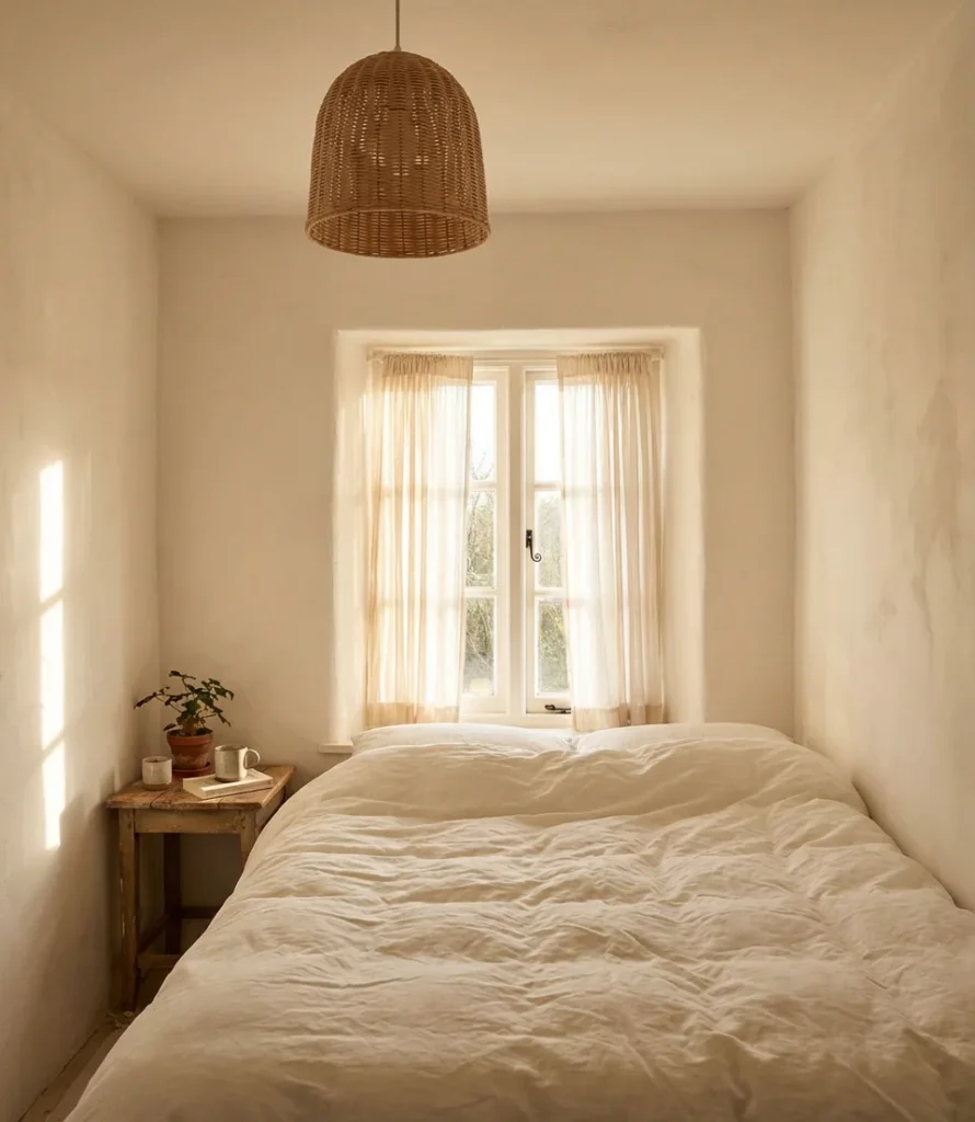
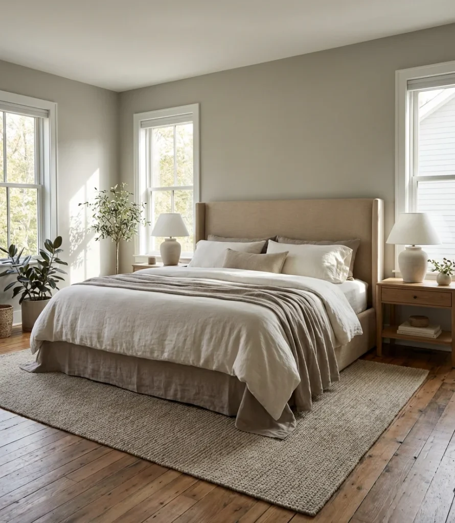
13. Attic Bedroom in Warm Oatmeal
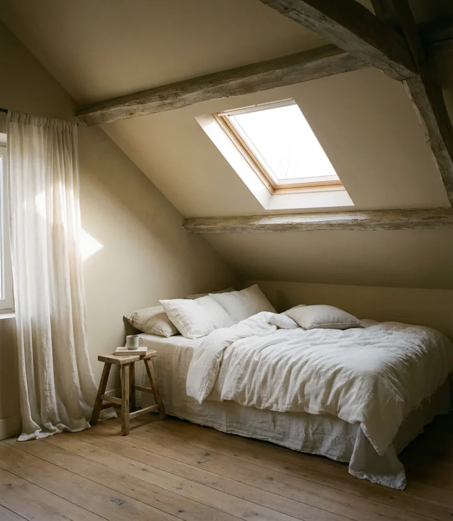
Attic bedrooms present a unique set of painting challenges—sloped ceilings, awkward angles, low knee walls—and a warm oatmeal or greige handles them better than almost any other color. The medium-toned warmth of oatmeal unifies all the mismatched surfaces of an attic room, pulling the angled ceiling and side walls into a cohesive whole. It’s a color that blends seamlessly, ensuring that nothing stands out and everything flows together harmoniously.
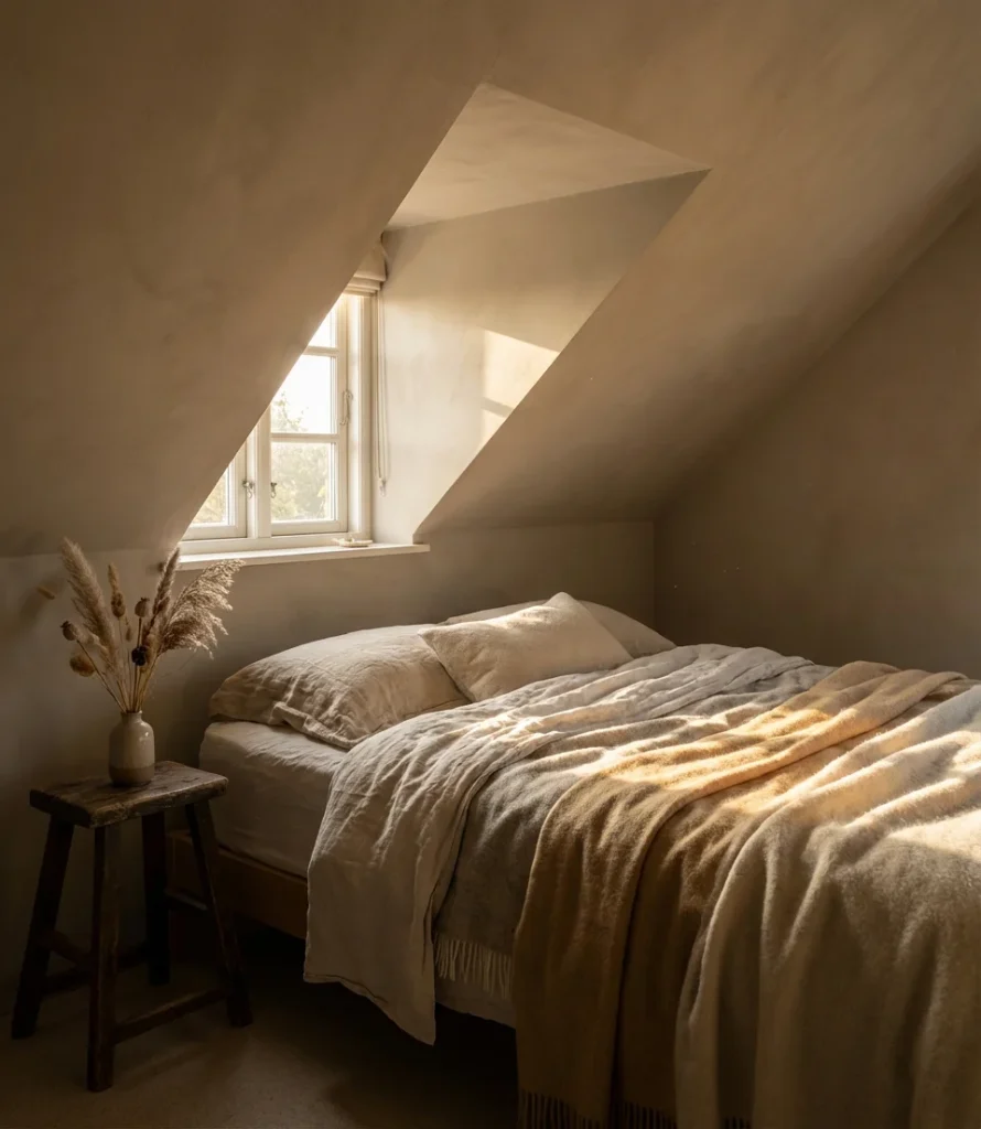
Painting the ceiling the same color as the walls—or just a shade or two lighter—is an especially effective technique in attic rooms. It removes the visual tension between the sloped ceiling and the vertical walls, making the room feel more intentionally designed rather than architecturally awkward. This approach works across virtually every furniture style, from farmhouse to Scandinavian to transitional American.
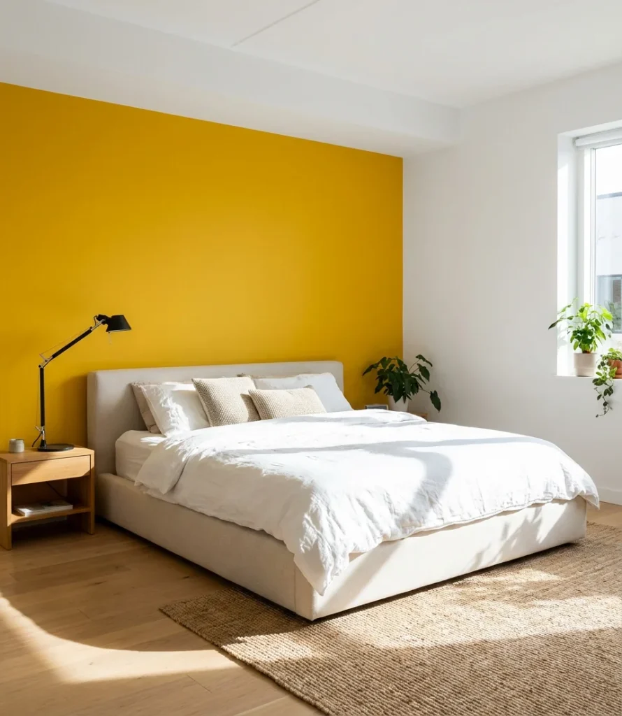
14. Primary Color Bedroom for Kids or Fun Spaces
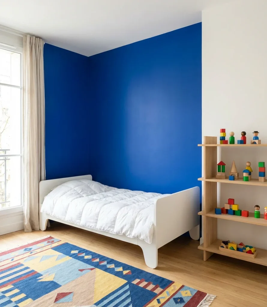
Primary colors—true red, classic yellow, and cobalt blue—might seem like obvious territory for children’s rooms, but in 2026 they’re showing up in adult spaces too, used with restraint and intention. A single primary-colored wall in a small room can become an art piece in itself when the rest of the palette is clean and minimal. Think one bold yellow wall behind the bed, white everywhere else, and clean-lined modern furniture: the result is graphic, cheerful, and surprisingly sophisticated.
For kids’ rooms especially, primary colors have genuine staying power—unlike trend-driven pastels or novelty themes, a well-executed primary bedroom can grow with a child from toddler to teenager with only minor updates to the accessories and furniture. It’s a long-term value play disguised as a bold design choice, and parents who’ve made this call almost universally report not regretting it.
15. Canvas-Ready White for DIY Art Lovers
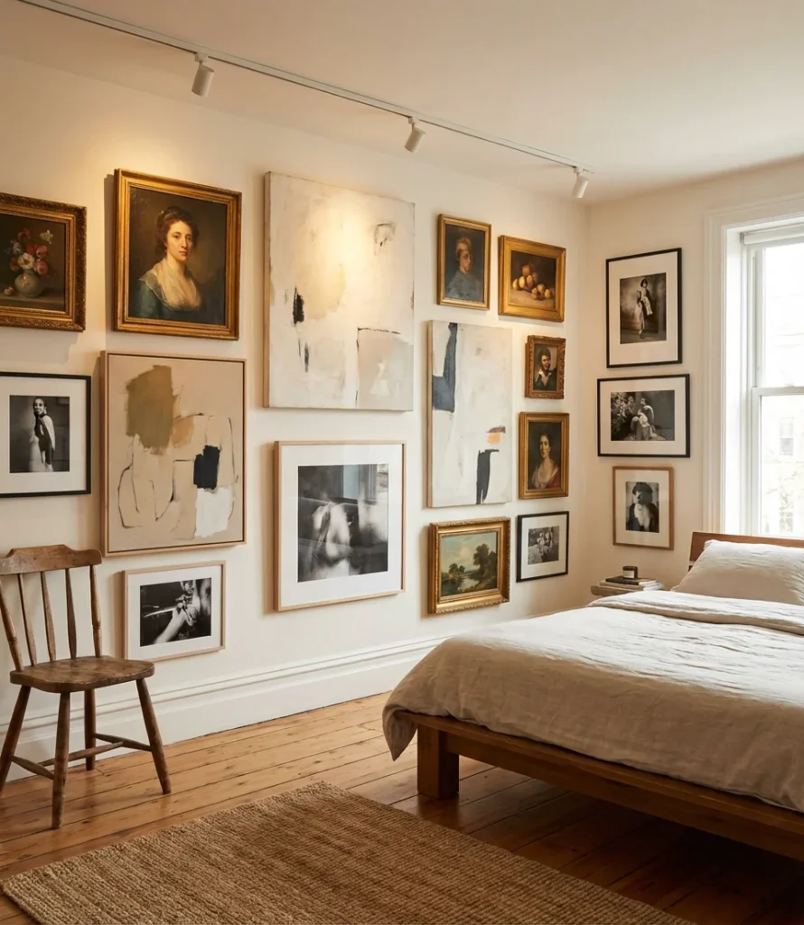
For the creatively inclined, choosing a canvas-clean white as the bedroom wall color is less a design decision than a philosophy. The room becomes the background to an ever-evolving gallery wall—a rotating mix of canvas diy art, prints, photographs, and textural pieces that tell the story of whoever lives there. In 2026, this approach is especially popular among younger homeowners who want flexibility and personal expression without committing to a single color direction.
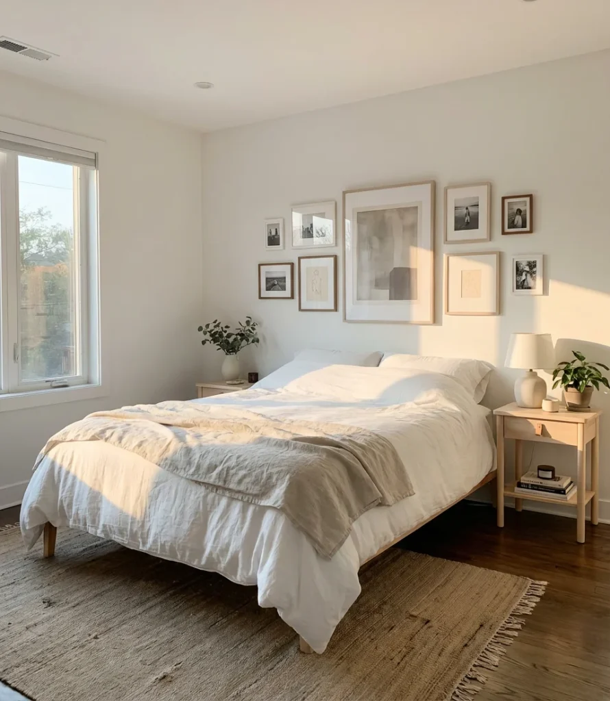
This method has a real benefit: the wall doesn’t need to change when the art or arrangement does. A properly chosen warm white—one that doesn’t compete with or wash out artwork—becomes genuinely invisible, letting the pieces on the wall do all the visual work. Use a low-sheen or matte finish so the walls recede completely and every eye in the room goes straight to what’s hanging on them.
16. Moody Plum for a Drama-Forward Bedroom
Deep plum sits at the intersection of purple and brown, and it might be the most underrated moody wall color of 2026. It’s warmer than navy, more unexpected than charcoal, and carries a sense of richness and history that few other colors can match. In a bedroom built around textures—velvet, silk, aged leather—a plum wall becomes the anchor the whole room rotates around. It’s a color that rewards commitment.
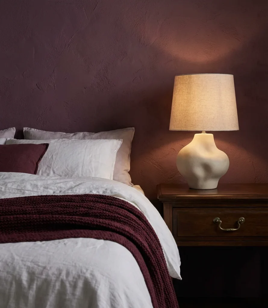
This color has a strong American cultural history in interior design—it shows up in Art Deco boudoirs, in Victorian parlors repurposed as sleeping rooms, and in the moody bedrooms of converted brownstones in Brooklyn and Boston. When homeowners choose it today, they’re tapping into that lineage of considered, unapologetic personal spaces. It reads as cultivated, curious, and completely individual—everything a bedroom should be.
17. Neutral Greige for a Master Color Scheme
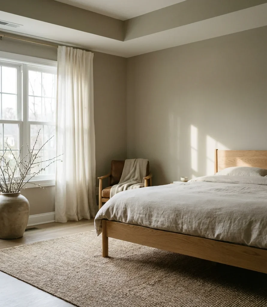
In master color schemes for 2026, greige, an elegant blend of half-gray and half-beige, is leading the way. It’s warm enough to feel inviting, cool enough to feel modern, and versatile enough to work with virtually any furniture style or wood tone. Greige asks nothing of the rest of the room—it simply provides a quiet, consistent backdrop that everything else can rest against.
Where it works best: large master bedrooms where the goal is calm sophistication rather than dramatic impact. In these spaces, greige lets high-quality furniture, layered bedding, and thoughtful lighting take center stage. It’s also an excellent choice for homeowners who plan to sell in the next few years—real estate agents consistently report that neutral master bedrooms photograph well and attract the widest range of buyers.
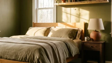
18. Earthy Olive Green for Small Rooms
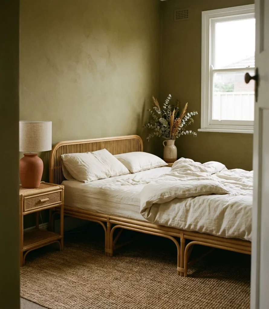
Olive green occupies a fascinating position in the 2026 palette—darker than sage, earthier than forest green, and somehow both retro and completely contemporary. In small rooms, it has a grounding effect: rather than fighting the room’s proportions, it leans into them, creating a space that feels intentionally intimate rather than cramped. The color schemes for small rooms that include olive tend to also feature warm wood tones and natural materials, which amplify the earthy effect.
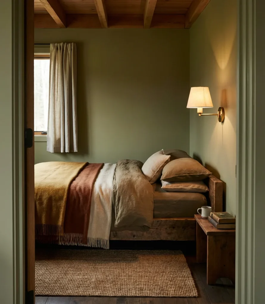
One small trend is to use olive green in a small bedroom with terracotta accents, rattan furniture, and a jute rug. This combination creates a space that feels distinctly rooted and handcrafted—almost like a cabin or an artist’s studio repurposed into sleeping quarters. It’s a look that has surged on Pinterest boards tagged with “cottagecore,” “earthcore,” and “organic modern” throughout the past year.
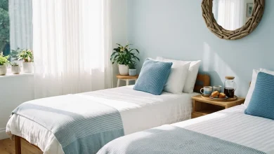
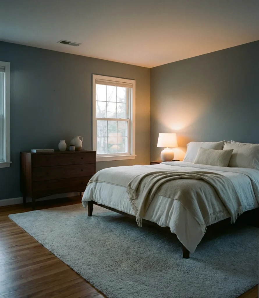
19. Cool Gray-Blue for a Calming Aesthetic
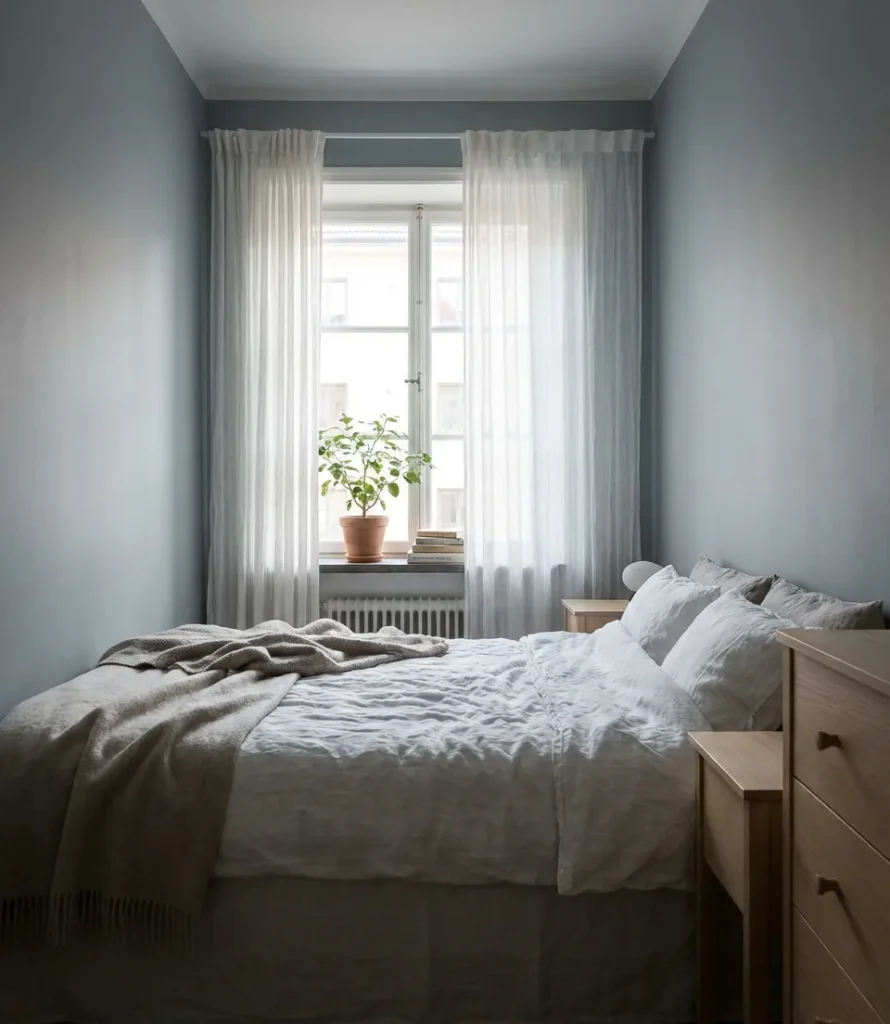
Where pure blue can feel intense and pure gray can feel cold, the gray-blue hybrid finds a balance that’s particularly well suited to bedrooms. This is a genuinely restful aesthetic—the color of morning fog, of still water, of the sky just before dawn. It pairs beautifully with white, ivory, and soft cream, and it supports almost every furniture finish from blond wood to ebonized oak. In a room designed for actual rest, few colors perform better.
Sleep researchers and interior designers have both pointed to blue-gray environments as particularly effective for sleep quality—the hue triggers a physiological response that helps the body down-regulate for rest. While the science is still evolving, the anecdotal evidence from homeowners who’ve made this switch is consistent: the room just feels easier to sleep in. Sometimes the best design decision is also the most biological one.
20. Warm Blush Pink for a Cozy Small Room
Blush pink in a small bedroom isn’t about being precious—it’s about being strategic. A warm, peachy blush reflects light gently and adds color without darkening the room, making it one of the most effective tools in the small-room toolkit. It’s also one of the coziest choices available, creating a soft warmth that makes the room feel like a gentle embrace. Paired with cream trim and warm wood, it reads as effortlessly personal rather than girlish.
This color has wide appeal across age groups and genders—a muted blush is just as at home in a young professional’s studio apartment as it is in a grandmother’s guest room. The key is choosing a blush with some warmth and weight to it rather than a flat, chalky pink. Look for undertones of peach or amber, which keep the color from feeling thin or washed out, especially in rooms with less-than-perfect natural light.
21. Inky Black for the Ultimate Dramatic Bedroom
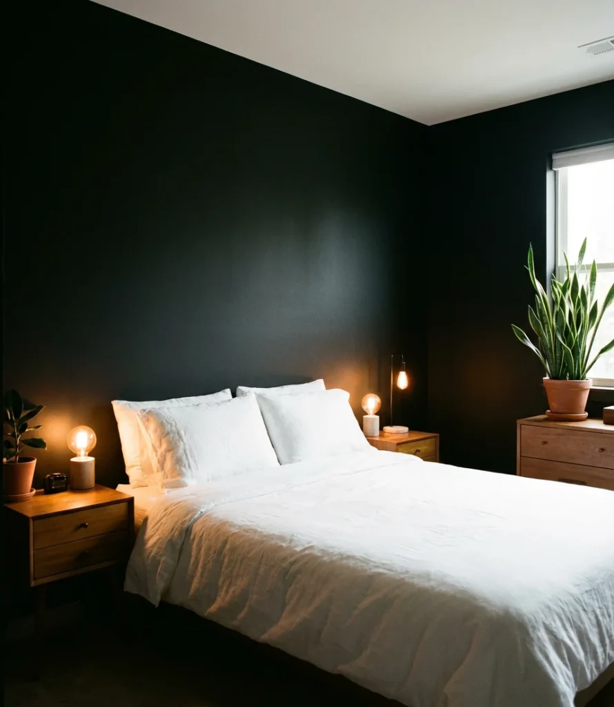
Painting a bedroom entirely black—or very nearly black—is the most committed version of the dark bedroom trend, and when it’s done well, it’s transcendent. True black walls eliminate visual clutter completely, making whatever is lit in the room—a lamp, a plant, a piece of art—seem to glow. It’s a bold, unapologetically unique choice, and it’s showing up with increasing frequency in the apartments and homes of people who’ve decided their bedroom should feel extraordinary rather than safe.
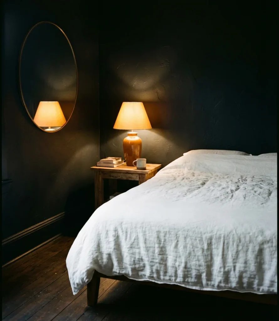
The most common fear with black walls—that the room will feel oppressively small—rarely materializes in practice, provided the lighting is thoughtful. Layered warm light sources (multiple lamps rather than overhead), light-colored bedding, and mirrors placed to maximize reflection all keep the room from closing in. Several homeowners who’ve made the leap describe the experience the same way: “I didn’t know what I was missing until I finally did it.”
22. Two-Tone Color Scheme for a Fresh Modern Look
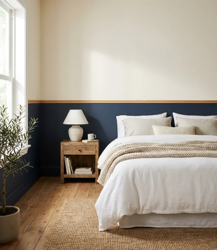
The two-tone bedroom—where the lower half of the wall is painted a deeper or richer shade than the upper half, separated by a chair rail or a simple painted line—is one of the most underused techniques in residential design. It’s inherently dynamic, adding architectural interest to flat walls without any physical construction. In 2026, the most compelling color schemes in this format pair a warm, deep tone on the lower third with a soft, light tone above—creating the visual effect of a room that’s grounded at the floor and open at the ceiling.
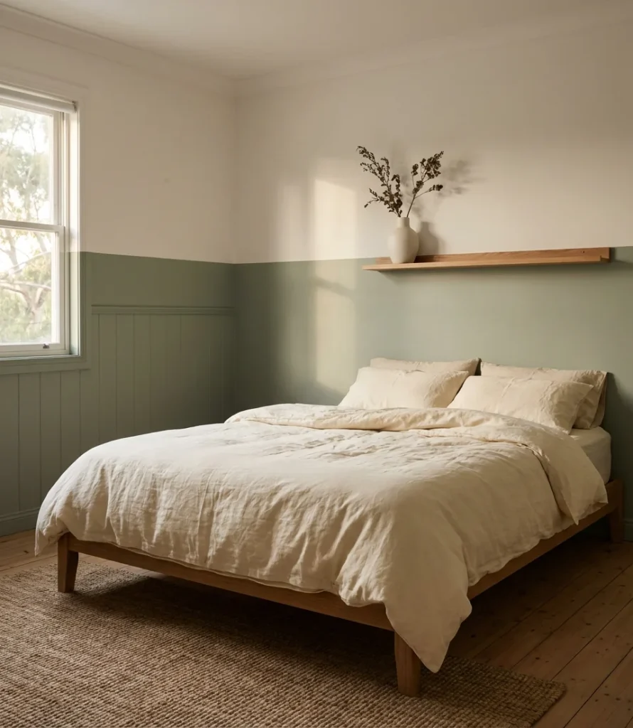
For anyone considering a two-tone approach, the proportion matters as much as the colors. A 1/3-to-2/3 split—with the darker color on the lower portion—tends to feel the most balanced. In most standard rooms, the dividing line should fall between 32 and 36 inches from the floor, ensuring it naturally aligns with door frames and window sills. The result is a genuinely DIY-friendly project that delivers a significant visual upgrade with basic tools and a Sunday afternoon.
There’s no shortage of directions to take a bedroom makeover in 2026 — the real question is which one resonates most with how you actually want to feel when you wake up in the morning. Whether you’re drawn to the drama of inky black, the calm of sage green, or the warmth of a terracotta cocoon, the most important design decision is the one that feels most like you. Drop your favorite idea—or share a photo of your own bedroom transformation—in the comments below. We’d love to see what you create.