Bedroom color schemes are shifting in 2026 toward more grounded, personal palettes that favor depth over brightness and intention over trend. Americans are moving away from stark whites and cool grays, searching instead for hues that feel lived-in, calming, and unmistakably theirs. Pinterest boards are filling up with moody greens, warm neutrals, and unexpected jewel tones that bring a sense of refuge to the bedroom. Whether you’re updating a guest room, designing a couples’ retreat, or just craving a space that feels more you, this year’s color direction offers something quietly transformative. Here are some ideas that showcase the current trends in bedroom design.
1. Deep Forest Green with Natural Wood Accents
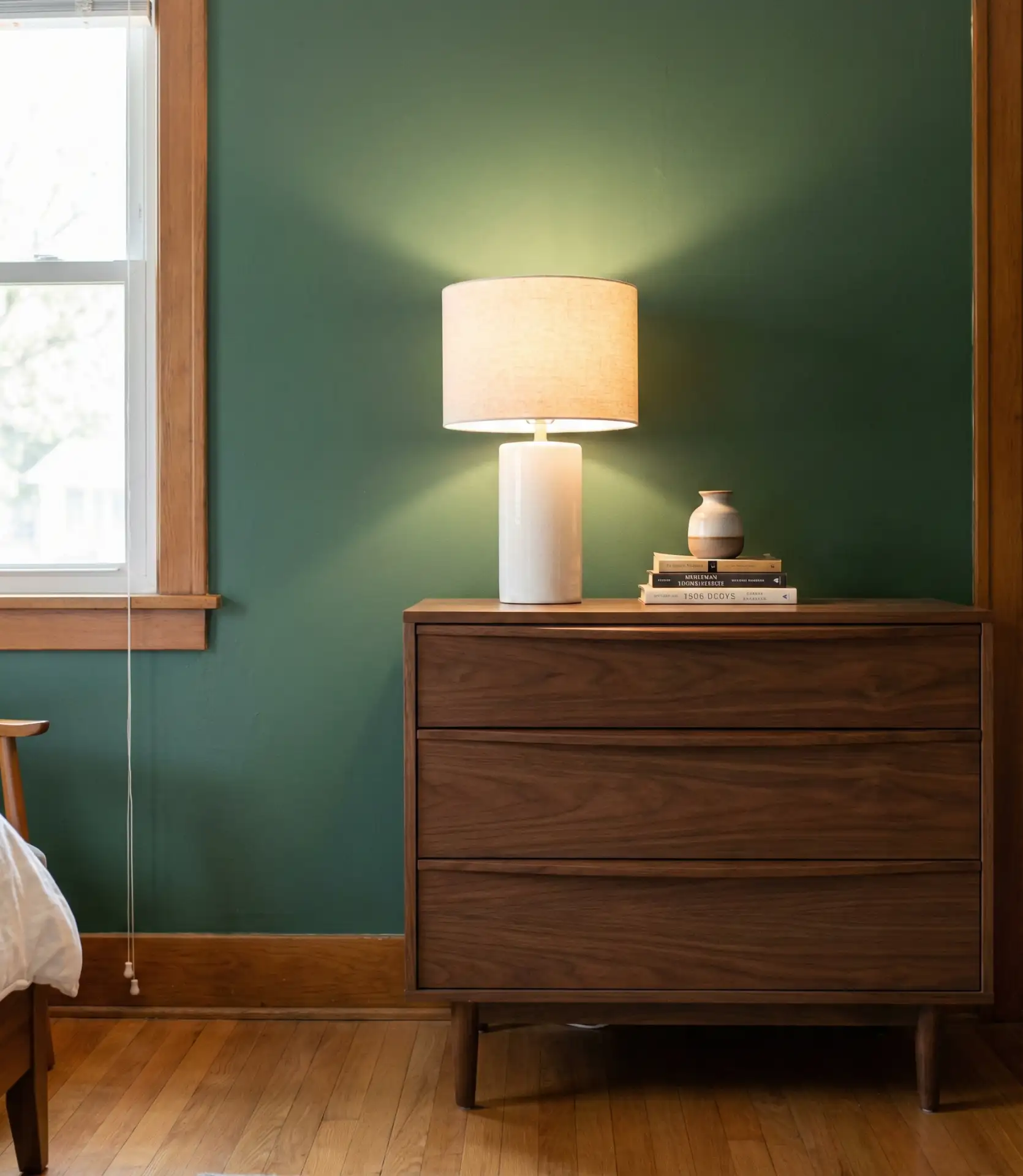
This approach leans into forest green as a primary wall color, paired with oak or walnut furniture that grounds the space without competing for attention. It’s a relaxing scheme that works especially well in bedrooms with ample natural light, where the green shifts throughout the day. The warmth of the wood prevents the room from feeling too cool or cave-like, and the overall effect is both earthy and sophisticated. It’s a palette that appeals to anyone wanting something dark but not heavy.
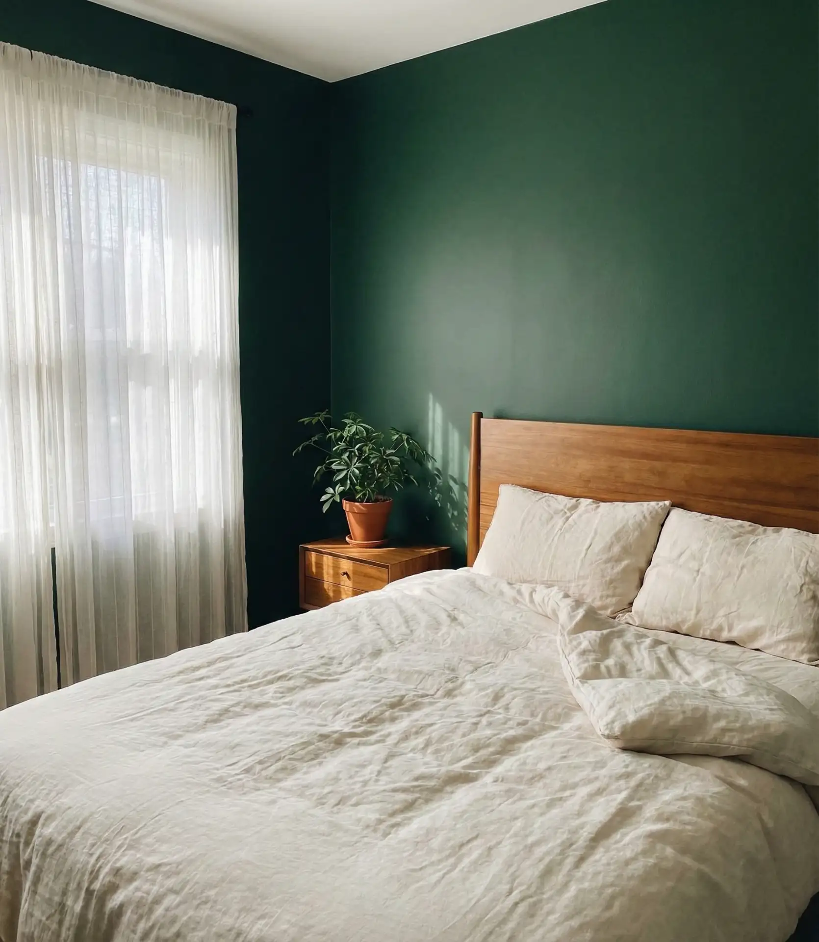
This palette works best in suburban homes with ample window placement, particularly in the Midwest and Pacific Northwest, where natural settings inform interior choices. Homeowners often pair this with vintage brass or matte black hardware to keep the look from skewing too rustic. One common mistake is choosing a green that’s too saturated—opt for something with gray or brown undertones to maintain versatility across seasons.
2. Soft Mauve and Cream Layers
Mauve has quietly returned, but not in the dusty rose iteration from years past. The 2026 version is softer, more grayish, and pairs beautifully with beige linens and off-white trim. This colorway is a cozy neutral palette that reads feminine without being overly sweet, making it ideal for a guest bedroom or a primary suite where calm is the priority. It layers well with texture—think linen, cotton velvet, and woven throws.
A designer I spoke with in Charleston mentioned that mauve works particularly well in homes with original millwork, where it complements both modern and traditional architecture. It’s also forgiving with art—you can hang almost anything on a mauve wall, and it won’t clash. Just avoid pairing it with cool whites, which can make the mauve look muddy.
3. Teal and Brass for a Jewel-Toned Retreat
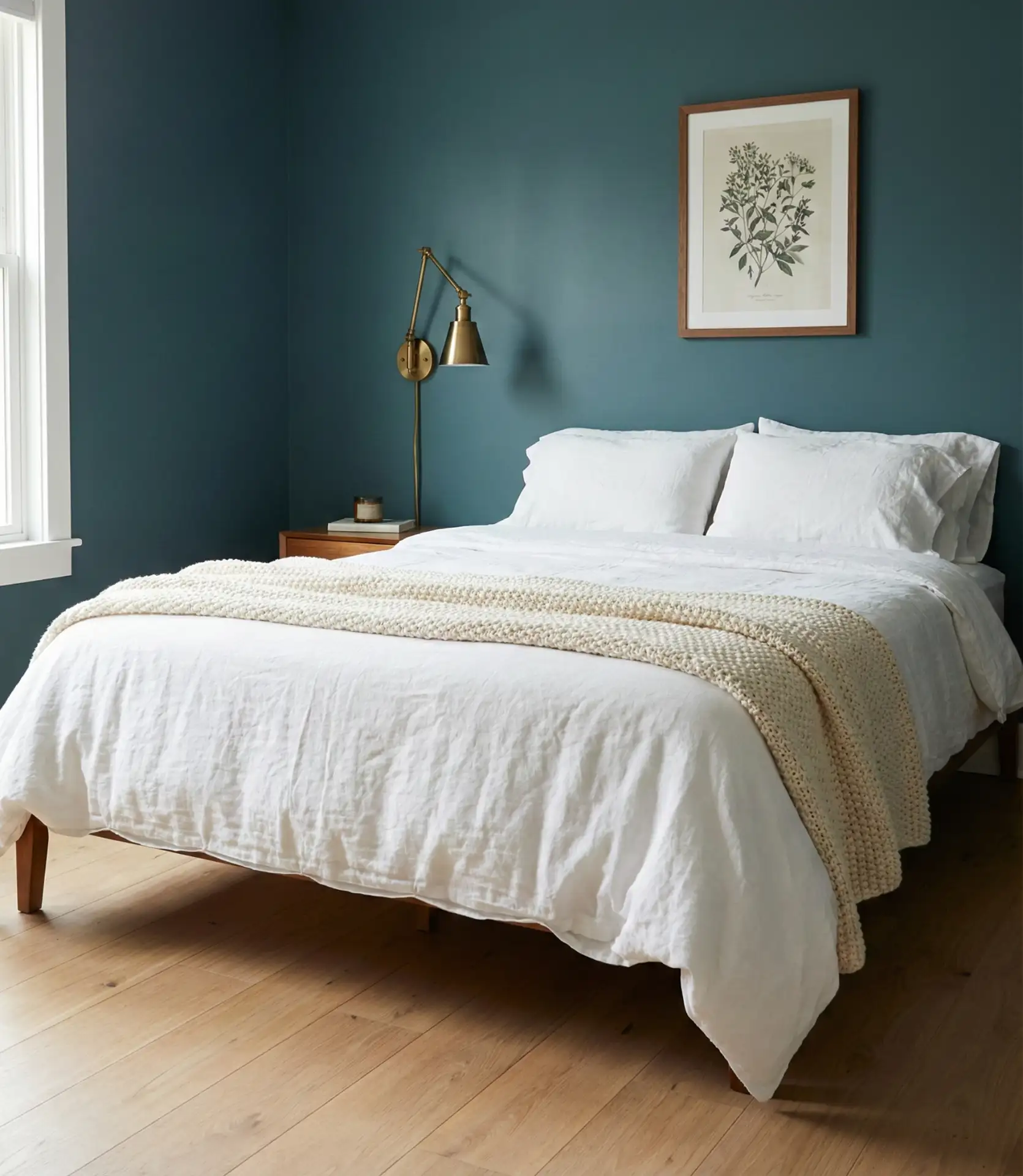
Teal brings richness without the weight of navy, and when accented with warm brass fixtures, it creates a classy bedroom that feels intentional. This palette is versatile, complementing both boho spaces with macramé and rattan and more tailored rooms with clean lines. The key is balancing the saturation with plenty of light-colored bedding and minimal clutter. It’s a scheme that rewards restraint.
Urban apartments with limited natural light often favor this scheme due to its ability to withstand artificial lighting. It also photographs beautifully, which explains its Pinterest traction. Budget-conscious updates can start with just one accent wall and brass drawer pulls—you don’t need to repaint the entire room to make an impact.
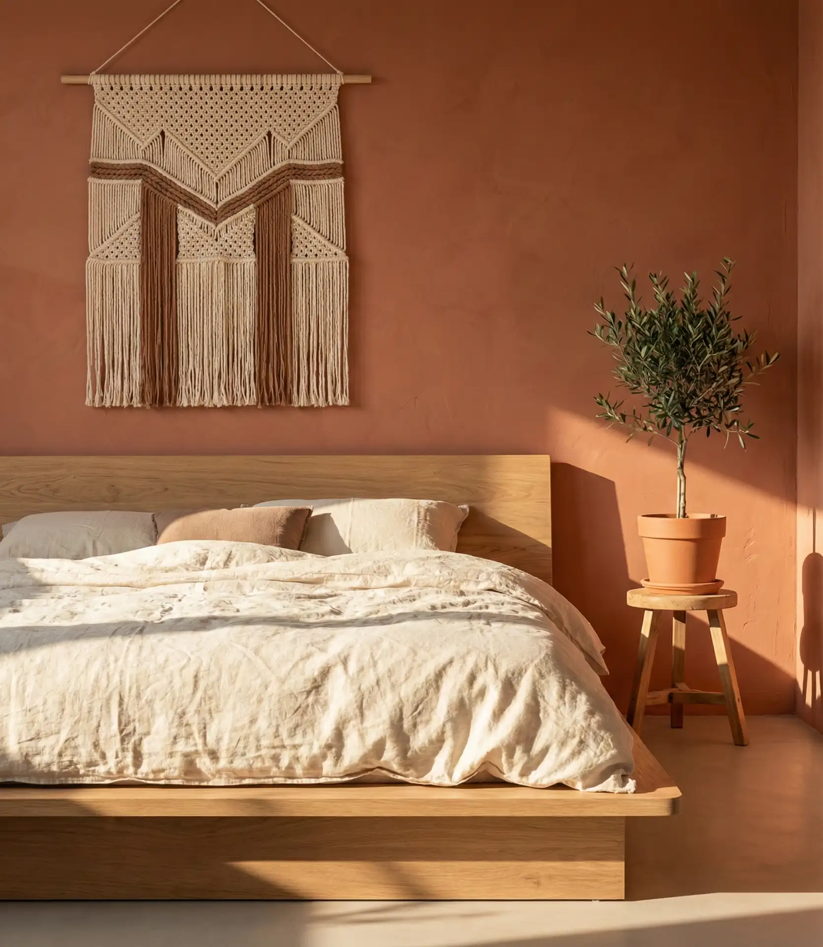
4. Olive Green and Terracotta Warmth
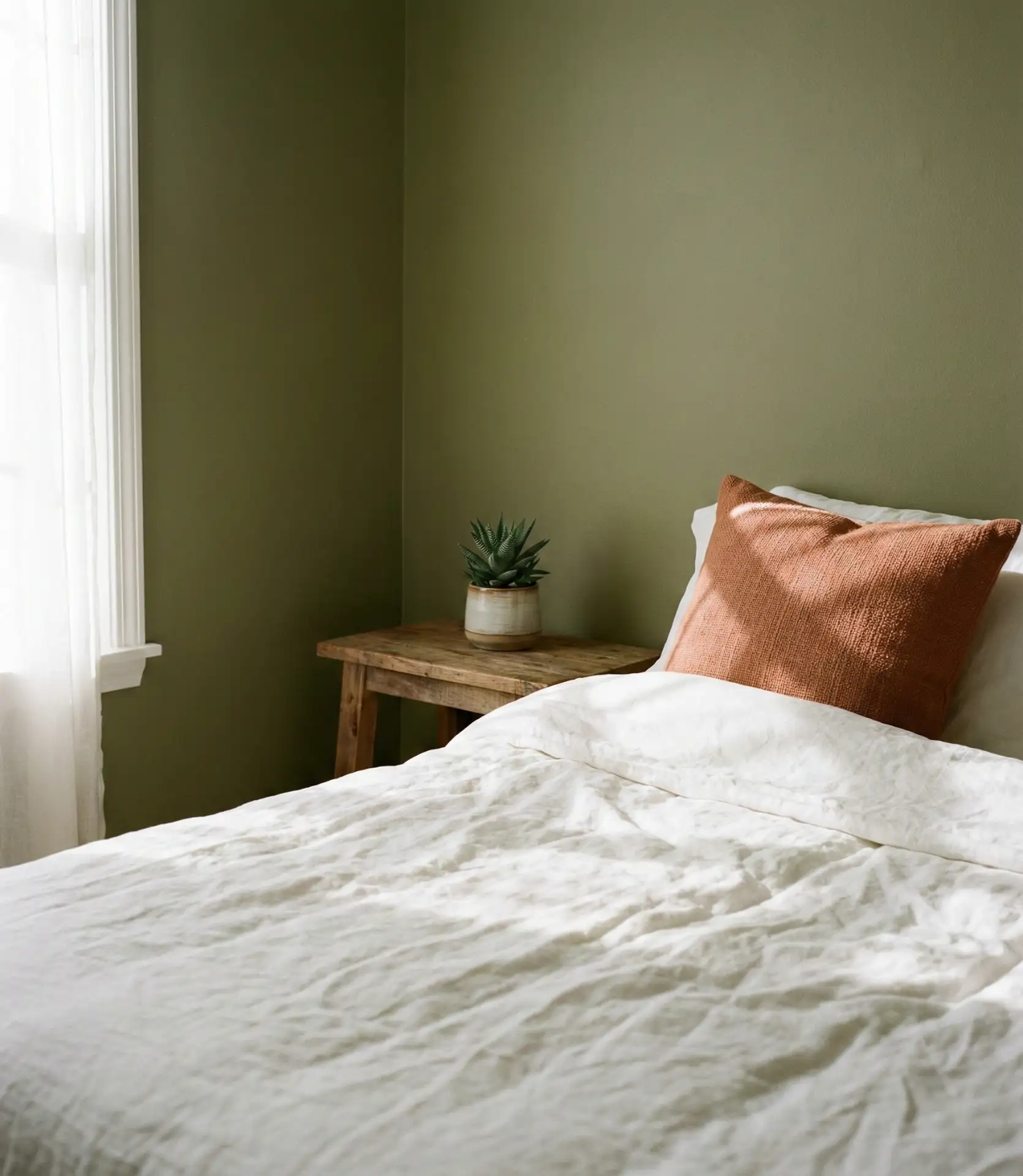
Pairing olive green with terracotta produces a palette that feels both warm and cozy and surprisingly modern. The green provides a neutral backdrop, while terracotta accents—whether in bedding, a ceramic lamp, or a woven rug—add just enough warmth to keep the room from feeling too subdued. This combination has roots in Mediterranean and Southwestern design but translates well into contemporary American homes, especially those with an interest in sustainable, earthy materials.
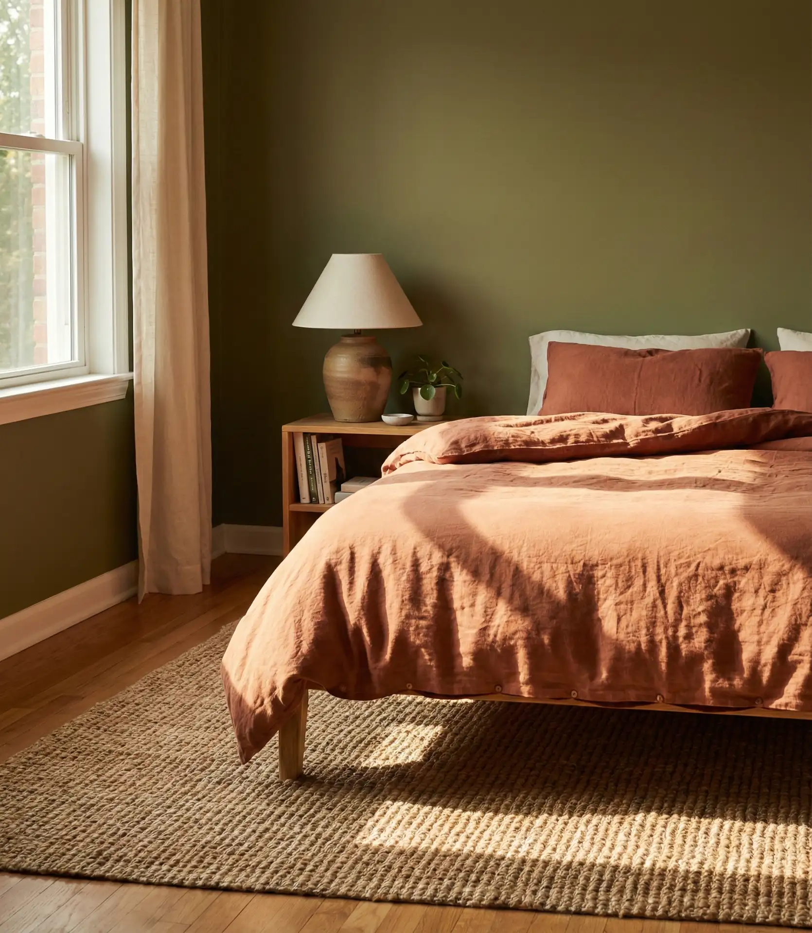
This palette works best in rooms with west-facing windows, where the afternoon light enhances the warmth of the terracotta. In the Southwest and Southern California, it’s become a go-to for homeowners looking to reference regional design without feeling too literal. The color pairing also ages well—it won’t feel dated in three years the way some trendier palettes might.
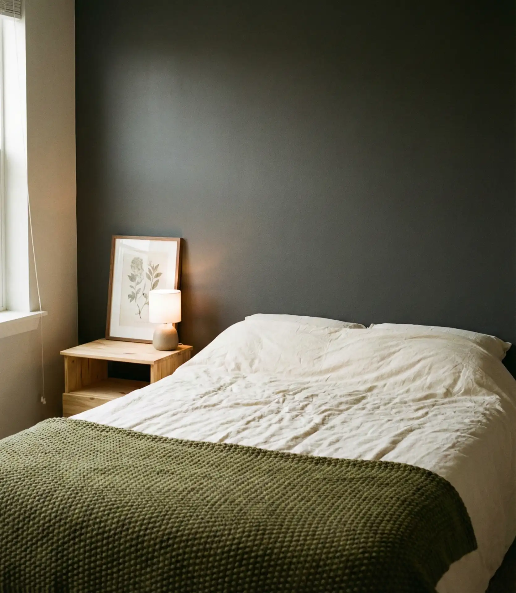
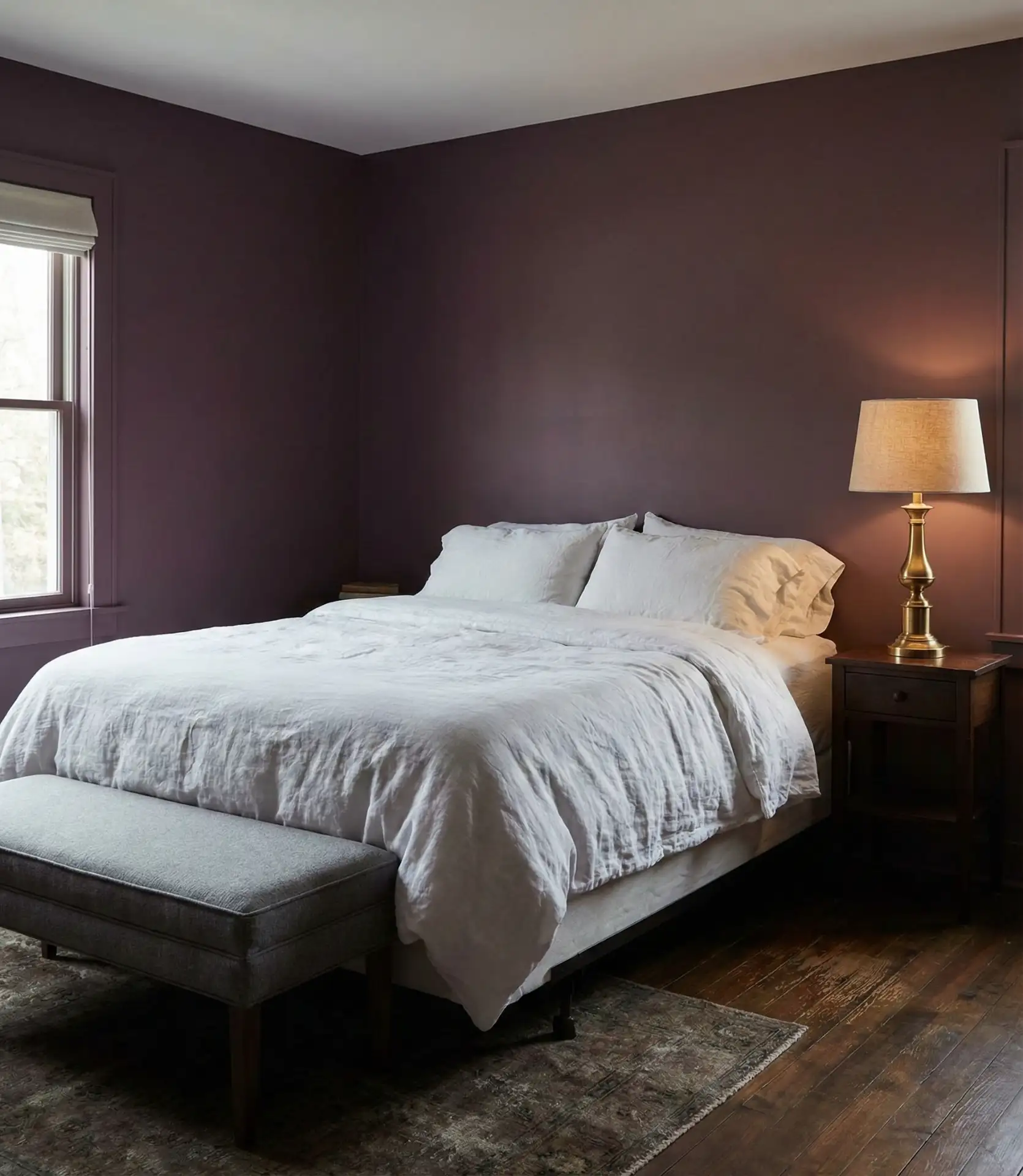
5. Charcoal Grey with a Black Headboard
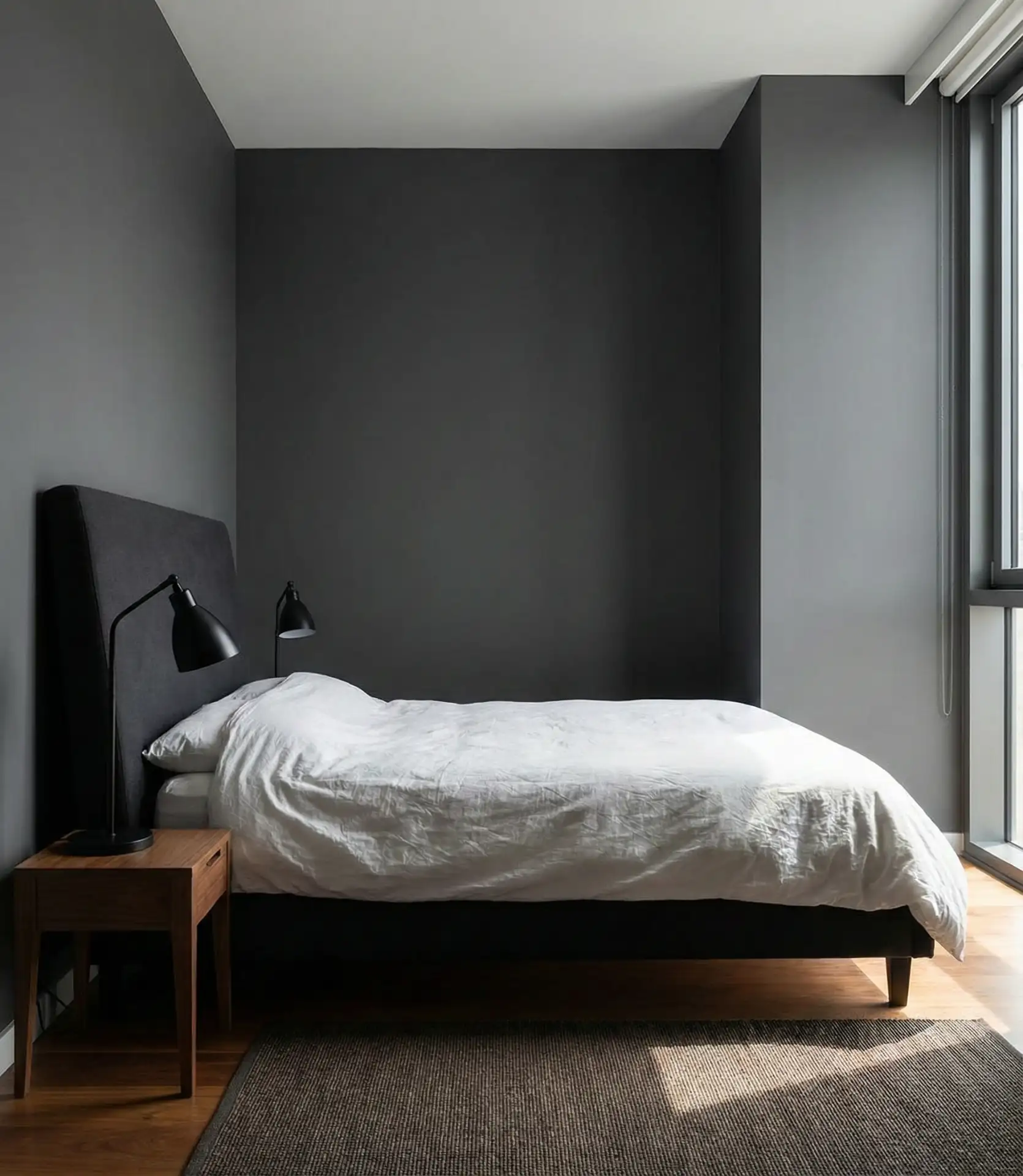
A gray bedroom anchored by a black headboard is a study in controlled contrast. The charcoal walls provide depth without drama, while the black headboard—whether upholstered, wood, or metal—becomes a natural focal point. The above design is a favorite among men and couples who want a mature, understated bedroom that doesn’t rely on color for interest. Layering in white or cream bedding keeps it from feeling too heavy.
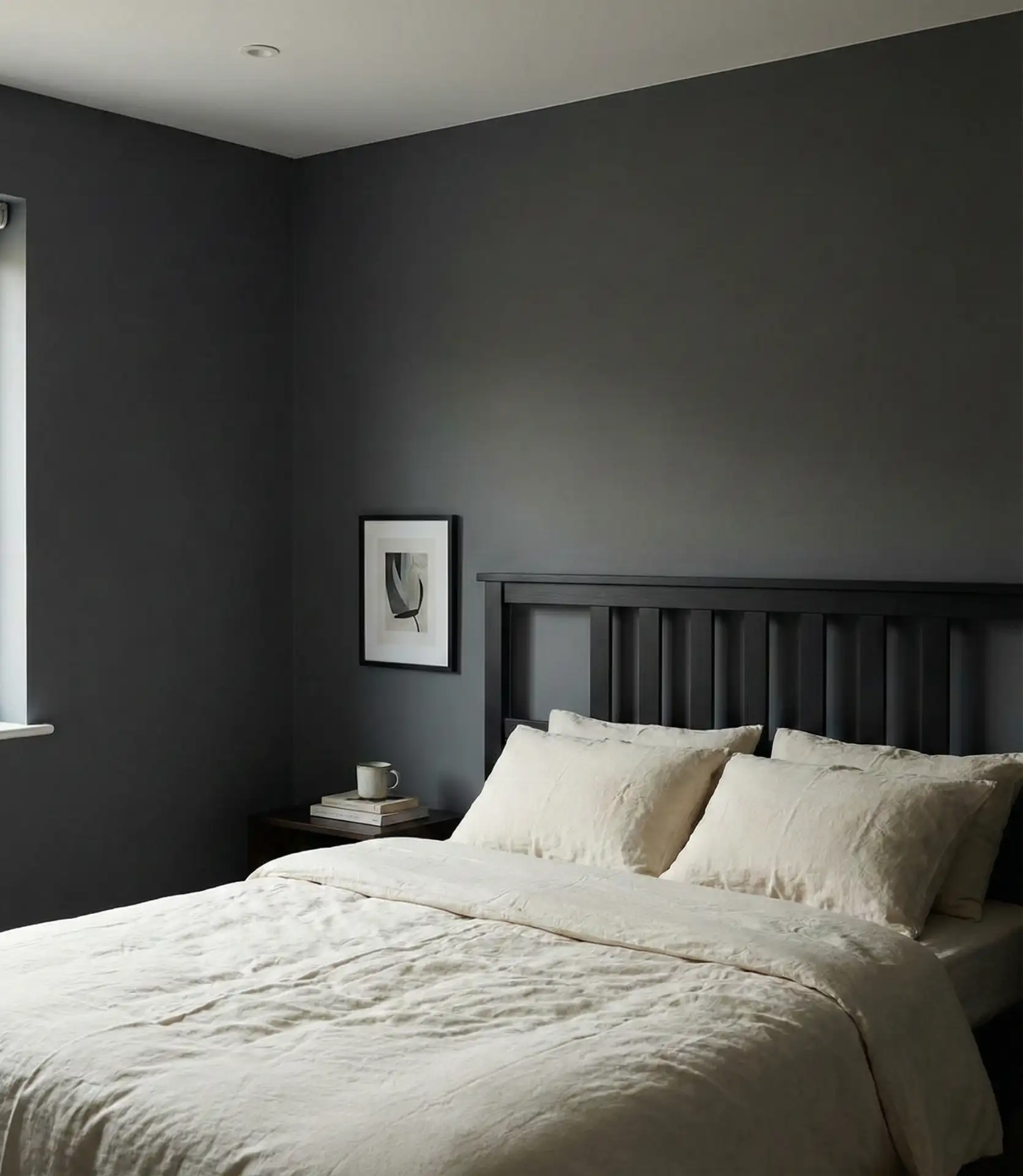
Common mistakes include choosing a gray that’s too cool, which can make the room feel sterile. Look for grays with warm undertones, especially if you’re in a climate with less natural light. Also, resist the urge to add too many black elements—one strong piece is enough. To maintain balance, the rest should be lighter.
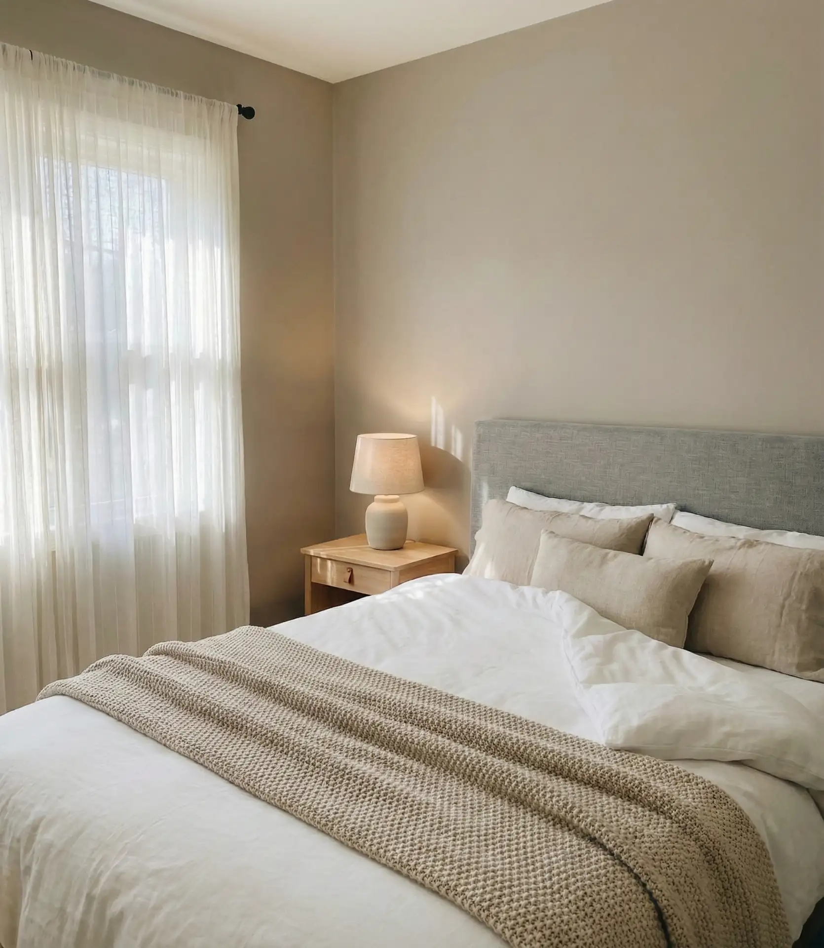
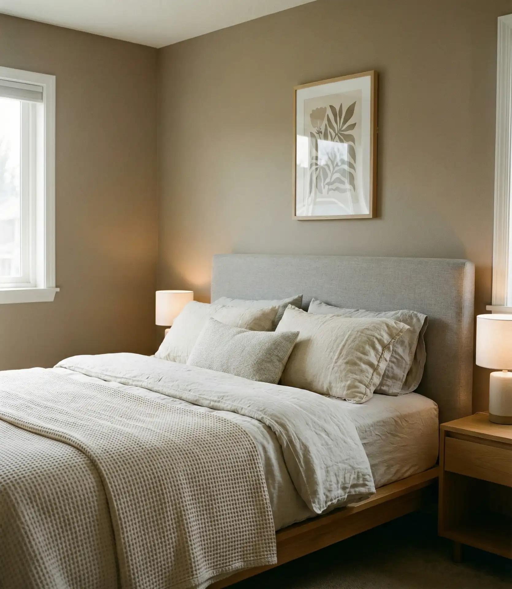
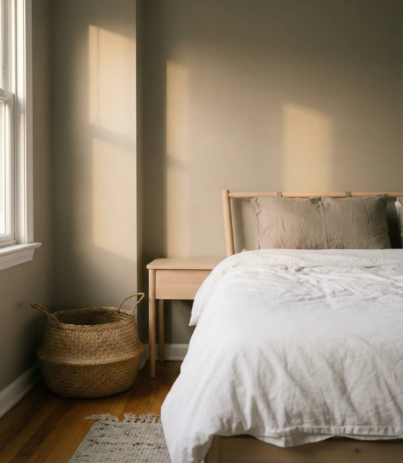
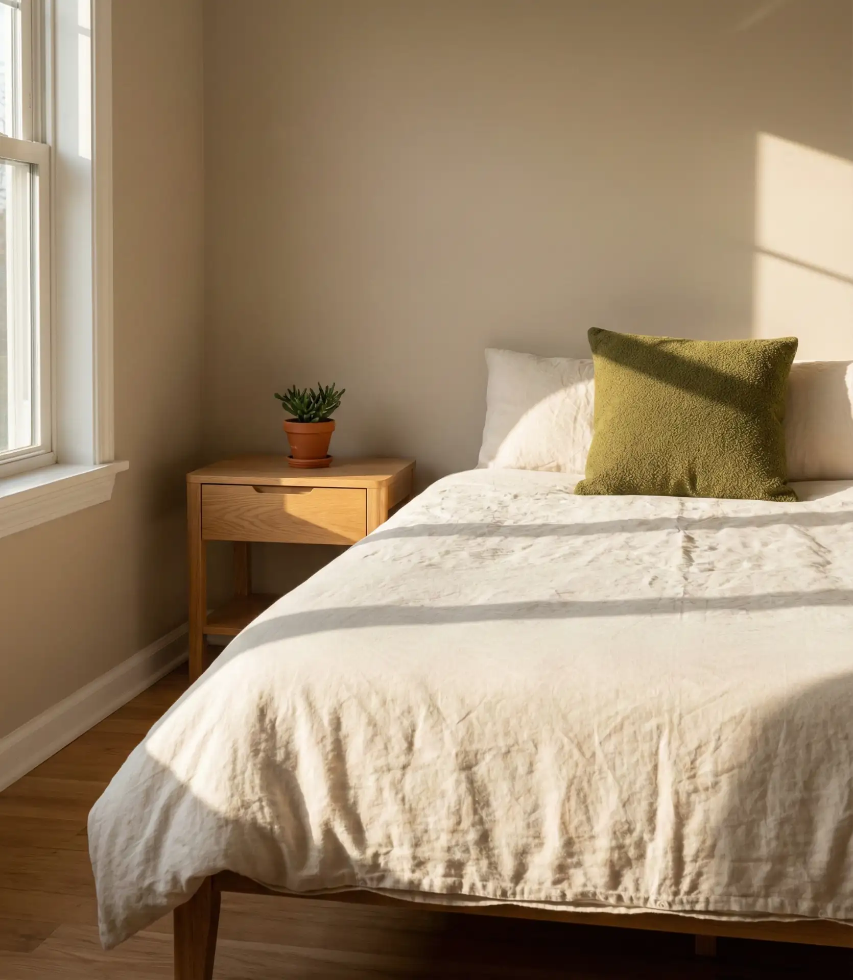
6. Warm White Walls with a Beige Headboard
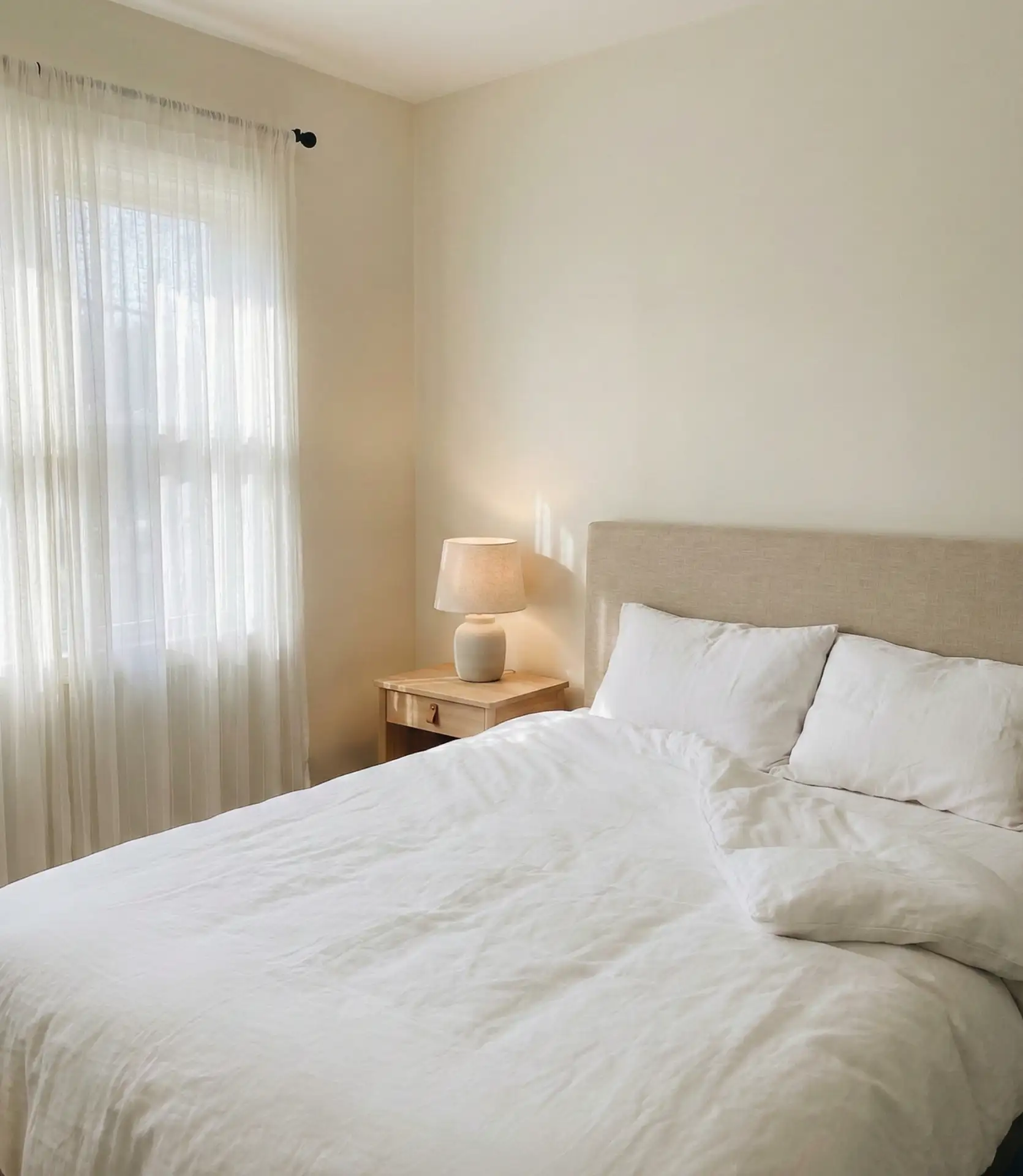
This is the updated version of the all-white bedroom, where white walls take on a warmer, creamier base and are paired with a beige headboard in linen or cotton. It’s a neutral scheme that works in nearly any home, but it’s especially effective in small bedrooms or spaces with limited natural light. The beige headboard adds just enough warmth to prevent the room from feeling cold or clinical, and the simplicity makes it easy to introduce seasonal accents.
In coastal areas and the Sun Belt, this palette is practically a standard. It reflects light well, stays cool visually, and works with nearly any furniture style. Homeowners often layer in texture through rugs, throws, and pillows to keep the look from feeling too flat. It’s also one of the most budget-friendly schemes—paint and a slipcover can transform the space for under $300.
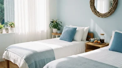
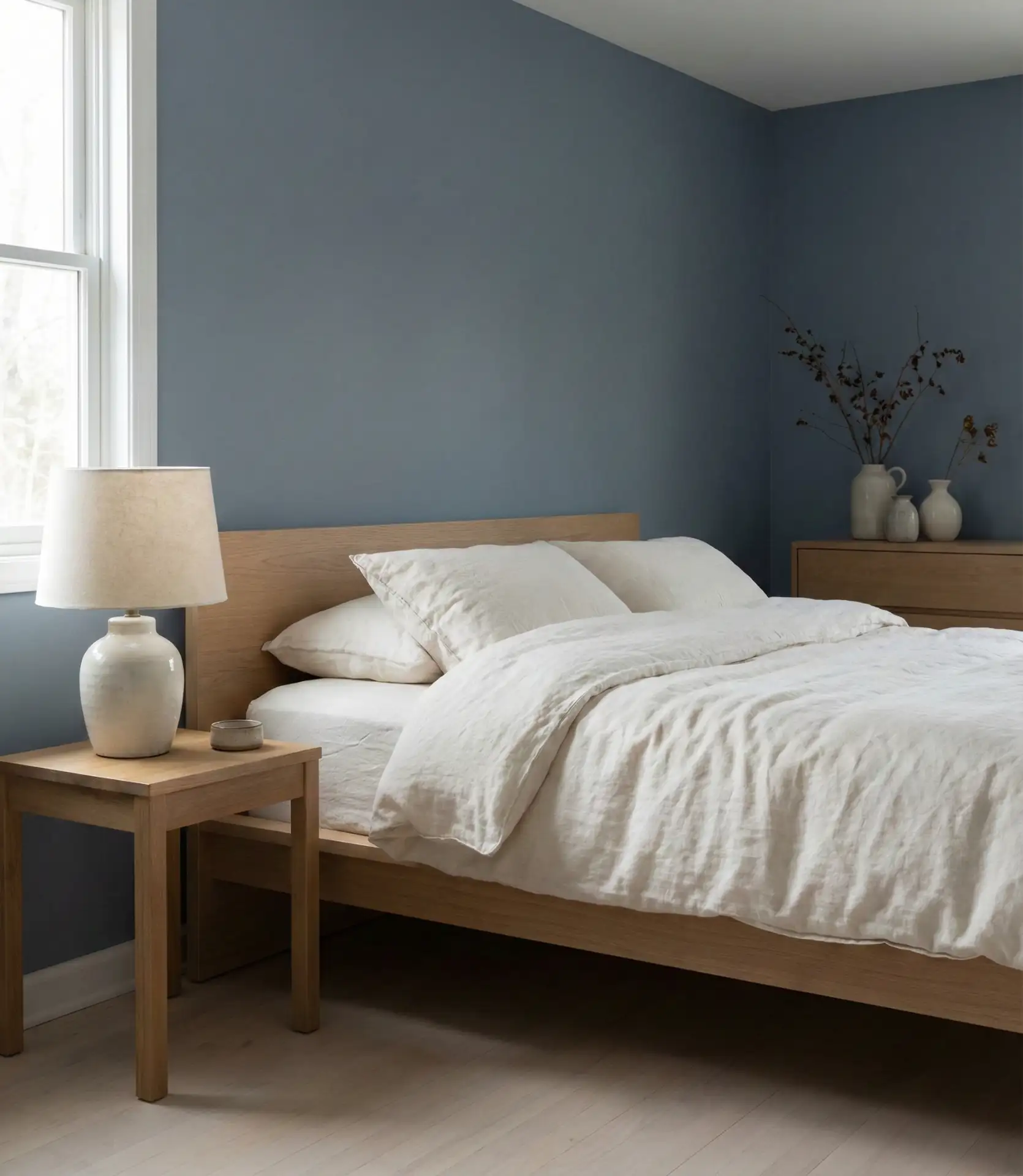
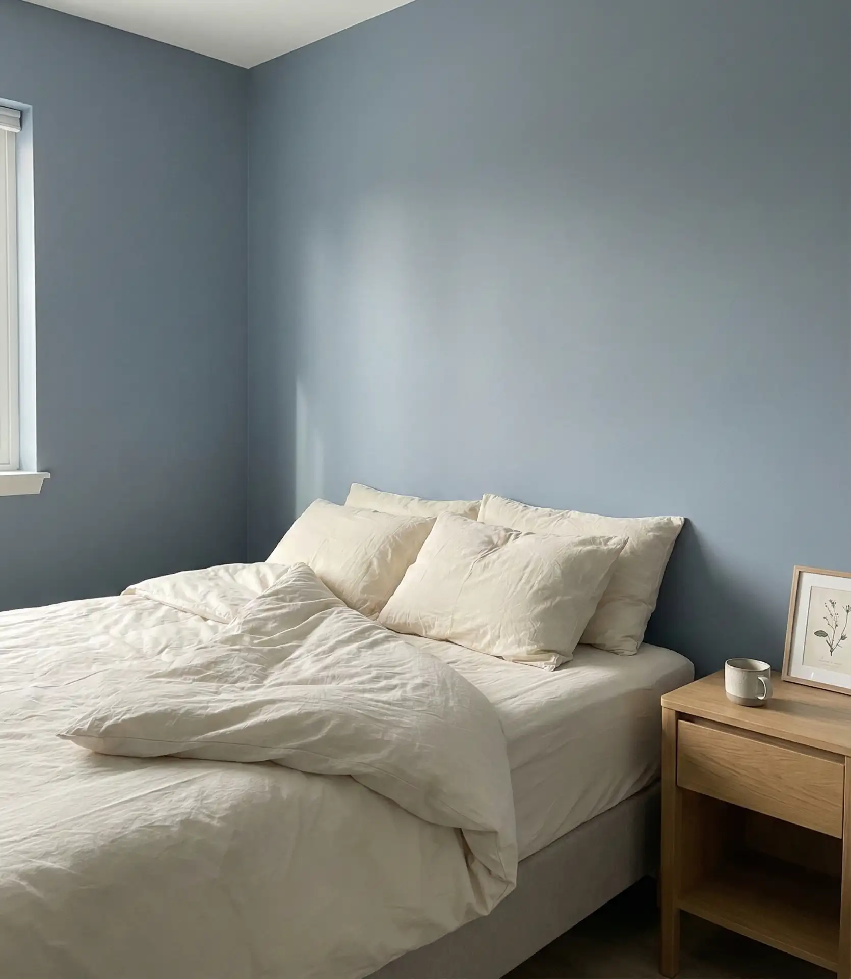
7. Dusty Blue with Grey Undertones
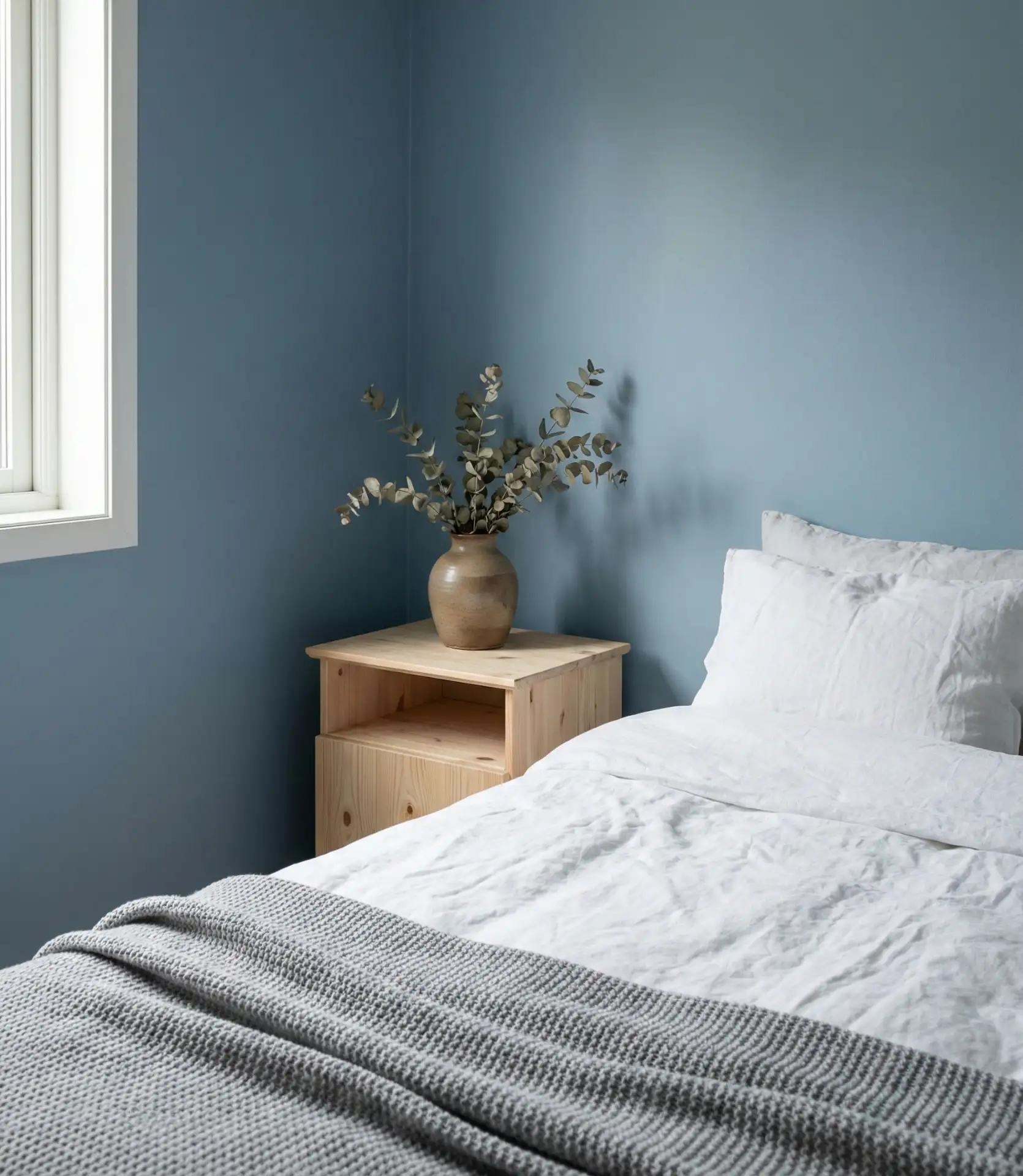
Blue bedrooms are moving away from bright, saturated tones toward something softer and more grounded. This dusty blue has enough grey in it to feel neutral, making it a versatile choice for a guest bedroom or a primary suite. It reads as calm and relaxing without feeling cold, and it pairs well with both warm and cool accents. It’s also one of the few colors that works across architectural styles, from farmhouse to mid-century modern.
A friend who recently painted her bedroom this color mentioned that it photographs differently depending on the time of day—morning light makes it look more blue, and evening light brings out the gray. That flexibility is part of its appeal. It’s also a shade that holds up well in rooms with many competing materials, like exposed brick or wood paneling.
8. Sage Green and Cream for a Soft, Cozy Neutral
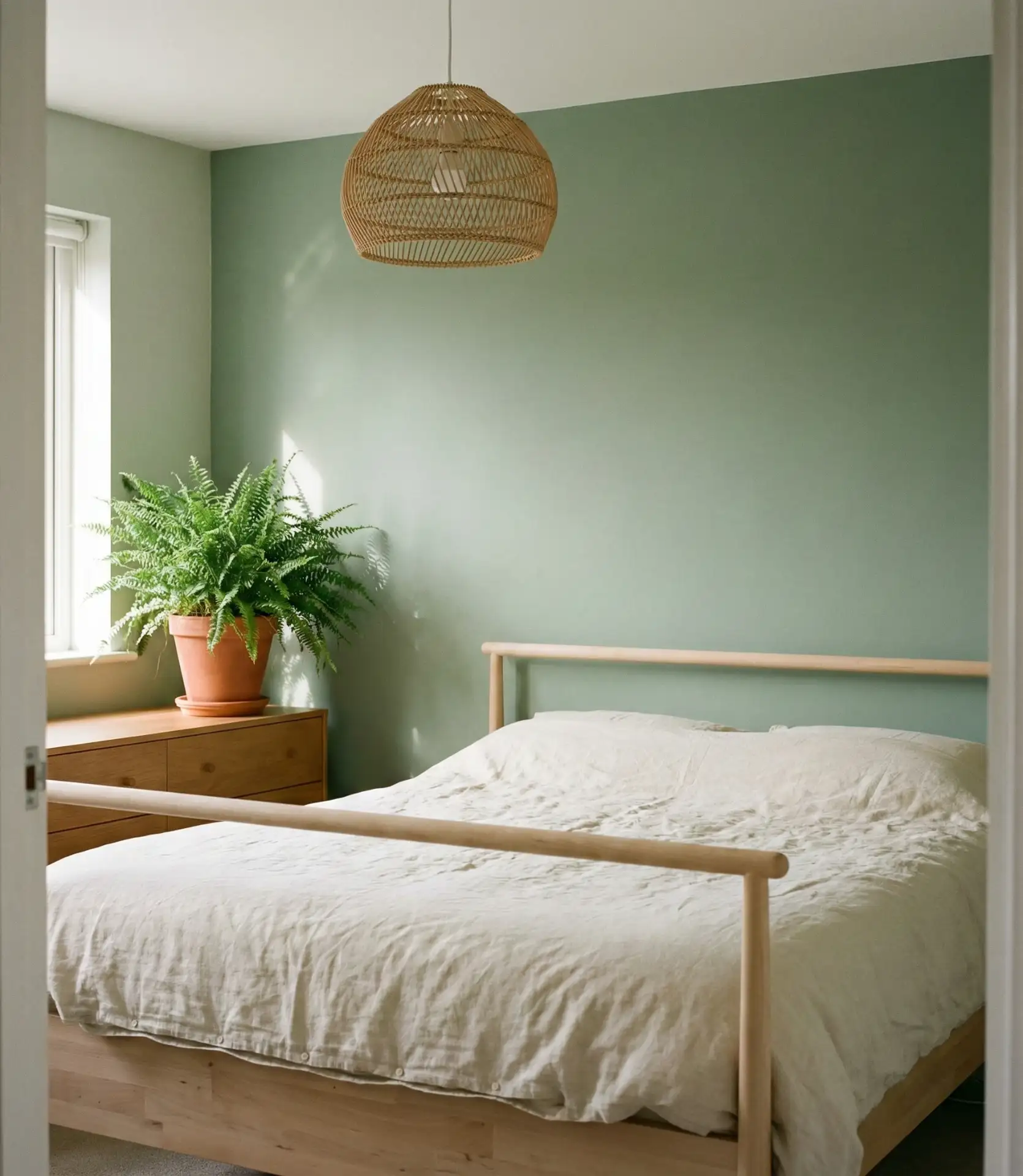
Sage green has staying power because it functions as a neutral while still offering color. When layered with cream bedding and natural wood, it creates a cozy bedroom that feels grounded and serene. This paint color is a popular choice for couples who want something that feels mature but not too serious. The palette works especially well in bedrooms with vintage or secondhand furniture, where the softness of the green complements older wood tones.
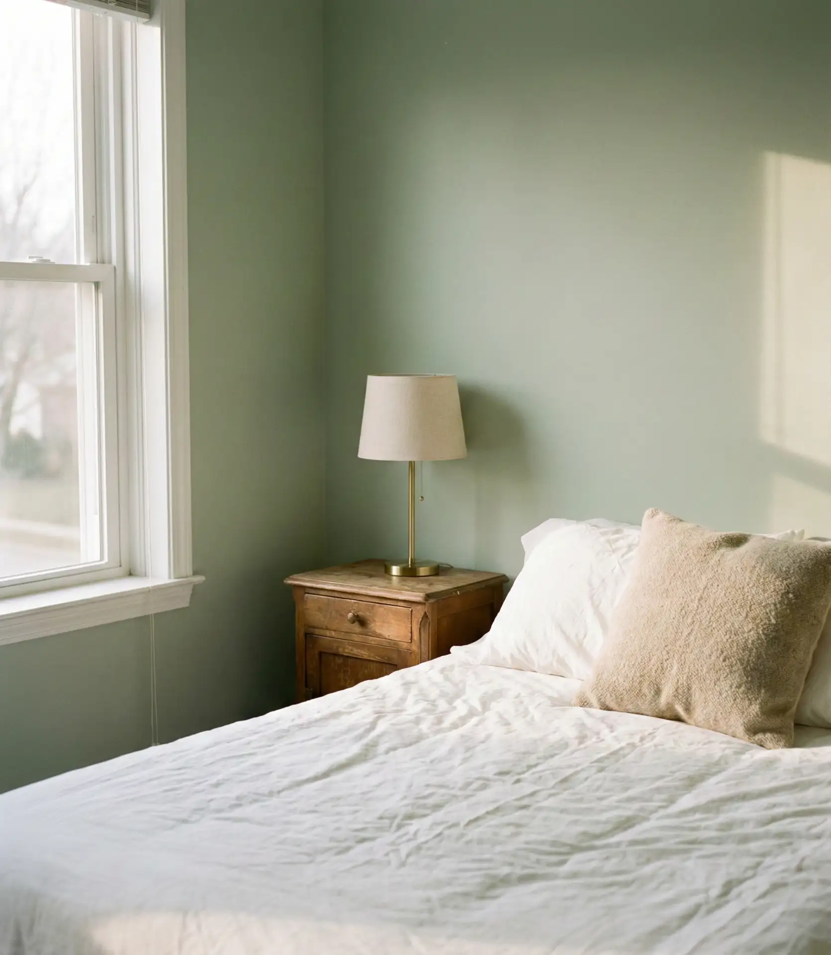
This palette is forgiving if you’re working with a mix of furniture styles or inherited pieces. It also works well in rental situations where you can’t paint all the walls—a single sage accent wall behind the bed can shift the entire mood of the room. The cost to execute the look is minimal, especially if you already own neutral bedding.
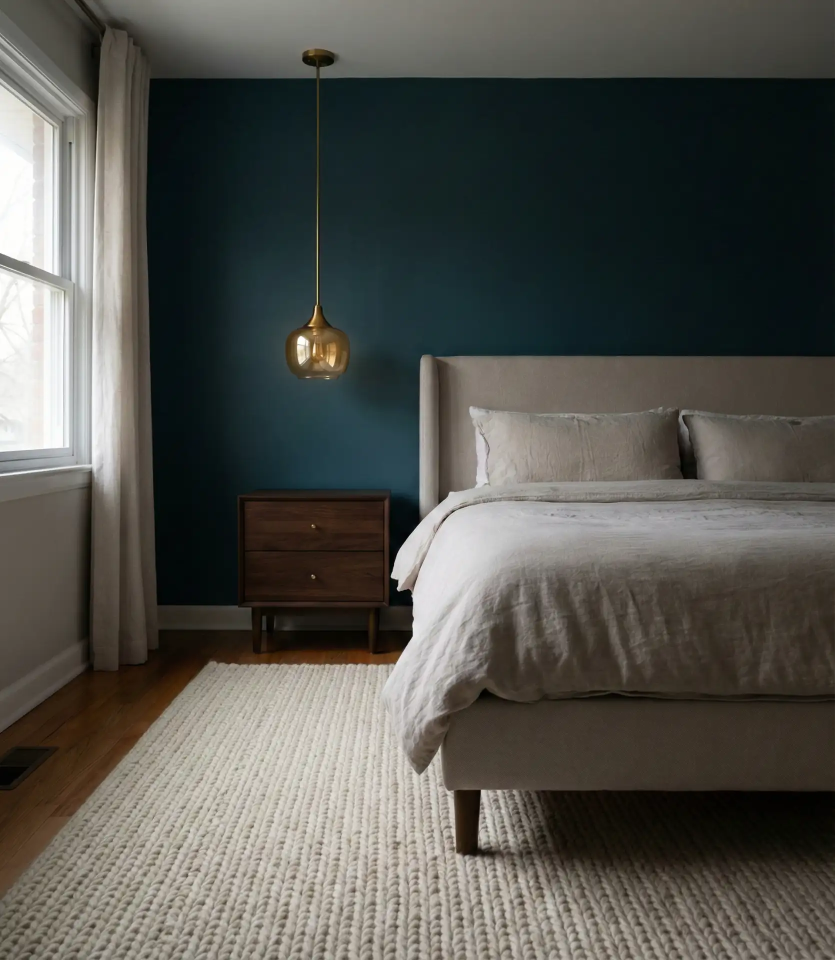
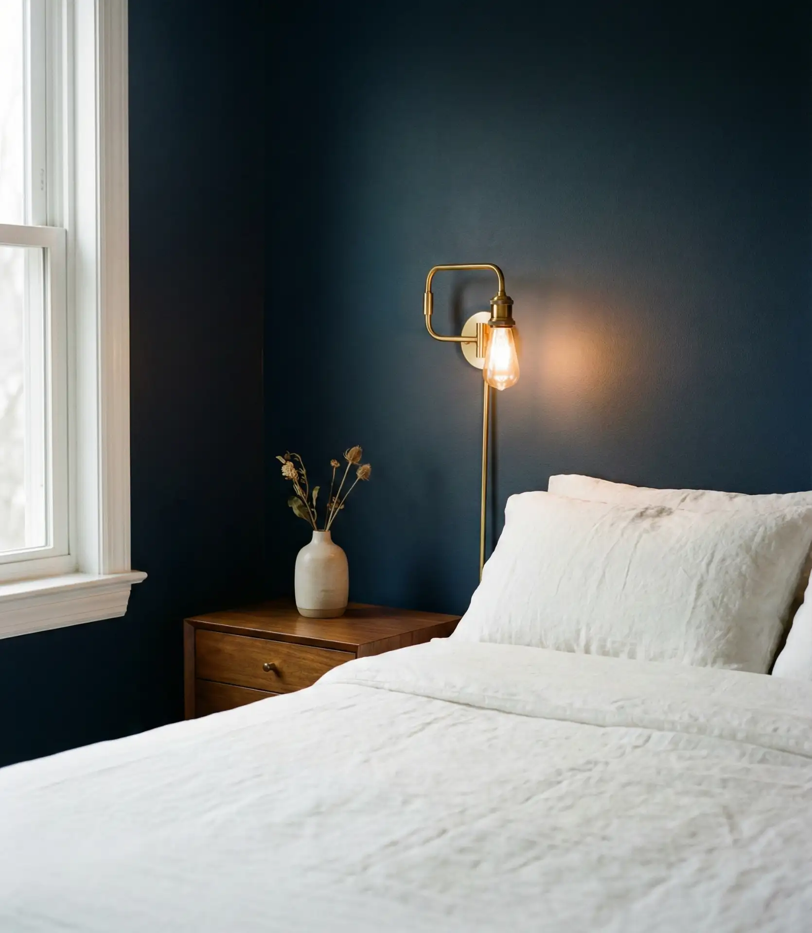
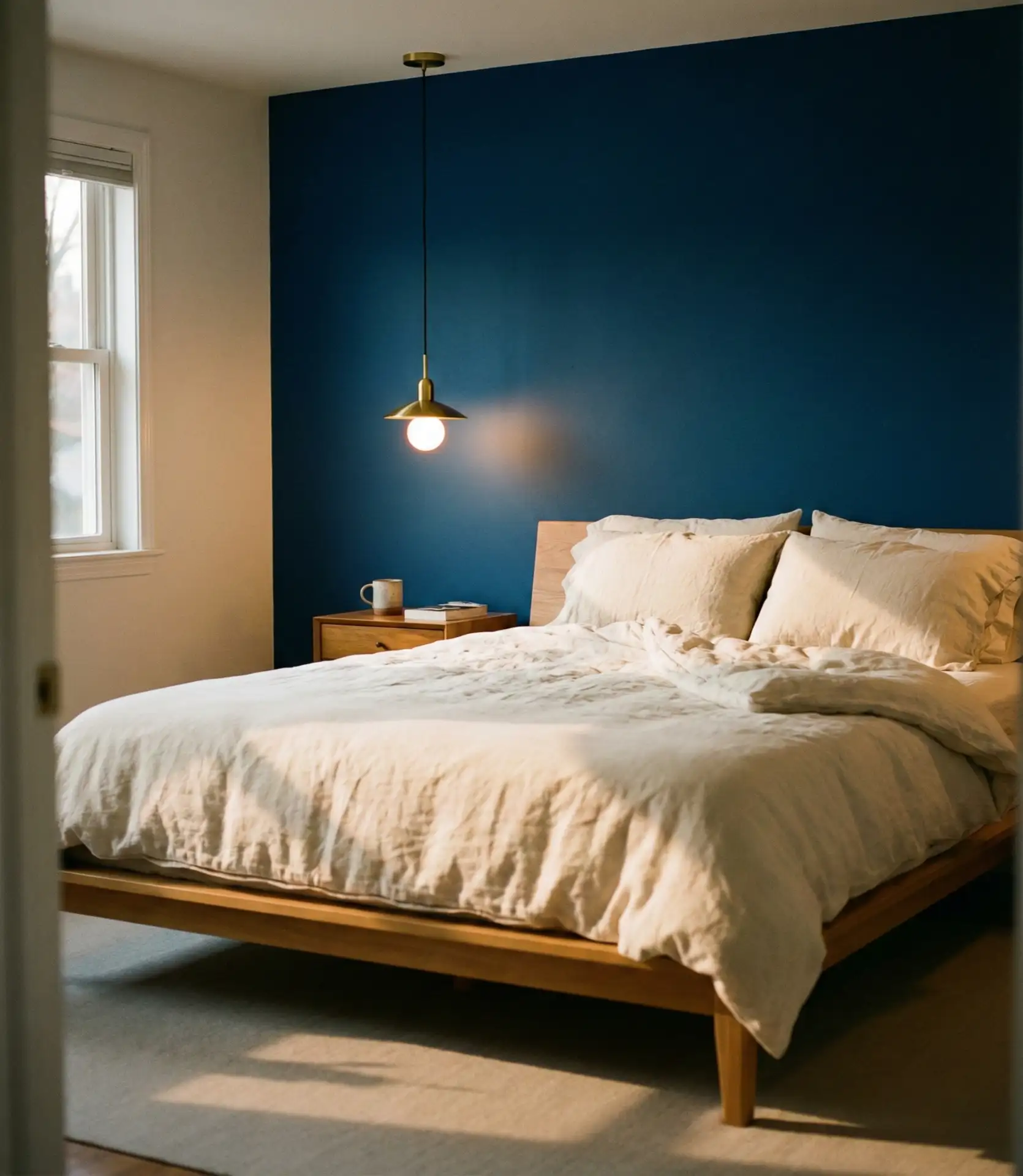
9. Rich Navy with Warm Beige Accents
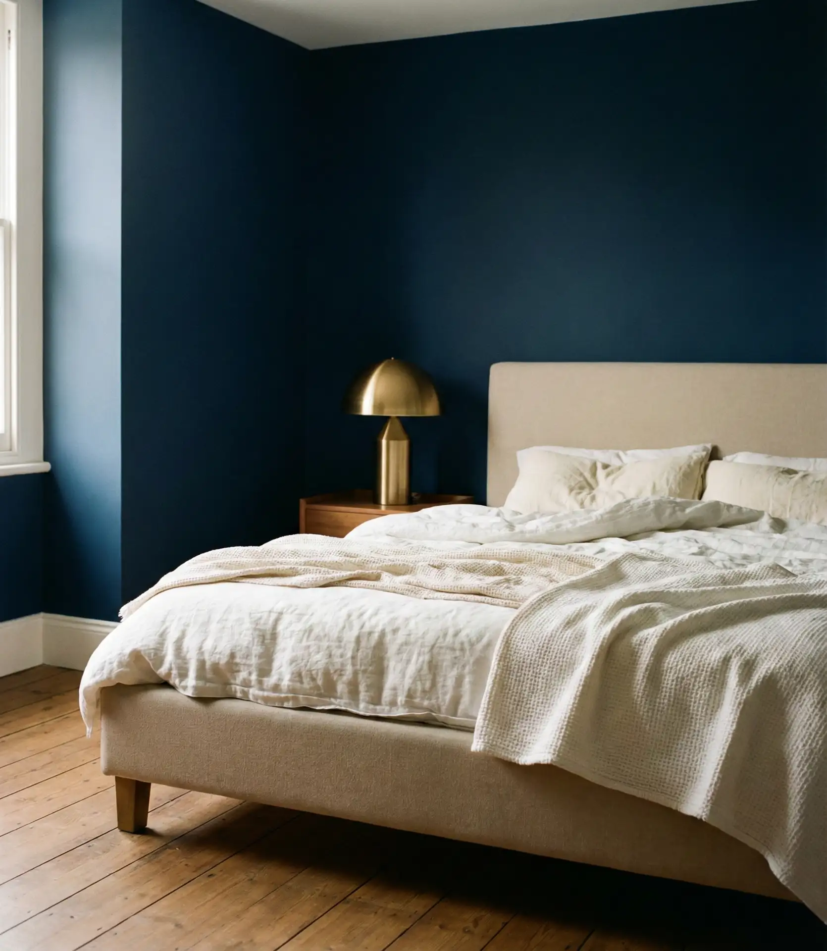
Navy has been a staple in bedroom design for years, but the 2026 approach involves balancing its depth with plenty of beige and cream to keep it from feeling too heavy. This is a classy palette that works particularly well for men or in a primary bedroom where you want something sophisticated but not austere. The beige softens the navy’s intensity and makes the room feel more approachable.
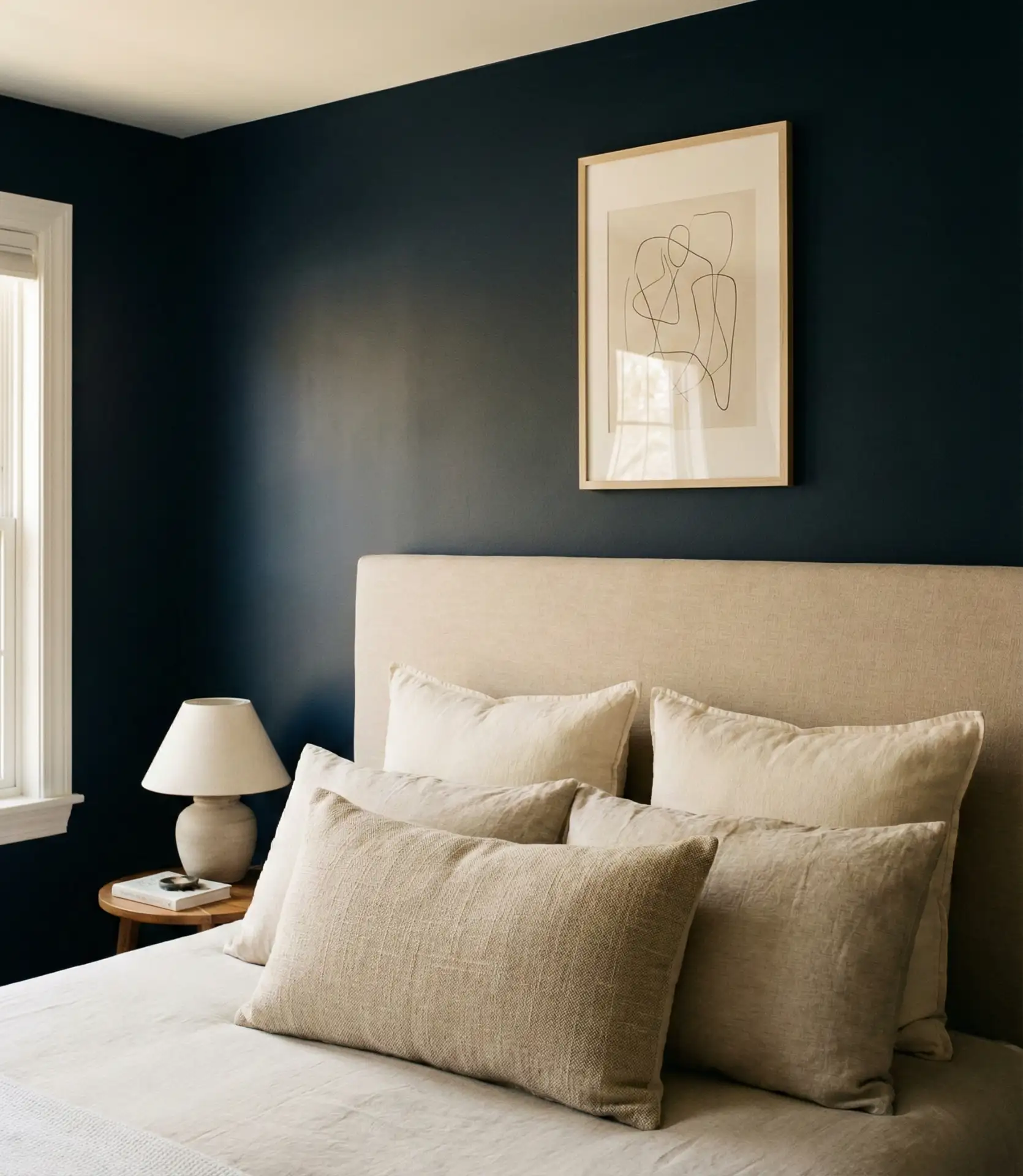
Navy works best in rooms with good artificial lighting, as it can absorb a lot of natural light. In apartments or homes with smaller windows, consider using navy on just one or two walls rather than the entire room. Pairing it with beige keeps it from skewing too masculine, making it a good option for shared spaces.
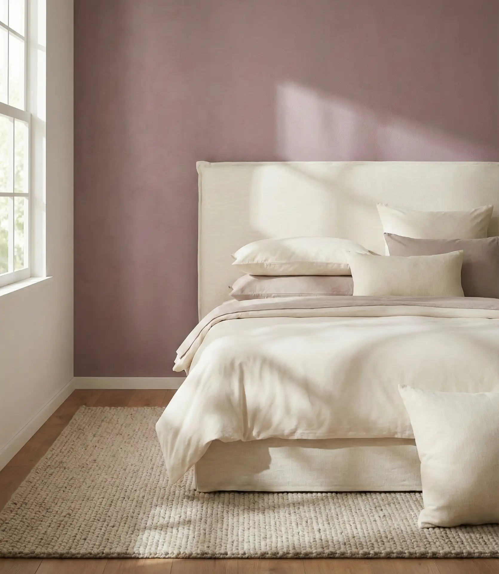
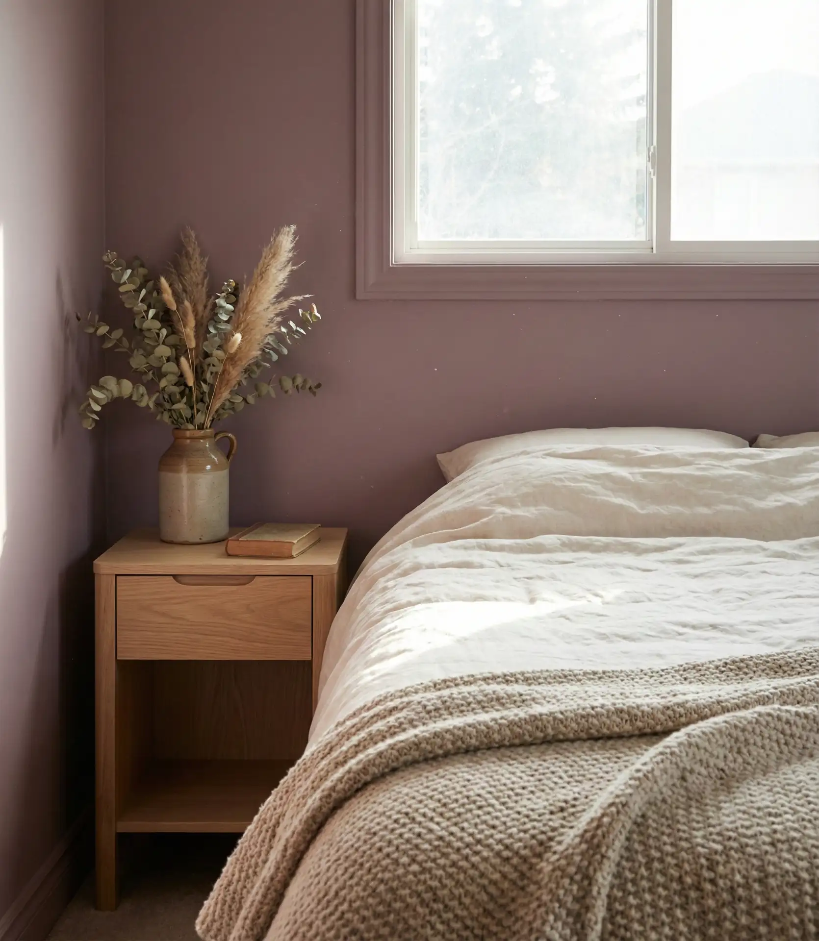
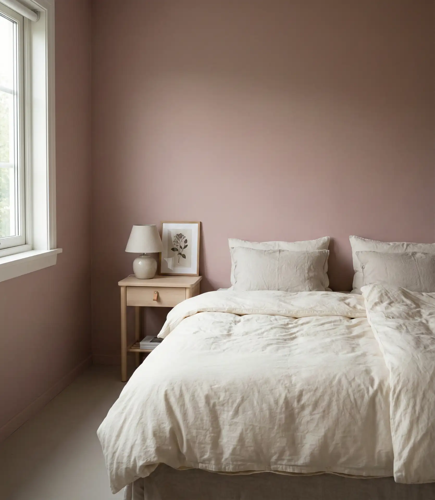
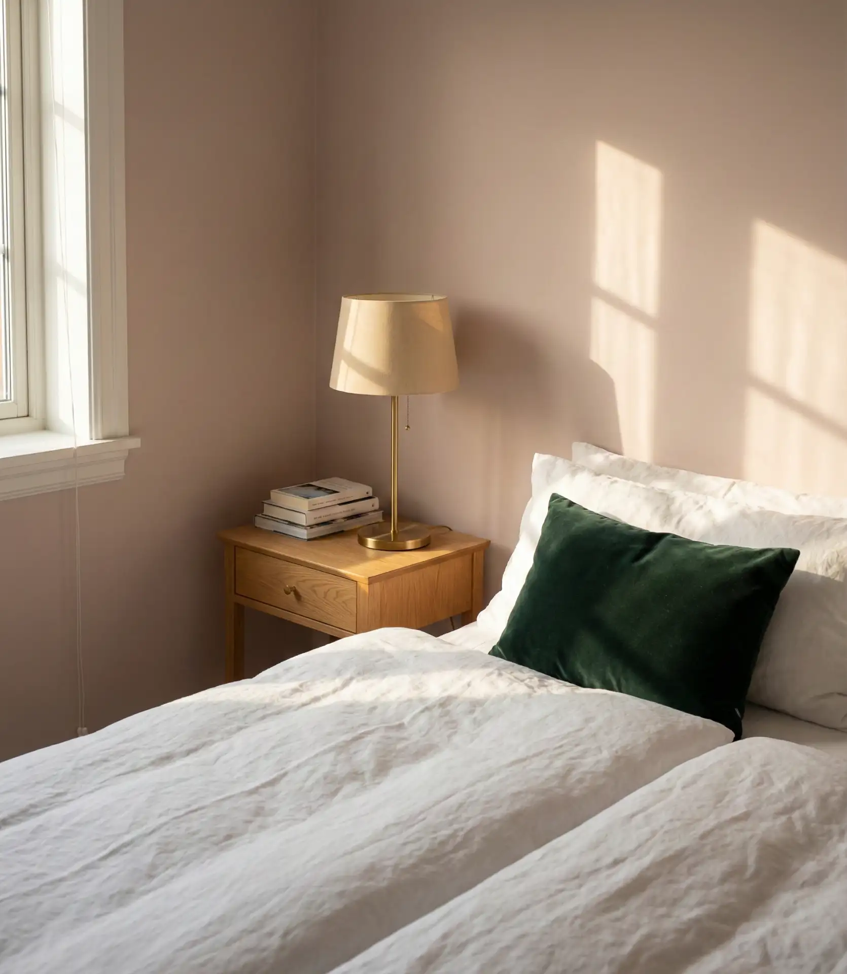
10. Soft Pink and White for a Modern, Airy Bedroom
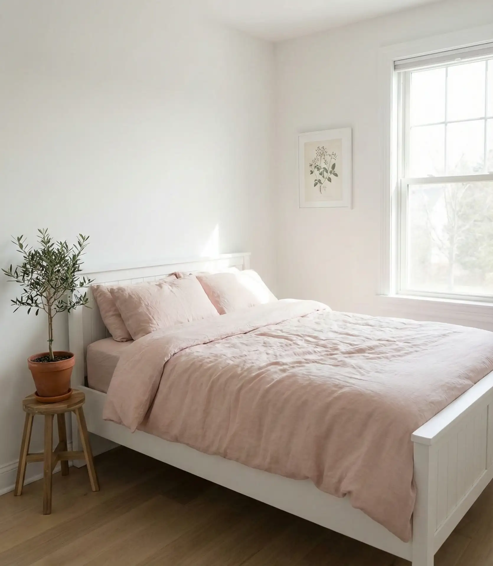
Pink in 2026 is muted, almost neutral, and pairs beautifully with crisp white walls and minimalist furniture. This isn’t a sugary palette—it’s restrained and modern, ideal for a bedroom that prioritizes light and simplicity. The pink can show up in bedding, a single accent wall, or even just in artwork and accessories. It’s a subtle way to introduce warmth without committing to a bold color choice.
This works particularly well in small bedrooms or spaces with limited storage, where visual calm is a priority. It’s also a favorite among homeowners in warmer climates, where the lightness of the palette helps the room feel cooler. One common mistake is choosing a pink that’s too saturated—stick with something that has gray or beige undertones to keep it sophisticated.
11. Warm Taupe with a Grey Headboard
Taupe is the ultimate neutral, and when paired with a grey headboard, it creates a bedroom that feels both warm and cozy and visually balanced. The taupe walls provide a soft, enveloping backdrop, while the grey headboard adds structure and a bit of contrast. This scheme is a go-to palette for couples who want something that doesn’t lean too far in any one direction—it’s neither too masculine nor too feminine, neither too light nor too dark.
Taupe is often considered dull, but it’s one of the most versatile colors when done right. It works across all lighting conditions, complements nearly every wood tone, and provides a perfect backdrop for art and textiles. It’s also a color that translates well to resale, making it a smart choice if you’re planning to move in the next few years.
12. Earthy Terracotta and Cream Layers
Terracotta on the walls creates an earthy, grounded bedroom that feels both modern and timeless. When layered with cream bedding and natural wood furniture, it becomes a cozy retreat that’s ideal for a primary bedroom or a guest room. The warmth of the terracotta makes the space feel intimate without being dark, and it pairs beautifully with greenery and woven textures.
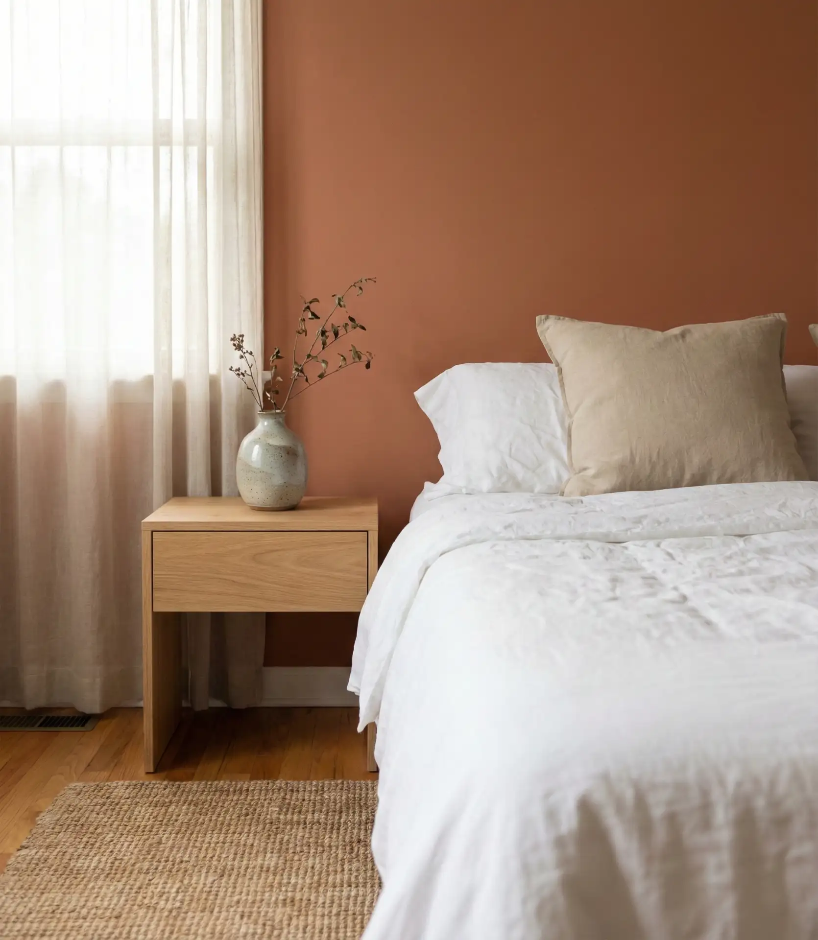
Terracotta is having a major moment, especially in the Southwest and California, where it references regional adobe architecture. It’s also gaining traction in the Midwest among homeowners looking for warmth without the heaviness of darker colors. The key is to balance it with plenty of light neutrals—too much terracotta can overwhelm a small space.
13. Charcoal and Olive for a Dark, Sophisticated Palette
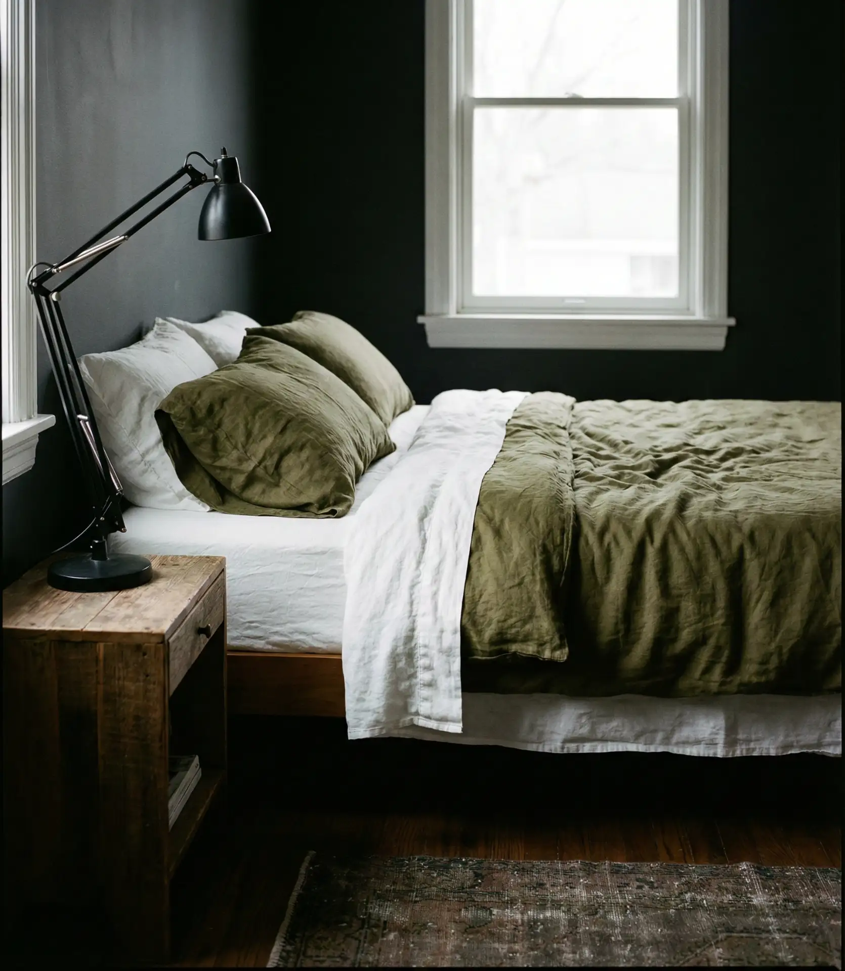
Pairing charcoal walls with olive accents creates a dark, layered bedroom that feels intentional and mature. This is a palette for those who aren’t afraid of depth—both colors are rich and saturated, but when balanced with white or cream bedding, the room doesn’t feel heavy. It’s a favorite among men and design-forward homeowners who want something that stands out without being loud.
This palette requires confidence and excellent lighting—both natural and artificial. In a room with poor light, it can feel oppressive, but in a space with large windows or well-placed lamps, it’s stunning. High-quality textiles, such as linen, wool, and cotton, best complement the palette’s richness of colors.
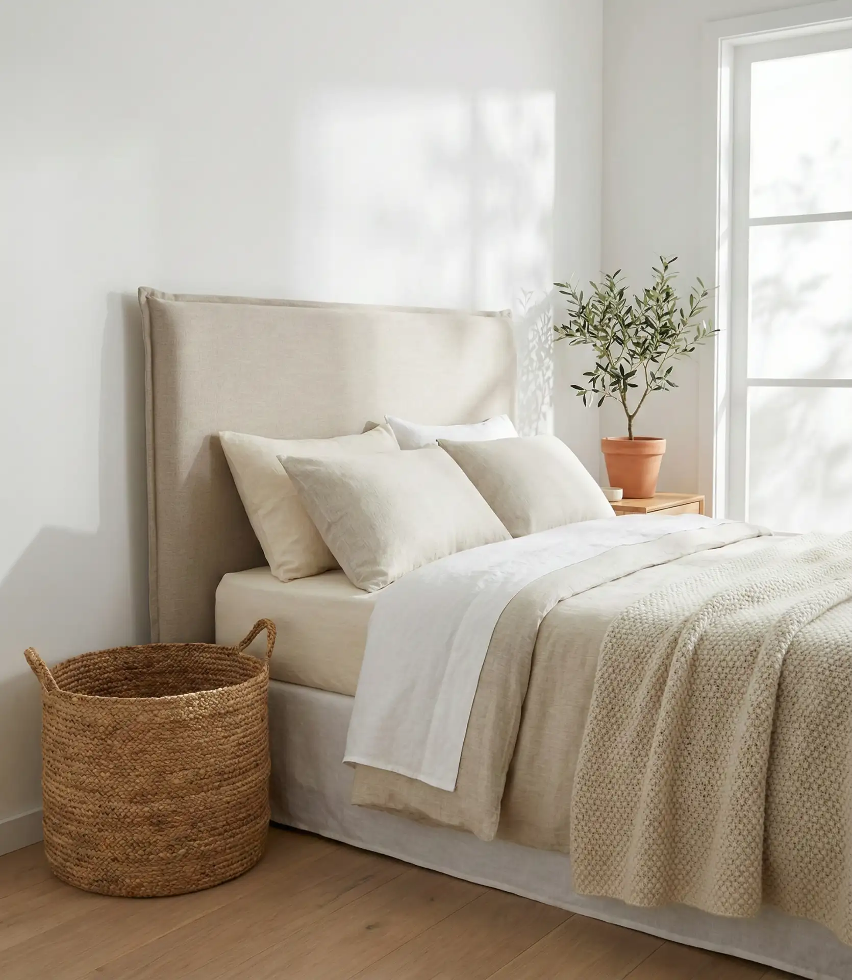
14. Boho Cream and Natural Textures
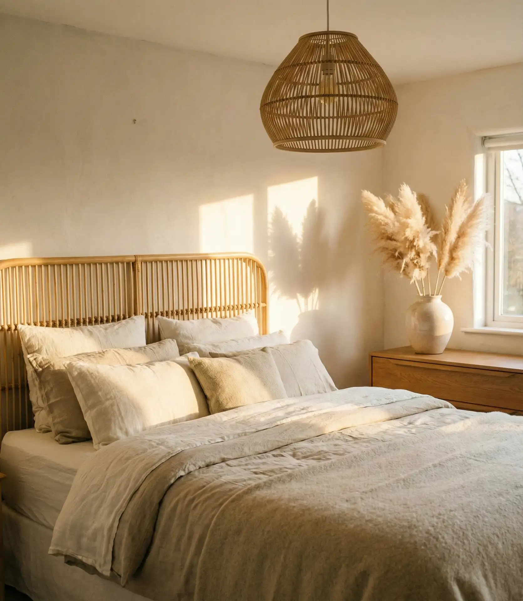
This theme is a boho-inspired scheme built on layers of beige, cream, and natural fibers rather than bold color. The palette relies on texture for interest—think jute rugs, macramé wall hangings, woven baskets, and linen bedding. It’s a cozy, neutral approach that works well in small bedrooms or spaces where you want a laid-back, lived-in feel. The absence of strong color makes the room feel open and airy, even when layered with accessories.
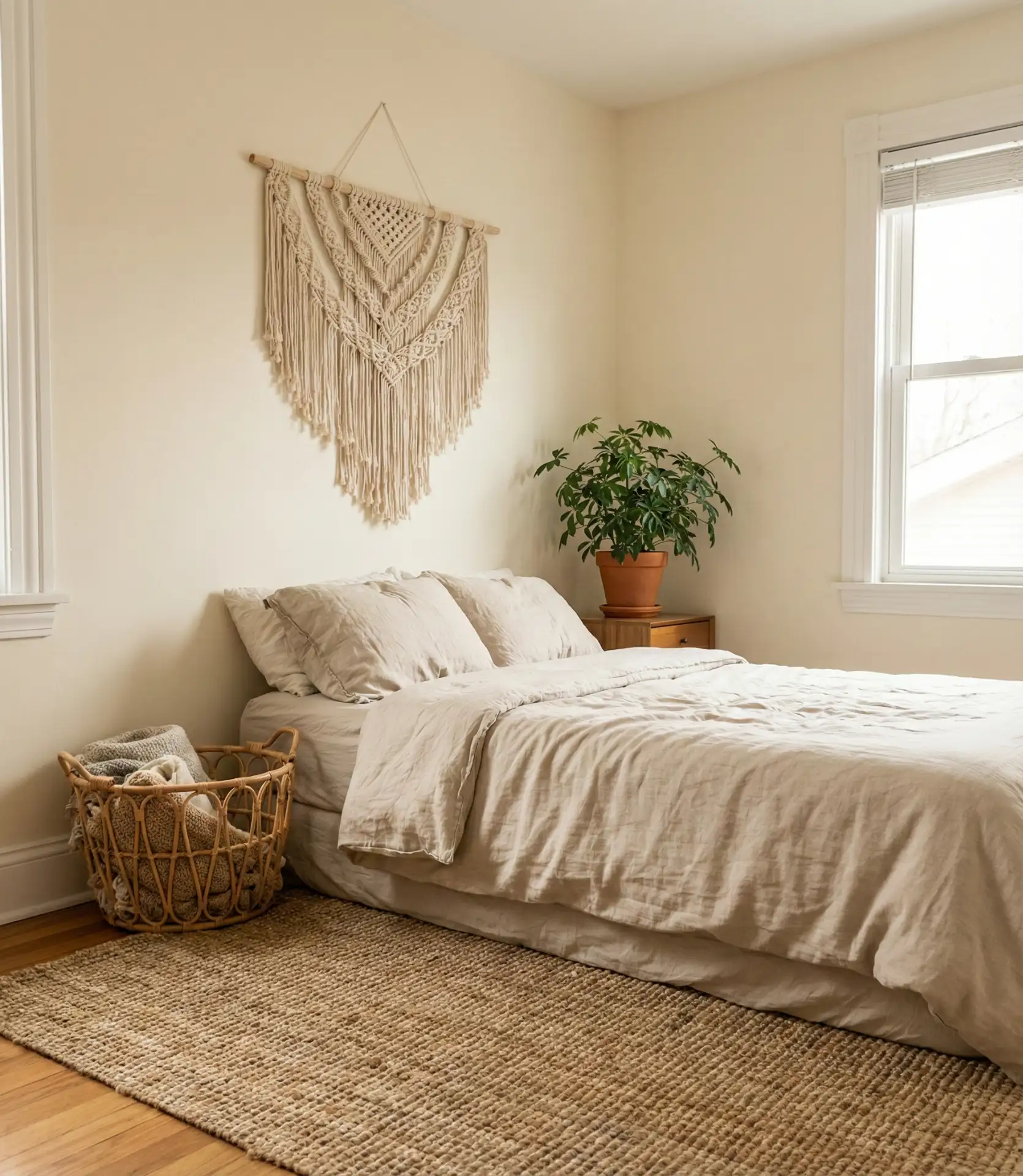
A neighbor recently redid her guest bedroom in this style and mentioned that it’s surprisingly forgiving with clutter—the neutral palette doesn’t compete with books, bags, or everyday items the way a more colorful scheme might. It’s also one of the most budget-friendly approaches, as thrifted and DIY elements fit right in.
15. Deep Plum and Warm Grey
Deep plum is an underused bedroom color that offers richness without the formality of navy or the predictability of burgundy. When paired with warm grey accents and plenty of white bedding, it becomes a classy, unexpected choice. This scheme is a palette for homeowners who want something a bit more daring but still grounded. Bedrooms with high ceilings or architectural detail, where you can fully appreciate the depth of the plum, work particularly well for this palette.
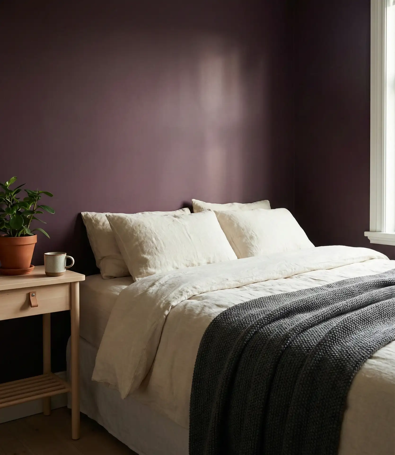
Plum works best in rooms with ample natural light or where you’re willing to invest in quality lighting. It’s also a color that benefits from restraint—too many competing elements and the room can feel chaotic. Stick with simple bedding and minimal decor to let the color shine.
16. Farrow and Ball-Inspired Muted Tones
The influence of Farrow & Ball on American bedrooms is undeniable, with their signature muted, complex colors showing up in everything from historic renovations to new builds. These are colors that shift throughout the day—soft greens, dusty pinks, and grayed blues that never feel flat or one-dimensional. This style is a neutral approach in the truest sense, where the subtlety of the color is the point. It’s ideal for homeowners who want sophistication without contrast.
These colors work particularly well in older homes with original molding or paneling, where the complexity of the paint complements the architecture. They’re also forgiving if you’re mixing furniture styles or eras. Budget-wise, you can achieve a similar look with careful color matching at most paint retailers, though the quality of Farrow & Ball’s pigments is noticeably richer.
17. Midnight Blue with Brass and Warm Wood
Midnight blue is a dark, saturated alternative to black that feels luxurious without being overly formal. When paired with brass fixtures and warm wood furniture, it becomes a classy bedroom that works for couples or anyone who wants a space that feels considered and complete. The brass adds warmth and prevents the blue from feeling too cold, while the wood grounds the palette and keeps it from skewing too modern.
This palette is popular in urban lofts and renovated brownstones, where it complements both industrial and traditional elements. It’s also one of the few dark palettes that doesn’t require a lot of maintenance—fingerprints and dust are less visible on blue than on black or charcoal. Just make sure the room has enough light sources, as blue can absorb a lot of illumination.
18. Warm Greige with Layered Neutrals
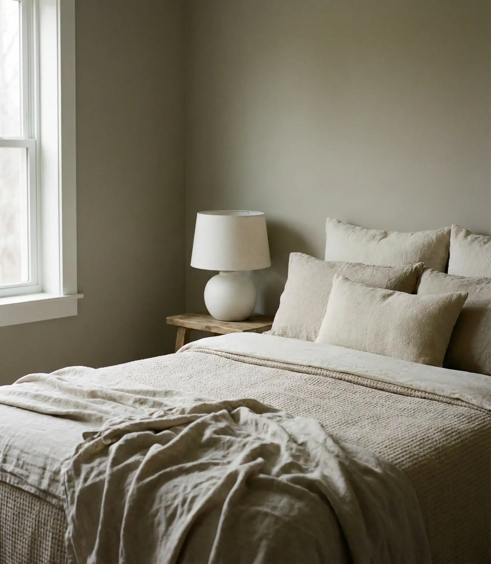
Greige—a blend of gray and beige—remains one of the most reliable bedroom colors, especially when warmed up with layered neutral textiles. This is a cozy neutral palette that works in nearly any home, from a compact condo to a sprawling suburban house. The key is varying the tones and textures—cream, taupe, ivory, and soft whites all layer together to create depth. It’s a forgiving palette that works with almost any furniture and can easily shift with changing trends.
Greige is particularly popular in the South and Midwest, where it complements both traditional and contemporary homes. It’s also one of the easiest colors to work with when you’re trying to coordinate across rooms or when you’re staging a home for sale. The neutrality doesn’t mean boring—texture and layering make all the difference.
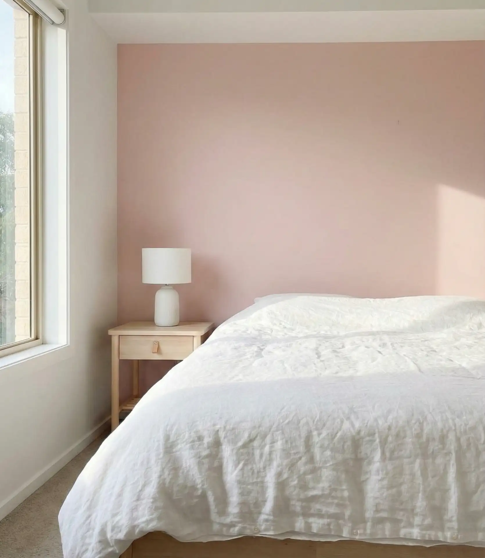
19. Soft Blush with Dark Green Accents
Soft blush walls paired with dark green accents create a bedroom that’s both warm and cozy and visually intriguing. The blush provides a gentle backdrop, while dark green—whether in bedding, a velvet chair, or artwork—adds contrast and depth. This color scheme is a palette that works well for couples who want something that feels romantic without being overly feminine. It’s also a popular choice on Pinterest for its photogenic, layered quality.
This color combination works best in rooms with plenty of natural light, where the blush can shift from pink to peach depending on the time of day. It’s also a palette that benefits from high-quality textiles—cheap fabrics can make the blush look too sweet or the green too flat. Invest in luxurious bedding, and the room will feel elevated.
20. Slate Blue and Warm White for a Cozy, Relaxing Space
Slate blue is a muted, grayed-down blue that feels both relaxing and sophisticated. When paired with warm white bedding and natural wood, it creates a cozy bedroom that doesn’t rely on brightness for impact. This is a wonderful choice for a guest bedroom or a primary suite where you want a calm, neutral foundation that still has personality. The warmth of the white keeps the blue from feeling too cold, and the overall effect is balanced and inviting.
Slate blue is forgiving with lighting—it looks good in both bright and dim conditions, which makes it a smart choice for rooms that serve multiple purposes or that don’t have consistent natural light. It’s also a color that works well across architectural styles, from coastal cottages to urban apartments.
21. Warm Beige and Olive for an Earthy, Neutral Retreat
Beige and olive together create an earthy, grounded bedroom that feels both modern and timeless. The beige walls provide a soft, neutral base, while olive accents—whether in a throw blanket, pillow, or piece of furniture—add just enough color to keep the room from feeling flat. This scheme is a palette that works well in bedrooms where you want a sense of calm and simplicity, and it pairs beautifully with natural materials like linen, wood, and stone.
This palette is particularly popular in the Southwest and California, where it complements the natural landscape and architectural traditions. It’s also one of the easiest palettes to execute on a budget—paint and a few well-chosen textiles can completely transform a space. The key is keeping the tones warm to avoid the room feeling too sterile.
22. Classic White with Layered Textures and Natural Wood
An all-white-walls bedroom doesn’t have to feel cold or sterile. When layered with varied textures—linen, cotton, wool, jute—and punctuated with natural wood furniture, it becomes a cozy, inviting space that feels anything but minimal. This style is a favorite among homeowners who want a clean, airy bedroom that still feels lived-in and personal. The white provides a blank canvas that can shift with the seasons, and the texture keeps it from feeling flat.
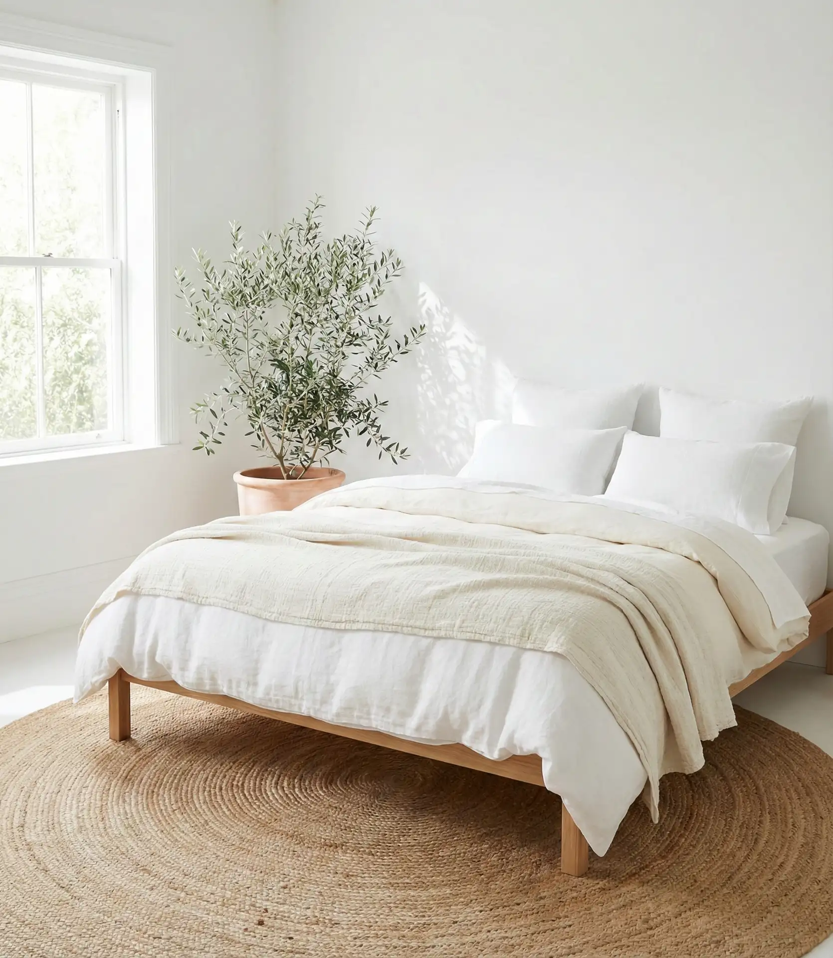
This color palette is one of the most versatile bedroom palettes—it works in small apartments, large suburban homes, coastal cottages, and urban lofts. It’s also one of the most resale-friendly, as it appeals to the widest range of buyers. The key to making it feel personal rather than generic is layering in meaningful objects and varied textures rather than relying solely on color for interest.
The bedroom color palettes gaining traction in 2026 reflect a broader shift toward warmth, depth, and personal expression. Whether you’re drawn to muted greens, layered neutrals, or unexpected jewel tones, the common thread is intentionality—colors chosen not because they’re trendy, but because they serve the mood you’re trying to create. If you’ve tried any of these combinations or have your favorites, share them in the comments below.