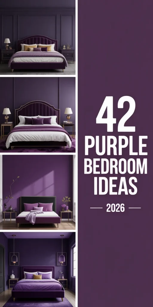
Purple has quietly reclaimed its place as one of the most searched bedroom colors on Pinterest—and in 2026, it’s showing up in ways that feel genuinely fresh. Whether you’re drawn to deep, moody plums or soft lavender washes that make a room feel like a daydream, there’s a shade and a style here for every kind of sleeper. This isn’t your grandmother’s grape-painted guest room. Today’s purple bedrooms are layered, intentional, and seriously beautiful. In this guide, you’ll find distinct ideas spanning everything from bold dark walls to pastel kids’ spaces—all designed to inspire your next bedroom transformation.
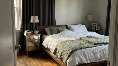
1. Deep Plum Velvet Headboard Moment
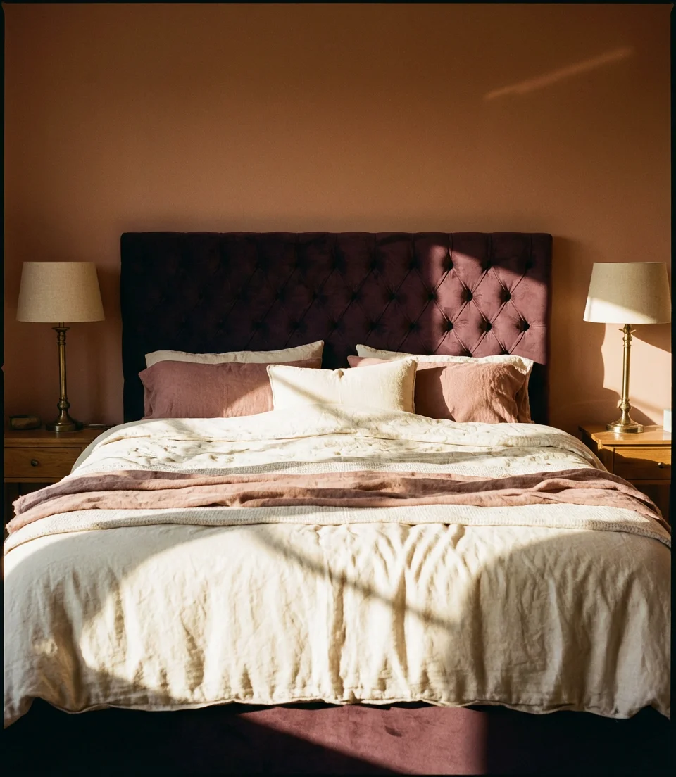
If you’re looking for a romantic focal point that anchors a room without overwhelming it, a deep plum velvet headboard might be the single best investment you make. This look works beautifully for couples who want the bedroom to feel like a retreat—somewhere intentional and a little indulgent. Pair the headboard with warm brass hardware, cream linen bedding, and a chunky woven throw, and you’ve got a space that feels both grounded and quietly luxurious without relying on a full room repaint.
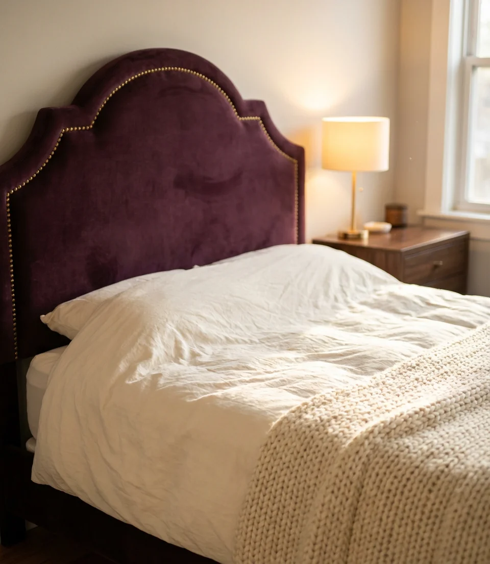
Velvet headboards have surged in popularity across the Midwest and South, where homeowners are leaning into cozy, statement-making furniture rather than neutral minimalism. The good news is that quality velvet headboards are widely available at mid-range price points—you can find genuinely beautiful options between $300 and $700, which is a fraction of the cost of a full bedroom renovation. Look for channel-tufted headboards, which have a pattern of fabric that is sewn into channels, or arched silhouettes, which have a curved top, as these styles are trending hardest right now and photograph incredibly well for those inevitable Pinterest saves.
2. Lavender Walls with White Trim—The Classic Reimagined
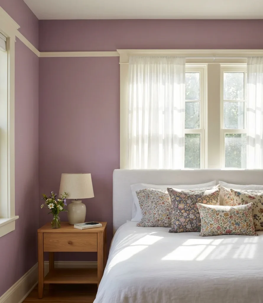
There’s a reason lavender walls with crisp white trim never fully disappear from design conversations—the combination is simply timeless. In 2026, designers are refreshing this classic by leaning into warmer lavender tones (think blush-purple rather than cool blue-violet) paired with off-white or creamy trim instead of stark white. The result feels less “children’s room” and more elevated European bedroom—the kind of space you’d find in a carefully styled Paris apartment. It works for teens and adults equally well.
One of the most common mistakes people make with lavender walls is choosing a shade that photographs blue under artificial light. Before committing, test your chosen paint in both natural daylight and your evening lamp lighting—the difference can be dramatic. Benjamin Moore’s “Violet Mist” and Sherwin-Williams’ “Amethyst” are both widely praised for staying true to their warm lavender in varied lighting conditions. A small sample pot and a weekend of observation will save you from a repaint you didn’t budget for.
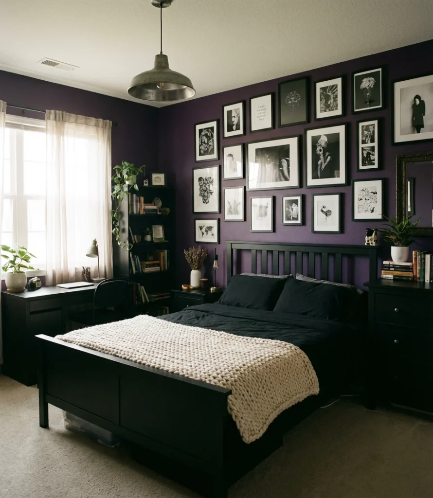
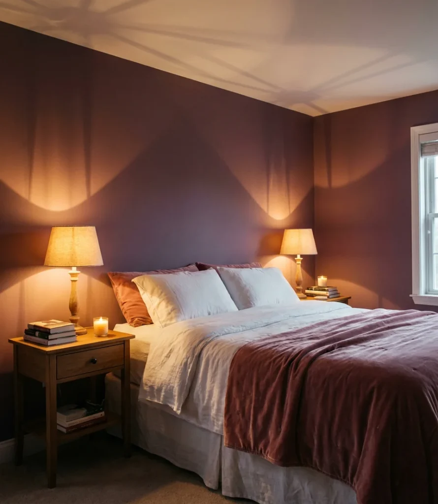
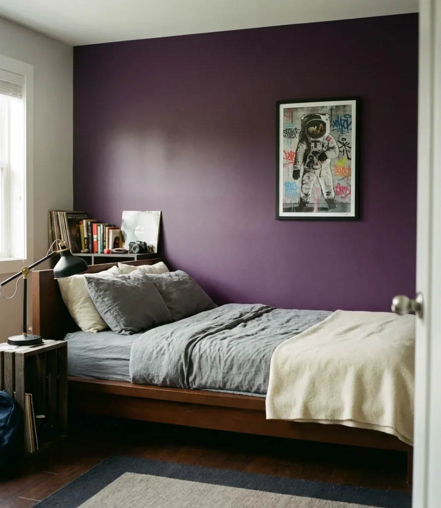
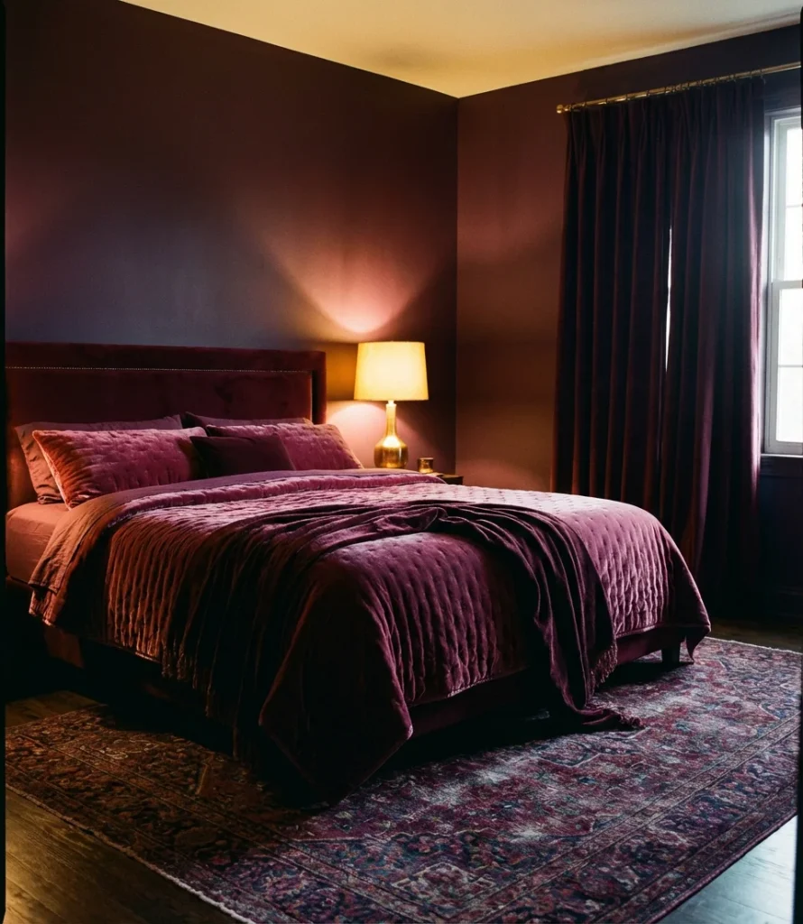
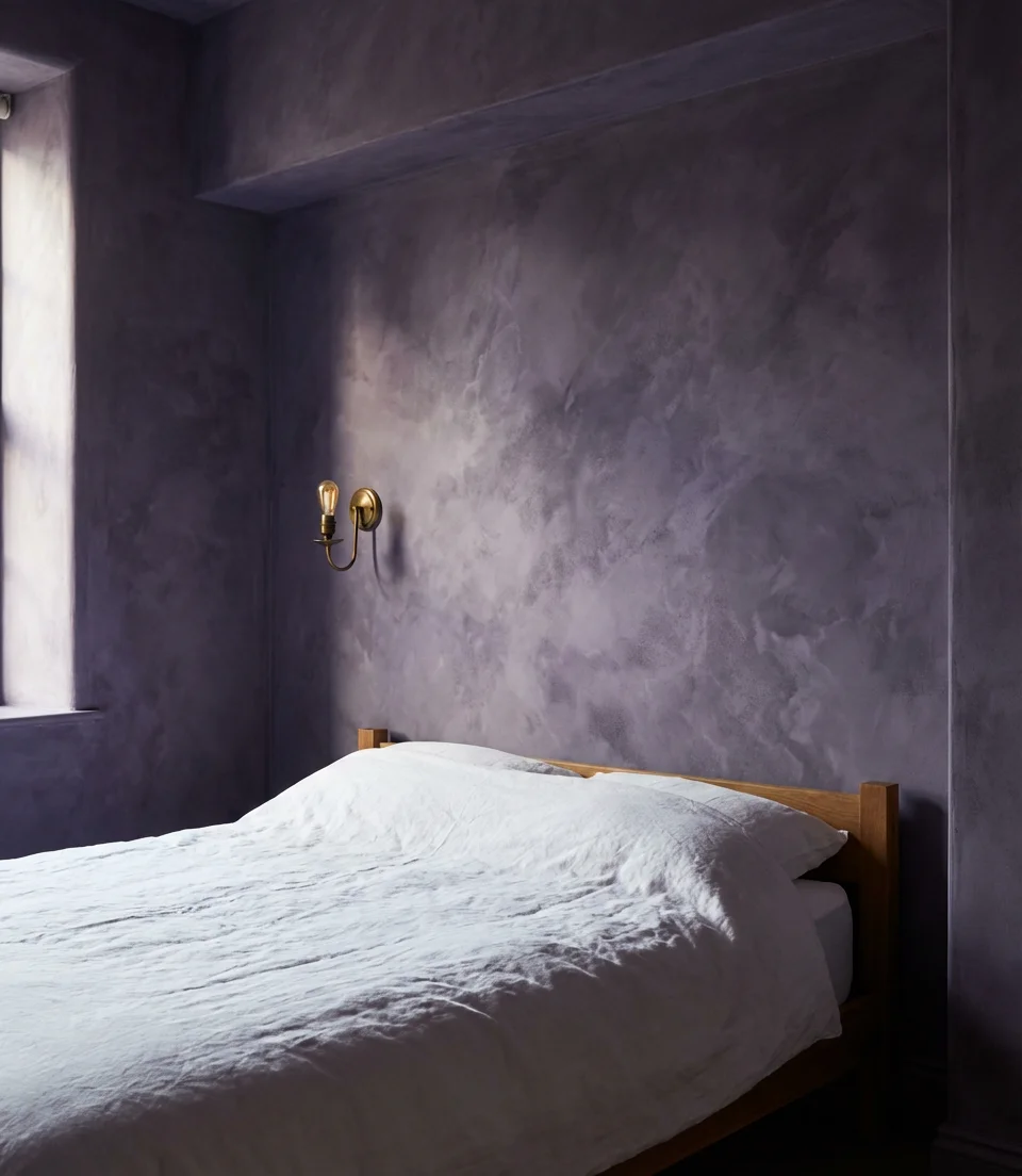
3. Dark Moody Purple Bedroom for Adults
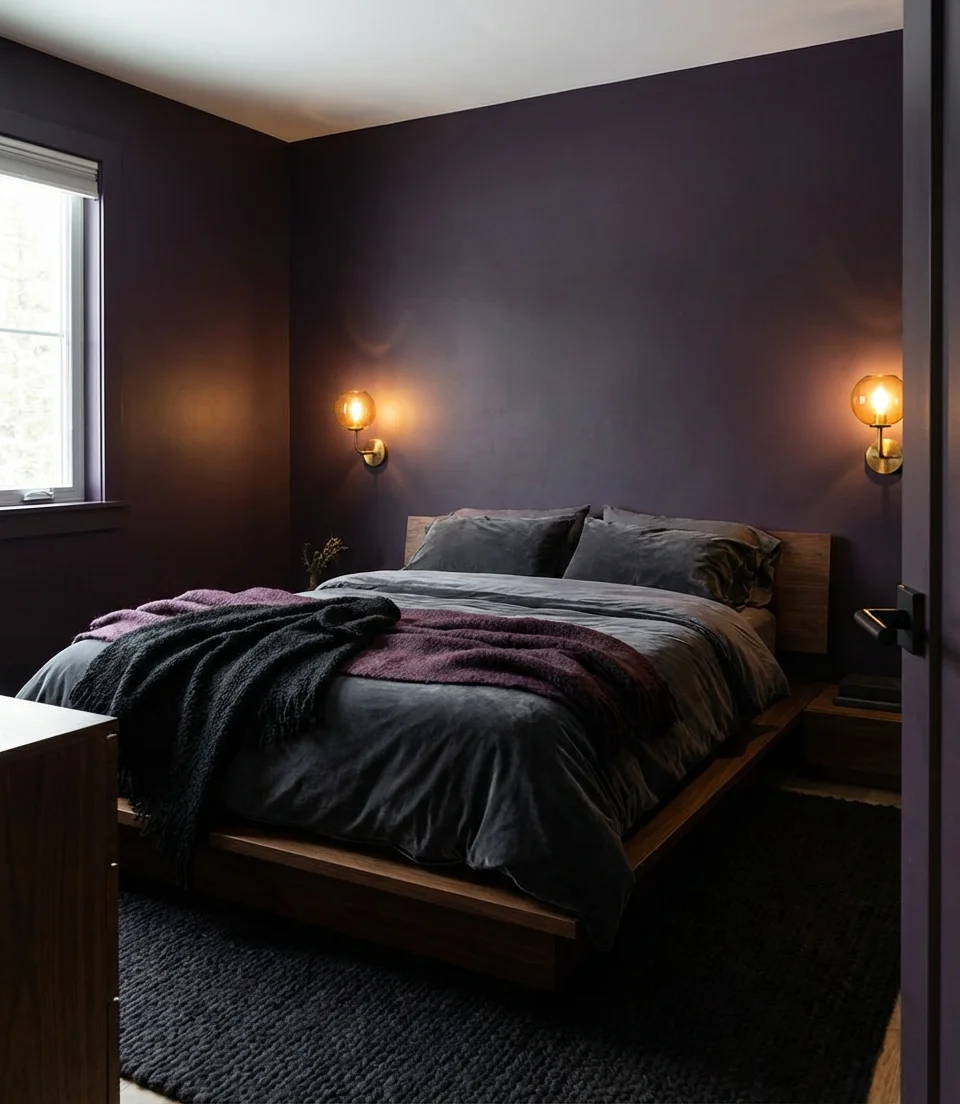
The dark, moody bedroom trend isn’t slowing down—and purple is its most underrated expression. Deep eggplant, rich mulberry, and near-black violet walls create a cocoon-like atmosphere that’s become a genuine design movement among adults who want their bedroom to feel dramatically different from the rest of their home. Unlike navy or forest green (which dominate moody bedroom searches), dark purple brings something extra: a sense of mystery and warmth that feels genuinely singular. Layer in dark wood furniture and low ambient lighting for full effect.
A well-executed moody bedroom requires thoughtful lighting—this is where most people go wrong. Dark walls absorb light aggressively, so you need multiple warm light sources positioned at different heights. Think: a statement pendant, bedside sconces, and a floor lamp tucked in a corner. Avoid cold-toned LED bulbs at all costs; they’ll make your carefully chosen plum wall look flat and slightly clinical. Warm bulbs in the 2700K range will bring out the richness in the color and make the space feel genuinely enveloping rather than just dark.
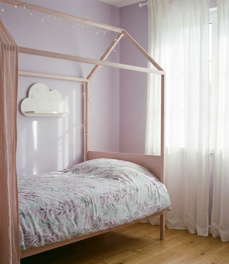
4. Pastel Purple Kids’ Bedroom with Playful Energy
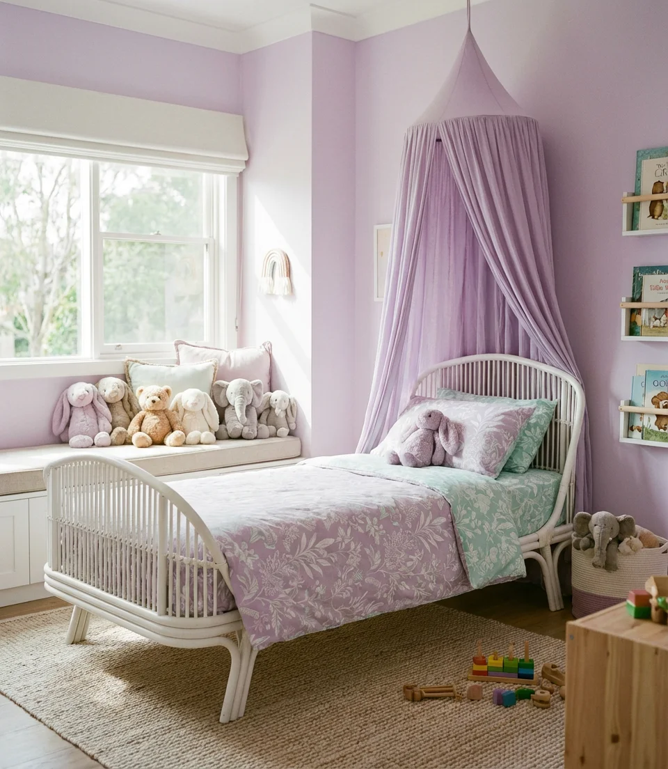
A pastel purple bedroom for kids doesn’t have to feel babyish or flat—when done right, it can be one of the most joyful, imaginative spaces in the whole house. The trick is layering soft lilac or wisteria tones with natural textures, playful patterns, and just enough white to keep the room feeling bright and open. Kids, daughters especially, tend to gravitate toward this palette, but it’s versatile enough to work for any child who loves color without the full sensory intensity of bright primaries. Rattan accents and linen curtains elevate it further.
Parents in the Pacific Northwest and New England are particularly drawn to this aesthetic, often pairing pastel purple walls with botanical prints and natural wood furniture—a combination that reads simultaneously playful and considered. If you’re decorating on a budget, you don’t need to repaint the entire room: even an accent wall behind the bed in a soft lavender can transform the energy of the space. Add peel-and-stick star decals or a canopy over the bed, and you’ve built something genuinely magical for a few hundred dollars total.
5. Gray-Purple Sophisticated Bedroom Palette
For those who love the idea of purple but worry it might feel too bold, the gray-purple middle ground is genuinely one of the most sophisticated places to land. Shades like mauve, dusty thistle, and muted violet-gray sit beautifully between cool neutrals and full color commitment. They pair naturally with grey linens, charcoal furniture, and soft silver hardware—creating a bedroom palette that reads as refined, almost editorial. The hue is a strong pick for women and adults who want a bedroom that feels like it belongs in a boutique hotel rather than a standard suburban home.
One interior designer who works primarily with urban condos in Chicago described this palette as “the most livable version of purple—it has all the depth and personality of color without ever feeling like a commitment you’ll regret.” Gray-purple walls tend to shift beautifully with the quality of natural light throughout the day, looking almost taupe in the bright morning sun and deeply violet under lamplight. That kind of dynamic quality is exactly what makes a bedroom feel alive rather than static, and it’s incredibly difficult to achieve with true neutrals alone.
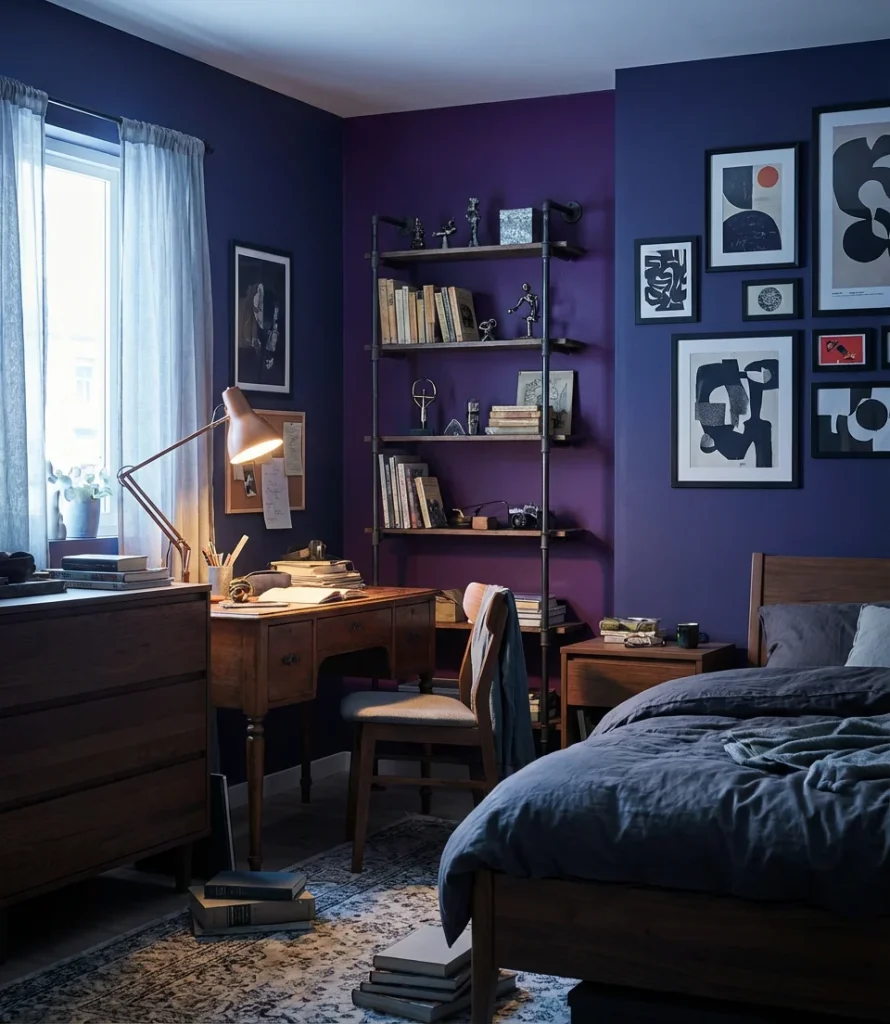
6. Teen Bedroom in Purple and Black—Edgy but Refined
Pairing purple with black in a teen bedroom sounds risky on paper, but executed with restraint, it’s one of the most striking combinations available. Deep violet or amethyst walls against matte black furniture and hardware create a space that feels genuinely cool—the kind of room a teenager actually wants to spend time in. It skews aesthetic in the best possible way, nodding to the dark academia and cottagecore-goth movements that are all over TikTok without feeling derivative or costumey. The key is keeping textiles soft: think chunky knit blankets and layered pillows in cream or blush.
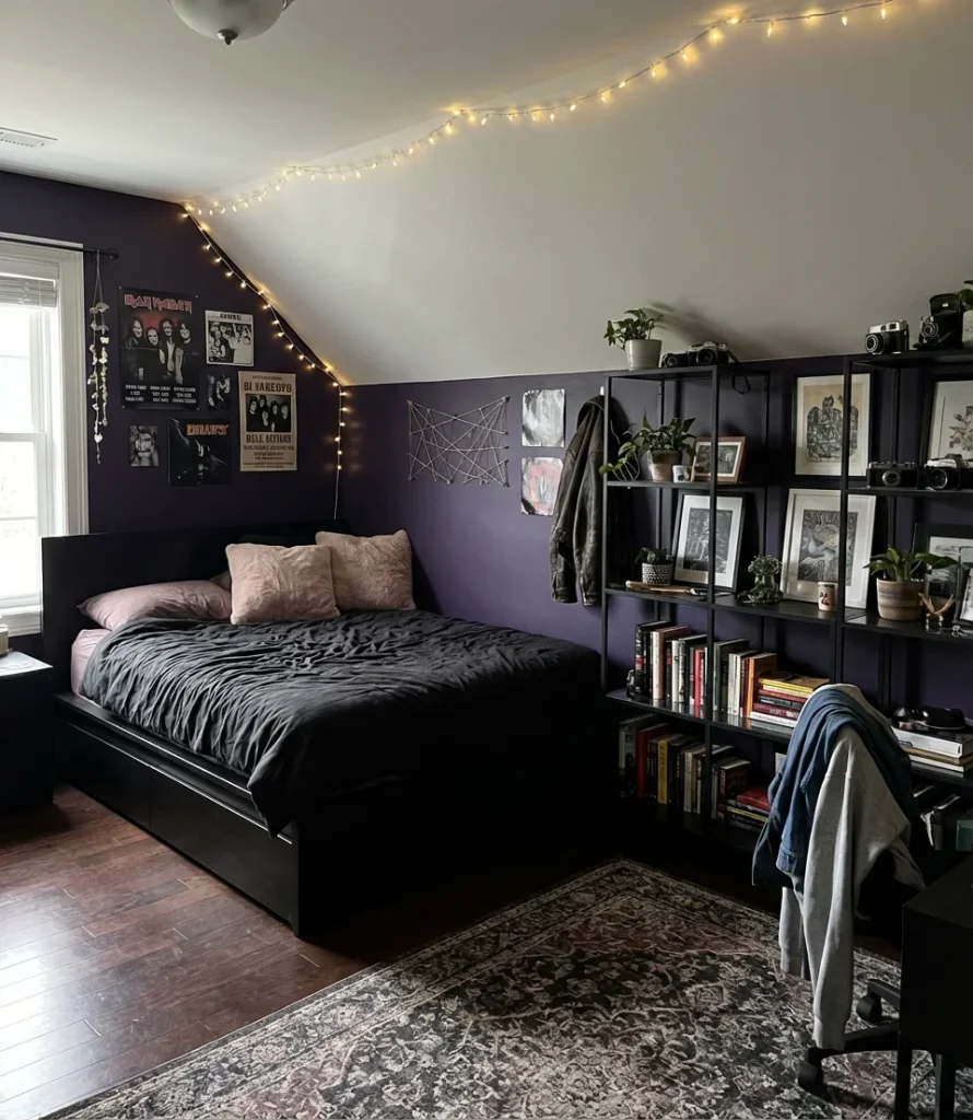
This combination works best in rooms with at least one good natural light source—a window that gets morning or afternoon sun will prevent the space from feeling oppressive. If your teen’s room faces north or gets limited daylight, consider keeping the ceiling white and using the purple-black palette only on the lower two-thirds of the walls and in the furniture. That approach maintains the dramatic energy while ensuring the room doesn’t feel like a cave. String lights or a neon sign (kept minimal) can also add warmth without undermining the overall vibe.
7. Purple and Teal Bedroom—Bold Color Pairing Done Right
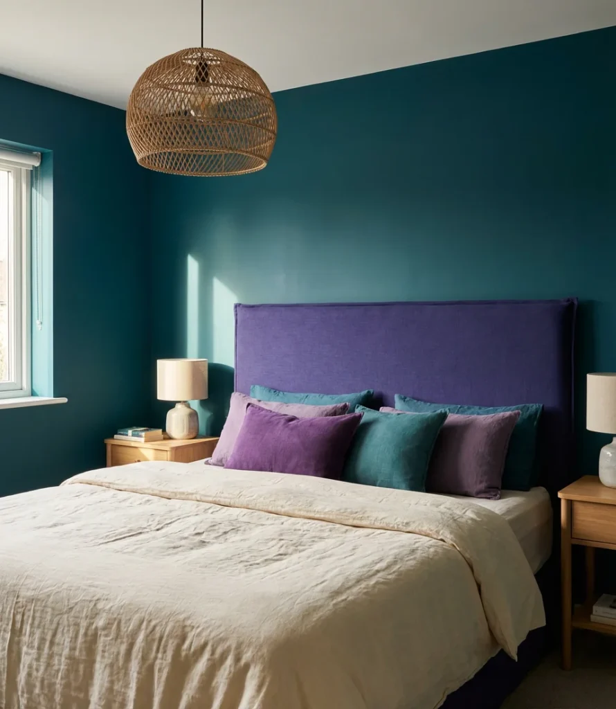
If you’ve ever seen a teal and purple bedroom done well, you know there’s nothing quite like it—it’s one of those combinations that shouldn’t work on paper but absolutely does in practice. The cool depth of teal balances the warmth in purple’s undertones, creating a bedroom that feels energized and layered without veering into chaos. Think teal as the dominant wall color with purple expressed through an accent wall, bedding, and throw pillows. This palette is particularly popular in teen bedrooms and young adult spaces where a little visual boldness is welcome and celebrated.
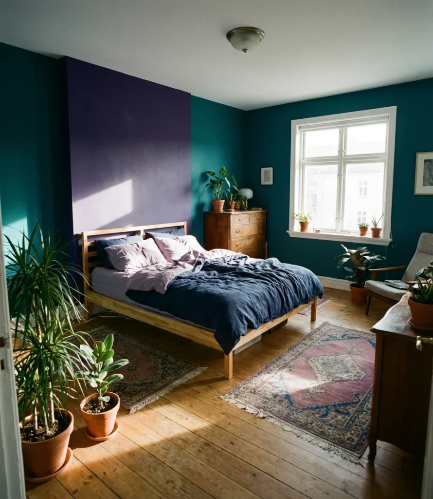
The secret to pulling this off is tonal consistency—if your teal leans warm (closer to peacock), choose a purple that also leans warm (plum or magenta-adjacent). If your teal is cool and slightly blue, pair it with a cooler violet or lavender. Mixing a warm teal with a cool purple can make the space feel slightly off without anyone being able to articulate exactly why. Natural wood accents, rattan, and plenty of white or cream in the bedding serve as visual breaks that keep both colors from competing too aggressively for attention.
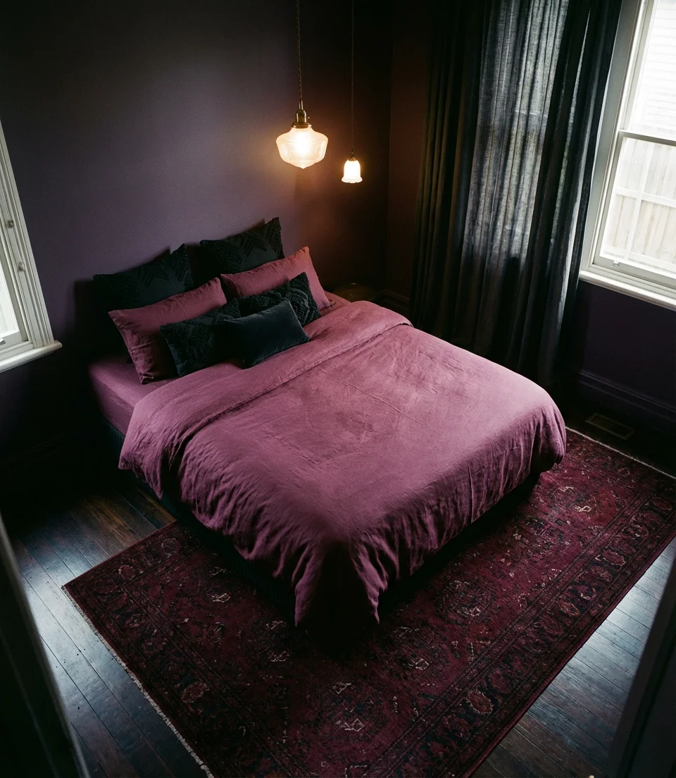
8. Dusty Purple Bedroom with Linen Textures
The dusty purple bedroom is having a serious moment in 2026, and it’s not hard to understand why. These muted, almost smoky purple tones—think faded iris, dried lavender, or antique wisteria—carry an inherent softness that feels both romantic and deeply restful. When layered with natural linen textures in warm ivory and stone tones, the result is a bedroom that looks like it was styled for a slow Sunday morning and never left. It’s an especially beautiful approach for women who want their bedroom to feel genuinely personal and unhurried.
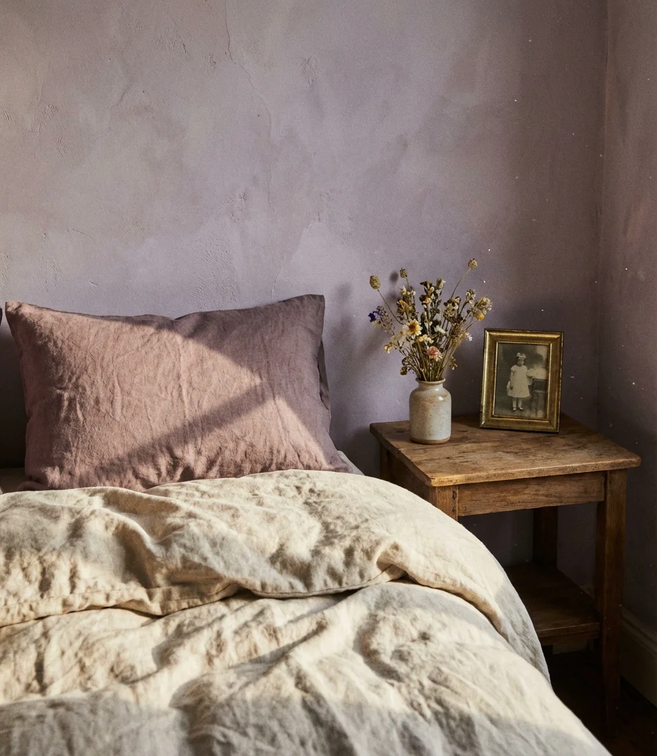
Real homeowners who’ve committed to this palette often describe the same experience: they were nervous the dusty tones would read as dirty or faded rather than intentional, but once paired with high-quality linen bedding and natural wood pieces, it clicked immediately. The investment worth making here is in the textiles—cheap synthetic fabrics will flatten the palette. A quality Belgian linen duvet cover in warm oatmeal or sand, combined with an aged brass lamp and a vintage-style mirror, will elevate the whole room without requiring a major renovation budget.
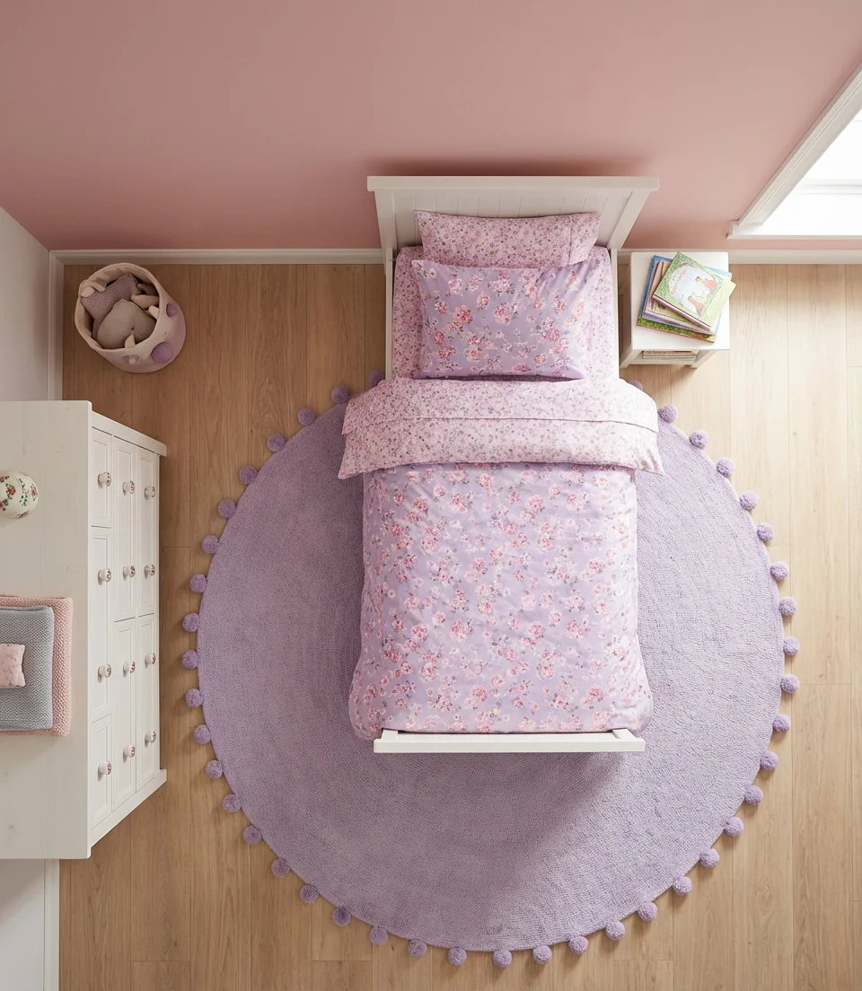
9. Purple and Pink Dreamy Bedroom for Kids Daughters
Purple and pink together in a bedroom for kids’ daughters is a combination that’s been beloved for decades—but in 2026, the approach has evolved beyond candy-colored walls and princess decals. Modern takes on this palette use lilac and blush rather than bright violet and hot pink, creating a space that feels dreamy and soft rather than loud. Layering in botanical prints, cloud-shaped furniture, and fairy lights gives the room that magical, adorable quality that young girls absolutely love while keeping it stylish enough that parents don’t cringe walking in every morning.
Where this look works best is in rooms with good proportions—it can feel cluttered in very small bedrooms if you lean too heavily into accessories. In a tight space, keep the walls a single soft tone (lilac or blush, not both) and bring in the second color through bedding, a rug, and a few carefully chosen decorative accents. A canopy bed or simple draped fabric above the headboard adds whimsy without eating into valuable floor space. Keeping the ceiling white ensures the room stays light and airy even as the walls carry full color.
10. Purple and Blue Bedroom—A Cool, Collected Look
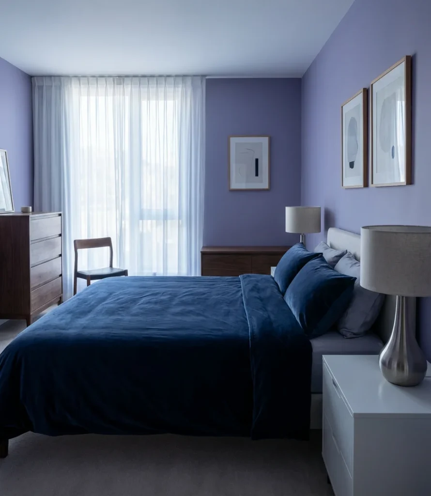
Purple and blue sit close enough on the color wheel that they could easily blur into one another—but when handled with intention, the combination creates a bedroom that feels coolly sophisticated and genuinely interesting. Dark blue as an accent against medium purple walls, or vice versa, produces a layered effect that rewards a second look. Navy bedding on lavender walls, for example, reads as almost editorial. This is a palette that works especially well for adults who want color without warmth—a bedroom that feels crisp, calm, and a little cerebral rather than cozy and enveloping.
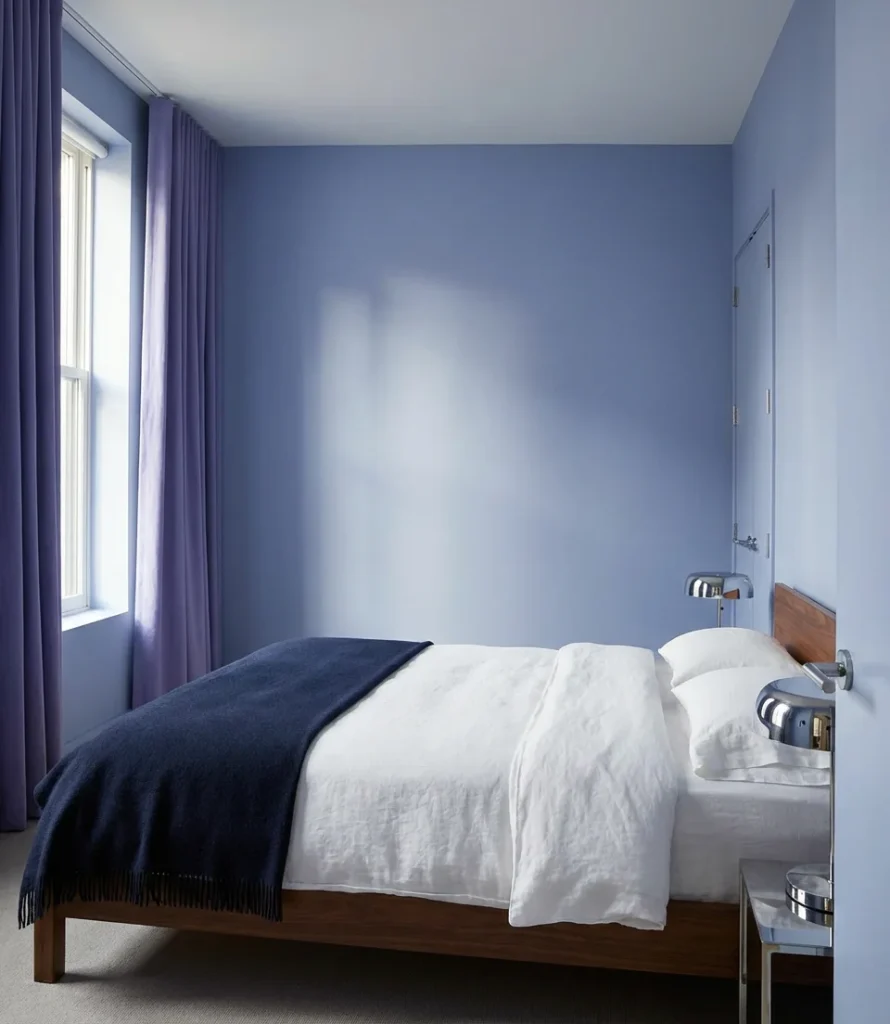
The most common mistake with this palette is losing contrast—if both the purple and the blue are too similar in value (lightness and darkness), the room can feel visually flat. Solve this by ensuring one color is significantly darker or lighter than the other. A medium lavender wall paired with deep navy textiles works beautifully. Alternatively, a near-white periwinkle wall with rich violet curtains achieves the same principle. Silver or chrome hardware adds a finishing note that complements the cool tones without introducing a competing palette.
11. Green and Purple Bedroom—An Unexpected Pairing That Works
Purple and green are complementary colors—opposite each other on the color wheel—which means they naturally create energy and contrast when placed together. In a bedroom, the key is dialing both tones down enough that the contrast feels lush rather than jarring. Sage green walls with dusty purple accents or deep forest green with soft amethyst both create a botanical richness that’s incredibly popular right now among design-forward homeowners. This palette is particularly compelling for couples who disagree on color direction—it’s simultaneously grounded and expressive.
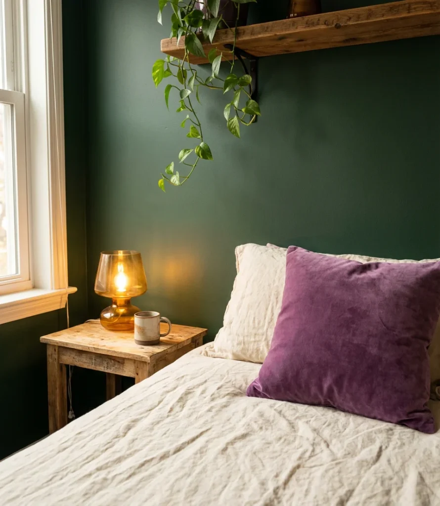
Bring in actual plants to reinforce the palette—a large fiddle-leaf fig or trailing pothos in the corner echoes the green in your walls while adding genuine life to the room. Purple shows up beautifully as an accent in this scheme through throw pillows, a vintage rug, or even a small upholstered chair positioned near a window. Keep larger furniture pieces neutral (warm wood tones, cream upholstery) so the green and purple can breathe. This combination photographs exceptionally well in natural light—your bedside table photo will look genuinely magazine-worthy without any effort.
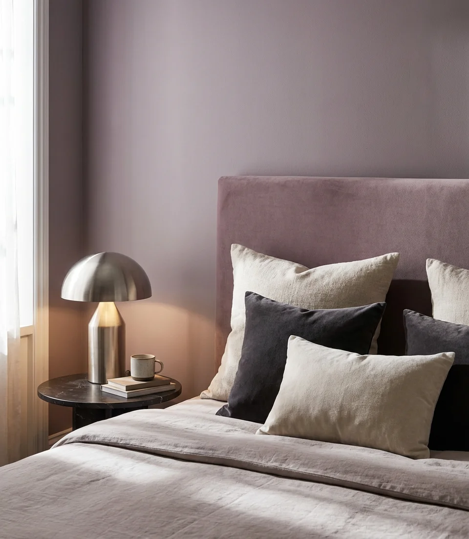
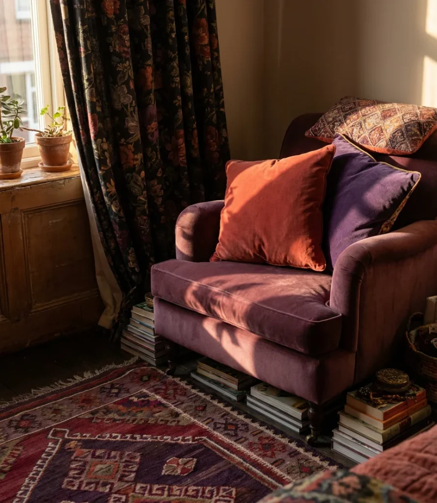
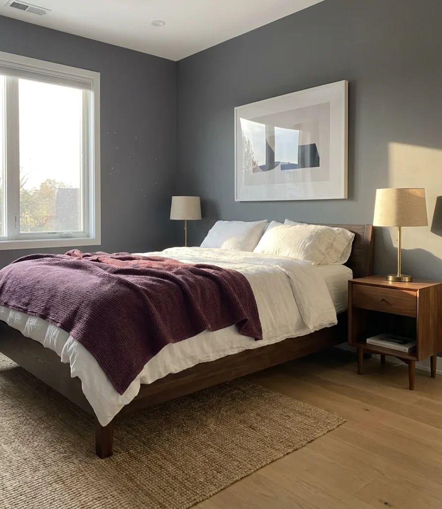
12. Romantic Purple Bedroom for Couples with Layered Textiles
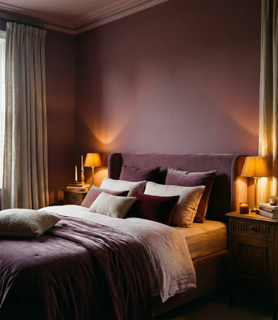
A bedroom built specifically around romance is one of the most searched and most misunderstood categories in interior design—people imagine it means red roses and canopy beds, but today’s romantic aesthetic is far more subtle and personal. For couples, a purple bedroom built on layered textiles creates a sense of intimacy that’s architectural rather than decorative. Deep mauve or muted violet walls, layered with a mix of velvet, linen, and cotton in tonal purples and creams, create a space that feels genuinely private and enveloping. Moody lighting seals the atmosphere completely.
Think of the textile layering as the architecture of this room’s romance: start with a smooth linen base sheet, add a textured duvet in a slightly deeper tone, layer a velvet throw across the foot of the bed, then stack pillows in a range of sizes and finishes. The variety of textures catches light differently and creates visual depth even when the color palette stays narrow. Scented candles in amber or wood holders, a small tray of books on each nightstand, and dimmable bedside lamps will complete a space that both partners can genuinely exhale into at the end of the day.
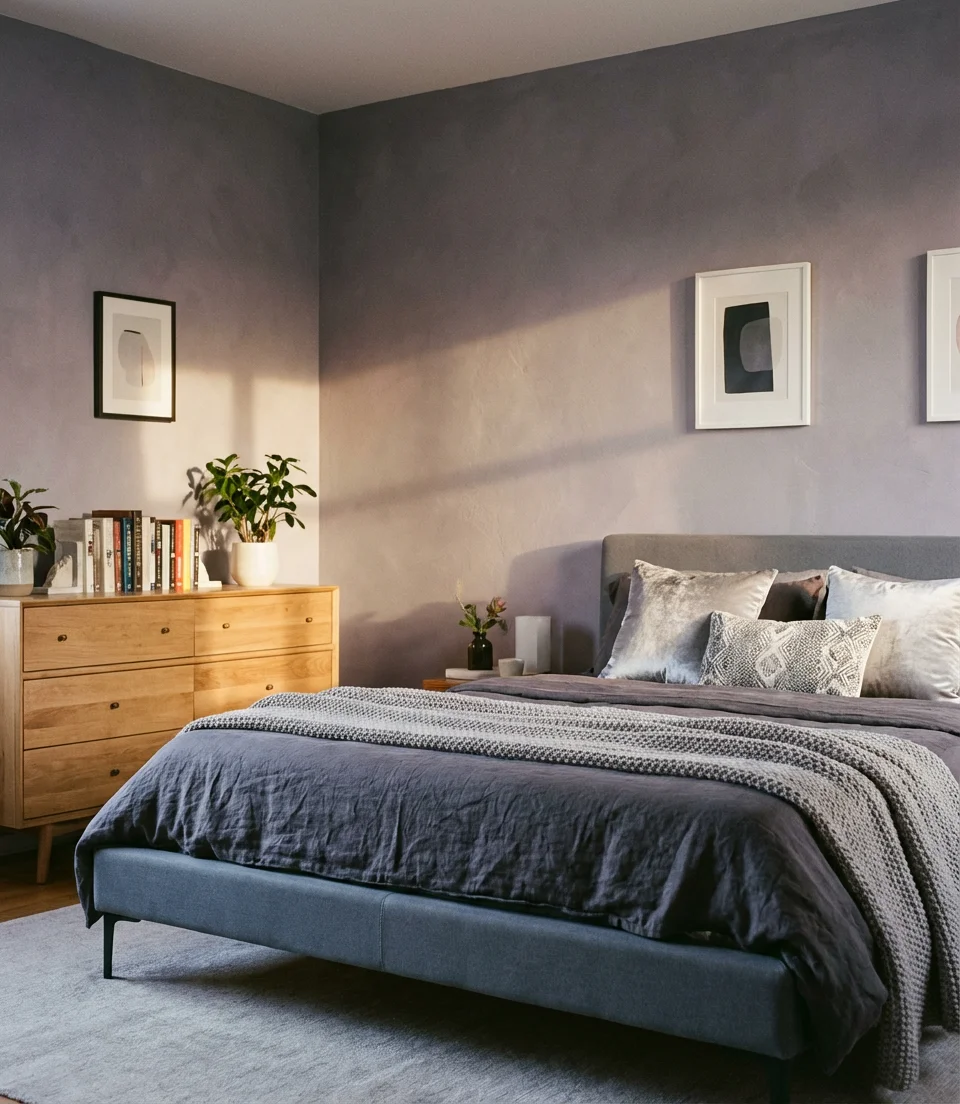
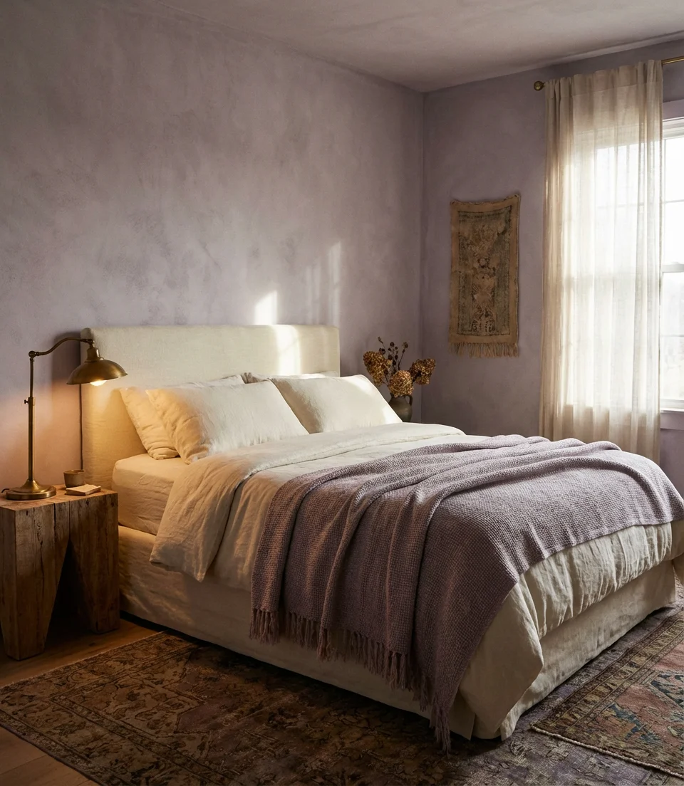
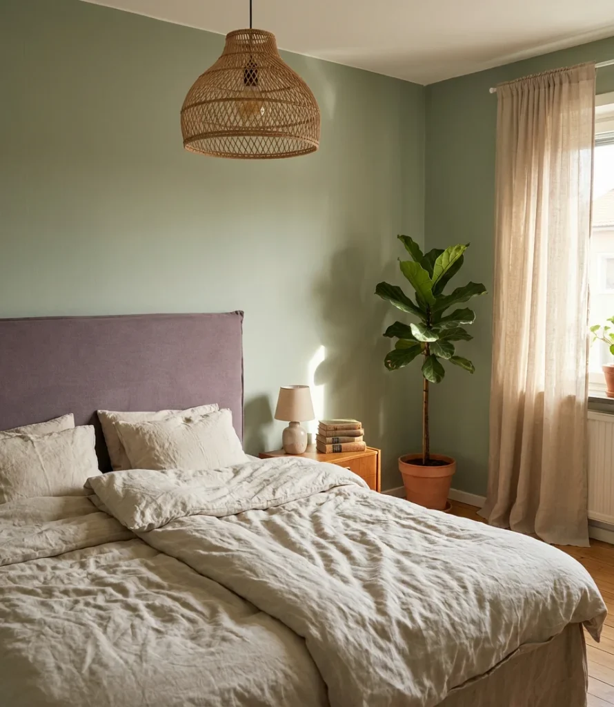
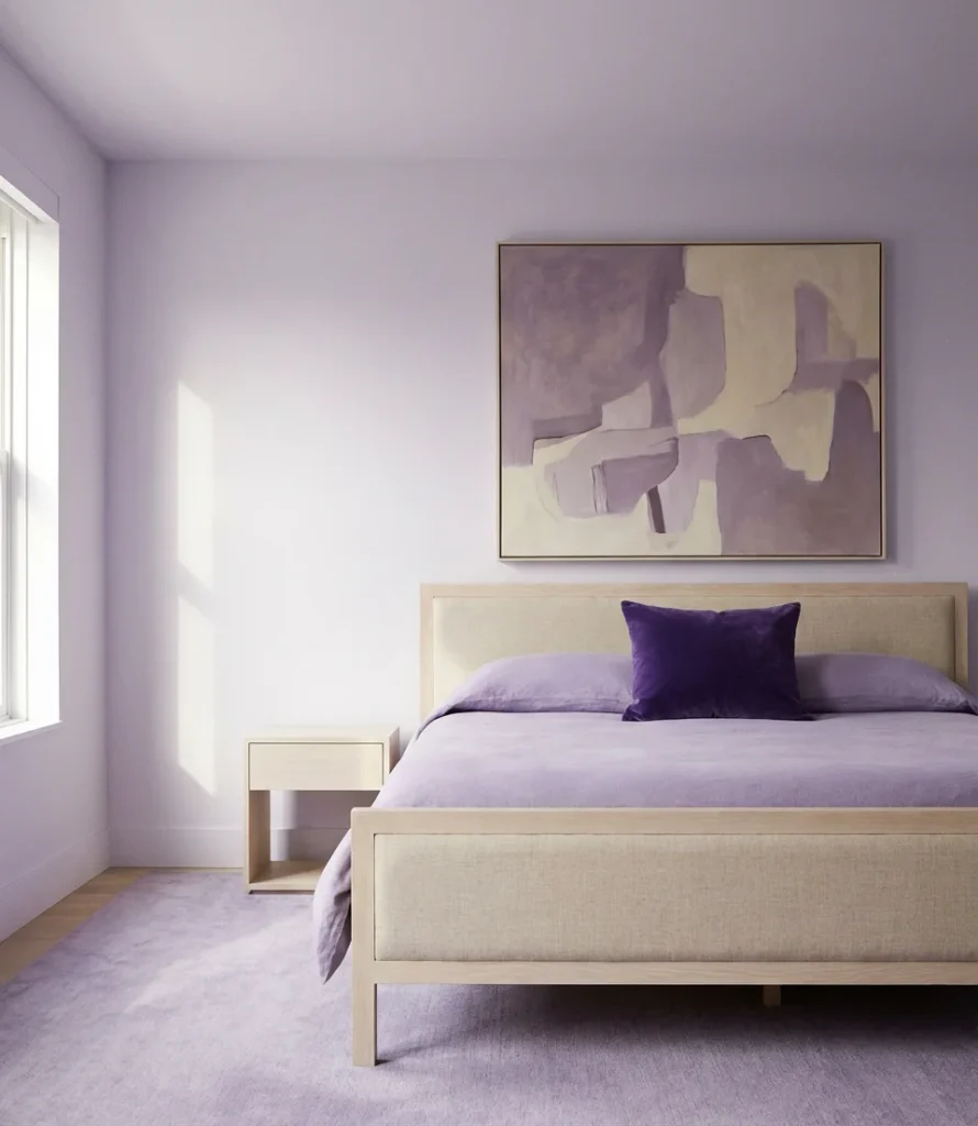
13. Gray Light Purple Minimalist Bedroom
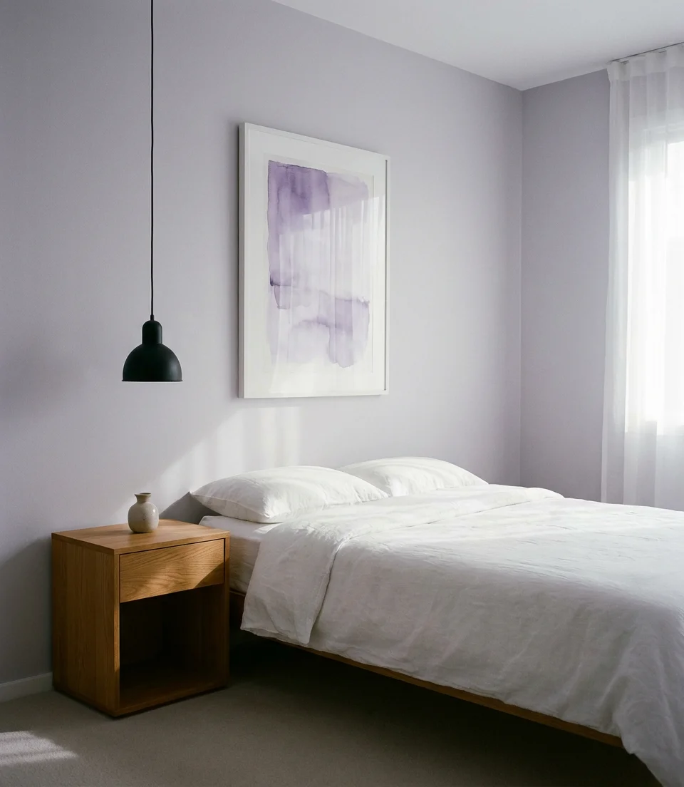
For those whose design instinct runs toward restraint, the gray-light-purple minimalist bedroom offers the perfect middle path. These pale, barely-there violet-grays—sometimes called “architectural lavender” by designers—create a backdrop that feels sophisticated without demanding attention. The color whispers rather than shouts, which makes it ideal for people who want visual interest without commitment. Pair it with clean-lined furniture, a single large piece of art, and bedding in white or warm ivory for a bedroom that feels genuinely peaceful. This palette suits adults who appreciate the idea of color but live comfortably in calm, uncluttered spaces.
The practical advantage of this palette is its extraordinary flexibility—these near-neutral purples work with virtually every wood tone, metal finish, and textile color. Warm oak furniture, cool concrete accessories, black hardware, and brushed brass—all of it plays nicely with soft violet-gray walls. That versatility makes this one of the safest “color” choices you can make in a bedroom, especially if you’re renting and need to repaint when you leave, or if you anticipate wanting to refresh the space without starting from scratch every few years. It’s a genuinely smart long-term investment.
14. Purple Bedroom for Teen Boy—Breaking the Color Stereotype
Purple doesn’t belong to any gender, and in 2026, that reality is finally showing up fully in bedroom design. A purple bedroom for a teen boy built around deeper, more saturated tones—think indigo-purple, eggplant, or smoky violet—reads as bold and confident rather than anything else. Pair it with industrial metal accents, dark wood furniture, and graphic art, and you have a bedroom that a teenage boy will genuinely want. The aesthetic here borrows from music studios, gaming setups, and street art—it’s aspirational and cool in a way that transcends any color association.
Parents are sometimes surprised by how enthusiastically teen boys respond to this direction when given the chance to explore it. In a survey by one major home decor retailer, purple consistently ranked in the top five most requested bedroom accent colors among teenage boys ages 14–18, ahead of orange and yellow. The key is letting them drive the specific shade—a 16-year-old who chooses deep royal purple for his room and pairs it with his own art and furniture will take far more ownership of the space than one who received a conventionally “masculine” navy blue by default.
15. White and Purple Bedroom—Clean, Crisp, and Calm
There’s something almost meditative about a white and purple bedroom executed with real precision. White creates a space for breathing, while purple nourishes the soul. When purple is used as a true accent against predominantly white walls, furniture, and bedding, even a small dose carries enormous visual weight—a single purple throw, a violet-glazed lamp, or a framed print with purple tones. For kids’ lavender expressions, this approach works brilliantly because it keeps the room light and easy to update as tastes shift. For adults, it reads as refined and intentional without any risk of color fatigue.
Material quality truly shines in the white-and-purple bedroom. When there’s little color to carry the room, texture and finish quality become the primary design tools. Invest in a duvet cover with a genuine thread count, choose window treatments with clean, tailored lines, and make sure your white walls are actually bright and unmarked—scuffs and yellowing will show aggressively in this clean palette. A single large piece of purple-toned botanical art above the bed can anchor the whole room, doing the work of an accent wall without a drop of paint and with far more personality.
16. Purple and Yellow Bedroom—Contrasting Colors, Surprising Harmony
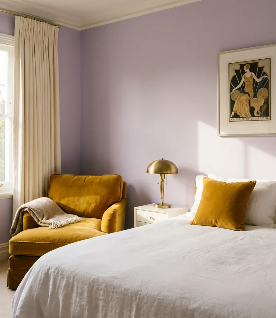
Purple and yellow are the original color wheel opposites—bold, graphic, and full of energy when placed together. In a bedroom context, the secret is tempering both tones dramatically: soft lavender walls with warm mustard yellow accents, or pale butter-yellow walls anchored by a deep violet rug and throw. The combination has a distinctly European art deco quality that feels increasingly relevant in 2026. For teens’ lavender bedrooms especially, this palette hits a sweet spot between playful and grown-up that’s genuinely hard to achieve with more conventional color choices.
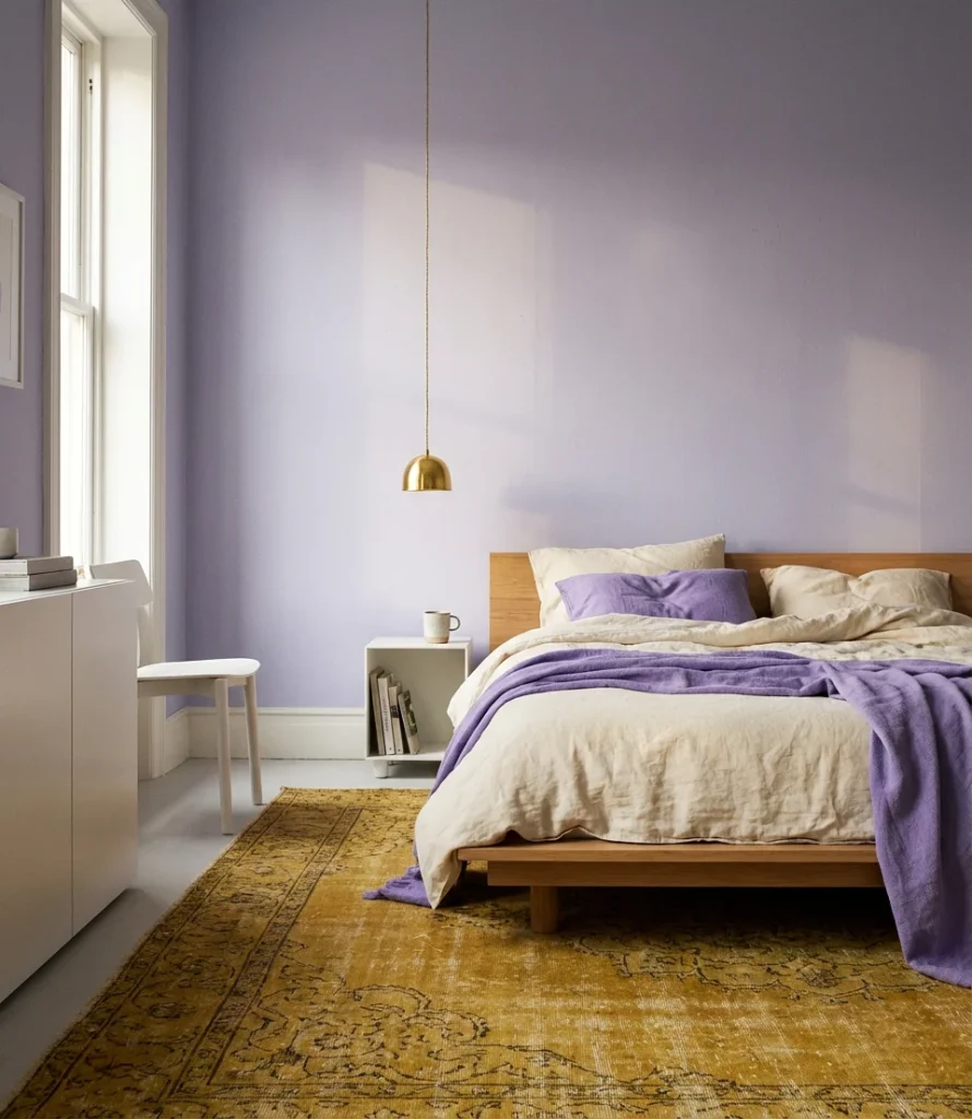
Use yellow sparingly—this is a case where less truly is more. One mustard yellow pillow among cream and purple bedding, a golden lamp on a white nightstand, or a single vintage poster with yellow tones is all you need. Flooding the room with both colors at full saturation will exhaust the eye quickly and undermine the sophistication you’re reaching for. The ratio to aim for is roughly 70% purple/neutral, 20% white or cream, and 10% yellow. That minority yellow becomes the note that makes the whole room feel edited and considered rather than randomly assembled.
17. Purple and Red Bedroom—Maximalist Drama with Structure
Purple and red together might sound alarming, but in the right hands—and with the right tones—this is one of the most genuinely dramatic and beautiful bedroom palettes available. The key is choosing shades that share an undertone: berry red paired with plum purple, or terra cotta red with warm mauve. Together, they create a depth and richness reminiscent of a jewel box, creating a room that captivates visitors from the moment they step through the door. This moody, dark palette is for maximalists who want their bedroom to reflect their identity.
This look works best when the room has architectural detail to showcase—crown molding, a fireplace, built-in shelving, or a bay window. Without structural interest, very saturated rooms can feel oppressive. If your bedroom is relatively plain architecturally, lean toward the more muted versions of both colors (dusty rose-red, smoky plum) and allow texture to carry the drama instead. Rich velvet curtains, a patterned vintage rug, and layered bedding in the same family of jewel tones will create a maximalist interior that feels collected over time rather than executed all at once.
18. Purple and Orange Bedroom—Warm, Unconventional, Alive
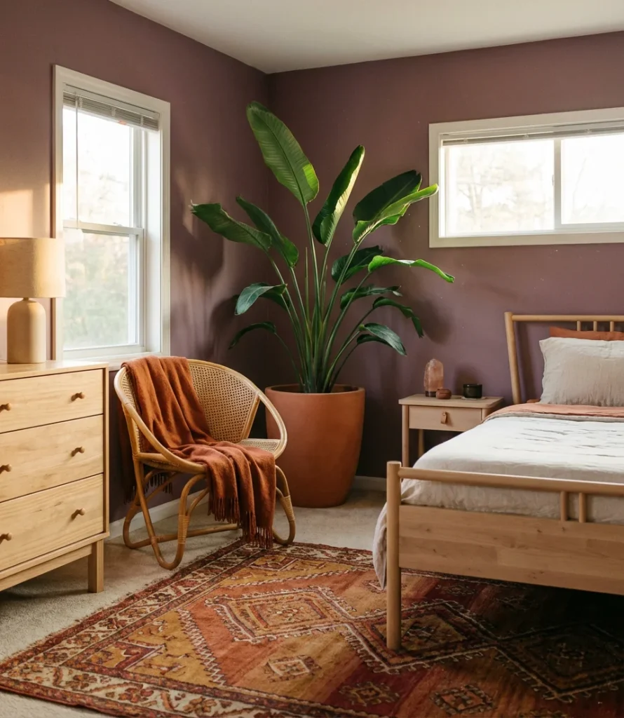
Purple and orange is a combination that design-forward homeowners are just beginning to explore seriously, and the results are striking. Burnt orange and deep plum create a sunset palette that feels warm, maximalist, and completely unexpected in a bedroom. Tangerine and soft lilac, on the other hand, achieve something altogether different: bright, playful, and almost Moroccan in its cheerfulness. Cute without being childish, this palette works well for adults who want their bedroom to reflect a genuinely individual taste rather than following any prevailing trend.
Anchor this palette with natural materials—terracotta pots, rattan baskets, raw wood furniture—which soften the vibrancy of both colors and keep the room from feeling artificially saturated. A jute or kilim rug in orange, rust, and purple tones is often the single piece that brings the whole room together, providing a layered reference point for every other color decision in the space. Introduce orange through plants as well: a large bird of paradise or several terracotta planters add botanical warmth that reinforces the palette without adding visual clutter.
19. Purple Bedroom Accent Wall Behind the Bed
For anyone who loves purple but isn’t ready to commit to four walls, the single accent wall behind the bed is the perfect entry point—and in 2026, it’s being executed with a level of sophistication that goes far beyond basic paint. Textured plaster in soft violet, moody purple wallpaper with botanical or geometric patterns, or even a panel of rich purple limewash are all genuinely beautiful options. This approach is ideal for kids’ lavender rooms as well as adult spaces, offering full color impact where you most want it—as the visual backdrop to the bed—without overwhelming the room’s light or breathing room.
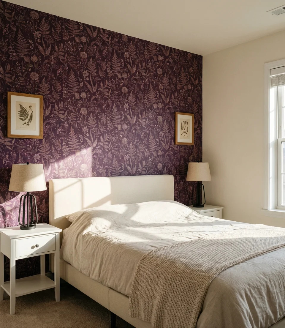
Limewash paint in purple tones is worth serious consideration here—it creates that beautiful, mottled depth that looks incredibly expensive but is actually quite accessible to DIY. Several well-reviewed limewash products are available at major home improvement stores in the $60–$80 per gallon range, and a single accent wall can typically be completed in a weekend with no professional help. The irregular texture catches light beautifully throughout the day and creates a living quality that flat paint simply cannot match. It’s one of the highest-impact, most budget-friendly upgrades in this entire list.
20. Plum and Gray Bedroom—Grown-Up, Timeless, Effortlessly Chic
The combination of plum and gray is one of those rare bedroom palettes that manages to feel simultaneously contemporary and enduring. Cool charcoal gray walls with plum accents, or warm greige with a rich plum headboard and throw—both versions share the same quality of quiet confidence. This is a genuinely grown-up palette, for adults and for couples who want a bedroom that will still feel right in ten years without looking dated. There’s no trend chasing here—just an elegant understanding of how complementary tones create visual depth and warmth when combined with genuine care.
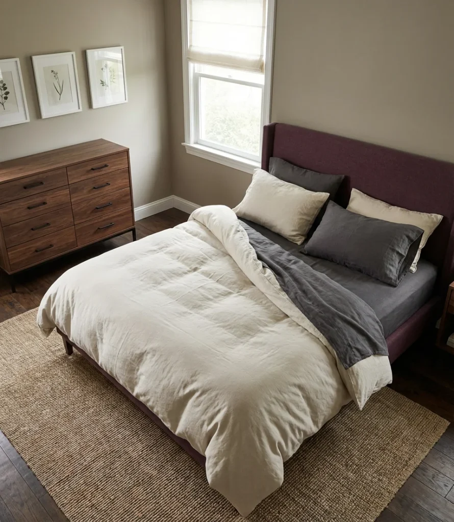
The furnishings that perform best in this palette are mid-century modern pieces with clean lines and warm wood tones—walnut side tables, a low-profile platform bed in a dark finish, and streamlined dresser hardware in matte black or antique brass. These elements anchor the color palette without competing with it. Avoid overly ornate or French provincial furniture, which can tip the palette toward something heavier and more dated than intended. The goal is a bedroom that looks like it was assembled slowly, thoughtfully, and without the influence of any particular trend cycle—just genuine taste.
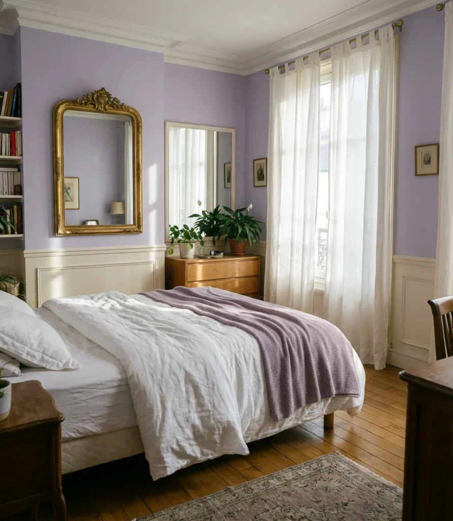
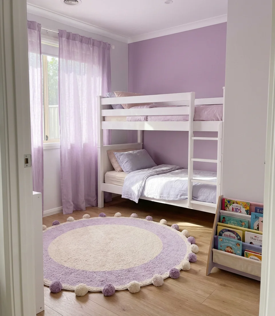
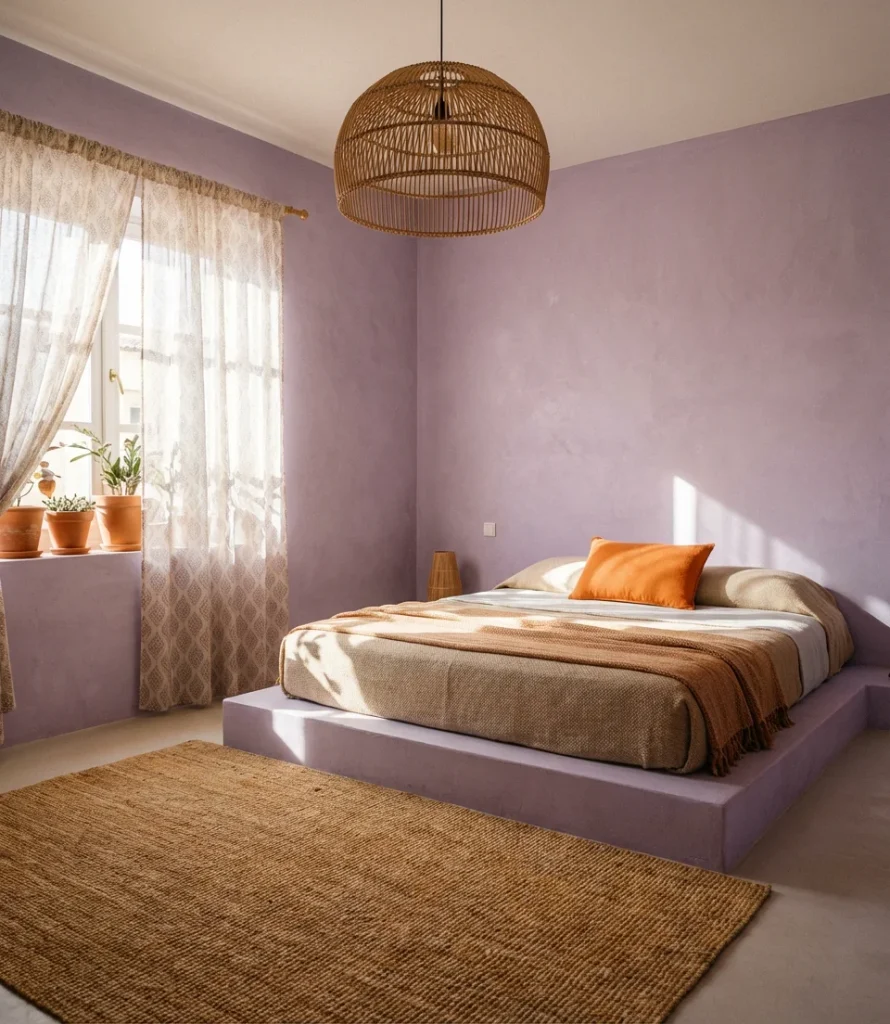
21. Full Lavender Bedroom—Committing to the Dream
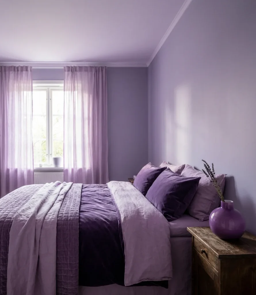
Sometimes the boldest move is the most complete one—and an all-in lavender bedroom, where walls, ceiling, trim, and textiles all live within the same soft purple world, is genuinely one of the most beautiful rooms you can create. Tonal dressing (the practice of layering multiple shades of one color in a single space) is the defining interior design technique of 2026, and lavender is its most evocative expression. For teens, lavender bedrooms create something dreamlike and personal; for adults, it reads as refined, confident, and deeply individual. Done well, it’s the room that stops every single person who walks in.
The mistake most people make with tonal dressing is playing it too safe—choosing shades so similar they collapse into one flat tone rather than creating genuine depth. Push yourself to include at least four distinct values of lavender in the room: a pale, barely-there tone on the ceiling, a medium tone on the walls, a deeper tone in the textiles, and a saturated accent in one or two deliberate spots like a vase, a candle, or a single piece of art. The variation is what makes tonal rooms feel rich and intentional rather than like you simply ran out of paint options. Embrace the range, and the room will reward you entirely.
Purple bedrooms in 2026 offer something genuinely exciting: a color language expansive enough to speak to every taste, every age, and every aesthetic direction. Whether you’ve been drawn here by one specific idea or you’re still deciding which shade of purple feels right for your space, the best thing you can do next is gather samples, live with them for a week, and trust your instincts—color is deeply personal, and your gut knows more than any trend report. We’d love to hear which of these ideas spoke to you most, which ones you’re planning to try, or photos of purple bedrooms you’ve already created. Drop it all in the comments below—this is exactly the kind of conversation we live for.