42 Exterior Paint Colors for House 2026: Fresh Ideas to Transform Your Curb Appeal
A fresh coat of exterior paint is the home project that yields the largest visual return on investment. Every year, color forecasters, designers, and everyday homeowners rethink what their house says to the neighborhood—and in 2026, that conversation is richer than ever. Americans are flooding Pinterest with searches for curb appeal inspiration, drawn to palettes that feel both timeless and of-the-moment. This guide guides you through some of the most compelling exterior color directions for 2026, whether you’re refreshing a classic bungalow, updating a modern farmhouse, or giving a stucco ranch a new personality. It provides practical tips, real-world context, and plenty of visual ideas to get you started.
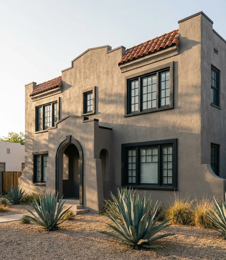
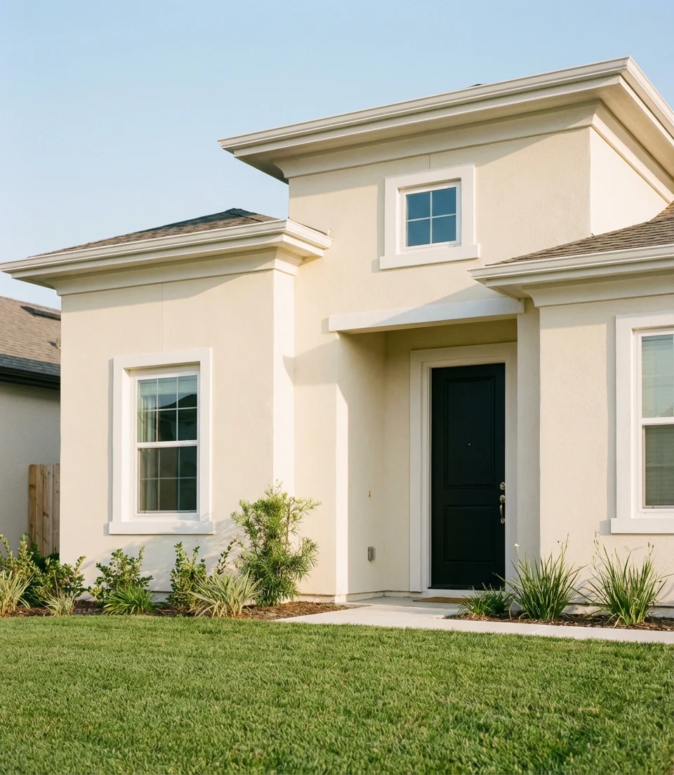
1. Warm Taupe With White Trim and Black Doors
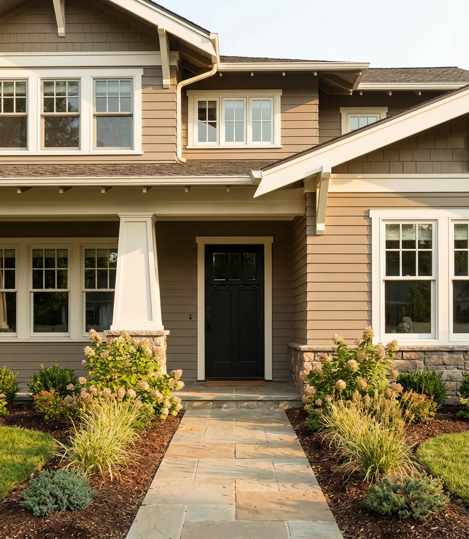
There’s a reason taupe keeps showing up on every “most popular exterior colors” list—it’s warm without being garish and neutral without being cold. In 2026, the specific pairing of a rich taupe body with crisp white trim and matte black doors is having a serious moment. This combination works because it creates just enough contrast to look intentional without screaming for attention. It’s the classic “quiet luxury” of exterior palettes, and it photographs beautifully—which is exactly why it thrives on Pinterest.
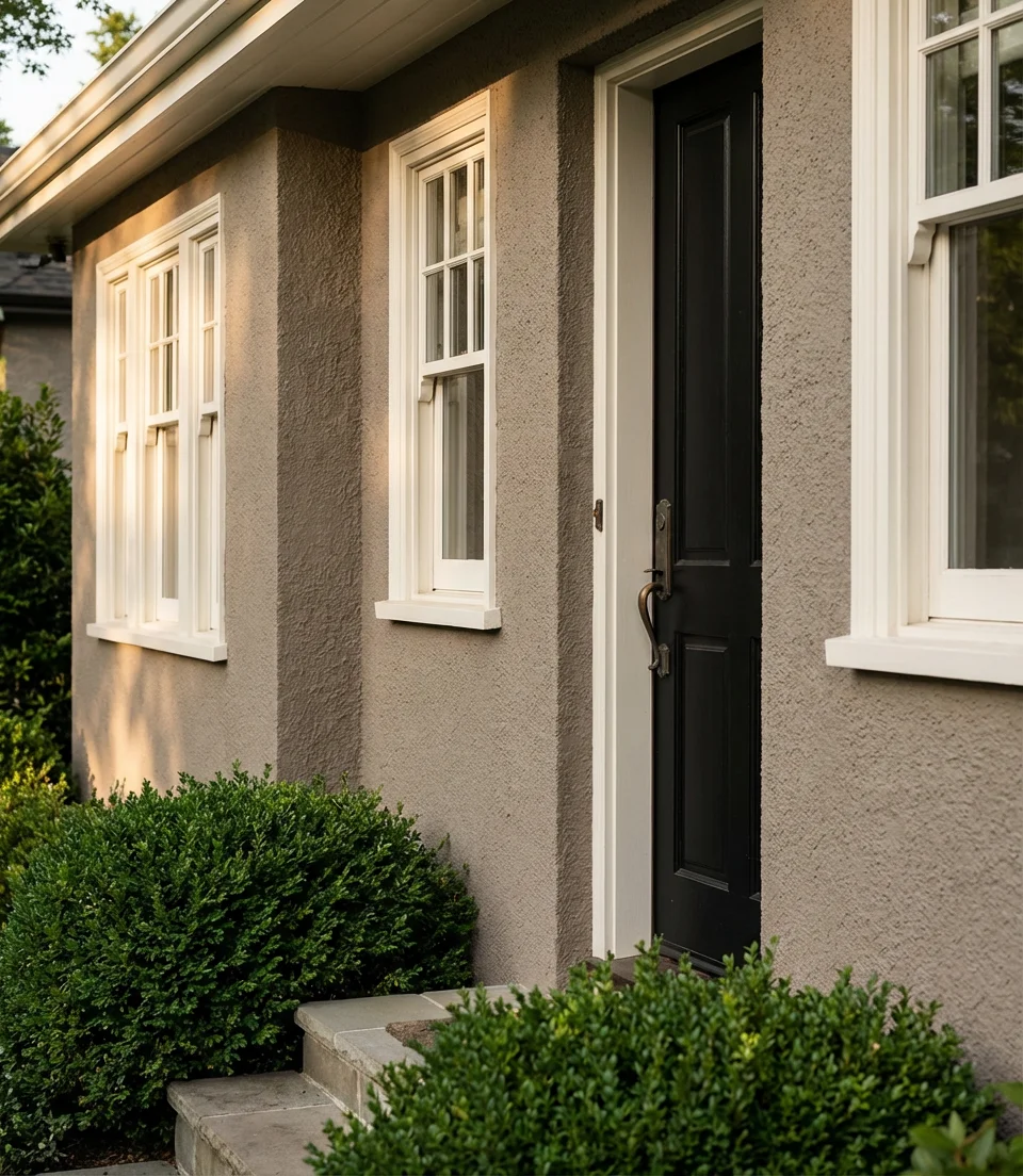
This combination works particularly well on Craftsman homes, colonials, and newer construction in suburban neighborhoods across the South and Midwest. Designers often recommend choosing a taupe with a slightly yellow or pink undertone—rather than a gray-leaning one—to keep the facade feeling approachable and sun-kissed rather than chilly. Don’t underestimate the black door: even on a modest home, a bold front door in a flat or satin black finish adds an architectural punch that elevates the entire color story.
2. French Country Blue With Stone Accents
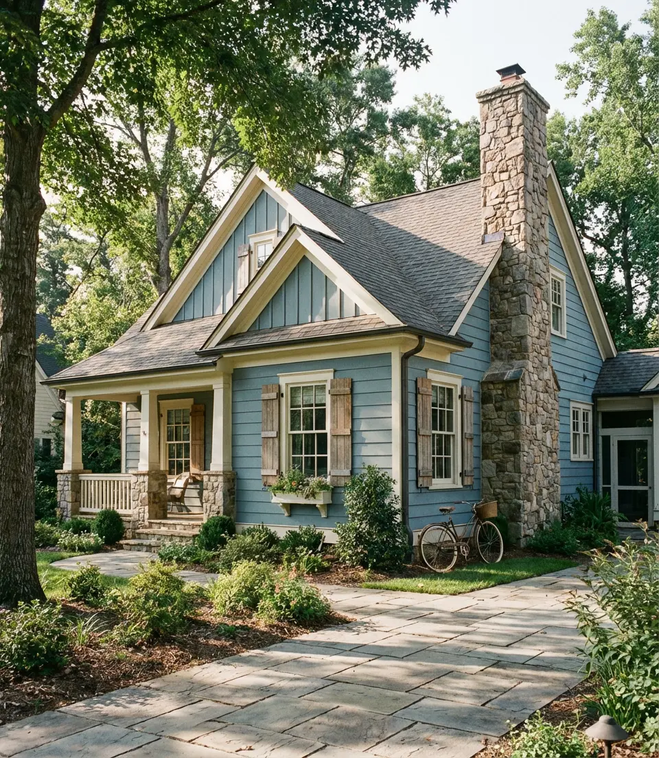
Soft, dusty, and effortlessly romantic—French country blue is the exterior color that makes a house look like it has a story. Think muted periwinkle, faded denim, or a smoky cornflower. In 2026, this shade is getting serious attention, especially paired with natural stone accents, aged wood shutters, and iron hardware. This color complements both the rolling hills of Tennessee and the leafy suburbs outside Chicago. The key is to go soft rather than saturated—this is not cobalt; it’s more like a sky after a light rain.
Where it works best: homes with steeply pitched rooflines, cottage-style architecture, and lots of natural landscaping. The stone accent element—whether it’s a foundation wrap, a chimney, or porch pillars—grounds the blue beautifully and keeps it from feeling too precious. One thing designers caution against is pairing this blue with too-bright white trim; opt for a creamy or antique white instead, which gives the overall palette a soft, weathered quality that feels intentional rather than washed out.
3. Sage Green on a Farmhouse With Board and Batten
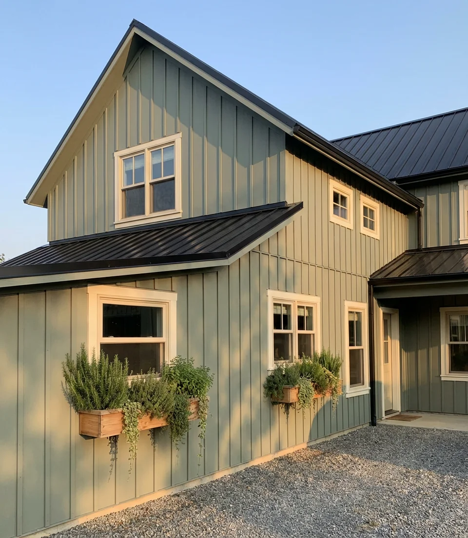
The farmhouse aesthetic has dominated American home design for years, and its exterior color story is evolving in a beautiful direction. Green—specifically the muted, herb-toned shades that feel almost botanical—is one of the most-pinned exterior colors heading into 2026. On a farmhouse-style home with board and batten siding, sage green feels organic and grounded, like the house grew out of the landscape. Sage green, with its earthy yet sophisticated hue, captures stunning photographs in the golden-hour light.
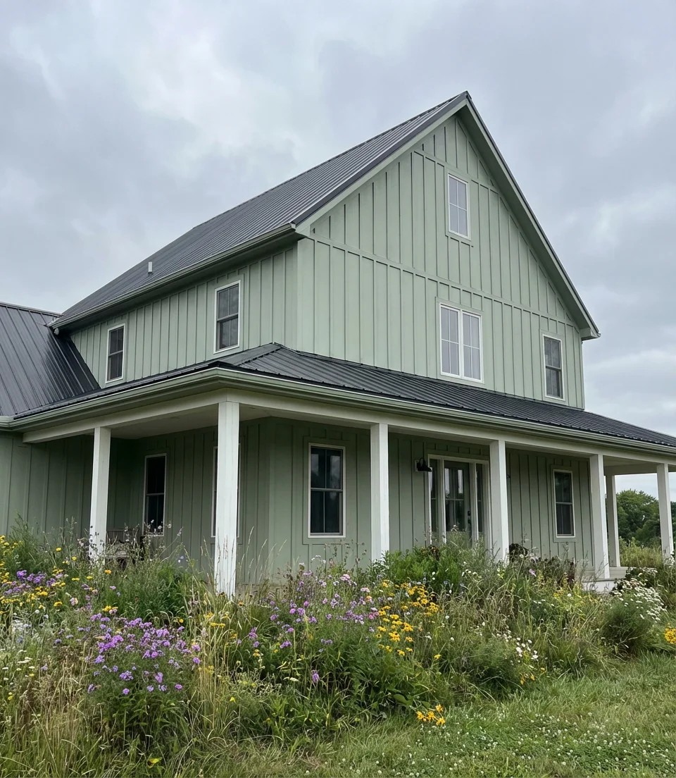
A real homeowner in rural Virginia recently repainted her 1940s farmhouse in a dusty sage and reported that neighbors stopped to comment within days—not because it was loud, but because it looked so right. Pair sage siding with a dark charcoal or black metal roof for a high-contrast, modern edge. Warm white trim keeps it from veering too earthy. Adding window boxes filled with herbs or wildflowers completes the image, transforming this exterior color into a comprehensive design system rather than just a paint choice.
4. Dark Green With Brown Roof and Red Brick Wall
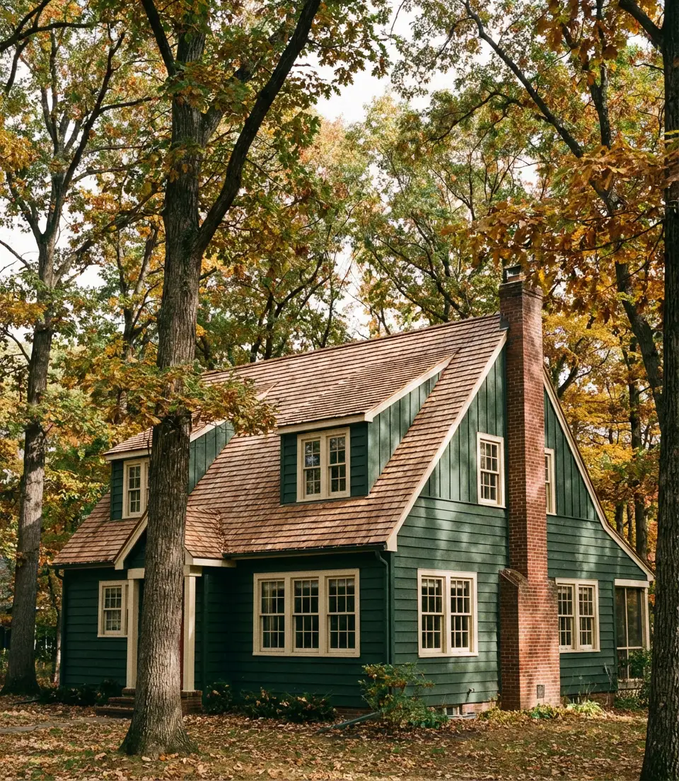
Deep, moody, and unapologetically bold—dark green exteriors are becoming the new navy. This is the choice for homeowners who want their house to feel like a destination. When you layer a forest green or hunter green body color against a brown roof and the warm texture of a red brick wall, you get something that looks genuinely architectural. The natural tones—bark brown, clay red, and deep green—pull from the same earthy palette, so they harmonize without feeling matchy.
This combination is especially powerful on two-story homes with existing brick features. The brick doesn’t need to cover the entire facade—even a front chimney or a partial foundation treatment creates that rich, layered look. Budget note: if your brick is painted or in rough shape, this swatch is actually a good palette to work with, since the dark green draws the eye away from any imperfections. Trim in a warm cream or sand color (rather than stark white) keeps the overall effect rich and pulled-together rather than stark.
5. Classic White With Light Gray and Black Window Frames
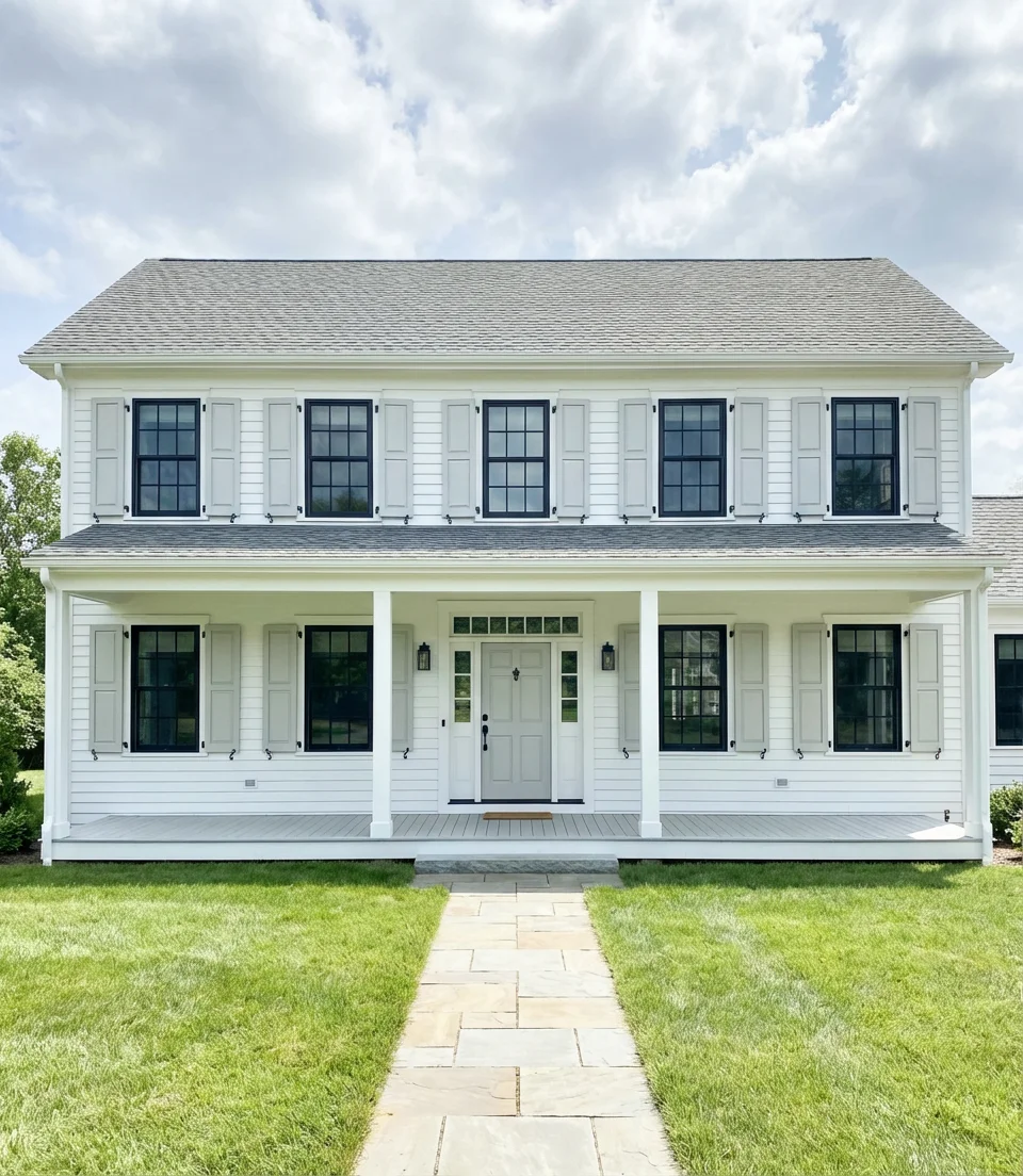
Certain combinations remain timeless; they simply undergo refinement. The trio of white, light gray, and black is having its most sophisticated moment yet in 2026, thanks in large part to the popularity of black-framed windows in new construction. A white or off-white body paired with light gray porch floors, steps, or accent panels, and anchored by matte black window frames and hardware, reads as contemporary without being cold. It’s clean, it’s timeless, and it looks incredible in aerial Pinterest photos.
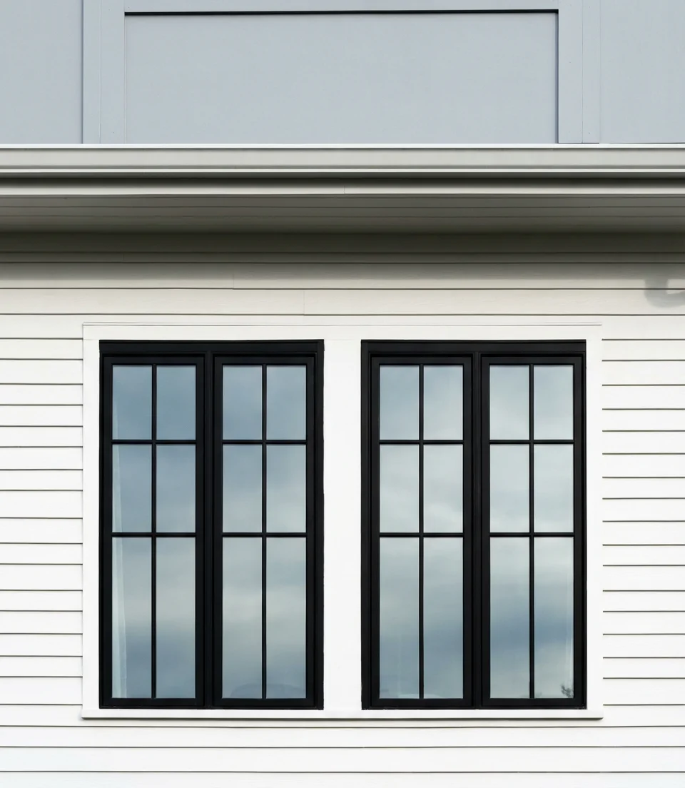
This palette is practically universally flattering—it works on colonials, ranches, bungalows, and modern builds alike. The secret is in selecting the right white: a warm white with a slight cream or beige undertone will feel welcoming in morning and evening light, while a cooler bright white can feel clinical. If your home gets a lot of direct afternoon sun, lean warm. The light gray element—whether on shutters, a garage door, or porch trim—acts as a visual buffer between the white and the black, making the whole palette feel layered rather than simply two-tone. d.
6. Terracotta and Cream on a Stucco Exterior
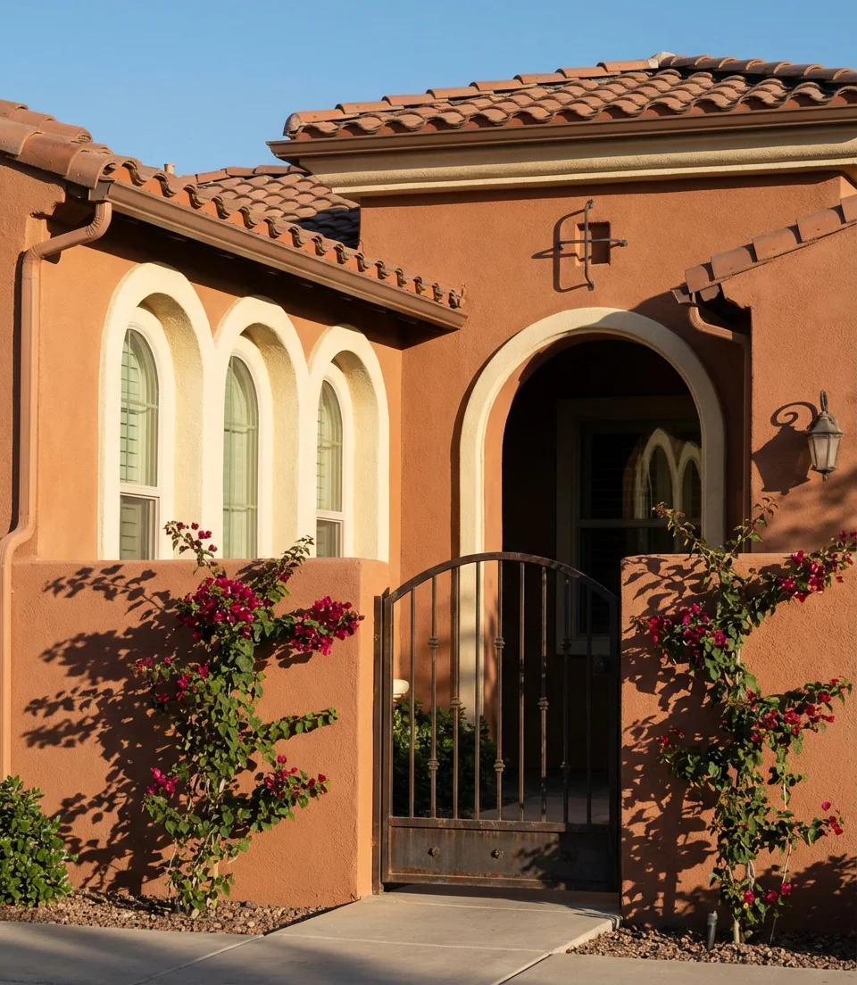
Warm, sun-baked, and rooted in Mediterranean and Southwestern tradition—terracotta is making a full comeback as an exterior color in 2026. When applied to a stucco home, this clay-red hue looks entirely natural, as if the material itself was baked in an oven alongside the tile. Paired with soft cream window surrounds, arched openings, and a terracotta roof, this palette delivers an effortless warmth that no gray or greige can replicate. It works whether you’re in Arizona, Florida, or New Mexico.
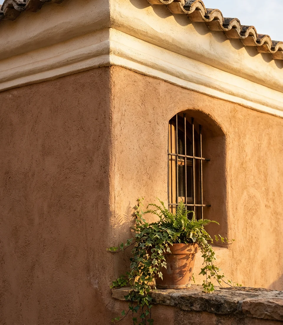
Color consultants who specialize in stucco homes consistently note that terracotta is one of the most forgiving exterior colors in hot, sun-drenched climates because it doesn’t show dirt the way lighter colors do, and its warm undertones become even more beautiful as paint weathers slightly over time. Choose a mid-tone terracotta rather than a very deep rust (which can read as brown in low light) or a very light peach (which can wash out). Iron planters with trailing greenery at the entry complete this look perfectly.
7. Navy Blue on a Contemporary Mid-Century Modern Home
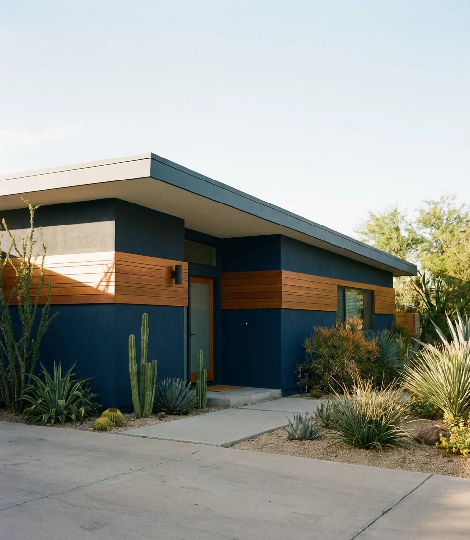
When it comes to contemporary mid-century modern homes—low-slung rooflines, clean overhangs, horizontal lines—nothing reads more architecturally correct than a deep navy blue. This blue plays beautifully against the natural wood and concrete elements that define MCM design, and in 2026, it’s one of the most-requested shades for mid-century renovations. The flatness of navy emphasizes the geometric planes of the architecture in a way that lighter colors simply can’t. It’s bold without being trendy, which is exactly what MCM deserves.
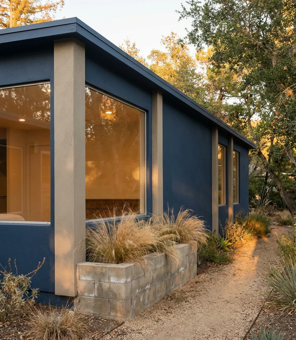
Pair navy siding with warm cedar or teak trim details and natural concrete hardscaping for an authentic mid-century feel. The common mistake with this look is to reach for bright white trim—it can feel too nautical and disrupt the architectural intent. Instead, a warm greige or natural wood tone in the trim reads as far more cohesive and era-appropriate. Lighting matters too: warm-toned exterior sconces mounted flush against the navy siding create a nighttime curb appeal that’s genuinely stunning.
8. Soft Gray With White Windows on a Brick Bungalow
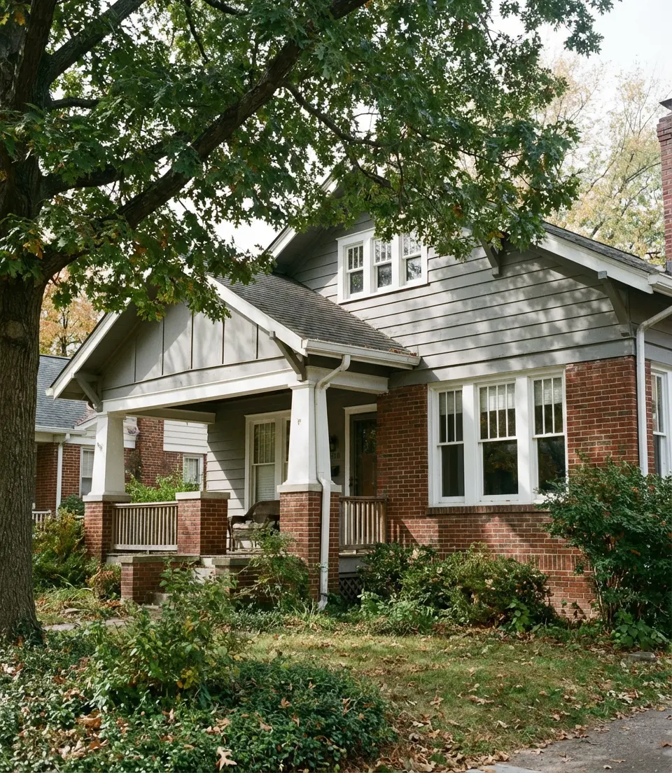
The bungalow is one of the most beloved home styles in America—compact, character-filled, and built with craft. Painting a brick bungalow’s trim and siding elements in a soft gray while keeping or painting window sashes in bright white windows is one of the cleanest upgrades available. The gray acts as a modern neutral that doesn’t fight the warmth of the brick, while the white windows pull light into the facade and make the home feel larger and more open from the street. It’s a trending look that earns its reputation.
In older neighborhoods across the Midwest and Pacific Northwest, this exact combination has helped homeowners modernize their bungalows without losing any of the historic character that makes these houses worth saving. When you select your gray, test swatches in multiple light conditions—what looks perfect on a North-facing wall in the morning can turn noticeably purple or green on a South-facing wall in afternoon sun. Always test before committing to a full gallon, let alone a full house.
9. Warm Brown With a Brown Roof for a Cohesive Natural Look
In 2026, tonal dressing is gaining traction as one of the most sophisticated approaches to exteriors. A warm brown body color paired with a coordinating brown roof (think chocolate shingles or deep cedar-brown metal) creates a home that feels completely cohesive, like it was designed from the roof down. This is especially effective in wooded or rural settings, where the earthy palette helps the home blend into its environment rather than compete with it.
A couple in the Pacific Northwest spent months agonizing over their exterior color before their designer suggested simply leaning into the brown of their existing cedar shake roof. They chose a warm walnut body color with deep espresso trim and reported that the house finally looked like it belonged to the land. The trick to avoiding a muddy result is to make sure the brown tones differ enough in value—a medium warm brown body against a noticeably darker brown roof creates depth rather than monotony.
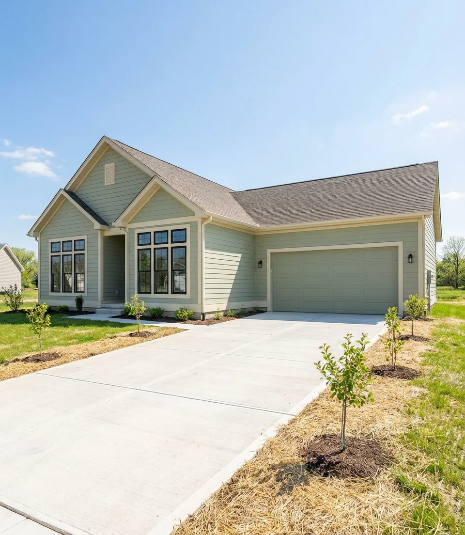
10. Greige Palette for a Modern Suburban Home
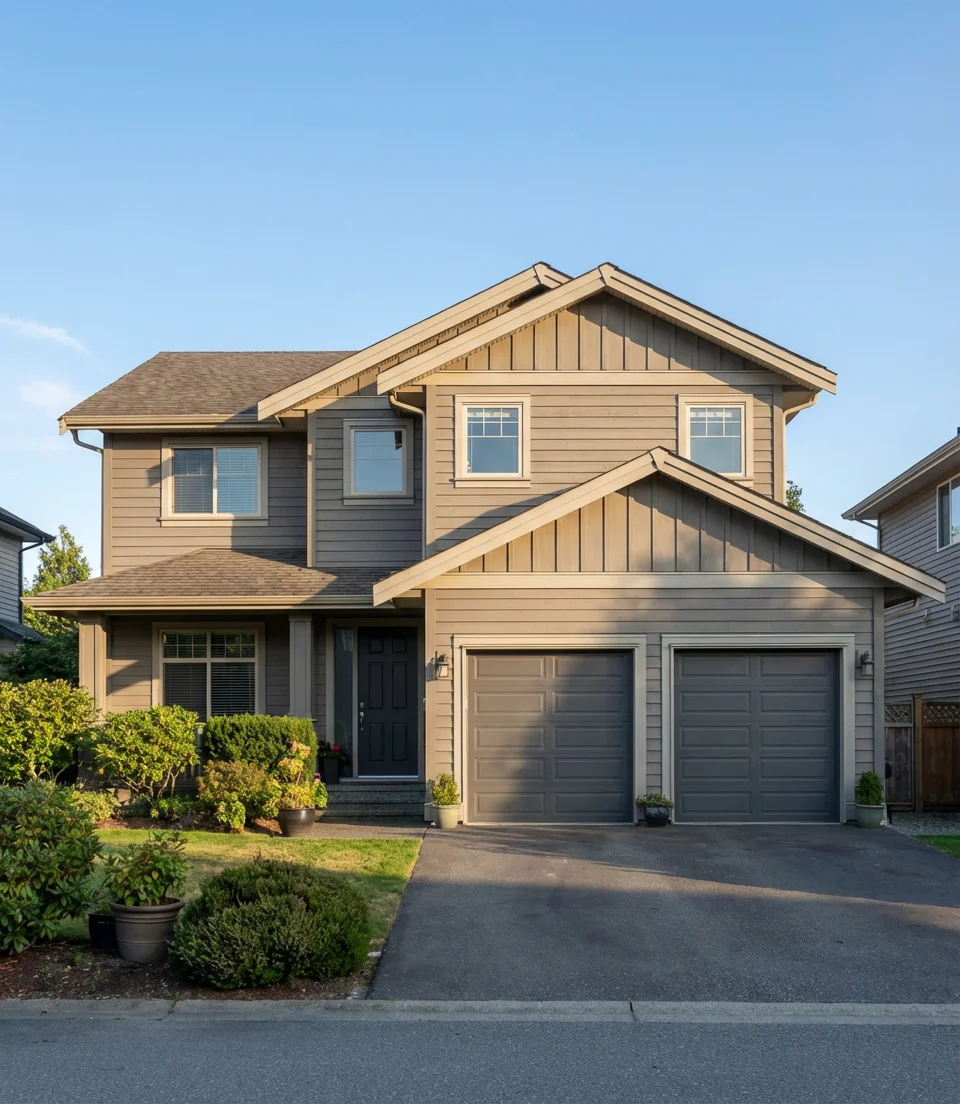
Greige—that magical blend of gray and beige—continues to dominate as the ultimate crowd-pleasing exterior neutral. A well-curated palette in greige tones gives a modern suburban home a designer quality without requiring any risk-taking. In 2026, the most compelling greige applications play with subtle variation: a slightly warmer greige on the body, a cooler or lighter greige on the trim, and a darker anchor color on the garage door or front door. The result is a home that reads as intentional and polished from 30 feet away.
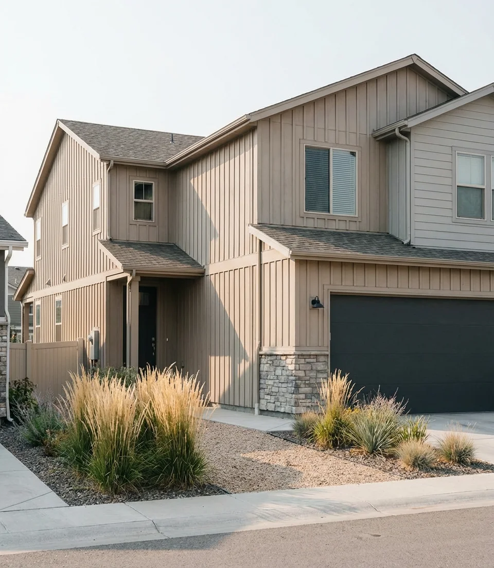
This palette excels on the kinds of two-car-garage-front homes that define American suburbia—homes where the architecture is pleasing but not particularly distinctive, and where the color needs to do a lot of work. Greige hides dirt better than true white, holds up better in sun-bleaching climates than true beige, and works with almost every roof color on the market. It’s the rare exterior color that your HOA will approve, your neighbors will admire, and potential buyers will love when you list the house.
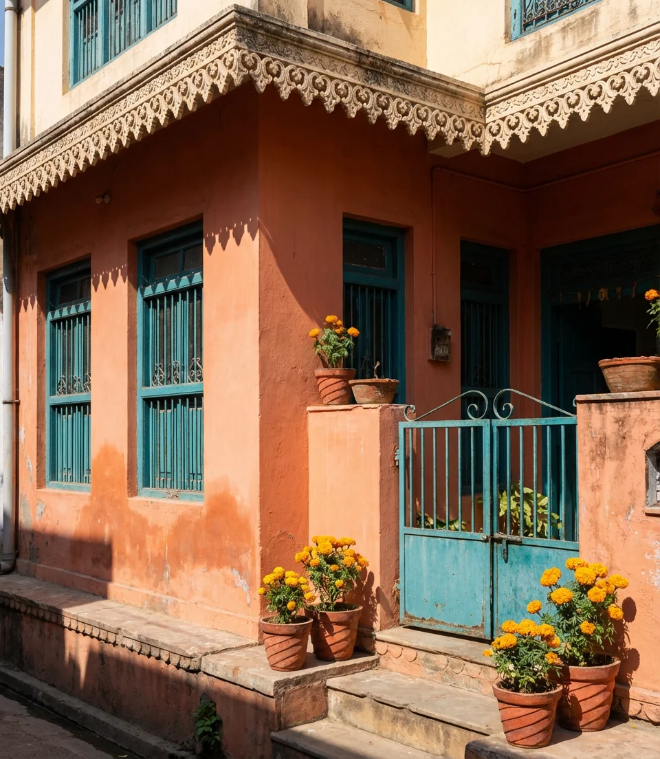
11. India-Inspired Ochre and Deep Teal Accents
Global color influences are shaping American home design in exciting ways, and one of the most striking is the arrival of India-inspired palettes on exterior applications. Rich Indian-style ochre yellows paired with jewel-toned teal doors, window frames, or shutters create an exterior that is confident and joyful. This design isn’t a maximalist overload—it’s about one warm dominant color against a single bold accent. In neighborhoods where every house is the same shade of beige, a home painted in this palette becomes an immediate landmark.
Where it works best: craftsman bungalows with decorative woodwork, Victorian-era homes with detailed trim, or any home in a warm, sunny climate where bold color reads as celebratory rather than garish. The key to pulling this off is restraint: keep the ochre as the primary body and reserve the teal strictly for accents. Natural stone or terracotta planters at the entrance bridge the two tones beautifully. This palette photographs incredibly on Pinterest because of its inherent warmth and visual contrast.
12. Modern Gray on a Stucco Home With Dark Trim
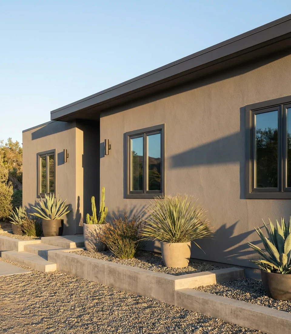
There’s nothing dated about gray when it’s executed with intention. On a stucco home, a cool or warm medium gray body color with dark charcoal or near-black trim produces a result that is undeniably modern and architectural. The flat, matte quality of stucco absorbs color in a way that wood siding doesn’t, giving grays a depth and richness that looks different—and better—at every time of day. This color is a particularly popular look in California, Texas, and Arizona, where stucco is the dominant exterior material.
The single most common mistake with this look is choosing a gray that tests beautifully on a small swatch but registers as lavender or greenish on the full-scale facade. This happens with cooler grays in certain light conditions, particularly late afternoon in climates with a lot of reflected sunlight. Request a large test patch—at least 2 by 2 feet—and observe it across three days in different light before committing. Also, avoid high-gloss finishes on stucco: flat or eggshell finishes preserve the textural beauty of the material and look far more sophisticated.
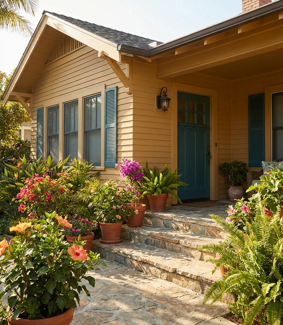
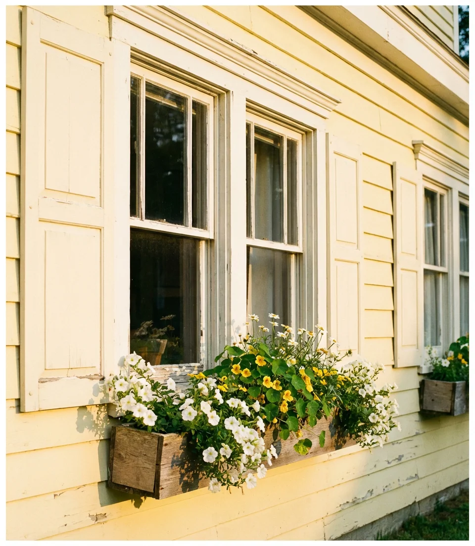
13. Pale Yellow Farmhouse With White Trim and Shutters
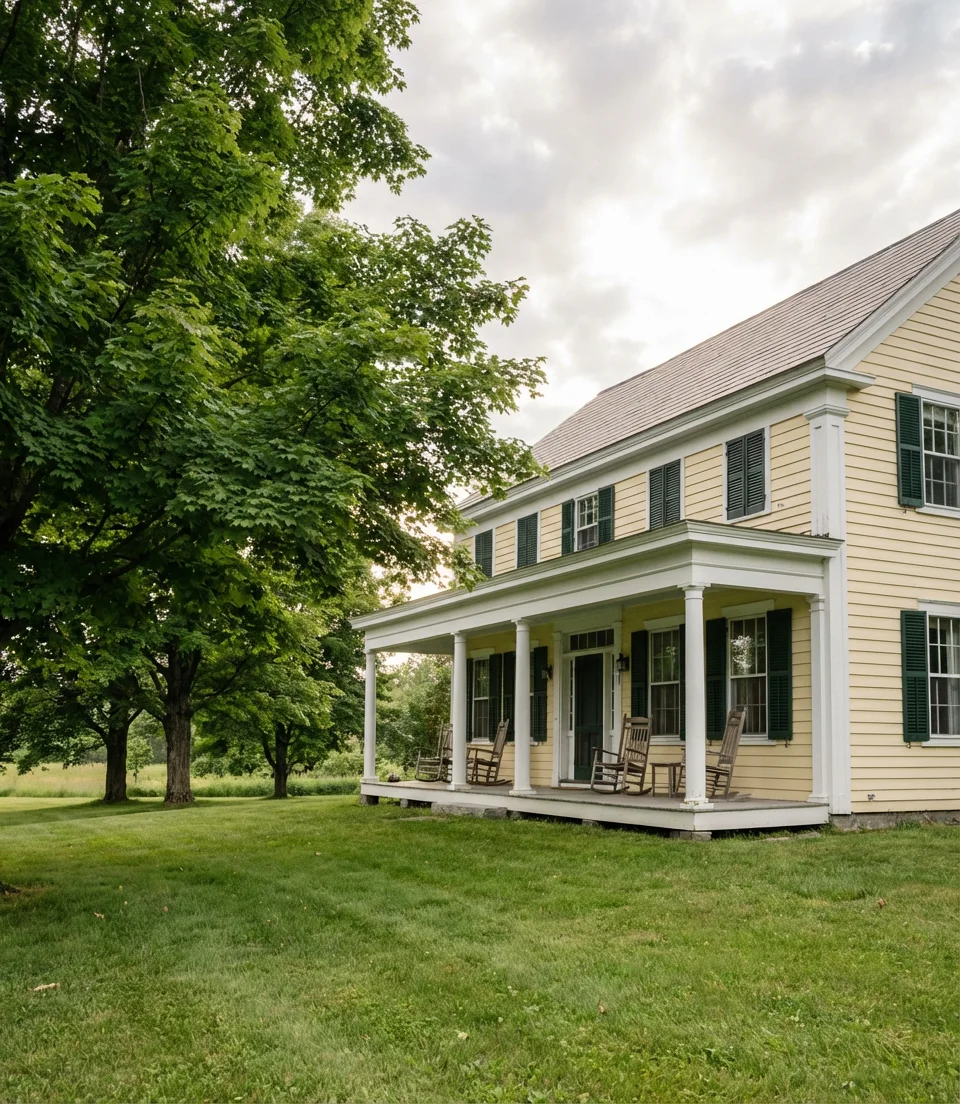
Pale yellow is one of those exterior colors that divides opinion sharply—but when it’s done right, it produces something that looks like sunshine made permanent. The key in 2026 is to move away from bright, saturated school-bus tones and toward soft, creamy, almost-white yellows with a buttery warmth. On a farmhouse-style home with wide front porches, white columns, and classic shutters, this color tells a story of American comfort and tradition that resonates deeply with Pinterest users seeking cozy inspiration.
Pale yellow is one of the more affordable ways to transform a home’s exterior because it hides minor surface imperfections and requires fewer coats for full coverage compared to darker colors. It’s also one of the more forgiving colors on older homes where trim lines aren’t perfectly sharp—the warmth of the yellow tends to blur those imperfections gracefully. If you’re concerned about resale, pale yellows consistently test well with buyers in the Southeast and rural Midwest, where they read as charming and well-maintained rather than eccentric.
14. Deep Charcoal Gray With Warm Wood Garage Door
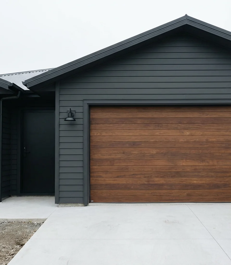
One of the most compelling trending exterior moves of 2026 is the pairing of a very deep charcoal or near-black gray body color with a warm faux-wood or real wood garage door. The contrast between the moody, saturated gray and the honeyed warmth of the wood creates a dynamic that feels both edgy and approachable—modern enough to look intentional, warm enough to feel like home. This combination also tends to age beautifully, with the dark exterior masking weathering and the wood door remaining a focal point year after year.
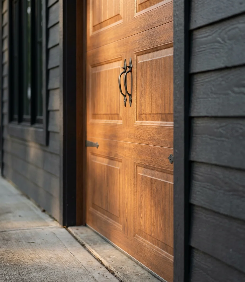
In surveys of Pinterest users who recently completed exterior repaints, homes with dark body colors and contrasting natural material accents received the highest engagement. The dark gray and wood door combination regularly outperforms lighter palette options in terms of saves and clicks. For execution, choose a garage door in a teak, walnut, or medium oak tone—avoid very light woods that can read as unfinished against a dark body. Matte black hardware on both the garage door and front entry ties everything together.
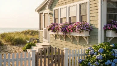
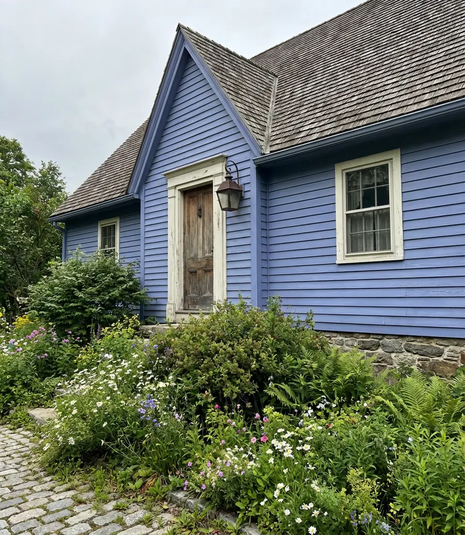
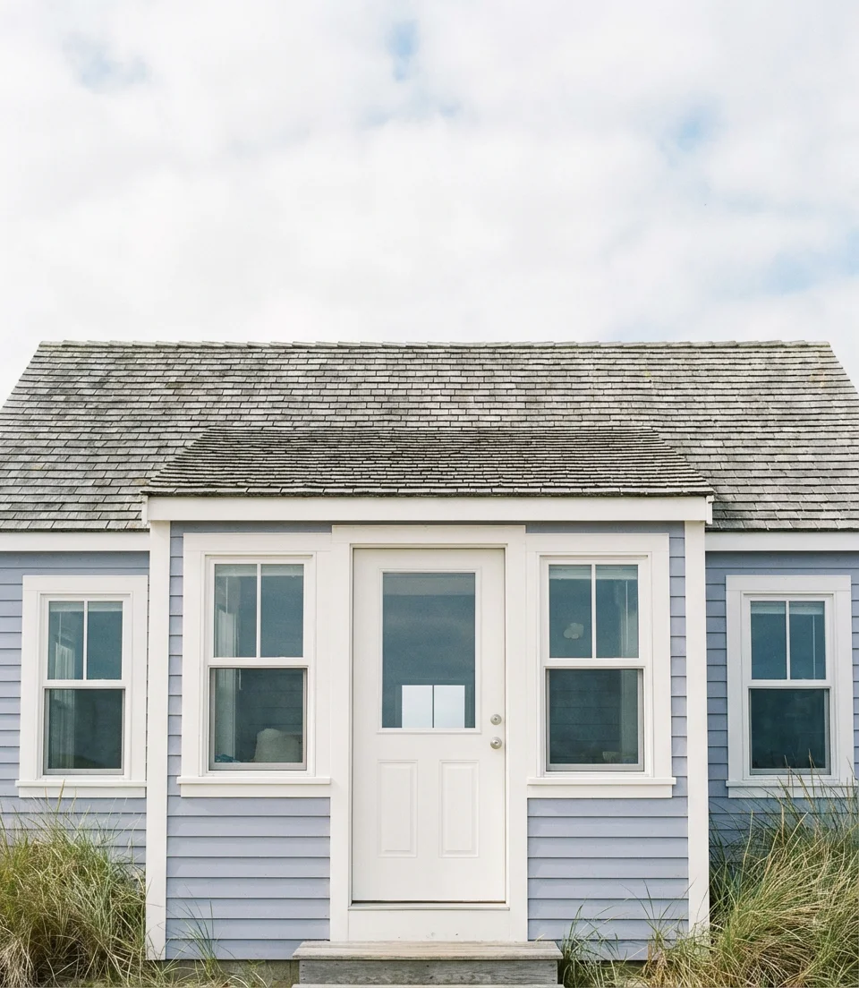
15. Light Blue With White Trim on a Coastal Cottage
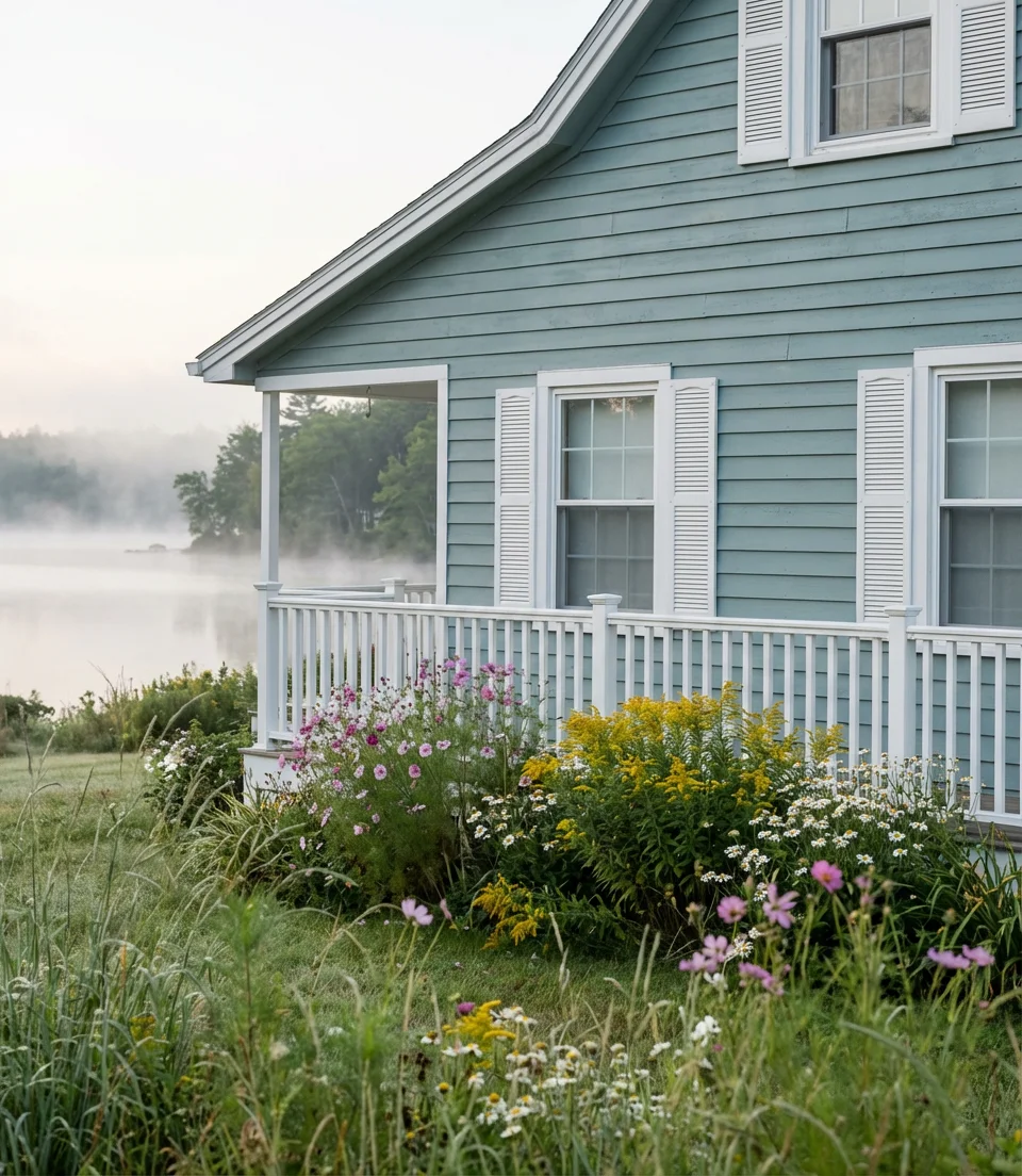
There are few exterior color combinations as universally loved as a soft blue cottage with crisp white trim—and in 2026, this look has evolved from purely coastal to surprisingly versatile. The new generation of this palette reaches for blues that are hazier and more complex than straightforward sky blues: think dusty aqua, faded robin’s egg, or a pale periwinkle that shifts toward gray. Against white trim and window details, these blues feel sophisticated rather than sugary and grown-up rather than novel. It’s effortlessly lovely and consistently one of the most-pinned exterior color stories every year.
Color designers who work on coastal and lakeside properties note that the most successful light blue exteriors use a shade with enough gray in it to read as sophisticated rather than cheerful. Pure, saturated light blues can look playful—which is fine in some contexts—but if you want a result that photographs elegantly and has lasting appeal, reach for a muted blue: one that’s been softened with a touch of gray or brown pigment. The result is a blue that feels like it has always been there, like a morning sky over quiet water.
16. Exterior Paint Ideas for Homes in India
The search term “exterior paint colors for houses in India” generates millions of Pinterest results each year, and it’s a market with genuinely distinctive needs. Homes in India face intense sun, monsoon moisture, and urban density—all factors that influence which colors work and which fail. In 2026, Indian homeowners and designers are gravitating toward colors that honor the country’s rich chromatic tradition: warm whites, deep corals, vibrant yellows, peacock blues, and earthy terracottas. These palettes have centuries of climate-tested logic behind them and translate beautifully to the global audience searching for bold exterior inspiration.
For Indian homeowners specifically, exterior paint with UV-resistant and anti-fungal properties is essential rather than optional. Monsoon season can devastate a beautiful paint job that lacks moisture protection. Beyond practicality, the design advice is consistent: use the vibrant, saturated colors that the Indian palette is known for on accent walls, columns, gates, and entrance features rather than on the entire facade. This approach delivers visual impact without overwhelming the architecture, and it makes maintenance and future repainting significantly more manageable and affordable.
17. Dark Olive Green on a Modern Farmhouse With Metal Roof
Dark olive is to 2026 what Sage was to 2022—the green that serious exterior designers are excited about right now. It’s deeper, earthier, and more complex than sage, landing somewhere between military green and mossy forest floor. On a modern farmhouse with a standing seam metal roof, dark olive creates a combination that feels both ancient and contemporary. This shade of olive is the color palette of working farms, hunting lodges, and—increasingly—aspirational rural home builds that want to project substance over style.
Where it works best: acreage properties with natural landscaping, homes surrounded by trees or meadows, and any building where the architecture is simple and strong enough to carry a dark, saturated color. The metal roof is key to the composition—it introduces a material contrast that keeps the dark green from feeling heavy. If a metal roof isn’t in the budget, a dark gray or charcoal architectural shingle delivers a similar effect. White or off-white trim keeps the whole picture from getting too somber and adds the crisp edge that makes farmhouse style so enduring.
18. Latest Trending Whites for Contemporary Homes
White will always be a foundational exterior color, but in 2026, the conversation around it has become remarkably nuanced. The latest approach to white for contemporary homes is all about understanding undertones. There are whites with pink undertones (warm and rosy), whites with yellow undertones (buttery and inviting), whites with gray undertones (cool and crisp), and whites with green undertones (fresh and almost minty). The trending whites right now lean toward warm cream—especially Benjamin Moore White Dove and Sherwin-Williams Alabaster—because they photograph warmly and hold up beautifully in both artificial and natural light.

The single most common exterior color mistake homeowners make is choosing a white that looks perfect in the paint chip booklet but registers as clinical or institutional on the full house. This almost always happens with whites that have strong blue or gray undertones. In direct sunlight, these cool whites can look brilliant, but in the shade—on a porch ceiling, under an overhang—they turn noticeably cold and uninviting. The warm whites avoid this problem entirely, shifting from golden to creamy depending on the light rather than from white to gray-blue.
19. Dusty Rose and Taupe on a Spanish Revival
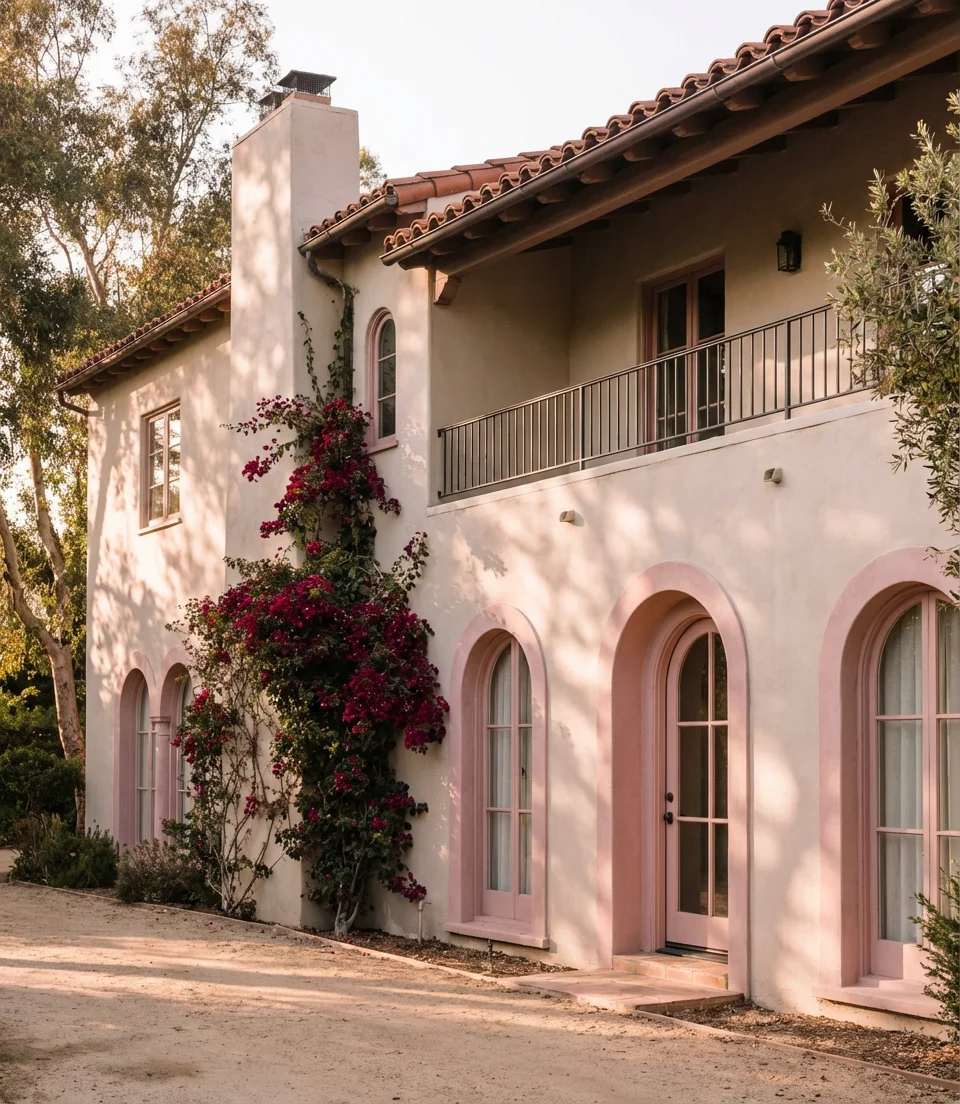
One of the more unexpected ideas gaining traction in exterior design circles is the revival of dusty, muted pinks on Spanish and Mediterranean-style homes. This isn’t the powder-pink of a baby shower—it’s a complex, chalky rose with enough brown or gray in it to read as a sophisticated architectural choice. Paired with a warm taupe body or used as an accent on arches, columns, and window surrounds against a creamy stucco background, this dusty pink delivers warmth and femininity without any camp. It pairs naturally with a terracotta roof and clay tile details.
This palette makes the most sense in warm, sun-drenched climates—Southern California, New Mexico, and Florida—where the Mediterranean and Spanish Revival architecture was built and where warm, clay-toned light brings out the pink’s best qualities. In cooler or cloudier climates, the same shade can read as washed out or sad. The taupe element—whether as the primary body color with dusty rose as an accent or vice versa—provides enough visual weight and warmth to keep the overall effect grounded and elegant rather than whimsical.
20. Black Exterior With Brass and Bronze Hardware Accents
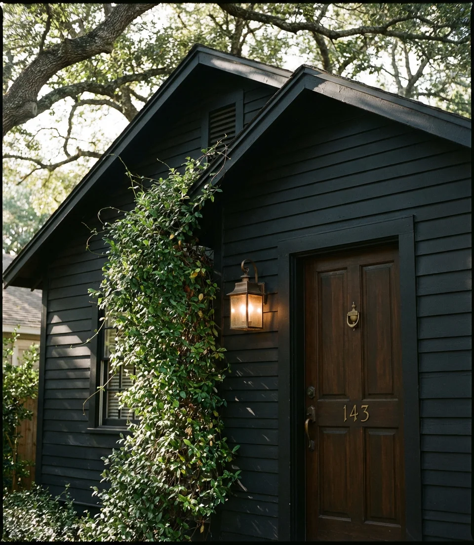
A true black exterior is one of the most striking moves in 2026’s paint playbook for homeowners who are willing to invest heavily. This isn’t charcoal or very dark gray—it’s genuine, committed black. On smaller homes like bungalows or cottages, the effect is almost jewel-like: the home reads as a rich, deliberate object rather than just a house. The critical styling detail that elevates this look from dramatic to magnificent is the hardware: aged brass knockers, bronze light fixtures, and warm gold house numbers create a contrast against the black that feels luxurious and intentional.
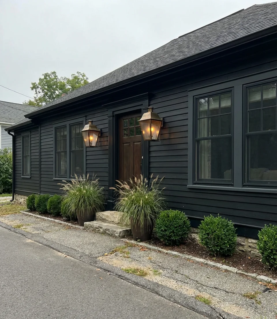
Many homeowners who paint their home black choose paint that’s too flat and end up with a surface that shows every nick, scratch, and water stain in high definition. A low-sheen or satin finish is often a better choice than dead flat for a black exterior—it gives the paint enough durability to hold up to weather and impact without producing a mirror-like quality. Pairing black siding with natural greenery—climbing vines, boxwoods, and ornamental grasses—keeps the look alive rather than austere and severe.
21. Pale Sage and Warm White for a New Construction Exterior
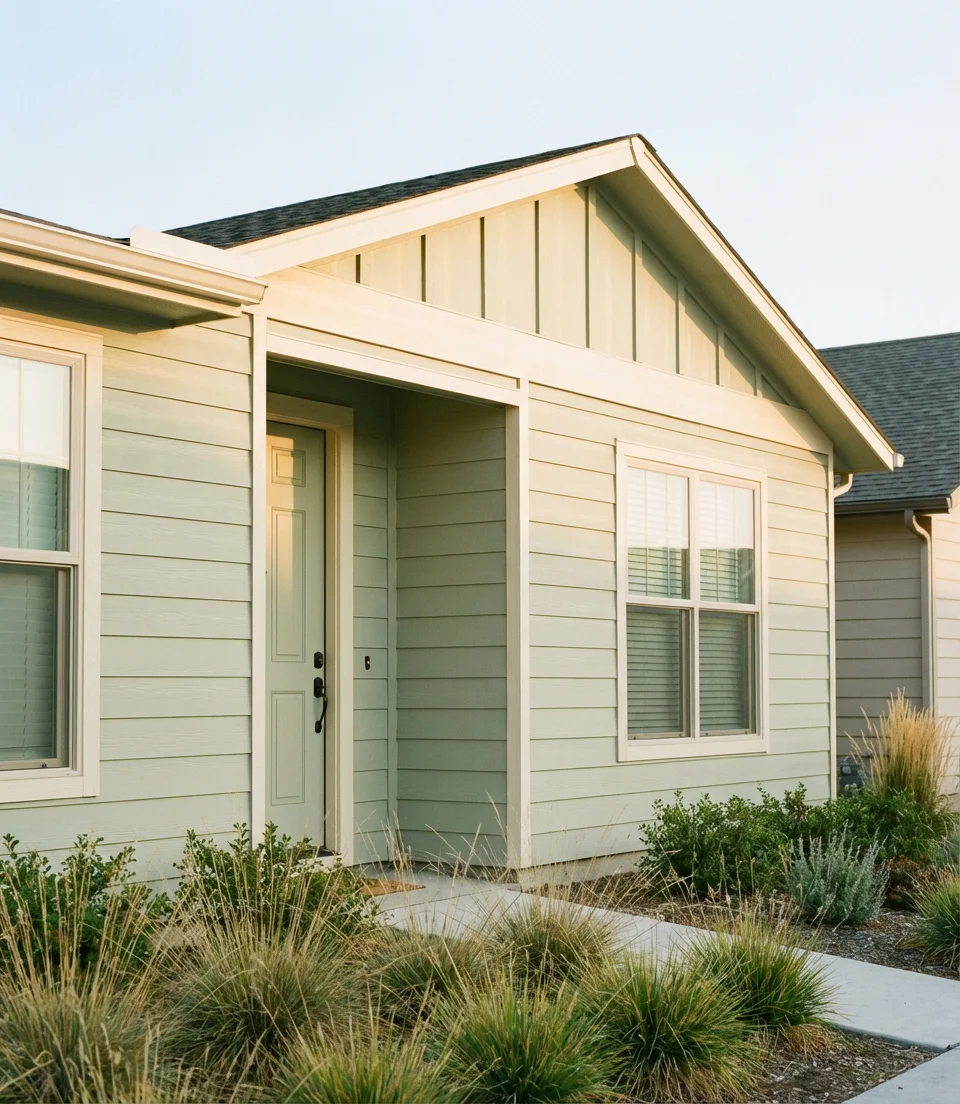
Pale sage—a green so soft it almost reads as a tinted white—is one of the freshest color stories in new construction exterior design. In 2026, this gentle, restorative green is showing up on homes across the country as developers and buyers alike respond to a collective desire for color that feels calm, natural, and optimistic. Paired with warm white trim and simple black hardware, pale sage delivers a palette that is instantly likable without being predictable. It works on vinyl, fiber cement, engineered wood siding, and virtually every material used in new construction.
Color forecasters at major paint brands point to pale sage as the color that best captures the collective mood of 2026 — a desire to reconnect with nature, simplify the visual environment, and find beauty in subtlety. For new construction in particular, this color tends to hold its value well over time, never reading as particularly dated or tied to a single moment. It’s the kind of choice that a homeowner makes once and never regrets, and it will look just as right a decade from now as it does today.
The right exterior paint color is more than a cosmetic upgrade—it’s the first line of your home’s story. Whether you’re drawn to the quiet sophistication of warm taupe, the bold drama of a black exterior, or the botanical calm of pale sage, 2026 offers a palette for every architecture, climate, and personal vision. We’d love to hear which of these ideas is speaking to you—drop your favorites in the comments below, share your own before-and-after experiences, or tell us which color you’re planning to use on your home this year. Your next chapter starts at the front door.