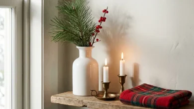
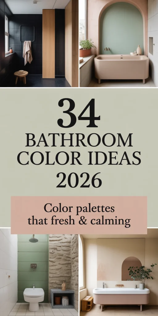
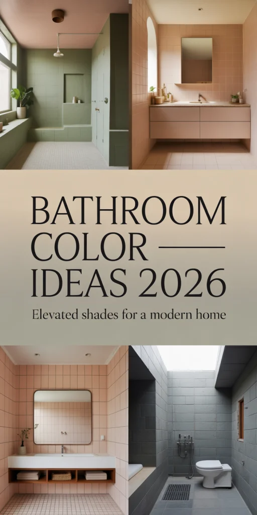
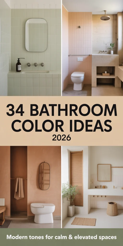
34 Bathroom Color Ideas 2026: Trending Palettes for Small, Modern and Farmhouse Bathrooms
Going into 2026, bathroom design is still shifting and incorporating new color combinations that stay true to the classic and modern styles. More and more Americans are going to Pinterest to get bathroom colors that are stylish and practical. No matter the case, be it a small bathroom renovation, a main suite update, or a guest powder room color refresh, the right color palette can elevate a room to the extraordinary. This guide describes more trendy approaches to the design of bathroom color, focusing on earth-tone sanctuaries and bold statement walls, each developed and ready to inspire your new project.
1. Sage Green Serenity
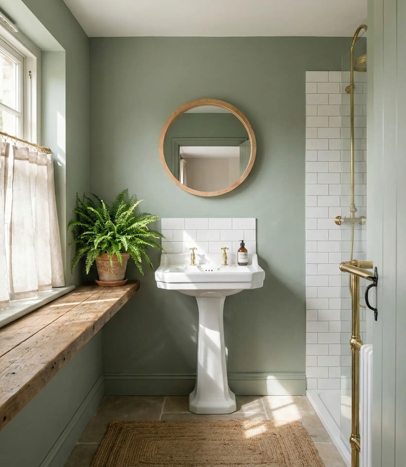
Light bathroom greens, especially sage green, are dominating the bathroom design, particularly in the modern homes where the new owners are looking for a calming retreat. This color works beautifully on the walls because it creates an organic, sophisticated connection to nature. It goes great with the brass, white vanities, and natural wood that usually work for bathrooms of any size. 
This color works best in bathrooms with natural light, where the green tones shift beautifully throughout the day from cool morning mint to warmer afternoon olive. In Pacific Northwest homes, sage green has become particularly popular, as it echoes the region’s lush landscapes. The color also has practical benefits—it’s forgiving with water spots and pairs well with both chrome and gold-toned hardware, giving you flexibility as fixture trends evolve.
2. Charcoal and Concrete Gray
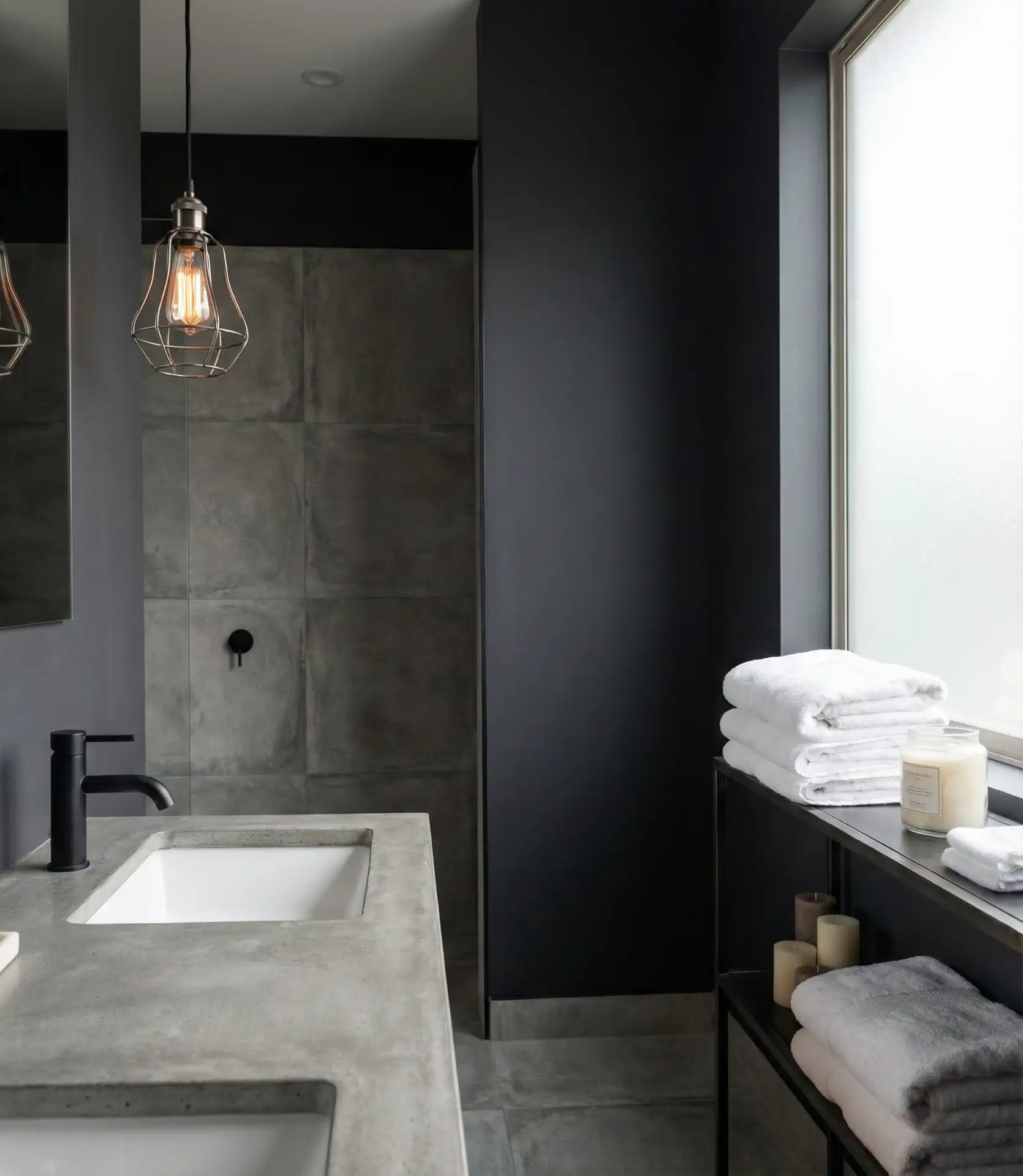
Deep gray bathrooms create a sophisticated, spa-like atmosphere that’s especially striking when paired with black fixtures. This dark and moody approach works surprisingly well in tiny spaces, where the enveloping color creates an intimate, cocooning effect rather than feeling cramped. 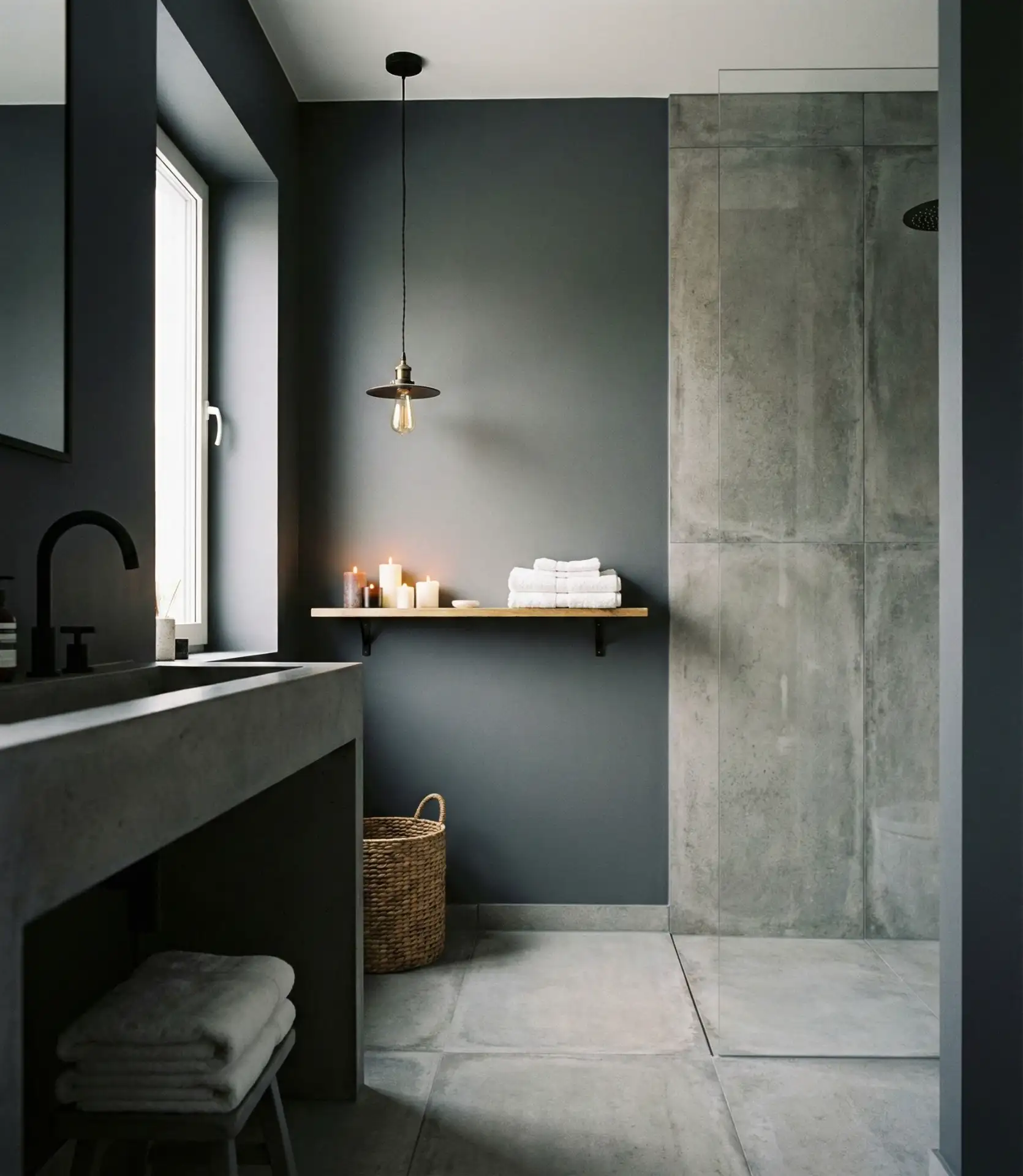
A common mistake with dark bathrooms is inadequate lighting—you’ll need layered illumination, including ambient ceiling lights, task lighting at the mirror, and accent lighting to prevent the space from feeling cave-like. Urban loft dwellers particularly embrace this aesthetic, as it complements exposed brick and metal elements common in converted industrial spaces. Budget-wise, dark paint can actually save money by concealing minor wall imperfections that would show in lighter colors.
3. Warm Terracotta Earth Tones
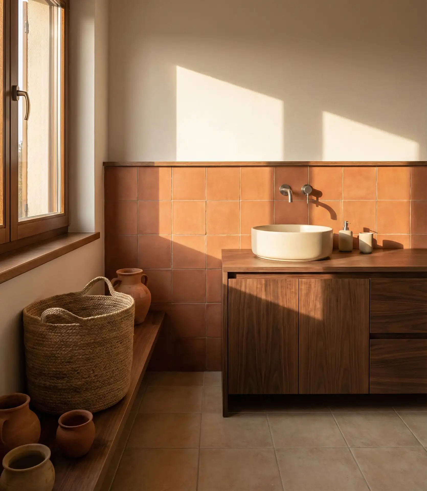
Earthy terracotta and clay-inspired shades bring warmth and character, especially when paired with brown cabinets in rustic or Mediterranean-style homes. These earth-tone palettes create bathrooms that feel grounded and inviting, channeling the organic beauty of Southwestern landscapes.
Last year, a homeowner in Santa Fe shared how switching from stark white to terracotta transformed her bathroom from cold and clinical to warm and welcoming—she actually started taking longer morning showers just to enjoy the space. The color particularly shines in homes with Spanish Colonial or Adobe architecture, where it reinforces the overall design narrative. These warm tones also photograph beautifully, which matters if you’re considering selling your home in the future.
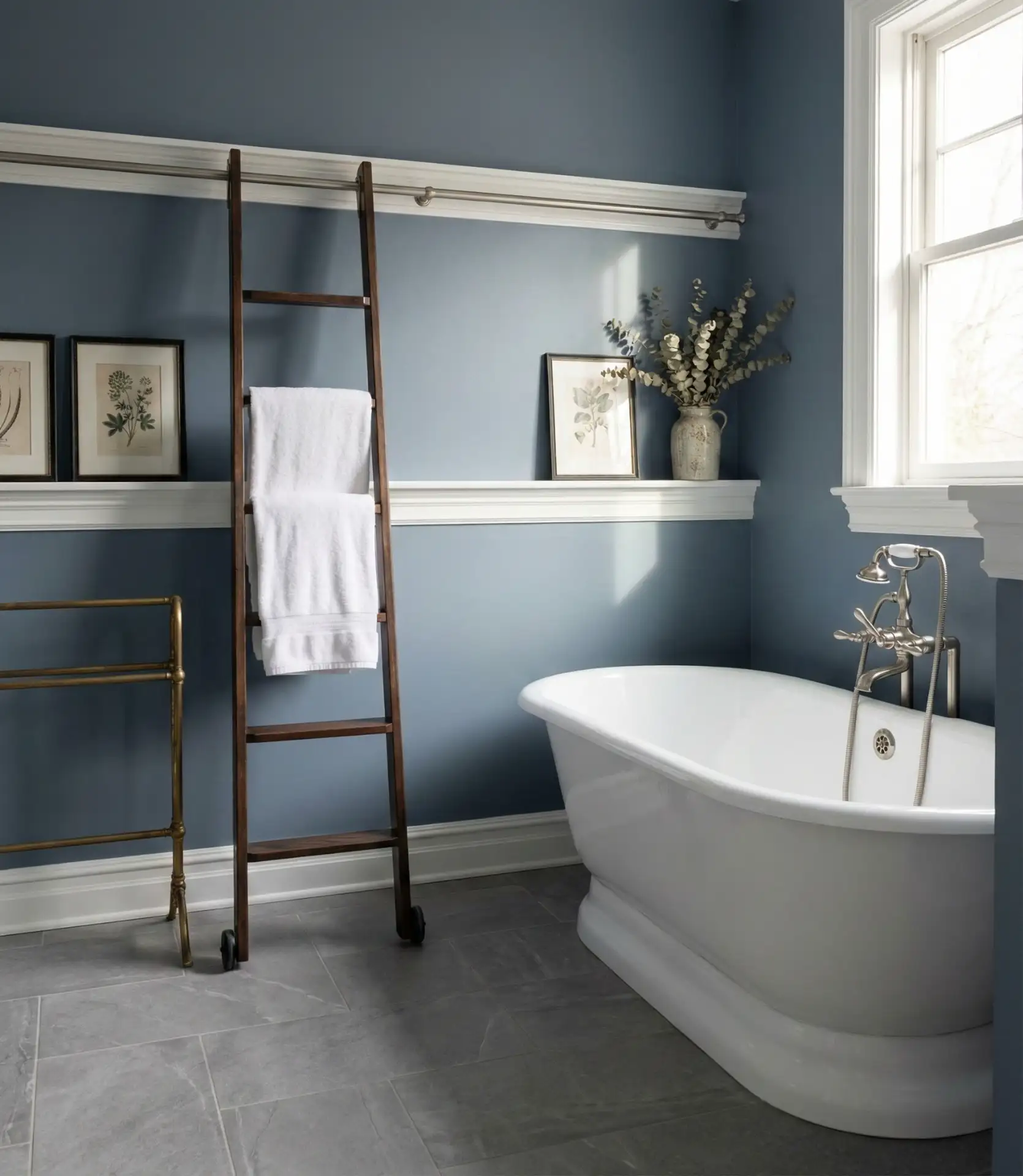
4. Classic Navy Blue Depth
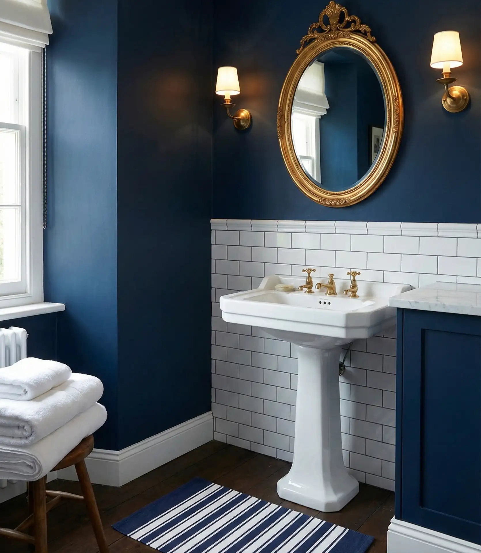
Rich blue walls bring timeless elegance to bathrooms, working beautifully in both traditional and contemporary settings. Navy creates a striking contrast against white fixtures and tilework while maintaining a sense of calm that’s essential for bathroom spaces. This color choice is particularly popular in coastal regions and nautical-inspired homes. 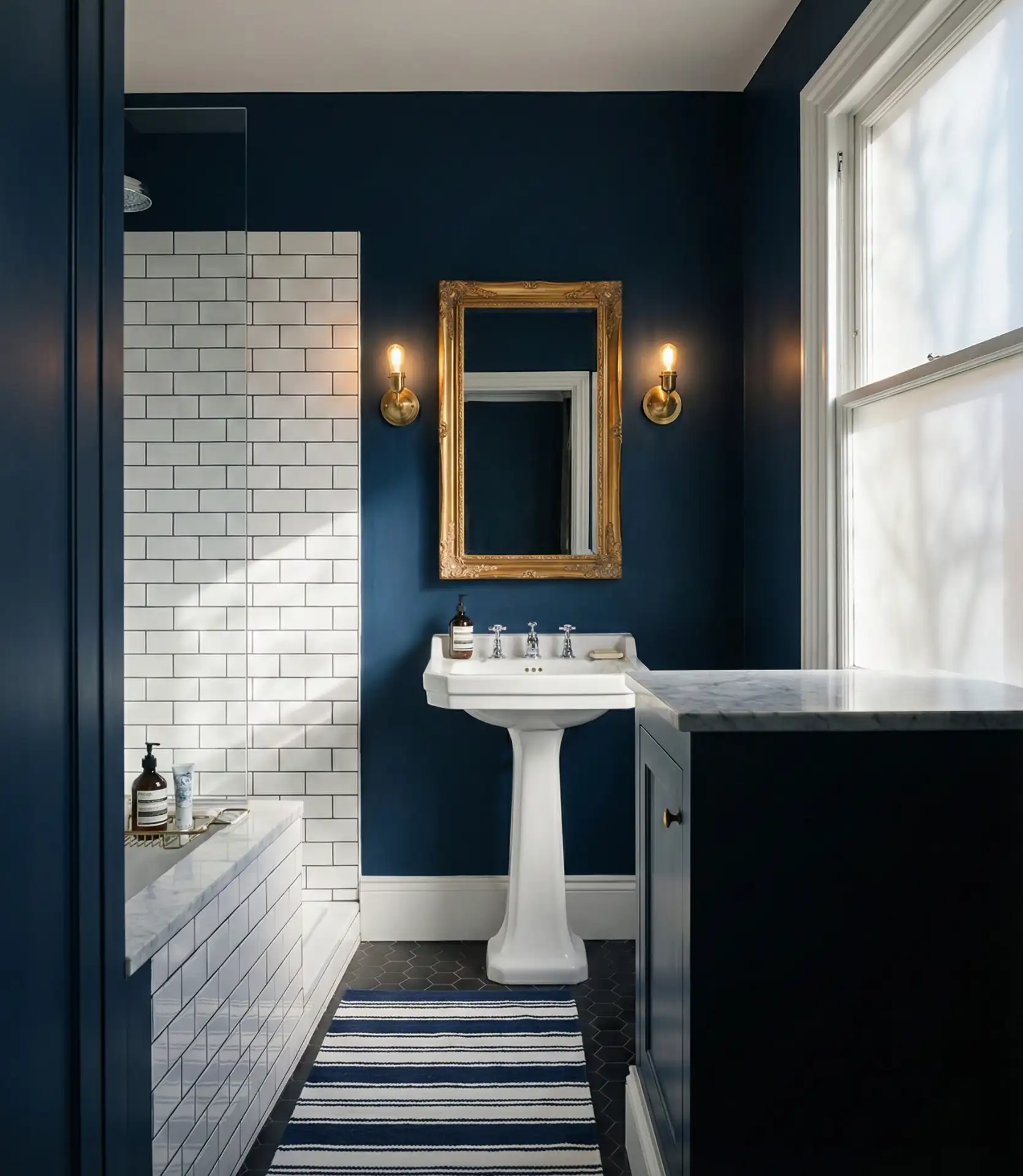
Interior designers consistently recommend navy for bathrooms because it’s one of the few dark colors that doesn’t overwhelm smaller spaces—instead, it adds depth and sophistication. The color works across multiple design styles, from Hampton’s chic to urban contemporary, making it a safe investment if your aesthetic preferences evolve. Navy also pairs exceptionally well with both warm metals like brass and cool finishes like chrome, offering flexibility in hardware selection.
5. Soft Greige Neutrality
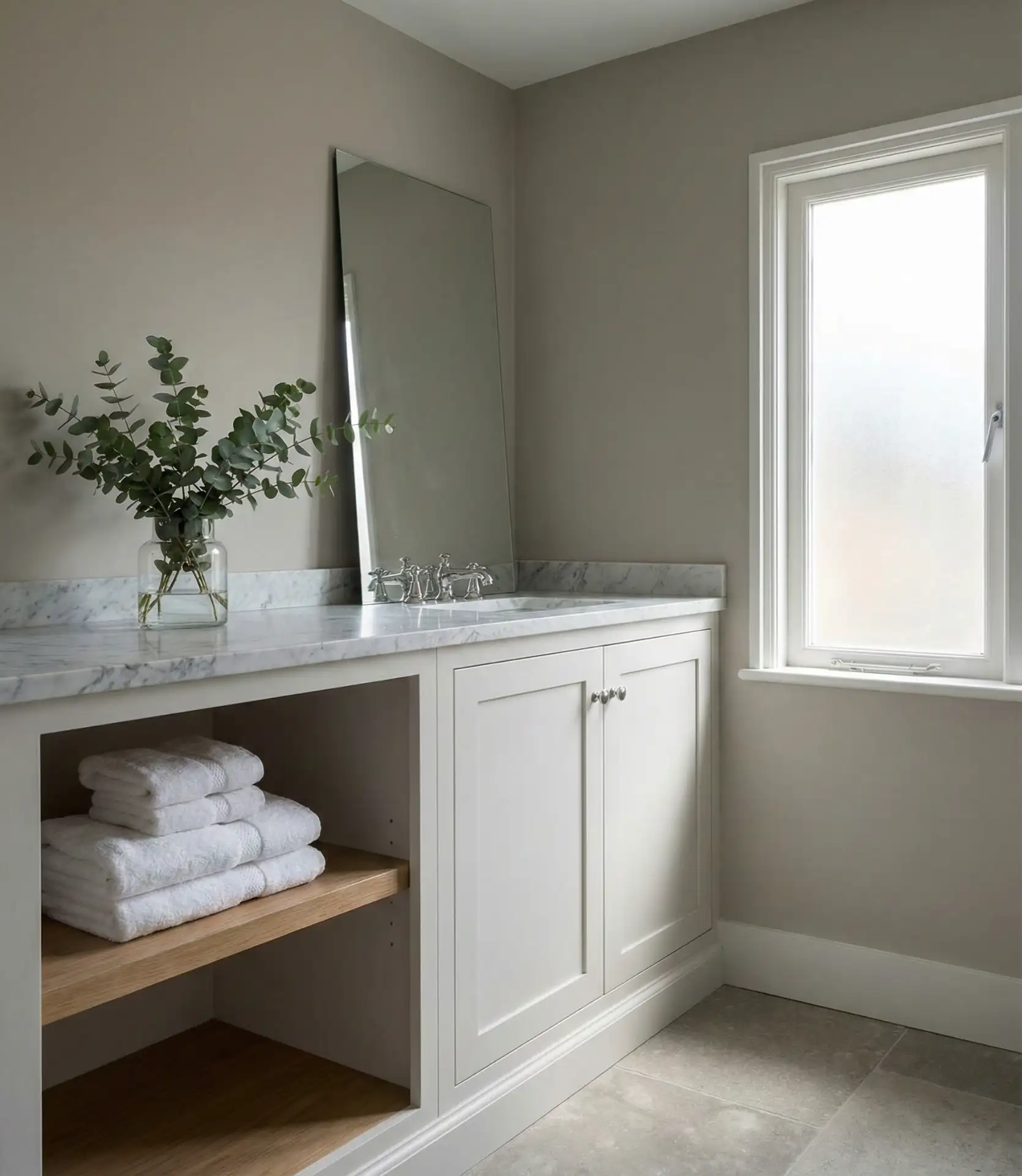
The ideal combination of gray and beige is the greige, which projects sophistication and is a popular neutral choice for those looking for calming and composed bathroom retreats. Bathroom renovations have become dominated by popular Sherwin-Williams colors, Agreeable Gray and Accessible Beige, as they are warm neutral colors that work well with almost any other accent color. 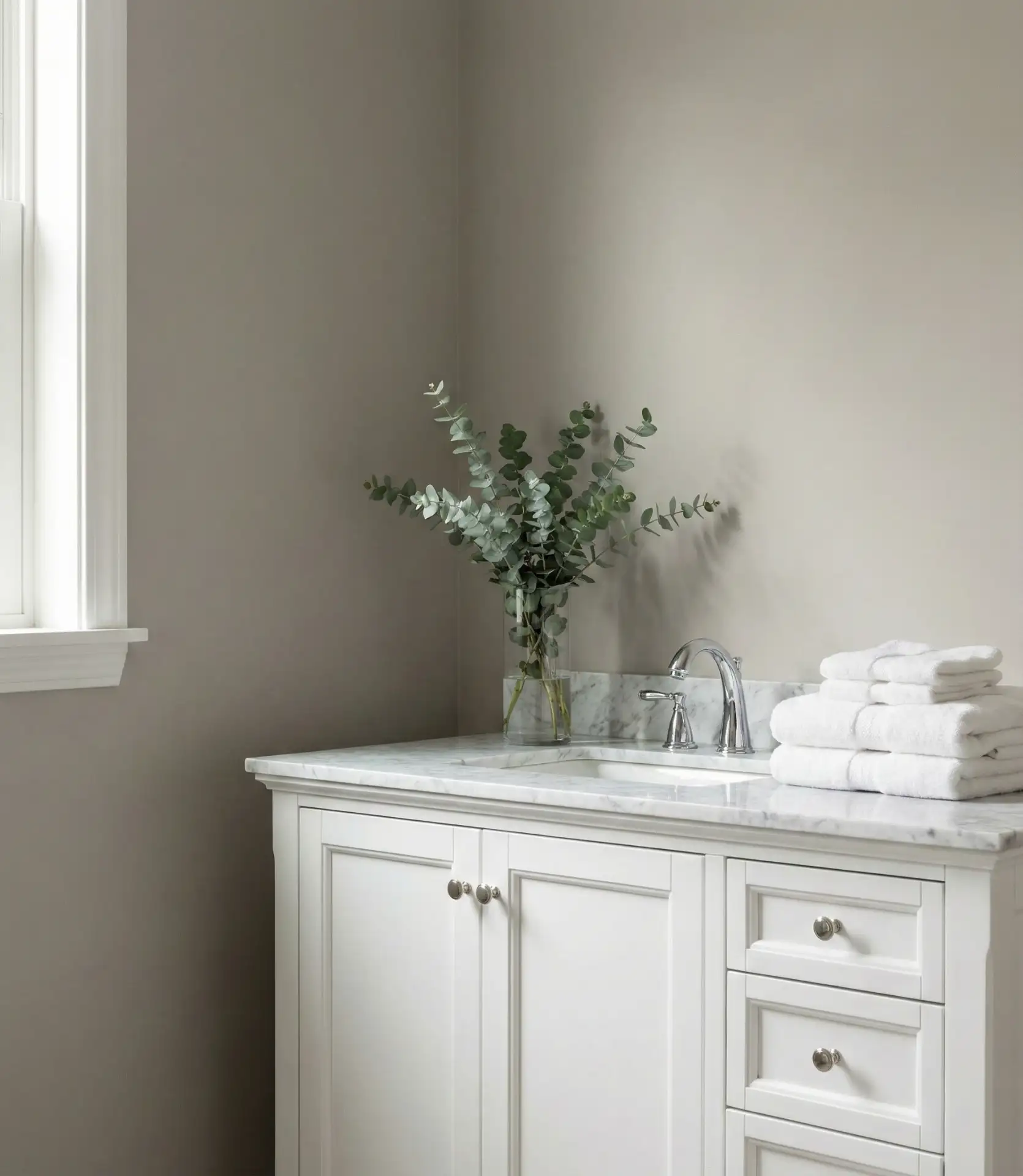
Real estate agents explain that greige bathrooms, as a result of their color choice and style, appeal to the widest of buyer demographics, making it a desirable renovation choice. The color greige adds a calming oasis feel to the bathroom, which homeowners increasingly want as they start using their bathrooms for more than just bathing. Bathrooms are in open-concept layouts, so the color greige is a suitable option to use in the bathroom so as to complement the bedroom color design.
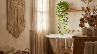
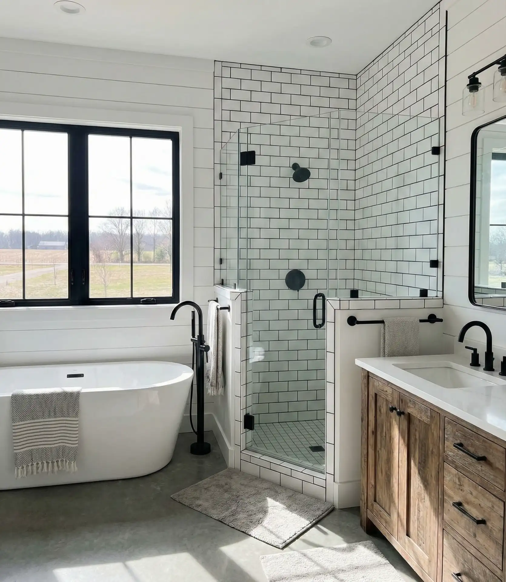
6. Crisp White Farmhouse Fresh
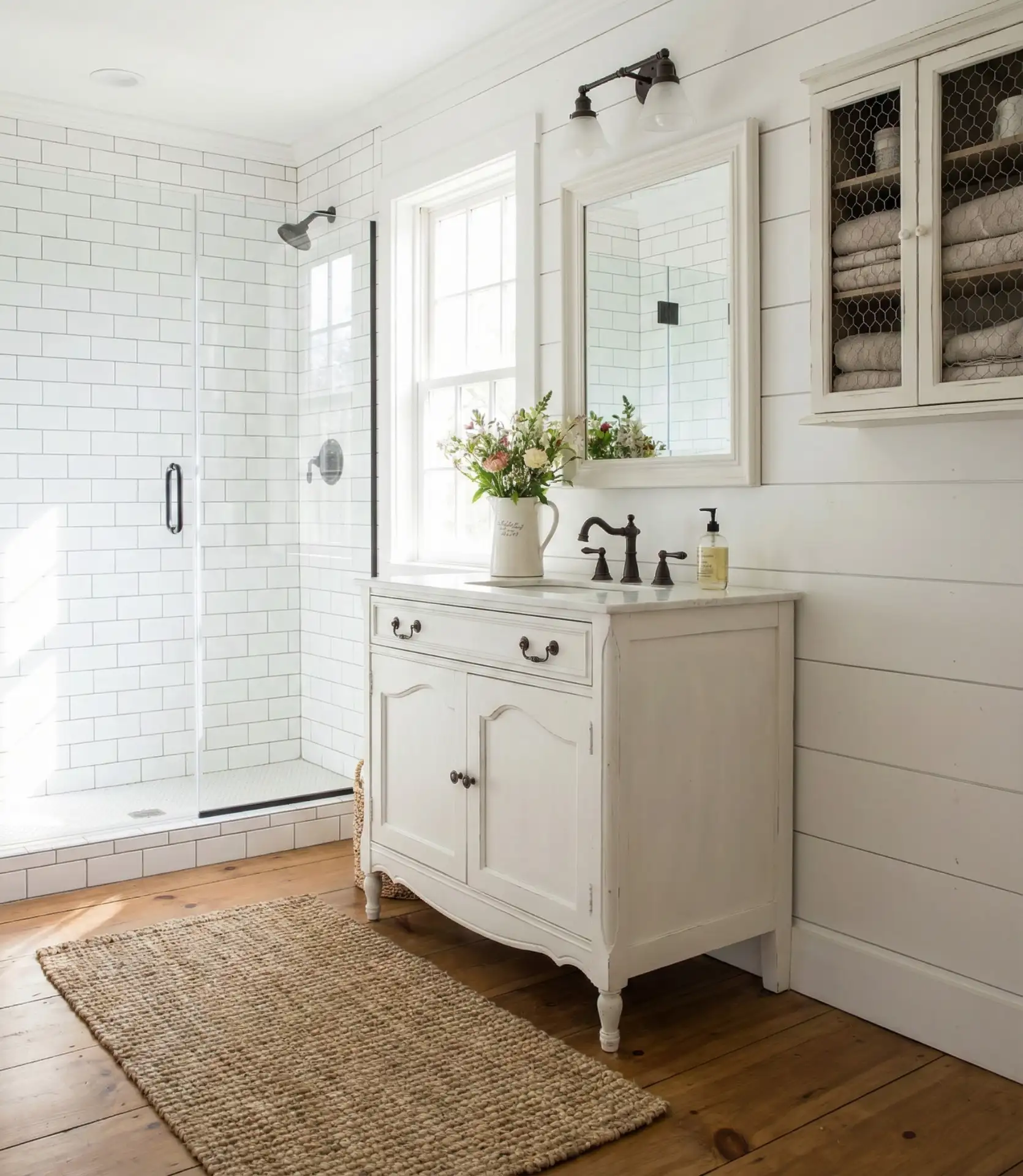
All-white bathrooms remain enduringly popular, especially in farmhouse and cottage-style homes where simplicity and light take priority. This approach particularly shines in small bathrooms where white walls maximize the sense of space and cleanliness. The key is layering different white tones and textures to prevent the space from feeling sterile.
This aesthetic thrives in rural and suburban homes across the Midwest and South, where farmhouse style has deep cultural roots. The all-white approach is also budget-friendly—white paint typically costs less than custom-mixed colors, and white fixtures and tiles offer the most options at every price point. Many homeowners appreciate that white bathrooms photograph beautifully for social media, though maintaining that pristine appearance requires regular cleaning to prevent yellowing or discoloration over time.
7. Moody Forest Green
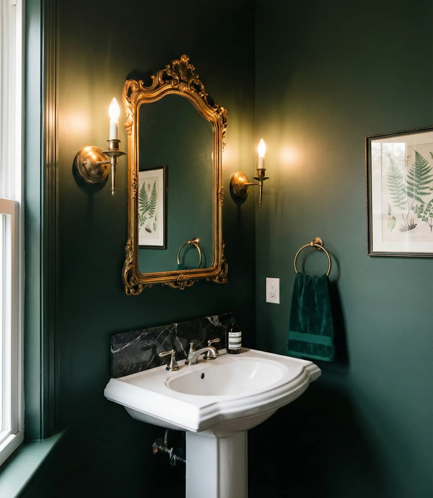
Deep, saturated green creates luxurious dark and moody bathrooms that feel like private sanctuaries. This bold choice works exceptionally well in half baths and powder rooms where you can embrace drama without committing an entire ensuite to such intensity. The richness of forest green elevates even basic fixtures into something special.
Expect to spend slightly more on quality paint here—cheaper paints in dark colors often require three or four coats for even coverage, while premium formulas cover in two. The drama of dark green particularly appeals to younger homeowners who grew up with builder beige and are eager to inject personality into their spaces. This color performs beautifully in bathrooms with no windows, where you’re relying entirely on artificial lighting anyway and the dark walls create an intentionally intimate atmosphere.
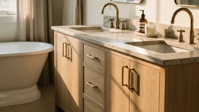
8. Warm Beige and Taupe
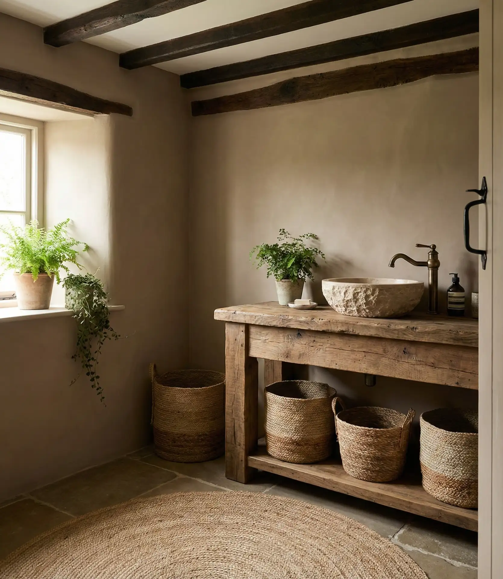
Warm beige and taupe continue to anchor rustic and natural bathroom designs, particularly in homes emphasizing organic materials and earthy textures. These colors pair beautifully with stone tiles, brown cabinets, and wood accents, creating cohesive spaces that feel connected to nature. The warmth prevents the space from reading as cold or institutional. 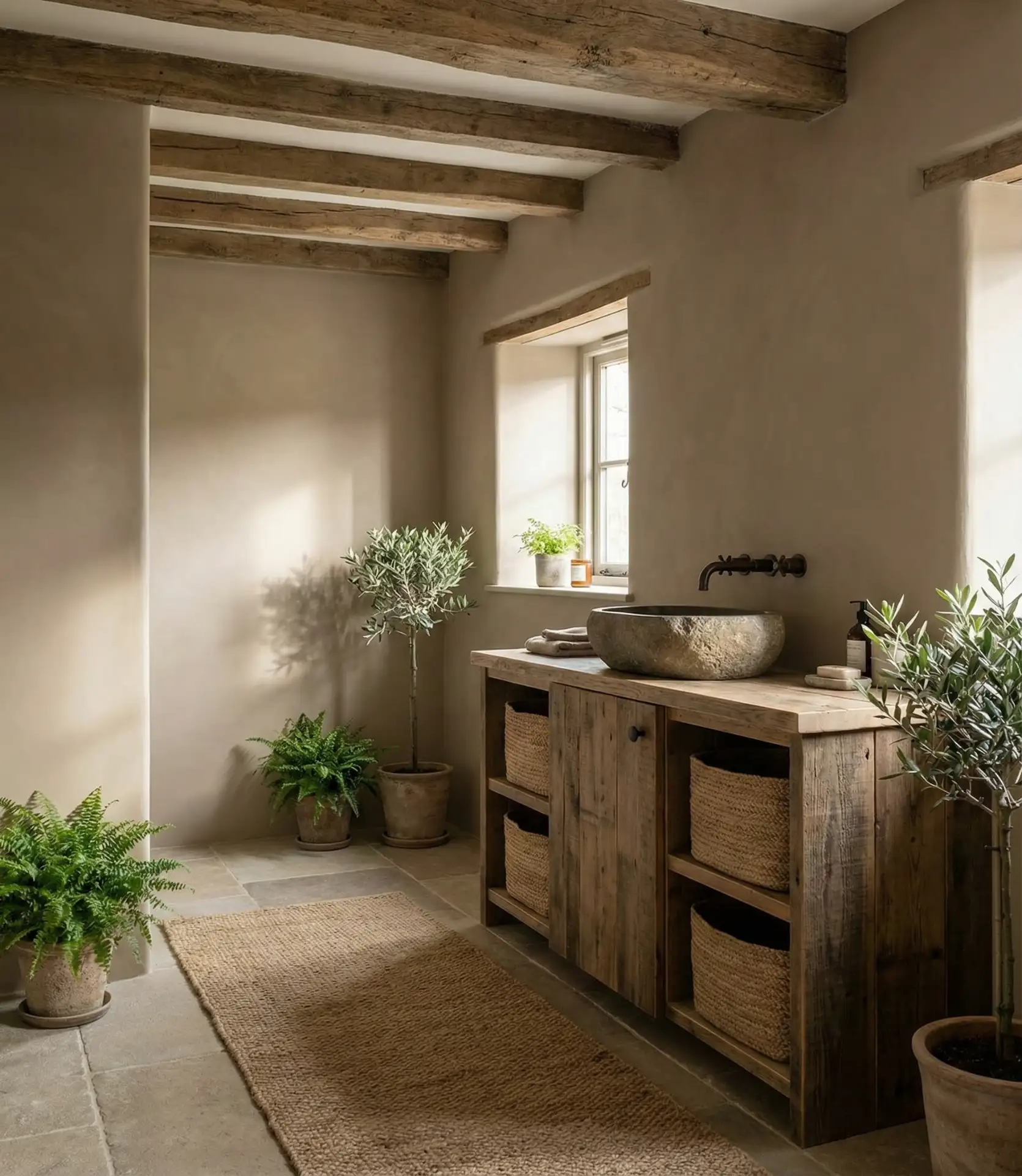
Taupe and beige work best in bathrooms with adequate natural light, where the subtle color variations become apparent—in dim lighting, these shades can appear flat and muddy. Mountain homes and lake houses frequently feature these palettes, as they complement natural surroundings without competing with outdoor views. The colors also hide minor dirt and water spots better than pure white, making them practical for high-traffic family bathrooms.
9. Playful Primary Color Accents

Fun and energetic, primary color accents bring personality to otherwise neutral bathrooms. This approach is particularly popular in children’s bathrooms and vintage-inspired designs where pops of red, yellow, or blue create cheerful focal points. The strategy keeps walls neutral while introducing color through accessories, towels, and artwork that can easily change as tastes evolve.
This flexible approach allows families to update the bathroom’s look seasonally without repainting—simply swapping towels, rugs, and shower curtains refreshes the entire space. Young families particularly appreciate this strategy, as children’s color preferences change rapidly; last year’s princess pink becomes this year’s rejected palette. The neutral foundation also ensures the bathroom remains appealing if you decide to sell, as buyers can easily envision their own style in the space.
10. Soft Blush and Dusty Rose
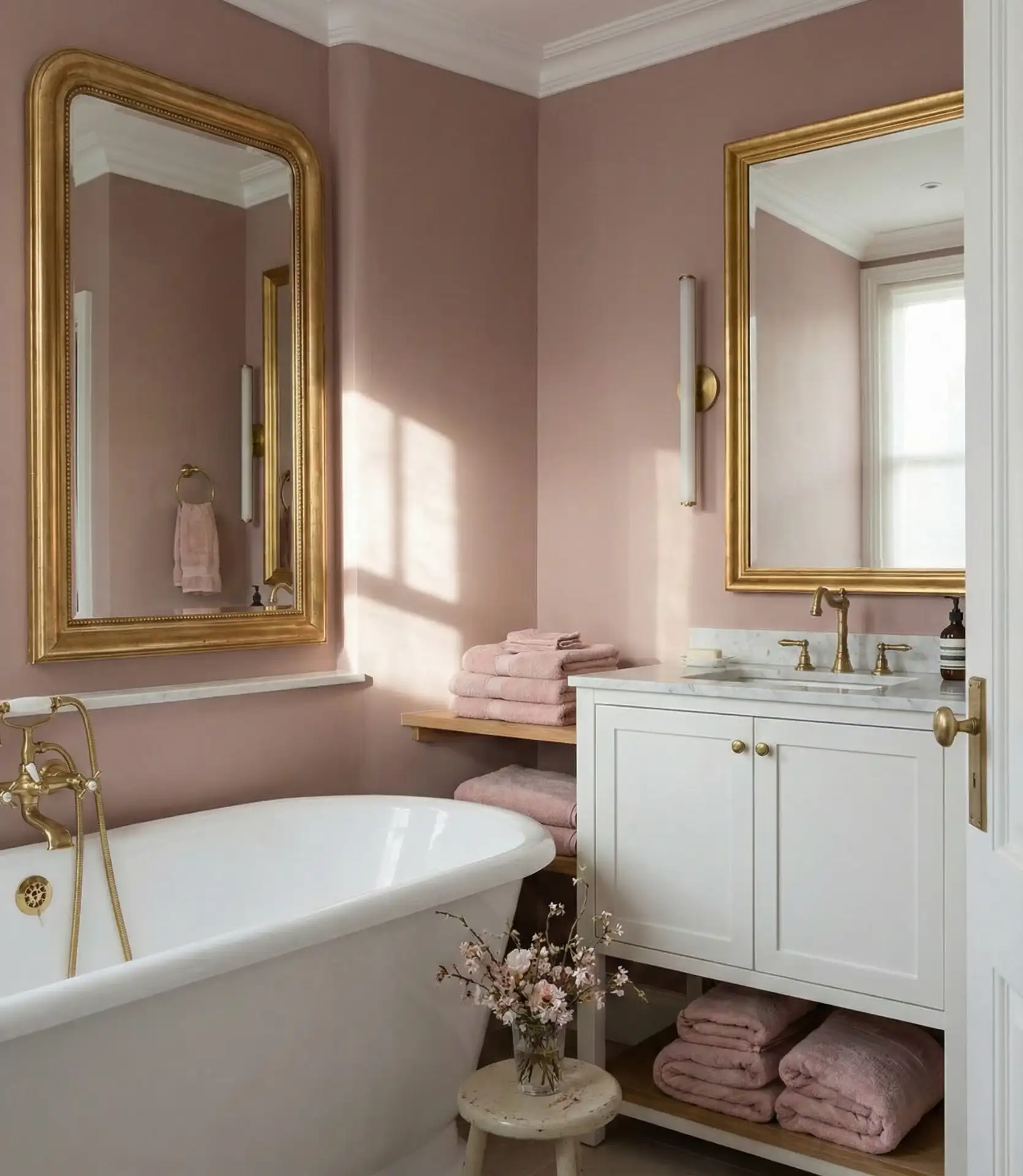
Gentle blush and dusty rose tones create vintage-inspired bathrooms with modern sophistication, particularly popular in large master suites where the soft color promotes relaxation. These subtle pinks work beautifully for small bathrooms as well, adding warmth without overwhelming the space. The color flatters skin tones, making it ideal for bathrooms where you apply makeup or prepare for the day. 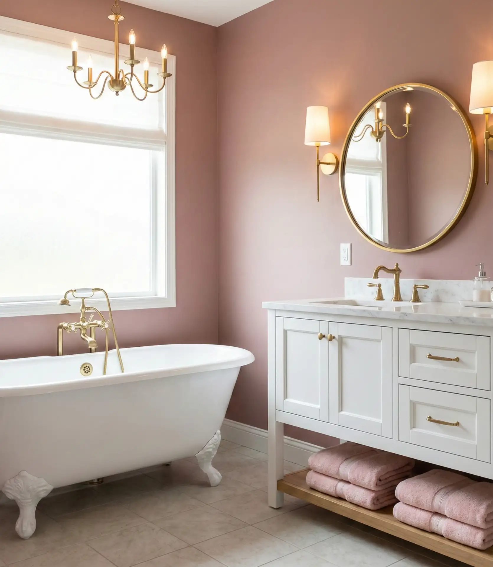
This palette particularly resonates in historic homes and Art Deco-inspired spaces where period accuracy matters. The softness of blush creates a romantic, spa-like environment that encourages longer soaks and self-care rituals—exactly what Americans increasingly seek from their bathrooms as wellness culture grows. These colors pair exceptionally well with brass and gold fixtures, which are experiencing renewed popularity after years of chrome dominance, creating a cohesive look that feels both current and timeless.
11. Sophisticated Charcoal and White Contrast
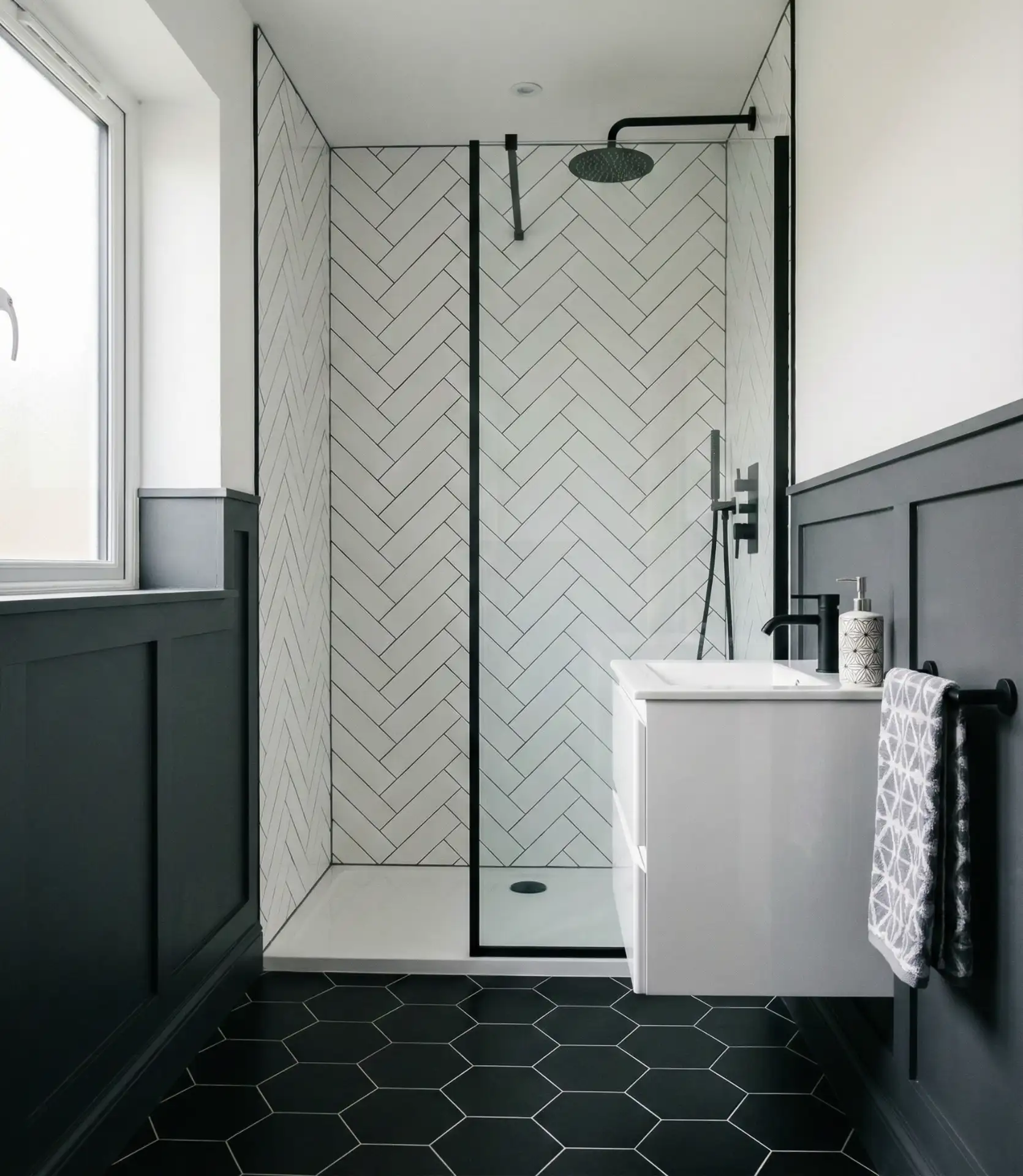
Bold gray and white pairings create striking visual impact in modern bathrooms where clean lines and geometric patterns take center stage. This high-contrast approach works brilliantly with black fixtures, creating a cohesive monochromatic scheme that feels both contemporary and timeless. The dramatic interplay between dark and light adds architectural interest even to basic rectangular spaces. 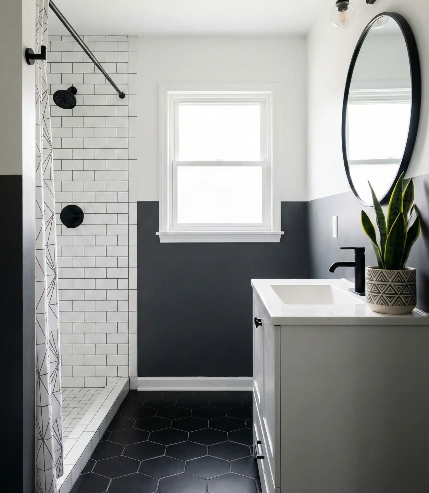
This color-blocking method works best in condos and apartments with few architectural details. In these cases, the color itself becomes the architecture. Urban professionals gravitate toward this aesthetic, as it mirrors the sophisticated simplicity found in boutique hotels. The sharp contrast also makes the bathroom feel larger by creating defined zones, a clever optical trick that works especially well when the darker color anchors the lower portion of walls.
12. Coastal Aqua and Seafoam
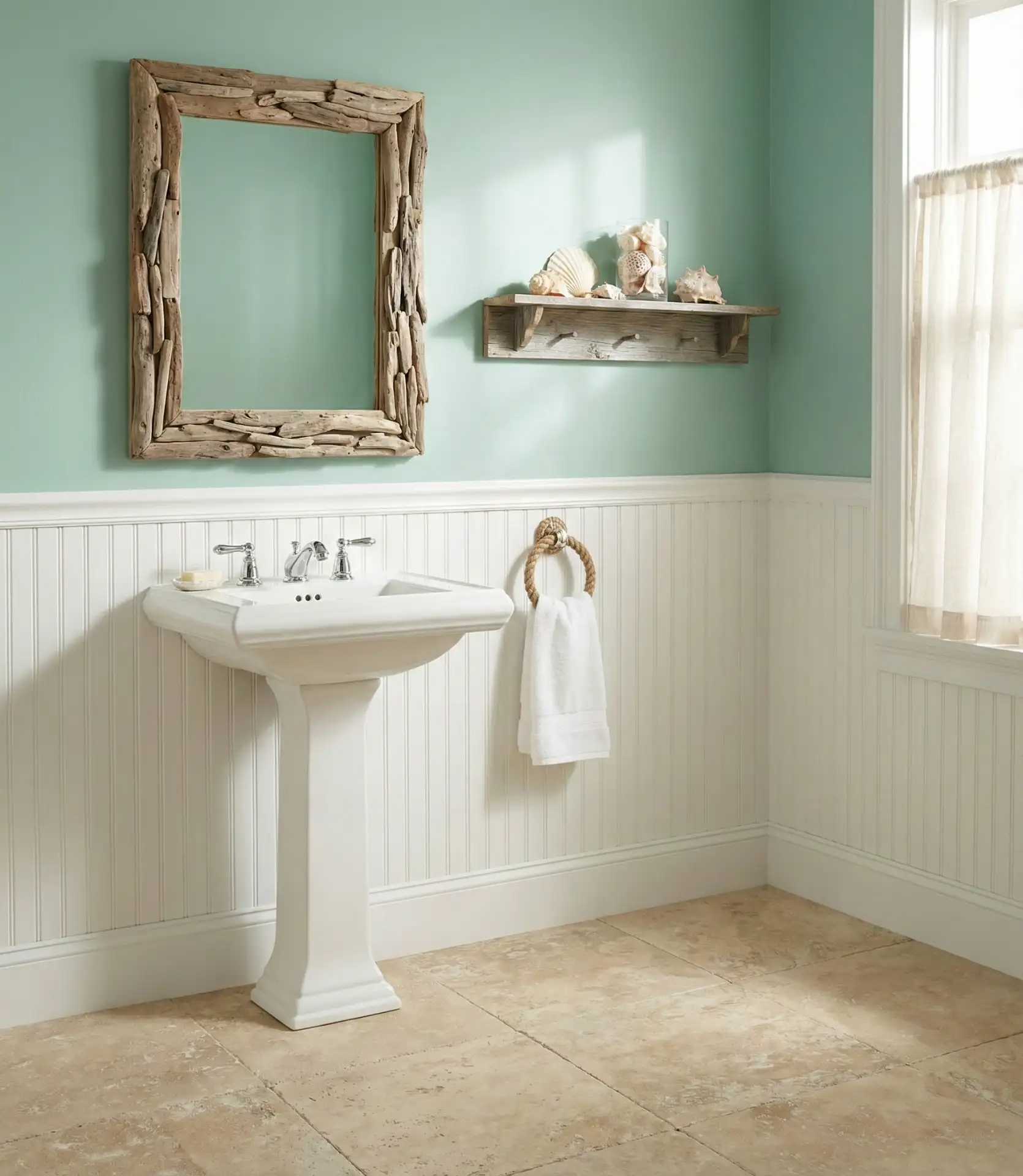
Soft aqua and seafoam blue tones evoke seaside tranquility, particularly popular in guest bathrooms where you want to create an instant vacation-like atmosphere. These watery hues pair beautifully with white vanity units and natural textures like rope, rattan, and weathered wood. The colors bring brightness without the starkness of pure white.
Coastal communities from Cape Cod to Southern California have long embraced these tones, but they’re now trending inland as homeowners create calming spa-like environments, regardless of proximity to water. A designer mentioned that their clients consistently report feeling more relaxed in aqua bathrooms, attributed to the color’s psychological association with water. Budget-conscious renovators love this color palette, as it pairs nicely with white, affordable fixtures and affordable design schemes.
13. Rich Burgundy and Wine Tones
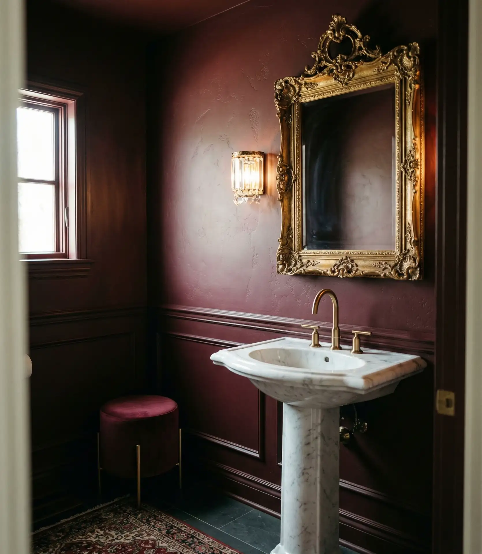
Deep burgundy and wine-inspired shades create surprisingly sophisticated moody bathrooms with a jewel-box feel. This choice particularly resonates in half baths and powder rooms that get a lot of use for a dramatic effect. The richness of these elements transforms these rooms into a custom and luxurious feel.
Where this technique works best is in rooms with excellent artificial lighting—install dimmers to control the mood from dramatic evening ambiance to functional morning brightness. Traditional homes and Victorian-era properties particularly suit these regal tones, as they complement period architectural details like crown molding and wainscoting. The color also photographs exceptionally well, creating Instagram-worthy spaces that guests remember long after their visit.
14. Sunny Yellow Accents
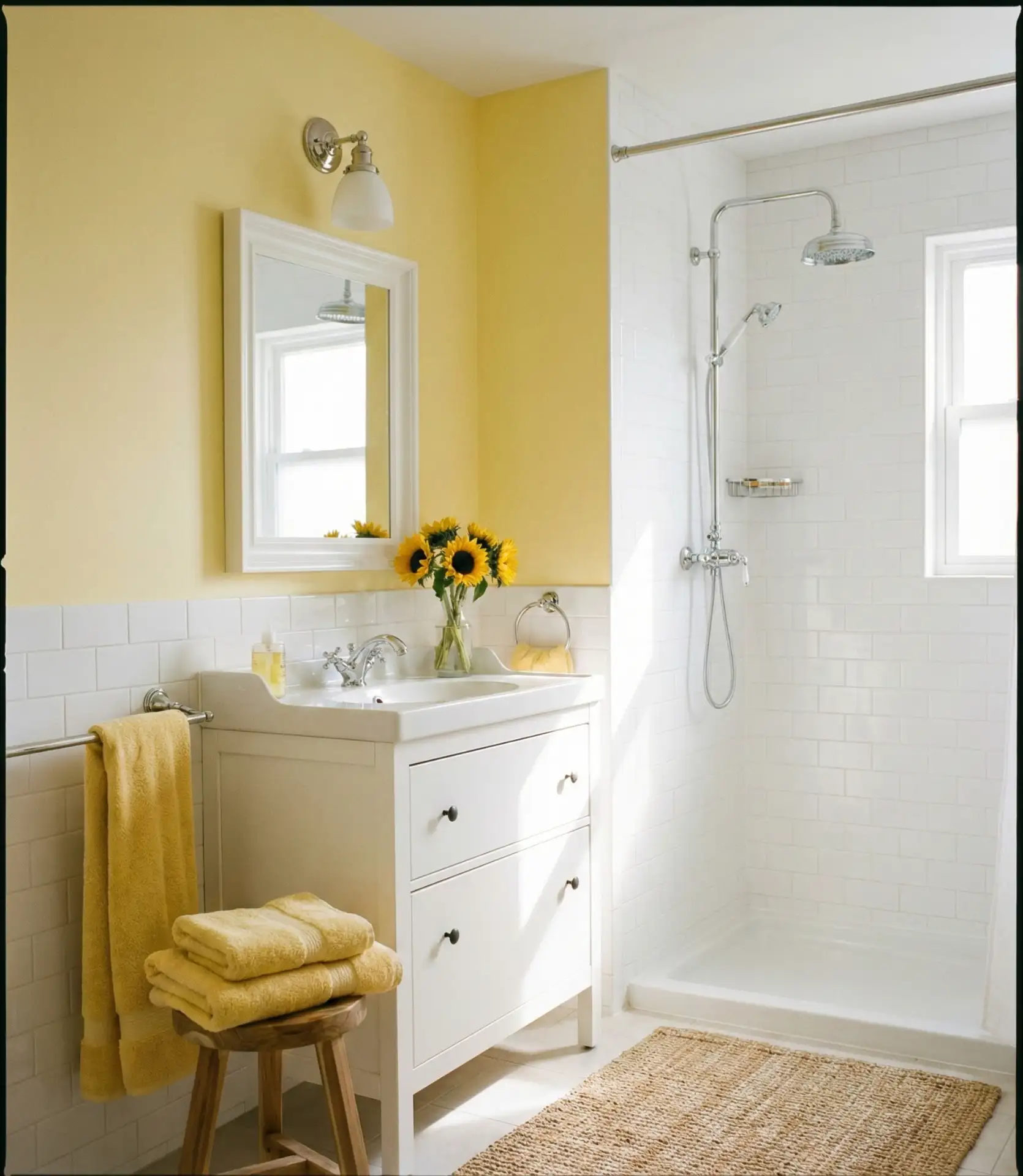
Cheerful yellow brings fun energy to bathrooms, especially effective in spaces with no windows where the warm color compensates for limited natural light. Whether used as an accent wall or through accessories, yellow creates an optimistic atmosphere that makes morning routines more enjoyable. This approach works particularly well in children’s bathrooms and small bathrooms that need brightening.
Many homeowners hesitate with yellow, fearing it will feel overwhelming, but softer butter and cream-based yellows create warmth rather than intensity. The color is experiencing renewed interest after years of gray dominance, particularly among millennials furnishing their first homes. Yellow also pairs surprisingly well with both cool grays and warm woods, offering styling flexibility as trends shift and your preferences evolve.
15. Slate Blue Sophistication
Muted slate blue offers a refined alternative to navy, bringing depth without darkness to main bathrooms and master suites. This versatile shade from the Sherwin-Williams and Benjamin Moore palettes bridges traditional and contemporary styles effortlessly. The gray undertones prevent it from reading as too colorful while still providing visual interest beyond standard neutrals. 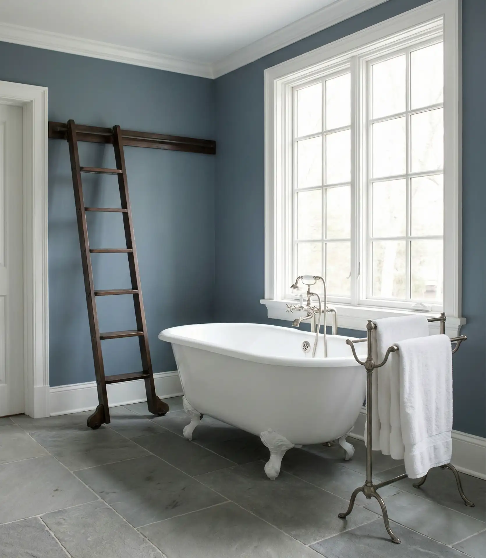
A common mistake with blue-gray shades is choosing them based solely on small paint chips—these colors shift dramatically depending on lighting conditions, appearing more blue in natural light and grayer under artificial illumination. Always test large swatches on multiple walls before committing. Slate blue particularly complements homes with cool undertones in flooring and countertops, creating a cohesive color story throughout the space.
16. Warm Honey and Mustard
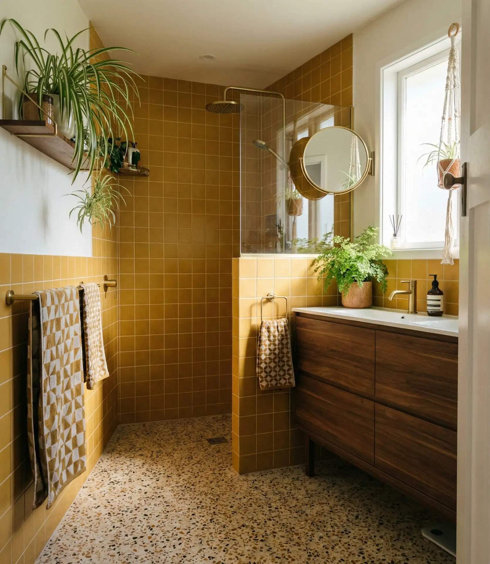
Golden honey and muted mustard tones deliver trending warmth with a retro-modern vibe, particularly appealing in vintage-inspired renovations and mid-century modern homes. These sophisticated yellows pair beautifully with brown cabinets and walnut wood tones, creating cohesive earth-tone schemes. The colors add sunshine without the sharpness of primary yellow. 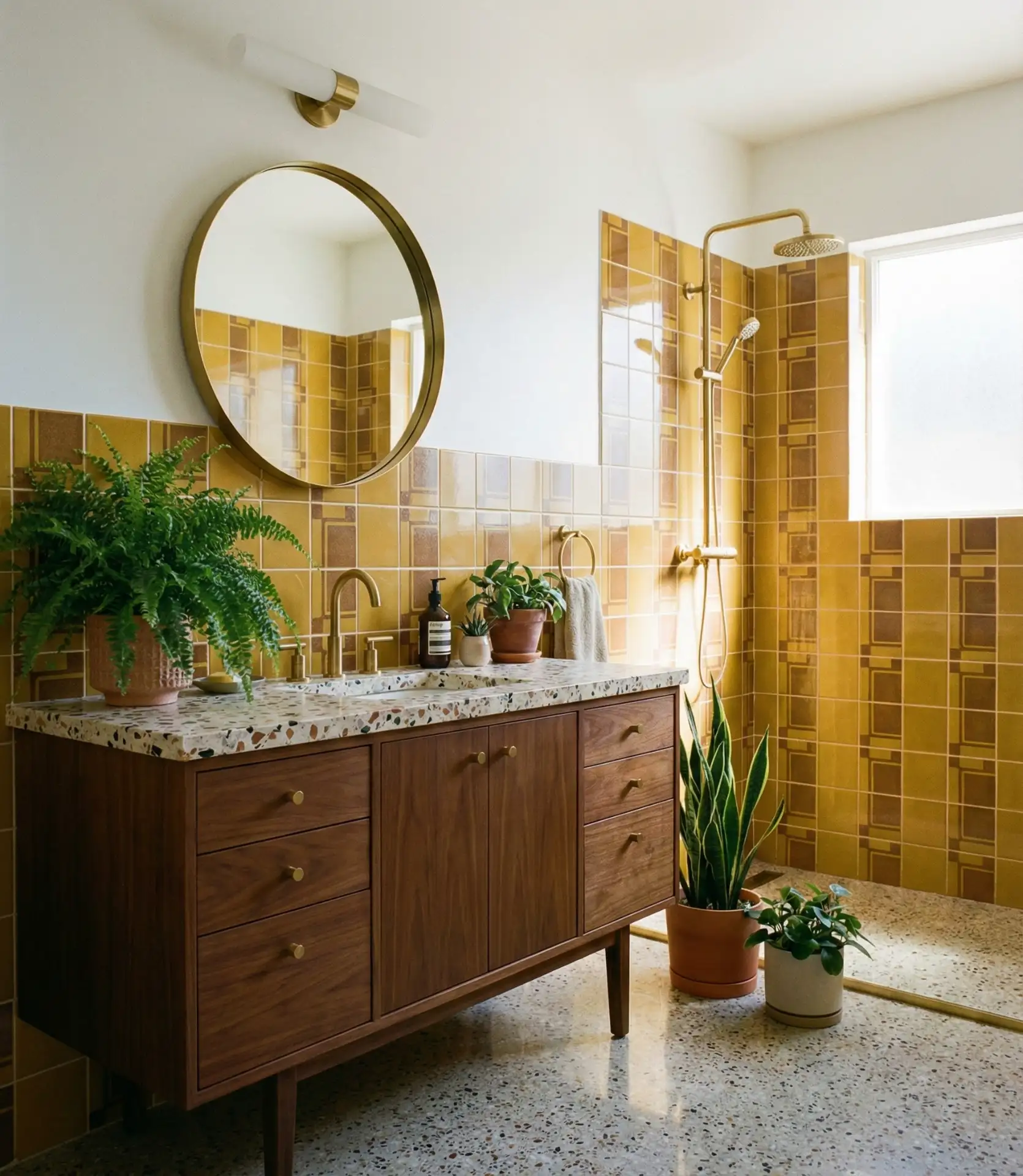
This palette has seen remarkable growth in Portland, Austin, and other cities with strong design-forward communities where homeowners embrace color more boldly. The warm tones create an instantly cozy feeling that’s especially welcome in colder climates where bathrooms can feel chilly and unwelcoming. Price-wise, these colors work at any budget—whether you’re investing in custom glazed tiles or simply painting walls, the warmth translates across materials and price points.
17. Crisp White with Black Trim
Classic white gains a modern edge when paired with black fixtures and trim, creating graphic appeal in farmhouse and contemporary bathrooms alike. This high-contrast combination works brilliantly for small bathrooms, where the dark accents define the space without overwhelming it. The crispness feels fresh and current while remaining fundamentally timeless. 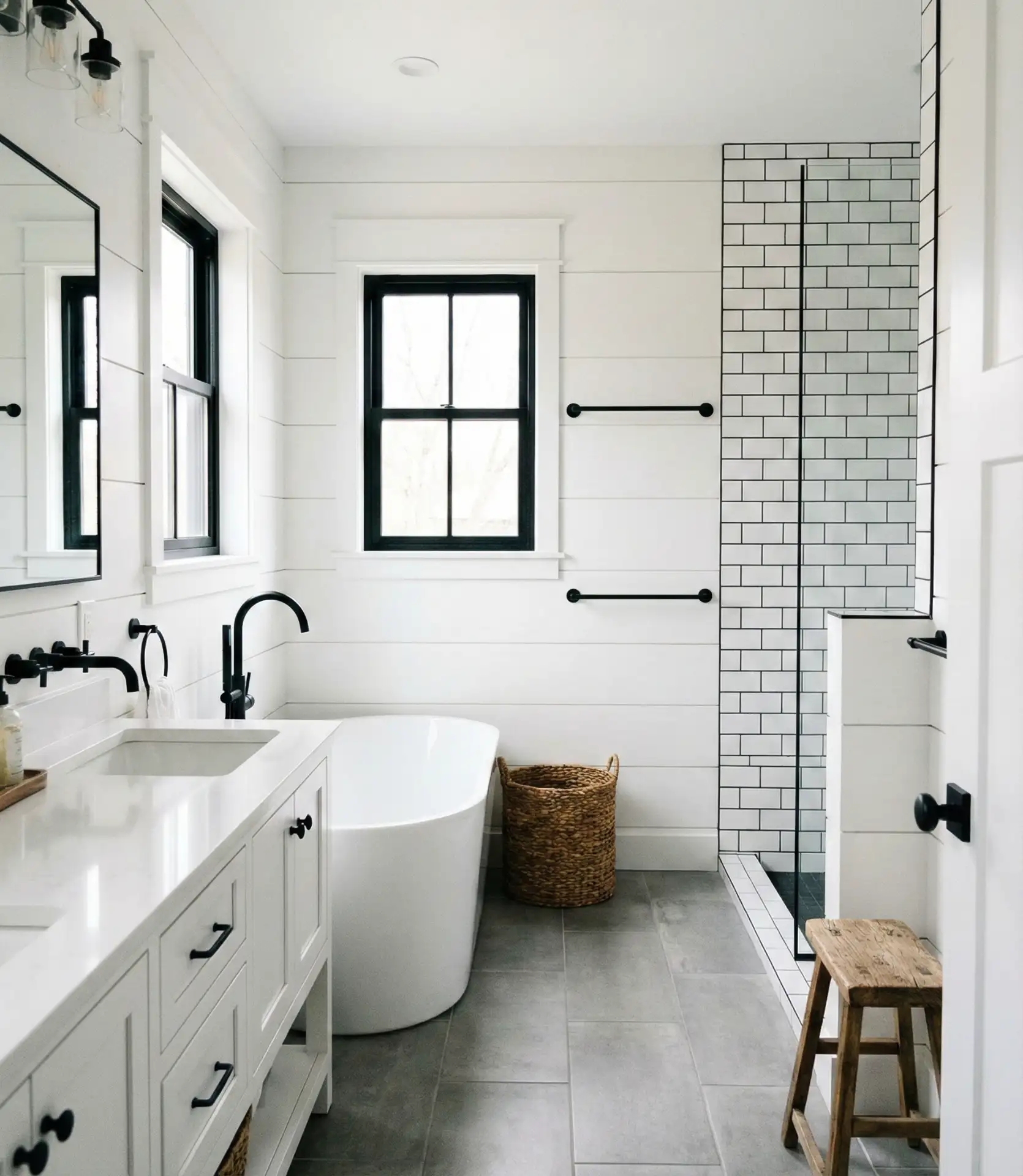
Real homeowners report this combination photographs beautifully for resale listings and social media, which increasingly influences design decisions. The stark contrast also makes cleaning easier to manage—you can see exactly where attention is needed rather than missing spots that blend into mid-tone surfaces. This scheme particularly suits new construction and recent renovations where you’re starting with a blank slate rather than working around existing fixtures.
18. Soft Lavender and Lilac
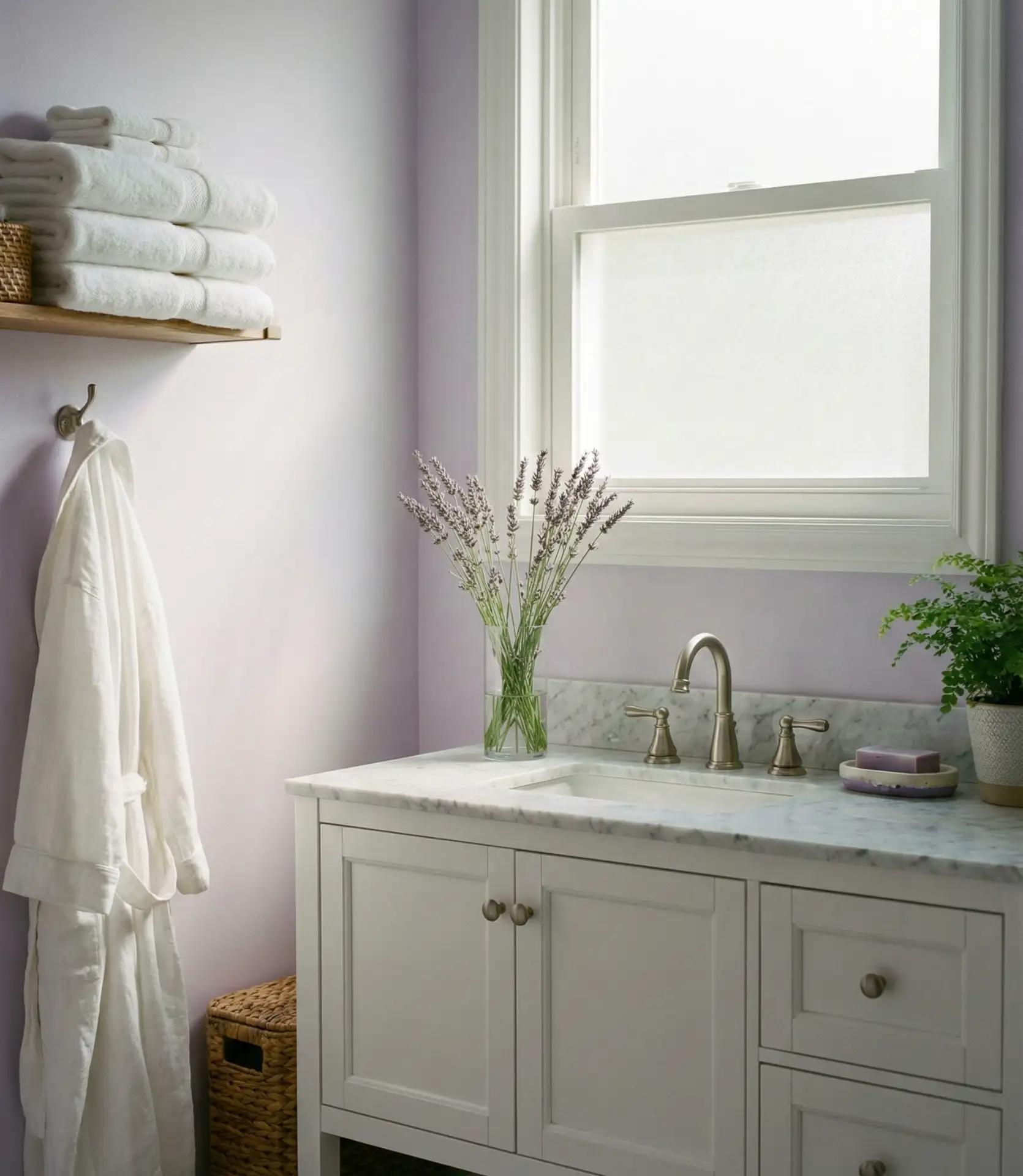
Gentle lavender and lilac shades create neutral and serene environments with subtle personality, working beautifully in large master bathrooms where relaxation is paramount. These purple-tinged neutrals offer an alternative to beige and gray, bringing a whisper of color without committing to bold statements. The tones complement both warm and cool accent colors, offering styling flexibility. 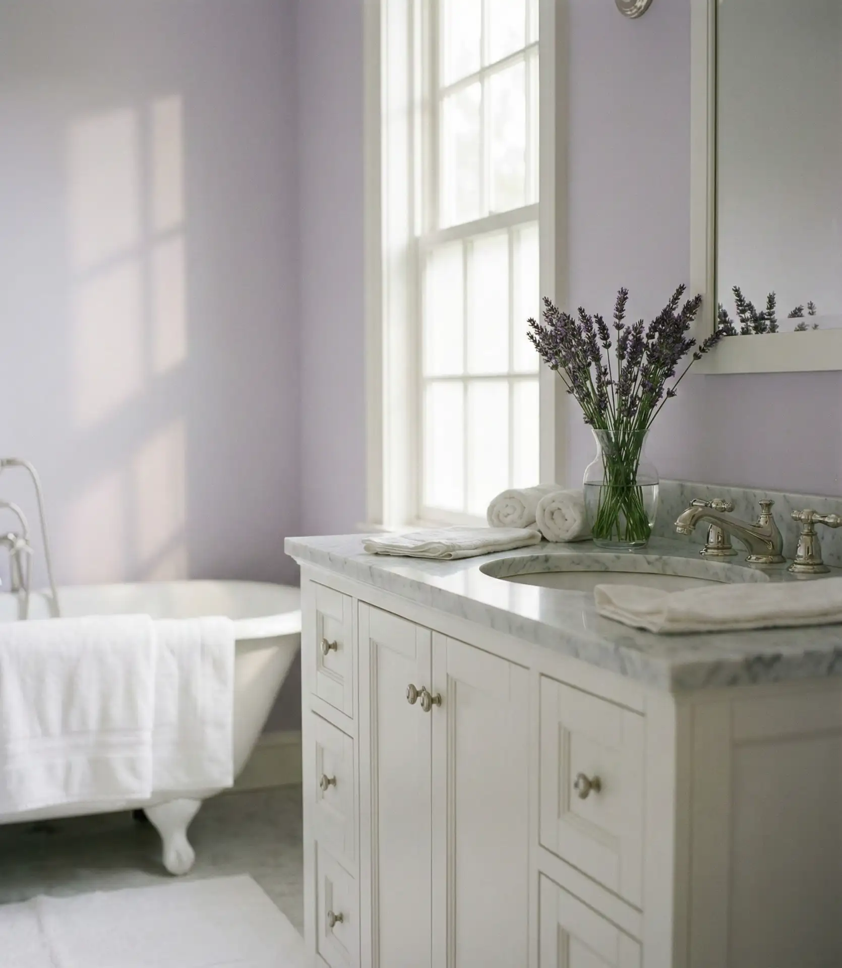
Interior designers note that lavender works exceptionally well in bathrooms because it’s naturally associated with cleanliness and relaxation through products like lavender soap and aromatherapy. The color performs beautifully in spaces with abundant natural light but can appear dingy in dark rooms—proper lighting is essential. Many homeowners pair lavender walls with eucalyptus or mint green accents, creating herbaceous color schemes that feel organic and refreshing.
19. Terracotta and Clay Red
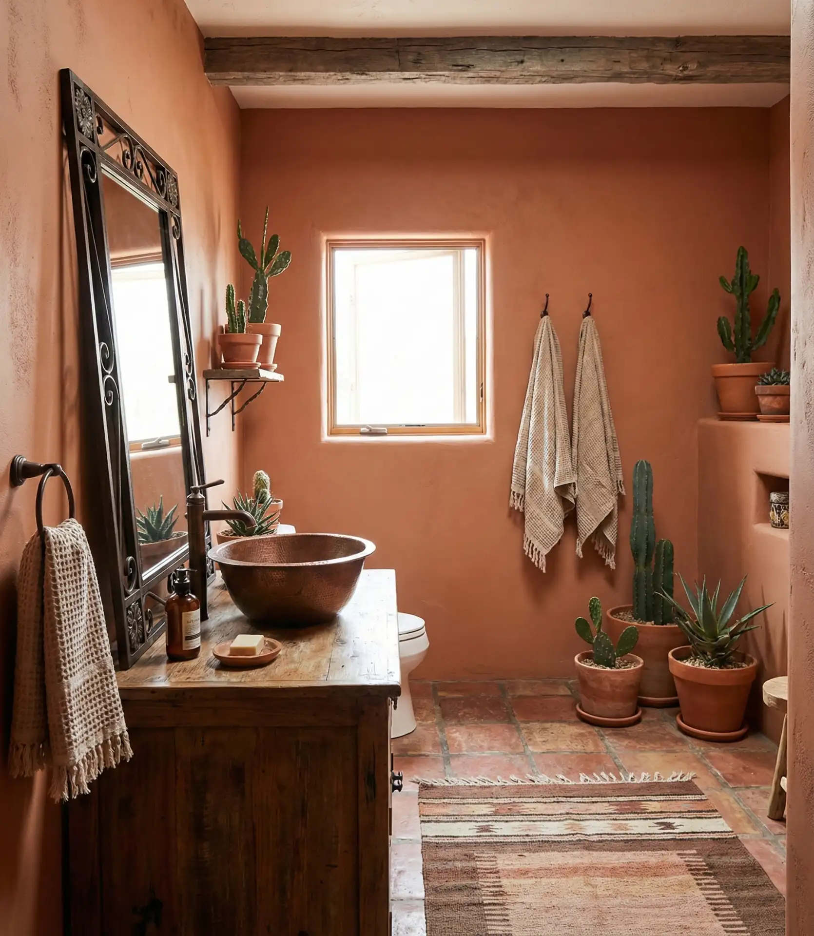
Warm terracotta and clay-red tones bring rustic and natural character to bathrooms, particularly stunning in rustic homes with Southwestern or Mediterranean influences. These earth-tone colors create grounding, organic environments that connect indoor spaces to natural landscapes. The warmth counteracts the inherently cold feeling of tile and porcelain fixtures.
This palette thrives in regions like Arizona, New Mexico, and Southern California, where the colors echo natural surroundings, but it’s gaining traction nationwide as homeowners seek warmth and character beyond standard gray schemes. A renovation expert shared that terracotta bathrooms consistently receive enthusiastic responses at open houses, as they feel distinctive without being polarizing. The earthy quality also allows imperfect finishes and textures to feel intentional rather than sloppy, which can reduce renovation costs.
20. Cool Mint and Pale Green
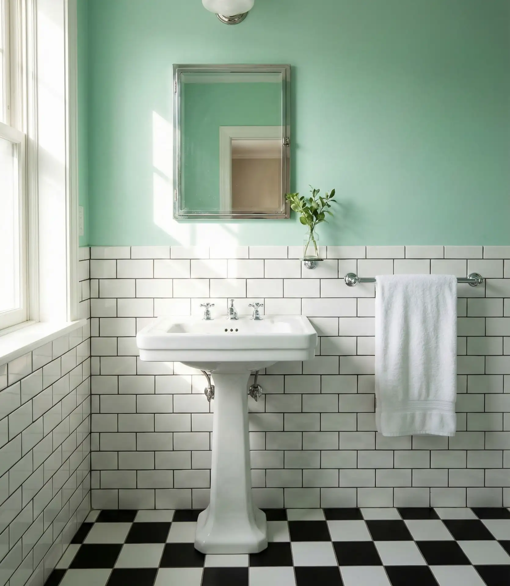
Fresh mint and pale green tones deliver invigorating energy while maintaining the calm essential for bathroom spaces. This color family works particularly well in tiny bathrooms where the cool, airy quality makes spaces feel larger and more breathable. The retro charm of mint appeals to both vintage enthusiasts and contemporary design lovers seeking unexpected color choices.
Budget-conscious renovators love mint because it transforms spaces dramatically with just paint, requiring minimal additional investment to make a significant impact. The color pairs effortlessly with white, chrome, and even unexpected accents like coral or navy, giving you room to experiment with accessories as your style evolves. Mint also flatters skin tones in mirror reflections, making it practical for bathrooms where you apply makeup or prepare for important events—a functional consideration often overlooked in color selection.
21. Charcoal and Brass Luxury
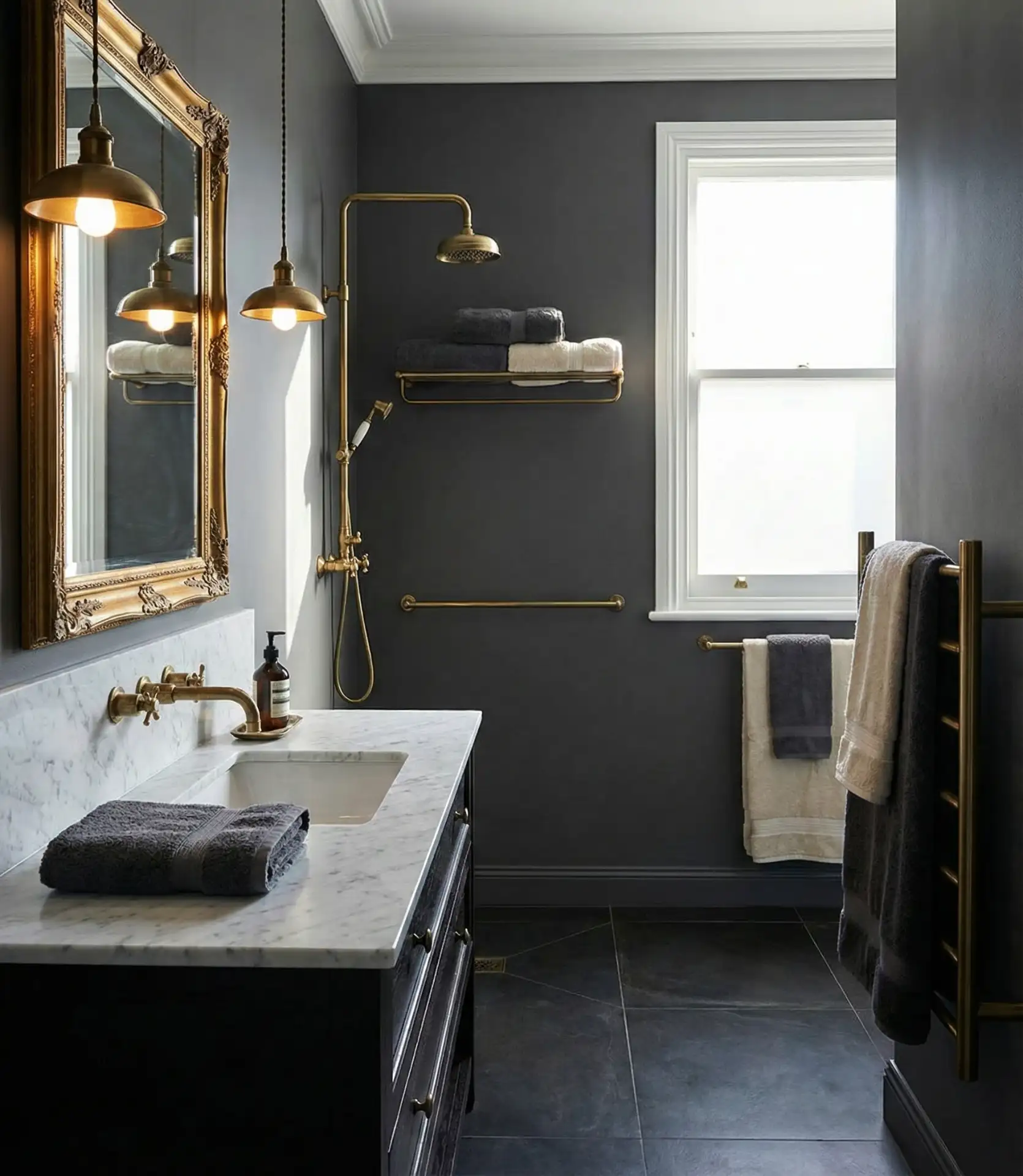
Deep charcoal gray walls paired with warm brass fixtures create opulent modern bathrooms that rival high-end hotel suites. This sophisticated combination works exceptionally well in main bathrooms and master ensuites where you want to establish a luxurious retreat. The dark and moody backdrop makes brass hardware and lighting fixtures appear to glow, creating visual warmth that prevents the space from feeling cold despite the deep wall color.
One contractor noted that clients opting for these palettes usually increase their budget by 20–30% to add brass fixtures, as their high-end, warm metallic finish will be a feature and not just an accent. This combination suits urban professionals in cities like Chicago, Boston, and San Francisco, as they tend to appreciate the masculine elegance with just the right amount of warmth. This palette is best applied in bathrooms that have at least one window or very good lighting, as the dark walls need to be well lit to not feel oppressive, although many owners tend to like the cocooning sensation for spa-like evening soaks.
22. Soft Sage with Natural Wood
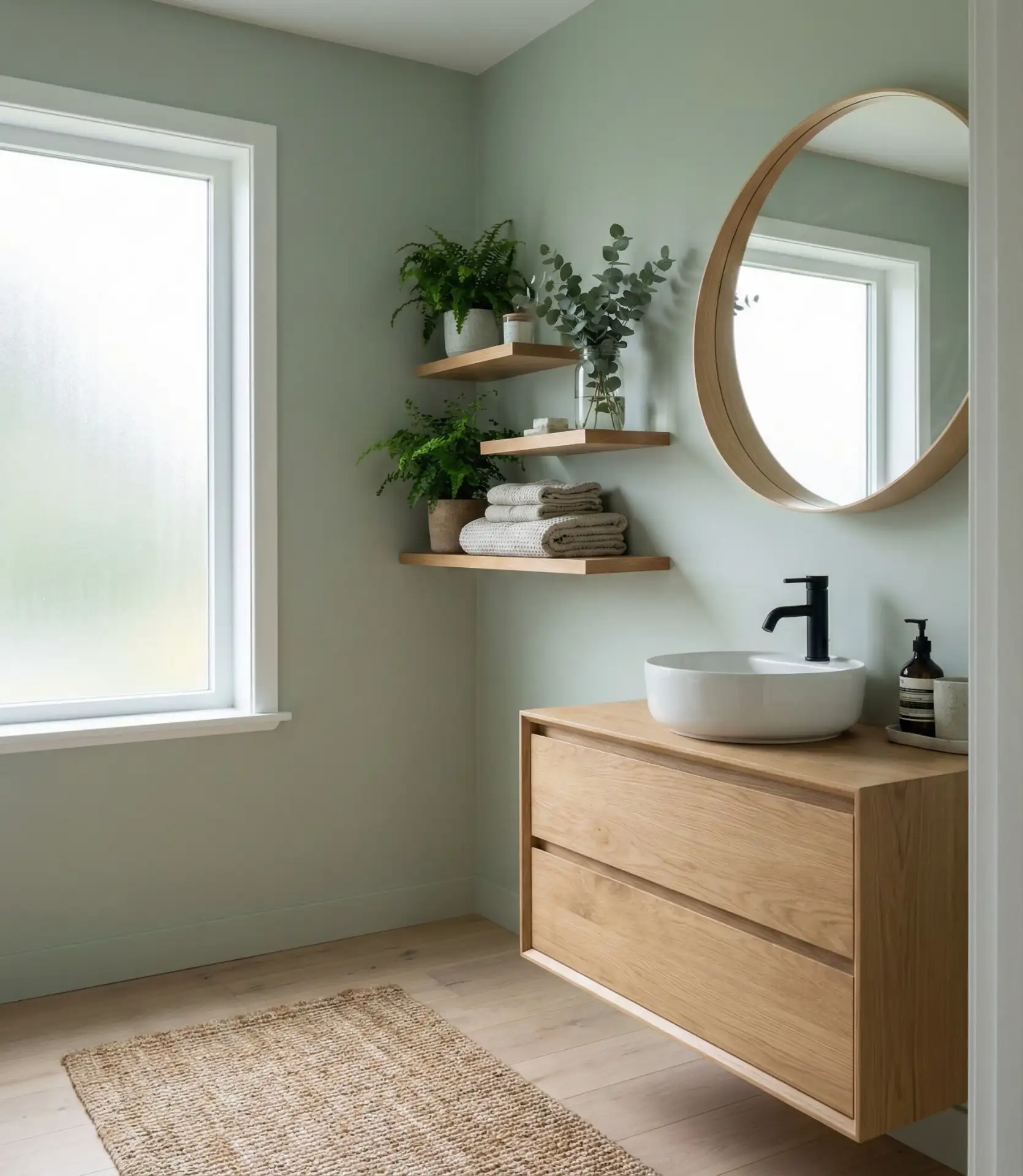
Gentle sage green combined with natural wood elements creates neutral and serene bathrooms with organic, rustic, and natural appeal. This trending pairing works beautifully with brown cabinets and wooden floating shelves, establishing harmonious earth-tone environments. The combination appeals to homeowners seeking connection with nature while maintaining sophistication, particularly popular in farmhouse and Scandinavian-inspired designs where simplicity and natural materials reign supreme. 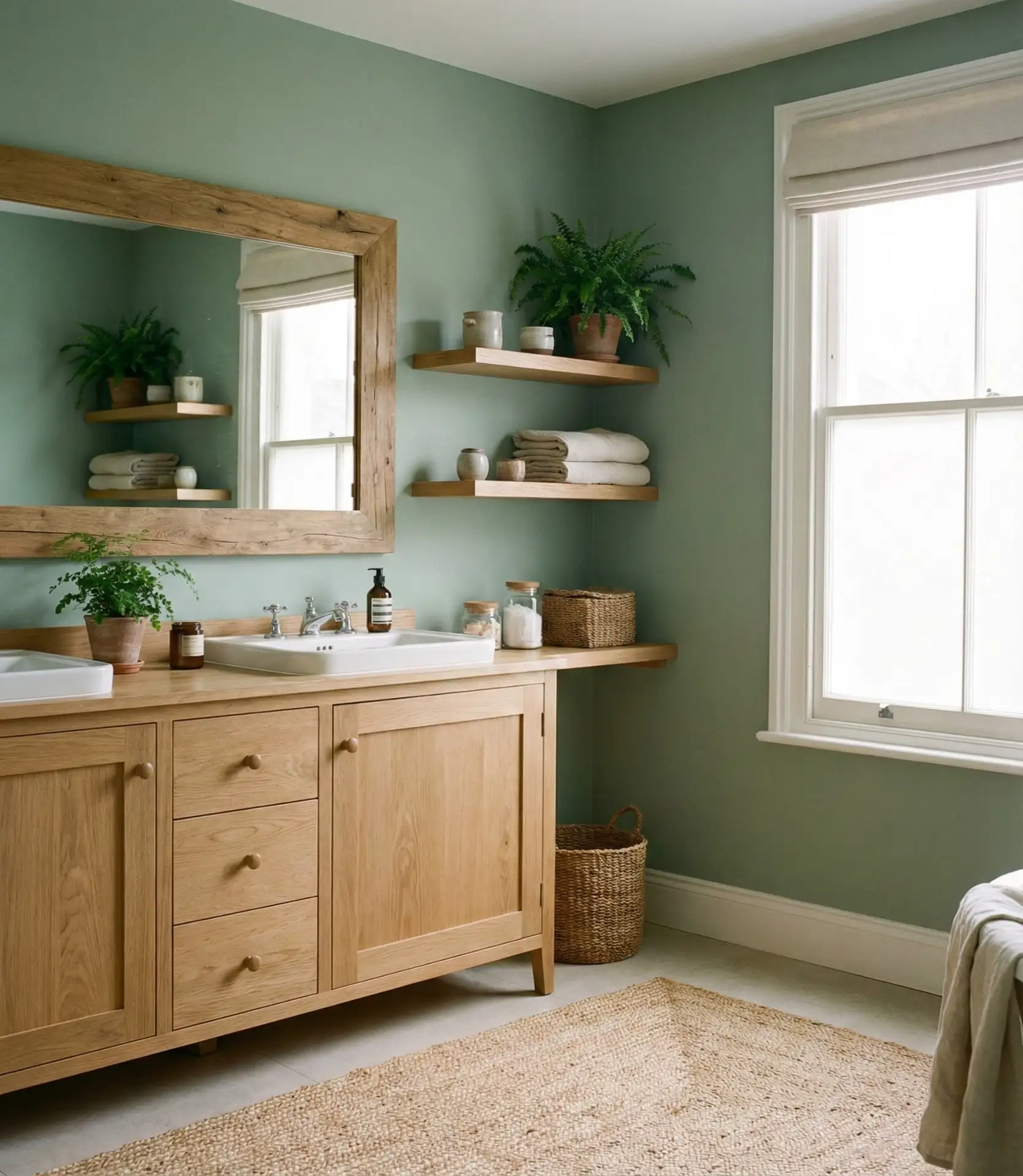
Real homeowner behavior shows that this palette encourages longer bathroom routines—people linger in spaces that feel calm and connected to nature, transforming quick showers into more mindful self-care moments. The sage and wood combination also ages gracefully, unlike trendy color schemes that feel dated within a few years, making it an excellent investment for long-term homeowners. Common mistakes to avoid include pairing sage with overly orange-toned woods like golden oak—instead, choose cooler-toned woods like white oak, ash, or walnut that complement rather than clash with the green’s subtle gray undertones. This thoughtful material selection ensures your bathroom maintains its serene, cohesive appearance for years to come.
As we’ve explored these distinctive color palettes for 2026, it’s clear that bathroom design has evolved far beyond purely functional spaces into personal sanctuaries that reflect individual style and support daily wellness rituals. Whether you’re drawn to the dramatic sophistication of charcoal and brass, the organic serenity of sage and wood, or the timeless appeal of crisp whites and navy blues, each color choice offers unique opportunities to transform your bathroom experience. The beauty of today’s design landscape is its inclusivity—there’s no single “right” answer, only the palette that resonates with your lifestyle, architectural context, and personal aesthetic. Remember that even small bathrooms can handle bold color when applied thoughtfully, while large spaces benefit from layers of tone and texture that create depth and interest. When renovating your bathroom, think about how the colors will affect your mood during your morning routine, evening wind-down, and all the time in between. We encourage you to test paint samples in your actual space, observe how they shift throughout the day, and trust your instincts. Your bathroom should be a retreat that energizes, calms, or inspires you—whatever you need it to be. What color journey will you begin? Share your plans, questions, or completed transformations in the comments below—we’d love to celebrate your creative vision and help troubleshoot any challenges along the way!